#((if needed I can post each individually zoomed in))
Text

his tummy looks like a happy face
#posting this alone for reasons because even though it's blurry I need to zoom in until I can see each tummy pixel individually#evgeni malkin#luce's gifs#TUMMY#i can't remember which of my moots has previously giggled over hockey player stomach with me bc brain like a sieve but YOU i'm tagging you
55 notes
·
View notes
Note
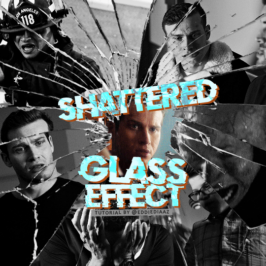
alie! I absolutely adore this mirrorball x buck set that you made last year! (/post/701462848238403584/) (also I can't believe it's been a year, like seriously what is time?) I was wondering how you did the shattered glass effect in the first gif? in particular how you made the black and white gifs appear distorted within the glass if that makes sense? thank you!!!
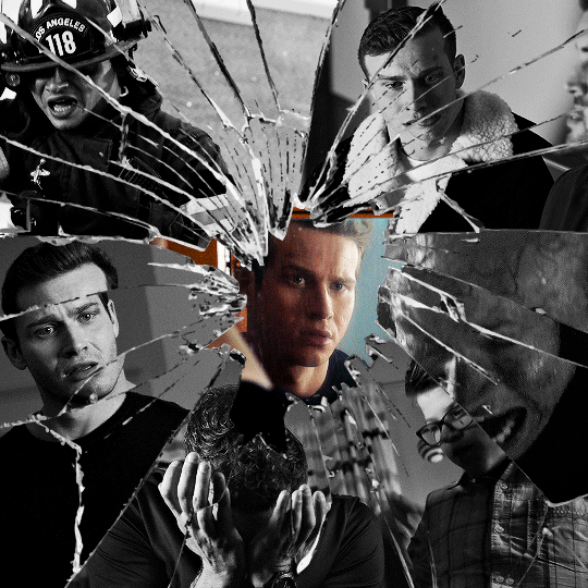
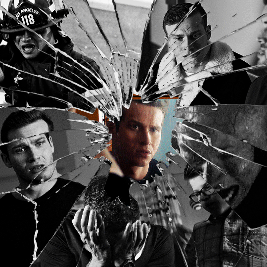
ahhh thank you so much renee! literally what is time lol, this gifset is still one of my faves that i made. the shattered glass effect is mostly just a lot of layer masks to be honest hahaha. i'm so glad i still have the psd, so here's how i did it under the cut~
(this tutorial assumes you know how to put multiple gifs in the same canvas and are familiar with layer groups and masks)
I. PREPARATION
first things first, create an empty canvas of your desired size. mine was 540x540 px.
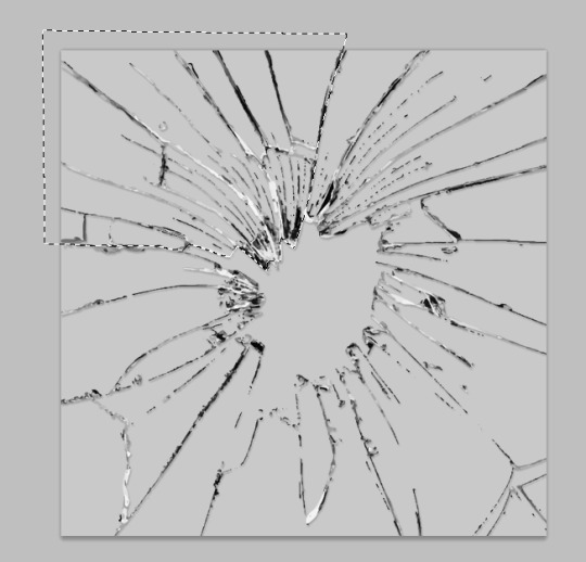
then, you need to find a cracked glass texture. if i remember correctly i simply googled something like "broken glass png", "cracked glass png", because i wanted something already transparent.
(a texture that's something like black lines over a white background definitely works too, you'll just have to put that layer's blending mode to darken or multiply.)
here's the png i used (and a download link for best quality):

and after positioning it into my canvas.

II. CREATING MAIN SECTIONS FOR GIFS
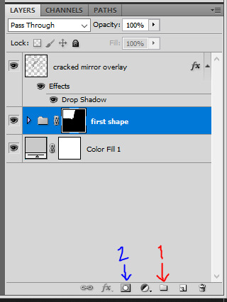
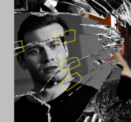
so basically when i did is i sectioned parts of the texture for each gif that i wanted to put. following the texture's lines, i zoomed in and carefuly drew a first shape along the lines with the polygon tool. you can also put a color fill layer behind the cracked glass layer so it's easier to see, like i did.
once you have your shape selected, click on the folder icon (1), then on the layer mask icon (2). it should give you a nice masked group to put gifs in hehe
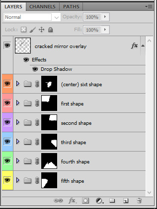
then i repeated the process until i had all of my desired shapes. i've put some color layers so it's easier to see, but here are my 6 main shapes and how my layer groups look like so far:

III. GIFFING TIME
after screencaping and making all 6 gifs required for each section, you need to put all of them in the same canvas. i simply put one smart object gif layer in each group created earlier. then, i resized and rotated each gif to fit its group (by hitting ctrl + T while selecting the gif layer), as you can see with the gif labeled 6x02 in the layers preview. for the coloring, i went simple with black and white for most of them.
once i have all six gifs sharpened, colored, and placed in each shape group, the gif looks like this. the broken glass texture does most of the work to be honest:


obviously the center gif doesn't have any kind of effect, it's just colored as usual, so i'm not gonna go over it. it's just one gif layer in a masked group.
IV. SUBSECTIONS FOR DISRTORTED EFFECT
okay so for the distorted effect it's even more layer masks! basically i created more smaller sections within each main shapes already, still following the cracked glass texture's lines with the polygon tool and put them in individual masked groups like i did in the second step. here's how i ended up dividing each main sections:

yep, each color here is a different masked group, for example the 2nd and 3rd shape sections:
for each main shape section, you want to duplicate your gif layer the same amount of times as you have subsections within that shape. so if the main shape has 5 smaller subsections, i want 5 layers of that same gif. just make sure to not change its duration or position yet, and make sure the coloring layers/group stays on top of the groups in its shape section. then, simply put one gif layer duplicate in each group. example of my layers for the second shape so far:
then just repeat this until all subsections have its own gif layer.
V. DISTORTED EFFECT
this is the best part! and it's really easy. basically you want to slightly move each subsection by a few pixels, so they're in a slightly different position than the ones next to it.
to do so, select one of the gif layers and with the arrows on your keyboard, move it left or right, and even up or down if it looks good. i do this for all duplicated gif layers, making sure it looks like they're all slightly offset. focus on the cracked glass overlay's lines while nudging the gif layers, it's easy to see how the shapes break when you move them. for example here:
this is really just all trial and error, you just need to move each subsection gif layer by a few pixels with the keyboard arrows until it looks good to you.
here's my result once i've done this for all (23!!) subsections:
VI. FINAL TOUCHES
i don't think i did much else to this before typography besides adding a bit of contrast overall and a thin drop shadow to the cracked layer texture on top of everything. if you have a transparent png this definitely helps to give a bit more dimension to the effect. so here's the final result:
i hope that was clear enough hehe :D
#alie replies#tutorial#photoshop#resource#*ps help#completeresrouces#allresources#userhella#userabs#userkarolina#userdena#tuserheidi#usercats#userrainbow#userbunneis#usersmia#tuserabbie#usertreena#usernik#swearphil
432 notes
·
View notes
Text
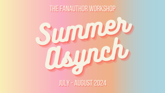
Introducing the FAW Summer Asynch Session!
Many people have mentioned that the times I lead the spring and fall workshops aren’t accessible for those with busy/unpredictable schedules, but they would still like to participate in the workshop and join the FAW community. To address that feedback, I’m running an asynchronous summer session. An asynch session doesn’t have a set meeting time. Instead, you’ll read up to 2 pieces presented each week by fellow participants, write them crit letters, and participate in discussion over Discord.
The only required* meeting is an individual 30 minute Zoom call with me any time during the two weeks prior to the start of workshop. We'll use that time to go over the syllabus together and I can answer any questions you have. You'll book via Calendly once I send the welcome email.
*Optional for previous participants
Participants of the workshop receive:
Attendance in a 4-6 week asynchronous course during which you’ll provide feedback to your peers and workshop one piece of your own work, up to 6,000 words.
Access to the Fanauthor Workshop Discord server, an active community where we host weekly accountability meetings, writing sprints, a twice monthly short story club, and other events.
A 15-30 minute pre-workshop consultation with me to go over the syllabus and any questions you have.
A 30-45 minute post-workshop consultation with me to discuss the feedback you received, come up with a plan for revision and/or publication, or anything else you’d like to discuss regarding your writing.
Open enrollment option in future workshops.
Timeline
Applications close: June 14
Syllabus calls: July 1 - 12
Workshop begins: July 15
Workshop ends: Before August 23, depending on the number of participants
Cost
The recommended amount is $150. If you’re experiencing financial hardship and unable to pay, or can't pay the full amount, please let me know.
How to apply
Eligibility
Anyone over the age of 18 who considers themselves a participant of fandom and who is familiar with fanfiction may apply. A stable internet connection is also required. Submissions must be written in English.
Application requirements
To apply, you will need:
A brief cover letter discussing your fan history and goals as a (fan)writer (more specific instructions on submittable).
Maximum 1,000 words of your writing, either original work or fanfiction. This may be previously published/posted.
You can apply via submittable. Applications close June 14. There is no fee for applying.
FAQ and other info under the cut.
FAQ
Are there any content restrictions to what I can workshop?
The only restriction is word count (max 6k), with the following caveats:
If you workshop a piece in a form other than prose (for example, a script), your peers may not be able to offer constructive feedback on that aspect of the work. Participants are asked only to have a familiarity with prose.
Content warnings are required for each piece (if applicable), and participants who are uncomfortable reading certain subject matter may abstain from your workshop.
What is the time commitment of the workshop?
As a participant of the workshop, you'll be asked to:
Workshop any piece of your own prose up to 6k words, which will need to be uploaded no later than the Sunday prior to your workshop week. For example, if you sign up to workshop in week 2, your submission will be due July 14. Participants will have a week to read it and write their crit letter, and discussion will begin over Discord on July 22.
Read 2 pieces per week, write a 1-page crit letter for the author, and participate in the Discord discussion.
What are the benefits of being in the Fanauthor Workshop community?
We have an active Discord server open only to those who have participated in the workshop. Once you've completed the workshop, you'll have access to attend our weekly accountability meetings*, writing sprints, our twice monthly short story club, and other events we host.
*I'm working on figuring out an asynch accountability group.
You'll also have an open enrollment option in future workshops, where in lieu of applying again, you can pay a portion of what you intend to pay and secure your seat in the upcoming workshop.
I'll be working on rolling out additional events and benefits throughout the year.
Can workshop participants submit to OFIC Magazine?
Yes! Part of the reason I run the workshop is to inspire and promote the original work of fanwriters. You can follow us on tumblr @oficmag.
Who is running the workshop?
@bettsfic! In short, I lived a dreary cubicle life as a banker until I found fanfiction at 24. I loved it so much that I quit my job to get an MFA in creative writing. I loved the MFA so much that I became a writing teacher. I have some publications, awards, an agent, and 2 million words of fic on ao3. I don't have a book out yet but I'm getting there.
Currently I'm a writing coach and freelance editor. I also have a lowkey writing-related newsletter. And I've been answering writing advice asks on my blog for 10 years.
If you want an idea of the kind of writing activities I create, last summer I worked with @books on a workshop series which includes craft essays and some fun prompts.
If you're interested in my original work, my short story "Not If, When" is a good representation of my writing. For something darker, check out "Shut Up and Kill Me."
What is the workshop like?
Check out G's experience of attending the workshop. And here's some feedback from previous participants.
One final note: This is the first summer asynch session so there may be some hiccups. I've taught asynch classes before so it's not totally new to me, but there's still bound to be some pivoting when the workflow that makes sense in my head doesn't work super well in reality. It happens sometimes. I'm always taking feedback and trying to improve the workshop.
If you have questions about the workshop or application process, you can shoot me an ask, DM me, or add me on Discord (I'm bettsfic there too). Or you can email me at [email protected].
105 notes
·
View notes
Text
Legacy: Life among the ruins (2e)
In honor of Fallout London's successful release
Touchstones: Fallout, Mad Max, general post-apocalypse media
Genre: Sci-fi, Post apocalypse
What is this game?: Legacy life among the ruins is a game about taking control of a faction of people, rather than individual players
How's the gameplay?: Legacy has each player take control of a different faction in the map, then they work together to add small bits of the map according to their faction, for example a faction of merchants might have a specific trading hub, or a group of crash landed aliens could have an ancient alien temple they built millennia ago. Gameplay is split between wide scale faction-based conflicts and interpersonal character conflicts, with the game zooming in and out according to what the players find most appropriate. Factions and individual characters both have playbooks, although they're totally different types of playbooks.
What's the setting (If any) like?: Legacy Life among the Ruins has a vague post-apocalyptic setting, however some setting books have been made that can take players to cryosleep spaceships that were turned off before their time, medieval city states released from an evil empire, the dawn of intelligent species, and even a castlevania inspired cursed city
What's the tone?: Player-dependent, Legacy has books for both a dire apocalypse that you cannot escape from, and a hopeful rebuilding of a dead world
Session length: Fairly long, 4 hours is realistic
Number of Players: Due to the amount of stuff at play, I recommend keeping it on the lower end, 3 players not including GM is recommended
Malleability: Most of the settings in Legacy are kinda generic, they'll give you vague concepts and let you fill out the rest
Resources: A bunch of setting books are available, I swear I've seen a google sheet before too, but its not the most complex game, it doesn't really need too many resources
Legacy is one of my personal faves, while its not what a lot of people are looking for, it works perfectly for what its made to be
47 notes
·
View notes
Note
question! im considering doing dividers as gifts for my friends and I was wondering if you had any tips? is it a better idea to hand draw the designs to avoid any potential copyright issues or is using free to distribute clip resources okay?
I know how to draw and do edits just fine I’m just not sure what other graphic artists do in this regard
Hi anon!
Okay, so this is going to be a little long winded and maybe stuff you might know about the process, but I hope it’ll be helpful as a guide for others too maybe? Tips under the cut otherwise everyone’s gonna have to scroll through it.
1. Personally, I LOVE Canva because it has a library of pre-uploaded elements and its super easy to use. Like if I search stars hundreds of individual elements come up as results.
(I know some people also use Visme, which I don’t have any real experience with, but it’s an alternative with good reviews.)
As long as you are not claiming each individual element is your own creation, you’re in the clear. People making graphics like these almost always use premade elements and combine or edit them into a unique piece. That being said, if you claim that an individual element is your own, you’ll probably be called out. I don’t know how familiar you are with the community so forgive me if I sound condescending: the graphics/digital art community is a wild place when it comes to plagiarism but it’s good that artists look out for each other.
Anyway. Creators that upload designs/elements/templates to Canva are aware that they can be changed/edited. If you have Canva pro (which I recommend because you can do transparent PNGs so easily) some elements are only available via pro subscription and you’re compensating the creator for the use of the element and however you change it.
Basically, the divider/graphic is yours, but the individual elements are theirs. You don’t need to give credit because it’s like using stamps or stickers. For example: You wouldn’t typically use Lisa frank stickers on a coloring page and then credit Lisa frank in the corner of the paper. ⚠️I strongly urge you to stay away from AI art. Generators steal from artists to create what the user searches for!⚠️
2. Hand drawing can get a little tricky. You have to be careful with your dimensions and even file size sometimes. In my personal experience, if you’re new to this type of graphic art you should wait until you’re comfortable with it. It can get confusing. I’ve had MANY graphics come out a blurry, frustrating mess and I’m by no means the best divider maker/graphic artist on the planet.
An extra example: my Cute Coquette set vs my Dark Siren set. Technically, there’s nothing wrong with the coquette ones, but they look fuzzy/blurry. I made them when I was first starting out and I struggled with how to line up the right dimensions. I keep them up because as much as I don’t like how blurry they are, it shows my progress and I’m rather fond of them. It’s not even close to what I do now, like the Dark Sirens, which even zoomed out have a lot of detail but are clear and defined. 🤷🏻♀️


3. To avoid said blurring, I recommend using these canvas sizes:
Banners and headers: 1055px x 500px, I’ve also done 3000px x 500px.
Standard Size Dividers: 3000px x 240px
Thicker/Thinner Dividers: Basically you can go as thin or thick as you want as long as that first number is 3000px. I added a screenshot of ones I’ve used recently that might help.
I think if you’re using software like procreate, the canvas sizes are the same but you’ll have to go through some extra steps if you want to get it into canva or whatever graphic editing software you’re using.

4. Lastly and most importantly, just have fun. Play around with the settings and figure out what works best for you!! You of course can DM me with more questions, but I hope this at least helped a little bit.
🩵🌸
*Edited 2 hours after posting to add personal examples, and this little guide can now be found in my navigation post!*
23 notes
·
View notes
Text
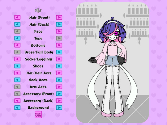
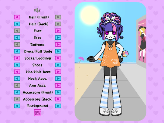
How I created a dress-up game in RPGMaker!
At least one person asked me to make a guide for this and that’s enough for me! Though, bear in mind, I may not be the best at explaining things and I used an example from assets I already had.
I made the dress-up game pictured below using RPGMaker MV, but I’m sure this method is applicable to versions above MV as well. I will be writing this post specifically through the lens of using MV (You’re also going to need some plugins, but not a lot!). At the time of typing this post, all RPGMaker engines are on sale until October 5th (just to let you know!)
(Please note: This method does not account for a game where you can freely change the colors of characters hair/clothes)
(Please note x 2: this is not a tutorial for learning RPGMaker, but a tutorial on how to make this specific type of game within the engine. Prior RPGMaker experience and familiarity is required when following this tutorial!)
I’m not the best at explaining things, but I’m sure going to try my best!
List of things we’re going to need:
-An RPGMaker Engine, preferably MV (or MZ) since they already come with mouse support.
-An art program
-A tileset consisting of words and arrows
-All your dress-up accessories as PNG images
-A blank PNG image
-2 plugins
First things first is you’re going to want to decide on the canvas size of your game. Keep in mind with the way RPGMaker works, there’s a high chance you’ll wind up with black bars on the side of your screen. If your game is intended to be played in browser on itch.io, it shouldn’t be much of an issue as you can choose the display size on the game’s page to match the visible game. (I also just personally wasn’t concerned about the black bars for a dress-up based game anyways)
The canvas I chose to work with for this game was 1152 x 864, but you can choose whatever size you feel will help you draw most effectively(just keep in mind how it might appear in browsers or if the player will have to zoom out!) If using MV, you change your canvas resolution by going into the plugin list and selecting “Community_Basic”

When making the assets in your art program, I find it easiest to have your canvas match the canvas size of the game. We’ll use Nova as our example character for everything. I drew them and all their assets in the center of the screen (for easier mirroring). The position of all the items can be adjusted later in the engine
I would start by doing a few test assets and putting those in the engine to make sure you get the hang of the whole thing, but this is where you’ll be making all your assets for a given character! (So if you wanna make some test assets and then move down to the “Putting it together in the engine” section, that might be a good idea!)
Here I create and separate every asset into their own folders(categories) and subfolders. For example, hats get their own folder labeled “hats”, and the subfolders “hat 1” “hat 2” “hat 3”, etc, each containing their own individual hat asset.
You can make as many or as little categories for clothing as you like. When you have everything you need, make at least one asset from all your categories visible, and make sure all the categories are ordered in the way they are meant to appear in game. This way, you can make sure nothing is overlapping in the incorrect way(at least for what your intentions are). When your categories are properly ordered, keep them in that order, as you’ll use it for a basis later when importing the assets into the engine.

Alright, this next part is a little tedious. Now you’re going to save every asset individually by hiding every other folder/layer except for the one you’re saving. It might help to have a naming convention for your assets, for example all of Nova’s assets follow the scheme of “dressup nova-shoes 4.png” “dressup nova-shoes 5.png” “dressup nova-shoes 6.png” etc etc.
NOTE: In addition to these files, remember to include a BLANK png image with nothing on it! This will help later!

Once this is done, we can start importing them into the program!
Putting it together in the engine:
Open up your RPGMaker project’s file directory. Find the folder named “img”, and in that find the folder named “pictures”. Drop all your clothing/hair/face/etc assets into this folder.
Now we need to set the scene. The scene being…a map! I used multiple characters so my game has a different map for each one.
Since Nova is our example character, let’s focus on Nova’s map.
Make sure the width and height of your map is large enough to cover the whole screen (sans any black bars you might have on the sides). You can fill in the back with tiles, or you can do what I did and add a small parallax backing that loops across the screen. I made a small one with two hearts in the corners for a nice scrolling effect!

To start this map, let’s put in some of the categories to choose between. I did this by laying out the words on a tileset, and drawing that tileset onto the map. The order of categories I chose does not reflect the layer order of clothing items, but rather was organized by what I felt was a natural start-to-finish order progression in a dress-up game.
Don’t worry about putting the choice arrows next to the categories yet, though! We’ll do that in a little bit.
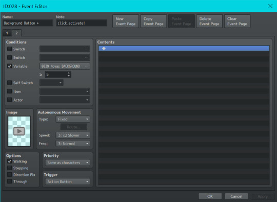
Now we’re going to start with actually putting your character and their clothes/hairs/etc into the map. Double-click anywhere on the map (where you won’t put any other buttons) to create an event.
We are going to set this event to autorun. In this event we are going to set up all your layers, even if nothing needs to be presented on them yet. To start, I added some comments to help me keep track of them.
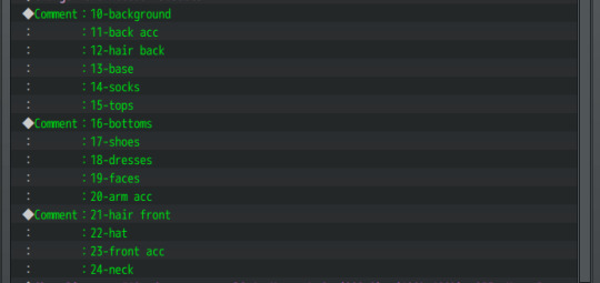
For context, when you choose to show an image in RPGMaker, it asks you for the image number. The image number is essentially the image’s “layer”, with 1 being the bottom-most layer and 100 being the top-most layer. Up to 100 images can be displayed on an RPGMaker screen at any given time. Even though 1 is the bottom-most layer, I chose to start at 10 just in case I wanted to add more layers underneath later. So layer 10 is my bottom-most layer, and layer 24 is my top-most layer.
Let’s start with our bottom-most layer, the background asset.
The background is this pink rectangle behind Nova.

Even if you change its appearance, this background itself is always visible. So we are going to show the first background on layer 10 with the Event Command “Show Picture”.
(Note, because I wanted all the dress-up assets to be on the right side of the screen, every picture’s X position is offset by 200. You may want to offset your game in another way, or keep it centered.)

Because this is an asset that is always visible on the screen, we are also going to set up its variable. Select “Control Variables” in your event commands, set it to a constant of "1" and add it underneath the "Show Picture" command,

Don’t worry about the #number of the variable, all that matters is the number of what the variable equals. As you can see we are showing “dressup nova-BG 1”, so our variable should equal 1 to correspond to this.
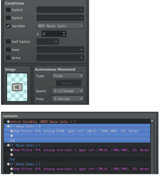
The next asset up from that is our back accessory on image layer 11. (Nova can have fairy wings or a yoyo accessory, for example.) The back accessory doesn’t always need to be present, so we will simply set this image as being our BLANK png asset.

We will continue going down the column like this! Any asset that doesn’t need to be present will be set as a blank, and any asset that does need to be present (like Nova’s background, Nova’s hair in the front and back, Nova’s face, and Nova’s base) will be set as the corresponding image and have its variable set to “1”.
(Note: The base does not require a variable as it does not change)

And because this is an autorun event, we have to close it off. Add a control self-switch A, and then add a new event page. On the 2nd event page, merely click off self switch A in the conditions box
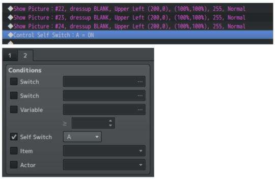
Doing this will ensure that the autorun event won’t keep trying to show the images in an endless loop.
Go into your database tab and under system, check that your starting position is on the correct map (if you have more than one) and start your game. Your autorun event should show all the images you asked it to. (I was gonna have a pic here but I'm limited on pics so)
Now, using our category list that we placed as tiles onto the map, we are going to be adding the arrows next to them to make them function.
Even though it's at the bottom, we’ll start with the category Background as an example since that was the first we implemented.
Create an event on the left side of Background and make its event image a grayed-out, left facing arrow, to communicate that the player cannot click anymore in that direction. Set its condition to be variable activated, with your Background variable being greater than or equal to 1. Leave the event page contents blank.
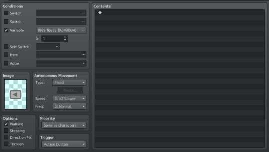
Create a 2nd event page on this event. On this 2nd page, replace the grayed-out arrow with a colored arrow, and set the Background variable to be greater than or equal to 2. This means that as long as the variable is 2 or above, the player can press the back button and go back to see the previous Backgrounds.
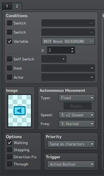
This time, we WILL fill up the contents on the event page.
First we are going to put a control variable command. Set your Background variable to subtract a constant of 1. This means that every time the event is clicked, it will subtract 1 from your Background variable (since this is your “Back” button).

Next, we are going to include a conditional branch command like so!
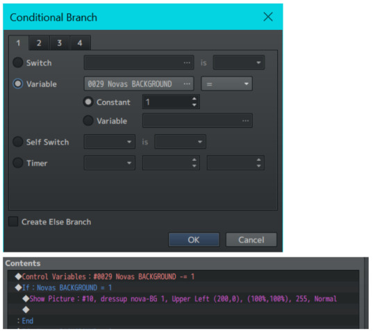
Under this Conditional Branch we put a Show Picture command, where we show an image on layer 10(the same from our autorun event). We can see that if Nova’s Background variable is equal to 1, then layer 10 is going to show the first background–that pink rectangle from before.
Let’s copy-paste this conditional branch and edit it slightly!
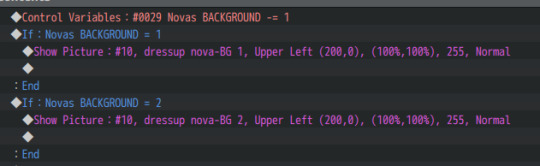
Repeat this for every asset you have for a specific category. (In this case, Nova has 5 different backgrounds, with one background needing to be visible at all times.) So our 2nd event page should look like this:

This button event is now ALMOST complete–but we’re missing something!
We need this event to activate when we click on it! Normally in an RPGMV game, when you click on an event, the player character will walk to the event before it can activate. But for a dress-up game, we want the event to activate as soon as it’s clicked on!
Therefore, we need a plugin! You’ll need a plugin that makes events activate based on a click trigger. For me, I downloaded the “TDDP_MouseSystemEx” plugin for MV found here: https://forums.rpgmakerweb.com/index.php?threads/mouse-system-ex.46511/
(Remember to follow the terms of service for whatever plugins you use!)
After adding it to my in-game plugin list and turning it on, I added the “click_activate!” notetag to the event (as instructed by the plugin) and now it works as soon as it is clicked on.
Next, we have to make the Forward Button! This is easier now that we have the Back Button as a base.
To make your Forward Button, we’re going to copy the 2nd Event Page of the Back Button event, and make it the first page of our Forward Button event. We are then going to change three things:
-Remove the condition variable
-Change the image to a right-facing colored arrow
-Change the control variable from a “subtract constant of 1” to an “add constant of 1”
So your first Forward Button event page should look like this!
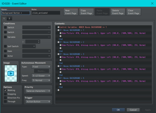
For the 2nd event page of your forward button, remove all the contents in your content box. Change the arrow to gray-right-facing arrow, and add a condition variable equal to your number of assets for the category.
Because Nova has 5 Backgrounds, our number is 5. If Nova had 7 Backgrounds, this number would be 7. If Nova had 3 Backgrounds, this number would be 3, etc.
This ensures that when a player has clicked to the last asset, they can’t continue increasing the variable past what is needed.
You then continue making these types of Back Buttons and Forward Buttons for every asset, until you have everything you need!
But WAIT!!
For objects that don’t always need to be present, we add one extra conditional statement!
Let’s use socks, for example. Nova does not need to wear socks to complete an outfit. So for the socks’s back button, we make sure to set the variable condition to 0.
After that, under the event contents of our sock buttons, we make sure to add an extra conditional statement for the sock variable. When the variable is zero, we show the BLANK image–so there are no socks to be seen! (Remember to apply this extra statement to both the back and front buttons!) Do this for every asset that doesn’t always need to be present such as socks, dresses, hats, etc etc.
That’s pretty much the basics of all the mechanics you need to get it to work!! I won’t be going over other things like the reset game button/disabling menu access/hiding the player walksprite, as those are things you probably know how to do already if you’re familiar with the engine.
But I WILL share one last piece of optional advice that I feel makes a big difference.
While testing things out you might notice that there is slight lag between changing images, a blip between pictures. This is because RPGMaker doesn’t preload images, and loads in an image as soon as it’s called.
In a downloadable version of a game this slight lag is negligible. However, if you intend for your game to be browser-based, this lag will be significant and noticeable. In order to fix this problem, I’d recommend downloading Galv’s Image Cache plugin found here: https://galvs-scripts.com/2017/04/26/mv-image-cache/
This plugin will help pre-load images so there’s no lag!
However, you will have to write the name of all your assets manually in its plugin menu. If you have a lot of images (which you will, for a dress-up game) this could take a very long time.
My advice is to go into your game’s picture folder, select all, and select “copy file path” from your folder options. Paste this list into an excel sheet, remove the directory name and file extensions, and then paste it into a google doc.
Edit the names together until there is no spaces between image names and they’re all separated by commas. Then, select all and paste your list into the Image Cache plugin’s settings. If you spelled something wrong or placed a space incorrectly, the game will not start and will tell you what image it was struggling to find. So having this to refer back to is very helpful and also means you don’t have to retype everything in the event of an error!
(Below is just a preview of how my list of image names looks for my dress-up game and what i copy-pasted into the plugin settings for the Image Cache plugin)

And thaaaaat should be everything! I hope this wasn’t too hard to follow, or messily formatted! But I tried my best and will try to answer any questions one may have about it!! Good luck creating your dress-up game!
#im so sorry i feel like this is so hard#but i hope it makes at least a little sense!!#i also apologize for the combo images tumblr doesnt let me have more than 30#guide#rpgmaker#rpgmaker mv#dress up#dress up game#dress up guide#game guide
95 notes
·
View notes
Text
diving back into reading comics so here are some tips from a former comic store employee:
There is so much more than superhero comics out there. Seriously. The comic book format has been host to groundbreaking autobiographies, subversive fantasy and sci fi, experimental horror, mysteries, romance, barbarian babe booby comics, you name it
If u do really want to get into Marvel or DC superhero comics I'd recommend that you pick a character with a smaller catalogue to get started, and/or find some writers you like and look through their catalogue. A lot of comic writers for the big 2 have great original stuff that gets overlooked. There's also a good chance an author you like has written a comic series!
If you want to read a certain character and don't know where to start just look up (character) reading guide !! a lot of comics Tumblr make them and you'd be surprised just how obscure our blorbos can get.
If you can think of a property, there's a 90% chance a comic of it exists. I have stocked Three Stooges comics before. The industry knows no bounds
If ur USAmerican your library probably has access to the service Hoopla which has tons of comics on it. Seriously you can read them for free in a legitimate way on your phone or computer and all you need is a library card. The app is even set up so you can read panel-by-panel instead of having to zoom way in on text boxes and speech bubbles
KEEP TRACK OF WHAT YOURE READING. I seriously cannot tell you how many times I've started a comic and really enjoyed it only to leave it unfinished because I found another series and got so excited I forgot about the other one. I personally use a spreadsheet I found by looking up a book tracker on Google sheets and modifying it to suit comic books.
If you want to buy comics, I'd recommend you get them in TPB (Trade Paperback) volumes AKA ~Graphic Novels~ instead of individual issues. Typically these will collect a series and each book will be 5-6 issues of a comic apiece, and you can even find some that collect important appearances of certain characters or events that arent necessarily held together by one series. Saves money, time, and space
Good places to get secondhand comics in any format include thriftbooks(dot)com, secondhand book stores with comic bins and graphic novel sections like Half Price Books or Vintage Stock, and mycomicshop(dot)com. Looking through comic bins can be kinda daunting, especially if they're not well organized so I mostly recommend going to the graphic novel shelves instead. If you do want to go digging it's definitely fun though and I'd recommend bringing a buddy so you can show each other weird obscure comics you find and giggle
9/10 times comic books are NOT the investment you think they are. The industry takes advantage of this misconception a lot to try and boost sales that have been falling for decades at this point. I personally wouldn't recommend buying individual issues of series unless they're like a short miniseries or oneshots. I could get into what actually makes a comic book go up in value but this post is already long as hell so I'll just leave it here
Now go forth and read!!!
#it speaks#comic books#marvel comics#spider verse#spiderverse#itsv#atsv#marvel#dc#detective comics#dc comics#reading guide#I figured this might also be useful w the new spiderverse out!! get into punk rock and comic books it will make u cool and interesting
67 notes
·
View notes
Text
On Beyond Evil's Opening Credits
As there is a lot to say even in the 20sec that constitute the opening credits of the show, I decided to cut my thoughts in multiple parts. Here, I will link other parts as I go:
In this part, I decided to focus on the very first and very last bits of the opening credits, containing the name of the show, also illustrated for reference as the following:
The circularity between the two shots I selected is insanely representative of the whole course of the show. But I will try not to epilogue too much on that, as I really want to focus on the implications of the artistic choices made to represent Han Joowon and Lee Dongsik.
• In the first shot (image 1), we can distinct two silhouettes, as selected by the producers of the show. Those two silhouettes are the outlines of respectively Lee Dongsik’s and Han Joowon’s faces as fully appearing in the last shot (see image 2). You can zoom in to see what I mean.
What is interesting here is that they kept Lee Dongsik’s silhouette as the framework, and merged Han Joowon’s in it. They don’t exactly overlap: Han Joowon is integrated to Lee Dongsik’s silhouette, which suggest several different things.
It could, for example, suggest that Han Joowon exists in Lee Dongsik, and that Lee Dongsik takes up most of Han Joowon’s own character. As if the story could not, or their characters would not, make sense without them being somehow intertwined on a whole other level. There exist shows where two characters are linked, one way or another, but still appear independently on promotional posters, or in opening credits. Here, they permeate each other’s existence, which serves as proof that they right away have some kind of connection, and dependency. It might not be the kind of dependency that we are used to being fed by the media, but they truly are dependent of one another: Han Joowon’s purpose is, in essence, Lee Dongsik. And Lee Dongsik could never have gotten what he wanted if it was not for Han Joowon. Han Joowon and Lee Dongsik need each other on an almost organic level when it comes to the definition of their characters regarding the storyline: not only on a human/emotional level, as part of a healing process, but also as part of their own individual drive towards a final destination (catching Han Joowon’s father, finding Lee Yuyeon, arresting a serial killer, redemption for past mistakes, bringing justice, etc…). This shot (image 1) suggests that they cannot appear one without the other, and that it would be deeply wrong to think of them as entirely separate entities, since they both are part of each other. They’re either each other’s shadow, or watchman, or conscience, or yearning. They’re each other’s reflection and mirror. It strengthens the impression that they’re the only ones who are able to understand one another the way no one ever did before in their lives: Lee Dongsik sees right through Han Joowon, and Han Joowon, though it takes some time, sees that Lee Dongsik is the only figure in his life able to uphold his values until the very end. Lee Dongsik sees his past in Han Joowon: a young man convinced there is a right way of performing justice in a corrupted world, and Han Joowon sees his future in Lee Dongsik, as the kind of fucked up role model he never had in his life: someone incorruptible, even to peer pressure, and consistent to the core, who values people more than greed. They also see their present: a thrive for justice, for closure with a hurtful past. And they see the three at the same time (but it's a complicated notion I will not elaborate). They see each other’s humanity: their flaws, vulnerability, lack, but also ability to do goodness. And it is all framed in Lee Dongsik, because it is all framed in Lee Yuyeon (see my post as Lee Yuyeon being the Laura Palmer of Manyang).
• Secondly, they chose to make Han Joowon’s silhouette take half of the space, more or less, which makes him look, symbolically, at Lee Dongsik’s brain. It suggests that Han Joowon is intrinsically trying to decipher Lee Dongsik’s mind, trying to get inside of him, to see things through his eyes. It is both an allusion to his conviction that Lee Dongsik is guilty, but also to the fact that he is, throughout the show, trying to explore Lee Dongsik from within: sometimes choosing to act in a similar way, or opting for the same methods, etc… He is maintaining his own (distorted) sense of self, illustrated here by the contrast of color and scenery, but he is looking up to Lee Dongsik, expecting something from him, and he is intimately, actively, working his way up to grasping the whole of Lee Dongsik’s mysterious personality. It can also be seen as Han Joowon opening the door to Lee Dongsik’s secrets, while the latter is always a very concealing character (once again, something that is explicitly appearing in the opening credits).
• At last, the two silhouettes are highly contrasting with one another. On one hand we have Han Joowon’s, which is green, represented by the reed field, symbolizing his nature as contrasting with Lee Dongsik’s apparent confusion and merging with the town of Manyang at nigh; but also symbolizing his inevitable and deeply rooted bond with the town. Both of them are linked to Manyang: Lee Dongsik is part of it, so much that he knows the dark side of the town, he is part of its scenery, and is part of the secretive and impenetrable atmosphere. On the other hand, Han Joowon is at the periphery of the town, but his hereditary involvement in the tragedy of Lee Yuyeon’s death in the reed field, renders him half-outsider, half-foreign, half-mystically involved and part of the town. He is the border between wilderness and civilization, between good and evil: he is the reed field. Besides, this contrast of color is also an echo of his own contrast with the town’s people: just as Lee Dongsik suggested to him when he first came with his fancy fast blue car: he is the most visible because he is not part of Manyang, he is easily spottable, he is easily read by a Manyang inhabitant, he is different by nature.
But, as I explained from the beginning, the circularity makes it come back to the very essence of this: he is different by nature, but, he is also just like Lee Dongsik. And you can just read everything all over again.
50 notes
·
View notes
Note
I apologize if you've answered this question before, but what are your general opinions on Faith Erin Hicks's writing vs. Gene Yang's for the Avatar Comics? Hick's seems to be significantly more faithful to the characters from my perspective, but I've only read a couple of her works(Suki Alone and Azula in the Spirit Temple). On the other hand, I'm not blown away with ideas behind these comics, with Suki Alone particularly failing to do anything remotely interesting with Suki's character.
You know, I don't think I've ever posted anything on Hicks's comics in general. I've 'reviewed' individual comics of hers, but never spoke on her overall level of writing, characterization, and/or style.
Basically, I think her work is infinitely superior to Gene Yang's in every way while never quite hitting a home run.
What's become an outlier to her overall body of Avatar work is the first thing she got to write for the franchise (although she'd previously drawn a short story that Yang wrote), the Imbalance trilogy. I think she absolutely nailed the characterization of the gAang, created intriguing original characters, wrote dialogue that sounds like something human beings would say while also capturing individual character voices, and successfully depicted a world that has progressed beyond the cartoon's finale. I also think it's the only thing in the franchise that successfully engages with the idea of Aang's ability to take away bending.
But that story was also hobbled by being an explicit prequel to LoK, saddled with that nonsensical Bender Vs NonBender conflict. Hicks did a fair job trying to explain it and manifest it, but it's still mostly nonsense if you stop and think about it for a second. We also have an eye-rolling moment where Toph discovers how great it is to fight with metal cables, but at least it's a quick moment that wouldn't have stuck out if the narrative hadn't stopped to call it out.
I also think the final act of the comic was a bit of a fizzle. I can't say anything is really wrong with it, and it doesn't try to resolve things by claiming all the problems are solved forever, but it still feels like it doesn't quite live up to the questions and conflicts it raises in the first two parts and ultimately ends in a non-surprising way. It's not bad, just a bit underwhelming. I never got around to reading the final part of Hicks's Nameless City trilogy, so I don't know if that's common for her. But, you know, it's far from the worst thing in the world to be a storyteller whose worst trait are endings that merely satisfy instead of wow.
Unfortunately, this is around the time the franchise decided that new cartoons are back on the menu and Avatar Studios is a thing, so all of Hicks's other work has been hit hard by the company mandate that Absolutely Nothing Matters Unless It Is Animated. So I can quickly zoom through the rest of her oeuvre with a + and - for each:
Katara and the Pirate's Silver
+ A cute little adventure that nails Katara's character.
- There's not enough material here for the full pagecount, so a separate and very stupid subplot with the rest of the gAang is thrown in to absolutely no consequence.
Toph Beifong's Metalbending Academy
+ There are some amusing gags here.
- This is hit hard by the one-two punch of being saddled with a lot of characters created by Gene Yang and also dealing with lore created by LoK.
Suki, Alone
+ A great little character study of Suki.
- Utterly pointless and even goes out of its way to provide absolutely no confirmed details about Suki's family.
Azula in the Spirit Temple
+ Exactly the story Azula needs at this phase in her arc with delightfully solid characterization.
- So open-ended that the next Azula story can easily ruin her character again, thus it feels more like we're poised to take the next step rather than actually taking it.
When all we're getting is stuff designed to be as inconsequential as possible, not matter how well-characterized, it's hard for the stories to feel like they have an impact. Now, I'm not saying I'm against the concept of 'filler,' as they can be great episodes, but the problem is that these comics are dealing with characters whose arcs have already been fully detailed for us, the audience, and we've already seen the characters' best stories. We're treading ground that's already been covered, and it takes a very clever storyteller to really wow with that kind of setup. Hicks, while a good storyteller who gets the characters and franchise, has never shown (at least in what I've read of hers) that snappy kind of cleverness.
Ironically, Gene Yang has -- consistently -- in his original graphics novels that I've read. But he really did not bring it to his Avatar stuff.
So, overall, I like Hicks, and while her comics don't excite me in the way the novels do, I'm so traumatized by Gene Yang that I relish getting stories about the gAang with good dialogue and no stupidity like expecting me to believe that the Rough Rhinos pose a threat to post-finale Aang.
11 notes
·
View notes
Text

hi @liliana-von-k, thanks for the follow! i have answered this question before but i love talking about kids in the hall and my "origin story" with them so i'm happy to tell it again (jsyk it will be a long post bc i always have to tell the full story bc i love it so much)
basically my parents have both been kith fans since the 90s, so even before i had seen any of the show itself there were certain kith quotes that were just part of my family's vocabulary. the first sketch i watched was "these are the daves i know" when i was like 8 years old and i became obsessed with that song. i watched a few other sketches/the first few episodes from season one but i didn't truly get into kith until after their documentary "comedy punks" was released
see, my mom is a big documentary person so she was like "oh hey there's a new kids in the hall documentary! do you want to watch it?" and i just kind of shrugged and was like sure i'll be in the room while it's on, probably working on my own stuff or scrolling on my phone. but like not even five minutes in i was hooked. while i'd always enjoyed kids in the hall's comedy, something about hearing the very personal histories of how the troupe came together and survived for all these years was so affecting. i think it was scott specifically that really signaled to me that this show was something special, and the part where bruce talked about comforting scott while he had cancer by telling him how the rest of the troupe would die first was so powerful. honestly no individual movie has changed my life more than comedy punks did specifically bc it gave me that push to get into kith and approached it from such a human perspective, which definitely informed my approach to the rest of their work and them as people. i remember watching comedy punks for the first time and getting this strange feeling i couldn't pin down yet that was like this is important, not just referring to the show or the troupe, but like this feeling that i had just crossed a turning point in my life, and i remember feeling this pull towards toronto which seemed frivolous at the time but has been so heavily solidified as i'm now planning to move there in just over a year.
so i bingewatched all of the kids in the hall tv show in summer 2022, as well as brain candy, death comes to town, the amazon season, etc. basically as much kith stuff as i could find. but i needed more. so i started getting into side projects, which brought me to "mouth congress" (a queer-punk band scott thompson and paul bellini had in the early 80s that they've recently started putting out new music with again). i found a youtube channel with a bunch of recent live performance clips of the band and each video had like less than 10 views. so since i didn't have anyone to infodump about kith with irl (aside from my very patient mother lol) i started commenting on every video, complimenting the performances and pretending i was talking to a friend, confident no one would actually see it
after 2 weeks of this, turns out someone did see it. PAUL BELLINI HIMSELF. this led to a whole back-and-forth which eventually ended up with him emailing me a copy of the unreleased mouth congress documentary, i emailed back asking if he'd be interested in meeting on zoom (since i am a queer comedy writer myself so both he and scott are my biggest comedy inspirations), and yeah bellini is a delightful person to talk to and we very quickly became friends. i ended up offering to run mouth congress's social media, which can be found on both tumblr and instagram as @mouthcongress and posts both vintage videos from the 80s/90s and recent live clips. they're currently working on an album of entirely new material written in the past 2 years which is going to be released soon (we don't have a specific release date but the recording is completed and they've started filming music videos for it!! but i'm getting ahead of myself lmao)
a few months pass and mouth congress is set to perform at a new year's eve show at a local club in toronto. i'd never been to toronto before, never even left the united states, but paul says it would be so great to have me there and by some miracle my parents say yes to making the trip (they still can't believe this is happening either, since they were kith fans first!). the trip is wonderful, i immediately fall in love with the city, i get lunch with paul irl for the first time and get to have my very first face-to-face conversation with my number one comedy inspiration scott thompson. it's honestly a little awkward but in an adorable funny way. i also have my first legal drink at that show (bc canadian drinking age is lower than the us), specifically saying i want to have my first drink with buddy cole, which both scott and paul are very into
it's actually only a couple weeks until i'm in toronto again, because scott is debuting a new buddy cole show consisting of monologues that were all censored by amazon that he pitched during the revival season. this is my first time traveling a long distance without my family which my mom is anxious about so paul bellini lets me have him as my emergency contact. the show is amazing, i get to stay for the afterparty, and while i'm there i casually mention that i'm surprised no one has made a buddy cole documentary yet. like, this character has such a rich history even beyond the kids in the hall (which i can infodump about all day lmao) and is such an important staple of queer comedy that doesn't get the attention he deserves. the kith documentary is great, but where's my buddy cole documentary? paul accepts my pitch (that i didn't even realize i was pitching), passes along the idea to scott, and yeah now i'm legit directing a film with my number one comedy heroes and i haven't even graduated college yet. what the fuck. i expected this to be the type of thing i accomplish over 20 years into my career, not at twenty!! so yeah that's how the buddy cole documentary started. i'm still in preproduction on it but we're launching an indiegogo crowdfunding campaign for it in the next 2 weeks bc this has evolved into a full feature-length film with some incredible celebrity interviewees, both kith and otherwise.
anyway a few months later it's announced bruce mcculloch is bringing his one-man-show to the city i go to school in. not only that, but his theater is literally 2 blocks from campus. i ask paul if he'd give me bruce's contact so i can set up an interview for my school's newspaper, paul gives me bruce's assistant's email, and i set up a 30-minute zoom two weeks before bruce will be in town. the conversation honestly goes bizarrely well. like it's honestly surreal how close bruce and i got after only knowing each other for a half hour? he's such an easy person to talk to and literally by the end of that conversation he was already calling himself my mentor, asking about my comedy, and offering to let me meet him backstage after his show. which is exactly what i did, launching yet another incredible friendship-slash-mentorship with one of the kids in the hall.
bruce eventually signed on to executive produce the buddy cole documentary (alongside paul bellini), i've been up to toronto in january, april, june, august, and october this year (so essentially every 2 months, though it was slightly offset by going twice in january) and i'm planning on going up in december, every time not only do i find time to meet up with scott, paul, and bruce but they all deliberately try to reserve as much "jess time" as they can because i have a unique and powerful friendship with each of them, every time i finish a new creative project paul has to see it bc he loves how ambitious i am, i repeatedly wake up to texts scott sends me at 3am about the documentary and how excited he is to have me on tour with him to film it next year, bruce thinks it's hilarious he used to think i was "shy" bc i've gotten so comfortable going on infodumps and tangents about things i'm passionate about, and the three of them all feel like extended family. best of all, i actually have plans to graduate from college a semester early so that i can use the money (and time) i've saved to find a place in toronto and start making even more connections with the comedy community up there (also for the record: no i have not met mark, kevin, or dave yet. i know kevin is aware of my existence from bruce giving me a shoutout at a show they both did but that's about it. but i know i will interview all of them for my documentary)
so anyway that's how i got into kids in the hall. i know only the first 2 paragraphs answer your question, but at this point my love for this show has become so so intertwined with my relationships to bruce and scott and paul as humans that i don't really consider getting into kids in the hall and getting to know the kids in the hall as separate things in my life.
(also if you have any follow-up questions on anything mentioned feel free to reply or dm me, this goes for everyone else too!)
#as always i hope talking about knowing some of the kith irl doesn't come across as bragging bc that's absolutely not my intention#bc i do very much feel like a very lucky kith tumblr nerd and my favorite thing is connecting the kith to this part of their audience#hosting little digital screenings of hard-to-find kith media or passing along questions etc#this is exemplified with my ''kids in the archive'' series which you should check out if you haven't already#but yeah this is a very (and i mean VERY) brief summary of how this all unfolded#bc like. yes this all kind of happened over a year and a half. but it was a very eventful year and a half#if you scroll far enough in some of my kith-related tags you can find posts from in-the-moment before i knew some of them#or when i was still coming up with the concept for the buddy cole doc or something like that#which is very interesting to see. this blog is like a living kith journal lmao#also: the bruce interview article was never written bc i actually lied about writing for the school paper lmaooo#but for the anniversary i might write a transcript and/or see if i can post the audio bc i did record it#i haven't relistened to it since the day (march 6th) so it'll be so cool going back and listening to myself being starstruck#compared to now where i see bruce as ''just some guy (complimentary)''
12 notes
·
View notes
Note
Hi I know you're aroace and aroallo blinkies are about a year old but can you please make an oriented aroace one or at least tell me how I can make one on my android phone?
Hi!! thanks for asking! even tho I haven't posted blinkies in a while it's no problem at all! I made these, I hope you like them! <3


I included the original ones and 3x upscaled ones. Also blank templates if you want to put custom text in them.
Also! I can't really make a proper tutorial rn, but if you or anyone else want to make blinkies on an android I'll still explain how I made it! I actually make blinkies on my pc, but everything can be done on android, too. (under a cut because wrote a bit much)
First you'd need a digital art app that supports layers (so most of them.) I use ibisPaint x which works fine. (though if you want to use it for blinkies or anything like pixel art you should go to the settings and disable "interpolation on zoom-in"!)
Make a canvas that is 150 x 20 px, and then make your background. In this case that was four 5px tall stripes.
Then for the actual blinking part! blinkie patterns are varied ofc but often for the simple ones I'll just copy them from a different blinkie. This one uses a simple pattern based on the pride blinkies from blinkies.cafe. I just changed it so the bottom "stripe" wasn't aligned with the top one, because then the blinkie would be asymmetrical, I prefer it this way.
For the flowing colors animation, you'll need as many frames as there are colors, so 4 in this case. Make the first frame on one layer then make the following frames, each on its own layer, however you want - by drawing them again or copying the previous one and editing it, whatever.
Then save each frame of the blinkie as a .png and plop them all in order in Ezgif gif maker. Change the delay time to 10 (or something like 8 or 12 depending on how you want it). And voila, a blinkie template.
The text! I'll confess for these ones I just made blinkies.cafe blinkies and removed the background. My art program of choice does NOT like pixel text so sometimes it's easier that way.
Anyway! The text! Write something on your canvas, either by hand lettering or with the text option. ibispaint x has some pixel fonts built in you can use.
You can save the individual frames with the text on it, but then you'd have to do it all again if you wanted different text. I prefer making the blank template like I explained.
So you should make the text look how you'd like it to look in the blinkie, and then save the text as a .png with a transparent background. Then go to Ezgif again and use the overlay tool to add your text! And it's done! Hooray!
Of course, if you wanted to add stuff like animated text it'd be more comlicated, but in general this works.
#blinkies#oriented aroace#webcore#stuff I made#eyestrain#flashing#fun fact! I accidentally deleted my response halfway through writing this so I had to rewrite the thing
20 notes
·
View notes
Text
Channel Branding
Commission Me

Introduction:
Hello! I'm thrilled to present a new service designed for individuals who want to establish a unique brand without a strong creative or technical background. Below, you'll find a range of affordable one-time payment options for a complete channel rebranding. This process requires no login information, only payment. After payment, you'll receive your personalized images and videos within a week. To ensure client commitment and avoid wasting time, a small $5.00 deposit will be added to the total price for tier one. The deposit for tier two increases to $10.00 and grows by $10 as the tiers progress in price. Each one-time payment includes a unique feature not found in the others, offering fair pricing. Whether you choose the least expensive option, you're guaranteed a refund if you're unhappy with my work, including the one-time deposit. Also, if you're happy with my services and would like to increase in a tier there will be no deposit fee and your last payment adds to that total making it well worth the cost! As I will be busy doing this I ask you to request your rebranding here on my appointment website! I do ask that you add the consultation fee (deposit) to make it easier for final pricing + whatever tier you are interested in!
Overview
Tier One Package
Pricing: $11.00
What You Get
Description
One Intro + Outro For your channel
An adorable and visually pleasing introduction that suits your preferences.
Channel Banner and Profile Picture
Personalized Channel Art and Images to Suit Your Style
Tier 2 Package Pricing $21.00
What You Get
Description
One Intro + Outro
Channel Banner and Profile Picture
Branded Tumblr Matching Channel Theme
Tech Support From Mwah
An adorable and appealing introduction that suits your taste.
Tailored Channel Art and Images to Suit Your Style
A Tumblr theme that appeals to you and meets your approval
If you require any technical support or channel assistance.
Tier 3 Package
Pricing $50.00
What You Get
Descriptions
Multiple Intro and Outros For Different Video Ideas
Channel Banner and Profile Picture Custom to your Facial Features
Branded Tumblr with Everything you want
Tech Support From Mwah
Custom Website For Products/ Things about your channel
Adorable and visually pleasing videos customized to match the theme of each video.
AI-generated using your face and authorized solely by you
Different themes and fonts can be chosen based on your preferences.
Technical Support
Store or online platform with information.
Timeline and Tasks
Appointments vary in duration based on the tier selected, ranging from one week to approximately three days. I kindly request your patience as crafting takes time, considering everyone has personal commitments. Additionally, I provide a custom tier service where we can have a personalized discussion over the phone or through Zoom to determine your specific needs, with pricing based on the services required.
I have plenty of free time and I might as well earn money doing something I am passionate about. I understand that online payments can seem daunting to some, with concerns about it being labeled as "spam." However, I am a content creator on YouTube, and you can verify my identity by visiting my page and checking out the links below.
Check out My YouTube @SimfinityPlays! With new videos posted twice a week, exciting content to enjoy. Don’t miss out - join the Simfinity community today!
Downloads, Creations, And Gshade Folder
I’m Not My Parents Legacy Challenge Post
Ask, Home, and Grid
My Resource Page
Notes
If you are interested, please revisit the appointment page mentioned above. I truly hope to deliver exactly what you are looking for!
#rebranding#commission#youtube#sims 4 cc#sims#ts4#ts4cc#the sims 4#sim4cc#simblr#gshade#sims 4#sims 4 maxis cc#youtube video#youtube music#new music#new video#world music
2 notes
·
View notes
Text
13 Years of Bering and Wells!
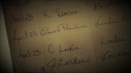
Thanks to this screenshot from Time Will Tell, we know that Agent Myka Bering and rogue former agent Helena Wells met for the very first time on April 23, 2010 - a date which will see its 13th anniversary next year!
An anniversary that should be celebrated! - and this blog will keep you informed as to the what, when, where etc. Under the readmore, find out:
What are we planning?
When are we celebrating?
How can I be part of this?
How can I make sure I know what's coming?
Who's behind this, anyway?
What are we planning?
Ideas include, but are not limited to:
a Big Bang (more info soon to follow!)
a list of themed prompts for fics and art
a Zoom get-together like we had last year; just a casual hang-out with other Bering and Wells fans around the world!
a round-robin style fic collaboration, in which every author writes one chapter for the prompt "13 missing scenes from 13 years of Bering and Wells" (as in, one scene from each year)
If you have more ideas for what we could do, please reach out! Here's a Google Form where you can put your ideas in! This is the same form that was already floated around in April of this year, so if you took part back then, you don't need to do so again!
When are we celebrating?
April 23rd 2023 is a Sunday, and with all the above ideas, we hope to be able to fill two entire weeks leading up to it, starting from April 13th (another 13! This can't be a coincidence!) for example by having a prompt for each of those days.
If we do another Zoom meeting, the 23rd is probably the best date for it! It's gonna be hard to find a date that works for everyone, we know that, but we hope that with this much of a heads-up, hopefully everyone who wants to come hang out can make it work.
How can I be part of this?
There are many things you can do!
You can create art, or fic, or any creation for Bering and Wells (prompt list will be posted as soon as they are finalized!), you can reblog what others are posting, you can just enjoy what people come up with, you can join us in Zoom and hang out, you can sign up for the Big Bang as an artist, a writer, or a beta reader, you can kudos or comment on anything that gets posted to AO3 - any kind of participation is just fine!
We want this to be a celebration of this entire fandom, of people who create things and people who love these creations, of new fans and old fans, of casual fans and hyperfixated fans - we want to celebrate the love that we all have for Bering and Wells.
How can I make sure I know what's coming?
This blog will be your central information source for this event; you'll find anything you need right here, and if you have any questions, you can use the Ask or the Message function.
We'll also use the hashtag #beringandwells13 for all our posts - so you can either follow that tag, or this blog!
And you can help spread the word about this, by reblogging our posts far and wide!
Who's behind this, anyway?
Thanks for asking! Right now, the organizing team consists of @galactic-pirates and @purlturtle. As the event gets closer and more things need to get organized, we might bring more people on board as needed. If you have ideas for how to organize this, by all means let us know, here or on our individual blogs!
45 notes
·
View notes
Note
Hey! I love your vault build/renovation! Do you think you can upload it please!
Hey, sure, here ya go! (google drive, no ads)
The library image is a couple of zoomed in trees 😅 and it's called Vault Challenge Build.
>>> Some things to note below the cut <;<<
** I've changed a bit around since my first post with all the screenshots, and I apparently didn't save that earlier version, my apologies. Nothing that would be difficult to change/add back yourself if you wanted to! Most notably I removed the family unit's kitchens and they just have the one kitchen in the main middle floor living area now, and I just moved some of the skill items into those empty spots for now cuz I was too lazy to keep sending them downstairs. I also added some very basic en suite bathrooms to those units for the same reason, and a chapel type room on the bottom level. I am honestly thinking about removing the bottom level all together and adding more beds to/rearranging the 2nd level family units, because I feel like it's a bit too much now that I've played in it for a while.
** There are some weird empty spaces/rooms I just haven't decided what to do with them yet, or are just there to prevent lighting issues or hide things, etc. I'm not a very good builder, so you'll get to see behind the curtain so to speak lol.
** The whole thing is a bit close to the road/edge of the grid. I tried to move it back on the lot to have a little more building space in the front (mostly because the kid's play area is a really awkward room,) but the game wouldn't let me without moving each level individually and I didn't want to do that again, but you could if you wanted to. Just know that it is frustrating with all the stairs and open ceilings.
** There's no cc, but I do own all the packs and kits and I think there is a lamp from a TS3 thing in there, so if the game tells you something is missing when you load it up for the first time, it's probably just that.
** I have to shift-click and set the growth stage on most of the plants in the garden area pretty much every time I log in. It's annoying, and sometimes their harvests go into the household inventory when that happens.
** There's a mailbox behind a tree on the surface if you need it for cheats or whatever.
** The stove may catch fire a lot. You have been warned!
#ask#cofessions-of-a-teenage-girl#oof sorry i was having some major text editor issues with this post for some reason#my builds dl
26 notes
·
View notes
Text
Tips & Tricks: Splat Charger and E-liter 4K
(Apologies in advance if it's formatted bad, this was written and posted on mobile)
Hi! I'm the person who got 3-star freshness on every weapon in Splatoon 3. Through my experience, I've picked up little bits and pieces on how to play the game better. So, why not share some of that knowledge?
Today, I'll be talking about Chargers. More specifically, the Splat Charger and E-liter, and their Scoped variants. Why talk about them both? I feel they're similar enough that the advice I'd give for one can more or less be applied to the other. That said, I will still talk about each kit individually.
The advice I'd like to give is to learn and remember three key points: Aim, Awareness, and Aggressiveness. Or – as an easy to remember acronym – AAA.
Aim is the most important, and the first thing you should try and learn. Aim is good for every weapon (but especially chargers) as you are limited in how fast you can take another shot if you miss. As a charger, you have a really powerful weapon that is outranged by very little. However, if you can't hit anything with it, it's not very useful. The laser sight can help you Aim, but remember that everyone can see it. Something you could do to help improve your Aim is going into the lobby (or the training room, by pressing Y when selecting a weapon) and practicing hitting the moving targets. Or, if you have a friend, you could set up a private battle, and just have them run around while you try to shoot them.
Awareness is also incredibly important, but it can take a bit longer to pick up on. Awareness includes things like tracking where your enemies are, and being able to figure out if you should keep fighting, or backup and regroup. Again, it's good to have Awareness with other weapons, but as a Charger, most times you'll be the backline. You'll be a high priority target for specials, and usually the last one alive on your team. I don't have as much advice for Awareness, because it's a harder thing to practice. Things to look out for are splashes in the ink that show where someone is swimming, or the UI at the top of the screen that'll show who's alive, and who has a special charged up, waiting to be activated. It'll also show if someone's an Inkling or an Octoling, but that isn't as important. Also, if you're using a Scope, you'll need to be a lot more aware. This is because when you're aiming, you'll zoom into a first person view.
And lastly, Aggressiveness. I wouldn't try learning this one until you've at least got a grasp on the other two first. Aggressiveness is how much you should move around, because if you stay in one spot the whole game, you won't do a whole lot. As a Charger, you have a lot of range, so finding unexpected angles where you can hit people from can end up drawing your opponent's attention – and sometimes, their resources – away from the objective. This can allow your team to swoop in and overwhelm them. An important thing for being aggressive is to always have an escape plan. Either make sure you have an easy path out, or you have a lot of Quick Super Jump on your gear. If you don't have an escape and you get surrounded, you'll leave your team at a disadvantage, unless they help you. The best way to practice this is to just go into a game and mess around. Things that have helped me be more aggressive are when there's another backline on my team, which forces me to play in different spots; or when there's a good Charger on the other team, which means I need to be able to find places where I can hit them easier than they can hit me. Remember to be aware if you're playing in a more risky position, so that you aren't just throwing yourself at a brick wall and ending up going 2-16.
Now, on to how the kits can influence your playstyle.
Splat Charger and Splatterscope come with Splat Bomb and Ink Vac. Splat Bomb is always nice to have, and it can help if you need to get someone out from behind a wall, as Charger shots always go straight. It will take 70% of your ink tank to use, though, so I would recommend using a little bit of Ink Saver(Sub) if you plan on using it. Ink Vac is good for helping protect your team-mates, but you need to be close enough for it to actually have an effect. If you're too far back, you won't be protecting anything, but if you're too far forward, you can get punished when your Ink Vac ends. And, you can't forget, you'll get a strong explosive shot when either the special ends naturally or when the Ink Vac is filled up. It'll scale with how much Ink you sucked up, so try and at least get a little bit of Ink in there before it ends.
The alternate kits are Z+F Splat Charger and Z+F Splatterscope. They come with Splash Wall and Triple Inkstrike. Splash Wall is great for being aggressive, as you get to block some shots to give you enough time to shoot back. Try and learn the spacing for how far out you throw the Splash Wall, so that you can maximise your effective range while being safe. Remember that Splash Wall has a lot of Ink Recovery Lag, so try not to throw one out unless you need to. Triple Inkstrike is a great Special for a backline weapon, as you won't be in nearly as much danger when you activate it, and you'll be able to have a good spot to throw the Inkstrikes without having to back up or throw them up higher. Use the Inkstrikes to block out a space, forcing people into your line of sight where you can Splat them, or forcing them back into an unfavourable spot, where they won't be able to affect the match much from.
On the E-liter side, we have the E-liter 4K and E-liter 4K Scope, equipped with Ink Mines and Wave Breaker. Out of the 4 Kits I'm talking about, I see this with the least aggressive potential. That doesn't mean it's bad, though. I think Ink Mines are a good sub for E-liter, as you can set them up on a flank and be alerted when an enemy tries to go through there, really helping with your awareness. You can only have two active at a time, and if you place any more they'll explode so that there are only two, starting with the oldest. Wave Breaker can help you keep or gain control of an area, by locating anyone nearby when it's first placed or when they're hit by a wave. The waves will also deal 45 damage, so you don't always need to use a full charge if someone is hit by a wave. If you can figure out how people act when they're tracked, you can predict what they'll do when the tracker goes away, and catch them when they think you don't know where they are anymore.
The alternate kits for E-liter are Custom E-liter 4K and Custom E-liter 4K Scope. If you pick one of those up, you'll find yourself with Squid Beakons and a Kraken Royale. Squid Beakons are nice for not only you, but your whole team! Try placing them in spots where you'll want to go, or places that are out of the way. Without any Ink Savers, you'll be left with one shot after placing one, so remember to recover your ink when you do place one. You can have three active at once, and, like Ink Mines, they'll destroy themselves if too many are placed, starting with the oldest. I recommend using Sub Power Up, as it decreases the Super Jump time when Jumping to a Beakon for everyone. Kraken Royale is a fun special. On E-liter, it's good for if you are getting rushed down. Activate it before they get to you, and you'll be able to easily fight back. But remember, it has a long start up and long end lag to make up for the fact that you become invincible when using it. It doesn't last for too long, however, so make sure you have an escape planned. Your Beakons may be able to help with that. If you want your Kraken to last longer, use Special Power Up.
That's all I have to say about those two Chargers for now. Hopefully you can learn something based on what I said, and let me know if you'd want to see more of these! If you want, suggest a weapon and I'll try and give my advice in either another post similar to this, or I'll just answer directly.
Also, if any people who actually main these weapons want to give advice, you should probably listen to them instead. They would understand the weapon a lot more than I do.
Until next time!
2 notes
·
View notes
Text
STAR TREK: DISCOVERY | S1E7
"Magic to Make the Sanest Man Go Mad"
[I will react to each episode individually and in full, raw reception and then post as is unrevised here onto my tumblr for the full span of every and all NuTrek episodes and series that have been and will be released. If this falls under your field of interest - I welcome your company in joining me. Enjoy the ride.]
-------
man
the intro just continues to remind me fucking ingenius the Star Trek introduction was period.
Love it.
forever. and always.
wonder when we will see these scenes play out
when we will see that big plant tentacle monster from the intro
or when we will see the two hands touch
etc
things are flowing so fast rn in burnham's evaluative speech at the start of this episode.
even though not much has happened.
and no offence but, i do not think shes earned this kind of audience?
because theres like.
still hardly much to like nor connect with these characters?
imo.
idk. idk if its just me, maybe it is.
but i definitely dont really have much investment in any characters yet.
actually, the one character i resonated MOST with was mega-sized space waterbear, no cap. (oh mossie i miss you i hope we can see you again)
trek party lol. ok
ill say this one thing
DISCO has a lot of filming inconsistencies between shots.
like, lets say burnham's hands will be up holding her face.
but then next shot, her hands are down at her seat.
then switch back and her hands are back up.
that sort of thing.
happens a lot all the time.
stamets.
happy drunk.
lovey dovey.
cute.
ash and burnham? idk.
every time lorca says saru, i just catch myself thinkning "sulu"
cute mega-organisms
gormagander
wow.
space whale sounds.
amazing.
is it prego.
…
who
ANDORIAN?/
IS THAT AN ANDORIAN
OML ITS HELMET
SO CUTE
oh nevermind
its scarier.
MUDD.
but yes that is an andorian helmet wow so cute
give me one.
stella.
MUDD is so vengeful.
what interesting implications for TOS.
DUDE
WTF
the end of DISCO.
man a time plot huh
ok
lets see how this goes
a remix of stayin' alive
runners said left.
let me guess.
burnham will later predict them coming from behind her.
and then be like "huh. why did i already know this"
there is something off about the delivery of these lines from so many of the actors
lorca's actor feels pretty grounded
same as saru
which is good.
something feels so weird with the line delivery.
idk if it sthe actors or
if its the way the filming is that just makes it feel less effective acting??
idk i think its cuz
theres a lot of organic quality missing in a lot of the actors getting a decent amount of screentime?
i dont want to sound rude ofc
i just feel something is off yeah.
man.
a time jumping Mudd.
now THAT'S terrifying.
Poor stewart.
he didnt deserve to get thrown.
"went his own way"?
u sure you didnt kill him.
Mudd's actor is also pretty grounded.
the lines roll off well and not awkwardly.
Nice Stamets.
this is too fast.
Muidd gets shot in the back and then Stamets has a comedic line delivery that seriously needed a pause or soemthing, but we switch imediately to ending the scene and returning after what felt like a commercial break or seomthing.
yeah the pacing of the show is just RUSHING so much like WHY.
it just eats up so much of any weight this show couldve had in even its smallest things.
i know i sound so critical but its built up a lot and its already the 7th episode into the 1st season.
Stamets actor feels pretty good too but i think its just awkward screenplay and awkward lines and weirdo af pacing/film style that ruin things.
they need to let this show BREATHE more.
it s such a shame they didnt.
maybe not the best director.
also too many zooms.
the show feels so experimental, but i dont know if necessarily in a good way.
i sound so pickky but bro im saying what im seeing,.
ok sorry this just now, stamets talking to burnham when he says hes the one "missing from mudd's timeloop" is actually pretty bad.
bad editing
super inconsistent between shots
and why are there like a billion camera cuts?
we dont need THIS many angles to talk about one single conversational exchange no offence.
this scene was pretty bad.
weird screenplay, weird delivery, bad editing
stamets even sounded like there was a shot with his mic off
i could hear the environmental reverb
why is this happening.
with such a beautiful visual and constume budget such as this.
also yes.
that is A GORN IN LORCA'S OFFICE.
oh my god that means maybe the gorn from SNW DO look humanoid fully matured.
ugh cant wait to see what that means.
mudd is so merciless.
man lorca died like a bug so many times.
wtf.
why is stamets out of focus-
WHAT.
WHAT IS THAT.
THE FUCK WAS THAT
im sorry no this wasnt funny cuz it was supposed to be funny in that way
im sorry but just now
when stamets tells burnham that "shes never been in love" at the party in the time loop, she says in the WEIRDEST most… sry ngl, badly acted type way, replying "why would you say that to me" that i had to actually PAUSE the episode and rewatch that again to confirm what i saw.
just finished the rewatch of this one scene.
wtf was that.
sorry that was so poor.
its soooo awkwarddddd.
and flatttt.
what is this ADR though.
stamet's ADR in this episode is some of the worse.
also sorry that lens reflection of that one green party light that hit right onto burnham's face during this exchange, its almost as if i HEARD the cameraman's thoughts going "ah shit this stupid light" as the camera moved downward to get as much of that green spot out of the direct line of her face.
okay, Mr. God-Named-Stamets.
is that an apron
that isnt a one sided dress.
dance in the hallway.
ok.
this wa so fast.
this tone feels very not in sync with the course of this plot?
where did this dance thing come from.
i think im feeling such a dissonance rn when stamets is on screen because he feels like hes NOT stamets.
idk its like, i get that charcters/people are hopefully more than 1-dimensional, and that we get to learn about them more as time passes, but like this kind of feels like stamets just wasnt properly developed and we the audience just didnt get enough proper exposure to him to recognise who really is his person?
if that makes ANY sense to anyone.
ok no offence, this episode probably is the most trash in terms of script.
harry mudd, time loop, saving the ship from destruction, but then also stamets is an omniscient constant, while also flat cardboard af awkward love revelations between ash and burnham??
idk. maybe in a different writers' room, this coiuld be made compellingly and cohesively.
but right now.
this episode is NOT. IT.
im sorry so
why does it feel like its deterioriating a bit.
the show had me in the beginning cuz how freaking DIFFERENT and UPGRADED it looked (gorgeous btw) compared to ALL the series that came before it in Prime-Timeline.
but no matter how i fought it, my emersions been finally broken by the consistently questionable factors that keep loudly making themselves known in this show.
too frequently bad deliveries from actors
weird af editing
bad cinematography
even my great efforts to ignore it all and benefit of the doubt, it was too much.
which is, based on everything ive ever watched ever, a BAD thing.
also, oml lorca is so small in this episode - which actually i like.
he feels so insignificant in this episode haha, small fry dying every single time.
also i hope i see more creative deaths in this show, cuz everytime someone dies is them dissipating in dusty colour.
come onnn, we can do better than thattt.
also just fyi, understand that i am NOT advocating for a super "serious/dire" star trek, weve had a bit of that in random episodes thoruhgout the franchise and moveis too - so no, i also absolutely love silly mad crazy trek plots too, but like. DISCO i think is probably handling this in a way that is the worst ever in Star Trek so far, even among its whacky insane moments.
I am keeping to the series and going to stick it through all the way to the end of course.
but yeah, i was never here to just be some blind non-insightful talking head that just admired this show unconditionally.
if you thought so, then you should try again.
i will say whats good, but likewise whats bad.
and right now, the good things are things that i have already said, but the bad is really kicking up a storm right now.
captain mudd.
amazing.
its so off-balance, this show.
some deliveries are great, pacing is great.
but then its like so sporadic and everywhere too often etc
yes.
delivery is REALLY weird and super weak in too many scenes.
idk. maybe construction of the show itself is just weak in too many areas.
so so strange.
with a show that LOOKS genuinely this good.
im just so perplexed.
the shows construction feels so amateurish i guess?
in not a very good way.
"nobody beats Mudd, huh."
a businessman is correct, lorca.
these camera zoomes are really distasteful.
like lorca over here making some consistently really solid deliveries, and the stupid camera cuts and zooms and unnecessary movements just cheapen it all.
it makes me so angry.
this show needed a better writers' room and better directing.
and terrible ADR.
its liek they use different mics every 2 lines.
i can HEAR the discrepancies, even without my audiophile headphones.
im so mad and sad by this.
because the threads of the issues i was sensing since episode 1 are now kind of unforgiveable.
i can no longer look over them.
so im here really speaking about them in this reaction this time.
no offence it kind of feels like nothing much happened this whole episode.
and im literally 3 minutes away from finishing this episode.
im sorry
im not impressed with this ending in how mudd was caught.
i feel like
this show didnt know how to quite handle the crazy nature of Trek.
Bad editing yeah.
i keep consistently seeing how for example Mudd is talking, and the camera cuts to a different angle shot of the same line delivery that has to get repeated and edited in, but i can physically see Mudd's jaw still moving in speech despite his dialogue halting from the ADR of the other camera shot.
THIS ^ stuff
KEEPS happening.
and it shouldnt.
its super BASIC stuff relatively speaking.
and there wasnt this much of an obvious degree of this problematic editing in even older series of trek.
so strange.
'i hate how it lifted me out of immersion of this show, this list of issues.
you know, id LOVE to see ANY scene of conversation withOUT the stupid slow-creep zoom.
listen, i KNOW that this is very often used everywhere in media, but it doesnt mean "always'.
in this case DISCO does it poorly.
ok episode over.
i am not convinced over ANYTHING that just happened.
its a 44 minute long episode, but it felt brief as fuck.
it didnt feel like it had much substance at all - and im NOT talking some kind of "moral message" shit - things do NOT have to have a real message to be good.
and this episode was actually not.
it felt so criminally underwhelming.
like ok, stamets had augmentation that let him resist the time loop.... and? so what. so what about that.
nothing significant happened except apparently blossoming love story between Ash and Burnham, which-
Ash x Burnham?
bullshit.
bro that was terrible.
and they got zero chemistry no sorry no.
get outta here.
burnham had more chemistry with the fucking captain than ash.
(i dont support either one dw.)
ok.
well.
ima continue the trip ofc.
but mmmmm stupid peripheral things are really not doing this show justice.
i fear that DISCO is a show that couldve been great but just wasnt even good.
bad writing, bad directing, bad editing, bad delivery - i am far from being sold than I was in episode 1.
i gave the excuse of the first episode feeling so brisk because it was an exposition…..
but the show quickly tired out my benefit-of-the-doubt with how i see that ep 1 wasnt so much a mere exposition, but that its kind of ACTUALLY what this show IS.
i cant lie.
im p nervous for this show.
SNW was fucking good, so i just hope that this show improves to SNW's level where all these questionable issues resolve at some point, more or less.
guess i'll see.
5 notes
·
View notes
Last Seen Blogs

blogkimnage
Untitled

hadj-hicham
Sans titre

semiroboticperson
Short Circuit!

hail-bill-cipher
Never Mind All That

wife-and-husbandand
HOT💝WIFE