#[ hope it helps tho ]
Explore tagged Tumblr posts
Text
Today my therapist introduced me to a concept surrounding disability that she called "hLep".
[plain-text version of this post can be found under the cut]
Which is when you - in this case, you are a disabled person - ask someone for help ("I can't drink almond milk so can you get me some whole milk?", or "Please call Donna and ask her to pick up the car for me."), and they say yes, and then they do something that is not what you asked for but is what they think you should have asked for ("I know you said you wanted whole, but I got you skim milk because it's better for you!", "I didn't want to ruin Donna's day by asking her that, so I spent your money on an expensive towing service!") And then if you get annoyed at them for ignoring what you actually asked for - and often it has already happened repeatedly - they get angry because they "were just helping you! You should be grateful!!"
And my therapist pointed out that this is not "help", it's "hLep".
Sure, it looks like help; it kind of sounds like help too; and if it was adjusted just a little bit, it could be help. But it's not help. It's hLep.
At its best, it is patronizing and makes a person feel unvalued and un-listened-to. Always, it reinforces the false idea that disabled people can't be trusted with our own care. And at its worst, it results in disabled people losing our freedom and control over our lives, and also being unable to actually access what we need to survive.
So please, when a disabled person asks you for help on something, don't be a hLeper, be a helper! In other words: they know better than you what they need, and the best way you can honor the trust they've put in you is to believe that!
Also, I want to be very clear that the "getting angry at a disabled person's attempts to point out harmful behavior" part of this makes the whole thing WAY worse. Like it'd be one thing if my roommate bought me some passive-aggressive skim milk, but then they heard what I had to say, and they apologized and did better in the future - our relationship could bounce back from that. But it is very much another thing to have a crying shouting match with someone who is furious at you for saying something they did was ableist. Like, Christ, Jessica, remind me to never ask for your support ever again! You make me feel like if I asked you to call 911, you'd order a pizza because you know I'll feel better once I eat something!!
Edit: crediting my therapist by name with her permission - this term was coined by Nahime Aguirre Mtanous!
Edit again: I made an optional follow-up to this post after seeing the responses. Might help somebody. CW for me frankly talking about how dangerous hLep really is.
Plain-text version:
Today my therapist introduced me to a concept surrounding disability that she called "hLep".
Which is when you - in this case, you are a disabled person - ask someone for help ("I can't drink almond milk so can you get me some whole milk?", or "Please call Donna and ask her to pick up the car for me."), and they say yes, and then they do something that is not what you asked for but is what they think you should have asked for ("I know you said you wanted whole, but I got you skim milk because it's better for you!", "I didn't want to ruin Donna's day by asking her that, so I spent your money on an expensive towing service!") And then if you get annoyed at them for ignoring what you actually asked for - and often it has already happened repeatedly - they get angry because they "were just helping you! You should be grateful!!"
And my therapist pointed out that this is not "help", it's "hLep".
Sure, it looks like help; it kind of sounds like help too; and if it was adjusted just a little bit, it could be help. But it's not help. It's hLep.
At its best, it is patronizing and makes a person feel unvalued and un-listened-to. Always, it reinforces the false idea that disabled people can't be trusted with our own care. And at its worst, it results in disabled people losing our freedom and control over our lives, and also being unable to actually access what we need to survive.
So please, when a disabled person asks you for help on something, don't be a hLeper, be a helper! In other words: they know better than you what they need, and the best way you can honor the trust they've put in you is to believe that!
P.S. Also, I want to be very clear that the "getting angry at a disabled person's attempts to point out harmful behavior" part of this makes the whole thing WAY worse. Like it'd be one thing if my roommate bought me some passive-aggressive skim milk, but then they heard what I had to say, and they apologized and did better in the future - our relationship could bounce back from that. But it is very much another thing to have a crying shouting match with someone who is furious at you for saying something they did was ableist. Like, Christ, Jessica, remind me to never ask for your support ever again! You make me feel like if I asked you to call 911, you'd order a pizza because you know I'll feel better once I eat something!!
Edit: crediting my therapist by name with her permission - this term was coined by Nahime Aguirre Mtanous!
Edit again: I made an optional follow-up to this post after seeing the responses. Might help somebody. CW for me frankly talking about how dangerous hLep really is.
#hlep#original#mental health#my sympathies and empathies to anyone who has to rely on this kind of hlep to get what they need.#the people in my life who most need to see this post are my family but even if they did I sincerely doubt they would internalize it#i've tried to break thru to them so many times it makes my head hurt. so i am focusing on boundaries and on finding other forms of support#and this thing i learned today helps me validate those boundaries. the example with the milk was from my therapist.#the example with the towing company was a real thing that happened with my parents a few months ago while I was age 28. 28!#a full adult age! it is so infantilizing as a disabled adult to seek assistance and support from ableist parents.#they were real mad i was mad tho. and the spoons i spent trying to explain it were only the latest in a long line of#huge family-related spoon expenditures. distance and the ability to enforce boundaries helps. haven't talked to sisters for literally the#longest period of my whole life. people really believe that if they love you and try to help you they can do no wrong.#and those people are NOT great allies to the chronically sick folks in their lives.#you can adore someone and still fuck up and hurt them so bad. will your pride refuse to accept what you've done and lash out instead?#or will you have courage and be kind? will you learn and grow? all of us have prejudices and practices we are not yet aware of.#no one is pure. but will you be kind? will you be a good friend? will you grow? i hope i grow. i hope i always make the choice to grow.#i hope with every year i age i get better and better at making people feel the opposite of how my family's ableism has made me feel#i will see them seen and hear them heard and smile at their smiles. make them feel smart and held and strong.#just like i do now but even better! i am always learning better ways to be kind so i don't see why i would stop
17K notes
·
View notes
Text


ARCANE LEAGUE OF LEGENDS S1 EP7 ↔ S2 EP6 (2021-2024)
#THE WAY THEY BOTH DROP EVERYTHING JUST BECAUSE THEYRE HURT VI GOING BACK TO HELP CAIT EVEN THO SHE WAS GONNA GO AFTER JINX#CAIT DROPPING EVERYTHING AND IGNORING JINX RUNNING PAST HER EVEN SHE WANTS TO GET HER BECAUSE VI GOT HURT IM UNWELL IM UNWELLLLLLLLL#ahem anyways the brainrot is so bad but im also kinda sick so i probably wont be able to make stuff much :C#caitvi#wlwedit#arcane parallels#arcane#arcaneedit#piltover's finest#caitlyn kiramman#vi#vi arcane#arcane vi#arcane league of legends#league of legends arcane#league of legends#s1 ep7#s2 ep6#caitlyn#caitlyn arcane#flashing#type: gif#media: arcane#ok going back to rambling#i hope yall notice i colored it blue and red heehee#ANYWAYS IM SOOOOOOO DOWN BAD FOR THESE TWO I SWEARRRRRRRRRRRRRRRRRRR
1K notes
·
View notes
Text
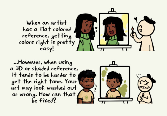

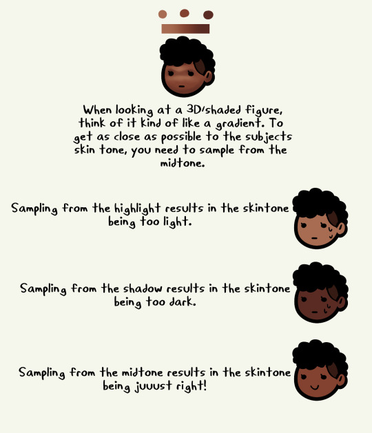
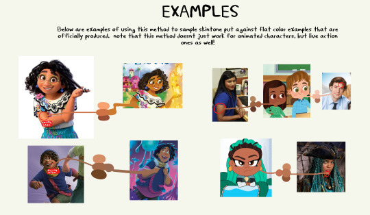

a little informational guide on trying to find skintones from 3d refs :)
i know that finding skintones from 3d characters is tricky and can result in accidental whitewashing and this isnt to make fun of those ppl! this is simply to inform and help other artists out :)
#fuck people who intentionally whitewash by sampling highlights tho hope you grow and change as a person#kupa draws#art#art help#art tips#skin tone#art tutorial
10K notes
·
View notes
Text
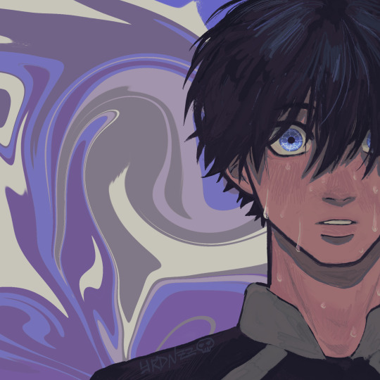
and i got eyes on the back of my head, i got eyes everywhere so i know where you go
#yrdnzz art#blue lock#blue lock fanart#isagi yoichi#isagi#bllk#artists on tumblr#hey#been a minute.... sorry fazgang#I FEEL LIKE IM ALWAYS APOLOGIZING IN THE TAGS my fault#ill do better mb yall i just graduated this month and ive been just chilling doing fuck all bc ive been artblocked AYE EFF#big thank u to jamie for talking me thru this piece even tho its sooo simple#just having someone to talk to about how i feel abt my art was very helpful bc i was definitely stuck on how to start drawing again#what graduating with a bs in comp sci does to a mf i guess#anyways hope yall like this one LOVE U ALL MWAH
2K notes
·
View notes
Text
(From the body swap AU)
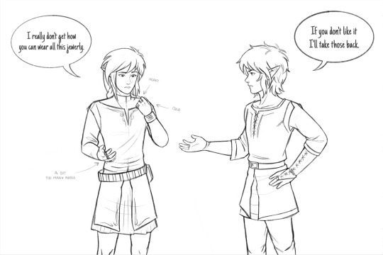
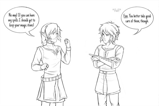
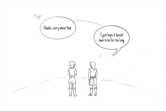
Hii! I'm very happy to see that my body swap comic was so well received, so here's a little something as a thanks for all the support <3
I'm excited to keep sharing my drawings, I hope you like what I make!
#Aand that's how Rulie ended up insisting on keeping Lege's bag lol#They're besties your honor. He wouldn't trust his entire inventory to anyone else xD#This time I had less pages to worry about so I hope this feels a bit less rushed. I'm still figuring this out tho#I also need to learn how to properly draw them bc this has been a struggle lmao#Hyrule's also stressed about the situation he's just been doing a bit of a better job at hiding it lul#Oh they don't know what's coming <3.#Anyways it feels so wrong to draw “Hyrule” with a scowl 😭#I like drawing his hair mirrored specially since it helps make it more different from Legends but it's so hard to draw it from the long side#This is a mess I have no idea what to call them#I confuse myself sometimes while making these lmao#lu legend#lu hyrule#linked universe#lu fanart#body swap au#Ig I'll tag it like that#offmozzart#I thought about kinda spreading all my ideas over time so as to no overdo it so quick ig (+not going crazy over drawing the same characters)#but rn I'm excited to draw them out so I need to take advantage of that
628 notes
·
View notes
Text
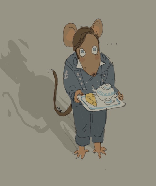
The Terror but it's Geronimo Stilton
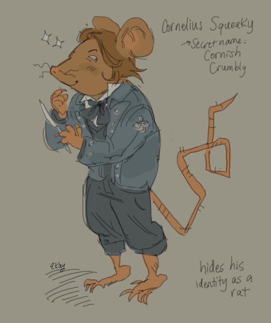
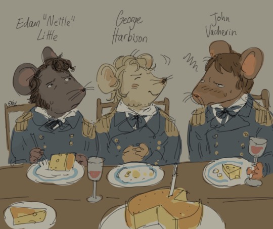
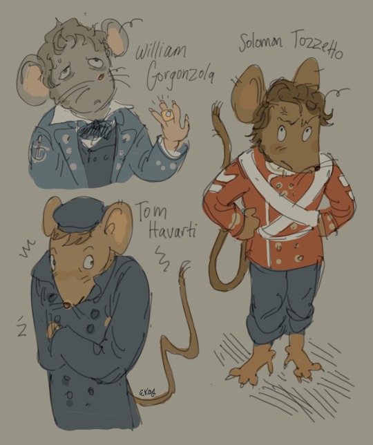
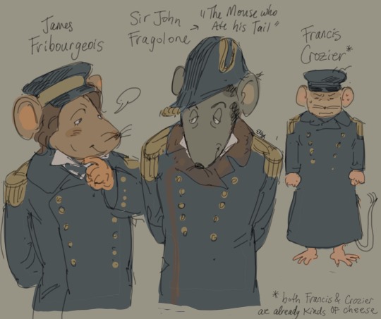
Bonus:

#all their names are cheese#some names I couldn’t find very good ones tho…rip#I’m sorry Irving#other characters will be made in the future…..maybe..#I’m hoping the reference lands cuz if you guys don’t know Geronimo Stilton…idk how to help you#my absolute favorite books as a kid#the shaky lineart is from a mixture of my laughing as well as being literally starving lmao#I did this all in one sitting#my art#amc the terror#the terror#the terror amc#francis crozier#john irving#jirving#cornelius hickey#the terror fanart#artists on tumblr#george hodgson#edward little#solomon tozer#thomas hartnell#sir john franklin#geronimo stilton#james fitzjames#william gibson#thomas jopson
540 notes
·
View notes
Text
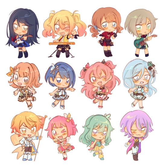
bugs when you lift up a rock
#GYAAAAAH oh god the tags. help me#project sekai#pjsk#prsk#emu otori#proseka#tsukasa tenma#nene kusanagi#rui kamishiro#mmj#leoneed#wxs#more more jump#wonderlands x showtime#HAPPY BRITHDYA SAKI I FAKWKNG LOVE YOUUU#ichika hoshino#saki tenma#honami mochizuki#shiho hinomori#minori hanasato#haruka kiritani#airi momoi#shizuku hinomori#Time for my secret tags. IF YOU'LL BE AT ANIME NORTH THIS SATURDAY AND SUNDAY I WILL BE HANDING SOME OF THESE OUT ..#and i will FINISH VBS AND NIIGO GOD WILLING 🤞#um itll just be paper i dont know i dont have sticker paper. im making some into magnets for friends w what i have left of magnet paper#THERES A 30 TAG LIMIT? ok well im makign cosplayer for the next 2 weeks and im so scared ALSO MIKUEXPO TORONTO GYAAAAAH!!!!!#if youll be at mikuexpo toronto i hope to being some with me to give no promises tho. i'll be .. cosplaying tsukasa .... on public transit.#AGAIN. to get there. anyways i need to lock in goodnight love you sorry to asks i havent answered im sleepy#yhis ones dedicated to the person who said my art tastes like hard candy. little candy bobbleheads for you
1K notes
·
View notes
Text

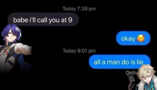


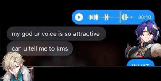
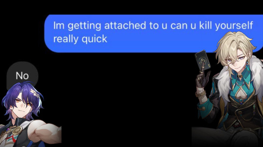
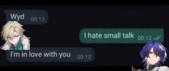
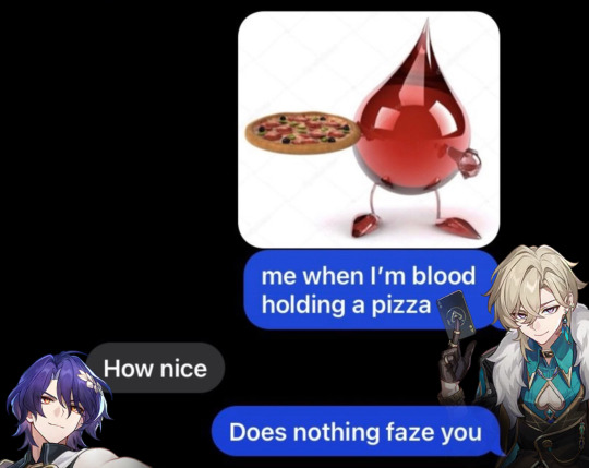


Making Incorrect H:SR Quotes Until I Run Out of (hopefully) Original Ideas - Pt. 1 - Ratiorine Messages Edition
[Pt. 2] [Pt. 3] [Pt. 4] [Pt. 5] [Pt. 6]
#aventurine#dr ratio#ratiorine#aventio#honkai star rail#hsr#hsr incorrect quotes#hsr memes#hsr meme#honkai star rail memes#honkai star rail meme#hsr aventurine#hsr ratio#dr. ratio#veritas ratio#this blog is about to be about 80% Star Rail for an indefinite period of time. and i’m not sorry abt it y’all have been warned#can't get these guys outta my head so here's my first attempt at contributing to this fandom please laugh#no but fr tho i can't tell if any of these are Actually funny slash accurate or if they just are to me#still. the idea's been nagging me for a couple days so i'm getting it outta my system#i also hope none of these have already been made. i always fear that i'm gonna unknowingly copy someone aaa#also also i've no clue if my attempt at adding alt text was actually helpful or done right so if it isn't feel free to correct me
2K notes
·
View notes
Text

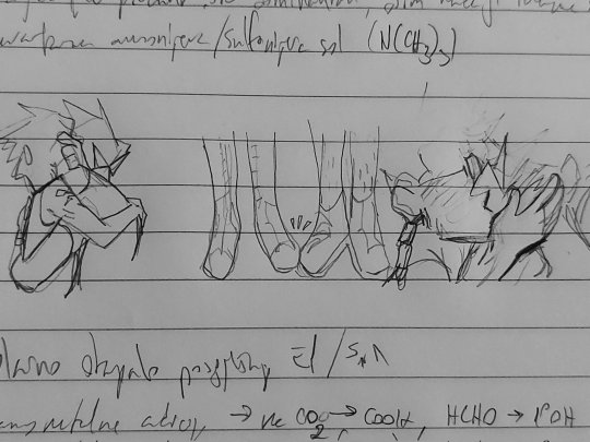


jakey + dirkjake sandwiched between my organic chem notes. a poem in there somewhere
#homestuck#hom3stuck#home24uck#home2t4ck#jake english#dirk strider#erisolsprite#brobot#dirkjake#admin draws#fanart#ok so the latter two are. a bit old and drawn in a rush because as usual i had thoughts about dirkjake and hair BUT ALSO#while reading the post-timeskip chatlogs i was like hm jake's hair looks kinda long here. i might be crazy tho#and then i continued thinking. because Ive had jakes haircut and t has to be trimmed often and i dont trust his ass to competently do that#so i think brobot helped out there and post entry it fell on dirk to trim it#and i think as their relationship worsened the first thing to properly go was the haircuts. because jake couldnt be assed to sit in dirk's#company for the duration of a haircut. direct line of strider word vomit while ur held captive basically (massive overdramatization)#so. its a good thing he got interrupted after trying to cover the tattoo up. because i guarantee you he wouldve been waking up on that#quest bed with breakup bangs.#finally formatted this one in drafts to post so im not leaving yall too high and dry again#i see my askbox and i appreciate it btw! its terraria night but i hope to be drawing tomorrow :]
812 notes
·
View notes
Note
I love the way you draw bodies sm! They're always so fluid and unique!! Do you have any tips?? (other than the super obvious look at a reference lol)
hi thank u!! rather than just looking at refs, i explained how i actually use them here in a big old post, and how i keep those poses fluid!
another tip tho, and a more recent thing i’ve been doing, is that i use a ref just to decide a general idea for a pose and then pick my favorite lines either within the reference already or i make up my own


^^ for above, i very loosely used the reference at all. it just gave me an idea to start with for a pose and then i picked dramatic curves i really wanted to do and pushed the pose to show those lines.
a lot of my fluidity comes from caring more about those lines showing in the pose than the pose or anatomy actually making sense LOL

this is a more direct reference !! i liked the angle and the point of the knees, so i started there and then exaggerated what i wanted to draw more swoopy :3

additionally helps line confidence to use as few lines as possible.
it makes a lot of organic swishes and pretty lines if u try to keep each section of a limb or whatever to just a few strokes. 2-3 if ur really wanting to push it!
#qna#nok talks#hope this helps! it’s one of my least coherent explanations HAHAH#but truly tho my best poses and art are just me repeating shapes i find fun..#i love that specific curve of the side of the ribs and spine.. or the calf..#quick tutorial#drawing
451 notes
·
View notes
Text
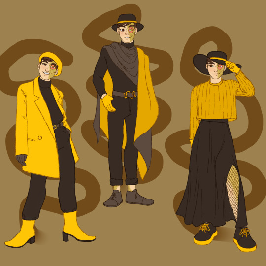

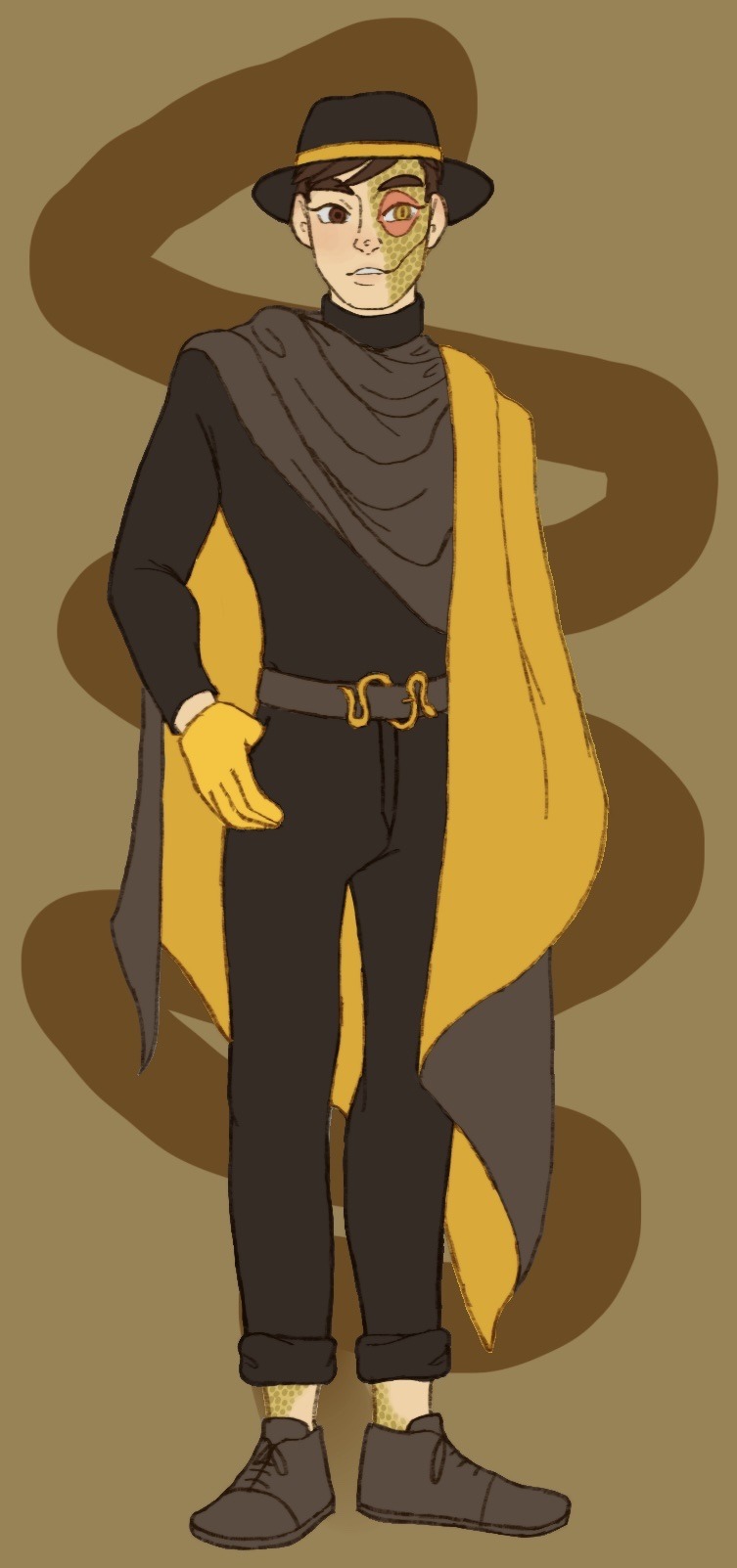
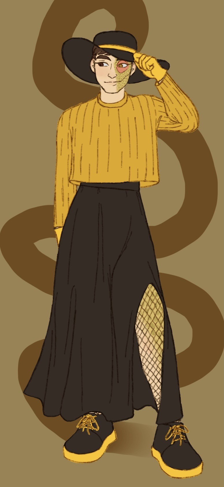
What do you mean I’m a bit late for Janus’ big day? Of course not, how could you say such a thing! I definitely didn’t forget all about it in my absence and only get reminded in the incorrect quotes video live chat; that’s not like me at all ;]
Anyways I decided to dress our sassy snake in some different outfits I think he’d like. He seems like the type to get all dolled up on his birthday and it goes with Thomas posting pics in outfits inspired by the sides on their appreciation days!
@thatsthat24
#sanders sides#janus sanders#ts janus#thomas sanders#sanders sides fanart#my hoard#I’ve returned!#the newest asides came out and I remembered how much I love it#so I’m hyperfixated again and I’ve not now peace since#it is nice to actually finish something again tho#I’ve been pretty busy working lately and now I’m starting to pack to move into my first apartment!#so not much time to really sit down and draw#and when I do have time I can’t get the motivation to actually draw anything#I want to get better about posting stuff on here#(even though it feels like I’m just dreaming into the void a lot)#even just silly little things or rough sketches I’ll never finish#I hope it’ll help me continue to draw and make things again#I forgot how nice it is#anyways if you’ve read this far thanks#have a cookie :] 🍪
2K notes
·
View notes
Text
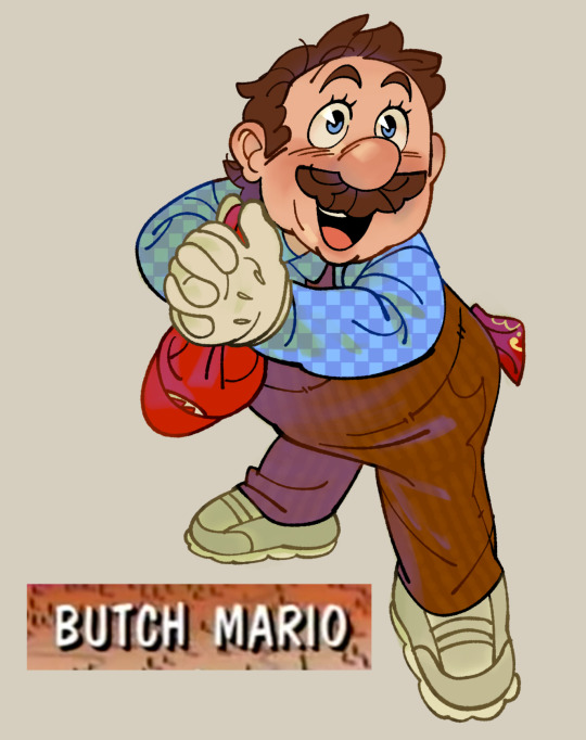
to be fair he’s butch 24/7 but i just needed to get this out of my system
#smb#mario#no id#giddly’s art#to be perfectly clear: i hc him as an amab he/him who likes women. him and peach are lesbians. hope that helps 👍#mario and pauling was also hella lesbian btw. what can i say he loves his femmes#i need to drawr him in fruity stuff more often. the handkerchief in his back pocket is a detail i’m particularly proud of#idk if there’s a dyke code handkerchief specifically tho so erm…. red!
1K notes
·
View notes
Text
FROM as a show is so special because it's one of those rare instances where the most disliked character that the fandom finds to be annoying for any and all reasons... is a white man. Instead of doing the usual thing where the most hated character is a woman who is over-hated for even the most minor misstep (with the underlying real reason being misogyny). And I just think that's so beautiful, so thank you Jim for being mildly but consistently irritating. The world is healing ❤️
#at least this is the general opinion of Jim that ive come across so far anyway lol i was so happy to find out i wasnt the only one#tho tbh Julie and Tabitha took a while to grow on me. but i think by about season 2 they did#from#from mgm#from epix#FROM tv series#FROM#'FROM' THE SHOW#help this show is so annoying to try and tag 😭#FROMily#FROMily i hope you find this#jim mathews#jim from#jim from 'from'#that word is starting to lose all meaning to me now
386 notes
·
View notes
Text

Espeon, Dusk Lycanroc, and Sylveon ko-fi doodle for Kaitlyn!
I'm accepting pokemon ko-fi doodle requests here! ✨
#artists on tumblr#pokemon#espeon#dusk lycanroc#sylveon#gotchibam arts#ko-fi doodle#thank you sm for the request!! <3#i'm sorry this took so long ;_;#been having an art block for the past week so I couldn't finish any doodle#I think i'm getting back to it now tho esp. since the weather here is cooler now#w/c helps a lot (the past days has been terribly hot so yeah)#anyways i'll get back to ppl's msgs soon!!#also need to update stuff for my kofi members >_<#i'm getting behind a lot of stuff but I hope u guys can be patient w/ me ;o;
2K notes
·
View notes
Text
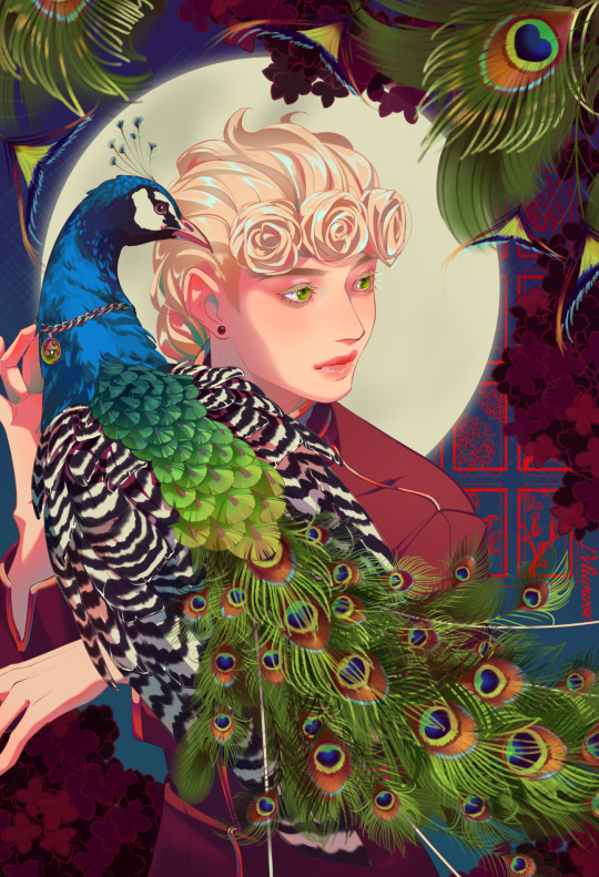
bird :)
#giorno giovanna#jjba#jojo's bizarre adventure#golden wind#vento aureo#deliart#yayyyy i finished ittt#a very busy image with lots of eye strain to it#banger!#i had my bestie help me choose between colors but in return i had to give that peafowl a necklace#so i did. hope he is happy#ngl its alittle cute tho
2K notes
·
View notes
Note
Hello so I really like your art style and the way you draw the transformers. And I was wondering if I could ask how did you learn how to draw them?
And do you have any tips for beginners?
Also read the fic btw and it’s genuinely one of the best things I’ve read. So keep up the good work and take breaks when you need too.
There're definitely ppl who can explain it better than me, like @bloominglegumes in this post here , but I here's a bit about how I approach it!


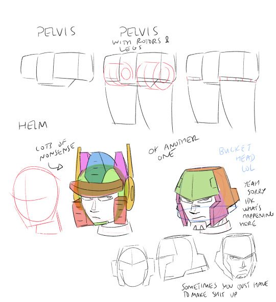


That's basically how I visualize it. It also helps to have reference when you're first starting out. Transformers are wacky to draw cause u need knowledge of organic and inorganic shapes and how they mesh. Personally I try not to let my guys look too stiff. I try to keep lines curved, even if they look straight on first inspection. Technically not realistic since they're made of metal, but it just looks better.
#Hope that helps!#Maybe not the most comprehensive but that's just how I do it#There are definitely also more resources out there#best advice tho is practice and have fun lol#transformers#drawing#tutorial#kinda
192 notes
·
View notes