#&&. and no references have this particular angle that I can find so I am just ffFFFFFfffFF
Explore tagged Tumblr posts
Text
Drawing hands: New Best Friend Drawing arm holes, particularly in vest like clothing: New public enemy number 1 for Amber's drawing muse
#&&. I MIGHT BE OVERTHINKING IT TOO HARD CORE BUT MAN#&&. Every attempt looks so off#&&. something about connecting the 'hole' under the arm pits correctly throws me through a loop#&&. and no references have this particular angle that I can find so I am just ffFFFFFfffFF#&&. tbd#&&. don't mind me I had to get some artist rage out LOL#&&. the author speaks ( ooc )
3 notes
·
View notes
Text
Made myself emotional over the “Leo and Donnie chose to be twins” headcanon.
———
“By the way, it’s Leo and Donnie’s birthday next Thursday. You’re coming, right?”
Draxum looked up from his work organizing next week’s lunch schedule to look at Michelangelo, sitting on the counter and swinging his feet. Celebrating individual birthdays wasn’t a thing that the yokai did, but Draxum had been forced to accept that the boys could not be dissuaded from this human tradition. He’d been to two birthday parties now, for Michelangelo and Raphael respectively, eating cake and presenting them with some small trinket he purchased.
He’d known that he would have to go to more birthday parties at some point. But he wasn’t expecting two at once.
“Why on the same day? I can’t imagine the blue one wanting to share.” Actually, he couldn’t imagine Donatello wanting to share, either.
“Oh,” said Michelangelo with a laugh. “That’s ‘cause they’re twins!”
Draxum stared at him. “Twins? What kind of nonsense is that?”
Mikey tilted his head. “What do you mean?”
“They’re entirely different species, for starters,” Draxum pointed out.
“I mean, we all are, but we’re still brothers.”
“Yes, by virtue of your shared DNA donor and the circumstances of your raising.” Draxum waved that off. “But “twins” refers to a situation where two children are born at once, especially as the result of a split of a fertilized egg. Which is absolutely impossible in the case of Leonardo and Donatello. Even if I were to be charitable and simply consider them “twins” for having the same hatch day, I can tell you they do not.”
“Uh, okay,” said Michelangelo, unimpressed. “But they’ve always been twins, so I don’t think it matters to them.”
“Why not? I would think it would matter to Donatello especially, since he claims to be scientifically minded.”
Michelangelo laughed. “Not everything is about science, Barry. Not even to Donnie.”
“Then his decisions about when to apply science and when not to are inconsistent and confusing.”
“Well, it’s their birthday, so they get to pick.”
“I am certain that is not how birthdays work.”
“It’s how it works for us!” Michelangelo slipped off the counter. “We’ll see you on Thursday, right? It’ll mean a lot to them if you come!”
Draxum was fairly sure Leonardo in particular would prefer he didn’t, but that didn’t matter. Now he had a mission: he had to correct this strange incongruence.
“Yes, I will be there.”
“Yay!” cheered Michelangelo. “Okay, see ya Dad!”
He squeezed Draxum around the waist on his way out. Draxum was finding he didn’t mind that as much as he used to.
———
Leonardo and Donatello’s party was just as loud and obnoxious as the other two. Blue and purple decorations covered every inch of the old subway station, strange music blared from unseen speakers, and a horrendous amount of junk food was spread out over a table. It was the same group of people present today as there ever was, the eclectic mix of humans and yokai that the boys considered family, but it felt like a crowd three times the size with the amount of noise being made.
Draxum stood off on his own for most of it, his slim birthday present already delivered to the table stacked with gifts. He’d been a little shocked when Donatello and then Leonardo came by to say hello, since he’d been prepared to be ignored by both of them. It was… nice, maybe, that they did that. Even if Leonardo just wanted to make jokes at his expense.
For most of the party, the two birthday boys seemed to be competing with each other for attention. In fact, the longer he took it all in, the whole affair seemed like a clash of ideas. The purple decorations were neat and tidy, geometric patterns and hard angles. The blue decorations were whimsical, uncoordinated, and haphazard, and there were places it seemed someone had deliberately covered up some of the purple with the blue. Leonardo wanted to play rock music and Donatello wanted to play techno. The cake was a mess because they’d both requested different themes for the decorations. There were arguments between the two of them every few minutes, and according to the human girl April this was “typical behavior.”
But why? They weren’t really twins. They didn’t have to share this day.
Hopefully Draxum’s plan would fix all this nonsense.
When it was time for gifts, Leonardo loudly declared that he was going first, sparking an argument. They squabbled for a bit before agreeing to play rock-paper-scissors, which was apparently what they did every year.
Leonardo won the game and celebrated obnoxiously while Donatello scowled at him. Then he gestured at the gift table - which Draxum, in his efforts to stay out of the main throng, was closest to.
“Hey, Barry! Grab me a gift! Make it a good one.”
Draxum sighed but reached over to take one of the blue packages, checking the tag to make sure it was for Leonardo. “This one is… to Leo from Donnie,” he read.
“Oh no, not that one. Our presents to each other are always last.”
“Because they always get sappy about it,” said April with a laugh.
“Do not!” yelled Leonardo at the same time Donatello hissed, “You take that back!”
“Uh, yeah you do, and you know I’m right.”
Draxum ignored the petty argument to look back at the gift table. If they weren’t going to be satisfied with his choice, he might as well give them his own gift.
He lifted it, in its sensible brown packaging, off the table and handed it over.
“Why not start with this? It’s to both of you from me.”
“Both of us at once?” asked Leonardo. “Oh man, you’re throwing off our whole system, Barry.”
“Yes, but he’s giving it to you,” Donatello pointed out, “which means my turn is still next.”
“Uh, no, if it’s for both of us then it counts for both of us, which means it comes back around to me!”
“Ooooh no, you do not get to loophole your way into opening two presents in a row-“
“Ahem!” Draxum loudly cleared his throat, getting their attention. “Would you please just open it?”
“Yikes,” said Leonardo. “Touchy.”
“Some people just don’t understand the sanctity of opening birthday gifts,” said Donatello with a sniff. But he leaned in to watch as Leonardo tore off the wrapping paper and opened the box.
They were both silent for a moment, staring at it. Then Leonardo said, “Uh, no offense, Barry, but what is this?”
“It’s a… scientific study on how twins are formed during the gestational period,” said Donatello, pulling the paper clipped thesis from the box. “Oh, there are more in here… Also about twins.”
“Uh…” Leonardo blinked at it, clearly bewildered. Well, he was always a bit slow. “Thanks…? I think?”
“Not that I don’t appreciate the scientific literature,” said Donatello, “but this isn’t really my area of study and Leo does better with training manuals and textbooks than research papers.” He looked up at Draxum. “Is there something about this we aren’t getting?”
“Yes there is,” said Draxum, sweeping his hand around at the entire party. “I am here to correct your mistaken assumption that you are twins.”
The room fell silent. Donatello set the paper back in the box, staring at him. Leonardo’s brow creased in anger.
“We are twins, though,” he said, setting the box aside like it was burning him.
“No, you are not. There is simply no way that the two of you could be twins. It is biologically impossible.”
“You think that I’m so stupid I don’t know that?” Donatello demanded, getting up from the chair he was sitting in. “Are you doubting my intelligence?”
“Yes, if you honestly think you are twins with him, then I am.”
“Uhhh, Draxum,” said Michelangelo quickly, stepping between him and the now furious Donatello, “this was a… funny joke, but you can stop now-“
“This is not a joke. I am simply explaining the facts.”
“Yeah, well,” now Leonardo was on his feet, too, “the facts are that me and Donnie are twins. Always have been, always will be.”
“You are not,” Draxum insisted. “And given what I have seen here today, I’d think you’d both be relieved, since you clearly don’t enjoy being twins!”
Both boys looked like they’d just been slapped in the face. The rest of the room had gone completely silent, like everyone was collectively holding their breath.
Donatello broke first, turning on his heel and marching out of the room, his hands balled into fists and his shoulders hunched up as high as they could go. “Dee!” called Leonardo, and then he was scurrying off after him. There was the sound of a heavy door slamming, then silence.
It didn’t last long.
“Draxum!” roared the rat, actually getting up from his chair to get in Draxum’s face. “You come in here and upset my boys on their own birthday!?”
“Seriously not cool, Drax,” said the human April. Cassandra shook her head in shared disappointment behind her.
Draxum pushed Lou Jitsu back, scowling at his accusers. “I was only explaining reality! This is really the rat’s fault for letting their delusion go on so long.”
“Delusion!?”
“Barry!”
“Rat!?”
“Ooookay,” said Raphael suddenly, stepping his way into the middle of the fray and starting to herd Draxum back toward the exit. “That’s enough of that for now.”
“I am simply trying to explain-“
“Trust me, hoss, you wanna step away from this one,” said Raphael, and his tone was angry but surprisingly measured. “Come on.”
They retreated to the sewer tunnels outside the subway station. The smell was much worse out here, and Draxum wrinkled his nose.
“Alright.” Raphael heaved a sigh, folding his arms. “So here’s the deal. Mikey likes you, and I guess I kinda do too, so I’m gonna try to help you before you completely torpedo your chances with the rest of the guys. Which, you kinda did already, but maybe we can turn it around.”
“I still don’t understand why they’re so upset,” said Draxum. “Surely it was obvious they aren’t twins.”
“Uh, yeah, they know they aren’t twins by bio-whatever,” agreed Raphael. “They ain’t stupid.”
“Hmm.” Draxum turned up his nose. “Donatello isn’t stupid, maybe.”
“Leo ain’t stupid, either, he just pretends like it.” Raphael pinched his brow. “Listen, that isn’t the point - the point is they already know they didn’t come from the same egg or hatch the same day or whatever. They’re just twins anyway.”
“But how? That doesn’t make sense!”
Raphael sighed again. “Alright, look. Dad didn’t know when we hatched, right? But we all wanted birthday parties like we saw on TV, so he let us pick.”
“Yes. And for some reason Leonardo and Donatello chose the same day.” Draxum could figure that much out on his own.
Raphael nodded. “I was the biggest and oldest, and Mikey was the littlest and youngest, and Leo and Donnie were just kinda sandwiched in the middle. I think at first they just wanted a thing. Somethin’ that set them apart from me and Mikey, ya know?”
“Not really,” said Draxum. Raphael glared at him, and he sighed. “But go on.”
“So they picked the same birthday and called themselves twins. I think Pops just so glad they were actually getting along that he agreed to it. And I think he thought once we got to the day, and they realized they were really gonna have to share it, they’d both demand their own day instead. I know I thought that was gonna happen.” He smiled at the memory. “But the day came, and… they fussed the whole time just like they do now. Arguing about what kind of cake they wanted and who got to open their present first. But they didn’t ask to split. They kept it the same day, and they kept calling each other twins and it just stuck, until we didn’t question it anymore.”
“…They are both stubborn,” Draxum pointed out, and Raphael laughed once.
“Yeah, guess they are. But that’s not what this is.” Raphael shrugged. “They chose each other back then. Maybe at first it was just to have a thing, but then it became real. And every single year they keep choosing each other. That’s why they’re twins.”
Choosing each other as twins… Draxum furrowed his brow. “It’s not normally a choice,” he pointed out finally.
“Yeah, well, our family doesn’t get a lot of choices, so just let ‘em have this one, okay?”
“…Fine,” Draxum finally relented. “As long as it’s noted that this is purely a social designation, and not a biological one.”
“Uh, sure, whatever.” Raphael rolled his eyes. “Glad we got that cleared up, though. Think you can come back to the party and behave?”
Draxum wrinkled his nose at that phrasing, but nodded. “Yes. I will not bring it up again.”
“Good!” Raphael’s smile abruptly transitioned into something much more dangerous. “Because if you make my little brothers upset on their birthday again, I’ll remind you what it was like when we were enemies.”
Then the smile was back. “Now let’s go in!”
He walked back to the subway station, leaving Draxum to follow on his own. Draxum couldn’t help but sigh wistfully.
Raphael would have made a great general for his army.
———
The boys had already returned by the time Draxum got back. They were opening more gifts, and he noted they were wearing hoodies now - though they had apparently decided to swap their signature colors. They were smiling and chattering, and any hint of their earlier upset was gone.
Until Draxum stepped into their line of sight, and both of them went rigid, wary of him.
Apparently just talking to the red one was not enough. Draxum would have to do more. What a pain.
But he didn’t want the boys to hate him. So he sighed and launched into it.
“I… am sorry. I shouldn’t have said you aren’t twins.”
The boys looked surprised at that; slowly, their posture loosened back up.
“And… to make up for my present, I will… take the two of you wherever you want to go in the Hidden City.” The next words were painful, and he ground them out. “My treat.”
Leonardo and Donatello shifted their gaze from him to each other. They were silent, but it didn’t seem like they needed to talk to have a conversation.
Then they finally looked back at Draxum, slow grins growing over both their faces.
Eerily matching, very evil grins.
“Oh,” said Leonardo, happily menacing. “I think we can think of something.”
“I concur,” said Donatello in the exact same tone.
Oh, thought Draxum. Maybe they really are twins.
#dandy fanfiction#rottmnt#rise Leo#rise Donnie#rise raph#baron draxum#rise Mikey#disaster twins#I didn’t proofread this haha#I love the twins being twins by choice#Donnie and Leo had a big sappy talk sorry it was off screen
2K notes
·
View notes
Text
if i keep seeing so many people refer to ayden as an indication of an unknown softness in pelor i will start setting things on fire. just because YOU cannot handle nuance does not mean the story of exandria has not contained it and done so consistently. in fact the first in depth interaction that any party had with pelor (vex becoming his champion) was a portrayal of him that was explicit in his complexity. taken straight from the transcript for 1x10⁴ elysium, “[vex you] spin and look, whereas there once was a burning star-- and to the rest of [vox machina], you see the painful, endless light that averts your gaze-- it doesn't hurt your eyes as much, and you can see the faint features, the soft cheeks, the hairless head, and the bright warm eyes of he who brings the dawn. And you can see the smile there, behind the light. “there is hope.”” sunlight can warm you and burn you in equal measure.
that burning image of the sun has much in common with a teenage boy who steps into a dark room, and reminds the dm that it’s not dark. the same way that a teenage boy who stands by as a woman who will not give up her worship of pelor is punished because he has more important responsibilities he must honour has much in common with a seemingly benevolent lord of the dawn might respond harshly to a cleric who asks if he is worth saving while he is trying to find a way to survive so he might keep helping to provide light. the gods aren’t simple and they never have been. i am as psyched about the particular angle that downfall is taking as anybody but it is already frustrating watching people act like the gods are suddenly more nuanced because they’re in literally mortal bodies when the entire Point of the gods in exandria in the various stories we’ve seen so far is that the only difference they have with mortals is the bounds of their power. they carry all the same flaws and the same profundity. just because so much of the fandom has reduced that to black and white flatness or faulty mapping onto real world religions (or the various traumas those might have caused individuals) doesn’t mean that complexity has been missing at all from the story.
#this reads like a vague post ik but i was just tryin to vibe and enjoy the liveblogs n tweets n stuff and the good good energy#and then i saw 4 separate posts in succession bein like ‘woah new dawn father just dropped’ get a grip. why don’t you watch vex’s arc in c1#and ponder the god who accepted her as champion and saw her as a source of hope . for a Moment#like yes pelor is a cold and ruthless bitch .#so is vex. so is percy. but wouldn’t ya know. that’s not it. strange#like yes i Do think we are absolutely seeing where some of the harshness of pelor grew more impenetrable#but acting like the only thing we’ve seen of the dawnfather is cruelty. foolish and textually incorrect#cr3#cr downfall#cr spoilers#critical role#pelor#the dawnfather
1K notes
·
View notes
Text
I think there is a difference between the comic as a sequence of images with text and the comic as a comic. it's a subtle difference that an untrained eye might not see but the more one as artist draws comics the clearer this difference becomes, because one who first aspires to draw comics will soon find they are merely drawing sequences of images with text.
when people say an artist is clearly inspired by anime they often use "anime" to refer to japanese pop culture in general, but if you look more closely you can often tell it really is specifically anime rather than manga that inspired them, because the paneling and camera angles in their comics will read like a series of anime screenshots rather than a manga page. similarly, when I was a teenager really popular manga that had anime adaptions would sometimes get "animanga" reprints where they replaced the panels with the equivalent anime screenshots of the scene, and they often looked like dogshit because the very premise showed blatant disregard for why the original comic worked in the first place. these two examples are both about anime because i am a weeb but it applies outside that context too. a cartoon storyboard can be read as if it were a comic, but what it really is is a sequence of images with text that has yet to be refined into its actual intended format.
there are many artists who only employ the medium of comic because what they actually want to draw is a video, or a video game cutscene, but the only tool actually at their disposal is the ability to draw a series of images and add text to them so that is what they use. there is no shame or mistake in doing this, you have to make your art with the tools that you have available, and if the sequence of images with text is enough to convey the idea then it was the right tool for the job. but these are different mediums with different visual languages, languages which have a lot of overlap and can occasionally be used in each other's stead to achieve similar results (especially when drawing a fanart comic of a video game for example), but which are still ultimately different. the comic and the video and the cutscene are all different forms that a sequence of images with text can take but they are far from completely interchangeable.
there is a key difference in approach to the comic as a series of images roughly interchangeable with other forms of series of images like the video and the cutscene, and the comic as specifically the comic. this difference in approach is not always necessary to achieve results, an artist who wants to convey a scenario they came up with needs only the sequence of images with text to achieve this. but the difference between a comic with good writing and art, and a comic that is a good comic, is in whether it was treated as a comic rather than a sequence of images with text. I say this as an artist whose nearly every comic has been simply a sequence of images, because I just don't have the patience to refine it into a comic when I merely want to convey my idea rather than draw a comic. it takes a particular skill and insight that have to be developed and practised separately from the ability to draw well and the ability to write well in order to become good at making "the comic" as synthesis of the two.
it's hard to specifically point out the essence of this difference between the sequence of images and the comic because it's kind of a vibes thing honestly, and it depends on where and how the comic was meant to be published too. comics meant to have paper print editions have different constraints and requirements and frameworks to work with than webtoons meant to be read on slim mobile screens in a continuous scrolling format. a good traditional comic will consider not just how each individual panel looks but also the way each page as a whole looks, and how the pages look next to each other in a spread, and how it feels to turn the page towards the next spread. a good webtoon will consider the movement of scrolling down and how this affects the transition from one moment to another in its composition. time is time in videos and cutscenes but space is time in comics, and the space your have available determines how you can divide time across it. when you make a webcomic on your own website you have no constraints but the ones you set for yourself, and sometimes this leads to things like homestuck, which would not work in any other format than the one it created for itself.
the best comics are good because they tell their story and present their images specifically in the form of a comic, in a way that would not be possible if it were not specifically a comic. I think this is true for basically every medium, I'm just thinking about comics specifically lately, because even though I don't really consider myself a comic artist - because I usually draw sequences of images rather than comics - the thing my clients want to pay for is often still "a comic", and they don't know or care to tell the difference. it's a difference that, as established, is often fairly moot anyway, because as long as it successfully conveys your idea it's good enough. but it's precisely because the sequence of images is often good enough that the specific skill of the comic artist is often overlooked.
1K notes
·
View notes
Note
i love your april SO MUCH 💛💛 do you have tips on drawing her???
thank you!! and im not entirely sure what that entails, but i'll try my best :D
i stray a bit far from canon april, mostly in the way i draw her hairstyles, outfits, and body type (the last is just to suit my style, its not a big translation IMO)
FACIAL FEATURES:


there's a few touchstones im always thinking about when i'm sketching her face out:
how wide her nose is (very important that the edges are past the inner corner of her eyes in most angles)
how full her lips are
how thick her eyebrows are (so they don't have to compete with her glasses)
roundness/heartshape to her face
even with all these features in mind, the way she looks can vary. i'm just always making sure these things are accurate, since most are key to depicting her ethnicity, even in the highly stylized show.


i'm also always checking for the relationship between her eye-whites and skin tone, because if its off, i'd be veering away from representing her deep brown skin accurately.
this very important to be mindful of!! and very easy to check and fix! if you're unsure, find a screenshot with a similar lighting scenario and check the values in black and white.
HAIR TEXTURE:
im always aiming for depicting coils, never curls, since i believe that's the hair type being shown in the show.

there's a lot of ways coils can look, but usually, keeping volume and staying away from single strands works. i wasn't always mindful of this tho (example below) and still am very capable of loosening it, even if it's subconscious. this is almost ALWAYS a simple fix as well.

i've see a lot of art of her hair in particular being very loose. like 2b/2c. guys.
and this problem is hardly addressed!! so i am here to recommend finding references for 4b/4c hair, refs are never bad.
MISC NOTES OF VARYING IMPORTANCE:
her skin is cool toned in most palettes in the show, so i stick with cooler skin for her (tho i mostly use warm palettes so it does get lost)
her red glasses usually salvage her recognizability (i know this because i draw her in different outfits/hairstyles all the time)
^^ green and yellow in her clothes does too.
i hope this helps :D, thank u again! im glad someone's asking. maybe this means more April art will be put into the world.
#inbox#rottmnt#april#kj speaks#her ethnic features are the most important to be mindful of IMO#i hope my post gets that across well#im serious#whitewashing? dont do it#if you've ever made a mistake depicting her features#its never too late to fix em#no ones above mistakes#its how we address them going forward#yknow
113 notes
·
View notes
Text
We Don't Gatekeep Art Resources | A Comprehensive List
Here's a list of some of the tools/sites I currently use or have used previously for works/studies. I'll separate it into Software/Utility, Reference, and 'Other' which will be just general things that could help you map out things for your experience with art. **[Free highlighted in pink, paid highlighted in green. Blue is variable/both. Prices Listed in USD]**
Software/Utility:
2D
Krita Painting app (PC) (my main digital art software on PC for 5+ yrs)
Clip Studio Paint [PC] [CSP 2.0+ allows for 3d modelling within the painting app and a lot of other cool features] [apparently allows up to 6 months free trial]
Procreate (12.99) [iPad/iPad Pro] (the GOAT)
Artstudio Pro [iPad/iPad Pro] (An alternative to Procreate if you enjoy the more traditional art app layout) -- I find this app handy when Procreate is lacking a feature I need, or vice versa. (you can easily transfer files between the two, but keep in mind Procreate's layer limit)
2D "Collaborative Painting/Drawing apps"
Magma Studio
Drawpile
Discord Whiteboard
Gartic Phone (Pretty decent for 2d animation practice, but has a hard limit on frames)
3D
Blender [3D Modelling, Sculpting + Layout] (PC)
Sculptris [PC] (it's an old unsupported version of Zbrush, but can help to get ideas out, and functions better than browser sculpting apps
Nomad Sculpt [iPad/iPad Pro] ($20) Works pretty well if you prefer a mobile setup, but it is a bit intense on the battery life and takes some getting used to
References + Study
Magic Poser [ PC and Mobile ] Has both free and paid versions, I've made do with just the lite version before
Artpose ($9.99) [Iphone + Steam]
Head Model Studio [IPhone] A 3D head, with both a basic blockout version for angles, and a paid version with more detail
Cubebrush [simply search "[keyword] pose reference pack"], they usually have good results + they frequently have sales!
Line of Action [Good for Gesture practice + daily sketching], also has other resources built in.
Quickposes Similar to Line of action, more geared toward anatomy
Drawabox | Perspective Fundamentals Improvement modules (Suggested by @taffingspy )
Sketchfab, this skull in particular is useful, but there is other models that can help you study anatomy as well.
Pinterest can be good, you just have to be careful, usually you're better off just finding reference pack if you have the money, sometimes certain creators have freebies as well
Artstation Marketplace can be decent [make sure to turn on the Aye-Eye filter so it doesn't feed you trash], a colleague of mine recommended this head model for practicing facial blocking, there is also this free version without lighting.
Local Art Museums [Unironically good for studying old "master work" if you're into that, or even just getting some inspiration]
Brushes + Other Useful software:
I personally have used both of these brush packs before making my own
(I actually don't know how to share my daily brush set because I frequently switch between Krita, Procreate, and ASP, but once I figure that out I'll be sure to do that lol)
Marc Brunet's Starter brush pack [Technically free but supporting him for this if you like it is ideal, there's some good brushes]
Dave Greco Brush Pack [$3]
Gumroad in general is a good place to find brushes and art resources. *Note; for Krita specifically, brush packs are a bit weird, so it may require you to find different packs, or import them in a particular way
PureRef [PC] - Reference Compiler/Moodboarding
VizRef ($3.99) [iPad] - Moodboarding/Reference Compiler
Artist Youtubers/Creators that helped me improve/guide me along as a self-taught artist from when I first started digital art to where I am today:
Proko
Marco Bucci
Sinix Design
Sycra
Hardy Fowler
Lighting Mentor
Winged Canvas
Moderndayjames
Swatches
Chommang_drawing
Marc Brunet (YTartschool)
+ Observing a lot of speedpaint art by people whose work I enjoy on social media/youtube, trying to dissect their processes
If you've gotten this far, first of all, congrats, you can read a lot, and second of all, thank you for reading and I hope this helps! I'll continue to come back and update this if I find any new resources in the future, or if my processes change :)
Much Love,
-Remidiy
#art#artwork#digital painting#painting#artists on tumblr#drawing#anime art#sketch#digital illustration#transfem#art tools#art resources#useful websites#small artist#illustration#digital art#artist on tumblr#procreate#my process#my art#krita#art tag#sharing is caring#learning#knowledge#useful stuff#links#reference
264 notes
·
View notes
Note
Any tips for getting better at drawing?
Oooooh that is a very broad topic.
If I’m being honest I find it hard to put my art journey (that I am still pretty young in) into words. It all depends on so many things- experience, medium, your ability to understand anatomy, objects in a 3D space, colour theory, how joints work, lineart, comprehensive understanding of form etc etc. There is a lot of stuff involved with art and it would be hard to just compile it all into one topic. But I’m gonna assume you mean drawing as in pencil, paper (or the digital equivalent) and an idea.
My main tip, which you’ve probably seen over and over and over again is just practice. It’s disheartening to hear the same thing repeated until your ears are bleeding but from personal experience, it’s how I improved my understanding of form/linework. But don’t just practice the same thing. Go on Google or Pinterest, find reference photos of real people, trace over the human skeleton, divide complicated structures into easy to understand shapes. There is no wrong way to study art, do whatever works for you!
Another one is to look at other people’s art, see what about it you like and you dislike, and how you can apply that to your own work. Someone use a particular brush for outlines that you like? Try it out! Do you like the fluidity/connectedness of colours within a particular piece? Have a go at it!
And not everything you draw will be amazing, or even good. I’ve been sat feeling frustrated with myself because I couldn’t get a face right, or the way I was drawing a hand looked weird a squiggly, and that’s completely normal! No one posts the fucked up looking pieces of warmup art that they abandoned because they couldn’t find the right angle to draw a character’s cheek bones at (Cough cough). Trust me, everyone that draws has art they will never post.
Finally, progress takes time. It’s a long, frustrating, gruelling process that has massive highs and lows where you feel like the worst artist in the world or the fucking reincarnation of Picasso. It depends on the weather.
For example, my art at the start of 2023 looked like this:
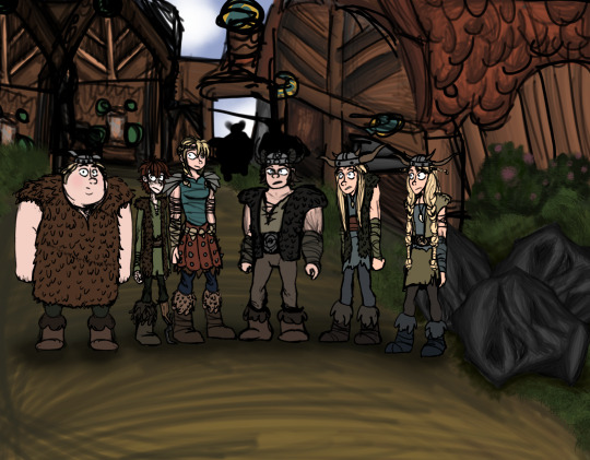
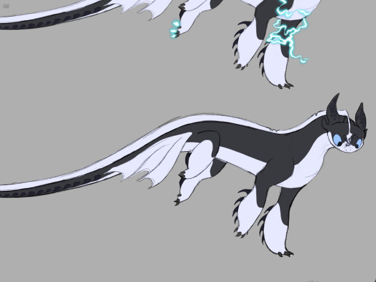
And now it looks like this:
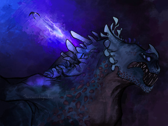
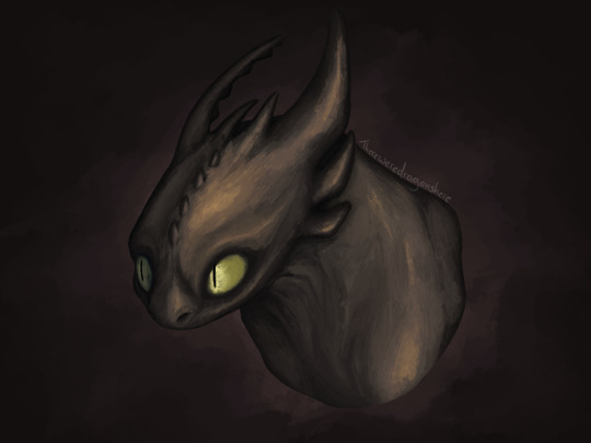
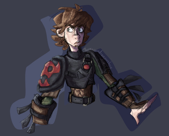
It took my two years to get that far, and fuck knows what my art will look like at the end of 2025.
Your art journey never stops, it only becomes less confusing and frustrating as time goes by. To everyone that feels like they’re in the art trenches right now, you got this, I believe in you and I promise that one day you will crawl out from the mud and filth with a clear understanding of the colour wheel (because fuck me I do hope I get out of that trench soon)
#httyd#how to train your dragon#my artwork#art stuff#artist#original art#my art#digital art#art#artwork#artists on tumblr#art advice#art advisory#hiccup#hiccup haddock#httyd hiccup#hiccup httyd#toothless#red death
68 notes
·
View notes
Text
Chain of fools
Promo season seems to always reactivate #BestOfFans' predatory instincts. Today, one of the people I was mildly 'following' on X, knowing she was a very decent, half-clandestine shipper had the naivete to share a pic taken today with C. Lo and behold, the KGB across the street immediately started the screeching. I would have granted them a pass, were it not for the very curious angle they chose to present things, this time:
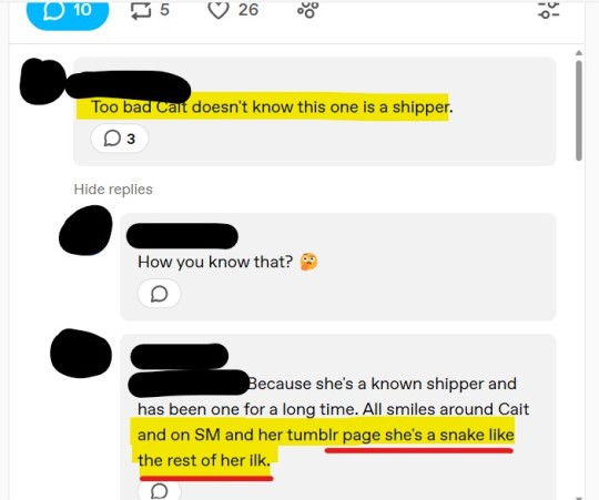
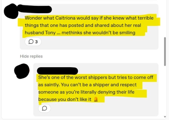
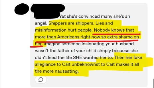
Most, if not ALL of the women involved in that conversation were born and lived their entire lives in a country where democracy was never completely obliterated. They have no idea, nor direct experience of what a dictatorship looks and sounds and feels like and yet they look and sound and feel exactly like The Pravda, circa 1951, where enemies of the people (including Americans, so basically... themselves?!) were currently called 'reactionary/ imperialist vipers'. Replace shipper by 'enemy of the people' and voilà:
'Because she's a known shipper enemy of the people and has been one for a long time. All smiles around Cait and on SM and her tumblr page she's a snake like the rest of her ilk.'
Most, if not ALL of the women involved in that revolting conversation can recite by heart The Pledge of Allegiance to the Flag:

[Source: https://en.wikipedia.org/wiki/Pledge_of_Allegiance]
'With liberty and justice for all'. This includes the freedom of speech, set into stone by the First Amendment to the US Constitution, which reads:
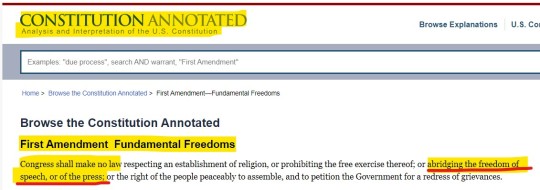
[Source: https://constitution.congress.gov/browse/amendment-1/]
You think I am overreacting? In that case, I wouldn't be the only one. It took me exactly three minutes to find on Google a short, but very interesting blog post about the metaphor of the snake being used as a dehumanizing tool in many totalitarian regimes' official rhetoric and media. I will quote it briefly, leaving the rather ironic references to current US politics aside. I find it very interesting and enlightening, for a certain pervasive mentality, in some regions of this fandom:


[Source: https://www.dangerousspeech.org/libraries/beware-of-snakes-a-common-dehumanization-trope]
I have written it before and I probably will write it again, but the Eastern European I am feels unsettled and worried about this. It is not only unsavory, it is violent and denotes a totalitarian way of thinking I am very surprised to find in the minds of these mature women, who lived in complete freedom for all of their lives.
Oh, and by the way. Given that particular 'enemy of the people''s active and very public commitment to charities supported by C (you know, as in raising money for WCC and so on...), I am absolutely sure C knows very well who she is. And I wonder what were they expecting from her, in a work-related context nonetheless, even if (the premise is perfectly absurd, as C does not give a fuck about fandom wars) C would not stand shippers.
By the same token, why would C offer anything more than a vague, borderline formulaic birthday reference while talking to the press, knowing fully well each and every word she utters would be immediately dissected to death and weaponized by the factions of this fandom?
Ironically, their knowledge about Eastern Europe is about zero. I just had to LOL (not really), reading this very serious and concerned dialogue between Marple and The Vulgar Canadian Journo. The Canadian was pissed off about Maril showing up, as she is supposed to, for promo, in NYC:
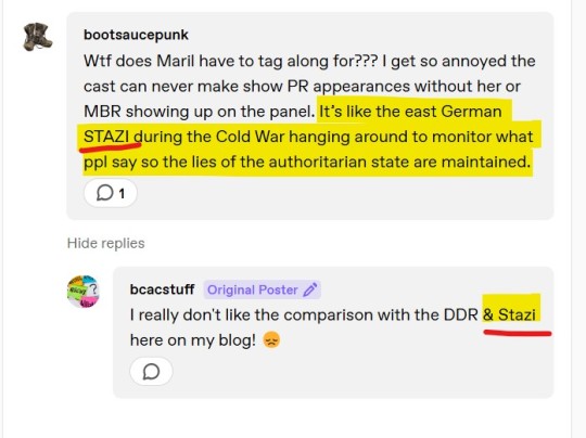
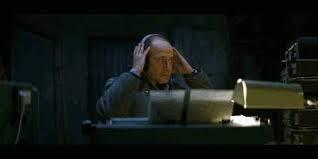
It's not STAZI, madams, but STASI - short for Ministerium für Staatssicherheit, or Ministry for the State Security. Each and every USSR satellite state had one, but both of these arrogant and superficial Westerners make it sound like a harmless gossip and propaganda machine. In reality, the STASI, along with its sister institutions, was a supremely powerful, merciless apparatus that crushed tens and tens of thousands of lives, encouraged hatred and denouncement (for money, political protection and social climbing) even within the same family. And I personally remember the day where an agent of the local STASI, the Securitate, picked me up from school, walked with me for almost one hour until he left me on my doorstep, in a cruel attempt to make me denounce Shipper Mom. I was nine years old. I will never forget, nor forgive. I felt raped. You don't care and you could never understand, of course, but for the love of God, keep off such complicated tropes you have no idea about.
73 notes
·
View notes
Text
The process (part 1)
@inquisitornocturn has requested that I talk about my artistic process. This, of course, is rather a large question, as I have many methods, but in this particular post I will try to be as general as I can. That also means that it will not always be exact, because every picture is different, but I will try to describe what I do in general. I will talk about the specifics of different methods and materials in a later post; that's why this is part 1.
There are, for the most part, three types of pictures for how I approach them.
Pictures from life
I can do these outside or indoors, or even hastily while sitting on a train. They usually happen immediately with no premeditation.
The defining feature is that I don't make up the composition, or at least not really: I just select the composition by looking at the thing that inspires me. Of course, if it is a still-life, I might move some objects around, and if it is a landscape or a plant portrait, I will move around a little to find the best angle, so I do make up the composition in that sense.
Then I take out my materials; normally for this purpose I carry a board just like I use at home, and the paper taped to it; or else (especially if I'm on a train) I only carry ink and I just lay the paper on top of whatever hardcover book I have on hand at the time.
Whatever materials I'm using, the sketch is on the final paper itself, and very minimal: it only serves to solidify what part of my view is going to be the picture. (A line to indicate where the edge of a tree trunk is, a pair of curves for the general shape of a path… Only as much as it takes for me to be able to immediately see how the thing I'm looking at will correspond to the paper.) I erase it as I go, once I no longer need it. Sometimes, to preserve time, there is not even this much of a sketch; that mostly happens if I am severely short on time, such as I'm sitting on a train.
Pictures from memory
Many times I wish I could paint a picture from life, but the circumstances (such as precipitation, low light conditions, cold, or simply the fact that I don't have my supplies with me or any convenient way to sit with them) prohibit me from painting it that way.
In this case, I draw a sketch if that much is at least possible; and then I try to stare at the sight as hard as possible, to remember most of all the light and the colours, because that is what I'm not able to preserve in the sketch. Then I go home and proceed as I would with a made-up picture; the early stages of it will be easy because the composition is already determined.
Pictures I made up
Usually the picture on my mind is a concept; sometimes it appears as a complete composition. I will describe the former and mention when it differs.
In order to solidify this concept, I look at references (in photographs or in real life), to aid me in deciding how the composition should go; that is not to say I will take the composition from a reference, but rather that the more I look, the more it helps the composition form. I also have to understand the things present in the painting; if it contains elements I don't sufficiently understand yet, it may be necessary to study the way something works structurally or as far as the nature of the surface. At some point during this process, I also draw sketches, sometimes several attempts at different compositions, sometimes just one; these sketches are often much smaller than the final picture will be. If the picture already appears in my mind as a complete composition to begin with, in that case I skip this step and just draw the sketch as I know it should be. Sometimes concepts and sketches mature for a long time before I feel ready to get to them, not only because there are so many pictures I want to do, but because sometimes they have to work themselves out in my mind in a passive, background sort of way. But often an idea comes to me and I'm immediately ready to work on it.
Then, if the sketch is a size that I want the final picture to be as well, I take the final paper and the sketch and tape them to each other, and place them against a lit window (myself standing inside if it's daytime, outside if it's night), and trace lightly along the sketch to transfer the composition. (It's much less annoying than having to sketch up the composition again after I've just done that work once already.)
If the sketch is a different size than I want the final picture to be (as is often the case), I scan the sketch and zoom in and out on my monitor until I get a size I like, then I tape the final paper to my monitor and transfer the sketch that way. (If the paper is larger than my monitor, naturally this is not feasible, but you don't see those pictures, because they are also larger than my scanner.)
If I'm using a heavy watercolour paper, the monitor will often not be bright enough for transferral; in this case I transfer the sketch from the monitor at the correct size to tracing paper, and then I use the tracing paper to transfer it to the final surface. If I'm using a truly opaque surface (like chipboard or wood), then of course I can't transfer the sketch, which is mildly annoying, I just have to do the same thing again, but at least by that point the sketch is already solidified and I know what I'm doing.
Then I untape the paper from the monitor or the sketch, and tape it to a big wooden board. This board is what will keep the paper from buckling under the wetness of the paint. (It's not necessarily to tape it down if I will only use ink; in that event I just place it on the board. And if I'm painting on chipboard or wood or other firm materials, then it's of course also not necessarily to tape it down, as it will hold its own weight and the tape would never hold it anyway; however, you generally don't see these pictures because of their size.) If the paper is so large that there is no wooden board that I could tape it to, I have technically used the floor to tape it down before at least once; I do not prefer this, because I can't just move the floor around like I can with a wooden board.
I keep the sketch, I don't throw it away yet. I will want to be able to refer to it, if needed, as parts of the picture get covered by layers of paint, so I know what was going to go there. In fact, sometimes (rarely) I make more sketches: colour tests, lighting tests, etc. These don't get transferred, just the composition.
Then I just have to execute the actual picture, and how I do that depends on the materials/method, so this will be a different post. But I can say that I sit with the board on my lap, so that I can easily change the angle I hold the painting at; I don't have a studio, so I just sit in the corner of the living room at my desk, and of course there isn't really any room on my desk, but I somehow manage to fit my necessary supplies in arm's reach. (Unless it's oils, in which case I paint on the balcony for ventilation.) I do have a lamp that's white enough and bright enough that I use for when it's night, because ordinary lamps are too yellow to give correct colour perception; this is not a perfect solution, but it is what I have, and it plugs in with a long cord, so I can move it around as well.
If the picture is for a client, and the client wishes to see progress reports, I may need to untape the picture from the board sometimes (when it's dry) in order that I can scan it. Otherwise I only dismount it when I'm finished.
This was my first post about this! But it's already gotten really long, and besides I have made Nocturn wait long enough for my answer, so I'll post it now, and I'll continue later with separate methods.
10 notes
·
View notes
Text
The Sideburns Scheme Post #4 v2

(For reference: The Sideburns Scheme)
Crowley, Good Omens 2, Episode 1, The Arrival, The Perfect Entrance Trick
The entrance is part of the coffee shop scene, but it is so special, I am giving it its own post.
Sideburns Check
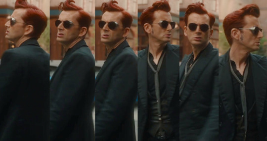
This show has treated us to something. Crowley does a full spin so that we can get a really good look at the hair from multiple angles. It's not that close up but still good. Thank you show and Crowley!
The sideburns are short. They are the intended shortness after driving. In turn, they are the shortest they have been up to this point in the present day storyline.
Short sideburns happen around human spaces most of the time, at this point in the story.
...
Brighter Red Streak Check
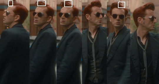
It's easy to think the brighter red streak is not there because of its position. The above image is brightened and more saturated with white rectangles to indicate where I see the streak.
I often find the streak above the center of his left eye and going up from his forehead. Here, the streak actually starts from his part on the top.
...
Hairstyle Changes
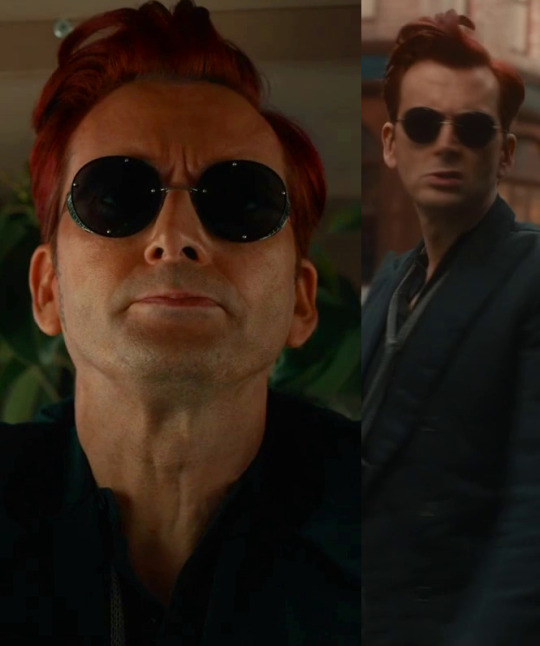
In both the Bentley and here, the top hair flared upward. Just outside the coffee shop, the flare has shifted further to his right instead of straight upward and lining up with his nose as it did in the Bentley. There is no extra saturation streak on the right side of his forehead.
Earthly Objects: The Perfect Entrance Trick
(For reference: Earthly Objects)
We have arrived at our first Threshold Trick!
This part is going to be very detailed because of pockets and thresholds.
Here are some GIFs to start us off:


This sequence is The Perfect Entrance Trick. Way, way back before I thought there might be an Earthly Objects game and was just exploring the sideburns, trying to figure them out, I remarked on my appreciation for the camera work and music for this segment. I always compliment those parts because they are so good. They contribute beautifully to the idea here.
While setting aside the Sideburns Scheme and trying to figure out Earthly Objects, I made a "Bonus Round" part of my main post because this sequence had me so amazed. It looked like threshold-only touches and avoiding earthly object touches, but I couldn't be sure due to some specific questionable things I will explore further down eventually. Nonetheless, it sure seemed to me like Crowley knows how to play the game as an expert, so if he is aiming for threshold-only touches, there must be something to his methods that gets the job done. These Threshold Tricks might even be special supernatural bonus points he's earning in the game.
My understanding of the game at this point in time is like so: In this sequence, they are threshold-only touches, but how are they threshold-only touches with this game's mechanics? That's what an audience player is supposed to figure out in the puzzle.
The Perfect Entrance Trick is actually the third Threshold Trick I found without realizing it because I did not have the words, "Threshold Tricks" for myself then. It felt like the first one I found when I was trying to understand Earthly Objects. I had already found The Bigger Thresholds Trick and The Door Trick without realizing they were Threshold Tricks too. I didn't have names for them then. I just knew there was something special about sideburns and thresholds so caught onto those parts. It took something more than weeks to put these ideas together because I spent a lot of time just thinking and making pictures while readying myself for making posts about sideburns.
Before we go over this particular sequence in more detail, here's something I think the game is putting forth as a challenge. The Pocket Trick is a hidden giant with a giant impact on many things. While I am at a point that I do not think I will ever solve The Pocket Trick to my satisfaction, I believe a significant one of its hidden messages is, "Pay attention to the pockets."
As stated in my main post for The Sideburns Scheme, pockets are a big, little thing in GO2. They are easy to miss and to dismiss. One should also pay attention to doors and windows, but because the pockets are so easy to overlook—even more than windows, it's a good idea to mind that message on pockets specifically all the same. Between doors, windows, and pockets, pockets are the hardest to see and to understand.
In Earthly Objects, a pocket can be a hole created by a character's body between their own self, part of the screen, part of an earthly object, or even part of a threshold. A pocket can be two or more characters surrounding something or someone on the screen in the framing. A pocket can be a character surrounded by things in the framing. A pocket can be the actual literal pockets characters can have on their clothing. That includes the ones we understand are actual pockets and even little holes the clothing can make on itself. Pockets are everywhere, but making sense of them for how they count, when they count, and what they count for, is another story. It is overwhelming—as if "think outside the pocket" wasn't hard enough in The Pocket Trick to begin with!
I think chances are good that pockets are somehow related to every Threshold Trick, and a big part of this challenge I do not expect to pass is to figure out how. That means I won't ever fully solve every Threshold Trick. So, I will pay attention to the pockets, tell you about the pockets, and admit freely, once again, my understanding of them is limited.
Okay, so here's the sequence in more detailed text form with paying attention to the pockets. It is very quick and heavily based on movement. Parts are also blurry. I won't swear everything below is correct because to play, I mainly have to guess based on clues.
With the car on screen before it is parked, I can find multiple different humans using pockets. However, one in particular catches my interest because he put his left hand in a pocket near where Crowley will park, and I recognize this human:
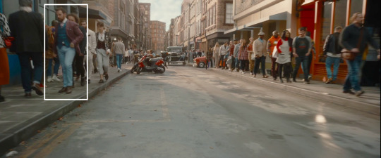
That guy shows up three different times in episode 6 during The Door Trick and The Door Catch. He is responsible or the Purple in the Rainbow Connection on Aziraphale's part.
Nonetheless, Crowley parks the car. The camera work is doing amazing things by going under the car, then around a wheel, focusing in on the shoes of the nearby humans before Crowley himself starts.

The door to the car opens, and Crowley touches the edge of the sidewalk with only one shoe. The heel is touching nothing behind it. The front tip is avoiding the rest of the sidewalk. That is the Single. The edge of the sidewalk is one threshold, and it was touched by only one shoe.
The camera pans up.

Crowley touches two different thresholds with his right hand. They are the window frame and the door panel for the door to his car. The fingertips avoid the window pane. That is the Double.
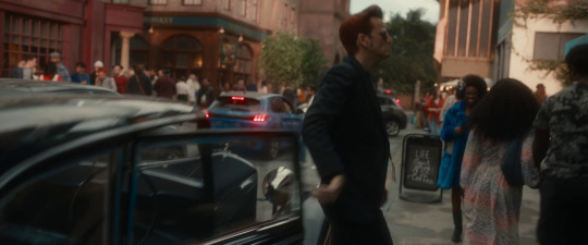
One of the tie strands becomes visible, including a clasp and a tassel. That's a thumb and thumb joint of one of the Tied Hands. Crowley's left hand moves forward such that the tie strand is visually in front of that hand. The left hand is important because it's the one that's going to do the Triple part of this Threshold Trick. I don't know the watch's role in pocket mechanics. It generally likes to be seen and seems to also watch things, like it's some kind of "lookout," but something more too.
Getting back to the left hand's movement with the tie strand, at the exact frame that thing happened, I can find a human visually behind Crowley's right elbow using a pants pocket with their left hand. They are wearing a white shirt over a darker one.
This part is a clue that this tie strand is going to be tied to the left hand and that it is the longer tie strand when both are seen together shortly.
Instead of moving ahead to get to what is going to be the Triple, Crowley has his back to the camera. He takes some steps and moves his arms around. I don't have it in me to log every pocket they make and close and what they might frame, but they do such things.
A light briefly pops out in one of the trees trying to communicate something, and I'm going with saying it's a little overhead light for Crowley since it's above his ear and to the left of his head.
There is a nearby car with red rear lights. These types of lights are often used to alert about a color switch in the Rainbow Connection when they light up a bit more. So, the main thing I see it to be an alert for is that pocket user already mentioned and knowing what we'll see soon for switching without an active Rainbow Connection. The pocket user is even pocketed briefly between these red lights. In fact, that overhead light mentioned above lights up at the start of when this human starts to pass the first of the two red rear lights. If those red lights mean anything else, I don't know what it would be.
When that human pocket user that was visually behind Crowley is finally completely off-screen, Crowley's left hand and the watch also go off-screen.
Crowley spins.

As he spins, both tie strands become visible. The longer tie strand is on Crowley's right. That means it is mirrored for now. The left hand becomes visible again too. During the spin, the tie strands switch. The longer tie strand becomes aligned with Crowley's left side. Generally, these things have a special mirror that flips through a Rainbow Connection Reflection, or whatever that Connection allows, in the Pocket Chain of The Pocket Trick. However, The Pocket Trick hasn't started yet, and this Trick is not linked to the Pocket Chain.
Well, without the initiating power of The Pocket Trick or a Rainbow Connection, it looks like a little spin switch is allowed this time.
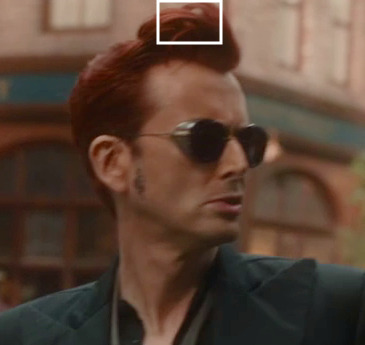
The belt—which is Crowley's Belt Head—also became visible, and Crowley has his mouth open during this spin. The vest tips are surrounding the Belt Head to have it pocketed between them. Additionally, the longer tassel tip just so happens to brush along the belt during the switch. There is even another self-made pocket of hair like there was for the newspaper door. With the movement, the vest tips and their pocket over the belt shift further towards Crowley's left as well.
The left hand and the watch hide behind Crowley's jacket. This action is part of closing pockets between Crowley's torso and both arms.
Crowley finally starts moving toward the door.
The right arm opens a pocket between his torso again, this time by itself instead of with the left arm.
The left arm forms a pocket between Crowley and the main part of the jacket.
The pocket between the right arm and jacket closes.
Soon after, the pocket between the left and jacket closes.
Then the left arm hides behind Crowley. In the blurred movement, that longer tie strand connected to the left hand pushes off the vest temporarily and becomes visible in the air. This action creates yet another temporary pocket.
In motion, all of these pockets amount to looking like pocket-to-pocket passes in the animated GIF shown further below.
Once the tie strand has presumably returned to where it belongs, the left arm is finally ready to make its move on the incoming threshold.

Crowley's left arm reaches out for the door panel. There is a lock that is extremely hard to see in the blurred movement, but it is there above the push plate. Crowley's palm of his left hand covers it completely. He pushes the door on the lock instead of the push plate.
Some video frames reach a nice, stronger clarity. Here is the one that strikes my own interest most:
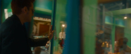
There are three digits touching the door panel. That's what makes this part the Triple. The index finger and middle finger are touching the front. Most of the thumb is touching the side. However, the ever so vital and important thumb tip is on the edge of where the door panel meets the window pane. Edges are thresholds, and pocket trickery loves edges.
The reflection of Crowley's left hand has pocketed the lock on the other side within the palm that is covering the covered lock. In other words, the palm has the locks covered.
The Tied Hands are making this acceptable because of their link to reflections. Plus, all those words I just had to write out because word play is a key mechanic for pocket trickery.
And there's more!
With the palm being busy with the locks, the thumb tip touches its own reflection while doing its edge touching. All of the digits, the real ones and the reflected ones are pocketing the door panel and its reflection because of their framing. Any issues with that window pane have been neutralized. There is a small bit of Crowley's right sunglasses lens past the door frame but not much.
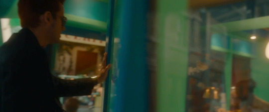
The watch takes over in the next video frame to keep everything in order because that real covered lock becomes slightly visible. The watch's reflective surface lights up to say that everything's still as it should be. Parts of Crowley's face—and more of the sunglasses themselves—visually passed through the door frame at the same time that real lock became slightly visible, so this threshold has been effectively tricked. We must recall the Belt Head had a role to play in the matter.
The Perfect Entrance Trick is the easy one! But the pockets have increased its difficulty immensely.
Something that is missing in this first Threshold Trick is a rainbow. Four of the others have one. The Sunglasses Trick does not, but it does have a notable white light reflected on the watch in its last touch. Rainbows can take shape through refraction in white light. The lighting on the watch here is not as white as what appears in The Sunglasses Trick. It has a tinge of yellow.
Well, Earthly Objects is a game with puzzles—and some silly puzzles at that, so I'm going to say that this Threshold Trick is excused because the Rainbow Connection within The Pocket Trick has not started yet. The Rainbow Connection starts in episode 2. In fact, the way it goes is that The Pocket Trick gets its official rainbow first. It and the other Threshold Tricks finish in episode 6. In episode 6 is where all of the other rainbows appear for the other Threshold Tricks.
The Perfect Entrance Trick is the only one that both starts and finishes in the first episode. It is the first of three Simple tricks. The Simple tricks are the ones that start and finish in the same episode.
Another way I like to play this game is that these Threshold Tricks are based on simple ideas even though they get so complicated—especially once pockets are known to be so important. I call these simple ideas "core concepts" because these things are indeed conceptual. While I don't like word play as much as The Pocket Trick does, I do like it some. So, let's toss some alliteration in here too.
My best guess for this one's core concept is, "Make a Perfect Entrance while making an entrance." The idea is also to introduce the Threshold Tricks. Each one is required to have a primary Single, a primary Double, and a primary Triple. A single is 1. A double is 2. A triple is 3. Add up 1, 2, and 3, and you get the number 6. That equation of 1 + 2 + 3 is what makes the number 6 a perfect number.
A standard set in Earthly Objects is 3 points. A Threshold Trick has a minimum of 6 points for its theoretical bonus rewards and must be done in this special format.
I had to look that up that part on "perfect" because that was the word I wanted to use to describe The Sunglasses Trick when I put those pieces together. I am familiar with the Tekken franchise due to a past stronger obsession with Devil Jin. In Tekken, a PERFECT is when a player wins a round without taking any damage.
So, once I grasped that 6 is a perfect number, for me, it was like "Oh! That's what the first one is! It has a name! It's a Perfect Entrance!" I had described it as a "beautiful entrance" in my Bonus Round section. Again, that took something more than weeks to figure out.
Also, David Tennant is perfect for the role of Crowley. I love this actor-character combination so much.
...
When Crowley enters and sits down, Aziraphale is sitting down, but there is no actual visible back of a chair for Aziraphale. I am reminded of Crowley's remark in episode 5 of "Looking where the furniture isn't." In one of my posts on Earthly Objects, I note this type of thing as a mysterious vendetta Aziraphale has with chairs. A lot of times, the back of one cannot be seen for Aziraphale. When he's in the bookshop and a back of a chair can be seen, his back will still not touch the back of the chair.
...
Story Commentary
Setting aside the threshold trickery at play in Earthly Objects, Crowley's open mouth could also be interpreted as him using his snake demon senses to find Aziraphale's precise location.
After the Threshold Trick itself is done, Crowley's body is briefly fully obscured, and suddenly the door's moving for him without his hands doing anything. The left hand that was on it is gone. He may as well be using telekinesis on the thing.
Crowley continues onward until he passes Aziraphale on Aziraphale's right. Aziraphale himself glances to his own left first, as that's generally where Crowley is expected for him. This movement also allows Crowley's body to be obscured briefly. He could even mouth something to Aziraphale without us seeing it.

The red on the back of the collar on Crowley's jacket is briefly visible before Crowley himself finally sits down and says, "Right, what's the problem?"
The car transformed a little. There's an extra part of a window frame on the window pane that wasn't there before.
...
Muriel
(For reference: Bookend Buddies - Crowley and Muriel (Part 2))
Muriel's first scene preceded this one. That makes their first scene the front bookend to the first Threshold Trick. Their last scene will act as the back bookend to the last Threshold Trick (The Window Trick).
In turn, Crowley's first Threshold Trick is the back bookend to Muriel's first scene.
...
That's it for this post. Way back when I started to track these things, I did have a tendency to update even these posts, so that could happen again, just FYI.
...
Main post:
The Sideburns Scheme
...
Past version of this post:
Post #4 (entering the coffee shop)
#crowley#good omens 2#good omens#good omens s2#david tennant#good omens season 2#good omens meta#good omens crowley#crowley good omens#crowley s2 hair project#crowley sideburns
60 notes
·
View notes
Note
how do you do the coloring in your art? its so good like im in awe!! the like... texture and color jitter is so awesome
Thank you so much ☀️🌻💛
I am still learning and discovering how to paint, so can't helpfully break down the process but most of my paintings are made in CSP with: - For 90% of the painting: Flat brush with Opacity Pressure (Hue jitter and sliiight Brightness jitter) - For details: Small round Brush, with Size pressure and slight Color Blending (blending is just a preference) (sometimes I add color jitter to make it look similar to the Flat Brush) - For nice big shapey shapes: Polyline, like lasso tool but you can only make straight lines. Lasso tool is also good, this one is just cleaner.

General advice: - Make as little of brushstrokes as possible, try to think more about the appealing shape each one of them would make. For this reason I also make Brush Rotation depend on Pen Angle for better control. If it's hard to do clean, cheat with a Polyline/Lasso tool to make a shape first and then fill it in. This restriction helps me personally to try and keep the paintings clean. - Learn to use RGB sliders to find harmonious Colors to the one you already have - References (you know them, you love to see them). I try to have some for real life lighting/materials references and how other artists try to replicate these lighting/materials in their works.
I have variety of style references on my pin boards for this particular type of painting that inspire me. If recommending a specific artist, I think it's Angela Sung (like a third of my style inspirations are of hers ^^) It's a bit of a rambly post and I am still learning, but I am happy to help, cuz online advice is how I learned to paint and draw myself💛 Good luck on your art journey ✨
#frong ask#art tips#painting tips#I am so sorry for a long and rambly post but I am full of anxiety because of approaching monday#hope this helps#thank you for kind words again 💛💛💛
12 notes
·
View notes
Note
I want to apologise for bombing your notifications with eevee reblogs
Though eevee does very much deserve it :3
i turned off notifications loooong, long ago on this blog. so they all got grouped together on one line when scrolling through the activity pane! but yes, eevee absolutely deserves it
hello, everyone! it's time for my basically-bi-monthly-at-this-point round of asks! i said i'd get better about answering these more often, but. well! here we are. maybe i'll do it this time! here we go:

for the most part, the models resource! there are a few other associated websites like this one, such as the spriters resource and the sounds resource, which are all incredibly good for all of your random-game-resource needs!

iii'm not sure entirely what you mean! for a lot of them, i do prefer to have the angles close-up and taking up the whole frame (as i just find this funnier), and it does depend on the angle in question. for the record, angles are voted upon in the front-facing pokémon discord server, meaning if you join there, you'll get to see multiple more angles for any given pokémon (and you don't have to say anything—or even vote, technically!). however, if what you're looking for is more head-on angles (as i've been told these were good for art references in the past), then you can reference the first round of the pokédex on this blog, which you can find by just searching any given pokémon's name! (e.g., searching the #rayquaza tag on the blog should give you a result you may be looking for, although looking at that angle now [and toucannon as well] i can see how these in particular may not be very helpful for art references) given the state of the original rayquaza and toucannon posts, i'll see what i can do right here:

toucannon, unfortunately, just genuinely does look like that from the front, no matter how much i zoom it out:

so here's a 45º-ish angle:

hopefully these serve your needs!

a concept i've talked about many times before! perhaps you need to read my tags more often! in short, i took up shiny hunting in scarlet/violet earlier this year, and in my efforts shiny hunting, i found that the game didn't like me very much, and would often spawn shinies for Literally Everything Except The Pokémon I Was Hunting. my flygon hunt was an especially notorious one, creating that clip that i believe i posted where i ended up with two shiny exeggutor spawning on the same screen while i was in the midst of shiny hunting the trapinch line. quite awful! i've come to call these shinies that spawn while i am hunting any other pokémon "evil shinies," as it's happened to me enough times to have a name of its own. i have maaany video clips of this very same thing happening to me multiple times, but lucky for me eventually i got all the shinies i wanted and just. stopped shiny hunting. now it's just something i do on rare occasions to pass time

this is… an interesting perspective! i guess looking at its older 2d sprites and its official art, the way that it's posed could… suggest this if you never really looked at it close enough. like that one post where the artist thought blaziken had big baby eyes because of the sprite. it's interesting how many different interpretations can arise due to the medium of pixel art!

sorry! that was a little issue with rearranging the queue– wait mamoswine is a retrofi—

oh! yeah, it was! that's… the only reason you didn't see it after piloswine, surely… no other reason…
anyway! that's all for now. my inbox is still lying to me about the number of asks in it, in case you were wondering..!
#not pkmn#it seems some folks only read Some of the tags on posts. as opposed to all of them. i wonder what it is that drives#folks to read certain tags as opposed to others..! is it the length? my tags generally vary in length quite a lot#sometimes i write entire Essays in the tags and sometimes i can't think of anything to say or i'm just Tired so i only write one or two#i've been told before that my commentary in the tags is interesting‚ so i‚ of course‚ kept doing it#and also because i Love talking#but i get comfortable thinking i can reference past tags in current tags and it turns out not everybody has the context i'd assume they'd#have if they were reading my tags… because i'd assume they'd also read past tags!#interesting conundrum!
10 notes
·
View notes
Note
every even number
hi hii skipped 16 n 20 cos i got asked those earlier
2. Do you do art in any professional capacity? (Graphic design, commissions, animation, etc.)
not right now—fooling around so I can develop more skills & maybe do freelance comics? one day I might reopen commissions but I'd have to adjust a lot of things in how I take them bc I'm otherwise really really bad at doing art for anything that isn't my whims
4. What's your least favorite part of the body to draw, if any?
lowkey beefing with buttcheeks lately. like I feel that I never draw the right amount of cake for whatever angle the character is standing at. pinterest I need more refs of butt and ass, it's for art, i promise im not wanking, hand it overrr
6. Favorite and least favorite angles/perspectives to draw?
now that im thinking abt it i don't think about perspective very hard... most of the stuff I draw is roughly around the range of human eye level or a bit higher (this is like. a full meter's variation of height.) because it's the most natural for human observers. of which i am one. most and films and photos and people i talk to & anything id use for visual reference are about at eye level height, thats a pretty normal level at which to see things
nott too good at worm or low level view EXCEPT i default to drawing shoes like youre looking at the soles near head-on. i can draw shoes worm-level all the fucking time. everything else i just dont rlly bother trying
8. How would you describe your art style?
faggy
jk. soft color palettes (relatively low contrast, strong color cohesion), thick colored lines, warmth, either soft warm lighting or hard vivid neon, sparkles, tendency to portray intimacy, not super clean/polished (messy, organic), uses textured/ streaky/ messily-edged brushes, lot of hatching or screentones
i do have particular stylizations for human forms but idk if it'd be worth trying to explain those in words?? forearms and forelegs are drawn like very long rhombus shapes, hands are kinda like a square with An Angle for the base of the thumb & fingers are often just grouped together as blocks with lines implying separate fingers, etc.
10. How do you deal with art block?
to not fall into it: keep drawing. do doodles as often as you can, carry a notepad around; I use mine to do gesture sketches or comic drafts for full pieces, because that's what I like doing—keep yourself in the habit. humans are creatures of inertia
draw what you like. Keep a list of things you like. draw exactly what you want when you want. Keep an actual list & record of things you find inspiring so you can look at the list whenever you need fresh juice
this one's outta steal like an artist by austin kleon: screenshot or write down every nice comment or bit of praise you get & keep it in a praise folder
be okay with some drawings not coming out as well as you hope. sometimes the anatomy just is not working, set the sketch aside, find a better reference (trace the reference for practice, redraw while referencing your trace), redo the piece later, or work on something easier or sillier for now. don't bang your head against the wall blindly trying to adjust anatomy for hours.
this might seem contradictory to what i said earlier but: if you're not feeling it, don't force it. fall back on your list of inspiration to see if you can get yourself motivated again, but if not, that's fine.
12. Ever participated in a multi-artist collaboration (3 or more) such as a multi-animator project?
yea i did a magi zine once & at least one hxh big bang
14. Do you prefer to make fan content or original content?
(looks at jangle & ais) both is good. i do lean towards fan content tho
18. Do you typically use filters on your art?
sometimes to adjust the colors, yeah, & I am really fond of using a noise overlay or paper texture. very occasionally I'll do chromatic aberration. i don't use em super extensively though
2 notes
·
View notes
Note
Hello! Could you possibly give a humble peasant like me some anatomy advice? The way you draw bodies and hands is just *chef's kiss* ;w;
I wish I had an easy answer for this... but for me what helped a ton was drawing A LOT. I've been working on this skill seriously for probably 25 years at this point. I am my own worst critic and know I have so much I can improve upon. VERY IMPORTANT, drawing from life (or photographs/video stills/screenshots/etc, *not tracing, photography distorts shapes*) has got to be my number 1 suggestion for how to get better with anatomy and drawing in general. Since it's hard to get out and do that a lot, my back up is photos. I particularly like finding photos and videos of athletes mid-motion because they are far more dynamic than staged photography). The studio classes I attended in college where we spent 6 hours just drawing models over and over again were a slog to get through, but the skills honed in them were invaluable.
I've gotten to the point where I can sorta fake it and come up with anatomy from my head, but I always try to find some kind of reference to back up my mental creation. REFERENCE is KEY. It is so so so important. There is no shame in using it, and I don't see the point in making a huge deal about *not* using it. That was a pervasive thing floating around back when I was active on deviantART a long time ago and it was not good.
Another thing to consider paying close attention to with regards to reference is drawing what you see, not what you THINK you see. Brains form biases that will interfere with what you're trying to draw. I've flipped references upside down to force my brain to recalculate as I go for this reason.
Any step, no matter how tiny, is a step toward improvement. Even just going out to a park or something and sketching whatever crosses your path is great. Or you could do the same thing on the computer while you watch videos or look at photos. Animals, people, trees, plants, whatever. It'll all help you improve. And don't worry about accuracy at first! Just draw whatever gestures come to mind. Like 99% of it will look like scribbly garbage (it did for me and a lot of my peers) but it does help. Hands, in particular, are really hard. Very early on in my artistic path I realized this and kind of became obsessive about drawing them properly, so I drew a *lot* of hands. Whole sketch pages of just hands. The great thing about hands is that you've got your own! You can just draw the hand in front of you, or take a picture of the gesture you need and use that as reference. Many places will have studios open to the public where you can do model/life drawings (some nude, so if that's a concern, be sure to check first). Some will be free, or you'll have to pay some kind of fee (they need to pay the models). One free online resource that's good is Posemaniacs.com. I highly recommend the 30 second drawing tool, wherein you only have 30 seconds to sketch out the reference before it cycles to a new, random one. The extreme time limit forces your brain into overdrive and it is shocking how quickly you can improve as a result. We did this in school, as well, with live models. They'd just switch up poses every time a timer rang. I could probably go on for hours about this, there's a lot of jumbled thoughts coming to mind, but I think this is a good starting point. Persevere, don't seek perfection, and treat yourself kindly because this is a skill that requires a lot (mentally and physically) to hone and it isn't easy. Every artist has their ups and downs, but I think it's worth the struggle to be able to create. I really hope this helps! Thanks for the ask! A little bonus snippet: Back in high school I was *terrified* of drawing people because I sucked ass at it. I was garbage. Absolutely refused to do it. I drew animals and dragons and gryphons and stuff and when I started angling toward my career I had assumed I would continue in that direction. Nope! Now I'm drawing pretty much nothing but people/humanoids and I love it.
8 notes
·
View notes
Text
#002: AtsuHina Exchange - Baseball
Date of completion: March 16, 2024
Program: Clip Studio Paint (iPad)
My piece for the 2025 AtsuHina Spring Exchange! I was feeling so warm and grateful for the community that I wanted to pour everything I had into this. Check it out on AO3 along with the rest of the amazing collection! Everyone here is so nice and talented, I can only hope this gives back a little bit!
Notes:
So... I know nothing about baseball! I started out trying to plan a whole thing in my head, like what positions they would all play, what scene I could draw that was more atshn than just MSBY/team dynamics but still more baseball than just slapping them in a different uniform (even if that is a little bit what ended up happening), etc., but I could tell I was going to think myself to death if I didn't just pick an idea and stick with it, so I went with a post-game celebration!
And when I say I know nothing, I really mean it qvq Pinterest ended up being my bestie for finding inspiration and references, and then I saw a pic of a gatorade shower and hubris said "I can paint that!!" and the rest is kind of history.
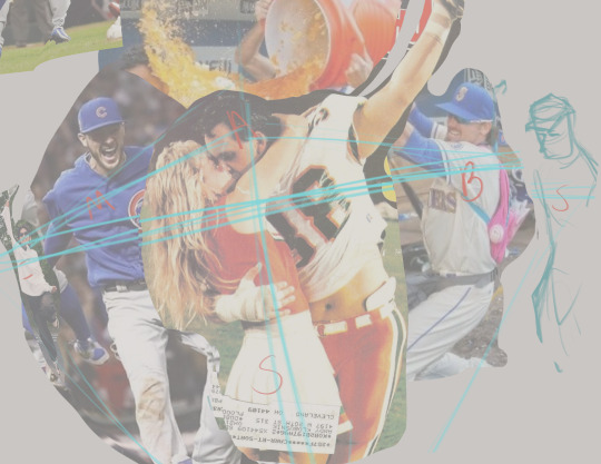
Composed everything using a collage of reference pics first, just going off of vibes until things felt right proportion- and perspective-wise
Loosely planned out background elements and adjusted poses to create implied or real lines that would point to atsuhina's faces as the focal point

A little layer management goes a long way, so almost every layer was named or sorted into a folder
Every character got a base fill, skin, hair, black, white, and gold layer. The brush I use blends color a lot, so I decided not to use separate shadow and light layers in this workflow
The group of uniform colors is marked with red so they'd be easy to see while scrolling through the panel, and lineart layers are marked in blue for the same reason
Once established, palette colors were added to my color mixer for easy access
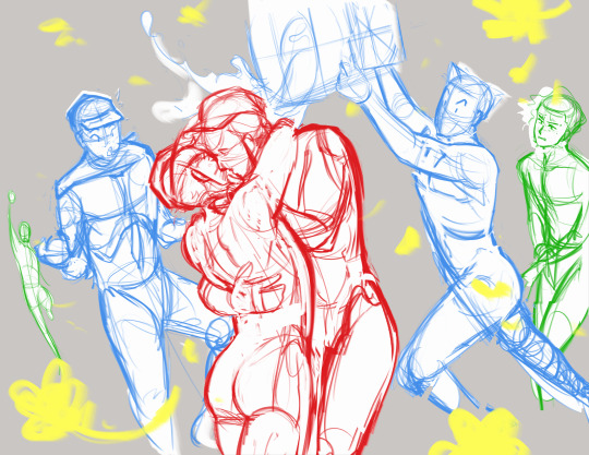
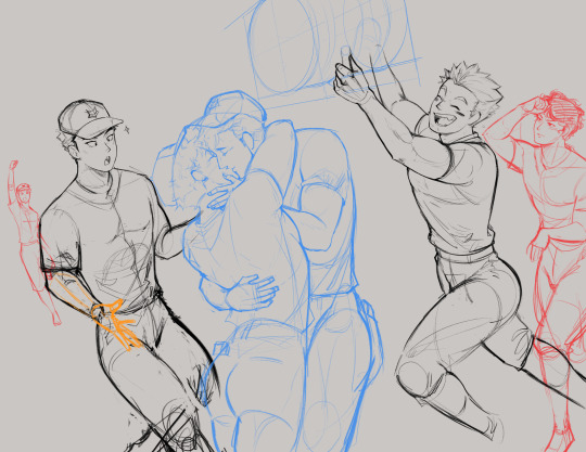
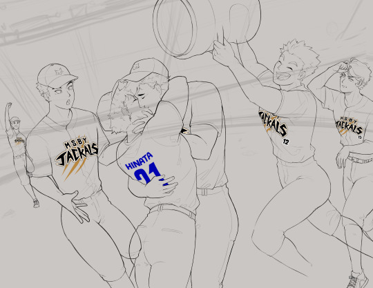
Usually am more of a sketcher/one sketch straight to lineart person, but this time I put a lot of attention into refining details over multiple sketches
Eliminated a lot of guesswork before going into lineart this way, and realized important details like the exact pose and angle of Meian's hand and atsuhina's lips were lost in the mess
Most anatomy is drawn from reference, but adjusted according to the character's body type or modified for a more appealing silhouette (Shoyo in particular had to be thickened up a lot. And caked up lol.)
Sakusa wasn't drawn from reference and maybe it shows... I also had to change his pose because I realized he was looking a little... homophobic.....
Meian also got changed because, for some reason, he just didn't feel like Meian?? I think I also didn't want him to look too surprised at the kiss, more like an "Oh! Finally!" reaction
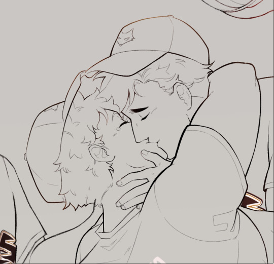
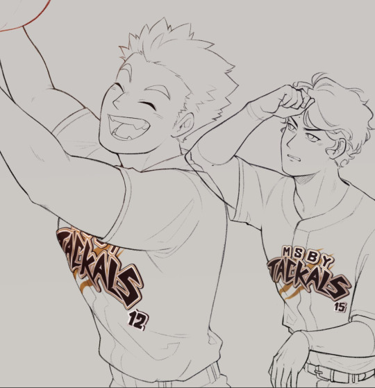
Focused on lineart to strengthn one of my weaker skills. I have a difficult relationship with lineart because I love sketching and most of the time don't color what I make, but I also don't have a good workflow without it... Plus for something polished like this, I didn't want to leave my lines rough like I had been
Atsuhina are drawn with the default Real G-Pen brush so they're a bit more crisp while still having texture. Everyone else is drawn with the HB Pencil brush I use for refining sketches, so they look softer
I've heard that thicker lines = closer to camera, and thinning lines where two objects contact each other show that they are touching better, so tried to apply this in my lines
I have a naturally light hand, so tried playing to my strengths with very thin detailing
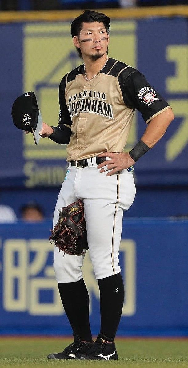
A lot of inspiration from this player and uniform when designing the Jackals baseball uniform!
It's impractical because black would get too hot to wear in the sun, but I wanted to keep the Jackal primary shirt color black, white pants, and gold accents
Only knew I wanted the end of their sleeves with gold trim, otherwise gold accents were added wherever it felt like I needed to break up the black. Putting gold into their socks was a little random, but I really liked it!
Inunaki's hat is colored differently because I originally thought the back should be gold with black in front... Then decided it looked better flipped, but Inunaki should stay black in front so it wouldn't be too distracting to have a lot of light colors there
Graphic design is not my passion :( But I try, for atsuhina
Entire Jackals lettering was based off of the two letters we see with the official logo
Tried to analyze where straight vs curved lines were used, the asymmetrical shapes, and the sharp points
Designed the logo on its own much bigger than I needed so that I could shrink and mesh it around without losing quality
Mesh transformation to get it to approximately the right shape, then finished using liquefy
Adjusted lineart where it curves around the body to make it look 3D like a sewn on patch
Decided on background details using reference pictures, designed the ads based on vibes/whatever I wanted at the moment! Even the "refined" sketch was loose and more for placing elements than anything
Fun facts: the sign under the screen originally had katakana for "rope bunny" because I didn't know what to put... then I got embarrassed realizing people can in fact read that and that it would be the only fully visible ad, so it got modified to "cope bunny" lol. If I had thought it out more, the "strongest dog"/"gleaming cat" signs would've been a fox and crow... Bouncing Ball and Pocari felt like they had to be included, but the easter egg I like most (and that ended up completely covered) was "Unmei Thread", just romaji for "destiny" + thread. That's Their Thing!!!
Starting furthest back in space to the front (in order: the sky and blocking in overall color transitions, the screen and ads in the back of the stadium, seating areas and crowd, grass, fence and ads, tufts of grass detail over the fence)
Struggle with freehanding architecture, so using the poly lasso tool until I have more practice. It gives it a unique sort of look, right? I think it's good for keeping things simple and "low poly"
Focus on shapes and selecting areas then adding color variation with the airbrush, or other brush as needed. Everything is done on basically one layer, so it's good to have brush variants like a Multiply/Highlight airbrush to make more interesting colors
This background technique is something I've been working on since I experimented with landscapes for a printmaking class. I was surprised to find people were actually drawn to the geometric style?? Been getting surprises lately that people are drawn to things in my art that I don't think are noteworthy at all

Tried out a different workflow! Where I usually focus on one character at a time, this time I tried painting everyone's skin first, then hair, then uniforms. I catch myself wondering how I got a certain look before when I work on a piece over a long time, so with so much going on it just made sense. I think I'll stick with this going forward!
After everyone was colored, used adjustment layers and a very light warm overlay to harmonize them more
Color saturation and luminosity: Areas of high saturation and contrast naturally draw the eye more, so I reserved these for atsuhina's faces and kept lighting/shading relatively subtle elsewhere
Sakusa and Inunaki in particularly were desaturated and painted over with blue from the background more to push them further back in space

In my sketches I favor hatching/contour lines a lot, and the delicate nature seemed appealing, so I tried bringing that in for rendering
Areas where its harder to blend colors smoothly or where things needed to be sharper, I used a very small size of my rendering brush to add hatching for texture. It's also good for darkening shadows or brightening highlights without being overbearing
If anyone wants to be an art nerd about it, that technique is probably classified as "optical mixing" where the viewer's eyes blend colors instead of blending them explicitly

Looked alright in the sketch then when it came time to render it turned out to be very hard...
Eventually approached with the idea of following "flowing lines" and staying mostly loose with it, just defining a couple spots where water would be splashing up
Followed this idea of "momentum" to block in shapes and large droplets with the Oil Brush
For the impression of a spray of tiny droplets behind Atsumu's head, I used the Dry Gouache brush, lightly brushed in the area with a large size, then erased out chunks or went back in with a smaller size of the brush to define the shape further
Oil Brush for more little details, especially highlights, until it looked alright
Airbrush set to "soft light" mode to give the effect of water "catching" in the droplets, then Droplet airbrush for larger drops into the Spray airbrush for very small but sharply defined particles
For the few rendered drops and happy tears, they were blocked in with white using the Oil Brush, erased in the middle, soft airbrush for the shadow of the highlight, highlight drawn in, then the "soft light" airbrush again in white lightly over the highlight
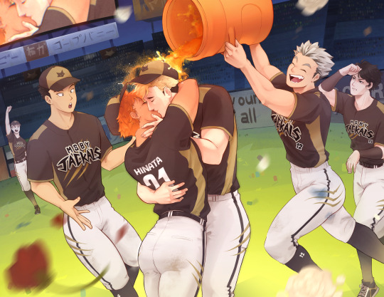

Raw image on the left, final on the right (Not blurry Sakusa exists!)
Spent much more time and effort than usual in compositing for this piece
Bounce lighting airbrushed over the characters from the grass, skin, orange keg, and pants. Light/bright colors will reflect more light while darker colors absorb more light. The airbrush can be large and loose too since bounce light scatters a lot.
Atmospheric perspective added to the background to push it further back
Nondestructive process: Creating flattened/merged copies of the background and characters to blur/use for other effects, and using masks to decide where effects would be applied without permanently erasing anything
Blurring areas aside from the focal point makes the focus very clear, and very light motion blur was added on Meian and Bokuto's legs
Blurred copies of the characters set to "soft light" mode at a low opacity gives a dreamy/soft look
Additionally, I had done a confidence building piece a little before I started this, just to remind myself that I'm most capable when I just go for things without fear, and to test drive some techniques before employing them for the first time on a work I considered much more important. I practiced some rendering techniques, giving the impression of lights, the dreamy glow effect, and reminded myself of things I often forget while making backgrounds, like working back to front and how messy my freehand gets haha.
Honestly, the process here looks long but it was a lot of fun! A lot of my weaknesses came from me just not having stamina to keep focused for a long time and lacking experience in certain things. if it takes a long time, it's because I haven't practiced enough. I want to study anatomy again and practice painting muscles more since my knowledge on the subject is fading and I'm scared of settling into what's comfortable instead of what's good.
In the end I'm not sure how to feel about this piece? I think it's good, definitely one of my better works, but after sitting with it for a while I can't help but think about what I wanted to do better. I think it shows some of my general weaknesses as an artist where I get absorbed in details and forget the bigger picture. I failed to plan properly and didn't take time researching different compositions, so I think in that respect it looks flat. I have resources for studying composition but feel intimidated by it, but it's one of the largest foundations of art so I have to try...!
I don't criticize my work to trash on it, but I do need to acknowledge where I could do better to set goals for the future!
2 notes
·
View notes
Note
I know you don't do hate on here and I really respect you for it - you're one of the very few accounts, that, despite avidly supporting one particular driver/team, does not go out of their way to shit on the other ones. This makes your race analyses all the more enjoyable, as I can always use them for reference, even against people that try to start fights on the topic of driver vs driver - I know you will always be taken seriously because your takes are as objective as possible (the only subjectivity being a sprinkle of extra praise for Charles here and there, but hey, he deserves it!)
All of this being said, however, I need to ask your personal opinion of the McLaren boys as drivers and as personalities - since as another die-hard Ferrari fan I cannot stand McLaren as a team but have found myself being fond of Oscar on occasion and ugh I just wanted to see if you get the rare flashes of affection too, because it feels almost sacrilegious to say that about a McLaren driver.
Anyhow, love your account, keep up the great work <3
Ah thank you so much, I have my opinions etc, but unless it becomes relevant to what's happening on track there's no point in just trying to knock other drivers, I'd rather spend my time enjoying my team and my drivers than anything else.
On the Mclaren line up, I do very much like Oscar, he's a good driver and I find him extremely relatable to me personally, it's just a shame he's in that orange team. But I get it, he wants to be in a good car and Mclaren are currently the ones able to give him that.
Lando isn't my favorite, I just don't vibe much with his humor.
As a duo they seem fun, I enjoy them on the rpf side of things, for those unaware I am a fic author (pretend to be shocked)
But yeah I can separate them just as people from the team. But I can not and will not cheer for a Mclaren driver to win or be on the podium
I like a lot of drivers. I respect good race craft, if you are good on track chances are I am compelled by you.
You can like a lot of drivers, but there is a difference between liking a driver and who you actively support during races. I like Oscar, I like Max, but on track I am cheering for one man to win and that is Charles, and if not Charles then Carlos because he is in red. I want red on the top step before anything else.
Also with objectivity. I don't post the most objective things, what I try to do is look at what actually happened and figure things out from there, with the goal not being to post my first emotional response but rather to take a step back and see it from there. I don't like the way a lot of narratives get spun about races. And I think a problem in F1 journalism is a lack of transparency when it comes to bias. I try to combat that by being abundantly clear where my bias stands, and where analysis crosses more into opinion. That way a reader can take or leave what I say and have no real doubts about what my angle is on a topic. There are a lot of journalistic outlets that have a clear bias, but because they will never admit it, what they say can be very misleading to a lot of people.
I am very much of the belief that no driver is above critique, and I want when I critique someone to matter. That doesn't work if I am bashing them weekly over nothing. Yes even Charles, if he makes a mistake I will point it out (not my fault he's just had a stellar season with no glaring errors yet. There are few things that maybe could have been better, but my man has yet to stumble) Does that make sense? Like when I do point out an issue with a driver I hope that the words will carry real meaningful weight.
Thank you so much anon, the support truly means a lot <3
17 notes
·
View notes