kheprrison-arts
2K posts
| Michael | 19 | they/them || Hobby: Artist/Writer | | Reblogs art and tutorials | Posts original pieces || Please don’t repost my art w/o my permission | | Originally “Maiatanfallan-arts” |
Don't wanna be here? Send us removal request.
Text

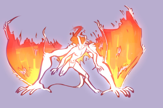
Couple doodles of Grymll'Voken, testing out ideas with his wing-arms. I decided the wing membrane is gonna be fire-based like their hair and honestly?? looks good. I'm really liking the direction I've been taking them lately so I'll probably mess with them more and post updates when I decide they're are ready.
8 notes
·
View notes
Text


It's been sorta hard for me to get back into drawing. Haven't drawn much since mid-April I think. But I did have an idea for some story stuff, mostly a behemoth-class monster. Plus a doodle of Liam lmao.
It's also been a long time since I animated as well, so I decided to start a small little thing while I had my motivation back. Some frames in my little outline kinda skipped coz I messed up a few that I made on accident. not even sure when that happened but that's ok! the colored stuff was mostly just for me LOL
Hope you guys like my current mediocre art :)
#digital art#animation#krita animation#krita art#character design#monster design#sketch dump#my art#my ocs#William Lowe#Grymll'Voken#sorry if the animation is kinda of scuffed avnjksnvjsav#i have a couple more [older] doodles i may post sometime this week if i remember#liam may not be THE tumblr sexyman but he is MY tumblr sexyman
12 notes
·
View notes
Text
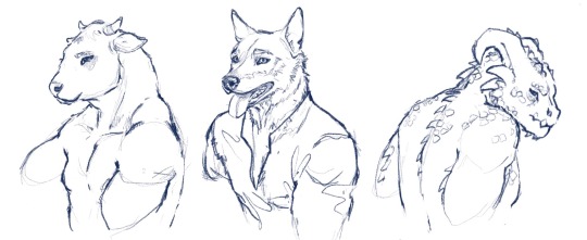
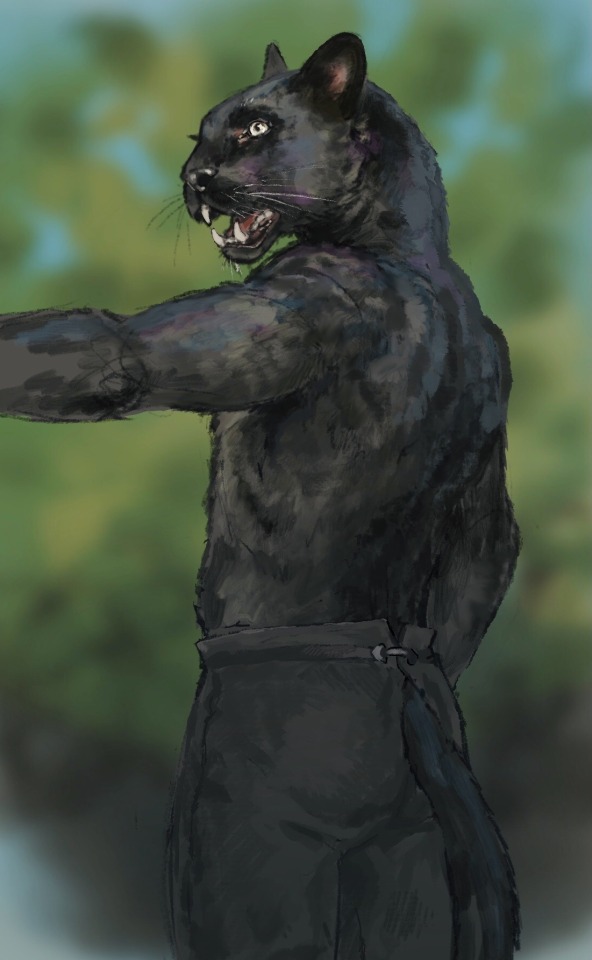
I just had some...thoughts... about sticking animal heads on human shoulders. Bear with me.
I think the reason some anthros look really strange (I’m looking at you, Skyrim) is because animal skulls don’t attach to their spines the same way ours do. Our spines and skulls are very vertical, but many animals’ are closer to horizontal.
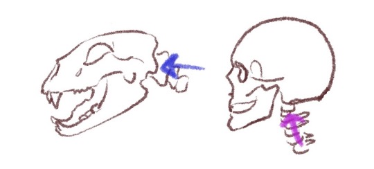
Some people solve this by giving the animal skulls a human skull shape on the back. But, to me it makes them look somehow bald(??) and just kinda weird in general. If, instead, you change their necks to curve so that the spine still connects where their four legged counterparts’ do, they no longer look yucky! (And also don’t need a hair-do!)
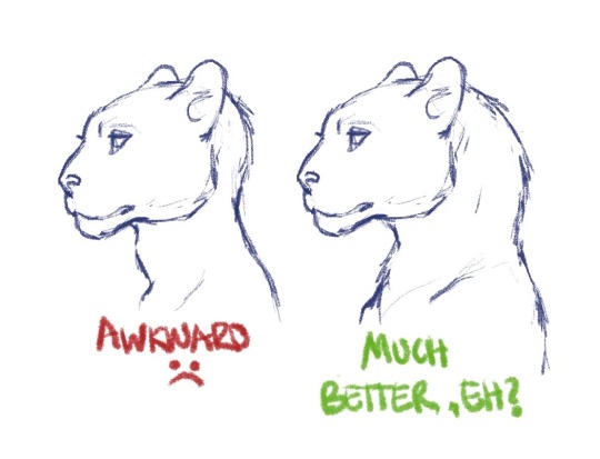
This seems especially applicable for animals like big cats, cows, and lizards — animals whose spines attach very horizontally to their heads.
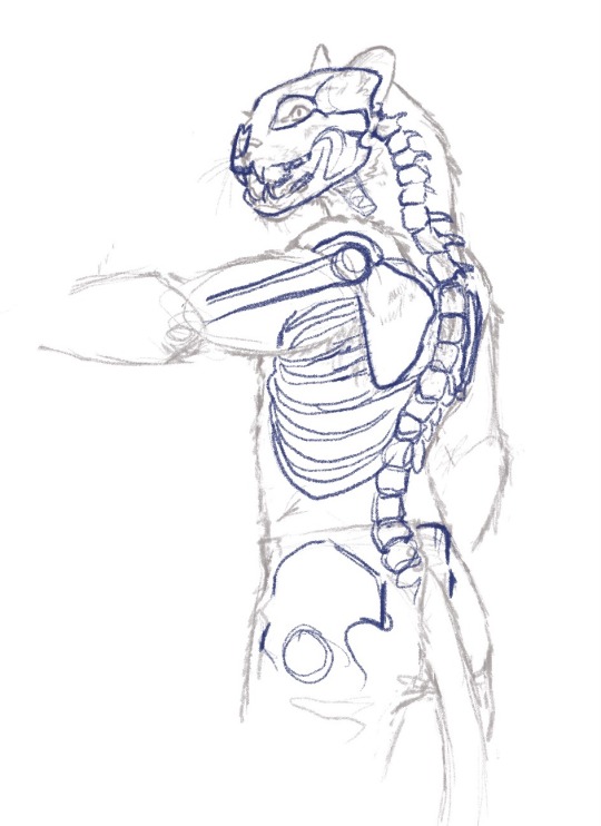
Anyway, enjoy some more art I did while having these very specific thoughts.
56K notes
·
View notes
Text

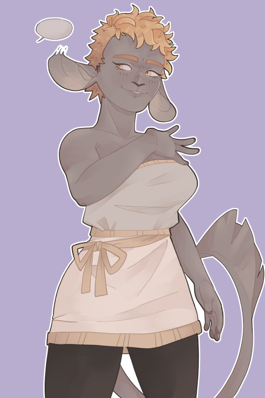

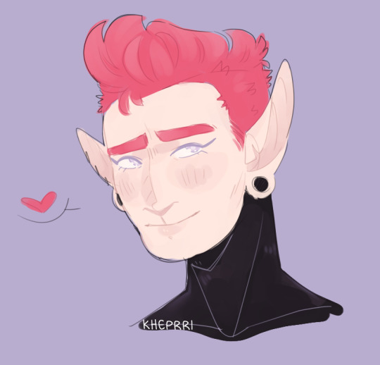
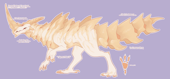
Some doodles of Platinum, his wife, Maiatan, and the Uro-Kuro who is an endangered species native to the Krezent region.
With the busts, I wanted to mess around a bit with style and coloring. But it's nothing too crazy.
#digital art#clip studio paint pro#character design#monster design#my ocs#my art#Platinum Uriborle#Sele uriborle#Maiatan fa'llan#Uro-Kuro
15 notes
·
View notes
Photo


Clay’s been caught snooping so there’s really no reason for William hide behind his soft facade.
34 notes
·
View notes
Text
historically, pixel art was rendered on limited hardware, there were strict limits on how many colours could be displayed on screen at once and in a single sprite.
These limits no longer exist, so you are no longer beholden to any of them. Despite what you might hear in certain pixel art spaces, there aren’t really any rules anymore, because there’s no technical limitations forcing you to work a specific way. You can make your pixel art have as many colours as you want, be whatever size you like, and have as many frames as you want it to.
However! the smaller you make a sprite, the harder things will become to read unless you shrink down the number of colours in equal measure.
In a photo you might have. i dunno. 1,000,000 pixels in it or something like that. Thats like a really small photo but that’s still so many pixels that you don’t really notice any of them individually. They all blend together into one big mass to tell you what you’re looking at in groups of hundreds!
On the other hand, in a 16x16 sprite you’ll only have 256 of them. Every single individual pixel can have something to say!
But if every pixel is trying to say something at once, it muddies the sprite and makes it hard to read. However, if a group of pixels are all the same colour, they’re all saying the same thing, and it becomes a lot easier to understand what you’re looking at.
like, for example, take a look at this 16x16 crop of a random photo.

does that look like a whole lot of nothing? yeah . theres 256 pixels, and theres 256 colours. the pixels aren’t really working together to tell you anything, so instead it just becomes one big vague mass. if i reduce the colour count to just 6 colours and increase the contrast, though,

it starts to look less like visual noise, and more like water at sunset!
The contrast is important - part of why you want to keep your colour count low is to make groups of pixels distinct from each other.
But, how exactly do you keep your colour count low, anyway?
a colour ramp refers to the gradient of colours in your palette that are used to shade one particular colour, such as tempests hair or her skin
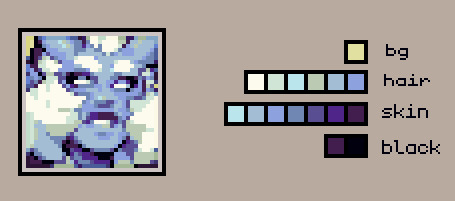
instinctively you’re probably going to want to make individual gradients of colour for each of these things.
however, if you connect these ramps together, you can greatly reduce the number of colours you’re using in your piece. This also helps create a cohesive palette!
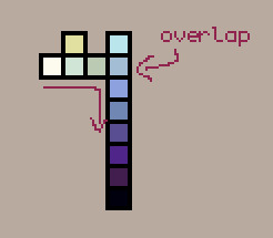
when it comes to connecting ramps, value matters much more than individual hues. you want to have a good range of values to have a readable sprite!
I think actually a really good example of value mattering more than hue in sprites, is this guide to anti aliasing by pixeljoint user ptoing
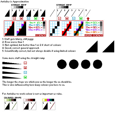
also just generally good advice, but take a look at this bit in particular

despite the wildly varying hues, they work together just fine. by focusing on the value when you combine your ramps, you can create some really interesting colour palettes!
anyway. now for some vaguer notes on how i do lighting
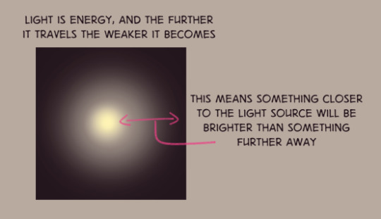
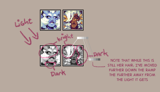


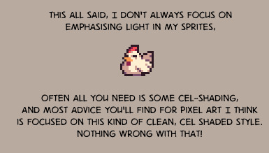
anyway thems just some thoughts for you all
15K notes
·
View notes
Photo
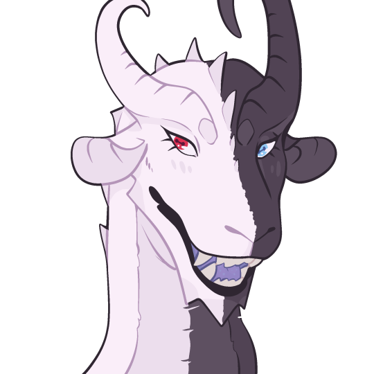

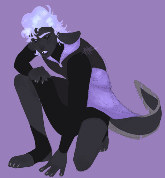
Some more funky doodles!
Icon of my boi, Toai. Half-body of Cerys, my vampire man. And a full-body of Rahlis, one of the gods of my main story.
I’ve been in and out of working on personally stuff and commission work. The icon was made while waiting for approval to continue some sketches for someone. Or I’ve just been playing games at night lmao.
#digital art#original characters#Dragon#clip studio paint#procreate art#my art#my ocs#Toai#Liam Cerys#Rahlis#also yes Cerys does have my obnoxious watermark on it
2 notes
·
View notes
Text

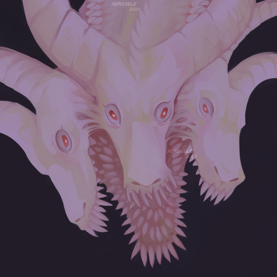
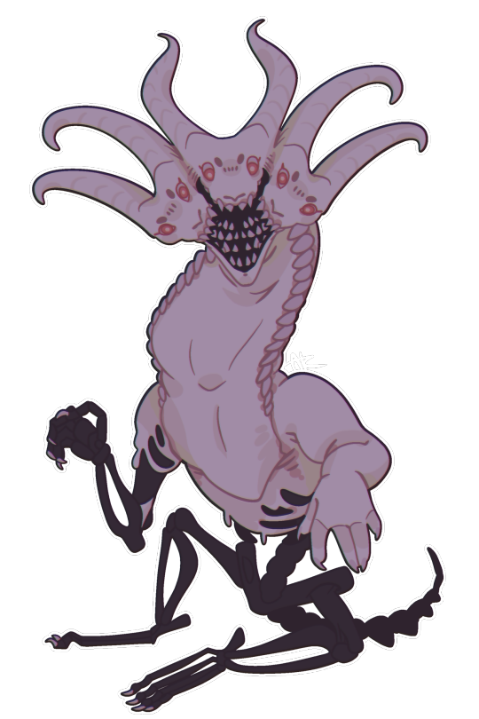
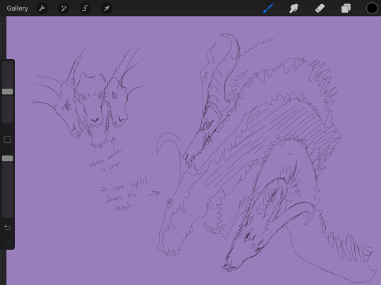

A new OC I made a few weeks ago finally got a reference done! I also included its early sketches. And also a chibi because I NEEDED a chibi of it.
Its name is Osiris, created as a last-resort vessel for a power-hungry man who’s devoted his life into becomming a god. Osiris was never finished, though that obviously doesn’t stop its creator.
11 notes
·
View notes
Link
Uh okay so I know I’m not active often but I’m hoping to be now that I’m working on my og characters again.
But if anyone is interested in any adopts/character designs for sale you can check out the link in this post. There are individual folders for designs on sale for USD, Trading for other characters, or just for offers of anything including art.
Feel free to DM me if any interests you <3
33 notes
·
View notes
Text

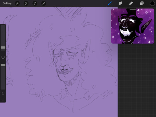


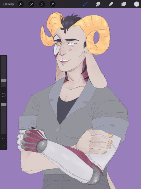
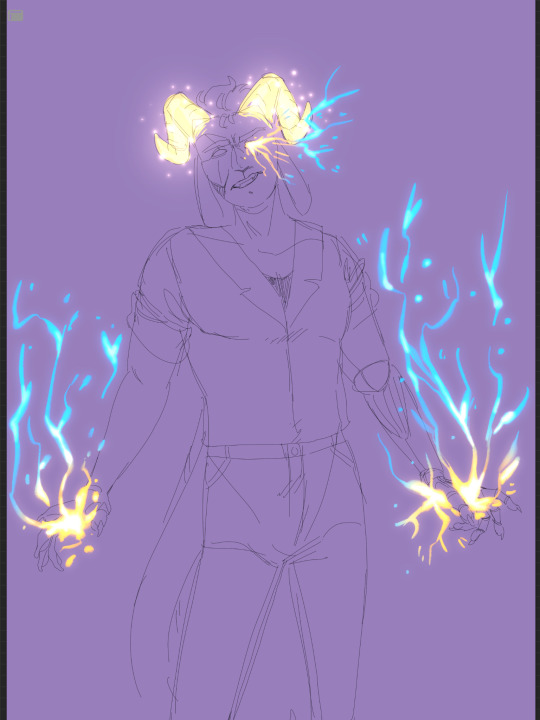
Wowie its really been a while since I’ve actually posted my art here. But hey, that’s alright because the hiatus from this blog gave me plenty of time to improve since I last posted!
It really also has been a while since I’ve drawn my og characters so being able to see them in my current style just fills me with so much joy? Its wild.
You can probs tell who my favorite is…
#digital art#original character#character design#procreate art#my art#my ocs#maiatan fallan#platinum uriborle#selenite uriborle#aeregele karmen#vendryk karmen#its platinum /// hes my favorite#anyway i do plan on maybe posting future adopts here (bunny themed)
5 notes
·
View notes
Text
✧ simple tips for how I draw full beards ✧
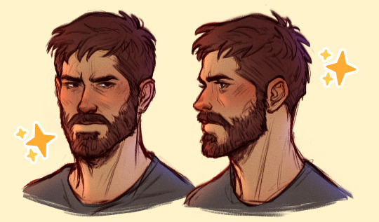
[ I don’t take tutorial requests, so please don’t ask for more! ]
Keep reading
2K notes
·
View notes
Photo
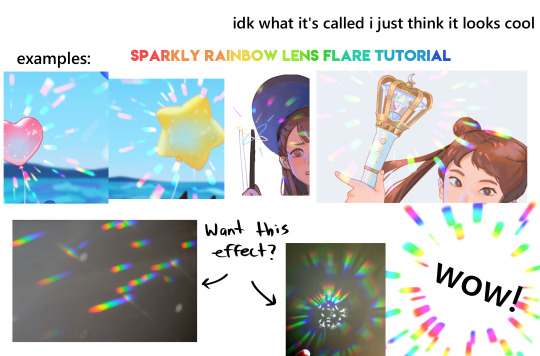
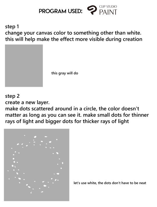
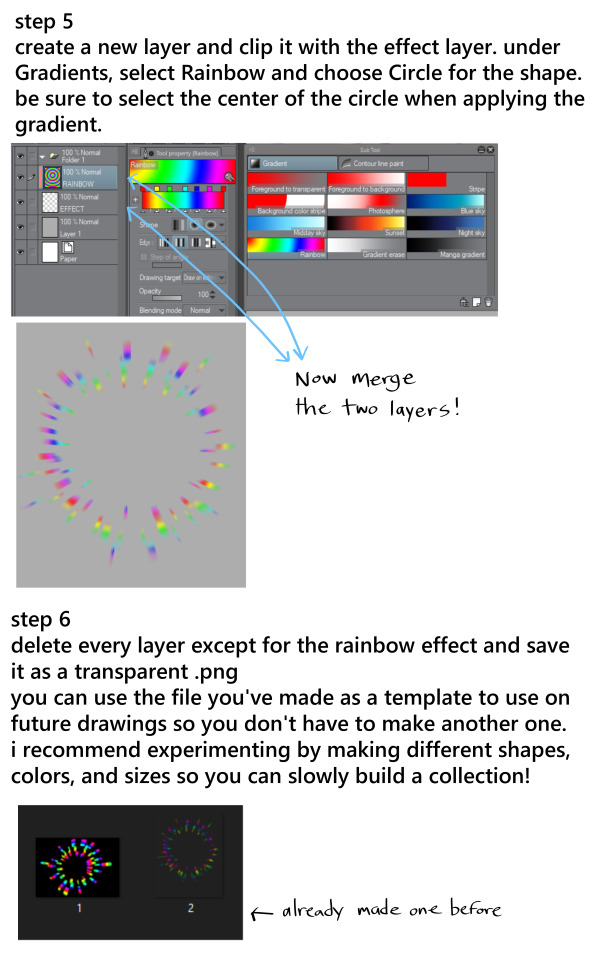
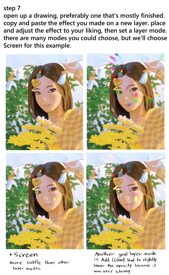
another art tutorial post :) this time it’s for rainbow effects
27K notes
·
View notes
Photo

This Feeling’s Tearing Me Up - Submitted by meowstic-seer-of-the-future
#73BEDD #F8ADBB #FFF7EC #D9CFC5 #565153
2K notes
·
View notes
Text
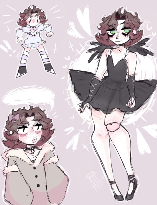
God, I absolutely love this boi so much!
His colors are so soft and he’s just an absolute baby. Keep up the amazing work, I absolutely adore your style and character design!!
40 notes
·
View notes
Photo
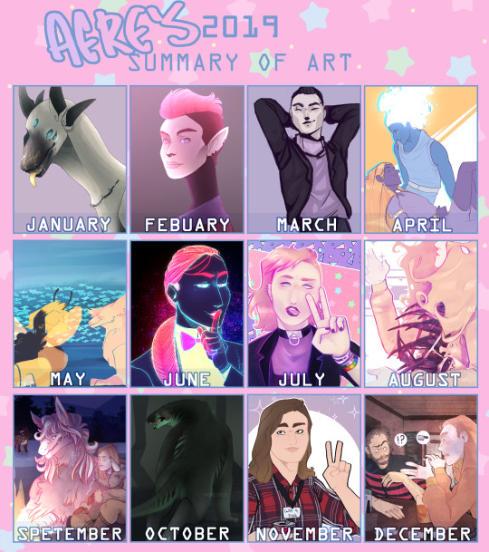
Summary of my art this year. I think out of every year I've drawn, this has to be my favorite year. The improvement may be small or not obvious, but even then it's still very important to me and makes me happy with how far I’ve come.
I don’t think I could've gotten as far as I did without the love and support of my friends and the ones I love. Thank you so much <3
1 note
·
View note
Text

Sorry if this isn’t the content you wanted from me but I made a meme.
If you know, you know.
#@ that one person who thinks they can loophole their way out of my custom prices#meme#shitpost#my stuff#no context
4 notes
·
View notes
Text
Launching the Color Palette Generator!
We now have a total of 3 artist utilities! Idea Generator + Reference Boards + now Color Palettes.
Click space to fetch more palettes! I linked my article on color theory that contains more resources & generators as well.
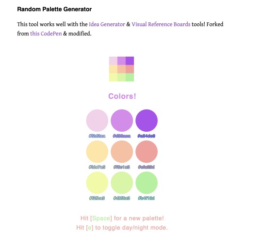
Make pretty palettes today! Thanks for looking!
If this tool helps you, please consider reblogging it or sharing it with your friends! It helps keep this place alive! ❤️
More useful articles and resources / support Art-Res | my art tumblr | Idea Generator | Check out the Art-Res Anatomy Ebook!
6K notes
·
View notes