Don't wanna be here? Send us removal request.
Photo

Usually I prefer pickles with my whiskey... But tonight, an eyeball will do. So long as it's cold.
Had a lot of fun trying to capture a moment in movement through vector design. Got to practice 4 different ways to incorporate a texture to my vectors. Most through clipping masks. Also, found out the most effective and versatile way to add texture. Especially without slowing my computer down by thousands of anchor points in a vector texture compound layer. It was great practice!
#vector#vector design#vector illustration#flat#flat design#flat illustration#graphic#design#graphic design#adobe#adobe illustrator#whiskey#eyeball
14 notes
·
View notes
Photo

Did a quick remake of my Nintendo Mii in Adobe Illustrator. I've enjoyed watching the evolution of their avatars. I love that no matter how modernized, they still keep that same silly Nintendo feel to them.
#vector#vector graphic#vector design#vector illustration#flat#flat design#flat graphic#flat illustration#graphic#design#graphic design#adobe#adobe illustrator#nintendo#nintendo mii#avatar
3 notes
·
View notes
Photo

Made an even more simplified Commodore 64 graphic. A 70's lookin version (even though they came out in the 80′s).
I’ve been really enjoying exploring different vector style in Adobe Illustrator. It really allows me to deconstruct ideas, and find challenging ways to simplify them. Problem solving at its finest. Now onto more vectors!
#vector#vector graphic#vector design#vector illustration#flat#flat graphic#flat design#flat illustration#graphic#design#graphic design#commodore#commodore 64#old computer#floppy disk#joystick#tack 2
14 notes
·
View notes
Photo

I wanted to dive into some nostalgia and recreate a Commodore 64 in vector. I have so many fond memories of ours, growing up. We had so many floppy disk programs and games. Dig Dug, Spy Hunter and Lemmings were some of my favorites. But we also had a program that allowed you to make music. Back then, computers didn't have the ability to create sound like they can now. They created sound through an SID chip (Sound Interface Device). Which we would call chiptunes today. So all the music we'd make would sound like an old video game, and that made it even cooler. I'm determined to find an emulated version of that program.
#commodore 64#commodore#old computer#vector#vector art#vectore design#vector illustration#flat#flat art#flat design#flat illustration#graphic#design#graphic design#adobe#adobe illustrator
78 notes
·
View notes
Photo


had to get a lil monsta out of my system... let's be honest, I really wanted to play around with Procreate in bed 😅😓
3 notes
·
View notes
Photo

There are few things magical in this world, BBQ is one of em
#vector#vectordesign#vectorillustration#design#graphic#graphicdesign#flat#flatdesign#flatillustration#adobe#adobeillustartor#bbq#grill#grilling#magic
9 notes
·
View notes
Photo

Made a quick chain ball.
Reminds me of a certain derp bouncin into this birthday weekend! BOING BOING!
#vector#vector design#vector illustration#flat#flat design#adobe#adobe illustrator#chain ball#mario bros
5 notes
·
View notes
Photo

Been having a lot of fun learning cello. But can't put down Adobe Illustrator either. So why not mix the two 😅 Figured out a trick with the knife tool too! (In Illustrator LOL)
#cello#celloart#graphic#graphicdesign#design#vectordesign#vector#vectorillustration#adobe#adobeillustrator#music#musicalinstrument#instrument#art#artists on tumblr
13 notes
·
View notes
Photo


Old Skool
Made an Atari/Nintendo influenced old school controller. Decided to make a big one for detail, and a much smaller, more simple one a bit of an icon of it.
#old school#video games#controller#adobe illustrator#illustrator#vector#vector illustration#flat design#design#flat#magical
11 notes
·
View notes
Photo


Pan’s Labyrinth
Recently, I rewatched one of my favorite movies. As dark and raw as much of the movie is, I think everyone including myself could identify with many of the characters. Ofelia, for example. Her struggle, as well as her fate resonates with each individuals personal connection to her character. I adored the costume design, and props. A dark fairy tale. The best kind! I loved Faun’s design. So much so, I started drawing him during the movie. Subsequently, it evolved into vector objects. And when I wanted to add more, I started creating an icon set to match XD
This is the final result. All in all, I am pleased with it. Now to move onto the next project!
#pans labyrinth#faun#graphic design#design#icons#portrait#vector#fantasy#dark fantasy#guillermo del toro
11 notes
·
View notes
Photo


PNP Firearms & Training A business logo I designed for a very knowledgeable firearms trainer I know, late last year. This was a very fun logo to design. Not only was my client great to bounce ideas off of, but the revolver is one of my favorite guns. And that was the preferred firearm incorporated into the logo. It is one of the most user-friendly, reliable guns out there. But it holds an aesthetic that captures more than it’s mechanical beauty. It holds an era of time. And many stories, encapsulated in each chamber.
It was challenging to find a solution to the problem: Find a way to create a logo using - Pick N Pull. I had to research the tools of a gun smith, and what was involved in taking apart guns more thoroughly. All while keeping it simple enough to be identified by itself on a business card, or even T-Shirt.
I love a challenge. Moreover, I love puzzles. And finding ways to incorporate PNP with guns, sparked a curiosity in me. I played around with silhouettes of people in proper shooting form. Even used silhouettes of the gun itself as parts of the letters. It was refreshing to see pages of ideas pour out. Because in that phase, you learn much more than just design. You learn more about what you’re creating, and why. It’s a journey. My favorite part of the journey, aside from the finishing phase. Where you can see all those ideas, tie into one that solved the problem most accurately.
2 notes
·
View notes
Photo


Battle Bun
Been flying around in a flight simulator called DCS - Digital Combat Simulator. And while I love the M2K and its heat seeking missiles, I have the most fun in the older WW2 planes. Even doing some aerobatics in the Christen Eagle is enormous fun! So much so, I made a classic style badge for my favorite plane models. I first started this sketch in Procreate. After getting the general idea across, I tossed it into Adobe Illustrator and started problem solving my way through some vector objects. I didn’t want to add too much detail, as this will be placed on top of an object with its own textures. So I stopped here. Excited to fly around representing Battle Bun style!
1 note
·
View note
Photo

Tools
After some time reconstructing a few things in my personal life due to this “plague” going around, I can finally get back on track with my practicing. And with that, one of my favorite things to design- icons! There’s a new show on Netflix called Dracula. And what a way to get through a cinematic plague alongside a modern day plague, but by making some tools for defense! Vampire hunting tools! Once again, I have so much fun following Andrei Stefan’s envato tutorials. Along with my obsession to detail, he really got me into creating icons! Making things pixel perfect really digs deeper into the mathematics of Adobe Illustrator, and the opposing side of my creativity. It’s a refreshing step away from basic art ideas. And sometimes, that type of reset sparks the best kind of creativity. If you’d like a try at these yourself: https://design.tutsplus.com/tutorials/how-to-create-a-vampire-hunter-icon-pack--cms-27673
1 note
·
View note
Photo

ZEUS Zeus the almighty Siberian forest kitty is electrifying .. just look deeeeep into his mustard eyes. My friends are having their baby, so I thought I’d animate their adorable kitten Zeus. You have no idea how absolutely, completely, utterly cute this lil guy is. But don’t let that fool you. He also has a side that DEMANDS the utmost respect. Never cross the all knowing Zeus. Or thou shall feel his wrath! Doodled and animated in Procreate. Playing around with the limited amount of groups you can add to a loop is challenging, but fun. It’s def prepping me for bigger game like digging deeper into After Effects. Until next time!
2 notes
·
View notes
Photo


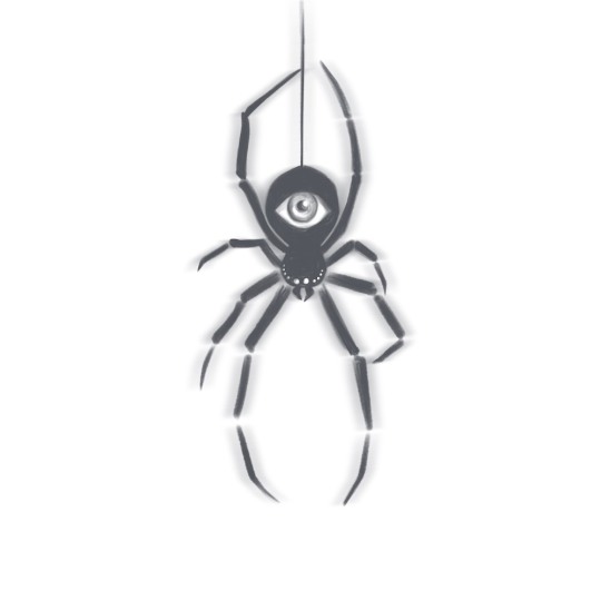
The eye of the spider I’ve had this idea rollin around my head for a while and after stewin on for so long, felt the need to finally see if I could get something onto paper. The initial doodle was done in Procreate, then tossed over to Affinity Designer and made into a vector.
After learning more about contrast, balance and form, I wanted to see if I could put it to the test by creating a black and white version first. I felt like adding some cheesy flare to the black and white version by importing it into Photoshop and adding a chromatic aberration. Then played around with some color palettes in Affinity Designer. WA-LA! There ya have it! A little fun with a creepy idea, some basic design principle practice, and vector wranglin! (”( :,,: )”)
1 note
·
View note
Photo

Love Tech Love is in the air, and my love for icons only grows stronger. Maybe it’s the design similarities between them all, or maybe it’s because creating them consisted of so much more than combining shapes. Either way, it’s the attention to details that wins me over, again and again. I always have such a blast with Andrei Stefan's tutorials. I highly recommend them. He’s very detail oriented, which is so important when dealing with vectors. And every step is explain perfectly. Whether you’re a beginner or more advanced in Illustrator, you’ll have fun. https://design.tutsplus.com/tutorials/how-to-create-a-share-the-love-icon-pack-in-adobe-illustrator--cms-28021
1 note
·
View note
Text

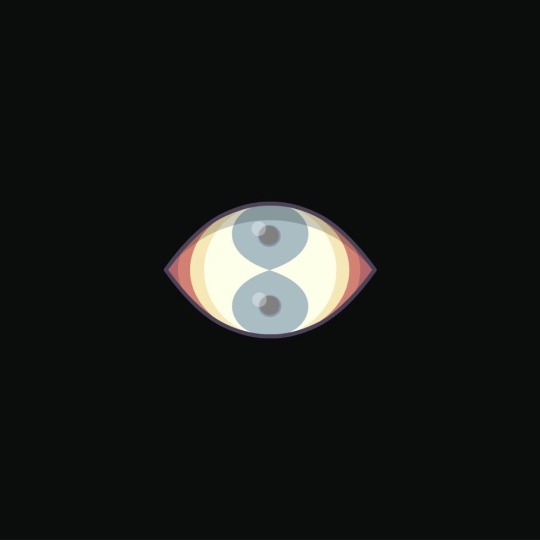
Double Vision *blink*
This was a quick play with shapes I created in Affinity Designer on iPad Pro. I crossed two hearts <88> and went from there. The more I explore AD, the funner it gets to create these quick warm up/cool downs. Especially from bed, cuddled up with my purring cat demon.
#vectorart #eyeball #trippin #affinitydesigner #affinitydesigneripad #ipadpro
1 note
·
View note