#flat graphic
Explore tagged Tumblr posts
Text

2023 @soulofherkarmaart
IG @soul_of_her_karma
#digital#digital portrait#minimal#minimalistic#flat graphic#graphic design#art#art now#tumbler#black women#blackart#black out
36 notes
·
View notes
Text


🧃🍰(ㅅ´ ˘ `)♡ 朋友。 ⊹˚.⋆ ⊹ ☽ ✮ 🌈🎀
#アニメ#⊹ ⋆꒰ఎ ♡ ໒꒱ ⋆゚⊹#かわいい#🎀。゚・。゚ᐠ( ᐢ ᵕ ᐢ )ᐟ。゚・。゚🎀#kawaii#anime#gif#aesthetic#animecore#otakucore#webcore#neetcore#moecore#my melody#onegai my melody#フラット#flat#pixel graphics#pinkcore#00s#2000s#2000s core#nostalgiacore#おねがいマイメロディ#nostalgia#childhood#nostaligiacore#マイメロディ#マイメロ
1K notes
·
View notes
Text
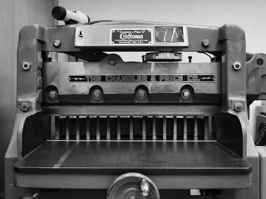
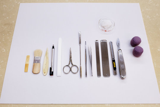
Inside the book conservation lab at the Metropolitan Museum of Art
Photos by Nicholas Calcott / New York Times
#things organized neatly#book making#books#conservation#history#museums#Metropolitan Museum#The Met#NYC#NYTimes#New York#Craftsman#Art#History#Flat lay#knolling#design#creative#graphic art#print
291 notes
·
View notes
Text
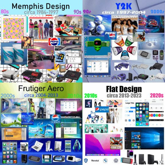
Eras of Aesthetics
#art#design#fashion#flat design#frutiger aero#history#graphic design#graphics#illustration#memphis design#photography#technology#timeline#y2k
743 notes
·
View notes
Text
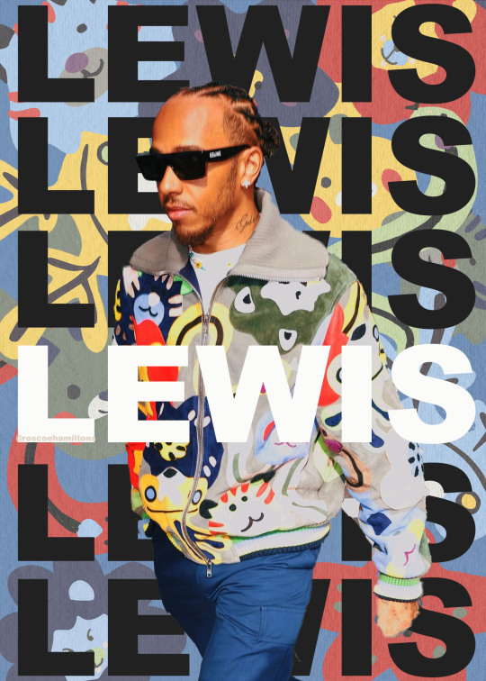
LHFW 2023 graphics: Australian Grand Prix
#f1#f1edit#f1 edit#formula 1#graphic design#graphic art#lewis hamilton#lewishamiltonedit#lhfw 2023#roscoehamiltons.jpg#hi f1blr i'm back 🫡#i drew the background myself from scratch and i think it turned out decently...#this is the extent of my digital drawing skills though... basic flat shapes w no shading lol smh
132 notes
·
View notes
Text

hello kitty flats !
#kawaii#aesthetic#animecore#かわいい#jojifuku#webcore#pixel graphics#old web#old internet#cutecore#cute#cuteicons#icons#cute moodboard#moodboard#cute kawaii#japan#gyaru#y2k aesthetic#y2k#sanrio#coquette#anime#glitter#2000s#2000s aesthetic#y2kcore#hello kitty#shoes#flat shoes
137 notes
·
View notes
Text
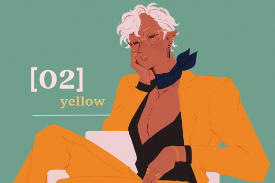
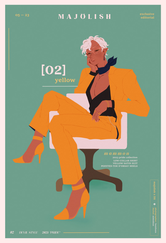
pretty in yellow
#obey me!#obey me mammon#obey me shall we date#obey me nightbringer#how is there a list of devildom flora + stores but not a list of fake brand names the game has??? i needed info to fill orz#anyway this was mostly a fun experiment on graphics + an idea in which i always wanted to draw mammon in heels ever since i started playing#shoutout to the b-52s for their album cover telling me go with a flat style instead of a detail one lol#art tag
1K notes
·
View notes
Text


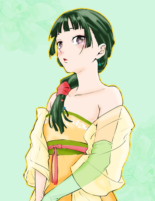


@animangacreators Challenge #26: ↳ Favorite Animanga in Fall 2023 || Kusuriya No Hitorigoto (featuring MaoMao)
#Kusuriya No Hitorigoto#The Apothecary Diaries#knhedit#maomao#anisource#animangahive#himawaari#userroh#usermoh#usergojoana#userkyaa#userzuura#userinahochi#usermoonz#tuserashes#myedits#coloring#coloring: knh#animangacreators#ahhhhh didnt have time to do an actual graphic and havent colored in so long it looks so flat argggg
521 notes
·
View notes
Text
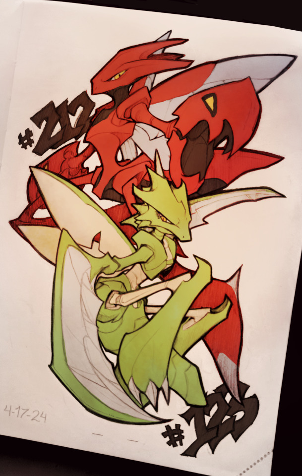
Feeling a little sick today, so figured I'd do some self-indulgent art of some of my favorite older pokemon designs. Contemplating setting up a Patreon or something similar to a room a project of sketching every single Pokemon, but maybe not too soon.
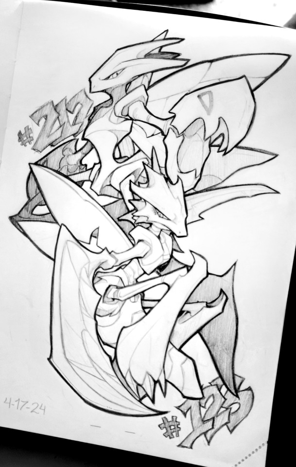
Pencil sketch, having a lot of fun working with pencils again!
#a little sick today so taking it easier#always loved their designs#but wished their execution was slightly different#very fun to mess with shape language in pokemon designs#also just feeling a little more confident trying stronger shape language in sketching#sketch#art#traditional#furry#sketches#furry art#small artist#pokemon#pokemon fanart#scyther#scizor#scyther fanart#scizor fanart#fanart#pencil sketch#color on phone#flat color#graphic design#shape language#shape language design#small art account#small art blog#small blog
318 notes
·
View notes
Text

Piet Zwart: Typotekt, Designed by Wim Crouwel and Otto Treumann, Stedelijk Museum Amsterdam, 1961 [Design Reviewed, Bradford. Flat & Bound, Integral Lars Müller GmbH, Zürich]

Exhibition: January 20 – February 20, 1961
#graphic design#typography#art#exhibition#catalogue#catalog#cover#piet zwart#wim crouwel#otto treumann#stedelijk museum amsterdam#design reviewed#flat & bound#1960s
48 notes
·
View notes
Text
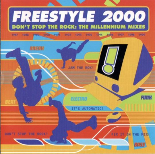
Freestyle 2000 - Don't Stop The Rock: The Millennium Mixes (1998)
#98#90s#1998#1990s#art#break dance#computer#cybercore#cyber y2k#dance#dancers#design#electronica#electronic#electro#freestyle 2000#future#futuristic#futurism#graphic art#graphic design#graphics#illustration#kaybug#music#scans#super flat pop#techno#vector#y2kcore
103 notes
·
View notes
Text
ok but actually genuinely do u guys have Original Art sticker vendors u enjoy. I'll share mine I love everything meatspice @/meatferal makes (I reblog her posts all the time so more ppl will be exposed to it). I love the Graphic Flat Bold look adn I have my own little collection of them I'm waiting to add to my sketchbooks...I'd love to hear what others enjoy. I want more stickers and insp

#talkys#(flat meant in the same way as graphic like its not 3D shaded its jst solid color)#using the alt smunker writing down reaction pic now wee hee#ffr
58 notes
·
View notes
Text

well howdy!
#this was such a silly self indulgent thing lmao nobody look at me#hsr#honkai star rail#boothill#artists on tumblr#fanart#my art#full body#flat colors#lineless#graphical bg#symmetrical#experimental
26 notes
·
View notes
Text





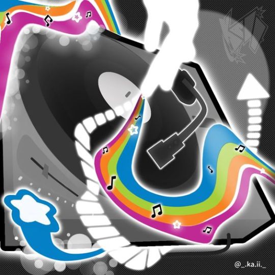
From Kaii
#art#colorful#colourful#design#digital art#frutiger aero#frutiger metro#funky metro#graphic design#graphics#illustration#kaii#super flat pop#vector
243 notes
·
View notes
Text
a former professor who i used to intern for and who occasionally has work for me reached out to me a few days ago offering alright money if I flat colored some graphic novel pages for him so he & his new assistant can make a deadline
and apparently his new assistant is named lucy which feels like a huge coincidence to me because i feel like thats also my name
except it isnt, and you cant just tell a woman you've just been introduced to
"what a coincidence, your name is not the same as mine, but it IS the one i went by for almost four years when i was pretending to be a woman from the 1770s"
i feel like that would give her an accurate but unfortunate impression of me
#messages from the ouija board#im so happy he reached out though even though the deadline is tight and i just sat working on flats for 12 hours straight today#but this is exactly enough money to make up for the work im going to miss bc of my surgery in april#and not having to worry about that is huge to me. like doing nothing but flat coloring for two days is a small price to pay for that#also knowing im still on his radar is a relief bc i keep getting worried ive gotten too disconnected from the professional art sphere#like im just falling behind and out of touch and missing my window but no!#theres at least one award-winning graphic novelist who is trying to find me work when he can and rooting for me and thats all i need rn
19 notes
·
View notes
Note
screw the setting, legends ZA could be set entirely in a white padded cell in an asylum for all I care, but holy fucking shit. those battles. look. NAUSEATING. gamefreak, buddy, can we try not to re-invent the fucking wheel every few years or so? you have been shoving new cheap battle mechanics down our throats every new generation, and now I gotta jog circles around my rival's tepig so I can make sure my totodile doesn't miss his water gun? WHAT!?!? 😨
I was interested for 5 seconds and then reality clocked me in the nose and landed me in the ER lol. You're right, the battles look irritating as fuck. I gotta run all around the damn place for my pokémon to dodge? Why can't they just keep the old dodge mechanic where they'll do it on their own, but randomly and not often? What was wrong with that? And what was that about different moves having different ranges??? So I have to take THAT shit into account, too? So much extra hassle for no reason. "Hurr durr it's like the anime now" fuck that I don't give a fuck about the anime. I never did. The games are not the fucking anime. This shit is fucking annoying as fuck
Also, am I the only one who's not happy that they seem to be doing away with turn-based battles? That is literally the foundation of a Pokémon battle. I understand wanting to do something new, this franchise NEEDS to do that shit's gotten stale, but not like this. Change too much and you'll lose your identity. What else will they take away? Completing a Pokédex? Oh God if they don't have a National Dex in this game I swear...
The only mechanic I'm happy to see is Mega Evolution. That's still the coolest gimmick so far, outside of regional variants (I also like Z-moves and Terrastalizing is an interesting concept. I don't care about Dynamaxing, you literally just make Pokémon extra large). But the trailer made it look like it'll be on a short timer instead of lasting the whole battle like in XY, so I guess they're gonna ruin that, too
#imagine you get 4th degree burns while you jog to the side with your Bayleef trying to avoid a Flamethrower lmao#what is even going on#hot take: pokémon should've stayed 2D pixelated. the jump to 3D has been a disaster overall#compare the style of gen 5 which was the pinnacle of the pixel style VS this shit with the jpeg buildings#did anyone even pay attention to the Pokémon models. Chikorita's eyes look like boring flat stickers glued to its head#2025 and they STILL have not improved the graphics!!! look at Zelda!!! look how good that looks!!! what is the excuse!!!#I'm so tired. I just want Pokémon to be cool again. it's been downhill since gen 7#pokemon#pokemon legends za#merchant asks
17 notes
·
View notes