#you can also see a bit of how i sketch the shapes of the torso. little bonus ig lmao
Explore tagged Tumblr posts
Text

btw. i made this quick guide of some of the natural size and proportion reference points in the human body. of course this all varies even irl, and you can stylize however you want, so ymmv but thought it might be helpful for some folks.
#you can also see a bit of how i sketch the shapes of the torso. little bonus ig lmao#again. this is not a 'you have to do this' guide this is just 'here's smth that helps me so maybe it'll help yall too'#tips#i think that's my tag for this stuff? idr
10K notes
·
View notes
Text
Hanfu in Components: Hanfu Anatomy, Tops (pt 3.1)
navigation: hanfu in components 1 2 3.1 3.2 4 ...
Now that you know about the names of different garments, what about the parts of each garment? There are so many confusing terms!!! I gotchu :>
When looking at hanfu and parts of hanfu, it can help to see how the garment is constructed. To do that, we have to look at the pattern of the garment. Sewing patterns are the templates that tell sewists how to cut their fabric into the shapes that are needed to make their clothes. Hanfu sewing patterns are fairly standard. They look roughly like this.
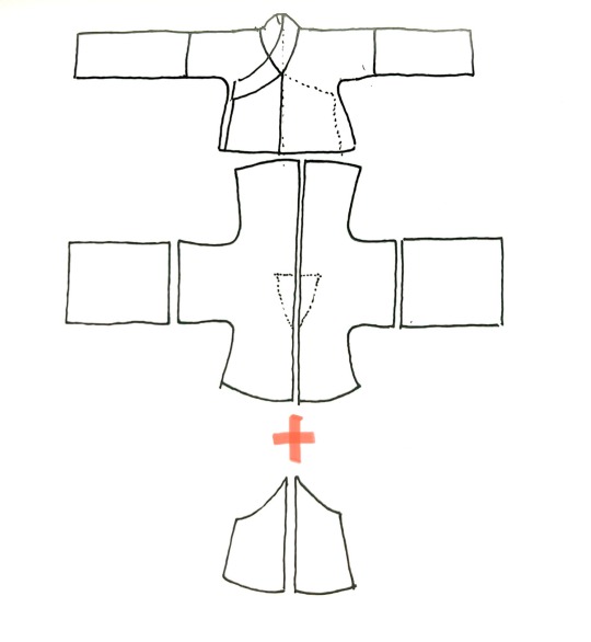
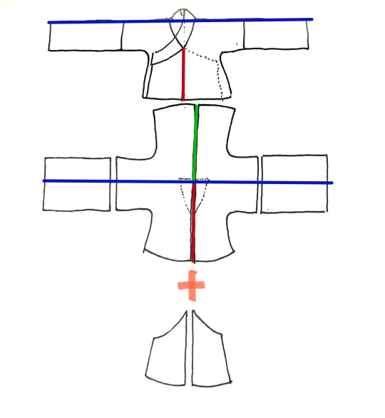
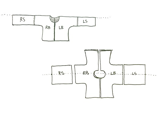
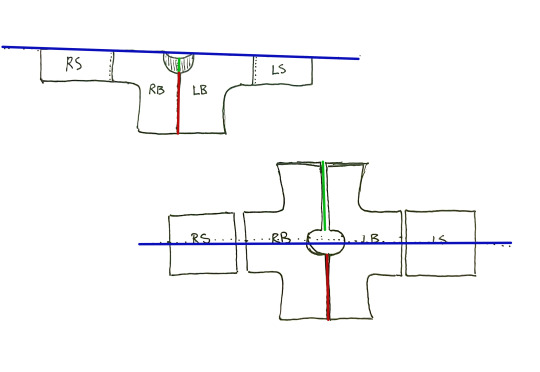
(blue = shoulder fold line // red = center front // green = center back)
To help you understand how this all comes together, when defining different parts of hanfu anatomy, I'll show it on the sketch above, and also on photos of people wearing hanfu, highlighted in green.
身/SHEN1/BODY
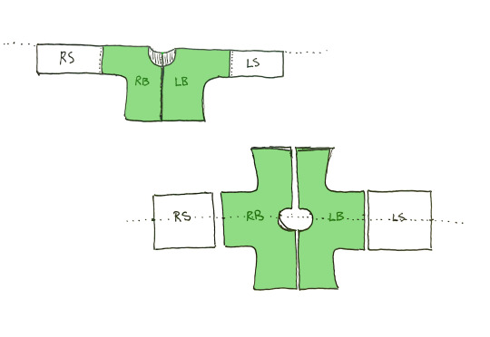
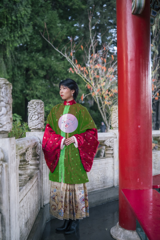
This refers to the body of the garment—the part that would cover your torso. Typically there are two pieces of cloth making up the body: one on the left and one on the right.
Once again, one of hanfu’s main defining characteristics is that traditionally, THE SAME PIECE OF FABRIC MAKES UP THE FRONT AND THE BACK. There is no shoulder seam separating the front and back of the garment.
袖/XIU4/SLEEVE
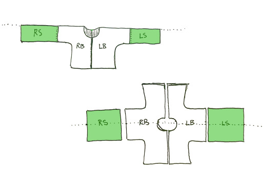

袖 means sleeve (in both technical and colloquial terms). There are many shapes that the sleeve can take: they can be narrow like normal clothing or they can be big and dramatic like the kind you see in cdramas. Like the body, there is no seam separating the front and back of the sleeve—the sleeve piece is draped over the arm and sewn together at the bottom. Another important characteristic is that the sleeves are joined to the body at the bicep or elbow area, NOT at the shoulder. (Short or half-sleeve tops might not have a separate sleeve piece.)
領/领/LING3/COLLAR
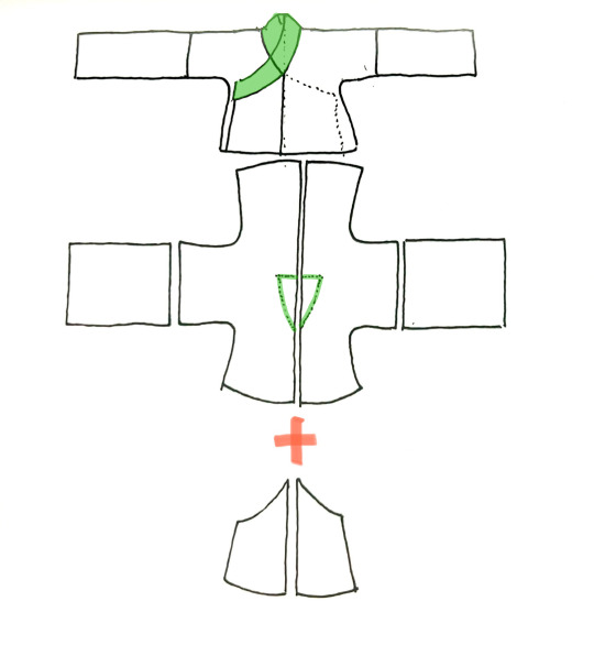
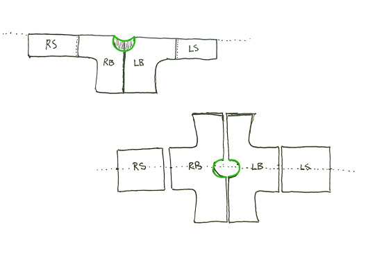

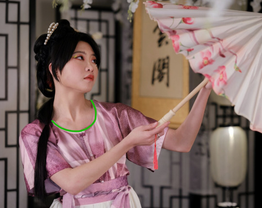
領 means collar (in both technical and colloquial terms). This can refer to two things: one, the general shape of the neck area (round, square, standing, cross etc.) and the actual strip of fabric that is attached at the neck to form the collar.
襟//JIN4/LAPEL
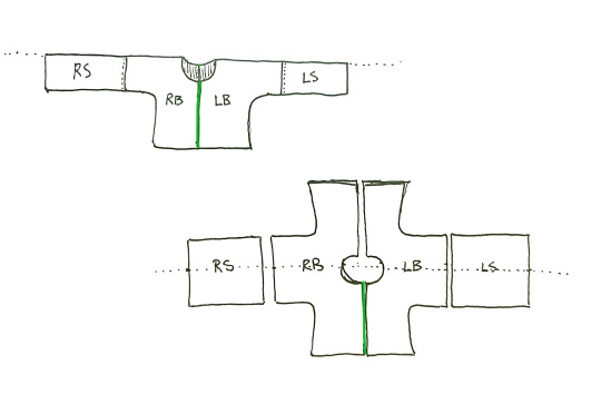
This can be translated as collar or lapel; I choose to say lapel to distinguish it from 領. This refers to the area where an open-front top would open. It’ll look different based on the collar type—generally a 對襟/对襟/dui4 jin4/parallel collar top’s jin coincides with the front centerline.
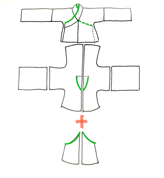
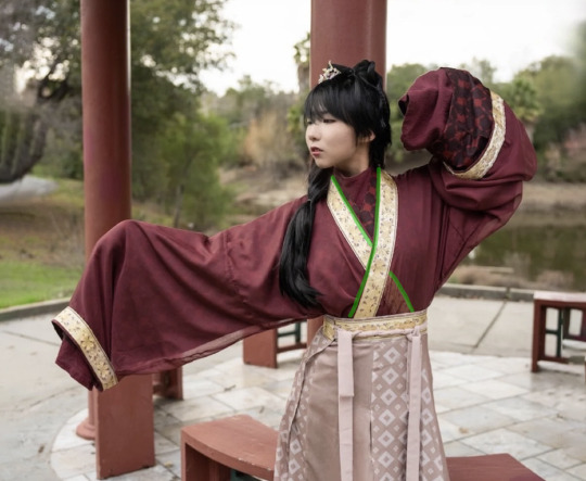
With a 交領/交领/jiao1 ling3/cross-collar top, however, it would coincide with the outer edge of the collar. (Will have a more detailed post about this later.)
下擺/下摆/XIA4 BAI3/HEMLINE
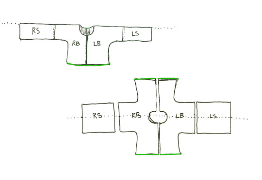

Refers to the bottom hem of the garment. 下 means down/bottom. Note that 擺 can refer to different things in different contexts. If you see someone talk about the 下擺 of a top, they’re talking about this bit.
The following terms only apply to a subsection of hanfu tops and may have fewer images as a result.
衽/REN4/LAPEL EXTENSION
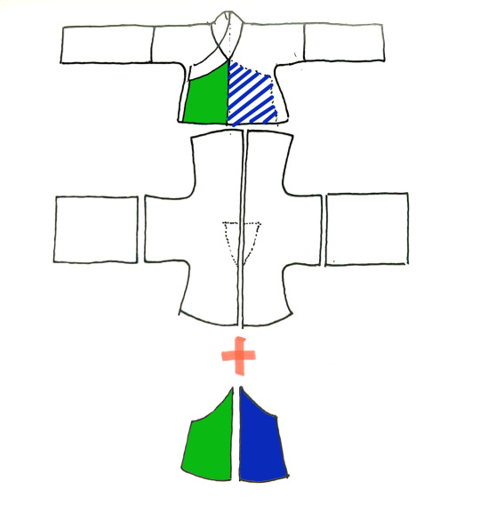

This one is a little harder to translate. Applies to non-parallel lapel tops like cross collar, diagonal-lapel standing collar, and overlapping round collar garments. It’s an extension of the BODY piece on the front, sewn to the vertical center front seam, that overlaps over the other side. (Will have a more detailed post about this later.)
衩/CHA4/VENT
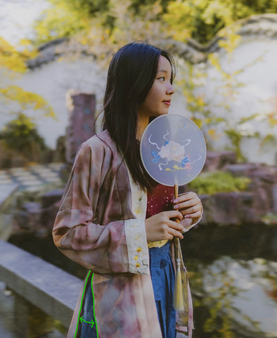

Also called vents or slits—an optional open slit, usually made on each side of a longer shirt or robe, to allow for ease of movement. Might be combined with the word 開/开/kai1/open to form the phrase 開衩/开衩/kai1 cha4/open slit. Mostly applies to longer robes or tops, where the length reaches the knee, so that you don’t have issues with walking.
襴/LAN2/WAIST EXTENSION

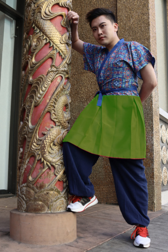
Also a little harder to translate. This only applies to 襦/ru2/Ru tops and 襴衫/襕衫/lan2 shan1/Lanshan robes, plus some varieties that were derived off of those two. The 襴/襕/lan2 is an extra rectangle of fabric appended to the bottom of a shirt/top to extend its length. It can be made of a contrasting fabric or the same fabric, and often has pleats on the sides to allow for movement. (Will have a more detailed post about this later.)
緣/缘/YUAN2/TRIM


Refers to the trim or decorative contrasting bits on a piece of clothing. Specific location goes in front of the character. For example, 袖缘 means sleeve trim, aka the cuff. Some specific trims might have their own special names but that’s for another post.
Later post about skirts/pants to come soon!
navigation: hanfu in components 1 2 3.1 3.2 4 ...
#hanfu#hanyuansu#chinese hanfu#chinese history#chinese fashion#hanfu photoshoot#hanfu fashion#terminology#reference#chinese#ft tangtang's shitty drawings again#long post#cloud9hanfu#九雲閣#cloud9 hanfu#hanfu in components
232 notes
·
View notes
Note
Do you have any art tips? Mostly for anatomy
VERY REALLY FAST rundown of some niche tips I have discovered, specifically for the body types I tend to draw (muscular-soft)
For torso: ribcage/lats area in purple, abdomen/belly comes in blue.


centre line to divide the chest and show the middle of the stomach. frowny face is the top of the abs (kisses the bottom of the pecs) and the nips. Pecs are trapezoidal and connect to the shoulders at a diagonal. The shape of the chest gets more rounded with more body fat generally


Then the traps are like a triangle, the bottom of the triangle is the general area of the collarbone, and the neck starts about halfway up the triangle (this is a super general guide ofc, lots of people aren't built like that... and this isn't perfect anatomy!! but it's a shorthand I use for sketching.)


From the side, the torso has a couple major Bumps:

And when drawing a leg, I tend to draw "hip dips" (really what a stupid name) and the two big boy muscles. I dont draw feet/ankles because I despise them. I'm also terrible at butts.


ARMS!!!!! I do delts/shoulders, bicep, tricep, and idk forearm muscles im not an expert


triceps tend to be engaged when the arm is extended straight (leaning on a surface, downward pull, etc), biceps tend to be engaged when bending at the elbow. Going to the gym helps make this make a lot of sense. Or just exercise in general. Idk)


ELBOWS... I think of elbow like the hard spot that hinges between two meaty bits... This one I don't know how else to explain. I woke up one day and god granted me the power to make elbows look ok
Anyway ya I am not an expert but hopefully some of this is helpful. Biggest most boring advice is: practice with reference photos. Learn about the major muscles and how they fit together, including on your own body if you can see them relaxed VS engaged. Practice practice practice until you can memorize the shapes. Practice!!!!!! And that's it
This is a good site for lots of poses but I also use good ol pinterest or take pics of myself if need be. That's a classic.
#i like to look at pictures of wrestlers for fun and for practice#cos models are going to be very dehydrated... good for seeing the muscle groups in action. bad for how a typical body should look tho#anon reply#bug words#thank you for asking!!! i hope this was of help in some way. there's a ton of resources out there for other anatomy#but i havent seen a tooooon of stuff pointing out the shapes of masc upper body/torso shapes
111 notes
·
View notes
Note
I absolutely adore your art style! Do you have any tips? Specifically for the fairies cause I am struggling to draw them.
thank you so much! well, this is gonna be a long post.
Im gonna be real, the best art advise anyone can give you is to use references and to break complicated stuff down into easier shapes. for example:
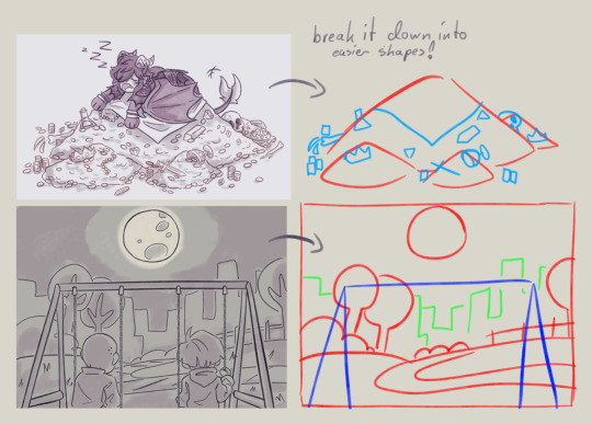
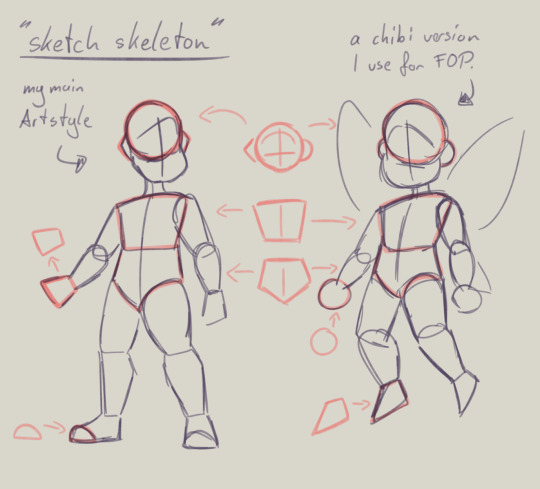
this is my basic body skeleton! i always start with the circle of the head and work my way down to the feet. i have highlighted some part of the body which are actually just simple shapes.
the center line down the middle of the torso also helps me draw on collars, bra cups, ties, or any other more difficult clothing more accurate!
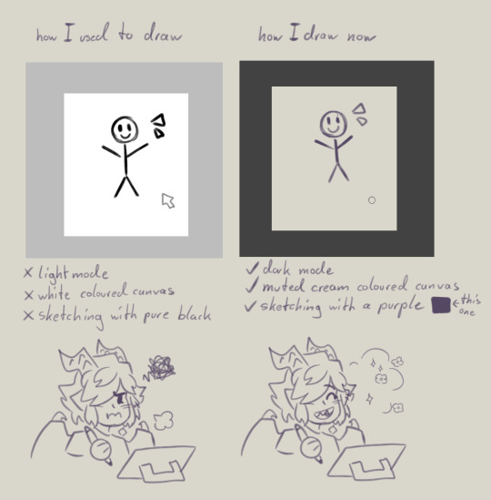
However i have to ask you, are you comfortable while you draw?
I remember when I first started drawing digital, i was really uncomfortable with the basic set up of my program. The white canvas and the light setting of the program was really bright and irritated my eyes. And the contrast of the pure black I used for drawing wasn't really helping. sketching and doing line art was my least favorite part of drawing because of this.
you don't have to draw on a white canvas, you can also use multiple colours for sketching if you wanted. Once I stoppend using a pure white canvas I noticed i stopped staring at a empty canvas not knowing what i wanted to draw anymore!
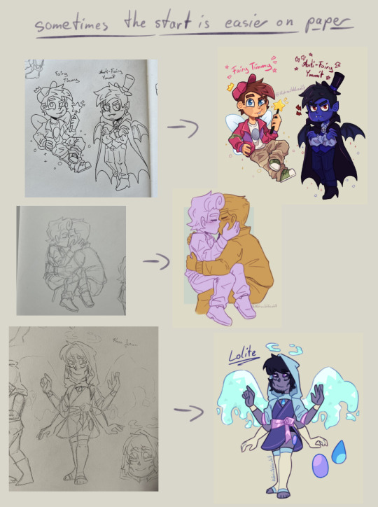
also sometimes when a drawing doesn't want to look right, i switch back to traditional. idk why but when my brain sometimes struggles with a specific pose or character design, it comes to me a lot more easier when I switch back onto paper. i guess the change of scenery opens up the creativity again haha.
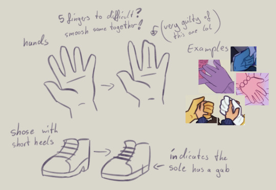
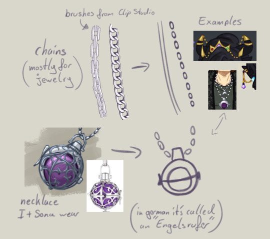
don't be afraid to simplify stuff, you don't have to draw everything! As long as it still translates to the thing, it should be fine.
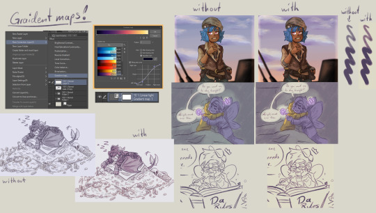
these two are a bit clip studio exclusive,
but Gradient maps! god how I love my gradient maps, it just makes the colours pop! I never draw without it anymore. I always pick the sunset gradient, put it in Linear light mode and put it on 10% (cus its really saturated on 100%)
usually i have it on while i sketch and line, and turn it off so i can properly colour and shade. i turn it back on at the end again
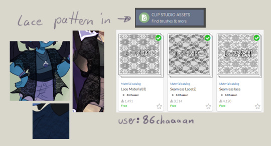
the clip studio assets has a lot of beautiful stuff in there created from other users. (a good amount for free too) for example I got the lace pattern of my shawl from there. and its really easy to import the downloaded stuff into the program.
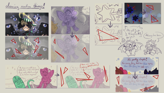
now this is a drawing hack that blew my mind when I first saw it! i use it all the time and I just have to share this!
whenever you want to draw something random like sparkles, stars, bubbles, feathers, falling leaves, or anything that you want to float around your characters, position them in the form of a triangle.
its even better if you put two points of the triangle closer together and then the third further away. this makes it look random but still looking appealing to the eye, and not oddly placed.
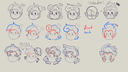
now that thats out of the way! Fairies! The one thing i struggled with when drawing them first is their hair. I suggest looking through the fop tag to see how other people have drawn them and take inspiration from your favorites and make up your own. (do not trace tho! that should be obvious!)
when I draw hair I think of it separated in two parts, the front and the back. I usually start with the front hair pieces, then draw in the jaw, ears and rest of the head, then continue with the back section of the hair.
the only outliers of this are Timmy and Peri. when I draw Timmy (Ymmit as well) I start with his hat, before drawing his hair. Since I draw Peris hair-swirl over his hairline, i start drawing his upper back hair style first before drawing his head and then his mullet.
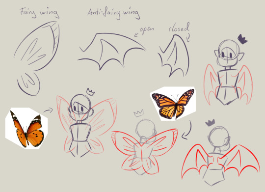
wings can also be tricky. the fairy wings i have given then have a more butterfly look. if you also want to base off the wings to real life animals or bugs you can use them flying as references to. Or you could even cut out the wing shape out of paper, fold it in the middle and take pictures in the angle you desire.
I hope this somehow helped, I thought about what could have helped me if I had known it sooner. even if most of these were for generic drawing.
#my art#asks#art tips#drawing advice#clip studio paint#fop#if anyone has more questions about how i draw#once i open up the ask boy again feel free to do so
49 notes
·
View notes
Text
Yk what no one asked for? My art process.
At least when it comes to drawing transformers... I don't put a lot of my other stuff up here haha. This guide probably won’t help with drawing TFP stuff tho. I like sticking to my cubes.
Who knows. Maybe this can help someone. Or provide amusement cause I have no idea what I'm doing. Just thought l'd share some stuff lol. And an unpopular art opinion.
So yeah, my secrets. Which like.... my art isn’t incredibly impressive or anything but... you get the point.
If you ever really wanted to try out whatever my style is called, here’s your guide. Along with a tutorial on how I draw Sunstreaker, but it’s like 5 steps lol.
I apologize in advance for the sheer amount of yapping I’m about to do. I’m just trying to makes sense
~~~~~~~~~~~
This is the part where I share my tips and tricks yippee! Small disclaimer, I just kinda do half of this stuff as a go. There is no real order to this. I’m basically just explaining how my style works (despite how much my style varies tbh)
There’s a general build for the body that I’m pretty sure most people have figured out. The head, chest, torso, and weird hip thingy. Then the legs are broken into two main segments, the arms are broken into three, shoulder, upper arm, lower arm.
Here we go, unpopular art opinion rant.
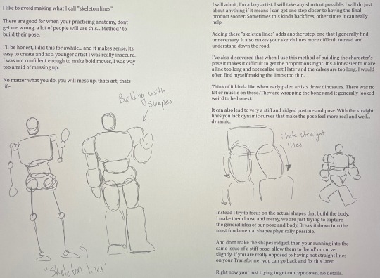
When I make my base I usually work from the head down. Don’t be afraid to use the lasso tool to readjust the sizes of different components. If the head you started with has the right angle but is too small, lasso it and make it bigger. If ur doing traditional, sorry, you’re just gonna have to redraw it.
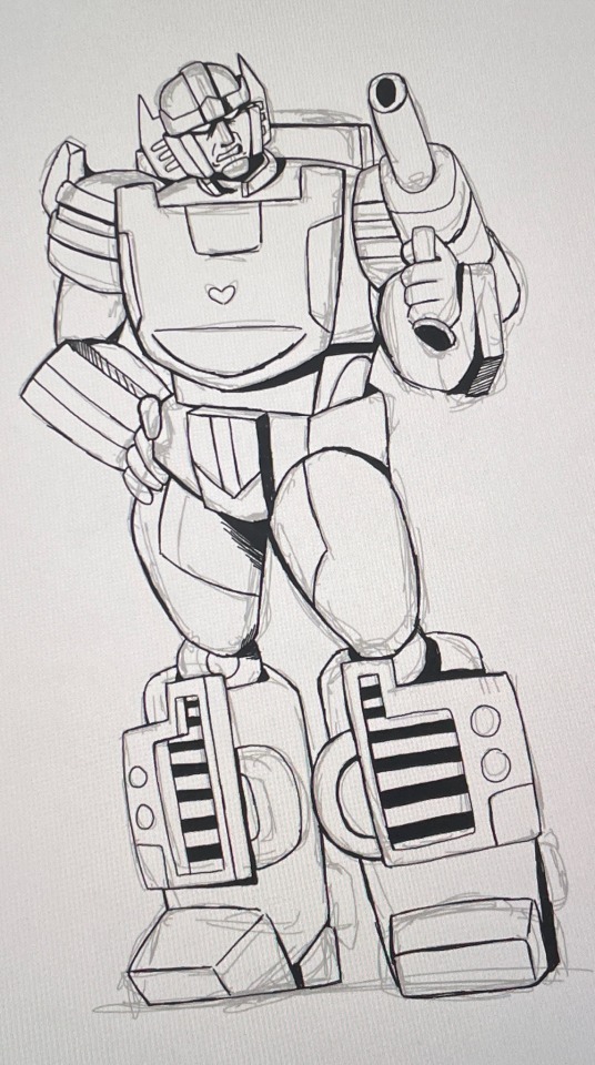
I’ll usually try and clean up overlapping lines, but I wanted yall to see the shapes before I did that.
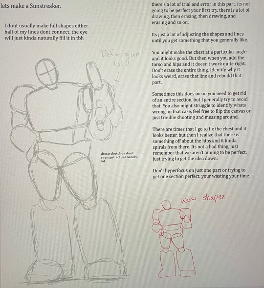
Then we can start adding details. I look at other artist’s designs and the source material and pick out reoccurring traits that will help make the character easily identifiable.
I tend to add the most detail to the head simply because that’s what is commonly used to identify characters. Usually when designing my version of a character I allow myself to kinda make up details for this part.
But do feel free to add your own details to make sure people can tell it’s “your” design!
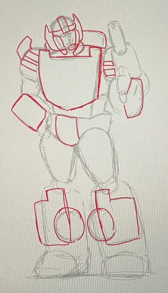
These are still very simple shapes and not detailed whatsoever. We are keeping it basic on purpose.
Very loose shapes, extremely vague idea. Just putting down the most identifiable parts that are important in building it, if that makes sense. I put down the bare minimum for this.
You really don't want to over complicate things. It makes it difficult for the viewer to figure out what's going on. A crowded design is distracting and unappealing. The simpler the better.
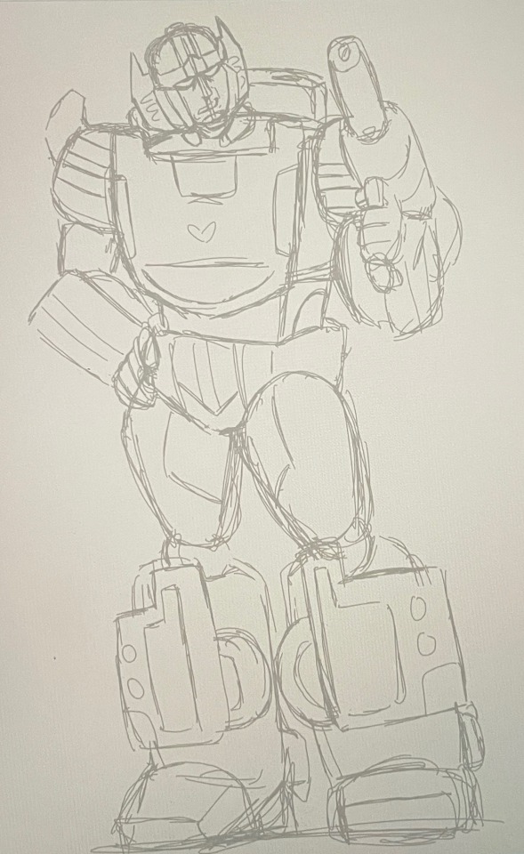
So now we have our sketch layer done. Because I'm impatient, it's line art time baby!
I end up just kind of feeling it out with line art. There will be some changes between the sketch and the line art. I’ll also use line weight to just general shading stuff sometimes. In this one it’s not very consistent but I was kinda losing motivation cause… adhd my beloved.
This is pretty self explanatory. Use your sketch to outline what you want, adding details as you go. I'll still leave my lines pretty loose and messy for most of these, just because it adds a bit more... character? Makes it feel more authentic? But feel free to clean it up as much as your little heart desires.
Smth im really passionate about is not overcomplicating the designs and crowding it. I know I already mentioned it once but… yeah.
While adding a bunch of detail can be cool, if not executed right, it can become overwhelming and difficult to understand visually. Keep it simple, you don't need to add every crease or seam. Just the important ones that can help a character stand out or fill in an awkward large space.
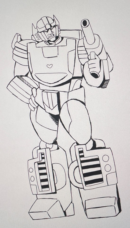
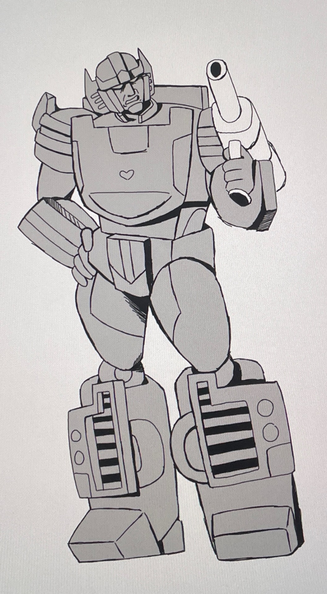
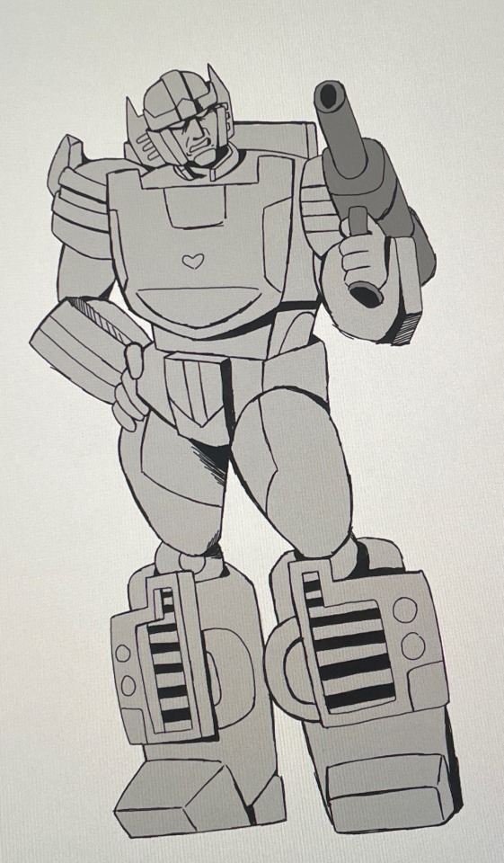
Usually after that l'll just put flat color down. Nothing fancy. I like to just do greyscale but you can go crazy. I'm not stopping you.
But adding a flat color under your line art helps pull together the sketch. It makes it easier for people to understand what is and isn't a character and makes it simpler to understand the character’s shape.
If I have several characters in one picture l'll usually make them separate colors to help make sure you can easily identify them as different people. I usually try to keep in mind the characters actual color when doing this. People with darker colors get a darker gray.
I’ll also try and give a different color to an object they are interacting with so it doesn’t get confused with the character themselves.
The entire reason I gave Sunstreaker a gun was to show this. I hate drawing guns.
These are also rarely perfect. As long as it's not extremely obvious that you're out of the lines, no one will notice. At least that’s been my experience.
I usually do this on separate layers
There's a lot of personalization when it comes to drawing and I don't know if I explained all of this very well. Ironically I don't really think much about how I'm doing it, I just... do it.
If you need any further explaining, I'll try my best to help. And if you made it this far ive got mad respect for you. I’m pretty sure I’m just rambling for half of this lol.
Have fun creating!!!!
#art#doodles#transformers#fanart#transformer art#my art#sunstreaker#art process#i’m trying my best#I don’t really know how to explain#but I thought it would be fun to share#the example Sunstreaker is far from perfect tho#literally no one asked#but I woke up today and decided I was gonna do this#unpopular opinion#very sorry for that rant#am I the only one that hates it tho?#probably#anyway#I hope you enjoyed whatever this is#fr I would love to see any people that did use this to help them draw#no pressure tho
25 notes
·
View notes
Note
Do you have any advice on how to get over lack of skill? I want to do the Astarion Lestate trend but I don't think my skills are ready for it. I have references pictures of Astarion pulled up when I'm working, and even have the game launched so I can turn him if I need to (mostly for the attempts I did at his hair) but everytime I tweaked something or started over nothing looked right. I keep getting frustrated 😭
Hi anon- Sorry this took me a while to get to, i hope you and others can still find this useful! While the basic advise to get over 'lack of skill' is PRACTICE, PRACTICE, PRACTICE! i hope this will help you knowig where to get started with that!
I'm going to put my teacher pants back on, this might be a bit long so buckle up- I'll go over a few areas:
Primitive Shapes
How to Use References
Delete your work (hear me out)
--------------------------------------
Primitive Shapes:
This is your foundation. Everything starts with this, and while you may find it boring to think of your art in terms of cubes and spheres- i kid you not it will help elevate your work.
If/when you are stuggling to draw a complicated pose, or a specific perspective, refering back to the form in these basic shapes can really help to simplify your process and help you problem solve.
A chill/silly watch for a more in depth discussion on what i mean / how this can help - Give Pikat's 'Draw boxes (correctly) to improve your art' a watch. They also mention this in the video but @/Uncomfortable on youtube also has some great fundermental videos.
-------------------------------------
How to use references.
Okay so references are great 10/10 very useful. But, unless you know WHAT to study from a reference, they can sometimes fall flat of their usefullness.
Anatomy studies are something a lot of us will be recommended as artists, but actually knowing what to pay attention to can boost your confidence in your work. Start with a goal, what do you want to get out of this sketch session? Do you want to get better at understanding the 3D form of a specific part of anatomy? Better at poses? Try to narrow down your learning each session to make it less overwhelming.
In this i'll focus on understanding the form so, lets start with a reference. Linking back to Primitives again, start off by braking down your anatomy into forms. Sketching over the top of your references is totally fine. But make sure you are doing so critically, otherwise it may look like a flat/unnatural trace and you're not really learning from it. Via the first sketch you can see where the primitive shapes fall on the body - think of it like a ball-jointed-doll, hips, knees, shoulders ect are ball socketed whereas arms, legs ect can be made up of tubes. (See the first image, when sketching your tubes, sketch your contour lines too- this can help determind how clothing / hair will fall over the body, and can help you understand the 3D Form.)
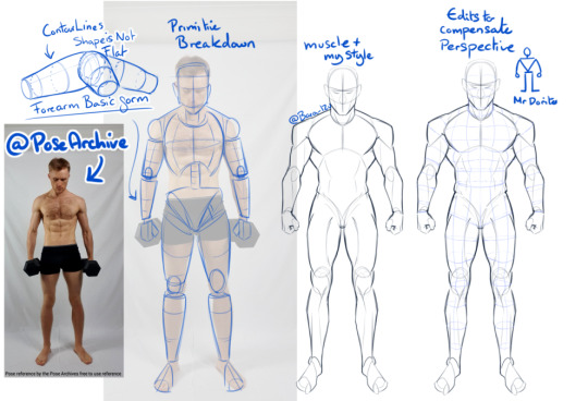
A BIG IMPORTANT SIDE NOTE - When using photo references, do be very aware that they may be distorted due to the height of the camera, or camera focal length - (you can see in my sketch i had to edit the torso and head because the reference was a little top heavy)
A few artists/books for some extra reading / reference : - Andrew Loomis (OG for body proportions, books are a little outdated but fundermentals are still useful), - Tenten云画画 (his stylised anatomy breakdowns are very interesting to me) - Anatomy Essentials (I've had this book for years, it covers lots of areas, is a bit complex though, i myself should reread it again 😅
Also, if you can't find a reference for a specific pose, don't be afraid to use 3D programs! Anatomy 360, DesignDoll, Clip Studio, Magic Poser - all nifty options~
SO taking when we've learnt from the primitive forms, you can now try applying that to the Lestrat Picture. (which, granted is a complicated pose, as it also has forshortening and an odd top down perspetive of the bottom character- so don't panic if you don't get it the first time!)
-------------------------------------
Final points- Delete your art (hear me out)
What i mean by this is, sometimes reworking the same face over and over again can bog your down. It can make it very difficult to actually see whats wrong. So, get rid of it and start again. (hide the layer/use a different piece of paper, please don't actually bin it (yet))
Next, redraw it. Use what you've learned the first time, and redraw it from scratch. (in this case, that might be just specifically the head, or the hair, or the eyes ect - you don't have to bin the whole thing, but sometimes it can really help give you a new perspective)
Once you've done this, unhide your original, compare, this may help you understand what you were doing wrong the first time. Or if there are areas of one that you like- its an opportunity to combine them as you see fit! :)
On a side note for Astarion's Hair, the lovely @mistercrowbar actually posted a breakdown yesterday! (i use p much the same method so-)
I HOPE this was of some use- do feel free to ask any questions if you've got them! i'll try to answer in a more timely manner next time 😅
95 notes
·
View notes
Note
Could you like critique my art pls
Specifically the art dump and that chosen fanart
Alrighty, sorry this took a while, mixture of getting sick and traveling.
Chosen One:
Because this is a) very stylized to begin with, b) a fairly minimalist format, and c) a very straightforward character design, there’s not tons to critique. It’s mostly a matter of lighting. By and large everything looks like it’s coming from the right direction, and the form looks proportionally correct. The only thing I’m a little thrown by is the eye placement – there’s not enough information to quite tell me where he’s facing and at what angle, partly because the oval of the eye isn’t sitting at right angles with the flare. That’s the only thing I’d really point out here, though.
Doodle Dump:
Perspective sketches:
These all seem to be pretty straightforward perspective exercises. The set up looks good, seems coherent enough. The topmost roof on the house of the fifth one looks a little odd, but that might just be an inking mistake. The internal details are also good. The sixth one looks a little wonky, but I think that might just be a mix of the photo and the extreme angle. Internally though, it works. The dude’s head looks a little far back on his shoulders – that or the shading on his torso needs to come farther up.
The lady:
I’m not sure if this is just how you took the photo, but she looks like she’s leaning to the right (our right) a little bit. Could just be a camera thing, though, hard to say. Hold it up to a mirror and see what it does. The proportions overall are solid, but there’s a couple details to work with. The calf muscle of her right leg seems a little too far out in comparison to her left leg, like it should be behind the leg more, since normally that leg would be facing us more than the left. Depends a little on how the leg is meant to be angled though. That leaning issue I mentioned earlier also looks like it could be solved by nudging the left leg out farther so she’s not “overbalancing.” The clothes look good as well, but the blazer button seems a little too far from the edge of the blazer’s front. I’d either move the button closer to the edge, or bring the fabric in farther – otherwise the tension makes the fabric behave weirdly and fold in on itself (speaking as someone who often wears blazers. Button + Fabric physics are a Whole Thing™). Also, and this is comparatively the big E on the chart – her frontmost hand. There’s… something weird going on with the wrist, and I think the hand angle too. As it is, her hand looks like it’s bending quite a ways back, more than people can usually do without pulling it while the arm is turned like that. Normally, the fingers and palm would be angled towards us a little more. Also, the arm doesn’t sit quite that high above the wrist junction – mostly looks like an overcorrection of some sort. The finger shapes are a little odd too here – the thumb doesn’t usually bend like that, and the fingers themselves look more like the back angle on the hand rather than the front.
Hand sketches:
These are all quite good, though there’s definitely some quirks here and there.
On the first one, the upper line of the middle finger is too low – if you trace it through the pointer, it doesn’t line up with its knuckle. I’m also not sure which finger is poking out past the thumb, but if the hand is angled far enough for you to see the back of the palm at all, you aren’t going to see the finger poke out, and visa versa. Also, same issue with the wrist – there is indeed a wrist bone, but it’s not that pronounced, especially not at that angle.
The second one looks good, although the ring finger looks a little broken, and the palm musculature on the pinky’s side indents in a little too far - it doesn't usually cut a straight line like that because of how it attaches to and goes around the bone there.
Three and four both look solid, though the palm-form by the pinkie is crushed down a little too far on four. Five looks good, note that the ring finger’s first joint looks bent back too far (the straight line marking the bend-point is part of it). Six looks good.
General summary:
Your hand anatomy is overall very good, with a couple issues in the wrist and palm flesh. Don’t hesitate to do through-sketching on the fingers to keep your skeletal line-up consistent.
Your perspective is good, especially with the exercises.
The freestanding gal is overall great, just with some minor detail issues and a slight lean that might just be photo angle. That's a little harder to correct for in traditional cuz there's no "flip canvas" option :P
If you’d like clarifying sketches on any of these, I’d be happy to do that.
15 notes
·
View notes
Text
🟨 Appearance Creator Mod Infos Dump
With the release of ACM (Appearance Creator Mod) I wanted to dump some information that might be useful, especially for non-modders that want to play around with it!
(I had no involvement with the making of this mod at all, nor I have any tie with AMM development, just throwing my two cents as a regular user, player and modder)
You'll find some How To, Tutos and other useful heads-up under read more, if you plan on using this mod as a modding tool (sketching up outfits ideas before modding them as custom appearance for your blorbo for example) or simply want to play blorbo dress up!
━━━━━━━━━━━━━━━━━━━━━━━
First, You might want to get familiar with these suffix, as you will need to identify what part of a character's outfit you wanna swap
▶ Garments Components Names
h0 - Character's head mesh he - Eyes mesh heb - Eyebrows mesh ht - Teeth mesh hx - Head's details meshes (pimples, makeup...) hh - Hair mesh t0 - Character's Body mesh t1 - Torso Inner Garment (T-shirt, Tank top...) t2 - Torso Outer Garment (Vest, Jacket, Hood...) a0 - Character's Arms mesh (Cyberarms...) l1 - Legs Garment (Pants...) s1 - Feet Garment (Shoes, Socks...) i1 - Accessory / Item Garment (Cyberware, Belt, Necklace...)
▶ Garments Rigs Names
ma - Man Average mb - Man Big mc - Man Child mf - Man Fat mm - Man Massive wa - Woman Average waf - Woman Average Fat
━━━━━━━━━━━━━━━━━━━━━━━
⚠ It's important to note that Garments are NOT automatically refited to the character! You can use a WA garment on a Male NPC but it won't magically fit his shape
⚠ Johnny and Kerry, despite using the MA rig, both have a thinner bodies and most of the garment will float and appear larger on them
⚠ A lot of Garments have their own RIGs and physics, and might T-pose / break upon being swapped on your NPC of choice! For this reason, Hair with physics will automatically break as well
━━━━━━━━━━━━━━━━━━━━━━━
AMC is a standalone window in game, and not included in AMM main window!
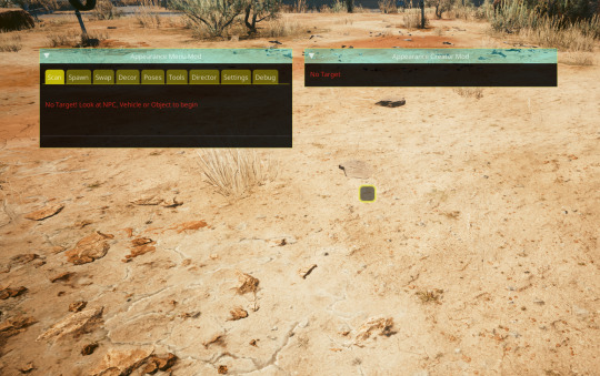
After spawning a NPC, the AMC window should fill up with the spawned entity's garment components (and yes it can get crowded really quick, especially on smaller monitors and resolution)
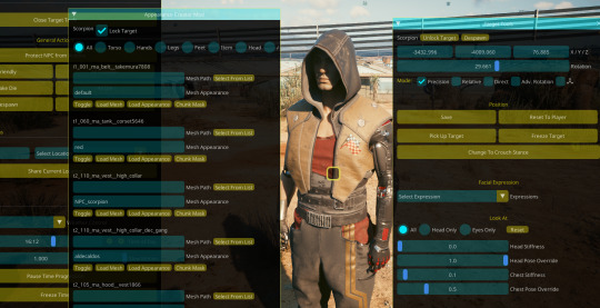
Yes, It also works on NPVs and NPC+! 🔥
Everything on these windows can be overwhelming especially if you're not familiar with modding, so I'll throw a little example here using Scorpion
First I want to get rid of his hood and vest, without using AMM's custom appearance, using only ACM
In the list, I look for his Vest and his Hood component
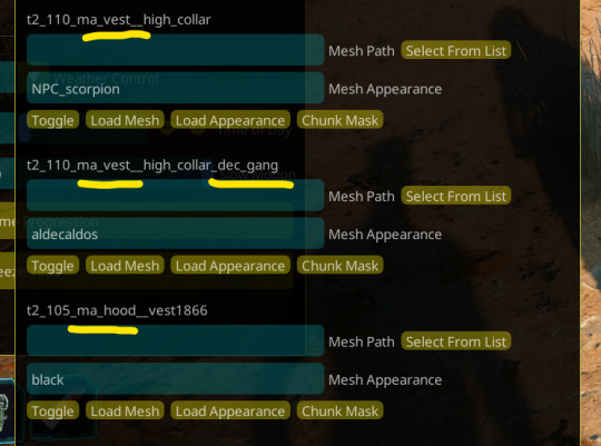
We can easily turn them invisible by clicking the "Toggle" button Make sure to also disable any decals, stickers, and additional component (his vest also has a decal component, see in the screenshot)

The little icon next to a component's name indicate it has been edited in some way
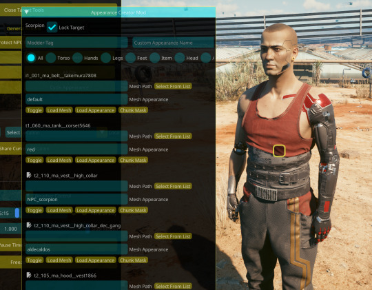
I'll now switch his tank top for something else
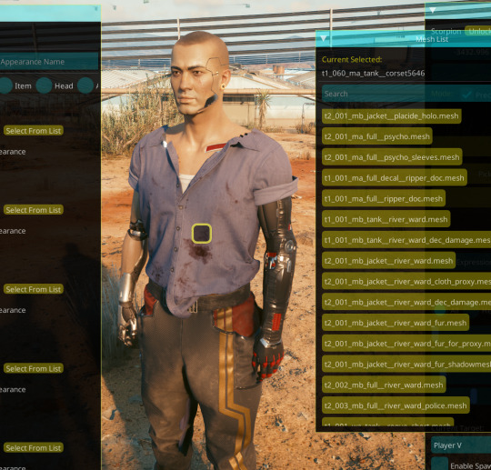
Click on "Select From List" next to the "Mesh Path" of the desired component (in Scorpion's case, t1_060_ma_tank__corset) Open up the "Torso" list, and you'll be able to click on any of the listed t1 and t2 garments!
⚠ As mentioned above, garments doesn't magically refits on characters; Scorpion use the Man Average body and rig, anything that isn't a "ma" garment won't fit him correctly!
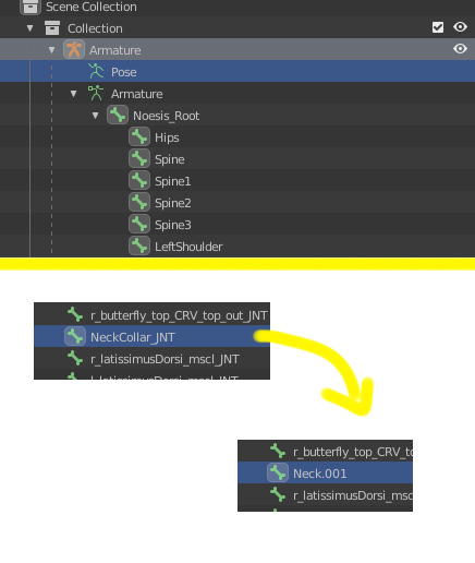
⚠ Another thing to be aware of is that a lot of garments's might break around the collar area! However if you plan on using this same mesh in an outfit, don't let that scare you, as it's easily fixable in blender
Export your desired mesh and look for the "NeckCollar_JNT" bone and simply rename it to "Neck" (blender will put some numbers next to it but that's fine, ignore that)
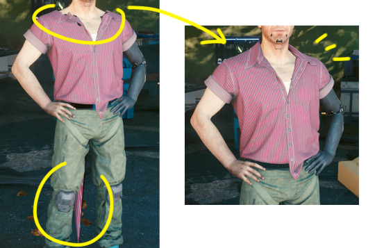
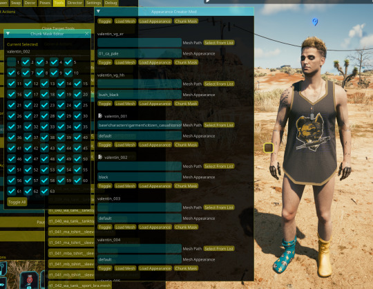
I'm going to switch to Valentin here to showcase how to deal with potential clipping 🤏 Since Valentin's body is customized, bit chubbier, he always needs refiting
Let's say you swapped your character's top for something else but part of his torso clips out

To put my boys titas away, I'll look for his body component (t0)

Click on "Chunk Mask" to open the garment's submeshes list
Garment's meshes are broken down in multiple submeshes that can be easily chunkmasked (disabled) at will to deal with clipping! This is why NPC usually don't even have a full body mesh when taking off their clothes, they are chunkmasked to avoid clipping :D
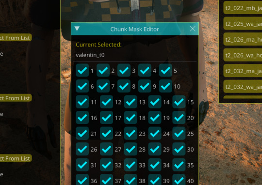
I will disable the Submesh 1 by unchecking the "1" box
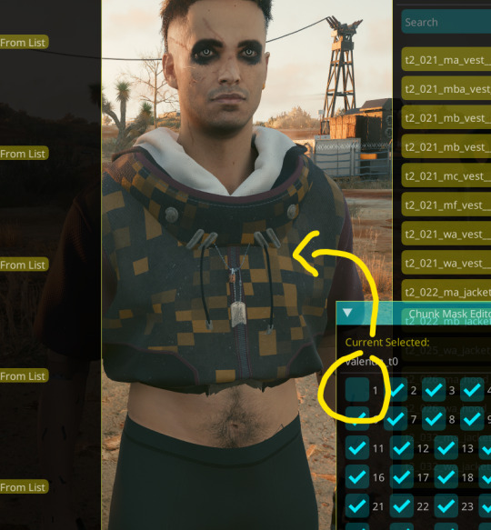
Don't be afraid to click on multiple box and see what gets chunkmasked on different meshes! You won't break anything 👌
aaand for now that's about all I can think of that might be confusing for users- tho if you have question don't hesitate to ask on this post, to reblog or to come into DMs!
115 notes
·
View notes
Note
How to anatomy?
okok i have been putting off replying to this because I’m shit at explaining and also mess up anatomy myself A LOT, but here’s some tips that have helped me.
Watching your surroundings/people IRL. I think this kind of requires for you to be more of a visual thinker, but this especially helps me with facial anatomy. You can also use pictures for this, in which you just… look. Looking and copying again and again really helps, but you gotta know how to look.
I think the most important things to study are the general sizes (of limbs, hands, etc.) and to play around with it a bit, which is easier if you are a digital artist. Then also the muscles and the shapes of every separate part. Also where they connect. For example where the arm connects to the torso and how that looks in different positions.
I also see a lot of people use thick lines in their first sketch, which I genuinely think doesn’t help. Loose, sketchy lines allow you to get a better feel of what you’re making and allows you to build a shape, rather than conforming to one shape at once. Sure, that’s got nothing to do with anatomy, but it helps when studying.
Art references. And also tracing and copying, but in a way that you don’t trace precisely, but check for general rules and use it to study the anatomy. Once again, sketching over instead of harsh tracing helps you understand easier and better imo. By tracing I also mostly mean the body, and I think you shouldn’t rely on it entirely, hence why it’s a study. You learn from it so you can stray away from actual references.
I also look at myself a lot. If I’m confused how an arm stretches? I’ll test it out. This adds onto the looking at others tip.
Breaking the (human) body down into simpler shapes for the sketch and working with lines to measure and guide? in a way (especially in the face area and to determine a clear middle throughout your subject’s body.
LOOKING AT ANCIENT GREEK (or inspired) STATUES. They were genius, I swear. They’ve helped me personally whenever I actually study anatomy to create more fluid and life-like poses, even if I do in fact fail to apply that to my art occasionally.
Limbs and other body parts aren’t straight, but actually more fluid, which is important to know. Of course stylization is a thing, but this fact helped me a lot. Also looking at how ‘fat’ is distributed between afab and amab people (generally) can be nice information to know, which adds to the muscle knowledge.
Practice…. so much practice….. I myself try to draw almost daily, but you also shouldn’t wear yourself out. Don’t draw if you can’t at the moment, but when you feel okay enough to do so, I do think studying helps a lot, even when you just draw a similar pose over and over again. Drawing shouldn’t be a chore, so from experience, don’t force yourself and be dumb like me and overwork the tiny artist working in your brain.
These are just a few! I might have more but I’m tired. If there’s more specific questions or more visual examples and stuff needed, I’ll definitely reply faster though… hopefully.
14 notes
·
View notes
Note
Looking at your past art has me really loving your drag king Natsumi, do you have any more thoughts on them? I'd love to hear them. Also just your genderbend ideas in general. They are very interesting!
for future reference, here is where i drew some drag king natsumi + sapphic ottosuba :) i definitely plan on making more genderbend au content in the future thats for sure! :o i have another older art post on this here also (i am. too lazy to find it rn but its there somewhere!!) but i have some in depth thoughts about fembaru for sure yes :3 ty for finding my genderbend ideas interesting!! :D !! id be happy to talk about them more :o
im gonna start with outward design stuff / gender presentation first!! :D bc in my head, afab subaru probably looks almost exactly the same. in general, canon subaru’s most likely at least a little androgynous (and i think he probably is judging off of how much he passes as the opposite sex!!), and we know hes got his dad’s spiky black hair and his mom’s mean eyes and general facial shape, has a long torso, that sort of thing, so i think afab subaru would look similar :o
plus i like to treat fembaru as basically just the mirror/foil/inverse of canon amab subaru anyway, so yep natsumi schwartz is gonna be her male persona!! canon amab subaru was mistaken as a girl when he was a child, and he also went to high school (iirc it was high school but at the very least he was about the same age he is during arc 1) for three days as natsumi yes and passed for three days. iirc he would put on the girl’s uniform and wig and stuff on the way to school and out of his parents’ view and then put on the male uniform and take off the wig before he got home!! plus you know he’d generally practice makeup most likely and wig styling and all sorts of things in private.
so definitely afab subaru is doing similar stuff but in the opposite direction now—looking more masc and presenting as a boy. while amab subaru can put on and take off a wig, in my head, afab subaru would probably have to have shorter hair. so one day she just got a haircut thats short enough to where she could style it masculinely but longer enough to where it could still be kinda considered feminine enough!!
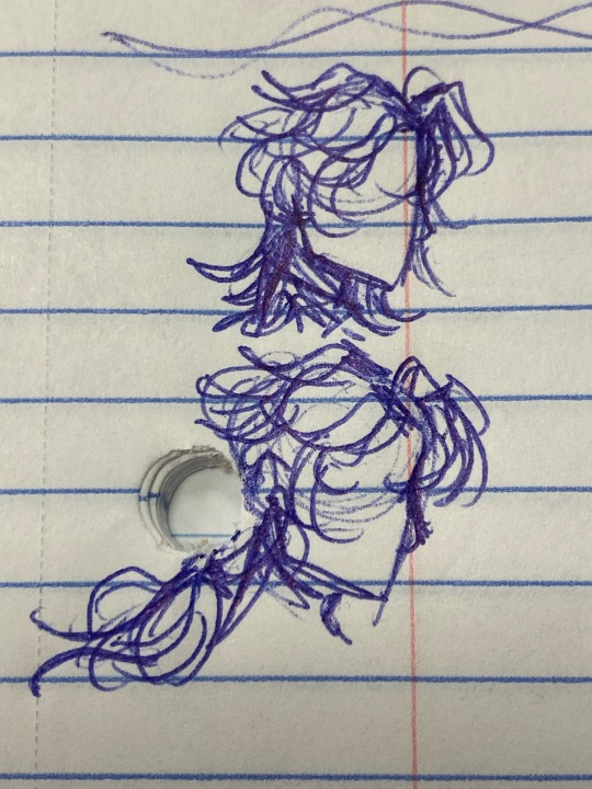
im not 100% sure how to draw her hair yet but in my earlier post and a few of my sketches it kinda looks like either a long mullet/wolfcut or a messy bob :3 i think you could probably say that her hair looks more like a wacky bob when shes more feminine and a wolfcut when shes styling it more masculinely?
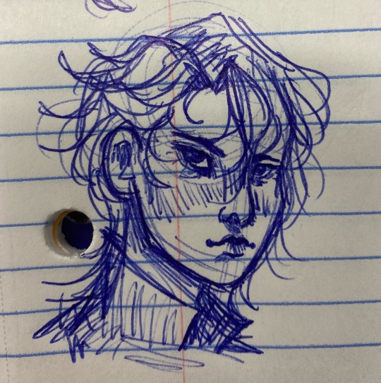
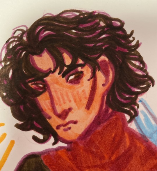
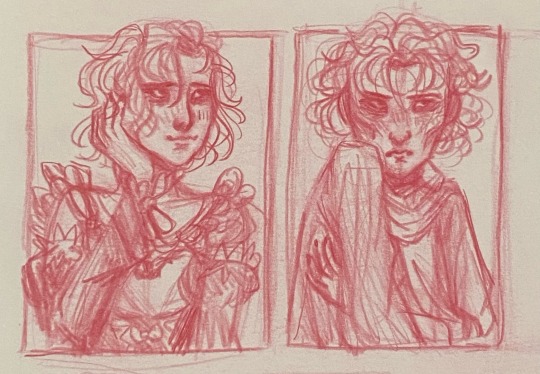
(^^ my take on fem wrathbaru is here also LMAO)
i also base my fembaru design off of canon natsumi!! with the side bang (though i sometimes draw it on the wrong side akdnd)!! meanwhile fembaru’s male natsumi would have canon amab subaru’s hair :) (which you can see in my earlier post as well!!)
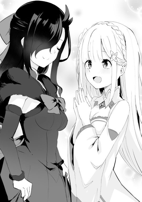
(i like this illustration actually <3)
i also like to hc that on top of subaru wanting to look and act more like his dad in canon, he did also kinda want to resemble his mom when hes presenting more femininely :o also for genderbend aus it depends on whether you ONLY want to genderbend subaru or if you wanna genderbend everyone along with subaru too, that sort of thing. i like to play with both possibilities :o
but in general, i like the idea of subaru either way trying to honor both her mom and dad. maybe to subaru her mom is what an ideal woman should be perhaps, and her dad is the ideal man, bc subarus parents are her biggest role models, so she tries to emulate both at different points in her life. she tries to be the perfect soft sweet girl like her mom and it doesnt work. she leans into being a bit of a delinquent and it doesnt work. then she cuts her hair and learns to present more masculinely and tries to copy her dad only to fail again. :((( then she gets isekaied……
i feel like afab subaru might get a bit more shit for getting into trouble too :(( or for being too loud. shes not very traditionally ladylike, i think!! boys will be boys and of course your daughter takes after you, kenichi, but dont you think shes a little too rough around the edges now?
anyway otherwise in general, i also like the idea that over the course of each arc in the fantasy world, subaru grows her hair out!! and once its long enough she can put it into a ponytail like her mom again :,)))
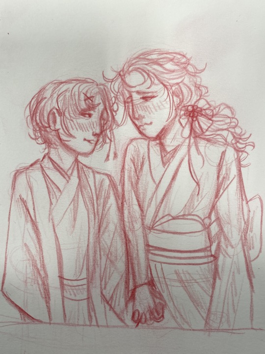
(male rem is here too <3)
also i like to give fembaru the maid dress instead of the butler outfit!!! probably not with the garter and stuff but 😭😭 its a pretty dress and fembaru should get to express herself both masculinely and femininely :3 in my head, i think subaru would be shy bc AGHH THIS DRESS IS SO REVEALING THERES NO WAY ID LOOK GOOD IN THIS IM NOT PRETTY AT ALL and rem and ram (genderbent or not) are probably like nonsense just try the dress. its your uniform to work here. and subaru does and huhhhh. maybe i dont look half bad ? :,) (bc of course subaru’s insecurities either present themselves the same or slightly different when genderbended). and of course when rem and ram warm up to subaru eventually ram can be like “you dont look as bad as i thought youd look” or something and rem can be like “subaru-kun youre very beautiful anyways!!!! <3”
and also i do think subaru would cut her hair a bit again or style it different for natsumi adventures later in arc 7 <3 just to have that symmetry again. the situation probably might go a little different but yep this is how id handle it 👍
and of course you can give subaru the canon natsumi hair bow sometimes when shes feeling fancy :3
OKAY and now im gonna talk about more character stuff!! lets talk about subarus whole thing with isekai and genre savviness and all that.
one of canon subaru’s many many Many parts making him up as a character and making up his story in general is a deconstruction of the isekai genre!! power fantasy and characters being cardboard cutouts for the male mc to triumph without a struggle—that sort of thing. but afab subaru is a female lead now, and female isekai is different.
id have to do way more research into this and watch more female isekai and shoujo and stuff (ive been Really wanting to watch im in love with the villainess…… someday i will…..). buuut from what ive noticed so far it seems like for male lead isekai the fantasy here is the Power and Prestige, but female lead isekai’s fantasy seems to be the Romance!! not that you cant have OP abilities in female lead isekais and not that every isekai is 100% the same of course. but that seems to be the common tropes from what ive seen so far? male isekai protags have girls throwing themselves at him as trophies, female lead isekais have their male romantic interests and the evil evil villainesses are defeated somehow and perfectly out of the way <3 the fantasy is that youll be loved by The One—the perfect boy(s) <3
and i think amab subaru is less likely to check out much female lead isekai but i think itd be fun if afab subaru would probably focus on female lead isekai but also a bit on male lead isekai as well!! she wants that absolute path to glory AND love. (and ahahhahahaha please ignore the gazillion ikemen anime figurines in her room hahahahahhahhahahahah AND DEFINITELY IGNORE THE SILVER HAIRED ONES. ESPECIALLY THE ONLY GIRL FIGURINE SHE HAS THATS BEEN GATHERING DUST UNDER HER BED—)
but also bc i think amab subarus more likely to go nah i wont look at girly media while maybe afab subarus like godddddddd i want instant OP abilitiessssssssssss and godddddddd i want hot girls around m—WHAT. WHAT. WHO SAID THAT WHO SAID THAT—
anyway so subaru gets isekaied and shes like SWEEETTT A NEW BEGINNING AWAY FROM NOT BEING ABLE TO MEET EXPECTATIONS HAHAHAHAHA IM THE ISEKAI PROTAG!!! THIS IS AWESOME!!! (is about to get her shit rocked). and shes like ooooh do i have any abilities (nope) and oooohhhhhh shit do i have a villainess. AM I THE VILLAINESS???? no way right. anyway lol wheres the ikemen who’ll ill marry one day. the ikemen that falls in love….. with a commoner……… like myself teehee… and they get married…… and the villainess is CONQUERED….
anyway so what im saying is. ………….fembaru is a femcel. AND a pick me. AND a disaster bisexual. you could practically imagine a vine boom after each of those.
i think the biggest most important to me with genderbend aus is keeping the humanity of the characters the same the best i can!! and fembaru is STILL subaru, of course shes fucking cringe!! of course shes got a heart of gold but its under layers of cringe!!! of course shes a nerd who doesnt have any friends at first and trips and stumbles through all the shit being thrown her way!!
also if male subaru is bi then so is fem subaru okay. we’re equal opportunity here. and also amab subaru has issues with his masculinity and uhhhh slight things with women (see: his boob comments in season 1…….. subaru i love you but cmon man). so. afab subaru i think has got a terrible case of internalized misogyny / homophobia / PROBABLY SOME COMPHET TOO LMFAO 😭😭
i think general plot beats (whether its only genderbending subaru or genderbending everyone) goes mostly the same but again, slight differences. im gonna go with only subaru being genderbent atm bc thatd have more differences i think :o
yes ok so subaru’s gonna see reinhard and go GASPPP oh my god. pretty ikemen. ohhhhhh oughhhhh hes so pretty. hes clearly main lead material… ohhhh what do i do ive never talked to people in so long and hes so PRETTY FUUUCKKKKK BUT I DONT WANNA BOTHER HIM EITHER AND PUT HIM IN DANGER. um um um um mmumimimm HE CLOSED THE DISTANCE BETWEEN US TOO???? what the hell what the fuck what the fuck shit shit um think THINK SUBARU THINK YOU HAVE CHARM RIGHT?? YOU CAN DO THIS. YOU CAN CHARM A HOT GUY. ARGGHHH— *explodes*
but also subaru sees emilia and gets that “do i wanna be her or be with her” feeling 😭😭 bc emilias so….. cute…. pretty… and NICE TOO?? WITH A FUN PERSONALITY??? SHIT SHES GOT EVERYTHING!! she went out of her way to save me 🥺🥺 and im just dragging her down 😔😔 BUT FUCKKKK I HATEEEE HOW GOOD SHE IS. and then :,)))) theyre both dying in the warehouse… and the first time subaru feels the touch of another girl in a more intimate light is her and emilia holding hands as they die…………….
SO YEAH THEN SUBARU RBDS :,,)))) so like. do you get what im saying. emisuba and remsuba and satella are subaru’s first sapphic heartbreaks and heartaches. muahahaha!!!! insert more evil laughter here!!!! bc since subarus a girl her relationships with emisuba and remsuba are definitely gonna be perceived (both by other people and rem emilia subaru) more so as friendships first and foremost.
so….. subarus getting the codependent homoerotic teenage friendship bright and early HAH. but i cannot blame her!! i too would go insane if i was put in a new unfamiliar world and i met this cute girl i was both jealous of and a little into and then we both died and the last thing i felt was searing pain and her soft fingertips!!! i too would go insane if i thought this maid was my friend but then she tortured me and—and—
but yeah you know how amab subaru has his whole weird complex bromances with reinhard and julius and otto?? now itll be like that but with emilia (the julius and reinhard…) and rem (the otto….). emilias the girl subaru’s having “do i wanna be her or be with her” weird rivalry shit with (subaru’s internalized misogyny probably also adding to this bc Obviously theyre rivals) and rem’s the girl who brutally betrays subaru personally (worlds worst homoerotic teenage friendship breakup of all time 😭😭) but then she later becomes subaru’s loyal best friend???? crazy shit.
and like emilia and rem are totaaally villainesses in subaru’s way (except emilias sweet af and misjudged by the entire world and subaru doesnt have the heart to fight rem and also shes chugging copium and trying not to think about failed loops. or about her gay feelings). toxic yuri is toxic yuri-ing. subaru doesnt wanna be explicit about it….. emilia isnt sure of her feelings other than stuff like caring a lot abt subaru… and rem is. Rem. so theyre all in gay situationship limbo HAH.
also as an afab person too rip subaru for also having periods while the whole world is ending on repeat 😭😭 LMFAOO. im sure theres medieval fantasy remedies though (and rem is 1000% spoiling subaru on her period)
also no one can tell me that echidna and rem WOULDNT still be into subaru as much as they are in canon. subaru regardless of gender fascinates echidna and her greed. subaru regardless of gender is someone rem will grow very very attached to. and if anything, rem would get way more bold with afab subaru.
bc the thing with female relationships is that i feel like theres a higher level of intimacy that you gotta go to for it to be considered more romantic or homoerotic. with guys it could be like holding hands and other people might be like WOAH THATS GAY, but if girls do the same thing its like aww youre such good friends. i think rem would take advantage of her and subaru being the same sex and she’d probably keep trying like “hey um um wanna cuddle together?? in the same bed?? and bathe together teehee?? i can help do your hair and dress you up? and make lots of cute dresses for you ? :) <3 🥰 and i can even massage your bo—I MEAN YOUR BACK. YOUR BACK!!” or it’ll be like. rem gets a little too happy that her and subaru’s periods get synced up or something 😭😭 shes Not Normal (and unfortunately subarus probably a little too into that)
also unfortunately the other time a girl touched subaru intimately was satella squeezing her heart :(((( and hahahah between that and rem and emilia and later echidna…. ohhhh poor subaru and her terrible toxic yuri 😭😭 her sapphic experiences and experiences with women have not been 1000% great.
but also of course subaru is so very not normal. you have the canon typical “lol every memory is a good one <3 even rem torturing me teehee <33” and also i just think itd be funny if you as an audience is lead to believe subarus jealous of emilia and rem’s boob sizes and no. no shes just gay. shes GAY.
and stuff like everything going on with julius and otto gets recharacterized too. bc subarus a girl and the guys are guys its probably gonna get perceived more both in and out of universe in a more. Quite Literally Straightforward light. esp bc subaru’s still gonna be into reinhard and julius lbr HAH.
i want arc 3 to still be an absolute fucking disaster with fembaru. let fembaru be flawed and ugly!!!! so in my au thoughts here itd be like. subaru feels jealous and threatened by lots of people. emilia, though its subsided a bit after becoming friends and after learning a bit more abt emilia as a person. but also i think subaru could feel so so jealous of the royal candidates!! esp crusch priscilla anastasia even though subaru will 1000% think theyre bitches at first during arc 3. bc theyre such strong determined women who seem way more confident than subaru herself is…. and also im sure there’ll be complex thoughts from her on felix too bc crossdressing… gender presentation… is a complex thing for subaru.
and subaru with julius is like. “get away from emilia!!!! shes mine!!! shes MY best friend that im homoerotically codependent on and obsessive of!!!! and also youre just trying to steal reinhard’s ikemen male lead spot huh!!!!! bastard!!!! (i hate that youre so pretty too)” and everything of course blows up in subaru’s face. im sure at some point in the story subaru might get slutshamed for having all these connections to people and romantic threads (especially since shes afab) but also its like. wow shes such a stupid girl lol causing a racket.
and uh being a man beating up a girl looks a little worse due to gender roles and stuff but lot of the knights are still gonna want to go after subaru and julius is still gonna want to save subaru. :,,)))) arc 3 emisuba breakup….. worlds worst sapphic breakup of all time…. and later rem will be the one that got away also :(((((
but yeah i think in general this subaru’s connections would be a little more. subtexty with the girls bc she’d be more hesitant to be explicit. but a bit more explicit with the guys bc itll be easily perceived as romantic in and out of universe. and of course subaru i think will be flustered in different ways between the girls vs guys—with the girls its OHH GOD I CANT BE GAY I CANT BE GAY NOOOOO I HAVE A RIVALRY!!! IM SO JEALOUS OF THEM!! BUT. BUT I LIKE THEM!! OHH GOD. with the guys its OH NO. GOOD LOOKING GUYS???? FML. FML!!!!! WHERES MY MAIN CHARACTER CHARM??? HOW DO I TALK TO GUYS???? JULIUS STOP MAKING FUNNOF ME!!! >:(((
also brief note on otto bc things are probably gonna go different here qkdnd. like i definitely am of course of the opinion that otto fell in love with subaru. in every damn arc in every damn main route otto side content hes getting unhinged over subaru in a way that i think makes a little less sense if you dont view it as otto just Not Being Normal About Subaru in a perhaps vaguely homoerotic way. Possibly? Maybe? Schrodinger's relationship blues.
but subarus afab now!! and ottos still a guy!!! and reinhard and julius are friendly with subaru right, but at around arc 4 things they dont show explicit romantic interest. (i think arc 5-6+ julisuba and juliemisuba would be 👀👀👀 though.) but otto?? in a universe where subaru is a girl??? well now its more acceptable for him to be grow openly head over heels for subaru. but also its probably also more pathetic bc now its probably gonna be more obviously taken by others as otto having a Romantic crush on subaru. regardless of whatever otto's feelings are.
and subarus had her arc 3 development right. but here its like. you wanted a male character who’d fall in love with you and be loyal to you and do Anything for you???? here you go!!! but also given otto is Like That and gets worse by arc 7-8 i think hes gonna seem a bit more sinister. not that canon otto with canon subaru isnt sinister but theres different connotations to male otto paired with female subaru. bc it sort of follows straight dark romance rules, right, with the cunning possessive male love interest and the female protagonist…
i doubt anything explicit would go on between otto and subaru in an au like this bc 1. otto and his avoidant attachment LMFAO and 2. subaru and her issues also and 3. subaru in main route is Not as into otto to the same extent or degree otto is HAH.
and fembarus probably like. i think itd be funny if she was a little disappointed otto wasnt a girl 😭😭😭 but then later hes weird about crossdressing and shes like why dont you wanna do it huh 👁👁👁👁 why are you weird about it 👁👁👁👁 im staring at your glass closet right now—
and also its like. “WHY ARE YOU THE FIRST BOY TO ACTUALLY BE IN LOVE WITH ME WHAT???” which i think is hilarious but i also think it could be fascinating in terms of playing with gender!! bc otto may want to be in control of things, but hes also so subservient to subaru anyway. otto and subaru are both androgynous; otto can pass as a girl and subaru can pass as a boy. if you wanna simplify things further you could also explain this as—otto is a man who looks like a woman who’s pledged his servitude to a woman who looks like a man. very intriguing imo!!
but of course ottosuba power dynamics are Always shifting over and over like a game of tug of war, but the most common thing is that otto will bow his head to subaru but under the surface ottos trying to be in charge. that sort of thing!! and the idea of male otto servicing female subaru is an idea rezero ao3 seems to like also but :,) lets just say its not fully to my taste haha :,,))
and otto is definitely not gonna beat up subaru’s ass so easily this time around bc itd look so bad and he’d know that lmfao 😭😭
but i think theres a lot of potential to play around with gender roles and such with all of these dynamics!! im very passionate about making my genderbend au ideas as wild and layered as possible :o !!
this is all my main ideas atm (and id love to draw stuff like more drag king natsumi or fem reinsuba :) ) but yes i hope this all makes sense :D !! thanks for reading this far and thanks for the ask!!
#rezero#re:zero#natsuki subaru#uhh should i tag the others….. i guess so#reinhard van astrea#julius juukulius#emilia#rem#otto suwen#ask#gender au#genderbend#save for later#i need to write or draw more stuff on this eventually :<<
40 notes
·
View notes
Text

Thanks for the ask, @strrwbrrryjam ! i'm flattered that you think I do a good job of that, because I'm still learning! (and I also struggle heavily with proportions. I have to resize my heads and arms so, so much...)
I'm afraid I don't have any secrets. I think the answer is to just practice, over and over again. But specifically, this is what I try to focus on as I'm learning:
references
quick practices - 30 second to 5 minute studies that help with getting a full scope of the shape and energy of the body, not meant to be perfect
studies - deep dives into certain anatomical structures (videos linked below)
Below the cut is how I use references go from this to this:

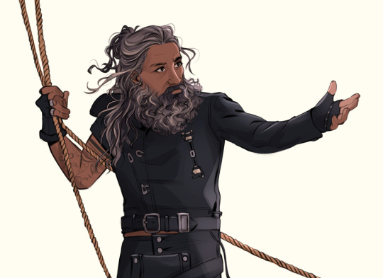
References:
Use a bunch of references! Pictures you take, stock images, from shows--practice real people. Even if your style is heavily stylized, it all starts from an understanding of anatomy.
How I Use a Reference When I Struggle With Proportions:
The first step I take while looking at a reference is to just draw a very loose sketch with a line of action that goes then entire length of the piece, and I try to section it out. I find if I don't think about the body as a whole, and just start drawing a head, the head will be way bigger than the rest of the image. So my first step is just really boxy and basic, just to get all appendages on paper. My first pass could look like this:
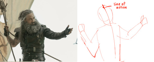
Okay, not bad. But the right arm is going way too far down--the forearm is really long. The head is too big for the style I want, and the left arm is at a 90 degree angle, unlike the picture. But, I have the general scope of everything on the page, so it's easier to adjust and look at the full picture!
Then, I try to focus on landmarks. I look at where certain body parts fall in the reference. For instance, Blackbeard's right elbow doesn't reach his belt, so his elbow shouldn't be near his waist. I can tell that his left arm is closer to being straight than at a right angle, and I can see that his head isn't as big on his shoulders as I have. I can also look at the negative space and see that the gaps between his right arm need to be smaller. So my next pass might look like this:
(I don't usually draw on the reference image, and I just "draw" the lines in my mind, but the for sake of things...)
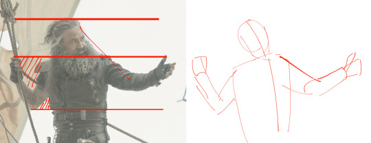
Now it's looking a bit closer!
The next is the harder part. It's making things shapes, and is closer to the lineart stage. I try to follow curves, separate the chest from the torso, get the angle of the shoulders and head, etc. I have some video links at the end that explain this step much more in def.
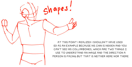
You may notice that the head angle is a bit different than the image, and the shoulders are a bit lower. Sometimes, following a reference image completely either doesn't fit your style or, in some cases, the more accurate drawing following a reference can actually look "wrong" (anatomically) when drawn. Figure out what works best for you, and for the message you're trying to get across in the piece!
[sliiiight flashing in timelapse]
And here is the final timelapse, with a little refining and polishing of the anatomy. Not everything is completely accurate to the reference image, but I've created a believable image in the likeness.
I hope this helped! This was a quick and dirty post of something I'm still learning. Here are some youtube tutorial artists, resources, and books that I use to learn!
Youtube:
-ModerndayJames has lots of videos on creating shapes and understanding anatomy, and placing people in perspective. He has a lot of free videos, and then some cheap ones on gumroad that go more into it.
-Proko has lots of videos on anatomy!
Practice Resources:
-Pose Maniacs - figures in different poses. You can move the camera around to see different angles.
-QuickPoses has images for figure drawing and quick gesture drawing! You can even have different timers.
Books:
Morpho Series. There used to be the one on "Fat and Skin Folds" that was a free PDF download that was on tumblr for a while, but I don't believe the books are that expensive.
Taco's Books, published by Lezhin. This is heavily anime styled, but talks a lot about anatomy, and is a great resource!
#art tutorial#asks#mytutoirals#myart#proportions#turns out you can't add videos to asks and if you try it makes the post uneditable#so i couldn't answer your ask directly. hope you see it sorry!#anatomy tutorials
59 notes
·
View notes
Note
I love all the art I've seen from your blog! I was wondering what your favorite part of designing a character is?
thank you! and goddamn that's a good question because that is such a tough one. see, i really really like character design. i love it, it's incredibly satisfying, i do a fuckton of it, and it is hard as fuck and often a miserable fucking process aubdskfjgb. it's like some messed up freeform puzzle, connecting shape and color language to personality and background, trying to mash it all up into one cohesive lump. but, as much of a pain in the ass as it is, it's also sooooo fucking satisfying. it's truly a rollercoaster for me.
that said, i'd say probably my favorite parts to work on are the face and hair! those come easiest to me and i feel most comfortable playing with them. colors can also be very fun because i like playing with accents n contrast. i really enjoy working with bold shape language, but it still doesn't come very naturally to me and the process often feels a little awkward. that's something i'd definitely like to work on more!
bonus rambles abt my design process below the cut because i got carried away lol
the best way i've found to do character design personally is working in rough stages and iterations- here's an example w/ outfit design

to start, i made a 'mannequin' base sketch, and then used a large brush in only grayscale to block in loose designs. you can see here i already had a basic idea in mind for how i wanted him to look- the shorts, robot legs, mask, and exposed skin on the torso pop up in each iteration in different ways. once i had several and felt like i was getting there, but hadn't quite gotten it exactly, i went back and circled my favorite parts of each design that i wanted to reuse. i made a couple more iterations with that in mind, then once i felt like i 'had it' i detailed it a bit more to finish it up.

then, with the final rough design, i made clean lines and filled it in with base colors, then copied it and recolored different ways. here's some more examples of color work-


(you can see that i also had some fun with recolors after i'd found colors i liked lmao)
i use the same general principle of focused iterations pretty much any time i'm doing serious character design stuff. i find it easier to approach designs in pieces rather than all at once ^-^


of course i don't ALWAYS do this, theres a lot of times that i approach things with a way looser 'fly by the seat of my pants' method, but when i'm really honing in and approaching it seriously this is usually my method ^-^
8 notes
·
View notes
Note
If you don't want unwanted art advice feel free to delete this ask ^^"
You do not suck at art! You simply haven't used the right step.
You seems to go right into copying your reference, but before copying, you should *understand* your reference. What I mean is that you should break it down! Your reference is great because it already do a big part of the job by turning complex anatomy into simple shape, but it's not the only part of breaking it down: you should also try to understand the proportion, angle of your shape and once you learnt a bit more about drawing how the shape works in 3d for example.
• To understand the proportion, you need to compare different part of the body with each other. For example if you take your character torso + belly, you'll see it's the same length as their legs + hips!
• To understand the angle, you need to understand how each part of your character bodies is bending. For example, if you compare the left leg you draw compared to your reference, you'll see the reference is much straighter!
To do so I really recommend you take your reference and draw on it. To understand proportion, you can for example make two box of equal size one for the torso + belly and one for legs + hips. Or to understand angle, you can for example draw line following each body parts angle.
Once you understood the reference, you shouldn't go right into drawing but rather make a sketch with construction line. See how you divided your character in two boxes? Well, now you can draw those two boxes before drawing the body! Now, when you'll draw torso + belly and legs + hips, you assure they will be equally sized so your drawing will look more like the reference :)
This is only a very simple explanation of construction like but I hope it can help you! I wish I could use picture in anon to show you directly but if you ever wants some I can share without anon.
Oh, this advice is definitely wanted, thanks so much anon!!!
Aaaah, I see I see. I plan on going back to it, but will do it traditionally, since I don't have the right equipment for it (and my laptop is ancient. Took half an hour to install WACOM haha), so I assume it's the same traditionally right?
Thanks so so much for the advice anon! :D I feel more confident in this (and please, share a pic! If you want me to answer it privately, just let me know! Alternatively, IIRC, I just drag and drop the picture and it works on anon, or even copy paste the picture and put it there on anon on mobile. That's what I remember doing before!)
7 notes
·
View notes
Note
hi hi! I really do love your art, but I would like to ask how you break down the body…? If that isn’t too much to ask!
Your work is a joy to find appear on-screen, and I like seeing it lots. I hope you have a nice time of day, upon seeing this.
Hello hello! Thank you sooo much for the kind words-seeing people genuinely enjoy my art means the world to me :D
Breaking down the body, huh? This is a fun complex question that I’ll answer aspects of so hopefully you’ll find this helpful ^^
Firstly, the most important step for me (and the one that plenty of artists get sick of hearing) would be references. By this I generally mean becoming accustomed to making your own references; references online work for plenty of people and that’s great! For me though, I like being able to shape exactly what the character is doing. Even if I don’t have time to snag/take a good reference photo, I’ll still use little aspects of myself while I’m drawing. Aka, flipping myself off for the purposes of making a better drawing of a character flipping someone off LMAO.
Another thing I recommend for those early stages of shaping the body would be thinking of every aspect as it relates back to the others. How far down does my arm go in relation to my torso? How big is my hand compared to my face? This is another reason why having your own body rocks because you can check these things pretty fast. Once you have the basic proportions down, it’s easier to shape each characters body type individually.
Speaking of body type, it can also be helpful to draw all the littleeee aspects of the character’s body type in the sketch-even if it might get covered up by clothing later. Things like hip dips, color bones, or anything that gives the character shape! Sometimes it can be a bit frustrating to draw something only to have to cover it up, but it helps me figure out how the anatomy of a specific character will look or how clothing with go over it!
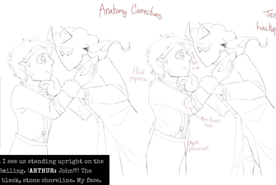
Luckily because I have to do a bunch of progress explanations for class I’ve got examples! Here’s one of me thinking about proportions as I mentioned earlier. John’s shoulder is also a really good example of me going “hey I think he would have sharper shoulders, lemme make sure I include that in the sketch” which actually ended up affecting the final result since his jacket is fitting enough to show that shape :]

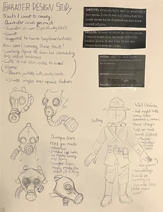
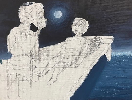
And hereeee is an in-depth breakdown of some processes I did while making a piece! Arthur’s pose is a good example of me using a reference. A friend did it for me, I took the shapes of each part to create guidelines all around, and then I could play around with them to get it where I wanted it!
Welp, hopefully I didn’t bore you too much with my long winded explanations! I love yapping about this stuff and have tons of progress photos in my album,, but I think that’s where I should leave it off :]
Feel free to lmk if you have any questions!!
#sighhh. yeah I ended up using malevolent to help me explain myself#what else could you expect from me honestly#art stuff#ask
3 notes
·
View notes
Note
I haven't slept in a day, and in that time i thought of some questions!
1. Myriad Island is made of several different groups, including hunters. Does anybody have a relation to the former warlords? Griselda, Ragnar, or the other guy (forgot his name lol)? Any one related to Johann or Viggo too? And if they do exist, do they hold any higher status, or would they need to prove themselves before such a thing?
2. Niv escapes Myriad island for a new life. Does anyone else get out and start a new path?
And 3, if it isn't too rude to ask, do you have any art advice? I'm kinda new at it, considering I'm only getting more serious now. Any advice on drawing heads/bodies and is any one method better than the other? Or is it more of a 'what fits for you' thing?
OH better go to sleep soon if youve been awake for that long!!!!
As for the answers!!
1. Some of the myriad tribe hunters do have some connections to the warlords, yeah!! Mostly the ones who joined after the warlords' defeat. There's not a lot of connections since the Myriad Tribe is a bit more isolated, so there isn't any relation to Johann or Viggo. They probably did hear some elusive tales about the tribe and thus might be wary of sudden strangers coming to assist them.
So, nope! The hunters of the myriad tribe aren't really held in higher regard. They aren't a talkative bunch over there, so i imagine there isn't a lot of room to talk about it either. The tales Niv and the others hear abt dragons and Hiccup and Berk and Berserker Island do come from mostly hunters, tho! Even if they aren't often believed by the youth haha
The Myriad Tribe is also mostly self sufficient, which makes connections with other tribes not too needed. They really strive to live as lonesome as possible after decades of crafting their assassin society
2. Yeah!! Per generation there are at least a few kids who escape somewhere during their teens. Sometimes, the Myriad Tribe tries to locate those kids to either drag them back or take them out so their existance remains in the elusive state it has been for a long time.
In Niv's generation, only his friend Olga escapes. She returns to the island of the Bog Burglars, as this is where she originated from. She escapes a bit later than Nivvie, a few or so years, so she's seen a bit more of the tribe than him and has a deeper understanding of how they work, since she was technically a part of the "adults" seeing as she left after her education was completed. When Niv and Olga near their mid-twenties, they start making plans to try and dismantle the Myriad Tribe and save the kids stuck there. Still figuring out the details on that haha
3. As for art advice!! Definately not rude to ask!! I'm currently not in a position to give an in depth tutorial as I'm in the train to college rn, but I'll try to make one with pictures for you when i can.
Heads and bodies are a tricky thing and i must say that its really a thing of knowing guidelines and practising a lot. There's also a thing about getting a feeling for it. Every artists draws bodies differently and with different notes to keep in their mind while drawing.
Personally, i have a very loose sketch style and try to first jot down the big shapes in the body. Think the position of the head, position of the torso and how it stands on the hips. Legs are difficult, seeing as they need to balance the body out. My biggest tip is to see the body as one big thing in the sketching stage, instead of seeing it as multiple small parts. Small parts can come later, but they won't fit in right if you don't have a solid base.
And of course, don't beat yourself up if drawing bodies doesnt work right away. I've been consistently drawing since i was 13-14 and believe me, I definately haven't mastered it completely either. Just try to draw a bit consistently and in the first few years, focus on drawing what you want and what makes you happy.
Do that afterward too btw lmao
And throw in some studies! Figure drawing, either from real life or from photos is a really good tool. I'm definately not against using references, but try not to trace everything directly over. This makes it more difficult for you to understand the underlying bone and muscle structures, as you only see a 2d mass instead of the 3d one you're trying to draw. If you do need to trace a photo reference, try to add in guidelines that make you understand those underlying structures.
I'll add some pictures of a way to do that in the tutorial post i'll make when i have some time, its pretty simple and will really help you in longer terms :D
I hope this way an okay answer!! My inbox is always open if there's more info needed on anything, including art advice. Art is definately a "what fits for you" thing, but when you keep trying, you'll probably develop those skills without even noticing
Ty sm for asking!!! These were so much fun to answer!!! <333
#art advice#ty for the ask!!!#niv and myriad asks are also always fun#still working a bit on closing some plotholes in the myriad tribes history but hey#we cant have everything at once#certainly not with my animation schedule lmao
5 notes
·
View notes
Note
Ur strength is definitely color and line work. Something I would say needs some work is definitely your full body drawings and poses. Your poses are always static and rigid and (especially when in motion) it takes me a moment to figure out what the character is supposed to be doing. Your anatomy is fine, its the stiffness of the over all pose thats the issue. It makes your pieces lack energy and any real umph. Your beautiful use of color and line usually covers for this but for me (someone who also struggles with this) it pops out like a sore thumb.
To practice, id suggest doing gesture drawings (1 minute sketches of action poses) to really understand how the body moves fluidly and to practice capturing that energy. Id also suggest doing 5-10 minute studies of full body figures in which you specifically observe how the pose affects the distribution of weight. How the torso curves in relation to the pose (your torsos are often very vertical and stiff) and how their muscles, fat, and clothing stretch, bulge, or fold depending on the pose.
Try to keep things loose during these studies and focus on capturing the energy of the pose over perfect anatomy. Focusing on anatomy can often be a distraction and can actually detract from capturing the fluid movement of a pose when you are first learning. You dont want to be thinking about anatomy during a 1 or 5 or 10 minute study if that is not what you are trying to learn.
While doing gesture drawings, its important that you move fast and dont get hung up on details. Get the line of action in there and the general shapes of the figure. Focus more on the movement of the figure over anatomy or details. Feel the rhythm in the pose and do your best to capture it. Id suggest doing 10 or 20 of these at a time. Sites like Line of Action are great for studies like this.
For 5-10 minute studies you want to build on the rhythm you developed during the 1 minute studies. Again, you want to focus on the movement of the pose over the details. Keep shapes simplified and force yourself to think in the abstract. A vibe i get from looking at ur art is that you get focused on the small details while losing sight of the big picture (might be wrong bout this but its something i also struggle with lolol) so during studies its important to keep ur mind on the bigger picture. Focusing in on small details adds to the stiffness of a piece as instead of one singular piece, it’s made of many smaller pieces. Idk if that makes sense lololol. Id do 1 hour of these 5-10 minute studies.
But yea id say this is really the main thing holding you back right now. Once you figure out how to capture the rhythm and energy in a pose id say ur golden lololol good luck! I hope this helps XD
oh gods yeah I need to whip some referencing for poses and specially dynamism, I tend to make things a bit too stiff. I think I cornered myself into making very static poses since I do a lot of character ref oriented work, and showing the design and outfits is a priority over the dynamism, and like, I need to get working on that.
It sucks to realize how I've let social media performance guide a bit on what I draw and I practice. People like their fullbody character designs with a grey background, and I've let a lot of What Isn't That fall apart, and it's bad! I gotta get better!
I need to find a way to maybe get a way to do these practices and still post it, bc even when I've done them, they stay in a folder and never get to see the light of the day. (Also, I saw the other ask and I'm gonna check that one soon! I struggle so much finding good refs for that!)
13 notes
·
View notes