#with vibrancy and exposure increased to make everything more colorful
Explore tagged Tumblr posts
Text
*shuffles out of bedroom with walker* Can I tell you kids about what it was like back in the day here, 10 years ago, on Tumblr in the Phantasy Star fandom? Again?
90% of posts were wordpress links about PSO2. I’m not kidding, that’s what the majority of the Phantasy Star tag was. There was also a few blogs doing posting for the original games, but when it came to PSO1, there was nothing, which is why I created this blog.
I created this blog with limited gif making experience, and the majority of this blog’s earlier postings was fanart I’d find online with the source provided. I created this blog for pretty selfish reasons because...I wanted to make an assload of PSO content for my main blog. Instead, this blog became the main blog. After I created this blog, a few other Phantasy Star related blogs popped up. Sadly, those blogs are no longer around to my knowledge.
Anyway I stopped posting fanart because I’d get upset when my GIFs got reposted on here. Ik there’s a difference but after that I just felt disrespectful reposting art.
Fast forward to current *wipes happy tears*
I see MANY Phantasy Star URLs!!!! THERE’S POSTING IN THE TAGS. THERE’S SOME OF US STREAMING IT AND OTHERS WATCHING AND OTHERS JOINING. THERES. ARTISTS. HERE!!!!!
It feels like. A wholeass community popped up. And its just so beautiful. And the most exciting part is seeing everyone else’s contribution. Looking through my archive, my feed looks identical to what it did 7+ years ago, and I have you guys to tank for that. Remember for the past 2 years I’ve mostly just been making GIFs and now will share magic based on Phantasy Star. (ADHD has been everywhere see tags lol)
I’d like to flex the Art by OP tag today
There’s a total of 12 pages now!!! Thank you SO MUCH artists for making and sharing your beautiful Phantasy Star art and for the time you put into it :)
And while we’re here talking about what Phantasy Star was like 10 years ago on here, I’d like to share 2 things I did in the past;
Phantasy Star Problems looking at the last 4 posts here, I’m assuming I lost an image file after a windows install and didn’t feel like going through everything immediately to go back to it, so just dropped it. Or I saved over the beginning draft file and was pissed and didn’t feel like making it up again. OH BUT THIS WAS SO FUN PEOPLE WOULD SUBMIT THEIR PROBLEMS TOO those are tagged #submission :3
Phantasy Star 30 Day Challenge. I’d like to remake this with different wording but meh.
#seriously u guys make me emotional#listen artists#i've been trying to draw the same picture for a week now#and i am narry an artist#but I like to roleplay#i've restarted 3 times#and redrew half the body like 5 times#i wANT TO DRAW HOT MAGICIAN#with biG TODDY#actually guys it rubs me weird when you tag my gifs as art#its just taking a picture of the game#with vibrancy and exposure increased to make everything more colorful#I don't consider it art idk#but thank you?
11 notes
·
View notes
Note
hiiii, if it's not too much trouble can I ask you how you color your gifs? I've been making them for years but all of mine come out looking a bit dull
oh ofc! firstly i would say that there’s many people who are far FAR better at colouring than i am and a lot of it is just finding what works for you and what YOU like!!
i tend to like my gifs colourful, bright and vibrant. every colouring will be slightly different but i’ll give you an idea of what i do:
every gif i’ll start with a curves layer and pick the whitest point of the gif and the darkest point of the gif. i find the tone of the whole gif can change depending where you drop it, so i’ll pick a few different spots to find the right one. make sure to zoom in as well!
then another curves layer on auto
levels layer where I’ll put the first box (on the left hand side) to 1
selective colours - black. i’ll normally put black between 6 - 10
vibrance: anything between 10 - 20
exposure: just a LITTLE
photo filter optional: if i find skin tones are looking too orange after increasing the vibrancy i’ll add a cool tone filter with opacity 20%
optional steps i'll also often do if i want it to be a little more colourful. these slot in between step 4 and 5.
selective colours - red. i’ll normally put red between 10 - 20, and do the same with yellow.
selective colours - yellow. on the yellow i’ll do MINUS red for however much i increased it on the last layer. i’ll either keep yellow the same or increase it by something small like 5
saturation: select red and then on the bar below move the needle so it’s not including any oranges. increase saturation a little bit
again, everything will depend on the material you're using. if the tones are off i.e. in post race lighting i either just wont bother making a gif (🤪) or change the steps. i don't really have anything for that bc often im just stumbling around in the dark
#anon#ask#sorry for sitting on this for so long!#but yh go have a little root around for other tutorials bc there's ppl who know a lot more than me and it's all about finding what u like!
4 notes
·
View notes
Note
Hey mik! what's the process you use to make lands? They all look super amazing btw
i follow this tutorial but i dont follow it word-for-word
here i can do a quick lil thang
i like to use photoshop for this, idk how to translate it to other programs
i start w a canvas 1000x1000pixels, that way u can get a lotta detail in and then it looks even better when u inevitably shrink it for whatever ur using it for
use shape tool to make a circle. hold shift + click while dragging the tool to make a perfectly symmetrical circle. (or dont im not ur mom)

merge the shape layer down onto a raster layer.
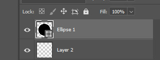
turns into

now ur basically just adding textures n shit. i like doing it Hussie Style and using google images to add texture, basically just taking that shit and bastardizing the hell out of them through fucking around w/ the contrast/exposure/colors/etc. u can also use the photoshop generative tool to generate random texture shit (i love putting in nonsensical prompts to confuse the hell out of it--my favorite results are the really shitty ones that look like terrible collages), but its the same process for each one.
lets make up a planet. Land of Horns and Thorns.
i like to use satellite images to get that planet-y texture. i try to think of a relevant land-type. thorns are triangular, so are mountains. lets grab this image

next what we're about to do is called "transformative use"
copy+paste image on a new layer

right click on the image's layer, select "create clipping mask"
this should be the result:

but its a little flat. so lets make it rounder. i use the Liquefy tool in photoshop, but im sure theres other ways of doing it.
click filter > liquefy, then make sure u have the bloat tool selected. now bloat that mfer to ur liking. its ok if it looks a bit shit right now. when uve bloated it as much as u want, click ok. now u have smth like this
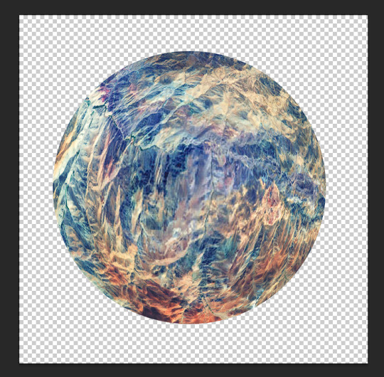
now start messing w/ filters and colors. i try to ascertain the mood im going for with a planet. Land of Horns and Thorns sounds a bit whimsical, but maybe subtly dangerous? so, translating that to color, maybe it's fun and colorful, but like, in the same way those deadly poisonous frogs are fun and colorful. maybe there will be some dark pits as well. lets see what we can do
i start w/ messing around w/ contrast. go to image > adjustments > brightness/contrast. fuck around w it to ur liking. this is what it looks like now
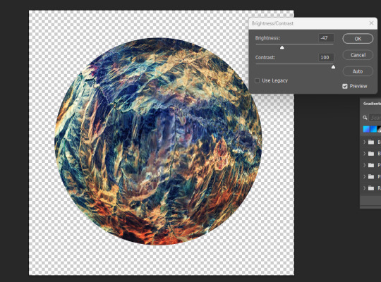
already we're starting to get some of those dark pits i wanted. lets make the colors pop a little more by messing w the exposure.

u can also mess w/ the vibrance, hue, saturation, etc. basically all those lil tools in the image > adjustments are ur best friends now. i like to increase the saturation to get that shit-jpeg look u see in homestuck sometimes
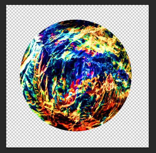
now create a new layer. we go back to google images. im gonna look up some closeups of thorns

this works fine. copy & paste. create clipping mask. bastardize the image however u want, similar to the first one. using the liquefy tool helps to get shit into place where u want it.
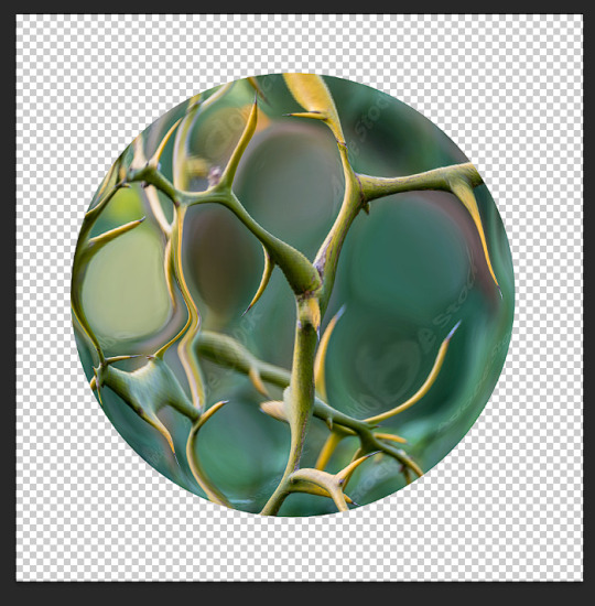
made it a little more abstract.
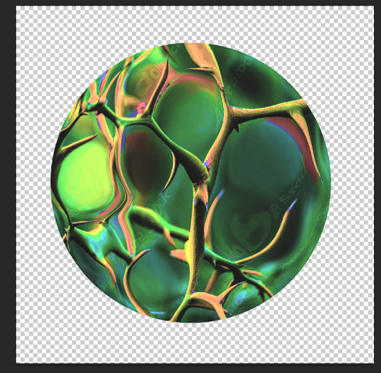
played w/ the color settings. i dont want this one to be as vibrant b/c im going to be using the layer modes. however, i do want to posterize the hell outta this
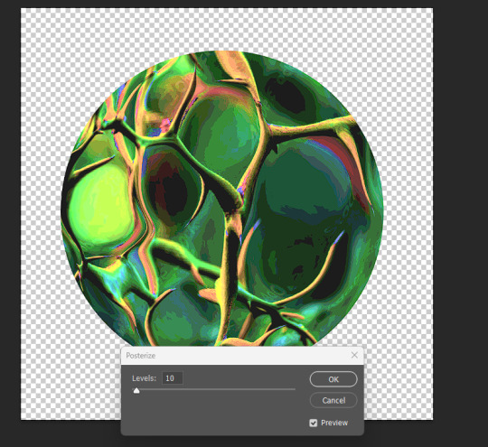
ok i like how it looks in luminosity mode.
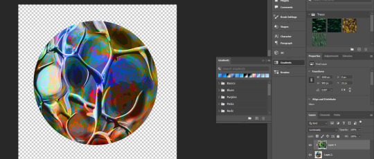
however, i kinda wanna change the colors of the bottom layer now. lets use a gradient map (image > adjustments > gradient map). just hit ok when the prompt comes up, we can detail it in the side panel.
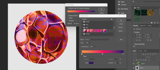
if u just click the actual gradient bar itself, itll open up the gradient editor. there u can make ur own custom gradient and specify the colors n shit. theres also a bunch to choose from.
so, i think that looks pretty fucking cool. i love the contrast, but i kind of want to see what it looks like in other colors too. we head to the hue/saturation tool.

there, i like that. a bright, poisonous color with the threatening blotches of red. now lets make this mfer look like a planet. merge everything into one layer if ya want
the gradient tool is now ur best friend. i like to fuck w the gradients, one of my favorite effects is making a sorta halo gradient (basically just copy the opacity controls i have, im sure u can also google how to do it) and merge the gradient to an empty layer
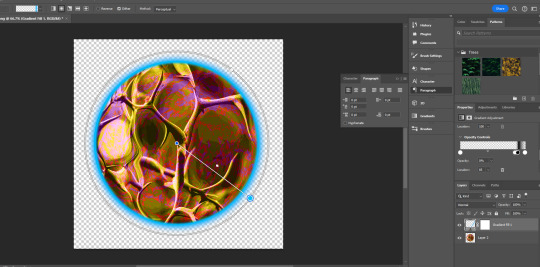
and, yknow, just mess with the settings
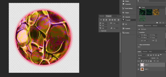
u can add gradients to make it look more like a 3d object. mess w the colors and settings n shit

we add some clouds now. i just use 1px pencil tool. try to use the curvature of the planet to inform how u draw the clouds. think about how u want them to be formed (swirling around the center? stretched out? etc) and think about what u think the atmosphere would be like on ur planet. a completely barren planet like mercury may have no clouds at all. or maybe its like jupiter, where its nothing but clouds? also think about the anemology of the planet. how do the winds form, what directions do they go?
i think the Land of Horns and Thorns sounds like a place that would have a good amount of thunderstorms, so lets make the clouds black. mountains are pretty windy, so maybe the clouds will sporadic but dense.
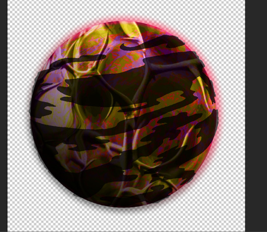
fuck around w/ it til ur tired of looking at it. then make that fucker smaller (the average mspa panel is 650x450. unless ur planet is taking up the entire page, u can probably get away with smt smaller.) **make sure u have interpolation set to bicubic or nearest neighbor.
and then ur done.
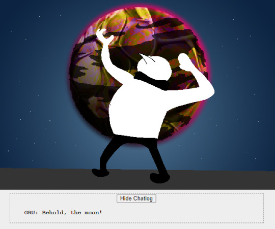
side notes: literally do whatever u want tbh, u can do as many layers as u want, use whatever tools u want. thats pretty much the basic format ive got.
7 notes
·
View notes
Text
UV Protection for Glass: A Guide to Safer, Sun-Proof Interiors
As modern architecture trends emphasize large glass windows and open, light-filled spaces, finding ways to shield interiors from the sun’s damaging rays has become essential. UV protection for glass is more than just a trend; it's a necessity for maintaining a safe, energy-efficient, and comfortable home or workspace. In this guide, we’ll explore the benefits of glass UV protectors, different types of UV-protective solutions, and how UV-protected glass can save on costs while enhancing overall quality of life. If you’re considering UV protection, here’s everything you need to know.

1. Why UV Protection for Glass Matters
UV (ultraviolet) rays are a significant cause of damage to both human skin and interiors. While natural light brings vibrancy to indoor spaces, prolonged exposure to UV rays can lead to various issues:
Furniture and Interior Fading: UV rays accelerate fading and deterioration of furnishings, flooring, and artwork.
Increased Heat: UV rays contribute to indoor heat buildup, leading to higher cooling costs and energy consumption.
Health Concerns: Overexposure to UV rays can impact skin health and lead to eye strain, even indoors.
Material Degradation: UV rays break down materials, especially polymers and fabrics, leading to wear and tear over time.
Using a glass UV protector can block up to 99% of harmful UV rays, preserving the aesthetics and comfort of interior spaces while safeguarding health.
For quality and durability, opting for professional Glass Manufacture solutions ensures longevity and reliable UV protection.
2. Benefits of Using UV-Protected Glass
UV protection for glass offers multiple advantages for residential and commercial settings. Here’s how it can make a difference:
a. Protects Furniture and Interiors
Without UV protection, interior fabrics, carpets, and even walls can discolor over time. UV-protected glass acts as a barrier, keeping colors vibrant and extending the life of furniture and fixtures. In spaces with expensive or unique decor, using glass UV protector products can be a game-changer.
b. Reduces Energy Costs
When UV rays penetrate untreated glass, they increase indoor temperatures, especially during summer. This puts added pressure on air conditioning systems, increasing energy bills. UV protection for glass reduces heat buildup, creating a naturally cooler environment and reducing reliance on cooling systems.
c. Enhances Comfort
Glass UV protection enhances indoor comfort by reducing glare. Whether you’re reading, working, or relaxing, less glare improves visibility and minimizes eye strain, allowing occupants to enjoy natural light without discomfort.
d. Health Benefits
UV exposure can lead to eye damage and skin issues even through glass. UV-protected glass acts as a shield, keeping out harmful rays while still allowing natural light, providing peace of mind for those who spend extended hours indoors.
3. Types of UV-Protective Solutions for Glass
There are various ways to incorporate UV protection into your glass installations. Here are some popular options available through Glass Manufacture:
a. UV-Blocking Window Film
Window films are an effective solution for adding UV protection to existing glass. They’re made of polyester sheets embedded with UV-blocking materials and are applied directly to windows.
Pros: Cost-effective, suitable for existing installations, reduces glare and energy costs.
Cons: Requires occasional maintenance, can reduce visibility over time, doesn’t offer as much durability as treated glass.
b. Low-E Glass (Low Emissivity Glass)
Low-E glass has a special coating that reduces the amount of UV and infrared light passing through it while still allowing visible light. It’s a high-performance solution often used in energy-efficient buildings.
Pros: Reduces both UV and heat transmission, improves energy efficiency.
Cons: Higher cost, best suited for new constructions or full window replacements.
c. Laminated Glass with UV Protection
Laminated glass is constructed with a UV-blocking interlayer, offering excellent protection against UV rays. It’s durable and often used in windows, skylights, and glass facades.
Pros: Superior UV protection, durable and shatter-resistant, effective sound insulation.
Cons: More expensive than films, typically used for new installations or extensive renovations.
d. Tempered Glass with UV Coatings
Tempered glass is treated to be stronger than regular glass and is commonly available with UV-protective coatings, making it ideal for outdoor applications.
Pros: Highly durable, suitable for high-traffic areas or large windows, offers safety and UV protection.
Cons: Higher upfront cost, typically recommended for new projects or major upgrades.
Each solution offers unique advantages depending on your requirements and budget. For customized recommendations and professional guidance, consulting a Glass Manufacture specialist ensures you choose the best solution for your space.
4. UV Protection Glass for Different Applications
UV-protected glass is versatile and can be applied to various areas, enhancing both residential and commercial spaces. Here are common applications:
a. Residential Spaces
In homes, UV-protected glass helps protect family health, preserve decor, and reduce cooling expenses. It’s perfect for:
Living rooms: Large windows can admit UV rays, so UV protection prevents fading of carpets and furniture.
Bedrooms: UV protection allows natural light while reducing heat, keeping the space comfortable.
Kitchens: Protects countertops and flooring from sun damage, essential in kitchens with skylights or large windows.
b. Commercial Buildings
For businesses, investing in UV protection for glass creates a pleasant environment for employees and customers, minimizing glare and improving energy efficiency. Applications include:
Office buildings: Reduces glare on screens, helping employees work more comfortably.
Retail stores: Protects displays and merchandise from fading or damage.
Restaurants and cafes: Offers patrons a comfortable dining experience without harsh sunlight.
c. Specialty Uses
UV-protected glass is also ideal for skylights, glass doors, atriums, and greenhouses, where intense sunlight is common. These applications benefit from reduced heat, glare, and damage.
5. Choosing the Right Glass UV Protector
Selecting the appropriate UV-protective glass solution depends on factors like budget, building design, and energy efficiency goals. Here are key considerations:
Purpose of the Space: For offices and retail environments, UV films may suffice. For high-end homes or buildings, investing in laminated or low-E glass can provide long-lasting benefits.
Aesthetic Preferences: Certain films and coatings can slightly alter the appearance of glass. Choose a solution that aligns with your design preferences.
Budget Constraints: Window films are budget-friendly for retrofitting, while laminated and low-E glass are more suited to new installations.
Climate: In hotter climates, higher-grade UV protection can offer enhanced energy savings, making an initial investment more worthwhile.
6. Maintenance and Longevity of UV-Protected Glass
UV-protected glass is relatively low-maintenance but does require some care to retain its efficiency. Here are some tips:
Cleaning: Use mild soap and a soft cloth to clean UV-treated glass. Avoid harsh chemicals that may damage the coating.
Check for Wear: Over time, UV films can lose effectiveness, especially with exposure to intense sunlight. Check periodically and replace if necessary.
Professional Installation: Ensuring a professional installation reduces the chance of bubbling or peeling in films, maintaining appearance and protection.
Proper care extends the lifespan of UV-protective glass and maximizes your investment.
7. The Cost Factor: Is UV-Protected Glass Worth It?
While UV-protective glass or films can involve a higher initial cost, the long-term savings on energy bills, reduced need for replacements, and protection of health and belongings make it a sound investment. When balancing the immediate expenses against long-term benefits, it’s clear that UV protection is worthwhile for those aiming to preserve their space and enhance comfort.
8. Partnering with a Reputable Glass Manufacturer
Choosing the right Glass Manufacture partner is essential for ensuring quality UV protection tailored to your needs. Working with experts allows you to customize your UV-protective glass, with options for tints, thickness, and durability to suit any residential or commercial project.
Conclusion
UV protection for glass is a powerful way to elevate the comfort, safety, and durability of indoor spaces. From reducing energy costs to safeguarding furniture, investing in a Glass UV protector is a forward-thinking choice for modern buildings. By selecting high-quality materials and partnering with experienced professionals, you can achieve a sun-proof, stylish interior that stands the test of time. For expert guidance and tailored solutions, contact a reputable Glass Manufacture provider, and transform your indoor experience today.
0 notes
Text
The Last word Tutorial to Adobe Premiere Professional: Suggestions and Tricks for newbies
Adobe Premiere Pro is one of the most well-liked video enhancing instruments, reliable by pros worldwide for generating everything from shorter social media marketing clips to whole-length movies. For beginners, Premiere Pro can appear to be somewhat intimidating as a consequence of its strong, function-loaded interface. But with the correct guidance and a few critical ideas, any person can speedily get comfortable Along with the software program and begin producing amazing films. Right here’s the last word guideline to getting started with Premiere Pro and generating probably the most of its a lot of functions.
1. Starting out: Starting Your Workspace One of many 1st ways when starting up a completely new project would be to configure your workspace. Adobe Premiere Pro permits you to personalize the format, making certain you've got quick access to equipment that suit your workflow.
Opt for a Workspace: Premiere Pro has numerous preset workspaces including “Modifying,” “Color,” and “Effects.” For novices, the “Enhancing” workspace is a fantastic area to begin. Drag and Drop Panels: Customise the layout by dragging panels all-around, ensuring that you may have the timeline and job panel noticeable and accessible. Help you save Your Workspace: Upon getting a format you like, put it aside as your custom workspace for future initiatives. 2. Importing and Arranging Footage Organizing your media is essential, specifically for tasks with lots of clips, audio, and images.
youtube
Use Bins to Organize: Make folders (bins) for video clips, audio, photographs, and other property in the Job panel. This organization will save time later on. Label and Colour-Code: Coloration-coding and labeling your clips assists you promptly determine differing types of footage in the timeline. 3. Mastering Primary Editing Equipment Discovering the basics of reducing and arranging clips during the timeline is the foundation of video clip modifying.
Chopping Clips: Use the Razor Instrument (C) to cut clips, or just drag the sting of the clip to shorten it. Trim and Ripple Edits: Utilize the Trim and Ripple Edit resources to refine your clips. Ripple Edit lets you shorten or lengthen a clip without the need of leaving gaps within the timeline. Undo Blunders: Don’t be scared to experiment, as you'll be able to generally strike “Ctrl+Z” (or “Cmd+Z” on Mac) to undo steps. four. Introducing Transitions and Consequences Transitions and consequences add a polished touch for your video, enhancing storytelling and visual appeal.
Utilizing Transitions: Drag transitions like Cross Dissolve or Dip to Black from the Effects panel onto clips to create sleek transitions between scenes. Incorporating Results: Check out the results panel for colour correction, blur, and also other Inventive effects. For any all-natural appear, use effects sparingly and continue to keep transitions refined. 5. Fundamental Coloration Correction with Lumetri Shade Colour correction can considerably enhance the glance of one's footage, which makes it search much more Experienced.
Change Exposure and Distinction: While in the Lumetri Color panel, use The essential Correction tab to adjust brightness, distinction, and highlights. Use Resourceful Seems to be: Attempt introducing colour presets for various moods, or experiment with saturation and vibrancy to create hues pop. 6. Incorporating Audio and Syncing Sound Very good audio is equally as crucial as online video top quality. Adobe Premiere Professional has resources for taking care of and enhancing audio, which could help your task experience a lot more Qualified.
Use the Crucial Seem Panel: The Essential Sound panel means that you can assign audio varieties (for instance dialogue or new music) and modify stages appropriately. Increase Music and Sound Results: Import audio and audio outcomes to improve the emotion of scenes. Make sure to stability volumes so dialogue is obvious and never overpowered by qualifications Seems. seven. Incorporating Titles and Textual content Premiere Pro’s Graphics panel supplies a variety of options for creating titles and adding text to your videos.
Using Title Templates: Premiere Professional includes customizable title templates. Use these to quickly increase professional-looking textual content on your job. Animate Text: Experiment with straightforward animations, like fade-ins and movement, to make titles visually partaking. eight. Exporting Your Video clip As soon as your edit is complete, it’s time to export your movie for sharing or publishing.
Decide on Export Settings: In the Export menu, find your most well-liked format (H.264 is a good selection for the majority of on the internet platforms) and resolution. Presets for Social media marketing: Premiere Pro has presets for YouTube, Instagram, and other social platforms to improve your video clip for the very best quality.
Ultimate Thoughts Adobe Premiere Professional is a robust Device with numerous impressive characteristics, but by starting Using these basics, you’ll be modifying with self-confidence very quickly. When you expand extra cozy While using the application, try experimenting with further consequences, transitions, and Sophisticated instruments to take your editing techniques to another degree. Follow will make ideal, so hold enhancing, continue to keep Studying, so you’ll before long be creating Expert-good quality video clips effortlessly.
Check out more info. here : premiere pro
1 note
·
View note
Note
idk if anyone has asked this before but how do you manage to make your traditional art come out w a clear and crisp quality when you upload it bc i've been trying to figure out how to improve that for my own art
i might've answered this before i don't mind repeating myself
STEP 1: make sure you have good lighting!
take your photos next to a window on a bright day, not in direct sunlight because that can cause glare or over expose the image, but next to a window where the ambient light is even across your piece
taking pics on a rainy day or after the sun sets? no problem! all you need is bright ambient lighting, like what you'd find in a well lit bathroom, light that isn't shining directly on you, but reflecting off the walls, diffused and even
when taking your picture you wanna make sure there are no shadows, be it cast shadows from your hands, or shadows on one side of the page due to focused light
here's a side by side:
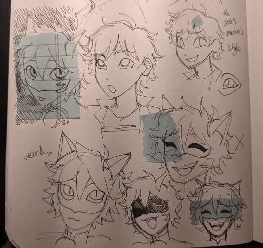
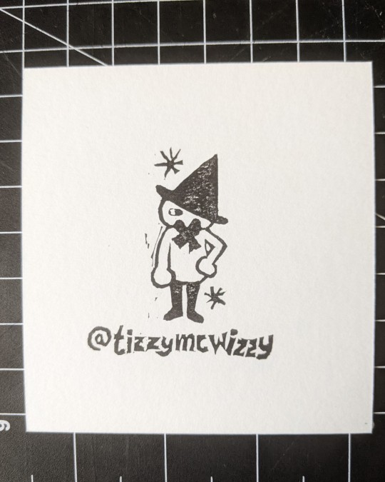
on the left side there's this gradient of value across the image because the light is just hitting the page from the top, and there's some visual striping caused by my lamp
on the right the image is evenly covered in light from a nearby window, so there is no gradient
of course the left image is exaggeratedly bad but if you photograph and edit with uneven light your end product will be passable, but not as great as it could be
here are some more examples post edit, notice the gradient across the drawing and the shadow on the bottom half
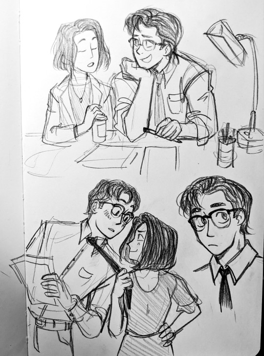
again not TERRIBLE but not ideal
STEP 2: photograph straight on, up close and crop tastefully!
when you're taking your picture stand up if you can, and i mean it, just get right on top of the piece and make sure your camera is parallel, because taking a pic at an angle can really distort the proportions of your drawing
also make sure you're fitting as much of the drawing into your picture as possible, you don't wanna lose quality unnecessarily by photographing from a distance
and when you crop, try and get out as much unnecessary space as you can, of course give the image breathing room, don't crop down to the edges of your image, but also try and cut out your thumbs or desk if you're going for that crisp professional look
all the rules in this section can be broken if it's done intentionally!
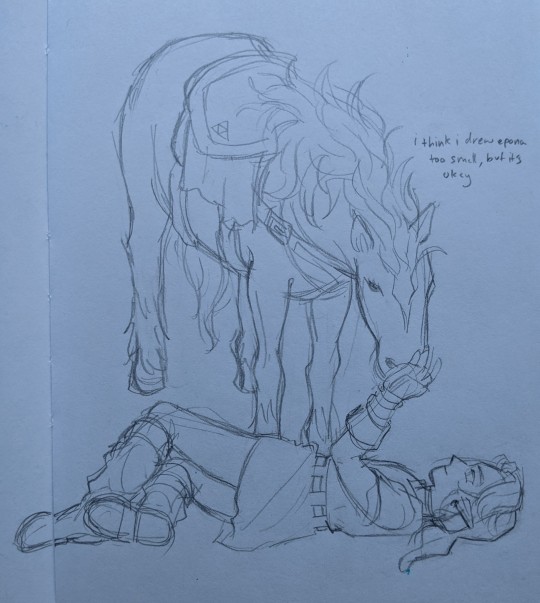
here are some examples of off angle/weirdly cropped drawings with my desk in the background but it's on purpose:
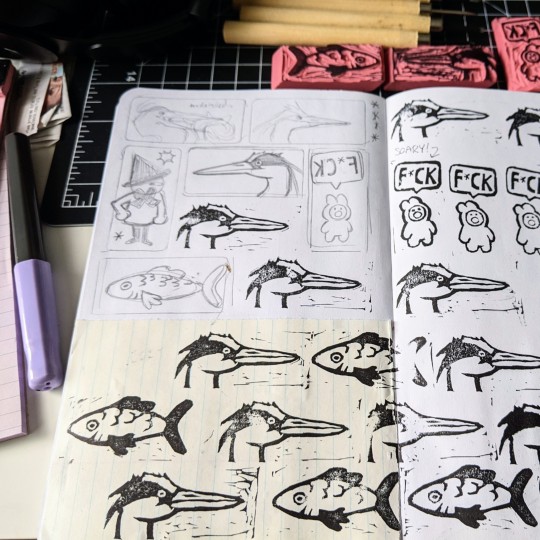
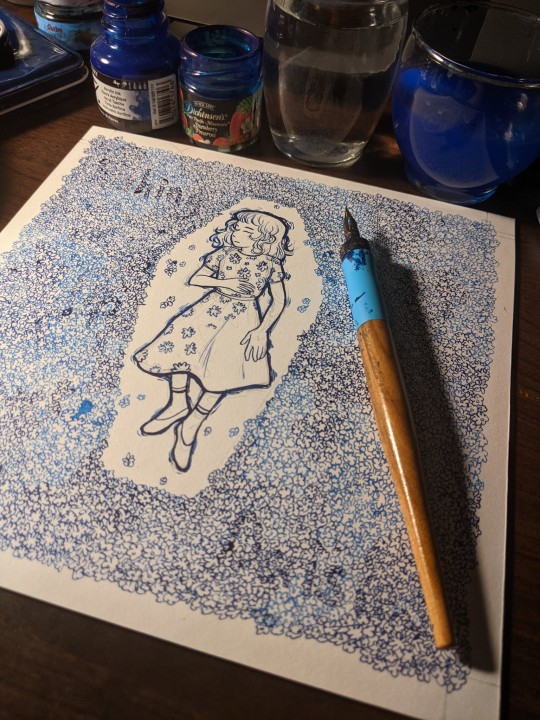
STEP 3: time to edit!
so this part is really going to depend on what software you personally use to edit and getting familiar with it, i use my phone's built in editor which is the google photos editor, ive used ios photo editing, ive used photoshop and procreate and most programs generally have the same couple of editing scales so im going to be general
FOR BLACK AND WHITE ART:
1. turn the saturation aaallllll the way down
we don't want the yellow of the pages or the warm light of your lamp or the blue tone of the sun on our white paper, unless you're going for a black and white in sepia sort of look, then edit to your discretion, but in general for black and white i eliminate all color
2. crank the brightness and contrast (highlights/white point/exposure/brilliance) UP and turn the black point/shadows DOWN
we want to create as much visual contrast as possible and make the darks REALLY dark and the brights REALLY bright, especially if you have a drawing that has very little midrange values, this worked well for my stamps, but for a pencil drawing you want to keep those details and middle values so the settings won't be as extreme
depending on what program you use the names and effects of each setting might be a little different, so fiddle around to find out what everything does!
here's a before and after
FOR COLOR ART:
1. increase saturation! (and vibrance on ios) depending on your piece and your camera and the medium and the lighting your image and its colors can come out a number of different ways, but usually cameras will not capture the vibrancy of real life colors. and personally i just like boosting them anyway :) i think it looks really nice!
2. turn the brightness and white values up, but not too much, we don't want to wash out any colors but if you have a white of the page we still want that to be bright white
3. turn the black point/shadows down just a little, we don't want to completely overpower the light and color values with darks and shadows, but we still don't want it to look washed out and dull
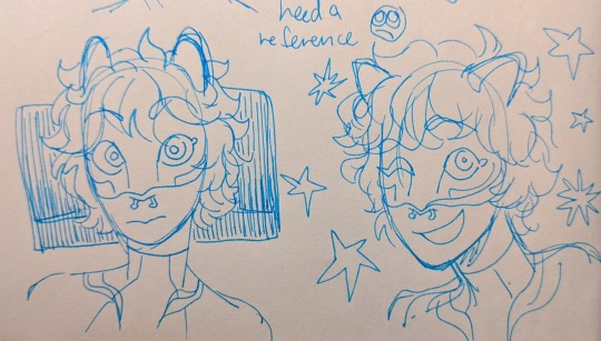
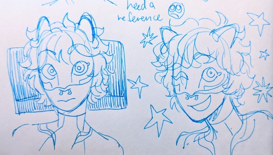
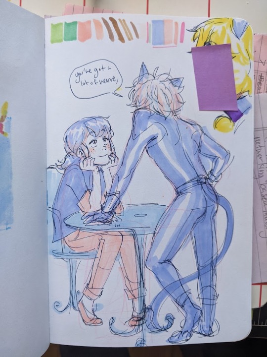
and lastly (for both B&W and color) fiddle with some other specialized settings! play with curves! or pop, or HDR or whatever other slider you have access to, figuring out what each does and which ones you like will help you get your final image closer to your tastes
happy editing and art making!!! i hope this was helpful :)
#did i stay up until 5 am today writing this ask.... yes....... yes i did#ANYWAAYYY enjoy this never before seen art lmao#ask#tizzy talks#my art
367 notes
·
View notes
Text
Everything You Need To Know About UV Resistant Pigment Ink Technology

Pigment type ink offers many advantage over traditional dye based inks. It has the potential to add great color, durability, vibrancy, and texture to your ID cards. If you’re new to card making you may be confused with the terms, but have you ever thought of what makes the pigment ink best for your cards? When comparing pigment based inks with others, it is rich and thick, it’s great for heat embossing techniques, and it’s long lasting.
What Are the Challenges Facing ID Card Programs?
When administering their identification card (ID) programs, organizations encounter difficulties that might be expensive if they don’t take their company’s bottom line into account. The type of printer ink technology utilized for ID card applications is the cause of some of these difficulties.The some of the main challenges are
UV Impact: Some Inks are exposed toenvironment, such as UV light. Employees who operate outdoors are more at risk of having their badges damaged by fluorescent lighting.Many businesses will attempt to solve this problem by purchasing pricey UV blocker laminates. Additionally, they frequently issue more cards again owing to damage from light exposure.But how about buying an advanced printer instead of replacing id cards for each and every employee over months. Force ID offers CR803 Retransfer ID Card Printer in India, it uses UV Resistant Pigment Ink Technology and it protects your cards from UV exposures and improves life of the card.
Image Quality: Many organizations are facing the integrity of the images because they are not using the latest technologies. Skin tone matching is one of the biggest problems, because some organizations want to print their company logo or face of employees, but they often face huge difficulty in printing the exact image that seen in the monitor.
Entrust Datacard is now using the pigment ink technologies, here are some of the benefits of using pigment ink retransfer id card printers.
Pigment ink has the advantage of being UV fade resistant, which prevents the cards from fading over time. This will increase the card’s lifespan and lessen the need for pricey reprints because of fading from light exposure.
The ability of true color pigment ink to match the original image on the screen to the printed image on the card is another advantage of pigment ink.
The ability to print with clear, crisp fonts at less than 2 point is another advantage of pigment ink technology at 600 DPI.
CR803 Retransfer ID Card Printer: Key Features and Benefits
Pigment ink prints lifelike skin tones so you can more accurately authenticate each cardholder to improve security
Over-the-edge printing with retransfer technology allows you to print on multiple card types, including technology cards
On-demand printing means you can print exactly the design you need, eliminating the need for pre-printed card stock
Print corporate badges, school IDs, driver’s licenses, and other high assurance Ids
Print on the card material that meets your needs and budget — from PVC to PVC composite, polycarbonate (PC) or PET card type
TPM module included in every printer — use Entrust Adaptive Issuance Remote Monitoring and Management (RMM) to insert, manage, and remove user-specific certificates and keys in a secure location
Optional inline tactile impression module provides enhanced security to the card
Card capacity is
Input hopper – up to 125 cards
Output hopper – up to 25 cards
Card input size — 0.030 inches to 0.040 inches (0.76 mm to 1.01 mm)
These are the main of the features of CR803 Retransfer ID Card Printer.Retransfer printing with pigment ink technology delivers the best printing solution in the world.We are the best supplier of ID card printer solutions in Mumbai, Pune, Bangalore, Chennai.Contact with us today to know more about our id card printers.
0 notes
Text
Entry 4 - 3:49pm (Rain)

Today's a rainy day and I've decided to simply do a photo observation for my studies today because I do not wish to get wet :(
Since it was mildly drizzling today, there is a definite absence of direct sunlight. Lots of indirect sunlight everywhere meant that there was an overall lack of contrast. Every element, save for the relative value of their hues, felt that they would be the same value. The only thing really indicating depth is the atmospheric perspective which can be seen in the receding buildings in the background.
When taking the photo, I realized that what my camera loves to adjust is contrast. It compensates for areas with low or high exposure and averages out the values and colors in a way that makes the overall photograph more appealing than we observed. It brings to attention details that we are unable to perceive. Thus, the absence of contrast in the scene today meant that the photo largely remained untouched, save for the increased vibrance of the colors in the photo, everything else remained largely unadjusted which was a welcome change.

Since I decided to not do a watercolor study today, I chose to bring up past photos I had taken and compare them with one another. By putting the photos next to each other, I can really see the difference in contrast. The sky feels just like one color in the rainy photo compared to the rich blues and greys in the sunny photo. Looking at it now, I should arrange them in a progression from rainy to sunny. Hang on while I start up Photoshop again...

Here, I think with this arrangement, I can easily see a progression of adding a wider variety of values, and then colors can affect the overall appeal of an image. It's amazing as I write this now that even with just photo comparisons, I feel that I was able to gain something for myself. Even if I didn't get to explore color by mixing any paint, I was able to see the effect of value and color and the role they play in creating an appealing space. Good job me?
0 notes
Note
hi sameera! how are you today love? i was wondering if you have any tips on coloring dark scenes? cause i loooove to add more contrast and overall when my gifs look a bit more dark but when it comes to darker scenes my usual coloring steps don't really work and they look just way too dark D:
hey!!! i'm doing good, thank you for asking :)
so i'm actually planning to make a hotd psd in a couple of weeks where i'll also give some general coloring tips, and i will definitely address coloring dark scenes because that show is filled with them. i totally relate to what you're talking about! for so long i've struggled with coloring dark scenes, and recently i've been brushing up my entire coloring process and have found some methods that, in my experience, definitely help (more under the cut!)
take the "we light the way" alicent scene for example. this is what it looks like originally (i've only cropped/sharpened the screencaps):

the entire wedding sequence in this episode is so. dark. alicent's green dress looks more blue, everything else looks yellow... it's just bad. so a trick that helps a lot is to add a curves layer, and you're gonna want to press the alt/option key while simultaneously pressing the auto button in the curves layer (circled in red):

and these are the settings you want to make sure it's set to:

after that, any scene you gif will automatically brighten up and be that much easier to color (just make sure you create this layer BEFORE you start coloring the gif so it works properly). i always keep this curves layer ABOVE all of my other layers, but that's my own process. if the auto-curves function makes the gif look a little wonky, try messing with the red/blue/green curves manually! it doesn't always work perfectly, but it's my go-to method for brightening and color correction.
here's what the alicent gif looks like after adding the curves layer:

after that, the layers i use most often to color correct and brighten dark scenes are exposure, brightness/contrast, channel mixer, color balance, photo filter (using a deep blue color and set to 15-30% opacity), vibrance, and selective coloring. these settings vary depending on the gif (for this alicent gif i had to increase the exposure to 5.10 because the scene was that dark! for normally lit scenes, i usually don't go above 0.90 💀), but they work best for me!
so here's what the gif looks like when my coloring is all done:

compared to the original, unedited gif:

hope that helps! please lmk if you have any more questions, and be sure to check out that hotd psd post that i'll be making hopefully in a couple of weeks if you want something more specific/detailed
have a great day/night <3
#also moots lmk how this coloring looks!#i've been working on my process specifically for hotd and i think it's improved a lot#ps help#💌 answered 💌
10 notes
·
View notes
Text
in the holiday spirit of giving, here’s a some ps tips (whether u asked or not):
make use of recording actions - this will save you so much time
esp for sharpens, flatten frames into animation, certain crop sizes, if you imported layers via stacking stills then action your make frames from animation -> reverse animations step....basically action anything and everything
assign custom shortcuts
this might not seem like a lot but it saves so much time.....e.g. i have f2 as my make timeline shortcut, f4 for make smart object, f3 for duplicate, a shortcut for select all frames, c&p frames etc. these seconds add up and severely reduces time spent
you can layer your sharpens to make the sharpen effect less aggressive
e.g. 1st layer is a smart sharpen, 2nd layer is a gaussian blur, then layer another smart sharpen layer and adjust opacity for each as seen fit (it “softens” the sharpen so to speak and makes it look more “detailed” instead of sharp edges if that makes sense)
for learning coloring highly recommend you experiment over using a downloaded psd (or use the psd as a base and make your own adjustments)
- don’t be afraid to stack adjustment layers.....i have anywhere from 15-20 on average bc sometimes i cant decide what looks best and sometimes layers stacked in diff orders have a very different effect.
- the order i prefer is generally curves, hue, selective coloring, hue, vibrance, exposure, curves, hue, brightness / contrast, and sometimes a photo filter or color balance at the end if i’m going for smth specific. also play around w opacity of each layer.
reduce gif size (aside from the obvious using lower resolution and smaller size):
- less aggressive sharpens usually ends in smaller gif sizes - adjusting blacks up in selective colors (black) usually reduces sizes for me - adjusting curves down - increasing vibrance - sometimes moving around order of layer adjustments also helps - exporting as selective diffusion at 99% usually yields lowest size but i don’t love the quality (imo adaptive diffusion at 99% dither is better quality at only slightly larger size)
#idk if any of these are helpful#if anything points 1 & 2 are the most crucial imo bc it saves u so much time#and we all know how much of a time suck ps is already#typed this while waiting for yeast to rise to excuse typos#photoshop
4 notes
·
View notes
Photo

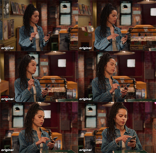
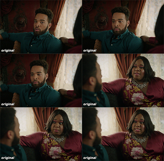

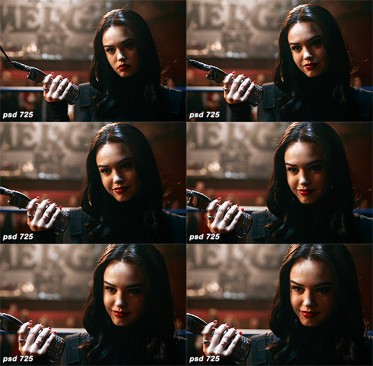
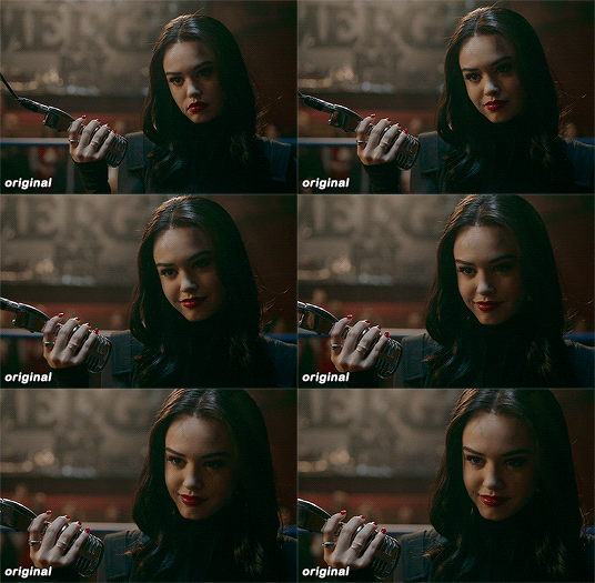
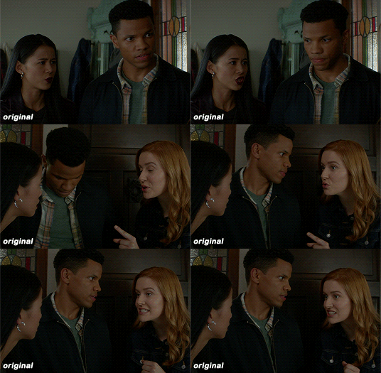

maziekeen’s coloring tutorial (part 1, base)
part 2 for dark scenes here
before anything, here are some helpful resources for what i’m about to do cause i think you need to test everything to see what will work for you and will learn so damn much in the process:
how to use curves: curves tutorial by completeresources. and gif tutorial by barrysberkman. curves is the best and it’s what i use to “fix” the coloring before proceeding with the coloring
how to color yellow-ish/terrible scenes: coloring tutorial by jungshoseok. i’m always going back to this tutorial when i’m stuck with my coloring or need a reminder of a different way to color difficult scenes, and again, sami uses curves!
and there is more on my resources tag here
downloads/settings
download the psds
save for web settings
sharpen settings
text settings
crop sizes (new dimensions)
my ko-fi ♥
the tutorial, finally lol
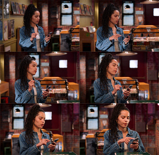
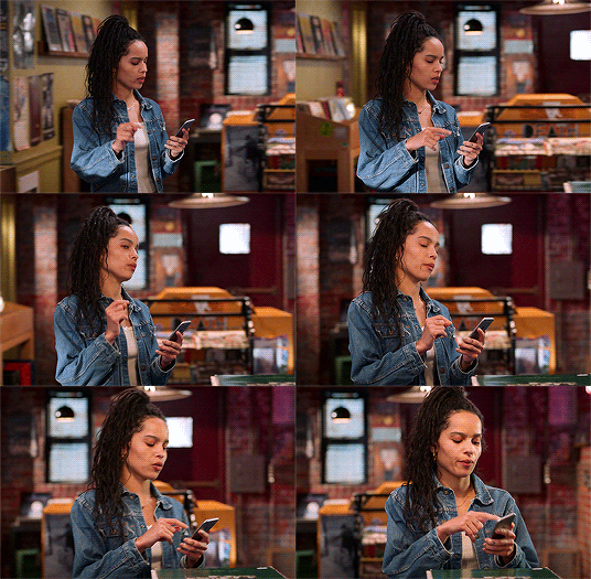
tv show high fidelity. this gonna be simple scene before going to the annoying dark/yellow/green/blue scenes on the second part of the tutorial.
this is important: i don’t always get right the first time like i’m showing this tutorial. i do all this process and then go back to the layers and adjust a few to get what i want
before:
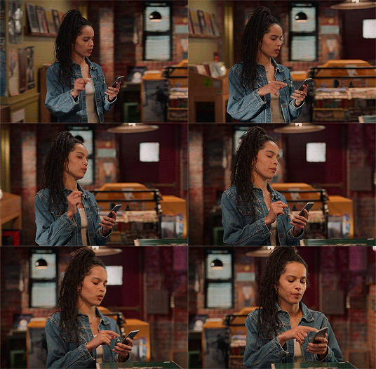
after:

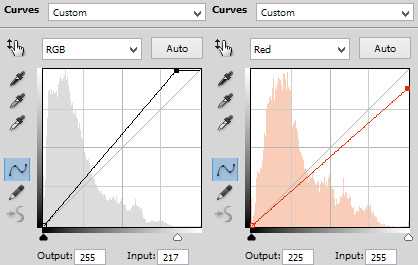
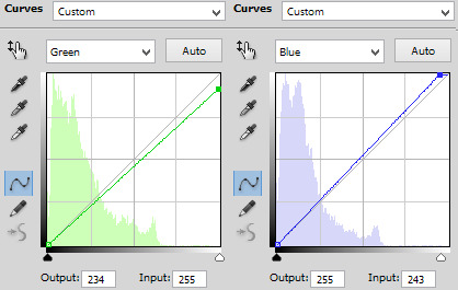
1) curves. first i brighten the gif just a little with RGB so i can see how to color correct, and to do that i use the red, green, and blue there. instead of using them up, i decrease their values, trying to leave as natural/red/magenta as possible, sometimes i increase, like i did with blue, but it’s really just a bit
okay, what do i do? i decrease the color that’s bothering me. when you increase the RGB, the color that stand out is what you will use the others to fix. like this one, the gif got too yellow, so i decrease red. then it was too green, so that’s the next one to change. i get this “controlled” yellow, it’s good but i want more red-ish/magenta tone so i can work with the colors only later, so i increase the blue just a bit for that. then you get the result
i always try to "take off” the colors here so i have more control of them in the future and edit the way i want
result:

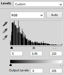
2) levels. i use for both darken and brighten, nothing too extreme
the white arrow to brighten, it depends on the gif, but since i'll use exposure to that later, i only use around 200 to 250
the gray one to darken, if you increase this one too much then you’ll be whitewashing the shit out of the gif, i only use this way or don’t use at all. exception if it’s a really dark gif
the dark one is to darken too, i use only around 0 to 10
result:
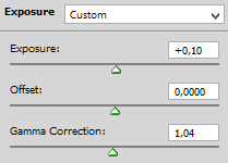
3) exposure. this one is the one i use to brighten, here the different is minimal, but in a dark gif this works really well as you’ll see on part 2. also, i know it looks like the levels was for nothing here, but most of the time you go back to previous layers and edit a bit more. or even after use exposure and need to darken, levels is there for it
exposure. i never use more than 1,00. and sometimes only +50 is enough in a dark gif
offset. nope, never, no
gamma correction. also, never use more than 1,10. sometimes 1,05 is more than enough
result:
4) gradient map. i wasn’t a fan, but now that i see the difference i’m always using it. i like that controls the dark parts of the gif, i could use more levels for that, but it would get weird
always soft light, and the fill i only use around 20%. sometimes my standard is 15%. i got this from sami’s tutorial and it’s amazing even tho it doesn’t look like much here
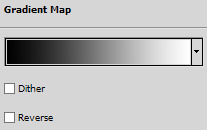

result:

5) color balance. i’m still in that thought of “taking off” the colors, because after this layer that i’ll edit them.but also here i fix the color if the gif is practically ready. i only used midtones, but sometimes i use highlights to make the gif as natural as possible. it doesn’t look like it changed much here, but you’ll probably get back here after finishing the psd to fix a thing or two

result:

6) selective color. the fun part! honestly, just mess around the colors. i can’t really say do this or that here because i change this a lot depending on the gif, so here are some tips:
reds and yellows. i use to fix whitewashing, make the person more vivid too, you know? usually i’ve been using magenta with yellow together, you have more control if the red will stay red or it will be pink-sh, and if the yellow will stay yellow or be around green
cyans and blues. if you come across a gif where the white is blue, you adjust this on cyans. decrease the cyan and mess around magenta and yellow
magentas and whites. sometimes the gif seems too red-ish, or something, so you decrease magenta and it will make a LOT of difference. the whites it’s helpful too when the white on the gif have another annoying color, you adjust here just like the cyans
neutrals and blacks. nothing hardcore, sometimes i don’t even use neutrals. and i used to use blacks on 10 and it’s just the worst on most of the gifs, so now i use top 5, depending on the gif
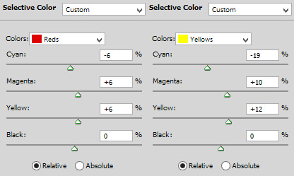

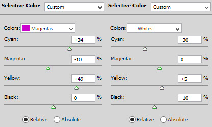
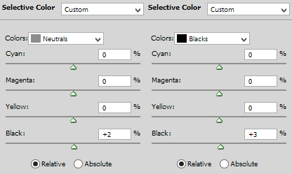
result:

7) vibrance. i don’t overdo because it will ruin everything i edited previously, like, if add more vibrance the yellow would go crazy along with the background and ugh, this way is so clean and exactly what i want. so, i never use more than 50, some scenes are really with no color, so i use more

final result:

other examples using the same process are in the post previews since tumblr won’t let me add more gifs here ;)
PART 2 OF THE TUTORIAL HERE
there i’ll color dark/yellow-ish/blue scenes <3
#dearindies#coloring tutorial#gif coloring#tumblr psds#high fidelity psd#zep psd#legacies psd#nancy drew psd#resources#my tutorial#psds#my coloring tutorial#base psd
954 notes
·
View notes
Text
My GIF making process!

I’ve been asked many times for a tutorial, but because I get really detailed, I always get overwhelmed by the idea. But I finally decided to buckle down!
Just so you know: I don’t use PSDs in this, and I don’t import layers to frames or anything like that. I like the hard way—at least in gif making, I believe you get higher quality gifs. Join me as I show you how to make gifs by loading videos directly into the Photoshop timeline and my coloring and sharpening techniques.
Tools used:
Mac OS X (only necessary for the first step, and there are other ways around it with a PC)
Adobe Photoshop
YouTube Purchases (any streaming service will work)
Topics covered:
Obtaining the Source Material
Loading the video file into Photoshop
Prepping, Cropping, and Resizing the Media
Adjustment Layers
Sharpening
Exporting
Obtaining the Source Material
There are a few different methods for obtaining video to work with. Proper YouTube videos are nice, but finding any major motion picture in that format is difficult, if not illegal.
Once I realized I could get really great quality video by doing screen recordings from streaming services, I stopped worrying about finding (and pirating) high resolution video files. So now, I just go to whichever streaming service I need to, pick out the movie or show, find the spot, and record small snippets.
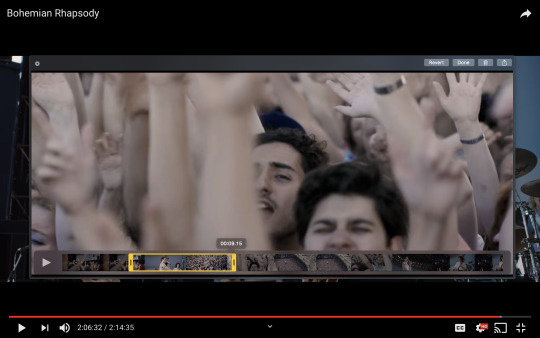
Mac screen recording instructions:
On a Mac, Command+Shift+5 will bring up the screen recording dialogue.
Resize the frame of what you want to record within the browser.
Go to a second or two before, press the “record” button, and then begin playing the video, remembering to keep your cursor out of the recording box.
Use the Space bar to pause your video when you’ve gotten the snippet you need. Stop the screen recording by clicking the ⏹ button that is in your menu bar at the top of the screen.
Important: when the recording appears in the bottom right of your screen, click on it, and then trim the video on either end. This will help your computer convert the video file to the type that can be opened by Photoshop.
Click “done” and it will appear on your desktop, ready to be used!
PC Users: ??? Here’s a Google search I did for you
Loading the video file into Photoshop
Lots of people use this process for making gifs (a great tutorial!). I didn’t even know it existed until last summer, when I’d already been giffing for years. I wish I could still do something like that with these screen recordings, but the files are absolutely HUGE, especially on Macs with double retina displays, which actually increase the dpi by a lot. Making screencaps of them fills up my hard drive, almost immediately—even when I’ve got 20 gigs of free space to work with. So what do we do? We just. Open the file. In Photoshop. Et voila!
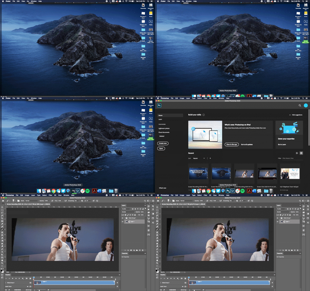
You can do this with any type of video, not just screen recordings.
Prepping, Cropping, and Resizing the Media
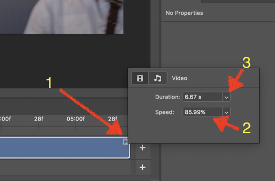
When Photoshop loads your videos up, it makes the video hilariously fast (something about frame conversion). You must slow it down for it to look natural. THIS MUST BE DONE BEFORE YOU RESZE. Your Photoshop timeline window should be at the bottom of the screen. See that little triangle in the top right of the video?
Click on it, and a menu will appear to change speed and duration.
Change the speed first- usually between 80-85% will seem realistic. (I actually went a little faster than I usually would on this at almost 86%—I don’t recommend this)
Press the button next to duration and pull the toggle all the way to the far right (if you don’t do this, full length of the video will be cut off).
Now you’ll want to crop it. Ever since Tumblr upped its GIF size limit, I have been playing around with 7:5 ratios, but let’s go with 3:2 for now. Use the Crop tool, pick out 3:2 in the top left (it may say 2:3, but you can switch that) and then find the most suitable spot in your gif for that. Hit enter on your keyboard.
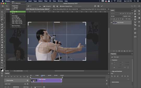
Some things to keep in mind when cropping:
Most videos come in 16:9 ratio (BoRhap is even wider). If it’s a wide shot, you’ll need to do the full 16:9 to not lose anything. Of course, experiment and find what’s right for you!
As you can see above, I moved forward in the timeline and made the crop to a point in the video when the broadest movement was happening.
Certain videos WILL have a black or red bar that may be imperceptible until you’ve already exported the gif. Just crop in a little tighter on top and bottom to avoid them.
Now you’ll need to resize your gif to be the correct size for Tumblr. If you don’t use Tumblr’s exact dimensions, your gifs (as uploaded) will appear blurry or pixellated. We’re doing a full-width gif here, which is 540px. On a Mac, I use Command+Option+I (for “Image Size) to open the resize dialogue. You can also find it under Image->Image size...
Make sure to also have “Resample” checked. Lately I’ve been playing around to see if different options are better. Most GIF makers use “Bicubic Sharper (Reduction)” and they are not wrong to do so. I’ve just been unhappy with it lately, so I have been trying this other setting out, “Bicubic (smooth gradients)”.
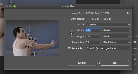
Click OK. A dialogue may come up that asks if you want to convert to a Smart Object. The answer is yes, okay, do it. The only major caveat is that you can’t go back and change the timeline speed. That’s why we did it first. But you can preview the speed now that it’s smaller, and if you don’t like it, use Command+Z (or “Undo”) and go back a couple steps to get the speed you like.
You may find, especially on a Mac screen (and possibly other displays), that at 100% your gif looks too small to be 540px. That is the curse and blessing of working with super-high resolution hardware. Zoom in to 200% and proceed about your business. This is what it will look like on Tumblr.
You may find it helpful at this point to begin by defining the beginning and end of your gif by moving around these bumpers. It’s safe to keep gifs under 02:00f in length. Under half of 01:00f will be way too short. (I tend to overshoot in length and then trim the beginning and the end once I see how big the gifs are upon exporting.)
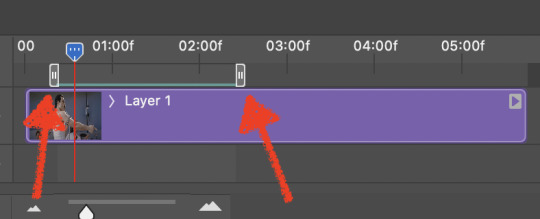
Adjustment Layers
Now the creativity and fun begin!
There are a LOT of ways to get creative here. I’m going to keep it simple, very simple, but I strongly recommend opening up a new adjustment layer of each type and trying to figure out what each does!
You’ll find the adjustment layer menu at the bottom of the Layers window.

Curves
There are a lot of ways to make Curves work for you! It can do the job of Brightness/Contrast, it can do Levels, it can do Color Balance! We’re going to use it mainly to help with brightness here, but also to level out some of the tones. One of the quick tricks you can do is use the droppers on the left side of the Properties window. There are three- one with a white tip, one gray, one black. These can help define what your white tones are (and whether they need to be more of one color or another), and so on with your blacks. Sometimes it works, sometimes it doesn’t; in this case, I think it doesn’t:
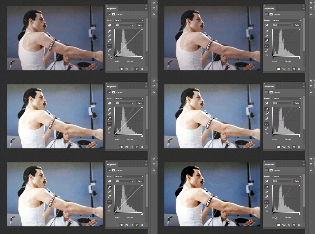
That looks totally blown out and somehow also too dark!
So instead, we’re going to use that little hand with the finger pointing out and some arrows pointing up and down. This lets you define which sections you want to get brighter or darker, and how much. It doesn’t do color correction. In the example below, you can see I dragged up on a white spot and down on a dark spot. Then, I moved points around on the curve itself to refine (which the gif here doesn’t show...).
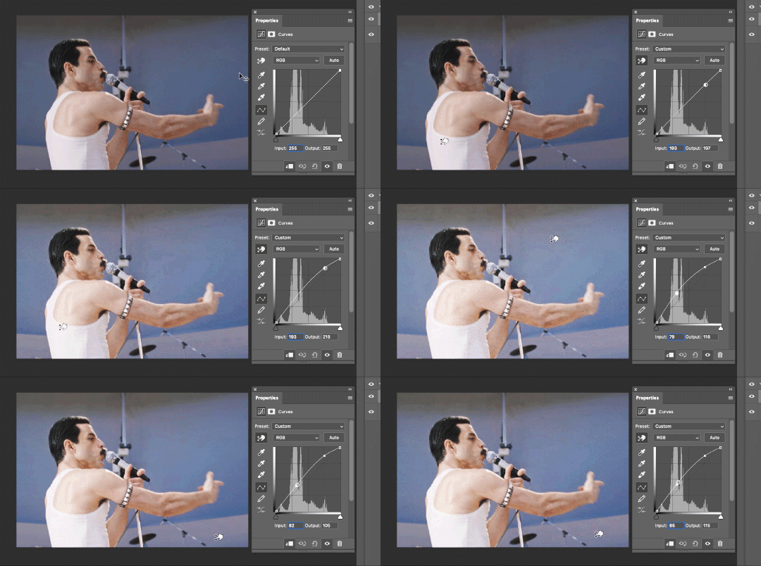
Vibrance/Saturation x2
Next, I’ve been using @gwil-lee‘s Vibrance/Saturation trick (I know you said you learned it from someone else, but I learned it from you!).
Create a Vibrance Adjustment layer, bump the values up a bunch, and then change its Fill to somewhere between 2-9%. Change the Blend Mode to Color Burn. Then make a copy of that layer keeping everything the same, but make it Color Dodge. I can’t quite define what these do, but it makes it punchier!

Color Balance
Most people are familiar with this. For this gif, I’m going to make the shadows more Cyan/Blue and the highlights more Red/Yellow. Just a few points each.
Exposure
I brought the Exposure up a bit, but not enough for you to need to read about, haha.
Selective Color
Here’s where you make fine adjustments to colors. This particular scene is extremely simple, color-wise, so keep it simple. I’m going to bump up the cyans/blues, take up the black by just a point or two, and maybe bump up the yellows and reds a tiny bit. (And as always, remember, the “opposite” of cyan is red, the opposite of magenta is green, and the opposite of yellow is blue. CMY/RGB!)

I think at this point I’m going to call it with the adjustment layers. You can go absolutely hogwild with more of them! But at this point, I’m ready to start sharpening!
Sharpening
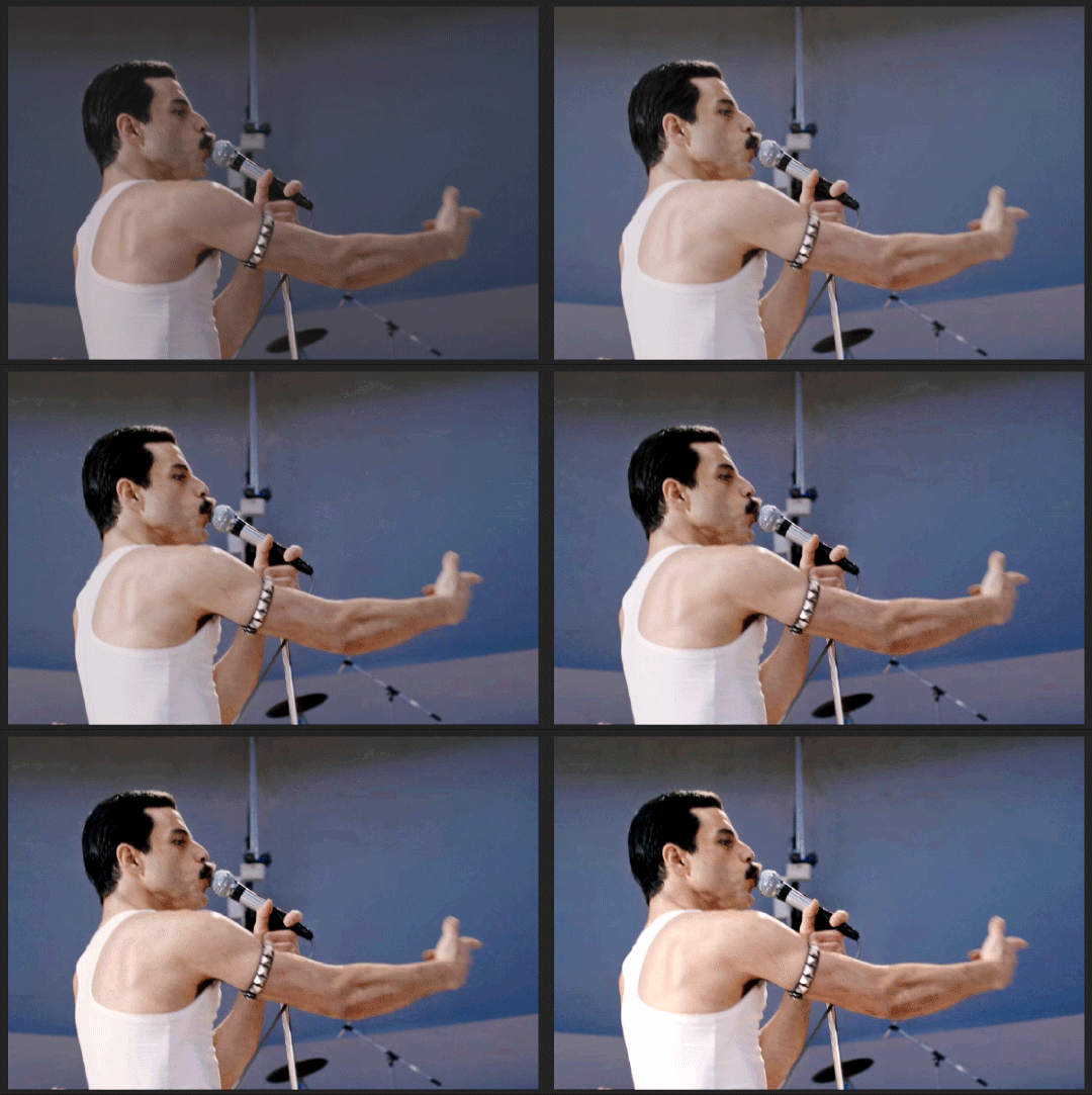
I do three sharpening filters these days. These are all under Filter->Sharpen. Make sure your media layer (default called Layer 1) is selected as we go through this! (Also, this can really take a toll on your processor, so don’t say I didn’t warn you.)
Sharpen- This layer does the basic job
Smart Sharpen (Amount: 10%, Radius: 10, Reduce Noise: 4% Gaussian Blur)- This layer gives texture
Smart Sharpen (Amount: 500, Radius: 0.3, Reduce Noise: 12% Gaussian Blur)- This layer gives refined sharpening and smoothing
Fiddle with these as needed! Let your gif play all the way through- this may go slowly as your processor works on it. Make sure the beginning and end points make sense.
Exporting
After You’re going to have to use File->Export->Save For Web (Legacy)... or use the shortcut of Shift+Option+Command+S. This could take some time for the dialogue to pop up! Be patient.
In my opinion, these are the best gif export settings for crisp edges and no noise:
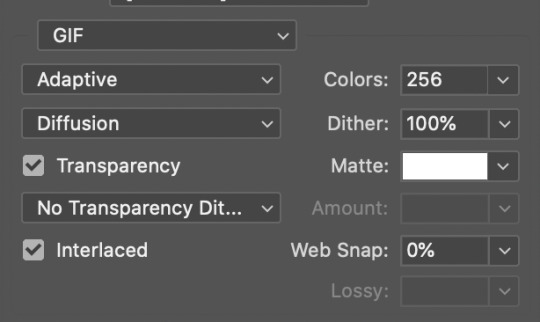
Now you see how big the file is in the bottom left. Tumblr won’t let you upload anything bigger than 10MB and it’s safer to stay under 9MB, in my experience. When your gif is too big, you have a couple options. You can close the dialogue and change the length of your gif.
OR, you can uncheck “Interlaced” and bump up the lossy to 1 or or more. This will create noise. Sometimes, that’s a good thing!
Here’s without lossy:
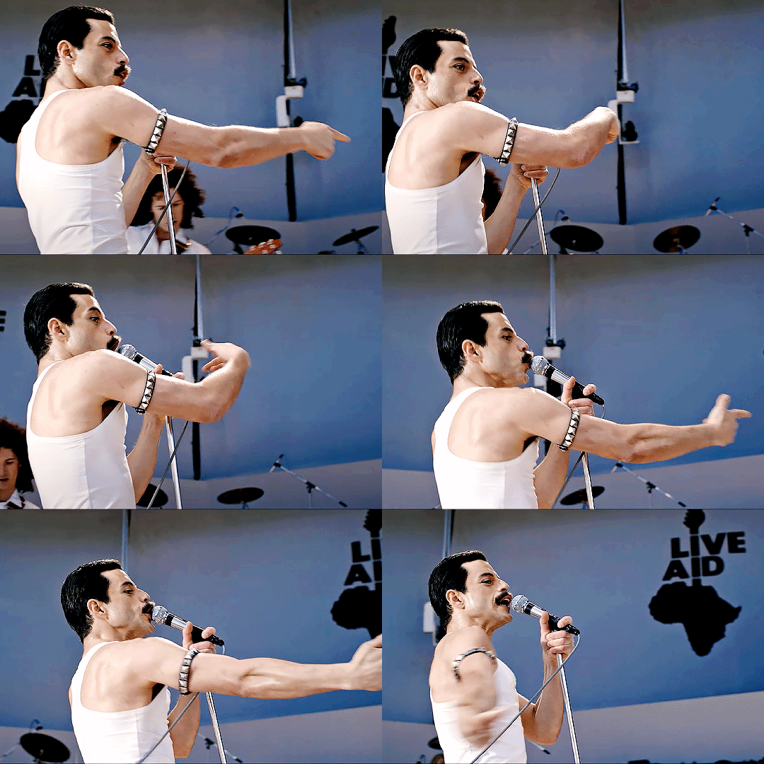
Here’s WITH lossy: (Honestly in a fast moving gif like this, it’s almost imperceptible, but I can see it!)

And now that I’ve exported, I can see what there’s a little black line on the bottom! So I’m going to trim that off and call it good! You can see the full gifset here.
Hope you enjoyed! Reblog if you try this out or learned anything. Feel free to reach out with questions any time!
348 notes
·
View notes
Note
oh my god?????? wowww????? can you do a gif making tutorial pleaseee? (or link it if you’ve already done it before sksjsk) what software and apps do you use? and what tips and advice would you give to a beginner? and also tumblr has some rules and stuff to post right? your gifs are amaaazinggg!!! thank you thank you thank you
oh, boo... thank you so much for the compliments. you’re so kind. i'm gonna be honest with you, though: making tutorials is a huge pain in the ass 😅. i’m gonna answer some of your questions myself, but i hope you'll forgive me for linking you to other people's tutorials that have helped me a lot.
i use ps cc 2019!
i use KMplayer to screenshot
i use videoder & 4k video downloader to download most of my videos (when it’s a movie or a tv show i usually go looking for the highest quality torrents)
here are a few tutorials:
a friend of mine did this AMAZING, super complete & resourceful tutorial for beginners. it basically has everything you need and more. it goes from downloading photoshop to which tags you should use.
here’s another tutorial made by the super talented @goldenlike. i’m linking you to second one because you can’t ever know too much & maybe a smaller tutorial will be less terrifying haha
this tutorial changed the way i used to brighten my gifs and i use these tips to this day.
i made this one tutorial once, because someone wanted to know something specific. if there’s anything in particular that you like about my edits, please, feel free to ask (despite my statement above, i would be willing to make a tutorial for something less... broad, yk? fhjdhks)
there are soooo many tutorials out there, and accounts that put these tutorials together. here’s an example. you can find tutorials for pretty much anything you want on tumblr dot com. if you see a gifset/effect you like in particular, don’t hesitate to message the creator asking for more info about the gifmaking process. 90% of the time they’ll be happy to explain it to you.
honestly, gif making is a very personal process. i’ve read countless tutorials since i started, because there’s always a tip you have never tried before. it may work for you or it may not. my main advice would be start out by following one of these tutorials step by step. then, once you get the gist of it and feel comfortable doing the basics, start messing around with any and every thing (i.e.: coloring (this is definitely one of the most personal aspects. what i think is a nice coloring might seem horrible to someone else), saving settings, typography etc).
as for some tips and advices:
everyone always says this, but it bears repeating: try to always use the highest quality source material you can. it makes all the difference.
learn the RIGHT PROPORTIONS if you’re planning on posting your gifs on tumblr. it makes me want to cry when i see a content creator working so hard only to end up posting their stuff in the wrong size. it ends up looking all wonky 😩
i believe the tutorials above mention the proportions, but, in any case: 540 px width for one gif per row, 268 px for two gifs, 177 px/178 px/177 px for three gifs. the height is up to you!
smart sharpen, exposure/gamma correction, vibrance and color balance are your best friends. i almost never mess with the saturation of a gif, i only increase the vibrance!
if there’s one color in particular that is bothering you, selective color will be there for you.
pay special attention to skin tones: you don’t want anyone to be red as a tomato but you also don’t want to whitewash someone. in my opinion, skin tones are almost always the trickiest part of a gif.
i always add at least one layer of selective color > black > increase black between 5-10, because i think it does wonders for the definition/quality of ur gifs, but that’s just me.
each fandom has its own rules & particularities when it comes to content... one of my main advices would be going to a content creator’s page and take notes on which tags they use to help spread their content and if there’s any apparent rules that the creators follow.
most fandoms have at least one account that helps with spreading content. in the 1d fandom i always tag: #stylesnews #dailytomlinson #stylesedits #tomlinsonedits #hlcreators #hljournal #1dsource and/or #hlsource (depends on what you’re posting. i’m not gonna tag “tomlinsonedits” in a harry gifset haha)
don’t be ashamed to self reblog like crazy 🤪 sometimes the timeline is too chaotic for people to see your creation (especially if you post it amidst a release day, when everybody else is also posting stuff), so you might as well just reblog your own post 2-3 times on the same day, just to make sure.
HAVE FUN!!!!!!!!!!!!! most of all, have fun. try not to stress too much about it. tumblr is a hobby, no one is paying you to create anything, so just have fun with it. gif the stuff you like (it doesn’t matter if a million other people have already edited the same thing), create gifs that look good to >you<, mess around with the settings, allow yourself to be creative and try not to be too discouraged if people end up not appreciating it the way they should. unfortunately, tumblr isn’t too kind to content creators in general, so don’t take it personally, yk?
#i'm almost sure this was no help at all#i'm just rambling nonsense i'm sorry#ask me for anything specific and i'll be happy to help i promise :(#answered#anonymous#GOOD LUCK I HOPE YOU HAVE FUN
24 notes
·
View notes
Note
woah!!! how did you do that fatou gifset? may i request a tutorial?
omg of course! i’m going to just give you an explanation of how i put it all together, for the sake of not making this a billion years long i’ll assume you’re already comfy with making, coloring, exporting gifs etc.
if you’re curious how to make gifs like the one below from this set of mine, a lil tutorial will be under the cut!
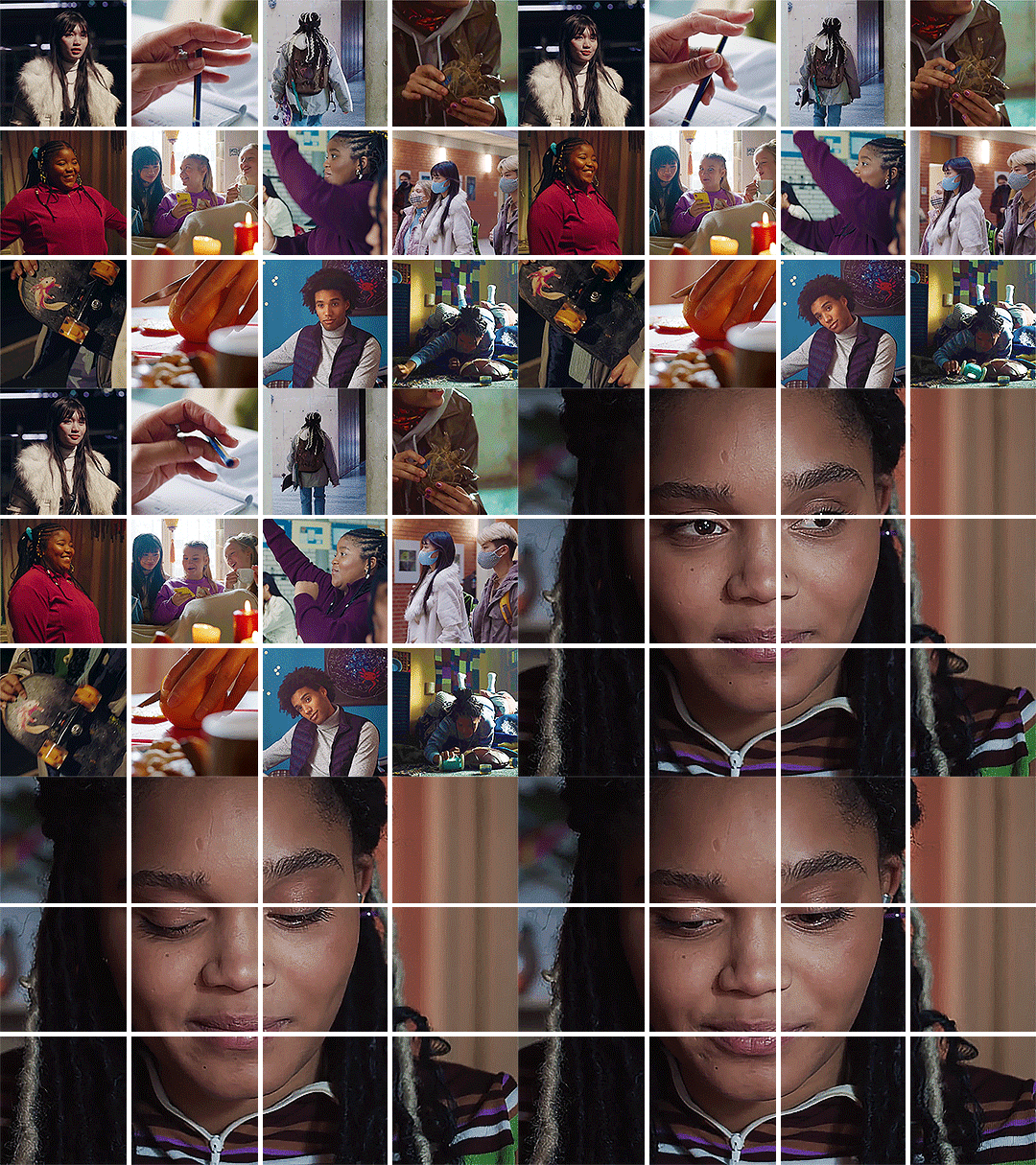
ok so you can do this with any number of gifs you want, a 4 by 3 grid is what I went with because 3 by 3 will mean that you’ll struggle to keep it under the 10mb limit.
If you’re making a 4 by 3 grid, you’ll need 12 square gifs that are 135 by 135 pixels and one 4 by 3 aspect ratio gif for the big gif at the end, which will be 540 by 405 pixels. For a 3 by 3 grid, use 9 square gifs that are 180 by 180 pixels and one that’s 540 by 540 for the big gif.
I made all of my gifs and sharpened them, but didn’t do any coloring yet. You can color first but I liked waiting to do it all at once, I feel like it helps it look cohesive.
Whatever way you make gifs, you want to make sure all the small gifs have the same number of frames. For my set I made all of my gifs 30 frames but you could probably get away with a little more while staying under 10mb for the finished product.
You might prefer to skip this step to save some time, but I exported all of my sharpened, not colored gifs, then opened all of those .gif files in photoshop, just to make sure there were the same frames for all of them. Regardless of if you do this or not, you will want all 10 or 13 of your gifs as smart objects.
If you have exported them, all you need to do to make your layers a smart object is to switch to the timeline (the purple bars stacked in the timeline window instead of a bunch of little squares of your frames.), select all your layers, right click, and say convert to smart object. Make sure you switch to the timeline before you convert to smart object or the gif won’t play.
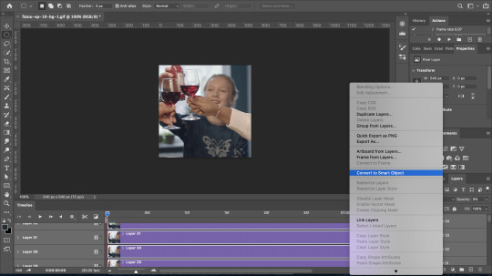
Once I have all of my smart objects, I take one of my small gifs and increase the canvas size to 540 by 405.
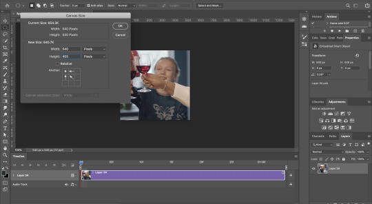
Then go through to each gif file, copy the smart object, and paste it into that large canvas. Photoshop should snap your gifs to be aligned with each other when you rearrange stuff. Put all the gifs touching each other. Don’t bother tryin to leave 5px borders, we’ll deal with that later!
When you paste your big gif, make sure to move the start of it to the end of the others, so the grid of small gifs plays, then the big gif by itself.
Once all the gifs are pasted into the same file, rearrange the grid however you like. You should be seeing something like this:
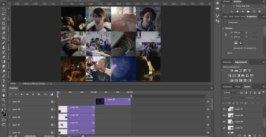
Now is when I did coloring. I put adjustment layers for exposure, vibrance, etc. on the very top so they affected all the gifs. Then if particular gifs are too dark, too orange, not as vibrant as the others, etc. you can adjust individual gifs by clicking the smart object of the gif you want to fix in the layers panel, then going up to image > adjustments and chose what adjustment you want to make. This creates a smart filter on that one gif, just like when you sharpen a smart object.
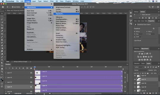
Once your coloring and placement of your gifs is to your liking, select all your gifs including the big gif, and right click, convert to smart object. You now have a bunch of smart objects nested into a big smart object. Don’t worry about not being able to edit, though. All you have to do is right click and choose edit contents. This will bring up a .psb file that has all of the layers and adjustments inside your smart object. All you have to do is make any changes in that file, save it, and exit out. The smart object will update itself.
This is where I bring the borders back in with a layer mask. I find it much easier to put in the 5px borders this way rather than trying to do the math and space things out properly. It also guarantees you clean lines.
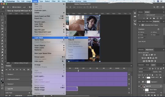
So I select the smart object that has all of my gifs and coloring in it, then go to layer > layer mask > reveal all to create a layer mask that will go over everything.
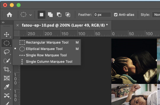
Then I go to the tool bar and select the single row marquee tool. I make sure I can see the grid of small gifs to do this part and I zoom in as far as I can on one of the horizontal intersections. I click on the line where the gifs meet and a row of pixels will be selected.
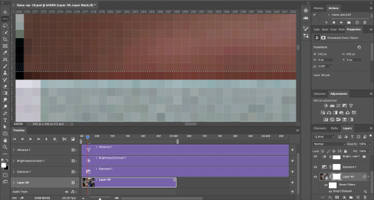
I switch back to the regular arrow which will give me handles to increase the selection to 5px tall. Once I have this 5px selection centered over the intersection, I click on the layer mask, then use the eraser tool over it to remove the selected area. You can click command or control + d to deselect, then repeat this for all of the intersections of the grid, using the single column marquee tool for vertical intersections.

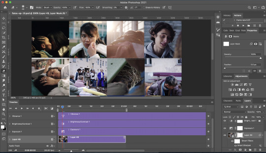
Now your grid is separated and your big gif is cut into pieces that line up, all in one step. And for any other gifs like this that you make, you can copy and paste the smart object you made here into the file you're working on and drag the layer mask onto the smart object you’re making, then delete the old smart object from that file once you’ve gotten its layer mask. So although the process of making the layer mask is a bit tedious, if you save your first one as a psd, you can reuse the layer mask anytime you need to.
Obviously you’ll need to export and adjust the delay of your finished product. I recommend a much slower delay than usual, since the gif switches, and the grid will only be about 30-35 frames, I did a 0.08 delay, but you could go even slower if you want. It’s good for it to be slow, because it gives people time to actually see what’s happening and not get a headache.
That’s pretty much the gist! I hope this was helpful, but I am more than happy to clarify anything if you want to send me an ask or dm!
12 notes
·
View notes
Note
how do you make your icons / headers?
hiya anon! thanks for the question!! this is probably longer than it needs to be so it’s going under a cut
choosing an image
so to start, pick the image you want to use! the higher quality the better and if the lighting is really dark it may be hard to work with. and just for personal preference, i like to have both shoulders clearly visible (and sometimes the tops of heads are cut off. i try to avoid those too)
this is the one i’m choosing! as you can see, it’s pretty well lit and there’s plenty of room around margret. also she’s making a cute expression which i always think makes icons more fun!

base coloring
i like to apply the “lighting” before cutting it out. the first thing i do is increase the blacks using a selective color layer, these are my settings:

then, to brighten it up i add some curves like so:

i follow that with some levels. and as you can see, because the blacks were added earlier, i only touch the mid-tones which i move to the left to brighten the whole thing:

then more brightness and some contrast:

and a bit of exposure:

right now your layers should look like this

and this is how my image looks now:

as you can see, it’s much brighter so we’re gonna start adding the colors. to start, i add some vibrance:

then you’re going to go all the way to the bottom and right above that first selective color layer add a color balance. the layers should look like this now:

i usually adjust mid-tones, highlights, and shadows. these are my settings here:


the most important part of color balance is to make sure the skin tone looks good. this is how mine looks so far:

now go back to the top of your layers and create a new selective color layer. this will be used to change the neutrals, whites, and blacks which will work to even out some of the colors as well as create more contrast. these are my settings: (note: make sure you have relative and not absolute clicked)
if you are working with characters of color be very careful when making the follow selective color adjustment. use the neutrals very limitedly or not at all. while they work nicely on white characters they can wash out the skin of darker skinned characters. if you have questions about how i adjust my settings for characters of color, please let me know. whitewashing is very easy to do on accident and i work hard to try and ensure that i don’t do it. (also if someone notices me whitewashing characters in anything i make, please let me know so i can make sure to not do it going forward.)


next create a second selective color layer. this one will be used to brighten the reds and yellows and add more color to margret’s skin. these are the settings i used:


then i’m going to add a second color balance, this time only mid-tones and highlights. you can skip this tbh it doesn’t do much but i think it adds a little bit more flush to her skin.


next is gonna be some hue and saturation to add color and brighten up the skin. these are my settings:


and now one final selective color. again, be careful here when dealing with characters of color and make sure you don’t lighten the skin.

for organizational purposes, i like to now stick all of these layers in a folder.
this is what the screencap looks like with the finished lighting:

cutting out the character
start by putting a bright solid color fill layer underneath your screencap. this will make it easier to see what you’re doing later on
i like to use the pen tool to do this but i’m not really going to go over that because then we’ll never be done with this. if you need help with that, don’t hesitate to message me!
first things first, i’m gonna crop it into a square so i can get a sense of how it’s gonna be framed. this is how i chose to do mine, as you can see there’s a space at the top where i extend past the original image but that’s okay

then i’m gonna use the pen tool to select the outline of margret and right click the selection and click on make selection

there should now be the “dancing ants around your selection”. click on the white box with the circle in it to make a mask on the screencap layer. it looks like this:

after doing so this is what your screencap should look like:

and the layers should look like, with the white part being the outline of your character:

if you hold option/alt and click on the clipping mask thumbnail it should switch to the black and white view of the mask. select all and copy/paste it into the lighting folder above it. then create a new folder and paste it there as well. this is what your layers should look like now, with the topmost folder being empty still:

coloring
now select a solid color layer and set it inside the topmost folder. pick a color for the hair. because margret is blonde, i’m choosing a yellowish color. #ecd495 in this case. set the layer to color and erase everything but the hair. it should look something like this now, so only the hair has been painted over:

now duplicate the color layer and set it to overlay. adjust the opacity settings for both as you like it. here i set them to 70% but it’s relative and depends on your personal preference.
do the same for the shirt and the lips/cheeks if you want and any other things like hats or jewelry that may be included. here i have the shirt as #408e11 on 100% and the lips at #ec3379 on 50%. this is what it looks like:

note: unless changing the color of the shirt, i usually only put the color layer on the hair. and never on the face at all.
the coloring is now done!!
background
at this point, it’s almost done! what i’m going to do now is make a new layer under the screencap but above the solid color layer and i’m going to create a gradient. i usually want the gradient to be the same color as the clothing so i use the eyedropper tool to pick a color from her shirt.
a rule of thumb when creating the gradient background, the lighter color should start at the side of the image that has the light source (in the case of my image, this is the left). here’s what mine looks like so far:

sizing
it’s almost done! except it’s really big. i usually make my icons 250x250, so we have to resize it.
you could stop it here but i like to sharpen it a bit first. to do this i first want to merge all my layers together. you can do this by selecting every layer together and right clicking. there should be an option that says merge.
this should now be all you see in layers:

i have two layers of sharpen. this is the first:

and the second:

and ta da!! all done! i hope this wasn’t too long/confusing! if you have any questions, don’t hesitate to ask, i’ll do my best to answer and i promise it won’t be disturbing me! ♡
this is it unsharpened:

and sharpened:

it’s entirely up to you what to do with this but i like sharpening it bc i think it looks better when small!
#anon#mail#shut up dee#tutorial#starsmish#this got sooooo long yikes#please lmk if this was helpful anon!#and yes margret is from mash i can do what i want
9 notes
·
View notes
Note
how do you colour your gifs so well!!
hello!! i use photoshop 2020 and i use a looooot of layers in my gifs. for all of my edits i mainly use curves, selective colors, gradient maps, vibrance/saturation, and exposure layers. the trick to the best coloring, in my opinion, is using a lot of vibrance layers to increase the strength of your colors, and using selective coloring layers to increase colors you want, decrease colors you don’t want, or mix colors to get different colors altogether (i.e. changing taylor’s delicate music video dress from blue to purple). i also play with a lot of gradient maps and changing the blending mode on them to see which mode fits the gif the best :) everything i do is very much so trial-and-error and the techniques i use vary depending on the original colors of what i’m editing.. i hope this makes a little bit of sense and i wish i could be more specific but i tend to be awful at explaining things!!
1 note
·
View note