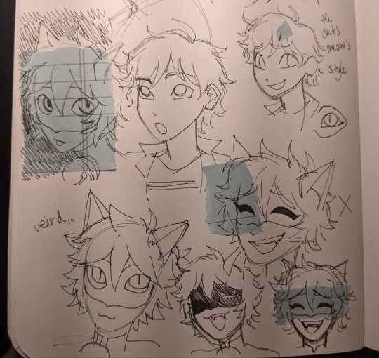
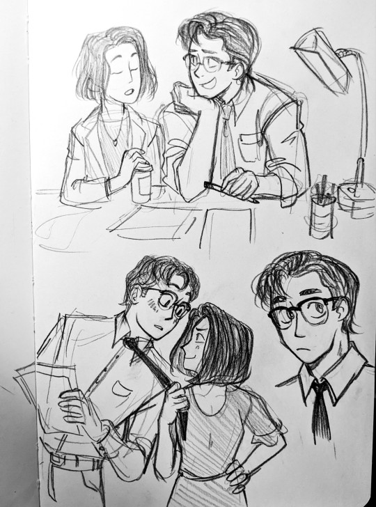
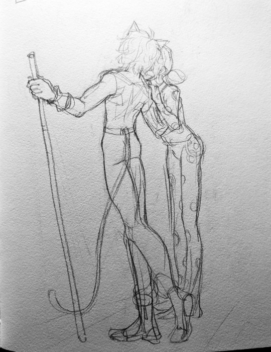
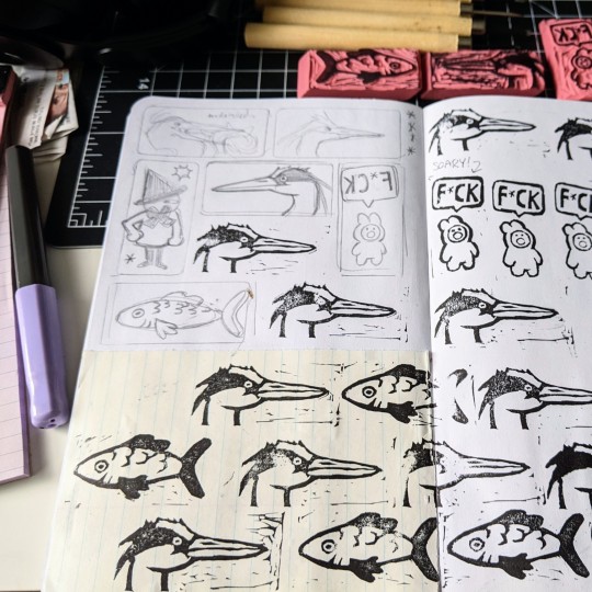
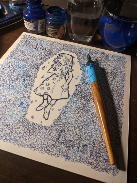
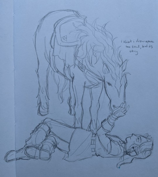
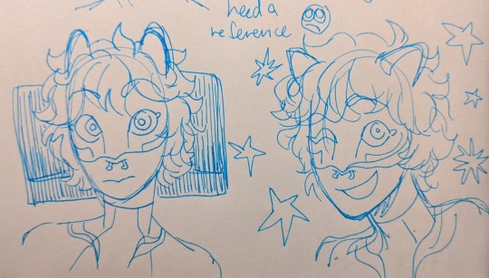
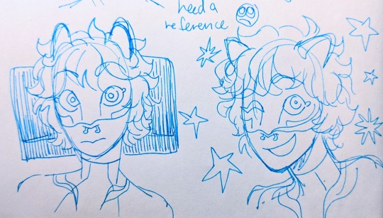
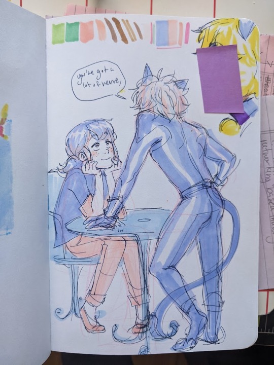
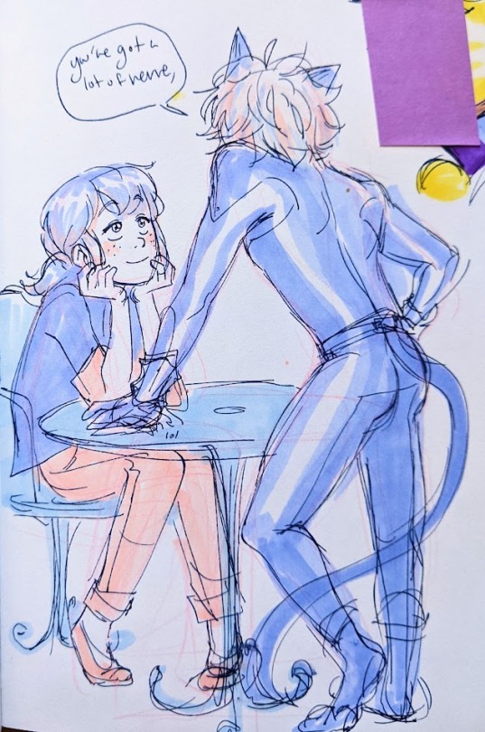
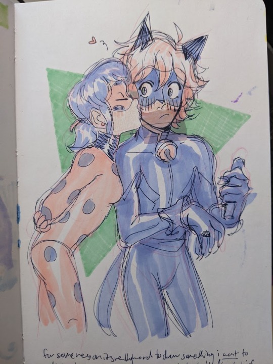
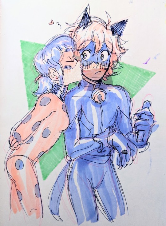
#ANYWAAYYY enjoy this never before seen art lmao
Explore tagged Tumblr posts
Visit Tumblr Blog
Explore Tumblr blogs with no restrictions, modern design and the best experience.
Last Seen Tumblr Blogs


Fun Fact
The most popular pages on Tumblr are about Minecraft, GIFs, and David J. Peterson.
Note
idk if anyone has asked this before but how do you manage to make your traditional art come out w a clear and crisp quality when you upload it bc i've been trying to figure out how to improve that for my own art
i might've answered this before i don't mind repeating myself
STEP 1: make sure you have good lighting!
take your photos next to a window on a bright day, not in direct sunlight because that can cause glare or over expose the image, but next to a window where the ambient light is even across your piece
taking pics on a rainy day or after the sun sets? no problem! all you need is bright ambient lighting, like what you'd find in a well lit bathroom, light that isn't shining directly on you, but reflecting off the walls, diffused and even
when taking your picture you wanna make sure there are no shadows, be it cast shadows from your hands, or shadows on one side of the page due to focused light
here's a side by side:
on the left side there's this gradient of value across the image because the light is just hitting the page from the top, and there's some visual striping caused by my lamp
on the right the image is evenly covered in light from a nearby window, so there is no gradient
of course the left image is exaggeratedly bad but if you photograph and edit with uneven light your end product will be passable, but not as great as it could be
here are some more examples post edit, notice the gradient across the drawing and the shadow on the bottom half
again not TERRIBLE but not ideal
STEP 2: photograph straight on, up close and crop tastefully!
when you're taking your picture stand up if you can, and i mean it, just get right on top of the piece and make sure your camera is parallel, because taking a pic at an angle can really distort the proportions of your drawing
also make sure you're fitting as much of the drawing into your picture as possible, you don't wanna lose quality unnecessarily by photographing from a distance
and when you crop, try and get out as much unnecessary space as you can, of course give the image breathing room, don't crop down to the edges of your image, but also try and cut out your thumbs or desk if you're going for that crisp professional look
all the rules in this section can be broken if it's done intentionally!
here are some examples of off angle/weirdly cropped drawings with my desk in the background but it's on purpose:
STEP 3: time to edit!
so this part is really going to depend on what software you personally use to edit and getting familiar with it, i use my phone's built in editor which is the google photos editor, ive used ios photo editing, ive used photoshop and procreate and most programs generally have the same couple of editing scales so im going to be general
FOR BLACK AND WHITE ART:
1. turn the saturation aaallllll the way down
we don't want the yellow of the pages or the warm light of your lamp or the blue tone of the sun on our white paper, unless you're going for a black and white in sepia sort of look, then edit to your discretion, but in general for black and white i eliminate all color
2. crank the brightness and contrast (highlights/white point/exposure/brilliance) UP and turn the black point/shadows DOWN
we want to create as much visual contrast as possible and make the darks REALLY dark and the brights REALLY bright, especially if you have a drawing that has very little midrange values, this worked well for my stamps, but for a pencil drawing you want to keep those details and middle values so the settings won't be as extreme
depending on what program you use the names and effects of each setting might be a little different, so fiddle around to find out what everything does!
here's a before and after
FOR COLOR ART:
1. increase saturation! (and vibrance on ios) depending on your piece and your camera and the medium and the lighting your image and its colors can come out a number of different ways, but usually cameras will not capture the vibrancy of real life colors. and personally i just like boosting them anyway :) i think it looks really nice!
2. turn the brightness and white values up, but not too much, we don't want to wash out any colors but if you have a white of the page we still want that to be bright white
3. turn the black point/shadows down just a little, we don't want to completely overpower the light and color values with darks and shadows, but we still don't want it to look washed out and dull
and lastly (for both B&W and color) fiddle with some other specialized settings! play with curves! or pop, or HDR or whatever other slider you have access to, figuring out what each does and which ones you like will help you get your final image closer to your tastes
happy editing and art making!!! i hope this was helpful :)
#did i stay up until 5 am today writing this ask.... yes....... yes i did#ANYWAAYYY enjoy this never before seen art lmao#ask#tizzy talks#my art
371 notes
·
View notes