#why do web designers subject me to this
Text

While I'm complaining about changes to Tumblr: what in the living hell is this and what's the fucking point
#i hate all these badges they're a waste of time and mean literally nothing to me#all they do is annoy the fuck out of me#why do web designers subject me to this#i don't care for badges on any site except for deviantart because it has a llama badge. which was memey and funny#all other badges are not valid and i want to throw them in the garbage#i'm a shrew leave me alone
3 notes
·
View notes
Text
TUMBLR POST EDITOR WON'T LET ME TITLE THIS POST ANYMORE SO I GUESS THIS IS THE TITLE NOW. WEBBED SITE INNIT
So let's say you grew up in the nineties and that The Lion King was an important movie to you. Let's say that the character of Scar - snarling, ambitious, condescending, effeminate Scar - stirred feelings in you which you had no words for as a child. And then let's say, many years later, you're talking about it with a college friend, and you say something like, "oh man, I think Scar was some sort of gay awakening for me," and she fixes you with this level stare and says, "Scar was a fascist. What's the matter with you?"

The immediate feeling is not unlike missing a step: hang on, what's happening, what did I miss? You knew there were goose-stepping hyenas in "Be Prepared," but you didn't think it mattered that much. He's the bad guy, after all, and the movie's just pointing it out. Your friend says it's more than that: the visuals of the song are directly referencing the Nuremberg rallies. They're practically an homage to Riefenstahl. This was your sexual awakening? Is this why you're so into peaked caps and leather, then? Subliminal nazi kink, perhaps?
And then one of your other friends cuts in. "Hold up," he says, "let's think about what Scar actually did in the movie. He organized a group of racialized outcasts and led them against a predatory monarchy. Why are you so keen to defend their hereditary rule? Scar's the good guy here." The conversation immediately descends into a verbal slap fight about who the real bad guy is, whether Scar's regime was actually responsible for the ecological devastation of the Pride Lands, whether the hyenas actually count as "racialized" because James Earl Jones voiced Mufasa after all. Your Catholic friend starts saying some strange and frankly concerning shit about Natural Law. Someone brings The Lion King 2 into it. You leave the conversation feeling a little bit lost and a little bit anxious. What were we even talking about?
INTRODUCING: THE DITCH
There is a way of reading texts which I'm afraid is pervasive, which has as its most classical expression the smug obsession with trivia and minutiae you find in a certain vein of comic book fan. "Who was the first Green Lantern? What was his weakness? Do you even know the Green Lantern Oath?" It eschews the subjective in favor of definitively knowable fact. You can't argue with this guy that, say, Alan Scott shouldn't really count as the first Green Lantern because his whole deal is so radically different from the Hal Jordan/John Stewart/Guy Gardner Corps-era Lanterns, because this guy will simply say "but he's called Green Lantern. Says so right on the cover. Checkmate." This approach to reading a text is fundamentally 1) emotionally detached (there's a reason the joke goes, oh you like X band? name three of their songs - and not, which of their songs means the most to you? which of them came into your life at exactly the right moment to tell you exactly what you needed to hear just then?) and 2) defensive. It's a stance that is designed not to lose arguments. It says so right on the cover. Checkmate.
And then you get the guys who are like "well obviously Bruce Wayne could do far more as a billionaire to solve societal problems by using his tremendous wealth to address systemic issues instead of dressing up as a bat and punching mental patients in the head," and these guys have half a point but they're basically in the same ditch butting heads with the "well, actually" guys, and can we not simply extricate ourselves from the ditch entirely?
So, okay, let's return to our initial example. Scar is portrayed using Nazi iconography - the goose-stepping, the monumentality, the Nuremberg Lichtdom. He is also flamboyant and effete. He unifies and leads a group of downtrodden exiles to overthrow an absolute monarch. He's also a self-serving despot on whose rule Heaven Itself turns its back. You can't reconcile these things from within the ditch - or if you can, the attempt is likely to be ad-hoc supposition and duct tape.
Instead, let's ask ourselves what perspective The Lion King is coming from. What does it say is true about the world? What are its precepts, its axioms?
There is a natural hierarchical order to the world. This is just and righteous and the way of things, and attempts to overthrow this order will be punished severely by the world itself.
Fascism is what happens when evil men attempt to usurp this natural order with the aid of a group or groups of people who refuse to accept their place in the order.
There exists an alternative to defending and adhering to one's place in the natural order - it consists only of selfish spineless apathy.
Manliness is an essential quality of a just ruler. Unmanliness renders a person unfit for rule, and often resentful and dangerous as well.
And isn't that interesting, laid out like that? It renders the entire argument about the movie irrelevant (except for whatever your Catholic friend was on about, since his understanding of the world seems to line up with the above precepts weirdly well.) It's meaningless to argue about whether Scar was a secret hero or a fascist, when the movie doesn't understand fascism and has a damn-near alien view of what good and evil are.
There's always gonna be someone who, having read this far, wants to reply, "so, what? The Lion King is a bad movie and the people who made it were homophobes and also American monarchists, somehow? And anyone who likes it is also some sort of gay-bashing crypto-authoritarian?" To which I have to reply, man, c'mon, get out of the ditch. You're no good to anyone in there. Take my hand. I'm going to pull on three. One... two...
SO PHYREXIA [PAUSE FOR APPLAUSE, GROANS]
We're talking about everyone's favorite ichor-drooling surgery monsters again because there was a bit in my ~*~seminal~*~ essay Transformation, Horror, Eros, Phyrexia which seemed to give a number of readers quite a bit of trouble: namely, the idea that while Phyrexia is textually fascist, their aesthetic is incompatible with real-world fascism, and further, that this aesthetic incompatibility in some way outweighs the ways in which they act like a fascist nation in terms of how we think of them. I'll take responsibility here: I don't think that point is at all clear or well-argued in that essay. What I was trying to articulate was that the text of Magic: the Gathering very much wants Phyrexia to be supremely evil and dangerous fascists, because that makes for effective antagonists, but in the process of constructing that, it's accidentally encoded a whole bunch of fascinating presuppositions that end up working at cross-purposes with its apparent aim. That's... not that much clearer, is it? Hmm. Why don't I just show you what I mean?
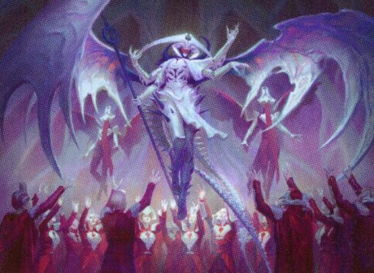
Atraxa, Grand Unifier (art by Marta Nael)
In "Beneath Eyes Unblinking," one of the March of the Machine stories by K. Arsenault Rivera, there's a fascinating and I think revealing passage in which Atraxa (big-deal Phyrexianized angel and Elesh Norn's lieutenant) has a run-in with an art museum in New Capenna. The first thing I want to talk about is that, in this passage, Atraxa has no understanding of the concept of "beauty". A great deal of space in such a rushed storyline is devoted to her trying to puzzle out what beauty means and interrogating the minds of her recently-compleated Capennan aesthetes to try and understand it. In the end, she is unable to conceive of beauty except as "wrongness," as anathema.
So my first question is, why doesn't Atraxa have any idea of beauty? This is nonsense, right? We could point to a previous story, "A Garden of Flesh," by Lora Gray, in which Elesh Norn explicitly thinks in terms of beauty, but that's a little bit ditchbound, isn't it? The better argument is to simply look at Phyrexian bodies, at the Phyrexian landscape, all of which looks the way it does on purpose, all of which has been shaped in accordance with the very real aesthetic preferences of Phyrexians. How you could look at the Fair Basilica and not understand that Phyrexians most definitely have an idea of beauty, even if you personally disagree with it, is baffling. This is a lot like the canonical assertion that Phyrexians lack souls, which is both contradicted elsewhere in canon and essentially meaningless, given Magic's unwillingness or inability to articulate what a soul is in its setting, and as with this, it seems the goal is simply to dehumanize Phyrexians, to render them alien, even at the cost of incoherence or internal contradiction.
Atraxa's progress through the museum is fascinating. It evokes the 1937 Nazi exhibit on "degenerate art" in Munich, but not at all cleanly. The first exhibit, which is of representational art, she angrily destroys for being too individualistic (a point of dissonance with the European fascist movements of the 20th century, which formed in direct antagonism to communism.) The second exhibit, filled with abstract paintings and sculptures, she destroys even more angrily for having no conceivable use (this is much more in line with the Nazi idea of "degenerate art", so well done there.) The third exhibit is filled with war trophies and reconstructions from a failed Phyrexian invasion of Capenna many years prior, which she is angriest of all with (and fair enough, I suppose.) But then, after she's done completely trashing the place, she spots a number of angel statues on the cathedral across the plaza, and she goes apeshit. In a fugue of white-hot rage, she pulverizes the angel heads, and here is where I have to ask my second question:
Why angels? If you are trying to invoke fascist attitudes toward art, big statues of angels are precisely the wrong thing for your fascist analogues to hate. Fascists love monumental, heroic representations of superhuman perfection. It's practically their whole aesthetic deal. I understand that we're foreshadowing the imminent defeat of Phyrexia at the hands of legions of angels and a multiversal proliferation of angel juice, but that just leads to the exact same question: why angels? To the best of my knowledge, the Phyrexian weakness to New Capennan angel juice is something invented for this storyline. They have, after all, been happily compleating angels since 1997. We could talk about the in-universe justification for why Halo specifically is so potent, but I don't remember what that justification is, and also don't care. Let's not jump back in the ditch, please. The point is, someone decided that this time, Phyrexia would be defeated by an angelic host, and what does that mean? What is the text trying to say? What are its precepts and axioms?
Let me ask you a question: how many physically disabled angels are there in Magic: the Gathering? How about transsexual angels? How many angels are there, on all of the cards that have ever been printed for Magic: the Gathering, that are even just a bit ugly? Do you get it yet? Or do you need me to spell it out for you?
SPELLING IT OUT FOR YOU
There is a kind of body which is bad. It is bad because it has been significantly altered from its natural state, and it is bad because it is repellent to our aesthetic sensibilities.
The bad kind of body is contagious. It spreads through contact. Sometimes people we love are infected, and then they become the bad kind of body too.
There is a kind of body which is good. It is good because it is pleasing to our aesthetic sensibilities, and it is good because it is unaltered from its (super)natural state.
A happy ending is when all the good bodies destroy or drive into hiding all of the bad bodies. A happy ending is when the bad bodies of the people we love are forcibly returned to being the good kind of body.
Do you get it now?
ENDNOTES
It's worth noting that the ditch is very similar to the white American Evangelical hermeneutics of "the Bible says it. I believe it. That settles it," the defensive chapter-and-verse-or-it-didn't-happen approach to reading a text, what Fred Clark of slacktivist calls "concordance-ism". I don't think that's accidental. We stand underneath centuries of people reading the Bible very poorly - how could that not affect how we read things today? We are participants in history whether we like it or not.
I sincerely hope I haven't come across as condescending in this essay. Close reading is legitimately difficult! They teach college courses on this stuff! And while it is frustrating to have my close readings interrogated by people who... aren't doing that, like. I do get it. I find myself back in the ditch all the time. This stuff is hard. It is also, sorry, crucial if you intend to say something about a text that's worth saying.
I also hope I've communicated clearly here. Magic story is sufficiently incoherent that trying to develop a thesis about it often feels like trying to nail jello to the wall. If anyone has questions, please ask them! And thank you for reading. Next time, we'll probably do the new Eldraine set.
#phyrexia#not defining the ditch except by implication#thanks to all the very smart vorthoi on the flavor text discord server for helping me work through my thoughts on fascism and phyrexia#this is technically the march of the machine review also#or as much of one as i care to do
5K notes
·
View notes
Text
A horror trope that I very much enjoy is the "haunted book" -- a book that affects the reader in some way, like the Necronomicon driving people mad, or Dr. Mabuse's book that hypnotizes its reader into doing his bidding. It recently had a nice moment in the Magnus Archives, with the Leitner subplot, and there's even a hint of it in Frankenstein, when Victor reads the work of a scientist that his professors dismiss as nonsense and becomes obsessively deranged studying the subject matter.
So it's not that I think it's time for a revival and lord knows the word "reboot" has begun to stink of soulless profit (I think we're one, maybe two flops from a reboot of the MCU). I'm not the most current on horror media in any case so maybe it's been done, but if not I do think we oughta start considering the idea of a haunted phone app.
Apps are already designed for this, anyway. In our current era, a lot of retail "apps" are just reskinned browsers that load an optimized version of the company's website, and the goal of most apps and websites is to keep you in the app/website. (Which is why the google mail and tumblr apps both have internal web browsers.) A lot of phone games are designed to keep you in the game and continually redirect you towards microtransactions, and even apps that aren't games often gamify use; "gamification" has come to be a polite euphemism for "creating addictive circumstances".
Alongside this, a lot of recent cults and cultlike organizations have determined that straight religion is not the best way in anymore, and are coming in sidelong through MLMs (Nexium), wellness and dietary orthodoxies (Bikram Yoga, a number of insta/tiktok orthorexia gurus), or political movements (Qanon). So you get a cult, set up like a business, with an app you use for your business -- or even a cult with a "wellness" app that monitors your sleep, eating, location (wait, that's just FitBit) -- and slowly it gamifies you right into attempting to raise a Great Old One using the power of your downstream or a nice big helping of olive oil coffee.
Although I hate those thinkpieces/art pieces that are all about "you're so busy on your phone you can't appreciate the world around you, remember when we read real paper books" so I would require that the protagonist defeat the evil also using a phone app, or at the very least blind the evil using the flashlight function. Locking the book away in a library app and then putting the phone on airplane mode is a nice resolution, followed perhaps by it lighting up even though it's offline with a message "someone is attempting to locate this phone" as the post-credits stinger for the sequel.
This thought brought to you by Duolingo, which recently fed me, in succession, the task of translating from Italian the phrases
Who do you see in the mirror?
We open the curtains and see the light.
The pillows and blankets are red.
812 notes
·
View notes
Note
Do you happen to have any resources regarding accessibility in ttrpg design? About design, colours, phrasing of text or anything else that could be helpful!
I spent wayyyyy too long compiling all this - but it's important, and I appreciate you asking!!
Accessibility is a subject near and dear to my heart, and I will say up front that I'm not sure universal (aka accessible to everyone) design is possible, because people's needs can vary even within the same subset of similar disabilities (such as limited vision or blindness). BUT that doesn't mean we don't try to design for and make our games available to as many people as possible. Mismatch by Kat Holmes is a great read on design for accessibility in general, as is Invisible Women by Caroline Criado Perez. You might also check out literally anything Alice Wong has ever done.
To start, I recommend this article on the Lenses of Accessibility.
(for reference, this article is about web/graphic design, so I'm going to try and distill the most salient points for game design)
We are going to primarily focus on a few of these lenses:
Color
Font
Images & Icons
Layout
Readability
Structure
Keyboard
More details under the cut.
Color
Why does color matter? Well, for starters, there's a lot of colorblind people out there. Contrast affects readability. Autistic people and people who suffer from occular migraines might be affected by particular vivid colors. There's lots of reasons to consider color and the work it is doing in your piece, but in general you can provide a black and white, high contrast version of your game to help users.
There are tools out there to figure out if your contrast meets certain readability standards, such as this one.
Font
Dyslexia and other visual processing issues can make font choice really important. Plus, some fonts really affect readability. Additionally, line height, justification, and size of text can affect readability.
Best practice would be to provide a plain-text version of your game (and beware of "dyslexia-friendly" fonts which may or may not actually help - sticking to a basic readability font like Arial, Tahoma, or Verdana, is safest). I like this style guide for reference.
Images & Icons
For visually-impaired people, it's important to use alt-text, descriptions, and/or captions to help screenreaders properly translate images. Tons and tons of details that could go into this, but there are better people than me to describe it.
Layout
We've talked about this a bit, but there's tons of resources for this. There was recently a great writeup about Yazeba's Bed and Breakfast in terms of layout that I highly recommend.
Readability
More of the thing we've already talked about - it really is a combination of all the other lenses that comes down to readability. Audio versions of your game are always a good way to avoid the restrictions of screen readers, but can be expensive to produce.
Structure
This is tables. Tables are a nightmare for screenreaders, but including them as images can also be a problem. The short solution is "don't use tables" but that's not necessarily great for seeing people. The section in this blog is really great when talking about options for structure.
Keyboard
Debated on whether to include this, but given how many games are being read as purely digital files, I think it's important to have workable interactive elements that can be navigated through without a mouse. Some of that is going to come down to the programs being used to open your files. But if there are things you can do on your end (such as labeling form fillable fields on an interactive character sheet), they're worth doing!
Please understand that this isn't an exhaustive list. There's tons of resources out there and technology and standards are constantly changing.
It's also is important to note that even doing one of these things is helpful. You might look at this list and go "wow that's too hard" but I promise you, it's worth it. My games do not all have accessible versions! That's something I'm trying to rectify. The biggest part of that for me is thinking about accessibility from the start instead of at the end! But we can start today, and that's better than not starting.
The most important thing to remember are that disabled people are NOT a monolith - needs will differ from person to person. Accessible design makes gaming better for everyone!
Final Resources:
Accessibility in InDesign
Accessible-RPG
A11Y
Accessible Design for Teams
319 notes
·
View notes
Text

"Bridal Portrait of Uncertain Origin"
Artist unknown, circa the Fall of the Preeminent (estimated)
Oils on bespoke canvas, silk tulle, gilded oak frame
Shortly after the last Yin-Yang Eclipse prior to the Merge, this portrait was discovered in the attic of the Temple of Airjitzu, despite no records of the portrait ever being displayed inside. Indeed, "Bridal Portrait of Uncertain Origin" lacks any solid provenance or provable history. The materials and techniques used only further obscure the truth; perhaps the only thing certain about it is that it exists.
Examination of the structure of the canvas and gilded wooden frame indicate classical techniques from the end of the Era of the Stone Warrior; however, chemical analysis of the paints, varnish, and other materials used to finish the base revealed compounds identical to substances readily available in civilian art supply establishments of pre-Merge urban Ninjago, specifically those available shortly before the portrait's discovery.
Further complicating matters, the image itself is a web of self-contradictions and mismatched details. The subject's pose is highly informal, but the portrait itself - from the level of detail in the oil paint to the larger-than-life scale - is lavish enough to suggest a formal reason for its creation. The subject's attire, too, is highly unusual. Of all known ceremonial attire in the realms, the blues, sharp lapels, and floral motifs rendered here most closely match traditional Djinjagan royal wedding garments (hence the portrait's given title). However, the presence of only two arms, human legs emphasized by a jumpsuit, and the highly unusual structure of the outfit preclude it from being truly Djinjagan in origin and match no other known ceremonial garments from any realm.
Despite all of these bizarre qualities, perhaps the most intriguing part of the portrait is the silk tulle veil flowing out from the painting to drape over the edge of the frame. Independent analyses by multiple art historians found absolutely no point of the connection between the veil and the canvas; the fabric seems to proceed from the image itself, as if the frame is in fact only a window sill separating the viewer from the bride. Furthermore, chemical analysis of the veil revealed trace quantities of organic Latrodectus sotoii venom - a toxin found only on one island in all sixteen realms, which was nowhere close to the portrait's point of origin. Combined with the spiderweb embroidery on the veil, as well as the subject's trio of spider shaped brooches and venom-coated raised hand, the presence of this toxin may be the most reasonable thing about this portrait.

(Now: notes from the artist.)
The process for this one was utterly unlike any other artistic project I've ever done. This all started with me thinking back over a past Skybound analytical piece of mine and thinking how fun it might be to try putting it on an actual person instead of the template croquis I designed it on. (Also: seeing how my texturing methods have evolved!) One Dallon Weekes photo and a Reel about quick contrapposto armature doodling later and I was off to the races.
Initially, this was only supposed to be a souped up edition of the original look - the second image shown just above these notes. Then, while I was trying to figure out how I wanted to display the veil, I wondered: wouldn't it be neat to let it drape out of the frame? Except for I didn't have a frame involved at that point.
At which point I decided, well.... let's make a frame happen. There was already a decidedly haunted portrait energy coming off of this thing (fully intentional, but that's what happens when two of the albums you associate most strongly with your Skybound work are Vices and Virtues and Violent Things), so I thought: let's put it on display. Let's let the veil creep out to meet actual gallery air. Furthermore, why not give it a scary ass, borderline SCP ish existence? I do love an excuse to try and write a museum plaque.
Put another way: If you walked into a gallery and saw an oversized portrait of you on one of the worst days of your life that never happened, except for all the details were wrong (but just right enough to suggest the artist knew what she was doing), would that be fucked up or what?
Some other assorted notes about this:
The design of the gallery space itself was inspired by an image of Crystal Bridges, an art museum in Arkansas that I'm hoping to visit later this year on a trip I'm taking to that area. I've had a family friend hyping it up for years now, and I've looked into it a lot; it's an incredible space. In the fictional lore of this painting, it ends up in a Crossroads art preservation institute of some kind that hangs on to art and artifacts from throughout the realms that crashed together in the Merge. (I couldn't quite squeeze that into the plaque writeup without sounding clunky.) Crystal Bridges, an American art museum with a dizzying range of works, inspired that idea and seemed the most appropriate place to base my fictional gallery on. Here's the image I used as reference, taken from a Google result from their site:

There is, in fact, text on that plaque on the wall. It's too tiny to read, but I promise that's text. Barring a few minor changes, it's the same as in the writeup; I typed it out, screenshotted and removed the background, and laid it out on the plaque. Much easier than trying to draw out teeny individual words.
Something else I couldn't fit into the plaque but tried to imply via the details was that this piece survived whatever collection it was originally in and made it through the Merge inexplicably intact, much like Nya's memories of the deleted timeline still hanging on even after the full reset. Weird as some stuff in this world is, there truly is no escaping it. Better get some nice lighting on it and try to get to the bottom of it. (I do also think it's funny how I bent over backwards trying to help this unnamed plaque author curator character trace every possible origin path when the motive for making this was just... fun. I just did this for fun and then I tried to make it look so grand and terrifying.)
The outfit in the portrait is faithful to the original design, with a few tweaks: the web collar is now gold to stand out against the veil, the veil itself is much longer, there are now two more spiders on the skirt, and there's a birdcage-inspired crinoline under the skirt. That last one was a technical decision, as the lace this time around didn't feel like it could hold itself up. Also, it's a convenient source of more symbolism if you need one.
That's about all the notes I have for right now - if I think of others, I'll be sure to add them. If you have any questions or comments, the inbox is always, always open.
Thank you for stopping by the exhibit.
#art on Tumblr#Ninjago fanart#Ninjago Skybound#Ninjago Delara#Ninjago couture#Lila draws#ordinarily I don't feel bad for people I have blocked but this one I do. rip my mutualship with [REDACTED] you would have had#thoughts on this for sure.#genuinely a banger I'm gonna have to go lie down til December I think#Ninjago Nya#how did I forget that tag that's like the most important one.....#Ninjago#I take that back THAT is the most crucial tag wtf. thanks Raine
88 notes
·
View notes
Note
WIBTA if I told my mother her book covers are bad?
I (20s F) used to design book covers for my mother, who is a self published author. I've recently stopped, both due to time conflicts because of work/school, and because it was a pain working with her (she never knew what she wanted and I would have to BEG her to give me enough information to work with, but then would ask for random additions to completed covers because new ideas suddenly came to her head; would give me deadlines for covers to be completed and then complain if I was doing personal hobbies instead of working on her cover even if the deadline was weeks away. also I don't know if this will be relevant, but yes I was paid for all covers I made for her). I did a handful of covers for her over the past few years, all of which she said she loved and would excitedly show to anyone she could. However I recently noticed she'd had some of the covers I'd done for her remade by a friend of hers. Some of them are Fine (not the best, I think the friend just throws stock photos into Canva) but others are very bad. Not quite Chuck Tingle bad, but close.
I love my mom, and she loves writing. It's been her dream to pursue a writing career for decades, and I want her to succeed! But no matter how much we say don't judge a book by its cover, a good cover can mean the difference between readers snatching a book up immediately and skipping over it without a second thought. Especially for self published authors who can't pull readers by name alone. I think it's important to note that she has explicitly asked for my help in this regard in the past (in addition to helping her design her website/developing an "brand" identity for her). She self admits to having no artistic eye and not knowing the difference between what looks "good" or "bad" (yes I know these are subjective, but you could slap a stock photo on a white background with comic sans and she wouldn't understand why that's not a Good cover she should be paying possibly several hundred dollars for) and has asked for my help both when I was a teenager with an interest in art and in the past few years as I'm currently in college for art and design. However she hasn't asked for my help recently, and that's where I fear I may be TAH. If this was her hobby I wouldn't care at all, but she's actively trying to make a career off her writing, and I believe some of her covers (in addition to things like poor web design and other miscellaneous stuff) reflect poorly on her because they look unprofessional, lazy and just. bad. From the way she's spoken in the past, I think she doesn't care/doesn't want to focus on anything that isn't actually writing, and while I understand that sentiment, I think it'll do more harm than good to her career. If it weren't for the issues mentioned above, I'd offer to work with her again.
WIBTA if I told her these covers were bad, despite her not explicitly asking for my input?
What are these acronyms?
113 notes
·
View notes
Text
Hai :7
I love you!
yes you!
click this.
now for introduction.
my name is Renée Corbeau
but you can call me ren or crow
I love crows! they feel like family to me and I hope next cycle I get to experience the life of a crow.
I have gone through alot in life and fancy myself some sort of activist by proxy of that pain, am I perfect? fuck no! I am still learning and probably operate under toxic bias still despite all the effort I have put into growth.
I'm adhd, autistic, anxious, depressive, dissociative, probably some degree of plurality.
I'm a gender non-conforming transwoman, definitely puppy coded, and severely down bad for women, especially butch women!
that being said the human body is beautiful. especially fat bodies, I'm a sucker for meat :3
all my guys, gals, and non binary pals deserve kisses (assuming that they want them)
I love gender fuckery, people who actively blur those lines are doing the lords work.
despite being very friendly and appearing slightly outgoing sometimes, I am very shy and dont have a very large social battery.
if I ever dont respond dont take it personally there are loads of reasons why this could be.
U^ᴥ^U U^ᴥ^U U^ᴥ^U
I am kind of a red mage when it comes to special interests, I know a little bit about alot.
(all lists are not ordered and not exhaustive)
some examples include;
from gaming~ pokemon, zelda, elderscrolls, darksouls, minecraft, osu!, space sims (elite dangerous, astroneer, dyson sphere project, hardspaceshipbreaker), roguelikes (noita, deadcells, gungeon, vagante, slaythespire)
from other media~ pokemon again, bluey, adventure time, atla, bee and puppycat, studio ghibli (nausicaa is goat), csm, bleach, dragonball, naruto, she-ra, dungeon meshi
from *gasps* real life~
space (and metaphysics), nature (it's peculiarities and the many funky adorable little guys born in it) I'm definitely a poser but skateboarding and rollerskating (I really want to get into rollerderby) philosophy (to the extent that any skid is);
History!
(not as well read as I would like because there is so much of it, and so much of the truth is buried under misinformation, but I have deconstructed the whole western myth of how things went and painted myself a much clearer picture as to how things got so bad and am learning new things about the world all the time, please feel free to info dump about anything history related I'd love to hear it. anthropology and archaeology too obvs)
Art!
(this is my chosen field for better or worse >.< I am going to college for web and graphic design (2024-2026) I might extend that an extra 2 years to make it a bachelor of design and hope to one day make graphic novels, beautifully illustrated with deep thought provoking stories)
໒꒰ྀིっ˕ -。꒱ྀི১ ૮꒰՞⸝⸝- ༝ -⸝⸝꒱ა ໒꒰՞⸝⸝. ̫ .ܸ⸝⸝ ꒱ა
Kink! (definitely subject to change)
petplay, musk, intox, bondage, impact, cnc, degradation, somno, hypno, blood, knives, size difference probably more I haven't thought of
I'm poly and very t4t
I'm a switch but this hellsite has been steadily turning me into a bottom day by day heheh
but no actually
I used to be a hypersexual dom pre-transition
but E has made me alot less uncontrollably horny and far more sensitive and inclined to seek vulnerability, all my drive to dom has dissolved
also I suck at tagging and will sometimes will reblog art/random things from tags without checking bios
if that upsets you or makes you uncomfortable please see the block button for more info ;3c
.♡. .♡. .♡.
anyways since you made it this far
here have some headpats

spread kindness please and thank you ^v^
As above, So below.
Hai :7
I love you!
yes you!
74 notes
·
View notes
Text
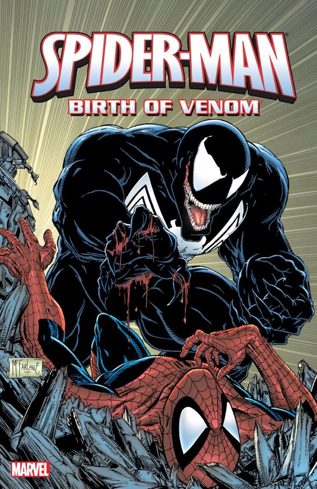


Just your friendly daily reminder that Venom was created by the same guy who made Spawn back in the 90's, Todd McFarlane. Makes a lot of sense when you think about it, especially with how they're designed.
And believe it or not, Todd McFarlane is also one of the most influential comic artists in the industry, and he's one the of reasons that Spidy's webs are drawn with so much detail, and one of the reasons (at least I'm sure he was) why Spidy tends to be drawn and even animated so flexibly when he's web swinging.
Many Spider-Man comics especially once drawn by Todd McFarlane himself before he left Marvel, the Spider-Man games by Insomniac Games and Spider-Man 2003, and I would even say the Spider-verse movies, and are very good examples of that.
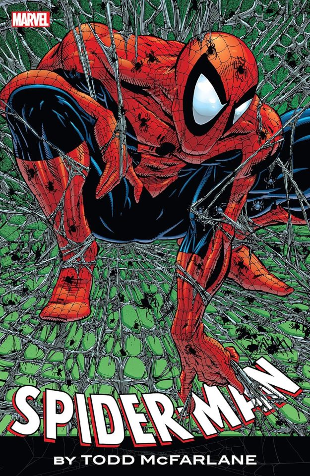


He's also one of the reasons Image Comics exists, leaving Marvel with a bunch of other people to from the company and making very edgy and dark and violent comic books that were very popular and beloved in 90's. I'm giving a very simplified version of the story though, feel free to look up history of the subject yourselves if you feel like it. I'm just being a silly little fangirl and artist who wanted to post about one of my favorite artists and facts about three of my favorite characters as well.
But what do you guys think about this? Feel free to tell me what you think in the comments.
#marvel comics#spider-man#venom#spawn#todd mcfarlane#marvel#marvel art#art#spider man#spiderman#venom comics#eddie brock#venom symbiote#symbiote#spawncomics#spawn movie#90s comics#comic books#image comics#comics#insomniac games#insomniac spider man#marvels spider man 2#spider man 2#spiderman 2 ps5#spiderman 2003#spiderman into the spiderverse#spiderman across the spiderverse#spiderverse#this was supposed to be short
47 notes
·
View notes
Text
Today is the day I unleash my Mr. Bonzo fanart upon this webbed site.
This post is relatively safe up until the cut.
Is the *tips fedora* meme over a decade old? Yes. Do I care? No, absolutely not.
~
Now this is where I recommend "getting off" this post to anyone bothered by graphic depictions of body horror, blood, violence, or Mr. Bonzo (monster, not mascot like above).
I know the first image is silly, but I cannot stress enough how serious I am when I say:
Proceed at your own risk.
Now that you have chosen to continue, I have arranged the images in order of least to most vile and disturbing (though that might be slightly subjective on my part).
Remember that you can click off this post at any time.
Final warning: split tongue Bonzo.
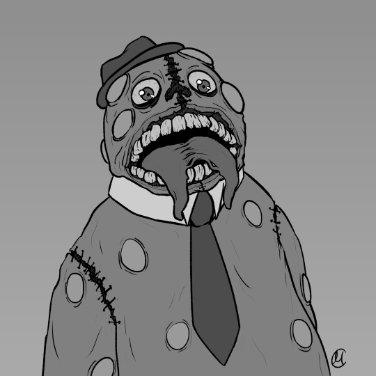
I tried channeling Julia Drawfee with the lineart a little bit. Didn't feel like shading that one, so it's a bit flat.
Where did I lose my colours? Plot twist: the first image in this post is actually the last I've made, so technically I gained the colours. I wanted it to have more of a cheery vibe, unlike the ones under the cut, which I wanted to be kinda dreary and I feel like adding too much colour can mess that up.
Alright, I'll address the tongue. Remember how his head splits in tmagp 12? Yeah, it's a nod to that and also I asked myself "how do I make his design worse than it already is?" and that's the only answer I could come up with. I debated adding stitches connesting the two halves of the tongue but couldn't figure out how, so you're welcome. It will be present in all the upcoming drawings as well.
~
The next one is bloody, but it's not that much worse than the previous one overall.
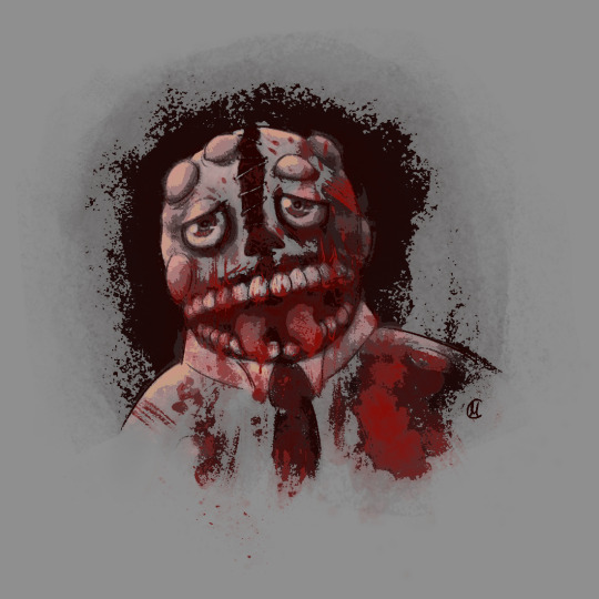
I was playing with filters after I was done with this piece, because I felt like it lacked something, but didn't know what. Really liked this one, I think it's some sort of a gradient map. It pixelised the image and adjusted the colours a bit, it also really made the blood pop out, though it covered up some of the details.
Why did he lose his hat? It's stupid and hard to draw.
You may have noticed the artstyle change a little, the previous images having neat lineart and little to no shading. That's because I am using different tools, sketchy and soft brushes, that allow me to experiment with lighting and textures more (plus the aforementioned filter altering the image even further).
~
Alright, I feel like this last image deserves a separate warning. It references episode 12 (spoiler ahead), specifically the moment before the bartender loses a hand, though it's not entirely accurate. It's rendered in more detail than any of the previous images, so keep that in mind before scrolling down.
Basically it's pov: Bonzo licks your hand.
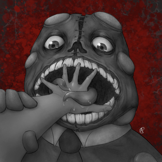
I feel like I could've made his tongue bigger in this one, it seems kinda small compared to his mouth. I really like how the skin on his face ended up looking. It took a lot of work.
The spit makes it look weirdly sexual, doesn't it? Listen, that was not my intention, but I'm not erasing it. I set out to make the worst thing I could and, though not without cost, I have achieved it.
I tried splattering Bonzo in blood, but it wasn't really working for me and it covered up a lot of the detail I liked, so I just put it in the background.
The human hand is drawn from reference, which I found by googling "hand reaching out away from the viewer". And let me tell you: google is shit at looking for drawing references, but I figured it was just going to be a sketch to explore an idea, so I didn't bother trying to get a better one. And then I fixated on it for a couple hours, you know, like a normal person.
I literally (and I mean no exaggeration) dusted off my drawing tablet after a few months of no use to spend the entire weekend, after tmagp 12 came out, glued to the screen making those images, except for the b'onzo one, which I made this evening.
Just to clarify: I drew all of those by myself. No filthy AI image generation is allowed in this house. I am capable of committing far greater sins than an artificial intelligence ever will.
The only thing left here is to extend my sincere congratulations/condolences to whoever got this far. It's up to you to either think you're brave or realise that you're foolish for doing so, but be comforted by the fact that at least you didn't make this post, which I cannot say for myself.
#this might be my worst post yet#i was so preoccupied with whether or not i could i didn't stop to think if i should (make bonzo worse)#do i regret it?#no#here's the sewage stew i promised/threatened you with a few weeks ago#the magnus protocol#tmagp#tmagp shitpost#long post#fanart#tmagp fanart#bonzo#mr bonzo#content warning#body horror#blood#violence#get bonzed#posts that would send me straight to a psychiatric ward were anyone i know irl to find out i made
14 notes
·
View notes
Text
A Call to Action
Hi all.
I wish I had better news to give. I thought long and hard about whether or not I should share this because I will be functionally doxxing myself when I do. But I've had several days to sleep on it and think about what to do. I've come to the conclusion that this is more important than me. This will be a long post but I urge you to read all of it. I'm afraid I have to be thorough here given the situation.
I think everyone who has been following me for more than a week knows how much I love religious studies as a field. It is my single greatest passion in life.
Unfortunately my school, UNC Greensboro, is trying to eliminate our department under claims of it being "not financially justifiable," among others (including anthropology and all Korean language classes.) These claims are highly spurious. Debunking this in full will take some time but I'll try to cover as much ground as I can in the relatively short space I am given and provide some sources. If anyone needs further elaboration, I'll report to the best of my abilities.
This is all to lead into the fact that I would like to provide some opportunities for people to help us out over here, which I will cover at the end. The shortest possible version is: please signal boost this. I do urge you to read it in full, though.
With the first introduction out of the way...
A Second But Very Brief Introduction to Religious Studies and a Justification of Its Presence in Academia (Given the Natural Bent of this Site is Sometimes Towards Antitheism)
Feel free to skip this if you have any familiarity with religious studies as a discipline, I'm putting it here because I find that it's often confounded with theology and every time I talk about it someone asks me if I'm going to be a priest (no.)
To be clear, religious studies is not theology. It does not purport the existence of any higher spiritual powers or presences. It is strictly the study of religion and spirituality as a force in human culture. This falls under both negative and positive effects, and covers everything from historical impact to individual psychology to macrosociological effects of religion to the simple understanding and study of mythology and folklore.
While internalized cultural norms are of course an issue that must be overcome by any scholar, for a religious studies scholar the Catholic Worker, the Sikh ragi, and the long-dead Sumerian ašipu should all have their beliefs and inner lives treated with the exact same sort of gravity and understanding, no matter how far their own beliefs might be from our own. It is, in my subjective opinion, the most humanizing of all the humanities because we are forced to operate on a deeply personal, vulnerable level.
I wish I didn't have to explain why these sorts of skills are important, especially given the current climate of intolerance that has been growing across the world and the growth of anti-intellectualism. I recognize that I might have to but I don't want to linger on that given everything else I have to cover in this post. Go ahead and ask as I do love talking about my field but I might take some time to answer.
A Brief Summary of Events Beforehand
My school has hired a firm known as rpk Group (lack of capitalization true to actual title) to restructure school funding financially with a focus on eliminating programs deemed to not earn enough for the school. Here is a brief explanation from the source itself. I apologize if the school website's CSS is still broken and it's difficult to read due to the social media icons being about thirty times the size they should be. Apparently they couldn't find the funding to pay a web designer instead of an expensive financing firm.
Those of you who have kept up with news in American academia may recognize this as the same group that forced cuts at West Virginia University. Please keep that in mind as we go forward.
Here are the high points:
Religious studies attained a passing grade under the rubric set out by the school. There have been active attempts to hide the scoring system from anyone but faculty. The spreadsheet in which the data was published has been password protected (source, which also contains several other refutations to the chancellor's talking points.)
For those who wish to keep score, anthropology did as well and our anthropology program is known for being quite good. This is without going into the other benefits the anthropology program provides the school with, which include such things as a community garden.
There were lower scoring programs that were kept. In other words, the decision-making process has been entirely inscrutable.
This is supported by the fact that the administration has been giving out incorrect numbers regarding program attendance to both news outlets and students, with some programs proposed to be cut having their student enrollment off by several factors.
Religious studies had over five times as many students as was originally reported. The Chinese language minor was reported to have zero students when there were thirty-six. To operate with this level of error from alleged professionals beggars belief and undermines any faith I would've had in this process.
The administration has claimed that they used the correct numbers in their rubrics. As they will not publish further data to myself nor the public, I have no evidence this is actually true.
They were going to cut Korean language as a minor. We don't have a Korean language minor. We do have a track of Korean language and I am given to understand as of this semester, culture courses. Which are operated solely by one professor and are consistently full or close to capacity due to popularity. There is no evidence they are losing the school money and I have several testimonials that the Korean culture-related programs have drawn students to UNCG as it is a unique niche the school gives not just over other UNC schools but over other colleges and universities.
Faculty and students were given information about what programs would be cut at precisely the same time, through an email sent schoolwide. Many students and faculty were in class at the time this was sent and had to proceed as if they weren't about to have their programs eliminated.
The administration alleges that current students will be able to finish their degrees. I have little faith this is the case for reasons that will take a while to get into but, to summarize as briefly as possible, completion of a degree here requires certain high-level classes that may be difficult to obtain with faculty cuts.
The chancellor alleges that Jewish Studies and Islamic Studies will not be affected by the elimination of religious studies, despite the fact that they are hosted under the department and Islamic Studies uses the same funding. As such, I believe that the highly technical and academic category used to refer to this sort of thing is "a blatant lie."
The administration has tried to quietly edit out any errors in original reporting. I am pleased to report that, as many of us intensely online people know, the Wayback Machine exists. Here is the original statistically incorrect press release that was given, which they have tried to bury.
While they have held forums, these have largely been ceremonial gestures rather than serious attempts at communication. At the one I went to, all non-administration speakers were given only two minutes to speak while the chancellor and dean were given as much time as possible to respond. Their responses to concerns were often dismissive and rarely addressed the necessary issues. I believe any person present will back me up on this, though I am not currently in possession of a voice recording.
I must operate within the evidence I am given. The best-faith interpretation of their actions is that the metrics they were using to determine what cuts should be made are incorrect and must be re-done before going through with any sort of program cuts, and that the administration's collaboration process with the group they employed is poor to nonexistent given the scattershot information provided. There is very, very clearly a communications breakdown somewhere along the line that raises this entire procedure into question.
I think it goes without saying it's all downhill from there. The level of arbitrariness with regards to cuts, lack of professionalism, and total lack of transparency would lead a reasonable person to believe there are heavy political motivations involved here and not simple brute facts. You are welcome to draw your own conclusions anywhere along this spectrum, of course. I encourage you to be skeptical.
Lastly, if I can't convince you that it's worth stopping this process to save religious studies, think about the anthropology department. Think about the languages that are getting cut. Think about physics or mathematics. A large-scale public university without a physics program is quite frankly unreal and the fact it's primarily humanities being targeted runs parallel with some sinister trends within American education. This process should, at the very least, be halted for time being.
What You (the Reader) Can Do
Firstly, be aware that we have until February 1st before decisions are finalized. I apologize for the short time limit. Myself and other members of the community were taken completely by surprise as well, and once again as I mentioned above it has caused some level of cynicism around the motivations of the administration.
With that out of the way...make noise about this. The school administration is making all efforts to keep this quiet. I can say the good news is that according to other people on the ground, they are beginning to lose control of their narrative that they are making difficult financial decisions to keep the school financially solvent.
Believe it or not, the farther removed you are, the better. If this hits a national scale then the school may be finally forced to acknowledge they are rapidly causing the otherwise prestigious UNC system, typically considered to be one of the best public university systems in the US, to be a national laughingstock and that they will lose money as their reputation declines in a way that they would not have if they'd simply carried out this process in a more reasonable way.
You can sign our petitions here and here. Easy enough, takes about three minutes, self-explanatory.
Finally, reach out to an academic or any passionate learner in a specialized field today. A lot of us feel understandably threatened and demoralized. Again, this is not just about me or even about my school. This is about trends within the American education system. Explaining the hows and whys in full detail is not within the scope of this post, but I think a reasonable person can conclude after looking at the current evidence that there is a dismantling of American schools in favor of a corporatized existence. For those of us who love knowledge and learning, this is incredibly sinister. Knowledge should not have a price tag put on it.
A Final Word
I and several other people have Chancellor Gilliam on record saying that he has dedicated his life to working at the collegiate level and towards students. While he and the administration have tried to ensure that their statements outside of highly controlled environments are not easily accessible, I should be able to provide a clip if needed given that this statement was livestreamed and North Carolina is a one-party-consent state in regards to recordings.
They have consistently characterized this process as having to make hard decisions to keep the university afloat. The chancellor is currently the highest-paid employee within UNCG itself and the fourth highest-paid member of administration within the UNC system as a whole (source.) Please be aware this does not include other benefits, which in 2022 put his salary above $500,000 (source.) As others have, I must ask why these "difficult decisions" within the school have not included a salary cut for himself if he is so dedicated to improving the lives of students.
Thank you for your time and consideration. If you've gotten this far, you've already listened more than anyone outside of the academic departments have and that means a lot to me in and of itself.
#religious studies#mythology#college#studyblr#college life#university#north carolina#theology#religion#unc#tagging in as much stuff as i can think of lol#anything is worth a shot at this point#academia
20 notes
·
View notes
Text
Dezi reads Pact
I am a newcomer to Tumblr and have just found out about liveblogging books. It seems pretty darn fun! So I decided to try my hand at it to both exercise my literary analysis muscles and to maybe make a few friends in this site. And I've decided that my first subject on this will be John “Wildbow" McCrae's web serial Pact.
I've been a huge fan of his other work, Worm, for years now (though I do have a couple issues with it). And I'm also a big fan of urban fantasy stories with well designed magic systems, so the premise of this book is already very appealing to my tastes.
I have actually started reading through it before but put it on hold for a while. I am currently sitting in the middle of Signature 8.7 and will be picking up the story from there. I'll try to post once I finish each chapter, sharing my overall thoughts and analysis, and maybe once I finish each arc to stitch them all together and make predictions about the plot.
The road so far
Here are some assorted thoughts I've had on what I've read of the story so far:
Blake Thornburn is definitely a protagonist of all time. This little wet blanket of a man has successfully fled his toxic family, survived homelessness and got adopted into a found family of queer artists only to then be dragged back into his family's issues. And the skeletons in his grandma's closet want to eat his soul.
Also he totally fumbled a threesome. My dude simply can't get a win.
Rose Thornburn is a character who is completely devoid of any trans subtext, thank you very much. At the beginning I thought she was an excellent addition to the story, being a tool to get Blake to externalize his thought process and opinions. The first arcs would have been really dry without her. But she has grown so contrarian; convincing her to help is now an additional step Blake has to do every time he comes up with a new plan of action. I suspect she might become an antagonist even before the end. Is it just me? Is it some kind of ingrained misogyny?
Evan is the best character in the story. He's such a ray of sunshine that every line of his is like a breath of fresh air in this dark and gritty narrative Blake is trapped in. Please, let him become a fire bird. I beg you. He's just a cinnamon roll too pure for this world.
The magic system is maybe the best I've ever seen and is definitely what makes the story stand out. It feels like what I, almost instinctually, always imagined magic should work like. But defined and refined to a point where it actually becomes a usable set of rules. Everything from true names, binding, spirits, demesnes... It's ugh, so good! I will probably dig more into each of those elements as they come up in the next chapters because there's so much to chew on.
The monsters. The author has this amazing ability of grabbing well-known concepts of mythological creatures and giving them their own spin while at the same time seemingly distilling them to their core appeal. After meeting Wildbow's goblins, that's how I expect all other goblins to be like. The same goes for demons, fey, ghosts... As with the magic system, I'll dig into each of those as they come up in the next chapters.
During the discussion of the binding contract, the imp Pauz has mentioned some “inviolable rules", which caught Blake's attention for a second but were not clearly explained. This has been living rent-free in my head since then and I am very sure it will come back later.
Isadora, the sphinx, could step on me. Also, she has mentioned the fact that in the classical Greek myth Oedipus actually gave the wrong answer. I've been dying to know what is the true answer the the classic sphinx riddle, but unfortunately I don't think it will be revealed...
The way they defeated Conquest was, to me, a total copout. I couldn't fully follow Blake's plan until it was all over, and I can't understand why Conquest needed to travel into the mirror world to catch Rose when previously he just pulled her out of it like it was nothing. It just felt anticlimactic to me.
Also, please, can we actually just give him an actual arsenal of stuff he can use? I know Wildbow likes to keep his protagonists as the underdog but this is getting ridiculous. This magic system allows for basically anything but still our main man only has two or three tricks up his sleeve at any time and is constantly losing resources as fast as he can get more of them.
Last time I saw Blake he was swallowed whole by an ontophagic demon, being completely erased from reality as we know it and leaving Rose to steal his life. I know he'll come back, he's the protagonist after all, but I'm really excited to see how it will play out. Will he fight his way out Hell itself? Like Kratos??
The spoilers I already got
I don't care that much about spoilers, but still would like to avoid them if possible. I decided to list here what I could already gather from the future of the story simply by osmosis from the fandom:
There will be a mermaid called Green Eyes who is super cute in a “bite your face off" kind of way.
Blake will become part tree(?).
The ending is bittersweet at best.
Next
#Dezi reads#wildbow#pact#liveblogging#liveblogging pact#pact web serial#pactblr#pact spoilers#otherverse
11 notes
·
View notes
Text
Authenticity

Following the quite predictable implosion and subsequent exodus of users from the hellscape that Twitter became once Elon gave free reign to the toxic horde, I “followed the spiders” across the internet in search of somewhere better to procrastinate.
A part of me asks “why bother”. There will always be somewhere new to discover - the internet never slows down. I'm often caught between the idea of setting up a beach-head for myself - becoming a fool on a hill - or descending into any of the “town squares” - the various popular social networks that seem to rise and fall every few years.
I’ve been writing a public journal - a “blog” - for over twenty years. Along the way I’ve seen countless platforms come and go. In the beginning of course there were no platforms - if you wanted to publish your thoughts it meant signing up for a web hosting account. Everybody was an island, and we would spend time building bridges among the archipelago.
In the same way that Wells' martians gazed jealously towards Earth, so Meta must have looked upon Twitter, given the speed with which they resurrected a long dead social experiment, re-badged it “Threads”, and set out on a spectacularly successful user trawling expedition.
For a while Threads seemed like it might be the future for many - an advertising free micro-blogging platform - a free start initially absent of marketers, advertisers, and trolls. Notice the word “initially”. A tipping point has been reached in recent weeks - a critical mass that has drawn the gaze of the brands, marketers and trolls. Suddenly the small-town feel of Threads has begun to erode - with it’s numerous small communities seeing the arrival of chain coffee shops, restaurants, bill-boards, shopping malls, and the inevitable army of trolls, attention seekers and “influencers” that follow any community where they might command eyeballs, hearts and minds.
We’ve been here before.
Blogger, ICQ, Geocities, LiveJournal, Vox, Posterous, Yahoo 360, Jaiku, Plurk, Tumblr, Wordpress, TypePad, MySpace, MoveableType, Google+, Buzz… I could go on.
While a few of those platforms are still with us, they are a shadow of what they once were. As each platform has taken it’s place in the sun migrations have emptied each of it’s neighbours. In more recent times “the community” came together to “fix” the ever-repeating cycle of silos and ring-fenced communities - giving birth to “the fediverse” - the “federated internet” - where no one company owns or controls either a platform, or your data. The only problem with this lofty ideal? It requires effort on the part of it’s users.
People are lazy. And busy.
Why even think about building your own city, when you can arrive on the doorstep of an already thriving metropolis and immediately set about finding your tribe? It explains why Mastodon, Pixeltube, Peerfed, Friendica, and Writefreely have never gained significant traction against the likes of Facebook, Instagram, and Threads.
I didn’t set out to write a monologue. I set out to wonder where might be best to “throw my hat” in the months ahead. Where might be “good enough”. Where I might find a tribe that doesn’t expect too much, but might also appreciate me quietly sitting in a corner and volunteering my tuppence-worth every now and again. Not sharing selfies every day like the attention-whore glitterati that have descended on Threads - more emptying my head into the keyboard about subjects that nobody else was thinking about, or really set out to read about.
You know the funny thing? I may have found my ultimate destination some time ago, but didn’t realise it.
Substack.
Yes, they’re paying to attract influential writers, and yes, they could do with a small army of user interface and interaction designers, but my word has their trajectory been spectacular. Where else can you find the likes of Patti Smith, Margaret Atwood, Salman Rushdie, Stephen Fry, Chuck Palahniuk, Nick Hornby, Richard Dawkins and Pamela Anderson (yes, that Pamela Anderson) writing personal blogs, alongside a rapidly growing community of old-media journalists, retired columnists, and plain-old-garden-bloggers such as myself?
Of course this is me though, and rather than switch platforms yet again, I’m trying to be everywhere, for everybody, all at once (isn’t that a movie title?). I’m cross-posting to Wordpress, Tumblr, Medium, and Substack.
Now and again the urge to find out what other’s think of each platform overtakes me, and a quick search uncovers an entire universe of commercial bloggers espousing Wordpress rule over the internet universe, and how you can buy their get-rich-quick series of posts, videos, and podcasts about how you too can live happily ever after while holed up in a perfect cabin with a laptop somewhere.
It strikes me that the same writers that destroyed Wordpress - turning it into a publishing rather than a blogging platform - arrive at any sufficiently popular platform and mansplain to the masses what to write, how to write, when to write it, and so on - you know, instead of telling anybody how their day went - unless of course that doesn’t preclude carefully posed, heavily photoshopped gym-flex photos of themselves inbetween yoga and boutique coffee shop visits.
I’m not ranting. In the words of the Dowager Countess of Grantham, “I’m explaining”. And certainly not mansplaining - more muttering to myself while the rest of the world gets on with it’s day, oblivious to the unfolding idiocy that doesn’t seem to matter to anybody else.
This post doesn’t really have a point. It’s just me - emptying my head - and wondering how many plates I can continue to spin until they all come crashing down.
Perhaps I do have a point though.
The famous writers that have begun to gather at Substack seem to be mostly independent - devoid of any sort of agenda or mission to prove the validity of what they might share. They are without publishers, agents, or marketers filtering, shaping, or writing their words for them. It’s refreshing, and brings about an authenticity that a lot of the “social internet” has been missing for a long time.
5 notes
·
View notes
Note
Hi! I am working on an assignment for school, and I am trying to find information on how animal crossing is styled. Through my scrounging of the internet I saw a link that lead me to your website that was a "Animal Crossing Style Guide" but it no longer exists. I was wondering if you might have some pointers that I could learn from for my project?
Hi there,
You're about 2 weeks shy of that link working. I just changed web hosts and rebuilt my website and ended up taking down the blog section, which is where that content lived. The Animal Crossing Style Guide was an article / blog post I wrote a few years ago around the time New Horizons came out discussing the topic of animal crossing character designs for artists. While the post no longer exists online, I did archive it to hopefully host again in the future, but I havent gotten around to remaking the blog yet. In the meantime here's literally the entire thing in a tumblr post, and if I remember, I'll try to update whatever links I can. Sorry if it reads or is formatted a little weird on tumblr, but rest assured it's identical except for some shopping / sponsor links that dont need to be on this version. No idea if this is the sort of thing you need for your project, but good luck and enjoy!
Animal Crossing Style Guide: Artist Tips for Drawing Your Favorite Characters
Apr 24 | Written By Birdy
Hello and welcome to this week’s edition of Fandom Friday. If you’re like every Nintendo Switch owner right now, you’ve been playing Animal Crossing nonstop for the last month. And who can blame you? This irresistible chore simulator has no trouble winning the hearts of the masses by helping us fall in love all over again with our favorite animal neighbors. Nintendo found a way to make tedium fun by implementing a fun reward system and fully embracing the rule of cool, or rather, the rule of cute if there is such a thing. Why do I like it? I don’t know, man!! It’s adorable! It turns my brain chemicals into a relaxed, happy soup.
If you’re an artist it’s possible you’ve seen these cute character designs and thought “I want a piece of that for myself.” I know I have. If you love to draw the Animal Crossing cast or have some OCs of your own who you want to mesh with the AC universe, read on for some mini tips for drawing in the Animal Crossing style. I’ve been studying the style for the past few weeks and this guide is a pretty compact version of what I’ve learned, but feel free to let me know if you guys want more. It was fun to study these characters and I’d love to expand upon this with a more definitive guide or deep dive into more specific aspects of the style!
On to the basics!
Villager Bodies
In the graphic below I describe that most animals are a little over 2 heads tall. That’s because the characters in animal crossing tend to have very large, bulbous heads as part of their appeal. You’ll find that certain species, such as eagles and gorillas, do break this convention slightly, often appearing with their anatomical midpoint lower on the chest than most smaller animals.
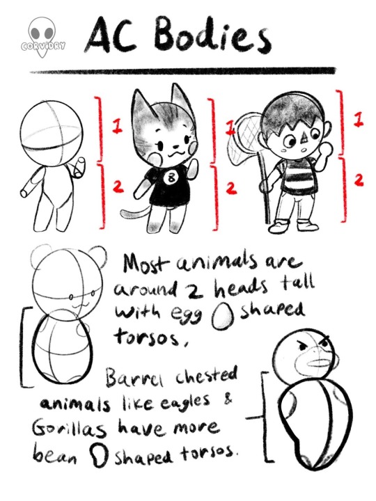
That said, this isn’t a hard and fast rule necessarily. While the height and shape of AC bodies is generally in the neighborhood of what’s stated above, there is some variation between installments of AC. Compare the following images and you’ll see what I mean.


As you can see, Bob’s shape and proportions vary between Wild World and New Leaf, as do many of the other characters. While many current players likely think of New Horizons as the definitive style for now, I would encourage my fellow artists to experiment here. Play around with height in the 2 to 3 heads tall range and see what you like. Stylize the torsos to your taste. It’s entirely possible to remain within the AC style of drawing while still making some details your own.
Heads
Heads of AC characters are a bit of a complex subject because there are literally so many different species of animals who all have their own goofy, lovable little faces. I’ve done my best to break them down to the basics without getting too specific about one species or another.
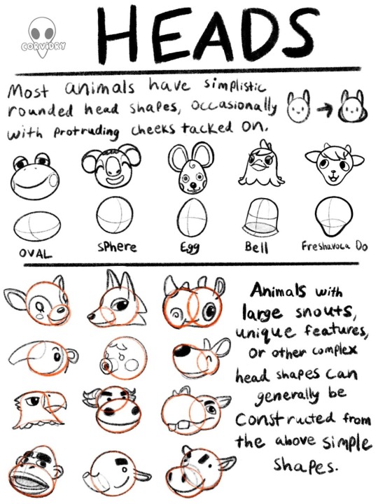
As you can see, even the the more complicated animals can be broken down into these simplistic, bulbous shapes that Animal Crossing loves so well. When designing a new character, it’s wise to plan their head and body using basic shapes before you tack on any other extraneous features. By doing this you can ensure that your character has the round, soft features that are key to Animal Crossing before you ever have to decide what their face looks like or what their personality should be. When in doubt, round it out. You’ll be drowning in the cute in no time.
Speaking of faces, feel free to let me know on social media if you’d like me to expand upon this guide in terms of facial features and placement. I avoided the topic in this case because I wanted to focus more on foundational elements, and animal faces felt it a bit broad for that scope. The sheer expanse of animal individuality in this game allows for quite a lot of different faces with quite varied placement. And that’s not even including the human character options!
Limbs
Arms are perhaps the simplest section of this guide because there are so few styles of arm in Animal Crossing. The vast majority of characters you encounter will have the cylindrical arm style, or something close to it. At that point, all you’ll have to do is vary the length to suit the character.
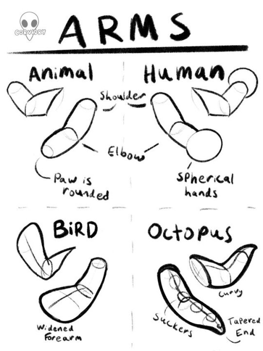
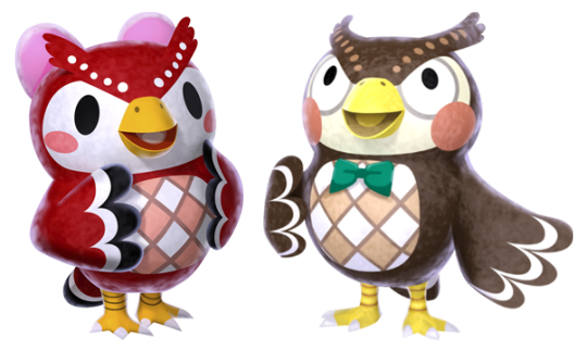
Birds and octopi are one exception to this rule, with birds in particular being the more complex of the two. In most instances, bird characters will have those flattened out oar shapes for forearms with a simple texture stretched over the shape, but on occasion some birds will have distinct feathering as part of their model, which can at times distort the underlying shape for the artist trying to make sense of it. Our owl friends, Celeste and Blathers, are good examples of this.
With birds and octopi in particular, don’t be afraid to experiment a bit with the design of the limb. Some birds, like Blathers and Celeste, have wider forearms, and many octopi have interesting textures for their suckers. In addition, don’t be afraid of extending or shortening the standard cylindrical arm shape, as this shape can be applied to all different sized animals, from cats to hamsters and beyond. Some animals will have very short stumpy arms while others will have longer ones. Some villagers have slender, delicate arms, while others have bulkier ones. You can adjust the proportions of the shape to suit the character you’re drawing.
Legs on the other hand….those are a different can of worms. I’d like to preface this by saying that legs are another topic I’d love to go into greater detail on if there is interest because this graphic could afford to do the topic a bit more justice.
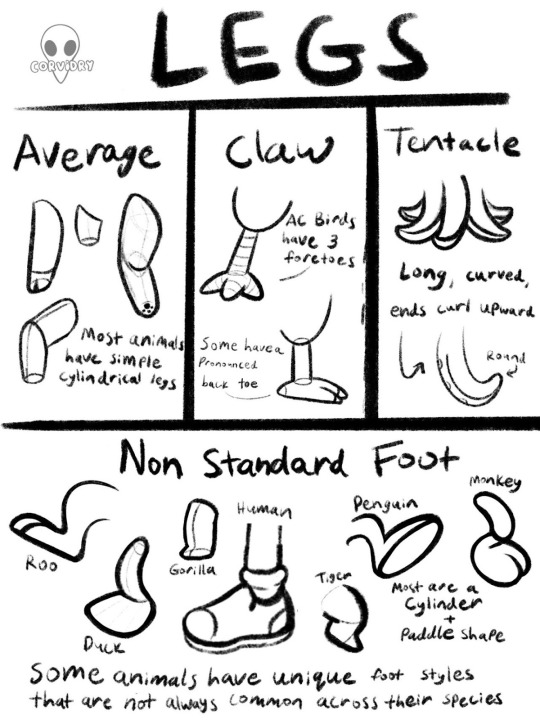
As with arms, most animals have the same simple cylinder that can be widened and extended as needed to suit the body of the animal. Birds once again have a unique trait in this department, but beyond that, leg styles vary widely. Mostly in the foot department, I should say. When starting off you’ll find that most animals maintain a cylindrical leg even if they have a unique foot, and in most cases the foot can be constructed out of a dome shape attached to the cylinder. Not unlike a plunger, if for some reason the stick was on one side of the plunger rather than in the center. On top of that, human characters can now wear a large variety of shoes, making this a second topic that I felt went beyond the scope of this exercise. If you’re interested in a more thorough explanation of Animal Crossing legs and feet, feel free to let me know. I just might write about it in more detail in a future installment.
But never fear! Feet, like most unique animal traits, do share similar design elements across the entire game even when they don’t look particularly alike.
Designing Unique Features
So you’re an artist who wants to draw a specific character, or maybe you want to design a brand new character. You can construct a simple animal body, but then what? What makes this character Your Character™ rather than Bob or Molly or Flora?
Despite how similar these animals all are in basic constructions, each animal and human has their own unique design elements that set them apart from one another. It is nigh impossible to cover every single interesting design element of every single animal in every single game, so here are some tips that will aid you in drawing any element you decide to apply to a character while still keeping them cute as a button.
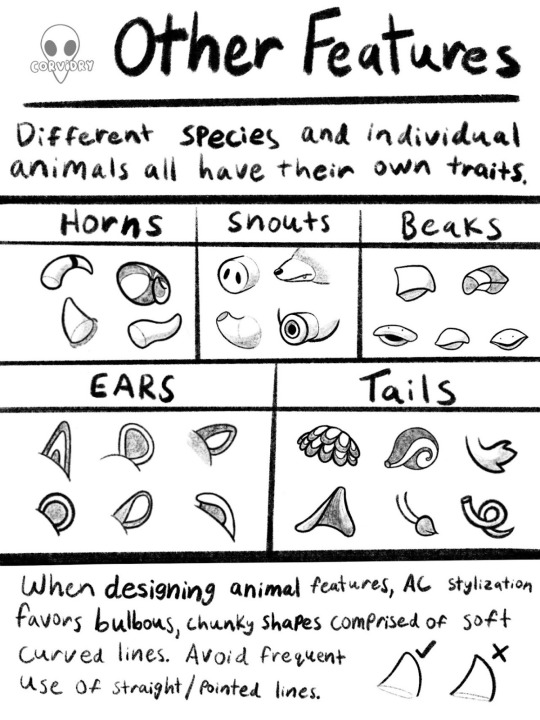
Just like up top, I reiterate. Big, round, soft shapes. Even the most hardcore animals in Animal Crossing look soft and huggable to some degree.

Take for example, these animals who all should be at least a little bit scary. Animal Crossing’s art style keeps them appealing even with their rougher traits on display. Alfonso the alligator should logically be among the most feared of reptiles, yet his sleepy eyes, gently sloping snout, chubby cheeks, and tubby belly give him all the charm of a stuffed animal. His pointy teeth feel more like a clumsy after thought than a mechanism for killing prey.
Coco the bunny is designed to look like a haniwa figure, an item commonly buried with the dead during the Yayoi period of Japanese history. Coco’s Japanese name is, in fact, Yayoi. In addition, many items in her house are reminiscent of Japanese funeral decor. She’s supposed to be a little unsettling. Her facial expression does not change like those of other villagers, so she can’t smile at you or put you at ease the way other characters can. Indeed, Coco wears a permanent somber appearance, but even so, she looks sweet and pleasant to touch. Her face is completely curved and she is given the body of a bunny villager. Her huge, round ears and tiny, dainty paws evoke the charm of a little rabbit even from a villager whose whole design is meant to remind one of death.
Rasher the pig and Spike the rhino have similar charm. Both of them don scars all over their bodies and in some cases wear aggressive looking shirts in their rough or rustic homes. Still, with Rasher’s big sleepy eyes and friendly round belly, he could almost give you a Winnie the Pooh vibe if you squint hard enough. Spike, meanwhile, has had his horns rounded ever so slightly at the tips and his curved hooves and short tail make him seem far from threatening. Even the most edgy creatures in the Animal Crossing universe can appear somehow friendly by making use of these softening design elements.
Go Forth and Draw
And that, in essence, has been my broad overview of Animal Crossing’s art style. I consider that last tidbit to be the most valuable tip of all. By closely studying the way Animal Crossing characters use round bodies, gradual slopes, and pleasant curves, you can make even the most threatening of animal characters look cute and perfectly cuddly for your town, village, or island.
Once again, please let me know if there are particular elements of the Animal Crossing style you’d like me to look into more closely. This has been a very broad and very general overview of the character designs, but I would absolutely love to dive deeper into this art style. If you use this guide to improve your Animal Crossing drawings, feel free to tag me on Instagram, Deviantart, or Tumblr, so I can see what cool art you’ve made!
Have a great weekend, The Internet! Can’t wait to see you again for the next Fandom Friday. If you need me, I’ll be waterscaping a moat around Raymond’s house.
46 notes
·
View notes
Text
Progress Update - May 2023
Hello, this is Azem!
After months and months of silence, I'm back with an update on the game's progress. Prepare yourself, because I'm about to reveal a number of new information and changes to "Send!"
This progress report will be divided into two parts:
1. News
2. Development

1. News:
As you may have noticed from my recent posts, the game window appears to have a 16:9 aspect ratio. You may wonder how this is possible given that RPG Maker VX Ace only supports a small aspect ratio (544x416 and 640x480). I was tired of the old, small window size and felt the need to upgrade. Along with that, I realized that the size of the pictures, overlays, and effects I was putting on the maps was limiting my abilities in terms of mechanics and smooth gameplay. So I figured, "Why not switch things up and move the entire thing to another engine?" and now I'm working on "Send!" in RPG Maker MV. It was a little difficult at first for two reasons:
1. Because my sprites and maps are the same size, I wanted to keep the same 32x32 tile size due to MV originally supporting only 48x48 tiles. And also because the majority of the resources and tilesets in my collection are the same size, whereas MV has fewer resources on the web than VX Ace.
2. I had to decide whether to start from scratch in MV or convert the majority of the game to MV while redoing the most of the maps.
After a long brainstorm and procrastination, with a mix of inspiration to rewrite the entire game's prologue, I decided to start from scratch on MV. I managed to find a way to keep the same tile size in MV, wish wasn't hard enough for a beginner user of the engine.
Yes, it may be nerve-racking and disappointing that there will be no demo sooner than expected, but trust me when I say that the final product will be far better compared to what was expected.
As previously stated, I have begun reworking and rewriting the prologue, which contains the story introduction and the game's beginning. While doing so, I learned to be much more organized in my work and resolved to improve my game planning for the remainder of the game. The game's aesthetic and each chapter's concept are now finalized, and you can rest assured that it will not disappoint.
Now I'd like to talk a little bit about the demo. Unfortunately, "Send!" will not have a "proper" demo. I'm thinking about what would be best for "Send!" and its release/s. Regarding this subject, I've decided to write a proper post in the near future in which I will finally announce "Send!"'s release schedule, plans, and so on.
2. Development:
Let's get started on the actual game's development. It's far too early to say that development is advanced, but the game has finally progressed from "the early state of development" (yes…after 3 years…you heard that right). Right now, I'm concentrating my efforts on the plot and story, as well as the maps. It's far more convenient for me to actually write the story while I "write" the game's environment and world. That being said, a little programming has been done up to this point.
The introduction is nearly finished. It mostly just needs a few touches, fixes, and glances after I finish writing the first chapter and maps, at which point I can finally devote my full attention and concentration to the game's programming. Yes, I've begun work on the first chapter of the game, and as I previously stated, not programming, but writing and designing the actual chapter before moving on to programming and finalizing it with bug fixes and overall final touches.
In terms of programming, I was able to complete some of the game's basic menus. I chose to keep it simple, polished, and tidy so that the player has a pleasant experience with the game menus.
As I previously stated regarding the game's aesthetics, each individual chapter will have its own aesthetic. The first chapter's concept and aesthetics have been finalized. Here are some chapter one previews to whet your appetite. As you can see, chapter one is mostly about the forest/cottage core, moss core, and a few touches of goth. For this chapter, I was heavily inspired by various images and artists, and I hope you enjoy it!
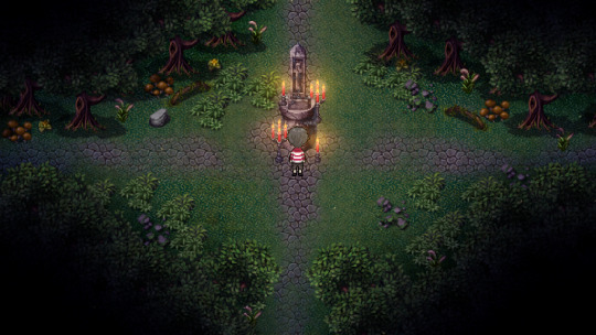
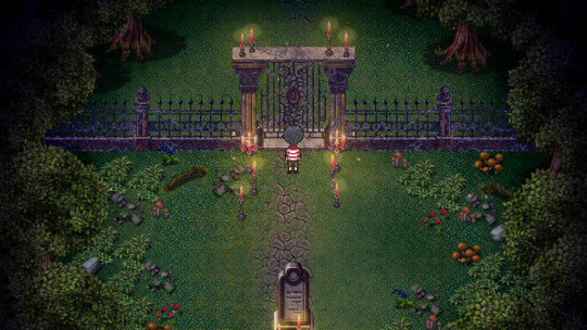
I also worked with the game's soundtrack. Due to the lack of a helping hand, I've decided to try my hand at learning another skill. This isn't particularly important for this progress update, but I wanted to include it.~
This concludes another "Send!" progress update. There's a lot more to unpack here, but first I need to finalize some plans. I hope the changes do not disappoint you and that you enjoy them.
Thank you so much for your support! See you in the next update post!
Make sure to check my other social media:
Twitter;
YouTube;
Instagram;
and if you want to support the game development here is my Patreon;
Thank you so much for your support!
#send(game)#azem762#rpg maker horror#horror game#rpg maker#indie game#game dev#indie dev#rpgツクール#screenshot saturday
16 notes
·
View notes
Note
hiiii omg you awakened the SU/fusions fan in me with that post and I love it. I'd like to make suggestions that Wanderer's traumatic experience with fusion was what the sages/dottore tried to do to turn him into a god - to make him the ultimate fusion of many-minded wisdom by combining him with hundreds of dormant gems that would stack his power levels and give him their knowledge as well. maybe instead of forbidden knowledge capsules, it was lab-created gems. maybe the dream samsara was siphoning everyone in sumeru's dreams into their lab-grown gems which they would use to multi-fuse into Scaramouche. This also results in him losing his own identity amid the mess. He was profoundly scarred by the experience of being the only conscious mind in a web of a million dead voices.
Also, I think it'd be really cute if when fused, Wanderer's hat/the Hanega back-halo became a much more literal actual halo, because of Nahida's innocence. :) Thanks for reading my random extra thoughts on the matter dfgfjhjkl
Based off this post
I mentioned in the replies Im imagining less an active crossover and Visions + elemental power stand in for why ppl can do fusion but I can rock a more active crossover too tbh! I think if there was a Cluster equivalent Dottore would probably be involved and I can see him subjecting Scara to it when he was being experimented on
I want to try designing them but I actually haven’t thought of what would happen with the hat….I think I would definitely try to combine Nahida’s association with the lotus to the lotus on Wanderer’s hat for something tho. I think a halo would depend on how sound it is with the characters’ preexisting religious influences
6 notes
·
View notes
Note
What jobs do the character have since their in their twenties and thirties
I believe this was regarding the Digimon au and I had put off answering because I had been in the middle of changing a bunch of their careers around! I still don't have them all figured out but I can give most of them!
Originally all the characters were meant to have techy careers, because it played into the initial plot I had. But then I realized I just,,, didn't want to do that and I changed it so they could have whatever careers worked best to my brain.
I'll put them all below the cut! They're all subject to change though ofc
So here's a screenshot of the sheet:
and I'm just gonna write it al out with some explanation and stuff for funsies.
Okay, so Bdubs has to work with horses he just deserves that. Professional horse girl. I don't have any extra reasoning or specifics, I just think he deserves it.
BigB I'm less sure about. His career has stayed the same from when I gave everyone tech jobs and I'm not sure how to feel about it. He's a Web Designer and he just lies for fun about being a top secret hacker agent because him gaslighting people is really funny... However I'm not sure how much I actually like this real career for him and if I can think of something more relevant to him or to the plot maybe I'll change it. Making him a baker felt like a copout but maybe it is more on brand? Idk. Maybe taking him more on rout with what i have with Martyn where BigB also has a closeness with his memories of the Digital World. His gaslighting stemming from just habitually learning to lie about the experience knowing it wasn't believed and in fact is the closest to having found his connection to the digital world again despite Martyn's fervent efforts....
Etho runs a small local tech repair shop, as suggested by one of my discords! the idea was that he's the local recluse with the small town shop but he really is a wiz. He can fix basically anything he's just insane no one knows how he does it. He's making it work though. this ofc contrasts the fact he has the most insane persona tech setup imaginable.
Scar is playing into the Hotguy bit! he's a TV and Movie celebrity! A former stunt actor, lots of action movies n stuff! Big big name and face :]
Grian is a white hat hacker, also from when everyone had tech jobs. I still kinda like this for him though, the idea of his job being him trying to break things. Really putting a new spin of something being Grian proof lol
Martyn is actually really important! A Feedback Tester for DataStream's Games company! His life has been really guided by his childhood Digimon experience and his closeness to his gaming industry has a lot to do with him holding onto the Digital world and trying to find it again!
Mumbo I admittedly have no idea why I made him a Security Engineer? maybe to do with the vault shenanigans in Season 9? I really don't know, this should maybe change...
Pearl cleaning lady eternal, I love her being the trash lady its so fun <33
Rendog... i have no clue why he's a carpenter. Maybe I change him to do more with television shows, scriptwriting or even just theatre! he needs the enrichment of acting and storytelling hm
Skizz as a dog Trainer was a Suggestion I don't remember the context for either to be honest so It might change unless I can remember why I decided that. I think it was about him being social/friendly/helpful?? But idk. I'm watching him for Hermitcraft10 now so maybe I'll get better ideas.
Scott is a florist! Big 3rd life energy, I love making Scott a florist! He likes pretty things and design and I associate most of his characters with flowers so this felt sweet! Especially since Flower Husbands is kinda important to me and is prevalent to this au for a while...
Jimmy is a ranch hand for very similar reasons to Scott being a florist! He handled the cows a lot in 3rd life, and then later in double life ofc his rancher thing! (Ranchers are also important eventually, potential Flower Ranchers happening) . I also think an emphasis on Jimmy having a connection with caring for animals connects with his own childhood experiences in the Digital World and helps in later adventures :]
Tango designing and running escape rooms was just such a funny idea to me I couldn't not make it real. It also serves a good use later during adventures when they're dealing with puzzles and what are essentially games. His problem solving and designs brain helps a lot in their actual adventures :]
Cleo I really hate making her a teacher to be honest I want to change it. I feel like making her a teacher is a copout just because she used to be a teacher irl? maybe making her a yoga or a gym instructor would be better since it plays into that one skin of hers and her season 8 stuff! Hmmm
Finally, Gem! Pro Valorant Legendary player was mostly a joke, but the general idea is that she is an extremely proficient competitive gamer! She wins like, big competitions and as a good online following! I wouldn't normally make these characters gamers, but I think it works for Gem in the context of the au and will help when she's eventually involved because she, like Martyn, will have good video game knowledge that can help with the adventures!
Joel Lizzie and Impulse I have nothing for. I might've at some point, but evidentially bailed and am back at zero for them :/ i like making Joel an artist of some kind in aus because the Mezalean king being a sculptor and all that, but idk... Need more thinking
Anyways way too long post, thats everything lol
3 notes
·
View notes
Last Seen Blogs
senditcolton
guess it's you that i'll be kissin'

jp-thevoiceover74
inkedandbold

awhtumn
Graffiti Love


darknessmaeggy
Untitled