#which is not what the stripes represent but you get what I mean
Explore tagged Tumblr posts
Visit Tumblr Blog
Explore Tumblr blogs with no restrictions, modern design and the best experience.
Last Seen Tumblr Blogs


Fun Fact
Tumblr is used by 21% of adults online aged 18-29 years.
Text
When it comes to flags I’m a big fan of Trinidad and Tobago. Simple but striking design. Bold colors well balanced. The black stripe leads the eye and the white fimbriation provides a solid contrast. You really can’t hate on a diagonal stripe flag (except maybe Tanzania’s, but that’s really just a feeling of imbalance due to the choice of blue, not the stripe’s fault). Even the naval ensign calls back to the nation’s history without falling into the trap of a design that’s overly nostalgic for colonization. No notes!
#hello Jeremiah I hope you see this#I always get a nautical feel from the trini flag bc it reminds me of the diver down flag#which is not what the stripes represent but you get what I mean#the red on the flag stands for fire#which I respect.
8 notes
·
View notes
Note
“I have larger thoughts about how DC has kind of written themselves into a hole with Jason and now he's stuck in this limbo that's unsatisfying to everyone which is why so many Jason fans are mad all the time, but that's for another ask.”
🤓 Do tell…
Okay, let's see if I can do this in less than a thousand words!
So Jason, at his core, represents a challenge to Bruce's ideology, right? Bruce's #1 rule is No Killing, and Jason's basic idea is: "That doesn't work. Some villains are bad enough that they have to be killed for the greater good." (There's something very funny about Jason, famously undead, thinking killing stops ANYONE in the DCU, but we'll leave that aside for now.) This is a really interesting ethical quandary to throw Bruce's way, and by having it voiced by his beloved son, his greatest failure, his second most profound tragedy, it becomes a deeply thorny emotional problem as well as an ethical problem. That's all great.
The problem is, DC can't allow Jason to be right, for two reasons:
Batman must always be right and must always win.
...I mean, come on. They can't actually publish a story advocating for a traumatized 19-year-old with assault weapons to be the arbiter of who lives and who dies, that's nonsense. I love Jason but really.
The problem with that is, Jason is a major recurring character.
UTRH works great in a vacuum. But if Jason is showing up in a comic every month, or even just a few times a year, this central conflict has to be addressed, and the options for doing that are limited:
Bruce and Jason fight and Jason wins. DC will never let this happen. (And what would "Jason wins" even look like, honestly? He's not going to kill Bruce.)
Bruce and Jason fight and Bruce wins. They've done this a bunch (sometimes with Dick in place of Bruce), but Jason fans don't want to see him repeatedly getting his ass kicked while being lectured, and frankly it doesn't make Bruce look great either.
Bruce allows Jason to kill people. This can't happen either; it would be wildly out of character for Bruce, not to mention literally everyone in the Batfamily. They are all canonically pretty opposed to murder.
Jason continues to operate however he wants, but outside of Bruce's reach/jurisdiction. As wretched as RHATO was, I actually think it was a smart decision to keep most of the action outside of Gotham, because then we can pretend Bruce doesn't know what Jason's up to, just like we pretend Clark couldn't super-hear everything in Gotham and save Bruce's ass every single night without breaking a sweat. The problem here is that it means Jason is unavailable for the kinds of casual team-ups and crossovers that fans of all stripes crave - plus, every time he comes back to Gotham, he and Bruce have to relitigate their entire relationship AGAIN.
Jason compromises and agrees to follow Bruce's rules in order to have a relationship with the Batfamily. This is basically where DC has landed, and I understand why they did, because it's the option that allows them to publish the most comics with Jason in them, which they want to do because he is an immensely popular character who makes them money. However, it leaves him in this awkward position where instead of being a tragic villain/badass antihero, he's just...the sassiest member of the family, while simultaneously always being available to be treated like shit because he's Bad. He gets punished without even the fun of doing the crime anymore.
So what's the solution? I don't know. Theoretically, DC could try to do what Marvel does with the Punisher. People always get mad when I say Jason is DC's Punisher, but he kills pretty much indiscriminately in UTRH and RHATO, for pretty much the same reasons. ("Dudebros think it looks cool.") And Marvel heroes inexplicably let Frank just kill however many people he wants unless they're appearing in a Punisher comic, at which point they go "Frank, you naughty boy, I shall stop you!" and then Frank kicks their ass and makes them look like an idiot. DC is never going to let Jason do that to Bruce, plus it would put a real damper on the Wayne family Thanksgiving dinner.
Alternately, they could make him a Nightwing villain. Dick has spent 40 years fighting inconclusively with Deathstroke; he's much better suited to go endless rounds with Jason without either of them Always Triumphantly Winning than Bruce is. I don't personally want this option because I just don't care that much about Dick, but it could be really interesting, though it would limit Jason to fewer appearances and primarily in Dick's book. (Jason would have made a superb Red Robin villain 15 years ago for similar reasons.)
My vote, I think, would be for a really good (god, if only), really thoughtful Jason series where he has reason to seriously reevaluate his philosophy towards crime - something that reshapes him into a character who can still challenge Bruce's entrenched ideas without being so diametrically opposed to them as to make him a villain. He needs to be close enough to Bruce's rules to appear in crossovers, but far enough and specific enough that he's not just Meaner Nightwing. Jason is a passionate character; DC needs to find a new way to let his passion work for him, because right now he doesn't have anything driving him, and it's satisfying no one.
(900 words, BOOM!)
207 notes
·
View notes
Text
So You Want to Write about Horses: Color Edition
Well, your knight better not be riding in on a white horse, because that horse is actually grey! And what do you mean a brown horse? Is your cowboy's faithful horse sorrel or chestnut and what does it matter?
I can help.
(Part 4! Enjoy this post? Want to know more? Check out So You Want To Write About Horses Part 1 and Part 2 and So You Want To Write About Horses: Medieval Edition)
Lets begin with base horse colors:
This is fairly easy. All horses are either red-based or black-based. The other colors of horses are all modifications on these two basic variations. A plain red-based horse is a chestnut horse. If you live West of the Mississippi river, you would call this horse a sorrel. Same thing.
A plain black-based horse is a black horse.
Easy, right?
Genetically speaking, the choice between a black or a chestnut is controlled by the Extension gene, represented as E/e. A black horse is created when the genetics are either EE or Ee, as the Extension gene is dominant. A chestnut horse can only be ee, the regressive form with no black hair expression.
However, black horses are actually not that common, relatively speaking. Most horses are some form of chestnut, ee, or a bay.

The bay horse is a variation on a black base. They have black manes and tails, black on their legs, and red or brown bodies. A bay horse is created by the Agouti gene (A/a), which changes the expression of the Extension gene (E/e). So a horse with EE AA will be a bay horse, like above. A horse with Ee Aa will also be a bay horse, exactly the same. In order for a horse to be black, they must have a dominant Extension gene and a regressive Agouti gene, EE aa or Ee aa.
Chestnut horses have no black in their coat, so the Agouti gene cannot affect them. They can be carriers, however, and make a bay horse when paired with a black horse. A chestnut horse could be ee aa, ee Aa, or ee AA, and look completely the same.
Congradulations, you now know horse color genetics! Now for the fun ones.
Dun Genes
If you've ever seen Spirit, Stallion of the Cimarron, you know this color
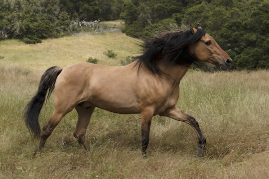
^This is the actual colt that Dreamworks animators modeled from!
Dun (D/nd1/nd2) is a gene that modifies all base coat colors. It can modify black, creating a black dun/grullo horse, it can modify bay, creating a bay dun, and it can modify chestnut, creating a red dun. In all of these variations, the body of the horse is lightened, the mane, tail, and legs are dark, and the horse has 'primitive' markings, including an eel stripe down the back, darker face, and leg bars.
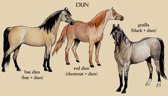
If you notice, dun has three variations! D is the dominant form, so any horse with D is a dun of some kind. Nd1 is a variant in the same gene that gives the horse similar markings, but it is not dun, and will be over powered by the dominant D version. Nd2 is a horse with no dun factor, so no markings or lighter coat. Dun horses can be D/D, D/nd2, D/nd1. A horse with non-dun factor (and look similar to a dun) can be nd1/nd1 or nd1/nd2. A bay, black, or chestnut horse will be nd2/nd2.
Cream Gene
Another gene diluting color is the cream gene, which you may know from the famous horse of Roy Rogers, Trigger
Trigger is a beautiful example of a palomino, a red-based cream dilute. As you can see, Trigger has a pale mane and tale and a gold colored body. Cream (Cr/Prl/-) is a dilution gene, or a hypomelanism gene, meaning it prevents red color in horse hair. Any red on a horse will be lightened. Chestnut horses, being all red, will have their entire bodies, mane, and tail lightened. Bay horses, with red hair only on their bodies, will have the body lightened, but the black mane, tail, and legs stay black, creating a buckskin horse
But wait! That horse looks exactly like the bay dun horse! Yes. Yes they do. However, buckskins do not have eel stripes, leg bars, or darker heads, and are a completely different gene. In fact, you can mix the two get a cream dun (Dunskin). It might be a slightly lighter dun.
Because a black horse has no red, black horses with the Cream dilute stay black, IF they have only one version (Ee aa Cr). Cream is an incomplete dominant gene, meaning that two versions makes the effect of the gene even stronger. Double creme dilutes are Cremellos, and they are very pale (but not white!)
The double creme dilute overrides all the other genes. They are still there, but the horse is so pale, you can't see them. A variation of this color is the perlino, a horse with a recessive dilute gene called Pearl (Prl/-)
Pearl is recessive, meaning that one copy does not change the horse's coat. Two copies creates the perlino, and because Pearl is on the same gene as Cream, a false cremello can be created by a horse with one cream gene and one pearl gene. Crazy, right?
Now, there are so many more genes, but lets skip ahead to some patterns.
Horse Patterns
These are technically not colors, but rather genes that selectively turn off color in certain areas to create a coat pattern in horses. The most important of these are Tobiano, Frame, and Appaloosa genes.
Tobiano is the gene for the coats of Paint horses (a color breed with a registry) and one of the genes for pinto horses. Pinto means any horse with large splashes of white, which includes the Frame gene, also known as Overo.

Both of these horses are Pintos, but only the lower one is an American Paint Horse, or Paint, and the top one has the Tobiano gene (TO), while the bottom has the Frame gene (O). A horse can be double Tobiano (TO/TO), Tobiano and Frame (known as Tovero) (TO/O), but a double Frame horse will die an early and painful death, due to Lethal White Factor.
Lethal White Overo is when two Frame horses are bred together and the foal receives the O gene from both parents. The foal can survive birth, but has malformations of the intestines that are incompatable with life. ALL affected horses die within days of birth.
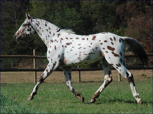
Appaloosa horses are a very interesting horse. Technically, Appaloosa refers to a breed, developed by the Nez Perce tribe in the Pacific Northwest. Appaloosa is thought to come from "a Palouse horse", the name of a major river in the tribe's area. When the tribe was forced on a reservation, most of the horses were slaughtered or given to local white settlers, leading to many Appaloosa horses becoming merged to the Quarter Horse breed. As a result, most people use it as a color term.
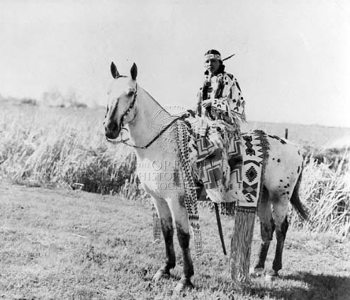
Nancy Wak Wak (Umatilla) on an Appaloosa, 1937. Oregon Historical Society Research Library, 018041
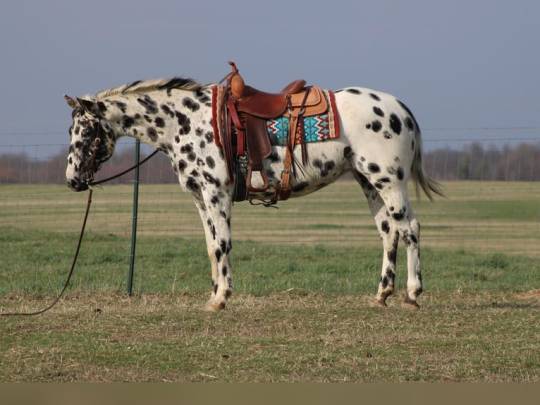
The genes responsible for the Appaloosa pattern is the Leopard Complex, controlled by an incomplete dominant gene (Lp/-), which turns on the complex when present, and turns it off when absent. Several other genes control the amount of white, the type of white, how big the spots are, ect. One Lp turns the complex on, but two Lps creates a mostly white blanket, or a fewspot coat.
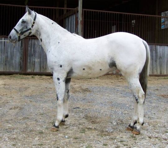
This horse has double Lp. The horse above it has one Lp, creating the many spotted coat.
Not all spotted horses are Appaloosas! In Denmark, the Knabstrupper is a breed of horse with no relation to the Appaloosa, but with the same gene creating the same spotted coat. Completely different breed, different origins, but same genes.
In all of these patterns, the pattern can be maximal, or very visible, or minimal, and not visible at all. A horse can look solid colored, but be hiding a pattern gene. So if you want to make babies, test your horse's genetics first! You do not want to accidentally cause a genetic deficiency.
Finally, the famous white horse.
Grey and White Horses
Most 'white' horses are actually grey. White horses are very rare. Grey horses are called grey because they are born with a colored coat, but because of the Grey gene (G/g) they lose color as they get older. Grey horses go through many colors throughout their lives.
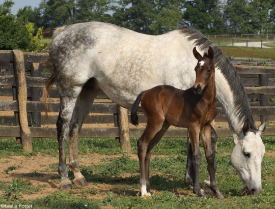
A grey foal and grey mother. Babies are born with the base color visible, but lose it as they age.
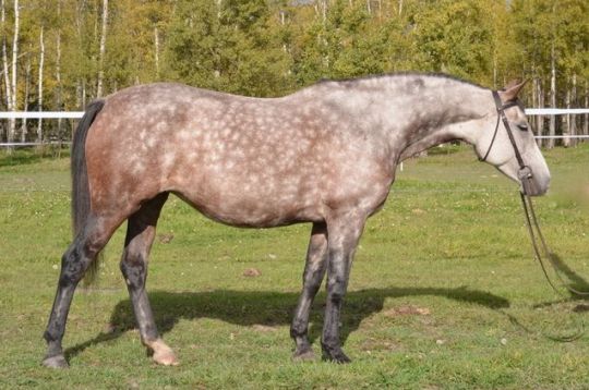
A dapple grey horse in the process of losing its baby coat.
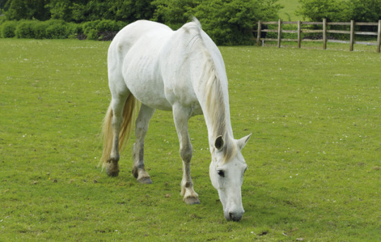
A fully greyed-out horse at adulthood. Even all grey, the skin around it's eyes and nose is still black, because the skin underneath has not lost color, only the hair.
A white horse is born white, will always be white, and is never naturally any other color. The skin of a white horse is pink, because it, like the hair, does not have color.

Sodashi is a Japanese racehorse and a member of a super-rare white horse family. Several members of her family are pure white, due to a mutation that gives them extreme white pattern, much like with the Tobiano gene. Her relative, Buchiko, shows the minimal pattern that gives them their white color.
Same pattern, but maximal and minimal expression!
#reach#writing#writing horses#writer advice#how to write#writing advice#writing help#writeblr#creative writing#writers on tumblr#writeblr community#writers#writerscommunity#horses#basic horse things#horse colors#cowboy
245 notes
·
View notes
Text

a lot of analysis of "Saltburn" that i see on the internet focus on the text/subtext and maybe the symbolism but i'd like to focus on how messages can be conveyed by the visual elements of the film.
after your first viewing of the film, you've probably asked yourself a lot of questions, including: did Ollie genuinely like Felix (and all his plans derailed dramatically) ? or was Felix a mean to an end from the beginning (and Ollie's mistaken his obsession with Felix, more precisely what he represents (i.e. coolness, wealth, injustice etc) for genuine affection) ?
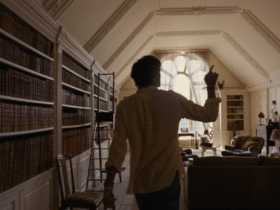
first and foremost, let's talk about the ratio used all throughout the film which is 1.33:1. so not a perfect square - that would be 1:1 - but here's a screenshot of my computer while i was playing the film on my media player so you can see the biiiig black stripes to the left and right.
such a square-ish ratio - especially compared to larger ratios, the hollywood standard being 1.85:1 - allows paying attention to the characters instead of the background in wide shots or floor shots and offers 'intimate' close-ups because little to no background is to be see as you get closer to the characters. the main drawback and that we cannot capture imposing backgrounds with it. it just doesn't fit.
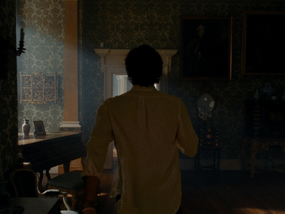

the scene where Felix shows Ollie around the house illustrates perfectly the paradoxes of the film. Saltburn is central to the film and yet just a background.
the camera never moves away from Felix, not even when Ollie looks left and right. to add insult to injury, the narrow frame prevents us from looking at anything else even if we wanted to.

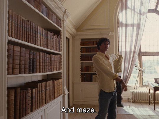
"some fucking hideous Rubens" said Felix. Rubens that...we will never see. same for the maze Felix will die in: we'll see it later.


of course, the previous scene depicted Ollie as insignificant compared to the castle but i think this scene is here to establish Duncan as the gatekeeper of the castle in a very literal sense. as if the gates of the castle had taken on a human form in the form of Duncan.
but the moment Felix comes in, all eyes on him.
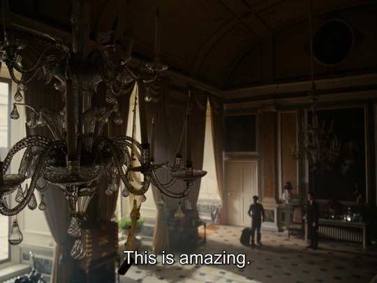
for me, the message is clear: before the death of Felix, we don't care about the castle . there's not even a single room of that castle that you could describe extensively. do you know what Ollie's and Felix's rooms look like? and the dressing room? etc. Ollie was genuinely obsessed with Felix and he had to improvise when he died that aspect of him is not part of any scheme. in contrary i think the moments when Ollie's sexually excited by Felix (cf bathtub scene, grave scene) are Ollie's rare moments of vulnerability when his real personality slips through. he cold-bloodedly killed all the members of the Catton family except Felix he genuinely cried for.
that's why i do not subscribe to the view that every single thing Ollie does is part of a scheme from the get-go. sometimes, Ollie improvises and his obsession for Felix is not a mean to an end.
#saltburn#saltburn spoilers#saltburn movie#oliver quick#felix catton#jacob elordi#barry keoghan#cinemetography
834 notes
·
View notes
Note
Can I get a flag for crip? Like crip theory crip. In a pan-disability sense. I don't have any particular iconography in mind, only that it shouldn't give a vibe that this is exclusive to physical disabilities. If you can link it in some way to the Mad & Deaf pride flags that'd be nice.
Thank you!
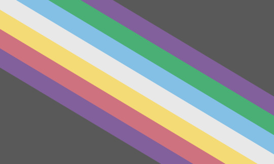
Crip Pride Flag
This is a flag for crips and those who feel represented by/part of crip theory, crip pride, and/or general cripness. [SVG version on WC]
Crip is a term that is open to people with ALL disabilities (physical or otherwise) and also to groups who share the crip mindset. (Note different spelling from cripple.)
For folks who like details: I'm gonna explain what crip is for those who may be new to the term! Then I'll talk about the flag design how the different stripes represent different models of disability. 💜
What is even is crip?
Like how "queer" is to LGBT+, "crip" is to disabled. It's an umbrella term, a way of seeing the world. Activist reclamation of "crip" goes back to the 1970s, with disabled performance artists popularizing the term in the 1990s.
Crip theory began in the early 2000s by building on queer theory. Expanding on your [QCI's] recent post, its characteristics are:
Understanding disability as socially constructed.
Fuck capitalism: the social construction of disability as we understand it was a result of the development of capitalism.
Fuck eugenics: Ableism and racism have been entwined for hundreds of years and cannot be understood in isolation.
Fuck colonialism: which is itself debilitating. Violence disables people, and Global South activists have been clear it's important to talk about how war, landmines, etc are disabling.
Disabled people are creative. Where queer-ing refers to a way of being critical of categories, cripping tends to focus on subverting ideas of ability. Disabled people ARE the original makers/hackers.
Disabled people are experts: we know shit. It is *us* who should be the epistemic authorities on disability, *not* physicians.
Crip as a term is open to anybody experiencing the violence of eugenic thought, regardless of identification as "disabled".
Fat studies scholars have been locating themselves as within crip theory since day one. Similarly, reading Cripping Intersex by Orr has made clear to me that intersex has always been crip.
Again, drawing a parallel to queer & LGBT: kink and polyamory may not be LGBT but they are Queer. 🌈
Flag details
The design is based on @capricorn-0mnikorn's Disability Pride Flag. In line with newer meanings for the Disability Pride flag, the stripes represent different models of disability associated with crip theory:
Purple represents the social construction of disability and the influence of queer theory. #82609b is from the Mad Pride flag.
Red represents postcolonial understandings of disability such as debility. Understanding that which chronic illnesses receive care and research is *political*. The choice of #CF7280 is a nod to the AIDS flag. I took the red from the disability pride flag and shifted the hue (but not chroma & lightness) to that of the AIDS flag.
Yellow represents the affirmative and identity models of disability. The opposite of the tragedy model. Many disabilities can actually be beneficial! The choice of #f4db75 is a nod to the intersex flag.
White represents how crip pride and crip theory are pan-disability. It stands for models of disabilities not otherwise represented here. The #E8E8E8 white is also a nod to the neurodiversity flag.
Blue represents the social model of disability, the intellectual progenitor of the social construction model (and crip theory in turn). The choice of #83bfe5 is a nod to the Deaf flag.
Green represents eco-crip theory, the eco-social model of disability, and other crip engagements with environmentalism. The choice of #48af75 is a nod to the nonhuman flag. Because being a cyborg (alterhuman) is a proud tradition of crip theory.
The repetition of purple serves to show crip pride & theory exist within a social construction framework. Also it widens the amount of the flag which is stripes, reflecting how crip includes groups not consistently understood as disabled (e.g. fat, intersex).
As with the disability pride flag, the dark grey (#595959) represents the lives lost to ableism and our collective grief.
Tagging @radiomogai @mad-pride @liom-archive for archival. And I wanna acknowledge @scifimagpie for giving me feedback on dozens of prototypes. 💛
Finally: I release this flag design as public domain! 💜
#crip#crip theory#crip pride#crip flag#krip hop#crip time#crip labour#disability#disability pride#disability flags#disabled flags#new flag
131 notes
·
View notes
Text
Proposing new meanings for the Disability Pride Flag stripes
I love the design of the disability pride flag made by @capricorn-0mnikorn (in consultation with many disabled people!). It’s beautiful, elegant, and distinct. I love the symbolism of the diagonal stripes.
But the more I think about the meanings of the five diagonal stripes, the more uncomfortable I am with them. So I'll explain my discomfort and then give proposed alternative meanings.
For those unfamiliar, these are the meanings that capricorn-0mnikorn gives:
The White Stripe: Invisible and Undiagnosed Disabilities
The Red Stripe: Physical Disabilities
The Gold Stripe: Neurodivergence
The Blue Stripe: Psychiatric Disabilities
The Green Stripe: Sensory Disabilities
With additional and helpful context here! 💙 Like a lot of disabled people my disabilities don't all fit neatly into these boxes, but I recognize some disabled people see themselves in these categories. I do appreciate the symbolism of it being the most common flag colours / internationalism plus the intent of representing diversity amongst the disability community.
Here’s what doesn’t sit well with me:
The yellow was chosen for the neurodiversity stripe because gold = Au = autism (and also as a fuck you to autism speaks, a sentiment I agree with 💯).
So autism is used to represent all of neurodiversity. Even though the 2018 AutisticsUK campaign to associate gold with autism was explicitly motivated by the idea that neurodiversity is larger than just autism and autistic people should have our own colour/symbol distinct from the rainbow infinity used for general neurodiversity.
One specific disability is effectively being given a whole stripe (autism) while the other four stripes are based on abstract ideas: red is associated with body -> physical disability, blue is associated with the mind (and is “opposite” to red) so -> mental disability. This is reasonable but it’s inconsistent. (And I am very much the kind of autistic who gets bothered by internal inconsistency 😅)
The Deaf community has been using cyan blue for ages (since at least 1999, probably older) and they have been so vital in disability rights history. I feel if any single disability deserves to get an entire stripe to themselves it should be them.
I appreciate the honestly that assigning green to sensory disabilities was because “that was the color that was left over” but it still feels wrong given how vital blind & deaf people have been to disability history.
Blue for mental/emotional disabilities also misses that the Mad Pride movement has been using purple as their colour since at least 2013.
If all five stripes were disconnected from actual disability-specific pride flags I think I’d be okay with it. What sets me off is the inconsistency: autism gets the privilege of its own chosen colour but not other disabilities? (Also: autism isn’t the only disability that uses yellow!)
My proposal for new meanings
I propose each stripe represent a different cause of disability, and the associated model(s) of disability that go with that cause:
Red: disability due to injury / the debility model of disability - e.g. injury due to armed conflicts caused by colonialism, injury due to gun violence in a country which fails to regulate gun safety, preventable illness due to sociopolitical neglect 😡🩸
Yellow: disability due to natural differences / affirmative models of disability - e.g. autistic people who lead lives that take advantage of their autistic traits, DSPS folks who are able to work night shifts and take pride in doing so 😄🌟
Blue: situational disabilities / critical models like the social model, social construction model, political/relational model, and radical model - e.g. a Deaf person who feels their only disability is that people don’t speak their signed language and don’t provide captions/etc 🗣️♿️
Green: disability due to illness / biomedical models of disability - e.g. people with conditions like ME/CFS and Long Covid who actually do want to be treated/cured 🤢🦠
White: disability caused by unknown or other factors / other models such as the human rights model - e.g. somebody with a poorly-understood and/or undiagnosed illness who is fighting for access for accommodations and medical care 👀🤍
People may relate to multiple stripes! Whether it’s for the same disability or for having multiple disabilities. Like the old meanings, the intent is to showcase our internal diversity. 🌈
It’s been my experience of disability community that attitudes about disability tend (in general) to be linked more to when/how we were disabled rather than mental/physical/sensory/etc. For example, people like me who were disabled from a young age tend to understand our disabilities differently than people who acquire disability later in life.
Colour choice justifications:
Red as disabilities caused by injury: keeping with capricorn-0mnikorn’s association of red with the body plus the common associations of red with blood, violence, and anger. I want to explicitly include the debility model of disability because a lot of white disabled people tend to forget or gloss over how disability is used as a weapon against racialized & Global South folks.
Yellow is associated with optimism and pleasure as well as enlightenment (such as in the Deaf flag) and so I connect it to the affirmation model of disability (which is the opposite of the charity/tragedy model). From there I associated it to disability due to natural differences, such as congenital neurodivergence. I want yellow to still be something that fellow autistics could still see themselves in the flag for! 💛 And I want intersex people who see their intersex variation as a disability to be able to see themselves here too because being intersex is natural 💛
Blue as disabilities that are social/situational in nature, like Deafness being a disability in situations where signed languages are unavailable. I wanted Deafness to actually be under blue this time. 💙
Blue has also been used for disability writ large for a long time now and so this one being the one associated with the Social Model feels most historically connected to me. I’m also including newer critical/postmodern models like the social construction model and radical model which also posit that disability is a social category rather than a deficiency of individuals’ bodyminds.
The social model is generally contrasted with the medical model - viewing disability as a medical problem. A lot of disability activism is focused on de-medicalizing our bodyminds and challenging the idea that we want to be cured.
But there are chronic illnesses like ME/CFS, long covid, and cancer where the people who are disabled by them do actively (and vocally) want to be cured! And they belong to the disability community too. Green was picked for illness because green has been used to symbolize sickness (e.g. the 🤮 emoji). And biomedical models like the traditional medical model and the more recent biopsychosocal model are thematically connected to disability being due to illness.
For white, I want people who are undiagnosed and/or who feel the invisibility of their disability as important to again be able to see themselves in this stripe. 🩶White is also the catch-all “other models” because of white being the sum of all colours in an additive colour model. Models like the human rights model I see as being appealing to disabled people who are feeling invisibilized by society.
For each stripe I've included both a cause of disability and a model of disability. The causes are concrete, and easy to understand. The models of disability are more abstract and not everybody will know them (especially ableds). But a flag gives us an opportunity to teach others about us and I think it's a great opportunity to increase awareness of the different views/models of disability. 🖤
Overall, I tried to keep as much of capricorn-0mnikorn’s reasoning/associations alive in my new proposed meanings as I could. 💜 I hope people who see themselves in a given stripe of the original flag will see themselves in this scheme as well. I hope people who didn’t see themselves in the original scheme find these options more inclusive. ☮️
#disability pride#disability#disability pride flag#flag meanings#colour meaning#disabled pride#pride month
263 notes
·
View notes
Text
honestly on that prev "its becoming ohio" post, i think the "progress flag" (maybe not that specifically but others "past" it) kinda visually represent the cluttering of "LGBTAQI+"
When you make an acronym like "LGBT" people are automatically left out, and in the community of people who escape boundaries and labels people made/make more hyper-specific labels (which is fine honestly who cares) and suddenly ace, aros, pan, demi(sex/ro/gender), etc. are all left out, not only that its a community of including everyone sans pedophiles and like actual harmful sex crimes so people want to include people, which means you have to add more letters and next thing you know you have LGBTQIAUJWNLEIFNWMDPJNDLFONVK and it's a cluster-fuck.
same thing is happening to the flag. My preferred two pride flags are the pink stripe one and the one with black and brown stripes which were already there by the way and then removed in other variants. The more you add to the flag the more visually cluttered it gets and the more people who are left out, and next thing you know you have either Ohio or that stuffed gay flag barcode thing that looks like vomit.
So what's the solution? Do we just stick to the culturally considered "vanilla" pride stuff?
No because this is a new problem. this wouldn't be one if we all just said queer
111 notes
·
View notes
Text
♥️Reveling in Richonne - TOWL
#58: The Fearless (1.06)

gif cred: @nerd4music
What Rick and Michonne are about to do is super risky, and yet they aren't scared to take this on. And as Michonne will make clear, their fearlessness has everything to do with how safe Richonne makes each other feel 🥰...
So first, Pearl shows up to Rick’s room to see if he’s there and does she knock? Of course not. 🙃 She again just walks right in and then, seeing that Rick left his prosthetic in his room when he’s usually never without it, Pearl starts putting some pieces together.
Rick leaving his prosthetic behind made me think about Rick and Michonne's final handhold in TWD. In TWD 9.03, Rick has his hand balled up in a fist when they get bad news. Then, Michonne slides her hand into his as he tightly holds her hand.
I've always felt that was a nice illustration of how Michonne is the one who can always get Rick to release his frustration and how being with her helps him feel like he’s never in this alone. They’re always held by each other's love and can recenter on that even amid frustrating or fear-inducing circumstances.
...But then Rick is taken from Michonne, he chops his hand off to get back to her, and what is he given as a replacement? A permanent fist. Almost like it represents how now Rick has to live with this cemented enduring sense of frustration.

gif cred: @ricksmarlene
And then when Michonne re-enters his life and brings that man back in mind, heart, and soul, what does Pearl see? That fist extension left behind. Why? Because even Rick’s “permanent” fist can be replaced by the embrace of Michonne’s love, just like in their final irl TWD moment together. 👌🏽

So next, CRM soldiers start taking their seats and Rick and Michonne enter a tent to finish out their plan. I know some felt this plan was all too easy, but to me...

Rick doesn’t technically have to be incognito at all since he’s actually supposed to be a part of this CRM gathering and Michonne has a red-striped uniform so she’s not likely to be questioned either which explains why they’re able to maneuver throughout the space fairly smoothly.
As Richonne discreetly sets up the bombs, Pearl watches from a window as CRM soldiers gather for CRMchella before they horribly go and commit mass destruction on innocent people. 😣
But this military won’t get the chance to fulfill their operation because Rick and Michonne are in the middle of prepping to cause some mass destruction of their own.

gif cred: @taiturner
I love the shot with Michonne’s wedding ring on her finger as she sets up the bombs. Our girl is wifed up, y’all. 🥹 I mean she has been for a long while, but still, I gotta celebrate it every time. 🥳
Also, I like how the contrast of the wedding ring and the bombs really hammers home the uniqueness of this epic apocalyptic love story. And it’ll always give me life seeing that Rick finally got to give her that ring like he dreamt about and that Michonne now gets to wear a ring of her own. 😌

As they walk back up to each other, Rick says, “This is it.” and Michonne says “Yeah.” And then Rick gets more specific about what he means when he says, “This is the last we’re apart.” Love it. 🥰 Spoken like a true magnet. 🧲😌
And Rick saying this just made it crystal clear that Rick and Michonne are about to be healthily attached at the hip from here on out. They’re not leaving each others side for anything anymore.
I know the finale being called The Last Time had some worried because it sounded so final and even ominous but y’all, I’m convinced it’s called 'The Last Time' because it’s the last time Richonne ever willingly part for longer than five minutes. 😋

gif cred: @nat111love
And it’s also super sweet that Rick says this because I got the sense that throughout this finale one of his least favorite parts of the plan was that he and Michonne would have to briefly separate again. So you know he’s happy they’re nearly done so that they don’t have to part anymore.
Rick saying that was already nice, but then the moment gets even better as Michonne looks into Rick’s eyes and tells him, “I should be scared. Just standing here, I should be scared, but I’m not. Because of you.” The best. 😭😭

gif cred: @coolpartytimefan
I adore the way this reemphasizes her sentiment that the only time she feels safe is when she’s with him. She really means that, and I love how she looks at Rick and has that subtle smile as she says it, knowing her husband is her truest safe space.
It's so meaningful how she's aware that the reason she's not scared right now is not just because she's a capable person who only envisions winning, but because she's with Rick, her other half who she trusts wholeheartedly. I love that Michonne always wants Rick to know that he makes her feel so secure even in the face of very dangerous circumstances. 🥹
And it’s really refreshing that this time around Rick is clearly responsive to hearing this from Michonne. When she told him that being with him is the only time she feels safe in episode 4, he felt he had to mask how he really feels about that - but here you can tell even in his subtle expression that his wife feeling this way means something special to him.

gif cred: @nat111love
Especially knowing how he started this show with loved ones who doubted his ability to keep people safe, Rick has to feel so uplifted knowing Michonne never doubts if she's safe when he's around.
I love how Rick and Michonne's love makes them both feel fearless. 🥲 For a time, their love made Rick riddled with fear of what could happen to Michonne. But, now that they’re back to fully believing the two of them can do anything, they’re back to operating in their fearless love. 😌
And then because gift-giving is truly one of Rick’s favorite ways to show his love, he says, “I forgot. I have something for you.” and gifts Beale’s sword to Michonne.

gif cred: @nat111love
Ok first of all - Man of the Year every year. No one is taking that title from Rick Grimes. 💯

Second of all; That is just the sweetest thing that Rick made sure to not leave Beale's sword behind because he thought it would make a good gift for his wife. 🥰 What a mighty good man. And mighty fine too.
I’ve long been convinced that Rick’s first thought when he sees most items is 'How can I turn this into a gift for Michonne.?' and TOWL just confirmed that lol. 👌🏽
Also, Rick really killed Beale in that briefing room, and before he left said...

Third of all; I like how this sword was so important to Beale and the CRM, it’s what thousands of soldiers swore on, for all of them it symbolized the power to kill and give life, it has a whole history...but then Rick decided what this sword is first and foremost is a nice little gift for Michonne until she gets her katana back. 😋
And Michonne might not even know exactly the significance of that sword because her and Beale didn’t really cross paths, but I know Rick knows that he’s giving this ‘life-giving’ sword to the woman that gives him life.
Michonne’s smile at Rick is so sweet and appreciative as she accepts the sword. 🥲 Again, I adore that it’s always so clear that Michonne loves all the ways Rick shows his love.
And only Richonne can have such an adorable and heartwarming husband and wife moment while surrounded by tons of bombs and chlorine gas pods. 🤭

gif cred: @nat111love
So then they resume the set up, operating in sync of course. And the POV shot of them both lifting out a walker from the crate is great. 👏🏽We truly got us a couple that can do the lovers aspect and the lethal aspect to perfection. 🤩

gif cred: @ricksmarlene
Pearl is standing at another window looking reflective and the puzzle pieces finally come together for her as she thinks back to several moments where it was clear Rick was actually probably in love with Dana Bethune.
Pearl recalls Rick urgently persuading her to convince the CRM that Dana is a B, Rick following Dana’s lead instead of hers after Pearl stuck her neck out for them, Rick proving to have a good poker face during their game of poker, and lastly she recalls Rick saying “She’s not gone” as Pearl officially realizes that not only is the someone Rick loves out there not gone, honey, she was all up in the CRM breaking kill records and doing Pearl’s job better than Pearl. 💅🏽

Pearl heads off with this new realization as it has to be hitting her that the one family member she thought she had here, she actually didn’t know at all. Because if she had known Rick even a little bit better, she’d have noticed a lot sooner that Rick had changed the second Dana showed up.
This is a man who previously was shut down to the point of being basically dead and now his eyes light up every time he talks about this new consignee...the writing was on the wall about who Rick and Michonne were to each other.
But I won’t go in on Pearl too much because I also know a thing or two about being late to the party when it comes to Richonne - even tho I also should have been way more aware that Richonne was endgame from the jump. To this day I'm like how blind could I have been back then? 😅 But those blind days are long gone.

Always one to find a practical use for walkers, Michonne and Rick attach wire to Walker Beale and the elevator solider so that they can set off the bombs and Richonne can escape in time.
As Michonne leads Beale out of the tent while wearing his sword on her back, Beale was giving us MJ Thriller realness as a walker lol. 🧟♂️😋

And then Rick and Michonne exit the tent and quickly reunite after leading their walkers in opposite directions. And seeing this part always makes me smile because I was like 'wait...is this what Rick meant when he said ‘this is the last we’re apart’ - the 30 seconds they’d be apart to lead the walkers away?' Oh that confirmed even more that Richonne really is about to be attached at the hip from now on. 🤭
But also I get it, because even if it was just a few seconds spent apart, it was a dangerous few seconds considering the circumstances. So I’m sure Rick is glad to have that part over with and be back together.

gif cred: @taiturner
Rick and Michonne make a run for it and then right on cue, Pearl shows up with her gun aimed at them. I was like now Pearl, you can be late to the party realizing who Richonne are to each other but you gotta be right on time right now?? Figures. 😪

gif cred: @sowhumpful
Pearl demands to know where Beale is and says she knows Rick lied to her. Pearl asks, “What did you do? Rick? Dana?” Rick tries to talk to her but she tells them to take off their helmets and she shoots at Rick’s feet to make it clear she’s not playing around.
I definitely see a lot of understandable hurt on Pearl’s face as it just becomes crystal clear that Rick was not her family…he was Dana’s.
In that regard, I do feel for Pearl because she needed something to believe in after being dealt a tough pair of cards. She wanted to believe in the mission she was given from Okafor and then the mission she was given from Beale, and she wanted to believe she found family in Rick. So I can see how that would be painful for her to realize so much of what she believed in no longer exists and maybe even never did.
All that being said, I still need Thorne to stop pointing guns at my babies tho. 🥊🙂

gif cred: @sowhumpful
Next, Pearl tells them they’re going to go back into the tent and undo whatever they did and then Rick and Michonne share a nod before turning around. Once again it comes in handy that Richonne are capable of communicating with each other without talking because they seem to quickly be on the same page as they walk toward the tent.
Pearl says they’re going to regret this when she finds Beale but I was like - ma'am...do you not see Beale’s sword on Dana’s back? When you find Beale he’s gonna be a 'creature crawling in search of blood to terrorize y’all’s neighborhood.' 😅

As Rick and Michonne walk toward the tent with their hands up, Rick demonstrates that being held at gunpoint is temporary but being a loverboy is forever as he still finds a way to make this moment romantic. He takes Michonne’s hand while they walk and this was a super heartwarming moment. 🥹
I love that Rick wants to use the one hand he's got left to comfortingly take his wife's hand and once again offer Michonne some sense of safety. And taking her hand is a comfort for him too.
Knowing that they’re very much between a rock and a hard place - with Pearl aiming a gun at them on one side & a tent full of bombs that are about to blow on the other - this handhold was Richonne letting each other know that no matter what they're in this together. 🥲

gif cred: @sowhumpful
I’m sure seeing Rick hold Michonne’s hand had to be another blow to Pearl as she sees that Rick found the someone he loves out there while she had to give up on ever finding hers.
As Richonne stays holding hands, Michonne says, “It never died. It won’t stop. It can’t stop.” And unless I’m mistaken, I think the 'it' she’s talking about is their love and connection. And if so, I love that. 🥰

gif cred: @sowhumpful
Both she and Rick have expressed how they view their love as endless, undeniable, and unstoppable. And it’s sweet that that’s what Michonne acknowledges here because, even in this predicament, she's confident they’ll find a way since Richonne doesn't get denied.
Michonne knows nothing has stopped the two of them together yet and it won’t start now. And as always...she’s exactly right. 😌👌🏽
#richonne#towl#reveling in richonne#1.06#RIR (58)#the ones who live#twd towl#michonne grimes#rick grimes#rick x michonne#twol#michonne#rick and michonne#twd: the ones who live#twd#richonnefandom
91 notes
·
View notes
Note
As a late comer to some of the nonsense, can you explain or point to something explaining what watermelons have to do with Palestine? Asking google "what the fuck do watermelons have to do with Palestine" was not a productive search. Where did that come from?
hello anon! yes indeed i can. this is gonna be a long post, so buckle in lmao.
so the main and simplified reason the watermelon is used (and i'll get into some more complex stuff and context because both are important to understand with this) is because red/black/green represent the PLO flag, which is known as the "palestinian flag."
now, i don't know if you know who the PLO are, so:

(this notice to include secondary sources is so faulty btw. this is based on primary sources written BY the plo, which removes bias of interpretation)


i recommend reading this wiki page at least and clicking on the sources for more information. it isn't as bad as some wikipedia pages and it can provide a good introduction.
now, the PLO is an internationally recognized terrorist org. it split into numerous factions, including yasser arafat's "fatah." fatah controlled groups like black september, which committed the munich massacre and also murdered the king of jordan.
the PLO itself has committed numerous acts of terror, including the hijacking of the Achille Lauro. terrorists who hijacked this ship shot and tossed a disabled jewish man in a wheelchair named Leon Klinghoffer overboard, etc. so no, they are not a resistance group. this act was sponsored and supported by arafat.
if you want to know more about their bullfuckery, which i recommend, read their charter here.
okay, now moving on to the flag:
you've probably noticed that the red/black/green/white thing is a motif used by several countries. this is because of "pan arabism."

rootsmetals did some good posts on arabization:
the specific colors have meanings, and those meanings are either religious or secular. the religious and secular connect though. let's take a look. i'm going to use arab sources without commentary on any biases:


on the other hand:
so. we know about the flag's history and its meaning. we know what it represents. now, let's go into the whole "watermelon" thing:
the reason it's used depends on who you ask. if you ask the pro palestine crowd, the watermelon is used in place of the "palestine flag" due to "censoring" and "silencing."
this goes back to the propaganda that israel banned the palestinian flag. israel DID NOT ban this flag legally, but it did have it taken down because...guess why? why would israel want the flag of the plo not flown? it's like flying a kkk flag in the usa, that's why.
yes, you have freedom of speech in israel, but it has its limits. those limits are hate and incendiary speech. the plo flag is a symbol of hate based on the charter and acts of the plo itself. also, fatah/the palestinian authority, which currently governs the palestinian section of the west bank/judea samaria and east jerusalem still pays terrorists who murder jews and israelis and are imprisoned. sooooo you can guess why the flag was taken down, but here is some of the propaganda:
the lack of sources in this article lmao.
again, hilarious lack of sources.
if you ask the pro israel crowd, it's an appropriation of a very zionist crop and a symbol of decolonization.

instagram
instagram
if i find more sources on this, i will do another post.
but yes, the watermelon emoji is used because "the internet silences palestine," which is hysterical, considering google favors palestinian sources and most major news networks employ either palestinians or palestinian allied supporters.
and of course, tiktok and the rest of social media won't remove antisemitism, but will constantly ban jews and israelis. hence why finding sources on the jewish history of the watermelon is difficult.
anyway. hope this helps. <3 if you're comfy, definitely dm me sometime if you want to discuss things and/or get sources.
@matan4il do you happen to have any sources on the israeli/jewish/zionist history of the watermelon? if you do, it would be so appreciated.
100 notes
·
View notes
Note
Does the ring BJ wears have any special meaning?
I hadn't answered this one yet because I was considering how to do it in a more thoughtful way than just saying something simple like it's just another character-defining accessory, like the striped suit, for example. I did talk to my sister about the ring the other day, when I noticed he wears it since the first film, and then at night when I checked my Tumblr inbox I saw this question and I was excited to answer, but then I decided to think about it more to give a better answer.
To say that it's just an aspect of his character design would be acceptable if the story had ended with one Beetlejuice movie. Considering there are some character design elements that were prominent in the first film which didn't make it into the second film (I mean, for example the watches; he might have been wearing them in the sequel, but it wasn't as noticeable, at least to me), dismissing the ring as a simple accessory might be too simplistic, when we consider the consistent theme of weddings/marriage running through both films. The sequel reinforced marriage as a strong theme in the Beetlejuice series, having not one, but three instances in which weddings were a part of the story (four, if we count Rory proposing to Lydia).
Weddings and marriages are pretty much akin to, if not the backbone of the Beetlejuice story.
This is all speculative, because, of course it might just be a simple accessory, but consider this: what if the ring is a symbol of the burden that binds Betelgeuse in the afterlife? Assuming his soul truly is bound to the ritual of marriage.
Rings are connected to the ritual of marriage, and Betelgeuse, as unreliable as he might be a narrator, has stated that in order to "get out" of the afterlife he needs to be married. He did say "come to think of it, I don't have any rules", which might prompt you to think he's just making it up, maybe as an excuse to marry Lydia (assuming his feelings for her were romantic from the beginning, which upon some thought I think he might have been at least interested). But I don't think he was just making it up. I think Betelgeuse truly is bound to the ritual of marriage (as I wrote in this post which I keep referring back to since it's just my favorite headcanon about Betelgeuse's curse).
Putting aside whatever keeps him tied to the model at the old Maitland's house in Winter River, there must have been something more keeping Betelgeuse's soul from moving on to the great beyond.
(I've always thought Juno's the one who bound him to the model and gave him the curse about his name, but I might be misremembering something. I've watched Beetlejuice at least three or four times a year since I was a teenager, but until now I've been a casual fan, so I didn't think to analyze anything too much or look into it too deeply lol).
We now know Betelgeuse didn't "unalive" himself, and yet he was once Juno's assistant, so, assuming he wasn't mistakenly put there as a public worker, like we presume happened to Astrid's dad, something was keeping him from moving on.
I personally think that what happened on his wedding night is what is keeping Betelgeuse bound. It's what's kept him around for over 600 years now. He was cruelly murdered on his wedding night, and he also committed murder himself. Not to mention the wedding itself was dark and cultish, so there's a lot there that might have tainted and bound his soul, and prevented him to move on and find peace.
It could be that the ring is the symbol of his attachment. You know how often ghost hunters believe that ghosts get attached to certain objects, and those objects need to be blessed or exorcised to free their soul? It might be that his ring represents something similar. If the writers wanted to go with the route of Lydia exorcising Betelgeuse to free herself of him, they could have her find his ring in the living world and perform an exorcism on it to finally free Betelgeuse's soul. I don't think he'd hop on the train and leave to the great beyond without her, if she does that (he would still definitely stick around and wait for her), but he'd finally be able to get on that train whereas before, he could not. That's something the writers could come up with (which I totally doubt).
I think what will actually free him is finally completing that wedding with the person he's in love with. Only then his soul will find peace and be free to move on.
It's never been fully revealed what will happen if Betelgeuse marries Lydia. Will he simply become a regular living man? Will he gain access to the living world and be able to cause all sorts of madness as a super powered poltergeist/demon? Or will his soul simply be freed of the afterlife in the sense that he can finally choose to pass on to the great beyond? The writers could go with any of these, as the story stands right now.
As I wrote in my Betelgeuse and Marriage theory, I just prefer the fantasy of his soul being freed once he marries someone he truly loves, who truly loves him back. For me Betelgeuse and Lydia being able to move on to the great beyond together in the end would be the ideal ending. Of course, it's all speculation, and the ring might just be an accessory Betelgeuse just likes to use, but it's interesting to think about and speculate about these things.
In the first film Betelgeuse appeared to be tired with the afterlife, and he just wanted to be done with it (arguably to become alive again). It always made me feel bad for him because he seemed desperate to be free of the state he was in. He didn't want to be like that, and he'd do anything to get out. In the second film at least he seemed to be doing better, in the sense that he now had a job and was a lot more mellow (less desperate to be out of the afterlife), so his motivations appeared to have changed from "I want out of here" to "I just want to be with Lydia".
I just want to see Betelgeuse free, and for Lydia to be free of her own burdens in the end; I want for them both to have a happy ending.
#Beetlejuice#Betelgeuse's ring#Beetlejuice's ring#Beetlejuice and marriage theory#Beetlebabes#Beetlejuice x Lydia#Betelgeuse x Lydia#anon#anonymous#anonymous questions#anon questions#answers#Things I write#Beetlejuice meta#Beetlejuice 3 speculation#long post#text post
67 notes
·
View notes
Text
El's Quadruple Piggyback
El piggybacked into four minds in the finale. But who is the fourth?

This is the sign that created El's piggybacking plan. There are four people. The little girl represents El, the mom represents Max, and the little boy is Henry/Vecna. Who does the other person represent? Everyone else on this sign is facing forwards while the man is facing the back, but his face is scratched out. His identity is being omitted, yet he stands out from the others. He's important.
He's Will.
The man on the sign is in a striped shirt and brown pants. Every single outfit Will wore in s4 had some kind of striped shirt, whether it be normal stripes or plaid. His pants for the majority of the season were brown too! The physical features of the other people on the sign hint at their mind counterparts. The girl has a white dress with a pattern like El's finale shirt, the woman has red hair like Max, and the boy has blonde hair like older Henry. I don't think it would be crazy to say Will's stripes and pants hint at him being the fourth person.

When El first draws Max and Vecna, the mind bubble goes directly above Will. Worth noting that El is right-handed, so her hand would naturally draw the bubble on her right (our left), which would place the bubble above Argyle, but they had her draw it above Will. This was intentional!
As I said in the previous post about this drawing, this means that Max and Vecna were in Will's mind at some point during the finale, but El was there too. Will is the fourth person El piggybacked to, as the road sign hinted.


The sign says the scenic route is at the next right. In s2, Will senses Hopper with his hive mind powers and tells Joyce to turn right. In the other scenes where someone tells someone else to make an abrupt turn, they always say to turn left. Will’s is the only right turn.
Will is constantly on the right of the shot when El is piggybacking. Even after she finishes piggybacking, Will is still always on the right. He is the scenic route on the next right!


Well that's... interesting. El said the exact same thing to Max that she said to Will in s1. Max was already inside of her own mind thanks to Vecna here, so what if Will was too? After El says this to Will, his eyes shut and he moves his eyes under his eyelids just like he does when he's possessed by the Mind Flayer. Will is in his mind... but he's awake in the Upside Down? Almost as if the UD is his mind.


When El actually starts entering Max's skatepark memory and in turn entering her mind, we see the group as the lights flicker. Then they cut to Will. Will is the only one who gets an individual shot at this point. Why is he important? Why would he be the focus as El is entering Max's mind? Maybe because she's entering his too...
From this point on, Will generally starts acting a little weird. He's just quietly sitting there, but they keep focusing on him for no reason.


Will is the one to ask El if she sees anything weird in Max's memory. Funny because right after Will asks this, Max's Snow Ball memory starts to rot and spores from the UD come out of nowhere. Are you causing the weirdness Will? Hm?
By the way, the spores are NOT a characteristic of Vecna's mindscape. They aren't in his red mind world at all. They also aren’t from Dimension X (the yellow dimension). So that rules out the spores being a Vecna mind thing. It's 100% from the UD and it’s unique to the UD. Not a dimension thing, not a Mind Flayer thing, not a Vecna thing. An Upside Down thing.


This is Will's reaction right after Argyle says "A memory within a memory?" Why does Will start to look sad and contemplative after a double memory mention? Are Max's memories also within Will's memories? I think so. I've said this a million times before, but the Snow Ball decorations in the Upside Down are from Max's memory! Max's mind is combining with the UD. Why? The UD is the fourth piggyback person's mindscape.
What was the point of the freezer line? To be silly goosey funny? Maybe. Or maybe we are meant to feel... cold. Cold like the UD. El is in a freezer, she's technically in the UD. Because? The UD is Will's mindscape.

Right as Mike starts to say this line, they cut to Will. Yeah they're really hammering in Will's involvement with the whole piggyback thing. He's in there too!
But wouldn't Will feel everyone in his mind if this were the case? Nope! Max had no clue El was in her mind until she was flinging Vecna across the room. Safe to say Will didn’t feel them during the fight either. Or maybe he did and his quiet, off-putting behavior this entire episode is related to that...
And so El's fourth piggyback partner mystery is solved! El wasn't just in Max and Vecna's minds, she was in Will's too.
78 notes
·
View notes
Text
rating oil paintings i did in high school based on their likability (to Me) ⊙▂⊙
light study 💡 - the earliest one out of all of these bcuz i technically painted it in middle school but then went back in HS to add the seagulls and boat so i could fit it into the theme of my AP art portfolio LMAOOO but still one of my favorites, which is sorta sad cuz it’s so old… 9/10
filial love - honestly didn’t care for this one very much because it was meant to just be more fodder for my AP portfolio but turns out my mom likes it a lot!! she says it reminds her of “the lion of judah ✝️” (whoever that is) so i was happy to give it to her! she displays it in her room so her fondness really carries this one’s rating: 10/10
play nice with your brother!! 🐻❄️ - i like this one a lot! because it’s one of the only paintings my hardass art teacher let me use neon colors on (or at least as neon as u can get with oil paint). usually he just paints over my colors to make them grayer. that guy… otherwise this one is just not very interesting. 8/10
koi pond 🎏 - PRIME EXAMPLE OF WHAT I MEAN when he paints over my stuff with gray!!! i was so excited to paint this one and added all sorts of flair that i like—pink dots as leaf highlights, super detailed colorful water—AND THEN HE JUST WENT AND SMEARED ALL MY DETAILS 💀💀💀 so i Hate this one and avoid looking at it as much as possible. 0/10 below it is a version from a diff angle that i did in an hour with shitty free acrylic verrryyy recently in college, and u can just see how i went ham on the colors right?! eugh. what could’ve been… 🪦
with heavy heart ❤️ - a pretty big old lady (18x24”). i feel obligated to like her because she won me the congressional competition for my district so i got to go to the capitol to see her framed there and briefly meet my stale white bread representative but HONESTLY all i can think about is how hideous my makeup was at the time and i get upset. 🙁 i do think this granny is very pretty though!! 7/10
my ocean blue 🪼 - this one im not sure if i like it or only tolerate it. i just wanted to paint a super colorful coral reef!! "🐠🪸🫧" you know?? but my mom and teacher said it Needed a message for ~intrigue~ so they brainstormed together (without me) and made me add this random ass child with a VR headset smack dab in the middle… something about cyberreality? IDK i just want her ass gone so badly. i also never got around to finishing the stripes on that fish in the front but nobody calls me out on it so it's whatever 🤷♂️ LOL 4/10
radial self portrait 🎯 - HUGE DEVIATION IN STYLE not only bcuz this one’s gouache instead of oil but also because i got to paint without an old man (art teacher) hovering over my shoulder!!! 😸 it was my first time painting something super stylized and i realized that painting can actually be Not Agonizing!!! 😸😸 this was at my summer camp where we had to come up with a radial pattern using a compass (i hate that little pointy shit) and then combine it with our self portrait. it’s me having a headache! i painted this in a single stressful sleepless night because i have HORRIFIC time management when i’m left alone so it’s pretty sloppy. also at the time i had those blonde e-girl bangs hahaha… i still like this one a lot!! i was just SO happy i didn't have to go photorealistic AND i could use my favorite colors (mainly hot pink)!!! 10/10 😸
overall my high school painting in experience was spent beefing with my art teacher and inhaling paint fumes. sort of miserable honestly -_-
80 notes
·
View notes
Text
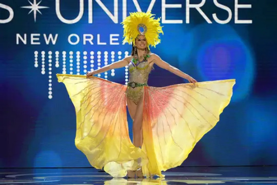
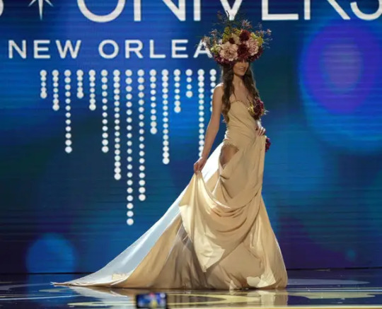
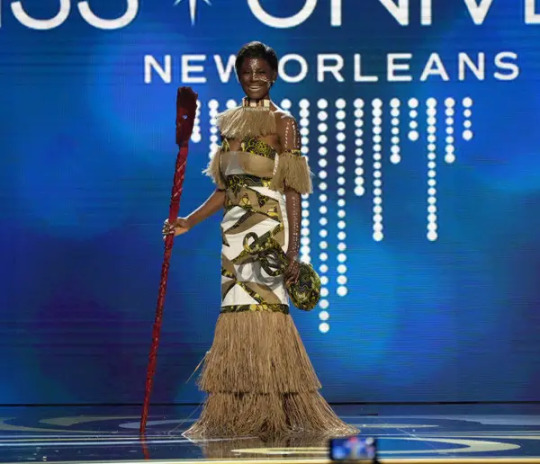
The 2022 Miss Universe pageant was last night!
Which means: the National Costumes are here.
Yes, there is video. It’s worth watching if you want to see how some of these look in motion, but I’m warning you in advance that the emcees keep doing these shitty little rhyming couplets, and they will make you want to strangle them with one of the many available voluminous gown trains. So I’m suffering on your behalf, and liveblogging.
First up: Albania.

Sparkly flag-inspired bodysuit with train is the voting “present” of the Miss Universe National Costume Competition.
Angola. She did a fun dance on her way to center stage, which would probably not have been possible in her original costume, which was “tree-inspired” and too big to ship to New Orleans.

Argentina. This is where the video does come in handy, because without it I would not be able to award her First Contestant To Visibly Struggle Under The Weight Of Her Outfit. It’s a waterfall. The rainbow crotch area was certainly a design choice.
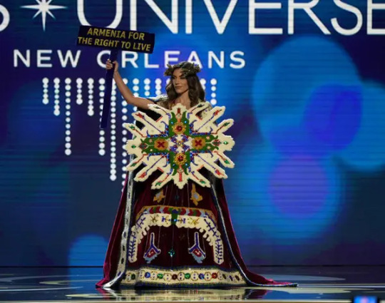
Armenia. I would like to see what’s going on with the bodice behind the... shield thing? but she never put it down.
Also, it turns out that when one contestant has a costume dedicated to solemn remembrance of the Armenian genocide, and the contestant immediately after her has a costume that’s about beach parties, there is kind of an uncomfortably abrupt tonal shift that happens onstage.
Aruba. Like I said: weird tonal shift! She did a little shimmy dance at Miss Armenia as they passed each other and it was clearly awkward for both of them. This is made of recycled materials leftover from Carnival, which is cool? I guess?

Australia. This is a prom dress. Boo.

Bahrain. A rare pants look! There’s a lot of detail in the headdress and bodice that’s kind of getting lost, but it looks cool in motion. Also the theme is apparently “Bahrain is rich as fuck,” so congrats I guess?

Belgium. Okay so the theme of this costume, my hand to g-d, is “the window on the International Space Station that Belgium built.” Why does this requires a shit-ton of leftover Christmas tinsel and some very awkward-to-wear angel wings? I do not know.

Belize. This is fun! It’s a good “lesser-known Batman villainess” kind of look. Like if Ivy and Catwoman co-mentored someone. The actual theme is “the world’s only jaguar reserve, which is in Belize,” but I think it’s also kind of implying that she might be a were-jaguar. Which, again, is fun!

Bhutan. This goes in the “just an actual regional/folk costume” category, which is also kind of like voting Present, but it looks like the fabrics are nice.
Bolivia. She has an entire Andean condor on her head so I’m already on board. This photo only shows the cloak, which is covered in silver spangles in honor of Bolivia’s silver mines, and is also why her condor is perched on a miner’s helmet. The dress underneath is entirely made of swags of sparkly gold beads, so the visual effect is actually pretty nice in motion.
Brazil. The construction details on this are actually quite lovely! Lots of intricate beading and rhinestone work. Unfortunately that doesn’t convey well at any distance, and also that white fin peplum thing flaps around really awkwardly when she walks. Oh, wait, she can flip it up to be a clamshell thing behind her head!
That looks much better.
British Virgin Islands. First giant flower of the year!
Bulgaria. Apparently this is made of neoprene? So with that and the rainbow stripes, the effect ends up being kind of “what if Midsommar, but at a rave.”
Cambodia. It feels weird to say “yep, standard Miss Universe warrior goddess costume” but basically that’s what this is. I do like the green-and-gold color palette, though.
Cameroon. “The baskets represent the nation’s agricultural movement.” Okay! I like how it’s giving “Valkyrie, but make it Global South,” though I’m not sure three entire country-shaped cutouts were necessary.
Canada. Another fine Miss Universe tradition: contestant who knows how to dance en pointe so she’s going to goddamn wear a costume that goes with pointe shoes, Or Else. Some nice beadwork! I would let her be the third, secret red swan in Swan Lake if that were a thing.

Cayman Islands. Sexy Blue Iguana is a fun concept! There’s a tail in back of the cape.
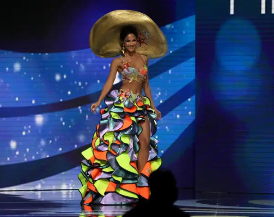
Chile. Sexy Atacama Desert is kind of abstract, as these things go, but I respect her choice to wear something she could walk in.

China. Hilariously, the announcer was like “This look... does not match the bio we were given, so I’m gonna wing it!” The fabrics are nice -- the satin drapes and moves well -- but the embellishments are kind of meh compared to some of the Miss China looks I’ve seen.

Colombia. This is a legit great Sexy Phoenix, but I need you all to know that her crown got turned a little sideways while she walked to the stage and she clearly knew it and just as clearly could do nothing about it, and I feel bad for laughing but it was funny.

Costa Rica. Sexy hummingbird! I think I’ve identified a recurring theme for this year. Corset and wings are made of recycled materials, which is nice, and they look well-made -- a lot of wing-based costumes tend to flop around or go crooked in motion, but not these.

Croatia. Oh, honey. This has big “my mom helped me make this the night before it was due” energy, unfortunately.

Curacao. “Meet the Fisherman’s Wife, a woman with a key role in Curacao’s fishing industry.” Okay? Honestly you could have left off the basket and said “this costume represents the beautiful marine life of Curacao” and I would have been like “yep, checks out” but now I have many follow-up questions.
Czech Republic. This is meant to be a Mucha-inspired look but uh. Mostly it’s just. beige. I’m starting to feel like all the other Slavic countries saw advance photos of Miss Ukraine and were like “let’s just phone it in this year, girls, there’s no point.”

Dominican Republic. “This costume recognizes the importance of birds in Dominican culture.” They did make it with silk feathers, which I appreciate, because it would have been very weird to use real ones with that mission statement. Also I like her headdress, and the giant feather fans are a good way to nod in the direction of wings without the hassle of actually wearing wings.

Ecuador. This looks good in motion! She did some dancing onstage that worked well, and there’s a great sculpted Inca head scowling on the back of her headdress. This is still only a few notches above voting Present, though.

El Salvador. “History of Currency,” which is definitely a concept! The Bitcoin wizard staff is sure something.
Equatorial Guinea. A perfectly nice entry in the “actual regional costume” category, but on the video I was like “oh, yikes, her headdress is really wobbly” and then it FELL OFF and I felt so bad for her.

Finland. “Spirit of the Forest”? Fuck off, that’s a prom dress. Boo.
I’m going to pause here so this readmore doesn’t get completely out of control. Shit, there are 50 more of these? Well, I have only myself to blame.
2K notes
·
View notes
Text
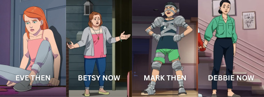
comparison and analysis on eve and mark's colors
i know this miggght be me overthinking but i really need to get it out of my system ahahajshajsha
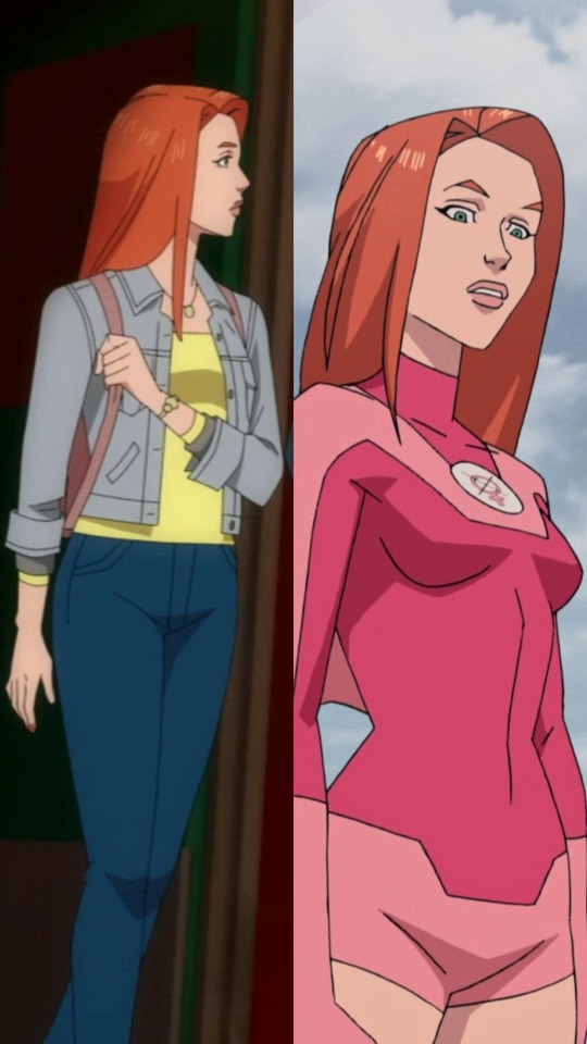
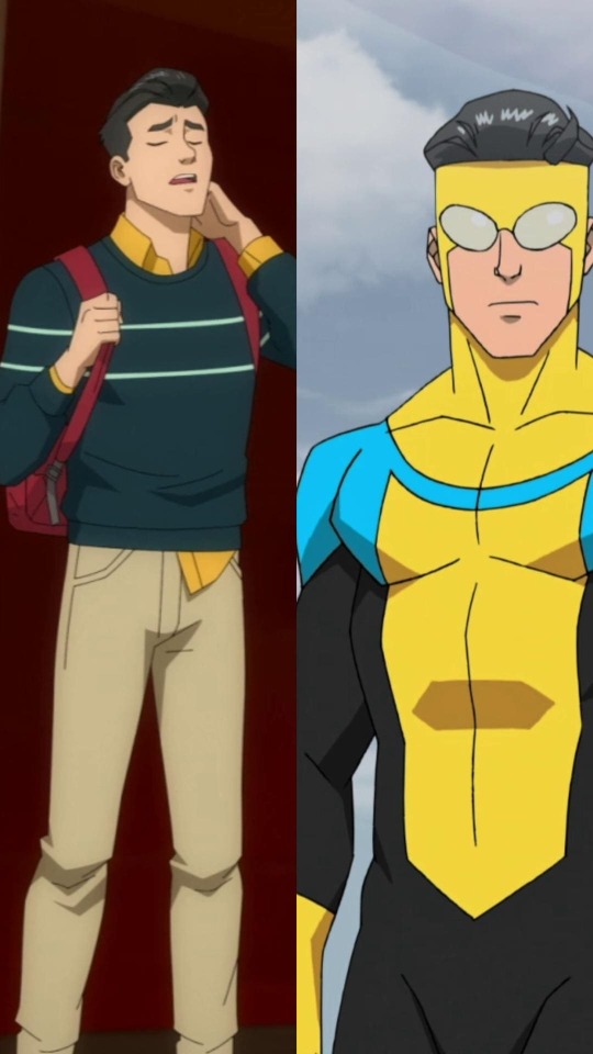
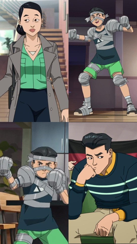
Pink is definitely Eve's signature color, it's the main color of her costume yet somehow you don't see that in her casual attire. As for Mark, no doubt his signature color is blue (even yellow can be included), and that's obvious in both his costume and his casual attire.
this post contains pics from season 1 and the atom eve special, putting a cut here cause this is lowkey long so,,,, oops-

Eve wore pink a LOT when she was a kid, it's in her every outfit throughout all the time skips in the special. When a character has a signature color, it's something that's reflected in (nearly all of) their outfit/s.
So where did the pink go on Eve's casual attire on season 1? Where did she even got the idea of wearing yellow of all colors when it's so far from her favorite color? There's red that when you mix it with white, it gives you pink. So she could have had a red top and white pants in her current casual attire, but that's not the case.
We got our answer on who she got the idea of wearing yellow from in the Atom Eve special: it was from Betsy.
There's a key thing that I noticed from the shade of yellow Betsy wore and what Eve is currently wearing. Betsy's yellow seemed happier. It was more vibrant.
Comparing Betsy's yellow to Eve, Eve's yellow is lighter. It's dull. As if it was drained of its vibrancy. And with what we saw of Eve's past in the special, it checks out that she must've have become so, so tired of so many things.
In animated series, yellow is often associated with warm, happy, and energetic characters. But when it comes to cinematography, yellow represents other things. From the link, I think cowardice is the symbolism of Betsy's yellow - due to her fear of Eve not being "normal" and her inability to accept Eve as she is. And @mandareeboo even pointed out Betsy telling Eve to "try harder" which leads to the symbolism of yellow that I associate with Eve: insecurity. There is no bigger source of insecurity than having your own parent say that to you, especially at a young age when a lot of things feel they're scary and overwhelming that you need a parent to guide you through it but instead they just tell you to repress yourself.
It's no wonder that Eve's yellow looked pale in comparison to past Betsy's yellow, pretending for years must have been exhauasting.
(Before anyone comment that Zak could be the reason Eve wore yellow instead of Betsy, I have an explanation I'm going to be giving later so please bear with me on this one hahahsdfjahsfda)
Now on to Mark!!
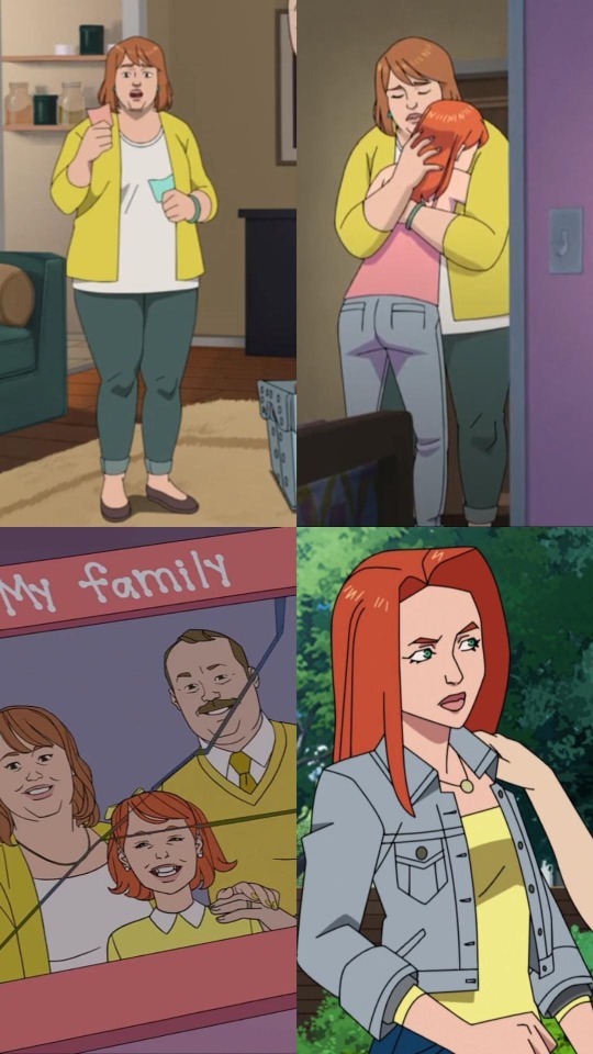
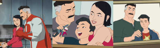
In the Atom Eve special, Debbie wore no shades of either blue or green. In fact, her top's color leans more to give a nod to Nolan's signature color (red). That, and their family pictures from season 1 showed that aside from Debbie, there was a time that Mark wore red too.
Compared to Eve and Betsy, I find it so fascinating that the opposite applies for Mark and Debbie.
We can see that kid Mark's shorts and top are currently the colors of Debbie's top and pants.
It was a nice switch to see the mom's colors reflecting her child. You often see the kid copying the color of their parent/s. This doesn't necessarily mean Debbie copied Mark, as a mom, this is her way of commemorating her son.
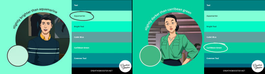
The two stripes on Mark is a brighter shade of aquamarine while Debbie's top is a darker shade of Caribbean green, and both colors are near to each other in the color spectrum. Which is definitely something we can describe their relationship: they are close to each other.
I always thought that the stripes across Mark's chest was sort of a subtle design thing to show that he keeps his mom, who represents his humanity, close to his heart. Seeing that Debbie got her colors from kid Mark adds a whole new layer to it.
This is the part where I compare the then & the now:
The reason why I mentioned Eve would never have picked up yellow with Zak in mind was that he was just a temporary figure in her life. Eve used to wear pink so much before, it was her favorite - so one can assume that the color itself brought her joy. You see Betsy wearing pink (this is the episode Eve left "home"). So my reasoning for Betsy wearing this color was to appease Eve, while Eve wore yellow to represent her trying to please her mom.
For Debbie and Mark, it was crucial for Debbie to wear the colors Mark wore as a kid. Throughout the series, we see how desperate Mark wanted to be like Nolan, to be good with his powers so he can be a good hero. One would think that Mark would have incorporated red in his outfit, but he didn't. What stood in the place of red in Mark's outfits was yellow, a color that's close to red in the rainbow arrangement. Using the same link for the meanings of the color yellow in cinematography from earlier, Mark's yellow symbolizes two things: naivety and idealization.
See how Mark has a yellow button-up underneath his sweater? It's his naivety about his father, it's not all out there yet it's on all the ends of his sweater as if making sure you know that the yellow is something that should be seen. And Mark's yellow I in his costume? That's idealization. In his eyes, Omni-Man is (probably, I can't speak for Mark 100%) the best hero. He idolizes his dad, there was never a doubt about it. He has put Nolan in such a high standard that there was more yellow in his costume to represent his idealization rather than his own signature blue.
That's why it's so important that Debbie wore his colors from the Atom Eve special in season 1. That Mark sees that on his mom. It was a reminder of kid Mark. That even then, he was just as precious. That he mattered even wayyyy before he had powers. That he mattered because of his humanity.
[inhales deeply to catch my breath] NOW FOR THE FINAL PART!!
i'm sorry this is so long i had so many thoughts about colors, color symbolism in characters is so personal to me.
you guys can skip these pics and list cause this is kinnnnd of a stretch now hahajsdfha - feel free to go straight at the portion after the bullet points end, that's just my final ramblings dedicated for season 2
Back to topic of colors!! It's obvious at this point how relevant both Mark and Eve's moms are when it comes to their colors. So it leaves me with two remaining things about Mark and Eve: (1) the color red on Mark on his casual outfit and (2) the color pink on Eve on her casual outfit
The only moments we saw red on Mark that isn't blood is when he wore his bag. Now I know this is a pretty small thing but that bag could literally be ANY other color - and it isn't, it's specifically red. It could have been white to match his shoes or black to match his hair but it's neither of that. It's red. It's Nolan.
I think it's really important to know the relevance of that red bag, especially in those two pictures. (1) The moment Todd was harassing Amber and Mark wanted to intervene, it's totally obvious that Mark carries the heavy fact that at the moment, he's powerless unlike his dad. And it sucks. Cause he's his father's son and even though he carries his blood, at the time, he doesn't carry Nolan's powers. It doesn't stop him from defending Amber, but it still hurts bothliterally from Todd's hits and emotionally. Mark's carrying the feeling of inadequacy cause he has no idea how to defend himself in this situation, his dad never taught him how to fight because he didn't have powers.
(2) The second picture was Mark rushing to school because his training with his dad made him late for class. He got powers now, and it's literally dragging him from his education (among other things and that's including his relationship with Amber). His power of flight, no matter how fast it is, doesn't get him to places on time. Even when he got his powers, he still had problems. They actually piled up now.
Now as for Eve, sure her casual attire doesn't have any pink on it but her bags are pink!! (1) The first picture of her was when she and Mark met at school. During my first watch, I found it cute that she held on to the straps cause it's a little habit of mine when I wear backpacks. Then at the (2) other picture where she had her luggage out so she can run away from "home", I noticed they're pink too. And it's a small observation but compared to Mark that just lets his bag hang down, Eve holds on to her bags.
The bags are both pink, and pink is her color. It's not a piece or part of her, it's her. Pink has been something she deprived herself to wear but it's something she still wants to keep, even if it's just with bags. It's the thing she's comfortable to carry, it's something she wants to hold in her hands.
I know bags are a practical item for any student to have and I overthought a lot about their bags' colors but yeah hahasdfjasdfha I'm done with that now
CLOSING WORD TIMEEEE HAHAHADSFAHFAHA
man that was a lot, anywayssss
The season 2 poster showed that Debbie has a new outfit. As for Mark and Eve, they're both wearing their hero costumes.
Slight spoilers from the comics: When Nolan left, there was a time that Mark began to dress himself in a style similar to Nolan (I can't tag op for some reason :(().
I feel there's a big chance Mark and Eve will also have new casual attires this coming second season.
Mark is likely to dress similar to Nolan just like in the comics. He will definitely have questions about his identity now that he knew the truth about Nolan, so I think Mark won't be able to wear his usual colors to show that he's figuring things out.
Mark could also wear that blue and black costume, the one that doesn't have the yellow anymore. Because he won't be idolizing his father's heroic persona anymore.
Mark, of course, misses his dad but he won't be looking up to him anymore after what happened.
As for Eve's season 2 casual look though, now that she has her own treehouse and starting to feel free from her parents, I hope she allows herself to incorporate pink in her clothing. She deserves it <33
#invincible#atom eve special#mark grayson#debbie grayson#atom eve#samantha eve wilkins#betsy wilkins#long post#character analysis#color analysis#color symbolism#i will definitely edit this later but now imma pass out hahasjdfhadfa#would ya'll believe me that styling eve in sims is what led me to this color analysis rabbit hole? (w-would ya'll also like to see said sim#outfits i assembled for her-)#summer.txt#summer.jpg
221 notes
·
View notes
Note
Hello Dutch, don't you think Cloud kissed Tifa too soon? The big reveal in the Lifestream scene is the hidden romantic feelings Cloud had for Tifa, but now that revelation won't be as impactful because he has already declared his feelings for her.
This is actually something I've been thinking about myself, and I think that you could definitely make an argument for this being the case. That having been said I think it's a matter of personal….for lack of a better word, choice. I think you can choose to be negative and see it as such, but rather than looking at "what could have been" you can also choose to look at what we actually got and see if there is a positive way to see it.
First lets look at what we didn't get though. We didn't get 2 games of Cloud and Tifa not showing any romantic interest in each other…..can we agree that that's a good thing? Because honestly that would SUCK!!!!! And if we consider how bad the backlash was back in 1997 when the "Tifa is the true love interest" reveal happened in the game itself how bad would it have been if we'd instead had had 8 years and two games of them seemingly being mostly platonic?
People would be absolutely bamboozled, they'd feel it came out of nowhere and probably have felt rather scammed. Clotis would have hated the first two games with a passion, and Cleriths (which would include every new player) would be rioting at the third.
So then the choice is between including it subtly, or going all in. Well, if they went subtle, it would still be noticeable, so the idea that Cloud might have a crush on Tifa would still no longer be a reveal. This isn't 1997, models have facial animations now, they have micro expressions. Back in 1997 being "not interested" or being in love was represented with the same vertical stripe, so regular interactions essentially revealed very little information about a characters emotions.
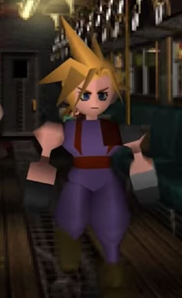
Pictured: Complete disinterest, or, complete sexual desire. You decide!
But in 2024 the same thing no longer applies. Every sentence, even the simple speaking of a name, comes with a host of meaning. You can't have Cloud speak Tifas name as though it means nothing for 2 games, and still expect people to be on their side when it comes to romance. And you can't expect people to hear Cloud speak Tifas name with longing for 8 years and then still be surprised that he's into her.
So the reveal was always dead in the water, and they instead went all in, because why not? You see, the reveal isn't exactly that Cloud is in love with Tifa. The reveal is the depth of the love, how far back it's gone, and all the things it has caused. Not just that Cloud has and had a crush on Tifa, but that it's been his entire raison d'etre for the past 10 or so years. When Yuffie asks Cloud whether he liked Tifa when he was younger, and he answered "don't remember", this scene suddenly became a lot more poignant as the player realizes that was actually either a bold-faced lie, or very tragically ironic.
The viewer is left wondering if Cloud, even as we were playing him then, was at least aware of his love of Tifa, but wasn't showing it due to his mask, or if even he genuinely forgot the very thing that set him on this path (personally I think that while Cloud is totally unsure of who or what he is, that he is 100% aware that he deeply loves Tifa, even at the start of Remake).
And if we're going to be explicit anyway, then what difference does it make whether he kisses her or not? The reveal that Cloud likes Tifa is gone with or without it, so might as well go with it. And while the reveal might be less impactful for us, there is one person who, even with the kiss, will still be blown away by it. The most important person, Tifa. To Tifa the kiss probably didn't reveal as much as it did to us, because Tifa has no clue what is really going on with Cloud, nor the state of his psyche. With everything he's been doing she could very well be wondering if the person who kissed her was even Cloud. So the reveal that it wasn't just Cloud that kissed her, but that it's so utterly him that he had been longing for it his entire life will feel SOOOOOOO unfathomably relieving that the mere second hand experience that we the player will get through empathy with Tifa will more than compensate for any loss of shock, IF it is done right.
So I guess what I am trying to say is, don't worry, the reveal isn't ruined. Because the reveal will still recontextualize everything that came before it. Before the reveal Cloud hugging Tifa in remake feels like a dude being hugged but being a bit uncomfortable because of his brooding personality, and not knowing what to do, but deciding to hug back because he's grown closer to his childhood friend over the course of the game, and has developed some feelings for her (essentially what Cleriths think Aerith and Cloud are experiencing at the end of Rebirth XD).
After the reveal Tifa hugging Cloud feels like a huge dork getting everything he's dreamed about his entire life and having absolutely no clue what to do because he's so shy and awkward and "omg I never thought I'd get this far, don't screw this up, don't screw this up". Before the reveal Cloud kissing Tifa feels like a cool guy who loves Tifa giving her the kiss they both desire, but probably Tifa most of all. After the reveal the kiss feels like Cloud winning a thousand jackpots at once. A sweet boy whose heart is probably pounding out of this chest and is barely managing to stay cool.
And there is a second improvement to the story resulting from the kiss. Namely the increased sense of loss and pain associated with Cloud drifting away from Tifa and finally breaking. In the original its sad to watch Tifa cry out about losing Cloud, but it's nothing compared to what we get in Rebirth, let alone what we will hopefully get in part 3. There can be no doubt that the reason it hits so hard when Cloud rips away Tifas hand in the temple of the ancients after he tried killing Elena is because the game so effectively established the bond between Cloud and Tifa. Him forcefully removing her hand has become viscerally shocking. Both because it now shows extra clearly how far gone Cloud is, but also because it makes Tifas experience extra tragic.
Without the romance and kiss it would have just been Tifa losing the Cloud she had found by the tracks. She wanted to find the boy she'd fallen in love with, she had wanted to rekindle something, but ultimately she wouldn't have done so, and therefore losing him would feel less painful. It's far more painful to have something and lose it than to never have it in the first place. With the romance and the kiss Tifa actually found that boy and bond that she'd thought about for so long. And to finally find that one sliver of happiness and then to have it ripped away right when she needed it most…..well it cuts twice as hard. When she takes care of Cloud in Mideel, knowing what she lost, having only ever gotten that kiss…..well, it cuts twice as deep.
And of course, this will also make the reveal in the lifestream that she never lost the real Cloud, all the more amazing. (OH THANK GOD, I finally figured out why TUMBLR was randomly not allowing me to post longer posts)
70 notes
·
View notes
Text
tigris hating the new snow (colour symbolism + minor meta from this scene)
i'm so deeply obsessed with so many of the colour choices in tbosas movie.... like wow! one day i'll talk more about them, but one i want to pull out and talk about right now is tigris' colour scheme in her last scene. the one where she's wearing this:
(the picture is not great quality, i'll update this when i have a pic that's more than 2 pixel lol, but it shows what we need to see)
she's got on a light purple/lavender dress with dark blue stripes. blue and purple are usually associated with wealth and royalty (given the historic complications that came with producing them).
purple is especially representative of royalty and wealth, and tigris' outfit is mostly purple, symbolizing the new (wealthy) life that she's found herself in.
blue, along with it's other meanings is associated with melancholy. we know that tigris is unhappy/heartbroken/disappointed with snow's changes, so this link makes sense. it is also a passive colour, showing us that she is passive in coryo's transformation into snow -- there's not much that she can do about it anyway, but i digress. the deepness of the blue implies something tumultous, which gives us an insight into what she's likely feeling: relief at being out of poverty, happiness for coryo's success, but a deep sense of uncertainty and unease at this new snow persona that he's adopted. finally, it can also a colour of peace, which i take to mean that she's sort of made peace with what she cannot change about him, regardless of how she may feel about it.
now we get to the standout of this outfit: the red lip!
usually we see tigris is lip colours that are complimentary to the other colours she has on from what i recall; when she wears pink, her lips are pink, when she's got on dark magentas her lip colour matches/compliments it. the red lip here is clearly an intentional choice as it is a contrasting colour that stands out brightly against the mostly subdued/cool-toned rest of the outfit.
red can be recognized as the colour of passion and anger. the fact that it is on her mouth is certainly trying to show us something. what she says to snow here is "you look just like your father, coriolanus". it is clearly a dig, clearly meant with negative intent, with anger. she is heated! this is the little boy she grew up with, that she protected, that she loved and he's morphing into something sinister before her very eyes. if it wasn't clear by what she said, the subtext behind it, and the way that she said it, the red lip indicates her anger here.
it stands out as a little piece of rebellion against just accepting snow the way he is. she is clothed in colours that show her wealth and complacency with the changes that caused them, but she isn't entirely willing to let it go all the way.
also, she wears warmer colours for a lot of the movie -- pinks and the like -- and now she's in more cool tones, which is an obvious choice being made. she loves coryo (perhaps not snow so much), and she is letting herself be swallowed up by this new life (symbolized by the royal colours and new wealth), but she has that little bit of her that is clinging to the past, that wants her coryo back.
her (minor) dissent against snow is verbal, it is subtle and not exactly obvious to anyone except her and him, in the same way that the red lip is a subtle way of emphasizing her displeasure with this new snow.
she chooses her words very carefully, tailoring them to be a direct referral to her convo with coryo after the arena ("i know you wanna be like your father, but, what i remember the most about him, was that in his eyes it was just hate. you don’t have to pay the same price just to survive. people can be good. you can be good"). snow is like his father, who tigris remembers most as having hate in his eyes. coryo didn't have to pay the same price just to survive, he could be good, but he paid that price anyway.
in the full quote from her last scene, tigris says "i think you look just like your father, coriolanus." This stuck out to me because I don't really remember her ever calling him by his full name often (maybe just at the start when we get the "future president of panem" thing). it seems like perhaps he insisted on; he's not coryo anymore, he's coriolanus snow -- no, he's snow; it could also be something tigris did intentionally. either way, it shows that he is not her precious, still-able-to-be-good coryo anymore.
another interesting thing from this scene is her positioning. she does not rise for him, instead remains sitting at her sewing machine (someone look back and see if its a new machine or if she's using the same one as before!!). she does not rise to greet him happily like the Grandma'am, she remains seated, clearly showing her displeasure at the new snow. plus, usually rising when someone enters a room shows respect; tigris does not rise, ergo she does not respect him!
this also makes me believe that she is not making his clothes anymore (she's at the sewing machine, clearly she can make the clothes, but he grabs the coat out of the closet, showing that it's not a tigris snow original creation). it's a contrast to how we first see adult tigris, rushing up to coryo with a shirt she made/modified. now she keeps her distance and doesn't give him clothes. this shows that huge huge huge pit growing between them. once again, this is not her coryo anymore.
i'd assume that she initially was offering to make/alter his clothes, but somewhere along the way he refused. it's a sign of the hard times when all he had to wear was too-small shoes and potato-starched shirts sneaked in with curtains to be bleached. buying new clothes shows power and wealth and coriolanus' 'impeccable, well-bred, respectable taste' that comes from being a snow.
regardless of the how, she's not doing his clothes anymore, she's displeased over the new snow, he's not her baby coryo anymore, and the distance between them has never been bigger, not even when he was all the way in 12.
#the ballad of songbirds and snakes#the ballad of songbirds and snakes meta#tbosas#tbosas meta#coriolanus snow#tigris snow#tigris snow meta#coriolanus snow meta#panem#panem fashion#the capitol#president snow#coryo#snow lands on top#suzanne collins#thg meta#thg#mine
116 notes
·
View notes