#which is gonna mean a lot of headshots of lil guys
Explore tagged Tumblr posts
Text
WAAAAAIIIIIIT I GOTTA TELL YOU SOMETHING‼️‼️
I am opening a SALE on my Transformer commisions!
So all my fellow, girls, gays and theys read below for infomation! >:))
Hey-! Its me! Rexi! I am a LOVER of Transformers! They make me so insanely happy and it's kinda becoming a problem ^^'. AnyWHOO!
I am offering all you silly lil guys a sale on some transformers related art! In about 2 weeks I'm going on a large break from my studies and thought what a perfect time to advertise! Specially with the hype surrounding TFO which was- MWAH! ✨️ chef's kiss 💋 ✨️
Anywho what does that mean for you my dear lil transformer fan? It means I'm gonna be drawing your Transform ocs ar a discounted rate! Woah! Below are some examples of my work with their now respected sale prices! I'll only have 5 spots available so hurry up~!
Open: 5
A simple headshot sketch~
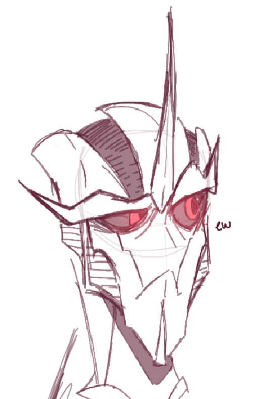
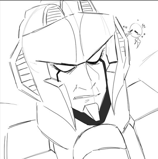
$15USD
Extra add ons
Extra character= extra $5USD (per character added)
Simple colours akin to first image = $5USD
A cheeky coloured sketch~
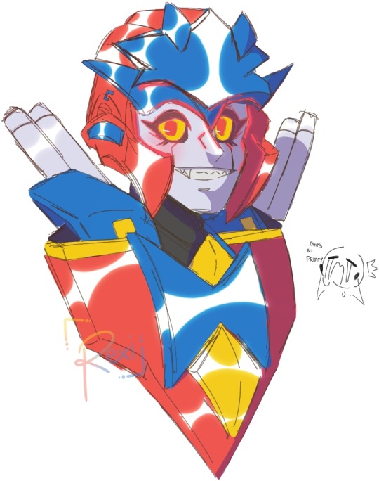

$20USD
Extra add on
Extra character = $10USD (per character)
A pretty boy rendered headshot peice~
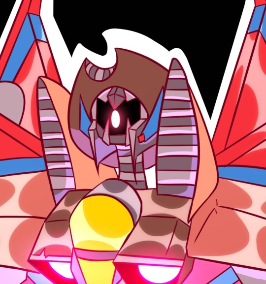
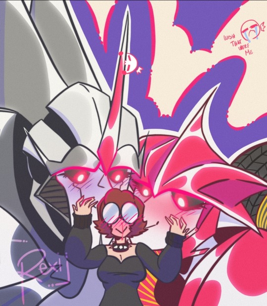
$35USD
Extra add ons
Extra character= $15USD (per character added)
Half Body, fully rendered peice~

$60USD
Extra add ons
Extra character= $30USD (per character added)
RULES:
Will draw:
OCs
Cannon Characters
Cannon x OC
Oc x OC
Transformer x human
Won't draw:
A lot of gore
NSFW
Problematic art
A few more rules to note: my art is not to be used for commercial use. If you repost my art or use them for your oc please add a credit!^^
#art#digital art#procreate#artists on tumblr#art commisions#transformers#macaddam#oc art#taking commisions#art commission prices#commission sale#maccadams#macadam#maccadam transformers#mecha#transformers prime#transformers one#d 16#d 16 x orion pax#orion pax#starscream#so much starscream
38 notes
·
View notes
Text



posting these design ideas on main because why not
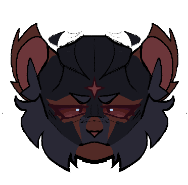
working with how I want to possibly redesign cat!miguel (Reclusestar in the warriors AU), here’s a few quick headshot ideas for em :)
dunno which one I should go with, but I’ve got some notes on each
Original:
Dark blue-grey tortoiseshell with reddish brown markings meant to replicate his most recent suit design. Small, slightly curved up ears with tufts around them that I want to stay in the design regardless of the fur color. A 4 pronged star on his forehead that will also stay true to every other design (supposed to be his leader mark. Usually I like the idea of leader marks either being like.. spots or stripes or something else but a physically inflicted marking not only fits his role better but is also just more visceral and reflects the implied and not so implied cruelty of StarClan in the warrior cats series. For those who don’t know StarClan is like… a holy amalgemation of all of the cats ancestors that went from this mysterious and whymsical force in the first series to unreliable and actually manipulate due to how biased they are.)
— why is he blue
— not accurate to comic design
— more accurate to his movie design, however, I believe the blue in his suit is meant to be light bouncing off of a black suit. So still isn’t exactly accurate
+ simple, easy to replicate markings and probably easy to animate (haven’t tested it but seeing as he barely has any floating stripes or markings other than his star marking it’d be easy to do frame by frame)
+ bluestar
original but the blue is changed to black.
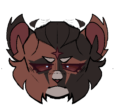
Classic black and orange tortoiseshell. Same other features mentioned before.
— boring. Yawn.
+ the mask markings are more prominent
+ the most accurate to the comics. Miguel has a black and red suit.
same as the last 2 but with a darker blue-black tint
— still blue :/
— his eyes blend into his face and it bothers me
+ colors are actually really nice
+ average cat Miguel design honestly this is how everyone draws him
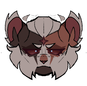
tortie-tabby dual colored cap mask. Instead of the usual ginger ear tufts he has white, and he has a lot more white in his design than usual
— I don’t like how much white I used for this design, I don’t think it works.
— replicating the fangs in the mask was kinda difficult I didn’t know if I wanted to make it a stripe or apart of the base mask so uh
+ is a tortie-tabby
+ accentuates his jawline!! The other designs did before as well, his markings are just placed a little differently here
+ the white hair is cute
Half and half tortie with minimal white markings (I’m leaning towards using this one)
+ I really like half and half tortie designs
+ cool symmetry
+ he looks like a lil guy here.. just lil.
— jawline isn’t ver visible, especially on the dark brown side :(
Half and half with medium white markings
+ same perks as above
+ accentuates jawline better than the others
(If you’d like please rb for a better sample size for the poll below :3)
Here’s an optional poll, just to see which ones people like more (doesn’t mean I’m gonna choose that one)
#atsv#across the spiderverse#miguel o'hara#warrior cats#procreate#digital art#cat miguel#cat au#warriors au#warrior cats au#designs#✭ Spider scribbles ✭
27 notes
·
View notes
Photo

bus jones was the first to bless my new sketchbook
#cats#cats the musical#bustopher jones#traditional art#markers#alcohol markers#self indulgent things Only in my new crescent rendr sketchbook#which is gonna mean a lot of headshots of lil guys#and perhaps lil fellas
184 notes
·
View notes
Text
Steam Games Festival: I played so many demos. My thoughts...
I spent a few days playing as many of these demos as I could and wrote down some rough impressions.
Black Book (Morteshka): Heavily atmospheric and steeped in Slavic mythology. You play as a Slavic woman named Vasilisa, attempting to bring back her husband, who has committed suicide, back from hell in an effort to save him from the eternal damnation that their religion believes befell those who commit suicide. She becomes a witch after venturing through the gates of hell and back. The gameplay takes several different forms, depending on what you’re doing. It’s got some point-and-click adventure game elements during the more exploration focused scenes. Sometimes you’ll find herbs that can be used as items later during combat. The combat plays out like Slay the Spire and other deck builder games of the ilk, with the key exception of the spell slots. Instead of the standard 3 energy system restricting card usage each turn, here you have 3 slots that can be filled with spells that correspond with the slot type. You have 2 Order slots (big spells) and 1 Key slot (little spells) you can fill each turn. It’s a small twist to the formula that opens up a lot of interesting possibilities and combinations. In between fights and the point-and-click scenes you’ll get to interact with people you meet along the path to your destination and make choices that effect the story and your character. Vasalisa’s journey looks bleak and full of death, and I’m interested to see where it goes.
AK-Xolotl (Daniel Piqueras Constantin): Fast paced, adorable and aggressive top down shooter. Very simple gameplay of shooting down waves of enemies picking up weapons and items that drop when they die. Feels great to play. Good movement, good dash, not much else to ask for. Really quick and snappy shooting and simple gameplay loop me keeps playing again and again just to get a higher score and see what new stuff it has to throw at me. It’s got really cute pixelated graphics and lots of forest critters with guns. The game also features an absolutely filthy death metal track that’s a perfect representation of how aggressive the game really is. Just a really quick and dirty time that definitely makes me want to see the finished product. Also, I love the lil axolotl guy.
Despot’s Game (Konfa Games): Rogue-like dungeon crawler where you control a mob of humans. It’s a pretty cool and complicated battle system my only problem is I can’t help but feel like I don’t have enough control on the outcome of the fights. It’s almost a little like Totally Accurate Battle Simulator in that way. Basically, your run begins with you purchasing a bunch of little humans and different weapons to give to those little humans which will give them a class. Give a little guy a medkit and now he’s a healer, give someone a gun and they’re a shooter now. Humans with classes have special abilities they can activate when there are enough classes of that type on the field. Like an Auto Chess (Auto Battler?) game, if you have, say, 2 or 3 Fencers on the board, your fencers will now have access to their special ability, a dodge roll. Position your people in what you hope is a tactical formation and start heading for the dungeon exit. Most rooms consist of a fight, which plays out automatically. When you press go on a fight, your troops and the enemies will all start fighting until only one side remains. This is where the game loses me a little bit as it’s unclear how much of a difference positioning makes or what more I should be doing to change the outcome. Did I win this time because that unit was farther up than last time, or did the AI just play it out slightly differently that skewed in my favor? I can’t tell if the changes I’m making are actually making a tactical difference, or if the AI routines are just clashing with slightly varying results each time. You’re gonna lose units a lot but they are pretty disposable, with frequent shops for buying reinforcements or new gear. And every unit contributes to your mob’s total hunger meter, which deplete with every new room you enter. You have to buy food to feed your troops to keep them from losing effectiveness. Bigger team=greater food consumption. Gotta find a balance with your money and spending it on new units, new weapons, and food. I really wanted to like this game more because I really dig the hook of building up a mob of little guys with cools powers and I like the unit synergy system as well, but the perceived lack of control over how the fights play out and the game’s edgy humor ultimately pushed me away.
Dead Estate (Milkbar Lads): Fairly generic zombie shooter rogue-like (there’s gonna be a lot of rogue-likes). Your standard twin-stick kind of shooting you’d find in the Binding of Isaac or Enter the Gungeon, except here you can jump, adding some verticality. Explore each room, kill the zombies, find the key and then find the elevator to the next floor. Sometimes you find a new gun or shop along the way. The movement feels pretty slow and the rooms feel small. Too many times would I walk into a room, fight three of the same zombie then walk int next room just to see two more of that same zombie. Too many times did I have to walk back across a whole level at a snail’s pace. Needs more enemy variety and to move a little quicker. The shooting is a little better, I like how the game makes its weapons feel distinct by how much it kick it has. More powerful weapons will push you back with each shot. Unloading the mini gun felt chaotic and rumbly that make you slide back and wiggle in a fun way. You can usually kill most enemies before they’re even able to do anything makes them unique, rendering most enemies the same “zombie that walk towards you for second before you finish them off.” Didn’t really draw me in or entice me to see what I might encounter on higher floors.
Foregone (big blue studio): This one feels a little like a watered down Dead Cells at first, AT FIRST. It’s a little slower and less snappy but it’s still very fun. Plus it’s more of a linear 2d action platformer with lots of loot. I like the loot aspect here quite a bit; watching a bunch of currency fly out of enemies is satisfying in a “headshot kill in Destiny kinda way.” Just a bunch of fun particles and a frequent gear drop that has you constantly popping open your inventory to equip your new gear and make those numbers go up. If that’s your kind of fun, you can definitely find it here. Lots of weapon variety on show here and most, if not all, of them feel unique. Just wish the combat was little tighter, which since this is a demo, I assume will come in due time. The game could also do a better job of informing the player that they’re taking damage, which made it difficult to hone the timing on the dash to avoid taking damage. And I’m hoping the environments of the full game become a little more diverse and sprawling, right now it feels like it’s mostly individual rooms/levels of engagement at a time. Excited to see how the full release pans out.
Tunche (LEAP Game Studios): Immediately drawn in here by the beautiful hand drawn art style. It’s a brawler roguelike and if you know what those two words mean in the context of video games, that’s all you really need to know. The brawler combat is what it is, very combo and juggle heavy, enemies that take dozens of hits to kill, fairly bland and just flat land environments. Walk forward until you’re stopped, fight a bunch of waves of enemies, rinse and repeat. Except this time you occasionally get upgrades after finishing rooms like “chance for attacks to cause burn” and “chance to regain health on hit,” your standard rougelike fare. With the territory comes the roguelike difficulty, and this game is plenty tough with the amount of enemies it throws at you and how limited your health pool can be. All of the art and the animations are what really shine here, and if you’re into that brawler style combat, this seems like a pretty good one of those.
Power of Ten (Pew Times Three): Next up we have a top-down space shooter roguelike. I like the minimalistic pixel art style in this one. It helps with atmosphere and you making you feel like a small ship in a large system. Your goal is to power planetary shields on inhabited planets throughout the system by gathering resources from asteroids. While you’re hunting asteroids, pirate ships will randomly attack a planet, pulling you away from resource gathering into a space dogfight against the pirates. That push and pull of gathering resources to fuel a planets shields while simultaneously protecting the planets whose shields are not yet charged is the core loop here that I really like. Conveying solid, core gameplay loop that’s engaging is exactly what you want to get across in a demo, and they definitely deliver that here.
Jelly is Sticky (Lunarch Studios): A lovely, casual sokoban puzzle game. Sliding around and rearranging cubes of jelly into oblong structures to match highlighted areas within a given space. You’ll encounter jellies of different qualities along the way, all with their own quirks around how they like to stick. I really like the non-linear structure in the over world, letting you navigate around between levels from all of the jelly-archetypes at any time. Solving sets of levels will unlock jelly in the over world you can stick to and rearrange to give you access to further levels gated behind walls and other triggers. It’s an appreciated extra layer of depth you don’t expect from a puzzle game that could have very well presented it’s levels in an ordered, level-select screen.
Potion Craft (niceplay games): In this game you play as a budding alchemist trying to make your mark on the world in your newly acquired (stolen possibly?) alchemy shop. Its an alchemist simulator. It’s presented in an “alchemy text book diagram-style” that’s immediately endearing. Every day, you collect ingredients like herbs and fungi from your garden and then it’s time to open shop. Customers come and share their plight, asking for potions of different types. They’ll offer different prices for potions of different potency which you haggle up further (or lower, if you mess up) through a simple timing mini game. The actually potion making is puzzling and unique, if not occasionally limiting. Ingredients you add to the cauldron determine a path that the potion icon in the center will follow across a fog covered map. Add more ingredients to add length and direction to the path, trying to build the path in a specific way that will lead to a “?” destination marked on the map. Name the potion, choose a bottle and label, and brew it. You’ll learn what it does, and can save the recipe for easy use again later. The only downside is how limited the ingredients are makes it very punishing when experimentation results in failure, all those ingredients are just lost. It seems like the game really wants you to just fill the orders at hand instead of blindly exploring into the fog to see what weird stuff comes up, which is my favorite thing to do so far. This is still easily one of my favorite demos of the bunch and has to be seen for oneself.
Aeon Drive Prologue (2awesome studio): This is definitely one of the ones I wanted to like more than I did. A self proclaimed “speedrun action platformer” and it demands that go fast. Very short 2d platformer levels with an ever ticking clock. If the timer reaches zero before you reach the exit, you fail the level. Consumables lined throughout the level can be used to add more time to your clock. This game is very punishing, one hit from anything, from enemy to stage hazard, will cause you to fail and restart. Very quick movement and a focus on chaining together different moves to find different paths through the level. There seemed to be benefits like special collectibles for taking more inventive, alternative paths, but the ticking clock really kept me tunnel-visioned on the most clear cut route through the level, meaning I only ever small a very tiny portion of each one. I’m not the type of person to butt my head against how to pull some crazy route as opposed to the clearly laid out one in front of me. Unfortunately, that clearly laid path just isn’t very fun to take. There’s also a dagger you can throw and teleport to, which I found difficult to aim and not as fun to use as it sounds. There is definitely something here, it’s just ultimately not for me.
Medievalien (dOOb games srl): Action RPG roguelike in a medieval world that has been invaded by aliens. You play an amnesiac protagonist trying to undo the calamity through repeated attempts from within a magical (or scientific?) time loop. Commence genre mashup. Nothing particularly stands out here. Two weapon slots and two throwables slots, lots of different items to fill them. Your weapons consist of bows, crossbows, and staves, and the throwables are bombs of varying elemental effect. It’s fun to play but fairly middling. The low poly art style doesn’t do anything for me and the soundtrack was forgettable. Still, if you’re like me and enjoy ARPGs and roguelike, it does the thing well enough to scratch the itch.
Minute of Islands (Studio Fizbin): Right out of the gate this 2d narrative platformer hits you with gorgeous hand-drawn art. A poisoned, decaying world that is beautifully drawn and animated. I’m gonna day this is not the best demo. The pace is very slow and the objectives are linear and don’t even register as puzzles. This game calls itself a puzzle platformer yet there were no puzzles to be found in this demo. I’m assuming the demo is trying to preserve story details so it starts at the beginning and only gives you a small slice from there. So maybe the game introduces more puzzle elements later in the game. But what’s left in the demo is not very compelling to play. The impressively detailed environments and atmosphere are only driving forces so far. But extremely strong forces at that.
Alekon (The Alekon Company): This feels like spiritual follow up to Pokemon Snap in all of the best ways. In its most basic form, the game plays exactly like Pokémon Snap, but builds on the nearly 30 year old classic in several key ways. Creatures in this game are called “Fictions” and whenever you take a picture of a new fiction, the creature also appears back in the game’s hub world. Once back in the hub world, you can talk to the fictions who have moved in and they’ll give you small quests to do that’ll usually reward you with key game features, like a zoom function for the camera. There’s a great feature that involves capturing photos of a fiction in all of its potential poses, which will unlock the ability to “see through the eyes of the fiction.” So when you’re looking through the album of your saved pictures, you can apply a fiction filter to see the image as a particular fiction would see if through their own eyes. Also, once you’ve unlocked all of the different routes in a specific biome, you gain the ability to “wander.” Wandering is free from the rails of the standard routes and allows to explore every inch of the biome and find other fictions that were previously hidden. It’s also a great space to snag that perfect picture of a fiction you couldn’t get while riding the rails. The creatures themselves are kind of hit or miss so far in their design. Sometimes it’s literally just a seal, sometimes it’s a ridiculous alien thing, but it seems like the personalities of the fictions are what makes them unique. Even though I didn’t care for the designs, I found myself endeared toward the creatures once I found them back in the hub and helped them with their troubles. There’s some good writing in these bits that really helps sell me on these creatures. Lots to love here if you’re into games about snapping pics of critters and throwing donuts.
Eat’n Eaten (Gaëtan Benoit): A cartoony tower defense game with bug plants. Bugs that grow from plants. It has a really fun and easy to understand “food chain management” system for building up units. It almost feels like it was designed to translate easily to touchscreens for mobile devices. Your soil has 100% nutrients, plants grow and feed off nutrients, plants grow apples which you can pick who will then become your units. When an apple dies it’s corpse returns nutrients to the soil and it’ll drop a seed that will grow into a new plant. If you don’t pick the apples off the plant long enough for them to consume extra nutrients, the apples will become a caterpillar. Pick the caterpillar off the plant and now you have a more offensive unit, who needs to eat apples to survive. The game only builds on the loop from there; the way bugs will level up into new or stronger forms after eating enough fruit, or how the game will add spiders to your team who will then need to eat caterpillars to survive. Manage this whole food chain to keep a steady supply and distribution of units against waves of enemies. I don’t know if that seems confusing when put into word like that but it’s really quick and simple to pick up they way it is presented. It can definitely get a little frantic at times but that’s when the game is at it’s most fun.
Dorfromantik (Toukana Interactive): Chill, colorful, tile placement puzzle game about building a village landscape. You start with a deck of 85 hexagonal tiles, and it doesn’t end until all the tiles have been placed. You’re placing tiles with the intent to line up as many like edges between adjacent tiles, making longer and longer networks of landscapes of matching type. The way the scoring works and how the game conforms matching sides together does a good job of making the best place to put your tile one that not only scores well but also looks good in the context of the interconnected village landscape you are ultimately trying to craft. I would kill for this game on Switch.
Unsouled (Megusta Game): An isometric pixelates dark souls-style action game. Described as an “ultra-brutal” game with “fast-paced and savagely rewarding combat,” Unsouled comes exactly as advertised. The combat in this game is very difficult and I am simply not the person to conquer it. It’s really fast paced yet proper movement and combat requires consistent timing and punished button mashing. Every thing you do has to be deliberate and calculated as it’s easy to lose control of the battlefield very quickly. Even just a few enemies can be dangerous as they all can dodge and block and roll just like you. The game is unafraid to put the pressure on and throw ten enemies at you all at once engaging from different ranges. The game demands that intimately learn the combat systems if you want to keep your stamina and health high in the heat of combat. I’d bet that if you’re a fan of Dark Souls or souls-like games, this game has all that difficulty but a different pace of combat that doesn’t feel derivative.
Rogue Invader (Squishy Games): Immediately I love the look of this game. It’s got this old school 1-bit black and white look to it. It also opens up with a fully animated and voice acted cutscene. The game is actually pretty difficult. It’s a side scrolling shooter where you’re part of an army in invading an alien planet one soldier at a time. You’re also managing weapon heat and breakage, and carry weight effecting run speed. Each soldier gets body armor and a pistol but you can equip them with a rifle and helmet from your armory. Which you’ll definitely want to do considering you die in one shot if hit in the head. When you’re soldier dies, they lose the gear you equipped them with and the new soldier needs to be equipped with whatever you can craft in the forge. This is where I ran into issues with hardy ever having enough materials to craft a helmet, go into a mission and die early to a single stray bullet to the head, and subsequently not earn enough materials to make a helmet. The evasive controls like jumping, running, rolling and taking cover all felt clunky in my hands, add that to fact that bullets often just miss even if you’re aiming right on an enemy, and it made for a pretty unsatisfying game to play.
Devastator (Radiangames): How is this not just Geometry Wars? Because this shit is just geometry wars. Fortunately, Geometry Wars slaps so this game is still pretty fun. But just go play Geometry Wars. There, I mentioned a different game like five times more than the game this was supposed to be about.
ANVIL (Action Square): Co-op top down shooter roguelike with space marines. It’s like a run-based Starship Troopers game. It’s pretty great. The three characters unlocked in the demo all have different weapons and abilities resulting in very distinct play styles between classes. There’s a fairly simple loop to each floor: search the floor for the boss, along the way areas will be filled with enemies, who’ll drop money, which can be used to buy passive upgrades from chests found throughout the floor. The upgrade system allows you stack multiple of the same upgrade for increased effect. Lots of variety in the enemy type really keeps you on your toes. Unsurprisingly, it just feels good to mow down mobs of space bugs.
Orbital Bullet (SmokeStab): A 360 degree shooter platformer. It’s a really cool gimmick actually, you move in 2d but in ring around a 3D space. It’s makes for some cool looking environments and depth from having inner and outer rings you can switch between. Really fast and arcade-y feeling. Snappy movement and gunplay. There’s seems to be a lot offered here among different weapons, in-run upgrades and meta upgrades that persist between runs. Which makes this a roguelite, as opposed to roguelike, which I tend to prefer. I like having something upgrade outside of my runs to make me feel stronger or different going into the next run. The games has a sort of ancient alien aesthetic, it feels industrial and monolithic. The bursts of neon in the walls, enemies, and weapons really pop among the ruins of the stone temple. Watching your weapons’ shot glide along the curve of the world is an effective visual as well. Just because I clearly like to compare to games so much, this game feels a lot like Resogun meets Downwell, and that’s just fantastic.
Chicory: A Colorful Tale (Greg Lobanov): A colorful and cartoony adventure game about painting that takes a small but welcomed bullet hell turn. You play as a cute little pup that claims the power of The Brush after it’s wielder (and your master) disappears along with all of the color in the world. Searching for cause and hopefully the solution, you embark on a journey to repaint the world and make your mark as the new wielder. Once you pick up that brush you can start coloring in literally everything in the world. It’s fun and charming the whole way through. You can help the townsfolk bring color back into the lives and color in their houses to their satisfaction. Use the paint to navigate the world by growing and shrinking plants by erasing/coloring them. The demo is a little thin but definitely makes me interested to see what fun stuff the game has in store for these paint mechanics.
Genesis Noir (Feral Cat Den): Okay this game was a trip. I barely have any idea what I just played but I know I really liked what was happening. It’s a heavily stylized point and click adventure game where it feels like you exist within an improvisational Jazz album. Train tracks becoming notes on a cello. Getting into a cosmic jazz-off that plays like a game of Simon and ends with your opponent on the wrong end of a mob hit. I think? Honestly this game is so trippy it was difficult to keep track of what was going on. And occasionally it was a little ambiguous as to how you’re supposed to proceed, which lead some random click and dragging around the screen until something clicks. It actually seems like it could turn out to be a really good example of a story and experience that can really only be through video games. Not quite an animated film, not quite a comic book or visual novel, but instead a fantastical, interactive amalgamation of many things. Whatever this thing may be defined as, it’s something unique and special.
2 notes
·
View notes