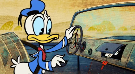
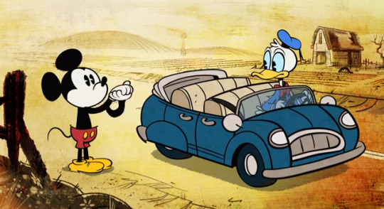
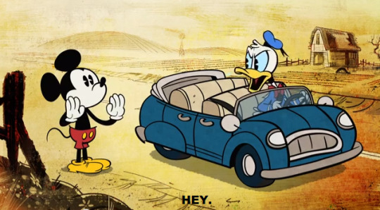
What's up my name is Spencer Gary. I'm the guy who genderbends both fictional and real people and I'm not sorry about it.This is a message for all who stumble upon my page. Ask as many questions as you like. Thank you for stopping by.
Don't wanna be here? Send us removal request.
Video
Atlas be like
Audio from here (by Josh Keaton)
10K notes
·
View notes
Photo


animated tv shows that are much more than they seem are the best
2K notes
·
View notes
Video
WHY DOES IT FIT
(edit: it freezes at the beginning, I hate it, and I am sorry lmao. Stupid tumblr. Rip quality too)
4K notes
·
View notes
Video
So this is how I’ve spent my afternoon.. I mean, day well spent?
Sorrynotsorry.
3K notes
·
View notes
Text
Tips for Illustrators (and other artists too!)
I’m an illustration major at MICA (please check out my blog here as a way to support me for making this post!), so this is catered towards what I learned in my illustration critiques and from professional illustrators. I think these tips can go for other artists too, though!
None of these are things that work all the time, but they’re general “rules” I’ve been taught. You can break them, just know why you’re doing so! These are just things I copied from my critique notes, so most are general tips I’ve heard and copied down.
General
Enjoy what you’re working on, but be okay with changing it.
Anatomy, and accurately trying to portray it, is really important.
Time and space can be portrayed through focus and distance.
When working digitally, make some of your own textures (traditionally) and scan them in. Adding them into a picture adds an element of your own hand and makes your work stand apart from other digital work.
Contrast is a great thing.
Saturation is a great thing, especially in watercolor (soak that brush with pigment!).
Your style should never draw an obscene amount of attention to itself; it should just work fluidly.
Consider what medium(s) work best for your idea.
Cover your paint palettes (particularly reusable ones) to make sure dust doesn’t get in the paints.
Spin the page when you’re working. The time is takes to do that will show some major improvement in your art!
Use dark watercolor and then a light colored pencil on top, never the other way around (it will look muddy and ruin clarity).
Make sure to sometime pin or place you piece far away and step away so you can see the whole composition (or zoom out a lot digitally).
Consider the genre and audience of what you’re working for (and if it’s yourself, then you’re your own audience!).
Illustration is a branch of fine art, don’t forget that.
Fantasy art usually needs a lot of high detail.
Coloring
Pick an overall color palette to work in, then add in other colors as needed.
Complementary colors (ones opposite on the color wheel), when placed next to each other, can pop an object forward or draw attention to it. (Think of a red ornament on a green Christmas tree).
Designate the shadows to be either warm or cool, and the highlights to be the opposite. Stay with this throughout the entire picture.
All colors have a warm and a cool hue (cool and warm blues, cool and warm oranges).
The more saturated a color is, the more it will pop forward in the picture plane.
Don’t use colors right out of the paint tube.
When making a shadow, tint the color with the complementary tone (it makes it a little more grey).
Colorizing backgrounds lines makes them recede in a colored image with line art.
Blue and pink tones are great for use in skin tones.
Flats need to be fairly differentiated colors.
Drawing
The reference should never be an excuse for a misleading or awkward pose. You have the artistic license to alter an awkward pose and not just draw from a photo.
With scratchy or textured line art, find some places of solid black too, to allow the eye to rest (or where you want something to pop out).
How you render all the elements of the picture is what makes your own individual style.
When something is illuminated, it should be the brightest part of the composition.
Anything with a straight angle (like the corner of a room) has one wall/side being lighter in value than the other. There is a crisp distinction.
Sometimes adding more lessens the strength of the image.
Fabric folds are crisp, if they’re too soft they’ll look like clay.
Line heaviness and weight can determine depth.
Anatomy/Characters
Anatomical consistency is very important.
Inside of the mouth is usually dark.
Show character motivations with actions and poses.
You can crop a face or figure to set a mood.
In any and every picture, pay special and close attention to the hands, feet, and face.
Learning musculature, even if you use reference, will help you create the body you want for your character. Understand the human form…it’s easier to alter if you understand it in the first place.
To pop a figure forward, add a little bit of rim lighting (great with backlighting).
Composition
Avoid spots where a line or shape comes really close, but doesn’t cross, the edge of the paper. This is called a tangent and tangents are bad (they suck the eye into just that one spot and stop the composition).
Nothing in the picture is accidentally there, it is all drawn by you, so make sure everything has a conscious placement.
Don’t crop anything that shows essential character expression (including essential parts of the pose).
Never crop a figure at a joint (it makes the limb look amputated unintentionally).
Consider how you show detail with smaller characters…what are the essential characteristics?
Shapes of color or tone can make great framing devices.
For the most part, render the foreground with more clarity than the background…you want atmospheric perspective to be used to make it look like it’s receding.
Line heaviness/weight can combat (in a good way) any very dark areas.
When the character breaks a border (shape, line, panel etc), it shows dominance.
Make the shape of your negative space visually interesting.
“Cornerstops” are great. They are a compositional element that visually blocks your eye from running off the corner of a page.
Shadows can be a great compositional element.
Narrative Illustration (Portraying the narrative)
It is a successful illustration if the story is told.
Use every element of the image to tell the story.
Sometimes you have to take out elements you love for the sake of storytelling.
Think of images as being fast/slow, quiet/loud. What techniques portray these senses for you, and why are you using such techniques? What areas of the picture are slower and faster, why those areas?
Indicate how lavish or simple a place is by the details you choose to include in the background.
Don’t make it obvious that you “curated” the picture; it should look natural.
Cover illustrations don’t always need big and bold text, as long as there’s a strong narrative being portrayed.
Something mid action carries the narrative better than pre or post action.
You should be able to tell a story without relying on text.
Sequential Art (Comics, etc)
Color between panels can draw the eye around the page.
Big jumps in narrative can add humor and excitement, just make sure to think of why you are having the jump there.
When starting a sequence, make it obvious where you start (establishing shot; biggest to smallest, etc).
Make sure panels can read as separate images even if you took the gutter away.
Smaller panels are frequently used for faster/quicker actions.
Removing the background in certain panels allows the scene to be read faster; you only need one background per page (unless the scene in the background is changing).
Style, readability, and timing are key things to keep in mind.
Does the punch line/climax happen at the right time on the page?
Before planning a page, ask yourself: “How much time is elapsing between the first and last panel?”
Consider panel shape and size.
The composition, and where the eye flows inside every panel, informs where the eye travels to next…compositionally lead the eye from panel to panel.
The more panels you have, generally the more time goes on.
Don’t rely on speed/action lines to make things dramatic.
Give word bubbles a little breathing room.
When doing a graphic novel, you’ll usually have to redraw the first few pages since the characters will come more naturally to you by the end pages.
There is a design element to sound effects.
Digital Art (Mostly Photoshop based, but some are general tips)
Before printing, you usually want to switch your file to CMYK (though save a file in RGB too). Print at 300 dpi.
Before printing, you can up the brightness, saturation and contrast until it just starts to look awkward. You’ll learn the best settings for the printer you print at.
Don’t place digital textures anywhere. Consciously arrange them.
Don’t overrender. Digital art tends to be the most successful when it feels less digital than someone would expect.
If your color scheme doesn’t look cohesive, you can use a fill layer of one specific color to unify everything (Layer->fill layer). Lower the opacity to around 15-30%.
16K notes
·
View notes
Note
Hi!! I love your art, i think you're SUPER skilled! I was wondering if you have any tips on improving and getting better at anatomy? Also stylization. How did you develop your art style?
Ohmgosh thank you you’re amazing and i want to hug you for saying such sweetie things to me ahhasdfJdskSFSAD. and tips?? hmm… I spent a long time thinking about these questions and how to answer them. Here I compiled all my personal advice and little mantra’s to myself and elaboration on each into three sections; improvement, anatomy, and stylization. gaw sorry this so looonnngg!!! but i wanted to cover as much as I could, so myeh here we go (mind you this is all stuff that works for me):
IMPROVEMENT
Learn To Be Patient- Artistic improvement is a lot like losing weight; people become very discouraged when they don’t see immediate results, which makes them feel like they’ve made no progress. The fact is that improvement is so gradual that it’s hardly noticeable. So I encourage you to be patient, because after a couple months when you look back, you’ll be amazed by all the progress you’ve made, and trust me, it’s a great feeling.
Don’t Be Discouraged By Other Artists; Be Inspired!- This is something I see a lot, and it practically makes me weep. There are so many people I see on here that become completely discouraged about their art when they see someone else who is leaps and bounds better. In the worst case scenario, that discouragement turns to anger and jealousy, even hatred! I would know because I’ve been there once upon a time, but this is NOT the right way to handle it, and that it will get you nowhere. Now, whenever I see amazing art from another artist, I do become somewhat disheartened at first, but as I keep looking through their artwork, I steadily begin to be inspired; “OOooooo I like that linework,” “aaAAH I wanna try that!,” “kajsdfkasndfksad I LOVE THAT COLOR SCHEME,” and so on. I eventually reach the rationale that if they can do it, I can too! Turn that discouragement into encouragement! Desperation into inspiration! You also have to understand that these people are better because they put in the work, the effort, and the time to reach that level. Many of them have already gone through art school, have taken classes, and have had more time and instruction to develop and harness their skills, so duh, no wonder they’re better. One is not born with talent— you earn it. Discouragement is understandable, but jealousy is stupid.
Practice Does Not Make Perfect; It Makes Progress- No one’s perfect or ever will be. Not me your dog your grandma or your frog— no one! In turn, nothing you do or make or create will be perfect, so if you’re shootin’ for perfection you might as well shoot for the stars ‘cuz, HUH— DAT SHIT AIN’T HAPPENIN’. Practice will not make perfection, hate to break it to ya, but it makes progress, which is much more realistic and doable. So the more you practice, the better you’ll get!! Remember; you can only get better, not get worse.
Don’t Be So Hard On Yourself- This is something I’m very guilty of, very guilty. I was really hard on myself when I was younger for not being better; I was extremely negative, downright cruel, harsh, unforgiving, borderline abusive, and I think I made myself cry more than anyone else did. Do not do this to yourself, it is unhealthy and it will damage you for a long time. Did being very hard on myself get me where I wanted to be faster? Sure, but it left a lot of mental scars I can’t mend— in the long run, it’s much healthier to be positive and forgiving. Do not be hard on yourself; I don’t want anyone to fuck themselves up like I did. If you need to talk or need help, you can talk to me. I’m always here to help and listen, something I never did for myself.
Constructive Criticism Is Meant To Help You, Not Bring You Down, And Know The Difference Between Good And Bad Criticism, But Don’t Necessarily Disregard It When It’s Bad- This is another thing I see a lot of; people are so afraid of criticism!! Criticism is meant to help you see what you need to work on, to help you get better! When you shy away from it, you’re only preventing potential improvement! But of course, there are two kins of criticism, so it’s important to know the difference. Good Criticism is constructive. When you get this kind of criticism, I learnt that it should be like a sandwich; the beginning should be good things about your work, the middle should explain what you need to improve one, and the end should sum it all up and be overall positive. Now, it’s also important to factor in who gives you criticism. Criticism from another artist should be constructive, ‘cuz they’ve been there and understand how to help. Criticism from a viewer, who knows nothing about art, is less likely to be constructive, and will more likely be insulting and offensive, even if they didn’t mean it that way. This is Bad Criticism; basically an insult (even unintentionally) about your work. Something like, “You draw hands weird,” or, “your faces are funky,” or “you suck at arms,” and god forbid anything more horrible than that. Now, maybe this is shocking, but don’t completely disregard such comments. Yes, they can be downright mean and rude, but it is somewhat constructive; it’s just horribly worded. The idea is to not take these comments to heart, but just take them with a grain of salt. If they say you “suck at arms,” what they’re trying to say is that you need to work on your arms, because they can tell something ain’t right. I’m not just spitting this out either, I have experience in both these areas! STORY TIME; I was a little spitfire years ago, and I didn’t take to constructive criticism lightly, and whenever I got it, I’d be all upset and defensive (they were from other artist’s too). But those people were right, I realized after a while. The biggest spurts of improvement I got were when I received good criticism about my art, and I’m so thankful I listened. As far as bad criticism goes, someone once told me in a very roundabout way that I drew my eyes so big they were frightening. Yo, it was rude as shit and it hurt my feelings at the time! but they were also right. My eyes were too big, and after I toned it down, my art looked much better. Criticism is good you guys, even if it’s badly stated.
Know That, As An Artist, The Only Time You’ll Be Satisfied Is When You Realize That You’ll Never Be Satisfied- This is something I repeat to myself a lot, and it helps. There are people who go up to artist’s and say “wow I wish I drew like you!” and “you’re so good!” and so on. You need to understand that art is all about improvement, and no matter how good an artist may be, they are always seeking out ways to improve. There is never going to be a level at which you’ll be like “I’m good now i don’t need to improve anymore!” Nnno-no-no. Art doesn’t work that way, nothing really does. You’ll always want more, you’ll always feel the need to be better, and that’s okay! You should feel like that, but it’s unrealistic to pursue the ultimate level of perfection, as I mentioned earlier in number three. No matter how good you get, you’ll always seek to be better, and coming to terms with that is a truly satisfying feeling.
It’s Completely Normal To Have ‘Swing-And-A-Miss’ Days- People can often come under the illusion that everything a good artist draws is perfect and that anything they draw is totally garbaggio. This mainly happens because when people go through an artist’s art blog, they see nothing ugly, or out of proportion, nada. Well, yeah. Why would an artist post his/her bad art? Artist’s want to show people their best stuff, not their failed crap. Every artist, whether at a novice level or a professional level, makes bad art every once in awhile. I have days where all my heads come out all funky and weird and gross, and then there are days that everything comes out nice like a dream! This is normal, this is natural. We all have swing-and-a-miss days, and I used this phrase for a reason. A baseball player doesn’t hit a home-run every time they step up to the plate, nor does every golfball player hit a hole-in-one on every course. Sometimes you’re gonna miss and that’s A-okay.
Practice When You Can; Observe When You Can’t- A lot of artist’s say you have to, have to, have to practice drawing everyday in order to get good. Yes, it helps speed up improvement, but sometimes we don’t have a pencil and paper on us 24/7, sometimes life gets in the way, and that’s not your fault. This is why I feel that practice isn’t the sole player in improvement, and that simply observing can be very efficient. Whenever you find yourself without pencil and paper, just observe everything around you; study how clothes folds when people bend or move, take note of how light and shadow affect a figure. Just looking and analyzing and making mental notes to yourself can be very effective in its own right. Remember; you need your hands to draw, but you need your eyes to observe first.
Don’t Force Yourself To Practice/Learn When You’re Not In The Mood- Do you remember in school, when you were in class in a subject you didn’t really care about, did you learn much? Did you pay attention as much as you would if it were something you found interesting? Likely the answer is no, you didn’t. It’s harder to learn things we find uninteresting, especially when we’re not in the mood to learn them. I’ve had this problem; I recently read a book that I felt I needed to learn from, but because I wasn’t in the mood, the first two chapters I read I can’t even begin to remember. But later, when I was in the mood, all up and ready and wanting to learn, the rest of the material stuck like glue. Simply put, sometimes you need to push yourself to learn things that will help you improve, but if you force yourself to when you’re in a bad mood, you’ll literally just be wasting time. Wait until you’re in a good mood, and learning material and having it stick will be much easier.
How To Not Use ‘How To Draw’ Books/Tutorials-There are thousands of How-To books and tutorials out there, and a lot of them are great resources for learning! But not if you take them literally. For example, not everyone draws hands the same, and some people have different methods than others. These different methods aren’t wrong, they’re simply another way that someone draws hands. It’s the same with drawing figures; some people can draw, like, blocks and just shape it from there. Some people can use cylinder shapes and some just use simple lines. One, or two, or all, or none of these methods may work for you. These is why I wish more people would name their tutorials ‘How-I-Draw-Hands,” and so on. It basically comes down to you, and what works best for you.
ANATOMY
Artistic Anatomy- There are more or less about 700 muscles in the human body, (oh yeah quite a daunting number) and learning anatomy for art can be quite taxing, especially if you’re teaching yourself (like me ugh). Fortunately, artist’s don’t need to know all 700 muscles to draw correct anatomy. For artists, we learn artistic anatomy, which only concerns the skeletal structure, tissues, and muscles that affect the surface form of the human figure. The book I’ve been using to teach myself anatomy is Classic Human Anatomy: The Artist’s Guide to Form, Function, and Movement by Valerie L. Winslow. Other good books for reference are like, training books, like Strength Training Anatomy by Frédéric Delavier. But learning anatomy is a slow process because anatomy is very complex, so pace yourself. Divide up the muscles; such as torso muscles, upper leg muscles, lower leg muscles, upper arm, forearm, shoulders, back, hands, feet, neck and head, etc. It’s gonna take a long time to learn it all, so try to tackle one section of the body at a time. My big thing is with hands right now, so I’ve just been focusing one that.
Figure Drawing- It’s essential to learn anatomy for better artistic representation, but what’s just as important is figure drawing. Figure drawing is your golden key for better human figures and I’ll tell you why; it teaches you speed, proper proportions, and how the figure moves. The absolute best way to do figure drawing is with a live nude model, but if it’s too costly and there aren’t classes available in your area, there are plenty of sights online that you can use to substitute for now. Pixelovely is a great tool for figure drawing. Not only does it have a tool for human figures, it has a tool for animals, heads/facial expressions, hands, and feet, too! Other sights I like to use are Scott Eaton’s Bodies In Motion and Posemaniacs, and while I’m not particularly fond of deviantart, there’s a hullabaloo of people on there that make great stock photos just for artists. Also Andrew Loomis’ books, particularly Figure Drawing: For What It’s Worth, are absolutely amazing and I implore you to look into getting them. His books are goddamn gold.
Studying Other Artist’s Work- Hrrmrnglemurnblehernfda… IIII haavee a story to thiiiss…. Once upon time, I. could not draw boys. For the LIFE of me. I couldn’t wrap my head around them. I could draw girls okay, ‘cuz they were easy for me but BOyZ were just this. WHoLe other thing I couldnt even begin to understand. BUT THEN— ..ah. omygod okay this is gonna kinda turn into a love story but goddammit it’s true… but then.. I discovered TeamFourStar, and TeamFourStar led me to Dragon Ball Z, and Dragon Ball Z led me tooo…. mmnngh,…… Vegeta. ohmygod. my heart. basically I just. I just fell in LOVE with Vegeta and he was all I wanted to draw for forever. but I couldnt draw boys at the time!! but I didn’t let it stop me, I LOVED HIM TOO MUCH. so i just started drawing Vegeta over and over and over again, and because I loved him so much I wanted to draw him well, I wanted to draw him right! So fukq. ohmygod. YES, I LITERALLY LEARNT EVERYTHING I KNOW ABOUT ANATOMY JUST SO I COULD DRAW VEGETA ANATOMICALLY CORRECT… AND IM STILL DOING IT JUST FOR HIM. I’m being one hundo honest; drawing Vegeta over and over again taught me how to draw men, and because he’s so muscular, I learnt a hell of a lot about muscles too. Studying Akira Toriyama’s anatomical style taught me a lot, and further inspired me to enhance my knowledge of the human figure with figure drawing, anatomy books, etc. The point of this story was to show how and why I started improving my anatomy. Vegeta makes my coca-cola go tokidoki. It beats only for him… I hope you don’t think I’m kidding. ‘Cuz I’m not. I’ll show you pictures.
STYLIZATION
Realistic vs. Stylistic- Often I’ll see these, oh I dunno, kind of tutorial-esque posts about drawing hands or other body parts correctly, and pointing out what’s wrong— eh, example; one where an artist is pointing out that fingers have two joints, not one, and that if you draw just one it’s wrong, or if you draw the fingers like sausages with no joints it’s also wrong, blah blah. Well, realistically, yes, it’s wrong, but stylistically no no no. Realism has rules, but personal interpretation does not. It’s just like if you draw hands with four fingers instead of five; artist’s with a more cartoony style sometimes do this, and some don’t even put joints in them. Yeah, it may have only four fingers, but you still in fact know that it’s a hand. This is your own personal interpretation of the real, and after you know the rules, it’s okay to break them however you like to match your personal taste.
‘Mix-And-Match’ and ‘Give-And-Take’- This might sound a little obscure, but let me try to elaborate; an artist’s style is basically kind of a culmination of tiny details and tidbits from other artists styles. I’m inspired by a plethora of other artist’s work and how they draw this that way and that this way. From these I kind of ‘borrow’ little ideas and details here and there and loosely incorporate them in my own work, thusly, developing my personal style. Literally, you’re mixing all these little details together, seeing what matches to your liking, giving your style what you want to see and taking out what doesn’t work. Urrgh it’s hard to explain, but you just gotta try different things and see what you like.
Ask Yourself: Do You Want To Draw Like Someone Else, Or Do You Want To Draw Like You?- It’s easy to study someone else’s style and become so good at it that it’s now your style, but seeing this is always a little sad for me, ‘cuz; Why would you want to be a carbon copy of someone else instead of be you? Personally, even though I see these artists that draw very well and awesome and great, in the end, even if they’re better, I’d rather draw like me. My style represents who I am, and I’d much rather be me than somebody else. So ask yourself; do you want to have a style that represents someone else, or do you want to have a style that represents you?
AhhhAHHFa so that’s it! sorry that was so extensive and elaborate, but hopefully I helped somewhat??? myehasjfndkfdsasfsd well let me know if i did, and thanks for reading all this if you also did. dfarhmeysbasdfhn /runs away
577 notes
·
View notes
Photo


Hi. It’s been a while again and I haven’t drawn much for various reasons, but here’s a few Pokémon “AU” pictures. It’s a style I like to try to out sometimes, even if ten characters in a row got a bit too much in the end.
Anyway, I decided to make all (or at least most) of my black female characters as trainers. Two Teges, too. She’s had a character arch I’m pretty proud of, and would start off as one of those low-level gym leaders in Nanalan city who eventually ends up in the elite four because there’s no chill and she was out of Samado badges. I had another sketch for Saffran as well, but didn’t finish it. Kotoye’s a film director and Tulie is so stronk.
41K notes
·
View notes
Video
Vento Aureo - First OPENING (Fighting Gold)
5K notes
·
View notes
Video
I keep going back to watch this video it just captures my sense of humour perfectly
680K notes
·
View notes
Video
73K notes
·
View notes
Photo
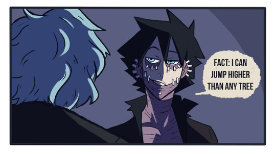
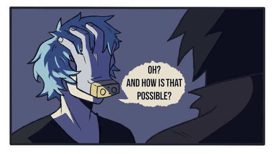
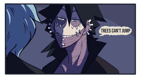

he just can’t stand Dabi’s shit anymore… original post (x)
6K notes
·
View notes
Photo


Tessa Thompson photographed by Timothy Sean O’Conell
43K notes
·
View notes

