#what to tag this as? unsure
Explore tagged Tumblr posts
Text

had my own post canceled moment
#not writing#what to tag this as? unsure#me and my friend were making fun of those big family instagram pages#and autocorrect changed mac n into arrival soon in chinese#bitches love my 马上到
0 notes
Text
My Favorite Cheap Art Trick: Gradient Maps and Blending Modes
i get questions on occasion regarding my coloring process, so i thought i would do a bit of a write up on my "secret technique." i don't think it really is that much of a secret, but i hope it can be helpful to someone. to that end:

this is one of my favorite tags ive ever gotten on my art. i think of it often. the pieces in question are all monochrome - sort of.
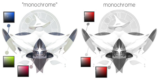
the left version is the final version, the right version is technically the original. in the final version, to me, the blues are pretty stark, while the greens and magentas are less so. there is some color theory thing going on here that i dont have a good cerebral understanding of and i wont pretend otherwise. i think i watched a youtube video on it once but it went in one ear and out the other. i just pick whatever colors look nicest based on whatever vibe im going for.

this one is more subtle, i think. can you tell the difference? there's nothing wrong with 100% greyscale art, but i like the depth that adding just a hint of color can bring.
i'll note that the examples i'll be using in this post all began as purely greyscale, but this is a process i use for just about every piece of art i make, including the full color ones. i'll use the recent mithrun art i made to demonstrate. additionally, i use clip studio paint, but the general concept should be transferable to other art programs.

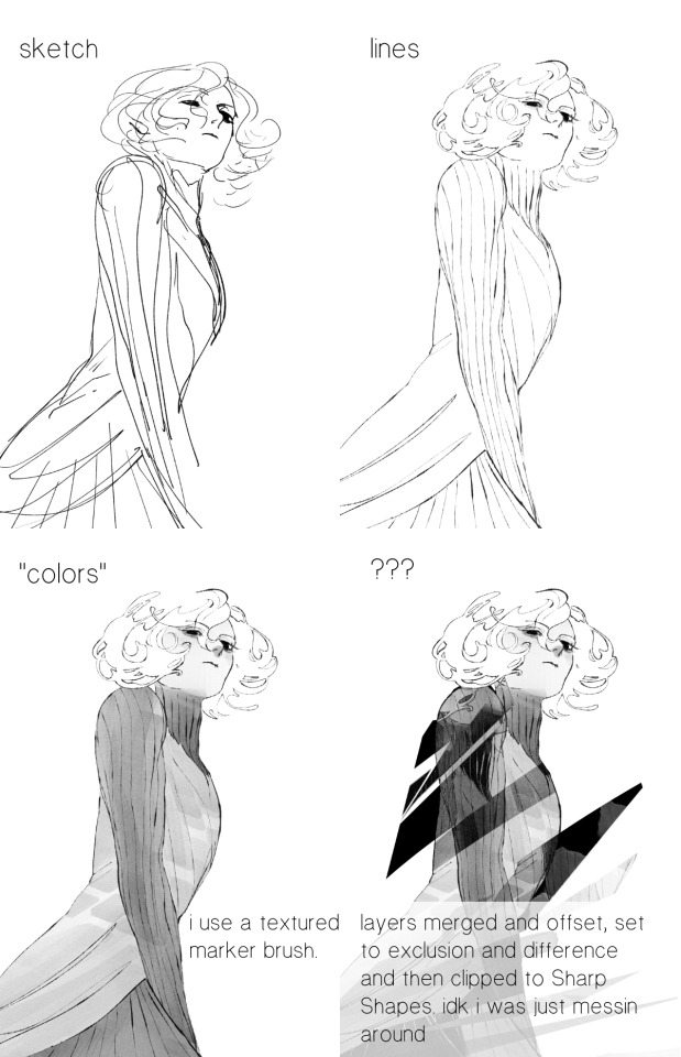
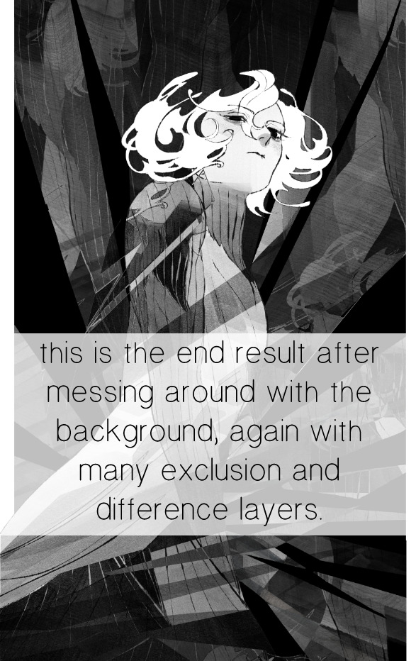
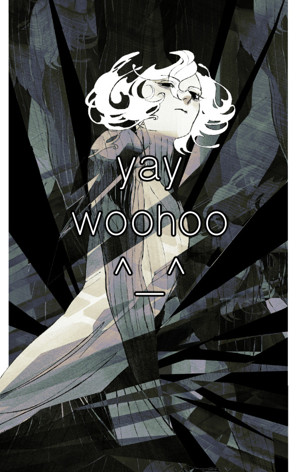
for fun let's just start with Making The Picture. i've been thinking of making this writeup for a while and had it in mind while drawing this piece. beyond that, i didn't really have much of a plan for this outside of "mithrun looks down and hair goes woosh." i also really like all of the vertical lines in the canary uniform so i wanted to include those too but like. gone a little hog wild. that is the extent of my "concept." i do not remember why i had the thought of integrating a shattered mirror type of theme. i think i wanted to distract a bit from the awkward pose and cover it up some LOL but anyway. this lack of planning or thought will come into play later.
note 1: the textured marker brush i specifically use is the "bordered light marker" from daub. it is one of my favorite brushes in the history of forever and the daub mega brush pack is one of the best purchases ive ever made. highly recommend!!!
note 2: "what do you mean by exclusion and difference?" they are layer blending modes and not important to the overall lesson of this post but for transparency i wanted to say how i got these "effects." anyway!
with the background figured out, this is the point at which i generally merge all of my layers, duplicate said merged layer, and Then i begin experimenting with gradient maps. what are gradient maps?
the basic gist is that gradient maps replace the colors of an image based on their value.

so, with this particular gradient map, black will be replaced with that orangey red tone, white will be replaced with the seafoamy green tone, etc. this particular gradient map i'm using as an example is very bright and saturated, but the colors can be literally anything.
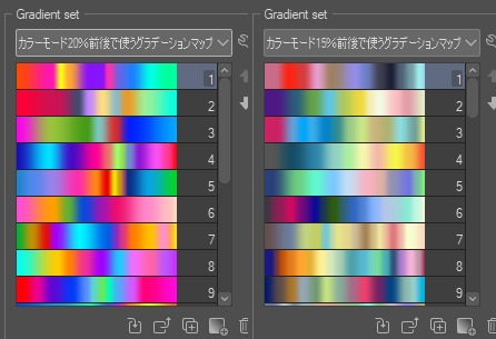
these two sets are the ones i use most. they can be downloaded for free here and here if you have csp. there are many gradient map sets out there. and you can make your own!
you can apply a gradient map directly onto a specific layer in csp by going to edit>tonal correction>gradient map. to apply one indirectly, you can use a correction layer through layer>new correction layer>gradient map. honestly, correction layers are probably the better way to go, because you can adjust your gradient map whenever you want after creating the layer, whereas if you directly apply a gradient map to a layer thats like. it. it's done. if you want to make changes to the applied gradient map, you have to undo it and then reapply it. i don't use correction layers because i am old and stuck in my ways, but it's good to know what your options are.

this is what a correction layer looks like. it sits on top and applies the gradient map to the layers underneath it, so you can also change the layers beneath however and whenever you want. you can adjust the gradient map by double clicking the layer. there are also correction layers for tone curves, brightness/contrast, etc. many such useful things in this program.
let's see how mithrun looks when we apply that first gradient map we looked at.

gadzooks. apologies for eyestrain. we have turned mithrun into a neon hellscape, which might work for some pieces, but not this one. we can fix that by changing the layer blending mode, aka this laundry list of words:

some of them are self explanatory, like darken and lighten, while some of them i genuinely don't understand how they are meant to work and couldn't explain them to you, even if i do use them. i'm sure someone out there has written out an explanation for each and every one of them, but i've learned primarily by clicking on them to see what they do.
for the topic of this post, the blending mode of interest is soft light. so let's take hotline miamithrun and change the layer blending mode to soft light.

here it is at 100% opacity. this is the point at which i'd like to explain why i like using textured brushes so much - it makes it very easy to get subtle color variation when i use this Secret Technique. look at the striation in the upper right background! so tasty. however, to me, these colors are still a bit "much." so let's lower the opacity.
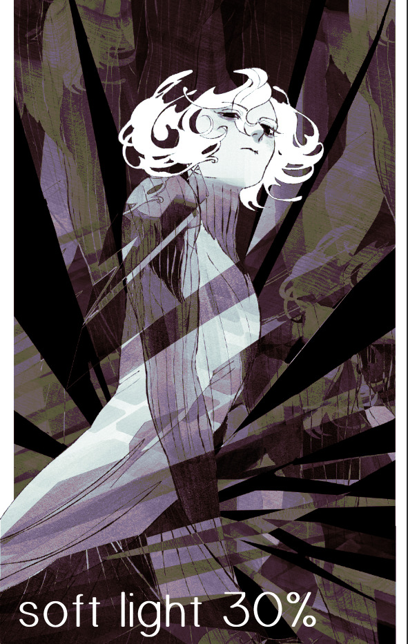
i think thats a lot nicer to look at, personally, but i dont really like these colors together. how about we try some other ones?
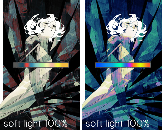
i like both of these a lot more. the palettes give the piece different vibes, at which point i have to ask myself: What Are The Vibes, Actually? well, to be honest i didn't really have a great answer because again, i didn't plan this out very much at all. however. i knew in my heart that there was too much color contrast going on and it was detracting from the two other contrasts in here: the light and dark values and the sharp and soft shapes. i wanted mithrun's head to be the main focal point. for a different illustration, colors like this might work great, but this is not that hypothetical illustration, so let's bring the opacity down again.
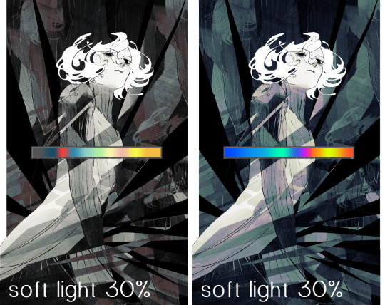
yippee!! that's getting closer to what my heart wants. for fun, let's see what this looks like if we change the blending mode to color.
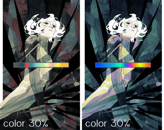
i do like how these look but in the end they do not align with my heart. oh well. fun to experiment with though! good to keep in mind for a different piece, maybe! i often change blending modes just to see what happens, and sometimes it works, sometimes it doesn't. i very much cannot stress enough that much of my artistic process is clicking buttons i only sort of understand. for fun.
i ended up choosing the gradient map on the right because i liked that it was close to the actual canary uniform colors (sorta). it's at an even lower opacity though because there was Still too much color for my dear heart.
the actual process for this looks like me setting my merged layer to soft light at around 20% opacity and then clicking every single gradient map in my collection and seeing which one Works. sometimes i will do this multiple times and have multiple soft light and/or color layers combined.
typically at this point i merge everything again and do minor contrast adjustments using tone curves, which is another tool i find very fun to play around with. then for this piece in particular i did some finishing touches and decided that the white border was distracting so i cropped it. and then it's done!!! yay!!!!!
this process is a very simple and "fast" way to add more depth and visual interest to a piece without being overbearing. well, it's fast if you aren't indecisive like me, or if you are better at planning.

let's do another comparison. personally i feel that the hint of color on the left version makes mithrun look just a bit more unwell (this is a positive thing) and it makes the contrast on his arm a lot more pleasing to look at. someone who understands color theory better than i do might have more to say on the specifics, but that's honestly all i got.
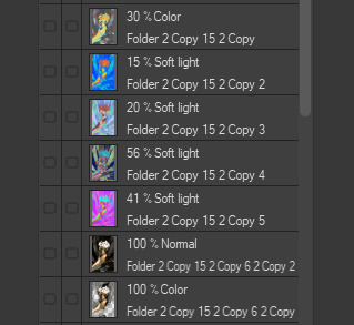
just dont look at my layers too hard. ok?
2K notes
·
View notes
Text


last time i post manga screenshots I prommy
3K notes
·
View notes
Text
new au idea
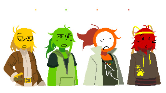
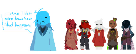
#alan becker#animator vs animation#ava#animation vs minecraft#avm#ava au#avm unusual brewing#ava red#avm red#ava tsc#avm tsc#ava yellow#avm yellow#ava green#avm green#ava blue#avm blue#avm netherwarts#unsure what to name this au.... ill have a think#edit: i now know what the au name will be! (its in the tags)#if people want me to ill explain this in another post#i swear they all look like girls but they have NO!!!!!!!! GENDER !!!!!!!!!!!! dont forget that theyre BLOCKS!!!!!!!!!!!!!!!!!#lilacsart
604 notes
·
View notes
Text
I know I’m gonna forget some cause I literally don’t know half of them lol
I’m also going to *attempt* to explain the AUs in case you don’t remember/don’t know what they are (if I mess one of them up it’s cause I don’t know that AU very well 😅)
Timestuck - Mabel gets stuck in the past with mullet Stan (variations can include Dipper also getting stuck in the past, or one or both getting stuck with Ford, basically any AU where the twins meet/get stuck with younger versions of one or both of their grunkles)
Drifting Stars: Mabel gets sucked into the portal at the end of “Not What He Seems” and goes dimension hopping with Ford (meanwhile Dipper and Stan are having a horrible time)
Reverse Falls: The twins and other characters swap personalities, where Mabel is more introverted and Dipper is more extroverted and same with the Stans…I think? (there is also an AU where I think maybe Gideon and Pacifia are good and Mabel and Dipper are bad but I genuinely can’t remember what it’s called, I’m sorry if this is what that AU is called but I don’t *think* it is?)
Relativity Falls: The twins roles are swapped, so Mabel and Dipper are older and Stan and Ford are the kids, visiting “Grantie” Mabel while Dipper is in the multiverse
Monster Falls: The characters are monsters instead of humans. I genuinely don’t know much about this AU but lots of people make the characters different monsters so there are probably a bunch of variations
Reverse Portal: Where Stan gets pulled into the portal instead of Ford. I know there are other AUs probably more popular than this one, but like I said I’m not the best as remembering AUs 😂
#gravity falls#gravity falls au#dipper pines#ford pines#stan pines#mabel pines#timestuck au#drifting stars au#relativity falls au#reverse falls au#monster falls au#reverse portal au#yeah the fact that that one doesn’t have a tag tells me it’s not very common oops 😂#not me actually unsure what I’m gonna vote for cause a few have special places in my heart….#also crap I was gonna make it a week long poll uh….haha…ha 😅
577 notes
·
View notes
Text
SECURITY ALERT.

felt. silly and wanted to do a little something more for my birthday besides the birthday comic so woe, starlit eclipse be upon ye except it's me fucking around with how to do uv lights (I FUCKING LOVE UVLIGHTING!!!!!!!!!!!!!)
CLOSEUP

#nebula art and doodles#starlit skies#fnaf starlit skies#fnaf eclipse#fnaf dca#fnaf daycare attendant#starlit skies eclipse#i might. give him his own tag now that we actually have ruin out and#canon eclipse sooooo#goofy thumbs up#cw eyestrain#tw eyestrain#cw bright colors#tw bright colors#unsure of what else. to tag this as uhhhh
809 notes
·
View notes
Text

[gavin parents] and i hope you die, i hope we both die
#sorry impulse moment. wanted to draw full body refs sghfdghjkd#i was unsure about these colors at first bc theyre pretty basic lol but yknow what. lean into those colors and the association with purity#make them look non-threatening color-wise. and then i explode a little bit after choosing what their shared accent color should be PFTTT#ok for some reason i make a lot of parent ocs for established characters DGHJD its like. fun deciding who gets whose features#ace attorney#karsten gavin#karen gavin#ace attorney oc#gavin parents#den's ocs tag#sunnysidedraws#sunnysideattorney#described#id in alt text
1K notes
·
View notes
Text
hi. theres no easy way to say this, but my mother, who i depend on for everything (food, shelter... everything) has decided to start physically attacking me again, as well as refusing to feed me. i make no money outside of commissions, and she gets mad when i eat the food she buys. so it would mean a lot to me if you could reblog this and consider either commissioning me or donating to my kofi to help me continue to eat. thank you!
tldr; need food money, accepting commissions and donations
click for comms | click for kofi
295 notes
·
View notes
Text

first somewhat rendered piece for this fandom. we're free from school and decided to draw darkchoco yaoi. yay ! 🎉
#alan becker#ava#animator vs animation#ava tdl#ava the dark lord#ava tco#ava the chosen one#chodark#darkchoco#<- our favourite name for this ship!!!#tdl x tco#we have no idea what tags we missed we are posting this sleep deprived#dont tag this as siblings ????? our hc of chodark are very#violently romantically gay#yeah#anyways ! hooray for us actually posting our stick designs for once?#might change#designs also inspired by flareboi's ehe#woooooo#-unsure tag#chaos art
182 notes
·
View notes
Text
MINOR JRWI EPISODE 53 SPOILERS!!
haven't posted to Tumblr lately so here's some crossover art I've done, calling this crossover once upon a riptide :3
a meme also exists under the cut because I am a kind god


he's full of gumbo,, stupid and small. anyways yeah this came to me in a vision. chip jrwi is like the son coalecroux never had. criminal, on fire, traumatized he's perfect all they need to do is teach him tricks it's jperfect
#jrwi#jrwi show#jrwi riptide#chip nolastname#jrwi chip#just roll with it#once upon a witchlight#kremy lecroux#gideon coal#legends of avantris#this crossover is so#hfbdhdbdh#yknow?#unsure what else to tag
298 notes
·
View notes
Text


id : a lightly shaded bright blue and red digital drawing. charles rowland is in profile to the left, looking slightly angry. red bubbles cover his blue skin up to his face and turn blue on the red background. the lyrics "in my blood i felt bubbles burst / you've a lazy laugh a red white shirt" are scribbled in white on the background (first drawing) or the foreground (second drawing). the last drawing does not have lyrics./end id
self indulgent literal interpretation of lyrics (the fallen by franz ferdinand) in my two favourite colors to draw with that i saw in a vision. need to draw more charles in bright red. (also cant post more pictures bc they are heavy so other ones will go in a different post)
#birdsongisland#bright colors#bright colours cw#eyestrain#trypophobia cw#< unsure of what tag to use sorry#dead boy detectives#dbda#dbda fanart#charles rowland#dbda charles rowland#my bbygirl 🖤🖤🖤🖤🖤#sorry but hes my favourite no contest
226 notes
·
View notes
Text
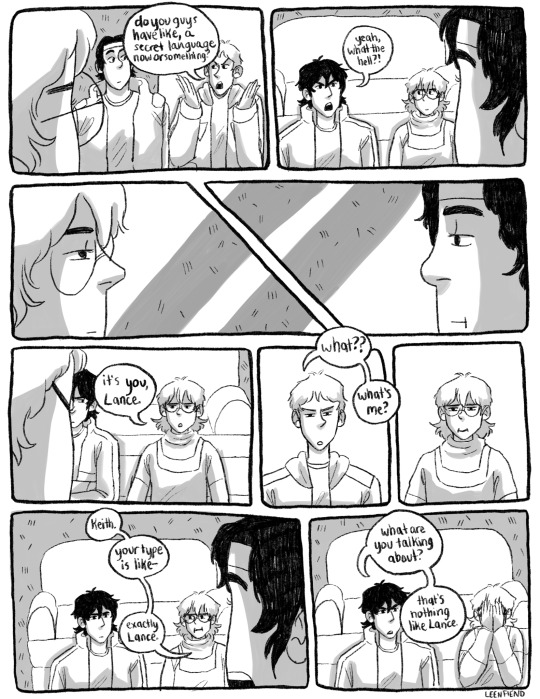
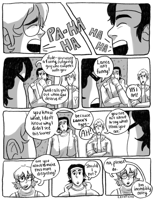
what's ur type first < prev next >
#YAHOOO#i finally finished editing this first scene in the fic lmfao ... so updates will probably be faster in the coming days#also still unsure as to whether I'll draw... the whole fic#it's like 10k words+ so#im still on like page 4 rn I think. out of like. 20.#let me know what u think tho do u guys want this all drawn out cause .. .. it'll take a lil while also i'll definitely still post the fic#ive put too many hours into that bad boy at this point to let it collect dust#and i think u get something different out of reading that than the comic anyway tbh#which is fun !!#ok enough tag essaying thank u all for reading if u did : )#wut#what's ur type#klance#vld#voltron#my art
1K notes
·
View notes
Text

theyre just like me fr
#my art#warrior cats#bristlefrost#shadowsight#doomed cousins#unsure of what to tag this as#cw self harm#??? just thoughts of it#WHATEVE.R they are the horrible intrusive thoughts cousins to me.
170 notes
·
View notes
Text


back by popular demand (my motivation skyrocketing), more horses!!!
#drdt#danganronpa despair time#drdt fanart#teruko tawaki#rose lacroix#xander matthews#hu jing#veronika grebenshchikova#arei nageishi#edens also there but im not tagging that shit 💀#mlp#my little pony#mlp au#my art#fun fact hus ears are meant to resemble butterflies ^^ unsure how well this comes off in the design but thats what i was aiming for#her flanks covered but for the record her cutie marks a zither#also to the person who said i made teruko a blank flank bc cutie mark designs are hard#um#uh#ummm#.#nuh uh 💀
238 notes
·
View notes
Text

the only thing in lobcorp that lags my screen
#lobotomy corporation#lobcorp#lobotomy corp agent#created to die. my apologies...#white night#im genuinely unsure how to even start w this one. tagging wise. i guess spoilers if you dont know what happens w plauge doctor#would rhat count? would it? i feel like im losing my marbles w this guy#i should probablt be using the pjm tag but im a coward. funny haha face the fear. one day#i acruallt think the abbreviation is just pm. dont knkwbwhy i added the j
188 notes
·
View notes
Text
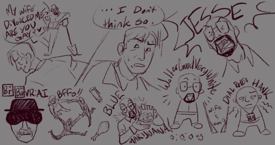
i loved this stream so much nobody understands
#bbvrai#wayneradiotv#radio tv solutions#rtvs#umm#unsure how else to tag thiiss#hl2vrai#lol#the bait and switch was funny and clever idgaf what anyone says#my art
813 notes
·
View notes