#what other game gives you the ability to pause loading screen animations so you can read the historical context
Explore tagged Tumblr posts
Visit Tumblr Blog
Explore Tumblr blogs with no restrictions, modern design and the best experience.
Last Seen Tumblr Blogs


Fun Fact
The total number of visits Tumblr.com received during January 2021 is 327 million.
Text
huaaaaaaah dynasty warriors 8xl is just as amazing as i remembered it on the vita it's good to be back
you cant get the steam version though even after gui and graphics mods it's hot garbage i had to refund it and was thinking like "was it just always this janky and ugly looking back then??" but after refunding i got it on switch and it's BEAUTIFUL and smooth exactly how i remembered it but in HD and 60fps
amazing the difference a dedicated port with attention to quality can make over a minimal effort cash grab
#also dw8 is just awesome#idk how you turn an anime musou game into genuinely deep and historical fiction but by sunzi they did it#what other game gives you the ability to pause loading screen animations so you can read the historical context#it's always awesome to look up the characters and events after a mission and be like “OHHHHH that's where those character traits came from!”#the attention to detail is superb - you dont realize how deliberate all the dialogue and details are til you read up on more of the history#the way historical factors are translated into character traits and dialogue is just is just 🤌 chef's kiss#shout out to my boy sun jian's retainer not even i remember your name forgive me#“I CAN GET THINGS DONE~”#love how he does the oliver hardy smile-to-glare face with his musou
1 note
·
View note
Text
HumanitZ Preview (Steam Early Access)
For this HumanitZ Preview, we play a co-op, top-down, open-world survival game in a world ended by the zombie outbreak. As one of the few human survivors, try to last as long as “humanly” possible. The past can’t be changed, but you can make a difference today for the future of humanity.
HumanitZ Preview Pros:
- Decent graphics. - 19.1GB Download size. - Steam achievements. - Graphics settings - resolution, v-sync, graphics quality preset, post-processing, foliage, shadows, textures, view mode, and max fps. - Full controller support. - Two ways to play - Single-player and multiplayer. - Zombie survival gameplay. - Eleven professions for your character - unemployed, mechanic, junior biodiesel researcher, emergency medical technician, apprentice gunsmith, amateur boxing, farmer, food service worker, Sunday fisherman, car salesman, and outdoorsman. These give buffs. - Character creator - male/female, face, skin, facial hair, hairstyle, upper wear, lower wear, and footwear. You can just randomize if you wish. - Optional tutorial prompt. Blood - on/off. Mouse settings - cursor size, color, Invert zoom, and sensitivity sliders. Two initial modes - Single-player, and multiplayer. (scenario mode shows but it is locked) The Survival Guide is basically the game manual offering tips and all the information from the game. Optional replayable tutorial. Game setup settings - permadeath, clear infection on death, disable eagle eye, airdrops, weapon break, respawn loot, loot respawn time, loot rarity, airdrop every X mins, zombie difficulty, hostile human difficulty, zombie amount multiplier, zombie respawn timer, animal respawn timer, starting the season, days per season, day duration, and vital rain. Best played with a mouse and keyboard. You get to choose your starting spawn point and get a brief bit of Intel before deciding. You can basically loot anything from cars to coolers to toolboxes and houses. Crafting can be done both at a table and freely from the menu. Rebind able controls for the keyboard. Zoom in and out. A torch is important for night but it does run off batteries. Vehicles can be driven if you manage to fix them first. Space is king for you need to find backpacks etc so you can carry more. Encumbered is in the game and every item has a weight tied to it. Movement is done with the WASD keys and the mouse is for aiming. You can stomp and kick down zombies. All the meters are at play like food, hunger, health, etc. Drag and drop inventory system but if you have space then you can auto-pick up. Uses different weather types. The map fills in as you explore but you do get a marker to show an objective. Excellent sound effects and noises. Save when you want. Auto saves regularly. You can pause in a single-player. Play and do what you want. A fantastic atmosphere. Melee and ranged weapons. Cars can trigger alarms that bring zombies in. Earn exp and level up to get skill points to put into the three skill trees - survival, combat, and world. When you eat or drink you can still move albeit at a much slower pace. Multiplayer has a server browser and the ability to make a private room with a password. Find items to make life easier like a compass to help the map Coordinates. On the map, you can place your own markers. Isometric view. Make fires to cook food and purify water. Toxic gas can hinder you unless you find a gas mask. Has strong vibes of State of Decay but without a home base and a lot slower. HumanitZ Preview Cons: - When in big-picture mode, even if you don't touch the settings the screen size changes and never goes back. Using a controller is bad as all the prompts are not clear, the game would still require mouse input and the prompts were not shown for the controller buttons. Not the best loading times. Never clear what cars can be driven. You have to be pinpoint and precise to interact with anything. Sucks that you can repair certain cars but you cannot strip other cars and all car pieces are just random loot drops. So much to take in. The controls however you cut it are clunky and not that smooth. Constantly having inventory issues with so little space. All the writing is so small from items to the menus. The music that is always playing is fine but very one note. Hard to see at times not just at night but also in houses. Takes a long while to get going from the slow speed to the constant resource management. Related Post: Charrua Soccer Pro Edition Review (Steam) HumanitZ: Official website. Developer: Yodubzz Studios Publisher: Freedom Games Store Links - Steam Early Access Read the full article
0 notes
Text
The Trouble with Ian

Warning: a Jacqueline spoiler for an upcoming episode is mentioned.
Let’s start at the very beginning - as the legend goes, a very good place to start. We only saw Ian Carlyle in a handful of episodes in the first three seasons of The Bold Type, but everything we saw indicated he was a loving, supportive and understanding husband - so understanding, in fact, that, when Jacqueline couldn’t make it to their anniversary dinner due to a work emergency, he brought the anniversary dinner to her. There were never any signs of trouble in paradise, not until season 4 rolled around, that is.
This whole mess started in the premiere episode, Legends of the Fall Issue, with a perfectly innocent game of chess in the Carlyle residence. Ian and Jacqueline appeared to be having a nice and relaxing time together, reminiscing about the day they met when he encouraged his wife to “press pause” for a while on the heels of her losing her job at Scarlet. He then followed that apparently innocuous and selfless statement, which was not well received by Jacqueline (“I’m not really the press-pause type…”) with, “I wouldn’t mind going back to work.” Jacqueline’s surprised reaction told us that was definitely the first she was hearing of it. After the briefest of hesitations, she was encouraging, telling him that he should - go back to work, that is. She had barely gotten the words out when Ian said, “Ok, I’ll put out some feelers,” got up and left the room to do just that.
Looking back, that was a red flag - this wasn’t something that had recently occurred to him, or that he had been thinking about casually. It was something that he had been wanting for a long time, as he wasn’t even willing to properly discuss the subject with his wife before taking action - hell, he wasn’t even willing to continue their game of chess. He literally got up and left to try and get a job. Judging by Jacqueline’s expressions, she was quite taken aback, either by his wish to go back to work (again, it was clearly news to her) or the very eager way he was going about it. Possibly both.
Let’s also consider something else that’s important here. Jacqueline had just lost her job of a decade. A job that meant the world to her. She might not have been crying in a corner but that’s because that’s not Jacqueline Carlyle’s way of dealing - and if anyone would know that other than the audience, it’d be her husband. She was upset enough she was day drinking with her then former employee (tbf, it’s Jane, who’s more than “an employee” to her, but I digress) earlier that day, not to mention upset enough to admit to said employee her first instinct after the news of her ousting had been to brandish a pitchfork and go burn down Safford. While that was an obvious exaggeration, and Jacqueline would never resort to such (literal or metaphorical) extreme measures, it was a clear indication that she was distressed by what had happened. And did we see Ian being there for his wife, comforting her, encouraging her? Nope. Just like we didn’t see him doing any of those things while she was struggling with Patrick’s arrival and the changes happening at Scarlet back in season 3. It took Jane (once again, Tiny Jane to the rescue!) to give Jacqueline the support and encouragement she needed to keep on keeping on at the time.
All of this to say… there’s a limit to how much credit Ian gets here. As much as their life has played out off-screen the majority of the time, we as an audience mostly respond to what we actually see, and Ian being a loving, caring, supporting husband is something that was basically left back in season 1. We acknowledge and accept he’s been home, taking care of the kids, having put his career ambitions in the back burner. He gets full credit for that. But let’s also not forget that was a decision he made in conjunction with his wife years ago, as it was probably the best thing for their family at the time. The current state of affairs wasn’t imposed on him - it was something he helped decide and required his active participation.
Ian feels differently now, as is his right. He wants to go back to work and that is fine. The problem comes when this wish is communicated, acted on and expected to come to fruition in the literal space of a few days, at most (as every fan knows, time goes by sloooowly in the Bold Type verse). To review - Jacqueline working and Ian being a full time “househusband” has been the status quo for the past ten years (and something the audience suddenly learned about this season). Jacqueline loses her job for a day, at most, during which time he tells her he "wouldn't mind" going back to work, manages to get some leads…
… and then Jacqueline gets her job back! She is left scrambling - let’s not forget she’s just been informed Scarlet is going fully digital, something totally new to her and a completely new direction for the magazine. At first, she thinks Patrick will be able to help out and share the load… but then he jumps ship and she is left all alone to tackle this new professional challenge… not to mention a new, unexpected challenge in the home front--
Yes, because what we soon learn is that Jacqueline being back at Scarlet doesn’t make Ian reassess his plans, which go full steam ahead. Jacqueline continues to support her husband and commits her most egregious offense in episode 2, #scarlet, when she (gasp!) is unable to leave the office in the middle of the day to be home for their son’s tutor - which means Ian has to rearrange a meeting about a potential job (and is angry enough about it that he hangs up without saying goodbye). He’s clearly successful in his efforts to “make it work”, however, because, after a Scarlet event, he simply announces to his wife that he not only received but already accepted an offer for a job that will take him halfway across the world… to the Ukraine.
Does Jacqueline protest? Put up a fight? Put her foot down? Nope. We see her accepting his decision and finding ways to make their home and her work life work, as best as she can. We see her arranging her schedule to fit in a bon voyage luncheon to Ian and a Scarlet photo shoot, which happen on the same day.
Throughout this whole episode, we see Ian pulling faces and making snide remarks under his breath, out of earshot of his wife, who appears none the wiser about his feelings - the one exception being when Ian arrives with the boys at the Scarlet photo shoot (they’re to leave for his luncheon after). The next words out of his mouth after “Hi” are “So… ETD?”. Jacqueline, is once again, taken by surprise, this time by her husband being so anxious to leave after he’s just arrived. Everything indicates they attend the luncheon as planned, however, which means that, that day, at least, Jacqueline is able to reconcile her home and work lives, making both RJ and Ian happy…
…or does she?
That night, as Ian is packing for Europe, still sullen faced, an uncharacteristically timid Jacqueline makes a remark about a clearly favorite shirt he’s taking with him and asks if he has plans to “go out” while he’s away… to which Ian says yes, because he’d like to, and I quote, “have fun for a change.”
This is the final straw. Jacqueline, who appears to finally put two and two together, asks Ian, point-blank, how unhappy he is with their marriage. Instead of giving a direct answer, he turns the tables on her, and says, “I think about as unhappy as you… Jacqueline.” She is, once again, taken aback, and silent for a long time. All she manages, by way of reply, is a simple “Right”, and nothing else. He leaves the room.
There’s a lot to unpack here. He got a job, which is exactly what he wanted. Meanwhile, Jacqueline is willing to hold down the fort at home so he can go back to work. Why isn’t he happy? Is it because she wasn’t perfect right out the gate, unable to ��share the load” the first time she had to, and he had to shift some things around to make his brand new career plans work with his long-established responsibilities at home? Is it because we were shown how much Jacqueline cares about Scarlet, at times excitedly talking to her husband about the new challenges she was facing and other times venting to him about the issues she was encountering? Is it because she didn’t appear to be sad or upset that he was leaving or ask him to stay…
…
Ding ding ding?
One of the times we saw Ian annoyed and sulking was when Jacqueline was having a good time at the aforementioned photo shoot, demonstrating her abilities at a game of flip cup to the shock and delight of Alex and Andrew. Maybe jealousy is a factor here - jealousy of how much time and energy Jacqueline devotes to the magazine and how she seems to thrive and come alive when she’s working. Maybe Ian feels he comes second to Scarlet and just can’t deal anymore.
In any event, Jacqueline and Ian’s issues appear to extend beyond his employment status. Perhaps the most worrisome part is that Jacqueline appeared, for the most part, oblivious to Ian’s misery. During these first few episodes, we’d see her being very animated and affectionate towards her husband, indicating she was not the one with the problem... he was. And the depth of his anger and frustration indicates he’s been nurturing negative feelings towards his wife for a long time now. Communication clearly is a major issue here, but as the discontent party, it was up to Ian to lay the cards out on the table and let Jacqueline know how he felt. Only then would we have been able to judge her own behavior when it comes to their issues - as it is, it’s hard to put her at fault here.
As far as Ian going back to work, the most glaring issue here is time, which is something he was not willing to give Jacqueline, who was expected to learn about his desire to resume his career, process the information and then adjust her life to make it happen, practically overnight. Such a drastic change in a family’s life should come with planning - not even short-term, but medium to long-term planning. Ian and Jacqueline are such hands-on parents that, years ago, they made the decision that one of them shouldn’t hold a job so they could be there for those kids full time, despite them having more than enough money to hire nannies and tutors to take them off their hands. Now, all of a sudden, he is more than ready to leave for Europe and not even give these children the chance to adapt to their dad suddenly being away. We know Ian was working for Rolling Stone Magazine in the US when he met Jacqueline back in the ’90s. Couldn’t he have gotten his feet wet with a local job first, that would allow him to be home for dinner most nights? It’s not as though he’s looked long and hard closer to home before accepting the Ukraine gig. Not to mention, it’d only be fair to give his wife a couple of months - hell, a couple of weeks - to adjust to her new reality at work before turning her entire life upside down. The man made it a full decade without a job - surely a few more weeks/months would not have killed him.
One can’t help but wonder what is the intended play here. One of the spoilers for season 4 of The Bold Type says Jacqueline will run into someone from her past who’ll “give her clarity about what she wants out of life”. My biggest fear is that these little moments where we witnessed Jacqueline absorbed in her work and Ian unhappy are supposed to make the audience feel bad for the “supportive” and “sacrificing” husband who put his career on hold so his wife could realize her own ambitions, and, as she is about to lose him, she finally comes to the realization that she needs to devote more of her time and attention to him and their family, or be more clear about how much they mean to her. In other words, she’s a thoughtless workaholic who needs to appreciate her hubby more and just… be better, because women can and should have it all, all at once, all of the time.
I swear to God...
Ok, ok, I’m perfectly aware I’m jumping the gun here. We’re only three episodes in, and a lot of water is about to go under that metaphorical bridge. What I described above is basically my worst, nightmare scenario. The dream scenario would be Ian having an open, frank conversation with his wife where he tells her exactly what his problem is. A conversation where he accepts fault for his passive-aggressive behavior and the way he went about going back to work, not including her in his decision making process. And I’m not saying Jacqueline’s perfect here, by any means - if anything she could’ve noticed Ian’s feelings sooner (seriously, how long has he been this pissy?). The reason I’m not nearly as hard on her is that Ian’s sins are so numerous and so egregious it’s very difficult to look past them.
I hope the show explores why Jacqueline has been so oblivious… or would indifferent be a better word? Is she content with the way things are between her and her husband? Does she care more about Scarlet than she does Ian, at the end of the day? If the answer to those questions is ‘yes’, then that’s bad news for their marriage, but all I ask is that the outcome of this storyline be consistent with the behavior of both characters we’ve seen (and continue to see..) on screen. As fans, we want - we crave - consistency. At the end of the day, a story that makes sense and does justice to the characters we know and love means more than one that has a happy ending.
#the bold type#jacqueline carlyle#ian carlyle#jacqueline x ian#jacquian#my thoughts#the bold type spoilers
37 notes
·
View notes
Text
Jade’s SSO Rambles - 2 Quality of Life (UI Elements)
(Please keep in mind that these are my thoughts and opinions at the time of writing these rambles. I may change my mind in the future.)
By quality of life I’m basically going into small aspects about the game that while certainly not necessary to acknowledge or fix are those little things that really help the overall feel of a game in the background. It’s the difference between having to click between 5 different menus vs 1 or 2 clicks to get to what you want. Yes it’s not necessary to tweak but players/users will often unconsciously greatly appreciate it. Also this may come up again later as I usually have a lot of thoughts regarding UI and HUD. (UI means User Interface and HUD means Heads Up Display. I use them semi interchangeably but HUD is more like your map, exp bar, status ect whereas UI would be more like the chat window or your inventory where you “interact” with it.)
Also if the SSO devs read this and care about me, please please please remove area and global chat notifications. I would love you forever if you did.
Okay now on with the insanely long rambles!
What SSO Has Done Well:
I think the updated store UI was a very long overdue update and I can’t wait for the rest of the stores in the game to get this refresh. I’m glad that the camera has been freed to move around the horse and that we have an option to turn on and off magical mode for our Jorvik Wilds. Using the 3D models instead of icons has been a blessing and makes shopping so much better as I’m not guessing what the object looks like or forgetting where it’s at in the store. I also am glad that we have filter options to select items based on what they are (tops, saddles, accessories ect) or based on colors and so on. The only thing I’d like to see updated is the color/style of the background to match the global store but I’m sure it’ll come in time.
The global store is another feature I greatly applaud and I think was a must for this game. While not everything is available in it I think it really helps even just with planning and testing outfits or tack sets let alone saving time and effort on shopping. I also love being able to look up the price of an item in game and figuring out where it’s located without having to go into my browser or hunt around in game. Overall I think the way the global store is setup is great, I adore all the filters, the ability to manage both my horse and my character’s outfit and see the stats even. I also like that a tutorial is available just in case but isn’t in your face either.
Adding 3D inventory models was again one of the best things the team has done for UI. I can’t stress enough how much better it is for finding what you need or looking for the right color items. It makes organization and finding objects so much better and probably the only thing I would like more is if they were slightly bigger. I also appreciate when items are zoomed into (especially earrings) as it helps make them easier to see and know which one you’re looking at. Personally I also like the updates to backgrounds of items and I can’t wait to see everything else updated from the black jarring background to a more color coordinated one. (My only worry is for people with color blindness though.)
Updating the race UI/HUD, namely in adding buttons that allow you to restart and exit the race. (I began playing the game before this update and was ecstatic to see it implemented.)
Removing the bar on the magical horse changes but leaving sparkles to still give the player a heads up of the change.
Having a bar on the swimming (so the player knows how long they can be in the water and when they are in deep enough water to be teleported out.)
I personally love the newer UI/HUD graphics in general and I feel it looks far more professional and sleek without taking away from the game’s feel and branding. Especially speaking of the updates to the race UI, boards and such. I hope to see the darker blues carried over into the rest of the game’s UI and HUD. I also really love the way the wooden boards look now (especially the western games one) and I hope to see that implemented in things such as stable chores boards.
The quest log update was badly needed and I like the new organization on it. Overall it is a small thing but I think for people still running main quests it’ll help a lot.
Suggestions for Improvement:
Please make everything able to be exited out of by hitting the “Esc” key. Prime examples of where this is missing is namely with the race boards to initiate a high score race, the druid lessons/missions board and the new western games board. (Can’t check the board at the rescue ranch but that might be one too.) While not necessarily UI I also want to mention that things such as dancing (like the disco) or sitting down (like at the cafe) would also be nice to exit via “Esc.”
I think area notifications should either be removed entirely (since we have the compass to update us) or turned off by default (especially since there are several bugs with them turning on despite the muting feature being active.) If they are left on by default then the game should be updated to remember the player’s settings. I personally don’t like to have to turn on the mute setting every time I log in and would love it if the game simply kept my settings saved client side so the only time it refreshes it is on a full reinstall. If none of these are a viable option then at the very least the area notifications should be moved to the top of the screen. They update far too frequently and become rather frustrating especially when either taking screenshots or recording. (Just moving around the circus in Nilmers is a prime example of the area notifications being way too easily triggered.)
Entering and exiting global chat notification should be removed entirely. Personally I don’t understand why it’s only active in certain areas (unless this is something on the back end that makes the game run better then yes that makes a lot of sense.) However if it must stay within only towns/stables then I think the notification is unnecessary. The player should get some kind of mini tutorial at the start of the game explaining how the chat system works. After that then most people old enough to chat will be able to figure it out on their own or use the “say” chat to ask for help. People who already know how to use global will be aware it only functions in towns.
Lower the loading bars and announcements or other notifications not placed in the upper right corner to the bottom of the screen. (Alternatively they could be moved up to the top of the screen.) For example the “Swimming” bar can be moved so it’s across the bottom of the screen instead of the middle and place the warning that it’s too deep in the same spot. Other examples are with the “Ferry Leaving the Quay” and when characters talk in quests outside of dialogue boxes such as cooking instructions. I would also move the druid commands during training like the change lanes as well. In general I would keep any brief info out of the center of the screen as that blocks the player’s view of their character/horse and what they are interacting with.
Add in a way to view your best time on appropriate races. (This is likely a lot of extra work since it only applies to ones you can run multiple times but I would love to know what my previous best time was while running said race.)
Remove the popup for all archaeology digging that causes you to pause and close out of it. Preferably replace it with the standard floating UI you get from races and items flying into your inventory. (I’ll go into this more on the archaeology ramble.)
Combine beating your personal best pop-up with the update on current time and current best time. When you beat your best time it should show 3 times instead of 2, your time on the race you just ran, your new personal best and your previous personal best. I would suggest making the “Congrats” text more noticeable to help avoid causing players interested in seeing these stats to skip it. There is plenty of room in the massive popup we currently have to be able to fit all these aspects and I feel trimming excess popups helps with general quality of life.
Remove the loading bar on most actions and either make them immediately completed or just let animations play. Most things I don’t think really need to have the animations play for so long as well. Prime example would be horse care and stable chores, you don’t need a “grooming loading bar” for example, just play the animation of the player grooming the horse or mucking the stable. The bar I feel just makes it feel less immersive (for as immersive as you can get with mucking) and also makes it feel more like a chore and something you have to wait out. Some things also just feel better being instantaneous like when you refill water or hay with daily chores. (Would love if refilling my buckets was instant too.)
Western games board improvements (I will also bring this up in my discussion about Starshine Ranch and go into some extra detail there.) Please make it so when the board is activated that the horse the player is riding will stop. I’ve found when I come out of the arena after running a race that my horse continues galloping past the board, often into the tables across the way as I’m used to the boards pausing my horse’s movement. As mentioned earlier I also think it should be able to be exited via the “Esc” key.
I don’t think I really need to mention all of the stores that need to be fixed but I do have a few specific details I’d like to list. I really hope the mall gets an update to function more like the newer stores or the global store where I can tilt the camera around my horse and rider. Speaking of the global store I would personally like to see the player/horse preview area increased in size and possibly adjust the lighting so it’s a little better on the opposite side of the horse from the player model. I would also like a way for indoor pet stores to have a means of viewing the pet with your horse. Otherwise I would simply just make it so they aren’t indoors at all. Lastly Farah seems to have a weird bug with the placement of the camera and I dearly hope that her new store is updated as it’s very hard to actually look at my horse and apparel. (Might submit a report on that.)
When you complete caring for your horse it should only pop up in the notification area in the corner. I think the extra popup across the top is pointless.
Small idea for the quest log, I would love to see daily quests (and possibly races and chores) separated per general area. So for example maybe something like Silverglade (Moorland/Fort Pinta/Silverglade/Manor/Valedale/Firgrove,) South Hoof, Harvest Countries (Jarlahiem and such,) Epona, Mistfall, Goldenhills, Dino Valley and so on as new areas are eventually added. Possibly even break central Silverglade down further. Basically this would be nicer for end game users to be able to see what areas have the most quests available that day and is certainly not something I would prioritize.
Other Notes:
With removing the “Okay” button that pauses you before starting a race I was initially on the fence about it. On one hand I think removing it helps when you’re doing a quick run of races because it means less time to get into the race. On the other hand, however I am also one of those people who uses it to pause the game. I think if I were on the team I would end up removing it as it feels pointless, there’s no reason to make the player pause as they already confirmed they want to do the race by selecting it.
I will be going into more depth regarding Starshine Ranch in another post but I did want to add a few of my immediate notes on the UI for the western games/races. Overall I love the board (besides my suggestions earlier) and I really like how you can line up several races via checking the boxes. (And I hope this means we get other barrel/pole/ect setups too later as well as group/friend races.) My main concerns are with how the UI before and after the races is handled. I think the line showing you the path is a great idea but I also feel it grows very tiring to have it before every race. I would think maybe having it as an option in the board menu would be better. Something that works as a “preview” of the race you’re interested in rather than every time you’re about to run it. I think maybe having Josh do a mini intro quest into western games would be a better means of showing players the layout of the course for the first time than having the line show up each time you run the race and can avoid having to code a way for it to only show up the first time a player interacts with the board. I think the number of popups could also be reduced much like the new best time on races. The same info is displayed on both screens (who wins is denoted by a medal instead of text) and therefore the first screen is sorta pointless. I also feel that the reward screen should only show up when you actually are rewarded money/exp and when repeating the races without a reward it shouldn’t show up.
Also, honestly if the team ever wanted someone to go through and find all of the places for suggested adjustments on small things such as removing loading bars on animation I would be happy to do so in my spare time. I care quite a bit about this horse game to probably a ridiculous point but I want to see it succeed even when it comes down to the little things like quality of life updates.
Anyone is free to add their thoughts via reblogs or replies, I’d love to hear what others have in mind regarding my rambles or what they think the game does well or can improve at. I’m also open to asks about my thoughts as well.
I’d like to also mention that I certainly don’t think I know better than the team, these are simply my personal observations on how I think the game could improve. I hope that they can help stir up discussions within both the SSO community and maybe even with the team on how to make the game even better. I want to help promote healthy and constructive critiquing and free shared thoughts in the fandom/community. Please try to keep any additions free of ranting/putting down the game or the team that works on it.
Thank you for reading my extremely long rambling thoughts!
15 notes
·
View notes
Text
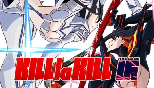
Kill la Kill IF, a review
(Disclaimer: The following is a non-profit unprofessional blog post written by an unprofessional blog poster. All purported facts and statement are little more than the subjective, biased opinion of said blog poster. In other words, don’t take anything I say too seriously.) Just the facts 'Cause you're in a Hurry! Publisher: Arc System Works Developer: A+ Games Manufacturer’s Suggested Retail Price (MSRP): 59.99 USD How much I paid: 49.94 USD (I got a pre-order discount) Number of Playable Characters: 8; Satsuki, Ryuko, Nui, Houka, Ira, Uzu, Nonon and Ragyo (Satsuki and Ryuko have 2 variations). Number of Stages: 6 Rated: M for Blood, Language, Partial Nudity, Suggestive Themes and Violence Nudity: Lots and lots of cleavage and side boob. Characters usually dressed down to bikinis and thongs when disrobed. No visible female nipples. Can I play offline: Yes How long I played: 4 Hours. 2 hours to complete Satsuki's perspective on Story mode and 2 to complete Ryuko's. Microtransactions: None so far. What I played on: My Nintendo Switch. Performance Issues: When the Switch is docked, the performance 'mostly' runs smoothly, albiet shows the soft textures up front. When in handheld mode, the framerate sinks like a rock and becomes stitled. One instance of the game pausing for one moment before resuming. Lenghty loading screens whether docked or on handheld mode. And of course, no anime game is complete without its most famous feature, missynced lip flaps. Dual Audio: Yes. Both English and Japanese voices are available. English Cast: Erica Mendez as Ryuuko Matoi, Carrie Keranen as Satsuki Kiryuuin, Matthew Mercer as Aikuro Mikisugi, Patrick Seitz as Ira Gamagori, Stephanie Sheh as Nui Harime, Christine Marie Cabanos as Mako Mankanshoku, Kaiji Tang as Tsumugu Kinagase, Grant George as Uzu Sanageyama, Romi Pak as Ragyo Kiryuuin, David Vincent as Senketsu, Sarah Anne Williams as Nonon Jakuzure, Steve Staley as Hoka Inumata and Todd Haberkorn as Shiro Iori My Personal Biases: I recently watched Kill la Kill and I enjoyed it quite a bit. I thought it was a good show. My Verdict: Even fans aren't going to be satisfied with this package. With an anemic roster, few stages and a battle system where you fight the camera more than you fight your opponent, Kill la Kill: IF is wasted potential. Even the amusing cutscenes can't save this piece of junk. Wait for a sale. Kill la Kill IF, a review
It's strange that after 5 years of one of the most beautifully animated action shows that we finally now get a release of Kill la Kill IF. Based on the popular anime, will the game do its original source material justice? Let's find out in this review! For those of you who aren't familiar, Honnouji Academy is a fictional high school situated in Tokyo Bay, Japan on the island of Honnō City. The school is dominated by its fearsome student council led by their president Satsuki Kiryuin. Its students wear Goku Uniforms, which give their wearers superhuman abilities because they are constructed with a special material known as Life Fibers. Vagrant transfer student Ryuko Matoi, who wields a scissor-shaped longsword that can cut Goku Uniforms, challenges the council as she searches for her father's killer. Although she is initially easily defeated by Takaharu Fukuroda, she finds a sentient sailor uniform that she names Senketsu, a Kamui which is completely made of Life Fibers and transforms her so that she can face Kiryuin and her trials and obstacles. Kill la Kill IF is a filler story set in the anime's canon storyline. Gone are the various side characters and multiple developments throughout the story and instead speeds through to the main battles and opponents. Set as an arena fighting game, players control one of the characters found in the show and use their unique abilities to whittle the enemy's lifebar to zero. Each character is given access to a melee attack, a ranged attack and a grab which breaks the opponent's guard. Overtime, a player's SP bar builds up. 2 out of the 4 bars can be used for a special attack or to unleash bloody valor, a rock paper scissors mechanic to gain boosts such as attack or health. Losing the battle results in damage while winning continuously allows you to unleash a final ultimate attack. The issues become evident right from the start. Despite Studio Trigger, the animator of the series, supervising, the game's engine just cannot live up to the 2D anime that told the original story so well. While the art direction certainly lives up to the original with its use of contrasting colors and unique aesthetic, the actual animation itself remains stilted and choppy, even on the best of machines. While the animators are able to work around this (Mako's scenes continue to be the highlight of the franchise), you can't help but feel the 3D counterpart is struggling to match up what Trigger mastered in 2D animation. You better get used to the visuals. In order to unlock any of the other modes, you'll have to play the MANDATORY story and watch the stilted cutscenes (which you can skip, Thank God). Because who wouldn't want a story mode that has cutscenes that are longer than the actual gameplay? After all, it isn't like someone won't upload those cutscenes up to Youtube and you can watch them for free... Wait... And that's not even mentioning the numerous loading screens that come between every other cutscene and before the gameplay starts. I don't know if the loading screens are shorter on more powerful consoles and PCs, but they were certainly a slog on the Nintendo Switch. So, if you're in the market for a game with little gameplay, lengthy cutscenes and lots and lots of loading screens, have I got a game for you. Most matches are set between an individual opponent and involve whittling down the foe's health bar to claim victory. However, certain modes allow multiple opponents to face off against each other, either in battle royale or with pairing into teams. Half the time, the game plays like a Musou or Open world beat em up where in the player character must defeat multiple enemies on screen. Sometimes it's rogue Covers, sentient uniforms and other times its Nui clones. With no camera control and no ability to lock on to individual opponents, you'll often miss your intended target and end up hitting a new enemy instead. Story mode, even on its easiest difficulty, opts to pad out the game by giving certain enemies so much health, it takes forever to shrink it down to zero. Forget the sword sponges throughout the game; half the time the camera can't keep up and my poor player character is out of frame because of all the enemies are upfront while said PC is all the way in the back. In addition to the story, there's also Online matchmaking, survival challenge in which you play AI opponents in a row and Covers Challenge, in which the game becomes a full Musou and you must defeat all foes in the arena. All the original voice actors from the anime's dub cast have returned. Erica Mendez as Ryuuko Matoi and Carrie Keranen as Satsuki Kiryuuin give the same respect to the source material as did the Japanese Seiyuu and it's always fun to hear Patrick Seitz, Grant George, Stephanie Sheh, Todd Haberkorn, Matt Mercer and Steve Staley again. If you dislike the voices, the game comes with Dual Audio and you can switch to the original Japanese. CAVEAT: What a waste! How did such a great property get saddled with such a lousy adaptation? Kill la Kill (the anime) still holds up as a show even 5 years after its release. It's too bad all that potential is made into a cashgrab of a game. With its limited roster, wonky camera, and lack of stages, even diehard Kill la Kill fans should wait for a sale while watching the cutscenes on Youtube. It's too bad. For just a brief moment, I did see the makings of a good game. The only reason this anime adaptation doesn't take home the award of "Most squandered potential of an anime property" is because Jump Force came out earlier this year. Verdict: Rental or wait for a sale. Or just watch the anime again.
#kill la kill#kill la kill if#ryuuko matoi#ryuko matoi#satsuki kiryuin#erica mendez#carrie keranen#darling in the franxx#trigger#ira gamagoori#nui harime#mako mankanshoku#tsumugu kinagase#uzu sanageyama#ragyo kiryuin#senketsu#junketsu#nonon jakuzure#houka inumuta#shiro iori
13 notes
·
View notes
Text
Cloud’s Return to Streamland
So, hey, enjoy some canon-happened-but-also-Cloud-streams-games flavor of Gamer Cloud stuff that I wrote at 2am.
--------
Game, check.
Microphone, check.
Streaming program set up? Check.
Alerts set up? Check.
Webcam ready? Reluctantly check. Cloud never really felt comfortable being visible on these streams, but the fans seemed to like it. Plus… Honestly, after he disappeared from streaming for weeks and after what happened recently, they’d probably be reassured to see him alive and sorta well right now.
He moved the arrow on screen to the “start streaming” button and clicked it. No turning back now… He’d be lying if he didn’t keep the “Now Loading” animation screen Denzel pulled together for him up a little longer than normal to delay the inevitable, though. It’d give people time to check their mail and social media and see he was up and running, he justified.
He couldn’t stall forever, however; already the chat was having a fit and flooded with messages like, “he’s back omg!”, “what happened are you ok!?!?!?!”, and “dude I saw the news you were totally boss holy shit”
Chuckling a bit at the latter sort of messages, he switched to the standard stream setup, showing the bright, colorful game he has chosen, the chat to the right of it, and himself in the upper corner, dressed more like a tired college student than the visual kei badass look he normally tried to rock when on the job. “Hey,” he said, giving the camera a little wave. “So, a lot of things happened while I was taking a break from streaming, but the good news is I’m not in any immediate danger of dying anymore, so that’s pretty baller.”
Not surprisingly, chat didn’t slow down a bit, now ranging in responses from “haha cool I know that feel too bro” to “same, fuck geostigma, it can stay gone” to “you were in danger of dying before????????”
Cloud couldn’t help but smile; it was nice to see the cure was making the rounds outside his little corner of the world too. “Right on, tableflippro, it absolutely sucked, being on the receiving end and watching someone else close to me suffer. Would not recommend.”
He picked up the controller from the table, moving the arrow on the game between the new game, load game, and options on screen as he tried to figure out how he wanted to say the things he wanted to say. “So, yeah…” he began, “I was pretty sick for a while there. Between that, and the stress from that, and… um…”—New Game, Load Game, Options, New Game—”… some things I hadn’t really dealt with that happened to me finally smacking me in the face, I wasn’t…”—Load Game, A, Save 1, Save 2, Save 3—”I wasn’t exactly in any sort of state to do much but drown in a bucket of my own wangst and depression and push everyone away. So… Sorry if I made anyone worry with my sudden disappearance.”
His eyes flicked back to chat. The general theme now mostly condolences and asking how he was now. He could try to sugarcoat things, downplay it a little, but…
Taking a steadying breath, he replied, “I wish I could say I was 100% better now, but that’d be a damn lie. I’m not OK. After everything I’ve dealt with in my life, I’ll probably never be 100% better. Having a load taken off of me doesn’t mean I’m not still pretty fucked up. Plus Geostigma may be gone, but it still did a number on me and recovering from the damage it did still sucks.“
He finally loaded a save file, taking his cute round character to the world map. “But.. Having that load taken off of me has helped. Not having to worry about me or the kid dying anytime soon helped. Learning to maybe forgive myself a little for not being good enough to save a couple people important to me has helped. Figuring out I’m not alone has definitely helped.” He made the character walk around in aimless circles and repeatedly duck and look up as he continued to speak. “So… I’m not doing great, but I’m not feeling like absolute trash, so… improvement.”
He saw one particular reply in chat and laughed. “Exactly, Eternal_Damnation, I’m a trash can, not a trash can’t. I’m not about to give up on trying to make things better anytime soon. I’m pretty sure Aerith would rise from the Lifestream to smack some sense into me if I gave up.”
That set off a new flurry of questions, mostly “who’s eris?” and a couple surprising “was that the pink lady with the spiky guy??????”s, which, honestly, was kinda reassuring to see. Cloud wasn’t going crazy, at least regarding that.
Hitting pause, he said, “First of all, to those who saw the pink lady and spiky guy, go to freaking bed, it’s like midnight and you’re all like 8, tops.”
One very familiar username exclaimed, “I am not 8!”
Cloud let out an embarrassing snort-laugh. “You’re close enough, Denzel. Go to bed, and if you’re gonna sneak staying up late, maybe don’t out yourself by talking to me.”
“But I can’t sleep,” was the swift reply.
Trying hard to look like a serious business parent and kinda failing, Cloud said, “At least lie down for a while, and if that doesn’t help, you can come chill with me for a bit until you get tired, OK?”
There was a begrudging “OK” from Denzel’s username, and it fell silent once more. Cloud unpaused the game and entered a level, only to faff around more once his tiny pink character gained an ability. “… anyway, I guess I never did talk about Aerith much here, huh? It hurt too much to think about, honestly. But…” He started demoing random moves with the character without really leaving the first screen. “… she deserves to be talked about. She saved us all, y’know? She was strong, like, magically. That stuff that stopped Meteor? That was her.”
This only made the chat ask even more questions. More questions than Cloud really wanted to answer. But slowly, painfully, he did. He knew himself; if he didn’t do it now, talk about this now, when would he ever? So, he talked. He talked about a woman who was kind, a woman who was patient enough to cultivate flowers in barren Midgar. He talked about how the same woman threated to rip the balls off a mob boss and how it was the part of the funniest-slash-most badass thing he would ever be part of. He talked about a woman full of confidence that she would fix the mess they were collectively in and come back to tell the tale. He talked about a woman who was right about the first part, but not the second. He talked about a woman who he felt was still looking after him, even now.
(He did, however, skip the part where she convinced him that wearing a dress was the only way to save Tifa. Some things, chat did not need to know.)
By the time he was done talking, he had completed roughly half a stage and had the character destroy the cap off a sentient mushroom person and make it look sad. “So, yeah…” Cloud said, his voice wavering, “… we may not have known each other all that long, but… I miss her a lot.” He could feel the tears stinging his eyes and mentally cursed. He did not need to do this now, not after trying to reassure people he was doing better, dammit.
He threw out a quick, “I’ll be back,” muted the microphone, and brought up the break time screen. He then leaned back in his seat, covered his eyes with a hand, and let out a strangled cry as all the things he’d been holding in let themselves out. He cried for Aerith, for obvious reasons; for poor Zack, still half-forgotten in the fog of Cloud’s memories and deserving better than that; for his mother and for all the years he lost; for Tifa, who was still alive but deserved better than having to deal with a emotional wreck of a friend.
So lost in tears he was, he didn’t even register the warmth at his side until he started to calm back down. Next to him was the same kid he had not long ago told to go try to go to sleep, holding a tissue box that had been plucked off the table. “… you all right?” Denzel asked.
Cloud started to nod, but turned it into a shake of his head as he reached for a tissue. “Not really,” he managed to say, “but I’ll manage. You happen to see what chat’s saying now?”
Denzel shrugged. “Mostly them worrying again, but I told them you’ll be all right,” he said, waving to the chat section of the screen.
“Thanks,” Cloud said. He paused, then asked, “So, still can’t sleep, huh?” The boy shook his head. “… y’wanna play the game for a bit while I go splash some water on my face and try to not look like a disaster?”
“Sure,” Denzel replied, holding his hand out for the controller. Cloud passed it to him, rose from his seat, and walked away. Once he was out of view, Denzel switched back to the main stream set-up and unmuted the microphone. “Hey, Cloud needed a couple more minutes, so I’m taking over. So, what was he—jeez, did he not even finish one level? Let’s fix that.”
#final fantasy vii#ff7#cloud strife#gamer cloud#my fic#cloud gets real and it's sad but he needed it#also#dad cloud best cloud
27 notes
·
View notes
Text
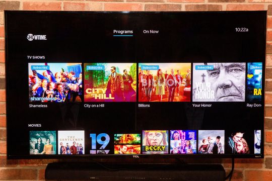
With baseball season starting, AT&T TV is the only streaming choice for many fans.
New Post has been published on https://appradab.com/with-baseball-season-starting-att-tv-is-the-only-streaming-choice-for-many-fans-3/
With baseball season starting, AT&T TV is the only streaming choice for many fans.


Sarah Tew/CNET
Change is the norm when it comes to live TV streaming services, but AT&T TV has had a particularly tumultuous history. It started life as DirecTV Now in 2016, and in the time since it has added and dropped channels, changed its name twice and hiked prices numerous times. The latest iteration no longer requires a contract or a set-top box — yay! — making it similar at first blush to competitors like YouTube TV and Hulu Plus Live TV. The downside is the high price: A monthly subscription starts at $70 and to get access to your local regional sports networks (RSNs) you’ll need to pay for the $85 package.
Like
$85 plan has robust regional sports channels for NBA and MLB games.
Fun channel-surfing capabilities.
Don’t Like
Expensive, especially with sports and DVR add-ons.
$70 plan has fewer channels for more money than YouTube TV.
Roku app doesn’t work as well as Apple TV’s or web.
Now playing: Watch this: Live TV streaming services for cord cutters: How to choose…
2:44
Those local channels, which carry the regular season games of NBA basketball and MLB baseball teams, are the best reason to subscribe to AT&T TV. No competitor has nearly as many RSNs, so for fans who want to catch all the action of their team live, paying $85 per month to AT&T TV is often the only streaming option. (As a bonus, that price also includes a year of HBO Max and NBA League Pass Premium.) A cable TV subscription, which typically also offers RSNs, is likely cheaper, however.
Read more: MLB 2021 streaming: How to watch the Dodgers, Mets, Yankees and more baseball without cable
Using the AT&T app feels more cablelike than any of its competitors, with a unique swiping channel-change mechanic. The service is best appreciated on an Apple TV because even though Roku is our favorite streaming device, its app lacks the ability to pause live TV. If you crave a familiar interface and want access to its extensive sports coverage AT&T TV is worth a look, but if you don’t need those RSNs, then YouTube TV, which costs less and has more non-sports channels, is a better choice.
Optional contract, multiple channel packages
One of the benefits of choosing a live TV streaming service over cable is that you’re not tied to a contract. AT&T TV does offer an optional two-year contract, but it’s not a very good deal.
Off-contract, the basic package starts at $70 a month with 65-plus channels and a 20-hour DVR but it does miss channels such as MLB Network, NFL Network and Travel Channel. For cord-cutters who want to follow their local NBA or MLB team, AT&T TV’s $85 Choice package is a better option, with access to those regional sports networks. The Ultimate tier costs $95 with more channels including Starz and Encore, while the “whole enchilada” $140 Premier level adds even more channels with HBO (and HBO Max), Starz, Showtime and Cinemax.

The AT&T TV Stream set-top box is free if you get a contract, but you can also use devices like Roku, Apple TV and Amazon Fire TV.
Sarah Tew/CNET
Opting for the contract gives you an AT&T TV Stream set-top box, an unlimited cloud DVR (normally $10 per month extra) and a discount on the first year — with a steep price increase in year 2.
With a contract, the basic Entertainment package’s first-year price is $60 per month, which then jumps to $93 per month in the second. The Choice package drops from $85 per month to $65 per month for the first year of the two-year contract, but the second year would jack the price back up to $110 per month. Those with Choice on a two-year contract would also be on the hook for paying an additional $8.49 per month as a “regional sports fee” for two years. Month-to-month Choice subscribers don’t have to pay the regional sports fee.
Those second-year price hikes make the overall cost of both packages higher than simply going month-to-month for two years, so we don’t recommend getting a contract.
Premium live TV streaming services compared
Premium services YouTube TV AT&T TV Hulu Plus Live TV FuboTV Base price $65/month $70/month $65/month $65/month Total number of top 100 channels 75 61 62 65 ABC, CBS, Fox and NBC channels Yes Yes Yes Yes Record shows for later (cloud DVR) Yes (keep for 9 months) Yes (20 hours, unlimited hours for $10/mo.) Yes (50 hours, 200 hours plus commercial skip for $10/mo.) Yes (30GB, 500GB for $10/mo.) Step-up packages with more channels No Yes Yes Yes Simultaneous streams per account 3 20 2 ($10 option for unlimited) 2 ($6 option for 3)
AT&T recently upped the number of concurrent in-home streams to 20, which is good news to households with lots of people who want to watch at once. The out-of-home concurrent streaming limit is three, which should still be plenty.
What’s it like to use?
AT&T bought DirecTV in 2015, and that service’s history still informs the functionality of AT&T TV. Our favorite cablelike feature is the ability to swipe left or right to change channels, even if it’s not quite instantaneous. There’s about three to five seconds of loading time when changing channels.
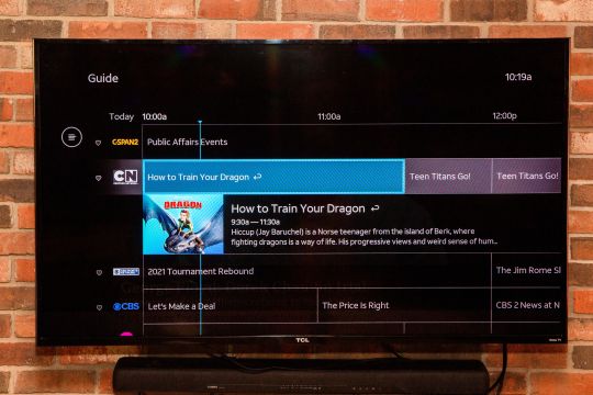
AT&T TV comes with a program guide
Sarah Tew/CNET
When using AT&T TV with a remote, the controls center around the direction buttons and Enter/OK. This makes it relatively quick to pick up and use, and also means you don’t need a complicated remote control to make it work, making the minimalist Apple TV clicker a great companion. If you want the full “surfing” experience on a universal remote, you could even program left and right arrows into your Channel up/down buttons.
The service loads straight into the last channel watched — further enhancing its cable credentials — and pressing down brings up the interface with a choice of the 14-day guide, Watch Now, My Library recordings and a Discover option. Navigation is intuitive and quick, something that the painfully slow YouTube TV is not.
While Roku is very similar to Apple TV, there is one major difference: There’s still no live TV pause on Roku. This is also potentially frustrating to sports fans who need to pause the action momentarily. Instead, pressing pause freezes the screen while the program keeps playing in the background. Meanwhile Apple TV will allow two minutes until it cuts to the live feed and pauses again, and will keep skipping forward and pausing each minute or two until you press Play. In comparison, YouTube TV lets you pause indefinitely, just like a normal DVR.
Sarah Tew/CNET
Depending on the tier you choose, AT&T TV’s DVR offers between 20 and an unlimited number of hours, while YouTube TV offers unlimited storage by default. YouTube TV lets you keep recordings for up to 9 months, while you are limited to 30 days on AT&T TV. If you live in a small to medium-size household, the service offers three simultaneous streams without the need to pay extra.
Some programs do give you the option to restart, and pressing down on the Apple TV remote will bring up show info, a recording option and Restart (if available). Pressing the Select button will pause the program. In contrast, pressing the middle button on Roku brings up a different menu with similar functionality but no pause, but there is the ability to restart.
I briefly used a Fire TV and found the experience closer to Apple TV than Roku. If you don’t have an Apple TV, the Fire TV is my next choice for using the service. Using an iPhone (an iPhone 6 Plus on AT&T, to be specific) also offered a smooth experience with quick channel changes.
Is it worth your $70 (or $85) a month?
The cable experience is what AT&T TV is all about — the swipe left and right functionality is quite inspired. While the company has really bulked up on its content since we last looked in 2019 — when it had fewer than 50 of the most popular channels — the service still lags behind every other rival in terms of breadth. The real reason to get it is if you’re an avid sports fan — the $85 Choice package with its twin draws of HBO and RSNs is unmatched by the competition.
If you want to save money though? Stay clear — almost any other service offers a better value than this, and many cable packages are comparable. Even if you’re an Apple user, other services such as YouTube TV and Hulu Plus Live TV offer a superior and cheaper experience.
Channel comparison
Below you’ll find a chart that’s a smaller version of this massive channel comparison. It contains the top 100 channels from each service. Some notes:
Yes = The channel is available on the cheapest pricing tier.
No = The channel isn’t available at all on that service.
$ = The channel is available for an extra fee, either a la carte or as part of a more expensive package or add-on.
Not every channel a service carries is listed, just the “top 100” as determined by CNET’s editors. Minor channels such as AXS TV, CNBC World, Discovery Life, GSN, POP and Universal Kids didn’t make the cut.
Regional sports networks — channels devoted to showing regular-season games of particular pro baseball, basketball and hockey teams — are not listed.
Top 100 channels compared
Channel Sling Blue ($35) Fubo TV ($60) YouTube TV ($65) Hulu with Live TV ($65) AT&T TV ($70) Total channels: 38 65 75 62 61 ABC No Yes Yes Yes Yes CBS No Yes Yes Yes Yes Fox Yes Yes Yes Yes Yes NBC Yes Yes Yes Yes Yes PBS No No Yes No No CW No Yes Yes Yes Yes MyNetworkTV No No Yes Yes Yes
Channel Sling Blue ($35) Fubo TV ($60) YouTube TV ($65) Hulu with Live TV ($65) AT&T TV ($70) A&E Yes Yes No Yes Yes ACC Network No $ Yes Yes $ AMC Yes Yes Yes No Yes Animal Planet No Yes Yes Yes Yes BBC America Yes Yes Yes No Yes BBC World News $ $ Yes No $ BET Yes Yes Yes No Yes Big Ten Network $ Yes Yes Yes $ Bloomberg TV Yes No No Yes Yes Boomerang $ No No Yes Yes Bravo Yes Yes Yes Yes Yes Channel Sling Blue ($35) Fubo TV ($60) YouTube TV ($65) Hulu with Live TV ($65) AT&T TV ($70) Cartoon Network Yes No Yes Yes Yes CBS Sports Network No Yes Yes Yes $ Cheddar Yes Yes Yes Yes $ Cinemax No No $ $ $ CMT $ Yes Yes No Yes CNBC $ Yes Yes Yes Yes Appradab Yes No Yes Yes Yes Comedy Central Yes Yes Yes No Yes Cooking Channel $ $ No $ $ Destination America $ $ No $ $ Discovery Channel Yes Yes Yes Yes Yes Disney Channel No Yes Yes Yes Yes Disney Junior No Yes Yes Yes Yes Disney XD No Yes Yes Yes Yes DIY $ $ No $ $ E! Yes Yes Yes Yes Yes EPIX $ No $ No $ ESPN No Yes Yes Yes Yes ESPN 2 No Yes Yes Yes Yes ESPNEWS No $ Yes Yes $ ESPNU No $ Yes Yes $ Channel Sling Blue ($35) Fubo TV ($60) YouTube TV ($65) Hulu with Live TV ($65) AT&T TV ($70) Food Network Yes Yes Yes Yes Yes Fox Business $ Yes Yes Yes Yes Fox News Yes Yes Yes Yes Yes Fox Sports 1 Yes Yes Yes Yes Yes Fox Sports 2 $ Yes Yes Yes $ Freeform No Yes Yes Yes Yes FX Yes Yes Yes Yes Yes FX Movies $ $ Yes Yes $ FXX $ Yes Yes Yes Yes FYI $ Yes No Yes $ Golf Channel $ Yes Yes Yes $ Hallmark $ Yes No No Yes HBO/HBO Max No No $ $ $ HGTV Yes Yes Yes Yes Yes History Yes Yes No Yes Yes HLN Yes No Yes Yes Yes IFC Yes Yes Yes No Yes Investigation Discovery Yes Yes Yes Yes Yes Lifetime Yes Yes No Yes Yes Lifetime Movie Network $ Yes No Yes $ Channel Sling Blue ($35) Fubo TV ($60) YouTube TV ($65) Hulu with Live TV ($65) AT&T TV ($70) MLB Network $ $ Yes No $ Motor Trend No Yes Yes Yes Yes MSNBC Yes Yes Yes Yes Yes MTV $ Yes Yes No Yes MTV2 $ $ No No Yes National Geographic Yes Yes Yes Yes Yes Nat Geo Wild $ $ Yes Yes $ NBA TV $ $ Yes No $ NBC Sports Network Yes Yes Yes Yes Yes Newsy Yes $ Yes No No NFL Network Yes Yes Yes No No NFL Red Zone $ $ $ No No NHL Network $ $ No No $ Nickelodeon No Yes Yes No Yes Nick Jr. Yes Yes No No $ Nicktoons $ $ No No $ OWN No Yes Yes No $ Oxygen $ Yes Yes Yes $ Paramount Network $ Yes Yes No Yes Channel Sling Blue ($35) Fubo TV ($60) YouTube TV ($65) Hulu with Live TV ($65) AT&T TV ($70) Science $ $ No $ $ SEC Network No $ Yes Yes $ Showtime $ $ $ $ $ Smithsonian No Yes Yes Yes $ Starz $ No $ $ $ Sundance TV $ Yes Yes No Yes Syfy Yes Yes Yes Yes Yes Tastemade $ Yes Yes No $ TBS Yes No Yes Yes Yes TCM $ No Yes Yes Yes Telemundo No Yes Yes Yes Yes Tennis Channel $ $ No No $ TLC Yes Yes Yes Yes Yes TNT Yes No Yes Yes Yes Travel Channel Yes Yes Yes Yes $ TruTV Yes No Yes Yes Yes TV Land $ Yes Yes No Yes USA Network Yes Yes Yes Yes Yes VH1 $ Yes Yes No Yes Vice Yes Yes No Yes Yes Weather Channel No Yes No No $ WE tv $ Yes Yes No Yes
0 notes
Text
What’s Wrong with Hitman?
I love Hitman, to the point that for the past couple of years it’s been the only game I’ve really invested myself into. I’ve been playing some other games in the long wait for Hitman 3 and while I still prefer Hitman they’ve given me perspective and ideas for what I’d like to see in the new game. Specifically Dark Souls and Dishonored, while the former isn’t a stealth game I think its consistency and repetition appealed to me as a Hitman fanatic. Anyway here’s my list:
Target AI is the biggest gripe I have with the new trilogy. It’s simultaneously too easy and too difficult to deal with, in a weird way. Targets won’t react to coins by themselves but will pick up an electric insta-kill phone no matter what, for example. I think the first change I would make is to have it so targets can only tell guards to check out distractions, not other civilians, and will check them out themselves otherwise. This would have a couple of knock on effects especially with my other suggestions but I’d like it if the target will only ask a guard if there’s about the same room’s length of distance between the two, otherwise they will go for the distraction. This will encourage the sandbox approach with more opportunities to lure targets, and encourage players less and less to use more scripted solutions to isolate targets or just knocking tons of people out to get a specific strategy.
My second suggestion, related to the first, is for target-specific bodyguards to no longer call in other guards to deal with found weapons. Now this won’t all be suggestions to make the game easier, because I think to counterbalance this targets will notice after a while if you’ve knocked out a guard that they’re no longer been monitored and appoint one of the regular guards to follow them. This gives more ways to deal with pesky bodyguards but add a little dynamic enemy behaviour to the targets, and one that makes sense.
I just watched this review of Hitman 2016 on YouTube, that I highly recommend, called The Physicist’s Review. In it the reviewer mentions that they actually found the map for the game’s levels by accident, and that made me realise how weird the game’s menus really are. See, Hitman 1 & 2 have two pause menus: one which has the objectives, map, intel and challenges, and another which lets you save, load and adjust settings like subtitles and volume. It’s weird that these are separate menus something like San Andreas for example flows a lot better when just one menu that gives you all of these functions. I think it was done for immersion, but it doesn’t work when the map and intel screens pause the world anyway. For gameplay purposes I’d have everything one menu, with map and save/load at the furthest left as soon as you hit pause. Or for immersion I’d have the map, intel, etc. be in real time with the pause menu being the only thing that pauses the game. But this is a comparatively minor issue that I’ve added in last when I discovered this video.
Not all my suggestions are to make the game easier, luckily. My next suggestion is for more consequences for suspicious activity in the world. Whenever you do something like poison a drink or turn off a stove there’s one of two reactions from NPCs, either you stay there and they eventually altert guards to come and gun you down, or you run away with no consequences other than to rating. I think an inbetween to this would be if an NPC catches you doing something naughty and you escape, they will become an enforcer to whatever disguise they saw you in. Perhaps showing up as yellow in instinct, with the consequences of this being if they catch you again in this enforced state you become compromised and they alert guards immediately. I think this would factor into Hitman’s social stealth really well, and would plug up an annoying flaw in the otherwise well-constructed if not particularly smart AI.
More target-related problems I have with the AI in the new games. While targets have a consistent route they take whether you’re distracting them, manipulating them or just observing them the bodyguards don’t. They often speed up, slow down or even stop in their tracks depending on weird the thing they’re doing is. A big example is Mumbai with luring Vanya or Dawood out of their lairs. I think in a predctiable and slow paced game like Hitman having guards that can either outrun you or just do random shit, or predictable shit in a random way, messes with the consistency of strategising. This seems like something that’ll be potentially fixed in Hitman 3, as many interviews talk about this consistency being a big part of the series’ appeal, so I’m putting this here just in case this still isn’t fixed after three games
My last target related gripe is that some don’t targets don’t defend themselves when they should. Target AI is more like a modified civilian AI rather than its own thing, and since civillians don’t have that functionality it probably is a pain to try to modify specific targets to have the function of a completely different AI, since guards have their own complexities and might not be compatible with the type of detailed scripting a target typically has on top of having to defend civillians. But in a game series that’s given us some incredibly colourful and intimidating personalities it’s a bit weird that the AI is very one size fits all. The Maelstrom can’t shoot you despite being a modern day pirate, Tyson Williams can’t engage in a fist fight despite being a big burly man and Maya Parvati does the same “cower and crouch” animation despite shouting at you with insults like bitch-tits. It takes you out of the experience a little bit
And finally the last thing I’d want from Hitman 3 is a brand new Custom difficulty option. I thought this was a great addition in Dishonored 2, allowing me to tweak the game to for example make combat near-lethal but hiding in shadows more affective. An ability to pick and choose things like limiting the amount of saves and allowing running footsteps to be heard from Master difficulty but then disabling stuff from there that might be tedious like the extra cameras would really help players to tailor the game to their exact liking. The real difficulties should still be the only place you get rewards and place on the leaderboards but this would really solve any issues people have with wanting to play Master with the higher difficulty but not wanting to have limited saves. They can play master once for the suit and then custom for fun
Anyway that’s all my thoughts for now. The games seventeen days away as of posting this so if none of this is on the cards for the release I hope IO had some parallel thinking and implements it in a year’s time as a patch
0 notes
Text
Quick Critique: Battle Chasers: Nightwar
Before I even get to the meat of this: DO NOT BUY THIS GAME, IT IS VERY BROKEN. Again, even if you loved the comic and love turn-based RPGS: DO NOT GIVE THIS COMPANY MONEY, THEY RELEASED A BROKEN GAME.
Joe Mad is one of my favorite artists and I read the Battle Chasers comic pretty much just to see him draw pretty things. I only just read it a year or two ago, so I thankfully avoided the whole incident of him bailing on the series and leaving it unfinished after a main plot twist. The actual story (and most of the writing) is kind of just Dungeons and Dragons meets generic anime stuff, but it had enough moments and unique ideas here and there to make the comic series worth it, even this many years after its initial release. So Battle Chasers the comic is pretty good. Battle Chasers the video game, however, is a steaming pile of garbage.
This game is so unfinished and slapped together that I'm just going to list out a stream of the constant issues it has: It crashes. A LOT. It's not just one thing going wrong, it crashes all over the place and multiple times at different spots (inventory screen, leaving a dungeon, changing screens, and so on) I actually had a crash during the ending credits It locks up every time I try to enter the Arena forcing me to force close the game I finally managed to enter the Arena (apparently some of the difficulties work and others don't), it's a series of battles with a 20 minute time limit, I'm doing the hardest difficulty to get the final prizes, get through multiple rounds where I'm one turn away from the entire party dying or I lucked out and a character dodged an instant kill move, I'm at the last boss with 2 minutes left on the clock, deliver the killing blow with 23 seconds left on the clock, I get the Playstation level trophy for completing the Arena, the game showers me with prizes, I leave the Arena, I open the menu, the game crashes and upon relaunching sets me back at the beginning of the Arena having made no progress at all and with none of the prizes. I think I just instantly skipped over anger, sunk back in my chair, and whispered "mother fuckers" to myself for a few minutes After a battle, I lost the ability to interact with any objects. Seeing as how the dungeon required me to flip a switch to advance, I had to quit the game. This happened multiple times Frequent hitches and freezing for a second on the map, exploring, and in battle Menus aren't responsive for a few seconds after opening them I had a story scene fail to load and the game just displayed a screen full of that "missing image" pink I had a different story scene fail to load but I still got the subtitles. This one was a major story sequence so it wasn't repeatable the next time I played the dungeon so I would have liked to have seen that The voice acting is Sega Saturn levels of bad. They're horrible choices for the characters but then poorly acted on top of that. And they apply random odd filters over the readings. There's a scene in the open air in a town where your characters talk to each other but Gully sounds like her lines were recorded in a particularly echo-y bathroom. The only character I cared for was The Collector, a sinister but gleeful little monster that is likely eating the remains of dead bosses that you bring it. The Collector deserves to be in a better game than this one The text size is WAY too small The walking speed is slow. If you doubled the walking speed, it would still be too slow Battles are slow both in animation and action speed and how many hits it takes to kill a grunt enemy The core combat system is tedious and relies far too much on crits and applying status effects. Most end game fights devolve into who can apply the most debuffs to the other team and then spamming special moves that gain extra traits if the enemy has specific debuffs The music is so laid back that it (rightfully) just seems uninterested in being a part of this game, even during battles. The soundtrack is so forgettable and uninteresting that I usually turned the game audio almost off and listened to the BBC while I played. The Shipping Report pretty much matches the pace and excitement of this game Totally unnecessary crafting mechanics By the time you get enough crafting materials to build a weapon, it's worse than what you get from dungeon crawling You can't sort your crafting materials alphabetically, so when you're looking up how many of a quest item you need, have fun sorting through that mess Totally unnecessary fishing mini-game Every time you enter battle, the UI flashes a move description. I think it's loading the last thing you used in the previous battle Occasional multiple second pauses at the start of a battle before the UI will display or you can interact with it in any way Clunky menu UI Loot-based drops that do nothing to make the game more interesting Loot that isn't even interesting or exciting because most of the equipment is very similar and the vast majority of what you find is just crafting materials you won't use Major side-quests and items that are gated by random loot drops. You have to hope the characters show up on the map and then hope they drop the item you need (usually multiple times) or else start a dungeon from scratch and do it all over again Semi-randomized dungeons where the actual rooms barely change but their order does, so combined with the need to grind, the dungeons get really boring and just have you looking for the exits rather than rewarding you for exploring. Later dungeons even repeat pieces of earlier dungeons Items in shops are stupidly expensive for how little they change your stats and for the piddly amount enemies actually pay out or what items sell for. While spending a night at the inn cost me 40 coins, selling a purple rank weapon only got me 17 coins. It's actually faster to play through the whole first dungeon and get the health and mana refill before the boss than it is to grind out the money to stay a night at the inn for a large chunk of the game Just about every item you find in the wild will raise one stat but then lower multiple other ones so you kind of just have to pick one stat for a character to use and min/max the hell out of it Items in your inventory will mark themselves as new even though you've seen them before Items in the world will still sparkle as if they're unchecked even though you already have them If you have to close and restart a dungeon (say because the game crashed or locked up), it will acknowledge that you've been through the rooms but respawn the enemies past a seemingly random point. I had one dungeon where the objective was to kill two mini-bosses, I did so, saved the game in case it crashed at the boss, and upon reloading it, the mini-bosses respawned even though I had the objective that said they were dead checked off Every time the game crashes, it resets your super meter. So you can go through a dungeon, build up your meter, save it for the boss fight, the game crashes, you reload at the boss, and now you have no meter and you're at a serious disadvantage Perks and equipment will unequip themselves (this may be related to all the crashes) I met an enemy without warning that was vastly stronger than anything I'd seen in the game before, I could only do 80 damage to it per turn, and every turn it could heal itself for 84 health. And for some reason I wasn't allowed to run away from the fight so I had to sit there for 10 minutes turn by turn hitting the enemy, watching it heal, and letting it whittle down my party's health. Dying then made me lose a chunk of my money Apparently those are special enemies that offer a special reward if beaten, but it wasn't until I was at the final dungeon that I ever saw them again. I don't know if the game was broken and would no longer spawn them or what Another dungeon had a bunch of enemies that I tore through with no problem, and then I got to the boss and it killed each member of my party in 1 hit. Dying, again, made me lose a chunk of my money. So the lesson is to never sell anything until you can fully afford the thing you're trying to buy because you never know when the game is going to throw balancing out the window and punish YOU for it I don't think you can manually save without quitting the game. But quitting the game dumps everything it loaded into memory or something because when you load the game back up, it can take 40 seconds to load into your first battle. Given all the crashes, you have to save and quit often, so get used to watching the first 15 seconds or so of the opening cutscene because you can't skip to the title screen until that plays out The trophies aren't properly proofread and sometimes won't award when you earn them and instead pop the next time you load the game If a character dies from a status effect at the start of their turn, the UI is not graceful I would love to hear some kind of justification on the game's balancing because the way it's set up is that you beat a dungeon, unlock the next story dungeon, but you're not actually strong enough to progress the story yet, so you have to go back and grind the dungeon a you've already finished to level up a bit. You pretty much have to beat each level on each difficulty before you can move ahead, so by the time you're ready to move the story along, you're really, really sick of the previous dungeon Characters not in your party don't gain any experience from battle, so the game actively discourages you from trying new characters. I was level 10 when I unlocked Knolan, but he was only level 9 and the more I use my normal team, the further Knolan falls behind, so I have no reason to ever add him to my party. Changing team members just means you have to redo all the grinding you've done to level them up and hope you get some loot drops for them. Maybe it's just how I play the game, but there's really only one viable team. You HAVE to have Calibretto on your team because he's the only decent healer. Garrison is the only one that can do any decent damage. Gully is slow and focuses on defense, while Monika has high evasion, good damage, and can bog enemies down with stat debuffs so Monika is way more useful Doing end game clean up, I used my weaker teammates because my main team stopped earning experience from the early dungeons, I met those special pirate enemies with this team, was happy to have a chance to fight them, but the pirates scale to your strongest team not the team you're actually using so my level 9, 12, and 17 characters got destroooyed by the level 30 enemies The team couldn't even do New Game + properly. Starting NG+ causes you to lose all your items, so all that time you spent on random drops to get the ultimate weapons and armor was totally wasted. It's completely unnecessary to do this because all the weapons are level gated. So if you reset the character levels, you stop them from having access to the top gear from the start, but once they level up, they get their hard earned weapons back. That would have been the competent way to handle NG+ here New Game + starts you off with the whole team, but it doesn't properly handle that you've unlocked characters before their normal unlocking event, so the shops won't sell you their perk bonus or costume items. Even if you come back at the end of the game when you'd normally have those characters, the game still treats them like they haven't been unlocked yet
Even with its many, MANY glaring flaws, they have the audacity to not actually finish the game's story. You slog through all of this, beat the final boss, and the ending is barely more than "hey, buy some DLC or a sequel".
So, yeah, don't spend money on this game. The perk system is kind of neat though. You get points when you level up and you can cash them in on an attack path or a defense path. As you buy perks on each path, every 20 points you spend unlocks a bonus perk that can offer some substantial stat boosts. You can respec for free, so you can mess around with different choices as you slooowly grind out levels or boss fight currency to get more points.
Battle Chasers is bad but not in the way that most low budget games are bad. The art's great so the game looks fantastic and draws you in. It's the quality design sensibilities and usability in the game that are godawful, the gameplay is as dry as it comes, and it's an unfinished mess. Everything about this screams that the team got a slew of crowdfunding money but then nobody on the team actually knew how to make a good video game so this got rushed out the door without proper testing or fixes to hit a deadline. Battle Chasers makes me question whether Playstation cert matters. If this game, with its constant crashes and 100% reproducible lock-ups, can be released for sale, then clearly nobody is checking the actual game or doing anything remotely resembling quality control.
1 note
·
View note
Text
No Mercy Dev Blog #1
Hey everyone!
We’ve had an amazingly successful first week to our Kickstarter for No Mercy; we’ve raised over $20,000–over 2/3 of our goal! Thank you so much to everyone who has supported us. We needed to come up with new backer tiers to replace the ones that sold out, which is a great problem to have to solve.
We’ve just released a new batch of updates to the public demo. If you’ve been following the demo on Itch, you know that we’ve been posting some sporadic bugfixes and updates for a couple of weeks now. We want to achieve a regularity in these updates throughout and beyond the Kickstarter campaign, and it seems appropriate to start earnestly creating content for this dev blog to go with it.
Latest Changes v0.1.291.4566 – February 17, 2017 – Elliot now has a little more range on many of his attacks – Ray’s spirits do more to stay above-ground – Ray’s secondary attack animation is now 20% faster – New loading screen with randomized tips – Fix for issue when pausing immediately on level load – Loading screen is now smoother, no longer hiccups when level is done loading – Tree Boss changes; smoke particle system and damage taken by head now tied to hand states – Fixed issue where player attack transitions could only happen on the exact first frame of the exit time window. It should now be easier to chain attacks reliably, and this should also fix many animation-locking issues, especially for Elliot.
Our goal is to produce a weekly blog piece written by someone on our team. They can write about anything at all that strikes their/our fancy; important and unimportant, business and personal, scientific and artistic, relevant and irreverent alike. Blog posts may or may not contain, include, or be released alongside No Mercy version change notes. We’ll do our best to keep updates of both the game and the blog coming on a regular basis, and entertain and inform you to the best of our abilities.
No Mercy has been in some form of development for nearly a year. It started as a very simple 2D/2.5D infinite runner prototype that we were working on alongside client work and other potential projects. The game started out extremely simple, but every time we took our most rudimentary prototypes out to show people, we got a great response. We got the feeling that people would be willing to invest more time in our game than the quick (mobile) endless-brawler format would allow for, so we began to pull and stretch the game out into a game that’s more truly 3D despite the 2D graphics.
We got together and came up with some rich backstories. The cooperative nature of No Mercy allows us to tell the story of the game in different ways, depending on which characters are playing together, so we made sure each character had a healthy amount of personal stuff going on that we could draw from. We want each of our characters to have a unique and distinctive playstyle, with some special details unique to each individual combination sprinkled in, so that every pair feels fresh and exciting. The hardest part of this will be balancing it all, but we’ve been very thoughtful about our character roster and we’ve kept it small so that we can put enough thought into each combination. Although Elliot is the poster-character, each of our characters are full-fledged protagonists in their own ways.
Though we’ve been rallying around the project and have been really excited by its potential, it has been difficult to put our full attention on the game. Even after we shelved other internal projects to focus on No Mercy, we still had to juggle client work to keep ourselves alive. We also moved offices and found ourselves working for months in a literal construction zone, with dust and loud noises creeping over the ceiling-less walls of our temporary space. We put our heads down and worked through it, and released our first public version of the game around the same time we finally got to move into our real offices, a couple of weeks ago.
Things have been simultaneously settling down and getting more hectic ever since, but we’re as prepared as we’ve ever been to handle the challenges before us. We’ve been honing our skills and finding our voice as a professional company for over 3 years and as a team in general for closer to 6 or 7. We’ve been through quite a lot and we all trust each other implicitly as professionals and as artists. There is also a whole extended network of people who have been through our doors and worked with us over the years, and there’s no way we could have gotten this far without them.
We’re excited by the opportunity that this Kickstarter campaign represents. We’re going to make our game whether or not we’re funded, just like we made our previous game (Hatch-It!) despite it not reaching its goal. A successful campaign accelerates our plans and give us a short period of financial security that can help us leapfrog ourselves towards the game’s release. We relish the opportunity to prove ourselves and create some art as the well-oiled machine we’ve been honing ourselves into.
We’re thankful that we’re able to do what we love here in Columbus, Ohio. We’re grateful for the vibrant and talented ecosystem of local game developers that our company continues to grow with. We’re humbled by the people who care about us and the things we make and do. Thank you for reading this far; we hope you’ll stay with us. We’ll make it worth your while.
Tschüß! Tom
Fun Links Homepage: http://www.multivarious.com/nomercy/ Kickstarter: https://www.kickstarter.com/projects/multivariousgames/no-mercy-for-lorne-hope Demo: https://multivarious.itch.io/nomercydemo GameJolt Demo Mirror: http://gamejolt.com/games/no-mercy-demo/228232 Steam Greenlight: http://steamcommunity.com/sharedfiles/filedetails/?id=863479593 Join our Discord! https://discordapp.com/invite/69XfVGS
No Mercy Dev Blog #1 was originally published on Multivarious Games
133 notes
·
View notes
Link
Before I actually delve into the main meat and potatoes of Cowardly Creations’ recent PS4 and Vita release, I want to discuss the title. Uncanny Valley is named after the notion that the more accurate simulations of human faces and expressions get, the more we (as in, us real humans) become aware that they might not be authentic. A great example of this are the characters seen in the Tom Hanks computer generated movie The Polar Express. The facial animations of the characters are eerily lifelike…but there’s something decidedly soulless about them and the human eye has an unnerving ability to detect the fabrication. The same can be said of the young Jeff Bridges in Tron Legacy or the recreation of Peter Cushing depicted in Star Wars Rogue One. Like The Thing from John Carpenter’s eponymous 1980s masterpiece, it looks like a human…but it isn’t. And so ends the pseudo-science lesson. I simply find the notion of the uncanny valley theory totally fascinating and this in part might be one of the reasons that I was drawn to this retro-inspired psychological horror in the first place.
Uncanny Valley is actually a fairly old game, having originally been released on Steam way back in 2015. I only discovered this after searching for information about the game prior to its release on the PlayStation Store earlier this week, and I unearthed a bunch of rather unfavourable reviews, too. Not wanting to be influenced by the actual reasons behind the various two-star ratings Google threw at me amongst the search results, I decided not to read them and instead wait for the game to arrive and play through it with no prior knowledge or information about the storyline or the gameplay mechanics. The only things I cared about at the point of purchase were that I was enamoured with the 2D, pixel art trappings and the promise of playing what looked like a retro-themed take on Silent Hill. Having experienced and enjoyed aesthetically similar games on my Vita, such as Lone Survivor and Slain (both of which have a definite horror theme), I wanted to give Uncanny Valley my full, undivided and uninfluenced attention.
The game starts with you playing as a guy called Tom (which was disconcerting at first, as I though the game somehow knew my actual name), who has just taken a job as a security guard at an isolated facility surrounded for miles around by nothing but snow-covered forests. The facility was once the home to an organisation called Melior, but now stands unused yet is eerily still full of office equipment and machinery. So far, so The Shining; and I think it’s important to reference Stanley Kubrick’s seminal horror flick at this point because Uncanny Valley draws much of its uneasy atmosphere from the 1980 movie. The feeling that everything appears to be normal, but there’s something not quite right. Where are all the workers from the facility? Why does the massive building stand empty apart from you and another security guard with who you share a shift pattern? Who is the mysterious house keeper you occasionally run into at the now deserted staff accommodation block? There are so many unnerving elements to the game’s story that you can’t help but be drawn in, driven by a desire to know more. It’s like The Shining mixed with the desolation of Pripyat and the mysterious, unnameable weirdness of HP Lovecraft’s novella Shadow Over Innsmouth.
Once you settle in, Uncanny Valley sets you the task of doing the rounds in the Melior building after dark, where Buck (the other security guard) gives you instructions on which floors to patrol and barks at you over the radio to fix the generator if the power goes down. During these shifts (which actually only last for 7 minutes each) you are generally free to roam around the deserted building and the limited outside areas by torchlight, picking up audio tapes and reading emails on the various computer terminals you find. Both of these activities will yield further information about what went down at Melior before the firm went to the wall, and also reveal the unease felt by staff at working in such a remote location, with the company dabbling in unethical and slightly disturbing research. It is once these night shifts end and Tom finds himself needing the warm embrace of sleep that Uncanny Valley truly takes a trip into the macabre and surreal.
The dream sequences place Tom in a host of unconnected scenes and locations – police stations full of corrupt cops, alleyways populated by mutilated corpses and tenements full of what can only be described massive green faces bursting through walls…because that’s what they are. The desolate reality merged with the horrific dream sequences, both in turn coupled with no real idea of what is going on (initially at least) do make Uncanny Valley a truly unique and genuinely unsettling experience. For this, I cannot fault it. The game does start a bit slowly, and is a little bit more of a walking simulator than you would expect, but after a while the creepiness ramps up and the action starts…and then it goes fully Silent Hill and you find yourself running down shadowy corridors, shooting zombies in the head and being chased by crowds of invincible silhouettes. What does it all mean? What was Melior doing out there in the place beyond the pines? Well…I won’t spoil it for you, but rest assured it’s pretty creepy and makes Uncanny Valley stand out on the Vita especially as a game well worth investigating.
Another, not so positive aspect of Uncanny Valley, is just how full of glitches it is. At first, I wondered if what I was encountering was a play on Eternal Darkness’s way of messing with the player. Remember the ‘corrupt memory card’ prank and the other ways in which the Gamecube classic tried to freak you out by breaking the fourth wall? Well, Uncanny Valley has plenty of these moments…but they aren’t intentional. A major bug I found was that if you are in the middle of attempting a puzzle when the game forces Tom back to his bedroom to get some sleep (it’s a bit like the mechanic used in Shenmue where Ryo Hazuki has to keep popping off to bed when it gets late), then the game will not load the following screens. It’s hard to explain, but essentially you can still move around and interact with items and other characters…but you cannot see anything on the screen. Pressing pause will make the black mask flash for a split second, revealing the game as it should be before going back to a black screen. In this case, the game had auto saved and no matter how many times I reloaded my save, the black screen glitch was replicated. Annoyed, I restarted the adventure resigned to the fact that I’d just wasted two hours of my life.
Interestingly though – and as a testament to the message you get upon starting Uncanny Valley for the first time – on my second play through I got a slightly different experience. Different conversations with the same characters, different items in the game world to collect and slightly different dream sequences. Uncanny Valley boasts several different endings and you are encouraged to play through the whole adventure multiple times to see everything the adventure has to offer, and the fact that this annoying glitch forced me to restart after just two hours allowed me to get a look at what the developers intended. There are some other clever aspects to Uncanny Valley, such as the ability to heal certain parts of Tom’s body with bandages, and the damage model will hinder progress (such as making Tom walk slower or not allowing him to move boxes at all if his arms are injured). There are standard puzzle elements too, such as finding key codes and unlocking doors and there are also some nice little touches like being able to interact with the vast majority of background items. However, the muddled way in which the story is revealed to the player, and the general air of not knowing what to do next does detract from the overall experience.
In a nutshell, Uncanny Valley is an intriguing and refreshing experience – certainly on the Vita, anyway. It looks pretty great and the animation is brilliant, while the sound design perfectly builds suspense and a feeling of uncertain and otherworldly horror. Sadly, there is a distinct air of style over substance. The somewhat aimless wandering around and slow pacing of the opening sections will probably leave many gamers cold, and the occasional game-breaking glitch means that many will likely never get to see the further recesses of either the Melior facility or Tom’s subconscious. Indeed, if I hadn’t decided I was going to review Uncanny Valley here for RetroCollect, I probably wouldn’t have restarted the game at all. Ultimately though, if you’re hankering for a new approach to horror on your Vita (or PS4, as cross-buy is included in the price), then by all means give Uncanny Valley a few of hours of your time. It looks good and the general weirdness peaks the interest just enough to make you want to see just how bizarre the game can get, and with multiple endings there’s a decent level of replay value.
Since playing Uncanny Valley, I’ve been back and looked at those reviews I mentioned in the opening section of this review and for the most part I agree with the criticisms levelled at the original Steam release. Not much seems to have changed since the jump from PC to console, and even the same glitches appear to have been dragged along for the ride. That said, as a Vita game there’s not really a lot of competition for Uncanny Valley and it’s really quite an interesting take on survival/psychological horror. Head into this expecting a Super Nintendo version of Silent Hill and you’ll be disappointed. Head into it expecting an intriguing new slant on the genre and you’ll be pleasantly surprised. Just remember not to attempt any puzzles before Tom’s bedtime.
Link: Uncanny Valley at PlayStation Store
via RetroCollect - Retro Gaming Collectors Community
1 note
·
View note
Text
Five of the Best: Specials • Eurogamer.net
Five of the Best is a weekly series about the bits of games we overlook. I’m talking about potions, hubs, bags, mountains, anything really – but things we ignore at the time. Then, years later, we find they’re cemented in our memory, inseparable from our experience of the game. Turns out they were important after all. So now we’re celebrating them.
Five of the Best works like this. Various Eurogamer writers will share their memories in the article and then you – probably outraged we didn’t include the thing you’re thinking of – can share the thing you’re thinking of in the comments below. We’ve had some great discussions in our other Five of the Best pieces. Some of you have memories like elephants!
Today’s Five of the Best…
Ultimate abilities! The kind you charge up and then unleash. You probably know them most from fighting games, but which ability in which fighting game do you choose? Or you’re used to them from MOBAs, or maybe Overwatch, but which one should we single out? It’s not only competitive games with ultimate abilities, either, so here’s to the big flashy moves games let us show off with. Happy Friday!
Omnislash
There’s a simplicity to Omnislash which I love – it’s essentially Cloud going to town with his sword – but in Final Fantasy 7, a game where combat can be a little on the sluggish side, unlocking this endgame Limit Break is a revelation.
Whereas summon animations lose their novelty quickly, the more you watch Omnislash, the more it gains a hypnotic quality – with its rhythm of three strikes at a time, polygonal shock waves and damage numbers flying off with every blow, before that elongated mid-air pause and blinding finisher.
It’s not the most showy or most ridiculous attack in the series. Hell, it’s not even the most powerful in this game – but in my eyes, Omnislash is as perfect an attack as there has been in Final Fantasy. It’s snappy, utterly devastating, and most importantly, involves a ridiculously oversized sword.
youtube
-Matthew Reynolds
Raging Demon
There can be only one: Akuma’s Raging Demon has been a part of Street Fighter iconography since Super Street Fighter 2 Turbo introduced the devil himself into the series. Akuma floats forward to grab his opponent, then, behind the cover of darkness, lands loads of super fast hits. The darkness lifts, Akuma stands menacingly, his back to the screen, and, if the super kills, all sorts of pyrotechnics spark in the background. It’s mysterious, it’s dripping with cool, and it can be devastating in the right hands.
It’s also unique. The input command for Raging Demon, which has remained the same for the last 25 years, is a series of button presses (light punch, light punch, forward, light kick, hard punch), as opposed to a motion or two and the press of a button or three. So, used on its own and out in the open, your opponent will see your jabs and back off. Flash that input series with quick fingers during some other action, however – that is, hide the fact it’s coming, and you can pull off some proper dirty finishes.
I’m quite fond of the Street Fighter 5 version of the Raging Demon, which pulls the curtain back on the darkness ever so slightly to reveal Akuma actually teleport punches around his opponent’s body. Fans have slowed this right down to reveal Akuma is punching vital weak spots – he is completely and comprehensively destroying his opponent, who is left in a heap on the floor.
Beat that!
-Wesley Yin-Poole
youtube
Spartan Rage
Rage is a pretty funny name for a special in God of War – Kratos is defined by his anger in the first place. So I guess now he’s…even angrier? Still, Rage is an ugly delight: build up the gauge, push down on the sticks – I think; it’s been a while – and Kratos puts aside his weapons and starts lamping people with his hands. Even better, I think you regain health with all the damage you do.
God of War is such a study in OP design that adding a special like this must have been pretty daunting. Inevitably the buffs and damage design of it goes some way to making it work, but it’s also a victory for the art department. They make you feel doubly-angry, and maybe a little bit out of control.
(One last thing – when God of War launched, Spartan Rage required two buttons to be held down at once, which is very hard for people with certain disabilities to do. Always worth thinking about flexible input systems and giving people freedom to change layouts!)
-Christian Donlan
youtube
Nerf this!
Which is the best ultimate ability in Overwatch? Whew, now you’re asking. How do you single out one? I mean, the healers aren’t going to get a look-in are they? Maybe old-school Mercy when she swooped in with a five-person resurrect, though there were team members who would let you die specifically for that reason. Still, any healer in Play of the Game was a nice sight (and they’re better recognised now by the game’s algorithms).
I’ve always had a soft spot for Mei and her Blizzard. There’s nothing like slowly freezing a team into ice cubes, then sliding up next to them to icicle them in the face one by one, knowing all they can do is look at you and fume. Bliss! I also think, and I hate to say it, Hanzo’s “ryuga waga teki wo kurau” (“dragon, consume my foes”) ought to be up there. The long dragon of death so characterised Overwatch in the early days. Genji’s Dragonblade, on the other hand, can do one.
Or there’s the connoisseur’s pick: Zarya’s Grav, which sucks all the enemies towards it. It’s the assist of all assists for ultimate combos, although she rarely gets the recognition on her own. Or there’s Junkrat’s iconic tyre bomb, which rolls in from sneaky places, or McCree’s unmistakable “It’s High Noon” and then everyone runs for cover thinking ‘where is he, where is he?’. Or Bastion’s bee-boop warcry as he turns into a miniature tank. I could go on and on.
But the prize, I think, goes to D. Va and her self-destructing mech which kills anyone caught unsheltered in the blast. It was the first ultimate to really promote showboating, as people would fire off the ticking bomb, spray the wall and emote, all under the assumption their little piece of choreography would be shown in Play of the Game later – if their ultimate landed.
It’s still used today, the D. Va bomb, even at the highest level, the Overwatch League. You should see the precision they fire the bomb off at, up into the sky only to drop on the other team at the exact, unshielded moment. It’s glorious. It doesn’t always come off but the anticipation of a big kill is always there.
-Bertie
youtube
The pros in action.
Star Power
There’s never been a better cheat ability than Star Power in Guitar Hero. Sure, you can use it to multiply your score into the stratosphere, but that’s what good players did. Us normals, we used it to get through the hairy parts of songs, like when Freebird kicks off, or when Jordan gets going. Did you ever play Jordan? It was a downloadable song by Buckethead, and it’s a great track, but fudge me was it difficult. Star power got me through that song, stopped me from being booed off stage.
The other thing I loved about star power was how you activated it. You had to pull up on the fretboard to set it off, like a real rocker wrangling his guitar in front of a crowd. You know, Guitar Hero is the only game I’ve ever run home to play – and I mean that as an adult! I ran home from work to an empty flat and I – I kid you not – put my foot up on the sofa, like I had my foot on an amp, and thrashed out Hit Me With Your Best Shot like I was playing Wembley. What. A. Game.
-Bertie
youtube
Oh my god!
from EnterGamingXP https://entergamingxp.com/2020/03/five-of-the-best-specials-%e2%80%a2-eurogamer-net/?utm_source=rss&utm_medium=rss&utm_campaign=five-of-the-best-specials-%25e2%2580%25a2-eurogamer-net
0 notes
Text
Below Review – Welcome to the Heart of Darkness
The very beginning of Capy Games’ (Capy) Below offers a taste of what you’ll come to experience as you venture down into the depths of their rouge-lite dungeon crawler. The camera is pulled way back over a stormy sea; thunder cracking all around as the waves roll. Slowly tracking in, a small boat comes into focus as it sails forward through the storm. After five minutes, the boat makes land and a tiny character hops out. The island and its depths are now open for you to explore.
Below provides an immensely gripping atmosphere with procedurally generated dungeons that reveal just how meticulously hand-crafted it truly is after a few hours of spelunking. The island’s mystery provides little incentive to find out “what lies below” after the notion of randomness is replaced with one of memorization and preparation. What starts out as intentionally obtuse becomes a game that demands you learn, study, and master its rules if you ever hope to make it to the end.
youtube
Developed over the course of five years, Capy revealed Below on Microsoft’s E3 stage in 2013. A much brighter game was shown off then, but the core idea has remained upon its release. Players would explore an island and the dungeons beneath it. Every time the player dies, the room layout changes and they’ll have to try and make it back to their previous body. This rouge-lite concept offers the potential for countless replayability.
“Below provides an immensely gripping atmosphere with procedurally generated dungeons that reveal just how meticulously hand-crafted it truly is after a few hours of spelunking.”
Below starts out with this feeling of possibility around every corner. The layout of each floor is new and the rooms are brimming with secrets to discover. I would always explore every room’s nooks and crannies before going down to the next floor. I’d find hidden rooms behind waterfalls and tiny switches that would open doors. The thrill of exploration was gripping.
This was amplified by Below not giving you any direction or help. The only predominant text in the game is the floor number as you enter a new area, the crafting menu, and the pause menu. I figured out how to properly swap weapons by checking out the controls in the options. This utter lack of clear, decisive help lends excitement in the game’s opening hours.
Once you die for the first time though, the excitement and thrill begin to fade. Not right away, but the erosion process begins. Per the nature of rogue-like games, you start off with nothing except the sword on your back and a full stomach. If you can get back to your most recent corpse without dying, you may loot it for all you were carrying before. It’s a slightly morbid mechanic, but a great motivator to push on.
And push on you do. As you enter the first floor, you’ll notice the room layout has changed. The floor’s whole room order gives off a sense of déjà vu though. You make it back down to Floor 2 and loot your old body before trekking down to Floor 3, where you get stabbed to death by a monster. You try again, retreading the same ground, but you get swarmed on Floor 2 and the body on Floor 3 vanishes. All that loot is gone and you spawn back on the beach. Where this grind really crushes you is down 20 floors.
Capy tried to mitigate this harsh blow by implementing shortcuts to be discovered and the ability to teleport one time to a campfire you paid 25x light crystals at. Shortcuts offer a sweet sense of relief when found. They are tangible signs of progress in your descent while offering a reprieve from the downward trudge. These shortcuts also fall into a somewhat vicious design circle.
The very presence of a shortcut encourages their use to make it deeper into the dungeon. Accessed from the starting beach, they perform as advertised, but once I skipped down to the lower floors I realized how ill-prepared I was with just a sword, shield, and bottle. So I’d have to grind to get more of the better supplies, mostly food that was usually on the lower numbered floors. Grinding uses up my little character’s energy, meaning I have to use the supplies I was gathering to help stay alive. Before too long, I would be deciding between forgoing the grind or pass up recovering my corpse.
Over time, I memorized the guaranteed spawns on the surface of the island and would hope I got lucky meat drops from killing animals. I memorized a route to run every spawn that involved running and swimming over three different, but connected areas to get enough goodies to cook up some stew at a campfire before I’d take the shortcut I needed to get back as low as I could go.
“Surrounded by darkness or suddenly faced with a new enemy, Below expertly makes its gameplay feel tense and crucial.”
Sometimes I’d spend a few characters’ lives grinding and stashing supplies in a special area called the Pocket. It’s a safe haven accessed by falling asleep at fires. Items, food, and weapons may be stashed here for future adventurers, but at the cost of dying over and over to build up the supply. It’s effective, but strips down the fun by a sense of constant preparation.
The trade-off created by shortcuts can lead to a mixed bag of emotions. Below often reminded me of a horror game. Surrounded by darkness or suddenly faced with a new enemy, Below expertly makes its gameplay feel tense and crucial. Burn a torch or use the lantern to light a small circle around your character to get a little sense of your surroundings. Enemies have their patterns and weaknesses for you to observe and learn on the fly when you first encounter them. Exploring uncharted floors reminded me of creeping through the house in Resident Evil VII, dreading whatever may be behind the next door. Urgency takes over pre-planned strategy in the darkness.
Mixed in with the fear I found a rush of satisfaction when a challenge was overcome. When I found a nifty shortcut that skipped 10 floors or a hidden chest when I needed items the most or I found a piece of food right before my hunger meter depleted. It’s the very nature of a suspense-driven piece of entertainment—tension and release. It’s an effective emotion when elicited, driving me to push onward.
What often trumped the rush was a parallel build-up of frustration. With the game’s lack of communication, it naturally encourages you to experiment and learn the rules of the island. For example, you’ll find out quickly that your little character needs to eat to last any significant amount of time exploring. The way food is gathered in ample supply isn’t cut and dry though. Vegetables found in the earth are easy enough, but meat is more random. Meat is the key to heartier stews that provide more health. You have to kill animals for meat. Slice up a fox and you may or may not get the option to loot the corpse. Sometimes you get meat and leather; other times you’ll score just leather or meat. You can even score intestines, a completely different form of food from the fox. You could also get absolutely nothing. Changing the weapon or the kill method didn’t seem to impact drops. RNG was the sole apparent god for the diet. This left me feeling like my fate was in the hands of luck rather than my skills improving.
“Below imparts a feeling of randomness more than learning the rules and triumphing over them.”
Some rules feel like a child making up the rules to a game on the fly. On frozen floors of the dungeon, the only way to stay warm is by standing next to a fire and filling up the respective meter. Carrying a burning torch has no effect. You could freeze to death with a fire in your hands. Certain elements in an environment may kill an enemy one time and not the next. Below imparts a feeling of randomness more than learning the rules and triumphing over them.
When you do learn the rules and prove their consistency, you do feel like you are getting better though. I feel way more proficient exploring the dungeons than my opening hours. Even on the toughest floors after 19 hours, I’ve discovered better ways to navigate dungeons with the toughest monsters.
Below’s strongest element is its gripping visual and sound design. While the gameplay may feel like a round of tug-o-war, the art direction of Below constantly pulls and pulls you in. From the neverending storm above to buried civilizations to spoiler territory, Below’s world does not let go. It is as unrelenting as the game’s mechanics. Choices like having a bokeh effect surround your character, leaving the room slightly out of focus, encouraged me to explore the edges. The drawn-out camera removes intimacy and creates dread. Fused with the soundtrack by Jim Guthrie (which I’m listening to as I write this review) and the sound design of the dungeons, Below‘s world is rich with complimenting intricacies. I soaked in every raindrop and clap of thunder as I explored again and again. Below is a masterclass in art direction.
“Below’s strongest element is its gripping visual and sound design.”
Unfortunately, the only intrusion to the world of Below is technical difficulties. The game frequently stuttered for me, dropping the framerate noticeably. This usually happened in the larger areas on the surface or with 12+ enemies on screen. What took me out of the game and the drive to plunge deeper was just how often Below crashed on me. As the game was loading up a new character after a death, it would crash and kick me to the dashboard on my original Xbox One. It never crashed during a run (thank God), but having it kick me 10+ times in between runs felt like a sign to put the controller down and stop exploring for the time being. There was a patch released during my playtime since launch, but it did not mitigate these issues.
Below is a game I struggled with. It felt like it was fighting me the whole way during my review process. As frustrated as I got (just ask my wife Abby or our Review’s Editor Logan Moore), I kept pushing onward. Partly for this review itself, but more so for myself. I wanted to give up. I wanted to quit. I grinded. I died 25+ times. I kept going at Logan’s encouragement and request. I have immense respect for Capy sticking so close to their guns, even at the chance of pushing new players away. There is nugget after nugget of truly exciting, invigorating game design to be found in the depths, but the darkness closes in far too often for them to truly shine their light.
The post Below Review – Welcome to the Heart of Darkness by Max Roberts appeared first on DualShockers.
Below Review – Welcome to the Heart of Darkness published first on https://timloewe.tumblr.com/
0 notes
Text
Task 2
Introduction
In task 2, I am asked to begin prototyping my user interfaces and post any idea generations or concepts I create. pre production is essential as I can better visualise what I want to create and draft it and then fully implement it into unreal engine. This is especially important for the industry as when you have other people working on the same project, The pre production is how you can share the vision and general idea of what you’re trying to create.
I’ll also take into consideration human factors during this process.
Here’s a simple flowchart detailing the way the menu system will direct the player into the game. It begins with a splash screen during the loading process. This gives the player a visual queue that the game is starting up. Then the main menu is opened with the following options:
Start Game > Takes the player to additional options
Options > Lets the player change game options
Exit Game > Exits the game application
Credits > Plays Credits for the game
If the player selects ‘Start Game’ they are then asked to either choose between starting a new play through or continuing from a previous save. Upon selecting start game the main menu will unload, the level will load and the player character will spawn.
Whilst playing the game the player character can pause and find an additional window detailing the player controls. The game can also be exited from this menu. I’m planning on having the player controls in the pause menu as it can be accessed at any time. Fighting games in particular like Mortal Kombat are notorious for having long combos that you have to remember and navigating the menu to find them is annoying. I want to avoid that in my game and have the pause menu be direct access to the control list.
Whilst looking into some potential colour themes for my game I came across an artist and game dev called Michael Shillingburg who has a really unique and colourful style that I love. His great visuals would be perfect for a game aimed towards children and so I’ll definitely be looking at his work for inspiration when developing visuals for my project.
I also found an interesting detailing the differences between photo-realistic and stylised game worlds. I’ve decided to go towards a minimalist stylised approach and this needs to be seen in my menu/hud too.
‘The significant difference between realism and stylized is that with realism you are restricted to making things look ‘real’ while enhancing their visual language. With stylized you are free to play with the shapes and colors, exaggerate or remove details to enhance the look and feel in any direction. Doing so with realism would break the illusion of reality as it wouldn’t be viewed as what we perceive to be as ‘realistic’, it would not belong in our world.’ (Aava, 2017)
I created a colour pallete in photoshop by using the eyedrop tool and taking colours that I liked from art in my moodboard. There are a lot of colours however this is spread across the game environment, particle effects and UI/UX so not all of these colours will be seen all at once. Instead they’re spread across different environments to not overwhelm the player.
Game Title


Here’s my concept title graphic for my project. I also created an animated GIF to visualise how I’d have the title animate in game. A good use of this animation would be during a splash screen/loading screen. The pulsing animation gives the player visual feedback that the game has not frozen and it’s just taking a moment to load the next area. I chose the name BabyBot as most games popular with younger audiences have short names because they’re easier to search for online like ‘Fortnite’ or ‘Splatoon!’. The alliteration also makes the name easier to remember.
To create this graphic I simply typed up the title ‘Baby Bot’ changed the leading of the font to reduce the space between the words then I went into the effect and gave it a thicker stroke. I chose pink and blue as they’re both colours that are common on my colour palette.I like how the gradient creates purple in the middle too.

I then used the timeline tool to create 5 frames of the stroke reducing and enlarging. This gives it the movement.

I’ll use what I learnt in the future when creating animated features of my menu system. As I concept more of the projects assets I’ll also stick to a general aesthetic so it all blends together well.
My main inspiration for the title was LittleBigPlanet and it’s similar use of bold colourful fonts. I chose the name Baby Bot as it’s short, uses alliteration and refers to the robot characters which use baby like proportions which are common in cute characters. (Large Head, short limbs)
HUD Draft
I’ve created a draft for my HUD for my project.
I’ve drafted a health bar and ability interface so far.

Here is a gif showing my concept for the ability interface. The player character will have four abilities that they’re able to activate with circle or triangle. They can hold L1 to activate the alternative ones. The symbol representing each ability will move forward to make it clear to the player what button activates what ability.
When the abilities are on cooldown the symbol will become transparent and then pop back into full opacity when it’s ready to be used again.

Here’s a gif showcasing my idea for the players health bar. As it’s a robot I thought it’d be fun displaying the health as a battery. As the player loses health it decreases and changes from green to orange to flashing red. This uses colours to represent the players health without relying on numbers. I have chosen this because younger demographics such as children will be able to see at a glance the characters health without having to stop and read text or percentages.
Splash Screen
Here is my wireframe. I took inspiration from games in my moodboard such as animal crossing. The splash screen in animal crossing is the game title with a simple (press start) button underneath. I will follow a similar format for my splashscreen.
I then went into photoshop and created my finished concept from my wireframe.
Here’s the splash screen which will prompt the player to press X to continue. I might add additional information like a company name or a project build. The reason why I changed ‘Press Start’ to ‘Press X’ is because I’m building this project with the playstation controller in mind and children will have an easier time finding the X button rather than the start button.
Main Menu
I’ve drafted up my main menu with another wireframe. I plan to have three buttons which I planned before in my flowchart. Start, Exit and Credits. After creating my wireframe I then went into photoshop and used the 1920x1080 resolution as that’s what’s most common at the moment with monitors. I tried to keep withing the blue guidelines provided by Photoshop.
It’s a transparent background so it will showcase the game environment behind it. I’ve chosen a transparent background to give this menu a clear difference from the splash screen.
Here’s a GIF showing how the player will scroll through the options.

I like showing the exact button itself as it leaves no room for confusion on what the player needs to press. I’ll add a sound such as a click whenever the player scrolls through different options to give an additional indicator that they’ve moved their selection. When adding sounds to a game however it’s important to think about how often the player is going to be hearing that and if it’s going to annoy them. That’s why you don’t want anything set too loud or shrill.
Credits Screen
Here’s a draft for the credits screen. I kept to the same structure in my wire frame except that I moved the title slightly lower and larger so it overlays over the moving credits. I did this because the slow pulsing animation on the title is pleasing to look at.

Pause Menu
Here’s the pause menu when the player presses ESC or Option/Start. It has a transparent background and two large buttons. When creating my concept in photoshop however I put a slight angle on pause to make it appear more playful.
The widget will come to the viewport and blur the gameplay behind it. This is so the character can still see what’s happening onscreen even when the game is paused. They’re also able to open up the help menu which will display the character controls.
Controls Menu
When the player selects help the player is taken to this menu. When creating the wire frame I went back and looked at the credits menu and kept to the same format. This is to simply keep the menu system to a similar structure as I don’t want every page being wildly different. Games in the industry usually have a set style and stick to it throughout which I what I’m aiming to do.
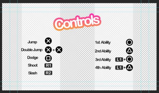
Here’s the controls menu to remind the player how to use their abilities. I added the transparent white walls so the black text stands out more. The rest of the screen will show the game environment behind it. The title “Controls” is also animated as you can see from this GIF.

In-Game Dialogue
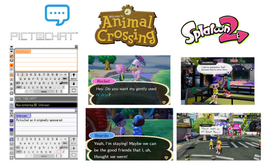
Here’s a moodboard of some ways of displaying text which I think will work well with the style I’m going for. I like the vaporwave aesthetic which often appropriates styles from 1990s-2000s. I’ll keep these three in mind when designing my dialogue display.
Here’s my draft dialogue box that’s heavily inspired from pictochat but I made the name box larger and off centre similar to animal crossing. I’ll also have different colours for the different character so it’s clear who’s speaking. I’m tempted to have the white background on the box slightly transparent so it doesn’t obstruct the players view of the game.
Here’s a draft dialogue box for sidekick character ‘3LLA’ (pronounced Ella) as she warns the player of the antagonist’s return and reminds them how to dodge attacks/dangers areas.
Here’s a draft one for K!NG who’s a malfunction buggy robot who acts as the main antagonist. I wasn’t too happy with this as I felt it was a little bland. I decided to go back and use filters such as offset and wave to mess up the text. I also made duplicates and switched off parts of the RGBs to get the shadows behind the first line. I like how the white text stands out against the background. I’ll use this method to create the distorted glitch affect for K!NG’s dialogue.
I’ll be having recorded voice lines playing alongside so I’m not too concerned with it being hard to read as it’s kind of the point with K!NG. None of his dialogue is informative to the player anyway rather it’s just ramblings of a mad robot.
Evaluation of Task 2
I enjoy pre production as it helps me organise my thoughts and ideas on the current task. It allows me time to look at games in the industry and select what I like and don’t like. I looked at games suited towards the same demographic and what I found was bright colours and simple layouts were favoured over more complex menu systems such as something you’d see in a game such as Fallout or Skyrim.
My biggest inspirations were LittleBigPlanet, Hello Kitty Roller Rescue and Splatoon. Animal crossing was also great when coming up for ideas for my in game dialogue.
Feedback I received from peers was that my idea generation was clear but to think more clearly on interactive elements I could add to my menu. I agree that an interactive element would make my menu system much more interesting. Interaction is also great for keeping the attention of younger audience which my game is aimed towards. In task 3, I’ll build my scene which will act as the backdrop for the menu and see what appropriate interactions I could add. I’m thinking of creating an urban scene to set the scene of the game from the get go. Appropriate interactive elements would be flickering lights or birds sitting on buildings which can be clicked on.
References
Aava, K. (2017). Realistic vs. Stylized: Technique Overview. [online] 80.lv. Available at: https://80.lv/articles/realistic-vs-stylized-technique-overview/ [Accessed 5 Oct. 2018].
0 notes
Text
Best iPad apps 2018: download these now
http://www.internetunleashed.co.uk/?p=20544 Best iPad apps 2018: download these now - http://www.internetunleashed.co.uk/?p=20544 It's the apps that really set iOS apart from other platforms - there are higher quality apps available on the App Store for the iPad than any other tablet. So which ones are worth your cash? And which are the best free apps?Luckily for you we've tested thousands of the best iPad apps so that you don't have to. So read on for our selection of the best iPad apps - the definitive list of what applications you need to download for your iPad now. Haven't bought an iPad yet and not sure which is best? We've got them listed on our best iPad ranking - or you can check out the best tablets list to see the full range available now. If you are looking for games, then head over to Best iPad games - where we showcase the greatest games around for your iOS device. Or if you're using an iPhone X or iPhone 8 head over to our best iPhone apps list. And if you're a professional, you may want to head straight to our top business apps. New: Poison Maps ($1.99/£1.99/AU$2.99) Poison Maps is an app for finding points of interest – POIs – on maps. Hence: Poison Maps. If you were hoping it’d provide insight into finding toxins, you’re out of luck, but for restaurants, hotels, banks, tourist attractions, parking, shops, hospitals and so on, it does the job – millions of such POIs can be found by way of the efficient search function.This might strike you as unnecessary, given the existence of the entirely free Google Maps, but Poison Maps has some trump cards. First, it has interesting and useful interface components, such as signs that clearly denote the distance to and direction of off-screen POIs.Beyond static POIs, cycling and transport routes are built-in. Poison Maps also works offline, so should you find yourself in a new town and without a data connection, you’ll still have a fighting chance of finding the things you need. Can't figure out which iPad to buy? Watch our guide video below! CARROT Fit is the answer if a more sensible exercise app just isn’t doing it for you. Like CARROT Weather, this fitness tool is helmed by a snarky, sarcastic AI. Here, she comes across like the deranged offspring of HAL 9000 and a personal trainer. To wit, she’ll threaten, ridicule and bribe you, in order to “prevent your body from blimping up.”The actual exercise bit is, broadly speaking, conventional, in that you partake in recognizable routines. But even there, CARROT Fit has a very distinct character, referring to push-ups as ‘Kowtows to Cthulhu,’ and subtly renaming the seven-minute workout ‘7 Minutes in Hell.’ Still, you’ll likely need some humor when sitting on the floor in a sweaty heap after a few minutes of exercise, and CARROT Fit has that over its straight-laced contemporaries. Away is an ambitious, multi-layered relaxation aid. It depicts a single scene, focused on a large blossom tree near a stream. Chill-out music begins when you tap the play button, mixed with sounds from the scene.Tap the settings button to select from three background tracks and adjust the mix. You can also shift the visual scene from sunrise to night time, with each period of day offering new sounds. There’s also a mixing disc that you can use to determine which sounds you’d like to be more prominent, such as leaves in the wind, the babbling stream or twittering birds.There’s a timer for defined meditation sessions, and if you hanker for more, the app’s developer offers several similar themed multi-scene apps based around wind, rain, and water sounds. Pause puts relaxation at your fingertip as you use a digit to slowly track a pulsating blob. It gradually fills the screen, whereupon the app urges you to close your eyes and keep mindfully moving your finger. A bell sounds when it’s time to return to the real world.The app’s creator talks of Tai Chi principles and EEG-technology validation, and it’s easy to be skeptical of such claims, but Pause can be effective. Slow, deliberate movements provide a sense of focus and calm, augmented by ambient audio.Pause could be more helpful in some ways – it stops if you move too fast, when an audible warning would be better, and you may find using it on iPad unwieldy. With the right setup and frame of mind, however, Pause provides a beautiful, tactile route into mindfulness on your iPad. Tinyclouds is an adorable weather app. That’s perhaps a slightly odd description to use for something that’s usually utilitarian, but then Carrot Weather (elsewhere in this list) showcases how weather apps can have a character of their own, and Tinyclouds is certainly unique.Select a location (you can store several within the app) and it provides a big temperature reading at the top of the sidebar, along with a forecast for the rest of the day and an outlook for the coming week. The rest of the screen is an ever-changing isometric city, with cars zipping about, its weather mirroring that of your chosen location.The app does, admittedly, feel like a sketch – it could do with more detail, and at least a wider range of views. Still, as a simple, great-looking weather app for a docked and charging iPad, it’s well worth a couple of bucks. White Noise+ is a sound machine designed to reduce distractions by way of ambient noise. Many apps in this space are a bit new age and flowery, and quite a few are, frankly, rubbish. Fortunately, White Noise+ is none of those things, instead providing a thoroughly modern, tactile take on noise generation.The app’s based around a grid akin to smart drums in GarageBand. Here, you get 16 slots, into which you drag icons that represent different sounds. Those toward the top play more loudly, and those toward the right have more complex loops. Your mixes can be saved, and sleep timers and alarms are available if you want to use White Noise+ for meditation sessions – or for waking you up should you doze off.You get a handful of sounds to play with for free, but the full set requires a one-off IAP. Given the quality of the app, it’s well worth the outlay. Streaks Workout wants you to get fit. Such apps are usually associated with iPhone – hardly surprising, seeing as you’re unlikely to go jogging with an iPad strapped to your arm – but for quick sessions of personal training, it fits the bill.You select from the exercises you’re happy to perform, and choose a workout length – from six minutes (‘quick’) to 30 (‘pain’). The app then randomly sends exercises your way, which are impossible to miss on the large display.When you’re done with an exercise, you tap the screen to continue, but if you find that a distraction, you can switch from rep counts to timed exercise periods. You can create bespoke custom workouts, too.During downtime, you can collapse in a heap and flick through saved statistics, mulling that iCloud support means Streaks Workout can follow you to every device, meaning you’ve no excuse to ever stop exercising. Ventusky is a weather service that started out online, but feels like it was always destined for iPad.Select a location and the main view enables you to switch the large map between various weather layers, including temperature, precipitation, snow cover, and air pressure. If you’re a weather nerd (and/or British), drag upward and you get an extended forecast to scroll through, along with a ton of graphs and data to bury yourself in.The one snag is Ventusky lacks Dark Sky’s animated radar, and so you don’t see storms rolling in – just where they will be during a three-hour window. Even so, the wind streaking across your display as tiny white lines helps you understand why conditions are the way they are.In short, then, this app looks great, is wonderfully tactile, and is pleasingly different from its contemporaries. Samplebot on the iPhone is primarily about collecting sounds and using them to make a noise (by way of live playback on a pad grid), or turning them into oddball songs via an easy to use built-in sequencer. This is still possible on iPad of course, but with a less portable device, Samplebot’s other abilities transform it into a subtly different app.Although you can of course still record you tapping pots, pans, glasses, and your own head, Samplebot can also bring in audio from Music, iCloud Drive, or the iOS clipboard, and sample from other apps if you’ve got Audiobus installed.The end result is a grid pad and sample editor that’s immense fun to play around with, twinned with a sequencer that’s simple, but still powerful enough to sketch out the basics of your next hit record. Retrospecs is a photo filter app that revels in the history of computing and gaming. Rather than turning any photo or image into a tiny Picasso with a tap, it instead reimagines whatever you load as if it was on the screen of a Game Boy, Apple Mac or C64.In fact, over 40 systems exist once you pay for the IAP (you can test Retrospecs for free with a small selection), and if that’s not enough, you can fashion your own custom emulations. For properly authentic retro output, you can edit dither modes, add glitch animations, tweak CRT effects and more.Full support for video combined with some bonkers filters (PETSCII! Teletext!) adds scope for YouTube weirdness. But even if you only grab Retrospecs because you’ve always wondered what your face would look like on a NES, it’s worth the outlay. Home Design 3D is an ambitious app for home remodeling. Rather than merely give you the chance to map out a floor plan, or slap virtual paint on your walls, Home Design 3D invites you to recreate an entire property – or any dream home – in 3D.This isn’t an app where you can whip up something amazing in a few minutes. You’ll need to spend time learning how everything works, whether adding walls, carefully positioning furnishings, or walking around the end result in 3D.It’s complex and time-consuming, and the interface has its share of quirks, but the results can be impressive and genuinely useful. If you’re unsure, you can play around with Home Design 3D for free – but to save anything you create you’ll need to unlock the app with a one-off IAP. Linia Sketch is an iPad sketching tool that deftly balances elegance and power. Create a new sketch and all of the tools sit at the screen edges. Scribble nearby and they temporarily get out of the way, and you can also invoke full-screen with a tap.This isn’t an app that cares for realism. Blending with the small selection of pens is minimal, and the end results look digital, but this is a superb app for speed. You can quickly surround a selection and transform it in various ways. And there’s the ZipLine feature, which lets you draw a line and hold for a second to straighten it. It’s then possible to add further lines (to create a polygon, or map out floor plan walls) by tap-holding.Virtual artists should look elsewhere, but if you’re after an app to jot down quick storyboard ideas or create diagrams, Linia Sketch is ideal. Monster Park - AR Dino World figures everyone should have their own dinosaur park, and enables you to create one on a table, in a garden, or in a mall when you’re feeling hemmed in by concrete and glass.Fire things up and a T-rex stomps about and bellows while pteranodons fly overhead. A US$0.99/99p/AU$1.49 IAP adds extra beasts, and the app enables you to augment your prehistoric critters with a virtual jungle.Alternatively, position the experience at a distance to create a ‘portal’ into an ancient world, with the T-rex terrifyingly poking its head through and threatening you with its massive teeth.Interaction is limited (tap the ground to make a dinosaur move, tap it repeatedly to unsportingly knock it down, and record any of your escapades), but this is nonetheless an entertaining take on augmented reality for kids of any age. OmniOutliner 3 is a desktop-quality outlining tool that aims to bring structured writing to the masses.It’s effectively two apps in one. Essentials is about quickly getting down and organizing ideas hierarchically. It’s quick and easy to add, promote and demote items (including with a physical keyboard, so you don’t have to keep reaching for the screen), and to shift rows around with drag and drop. The built-in search further elevates the app from more basic tools, filtering out non-matching rows so you only see only what’s relevant.If your needs are greater, you can opt for Pro (US$38.99/£38.99/AU$62.99). This pushes the app towards word processing and spreadsheet territory, adding automation, styling options for document types (lists, book drafts, mathematical and so on) and section navigation from a sidebar. In either incarnation, the app is excellent, and a free two-week trial lets you switch between both versions to see which best suits. FileBrowser makes it easy to grab documents from just about anywhere, then view and edit them. Think of it like a companion app to Files. Although Apple’s file manager supports iCloud and integrates with the likes of Dropbox, FileBrowser can explore connected Macs and PCs, FTP servers, NAS servers and more.Setting things up is straightforward, and the app’s tabbed interface makes it a cinch to quickly switch between sources. Unfortunately, tabs aren’t drag-and-drop aware, but sidebar shortcuts are. File viewing works well, and you can annotate PDFs and create/unpack ZIP archives.It’d be good to see FileBrowser more fully embrace the space available on iPad – an optional two-pane view, for example. The lack of Share sheet support is also a pity. Other than that, it’s a solid option when your file management needs exceed what Files can do. Typorama is about adding text to your photos – or creating typographic designs from scratch – with a minimum of effort. Select a photo, flat color, or a stock image background, choose an output size, and you’re ready to get started.Other apps in this space let you select fonts, but Typorama has you select designs. Enter some text, tap a design style, and what you typed is instantly transformed. If you’re not keen on what you see, tap the style again for variations.You can add multiple type layers, and apply shadows and gradient effects to each one. There’s also a 3D rotation/perspective tool, and a selective eraser. Some features are locked in the free version and you must put up with watermarks, but there are various IAP available, including the ability to unlock everything for $5.99/£5.99/AU$9.99. Toca Life: Office gives your kids a chance to play out what they imagine their working parents get up to all day – albeit in exciting environments likely more colorful and interesting than the real thing.For young children, there’s plenty of fun to be had simply in moving the little figures about, and poking backgrounds to see what happens. For slightly older kids, exploration can prove rewarding in other ways – there’s a secret exit from the jail, a working copy machine in the office, and a cafe where you can merrily experiment with what’s on the menu.Neatly, there’s even a recording feature, so kids can get creative and act out a scene, which can then be shared with friends. In all, this is another superb Toca Boca creation that ticks all the right boxes. Affinity Photo extinguishes any lingering doubt regarding the iPad’s suitability for creative professionals. In short, it’s Serif’s impressive Mac/PC Photoshop rival, carefully reimagined for the touchscreen.This is pro-level photo/image-editing fare, and you need the hardware to match – at least an iPad Air 2, but preferably an iPad Pro – but with the right kit, you get a huge range of features for image editing, creation and retouching.The live filters and liquify tools are particularly impressive, responding to edits in real time. Working with a finger or Pencil is pleasingly tactile in a manner desktop equivalents can’t match.RAW shooting/processing support, the ability to add fonts, layer isolation, and robust Files integration all cement Affinity Photo’s place among the iPad app greats. And if you become an expert, there’s even a ‘Show Touches’ option for making tutorials that other users can follow. Noted is a combination of audio recorder and notepad. The rich text editor gives you something akin to a simplified take on Pages, with predefined styles for headings and lists, the means to add images, and a highlighter for drawing someone’s attention to particularly important bits.This in itself perhaps isn’t new on iPad, but the way text and audio can integrate is. When recording a lecture or meeting, tapping the tag button adds an inline ‘#TimeTag’ button. Tapping this later will immediately jump your note’s audio recording to the relevant moment, thereby adding context to your text and providing you with a means to flesh out brief notes.We’d like to see more export options for completed notes (txt is no good for formatted fare), but other than that, Noted is an ideal productivity aid for a wide range of situations. Tayasui Doodle Book is a sketching app that takes a slightly different approach to its contemporaries. You still get a selection of tools, but this app’s more about the virtual paper – a semi-randomized selection of backgrounds that vary from grids and lines to bubble patterns and tiled teddy bear heads.The idea is that these repeating patterns will inspire you to try new things, such as painting a selection of tiny monsters, or working with lined paper to create a drawing of a cat mucking about in a blind.The tools are a bit basic (although the watercolor brush is lovely and includes a fun splat effect), but there are other apps for when you want a wide, realistic range of media. Tayasui Doodle Book is great when you just want to get drawing, but don’t know where to start. Core Animator is an app for creating motion graphics on your iPad. If you’ve ever seen Adobe Animate (formerly Flash), you’ll feel at home. If not, the app might take longer to get to grips with, but you’re helped along by built-in tutorials and Core Animator’s usable, logical interface.The basics involve adding objects to a canvas and manipulating them at various ‘keyframes’ on the timeline. You can adjust each one’s position, rotation, scale, and opacity, and Core Animator deals with all the frames in between.It’s worth noting there are no drawing tools, so you must import elements created elsewhere. The app also demands time and patience, but give it both and you can end up with superb results. Things 3 is a powerful task manager based around to-dos. Its ultimate aim is to ensure you get more done, and this is achieved by a smart and sleek workflow model that makes it simple to collect your thoughts, figure out your day, and plan far into the future.The app can be as expansive or as simple as you need it to be. You can live in the Today and Upcoming views, working from basic to-dos, or add extra context and nested lists for more complex tasks. With iOS 11, Things 3 adds support for Split View and drag-and-drop, so you can drag links or emails right to a to-do.This is the kind of app where you quickly wonder how you lived without it. And although it’s pricey when you buy it across iPad, iPhone and Mac, the time you’ll gain ensures it’s good value for money. Bandimal is a music toy for the rest of us. Actually, its App Store description states it’s a music composer for kids, but ignore that because Bandimal is great fun for everyone.It offers three slots into which you swipe an animal. A quick tap opens a dotted grid, on to which you assign notes by prodding the dots. These trigger loops when the playhead moves over them, and there are no wrong choices.There’s a drum track too, along with some basic effects and a speed dial. And as you’re composing, your little menagerie will bop to the beat, with animation that’s so much fun it’s sure to make any cartoonists in the vicinity a touch envious.You might avoid Bandimal because you’re not a musician. Don’t. This app’s only to be avoided if you hate fun. Concepts is an advanced vector-based sketching and design app. Every stroke remains editable, and similar flexibility is evident elsewhere, with varied grids (dot; lined; isometric), definable gestures, and an adjustable interface.With version 5, Concepts’ design revamp transformed the main toolbar into a space-efficient tool wheel, from which Copic swatches pleasingly explode when you switch colors. As such, the app’s a touch alien at first, and can be fiddly if you don’t have a Pencil.But Concepts soon becomes natural and fluid in use, and it’s apparent the app’s been designed for touch, rather than a developer hammering desktop concepts into your iPad.If you’re not a professional architect, illustrator or the like it might be overkill, but if you’re unsure, you can get a feel for the app for free. IAPs subsequently allow you to unlock shape guides, SVG and PDF export, infinite layers, and object packs. Artomaton - The Motion Painter is an ‘artificial intelligence artist’ – recreating photos as sketches and paintings. For free, you get a small selection of media, but pay a $2.99/£2.99/AU$4.49 IAP and you unlock the full range, including the arresting ‘Pointil’ (as in ‘lism’), scribbly crayons, and a lovely sketch/watercolor combo.Unlike most competing apps, this one has many settings for adjusting properties, such as vignettes, stroke width, hatching angle, and color saturation.It even works with video, and although it takes some time for Artomaton to draw all of the individual frames (just a 20-second clip will need close to 200), output with ‘Sketch&Water’ has a gorgeous scratchy hand-drawn quality.For free, then, this is a great download; but grab that paid IAP for something really special. Yoink is a superb iPad shelf app, providing a place to temporarily store and collate files and content. It supports pretty much anything you can drag and drop on iPad – images; text; URLs; documents – and works in Split View and Slide Over (the latter feeling like Yoink’s most natural set-up). Handily, you can directly import items, too, or send content to Yoink via share sheets.Yoink excels in the details. When items are dragged off of Yoink, they’re copied or removed, depending on the status of a padlock icon. Groups of items can be collated into stacks, and moved as one.And because Yoink exists as a Location in the Files app, you can explore and interact with anything you’ve saved to the app without opening Yoink itself. MindNode 5 is a mind-mapping app. That might sound dull, given that such tools are associated with boring business meetings that involve massive whiteboards... and the hope the ground will swallow you up.But MindNode 5 is different. It’s sleek and fun to use as you smash out ideas. You can start with a Quick Entry list, which the app then turns into a mind map; or you can manually create and position nodes. For more context, it’s possible to add photos, stickers, and notes to your maps. And for when you do have to get properly businesslike, there’s a vertical layout for organizational charts.Whatever you’re working on, MindNode 5 is far better than paper equivalents – it’s flexible, sharable, and always comprehensible. Human Anatomy Atlas 2018 represents a leap forward for iPad education apps and digital textbooks alike. In short, it turns your iPad into an anatomy lab – and augmented reality extends this to nearby flat surfaces.You can explore your virtual cadaver by region or system. Additionally, you can examine cross-sections, micro-anatomy (eyes; bone layers; touch receptors, and so on), and muscle actions. If you want to learn what makes you tick, it’s fascinating to spin a virtual body beneath your finger, and ‘dissect’ it by removing sections.But the AR element is a real prize, giving you a captivating, slightly unnerving virtual body to explore. Ideal fodder for medical students, then, but great even for the simply curious. And although it’s pricey for the latter audience, the app’s often on sale, most recently dropping as low as $0.99/£0.99/AU$1.49. Snap it up if you see it cheap. Zipped largely fixes a major shortcoming of the iOS Files app for iPad – its inability to deal with ZIP archives. The default Files app merely lets you peek inside a ZIP and extract items one at a time, but Zipped is far more capable.If you need to unpack an archive, that can be done with a couple of taps. The files within are then saved to a user-defined location – either as they are, or within a named folder.Creating archives is simple, too, and works via drag and drop in Split View or – an often better option – Slide Over. The one snag is Zipped only recognizes specific file formats, although the most common are covered.Still, the low price makes it worth grabbing even if you only use it to quickly get at files within ZIPs, rather than laboriously extracting them one by one. Clip Studio Paint Ex for manga brings the popular PC desktop app for digital artists to the iPad. And we mean that almost literally – Clip Studio looks pretty much identical to the desktop release.In one sense, this isn’t great news – menus, for example, are fiddly to access, but it does mean you get a feature-rich, powerful app. There are loads of brushes and tools, vector capabilities, effect lines and tones for comic art, and onion skinning for animations. It also takes full advantage of Pencil, so pro artists can be freed from the desktop, and work wherever they like.The app could do with better export and desktop workflow integration, and even some fans might be irked by the subscription model. But Clip Studio’s features and quality mean most will muddle through the former issues and pay for the latter. Zen Studio is a unique, beautifully conceived painting and coloring app. Instead of giving you a blank canvas for free-form scribbling, Zen Studio opts for a triangular grid. Tap spaces and they fill with your selected color as a note plays. This combination of coloring and ad-hoc melody proves very relaxing – for children and adults alike.In its free version, this is an entertaining app, but it’s worth grabbing the main $2.99/£2.99/AU$4.99 IAP. This lets you save unlimited drawings (rather than just eight), and unlocks white paint, which acts as an eraser on compositions with white backgrounds.It also provides access to a slew of tutorials. These have you build up a picture by coloring inside stencils, which even a two-year-old should be able to cope with – and then subsequently scrawl over when the stencils disappear. Percolator is a photo filter app for ‘brewing’ circular mosaics using a custom recipe. The coffee theme is fanciful, but it is admittedly lovely to see your photo explode into a bunch of bubbles that disappear and then reform when major changes are made to the ‘grind’ (circle size and effect) settings.Mostly, though, we were impressed by Percolator because its effects range from the bizarre to the beautiful. Some have a kind of classical feel, a few look like high-end art posters, and with careful tweaking of ‘brew’ (pattern and blend) and ‘serve’ (effect and texture) settings, you can even approximate painterly effects.It’s a pity you can’t save your own custom presets, although the app does at least offer some examples to get you started. For the most part, though, Percolator’s a tasty treat. Dropped is an app designed to take advantage of the drag and drop feature that made its debut in iOS 11. It’s designed as a temporary resting point – commonly referred to in computing terminology as a ‘shelf’ – for various kinds of data, including URLs, photos, videos, text, emails, notes, and PDFs.The idea is you can dump a bunch of things on Dropped, and figure out what you want to do with them later. Helpfully, the app automatically organizes items into categories (media; text; URLs; files), although you can also scroll through your entire list in the Recents tab.Search and rename functionality would be helpful, but otherwise Dropped is a very useful app to have if you’re often moving content around on your iPad. It’s usable, straightforward, and works especially well as a Slide Over app. Prompts is a writing tool designed for anyone having a hard time getting started. Create a new document and the app draws from over 300,000 unique starting lines and prompts. If you’re not keen on what it provides, tap refresh until you get something suitably inspirational.As you’re typing away, the app then leaves you alone, but you can at any point tap the prompts icon to get a further helping hand. Often, the suggestions are rather obvious, but that doesn’t mean they’re not helpful.The app also includes a tracking and statistics system, to try and get you writing regularly. On that basis, it’s a useful training aid to keep your writing ‘muscles’ fit and healthy, even if you naturally gravitate towards Scrivener and iA Writer when it’s time to get down to serious writing. Little Digits is a new spin on finger counting, making use of the iPad’s large screen, and its ability to recognize loads of fingers pressing down at once.The app’s most basic mode responds to how many fingers are touching the screen. Use a single digit, and the app chirps ONE! while a grinning one-shaped monster jigs about. Add another finger and the one is replaced by a furry two. You get the idea.Beyond this, the app offers some basic training in number ordering, addition and subtraction, making it a great learning tool for young children.But the smartest feature may well be multiple language support and recording. This means you can use the app to learn to count in anything from French to Swedish, and record custom prompts if your own language isn’t supported. Kaleidoscope is a resolutely production-focused app, designed to take advantage of new functionality found in iOS 11 on modern iPads.The app’s used to quickly compare the contents of files, images, and folders. It makes great use of drag and drop from Apple’s Files app, and uses colored overlays to clearly outline the differences between two text documents or whatever’s lurking inside a pair of folders.When comparing images, there are various views (such as a basic A/B switch), but Kaleidoscope’s interpretation of a wipe slider is awkward, having two handles that must be separately positioned. And even with text, there’s one shortcoming, in the iOS app lacking the ‘text merge’ capabilities of its macOS cousin.Still, if you routinely find yourself juggling folders or text documents, Kaleidoscope may prove an essential part of your iOS toolkit. SoundForest is a creative sound toy that mashes up minimalist animal stickers and song-making.Across four environments, you drag stickers from a strip at the bottom of the screen onto your canvas. Each one – be it animal, plant, or landmark – makes a sound that rarely recalls reality. A mandrill, for example, blasts forth a raucous slap bass. It’s colorful, entertaining, and encourages discovery and experimentation.Once you’ve dotted your stickers about, you can fire up your composition. The sun or moon acts as a playback head, and your stickers animate as your oddball musical masterpiece blasts forth.Pros may be frustrated by the app’s lack of export functionality, but really SoundForest is more for the masses than them – an approachable, fun way to make a noisy music loop, using a vibrant, unique interface. Toca Life: Farm is an ambitious and rich exploratory title for kids, inviting them to manage a farm and fashion their own stories.There are four locations: barn, house, field, and store. Each of them is packed full of elements to interact with. For youngsters, there’s plenty of fun to be had just poking around, making noises, and dragging colorful characters about.Toca Life: Farm encourages older kids to think a little more. They can grow their own ingredients, which can subsequently be made into food. Animals can be fed and cared for, whereupon it’s possible to reap the rewards of eggs from chickens and milk from cows.There’s no stress - this title is all about moving at your own pace. Importantly, it also eschews advertising and IAP, ensuring your little farmer can’t accidentally spend real-world cash on virtual hay bales. Procreate is a powerful, feature-rich digital painting and sketching tool. You immediately get a taste for what’s possible by exploring the example art; and the more you poke around, the more you realize the potential on offer.Procreate isn’t aimed solely at pros, though. Sure, they’ll love its advanced features – a perspective grid; custom brushes; layer masking; curves. The interface, though, is approachable enough for anyone. The thin strip across the top enables fast access to tool and brush menus; at the side is a bar for quickly adjusting your brush’s size and opacity.The brush selection is immense, whether you’re into abstract doodling with strange textures, digital takes on traditional media, or something fantastical by way of brushes that paint with ‘light’ atop your creation.In short: just buy this app, because it’s terrific. Chambers Thesaurus is a thesaurus for your iPad. You might argue that doesn’t sound like the most exciting app in the world – and you’d be right. But if you do any writing on your iPad, it’s pretty much essential.On macOS, Apple bundles a thesaurus with its Dictionary app, but this is absent on iOS, which merely attempts to correct spellings. Chambers’ offering therefore fills a void – and it does so in a straightforward, unassuming, highly usable manner.Entries are clearly laid out, and you get a handy search sidebar in landscape. Pages can be bookmarked, and shared, or sent to equally impressive sister app Chambers Dictionary. If you fancy both, grab the bundle to save a few bucks. Tayasui Memopad is a drawing tool for iPad that places an emphasis on speed. Its no-nonsense approach gives you a blank canvas on which to scribble, and a small but pleasingly diverse set of tools.You get the usual brushes and pencils, but also more imaginative fare: blocky ‘pixel’ fingerprinting, and a slightly splodgy India ink pen – the latter being part of the one-off IAP pack. There are no layers or objects – everything you add is burned into the page (although you of course get an undo).But it’s with image management that Tayasui Memopad really shows its stuff: your images are automatically sent to Photos, and your current canvas is copied to the clipboard when you exit the app, ready for pasting elsewhere.As a drawing app, you might argue Tayasui Memopad is ultimately quite ordinary – if usable; but as a drawing app designed for efficiency, it excels where it counts. MaxCurve is a professional-quality photo editor, designed for people who want plenty of control over the images they’re working on. Much of the app is based around curves you typically find in high-end editors such as Photoshop.Adjusting curves is pleasingly tactile, enabling you to make dramatic or subtle adjustments to colors and exposure settings with ease. It makes many of MaxCurve’s iPad contemporaries seem comparatively crude. Smartly, edits are stored as virtual layers, which can be toggled, and there are also tools for cropping and vignettes.The app feels at home on iPad, which provides enough space to see your photo and tools, without the latter obscuring the former. MaxCurve could probably do with some quick-fix solutions for things like exposure, but then perhaps that’s missing the point of an app more about careful, considered edits rather than speed. The Brainstormer is designed to spark ideas when you’re working on a story. In its default state, it’s something of a visual oddity, with three wheels that you spin for a random set-up of plot/conflict, theme/setting, and subject/location. Individual wheels can be locked, and you can swap the wheels for a ‘slot machine’ interface if you prefer.Although that might seem a bit gimmicky, The Brainstormer can be genuinely useful if you need a little nudge to get going. Also, the app is extensible, vastly broadening its scope. You can buy additional wheels via IAP, such as creature and world builders.You can also directly edit existing wheels, or create your own from scratch. When you’re fresh out of ideas, a couple of bucks for endless new ones could be a bargain buy that sends you on your way to a best-seller. Textastic is a text editor geared towards markup and coding. It’s an app that takes a no-nonsense approach – very evident the second you sit before its tasteful, minimal interface.But that doesn’t mean the app’s heavily stripped back. As you work with Textastic, you realize it’s been cleverly optimized to speed your work along. The custom keyboard row is superb, providing fast access to a slew of handy characters.Not keen on the way code is presented? Quickly flip to the settings, and tweak the fonts or choose an entirely new theme.As ever, there are limitations to an iPad editor of this kind, most notably local previews when coding web pages. On that basis, you’re probably not going to create a site from scratch with Textastic.But with its smart editor, useful settings, Split View support, and a built-in file-transfer system, it’s ideal for making quick changes or typing up Markdown notes when on the move – or on the sofa. Thinkrolls Kings & Queens is a set of logic and physics tests for children disguised as a game.Like other Thinkrolls titles, it involves rotund protagonists working their way to the bottom of a series of blocky towers. Their way is regularly barred by various elements that must be successfully manipulated to fashion a way onward.For example, gears and racks might need combining to create a conveyor belt, or a mirror shifted to reflect light and remove a ghost.It’s all clever stuff, and also broadly stress-free. There are no time limits at all, and multiple profiles can be set up to cater for several kids on a single device.And although Kings & Queens is intended for kids between five and eight years old, the interface and design is such that younger children should be able to delve into the adventure, too – albeit perhaps with supervision to initially help them understand the trickier challenges. is a photo editor designed to make snaps more animated. The results are essentially cinemagraphs – stills with subtle looping animations, such as a flowing river within a landscape, or waving hair in an otherwise stationary portrait. With Plotagraph+, though, you add movement to any existing single image, rather than working from a series of stills or a video.After you load a photo, you drag ‘animation’ arrows across areas you’d like to move, and use masks or anchor points to define sections that should remain stationary. Speed and crop tools add a modicum of further control. It’s all very straightforward.The effect is specialized, mind, and only works well with certain images. You won’t, for example, find Plotagraph+ successfully animate a human face. But it works wonders on flowing elements (smoke; clouds; water; hair), and can with care be used to craft visually arresting madness based around shots of architecture. CARROT Weather is a weather app helmed by a HAL-like artificial intelligence that hates humans. As you check whether it’ll be sunny at the weekend, or if you’ll be caught in a deluge should you venture outside, CARROT will helpfully call you a ‘meatbag’ and pepper its forecasts with snark.That probably sounds like a throwaway gimmick, but it’s actually a lot of fun – adding color and personality to a kind of app usually devoid of both. Most importantly, though, CARROT Weather is a really good weather app.The forecasts are clearly displayed, the interface is superb, and the Today view widget is one of the best around. There’s even an amusing mini-game for finding ‘collectable’ hidden locations.There are some downsides: the rainfall/cloud maps are weak, and there are no notifications. But if you’re bored of the straight-laced, dull competition, and fancy a weather app that’s informative and entertaining, CARROT Weather’s well worth the outlay. Waterlogue is all about transforming photos – or any other picture you care to load – into luminous watercolors. You shoot a photo or open one already on your iPad, and then choose from one of 14 pre-set styles. Waterlogue will then rapidly ‘paint’ your photo in a manner that looks pleasingly authentic.Although the app doesn’t offer the level of control (nor the endless playback) of Oilist, you do get a few settings. Brush size, lightness, and borders can be amended, each change providing a thumbnail preview you can tap to have Waterlogue repaint your image.Export size is reasonable (at 250dpi, you’d get roughly an 8 x 6-inch/21 x 16cm print), and the app as a whole is approachable enough for everyone, while being just about authentic enough to appeal even to those who dabble in real paint. Axel Scheffler’s Flip Flap Safari is an entertaining digital take on those children’s games where you create weird and wonderful (and occasionally terrifying) creatures by combining different body parts. Here, you get tops and bottoms to swipe between, in order to construct the likes of a ‘zeboceros’ or ‘crocingo’.Each animal is nicely illustrated and comes with two verses of text, which the app can optionally read aloud. Also, note you don’t have to create strange new animals – you can instead match halves to make normal ones.Perfect for when your resident tiny person is getting a bit perplexed at seeing a grinning elephant propped up by a spindly pair of flamingo legs. With Hyp, you’re essentially in digital lava lamp territory. Drag about your iPad’s display, and you’re treated to an ethereal – if somewhat neon – light show that mutates and evolves as you experiment. Ramp up the volume and a soothing responsive soundtrack plays, sucking you further into the chill-out zone.For the outlay, that alone would do the job, but double-tap and Hyp offers more. You can snap a shot of the current pattern, adjust the speed and complexity of the animation, or prod a randomizer to shake up what you’re seeing and hearing.We’d love to see an autoplay option too, so Hyp could be played indefinitely with the iPad in a stand; otherwise, this is a simple, smart, engaging slice of digital ambience. Although doesn’t really offer anything new, this is an app that does an awful lot right. It manages to make adding text to images fun, along with providing a no-nonsense interface that marries usability and power.Load a photo and you can add art, text, and effects, before sharing it. ‘Art’ comprises slogans, shapes, and clip art. This can be recolored and resized, and you can add shadows and adjust opacity. Text is similarly easily added, and there are straightforward spacing and alignment options for tidying typography.Finally, the effects comprise filters and overlays, the latter being eye-catching but limited in terms of application (you can adjust opacity but not, say, rotation). Still, as a package, Addy’s easy to love, given the speed at which you can work and the quality of the end result.If you’re only occasionally adding text to an image you might be fine with a free app, but the ease of use and quality results make Addy worth a fiver for everyone else. There are full-on screenwriting tools for iPad, such as Final Draft, but Untitled is more like a smart notepad – an app for a first draft until you feel ready for, um, Final Draft.You jot down ideas, and don’t worry about formatting – because the app deals with that. In some cases, it does so automatically – write “Inside TechRadar HQ at midday” and Untitled will convert it to “INT: TECHRADAR HQ – MIDDAY” in the full preview (which can be exported to PDF or HTML).For dialogue, place the character’s name above whatever they’re saying and Untitled correctly lays everything out.Some other formatting needs you to remember the odd character - ‘>’ before a transition and ‘.’ before a shot. But that’s not too heavy on the brain, leaving you plenty of headspace to craft your Hollywood breakthrough. On the Mac, PDF Expert 6 is a friendly, efficient, usable PDF editor. If anything, the app’s often even better on iPad.You can grab PDFs from iCloud or Dropbox. Pages can be rearranged by drag-and-drop, and you can add or extract pages with a few taps. Adding pages from another document sadly remains beyond the app, but you can merge two PDFs in its file manager.As a reader, PDF Expert 6 fares well, ably dealing with large PDFs, and the text-to-speech mode can read documents at a speed of your choosing. Similarly, the app makes short work of annotations, document signing, and outline editing.Buy the ‘Edit PDF’ IAP ($9.99/£9.99/AU$14.99 on top of the original price) and you can directly update text, redact passages, and replace images. You’re obviously a little limited by a document’s existing fonts and layout, but this functionality is great if you spot a glaring error while checking a vital PDF on your iPad. With visible pixels essentially eradicated from modern mobile device screens, it’s amusing to see retro-style pixel art stubbornly clinging on.But chunky pixels are a pleasing aesthetic, evoking nostalgia, and you know thought’s gone into the placement of every dot. Pixaki is an iPad pixel art ‘studio’, ideal for illustrators, games designers, and animators.At its most minimal, the interface shows your canvas and some tool icons: pencil; eraser; fill; shapes; select; color picker. But there are also slide-in panels for layers/palettes, and the frame-based animation system.Bar a slightly awkward selection/move process, workflow is sleek and efficient (not least with the superb fill tool, which optionally works non-contiguously across multiple layers), and the app has robust, flexible import and export options.Perhaps most importantly, Pixaki’s just really nice to use – more so than crafting similar art on a PC or Mac, and although pricey it’s worth the money for anyone serious about pixel art. The iPad may not be an ideal device for shooting photos, but its large screen makes it pretty great for editing them. And Mextures is perhaps the finest app around for anyone wanting to infuse their digital snaps with character by way of textures, grunge, and gradients.The editing process is entirely non-destructive, with you building up effects by adding layers. In each case, textures, blend modes and rotation of scanned objects can be adjusted to suit, and you can experiment without fear of edits being ‘burned in’.Particularly interesting combinations can be saved as ‘formulas’ and shared with the Mextures community – or you can speed along your own editing by downloading one of the many formulas that already exist. There are quite a few dictionary apps on iPad, and most of them don’t tend to stray much from paper-based tomes, save adding a search function. LookUp has a more colorful way of thinking, primarily with its entry screen. This features rows of illustrated cards, each of which houses an interesting word you can discover more about with a tap.The app is elsewhere a mite more conventional – you can type in a word to confirm a spelling, and access its meaning, etymology, and Wikipedia entry.The app’s lack of speed and customization means it likely won’t be a writer’s first port of call when working – but it is an interesting app for anyone fascinated by language, allowing you to explore words and their histories in rather more relaxed circumstances. First impressions of Oilist might lead you to think it’s yet another filter app. And to some extent it is, given that Oilist enables you to feed it a photo and end up with something resembling an oil painting.However, Oilist also has much in common with generative creativity apps, since it keeps painting over and over, to mesmerizing effect. Additionally, it’s not an app where you select a preset and then sit back and wait – instead, while Oilist is painting, you can adjust settings, and even splatter the virtual canvas with ‘chaos’ paint if the mood takes you.This is all entertaining in and of itself, but Oilist also has practical benefits – at any point, you can snap the in-progress painting, and the resulting high-res image can be exported for sharing online or even printing on a canvas. There are so many amazing music-making apps on iPad that it’s hard to choose between them. With Audiobus 3, you sort of don’t have to, because it acts as a kind of behind-the-scenes plumbing.Virtual cabling might not sound sexy, but it hugely boosts creative potential. You can send live audio or MIDI data between apps and through effects, mix the various channels, and then send the entire output to the likes of GarageBand.Much of these features are new to Audiobus 3, and this latest update also adds Audio Unit support, enabling you to open some synths and effects directly in the app.With support for over 900 iOS products in all, Audiobus 3 is an essential buy for anyone serious about creating music on an iPad. Young children love wooden puzzles, where you plug a load of letters into letter-shaped holes (with a little luck, ones that actually fit). The thing is, those puzzles never change, whereas Endless Alphabet has over a hundred words to play with.On selecting a word, a horde of colorful monsters sprints across the screen, scattering the letters, which must then be dragged back into place. As you do so, the letters entertainingly grumble and animate. Once the entire word’s complete, a short cut-scene plays to explain what it means.From start to finish, Endless Alphabet is an excellent and joyful production. The interface is intuitive enough for young toddlers to grasp, and the app’s tactile nature works wonderfully on the iPad’s large display. The ‘pro’ bit in Redshift Pro’s name is rather important, because this astronomy app is very much geared at the enthusiast. It dispenses with the gimmickry seen in some competing apps, and is instead packed with a ton of features, including an explorable planetarium, an observation planner and sky diary, 3D models of the planetary bodies, simulations, and even the means to control a telescope.Although more workmanlike than pretty, the app does the business when you’re zooming through the heavens, on a 3D journey to a body of choice, or just lazily browsing whatever you’d be staring at in the night sky if your ceiling wasn’t in the way.And if it all feels a bit rich, the developer has you covered with the slightly cut down – but still impressive – Redshift, for half the outlay. Generally speaking, music apps echo real-world instruments, as evidenced by the piano keyboards found in the likes of GarageBand. KRFT is different – along with creating loops and riffs (either by bashing out a tune on a grid of pads, or tapping out notes on a piano roll), you also create the play surface itself.Designing your instrument in KRFT is all based around shapes and icons – diamonds trigger loops, dials adjust sound properties, and squares can be set to trigger several loops at once.Admittedly, staring at a blank canvas can intimidate, because you must consider composition and instrument construction as one. But KRFT bundles several inspirational demos to show what it can do – and they’re so much fun they might be worth the entry fee on their own. Billing itself as a kind of 3D sketchbook, isolad is designed for people who want to quickly draw isometric artwork. Its toolset is simple – you get a line tool for connecting magnetic dots, a shape fill tool, undo, panning and zooming.That might sound reductive, but isolad’s straightforward nature means anyone can have a crack at doodling the next Monument Valley, and you end up focusing more on what you’re creating rather than being deluged by a load of tools you’ll never use.Future updates promise the addition of selections and layers, but for now isolad’s elegant simplicity is enough to make it a winning app. The idea behind Printed is to transform your photos into vintage printed art. You load a photo (or choose from one of the demo images), press a filter, and are suddenly faced with something that could have fallen out of a 50-year-old book, or been posted on a wall many decades ago.But Printed is more than a tap-and-forget filter app: beyond the filter selection are tools for adjusting dot pitch, brightness, borders, and color saturation.There are some shortcomings: changes to settings are initially displayed as a thumbnail you tap to approve, which only then gets rendered at full-size (whereupon it may look different from how you thought it would); and landscape orientation appears to have been an afterthought.But on a large iPad display, the actual filters – which are excellent – are shown off to their fullest, in all their retro dotty glory. If you’re the kind of person who likes spinning virtual decks, you’ll tell right away with djay Pro that you have in your hands something special. On the iPad – and especially on an iPad Pro – the app has room to breathe, lining up all kinds of features for being creative when playing other people’s music.You get four-deck mixing, a sampler, varied waveform layouts, and useful DJ tools like cue points and beat-matching. There are also 70 keyboard shortcuts for quickly getting at important features, such as matching keys and adjusting levels.For a newcomer, it’s perhaps overkill, and the similarly impressive djay 2 is cheaper. But if you’ve got the cash, djay Pro is a best-in-class app suitable for everyone – right up to jobbing DJs. Even iPads with the largest amount of storage can’t cope with a great deal of on-board video. Infuse Pro is designed to access your collection, without any of it needing to be on your device.The app connects to local drives and cloud services, and plays a wide range of file types, including MOV, MKV and VIDEO_TS. If the files are named sensibly, Infuse downloads cover art and can optionally grab soft subtitles. The interface throughout is superb.On iPad, you also get full support for Split View and picture-in-picture, so you can pretend to work while watching your favorite shows. And if you continue on another device – this universal app is compatible with iPhone and Apple TV – cloud sync lets you pick up where you left off. Reasoning that sketchbooks aren’t complicated, and so nor should your iPad be, offers a friendly approach to digital sketching. The main interface puts all of the app’s tools within easy reach – colors on the left, and layers and brushes on the right. Scribble nearby and they get out of the way, or you can invoke full-screen with a tap.There’s Pencil support, but no pressure sensing by other means. Also, although some of the pens offer blend modes, the end result still looks quite digital rather than realistic. Even so, Linea’s straightforwardness and smart design tends to make it a joy to use, even if the app lacks the range of some of its contemporaries. If you find iMovie isn’t quite doing it for you from a video editing standpoint, take a look at LumaFusion. This multitrack editor is designed with the more demanding user in mind, and is packed full of features to keep you editing at your iPad rather than nipping to a Mac or PC.The main timeline provides you with three tracks for photos, videos, titles and graphics, and you get another three audio tracks for complex audio mixes involving narration and sound effects. Should you wish to take things further, LumaFusion includes a slew of effects and clip manipulation tools seemingly brought over from the developer’s own – and similarly impressive – LumaFX.Occasionally, the app perhaps lacks some of the elegance iMovie enjoys, and LumaFusion is certainly a more involved product than Apple’s. But if you want fully-fledged video editing on your iPad, it’s hard to think of a better option. On iPhone, Hipstamatic lets you switch between a virtual retro camera and a sleek modern camera app. On iPad, it all goes a bit weird, with the former option giving you a camera floating in space, and the latter making you wonder why you’d use a tablet for taking snaps.But Hipstamatic nonetheless gets a recommendation on the basis of other things it does. Load an image from your Camera Roll, and you can delve into Hipstamatic’s editor. If you’re in a hurry, select a predefined style – Vintage; Cinematic; Blogger – and export.Should you fancy a bit more fine-tuning, you can experiment with lenses, film, and flashes. And plenty of other adjustments are available, too, such as cropping, vignettes, curves, and a really nice depth of field effect. If your iPad’s sitting around doing nothing while you work on a Mac or PC, Duet Display can turn it into a handy second screen for your desktop or notebook.You fire up the app on your iPad and a companion app on your computer, and connect the two devices using a cable – like it’s 2005 or something. Minimalist fetishists might grumble, but a wired connection means there’s almost no lag – even when using Duet Display’s highest detail settings and frame rates.With macOS Sierra, you also get one extra goodie: a virtual Touch Bar. So you needn’t splash out on a brand-new MacBook Pro to check out Apple’s latest interface innovation – you can use Duet Display instead. Carl Burton’s Islands: Non-Places is listed in the App Store as a game, but don’t believe a word of it. Really, this ten-scene artistic endeavor is a surreal, mesmerizing semi-interactive animated film.Each ‘non-place’ is somewhere you’d usually ignore or stay only on a very temporary basis, but here, the mundane is subverted through unusual and unexpected juxtapositions.You’ll find yourself staring at a luggage carousel, before the bags begin a lazy Mexican wave. Elsewhere, palm trees ride mall escalators, while a run-of-the-mill seating area is suddenly flooded, a warning siren slicing its way through inane background chatter.The result is frequently disorientating, but Islands also has the capacity to surprise, and is often oddly beautiful. It’s concert time for the motley crew of Toca Band, in this toy designed to help kids explore music creatively. (And, um, adults who might get sucked in a bit.)It’s all very simple: drag weird cartoon characters (each of which plays their own instrument) to spots on the stage, and they automatically jam along with the only song that Toca Band appears to know. Lob a musician at the star and they start a unique solo improv with a modicum of user control.Toca Band is a very sweet app, which even toddlers should be able to grasp. A word of warning, though: that Toca Band riff will quickly become an earworm you’ll be hard pressed to remove. iA Writer provides a writing environment suitably focused for iPad, but that also makes nods to the desktop.The main screen is smartly designed, with a custom keyboard bar offering Markdown and navigation buttons; if you’re using a mechanical keyboard, standard shortcuts are supported.Further focus comes by way of a typewriter mode (auto-scrolling to the area you’re editing) and graying out lines other than the one you’re working on.Elsewhere, you get an optional live character count, iCloud sync, and a robust Markdown preview. We’d like to see a split-screen mode for the last of those (as per the Mac version), but otherwise iA Writer’s a solid, effective and affordable minimal writing app for iPad. We're not sure what makes this edition of the famous mockney chef's recipe book 'ultimate', bar that word being very clearly written on the icon.Still, Jamie Oliver's Ultimate Recipes is certainly a very tasty app. The 600 recipes should satisfy any given mood, whether you're after a sickeningly healthy salad or fancy binging on ALL THE SUGAR until your teeth scream for mercy.Smartly, every recipe offers step-by-step photos, so you can see how badly you’re going wrong at any point. And when you've nearly burned down the kitchen, given up and ordered a pizza, you can watch the two hours of videos that reportedly tell you how to "become a real kitchen ninja".Note: this doesn't involve wearing lots of black and hurling sharp objects at walls, sadly. Music-creation apps can overwhelm, even when trying to be friendly. Lily neatly takes a rather more playful – if slightly twee – stab at having you make tunes.You start by selecting a color and shape. The former dictates an instrument and the latter the number of leaves on your lily. Tap + to open the flower, and then the flower itself to access a pulsating playback head.You then tap spaces to lay down notes, which can be shifted entire octaves by prodding adjacent vertical lines. Repeat the process with more lilies and you'll soon have an oddly delicate cacophony serenading your ears.Lily's a very sweet app. It's perhaps a touch too abstract to be as immediate as it wants to be, but all becomes clear with a little play. We do wish songs could be saved (although you can export a recording) – the lives of these lilies are all too fleeting. So, you’ve picked up an iPad synth to compose music, play live, or bound about like a maniac, pretending you're on stage at Glastonbury. Fortunately, Poison-202 is ideal for all such sets of circumstances.The moody black and red graphic design is very 1990s, but it's Poison-202's sounds that hurl you back to the halcyon days of electronic music. Aficionados of The Prodigy, Chemical Brothers and Orbital will be overjoyed at the familiar (and brilliant) sounds you can conjure up simply by selecting presets and prodding a few keys.And if you're not satisfied by the creator's (frankly awesome) sound design smarts (in which case, we glare at you with the menace of a thousand Keith Flints), all manner of sliders and dials enable you to create your own wall-wobbling bass and ear-searing leads.There are iPad synths that have more ambition, and many are more authentic to classic hardware; but few are more fun. For free, Ferrite Recording Studio provides the means to record the odd bit of audio, bookmark important bits, and mash together a few such recordings into something resembling a podcast. But pay the $19.99/£14.99 IAP and this app gives desktop podcast-creation products a run for their money.Using the smartly designed interface, you can import clips and sounds from various sources, craft multi-track edits that make full use of slicing, fading, ducking, and silence stripping, and add professional effects to give vocals that bit of extra punch.On an iPhone, this is an impressive app, but on iPad, the extra screen space you get makes for significantly faster editing of your audio and a far superior user experience compared to the cramped screen. As a combination clock and weather app, Living Earth works well across all iOS devices, but use it with an iPad in a stand and you've got something that'll make other clocks in the immediate vicinity green with envy.As you might expect, your first job with the app is to define the cities you'd like to keep track of. At any point, you can then switch between them, updating the main clock and weather forecasts accordingly. Tap the weather and you can access an extended forecast for the week; tap the location and you get the current times and weather for your defined locations.But it's the Earth that gets pride of place, taking up the bulk of the screen. It shows clouds by default, although weather geeks can instead choose colors denoting temperature, wind speed or humidity values. Then with a little swipe the globe rotates, neatly showing heavily populated locations during night time as lattices of artificial man-made light. Animation can be painstaking, whether doing it for your career or just for fun. Fortunately, Stop Motion Studio Pro streamlines the process, providing a sleek and efficient app for your next animated masterpiece.It caters to various kinds of animation: you can use your iPad’s camera to capture a scene, import images or videos (which are broken down into stills), or use a remote app installed on an iPhone. Although most people will export raw footage to the likes of iMovie, Stop Motion Pro shoots for a full animation suite by including audio and title capabilities.There are some snags. Moving frames requires an awkward copy/paste/delete workaround. Also, drawing tools are clumsy, making the app’s claim of being capable of rotoscoping a tad suspect. But as an affordable and broadly usable app for crafting animation, it fits the bill. Scanners for iPad have come a long way from their roots as souped-up camera apps, and Scanbot 6 is making a play to be the only one on your iPad - by doing way more than just scanning.The basics are ably dealt with - the app automatically locates documents in front of your iPad’s camera (assuming there’s contrast with the desk underneath), and you can crop, rotate, color-adjust, and save the result.Buy the Pro IAP, though, and Scanbot becomes far more capable. It’ll run OCR text recognition on any document, and attempt (with a reasonable degree of success) to extract details for single-tap ’actions’, such as triggering a phone call or visiting a website, based on what it finds.There are annotation and PDF signing tools, and the means to reorder pages in multi-page documents. So rather than being a tap-and-done scanner, this app keeps helping once the scans are done, making it an essential purchase for the office-oriented. (We do miss the smiling robot icon, though – the new one is so dull.) On the desktop, Scrivener is widely acclaimed as the writer's tool of choice. The feature-rich app provides all kinds of ways to write, even incorporating research documents directly into projects. Everything's always within reach, and your work can constantly be rethought, reorganised, and reworked.On iPad, Scrivener is, astonishingly, almost identical to its desktop cousin. Bar some simplification regarding view and export options, it's essentially the same app. You get a powerful 'binder' sidebar for organizing notes and documents, while the main view area enables you to write and structure text, or to work with index cards on a cork board.There's even an internal 'Split View', for simultaneously smashing out a screenplay while peering at research. With Dropbox sync to access existing projects, Scrivener is a no-brainer for existing users; and for newcomers, it's the most capable rich text/scriptwriting app on iPad. Your eyes might pop at the price tag of this iPad synth, but the hardware reissue of this amazing Moog was priced at a wallet-smashing $10,000. By contrast, the Model 15 iPad app seems quite the bargain. To our ears, it's also the best standalone iOS synth on mobile, and gives anything on the desktop a run for its money.For people used to messing around with modular synths and plugging in patch leads, they'll be in heaven. But this isn't retro-central: you can switch the piano keyboard for Animoog's gestural equivalent; newcomers can work through straightforward tutorials about how to build new sounds from scratch; and those who want to dive right in can select from and experiment with loads of diverse, superb-sounding presets. There are plenty of apps that enable you to add comic-like filters and the odd speech balloon to your photos, but Comic Life 3 goes the whole hog regarding comic creation. You select from pre-defined templates or basic page layouts, and can then begin working on a Marvel-worrying masterpiece.Importing images is straightforward, and you get plenty of control over sound effects and speech balloons. For people who are perhaps taking things a bit too seriously (or actual comic creators, who can use this app for quick mock-ups), there's a bundled script editor as well.Oddly, Comic Life 3's filters aren't that impressive, not making your photos look especially hand-drawn. But otherwise the app is an excellent means of crafting stories on an iPad, and you can export your work in a range of formats to share with friends - and Stan Lee. It's been a long time coming, but finally Tweetbot gets a full-fledged modern-day update for iPad. And it's a good one, too. While the official Twitter app's turned into a 'blown-up iPhone app' monstrosity on Apple's tablet, Tweetbot makes use of the extra space by way of a handy extra column in which you can stash mentions, lists, and various other bits and bobs.Elsewhere, this latest release might lack a few toys Twitter selfishly keeps for itself, but it wins out in terms of multitasking support, granular mute settings, superb usability, and an interesting Activity view if you're the kind of Twitter user desperate to know who's retweeting all your tiny missives. This music app is inspired by layered composition techniques used in some classical music. You tap out notes on a piano roll, and can then have up to four playheads simultaneously interpret your notes, each using unique speeds, directions and transpositions. For the amateur, Fugue Machine is intuitive and mesmerising, not least because of how easy it is to create something that sounds gorgeous.For pros, it's a must-have, not least due to MIDI output support for driving external software. It took us mere seconds to have Fugue Machine working with Animoog's voices, and the result ruined our productivity for an entire morning.(Unless you count composing beautiful music when you should be doing something else as 'being productive'. In which case, we salute you.) There's a miniature revolution taking place in digital comics. Echoing the music industry some years ago, more publishers are cottoning on to readers very much liking DRM-free content. With that in mind, you now need a decent iPad reader for your PDFs and CBRs, rather than whatever iffy reading experience is welded to a storefront.Chunky is the best comic-reader on iPad. The interface is simple but customisable. If you want rid of transitions, they're gone. Tinted pages can be brightened. And smart upscaling makes low-res comics look good.Paying the one-off 'pro' IAP enables you to connect to Mac or Windows shared folders or FTP. Downloading comics then takes seconds, and the app will happily bring over folders full of images and convert them on-the-fly into readable digital publications. You're probably dead inside if you sit down with Metamorphabet and it doesn't raise a smile — doubly so if you use it alongside a tiny human. The app takes you through all the letters of the alphabet, which contort and animate into all kinds of shapes. It suitably starts with A, which when prodded grows antlers, transforms into an arch, and then goes for an amble. It's adorable.The app's surreal, playful nature never lets up, and any doubts you might have regarding certain scenes — such as floaty clouds representing 'daydream' in a manner that doesn't really work — evaporate when you see tiny fingers and thumbs carefully pawing at the iPad's glass while young eyes remain utterly transfixed. Pop music is about getting what you expect. Ambient music has always felt subtly different, almost like anything could happen. With generative audio, this line of thinking became reality. Scape gives you a combined album/playground in this nascent genre, from the minds of Brian Eno and Peter Chilvers.Each track is formed by way of adding musical elements to a canvas, which then interact in sometimes unforeseen ways. Described as music that "thinks for itself", Scape becomes a pleasing, fresh and infinitely replayable slice of chillout bliss. And if you're feeling particularly lazy, you can sit back and listen to an album composed by the app's creators. Illustration tools are typically complex. Sit someone in front of Adobe Photoshop and they'll figure out enough of it in fairly short order. Adobe Illustrator? No chance. Assembly attempts to get around such roadblocks by turning graphic design into the modern-day touchscreen equivalent of working with felt shapes — albeit very powerful felt shapes that can shift beneath your fingers.At the foot of the screen are loads of design elements, and you drag them to the canvas. Using menus and gestures, shapes can be resized, coloured, duplicated and transformed. Given enough time and imagination, you can create abstract masterpieces, cartoonish geometric robots, and beautiful flowing landscapes.It's intuitive enough for anyone, but we suspect pro designers will enjoy Assembly too, perhaps even using it for sketching out ideas. And when you're done, you can output your creations to PNG or SVG. The lofty boast with RealBeat is that you can use the app to make music with everything. The remarkable thing is, you really can. The app has eight slots for samples, waiting for input from your iPad's mic.You can record snippets of any audio you fancy: your voice; a spoon smacking a saucepan; a pet, confused at you holding your iPad right in front of its face. These samples can then be arranged into loops and songs using a familiar drum-machine-style sequencer and pattern editor.Completed masterpieces can be exported using Audio Copy and iTunes File Sharing, and the app also integrates with Audiobus. Calling Editorial a text editor does it a disservice. That's not to say Editorial isn't any good as a text editor, because it very much is. You get top-notch Markdown editing, with an inline preview, and also a TaskPaper mode for plain text to-do lists.But what really sets Editorial apart is the sheer wealth of customisation options. You get themes and custom snippets, but also workflows, which can automate hugely complex tasks. You get the sense some of these arrived from the frustrations at how slow it is to perform certain actions on an iPad; but a few hours with Editorial and you'll wish the app was available for your Mac or PC too. Previously known as iDraw, Graphic is now part of the Autodesk stable. Visually, it looks an awful lot like Adobe Illustrator, and it brings some suitably high-end vector-drawing smarts to Apple's tablet.All the tools and features you'd expect are present and correct; and while it's admittedly a bit slower and fiddlier to construct complex imagery on an iPad than a PC, Graphic is great to have handy when you're on the move. Smartly, the app boasts plentiful export functions, to continue your work elsewhere, and will sync with its iPhone and Mac cousins across iCloud. One of the curious things about the iPad is the absence of major Adobe apps from the App Store. The creative giant instead seems content with smaller, simpler 'satellite' apps, assuming users will continue to rely on the desktop for in-depth work. Pixelmator thumbs its nose to such thinking, reworking the majority of its desktop cousin (itself a kind of streamlined Photoshop) for the iPad.Given the low price tag, this is an astonishingly powerful app, offering brushes, layers, gorgeous filters, levels editing, and more. You need to invest some time to get the most out of Pixelmator, but do so and the app will forever weld itself to your Home screen. iPad video editors tend to have a bunch of effects and filters lurking within, but with VideoGrade you can go full-on Hollywood. On launch, the app helpfully rifles through your albums, making it easy to find your videos. Load one and you get access to a whopping 13 colour-grading and repair tools.Despite the evident power VideoGrade offers, the interface is remarkably straightforward. Select a tool (such as Vibrance, Brightness or Tint), choose a setting, and drag to make a change. Drag up before moving your finger left or right to make subtler adjustments.Smartly, any tool already used gets a little green dash beneath, and you can go back and change or remove edits at any point.All filters are applied live to the currently shown frame, and you can also tap a button to view a preview of how your entire exported video will look. Want to compare your edit with the original video? Horizontal and vertical split-views are available at the tap of a button. Usefully, favorite filter combinations can be stored and reused, and videos can be queued rather than laboriously rendered individually. Korg Gadget bills itself as the "ultimate mobile synth collection on your iPad" and it's hard to argue. You get well over a dozen varied synths, ranging from drum machines through to ear-splitting electro monsters, and an intuitive piano roll for laying down notes.A scene/loop arranger enables you to craft entire compositions in the app, which can then be shared via the Soundcloud-powered GadgetCloud or sent to Dropbox. This is a more expensive app than most, but if you're a keen electronic-music-oriented songwriter with an iPad, it's hard to find a product that's better value. There are quite a few apps for virtual stargazing, but Sky Guide is the best of them on iPad. Like its rivals, the app allows you to search the heavens in real-time, providing details of constellations and satellites in your field of view (or, if you fancy, on the other side of the world).Indoors, it transforms into a kind of reference guide, offering further insight into distant heavenly bodies, and the means to view the sky at different points in history. What sets Sky Guide apart, though, is an effortless elegance. It's simply the nicest app of its kind to use, with a polish and refinement that cements its essential nature. Every now and again, you get an app that ticks all the boxes: it's beautiful, audacious, productive, and nudges the platform forwards. This perfectly sums up Coda, a full-fledged website editor for iPad.The app's graphic design borrows from the similarly impressive Transmit for iOS, all muted greys and vibrant icons. It's a style we wish Apple would steal. When it comes to editing, you can work remotely or pull down files locally; in either case, you end up working in a coding view with the clout you'd expect from a desktop product, rather than something on mobile.Naturally, Coda is a fairly niche tool, but it's essential for anyone who regularly edits websites and wants the ability to do so when away from the office. When you're told you can control the forces of nature with your fingertips that probably puts you more in mind of a game than a book. And, in a sense, Earth Primer does gamify learning about our planet. You get a series of engaging and interactive explanatory pages, and a free-for-all sandbox that cleverly only unlocks its full riches when you've read the rest of the book.Although ultimately designed for children, it's a treat for all ages, likely to plaster a grin across the face of anyone from 9 to 90 when a volcano erupts from their fingertips. You might argue that Google Maps is far better suited to a smartphone, but we reckon the king of mapping apps deserves a place on your iPad, too. Apple's own Maps app has improved, but Google still outsmarts its rival when it comes to public transport, finding local businesses, saving chunks of maps offline, and virtual tourism by way of Street View.Google's 'OS within an OS' also affords a certain amount of cross-device sync when it comes to searches. We don't, however, recommend you strap your cellular iPad to your steering wheel and use Google Maps as a sat-nav replacement, unless you want to come across as some kind of nutcase. Adult colouring books are all the rage, proponents claiming bringing colour to intricate abstract shapes helps reduce stress - at least until you realise you've got pen on your shirt and ground oil pastels into the sofa.You'd think the process of colouring would be ideal for iPad, but most relevant apps are awful, some even forcing tap-to-fill. That is to colouring what using a motorbike is to running a marathon - a big cheat. Pigment is an exception, marrying a love for colouring with serious digital smarts.On selecting an illustration, there's a range of palettes and tools to explore. You can use pencils and markers, adjusting opacity and brush sizes, and work with subtle gradients. Colouring can be 'freestyle', or you can tap to select an area and ensure you don't go over the lines while furiously scribbling. With a finger, Pigment works well, but it's better with a stylus; with an iPad Pro and a Pencil, you'll lob your real books in the bin.The one niggle: printing and accessing the larger library requires a subscription in-app purchase. It's a pity there's no one-off payment for individual books, but you do get plenty of free illustrations, and so it's hard to grumble. Podcasts are mostly associated with small portable devices - after all, the very name is a mash-up of 'iPod' and 'broadcast'. But that doesn't mean you should ignore your favourite shows when armed with an iPad rather than an iPhone.We're big fans of Overcast on Apple's smaller devices, but the app makes good use of the iPad's extra screen space, with a smart two-column display. On the left, episodes are listed, and the current podcast loads into the larger space on the right.The big plusses with Overcast, though, remain playback and podcast management. It's the one podcast app we've used that retains plenty of clarity when playback is sped up; and there are clever effects for removing dead air and boosting vocals in podcasts with lower production values.Playlists can be straightforward in nature, or quite intricate, automatically boosting favourites to the top of the list, and excluding specific episodes. And if you do mostly use an iPhone for listening, Overcast automatically syncs your podcasts and progress, so you can always pick up where you left off. On opening Toca Nature, you find yourself staring at a slab of land floating in the void. After selecting relevant icons, a drag of a finger is all it takes to raise mountains or dig deep gullies for rivers and lakes.Finishing touches to your tiny landscape can then be made by tapping to plant trees. Wait for a bit and a little ecosystem takes shape, deers darting about glades, and fish swimming in the water. Using the magnifying glass, you can zoom into and explore this little world and feed its various inhabitants.Although designed primarily for kids, Toca Nature is a genuinely enjoyable experience whatever your age.The one big negative is that it starts from scratch every time — some save states would be nice, so each family member could have their own space to tend to and explore. Still, blank canvases keep everything fresh, and building a tiny nature reserve never really gets old. The fairly large screen of the iPad means you can access desktop-style websites, rather than ones hacked down for iPhone. That sounds great until you realise most of them want to fire adverts into your face until you beg for mercy.Old people will wisely suggest 'RSS', and then they'll explain that means you can subscribe to sites and get their content piped into an app.Reeder 3 is a great RSS reader for iPad. It's fast, efficient, caches content for offline use and — importantly — bundles a Readability view. This downloads entire articles for RSS feeds that otherwise would only show synopses.Like on the iPhone, Reeder's perhaps a bit gesture-happy, but it somehow feels more usable on the iPad's larger display. And we're happy to see the app continue to improve its feature set, including Split View and iPad Pro support, font options for the article viewer, and the means to sync across Instapaper content. Although Apple introduced iCloud Keychain in iOS 7, designed to securely store passwords and payment information, 1Password is a more powerful system. Along with integrating with Safari, it can be used to hold identities, secure notes, network information and app licence details. It's also cross-platform, meaning it will work with Windows and Android.And since 1Password is a standalone app, accessing and editing your information is fast and efficient. The core app is free – the company primarily makes its money on the desktop. However, you’ll need a monthly subscription or to pay a one-off $9.99/£9.99/AU$14.99 IAP to access advanced features (multiple vaults, Apple Watch support, tagging, and custom fields). The vast majority of iPads in Apple's line-up don't have a massive amount of storage, and that becomes a problem when you want to keep videos on the device. Air Video HD gets around the problem by streaming video files from any Mac or PC running the free server software. All content is live-encoded as necessary, ensuring it will play on your iPad, and there's full support for offline viewing, soft subtitles, and AirPlay to an Apple TV.Perhaps the best bit about the software is how usable it is. The app's simple to set up and has a streamlined, modern interface - for example, a single tap downloads a file for local storage. You don't even need to be on the same network as your server either - Air Video HD lets you access your content over the web. Just watch your data downloads if you're on 3G! Apple's own Calendar app is fiddly and irritating, and so the existence of Fantastical is very welcome. In a single screen, you get a week view, a month calendar and a scrolling list of events. There's also support for reminders, and all data syncs with iCloud, making Fantastical compatible with Calendar (formerly iCal) for macOS.The best bit, though, is Fantastical's natural-language input, where you can type an event and watch it build as you add details, such as times and locations. On iPad, we do question the layout a little - a large amount of space is given over to a month calendar view. Still, in portrait or, better, Split View, Fantastical 2 is transformative. Touch Press somewhat cornered the market in amazing iOS books with The Elements, but Journeys of Invention takes things a step further. In partnership with the Science Museum, it leads you through many of science's greatest discoveries, weaving them into a compelling mesh of stories.Many objects can be explored in detail, and some are more fully interactive, such as the Enigma machine, which you can use to share coded messages with friends.What's especially great is that none of this feels gimmicky. Instead, this app points towards the future of books, strong content being married to useful and engaging interactivity. It's not like Microsoft Word really needs introduction. Unless you've been living under a rock that itself is under a pretty sizeable rock, you'll have heard of Microsoft's hugely popular word processor. What you might not realize, though, is how good it is on iPad.Fire up the app and you're greeted with a selection of handy templates, although you can of course instead use a blank canvas. You then work with something approximating the desktop version of Word, but that's been carefully optimized for tablets. Your brain keeps arguing it shouldn't exist, but it does — although things are a bit fiddly on an iPad mini.Wisely, saved documents can be stored locally rather than you being forced to use Microsoft's cloud, and they can be shared via email. (A PDF option exists for recipients without Office, although it's oddly hidden behind the share button in the document toolbar, under 'Send Attachment', which may as well have been called 'beware of the leopard'.)Something else that's also missing: full iPad Pro 12.9 support in the free version. On a smaller iPad, you merely need a Microsoft account to gain access to most features. Some advanced stuff — section breaks; columns; tracking changes; insertion of WordArt — requires an Office 365 account, but that won't limit most users.Presumably, Microsoft thinks iPad Pro owners have money to burn, though, because for free they just get a viewer. Bah. There are loads of note-taking apps for the iPad, but Notability hits that sweet spot of being usable and feature-rich. Using the app's various tools, you can scribble on a virtual canvas, using your finger or a stylus. Should you want precision copy, you can drag out text boxes to type into. It's also possible to import documents.One of the smartest features, though, is audio recording. This enables you to record a lecture or meeting, and the app will later play back your notes live alongside the audio, helping you see everything in context. Naturally, the app has plenty of back-up and export options, too, so you can send whatever you create to other apps and devices. Apple's Photos app has editing capabilities, but they're not terribly exciting — especially when compared to Snapseed. Here, you select from a number of from a number of tools and filters, and proceed to pinch and swipe your way to a transformed image.You get all the basics - cropping, rotation, healing brushes, and the like — but the filters are where you can get really creative.There are blurs, photographic effects, and more extreme options like 'grunge' and 'grainy film', which can add plenty of atmosphere to your photographs. The vast majority of effects are tweakable, mostly by dragging up and down on the canvas to select a parameter and then horizontally to adjust its strength.Brilliantly, the app also records applied effects as separate layers, each of which remains fully editable until you decide to save your image and work on something else. Soulver is more or less the love child of a spreadsheet and the kind of calculations you do on the back of an envelope. You write figures in context, and Souvler extracts the maths bits and tots up totals; each line's results can be used as a token in subsequent lines, enabling live updating of complex calculations. Drafts can be saved, exported to HTML, and also synced via Dropbox or iCloud.Initially, the app feels a bit alien, given that people have been used to digital versions of desktop calculators since the dawn of home computing. But scribbling down sums in Soulver soon becomes second nature. We're big fans of the Foldify apps, which enable people to fashion and customise little 3D characters on an iPad, before printing them out and making them for real. This mix of digital painting, sharing (models can be browsed, uploaded and rated) and crafting a physical object is exciting in a world where people spend so much time glued to virtual content on screens.But it's Foldify Dinosaurs that makes this list because, well, dinosaurs. Who wouldn't be thrilled at the prospect of making a magenta T-Rex with a natty moustache? Should that person exist, we don't want to meet them. Source link
0 notes
Text
Best encrypted messaging apps 2018 for Android
New Post has been published on https://www.etechwire.com/best-encrypted-messaging-apps-2018-for-android/
Best encrypted messaging apps 2018 for Android
Best encrypted messaging apps
The proliferation of messaging apps across mobile devices means that we can keep in touch with dozens of people at once, from friends and family to clients and colleagues, even if they happen to be on the other side of the world. But to ensure that your conversations stay private, you really need to get one of the secure mobile messaging apps on offer out there.
These are the apps which offer end-to-end encryption – in other words, the chat is scrambled so only the sender and the receiver can understand what’s being said.
Encryption means that even if someone should hack the messaging app’s servers, or tap into your conversations thanks to the badly secured Wi-Fi at your local coffee shop, they still won’t be able to interpret the messages. Here are the best Android apps with this feature.
One of our best VPN services can also help you stay secure online
1. Signal
The gold standard of encrypted messaging
Open source, industry-leading encryption
Supports disappearing messages too
Rather sparse interface
Signal is widely regarded as the gold standard of encrypted messaging apps, not least because its encryption engine is open source and available for anyone to inspect. That doesn’t make it any easier to hack, but it does mean there are a lot more pairs of eyes looking at the robustness of the encryption methods.
Besides the industry-leading encryption on offer here, the app itself is fairly plain and basic in terms of visuals and appearance. It does support group chats though, as well as the sending of files and photos in addition to text, so you’re going to be pretty well covered no matter what your needs.
Signal can replace the default SMS app if you want it to, but basic SMS texts aren’t encrypted – you and the person you’re chatting with both need to have Signal installed for the encryption feature to function properly, otherwise Signal doesn’t have enough control over both ends of the conversation.
The app also includes several other useful features on top of the tight security, such as video calling, and disappearing messages that vanish after a certain time period (perfect for those conversations you don’t want to stay on the record).
2. Telegram
Keep your chats securely locked
Offers all the key IM features
Polished and intuitive interface
End-to-end encryption isn’t default
Telegram is almost as well-respected as Signal is, although its encryption methods aren’t open source and thus haven’t been as well audited by third-party security experts. What it does have in its favor is a slicker interface, if that’s important to you.
Another black mark against Telegram is that end-to-end encryption isn’t enabled by default, so you need to make sure the Secret mode is activated before you can be sure that no one else is going to tap into your communications. Other types of chat and file transfer are encrypted, but only for part of their journey to other parties.
Those caveats aside, Telegram impresses in most areas, with features like chat backups and disappearing messages (messages with expiry times attached). You can load up group chats, make video calls and more, and in use it’s just as responsive and intuitive as the other messaging apps out there.
If you need all the bells and whistles of an instant messenger, like stickers and audio memos, and even basic photo and video editing, Telegram is a solid choice. Just be sure to enable the Secret mode for the most secure messaging.
3. WhatsApp
The fully featured instant messenger
Your contacts probably already use it
Very secure encryption standard
Owned by Facebook
You’re no doubt already familiar with WhatsApp as one of the best messaging apps out there, but you might not have realized that it offers end-to-end encryption for your messages – in fact, it uses the super-strong encryption protocol developed by Signal.
There’s very little that WhatsApp can’t do. As well as the standard text-based conversations, it’s able to handle video calls, group chats, location sharing, and the transferring of files of various types. You can ping a lot of people at once with the Broadcast feature, leave voice memos, and more besides.
WhatsApp’s immense popularity works in its favor as well, because the chances are that the people in your contacts list already have it installed to keep in touch with friends and family. All those chats are fully encrypted by default – there’s no way to turn this off.
What might give you pause when it comes to using this app is that it is, of course, owned by Facebook, which means you’re contributing to the data collection practices of the world’s biggest social network. Facebook can’t read your messages (the end-to-end encryption prevents that), but it can log other data about you for marketing purposes, like the location of your phone.
4. Silence
Protection for your texts
End-to-end encryption for SMS/MMS
Top-tier encryption standard
SMS not as secure as IM
The unfussy, no-frills Silence focuses on keeping your messages safe and secure, with other considerations – like animated animal stickers – some way down the priority list. It deals directly with SMS and MMS, rather than chat protocols that work over the web.
It is in fact a spin-off from Signal, and uses the same open source, ultra-secure encryption methods – regularly audited by security experts in public view to make sure the code hasn’t been cracked or unlocked by whatever government agency wants to get its hands on your conversation history. If you wanted to, you could use Silence and Signal together.
So you get all of the benefits of SMS/MMS, like the ability to use it without Wi-Fi, as well as all the drawbacks, like limited support for group chats and no video calling. As you’re using SMS/MMS, your phone network can tell who you’re texting, even if it can’t tell what’s being said thanks to the encryption applied.
To make sure everything is secured as it should be, you need to enter a unique passphrase to keep the app locked. On top of that, it can stop your communications being screen-shotted at the other end, for extra peace of mind.
5. Facebook Messenger
Social networking with added encryption
Packed with diverting features
Already very popular
End-to-end encryption not on by default
That’s right – friendly old Facebook Messenger uses end-to-end encryption too, which means your messages can’t be intercepted by hackers, demanded by the government, or spied on by Facebook staff (yes, it’s the same Signal protocol used by WhatsApp and Silence). You do need to turn the feature on though, via the Secret Conversation setting you’ll find in the conversation options.
At the same time, of course, you’re contributing to the masses of data that Facebook holds on you, as you are with WhatsApp. The content of your messages is all safe, but Messenger will take note of who you’re chatting with and where from, which in Facebook’s eyes helps it to improve products and services. You should only use Messenger if you’re comfortable with Facebook’s data and privacy practices.
Outside of the encryption options, you get just about every feature you can imagine being packed into an instant messenger – the ability to share anything from a photo to your location, easy group chatting, stickers and GIFs, video calling, and so on. There’s even a range of simple games you can play inside the app.
You can’t fault Facebook Messenger from a usability point of view, but having to jump through an extra hoop to get encryption enabled is disappointing, and you can’t encrypt conversations you’ve already had. On the plus side, it’s unlikely you’ll have to tell your contacts to install another app, as they probably already have this set up.
0 notes