#what is a ui ux designer
Explore tagged Tumblr posts
Text
pinterest went ahead and chose the most ugly font available for their UI redesign
7 notes
·
View notes
Note
if you don't mind me asking what did you study in uni?
i studied english literature! with a minor in book & media studies :~)
#im a ui/ux designer now so completely unrelated..but my heart still lies in what i studied..#if money allowed i would looove to go back for the print culture/book history grad program#ask
11 notes
·
View notes
Text
Joined the UX Reddit community and already engaged in discussions about conversation rate formulas and quarrels about off-putting weird as shit details in Spotify's interface + shadows on buttons lol.
I've officially gone so nerdy :-) this is 30 so far
#Yet the UX field is so comfortingly tangible and concrete and clear to me. It keeps me focused and down to earth#I think this is what draws me in most about it on the level of execution#I am so creative but only when guided and molded a little. I think UX/UI is the perfect sweet spot for that#It keeps me grounded and also creative#personal#I have a passion and it's buttons and interactive design elements lol
12 notes
·
View notes
Text
thinks rly hard ab going back to school so im not a forever dropout then doesnt do anything ab it
#what would i even get a degree in#i went to school for UI/UX design and flunked it so bad i just dropped out SKFKSJFJS#it was so humiliating i asked the teacher point blank if my work was good enough to ever get a job and she said no LMAO#lico.txt#idk. ive thought ab. multimedia arts and anthropology and idk im just not sure what id even be good at all im good at is magic#and u cant rly go to school for that here
3 notes
·
View notes
Text
God when I see design team getting included in stuff I immediately just internally groan
#what does the owl say#i am not built for ui/ux#i simply do not have the patience#who the fuck cares if the spacing between headers are a TINY bit different#sorry to any followers i have in design i'm sorry#when exact pixel sizes get brought up i get so agitated
4 notes
·
View notes
Text
as a user of websites i do absolutely respect really good front end developers because there is nothing worse than a poorly designed website or unpleasant interface like that shit will send me into a blind rage like i literally chose which universities to apply to based on how intuitive their website navigation was. however. as an engineer i straight up refuse to touch any html/css for the rest of my life. i don't have a visually creative bone in my body. to the point where if someone asked me to make a diagram or powerpoint i would probably quit on the spot. let me work on your behind the scenes data processing and leave me the hell alone.
#ux/ui designers are to front end devs what architects are to civil engineers#lovely idea! not building it tho
15 notes
·
View notes
Text
ppl complaining about the new legally blonde prequel coming out didn't seem to get the movie cause elle WAS interesting and smart from the get go????
"i have a 4.0...." "but in fashion merchandising"
girlie's got a business related degree from the beginning, even if it's a "frivolous" thing
i think u rlly missed the main idea?
#personal#omg no i want the FIT MPS in global fashion manageneny#management*** im rlly grumpy cuz like 3 yrs ago it was an MBA but now its an MPS ;^;#which i wanna try to shmooze my way into having my company pay for#(or hop to someone else who WILL pay cuz at work i built basically the same automation system VS has lmao#like my coworker who used to be at VS was like 'u made this....huh this is what VS contracted out')#BUUUUUUUUUUUUT like i was one of the top students in my class for my art school and ran a student org#and when i told ppl i wanted to do either animation or apparel with my graphic design degree ppl were sooo nasty#i mean like PROFESSORS and advisors /#:/#so i feel for the character lmao?????? cuz i know for a fact i earn more than my archi and a couple of my ui/ux friends who#like...arent at faangs so.........and im happier than them :)#like ive been on a product development design team as one of two artists for 2.5 years now#and like i have to be in the FASHION MERCHANDISING meetings#and....theyre business meetings about sourcing and costing and meeting minimums to make profits#its not cutesy clothing its....spreadsheets#and my art automation system is also based off of a spreadsheet :)
2 notes
·
View notes
Text
i love how im so vigorously planning out what games i'm going to play next now that i'm finished yakuza 5 along with what movies i'm going to watch this year and what i'm going to draw fanart of as if i don't need A Job and To Move Out first
#i think i'm gonna try to maybe go for ui ux design or web development... i'll probably be kinda miserable but at least it won't be on call#problem is i need to make A Whole Portfolio with projects and that's gonna take uh. months#whateverrrr ill just try not to stress over it and do what i can#text
4 notes
·
View notes
Text
not only the fact that making the user interface resemble twitter more is a terrible idea because twitter is a dying website with an actively hostile user experience
why would you move the post button down to the bottom left. why would you make the button to make posts one of the hardest things to reach....... on the blogging website. the website you make posts in.
#it feels like current day ui/ux is not about the user experience anymore#but just an endless broken telephone of sites copying design elements from eachother without even trying to understand why they're there.#which not only is detrimental because it makes it so there are no unique designs anymore#none of it is thought out and actively drives new users away#it's stupid is what i'm saying. and as a person currently finishing their design degree it's disheartening
11 notes
·
View notes
Text
do i like the new ui? not sure yet
2 notes
·
View notes
Text

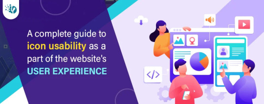
Whether you're creating a website or an app, every icon in your interface should have a function. Icons are present to conserve screen space. They're also there to help your users. Icons, when used effectively, may assist you in guiding people naturally through a process without depending on excessive copy. When done incorrectly, they can be confusing to your consumers, leading them down the wrong routes and ruining their experience with your product.
#UI/UX Designer#icon usability#icon usability tips#icon usability guidelines#tips for icon usability#what are icons in website interface#icons in user experience#importance of icons in user experience#user-friendly icons#hire UI/UX designer#web development company#hire dedicated web developer#software development company
3 notes
·
View notes
Text
My childhood ideal of this:

every girl wants to get in a vehicle and flip 3-6 switches overhead in the process of turning it on
#ps what the fuck is the batray#my ux of choice#eschew touchscreens#buttons#switches#old school ux#old school ui#ux design#batmobile#tactile ui#tactile ux
63K notes
·
View notes
Text

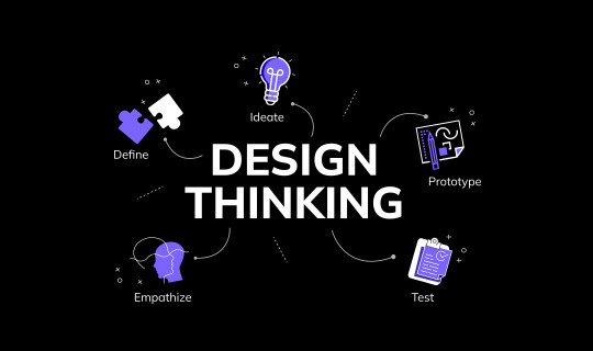
Design Thinking: The Secret Sauce to Successful Branding!
Design Thinking is the key to build a brand that truly connects with your audience! It drives innovation, fosters deeper connections, and ensures consistency across every touchpoint.
Read OneZeroEight insights, the Creative Design Agency in Pune, and see how Design Thinking can transform your strategy today!
#marketing communication#ui and ux design#ui ux design#ui ux development services#seo services#brand voice#brand identity#brand value#brandidentity#branding#design thinking#what is design thinking
0 notes
Text


i did a lot of portraits for my dating agency on a super short timeline but caspian my beloved. you will always be my favorite
#i always felt bad cuz she got shunted to like the last week of development so her design and portrait were the VERY LAST of everyones#i literall got her done like. the week we released#LMFAOOO#so theres sooo many things i would change about her design and vibe but it is what it is.#when we do the graphics update for the UI/UX and backgrounds ill redo her too...
1 note
·
View note
Text
https://digitalanivipracticeb.com/what-is-figma-used-for-2024/
Figma is a multifaceted design application used mostly in UI/UX design, prototyping, and building design systems. Mainly, it is web-based which allows designers to carry out their design projects in real time, provide feedback, and collaborate in the process. From these lines, you can understand
#is figma difficult to learn
0 notes
Text
Benefits of UX design | Liveblack

For any company, organization, or business, the main goal is to satisfy customers’ needs by providing an effective way to stay connected. Website is one of the most important ways to let customers know about a brand and its products and services. Behind every fantastic and brilliant website, there’s a lot of brainstorming, complications, errors, cooperation and communication, developer and designer’s hard work.
An immense growth of digital products used by large organizations and small businesses to acquire their customer’s attention brings brilliant concepts in web development and UX design. User Experience Design is the backbone of a good website, including all the elements of end-user interaction. The primary purpose of UX is to give customers or users a feel of an easy-to-use and easy-to-understand website. UX satisfies users with ease, preferences, accessibility, and much more.
What is UX Design and why is it important?
UX is User Experience for enhancing users’ overall experience while interacting with any app or website. The UX design process aims to provide users or customers with great satisfaction. In this digital world, every website wants to serve higher satisfaction to its users. It considers UX the most crucial factor in website design because websites with poor UX and below-average user experience impact the brand’s image and sales.
Why is UX important to business?
A well-designed user experience can improve a brand’s image and conversion rate. The positive UX makes complicated tasks easier for users and, on the whole, makes the user’s experience better and more convenient, keeping them loyal to brands. A visually attractive website can seize many advantages for businesses. The best UX creates positive first impressions, making your brand stand out and draw additional revenue.
Why is UX design important? So the answer is UX is for fulfilling users’ needs and giving them a meaningful experience so they trust your brand or product. Good UX defines a customer’s journey for how often they return to your site, purchase, and contribute to the brand’s success. The design of UX focuses on understanding users better to keep them close, comfortable, and coming back every time to the website. The boost in the percentage of website visitors is also an essential factor of UX.
Knowing the critical concept of UX design, let us talk about the benefits it brings to you and your business.
Benefits of UX Design
1 — Increase Customer Engagement -
An excellent UX design gives visitors a reason to explore further on the website for what they are searching for or want to know more about the brand. Experienced users know how to browse a website, but a new visitor or user will get confused, so make sure you have a good UX design so that your audience will be able to handle the situation.
With the engaging and straightforward UX, it will interest people to continue to move forward with your website. This way, you can increase customer engagement and make people aware of your brand or business.
2 — Increase Conversion Rate -
There are a lot more businesses or brands that sell the same products or services as yours. The point is, what makes you different from all the others? You can attract visitors with excellent, easy, and operative UX design, increasing conversions. Increase conversion rate by increasing the number of visitors and see a significant bounce in company revenue.
In such a manner, you give primary reasons to people not to switch brands, increase their interest in buying from you, and make them recommend your products and services to others. A good UX design is another factor in your business’s success.
3 — Increase in Brand Loyalty -
To form a long-lasting relationship, you need two things — user-centric UX designs and fixing bugs wherever you find some issues within your site. It says the first impression is the last, which also goes for your UX design. Building brand loyalty is the soul of any business. Impress your customers with good UX design so they experience hassle-free experience and purchase from you.
Give your customers a reason to buy repeatedly from your website. A pleasant and efficient UX design is a plus point for your website.
4 — Growing ROI -
Why do people do business? There are many reasons, but the common one is money. People do business to generate more revenue and ROI. UX design also helps you increase ROI because it is possible to get the desired results with effective and easy-to-understand designs.
With well-structured designs, customers engage with your site more. The more engagement, the more the sales come. More purchases lead to more revenue and customers’ loyalty to the brand as they love shopping from you. Customers prefer to return to any product or service if listed on the website, making their visit smooth and effortless.
5 — Creates Strong Brand Image -
Creating a strong and positive brand image for any brand or business is mandatory because no brand can stand in the marketplace without this. But how is UX design helping you in creating a strong brand image? Just think of a 5-star hotel serving the food that has no taste you expect. How does it sound? Poor, right? The same thing goes for websites. How good content, creatives, products, or services a website has, but if it doesn’t have effective functionality and an easy-to-use feel, no one spends time on such sites.
Website is not just about selling products and eye-catching graphics; it has to be efficient and understandable for people to use easily.
In today’s digital age, brands with good UX design stand out. Understand what your customers want and what they need. Make the user experience the best for them to come to you repeatedly. Find a way to stand out from the crowd and be phenomenal in this monotonous world.
Liveblack is a digital marketing agency providing services in��UI and UX design. We believe in offering concepts that are out of the box and make your brand stand out. We love to design in a way that engages people. Our skills speak through our best UX portfolio.
#user experience design#UX design process#UI and UX design#UI and UX Design Agency#best UX portfolios#Why UX design is important#Benefits of UX design#Why UX is important to business#what is UX Design and why it is important#liveblack
0 notes