#icons in user experience
Explore tagged Tumblr posts
Visit Tumblr Blog
Explore Tumblr blogs with no restrictions, modern design and the best experience.
Last Seen Tumblr Blogs


Fun Fact
Tumblr Inc. is funded by 13 investors.
Text
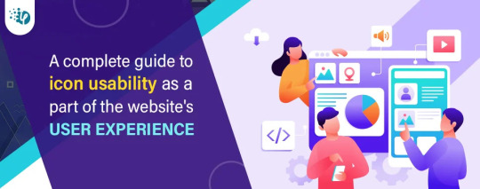
Whether you're creating a website or an app, every icon in your interface should have a function. Icons are present to conserve screen space. They're also there to help your users. Icons, when used effectively, may assist you in guiding people naturally through a process without depending on excessive copy. When done incorrectly, they can be confusing to your consumers, leading them down the wrong routes and ruining their experience with your product.
#UI/UX Designer#icon usability#icon usability tips#icon usability guidelines#tips for icon usability#what are icons in website interface#icons in user experience#importance of icons in user experience#user-friendly icons#hire UI/UX designer#web development company#hire dedicated web developer#software development company
3 notes
·
View notes
Text
Had a dream where I was back in high school in a math class and my teacher was just. Incredibly disrespectful about my identity/pronouns. So I swapped to the other math class section with a different teacher
And new teacher didn’t use my pronouns either, but it still felt better. And then someone broke my desk. And someone asked me if I made the right choice swapping, because neither teacher used my pronouns, right? And I just had this moment of such clarity, of, “yeah, he doesn’t use my pronouns. He doesn’t always use the right name. But you know what? He’s angry someone broke my desk, and I know that if he finds out who it was, they would be in trouble. And it wouldn’t be like that with the other teacher.”
Just. Utter clarity of the definition between someone who doesn’t understand pronouns but still sees me as a person deserving of safety vs. someone who maliciously doesn’t use my pronouns as a way to communicate disrespect and thinks that means I don’t deserve to be safe
#my dreams#rip to my high school history teacher who got cast as the villain#but also neither of these teachers were math teachers#it was my highschool history teacher and my high school art teacher?#very out of character for my history teacher. but honestly pretty in character for the art one#do I think my old art teacher would have used my pronouns? no#do I think he would have bitten then head off of someone who was messing with me? yes absolutely#terrifying man. used art as a coping mechanism for his war experience. 10/10#I think this dream is a reaction to my new job actually#sat down and had a very emotional but helpful conversation with my director about pronouns and use of them with clients#my supervisor is a queer elder who is confused but supportive#told me that if non-binary were as known as it is today back then supervisor might also identify with it#but supervisor is apparently too old to come out *again*#which what a mood#man being non-binary is fucking hard#nothing but respect for my fellow they/thems and neo-pronoun users this shit is EXHAUSTING#also shoutout to the dream bit where bad teacher was like ‘haha and is that an apple’ when I was holding a banana#and I just fully ignored him. didn’t even acknowledge the ‘joke’#an iconic move if I don’t say so myself
24 notes
·
View notes
Note
usernames themed around the anime serial experiment lain ? if you’re unfamiliar with that then maybe an old webcore theme ? lmk if i need to be more specific ! no worries if you can’t do it /g - @mogai-infirmary

i haven’t seen serial experiments lain, but it’s on my watchlist! i leaned more towards the old webcore theme. hope you don’t mind!

૮꒰ ᴗ.ᴗ ꒱ა 🎀 𓂅 ♡ old webcore themed usernames!
ᓚᘏᗢ : 🗯 ꗃ feel free to modifi them to your liking!
tubesnwirez (tubes n wirez)
bleedingscreens (bleeding screens)
woundedwires (wounded wires)
rottingwires (rotting wires)
wiredrabbithole (wired rabbit hole)
glitchygore (glitchy gore)
glitchgalore (glitch galore)
codedhearts (coded hearts)
bleedingcode (bleeding code)
liminalcode (liminal code)
digiluv (digi luv)
digigore (digi gore)
digibeing (digi being)
membranemalfunction (membrane malfunction)
%!? 𓂃 🧸 like or reblog to use and do not repost!
#˚ ༘♡ ⋆。˚ asks#˚ ༘♡ ⋆。˚ users#potentially triggering#serial experiments lain#carrd icons#carrd material#carrd inspo#carrd pngs#carrd resources#carrd profile#carrd moodboard#carrd stuff#carrd aesthetic#carrd bios#carrd gifs#carrd users#carrd theme#carrd template#username
53 notes
·
View notes
Text
tell me you've never had to use skype without telling me you've never had to use skype: you complain about discord
#liz blogs#what am i doing that i am actually completely 100% ok with the way discord runs right now and what they have behind paywalls#what am i doing that other people seem to not be doing that they get frustrated#i hate corporations more than the next guy but they do. still have to make money. to Function#its just bad when the app barely functions Without giving it money#its the difference between having a basic car and having four wheels 1 seat and a steering wheel. only the latter is bad#but the vanilla discord experience is... just fine?? you're not losing out on any Necessary features without it#it's Nice having custom colors and profile themes and funny icons but you don't Need them#the objectively best feature of nitro is the emojis and i am fine shelling out $30 A Year to use them where and however i want#in the basic nitro tier because i cannot fathom how much money it must cost#to run discord and host the insane amount of data it does. can you even Comprehend the sheer Size of what it stores#it is in fact the Only subscription to Anything i currently have#i think the 'fuck corporations fuck capitalism' attitude is Excellent but i think when most people Cannot think critically at all#everything is just black/white to them and they see Any service trying to make money as Bad and start screaming about it#tumblr and discord are on my very short list of services that i am actually very happy with and fine letting them make money#i feel strange watching the internet turn on discord the last couple years. it's still the same app. nothing has changed#literally trying to encorporate n//fts and AI is the only real Shit Move i can think they've ever made and to be fair#like every fucking company is jumping on that right now out of ignorance and not malice#nitro is not the problem though 🥴 are y'all ok#yes i saw people pissing and shitting their pants about discord giving nitro users more themes and thought they were insane#dark mode/light mode is just fine for basic functionality. you dont Need colors. shut up and go burn down an amazon warehouse instead
17 notes
·
View notes
Text
had some new followers the last few days so i just want to say — please personalise your blog and include your age or an 18+ indicator! the default avatar & no title/bio makes you look like a bot and is an almost certain way to get blocked by myself and most other writers!
#j talks.#psa.#consider reblogging some stuff onto your blog too because empty pages are just as scary to writers as completely blank/bot looking ones!#this is a blogging platform! you have a blog for a reason pls use it even if it’s not for rbing fics#some pictures or gifs or whatever#(if ur a newbie. I promise you. your user experience improves hundredfold when you engage and interact with content creators properly)#(likes r neato but all they tell us is that you saw the thing we posted. reblogs and tag comments and commenting on the post—#are so much more meaningful and people will interact with you in turn!)<3#mwah mwah etc but I will be going on a blocking spree soon so pls personalise ur pages and give yourself a title and an icon. at minimum#Ty!!<3
3 notes
·
View notes
Text
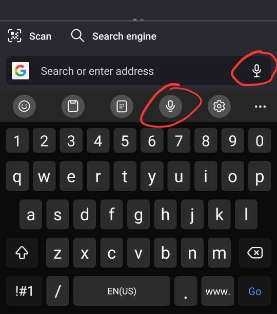
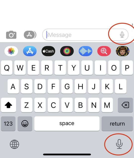
Every time it's a test.
Can you remember which icon records voice audio and which one is speech-to-text?? Because the interface gives you no clues.
#bad ux#uxui#uxuidesign#a-ux-person#user experience#user interface#icon design#intuitive design#design thinking#design#ui design#phone design#andriod#iphone
6 notes
·
View notes
Text
jfc you couldn't even adjust the DM icons up when u placed that obnoxious taskbar on the bottom of the page and half-covered one of the icons?
#i'm curious why tumblr in particular hates the user experience so goddamn much#sometimes (often) i come onto tumblr and i'm like why do ppl like this site lmfao#not in a great mood as it is but like. come on. it would have taken so little effort to do a vertical check and adjust the elements.#now i have this half covered icon and it's driving me insane#like. i don't even use DMs rlly lmao i don't talk ppl on sms but it's so fucking bothersome#not to mention tumblr's just generally 'we're just pals!' attitude when they plaster stupid ads on my screen#leaving again bye !!!!!!#edit yes i use ublock so i've hidden it but -old man voice- it's the principle#if they had moved the icons up i'd have been like. yes it's annoying. but at least they moved the icons up.#but i'm honestly kind of convinced that tumblr has no genuine respect for its user base
3 notes
·
View notes
Text
Tumblr is such a functional webbed site.
Staff made the follow button on posts span the entire width of the post (not just the actual word follow. Anywhere to the right of their username) on mobile and so it’s super easy to hit accidentally while just scrolling. Sometimes I hit it see the little animation and go "aw damn it" and click on the blog to unfollow and. This time. Nothing happened. Clicked again. And it registered me clicking it! just didn’t open. I had to navigate to my follower list to unfollow the blog. It was perfectly accessible there.
Thanks tumblr
#why is it so easy to follow people. on accident. who follows someone based on one post and not their blog as a whole#how frequently is that a convenience for users vs how frequently is it an inconvenience#og post#sidenote i thought maybe the blog had a visibility setting active. but i looked in the settings and i have NO clue what one that would be#ngl initially i was like. did tumblr glitch and cause me to follow a deactivated blog. is that what happened. but then i accessed it so.#possibly a visibility setting? but i COULD access it on mobile just from my follower list.#and i can't find a mobile excluding visibility setting#HOLD ON. new information i can't click the username at all on the like. dashboard version of my blog. but i can on the webpage version.#that works in the exact opposite fashion as the visibility setting i found (hiding from web). what the hell. man#it seems like the blogs that it happened to are broken urls. like someone changed their url and the post just. didn't update.#the one that inspired this post had a single post directing people to their new url. but then i found others that were completely blank#default icons#sorry if this is a common experience/obvious or something it just made me a bit confused 2day#i didn't know tumblr mobile would let you FOLLOW these blogs#usually they're just FULLY broken
4 notes
·
View notes
Text
The number of times I have opened my calendar instead of my email because of this shit...

36K notes
·
View notes
Text
Mastering Mobile App Localization: The Ultimate Guide

#In an increasingly globalized world#mobile app localization is crucial for developers aiming to expand their reach and connect with international markets. Localization involve#content#and functionality to suit different languages#cultural nuances#and regional preferences. This comprehensive guide will walk you through the steps of effective mobile app localization#ensuring your app resonates with users around the world.#1. Understand Your Target Audience#Before diving into localization#it's vital to thoroughly understand the markets you are targeting. Research the languages spoken#cultural norms#legal requirements#and local technologies. This foundational knowledge will guide your localization strategy and help you prioritize which elements of the app#2. Internationalize Your App#Internationalization is the process of designing an app's architecture so that it can support multiple languages and regions without requir#text directions (like right-to-left scripts)#local date and time formats#and numerical values. Preparing your app in this way simplifies the subsequent localization process.#3. Localize Content and UI#The next step is to translate and localize the app’s content and user interface. This goes beyond mere translation; you must also adapt gra#icons#and layouts to align with local customs and expectations. It’s advisable to work with native translators who understand the linguistic subt#4. Adapt to Local Regulations and Legal Requirements#Different markets may have specific legal standards regarding data privacy#digital transactions#and censorship that can affect your app. Ensure that your app complies with local laws and regulations to avoid legal issues and build trus#5. Test and Optimize for Local Markets#Once localized#thoroughly test your app in each target market to catch any issues with translations#or functionality. Consider conducting usability tests with local users to gather feedback and understand their user experience. Use this fe
0 notes
Text

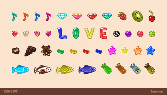


UI art for a casual mobile game
#characterdesign#stylized#gameart#mobilegame#mobile#game#digitalart#conceptart#ui#ux#user interface#user experience#icons#cartoon#cute#food#candy#sweet#boba tea#bubble tea#christmas#santa#santa claus#elsa#frozen#cat#grimace
0 notes
Text
Making usernames and icons slightly smaller on mobile was the strangest decision I’ve seen on here. Like ok let’s just make everything harder to see on the app where you can’t zoom in
#I’m an app exclusive user so#I don’t experience the pain of desktop users#you have it so much worse#the worse part is the little bar the icon/name is in didn’t change#that’s the same size#which makes it look worse
0 notes
Text
I refuse to update my tumblr app, which means I still don’t have mobile access to polls, and that means I sometimes get to see beautiful posts like this where I get to make up the context for myself:

Like is the question who is more influential? Who had the worst childhood? Best nemesis? Worst relationship with father? I have no clue but I’ll be thinking about this all day.


#polls#i still have the og app icon#the bugs are part of the user experience#one day i will be forced to update#but today is not that day#i am content going on my laptop when required
63K notes
·
View notes
Text
Reasons Discord's New Mobile Layout Update is Bad
The reply function is redundant, as most people are used to just holding down and tapping the reply option at the top. If they're going to change it, they shouldn't have gotten rid of the member list for this functionally bad option. It also doesnt line up with any other platform in terms of swipe direction.
The member list is gone from easy viewing
It doesnt auto open your last group chat/DM making multiple simultaneous conversations far more difficult and longer
It's already broken my app once (Locked all channels including other servers' to one channel. I could not access anything except that and my DMs.)
You can not see images that have been pinned in the pins tab.
The search function was fine before. Where did your before, during and after date search go??
All of Discord's individuality is disappearing.
Getting used to a mobile format actually impedes usage of the desktop format and likely discourages people from multiplatforming discord because theyre so used to the "intuitiveness" of the new "tailored for mobile" experience
There is no way to CHANGE IT BACK. This is like Tumblr rolling out Tumblr Live without any Disable button At All.
Why are they marketing midnight mode as Something fucking ENTIRELY new??? It has always been a feature on Android as the AMOLED theme???????
DARK MODE IS NO LONGER LOW CONTRAST AND DISCORD IS DEVOLVING INTO AN ACCESSIBILITY NIGHTMARE
Disable swipe-to-reply by activating full-screen Launchpad in Advanced Settings
Discord’s new layout is apparently permanent. Keep sending feedback and rating it one star on all appstores; if you get redirected to the advice article, double tap gove feedback.
If you, too, dislike the theme, head to settings (you can double tap your account picture) and go to Appearance, scroll to New Layout and Send Feedback.
Overall, what they've done is disorientate every single current user on discord, and you cannot avoid it unless you've not updated to the latest discord because this is not an update. It is a feature that has already been on the latest update and is being slowly rolled out, like Tumblr Polls.
Good Luck, and may we send as much feedback as possible and have them make it optional or at the least, revert it. I've already sent in at least seven complaints to discord, commented on their instagram post about the layout and I'm about one star review it on google play and app store.
This isnt just the appearance and vibes being off like the new (ish) app icon, this is a matter of functionality.
11K notes
·
View notes
Text
ok my only starfield complaint apart from the unoptimisation in some areas is the lack of visual feedback when you're looting stuff?? even just a tiny icon to indicate what type of item you're taking would be so useful 😭
#i do like that there's no menu for looting like skyrim and games that came before bc that was a neat thing in fo4??#but like. i just killed this guy and idk if this item he's carrying is a weapon or misc stuff!!#modern game uis are either hit or miss and it works really well in starfield bc of the context BUT visual feedback is a very important thin#in user experience and its tricky to find a way to implement it sometimes but here!! it'd be so easy to just. add a little icon#and also im terrible at remembering weapon names nd visuals are easier for me to remember weapons but thats a personal issue
0 notes
Text
Wait where are all of your icons
No, please don't get rid of the icons on desktop If this is an intentional update it's the first one I'd be really unhappy with
#i can see the icons of the people that made the post but not the people that reblogged them to appear on my dash?#is this part of streamlining the user experience?#but i love all of your little icons it's your faces i know you by those not the urls
1 note
·
View note