#weeklycharts
Explore tagged Tumblr posts
Visit Tumblr Blog
Explore Tumblr blogs with no restrictions, modern design and the best experience.
Last Seen Tumblr Blogs


Fun Fact
1,644 Tumblr posts in 1 second.
Text
My weekly chart (27 Jan 2025 - 02 Feb 2025)
That's what I like. That's what surrounds me. That's what creates my mood.
*Created by my preferences only*
Аll chart positions in 2 minutes here -> https://youtu.be/7POh-tN1inc
5. Misaa - Interest
youtube
4. ZVANA - Ganymede
youtube
3. Iniko - Rain
youtube
2. Kllo - Maybe We Could
youtube
1. EMUNA - Спектакль
youtube
If you want to support channel:
If someone wants to help or support Ukraine:
https://saveukraineua.org
#Music#FavoriteMusic#Songs#DonationLinks#Canada#Ukraine#USA#Australia#Electronic#AlternativeRnB#UKGarage#2Step#UKBass#AltPop#FutureGarage#PostDubstep#IndiePop#UkrainianIndie#Alternative#Dancehall#Afrobeats#PopRock#Trap#RnB#MyMusicWeeklyChart#MyWeeklyChart#WeeklyChart#MyChart#Chart#MusicChart
0 notes
Link
#BankNifty#BankNiftyAnalysis#bearishcandle#breakout#candle#candlestickpatterns#candlestickpatternsintrading#candlesticktrading#consolidation#downtrend#insidecandle#MA22#MA55#movingaverages#resistance#support#tradingsession#trendline#upsidemomentum#weeklychart
0 notes
Photo

Is success a hard catch for you? Here are 5 tips that can fetch you success in Forex trading.
2 notes
·
View notes
Text
Keep voting!
That list isn’t the only one out there! Go find more and vote to get our girlies on/higher up on those lists as well!
~♡
2 notes
·
View notes
Photo

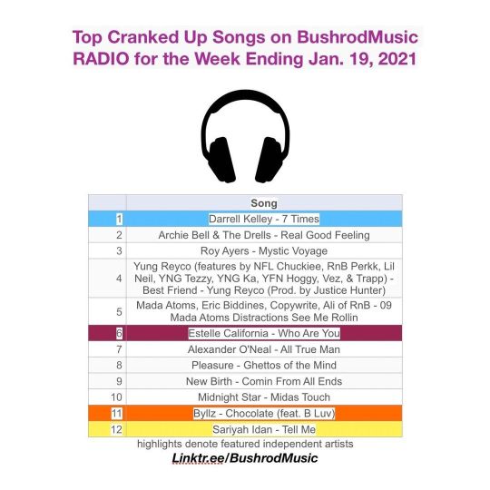
It’s official. Shoutout to the independent artists topping this week’s chart. Keep cranking up the volume on your weekly favorites. Thanks for tuning in. #topcrankedup #bushrodmusicradio #weeklychart https://www.instagram.com/p/COqAeTaJghT/?igshid=1lzg3ep9jordh
0 notes
Text
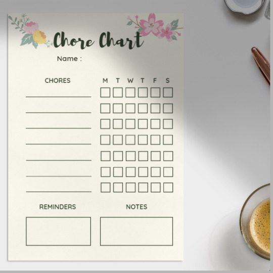
Floral Chore Chart - Weekly Chore Chart - Chore Chart for Busy Moms & Kids
Plan your chores and get organised for the week ahead with my super handy Floral Chore Chart.
It's an old school concept but Checking Off my Weekly Chore Chart has become a total game changer for me over the last few months.
You may also like :
Daily and Weekly Planner Pages - Floral Printable Planner
Follow me on Instagram @smileybrains and Twitter @smiley_brains
#chorechart#chores#chart#todolist#choresforkids#choresinthishouse#choresaregoodforkids#choresprintables#floralchorechart#floralprintable#weeklychorechart#weeklychart#weeklychores#notesnotepad#memopad#floraltodolist#busymoms#organize#organization#househelp#housechores#printables#plannerprintables#printablesformoms#printablesforkids#printablesforplanners
0 notes
Photo

#xauusd #gold #weeklychart #technicalanalysis #doubletop on #4hourchart at #resistance #rsi is #overbought potential #trendreversal to the next #support #priceaction #chartpatterns #candlestickpatterns Wait for Friday #goldrush #leipzigtradingclub (hier: Leipzig, Germany) https://www.instagram.com/p/Bsd9aksgcR3/?utm_source=ig_tumblr_share&igshid=14nkffqk77315
#xauusd#gold#weeklychart#technicalanalysis#doubletop#4hourchart#resistance#rsi#overbought#trendreversal#support#priceaction#chartpatterns#candlestickpatterns#goldrush#leipzigtradingclub
0 notes
Text
My weekly chart (05 Jul 2021 - 11 Jul 2021)
That what I like. That what surrounds me. That what creates my mood.
*Created by my preferences only*
Аll 10 chart positions in 6 minutes here --> https://youtu.be/5tBzkGIKbLU
10. Andrew Rothschild - Ren
youtube
9. Romare - Sunshine
youtube
8. BREAK IN - LAWG
youtube
7. Låpsley - First
youtube
6. WEIRDO (IYES) - 321MEOUT
youtube
5. LANY - you!
youtube
4.James Righton - Start
youtube
3. Two People - I Was Wrong Thinking You Were Right
youtube
2. James Blake - Godspeed
youtube
1.Jamala - Вірю в тебе
youtube
#MyMusicWeeklyChart#MyWeeklyChart#Music#FavoriteMusic#Songs#WeeklyChart#MyChart#Chart#MusicChart#MyMusicChart#Electronic#Downtempo#Folktronica#TripHop#House#Breakbeat#Alternative#Rock#IndieRock#IndiePop#NeoSoul#LoFi#ArtPop#NeoPsychedeliс#DancePop#ElectroPop#RnB#Piano#AdultContemporary#Pop
1 note
·
View note
Link
#15-minutetimeframe#andtrendlines#BankNifty#candlestickpatterns#dailychart#downtrend#marketanalysis#resistancelevels#supportlevels#tradingsession#trendline#uptrend#weeklychart
0 notes
Text
Weekly Charts with Rhum (XBB, IBIO, TWTR, AC)
Rhum breaks down the charts for the hottest tickers last week: iShares Bond Index (XBB), iBio (IBIO), Twitter (TWTR), and Air Canada (AC). #stocks #investing Read the full article
0 notes
Photo


Third attempt but go vote for BPRanai! Tweet from A1STSherlock "In this Kpop Fan Chart BP RaNia has ranked 28 and 38! https://t.co/DlHpW0aZez Thanks for the tip @soneinlove8 https://t.co/8OUZG5PDg1 " Send love to soneinlove8 on twitter! ~♡
#3rd times the charm#vote#bp rania#MMA#SAF#Vote for Killer while you're at it#Killer#weeklychart#38#28#reach for 1
9 notes
·
View notes
Photo

How to Plan an Effective Long-Term Forex Trading Strategy https://www.thebalance.com/big-picture-forex-trading-strategy-1344811
#LongTermForexTradingStrategy#forexbigpicture#currentmarket#technicalanalysis#MACD#WeeklyCharts#Realtrading#GlobalMacrofunds#forexeducation#tradersir
0 notes
Photo
It’s official. Thanks for cranking up the volume on your weekly favorites. Did you know that cranking up the BrM radio App volume allows you to register your favorites at-will? Get the radio App. It’s a free download. And finally, shoutout to the featured independent music contributors topping this week’s chart. We salute you for sharing your music with our listeners. #topcrankedup #weeklychart #music #tadioapp# bushrodmusicradio https://www.instagram.com/p/CKP2Ve5M3Fh/?igshid=1tmg5bxd5jbqy
0 notes
Text
How to Read a Log Scale
https://blog.datawrapper.de/weeklychart-logscale/ Comments
0 notes
Text
My weekly chart (28 Jun 2021 - 04 Jul 2021)
That what I like. That what surrounds me. That what creates my mood.
*Created by my preferences only*
Аll 10 chart positions in 6 minutes here -> https://youtu.be/ljGmvsnm960
10. Jim-E Stack · Bearface - One Shot
youtube
9. Braii - Wake Me up in the Next Life
youtube
8. Phantogram - Mister Impossible
youtube
7. Choir Boy - It's Over
youtube
6. TWO LANES & Panama - Rolling Back
youtube
5. THE HARDKISS - Сестра
youtube
4. Dephzac - Rolling Faith (Original Mix)
youtube
3. Måneskin - Are You Ready?
youtube
2. Tyga - Floss In The Bank
youtube
1. Radio 4 - Enemies Like This
youtube
#MyMusicWeeklyChart#MyWeeklyChart#Music#FavoriteMusic#Songs#WeeklyChart#MyChart#Chart#MusicChart#MyMusicChart#Electronic#RnB#Bass#LoFi#Indie#IndiePop#PostPunk#AlternativeRock#Rock#Synthpop#NewWave#Synthwave#FutureBeats#Chillwave#PopRock#ProgressivePop#SynthRock#Breakbeat#DRUMnBASS#Jazzstep
1 note
·
View note