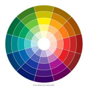
#website color palette generator
Explore tagged Tumblr posts
Visit Tumblr Blog
Explore Tumblr blogs with no restrictions, modern design and the best experience.
Last Seen Tumblr Blogs


Fun Fact
Tumblr has been providing a Korean-language service since 2013.
Text
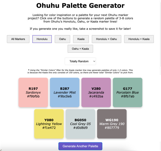
Ohuhu Palette Generator
----------
Hey look, I am actually capable of finishing & posting something!
What can I say? Life was just too chaotic the past couple of months and something had to give. Art posts were unfortunately the easiest thing to cut. 😅
Anyway. I have managed to chip away at a few projects in between other things, and this in particular was kind of a spur-of-the-moment decision I spent most of January working on: A very basic website where you click a button (or two) and get a random assortment of Ohuhu marker colors to then use however you see fit! ✨
If you are interested in listening to me ramble about how exactly we got here, that's what the "Keep Reading" button is there for. 😉
Like My Art and Want to see more of it? Here's All My Links! ⭐️
----------
Well Sparklers, this is certainly not how I expected to start off 2025 (nor did I plan to end 2024 as silently as I did as far as art posts go), but here we are! 🤗
Quick Recap: I made a very bare-bones website that will generate palettes of randomly selected Ohuhu markers colors for you!
I've probably said this somewhere before, but it bears repeating: I've been slowly but surely chipping away at various projects behind the scenes, a couple of the bigger more involved ones being related to yes, Ohuhu markers. [And for the record, no I really didn't forget about OhuHueVember, this past November just turned out to be one of the most chaotic and busiest of my entire life, and unfortunately putting art posts on Pause was what made the most sense at the time, and then December was just naturally busy what with Christmas and Family and all.]
A few days into the New Year, while I was taking a break and scrolling social media, since I am pretty deep into the wider Ohuhu Community at this point, I saw a kind of post that I've seen a few times before: Someone asking about generating color palettes of Ohuhu markers for coloring (as in adult coloring books). Usually, the "answer" to this is to use an existing color palette generator (of which there are many) and just manually match your markers to the colors, but that's not usually as easy of a solution as people are looking for.
I think there's at least one generator out there that can tell you Copic marker (and maybe Prismacolor pencil?) matches for the colors it generates, but it hasn't quite caught up with the boom in popularity that Ohuhu has had, so instead of matching to the color itself, you'd just be trying to match to the Copic color instead, which I would argue might actually be harder to do, even with some community resources that are out there.
The point is I know in the Coloring Community, people tend to like easy solutions and there really wasn't one for this specific problem. And I've known this for a while—since the first time I saw a post asking for something like that, which was many, many months ago (maybe even a year or more), but yet for some reason this most recent, totally inconspicuous post sighting was the straw the broke the camel's back and made me finally snap:
Surely there has to be something out there were you can put in a custom list of colors and it'll randomly spit like 5 of those colors back out at you. There are all kinds of random generator tools out there, surely at least one could do something like that, couldn't it?
So down the rabbit hole I went.
There wasn't a terribly straight line that lead me here and I went back and forth to a few things a few times, so I'll just give you a list of the highlights that had the most influence in how we got to this point:
I tried just about every keyword combination I could think of for "custom palette generator," "make your own palette generator," "make random color palettes," "color randomizer," etc. Even if it wasn't terribly fancy and the absolutely barest of bones of the concept I described. No real luck there, but it's very possible I just totally missed something.
I eventually checked Flippity.net because I love their Flippity Manipulatives tool (for digital Mini-Magnets), and their "Flippity Randomizer" would have worked except it has a very strong default color palette for what the final randomizer looks like. While it still would have been totally functional otherwise, I know the strong color mistmatch could very well be a dealbreaker for some people to not want to use it at all. (And, to be fair, the final Flippity links tend to be...long and suspicious looking if you've never seen one before.) You can use images with the Flippity Randomizer, but the thought of having to make 300+ separate small image files that would also need to include the color names and numbers directly in the image and then also put them in order in a Google Sheet sounded torturously tedious (even for me), so I filed that idea away as "Plan C" and kept looking.
Flippity did give me the idea to try looking for more generalized randomizers that could be re-purposed for what I wanted since theirs' was originally for making sentences. Through that, I finally stumbled upon perchance.org
Perchance all by itself was a big step in the right direction because it's entire purchase is making your own generators and you can use existing Perchance generators as a starting point to make new ones.
So imagine my delight to learn that there have been a few color generators already made with Perchance, and buried among them even a couple of Ohuhu ones!! 😃
But you'll notice my final generator isn't running through Perchance. Suffice to say, I know just enough about coding to be a menace, but not enough that I could truly say I ever really "know" what the heck I'm doing. My "coding experience" consists of:
Messing around with CSS and Journal Skins on deviantArt, back before the Eclipse update when those were still Things™
Many half-hearted attempts to make a Blogger blog, all of which were eventually deleted and lost to time
Creating and Maintaining Fandom Wiki pages (and, within the last couple of years, a whole Wiki for my own personal use)
Relatedly, I briefly tried messing around with some code on Toyhou.se but that ended up going nowhere
Playing with a premade theme here on Tumblr to make my page look nicer
And anyone with real coding experience might gather from that list that I certainly don't have the skills to build anything from scratch, but I can generally fumble around with existing code and figure out how to change things to make the end result look the way I want. So, as I said: I know just enough to be a menace.
This means that I started off by spending a lot of time hopping back and forth between different palette generators that had already been made with Perchance and Google while trying to combine various elements I liked in a way that ran smoothly...and also trying to not "break" anything so it would run at all.
I kept hitting walls with Perchance because, as I eventually figured out, I kept finding solutions and suggestions that were for "regular" HTML coding, not Perchance's specific variety.
After some Googling, this led me to move over to Glitch.com so that I could use regular HTML code but also still see the "live" results alongside the code, which was something I really liked about Perchance (and was familiar to me from Tumblr themes).
I also thought I'd end up making posting the final site through Glitch too, but we'll get to why that didn't happen in a bit.
The primary culprit that had me switch from Perchance to Glitch was the fact that I realized the code would be so much longer and probably what would be considered "messier," and I would guess more difficult to update at a moment's notice if I had to manually type 300+ color number codes, names, and hastily-selected hex codes (just to have a visual representation of the color) in there, let alone if I decided to basically do that twice to cover both the Honolulu and Oahu lines.
I keep a few different spreadsheets for Ohuhu markers already, so I wondered if there was a way to get the code to reference something like that instead to keep the code itself "cleaner" and maybe make edits/additions to the color list easier in the long-term. And lo and behold—There is! You can, apparently, paste in "CSV" Google Sheets links in a specific way into the code and it'll look at those instead of having to type everything directly into the code itself. I did have to make three separate spreadsheets—One for Honolulu, one for Oahu, and one for Kaala—but I was able to copy and paste a lot of the information I already had in my other spreadsheets into those, so overall that was still way easier than the alternative! The catch is that, as I alluded to, there might be a way to do that using Perchance, but the results I was finding were all for regular HTML code and I really did not feel like chasing down Perchance-specific instructions. So to Glitch I went.
Moving to Glitch did have the additional bonus of me being able to paste in the widget for my Ko-fi Page, which I only thought to do because I got a Ko-fi notification in the middle of working on the code and while I was checking that, I remembered: "Hey doesn't Ko-fi have like an HTML thingy you can put on your website?" [They have two, actually!] Anyway. I got what I'd already been working on moved over to Glitch, which was most of the basic set up for the page; I was just using a placeholder list of colors from OhuHueVember so I could get the Categories and page layout taken care of first. Then I did kinda the same thing—I set up the basis for the spreadsheets I'd need using the OhuHueVember list as placeholders since I already had hex codes picked out for them and wanted to make sure the whole spreadsheet thing was actually going to work before I went any farther.
Once I did verify that method was working, I got to take a very tedious detour and actually fill out the spreadsheets with the proper information. As I said, I was able to paste in a lot of what I needed from my other spreadsheets—The number codes and names for all the colors—but it was that last piece of information I needed for each color that ended up taking the longest: The hex codes. Since I wanted to have this thing at least functional sooner rather than later, I did not have time to go through and meticulously curate matching hex codes for each color like I did for OhuHueVember, and technically I couldn't have done that even if I wanted to for the Oahu and Kaala lines since my collection is all Honolulu. So I relied mostly on quick eyedropper color-picking from swatch photos from my collection and photos/images online for the rest.
From that, I know a lot of the hex codes are not good matches, but again: The point was to get everything functional first. Especially since I was able to switch to using spreadsheets to store the information, I can always (and intend to!) go back and update the hex codes to better matches later on.
Still: Once I got all the hex codes filled out, the most basic version of the generator was in fact functional! 🎉
That by itself was super exciting and I had to spend several minutes generating palettes just because I could now...But me being me, and not always knowing when to quit when I'm excited about a project...I wanted to do more, especially now that I was working in regular HTML coding.
So I spent the next couple of days trying to figure out how to add a Filter so people could narrow down the types of palettes a little more. My very first thought was Pastel, since I know soft/pastel palettes tend to be kind of popular in coloring communities, and then I figured if I was going to do Pastel, why not include bright "Vivid" pastels and dark "Moody" ones, too? [And a little later on I ended up adding a "Neutral" filter for greys + earth tones too, just because I could.]
Getting the little dropdown button in there for the Filter wasn't actually that bad, but getting it to actually filter like it was supposed to was another story. I lost count of how many times I accidentally broke the whole generate (mostly buttons not working like they should) while trying to get the filter to cooperate with me. 🫠
I did eventually....mostly get both the filters and the marker line buttons to work at the same time after enough trial and error, though.
And originally, this was the point in the story where I had to explain that I did run into issues with having "Kaala" + "Similiar Colors" in the dropdown selected at the same time causing the generator to freeze up about 7 out of 10 times, even though everything else was working fine, and I couldn't figure out how to fix it to save my life. 🙃
But! Shortly after I started writing this description I took a procrastination break and I went back in to try and clean up some of my notes I'd left in the code to tell the different sections apart...And I couldn't help myself. I had the code in front of me, so I started fiddling with it again.
Finally I hit the right keyword search I needed and was able to find a solution that actually worked and I could mostly just copy and paste in without breaking anything else in the process! 🙌
As I had suspected, the problem mostly stemmed from the fact that there are just a lot less Kaala colors to pick from—150, vs. the over 300 for either Oahu or Honolulu. So sometimes the generator would try to pull 3-8 "Similar Colors" and it just...couldn't because there weren't 3-8 colors that fit the "Similar" range it was calling for.
So I put in a few lines that basically force it to just use whatever colors are available even if it's not the intended 3-8...This does mean (as noted in the preview image and on the site itself) now you'll sometimes get just 1-2 colors with that specific combination (Kaala + "Similar Colors") but I think that works a whole lot better than the entire page bugging out.
But so, okay! Generator is (mostly) working as intended and I even added some extra things I hadn't originally planned on—I even got really crazy and tried adding some SEO things to the code because I found a template and you hear so much about how important that is now [I can't tell if it's really working or not, but it's in there)—Great! But there was one last thing that was bothering me...
Glitch has a limit of 1000 active hours per month on a project, and that includes both hours I spend editing the code and time people spend actually using it. Logically, do I really think I need to be worried that my very basic site that will only appeal to a very niche community within a niche community will come anywhere close to actually hitting 1000 hours of activity in a month? No.
But I also know this is the internet and sometimes you post things and they get way more attention than you expect (as sort of became the case with Ohuhu markers themselves), and to be fair I have no statistics whatsoever on the kind of time people usually spend on palette websites, so I really have no way to know if 1000 active hours is even an unrealistic expectation or not, in either direction.
Between that and past experiences with "Oh, I'll worry about that limitation later when it actually proves to be a problem," I decided to look into other options that wouldn't be limited by hours, and after a cursory look around, GitHub is probably way more complicated than what I really need, but it felt like the obvious choice. At least I'd actually heard of it before!
I can't edit the code "in real time" like I can with Glitch (at least not without signing up for a subscription, I don't think), but so far I can still edit in Glitch and just copy & paste the updated code into GitHub, so that'll work for me. And it might be for the better anyway since that's another layer between my trial-and-error editing and the final site, so if I go back and try to change or add to the site in the future (which I very well might) and I accidentally break more things, it won't effect the "live" site people are actually using. 😅
I must admit I kind of want to keep toying with the site to see just how far I can push it...And it's given me some ideas for other projects, too, but I have to draw the line in the sand somewhere so people can actually use it and it's not just a private project I tinker with sometimes for all eternity 😆 😊
At least I did accomplish what I originally set out to do + a few extra things, so I don't feel like it's really "missing" anything and it should be plenty usable even if it's not totally perfect. (And I'm speaking mostly of the imperfect hex codes when I say that, for the record.)
Like I said at the beginning: This is definitely not how I expected to start the year off, but I'm really happy with the end result and I'm cautiously optimistic about where/how things might go from here.
In any case, I hope any of your Sparklers that chose to try it out like/enjoy the generator too...Or at least that you got some enjoyment out of my rambling about it here. 😆 (Which I'm assuming you have if you managed to get this far....)
The Ko-fi widget is there on the final site, but I would like to get better at promoting myself and my work so it bears repeating: If you do like the generator and feel like sending a little monetary support my way, my Ko-fi Page has a few different ways you can do that. And if it means anything to anyone: My Ko-fi Supporters got a little early preview of the generator before today and if I add anything to it in the future, they'll probably get an early look at that too. 😉
I think that's going to do it for me here today, though. It's been a while since I made a "big" public post so I have to go get re-acquainted with my cross-posting process...Which I'm not really looking forward to, but oh well—has to be done!
I look forward to seeing you Sparklers again (hopefully) very soon...! 👋
----------
Website created by me, MysticSparklewings
The Generator/Website is not officially affiliated with or sponsored by Ohuhu
----------
⭐️ Like My Art and Want to see more of it? Here's All My Links! ⭐️
#mysticsparklewings#xxmysticwingsxx#ohuhu markers#alcohol markers#copic markers#limited palette#palette challenge#color challenge#art supplies#art resources#resource#free resource#cool websites#coloring tools#adult coloring#coloring challenge#colors#art inspirations#palette generator#markers#art tools#color palettes#ohuhu.
4 notes
·
View notes
Text

How am I supposed to score -10000000???
How well do you see color?
I’m cry I scored 60, I feel blind
#scored 0#but i had to turn off night light and turn up my screen brightness first#also turned off dark reader#holy spotlight website batman#unrelated#but i also spent like three hours generating random accessible color palettes last night#trying to find a good one for the app im building
689K notes
·
View notes
Note
😍: What color do you think looks the best on (S/I)?
To Aurora?
[Aurora] Oh, hello! Absolutely, I'd love to answer.
Emerson defaults to a lovely violet shade when they attend to me in the castle, a pale sort of lavender. I love their gown– we're not sure what the fabric is, really, but it's soft, and it shimmers in the light. Aunt Merriweather made a face at the color once, saying violet reminded her of someone she'd rather not recall. I told her to play nice, for my sake, especially considering Maleficent really can't do us any harm or even bother us without Emerson letting her, and frankly, it wasn't even nearly the same shade as Maleficent's cloaks.
And then she said something along the lines of, oh, you know, it's actually closer to a blue, isn't it? And I said yes, Auntie, you could certainly say so. And she seemed a lot less nervous about the whole situation after that.
So I do think they look lovely in that shade. And though they don't wear it much anymore, as a child, they always dressed in forest tones– browns and greens, you know, and they'd blend right in to the trees and leaves. They've told me now it made them much better at hide-and-seek than I was, but if you hear that from them, tell them they're remembering wrong! I could always find them in no time at all.
And... well, I also think they look darling in pink. 🩷
#(jasper this is so funny. literally a week before you sent this ask i had gone through a multiple-day-long brainstorming session#where i tried desperately to settle on a color scheme for this s/i. because i needed to paint her for my navpage. like using websites#to generate palettes and color picking from the movie and trying to understand the color wheel. all of this.)#takeover time
1 note
·
View note
Note
https://randomwordgenerator.com/color.php random color generator.
-🌿(Tumblr is for the animals and people with mental disorders. Random generation websites are for pallets that probably suck.)
the reason i said "feed me color palettes" is because my dash is usually full of them and i'm following 3 accounts dedicated to color palettes and just that. so when i got something i don't want it was a little annoying .mywife (color palettes) was kicked out of the house (my dash)… sniffle sniffle
#screenie answers#//;i don't really open links i can't recognize fot safety reasons but! don't worry i know ab color palette generation websites#//;i mainly use coolors#//;THIS GOT STUCK IN MY DRAFTS AND I FORGOT TO POST OT SORRY
0 notes
Text
Just a bunch of Useful websites - Updated for 2023
Removed/checked all links to make sure everything is working (03/03/23). Hope they help!
Sejda - Free online PDF editor.
Supercook - Have ingredients but no idea what to make? Put them in here and it'll give you recipe ideas.
Still Tasty - Trying the above but unsure about whether that sauce in the fridge is still edible? Check here first.
Archive.ph - Paywall bypass. Like 12ft below but appears to work far better and across more sites in my testing. I'd recommend trying this one first as I had more success with it.
12ft – Hate paywalls? Try this site out.
Where Is This - Want to know where a picture was taken, this site can help.
TOS/DR - Terms of service, didn't read. Gives you a summary of terms of service plus gives each site a privacy rating.
OneLook - Reverse dictionary for when you know the description of the word but can't for the life of you remember the actual word.
My Abandonware - Brilliant site for free, legal games. Has games from 1978 up to present day across pc and console. You'll be surprised by some of the games on there, some absolute gems.
Project Gutenberg – Always ends up on these type of lists and for very good reason. All works that are copyright free in one place.
Ninite – New PC? Install all of your programs in one go with no bloat or unnecessary crap.
PatchMyPC - Alternative to ninite with over 300 app options to keep upto date. Free for home users.
Unchecky – Tired of software trying to install additional unwanted programs? This will stop it completely by unchecking the necessary boxes when you install.
Sci-Hub – Research papers galore! Check here before shelling out money. And if it’s not here, try the next link in our list.
LibGen – Lots of free PDFs relate primarily to the sciences.
Zotero – A free and easy to use program to collect, organize, cite and share research.
Car Complaints – Buying a used car? Check out what other owners of the same model have to say about it first.
CamelCamelCamel – Check the historical prices of items on Amazon and set alerts for when prices drop.
Have I Been Pawned – Still the king when it comes to checking if your online accounts have been released in a data breach. Also able to sign up for email alerts if you’ve ever a victim of a breach.
I Have No TV - A collection of documentaries for you to while away the time. Completely free.
Radio Garden – Think Google Earth but wherever you zoom, you get the radio station of that place.
Just The Recipe – Paste in the url and get just the recipe as a result. No life story or adverts.
Tineye – An Amazing reverse image search tool.
My 90s TV – Simulates 90’s TV using YouTube videos. Also has My80sTV, My70sTV, My60sTV and for the younger ones out there, My00sTV. Lose yourself in nostalgia.
Foto Forensics – Free image analysis tools.
Old Games Download – A repository of games from the 90’s and early 2000’s. Get your fix of nostalgia here.
Online OCR – Convert pictures of text into actual text and output it in the format you need.
Remove Background – An amazingly quick and accurate way to remove backgrounds from your pictures.
Twoseven – Allows you to sync videos from providers such as Netflix, Youtube, Disney+ etc and watch them with your friends. Ad free and also has the ability to do real time video and text chat.
Terms of Service, Didn’t Read – Get a quick summary of Terms of service plus a privacy rating.
Coolors – Struggling to get a good combination of colors? This site will generate color palettes for you.
This To That – Need to glue two things together? This’ll help.
Photopea – A free online alternative to Adobe Photoshop. Does everything in your browser.
BitWarden – Free open source password manager.
Just Beam It - Peer to peer file transfer. Drop the file in on one end, click create link and send to whoever. Leave your pc on that page while they download. Because of how it works there are no file limits. It's genuinely amazing. Best file transfer system I have ever used.
Atlas Obscura – Travelling to a new place? Find out the hidden treasures you should go to with Atlas Obscura.
ID Ransomware – Ever get ransomware on your computer? Use this to see if the virus infecting your pc has been cracked yet or not. Potentially saving you money. You can also sign up for email notifications if your particular problem hasn’t been cracked yet.
Way Back Machine – The Internet Archive is a non-profit library of millions of free books, movies, software, music, websites and loads more.
Rome2Rio – Directions from anywhere to anywhere by bus, train, plane, car and ferry.
Splitter – Seperate different audio tracks audio. Allowing you to split out music from the words for example.
myNoise – Gives you beautiful noises to match your mood. Increase your productivity, calm down and need help sleeping? All here for you.
DeepL – Best language translation tool on the web.
Forvo – Alternatively, if you need to hear a local speaking a word, this is the site for you.
For even more useful sites, there is an expanded list that can be found here.
80K notes
·
View notes
Text
I've got to give up. I can't come up with a background.
This one has been in limbo for months cuz I could neither keep the background empty nor create one.
I was doing a bad colour palette challenge from a bad palette generator, but what I ended up doing was pretty much a tinted greyscale cuz I don't know how to work with colour palettes.

I can't find the website or the post anymore. Probably this. I once saw the post on @color-palettes.
#beyblade#beyblade fanart#beyblade hyde#beyblade phi#beyblade hearts#beyblade burst#beyblade burst turbo#beyburst#beyblade burst chouzetsu#beyblade burst cho z#phi kuromi#hyde kuromi#phi beyblade#hyde beyblade#my art#traditional art#art#drawing#fanart#artists on tumblr#palette challenge
92 notes
·
View notes
Note
hi I really like your mb and I'm new here. Do u have any suggestions or tips to make mb? like where did u get the pics and the captions.
𝓜oodboards: a guide for beginner blogs!
I decided to bring here a small tutorial that can help other blogs that are starting out and still have questions that need clarification, with tips and links that you may need. I wrote this from my point of view of creating moodboards and I tried to be as brief as possible in my explanation, there may be errors in English as I'm not fluent in that language and everything here was translated using Google Translate, any questions you can contact me via asks or by message.

how do I find pics for moodboards?
Pinterest is where you will find most images for moodboards, so create a Pinterest board just for these images, separating them into subboards for each color or aesthetic to make it easier.
Some blogs leave the link to their Pinterest accounts in pinneds or in the carrd, you can follow them and save the pics they published on the app in your boards, this will influence the Pinterest algorithm so that they recommend more of the type of images you want.
You can also search on Pinterest for the aesthetic and color you want (coquette pink aesthetic, cottagecore aesthetic, y2k, etc.).
how to make moodboards + tips:
Well, it's not such a complicated thing for me. I generally make moodboards with 6 or 9 images, taking inspiration from the moodboards of other blogs that I admire, so I can get an idea of how to make the captions and how to position the photos in a way that matches them.
To make it easier, first I create the moodboard and then I look for an icon of a kpop idol that can match the aesthetics and color of the moodboard. The reverse can also be done: first choose an icon and make a moodboard for that image, paying attention to the color palette and tonality (and for some reason, for me it's better to create moodboards in Tumblr's light mode instead of dark mode)
When I finish the moodboard, I add the caption, the hashtags (which will be very important for your post to reach other people) and maybe a divider. You can find these dividers on other blogs or by searching for "dividers" on Tumblr.
If you want to split a photo into two or more images, use this site.
how to create captions:
To make the captions, I use parts of songs that I like or that I found searching on Pinterest for "Spotify song lyrics", but they can also be album or song names, movie names, a phrase you thought, etc. The symbols you will put in the caption can be found on this website or just by searching for "symbols", "kpop symbols", "kaomojis" on tumblr.
If you want to use a different font for the letters, there are these two websites (01 and 02). And to change the color, there are also these two tutorials (01 and 02).
what to do to make your blog "popular":
Add popular hashtags that relate to the content you are posting. If you use almost the same tags as other big blogs, your posts will have more reach. Posting frequently and your account looking nice and organized helps too.
Ask several other popular blogs to promote your account. This was very important for my profile to grow in the number of followers and engagement.
Join the events that some blogs do, as they offer good prizes like reblogs if you win. And remember to have patience, as it often takes a while to get good engagement on Tumblr.
217 notes
·
View notes
Text


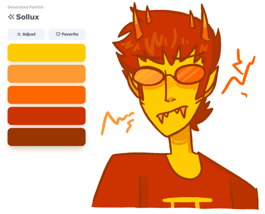
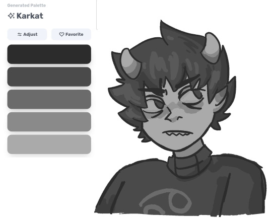
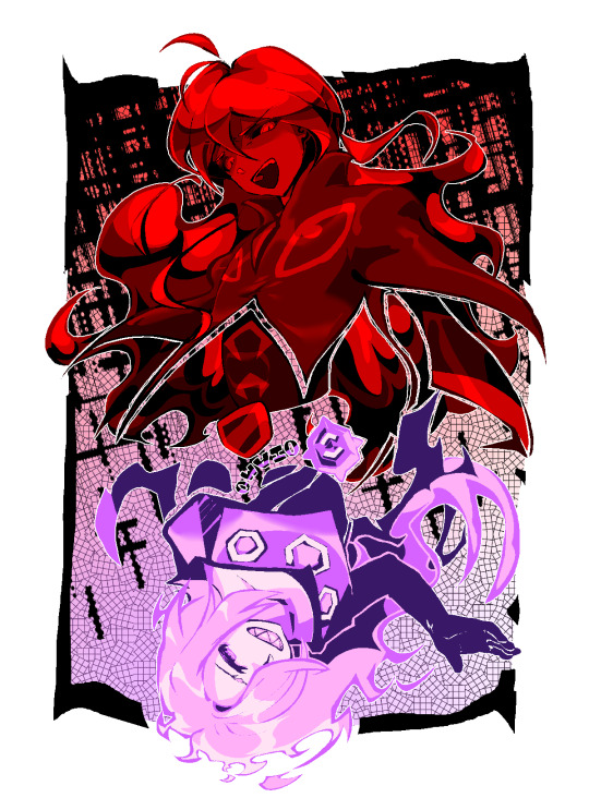
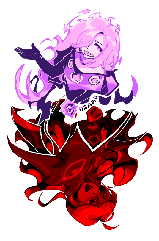
this website generates color palettes based on words so obvs i put the troll's names in there.
#tavros is my favorite but i think karkat's makes the most sense hehe#homestuck#my art#karkat vantas#aradia megido#sollux captor#tavros nitram#karkat#aradia#tavros#sollux#daily post#day 228
309 notes
·
View notes
Text
quick tips: motor control drills
This really isn't a guide but more of a ramble lol.
I haven't done this in forever but I did it this afternoon and highly recommend spending a little bit of time just drilling hand eye coordination. I think it helped, and was nice to do when I wasn't feeling particularly inspired.
Focused on fast and smooth, but also wasn't afraid to draw over the shape until I was happy with it
draw circles as fast as possible using the shoulder as much as possible
draw ovals and for a few of them, I tried to draw them from every angle as clean as possible
draw lines radiating from the center and try to draw the same line as straight as possible.
parallel curved lines
cubes from different angles if you are feeling wild
Here is just one page of some of the exercises I did today, messy chaos but ended up being kinda fun actually
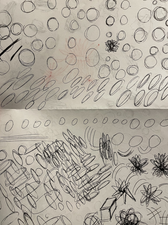
Hope this helped!
best, AL
Please consider helping me keep Art-Res running for years to come! (to host website where I keep the artist utilities found below :))
> buy me a coffee
Artist Utilities
Idea Generator
Visual Reference Boards
Random Color Palettes
Free Habit Tracker Printable
264 notes
·
View notes
Text
I've been itching to dive into something totally new and outside of my usual web dev comfort zone! After brainstorming for a while, I finally landed on a brilliant new project idea: building my very own desktop widget~!
Now, full disclosure—I have zero idea where to even start when it comes to programming a widget, but that’s where the fun comes in, right? I’m all about learning new things (I have an addiction to studying so…)~!
In this post however, I’ll be sharing my initial ideas for the widget and brainstorming what tech stack might bring this amazing idea to life~!
Prior knowledge on desktop widgets?
All I know is that they stick to the desktop area and some even always in front of the other windows. That’s all I know!
Widget Idea
So, the project idea I’ve chosen is something simple, just so I can get used to making widgets: a notepad. But, it’s not just any plain notepad widget—it’s going to have an aesthetic color scheme! (I know, pretty cool, right?) I really wanted to keep things basic for this first project.
The inspiration actually came from a Pinterest pin that I saved. I think the design is originally from a color palette generator website, but I want to take that concept and turn it into an actual desktop widget. Thus this project was born!

Tech Stack
Alright, I lied—I'm not entirely stepping out of my comfort zone for this one! I'll be using ReactJS, a technology I’m super comfortable with and absolutely love. But to keep things fresh and challenging, I’m diving into something new as well!
After researching (thank you, ChatGPT, Google, and YouTube), I found out there are plenty of ways to build a desktop application, or in this case, a widget. You can go with WinForms, WPF, Tauri (Rust), Qt, and others. But I wanted to stick closer to JavaScript—specifically something I could pair with ReactJS. So, ElectronJS seemed like the best fit.
For this project, my tech stack will be:
ReactJS (JavaScript)
ElectronJS (JavaScript)
SCSS (for those extra styling powers)
HTML (obviously)
Visual Studio Code (with a lovely brown theme 🧸)
Toward the end of the project, I’ll also explore how to package the widget so people can download and install it on their own computers, and how to store the notes locally!
Finally
As I post this I am going to start the project so I will soon post updates! (This is where I fail…!)
#xc: project logs#coding#codeblr#programming#progblr#studyblr#studying#tech#comp sci#computer science
89 notes
·
View notes
Text
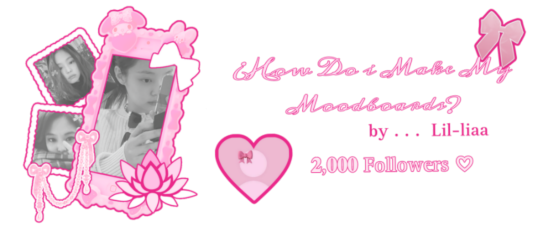
𝓛𝓮𝓪𝓻𝓷 with 𝐋𝐢𝐚!! ♡
2,000 𝒔𝒑𝒆𝒄𝒊𝒂𝒍 followers ♡⋆౨ৎ˚⟡˖ ࣪

Hi!! It's Liaa and if you don't know me i'm a kpop mbd creator i'm not sooo old or recent, but I do have some notable tips that I can give you if you need a push to improve (or start creating) your moodboards based on my criteria and experience ♡ bonus at the end!
Before you r e a d this : This guide is not a rule! You don't have to apply all the tips, feel free to apply them depending on your own style and taste.

In choosing the image on which the mb is based I want to separate them into 3 levels
Easy: An image that has common and striking colors that you can find popular aesthetics - easy to combine, harmony in colors etc!
Not so difficult: an image that has one or more not so popular colors,a background or image a little more complete, with aesthetics not so seen or visual
Difficult: The image has a color filter (dying) It has extra decoration or accessories, it has a specific bright (or duller) color (it means in any case that any image to combine will have to be edited to get the exact color)
Not everything is as difficult as I describe it! Getting started tips to make it much easierrr
# 𝐓𝐈𝐏 𝟏 : ¿Where to find?
Ways to find the aesthetic you are looking for!
Searches on Pinterest
Color + color aesthetic
Color- X Soft X Bright X Palid X Dark
Object - Subject-Color-Animal-Place-Serie/movie-country- Aesthetic
𝓐𝓮𝓼𝓽𝓱𝓮𝓽𝓲𝓬𝓼 that you may be 𝐥👀𝐤𝐢𝐧𝐠 for
I recommend this website that, apart from showing you many aesthetics, tells you the story of how it came about and more info!
Click to "Find aesthetic"

# 𝐓𝐈𝐏 𝟐 : ¿How to decorate it?
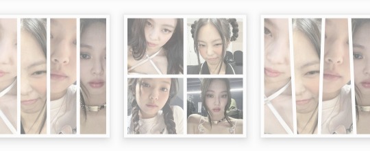
1. Collages on PICSART cute and easy♡ Make sure that the images complement each other from one side to the other so that there is balance and very importantly give it a center image!
2. Dividers You can make them yourself (On PICSART again) or find them here on tumblr!
I also have my own dividers if you want to check them out ദ്ദി ˉ͈̀꒳ˉ͈́ )✧
3. Gifs I always move the images a little to make it more striking! (you can do it in capcut and create the gif here on tumblr♡) another tutorial of example gif here
4. Texts! separate the angles you can always put a poem or some lyric music! (To add color to the text I have a tutorial here) You can always add "bios", symbols or kaoemojis since they are closely linked to the aesthetics in the texts
5.Pngs: It's very cutee and also gives an extra resource ((I don't use it as much as before but it can work well on quite a few mbds) I would recommend putting it in the middle
# 𝐓𝐈𝐏 𝟑 : ¿How to combine images? (My way to do it!)

Taking into account the general color palette, look at the image and check if the most prominent colors are warm or cold (including the background will be very useful) this way it will be easier for you to combine the tones without really having to find the exact color of the image! It will make it look much better.
# 𝐓𝐈𝐏 𝟒 : Center and sides
Keep in mind the center of your moodboard! As it is still a square (think like it's a painting) you can have more balance if you put certain colors or certain photos on one side or the other and put the main photo (or a collage) in the middle! So that it harmonizes and draws more attention.
# 𝐓𝐈𝐏 𝟓 : Tonal degrees
Always keep in mind what tonal degree the color of the photo has. Depending on that, you can look for images with the same tonality! As I already mentioned, if it is more opaque or stronger or brighter, it makes it much easier to identify a better combination.
# 𝐓𝐈𝐏 𝟔 : Combination
At first glance, you might be able to identify the most prominent colors in a photo, but taking into account color theory, the color of that photo only exists when it is contrasted by another, that is, based on the combination of colors with each other.
So when choosing photos to match, look for the two colors together in the photo to give a more similar impression even if the colors are not exact (In any case, you can also edit the color of images that have the same tone as your photo by changing the image and the difference would not be noticeable)
# 𝐓𝐈𝐏 𝟕 : More ways to apply aesthetics . . .
Related objects: depending on the image, there are also usually certain objects that can be related to the aesthetics of the photo. You can always add details with reference to the aesthetics that, without necessarily matching the photo, can look good.
Angles and sizes: Looking at the reference photo we can find photos that have the same dimensions as this one will make it look pretty good and make sense to put together
Requirements for adding a photo: to make it easier to combine you can write down things to keep in mind so that they combine, for example:
1.Color and Color palette
2.Size, shapes and angles
3.Common objects
4.Balancing abundance (for example if a photo has a lot of details, you have to find similar ones and at the same time find photos that have less details to give it a better impression.)
# 𝐓𝐈𝐏 𝟖 : Your own Style and have fun!
Don't rush into having your own style, eventually your mbds will be guided by your tastes and then you will have your own stamp unconsciously so don't rush!
Have fun and take your time making mbds, that's the secret formula to making a good moodboard♡
𝓑𝓸𝓷𝓾𝓼 𝐁𝐎𝐍𝐔𝐒𝓑𝓸𝓷𝓾𝓼
Match Technique 💋🎀: My painful technique for making everything match so well comes from my perfectionism and I'll tell you what I do,sometimes the photos match each other perfectly (which is perfectly fine lol if you want you can leave it like that) but to make sure.. what I do is separate each of the images and compare them to each other to see the contrast and thus realize if they really match.
Searching: ¿How did we get to the final result? There will always be many times in sex where you simply won't like the result, I always recommend having at least two stages when looking for a good result.
This requires quite a bit of experimentation.
Stage 1 "Draft" : Where you look for the basis of what you want
Stage 2 "Improvements" : You look for the parts that don't fit and why.
Stage 3 "Details": The finishing touches!
𝐓𝐲𝐬𝐦 𝐟𝐨𝐫 𝐑𝐞𝐚𝐝𝐢𝐧𝐠! These are my own techniques and I know that probably not everyone puts so much science into this but I hope I have helped you improve certain things 💕 xoxo
(English is not my first language, I would really appreciate it if you could tell me to correct any mistakes!)
#𓇻゜𐬹#🗣𝓣𝗎𝗍𝗈𝗋𝗂𝖺𝗅 ; 𝓑𝔂 𝗟𝗶𝗮#(๑>◡<๑) © 𝐅 𝐑 𝐀 𝐌 𝐄 𝐒 @his-tomorrows⭒ 𝇈 𝅄#and @mochilly#moodboard#messy moodboard#kpop gg#coquette moodboard#kpop moodboard#soft moodboard#pink moodboard#aesthetic#aesthetic moodboard
80 notes
·
View notes
Text
Thoughts on the DA:TV Companion Concept Art:
General
I love that we saw these and I think the art is beautiful!! it's so cool seeing different versions of a character, different ideas for a character, and how things translated from concept arts into the character models in the game. I can't waaait to look through the rest of The Art of Dragon Age: The Veilguard, with a fine-toothed comb!!
each character has iconic color palettes and iconic shapes and stuff :)
I feel like there is a lot to examine in these pictures, even with the spoilery text redacted!! 🔍🔍
I'm so extremely curious about what the redacted text says. 👁️
It looks like the geometric patterns drawn behind the characters are slightly different each time?
In the ones where multiple different outfits are shown for the character, do you suppose that these are only discarded concept ideas, or are some similar to some of the alternate outfits for the companions that we can find or upgrade for them in the game?
in some of the pages, there appears to be additional parts of the page blanked out/redacted rather than just the paragraph of text. I wonder if there are small text captions or even additional small drawings in those spaces that also needed to be redacted for spoiler reasons 👁️
In some of the sections below I just described what part of the art I was referring to, in others I popped in images because I was finding it hard to describe what I meant ^^
Also, the associated tweet mentions the BioWare Gear Store-exclusive variant of the artbook. The link in it just takes you to the general Gear Store website landing page at the moment. At the moment, the BioWare Gear Store variant of the artbook is out of stock (it went out of stock really quickly after release). However, CM Violet mentioned in the Discord that "We are planning on another printing [of the Gear Store variant of the art book], but no date yet! I'm sure we'll announce it when we have more news!" [source: the official BioWare Discord]
Bellara
Bellara's page is the only one I think with no name. did her name have to be redacted too bc of a spoilery reason?
I LOVE Bellara's pages. she's just so 🥺 (clenching my fist). some aspects of the design of Bellara's clothes remind me of butterflies or butterfly wings.

Left: the angle of this one reminds me of her party icon art. Center: this one shows a different design concept for her vallaslin. in this one she also has different earrings. in the full version of this drawing, it looks like she is holding some kind of tool in her hand (makes sense considering her Tinker ability), while in her other hand it's a piece of cloth, reminding me of the way mechanics are sometimes drawn holding rags during their work. her posture in the full version of this drawing is like 'You can fit sooo many triangles inside this bad boy [the giant elf head artifact/sculpture]'. hhh. Right: can anyone make out what the text above her bag says? ^^ btw, this bag design is so cute. edit: thankyou to @squidaped-oyt who mentioned in the replies of this post that this looks like it says "Foldable map"! more on that here.

HELLO??, this ancient elven sculpture/artifact thing is extremely 👀. the scale of it compared to Bellara is massive. there are beams of light coming from its eyes and the triangle set in its forehead. the triangular parts are a now-familiar aspect of ancient elven magic-tech and artifacts. the nose bridge reminds me of the design of elven nose bridges circa Dragon Age II - only he has a pointed part on his in addition. the bald head we're all familiar with from ancient elven statues, in-world murals/wall paintings etc. is it just me, or are the teeth also pointy? I wonder what this thing is.. was it just decorative (a head of a giant statue)? (this kind of thing in this Veil Jumper/Arlathan Forest concept art comes to mind). was it an art piece representative of a particular Evanuris or one of their chosen? or did it have some kind of actual function - maybe it was part of a giant protective automaton kinda thing? what this head really reminds me of is Codex Entry: Vir Dirthara: Signs of Victory -
The pages of this book—memory?—describe a monument made in a single afternoon by a thousand-thousand toiling servants swarming over a lump of fallen stone as large as a collapsed mountain. By the end of the day, the stern figure of Elgar'nan stares down into a valley, carved out from the foothills of the rock. The slaves have disappeared. Light radiates from the eidolon's narrowed eyes and its open, snarling mouth. "Hail Elgar'nan, first among the gods! Mark his victory eternal!"
Could this be [part of] one of those sorts of monuments/eidolons? It sure looks like it's snarling through its open mouth. And it has narrowed eyes and light is radiating from them.
The other things it reminds me of are: 1. the ancient elven sentinels (the magic-bot kind, not the Abelas and crew in Temple of Mythal kind), two. like maybe it's a giant one of these. 2. these big ancient elven hands and the Dead Hand landmark (see Trivia section) in DA:I, which is found in the Dales and contains an elven shrine and is not far from Ghilan'nain’s Grove.
Horace Medford wrote of that landmark,
"The great stone hand was something of a mystery. One assumes it is a piece broken off from a larger whole. If so, judging by the size of that one hand, I imagine the entire sculpture to be... well, large enough to require the use of obscenities to describe it. Thus I have only one question: where is the rest of the statue? It is difficult to imagine how something so large could go missing."
like maybe the head from Bellara's concept is the giant head to a similar kind of pair of giant hands (of either type).
(^ post which discusses these both here)

Left: the way this bracelet thing is worn gives it the impression of a watch, which is cool and fits her machinist/inventor kinda vibe/aesthetic :) Center: the cloth, a bit dirty from active use (what a thoughtful touch), tucked into her belt :) Right: I love the eyepiece/monocle look!! It's giving Artificer, it's giving gadgets. does anyone else think Bellara and Dagna would get on super well? 💜

These are all super interesting and I love that they were thinking about the different parts of Bellara's kit and belongings like this. in the top row, it looks like the book on the left is the closed version of the book on the right. Bellara's book full of research notes :D what I wouldn't give to browse through it!! I love how she's filled it with different bookmarks, it gives you an insight into her mind and the way it works. on the front is one of those ancient elven golden faces (like on Solas' armor's knees in Trespasser, on the Sentinels in the Temple of Mythal, on the ancient elven Deluxe edition of DA:TV armors, etc). inside, it looks like she has pressed a flower, which is so lovely. on the right-hand page, I'm really curious about the drawings there. what is it of? a map, a diagram? it reminds me a bit of the map of Arlathan Forest in the Veil Jumper issue of Dragon Age: The Missing (and it would make sense for her to have a map, Arlathan Forest is changeable lately). and if you squint, maybe that's an 'X marks the spot'? also extremely curious is the drawing on the left-hand side of the page:

Who is this depicting? the figure's headshape/headpiece/mask reminds me a lot of the Evanuris headshapes. and the general vibe of the drawing reminds me of the ancient elven Evanuris mosaics (example). Sylaise-y? but maybe it's not an Evanuris and it's more like a figure from Bellara's past? the way the flower is pressed on this page makes it look tender, like memory. or if it was an Evanuris, it makes it look like an offering or token. perhaps Bellara's vallaslin correspond to Sylaise or whichever member it is. there was a time before the gods came back the way they did in DA:TV.
It's also really cool to get a look at the fold-out material thing. do you think she usually carries this rolled up at her belt or in her bag? it looks like somewhere where she stores various kinds of ancient elven triangle fragments, or maybe it's even some kind of strange map. A map of a bunch of different reality-fragmented Veil Bubbles or something would look really strange no doubt, not like a normal map.. edit: more on that here.
Davrin
It's neat to see different hairstyle versions of Davrin! the shape of the blue sword reminds me just a lil of Starfang, which is really nice. and we saw Davrin with a griffon-wing shield like there is in these concepts in the character reveal trailer.

Comparisons of the various vallaslin designs he has in his concept arts to the final one in the game. (in some of the concepts, his vallaslin look a bit bluer, which reminds me of his tarot-style art from the party selection screen). though, in the right-most version, it looks more kind of like a circlet, a Samara Mass Effect-type situation instead :)

This on his heel is totally a spur. makes sense, for a Warden that may one day be a griffon-rider like the Grey Wardens of old :') (at least in the sense of visual language, like "spur - riding - horse - griffon").

We see Davrin equipped with an additional dagger/shortsword like this in the warrior gameplay video, albeit not this specific one, if you go by the handles.

He maybe has some stubble here. ^^

In this version of Davrin, it looks like he has a staff. (though, he still has a sword here too). Is it a polearm kinda deal, or was there a time during development when Davrin was a mage? perhaps the elf in this concept art is a version of Davrin? that elf is wielding a staff to fight, and there are some similar aspects in the outfit designs, like the considerable collar.
interestingly, his staff here reminded me of the staff held by the elven figure on the front of the DA Vinyl art. 🤔

^ Looking at that staff-Davrin concept more generally, it's interesting that this version has more overtly Grey Wardenny-parts to his armor compared to his final look, like the griffon symbol on the chestplate and shoulder.

This Davrin holds out his arm, like a falconer. in Dalish culture, the hawk is a sacred animal of the Huntress Andruil.

And this Davrin straight up is a falconer. how cool!! due to image resolution I'm not sure if the darker parts on the raptor are parts of its plumage or accoutrements, but in falconry, the birds sometimes do wear these types of accoutrements. Falconer Davrin Concept reminds me of that one DA:I Dorian concept art where Dorian had a monkey haha. :D the attention to detail in Falconer Davrin is neat too, you can see that on the hawk-perch arm he has a thick extra cover on his arm, due to the sharpness of raptor talons and grip. I really love Falconer Davrin's griffon shoulderplate, and when looking at the more geometric diamond design of his vallaslin here, what struck me was its resemblance to the diamond geometric pattern behind him.

Harding
Harding is the only one on the concept art among the named characters there who is listed as her surname rather than her given name haha. she's just Harding just like Hawke is Hawke, that's just the way it is.
The flower and leaf pattern in the top left is cute, I wonder if it was inspiration for the flower and leaf stitching Harding has on the collar of her casual clothes in the game. In the concept art it looks like the kind of design that you might have on the leatherwork on the front cover of a beautiful leatherbound journal or something. :) In the central picture she's holding and appreciating a blue flower, which is so cute ♡ and which ties to what was said about her loving plants, raising plants, and nature. she has what looks like the Inquisition hairy eyeball symbol on her belt pouch as well as on her knee pads. (;;) the version of her to the left of that shows her with her hair down, in a more pony-tail like sort of style. on that version of her, you can see flower and leaf floral patterns curling up the bottom of her cape. (very pretty).
To the right of the central image, there's a big diagonal blank rectangle of content which has been removed, presumably due to spoiler reasons. Was this also text? It seems like a weird angle to have placed text at. Maybe it's a drawing of an object of some kind being hidden? A different version of her bow perhaps? (this is the case in a few of the companion concept arts btw.)
The tailored coat and pinstripe pants version of her is so cool. :D look at the tails on the back of her coat in that image. dapper. Harding formal wear? :D
of course, the two most !! images from Harding's one are these ones. copying over my thoughts from that post,
Presumably this is to do with Harding’s new magical stoney earthy powers. (In the second image, along with the bow, it looks like half her face, part of her neck and her arm itself is also stone/crystal). The glass-like shiny parts reminds me of quartz or something. :)
I do wonder if (if they are still things in the game) perhaps those two images or the stoney parts of them could also potentially have done with being redacted for spoiler reasons? how I wish the Harding image was higher resolution so we could take a closer look at stone-Harding..! somewhere off in the distance, Varric "haha, you'd be Harding in Hightown" Tethras is like "haha, Harding, you're hard/hardening" hhhh. 💀
In the image with her hood up, the blue veins on the bow remind me of blue lyrium veins. I also wonder, is she holding the stone/crystal bow with her stone/crystal arm, or is the bow simply growing from the arm? does the hard surface of her body when it's like this repel or take less damage owing to its hardness? is this something she might be able to do in gameplay later on as her story (and powers) progress?
it stands to reason that if you can turn other people/things to stone, as she did to some ghouls in the release date reveal trailer, you might also be able to extend this power to yourself. presumably this ability is tied to the Titans, the dwarves as their children, the Stone, maybe a restored (in Harding's case) connection to that, the way dwarves used to be. it also reminds me of how golems are created using live dwarves. Caridin said "It allowed me to forge a man of steel or stone, as flexible and clever as any soldier." 👀
Btw, speaking of Harding's magical powers, I wonder if Harding dreams at night now..?
Lucanis
it looks like there's a spot on Lucanis' page other than the text at the top that is blanked out/redacted. I wonder what it contained.
part of the geometric designs behind him reminds me of his eyes motif.
some of the alternate outfits for him look really like, majestic. in the one with the manbun, he has big poufy shoulder pieces and huge sleeves.
I wonder if any concept art of clean-shaven Lucanis exists anywhere? ^^ I'm really curious about what he looks like clean-shaven, or without a beard as he was in The Wigmaker Job.
I'm losing my mind at all the different concept ideas for Lucanis' hair, especially the one with the curled forelock and LUCANIS MANBUN omg. but I like his feathery mullet that he has in the game the best. :D


The design and coloring of his sword is just so COOL. The oil-like iridescence, purple-black, is like corvid feathers.

What a lovely sketch, lovely pencilwork. ◕‿◕ his eyebrow is slightly raised and you can see here again that his nose is slightly 'crooked' (perhaps he's broken it in the past?). I love this sort of feature sm in every character that has it.

In this one his eyes are doing the glowing purple thing again. again he is not defeating the possessed/dead/abomination/-somethingelserelatedorsimilar-is-going-on with him allegations. this one has a hood in an Assassin's Creed sorta style and the general vibe is like a ninja. the shoulder pieces look feathery, and the cloak/coat looks like feathered wings or tailfeathers. this piece feels the most "The Demon of Vyrantium" in vibe hh 👁️ And are you guys seeing this?? Here it looks like has claws like Wolverine hh!! :D though he could simply also be holding multiple knives in between his fingers (of the sort you can see at his belt in another concept, I've put that one just below here to show them), or have a bladed gauntlet, etc.
This person coming at you in the night, no wonder the evil Venatori magisters are scared of him :)


Coffee, no doubt :) cool mug shape.

Bird design again on this leg-piece.

Left: a take on the now-iconic Antivan Crow bird-masks. really cool design. here it's giving Batman, it's giving masquerade ball. I really hope we see him wearing a Crow bird mask of this sort at some point during the game!! 🧎🕯️🧎 it's a big missed opportunity if not imo hh. Right: Lighthouse casual-wear, or something very close to it. his vibe in this art is also similar to his vibe in the Lighthouse group shot.

Veilguard symbol on his chest? some of the alternate outfits include a more Veilguardy purple to them, and this one reminds me of how the Veilguard symbol looks for Rook here for example.

Lastly, in this main one, his general shape is sooo triangular. :D and his face/expression here really captures this description of him from Tevinter Nights:
Lucanis stared ahead, focused and intense. He was the kind of man you couldn’t look away from—until he looked at you.
In this one I also get the sense of dark circles under his eyes, which is a trait that in fiction reminds me of coffee-drinkers. ^^
Emmrich
Both staffs in Emmrich's concept art are different to the one we see him with here, but the bigger one on the concept art is close to it.

In this concept it looks like Emmrich has a scar on his chin.

Left: without his jacket on, he looks so svelte. the gold parts on his boots/knees remind me of the gold headpieces fixed to walking dead in the Necropolis. they are also hexagonal in shape, which I've become convinced is part of Nevarra's visual design language (and therefore part of Nevarran architecture, fashion/culture etc. :D he has so many bracelets and rings. Center: he looks so happy here and in the one next to it! these versions of Emmrich seem to lean more to the purple side of his color palette. these ones have a sorta futuristic vibe. you can see some of the tools of his trade at his belt, and it's a different version of his staff. here the skull floats at the top of the staff and burns with green fire, rather than being fixed to the pole of the staff. Right: Emmrich with big hair! quiff-like, and it looks like a large part of it is white rather than gray.

in this alternate outfit he's wearing a work apron with tools of his trade on the front. he's holding a glass flask that is filled with green liquid and billowing green smoke. I wonder if Emmrich is skilled at alchemy? do you think he has a lab, or that his room in the Lighthouse might be filled with stuff like alembics?

Looking again at Emmrich's outfit in these arts - from the back, the back of his coat reminds me of depictions in art and tv/film of the blood eagle?? (if you are sensitive or squeamish to gore and things of that nature, please don't google that!). the lines on the back of his shoulders remind me of musculature. The repeating pieces down the center of the bottom part of his coat reminds me of a spine. and the back of his gold belt-piece from behind straight up looks like a pelvis. the skeleton and body imagery here is an amazing art direction/symbolism for him!! what a bigbrain idea. is that sort of detailing why the design of the front of his coat looks like someone's chest has been opened on an operating table?
also, the long coat reminds me of labcoats. :)
I wonder if the bracelets and things are a Nevarran cultural thing/common fashion in Nevarra, or more of just an Emmrich thing? ^^
lastly his expression in the one on the right is so gentle and kind.
Neve
There are two spots on Neve's page other than the text at the top that are blanked out/redacted. I wonder what they contained.
I love that they tried out differing concept/designs for the look of Neve's leg, and what looks like a stand for it as well. they're all really neat and you can see serpentine aspects in all of them. a person could also have more than one.
this image contains another great reference for Neve's wand-cane thing. here the orb in the middle looks like a big pearl, like from inside a mollusk. the ring around it is definitely evoking the body of a snake coiling.
The concept art contains a blond version of Neve. because of her ice powers, it reminds me a bit of Emma Frost (Marvel). look at that Neve's heeled boot, and the size of her hat!!
I prefer the Neve they decided to go with in the end. ♡♡ ^^
Taash

oh my goooood. breathing in and out rapidly into a paper bag. oh my godd. she looks sooo cool!! I'm posting the whole thing again here just bc omggg.
Most versions of Taash have the green crystal horn. her concept arts show versions with different skin colors. her eyes in some of them look green. I love all her different-version Lord of Fortune / Rivaini gold pieces. in the top-left hand version of her, her bigger shoulder-piece is really cool (the right-hand side one); it could at once be a piece of spiky dragon bone or a piece of a big spiky sea-shell (both ideas work perfectly for her character and background). I've said this before when talking about Taash's design, but I love the parrot-break design of one of her weapons. it's very piratey. in this page, we can see several different versions of the parrot-beak weapon. also, I love all her different facial expressions.
in the right-most Taash concept, the dragon tooth-like pointy bits on her gauntlets look like they're made out of gold, not tooth. her big piratey boots are so cool and they even have a gold coin on them! you can see the spike braided into the end of her ponytail, and in that drawing the dragonscale-looking parts of her iconic armor look even more scaley, owing to the way they graduate from a full covering of scales to a partial covering to not present (in a way that reminds of how on some fantasy arts of things like dragons, there can be softer/less protected areas of their hide with no or less scales, like towards their undersides):

The bottom-left most illustration looks like it might be her iconic armor, only seen from the back, which is good to have a reference of. the design of her sword scabbard is cool, it's like the segmented flat of a dragon or sea-serpent's tail. in that image it also looks like the eye of her parrot-weapon is matched by an eye on the scabbard. something about the designs of her sword and scabbard remind me of weapons like daos. from behind, it also looks like her gauntlets might have thicker armor on one-side, better protection for the upper side of her forearms. the fingers of her gauntlets also look taloned, in a way that reminds me of Fenris.
Okay now let's talk about the concept in the center at the top! this version has longer horns and more spikes in her ponytail, in fact the ponytail here looks like a dragon tail as a result. it reminds me of Flemeth's dragony hair from Dragon Age II onwards. this version also looks like she may have blue-ish facial tattoos, or it could be vitaar. it also looks like she may have a second, smaller set of horns. in this version, the red ropes are cyan-blue instead, and she not only has the spikes/teeth on her gauntlets, but also on her boots (knee 'pad' and the heel, like spurs). in this version, her swords are dragon wing-shaped, which is pretty metal. I can't tell if the triangular piece that hangs down in the center is from the front piece of her clothing or the back piece, but it gives the impression of a dragon tail.
Lastly, the concept in the center at the bottom: here her boots remind me a lot of Dragon Age II Isabela, who is of course, also a piratey type of character from Rivain. the giant axe here is cool, the shape of its blade also evokes the shape of a dragon wing and it looks like the handle might be made of bone. the way she's carrying the axe here reminds me a bit of how Iron Bull carries his weapon in this art piece. the teal and gold color scheme of this piece reminds me of the gold and blue/green of some Ancient Egyptian things, and round her neck it looks like she is wearing a torc.
#dragon age: the veilguard#dragon age the veilguard spoilers#<- this is my spoiler tag!#dragon age: dreadwolf#dragon age 4#the dread wolf rises#da4#dragon age#bioware#video games#long post#longpost#mass effect#gore cw#dragon age: tevinter nights#fenris#the fenaissance#dragon age: the missing#dragon age: the missing spoilers#squidaped-oyt#solas
115 notes
·
View notes
Text
July 2024 Check In

Hello, all!
Happy update day! Thank you for your support and patience while we work. This has been one of the busiest times for our team, and we’re making good progress. But it's challenging to share without sounding like a broken record. Lots of coding. Lots of numbers. Lots of items. So little time...!
But first, I must share solemn news. Our backdrop artist, Kzart, has passed away. He died of cardiac arrest just the day after our last update, where we previewed his wonderful work on the Cogwheel Outskirts.
This is a deep and mournful tragedy. Our heart goes out to his family, friends, and loved ones. Kzart was a welcome, cheerful, and bright part of the team, and the loss is devastating. May his memory be a blessing.
We are dedicating our work this month to his memory. We hope to ask your patience while we make decisions for future team members in the wake of his passing.
To start off, here are some asset updates.
New Icons
We’ve been picking away at icons. Populating the site itself with estimates for cooking, crafting, dailies, site store, and guild play has been a behemoth of a task which has taken weeks of calculating out delicate numbers, drop rates, and seeding tactics. We have an insane amount of spreadsheets. I’m very proud of how much we’ve figured out.

Wild Boar, Bison Calf, Kid, Lamb, Blackbird, Red Squirrel and Brown Hare illustrated by Tybaxel and Remmie
The young animals will be available as plain food in Alpha and part of Beta, but are designed in preparation for our Farming and Husbandry mechanic, explained more in this update!
I’m dying to see the dye icons!

Illustration by Tybaxel
And lastly, we’ve started work on the stone assets!

Harvest Stone, Metropolis Stone, and Luna Stone by Hydde
Above you see the Harvest Stone, Metropolis Stone, and Luna Stone. Paw-carved by catfolk out of various precious stones and the elusive Prismaline—Mewmoia’s magical mineral and the origin of modern magical technology—these stones act as a magical catalyst for sorcerers performing transmutation.
We also want to note: we see the discrepancy in the Harvest logo and its child assets. While we were working on the visual development, we found that the leaf was not only more recognizable as a symbol, but more reliably adaptable in different simplistic forms. We will be experimenting with replacing the vegetable in the Harvest logo with a leaf.
Recolorings
Recolors continue! This month, we have the Guard set.

Colors done by Emma
New Decor
We have begun our work on decor!
Our goal is to have a substantial amount of decor befitting every type of backdrop we are starting with. Our first set we are tackling is the Summer Natural set. We have sets known as Sea Faring, City Clearing, Academic, and Winter Natural planned as a starting roster.

Florals by Giulia, lemonade by Jerso, butterlfies by Asp
And here it is put together!

NPC Sketches
Early last month, we shared a preview of the initial sketch for Wheatley and Crowley, the sitewide general store!
Initial feedback included a poor merge of cat-like anatomy and anthropomorphized character acting. We took this feedback, spent another day on visual development for NPCs, and updated our character design visual philosophy!
So, presenting…
And here is how they look on the website!

This sketch is still subject to change as we hash it out, line, and render it, but we’re excited to share what we’ve developed so far!
Wheatley and Crowley were the first NPCs ever developed during pre-production.
(Just as the Bovine was the first Mystic breed ever developed, and Sugar was the first color palette ever designed!)
So there is something a tad emotional about making it this far. Seeing them animated and on an actual game UI has been very rejuvenating. We’re nearing the end of this development hole!

So you want to form a team and join the Guild, huh? Meet Maven, your guildmaster. She’s rough, prickly, and can scare the faint of heart. Yet the Guild is dedicated to helping poor cats in need, in the wake of wastebeasts and outlaws terrorizing outskirt villages. You wonder who she is under that thorny exterior…
Maven is a primary character in the ongoing site plot. We have the technology for NPCs to emote during dialogue. Many story-focused NPCs will get this treatment. This means that Maven's expressions will change as you talk to her!

All NPC sketches by Hydde
Everyone knows Winnipeg, the longhair chef from Luna. Introducing his twin sister, Winnifred! Winnifred sells husbandry and farming supplies, including young animals and seeds.
(Note: all 3D assets used for render references are ours, minus the watering can! Credit to Toonz Media Group from Sketchfab.)
So let’s talk about the farm mechanic!
In Development - Farming and Husbandry

See the initial UIs for our major in-development mechanic.
Plant seeds on plots of land in your camp. Certain plants will raise or lower your soil quality, which in turn will affect how many items these plants yield. It’s up to you as the player to grow a variety of different plants to diversify your soil and get the most yield.

Husbandry will feature the same concept, utilizing livestock as opposed to plants. Grow different animals over time and maintain grass density to get the best quantity of items!
Lastly, some folks were curious about incense, how it works, and its attainment method.
Incense will be craftable, and its ingredients will be farmed! Incense ingredient seeds will be scattered around the game, including as reward drops for gameplay. It will take intentional cultivation to attain an incense item.
Because we had a few users who were curious to the specific ingredients of every incense scent, here is each Borough:
Luna = Lavender and Jasmine Sol = Cinnamon and Fennel Abyssal = Lotus and Sakura Zenith = Rosemary and Sage Harvest = Basil and Oregano Cogwheel = Saffron and Turmeric Metropolis = Patchouli and Vetiver
For testing until farming is implemented, items which would be farmed will be available to buy through Winnifred.
Cooking and Crafting
Lastly, a peak at the UI for the cook and craft mechanic!
We surveyed the playability of the original grid system and weighed the pros and cons of managing a grid and memorizing recipes in a multiplayer resource game, and ultimately decided that our platform and format doesn’t quite suit the crafting grid playstyle.

Instead, recipes and blueprints are found, added to your collection, and able to be insta-made.
We found the act of users individually adding items from storage to be tedious, and ultimately our original format would end up with users researching recipes on wiki articles instead of engaging in explorative play. While other games have crafting loops which incentivize exploration, the petsite setup as we have built it simply does not accommodate it without serious overhaul.
But we hoped to preserve some of that magic by including the “add ingredient” feature. Users will be able to discover new combinations by experimenting with add-ons. For example, a pizza recipe could become mushroom pizza by adding mushrooms!

Users may still end up just looking things up, but the mechanic itself is now not ultimately dependent on off-site research.
Peak at this mockup recipe!

We are currently experimenting with how to include the NPCs in this UI format. Fear not that you do not see Winnipeg here. He will be in the game!
This mechanic in general is what we are currently working on! Thanks for sticking by!
And that’s all we have for today. We know that a lot of users are holding out for Mystic breed updates in the demo, and we are working on those. But game playability is taking the highest place for us, as we want to get testing ASAP! So, we appreciate this patience. Moontails, and likely Thumpers, will be here for Beta, but our #1 focus this last month has been the sprint to the finish line for playability in both development and assets. The semi-quiet activity is because we're putting all our energy into this huge milestone.
Which to mention!
Alpha acceptances have been sent out! If you have not yet, check your email!
We asked those who receive it to reply that they have. There is not a strict deadline on this reply, we simply want to ensure that those who received the email have seen it and are ready to volunteer. We will still be sending keys to everyone who received an email, minus those who are dropping out. If someone is MIA by the time people are registering accounts, we will consider reaching out to other potential testers.
Home stretch, everyone! It’s starting to come together just how much we’ve completed, and the application is beginning to feel real in a way it hasn’t previously. We’re all super antsy to buff it out and get people playing!
Thank you all!
To summarize: We shared icons, Guard set recoloring, decor assets, 3 new NPC sketches, the farm and husbandry mechanic, and the cook/craft functionality.
What to expect next month: Further asset and development updates. Check-ins for how Alpha will be going, timeline expectations in the wake, NPCs and lore.
#paw borough#virtual pet#pet site#art update#indie game#kickstarter update#petsite#pet sim#development update
66 notes
·
View notes
Text

A mini looping animation gif I made in class…What music is he grooving to?
~
For this looping animation, the art style I took inspiration from in the classic UPA retro visual style from the 50s - 60s.
This animation style usually consists of bold, bright colors of geometric stylised shapes mixed with mid-century modern retro style to give its whimsical design.
I’ve been experimenting with Illustrator and crayon brushes to re-create this art style along with the website Coolers to generate the color palette.
Cat animation is done frame-by-frame in Illustrator and then imported into AfterEffects to put everything together and to add some motion graphics with the music notes 🎶
#2d animation#frame by frame#2d art#artists on tumblr#upa animation#upa style#retro animation#retro aesthetic#retro#retro art#digital 2d#digital artist#art style#art stuff#original art#artwork#art#digital illustration#animated gif#animation#animated#cat#cat animation#cat dancing#digital art#motion graphics#after effects#adobe illustrator#adobe#looping animation
34 notes
·
View notes
Note
Haiiiiiiiii how do you like, choose yer color palettes I really like your colors
ok so how do i put this in a way that can help everyone and doesnt make me sound totally off my rocker.
surface level its as simple as microwaving because it seems the colors i use are just warm and darker versions of themselves, with the occasional bright color to contrast. its also pretty conspicuous that i never color with white. white on a character will typically translate to yellow or gray, mother of pearl if youre feeling fancy. a lot of my color choices are with intent to make it look old, like something from the 70s-80s If That Wasnt Obvious. and this also applies to how it sounds to me. in melodies i will see colors, patterns, and faces, (and vice versa) which is a big reason why my artstyle is the way it is so thats why its pretty difficult for me to give advice for things like this as much as i LOVE giving art advice… if i truly went into detail about my method of coloring it’d be utter jabberwocky which wouldn’t be much help to a general audience.
i can give you a little color game i like to play every once in a while, though! it can also be a good exercise for coloring in general. basically find any good ol color palette generator website and snag whatever it gives you, then try and make a full piece with these colors alone (you’re free to adjust it as much as you like because personally i cant do this without adjusting it five million times) start with the background first btw it’ll help you figure out what the hell you wanna do. i think its good practice, especially since it helps you realize the way color is always playing tricks on you (which is a whole other can of worms thatd require an extra three paragraphs)
#frank answers a thing#once again i love giving art advice like never be afraid to ask for art advice#but i need to preface the fact that i am insane and nothing i do truly makes sense
69 notes
·
View notes
Text
List of Online Embroidery/ Sewing / Needlework Resources
Hello my name is Cleo and this is my masterpost full of resources and information that will help you in your stitching journey.
Taglist Form
Invite link to my community Fibre Artists on Tumblr
My Tags
Intermittent Stitcher Recommends
I don’t go here but I wanted to pass it on
Intermittent Stitcher Thoughts
Intermittent Stitcher Opinions
Intermittent Stitcher Poll
I love myself a beautiful gradient
Intermittent Stitcher PSA
Intermittent Stitcher FO’S
Intermittent Stitcher Tips
Cats of Craftblr
Personal Project Poll
My Perchance Generators
Random Things to Stitch
Needle Type generator
Random Textile Craft and Technique generator
Random Thread Colour Generator - DMC .
Random Thread Colour Generator - DMC Colour Variations
Embroidery Website randomiser
Embroidery Hoop Size randomiser - in inches
Embroidery pattern Design Prompts
Random Embroidery stitch Generator
Aida Fabric Count generator
Embroidery Styles
Embroidery Project Generator
Other resources that I have made
My Goodreads book recs
Needle Organisation System
Embroidery Organisation Bingo Card
My Embroidery Pinterest board
Songs to Stitch To - my Spotify playlist for when I’m crafting
Orchestral Crafting Music - for when you really want to focus on your projects.
Crafting Acronyms - a list of acronyms used in the crafting community.
Videos to embroider to - videos that I like to put on in the background whilst I’m stitching.
Other Resources that I have found
Threadcolors.com - colour matching for DMC threads
Thread - Bare Stitching - tools and calculators
Flossmaxx - colour conversion for major floss brands
Needle N’ Thread - blog with useful tricks and tips.
Royal School of Needlework Stitchbank - has a wide variety of modern and historical stitches.
Sarah’s hand Embroidery Tutorials - a visual dictionary of embroidery stitches
StitchLifeStudio - an Etsy store that sells custom frames for embroidery hoops
Colour Scheme - good for helping you to select fabric/ thread colour palettes for your projects.
Color Designer - a website that has a wide variety of tools that can help you develop colour palettes for your projects.
List of colours ( alphabetical)
List of colours by shade
List of Crayola crayon colors
The symbolism of flowers
Sew What Podcast - A podcast where the host Isabella Rosner talks about historical embroidery and interviews a wide range of guests
Sarah Homfray Embroidery - YouTube channel
Antique Pattern Library
Bernadette Banner - Historical recreation YouTube channel
Sewstine - a historical recreation YouTuber that specialises in machine embroidery
Danielle Clough - A South African embroidery artist who produces beautiful pieces with bright colours. I have linked her Instagram.
Quilter’s Paradise - free online quilting calculators
ImageColorPicker - allows you to pick colours from photos
Loose Ends Project - This allows crafters to sign up to finish the craft projects of those who have passed away or have become disabled.
DMC - A well known embroidery supply brand. They produce high quality stranded cotton as well as a litany of kits and free patterns.
The DMC Youtube channel- has lots of tutorials and information. 
Sylko thread colour inventory list - for those who have inherited their grandmother’s thread stash
Omni calculator - allows you to convert various lengths
Thread colour palette generator - allows you to generate colour palettes to use in your projects
Stitchpoint - allows you to write phrases in 7 different cross stitch fonts
FlossCross - a free online cross stitch pattern maker
Hours Tracker - the app I use to keep track of the hours I spend stitching
r/Embroidery - the embroidery subreddit is a really good source of information, encouragement and inspiration
r/CrossStitch - the cross stitch subreddit is a really good source of information, encouragement and inspiration
Code Crafters Quilt Generator - allows you to generate a random quilt design
Freebloss - a Amazon store that produces kits for many crafts including embroidery and they are affordable and high quality
prettycolors - a Tumblr blog that posts random colours along with the hex code and this can be a helpful resource for fibrecrafters when they are trying to pick a colour for their project(s).
colour-palettes - a blog that posts user submitted colour palettes and I think that this blog can also be used as inspiration for fibrecrafters when selecting colours to use in their project(s).
Swatches - this app allows you to swatch colours from photos as well as being able to swatch colours in real time.
John James Needle Guide - a guide to different types of needle and their uses.
Cable Patterns - allows you to make your own cable patterns for knitting
RSN collection and archive- photographs of objects in the Royal School of needle work collection. The first 100 objects have just been digitised and put online.
Hand exercises for knitters- these can also be used by other crafters in general
Things that I suggest you buy
I have not received anything in exchange for recommending these products
A colour wheel - this will enable you to choose the best colours for your projects
Multicoloured cases - this box filled with multicoloured cases will help you to organise your threads ant to easily take them on the go.
Plastic embroidery hoops- I find that plastic hoops are able to maintain tension and keep your projects drum tight.
Embroidery Floss Organisers- these help you to keep all of the various colours that you are using in your projects in one convenient place.
Pellon Stick-N-Washaway Embroidery Stabilizer - allows you to trace or print out your design and stick it onto your fabric, stitch over it and then wash it off once you’re done.
#hand embroidery#online resources#masterpost#Intermittent Stitcher Recommends#reference#quilting#cross stitch#my online resources#fibercraft#textile art
85 notes
·
View notes