#website UI UX
Explore tagged Tumblr posts
Text
#ui/ux#ui/ux design#ux design#ROI of UI/UX#UI UX Case study#Website design#User Experience (UX)#web development#website UI UX
0 notes
Text
We ask your questions so you don’t have to! Submit your questions to have them posted anonymously as polls.
#polls#incognito polls#anonymous#tumblr polls#tumblr users#questions#polls about the internet#submitted june 23#mobile#websites#internet#ui#ux#user experience
189 notes
·
View notes
Text


Hello! I'm reaching out to share about a fundraiser that's very important to me. Muhammad, a hardworking UX UI designer from Gaza, is seeking help to escape the harsh conditions he and his family are currently living in. The funds raised will help Muhammad and his family move to Egypt, where they can live a safe and dignified life. The travel costs are high, and every bit of help counts. Muhammad's story is one of resilience and ambition. By supporting this fundraiser, we can help him continue his journey to safety. Please consider donating and sharing this message. Thank you!
Help me and my children we are dying now
This family has a lot of money, while my family and I have no food or drink. My father is dead and my mother is disabled. Help me.https://www.gofundme.com/f/support-alashqar-familys-path-to-safety
Blaze
857 notes
#america#basketball#legend of zelda#comics#video#czrsed#i stand with palestine#design#ui ux design#ui ux development services#web development#website#ux research#ui#ai#london#new zealand#self love#ecommerce#israel is a terrorist state#chairty#help my family#help my friend#mental health#death note#children#cats of tumblr#warrior cats#cute animals#united nations
62 notes
·
View notes
Text
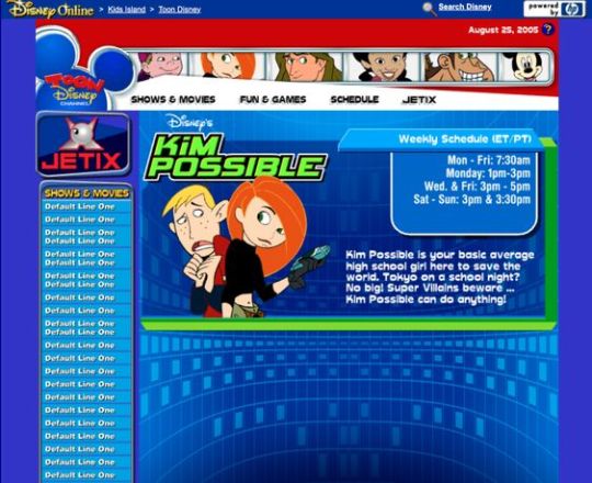
Kim Possible Webcore Y2K
#2000s#00s#art#blue#cartoon#childhood#cybercore#cyber y2k#design#disney#graphic design#graphics#illustration#kaybug#kim possible#old internet#old web#tech#screenshot#technology#uidesign#ui#ui ux design#webcore#website#y2kcore#y2kore#y2k aesthetic#y2k core#y2k cyber
213 notes
·
View notes
Text
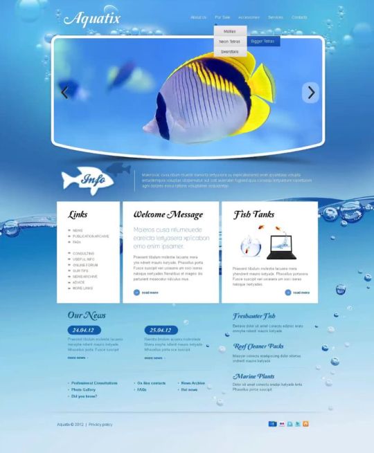
"Aquatix" website template
#art#blue#design#fish#frutiger aero#graphic design#graphics#helvetica aqua aero#internet#template#uidesign#ui#ui ux design#water#webcore#website
58 notes
·
View notes
Text
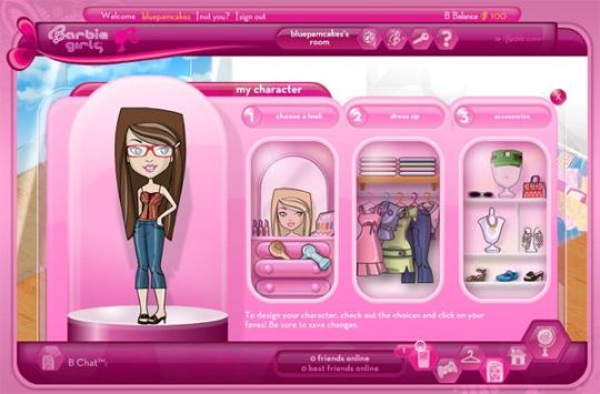
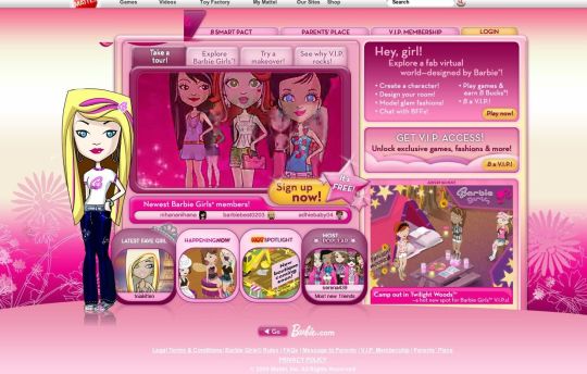
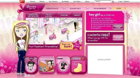
BarbieGirls Website
#2000s#00s#art#barbie#fashion#girly#graphic design#graphics#internet#old internet#old web#pink#screenshots#ui ux design#webcore#website#vectorbloom
123 notes
·
View notes
Text
JavaScript Fundamentals
I have recently completed a course that extensively covered the foundational principles of JavaScript, and I'm here to provide you with a concise overview. This post will enable you to grasp the fundamental concepts without the need to enroll in the course.
Prerequisites: Fundamental HTML Comprehension
Before delving into JavaScript, it is imperative to possess a basic understanding of HTML. Knowledge of CSS, while beneficial, is not mandatory, as it primarily pertains to the visual aspects of web pages.
Manipulating HTML Text with JavaScript
When it comes to modifying text using JavaScript, the innerHTML function is the go-to tool. Let's break down the process step by step:
Initiate the process by selecting the HTML element whose text you intend to modify. This selection can be accomplished by employing various DOM (Document Object Model) element selection methods offered by JavaScript ( I'll talk about them in a second )
Optionally, you can store the selected element in a variable (we'll get into variables shortly).
Employ the innerHTML function to substitute the existing text with your desired content.
Element Selection: IDs or Classes
You have the opportunity to enhance your element selection by assigning either an ID or a class:
Assigning an ID:
To uniquely identify an element, the .getElementById() function is your go-to choice. Here's an example in HTML and JavaScript:
HTML:
<button id="btnSearch">Search</button>
JavaScript:
document.getElementById("btnSearch").innerHTML = "Not working";
This code snippet will alter the text within the button from "Search" to "Not working."
Assigning a Class:
For broader selections of elements, you can assign a class and use the .querySelector() function. Keep in mind that this method can select multiple elements, in contrast to .getElementById(), which typically focuses on a single element and is more commonly used.
Variables
Let's keep it simple: What's a variable? Well, think of it as a container where you can put different things—these things could be numbers, words, characters, or even true/false values. These various types of stuff that you can store in a variable are called DATA TYPES.
Now, some programming languages are pretty strict about mentioning these data types. Take C and C++, for instance; they're what we call "Typed" languages, and they really care about knowing the data type.
But here's where JavaScript stands out: When you create a variable in JavaScript, you don't have to specify its data type or anything like that. JavaScript is pretty laid-back when it comes to data types.
So, how do you make a variable in JavaScript?
There are three main keywords you need to know: var, let, and const.
But if you're just starting out, here's what you need to know :
const: Use this when you want your variable to stay the same, not change. It's like a constant, as the name suggests.
var and let: These are the ones you use when you're planning to change the value stored in the variable as your program runs.
Note that var is rarely used nowadays
Check this out:
let Variable1 = 3; var Variable2 = "This is a string"; const Variable3 = true;
Notice how we can store all sorts of stuff without worrying about declaring their types in JavaScript. It's one of the reasons JavaScript is a popular choice for beginners.
Arrays
Arrays are a basically just a group of variables stored in one container ( A container is what ? a variable , So an array is also just a variable ) , now again since JavaScript is easy with datatypes it is not considered an error to store variables of different datatypeslet
for example :
myArray = [1 , 2, 4 , "Name"];
Objects in JavaScript
Objects play a significant role, especially in the world of OOP : object-oriented programming (which we'll talk about in another post). For now, let's focus on understanding what objects are and how they mirror real-world objects.
In our everyday world, objects possess characteristics or properties. Take a car, for instance; it boasts attributes like its color, speed rate, and make.
So, how do we represent a car in JavaScript? A regular variable won't quite cut it, and neither will an array. The answer lies in using an object.
const Car = { color: "red", speedRate: "200km", make: "Range Rover" };
In this example, we've encapsulated the car's properties within an object called Car. This structure is not only intuitive but also aligns with how real-world objects are conceptualized and represented in JavaScript.
Variable Scope
There are three variable scopes : global scope, local scope, and function scope. Let's break it down in plain terms.
Global Scope: Think of global scope as the wild west of variables. When you declare a variable here, it's like planting a flag that says, "I'm available everywhere in the code!" No need for any special enclosures or curly braces.
Local Scope: Picture local scope as a cozy room with its own rules. When you create a variable inside a pair of curly braces, like this:
//Not here { const Variable1 = true; //Variable1 can only be used here } //Neither here
Variable1 becomes a room-bound secret. You can't use it anywhere else in the code
Function Scope: When you declare a variable inside a function (don't worry, we'll cover functions soon), it's a member of an exclusive group. This means you can only name-drop it within that function. .
So, variable scope is all about where you place your variables and where they're allowed to be used.
Adding in user input
To capture user input in JavaScript, you can use various methods and techniques depending on the context, such as web forms, text fields, or command-line interfaces.We’ll only talk for now about HTML forms
HTML Forms:
You can create HTML forms using the <;form> element and capture user input using various input elements like text fields, radio buttons, checkboxes, and more.
JavaScript can then be used to access and process the user's input.
Functions in JavaScript
Think of a function as a helpful individual with a specific task. Whenever you need that task performed in your code, you simply call upon this capable "person" to get the job done.
Declaring a Function: Declaring a function is straightforward. You define it like this:
function functionName() { // The code that defines what the function does goes here }
Then, when you need the function to carry out its task, you call it by name:
functionName();
Using Functions in HTML: Functions are often used in HTML to handle events. But what exactly is an event? It's when a user interacts with something on a web page, like clicking a button, following a link, or interacting with an image.
Event Handling: JavaScript helps us determine what should happen when a user interacts with elements on a webpage. Here's how you might use it:
HTML:
<button onclick="FunctionName()" id="btnEvent">Click me</button>
JavaScript:
function FunctionName() { var toHandle = document.getElementById("btnEvent"); // Once I've identified my button, I can specify how to handle the click event here }
In this example, when the user clicks the "Click me" button, the JavaScript function FunctionName() is called, and you can specify how to handle that event within the function.
Arrow functions : is a type of functions that was introduced in ES6, you can read more about it in the link below
If Statements
These simple constructs come into play in your code, no matter how advanced your projects become.
If Statements Demystified: Let's break it down. "If" is precisely what it sounds like: if something holds true, then do something. You define a condition within parentheses, and if that condition evaluates to true, the code enclosed in curly braces executes.
If statements are your go-to tool for handling various scenarios, including error management, addressing specific cases, and more.
Writing an If Statement:
if (Variable === "help") { console.log("Send help"); // The console.log() function outputs information to the console }
In this example, if the condition inside the parentheses (in this case, checking if the Variable is equal to "help") is true, the code within the curly braces gets executed.
Else and Else If Statements
Else: When the "if" condition is not met, the "else" part kicks in. It serves as a safety net, ensuring your program doesn't break and allowing you to specify what should happen in such cases.
Else If: Now, what if you need to check for a particular condition within a series of possibilities? That's where "else if" steps in. It allows you to examine and handle specific cases that require unique treatment.
Styling Elements with JavaScript
This is the beginner-friendly approach to changing the style of elements in JavaScript. It involves selecting an element using its ID or class, then making use of the .style.property method to set the desired styling property.
Example:
Let's say you have an HTML button with the ID "myButton," and you want to change its background color to red using JavaScript. Here's how you can do it:
HTML: <button id="myButton">Click me</button>
JavaScript:
// Select the button element by its ID const buttonElement = document.getElementById("myButton"); // Change the background color property buttonElement.style.backgroundColor = "red";
In this example, we first select the button element by its ID using document.getElementById("myButton"). Then, we use .style.backgroundColor to set the background color property of the button to "red." This straightforward approach allows you to dynamically change the style of HTML elements using JavaScript.
#studyblr#code#codeblr#css#html#javascript#java development company#python#study#progblr#programming#studying#comp sci#web design#web developers#web development#website design#ui ux design#reactjs#webdev#website#tech
400 notes
·
View notes
Text
Having loud thoughts again, but you know what would be an absolutely baller idea for tumblr's layout? Everything being a full widget system, especially on the dashboard. I'm just using this as an example, but the old UI for deviantart, dated as it is now by website standards visually, worked off a widget like system where you had so much control over how your profile page was displayed. Certain elements/boxes could be dragged and placed on your page and then adjusted via preset options or through a bit of light coding shenanigans. Imagine that, but with the tumblr dashboard. Instead of being stuck in just one format, you could drag your navigation bar to the left or right or if you don't like that you could pull it up top instead. Or you could have a widget on the side bar like xkit does for tag tracking, or trending tags or just not have any of that on the dashboard. Or how about a widget purely to keep track of recent mutuals that will take you directly to a full list in one click or a widget listing your current que ect ect. All of these being movable pieces yeah? The main point being the ability for a user to rearrange their dashboard to their liking for the best personal navigation with the least amount of clicks. I think the idea of drag and dropping UI elements is taken for granted on most current social media sites even though it's extremely intuitive once you understand it's a feature that exists and how clunky things feel when you don't have it or it's taken away. There's personal website builders that already use widgets pretty frequently, so why not extend that to bigger websites that rely on plenty of consistent user navigation daily? Like imagine updates that could be about adding in highly requested new widgets or adjusting functionality of current widgets to perform better based on user feedback. I am not a coder so I don't know how difficult it would be to implement a robust widget system for a large scale social media website, but it's been on my mind for years now with trying out all kinds of beta art sites before. I really think something like that would be worth the investment for a place like tumblr and potentially cut down on a lot of discontent over layout changes.
#tumblr#tumblr layout#tumblr dashboard#dashboard#tumblr ui#ui design#ux desgin#personal#personal ramblings#long post#I think about this A LOT in some of my friend groups#talking about failed or struggling art websites mostly#widgets are so dope and they should be the standard for desktop layouts
121 notes
·
View notes
Text
JobX TNC -Your Ultimate Webflow Job Board Solution
Want to create a job board that looks good and works well? JobX TNC is a Webflow template that makes hiring easier for recruiters, startups, and SaaS platforms while still giving users a great experience. With this template, it's easy to post jobs and apply for them, and they all look professional and sleek.
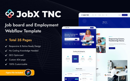
What does TNC JobX do?
JobX TNC is a Webflow SaaS template with a lot of features that makes it easy to make job board websites that work on any device. This template is perfect for businesses, HR departments, and staffing platforms that want to set up a modern hiring center. It has a clean user interface, CMS features, and layouts that are meant to get people to buy. JobX TNC gives you the flexibility and power you need to hire people for tech jobs, freelance work, or full-time jobs.
Who Uses This Template?
Companies that hire people
JobX TNC gives agencies everything they need to post job openings and keep track of candidates in a professional way with a CMS-driven system and a modern interface.
HR Departments in Businesses
This template helps HR departments create career pages that are true to their brand and make it easy for the best candidates to apply.
Startup FoundersJobX TNC lets startup founders quickly make job boards that can grow and perform well without having to write any code.
People who hire people for themselves
The template's simple design and structure make it easier for independent recruiters to post job openings, applications, and even blog posts.
Platforms as a Service
JobX TNC lets SaaS companies add a job board to their sites that is unique to them. This makes it easier to hire people and grow teams.
People who create job boards for specific fields
People who start job boards for certain fields, like tech or healthcare, like how easy it is to change JobX TNC to fit their needs.
Why should you choose JobX TNC?
Responsive and ready for phones
JobX TNC makes sure that your job board looks great and works well on all devices, from desktops to smartphones. This is great for people who need to find work quickly.
Connection to CMS
You don't need to know anything about computers to use Webflow's CMS features to easily and quickly manage job postings, categories, and applications.
Designed to Get More Sales
All of JobX TNC's layouts are made with user flow and conversion in mind, so it's easy for candidates to browse, apply, and get involved.
Easy to change
No code? Not a problem. In just a few minutes, you can change every part of JobX TNC to fit your brand.
Structure that is good for SEO
The template is made to work well with search engines, which will help your job board get more employers and candidates without having to pay for ads.
Hosting that is both fast and secure
Webflow's hosting makes sure your site loads quickly, stays safe, and can handle a lot of traffic without affecting performance or uptime.
Important Features:
✅ Fully Functional Job Board Template ✅ Modern Design ✅ CMS and E-commerce Included ✅ Streamlined Job Management ✅ Seamless Job Search ✅ Three Job Page Categories ✅ Blog Showcase ✅ Pricing Information ✅ Impressive Client Testimonials ✅ Contact Details ✅ Dedicated Customer Support
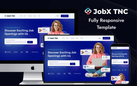
Benefits of Using JobX TNC
JobX TNC is good because it looks professional.
Employers and job seekers will both be impressed by a well-designed website that shows trust, expertise, and reliability right away.
Faster Time to Begin
You can quickly set up your job board with ready-to-use layouts and sections. You won't have to wait for design or development.
Candidates will have a better experience
A smooth application process keeps users interested and makes it more likely that they will send in good applications for your listings.
Manage Custom Branding
You don't need to hire developers to change the colors, fonts, and layouts in Webflow. This way, you can keep your brand's personality.
Hiring Plan Based on Content
You can post tips, news, and success stories on the built-in blog and resource pages. This helps SEO grow and builds trust.
Can grow along with you
The CMS-driven architecture makes it simple to add more team pages, listings, and categories as you need to hire more people.
Last Word
JobX TNC gives you the performance, flexibility, and design you need to stand out, whether you're expanding your company's hiring efforts or building a niche job platform. JobX TNC will help you save time, impress your audience, and make the hiring process work.
2 notes
·
View notes
Text

Sau một thời gian vận hành, website cần được nâng cấp để phù hợp với xu hướng thị trường cũng như nhu cầu của người tiêu dùng. Đây chính là chìa khoá để doanh nghiệp luôn ổn định, giữ chân các khách hàng trung thành và bứt phá doanh thu.
Nếu bạn thấy website đang gặp một hay nhiều tình trạng dưới đây:
1. Tốc độ website chậm
2. Giao diện website lỗi thời
3. Website không tương thích với thiết bị di động
4. Website gặp vấn đề bảo mật
5. Website khó thao tác (UX kém)
6. Cập nhật nội dung khó khăn
7. Website không phản ánh đúng thương hiệu
8. Thông điệp thương hiệu, sản phẩm hoặc dịch vụ đã thay đổi
Thì đã đến lúc bạn cần nâng cấp website rồi đó!
Puramu là 1 trong những đơn vị nâng cấp website uy tín hiện nay. Giải pháp nâng cấp website của Puramu giúp nâng tầm thương hiệu của bạn:
✔ Giao diện hiện đại, thể hiện đúng tinh thần thương hiệu
✔ Tốc độ tải nhanh, thân thiện với thiết bị di động
✔ Chuẩn SEO, tối ưu trải nghiệm người dùng
✔ Dễ dàng quản lý và cập nhật nội dung
Đã có rất nhiều doanh nghiệp được Puramu hô biến từ một website cũ kỹ, lỗi thời thành một website hiện đại, chuẩn SEO. Còn bạn thì sao? Inbox ngay cho Puramu để bắt đầu hành trình đổi mới diện mạo của doanh nghiệp trên Internet nhé!
Tìm hiểu sâu hơn về thời điểm cần nâng cấp website: https://www.puramu.com/post/8-dau-hieu-can-nang-cap-website
#business#design#web series#website#công ty thiết kế website#software#thiết kế web#thiết kế website#userexperience#web design#puramu#plugin wordpress#wordpress#webhosting#webdesign#onlinebusiness#web development#ui ux design#wordpress development#wordpress hosting#wordpress website
2 notes
·
View notes
Text
#ecommerce website development#website design#web development#ui-ux design#mvp development company#iot application development#software development#wordpress development#digital marketing#mvp development
2 notes
·
View notes
Text
the internet is so boring lately, probably because all of the good content is paywalled and websites that aren’t social networks are basically nonexistent
#i yearn for a beautifully curated website with varied content themes that only exists in my head#i yearn for a grown up rookie mag#i yearn for better ux and ui design that makes academic content more accessible to the masses#my dreams… are big yet honest🥺
6 notes
·
View notes
Text
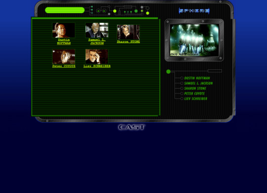

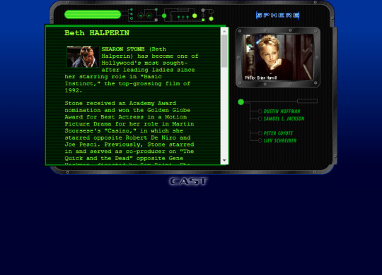
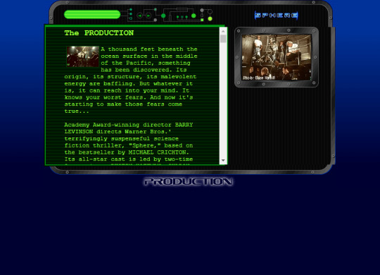

Website for the movie Sphere (1998)
#98#90s#1998#1990s#art#blue#cybercore#cyber y2k#design#film#future#futuristic#futurism#graphic design#graphics#green#internet#kaybug#movies#old internet#old web#screenshot#sphere#uidesign#ui#ui ux design#webcore#website#y2kcore#y2kore
36 notes
·
View notes
Text
The Living Museum - An Imagined Botanical Garden

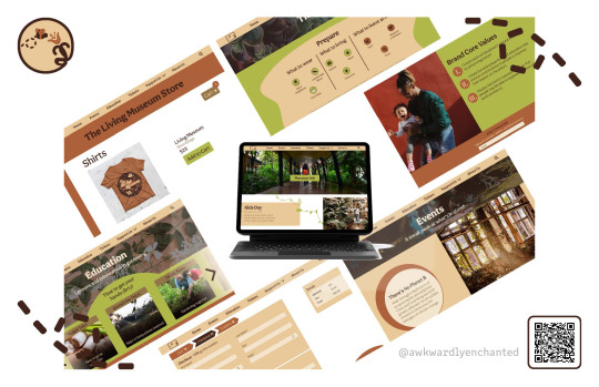
The Living Museum is a branding project for an imagined botanical garden. I created an animation for the logo, a website prototype, and products that are on the website. The overall concept of the botanical garden is to encourage people to take care of the Earth.
Click through the website here! (it's at the bottom of the page)
#awkwardly enchanted#website design#ui ux design#logo design#graphic design#digital illustration#logo animation#brown aesthetic#plant aesthetic#adobe xd#adobe illustrator#black artist#clothing design
3 notes
·
View notes
Text
An E-commerce Online Store for Ladies Fashion "Janine".
An appeasing design with beautiful edits and is very user friendly.
2 notes
·
View notes
