#watercolour tips
Explore tagged Tumblr posts
Text
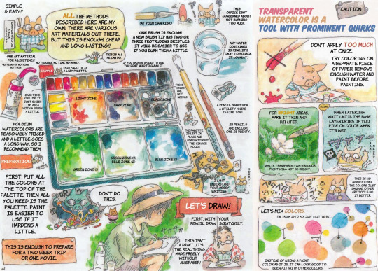
Hey, everyone! Have this translated Studio Ghibli guide to watercolours that a classmate sent me.
4K notes
·
View notes
Text

Some Etho and Bdubs watercolour for the world of tumblr
#if anyone has tips on watercolour pls tell btw#I’m really enjoying it but I don’t know any of the techniques#fanart#bilby art tag#etho hermitcraft#etho#hermitcraft etho#etho fanart#ethoslab#ethogirl#hermitcraft bdubs#bdubs fanart#bdubs#bdoubleo fanart#bdouble0#bdoubleo100#bdouble100 fanart#mcytblr#mcyt fanart#mcyt#hermitblr
192 notes
·
View notes
Text


Kielo
Watercolor, ink, gouache
Do not copy, repost or use in any other way without permission, thank you
#korppipoika#korppipoika art#traditional art#original stuff#unicorn#unicorn art#watercolour#did this to try out my green ink!! unfortunately the masking fluid ripped this up some so this was forgotten for a while#cause i wasnt sure how to work with the rips#luckily got a tip about white gouache so tadah!!#you can still kinda see them if you know where they are but ehh
43 notes
·
View notes
Text
Has anyone got any watercolour tips?..
And yes I know it's not perfect but I drew what was there

22 notes
·
View notes
Note
Hi Nic!! What's the thing you most look forward to doing when you're drawing/painting? I've never touched a paintbrush in my life, sorry if that's a super broad question. But say, your eye watercolours- is it trying to reproduce the tones with a limited (at least to a digital artist) palette? The initial drawing stage? Painting in the wispy lashes and brows? It all seems like magic to me!!! 😍
Hello I apologise for the late reply! Race week was busy, and I wanted to give your lovely message the care it deserves (& also I just love talking about watercolours)
That's a hard question! I really enjoy the process as a whole (except when I am complaining about it, which is an important part of the process), especially my eye paintings because they're so intuitive to me by now.
But, a few parts I really enjoy are:
1. Choosing the palette — both the actual paint palette I'll be using (I have so many), and the palette of usually 2-6 actual paint colours I'll be mixing my colours from. I'm a bit of a pigment nerd, so figuring out which paints are gonna have the perfect properties (granulation, staining etc) and mix the colours I want very enjoyable
2. The first wet wash, normally working wet-in-wet (applying diluted paint to already wet paper), where the goal is to simply place your colours in the approximate areas they should be, and let the watercolour work its magic.
Here's a couple WIP shots of my Yuki eye, in both that initial stage and the one I'm about to describe below:
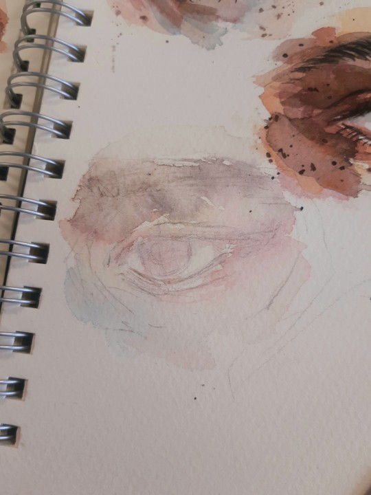
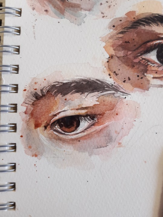
3. Getting the darkest darks in, and all of a sudden, just like magic, it becomes an eye! This is normally the third layer out of an approximate 4, and whilst I try to save the individual brow hairs and lashes until that final stage, I'll often mostly block them in here. An artist I follow on youtube, Arleebean, says often that if you feel your painting is going through the Ugly Stage, you've probably lost your values and need to get the (relatively) darkest darks in to bring it back to balance. It's a rule I live by, and that's what this stage is to me. I also get any freckles/spots/splatters in at this point, which is very fun to do too!
I hosted a watercolour workshop on eye paintings back in 2022 (and have another planned for this year), and here's a step-by-step I made of the first four stages (sketch, wet wash, mid tones, darks) in preparation for that. The final step after that would be, as you mentioned, any fine eyebrow hairs and eyelashes, which I think you can tell it's missing here

4. And possibly the stage I get most excited about, from about the middle of the painting onwards if it seems to be going my way, is posting it in the group chat or on here and watching my fandom friends and mutuals yell about it :)) Big fan of that, even if I am usually terrible at replying to nice comments :')
Here's a selection of older eyes I painted again as workshop examples, all using a limited palette of four colours (quin gold hue, pyrrol red, ultramarine, burnt umber)
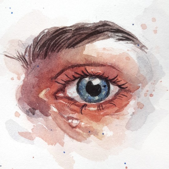
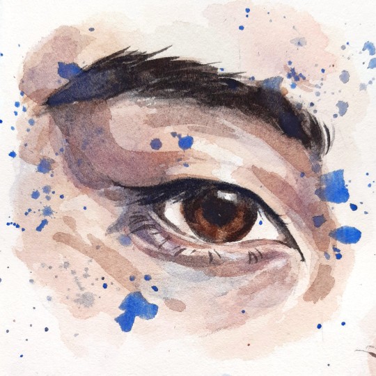
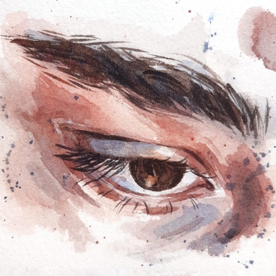
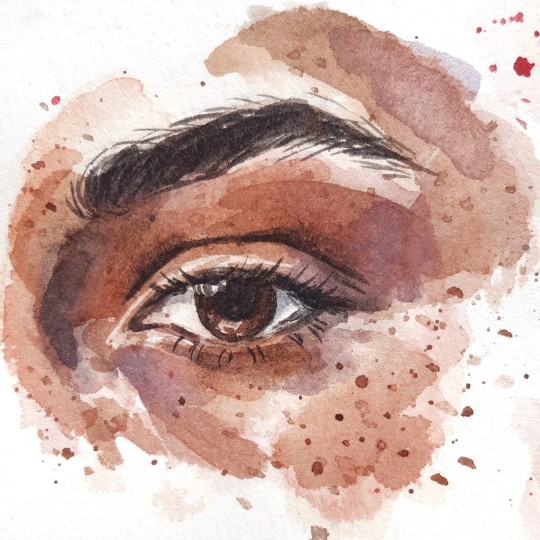
+ a selection of more recent eyes:
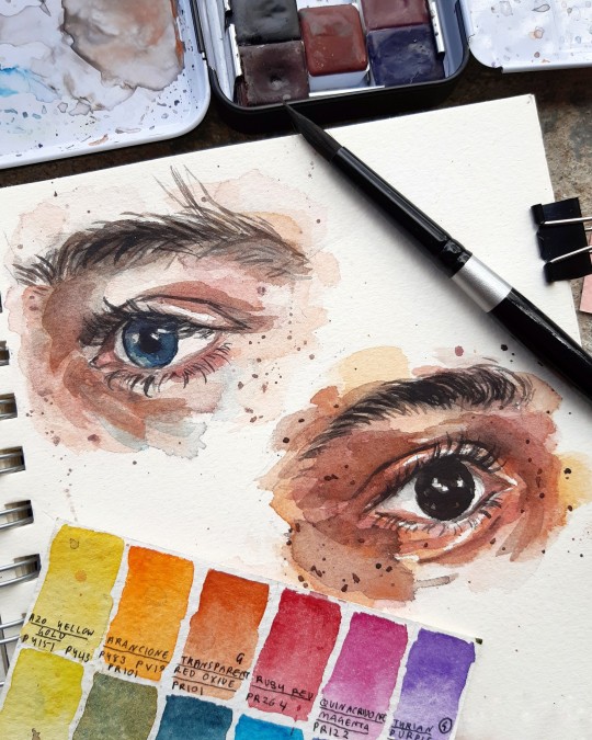
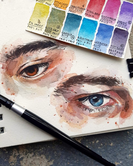
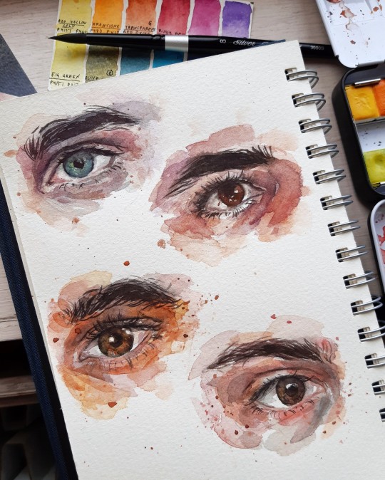
Thank you so much for the lovely message! I adore your art (& seriously, if you're ever in the mood for an art collab or something, you know where to find me), so I'm glad you enjoy mine too ☀
46 notes
·
View notes
Note
seen a square brush so beautiful you start crying
i got you man [x]

#brushes#art tips#I didn't make any of these myself these are just collected over the years#the flat watercolour is a default one that comes with csp I think#chisel brushes for the fucking win... just helps me a lot personally getting that line weight down
192 notes
·
View notes
Text
A small advice from one artist to another 🎨✨
#art tips#art advice#made by shae#madebyshae#art#illustration#artists on tumblr#painting#watercolor#sketchbook#watercolour#drawing#work in progress#art wip#current wip
210 notes
·
View notes
Text
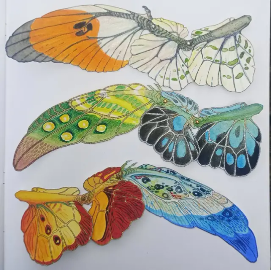


I have been making some posable insect themed dragon wings. I am planning to make some articulated paper dragon dolls/puppets for stop motion animation purposes. And also because I love derpy little dragons.
The orange and white one is based off a male orange tip butterfly and the other two are based off different species of lantern bugs.
They are made with watercolour paper, watercolour paint, ink and split pins
#dragon wings#dragon#dragon sculpture#art doll#paper dolls#creature#art#creature concept#craft#diy#creative#butterfly#insect dragon#dragons#wings#articulated#stop motion#animation#paper craft#paper#watercolour#watercolor#fantasy art#paper dragon#butterfly dragon#orange tip#lantern bug#art wip#monster#magical
39 notes
·
View notes
Text
entirely too charmed by dundy's little imaginary hat tip gesture when he's not wearing a hat that he does when crozier enters the great cabin after sir john's death
wait a diddly dang minute the imaginary hat tip is also in the same episode as him eavesdropping and then hauling ass immediately so he won't be caught. he's so funny
#dundy hauling ass. jirv watercolours speech. sir john mauled by the bear and sent down an ice hole. dundy's imaginary hat tip.#ep 3 rly got everything#the terror#whaaat the fuck do i tag dundy with ?? man's got way too many names
16 notes
·
View notes
Text

#traditional art#Im trying watercolour for the first time#so if i do bad please tell me some tip#i have no idea what im doing#handmade#watercolor#painting#art#pikmin#fanart#yellow#he so eepy#cutedreamerangel post
16 notes
·
View notes
Text

also a significantly less cool 4×04 watercolour diana to follow up the bridget i posted earlier
#shui draws#mythic quest#david brittlesbee#diana brittlesbee#lesbaksbee if u squint but i wont tag it#i love working with this pen ... these watercolour sketches would be nothing without it#steadler chisel tip pigment liner my baby darling dearest
15 notes
·
View notes
Text

★ ( I'm not sure what to put here, side profile practice I guess. (ft Donnie !! )★

👾| NON COLOURED VERSION ↓


#★..ermmm#yeah erh#felt like drawing Donnie#...#like always-#and like always I erm#messed up one of the arms and the pose looks stiff#the hand on the left looks like it's twisted towards the screen (???) or something#I don't know#I like the colours on the plastron tho#...and the battleshell is looking#erm#not bad but#something bout it is bugging me a bit#..oh well#I am practicing after all sooo..#Also#hot tip:#while drawing a character listen to a playlist based on them. 10/10 would recommend.★#rottmnt#riseofthetmnt#rise of the tmnt#rise of the teenage mutant ninja turtles#rise donnie#rottmnt donnie#rise donnie fanart#rottmnt fanart#rise of the tmnt fanart#watercolour art#pen outline
32 notes
·
View notes
Text
please click for better quality

magnolias 🌸✨️
#secret garden 📚🧮#artists on tumblr#illustration#traditional art#magnolia#drawing#doodle#sketches#artwork#my art#sketchbook#zentangle#zendoodle#zen art#zentangle art#mandalas#mandala#mandala art#broke away from the cheap felt-tips for this one#watered down my calligraphy inks and used them like watercolours#lowkey love how it turned out#magnolias are some of my favourite flowers 💕
28 notes
·
View notes
Note
hiiii so sorry if this has been asked before but i was wondering what brushes you use for your art? i love the texture :3
your art is so so lovely i loooove the linework and the shapes!!!
Honestly if this had been asked before it wouldnt matter bc im addicted to using every brush i can get my hands on atm lol
Currently for lineart i use a modified version of the procreate pencil, pandani, inka, and blotchy brushes, which are all default brushes on procreate (though you'll see me using procreate pencil the most bc i spent hours modifying it lol). For extra crunchiness though i ALWAYS always use the spraypaint brushes instead of airbrushing, and the blackburn brush is great for painting with once you get the hang of it.
#also grain filters make such a difference#grab a hd image of watercolour paper or corkboard or whatever you like#slap that on there lower the opacity set to overlay/multiply/whatever works#thats another great way of adding texture#art tips#asks#brushes
9 notes
·
View notes
Text
youtube
11 notes
·
View notes
Text
Me painting blackberry
What to do when it's sunny but it's cold outside?
Paint!
#watercolor#traditional art#art tips#realistic painting#botanical illustration#food illustration#watercolour#my art
3 notes
·
View notes