#thats another great way of adding texture
Explore tagged Tumblr posts
Note
hiiii so sorry if this has been asked before but i was wondering what brushes you use for your art? i love the texture :3
your art is so so lovely i loooove the linework and the shapes!!!
Honestly if this had been asked before it wouldnt matter bc im addicted to using every brush i can get my hands on atm lol
Currently for lineart i use a modified version of the procreate pencil, pandani, inka, and blotchy brushes, which are all default brushes on procreate (though you'll see me using procreate pencil the most bc i spent hours modifying it lol). For extra crunchiness though i ALWAYS always use the spraypaint brushes instead of airbrushing, and the blackburn brush is great for painting with once you get the hang of it.
#also grain filters make such a difference#grab a hd image of watercolour paper or corkboard or whatever you like#slap that on there lower the opacity set to overlay/multiply/whatever works#thats another great way of adding texture#art tips#asks#brushes
9 notes
·
View notes
Note
Hello hi I just found out you're the artist of my favorite pic of Jamil from all time 🥹 I absolutely LOVE LOVE LOVE LOVE LOVE LOVE LOVE LOVE LOVE LOVEEEEEEEEEEEEE SO MUUUUCH his bday art from 2020!! It's my favorite one from every art and he looks so pretty and hot and cool and like he's in a music clip and about to drop a fire verse!! I LOVE your painting style so much, as a baby artist, would you one day show us how you color? I'm sure you put so much blood, sweat and tears into your hard work and it would great to get a little bit of that wisdom. Please keep drawing, keep doing what you love because it makes the world a better place to live!
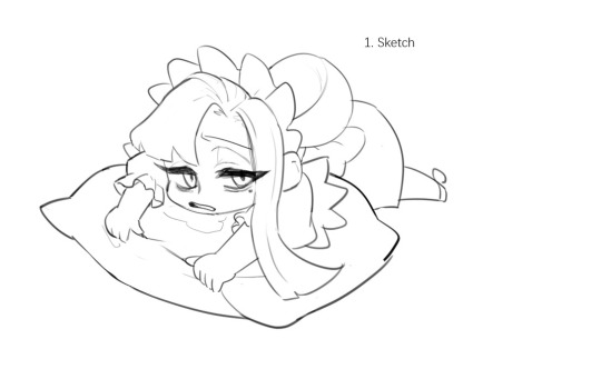
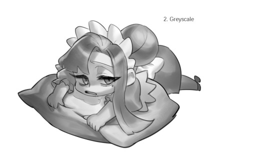
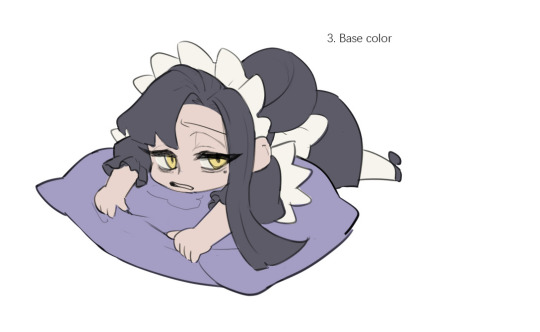
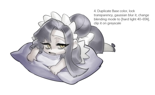
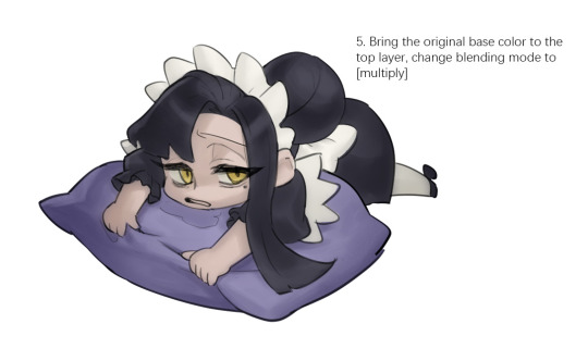
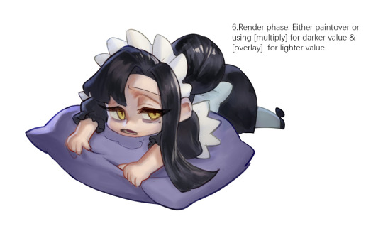

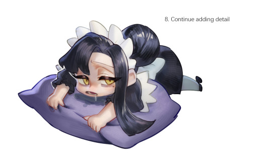
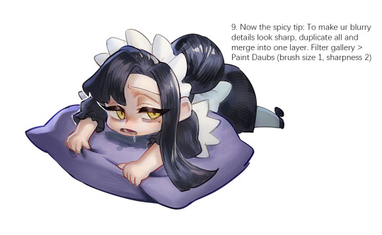
Sketched my sleepy and tired oc to do a very quick demonstration but it covers how I color when i render things:
Start with rough greyscale first, it's a good start to roughly decide light direction and value of your overall work. Especially if you have no idea on your shading.
Next, apply base color to greyscale. I'll use gradient map if I want to keep the details of my greyscale. But if not, I'll just start with a flat base color, and try whatever I can to apply color.
Rendering phase. Add layers and just paint on top to refine it. Merge all layers if it's too messy. Then add layers again. My rendering really depends on how much time taken because it's just a loop of paint over and refining. Thats why i do more simple fanart cuz I sometimes get bored of rendering Also at this stage when doing lineless style, I merge lineart with layers and cover up the lines.
Final touch. Merge all layers and use [filter gallery > paint daubs (brush size 1, sharpness 2)]. It will sharpen your work and look detailed. Or add some very fine noise texture, it will look detailed too.
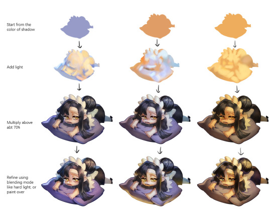
Another very rough demonstration on how i apply color mood. This will be after step 2. And same will be more refining and even paint over to ensure the colors look ok.
Other tips:
Add warm and cool colors especially on skin.
Use pinterest. Always find more than one reference for a subject if you want to draw better than yesterday. Pure ref is a nice tool to gather reference on your pc. When i draw a single hand I had a lot of ref. (pose, color temperature, lighting, photos, artwork, all diff ref)
Color theory is so important I still struggle a lot. I highly recommend beginners start from practicing Marco Bucci's ball practice. After that slowly change to adding character into movie scene and photographs, the purpose is to adapt different color moods and learn the lighting from the image. Learn more from famous movie and cinematic. They did their best to nail the colors.
Anyway,
this is a long answer about how I color. My previous job influenced me so much on coloring so there's a lot of thinking and struggle on my colors.
So, I suggest you be more experimental and try new ways, at the end what remains is what fits you.
139 notes
·
View notes
Note
Oooh, what about Journey? I think the sand probably took a lot to pull off
it did!! i watched a video about it, god, like 6 years ago or something and it was a very very important thing for them to get just right. this is goimg to be a longer one because i know this one pretty extensively
here's the steps they took to reach it!!
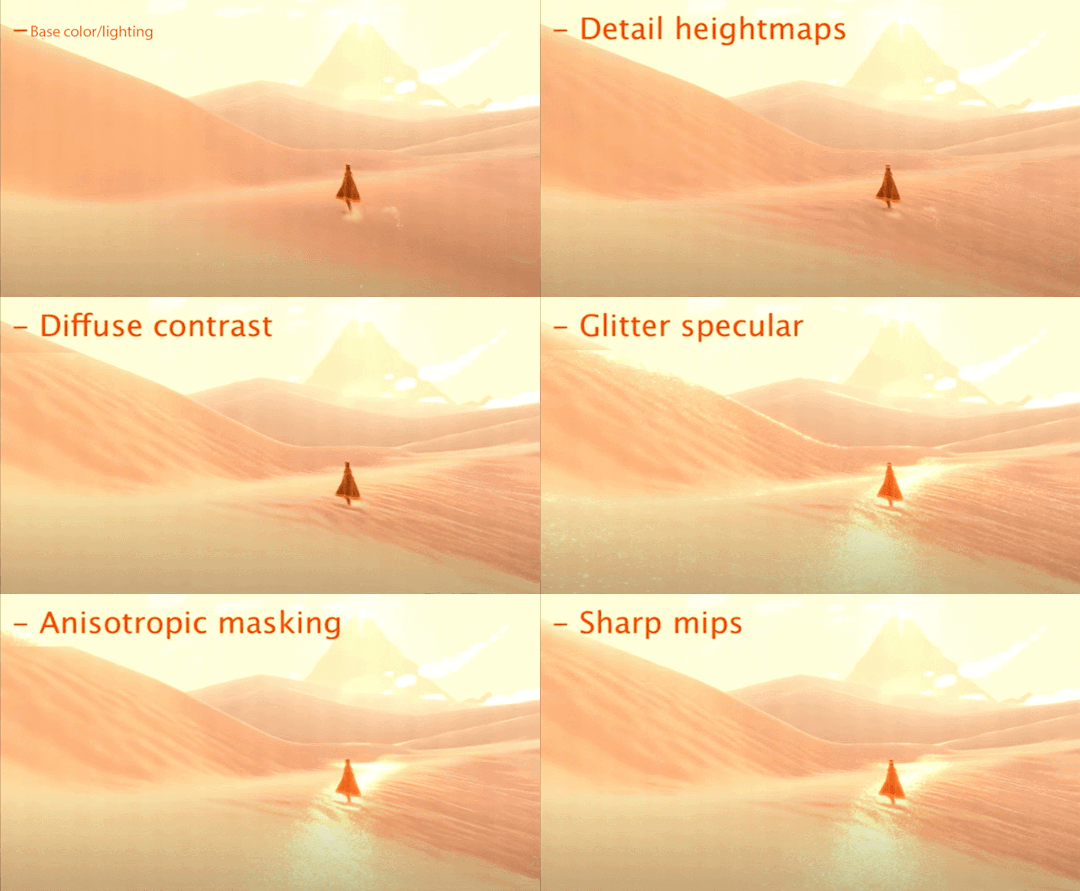
and heres it all broken down:
so first off comes the base lighting!! when it comes to lighting things in videogames, a pretty common model is the lambert model. essentially you get how bright things are just by comparing the normal (the direction your pixel is facing in 3d space) with the light direction (so if your pixel is facing the light, it returns 1, full brightness. if the light is 90 degrees perpendicular to the pixel, it returns 0, completely dark. and pointing even further away you start to go negative. facing a full 180 gives you -1. thats dot product baybe!!!)

but they didnt like it. so. they just tried adding and multiplying random things!!! literally. until they got the thing on the right which they were like yeah this is better :)

you will also notice the little waves in the sand. all the sand dunes were built out of a heightmap (where things lower to the ground are closer to black and things higher off the ground are closer to white). so they used a really upscaled version of it to map a tiling normal map on top. they picked the map automatically based on how steep the sand was, and which direction it was facing (east/west got one texture, north/south got the other texture)

then its time for sparkles!!!! they do something very similar to what i do for sparkles, which is essentially, they take a very noisy normal map like this and if you are looking directly at a pixels direction, it sparkles!!
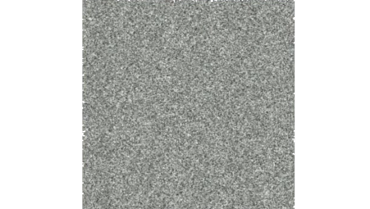
this did create an issue, where the tops of sand dunes look uh, not what they were going for! (also before i transition to the next topic i should also mention the "ocean specular" where they basically just took the lighting equation you usually use for reflecting the sun/moon off of water, and uh, set it up on the sand instead with the above normal map. and it worked!!! ok back to the tops of the sand dunes issue)
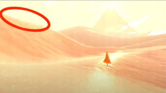
so certain parts just didnt look as they intended and this was a result of the anisotropic filtering failing. what is anisotropic filtering you ask ?? well i will do my best to explain it because i didnt actually understand it until 5 minutes ago!!!! this is going to be the longest part of this whole explanation!!!
so any time you are looking at a videogame with textures, those textures are generally coming from squares (or other Normal Shapes like a healthy rectangle). but ! lets say you are viewing something from a steep angle
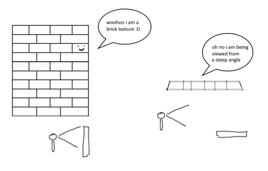
it gets all messed up!!! so howww do we fix this. well first we have to look at something called mip mapping. this is Another thing that is needded because video game textures are generally squares. because if you look at them from far away, the way each pixel gets sampled, you end up with some artifacting!!
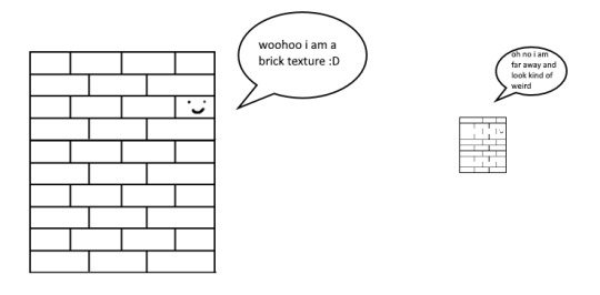
so mip maps essentially just are the original texture, but a bunch of times scaled down Properly. and now when you sample that texture from far away (so see something off in the distance that has that texture), instead of sampling from the original which might not look good from that distance, you sample from the scaled down one, which does look good from that distance
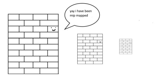

ok. do you understand mip mapping now. ok. great. now imagine you are a GPU and you know exactly. which parts of each different mip map to sample from. to make the texture look the Absolute Best from the angle you are looking at it from. how do you decide which mip map to sample, and how to sample it? i dont know. i dont know. i dont know how it works. but thats anisotropic filtering. without it looking at things from a steep angle will look blurry, but with it, your GPU knows how to make it look Crisp by using all the different mip maps and sampling them multiple times. yay! the more you let it sample, the crisper it can get. without is on the left, with is on the right!!
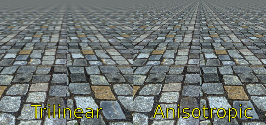
ok. now. generally this is just a nice little thing to have because its kind of expensive. BUT. when you are using a normal map that is very very grainy like the journey people are, for all the sparkles. having texture fidelity hold up at all angles is very very important. because without it, your textures can get a bit muddied when viewing it from any angle that isnt Straight On, and this will happen
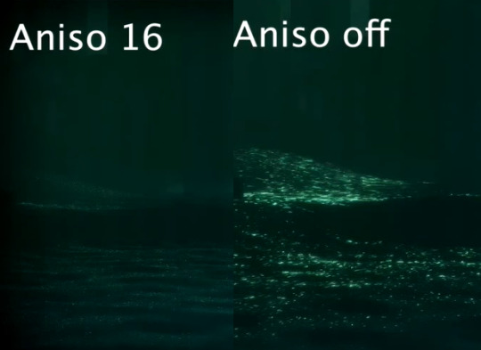
cool? sure. but not what they were going for!! (16 means that the aniso is allowed to sample the mip maps sixteen times!! thats a lot)
but luckily aniso 16 allows for that pixel perfect normal map look they are going for. EXCEPT. when viewed from the steepest of angles. bringing us back here
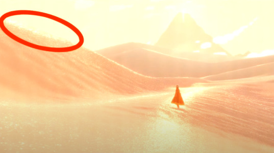
so how did they fix this ? its really really clever. yo uguys rmemeber mip maps right. so if you have a texture. and have its mip maps look like this

that means that anything closer to you will look darker, because its sampling from the biggest mip map, and the further away you get, the lighter the texture is going to end up. EXCEPT !!!! because of aisononotropic filtering. it will do the whole sample other mip maps too. and the places where the anisotropic filtering fail just so happen to be the places where it starts sampling the furthest texture. making the parts that fail that are close to the camera end up as white!!!
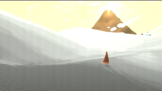
you can see that little ridge that was causing problems is a solid white at the tip, when it should still be grey. so they used this and essentially just told it not to render sparkles on the white parts. problem solved
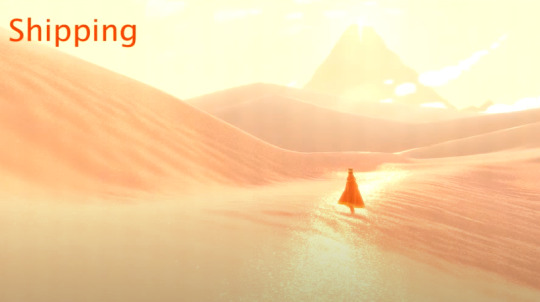
we arent done yet though because you guys remember the mip maps? well. they are causing their own problems. because when you shrink down the sparkly normal map, it got Less Sparkly, and a bit smooth. soooo . they just made the normal map mip maps sharper (they just multipled them by 2. this just Worked)
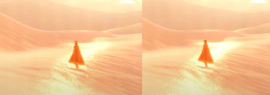
the Sharp mip maps are on the left here!!
and uh... thats it!!!! phew. hope at least some of this made sense
433 notes
·
View notes
Note
i currently watch 18 of the hermits and am constantly stuck between wanting to watch more hermits and knowing i should probably drop a couple before i get a job again. but also like... what if i watched more anyway....
im too behind atm to actually add another pov, and i need to catch up on the life series too but like... man what if i just did it anyway. whos gonna stop me? no one. thats who. i will feed my own hyperfixation and no one can get in my way!!!!
if i do end up adding a new pov who would you recommend? i currently dont watch Xisuma, stress, false, wels, hypno, jevin, joe and doc
i also dont watch xb, but i tried to and i just cant get past the texture pack (it upsets me that i cant)
i get you so much .. idk how i have technically two jobs (although they're very much part time) and am in school full time and still somehow manage to keep up with 26 different povs or. however many it is.
out of all the people you don't watch i'd probably recommend xisuma the most, i think his videos are super easy to watch even if you havent seen a lot of his content before. he has a great balance of building/redstone/interaction with the other hermits and his episodes are typically on the shorter side but he uploads regularly. i may be biased because i really really love his content but. i think he's great
also totally understand the issue w xb's texture pack lol, it's taken like 4 years of me watching him to adjust to it and i still don't like it buuut. i like his content enough to look past it... he's such a silly guy. although i do find that with quite a lot of his episodes i end up playing them in the background like a podcast rather than paying close attention to what's happening on screen. tbh if you watch keralis and beef you probably get quite a lot of xb content anyways so i wouldn't worry too much about missing out!!
#i think watching every pov is hardest at the start of any season because that's when everyone uploads at the same time#but it's actually not that hard to keep up with as long as you don't let yourself fall too far behind#i think if i took a break for more than a couple weeks it'd be really hard to catch up#i also don't watch anything else really .. i don't have a tv or any streaming service subscriptions#i listen to podcasts and a lot of music but i basically don't watch anything other than hermitcraft#i maybe spend like.. an hour a day watching minecraft? which sounds like a lot but#a lot of people easily spend that much time watching tv or scrolling tiktok or something so i guess it's just about balance#honestly hermitcraft just brings me so much joy i would choose that over anything else i could be doing on my phone#it's also easy to watch youtube while drawing which is what i spend most of my time doing#with a different job i can understand that it'd probably be much harder#like if my job wasn't freelance or if i was writing instead of drawing. idk#asks#horsemeatposting
6 notes
·
View notes
Text
Update :) I cooked the berries on the lowest setting with some water for 4 or 5 hours, then mashed them, then strained them. I used about a 5:1 by weight ratio of berries to wool. I think that was excessive; there was a lot of color left. I think 3:1 should be enough probably. I used a clun forest x Shetland crossbreed fleece, which I had pre-mordanted with alum a month or two ago and let to age. This was exactly 100 grams of wool.
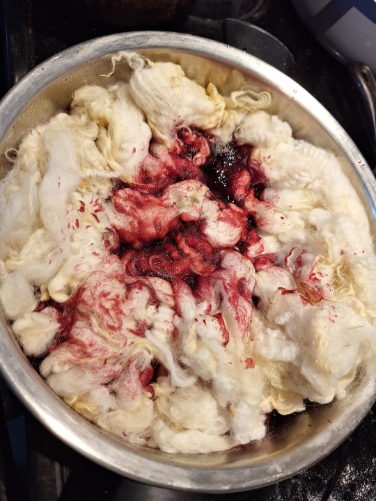
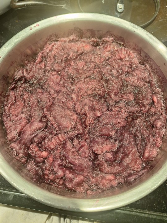
Always fun to see Fresh Blood Red on some white wool. I called my sister in to look at it and she grimaced lol. I cooked it in the pot for about 5 hours overnight on low, let it cool another couple hours until morning, and then did a small experiment.
A lot of natural dyers use pH all the time, but I'm not typically one of them. I have tried adding baking soda (alkali/basic) to some wool while it was cooking, which always has dramatic effects to both color and texture of the wool. So I usually only do it when I'm really not liking what I see.
In this case though I was just curious. I read that you can get green this way, and wanted to try it out.
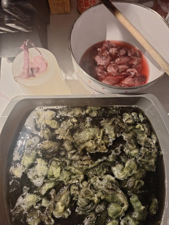
First it just seemed to lose all color, but then it slowly turned green. I wish I had left it in longer, I only did about 15 minutes.
Anyway, I post mordanted most of the fiber with baking soda and got that green. The rest I set in water with lemon juice (acidic) to no noticeable effect. Probably because the berries themselves are sour already. I kept a couple locks back; theres no difference in color. I do wonder if they will fade differently, but there's no way to know (I lost track of the two control locks basically immediately).OK.
Either way, I also really like the lilac color I got without the baking soda. Both great colors.
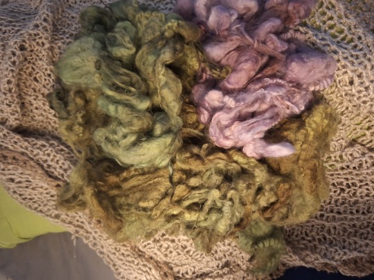
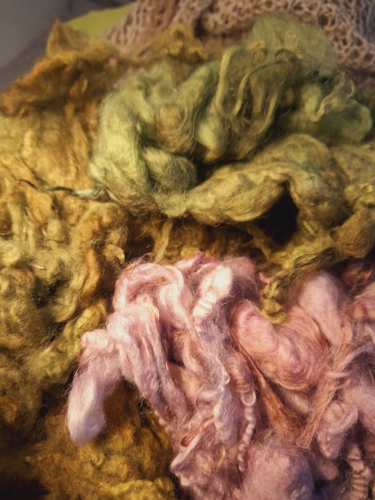
My kingdom for a phone that accurately captures colors....ah well. It is at parts neon green, at other parts more 'random pile of wilted plant debris'. I honestly am obsessed with it. I know it won't be lightfast, so i will need to re-dye anything I dye with this, but I love it ! And oregon grapes are very plentiful here, so it should be OK.
In this case I think it will be a blanket.
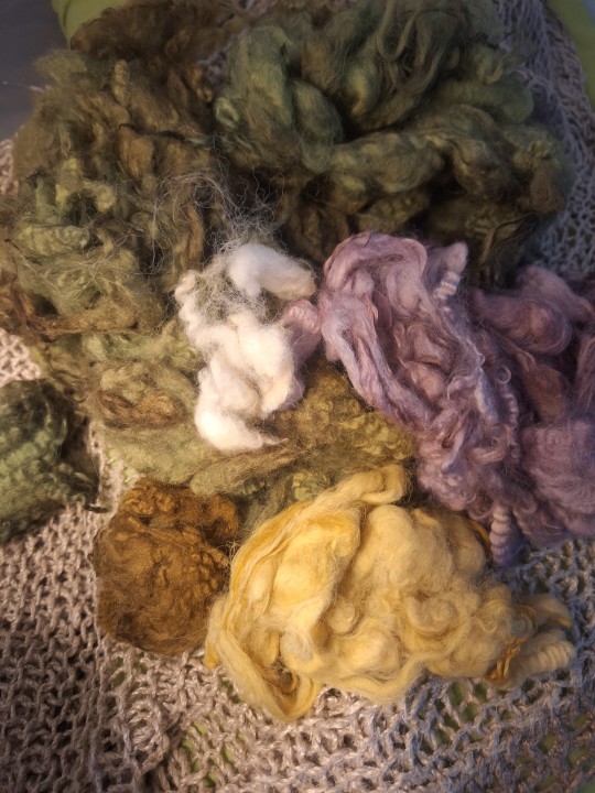
Here's the other (highly inaccurate) colors. There's the spring green, the lilac, the yellow, the khaki, and of course undyed white. I still have another couple batches of dyeing before I finish the colors for this fleece probably. I want to weave it into a blanket. No idea how doable it is for me, but thats the plan. As a blanket it shouldn't get much exposure to light, so I hope the colors should be ok.
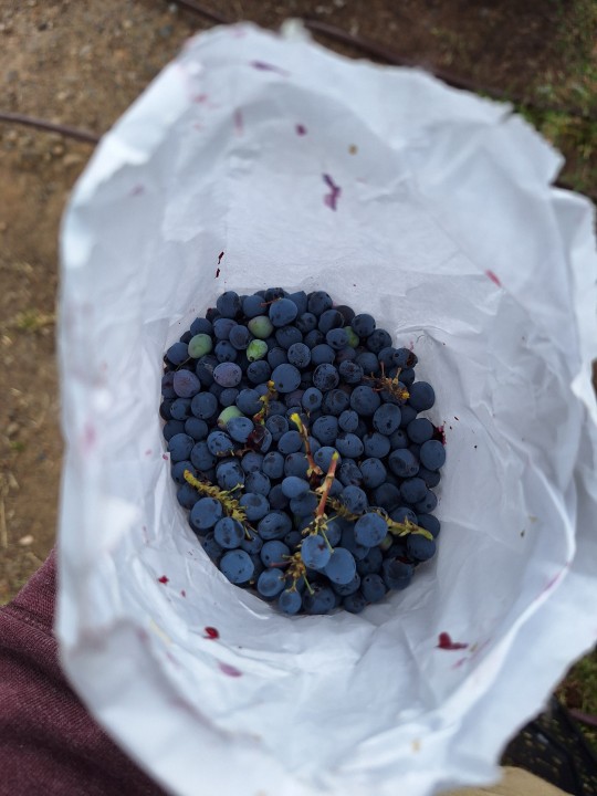
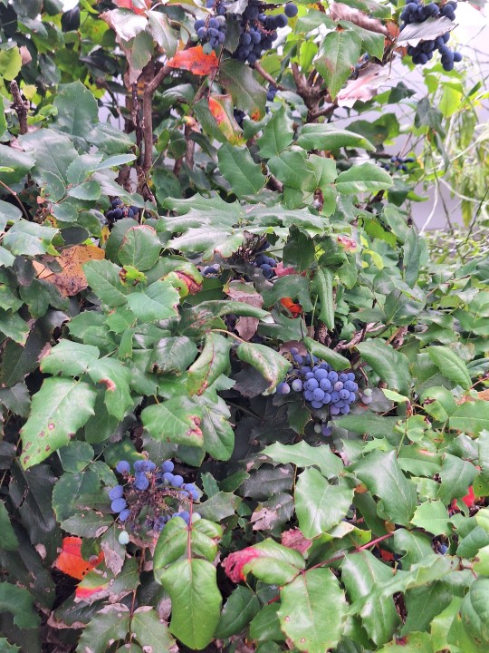
I'm starting to suspect there's easy oregon grapes and difficult oregon grapes, and I usually seem to find the difficult ones, which are super prickly.
These ones are hardly prickly at all though. Picking them for a dyebath. I have some pre-mordanted alum shetland x clun forest fleece I want to dye with them I think. Gonna pick more during my next break. There's a lot right by my work.


#natural dyeing#naturally dyed#wool fleece#oregon grape#shetland x clun forest#clun forest x Shetland#cant remember which one i use... RIP
126 notes
·
View notes
Note
I have not much knowledge about theatre and never get to see a show, do costumes read differently when you are up in the circle or all the way at the back? Some of the newer costumes look proportionally off up close (Jen’s long bodice, Aragon skirts, peplums) but I can’t tell if they’d look different in an actual show
Costumes will not look the same from the front row and from the back of the theatwr that is true. But theater costumes are designed so everyone can see them. That was one of the reasons for the six design updates. You wont be able to count squares from the back but you will see all the texture and the detailing. Longer bodices or bigger skirts will also read different depending on the angle or distance as what shapes you see change from your position. But in general if a proportion is off or different from what you are used to (specially if you know the costumes) you will be able to realise.
Now as for how some costumes look. @six-costume-refs just made a great post on how the costume industry might affect the sizing for plus size queens.
Some "issues" come only from a change on costume makers. Despite working under the same guidelines they will have different approaches into fitting and patternmaking so two costumes might look different despite being well fitted. Something that also affects a lot and people tend to forget is that with six costumes it is literally the first time ever some things have been done. The shapes and materials wont be found anywhere else and so the costume makers are learning as they go. Thats why recent skirts have better structure or stretch panels were added or shapes were altered. There is no way to know how something will behave onstage until it is onstage, and costume makers dont have references from previous work to pull from either. Others are just bad fits (which again materials can affect but not always).
Proportions are another thing. Different costume studios will end with slightly different proportions but a few things are indeed off. Recent NCS aragon skirts are too long, some peplums have odd shapes. Some bodices are too wide or seams don't fall in the right place. Six has also been moving towards showing less skin on the midriff area. So tops might look longer.
It is in general a combination of things
25 notes
·
View notes
Text
Ya know that thing thats like “you can be creative with cooking, but dont touch the baking recipe, and fuck bread you’re screwed.” Thats a lie. Just add about enough baking powder or soda (depending on what you’re making) and as long as you learn what the ingredients do and what what does you can glance at a recipe add in some shit and slap that bad boy in the oven. I only vaguely glance at cooking recipes and i guesstimate with baking and all my friends i cook or bake with hate it.
Heres a list of things i know about baking and its ingredients or prep
Baking powder is for fluffy shit like cake or cupcakes while baking soda is for more crunchy shit. They both rise but in different ways. Watch out
Flour is a filler. It gives it a base and something to change texture or add volume and stickyness. Is great to use in conjunction with water to adjust the texture of the shit
Water is fun and makes the thing light although if your making something dense and flavorful you can sometimes replace it with milk. Especially with pancakes and waffles.
Flavor ingredients are good but dont add too many contrasting flavors I usually stick with 1-2 or 3 tops
Don’t forget if you’re adding herbs or spices, even if they’re ground they add texture so mix them with your dry ingredients if you grind them first. If you leave them whole be mindful it’ll leave a texture and uneven flavoring but its still fun. Whole herbs and spices can usually be added in with dry or mixed ingredients.
Use salt. Seriously. It brings out the flavors and since theres less spices in your food then in cooking its really needed. But dont add too much bc you know what’ll happen. Just add some pinch
Granulated sugar is a good sweetener if you want it to just be sweet although if you want a more depth sweetness add brown sugar.
Butter is good. It makes your shit creamy and soft but too much and it’ll make it both delicious, fattening, and crumbly so finding a good ratio for what you want and are making is important
Chunks of shit (choco, nuts, berries, etc) are added last and give it something a little different. Easy to take in and out since it doesn’t effect anything besides taste
Separating your wet and dry mixes gives you a more even mix and keeps the texture smooth. Generally a good idea.
Mixing is good. Make sure everything is well mixed so its smooth but as soon as everything is incorporated stop mixing or you’ll over mix it
When adding air to something you can beat it but dont over beat it. Water is good to add to it since it evaporates and makes bubbles of air. Another way to make floof is to separate the whites of eggs and beat them with a scoop of the sugar you plan to use. Fold this in after mixing. Dont mix after you’ve added air bc it’ll make it deflate.
Cornstarch makes shit soft. Dont add too much or it’ll get powdery
Bake at 400 if you want it to have a crisp outside
350 for general shit
300 if you want it soupy
Sprinkling sugar or whatever on top is fun. But it’ll adjust the texture and makes it sweeter so keep that in mind
Same with egg washes
Anyway thats just what I’ve learned about ingredients n shit. Now use this knowledge to bake without a recipe and if it doesn’t come out perfect first try adjust the recipe and try again. Baking is more exact then cooking so dont be too hard on yourself. It cant be worse then the Alfredo sauce cake i made a few years ago. It was Alfredoy and sweet in a way that made me want to light myself on fire.
3 notes
·
View notes
Note
Hi, I didn't really know who to reach out for this question, but do you have any tips on how to find your own unique fashion style? I'm not really looking to hop on popular clothing trends on social media e.g. eboy/girl or cottagecore, so I'm not exactly sure where to start! I come to consult you because I've seen some of your posts and you look very well versed in fashion and you seem to know your own personal style. My wardrobe is very outdated and I would like to update it to reflect the truest expression of myself. Thank you 😊 You don't have to answer this if you don't feel like doing so btw 😅
EEEE more fashion asks i love these thank you!!!! warning this got a lil (very) long so its under the cut :^)
so first and foremost the most important part about curating your own style is to learn more about your body and what flatters/doesnt flatter it. it's learning some basic fashion 'rules' pertaining to proportions, cuts, etc. there are plenty of resources on this if you dont know where to start (kibbe body test, video, video) but keep in mind this step has nothing to do with your weight!!!! i could talk wayyy more about this but at the end of the day, some clothing is just more flattering for specific body shapes - that doesnt mean you cant wear something that isnt perfectly flattering, but knowing your body and knowing what flatters it will make you understand your own style and help guide the pieces you buy. fashion 'rules' arent necessarily meant to be followed, but just understood so that 'breaking' them is a conscious choice. (it also really helped with my insecurities???? like this step is basically recognizing that its not your body thats unflattering, its the clothing, if that makes sense???)
also remember that every 'style' works for every body type. i.e if you want to be a 60s vibe but youre too curvy for shift dresses, there are plenty of clothes in a similar style that would look great on you <3 basically, if you dont like the way a piece looks on you, you can still achieve the same vibe with a different article of clothing thats more flattering. but also umm.... you can just wear the unflattering thing if you want LOL if it makes you happy... then it becomes your own controlled decision <3 live love laugh follow your heart
okay. now that you have that out of the way. there are a million ways to develop a sense of style, and no particular order in which i recommend them. what i love doing is creating pinterest boards for the spring/summer or fall/winter seasons and just filling them with pieces i would wear in a perfect world. i dont mean like cottagecore aesthetic boards, just boards full of runway looks and clothing pngs that i like. i also love making little outfits for characters which can influence my own style. everyone thinks of their style differently; i think of my own outfits as little vignettes with narratives behind them, but other people are more concerned with just wearing things they think are pretty, other people view it as an expression of art or their identity, and other people just want to feel comfortable!!! its all up to you and what youre drawn to!!
one thing that tan france mentioned once was to go online window shopping by going onto the website for a brand you like (regardless of whether its affordable or realistic!) and just adding things to your cart that youre interested in. dont worry about how expensive they are or anything, and when youre done, remove all the items you like the least. and then keep reviewing and removing until you have just a handful of really nice items you really like, and keep doing this with other brands until you can identify common threads between the pieces you like. you dont have to buy them!! in fact maybe its better if you dont!!! and the websites dont have to be like zara or h&m ... go on balmain or chanel if you want, play pretend and have fun!!
re: the last bullet point, i think a big turn off for people in terms of fashion is the idea that you need to wear something palatable and 'appropriate.' its like looking at a runway and thinking "its nice, but i would never wear that in real life." but honestly????? in a perfect world i would be wearing full gowns to the supermarket!!!! if your ideal style is imaginative but unattainable, your style in practice will be a microcosm of it. basically... dream big... dont be afraid to 'overdress' if its what you like!! one of the best pieces of advice i ever got was from my aunt, who offered to by me a plastic tiara. i asked her when i was ever going to wear it irl, and she just looked at me and said "??? you can wear it whenever you want to!!" so true!!! wear a tutu to mcdonalds. wear a bedazzled tux to prom. who cares
accessories, nail polish, hair, jewelry, perfume and makeup goes a long way in developing style. i dont wear a ton of makeup, but just putting some color on my cheeks achieves a kind of sunkissed lovestruck vibe that i strive for. i paint my nails red because i think its chic or bright colors so they contrast with a toned down outfit. even wearing no accessories is an accessory in itself. accessorizing (or specifically not accessorizing) is like adding texture to an outfit imo
anything that advises you about 'absolutely necessary essentials everyone needs' is entirely wrong. there is no one size fits all; i.e everyone says you need one good pair of denim jeans, but i havent worn jeans in two years!!! an essential for ME is a pair of neutral wool shorts, but an essential for another person could be a thick knit sweater or for another person, a flannel. the idea that everyone needs a 'little black dress' or a 'basic white t shirt' is preposterous. YOUR essentials depend entirely on YOUR style. a pair of denim jeans is useless if you hate wearing jeans!!!!
as for my personal style, im mostly influenced by movies, books, songs, characters, feelings, colors, high fashion, and costumes. ultimately, you should worry less about what you want to be and worry more about what you already like. every piece i have kind of plays into some narrative ive constructed, or otherwise theyre all special to me :) if you want to update your wardrobe, dont feel the need to over consume fast fashion (or any fashion for that matter) to do so. if you take it slow and buy pieces you really love, every item will have a story and you'll begin to develop a more stable internal style and they'll last longer :)
let me know if you have questions or want me to talk more about any of this because i really love answering these kinds of questions!!!!!! especially the body type thing because thats such an important but long winded thing i couldnt really fit it all LOL
some more videos + resources about style and fashion i think are interesting:
deep dive into kibbe body types
pinterest aesthetics, fatphobia, and white washing
lies about clothes to unlearn in your twenties
studio ghibli: how clothing shapes identity
breakfast at tiffanys style analysis: the reinvention of onself with fashion
will the millennial aesthetic ever end?
go viral, post #spon, get canceled: how social media transformed fashion in the 2010s
analyzing the "is it a cute outfit or is she just skinny?" meme
41 notes
·
View notes
Text
Cooking for Hubby!
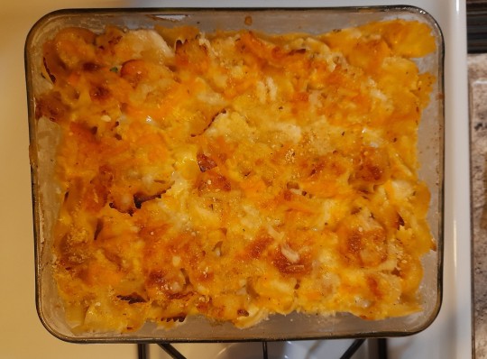
One of my favorite times of my everyday life is cooking and preparing home cook meals for my husband.It brings me joy when its time to do so.But as the old saying says,A way to a man's heart is through his belly lol.Hmmm..i do think this is true.So today i am going to share a easy wednesday evening meal with you queens to prepare for your kings.
Today i have here is a easy Seafood Casserole.Its easy,taste delicious and its a great meal thats excellent for a special night at home.
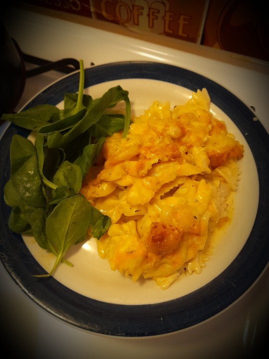
Ingredients:
Heavy cream
Seasoning of choice
Mexican creamy melt cheese
Scallop
Shrimp
Tilapia
Parsley
Garlic
Butter
Noodles of your choice(for me,i used the butterfly noodles)
You may add any other inegredients you wish to add that you think will enchance the taste etc.As you can see in the picture i have above i top mines off with a side of spinach,which went great with the seafood cassarole.
So here is how i got my cassarole together.I first got a skillet pan,added alittle bit of cooking oil(any one of your choice)I heat my skillet pan,add my cooking oil,add the onion,shrimps,scallop and other seasoning of my choice.After about 20mins of cooking whats in my skillet pan,i then add the talapia and cook it for another 15mins.During that process,i cooked the noodles in a separate pot.After thats all done cooking.I pour all the cooked ingredients into a pirate dish,then add the heavy cream and cheese,mixed it altogether.I add a little breadcrumbs to help with the texture of the cassarole.
This is a must try dish!And i know hubby will enjoy this special dish.
7 notes
·
View notes
Note
What was the bomb Ramen recipe?
Aight BOOM I finally got a chance to answer your question so here it is! Thank you for being so patient anon:
To start, I use this video as a reference regarding cooking methods and ingredients/measurements
youtube
Here’s the printed instructions for the above video
I don’t follow it fully because I don’t have all the stuff/don’t feel like doin allat, but here’s what I do use:
*1 Tbsp. sesame seeds
*2 cloves garlic (minced or grated)
*½" ginger (grated)
*Scallion (white part, diced)
*2 tsp. sesame oil
*2 tsp. chili bean paste
*2 tsp. soy sauce
*1 cup rice milk [substituted for soy]
*½ tsp Kosher salt
*Dash of white pepper
I also use the following as a personal preference:
Star Anise seeds (about 3 per serving)
Brewed Noodle Dipping Broth (optional)
Fresh Corn cut off the cob (about 1 cup per serving)
Fresh Spinach (1-2 cups per serving)
Mushrooms (sliced; about ½ cup per serving)
Red Onion (some diced, some sliced [for texture difference])
Eggs (1 per serving)
[For the pictures below, since I’m familiar with this recipe the ingredients shown aren’t exact measurements, so don’t get worried if yours don’t match up. I didn’t use all the ingredients below, but also I was cooking for 3 people {for example I only used about half the ginger on the cutting board, but all the spinach, etc etc.}
If its your first time cooking ramen/this recipe, I’d suggest going with the listed measurements for all the *starred* items until you get more comfortable with your personal taste/preference.]
Heres a few pictures of the ingredients I used, just in case you’re a visual person like myself or you also need an idea for what some of the items look like:
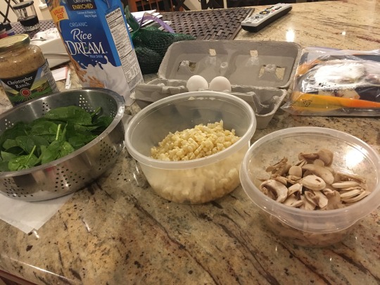
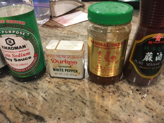
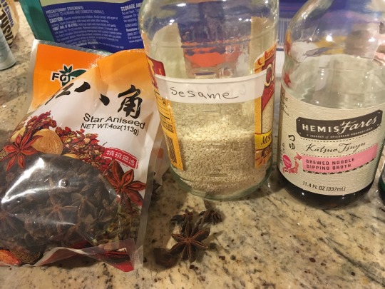
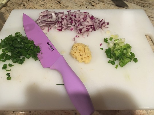
(That hunk of yellow in the middle is grated ginger)
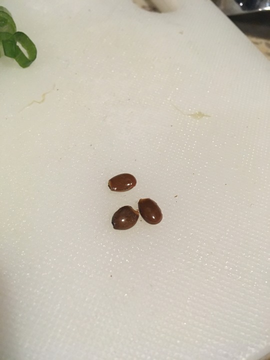
(These are Star Anise seeds)
ALRIGHT! So you’ve got all your ingredients laid out and ready to go.
Starting with your sesame seeds, pour those into a small saucepan and toast them until they’re a nice golden brown. Make sure you start off with low heat because this can get away from you real fast, so stir them regularly every few seconds to keep them from burning.
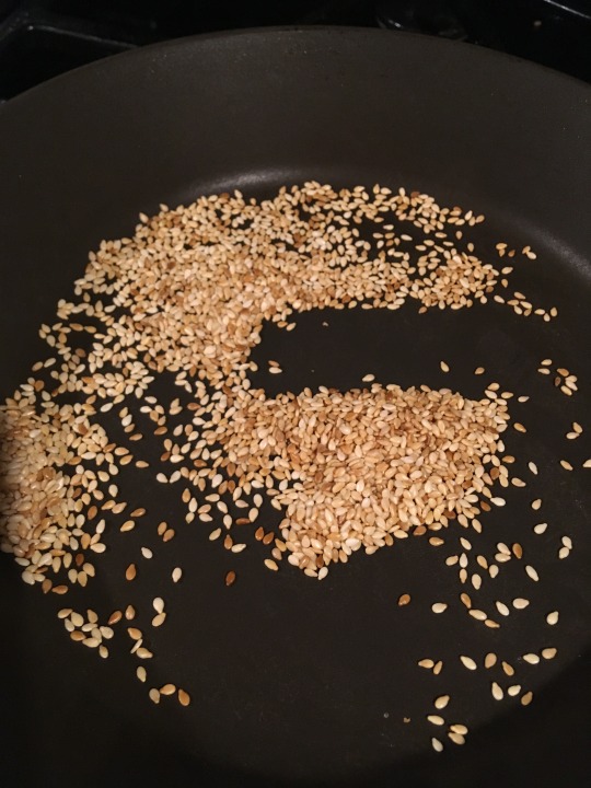
As you can see above these kinda got away from me [😅] but I was comfortable with the toasted : semi- toasted ratio so I stopped several seconds after this point. Toasting the seeds helps to bring out the oils and flavor, and you can also throw the anise seeds in there at the end for a few seconds to get those a little toasted too if you like.
Now you’re gonna grind up the seeds. Don’t have a mortar and pestle? Cool! Me either! What you might have tho is an ice cream scoop and a mug, so throw that shit in there and get to grinding! (You can also use a ziploc bag and a rolling pin, but remember to let the seeds cool before you dump them in the bag or it’ll melt [yup. been there done that 😅] ).
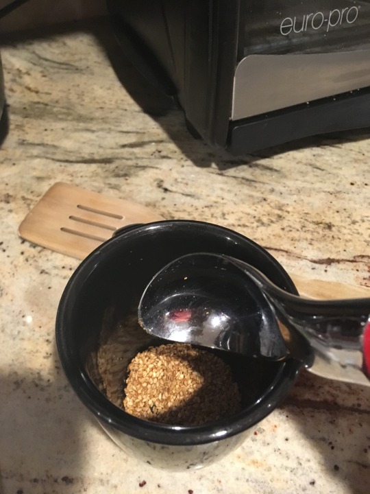
(Unground sesame seeds)
Once you’ve got those ground up to your desired texture (mostly powdery is good, don’t feel it needs to be perfect you just wanna smash open a good amount of the seeds) start heating up your medium sized pot on low.
This would be the 1:18 mark in the video above, and you’re gonna follow the instructions as so up until 2:18.
Start with your sesame seed oil and let that heat up (only takes a few seconds). Then, dump in your garlic, ginger, and white parts of the scallions ( I call them green onions but whatever lmao) and let that cook for a lil until that shit starts smellin good (or until the white parts of the onion get a little translucent). You can play with your fire a little bit but sesame oil burns fast so try to keep it on the low side to keep your food and pot from burning.
Now, if you’re like me and adding red onion and mushroom too, you can add that in now to get those cookin. The mushrooms might soak up a bit of your oil so feel free to add a little more sesame oil and cook until your veggies are evenly coated. Don’t worry about the mushrooms not being thoroughly cooked yet cuz they’ll soak up the flavors of the broth and get cooked with the next few steps. Don’t forget to add in your sesame and anise seed powder now.
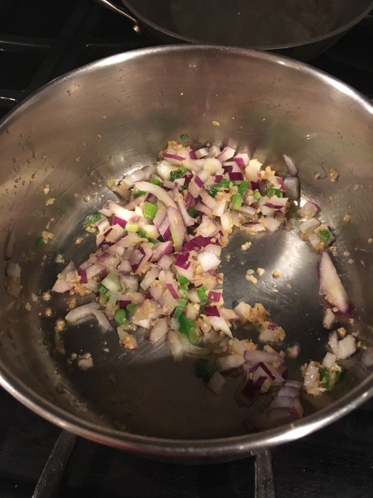
(Forgot to add the mushrooms here lol)
Feel free to turn your heat up to low medium at this point to get your pot headed in a nice simmering direction. Now, you’re gonna add your chili paste, soy sauce, and dipping broth (a quick splash is good enough) and stir that in nicely as well. I suggest tasting all these ingredients before adding them so you have an idea of the spice and sodium content you’re working with, as well as the flavors. I like my food spicy and not too salty, so I use extra chili paste and low sodium soy sauce.
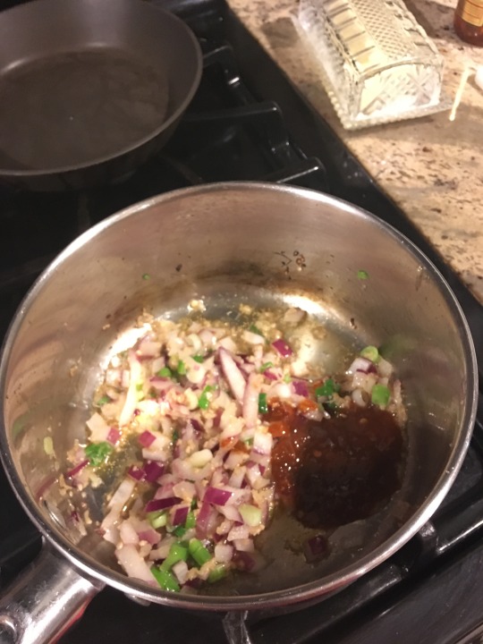
(Does not include soy sauce or dipping broth yet. Still no mushrooms XD)
The dipping broth I use has a little bit of a sweet flavor in it, so I keep that in mind to prevent from adding too much (if you’re using fresh corn the sweetness will also be heightened, tempting you to add more salt). All of the above ingredients have a good salt content tho, so be mindful of that if you need to watch your salt intake. Also! Taste as you go. That way if you need to add a little of anything you can add it in before you get to the finish line.
[You also may want to take a moment to start another pot of boiling water for your ramen noodles at this point.]
You can turn up your heat now to medium, because we’re about to add in the milk. The recipe above calls for soy milk, personally I use rice milk, but if you wanna use another non dairy milk, thats also great! (I’ve only used soy and rice milk tho so I can’t dictate what the taste may be like with another type of milk)
If you’re not fucking with non dairy milk (understandable lmao) see the substitutions I provided down below.
Add in your milk, stirring to blend all the flavors. You can pour half, stir a little, and pour the other half, or pour it all at once and stir, or pour little by little while stirring. The point is, it doesn’t matter how you do it, long as your pour the shit in there and stir it together 😂. Once you get that all mixed in nicely, you can turn your pot up to full medium or even a low high, to get it bubbling.
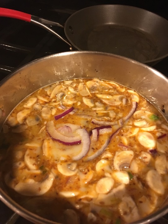
(A non bubbling but very delicious pot of broth)
The raw looking onion up there is just the leftover onion slices I added in for texture. At this point, I like to add a little salt and white pepper into my broth and give it a little taste test to see where its at. Sometimes I use a pinch of sea salt, sometimes just regular salt, it depends on what I feel like reaching for. They’re both the same to me, but again if you need to be mindful of your salt intake for personal or health reasons, you can go ahead n skip this step. I also add a few handfuls of fresh spinach to get that cooking down. ***Also don’t forget to add your corn in too!***
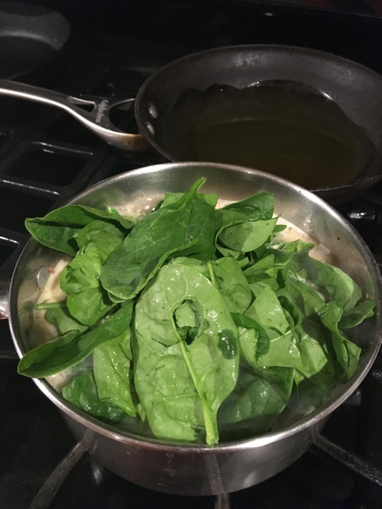
Check on your pot of boiling water, and if its ready, go ahead and add your noodles in. Feel free to use whatever ramen noodles you want, be it Top Ramen, Neoguri, Maruchan, its all up to you. I used Shin Ramyun noodles, in case you’re curious. Cook the noodles as directed.
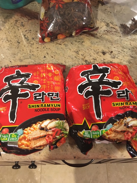
I don’t really use the flavor packets, because 1) ummm we just made some bomb ass homemade ramen broth SON!!! get that shit outta here 😤😤 but also 2) the salt content is out of this world, and as you keep hearing me say, you wanna keep an eye on that.
BUTTTT if you’re tasting your broth and you feel like maybe it could use a lil sum sum, sometimes I’ll add in a couple sprinkles of the flavor packet to give it a little extra spice and umph (the noodle packs up there are Gourmet Spicy), but I really don’t add much, maybe two amounts of whats shown in the spoon depending how many people I’m cooking for. (Maybe a little more if my grannys not looking lol)
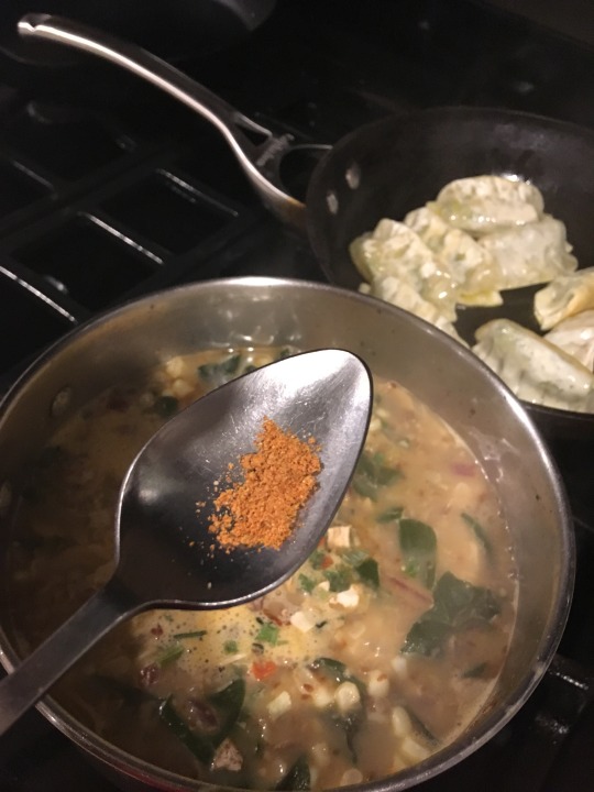
I do however use the vegetable packet, so dump that in the broth too.
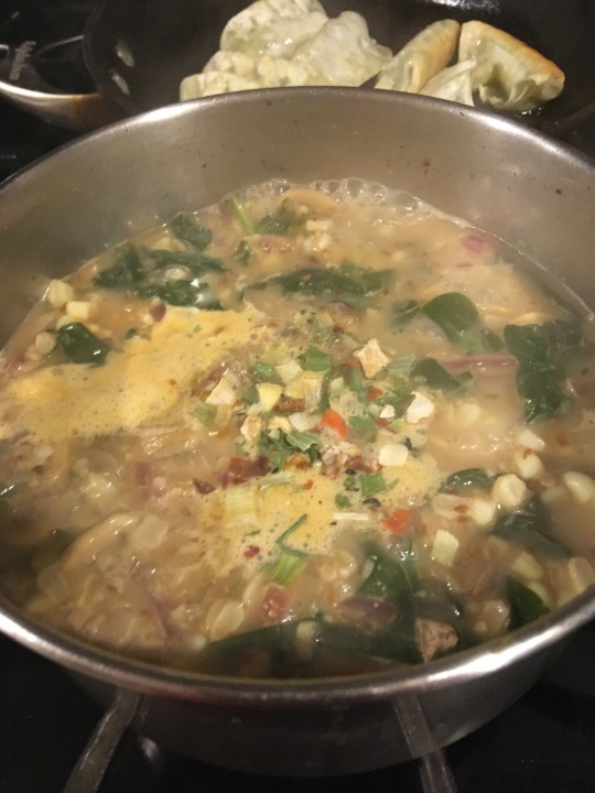
I’ll also crack an egg or two into the pot and let that get cooking. I don’t like the boiled runny yolk versions you’ll normally find in ramen, but I like eggs, so I like this much better. Its basically scrambled egg, just wet lol.
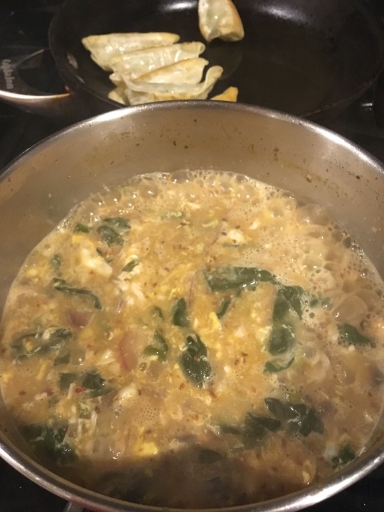
(The egg is the little flecks of yellow and white in the pot)
Try to prevent immediately stirring the egg once you crack it in the pot, otherwise you’ll get little baby disintegrated bits, which is okay, but if you want to taste good amounts of egg with the rest of your ingredients, try the following:
Let it sit for maybe half a minute after cracking (start by doing one egg at a time) then taking some wooden chopsticks, or a fork, and just mix back and forth through your broth. If you’re doing this while the pot is still boiling or on medium heat, it won’t take long for your egg to cook, so don’t get worried about the possibility of uncooked egg in the pot. Give it about 2 minutes, maybe a little more for comfort, and you’re good to go! Put your pot on low and let it simmer.
Go ahead and check on your noodles now, they should be done now or close to it. Once they are, drain the water out of the pot and set aside. Sometimes I forget this part, but you want to drain the water to keep the noodles from getting to the translucent/overcooked stage, unless thats your personal preference.
Now if you’re anything like me, you’re probably up there lookin at the last three photos like “woooow Homie, you out here providing ramen recipes but you aint providing the recipe for them potstickers you got goin in the back,”

First of all, mind ya bidness

Nosy ass….
Second of all, these from Trader Joes bruh!
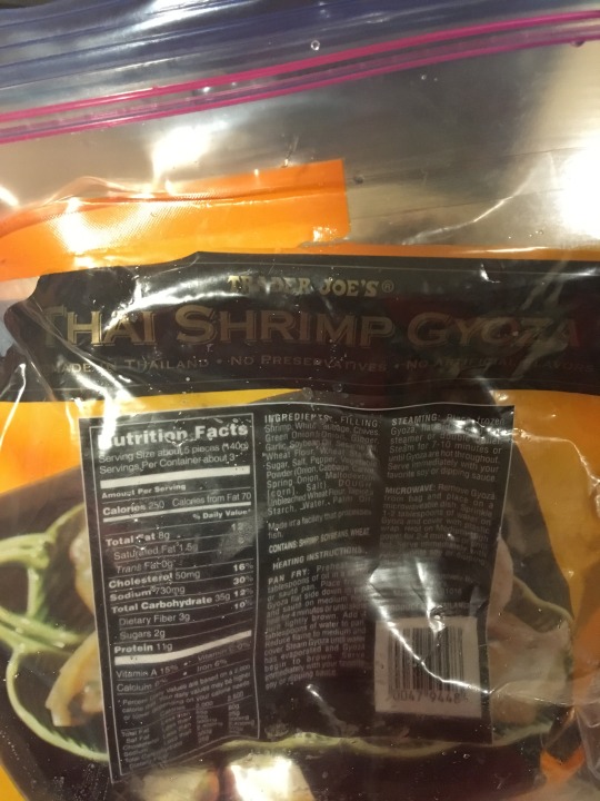
They’re the Thai Shrimp Gyoza ones and they’re in the frozen section. As you can see, I panfried them, using olive oil and sesame oil (like 1 tablespoon each) and these shits are bomb af. See? Don’t I be comin thru for yall?

But anyway, back to the ramen recipe.
NIGGA you done!! All you gotta do is plate your noodles in a bowl, ladle your broth in there, sprinkle your green onions on top, maybe add little sriracha and BOOM
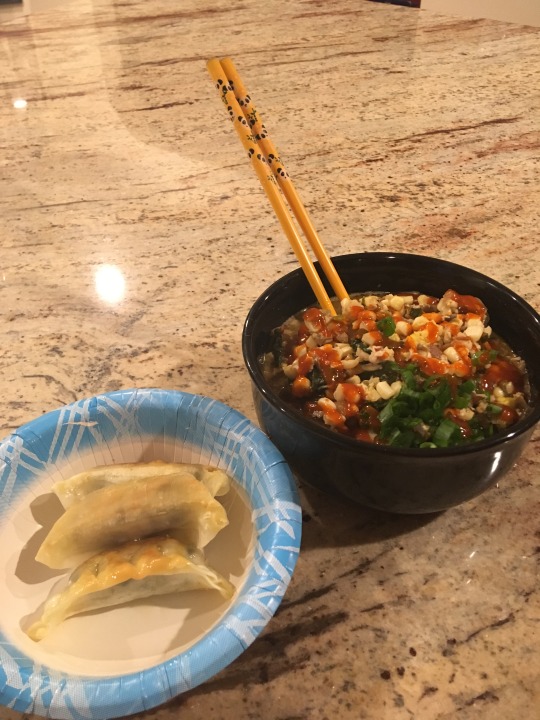
Congratulations! You just made some bomb ass ramen homie!!!! (peep the panda chopsticks :D)
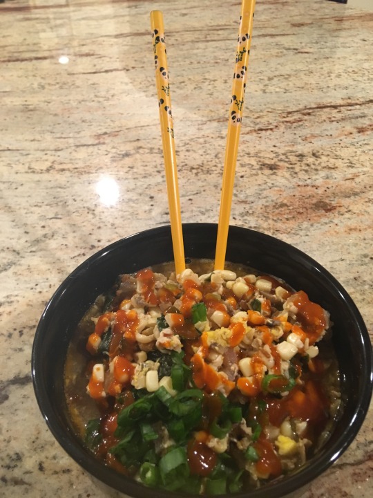
Now go put on your favorite show, kick back, and get to grubbin!
Warning: You will absolutely knock tf out after devouring this shit, so clear a space and prepare for that lmao. Trust me, I do it every time 😂😂

////Substitutions////
For the Garlic, Ginger, and Onion, feel free to use the powder versions instead if you don’t have fresh on hand.
There is also sesame seed powder and, apparently, anise seed powder (don’t ask me where to find those two because ionknow)
Kosher Salt- as far as i’m concerned salt is salt, like I said I use regular or sea salt if you don’t have kosher
Rice or Soy Milk- If you wanna use dairy milk, I’d say start with half a cup of dairy and then half a cup of vegetable or chicken broth (low sodium versions are a thing). This will help make it creamy without compromising too much of the flavor you’ve built up. Again, taste as you go to tweak as needed.
Soy Sauce can of course be substituted for the low sodium kind.
Fresh Ingredients: For Corn, Spinach, Mushrooms and even Onions, Frozen or Canned works just as well and its a significantly cheaper option (idk bout canned onions tho). If you’re going the canned route, make sure to just rinse it out first before adding to get rid of any extra salt content and preservatives that might be floating around in there.
***Black pepper can be subbed for white, theres no difference
I know the struggles college students, those on budgets, and peeps who live in food deserts may have when it comes to getting some of these ingredients, so don’t feel you gotta have it all to make it taste good. Just work with what you got, get a little crafty and experiment a little, and maybe try some new things and see how you like it! (Like, seriously, rice milk is great I love it 😂 )
Lastly, this recipe is vegetarian and vegan friendly! (Sans egg for the vegans of course) so its super enjoyable for yall as well!
I’m not vegan nor vegetarian, and I have added meat sometimes in the past, but I like this version the best because it just taste the best to me.
If you try the recipe, feel free to shoot me an ask and tell me how it went! Now go get cookin! :D

#nons#recipes#cooking#uhhh i'll link this in part two of Movie Night (and one) so that yall can find it#i'll also tag the folks who wanted to recipe but rn its 2:30 in the morning and im tired#so ill hit yall back tomorrow lmao#enjoy homies!#i wanted to add some color but tumblr mobiles being a bitch
233 notes
·
View notes
Note
Hey I sent an ask before but I guess it got swallowed? I was wondering if you had any advice on editing headers for fics? I’ve loved the ones you’ve done in the past and I’d really like to do something like that for my own fics too! Hopefully this one gets to you💓—🦋 anon
Hi!!!
I actually design things and work in printing for my main job so I have access to things like Adobe photoshop and Adobe illustrator (I do my painting/retouching in photoshop and everything else in illustrator). But it’s hella expensive so I try to look at free alternatives.
I have a bunch of asset/resource sites I use for photos and fonts. Sorry I tend to ramble so here we go.
Firstly I have a lot of free resource sites that I can get high-res assets from. I often am using things for commercial purposes because I get paid to do what I do. But for most people, they don’t have to worry so much about it bc they’re making it for themselves, but it’s always nice to have high-res assets still.
When I get a concept, I look for imagery that inspires me from sites like these and I can usually find what I’m looking for. The amount of beautiful, free, high-res images out there is amazing.
Good rule of thumb is that you can always make a big image smaller, but never make a small image bigger, so always download the biggest size you can and size to your needs. -holding SHIFT when resizing keeps things in proportion when scaling-
I usually use pexels and freepik as my default. There are sooo many image sites I could list but here are the ones I use.
https://www.pexels.com/
https://www.freepik.com/search?dates=any&format=search&page=1&selection=1&sort=popular&type=photo
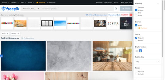
https://pixabay.com/
https://unsplash.com/
https://www.rawpixel.com/free-images (There’s free and premium images, but you can download 5 images per day are labeled free)
https://lostandtaken.com (textures that you can tile!)
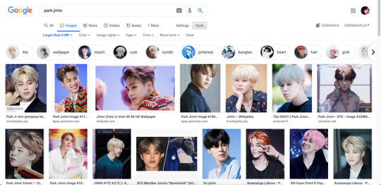
For BTS photos I look via google for images over 4MP (usually dispatch or official photos are my go-to).
I use photoshop to cut them out and retouch, but there is another editing tool I’ve been experimenting with called Photopea, which is a FREE online editing tool that’s just as powerful. It even looks like photoshop so it’s pretty comfortable to use.
https://www.photopea.com/
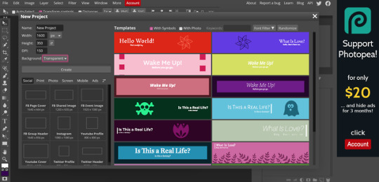
I make my banners at 1600px x 350px, but i realized tumblr auto resizes anyway [LIKE A BITCHASS PUNK IM MAD ABT IT AND FOUND A WORKAROUND thats for another post tho]. I keep my DPI higher in case I want to use it for printing at some point, but that’s optional -72 is perfect for what you’re doing.
Reference:
300DPI= GREAT PRINT QUALITY - (work brain loves this but it’s useless for what we’re doing)150DPI=GOOD PRINT QUALITY 72=OPTIMIZED FOR DIGITAL USE ONLY (standard screen resolution)
_
Custom fonts can be your friend or the enemy. If you’re using a scripty one, try to make sure it’s legible with your title (there are some really terrible ones out there, but there are so many good ones too).
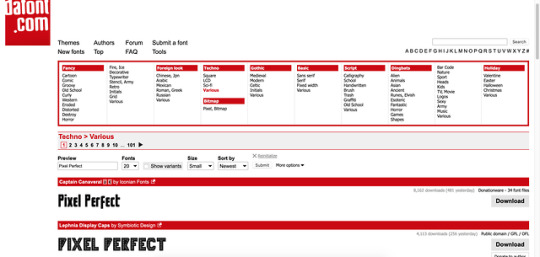
The easiest and quickest font place I use is dafont bc you can choose fonts based on the style you’re going for and you can test your text before you decide to download. They can be loaded into photopea! Also they’re free:
https://www.dafont.com/

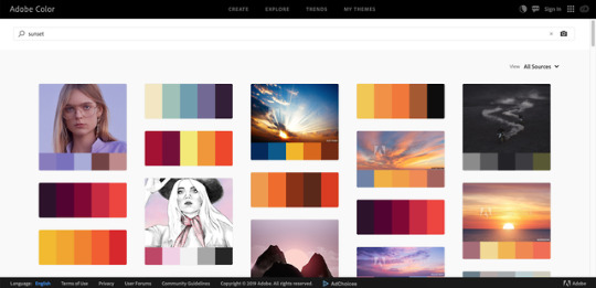
As far as editing goes, I tend to choose a color theme based on feelings and adobe has a site that can help you by showing you palettes based on search terms. ( you can even search for things like happy, sad, angry, etc)
https://color.adobe.com/explore
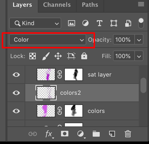
I tend to use fuzzy edge brushes on everything to make it look soft, especially in lighting. The trick is just layers upon layers with different blending modes
I use “Color”, “Saturation” and “Overlay” modes a lot.

Ignore my layer names: I’m a mess.
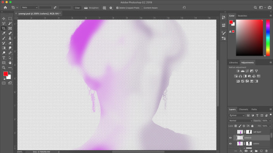
This is what it looks like in reality. I just blob brush everything.

So in steps you can see 1)original cutout
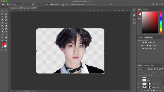
2) adding effects like busted lip (a brush i downloaded for PS–I don’t think these import to photopea unfortunately), bruising (textures set to overlay/multiply using different colors), earrings (hand-painted over the originals for a cleaner edge), and EYES (eyes i tend to cut from the main layer, copy above, lighten/contrast the shit out of them and change the color using “replace color” or “hue/sat” or blob color on a new layer and set it to “color” blending mode and then paint over –there’s a lot of ways to do it– but then blend them back into the photo in a natural-ish way)

3) lighting overlays give color to the skin and you can use colors from your background to create interesting pop effects (in this case i used purple)

I hope this helps??? But if you want more like in depth help with editing and stuff, let me know!!! It can get overwhelming, but it can also be really fun!
3 notes
·
View notes
Text
With a little distance from the release of Pokémon Scarlet and Violet, I feel like I can give a fair review without honeymooning it too much. My review of Pokémon Violet is that Breath of the Wild ruined video games.
My real objective stance on the game is that obviously it needed more time, but for what it is, the first run through the game is a very enjoyable experience. All the character and story stuff is really great, and this generation of Pokémon is honestly one of my favorites, and part of that is because their stats are all off the goop fucking insane. (except Spidops)
But my issue now is in the postgame. To be clear, everyone has been saying pokemon has no postgame since XY. This is a common whiny baby complaint from people who dont play other games. To date I have played 520 hours of Pokémon Shield, and almost 200 hours of PLA simply because I enjoy playing those games and hanging out with my little guys. This time around is a little different though.
The issue here is a problem with open world games that I've talked about in previous posts. Open world games are so gigantic that they cannot be curated the way a linear game can be. PLA escaped the open world curse by having multiple Monster Hunter Rise sized maps that feel like they were built more deliberately, and stay fresh for longer cuz when you get sick of one you can just move to another. There are 5 of them total. There's one big Paldea. So whats the issue with one big map vs a few little ones? Well the Paldea map is very impressive for its scale, and I do like it a lot, but the problem with big maps is that theres almost always nothing in them. They become so large that the only thing to do in them is see everything. So once you've seen everything there's nothing left to do. Pokémon held my attention for longer just by having Pokémon in the big map to find, but now that I've found them all traversing the map is tedious. And part of that is that Miraidon doesnt feel as good to control as the Noble Pokémon from PLA.
So with no map to explore, no items to find, no pokemon to track down, youre left with a few options. The Ace tournament, shiny hunting, or raids.
The Ace tournament is not difficult and it takes too long to be worth the money because you cant turn animations off. But the money would just be used to train Pokémon that I would only really need for raiding. Which we'll get to.
Shiny hunting requires too much attention because of the lack of a visual or sound effect. As a result it can be a little stressful, where in PLA I've found like actually 20 shinies in the past month, and half of them appeared behind me. I only knew they were there cuz they kept sparkling at me until I heard them. The more realistic lighting (coupled with lighting bugs) also makes telling certain shinies apart even more difficult. The other day I thought I saw a shiny Lumineon but it ended up just being the sunset turning it yellowish. And example of how games with art styles, again like PLA, are always better. The textured models of the Pokémon look really really good, but just adding scale textures and stuff in PLA and Snap was good enough as well.
So then you're left with raids. I actually like the active time raid idea, but much like my stance on open world games being inherently worse than less open world games, I think that FFXIII is the only game that ever had good ATB, and thats because in that game you can cancel the bar to use moves early. Youre not beholden to the flow of time. But its fine the raids are fun, EXCEPT, people are so unbelievably unfathomably incompetent that the raids are actually incompletable most of the time. People will bring Azumarill, or Iron Hands, or Sylveon to every single raid no matter what type the boss is. I had a group join me for a water Tera type Toxapex, a water POISON type, and our team consisted of me, two Azumarills, and a Sylveon. I went through 4 groups of people before doing it alone with computers and beating it. And thats how every single encounter has played out. But it takes so much longer solo that it isn't worth doing. This is an entire mechanic of the game that I expected to keep me playing which has now actively stopped me from playing because people online are so bad at video games.
But I wouldn't be relying on raids for content if the game didn't have to be Pokémon of the Wild. Just like I'd still be playing Elden Ring if it wasnt Breath of the Souls, and Sonic Frontiers couldve maybe focused on its plot and animations more if it didnt need to be Breath of the Sonic.
So in conclusion Pokémon Violet is a very good game that I will never replay. I'm excited for DLC to come and add more Pokémon because I do like the game and I love my Skeledirge and my Slither Wing, but I think I'm gonna mostly just keep playing PLA whenever I have a hankering for Pokémon in the future. I think for an open world game this is one of the best I've played, but I also really hope BotW2 bombs so we can get normal games out of Nintendo and Sega again
0 notes
Text
Sharing My Thoughts For Star Stable Online
Sorry, no pics with this first post, but others have inspired me to share some ideas SSO should really use, so forgive me that they are likely repeats of already existing ideas you’ve read or considered.
Alright, first on my list is horse mane and tails, ok so on my way in I liked one about “styles” but how about some colors? instead of just being able to change the style (which is great) maybe add some color streak options to the styles we already have? I mean you’ll have the same mane base so it shouldn’t be that difficult. In addition to this they could also offer more color options for the mane and tail, this could be general like most hair style options, or they can make custom options for the horses based on breed. For instance maybe you’d like your white mustang to have a two toned mane just like one on one of the other mustangs available. So there you have it, two ideas that are probably already out there that wouldn’t be that hard to add to the game and would give more options to making your horse more unique.
Now for something else on my mind, FOALS, yes we all love the little things, and users on SSO do roles alot when out of quests. Well, they already have some foal designs anyway, why not add them as a pet (follow only for obvious reasons). Now this doesn’t mean much to some people but you’re already paying the price of a pony for some pets as it is so why not make foals a pet? Sure they will likely cost around 400-600 star coins but I’d buy a few, I mean who wouldn’t want at least one little foal pet to follow them around? Since all of the foals look the same in build they just have to have plenty of color options.
Because Im not making you read nearly enough of my poorly written thoughts, I have another one for you. Furniture? what does that mean? Well they apparently have some use for items you received forever ago but they still have no use, forget updating textures for a moment and finish that area of the game because if we’re getting something to put the furniture in then they will need to prepare for adding shops to buy more stuff, also, make it so people can let others in this new place because there is no point of owning a sofa if nobody can enter the place but you, this would be great for a “build a house” quest.
That’s it for the moment, if you do art displaying any of these ideas or have any positive feedback it is welcome and special thanks to anyone that read even half of what I wrote. Any haters out there can keep their opinions to themselves please.
1 note
·
View note
Photo
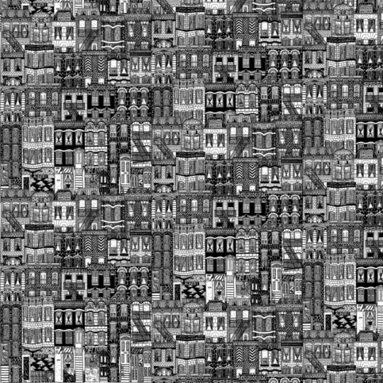
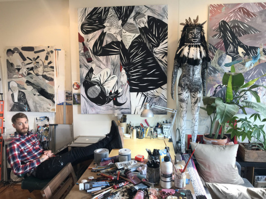
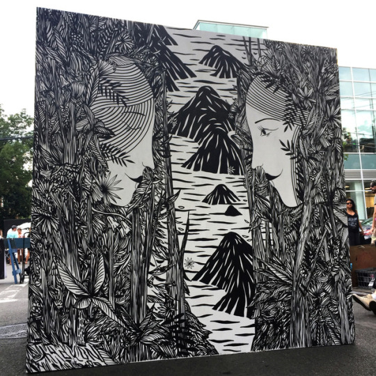
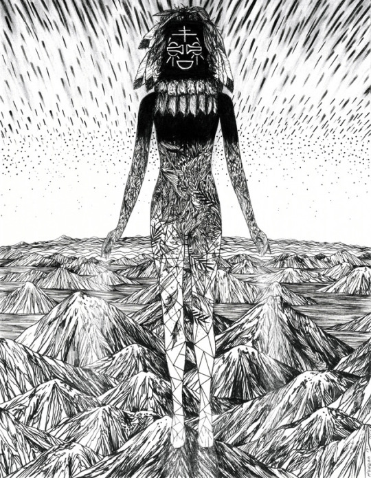
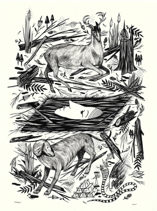
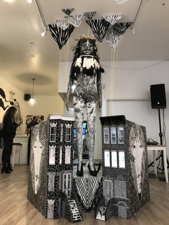
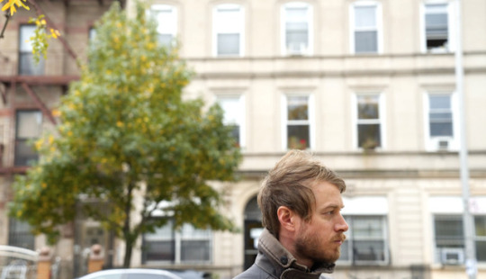
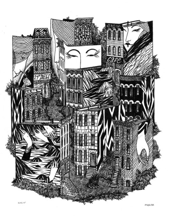
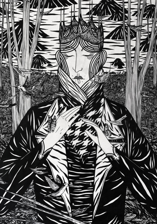
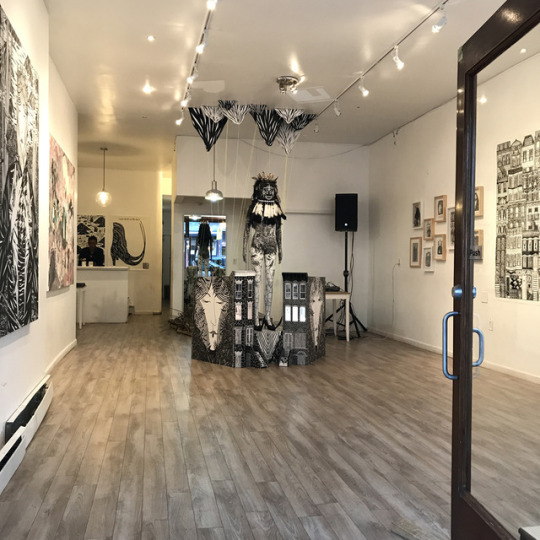
ART SCHOOL | HYDEON (Brooklyn, NY)
Visual artist and designer Ian Fergurson aka HYDEON is known for his simple monochromatic black and white works, often featuring old gothic buildings, Colonial style witches, and eye catching installations and murals. Not only one thing, Ferguson was most recently employed as a silk screen printer an wallpaper company, until his works were purchased by a private collector in the summer of 2017, launching his art career. We’re really excited to chat with Ian about his art journey, his works and processes, as well as a mural he completed on the 69th floor of 4 World Trade Building.
Photographs courtesy of the artist.
Can you tell folks a little about yourself? We’re always curious about artist handles, sometimes there is a good story behind it, just curious what’s the significance of @hydeon? My name is Ian Ferguson. I’m a visual artist and designer living and working in Brooklyn, NY. I work out of my home studio. I’ve been publishing my work under the name Hydeon for about 15 years now. The name Hydeon is partially derived from the avant-garde animated series Æon Flux which aired on MTV in the 90’s. Eon Flux became a nickname I had in Middle School. My friends at the time would call me Flox or Eon or both. Years later when I was in college studying graphic design In the early-mid 2000’s I wanted to have an alias to sign my work under as a way to create my own unique identity and branding. I used the Eon part from my nickname in middle school and added the Hyd part in front of it. It can be pronounced two different ways, It can be like “Hid-Ian”, or “Hide-Ian”. The idea is that my own name is hidden within the alias.
When did you first get into drawing, and what were you drawn too? How did your early interest evolve into something more? I grew up in a family of artists in San Diego, CA. I was born in 1985. My mom had me drawing very early before I could hold a pencil on my own. She would hold my hand with the pencil or brush and help me make drawings and paintings. I must have been 2 years old maybe when she started teaching me, I’m not entirely sure. My earliest memory of creative inspiration that really spoke to me was seeing the work of M.C. Escher. I was absolutely obsessed with his work as a child. One of my first ever art exhibits I ever saw was an M.C. Escher exhibit at the San Diego Museum of Art. All throughout my youth I was always making art. I was obsessed with drawing and how it would make me feel. It always seemed to calm me down and I was eventually able to discover a form of meditation through it. I grew up skateboarding as well, wearing Vans, hiking and going to the beach, classic Southern California activities. Through skateboarding my influences in art and music evolved. The drawings and paintings I grew up making would eventually evolve into designing posters for shows. I think thats where I got the initial start into my career. Everything seemed to stem from making the posters. My first ever art show was a group show on skateboard decks in 2003 at King Cassius Gallery in San Diego.
Having attended Art Institute of California, San Diego, what was your experience with art school, and what was your experience after art school as an artist? Did you find the transition difficult, challenging, easy, and/or just totally off the rails? My experience at AI-SD overall was positive. I met some amazing friends there and that was the best part of it. I studied graphic design so almost everything I did in college involved a computer. Once I figured out the Adobe programs I just wanted to get through school and do my own thing.
My career transition after college was very textured and difficult. I had moved to Seattle in 2006 right after school to explore the mountains, forests, music, and art scene there. I was hoping to land a design job up there with my new degree, but It never really panned out and the school couldn’t really help much with jobs because I was out of state. I ended up working mostly at a thrift store and would just do art and music on the side. After several years in Seattle I had a crazy mental breakdown at the thrift store I was working at and shortly after that I got some help and was diagnosed with bi-polar disorder. I fled back to San Diego for a few months to get some sun and just chill out at home. During that period I worked at an art store in downtown San Diego for about 6 months.
After that I felt a strong magnetic pull to move to Chicago and explore the architecture, art, and music scene there. I figured I would have more opportunity in a bigger city and I knew I wanted to live outside of California. I saved up money at the art store and moved to Chicago. I tried to get a design job there, but It wasn’t working out so I quickly ended up working as a full time cashier at a grocery store. I did that for a while until I completely burned out on the register and they fired me. I was able to get unemployment, so I took advantage of it and hustled my art as hard as a could with the time I had. After that I worked a weird retail shoe stocking job, worked at a fast food chain, and did bike messaging in the loop. I basically took whatever job I could get to support myself on a basic level and then just hustled my art and design stuff as much as possible on the side. I started doing allot of shows and after a while I had built up a little success in Chicago but It wasn’t until I moved to NYC in 2014 that everything really changed and I started having significant success with my work.
Often times artists are not only ONE thing, each juggles art and or is making a real effort to hustle at it? How do you balance art and life? What is your other hustle and how does that factor into what you do? Good question. As I mentioned in the previous question I had many different types of jobs I would do to support myself so I could do my art. When I moved to NYC in 2014 I landed a job working as a silk screen printer for Flavor Paper, an amazing wallpaper company in collaboration with the Warhol foundation. This was the first real art job I’ve ever got and the best job I have ever had. I worked there for about two and a half years full time making hand silk screen wallpaper and then hustling my art on the side.
It wasn’t until just this past summer of 2017 that I had a career breakthrough with my work. I sold a giant painting to a private collector in Washington D.C. that had discovered me on Instagram. This was the sale that changed everything for me. I was able to quit my job at Flavor Paper and work entirely for myself. I work every single day for myself now. It’s the most gratifying feeling. It feels more than a full time job, it’s a full time commitment and a lifestyle. I’m always working. Aside from doing drawings and paintings for gallery shows I do commission work involving anything from murals to branding design and illustration work. I’ve also been collaborating with Brazilian fashion brand 1994. and an NYC based fashion brand The Very Warm. Flavor Paper has also released my first wallpaper pattern “Brownstoner” which has been a great success.
How would you describe the black-and-white works you create? Amongst the various things you illustrate, buildings and old style victorian structures play a role. How did this come about? I became fascinated with old world gothic architecture and the victorian era around 2009 when I first left the west coast and visited Chicago and New York for the first time. Seeing the brownstones and old gothic buildings in both cities really impacted me in a significant way. I fell in love with these types of buildings. They have a romantic historical quality to them that makes me feel transported back in time to another world. I feel a deep connection of energy in them and it makes me feel good, its a beautiful feeling. I had never really seen buildings like this before I came out to these cities. I have always done black and white work, but started working exclusively in black and white about a year ago. I felt like I needed a break from color for a while to just focus on the simplicity of monochromatic work. I love the quality of black and white and the versatility of it. You can put a black and white piece in almost any home or environment and it will look good. Black and white doesn’t fight any other colors, its its own thing. I’ve recently been doing color work again and loving it, but will always keep the black and white pieces going.
Do you keep a sketchbook for ideas or do you find yourself just sitting down, hitting the paper off to the races, so to speak? Sometimes and it’s a little bit of both! I keep a few different sketchbooks of various sizes. I like to go to cafes and parks and chill and sketch out ideas when I have them. I ride my bike everywhere and find allot of inspiration while riding the bike or running. I get allot of inspiration from my environment and life experience so I like to wait for the inspiration to hit me and then act on it with the sketchbook. Often times I use basic computer printer paper to sketch out final ideas before they go to nice paper, canvas, or wood panel.
Who were some of your artistic influences? Some of my absolute favorite artists and influencers are: Marcel Dzama, Thomas Campbell, Tim Kinsella, Cleon Peterson, M.C. Escher, Mamma Anderson, Henry Darger, Ed Templeton, Toulouse Lautrec, Andrea Joyce Heimer, Pitseolak, Egon Schiele, Danny Fox, and More..
What are your top 5 art materials to work with? Faber-Castell PITT artist pens Ticonderoga HB #2 pencils Bic Black Ballpoint Pen Montana Paint markers OR Molotow Paint markers (both are great!) Golden Acrylics
You recently installed your work at 4 World Trade Center as well as created a mural in the East Village? How did this project come about? What was the best part of the overall experience? The World Trade Center mural happened through my good friend Joohee Park AKA Stickymonger. We both show at this gallery in the financial district of Manhattan called World Trade Gallery, which is a gallery affiliated with the WTC.
The gallery had access to the 69th floor of 4 World Trade and asked a number of artists to do murals on the floor. Stickymonger was really the catalyst for me getting into the tower. She’s an amazing artist and a very good friend of mine. The experience working in the tower was absolutely amazing and beautiful. There were several nights where I got to work up there entirely alone on the 69th floor. It was just me and my music and jamming away on my mural. The experience was ethereal seeing the whole city glowing from above with 360 degree views. I felt like I was on top of the world and the mural came out fantastic. I did a black and white architectural motif of New York City with the Hudson River as the floor and the Palisades on the other wall.
My mural covered an entire corridor of the Woman’s bathroom. It was one of the only spaces left for a mural and no one wanted it, so I jumped on it! I loved the whole experience and everyone took good care of me throughout the process. I met some amazing people through that project, one of which was curator Joshua B. Geyer who eventually asked me to do the mural in the East Village which was apart of the Centre-Fuge Public Art Project.
What would your dream collaboration be like? Oh wow! I have allot of ideas for this one, but I would love to do a collaborative drawing with Marcel Dzama sometime.
What are your favorite Vans? The Sk8-Hi all the way!
What advice would you give someone thinking about art as a career? Really dive deep within yourself and make sure you love doing it first. Then decide if you’re willing to make the full commitment. Consider it a lifetime investment and learn to trust and believe in yourself against all odds. Be ready and willing to take big risks at any given moment. Always be prepared to take criticism of all sorts, good or bad. Know that a career in art takes allot of time, allot of hard work, and a 100% commitment and belief in yourself. Be willing to network and expose yourself to the art world. Explore as many galleries/museums as possible. Always do your absolute best work, put everything you have into it, experiment, take chances, and never give up. Celebrate every success no matter how big or small and eventually if you work hard enough and you believe in yourself, you will be able to achieve your goals. Anything is possible.
What are you looking forward to the rest of this year and beginning of next? For the remainder of 2017 I’ll be working on large scale works in color on paper and canvas. I’m going camping soon with my family in Joshua Tree where I hope to discover some fresh insight and inspiration. I’ll be showing new work at Spoke Art NYC in March 2018 for a really amazing group show. I have a few other things lined up but thats about it for now.
Who is an artist you’d like to see on Art School one day? Lala Abaddon !
Follow Hydeon: Instagram | Vimeo | Website
142 notes
·
View notes
Text
Ableton Non-vst Plugin

We're currently conducting systematic tests with the release version of macOS 11 (Big Sur) in order to offer full compatibility of our products as soon as possible. You can find our latest compatibility status - here
Please note that although announced at the same time as macOS Big Sur, Apple Silicon processors are an independent release with separate compatibility concerns for NI products. Compatibility with macOS Big Sur will not yet ensure compatibility with Apple Silicon processors. At the moment, Native Instruments products are not supported on computers with Apple Silicon processors. Read more - here
Dismiss Notice
Here are my top 5 essential VST audio plugins for 2019. Download my Top 30 Essential EDM mixing tips here FREE. UPDATE: Top 10 V. Ableton / Cubase / Reaper / FL Studio / Reason / Sonar / Logic Pro Tools & Such DAW. A RTAS to VST Converter Is Required For Non-VST DAWs Product Details 20 808'S 19 Ambient Sounds 16 Bass 23 Bells 5 Choirs 20 Keys 13 Misc 11 Organs 19 Pads 13 Plucks 11 Reversed 20 Strings 20 Synth Leads 10 Textures 10 Woodwinds. My remark about VST buggy instrument rack was wrong because i didn't activate VST scanning in Ableton. I use AU plugins since ever. So my add of VST Komplete instrument rack was empty without the VST instance of Komplete, logical due to non VST activation in Ableton. Then i was trying to add the AU plugin to VST instrument rack. Ableton/ Cubase / Reaper / FL Studio / Reason / Sonar / Logic; Will Also Work With Pro Tools & Such DAW. A RTAS to VST Converter Is Required For Non VST DAWs; Zipped File Size: -7 GB Unzipped File Size: +17 GB. Sounds like thats also a no-no for non vst straight hardware synths then. In Sonar you can record any sort of midi automation.cc, rpn, nrpn. So the Nova works just fine thanks! I wont even bother looking at live. Sonar seems streets ahead.
Discussion in 'MASCHINE Area' started by bodhilight, Feb 15, 2012.
Posts: 1077
Offline
Posts : 1077
Joined : Sat Dec 06, 2014 6:12 pm
Has thanked:86 times
Been thanked:137 times
Agreed. My workaround is to copy the vote page URL to the clipboard before logging in, then paste it back afterwards.
Garry Knight Studio One 3 Professional Melodyne Editor 4, NI Komplete 11 Focusrite Scarlett 2i4 audio interface Windows 10 Professional 64-bit, 16 GB RAM, Core i5 Microsoft Surface Pro 3, Core i7, 8GB RAM, 128 GB SSD Nektar Impact LX49+, Samson Graphite 25, and Korg microKey 25 MIDI controllers Novation ZeRO SL MkII mixing control surface Korg nanoKontrol 2 mixing control surface Reaper, Logic Pro X, GarageBand https://soundcloud.com/garryknight
Posts: 905
Offline
Posts : 905
Joined : Tue Jul 01, 2014 4:00 pm
Location : Peculiar, MO
Has thanked:22 times
Been thanked:31 times
garybowling wroteI don't understand why when I click to vote on one of these, then click the thumbs up, it says I need to log in to vote. But according to the page, in the upper right, I am logged in. Then if I click the log in and re-enter my details, I lose the vote page.. Arrgh, it's the little things that get frustrating! gabo
Same thing happens to me.
Shane Intel i7 6700k | Gigabyte GA-Z170-HD3P | Kingston 16GB 2133 | 2 x Samsung 250GB EVO SSD's | Vantec UGT-FW210 FW Card | Win 10 Pro | S1 Pro 3.5.4 x64 | Firestudio Mobile | Yamaha HS-80's | ART Pro VLA II Vactrol Tube Compressor | ART Pro MPA II Reference Series Tube Mic Pre | Blue Bluebird Mic
Posts: 905
Offline
Posts : 905
Joined : Tue Jul 01, 2014 4:00 pm
Location : Peculiar, MO
Has thanked:22 times
Been thanked:31 times
wonder6oy wrote...and by 'Bad Edits', I mean tracks that have been rendered and sent to you without proper crossfading, resulting in loud 'pop's and 'click's. In Pro Tools, it's just a matter of pulling up the pencil tool and drawing them out - literally a 5-second process. And when that fails, I use Izotope RX to do the job. But neither of those are an option in S1, and I need a solution going forward because I have to deal with these ALL the time. Any help appreciated!
I cut and fade the edge of the clip. I do this a lot for taking the fret click out of bass at the beginning of notes. Hit 3 on the keyboard to bring up the 'Cut' tool, then leave my hand there and hit 1 to bring up the normal tool and grab the edge of the clip. I've used the draw tool in other DAWs and this way is much fast to me.
Shane Intel i7 6700k | Gigabyte GA-Z170-HD3P | Kingston 16GB 2133 | 2 x Samsung 250GB EVO SSD's | Vantec UGT-FW210 FW Card | Win 10 Pro | S1 Pro 3.5.4 x64 | Firestudio Mobile | Yamaha HS-80's | ART Pro VLA II Vactrol Tube Compressor | ART Pro MPA II Reference Series Tube Mic Pre | Blue Bluebird Mic
Posts: 905
Offline
Posts : 905
Joined : Tue Jul 01, 2014 4:00 pm
Location : Peculiar, MO
Has thanked:22 times
Been thanked:31 times
I wouldn't want them wasting time developing audio editing and embedding it, but partnering with someone to have a light version that does the basics through ARA and give you the option to upgrade if you need more advanced tools would be really nice. I mean, that was the whole purpose of ARA from the git go, wasn't it?
Shane Intel i7 6700k | Gigabyte GA-Z170-HD3P | Kingston 16GB 2133 | 2 x Samsung 250GB EVO SSD's | Vantec UGT-FW210 FW Card | Win 10 Pro | S1 Pro 3.5.4 x64 | Firestudio Mobile | Yamaha HS-80's | ART Pro VLA II Vactrol Tube Compressor | ART Pro MPA II Reference Series Tube Mic Pre | Blue Bluebird Mic
Posts: 322
Offline
Posts : 322
Joined : Wed Jul 02, 2014 6:37 pm
Has thanked:2 times
Been thanked:28 times
Bub wroteI wouldn't want them wasting time developing audio editing and embedding it
Exactly. If the devs do not want to do this right (or at all) - they should at least allow clean passage of audio to a designated editor and leave it at that. I too use RX but the fact that RX Connect simply does not work in S1 makes it is disappointing waste of time when apps like Nuendo/Cubase can use this like a dream. Time for Presonus to get off it's 'closed' sandbox approach and offer the ability to pass audio back and forth between some standard editors out there. (please consider RX and/or Wavelab as starters ) VP
Posts: 3138
Offline
Posts : 3138
Joined : Tue Jun 09, 2015 12:21 pm
Has thanked:213 times
Been thanked:608 times
Skaperverket wroteI've created a macro called 'Bounce to Finder' with Bounce Selection [Snap ('0')] Select in Pool Show in Explorer/Finder but for some reason S1 won't focus on the Browser window and the Pool when 'Select in Pool' is applied and the Pool is opened, so I have to do the Show in Finder command separately.
I ran in to that same issue when creating a drag location macro for non VST-XML sample players. What I did was adding the following before executing Show in Explorer/Finder: View | Browser [State '1'] Navigation | Up Navigation | Down
Export to Explorer.studioonemacro
(586 Bytes) Downloaded 80 times
OS: Windows 10 Pro | HW: P9X79 • i7 3930K • 16GB • 3x EVO 860 • NVIDIA GT1030 (@WQHD) • RME AIO
Forum Moderator
Posts: 4616
Offline
Posts : 4616
Joined : Tue Jul 01, 2014 6:39 pm
Has thanked:3 times
Been thanked:588 times
This thread is a little old and may have been lost but it also goes into this and shows how I do editing anyway: viewtopic.php?f=151&t=18309 I use an editing program on a mother machine networked to my main machine running Studio One. This works rather well in fact. You can open files that are even active in a Studio One session. Edit them and resave them with a slight title change and they can be easily dragged into the session. I find editors like Cool Edit Pro (Audition) are very fast and slick at editing audio. Might be good to have a range of built in basic edit operations though.
Please add your specs to your SIGNATURE. Search the STUDIO ONE 4 ONLINE MANUAL. Access your MY.PRESONUS account. OVERVIEW of how to get your issue fixed or the steps to create a SUPPORT TICKET. Needs to include: 1) One Sentence Description 2) Expected Results 3) Actual Results 4) Steps to Reproduce. Specs i5-2500K 3.5 Ghz-8 Gb RAM-Win 7 64 bit - ATI Radeon HD6900 Series - RME HDSP9632 - Midex 8 Midi interface - Faderport 2/8 - Atom Pad- iMac 2.5Ghz Core i5 - High Sierra 10.13.6 - Focusrite Clarett 2 Pre & Scarlett 18i20. Studio One V5.1 (Mac), Notion 6.7, Ableton Live 10 Suite, LaunchPad Pro
Posts: 566
Offline
Posts : 566
Joined : Sat Jan 02, 2016 7:18 pm
Has thanked:230 times
Been thanked:61 times
niles wrote
Skaperverket wroteI've created a macro called 'Bounce to Finder' with Bounce Selection [Snap ('0')] Select in Pool Show in Explorer/Finder but for some reason S1 won't focus on the Browser window and the Pool when 'Select in Pool' is applied and the Pool is opened, so I have to do the Show in Finder command separately.
I ran in to that same issue when creating a drag location macro for non VST-XML sample players. What I did was adding the following before executing Show in Explorer/Finder: View | Browser [State '1'] Navigation | Up Navigation | Down
Thanks, niles. Loving it. And daw.one is back! I have a long train ride tomorrow, so it'll be a perfect opportunity to read up on your great site. Looking forward to it. Keep up the great work, mate.
Posts: 1858
Offline
Posts : 1858
Joined : Tue Jul 01, 2014 8:45 pm
Has thanked:161 times
Been thanked:295 times
garybowling wroteI don't understand why when I click to vote on one of these, then click the thumbs up, it says I need to log in to vote. But according to the page, in the upper right, I am logged in. Then if I click the log in and re-enter my details, I lose the vote page.. Arrgh, it's the little things that get frustrating! gabo
Click 'Log In' right on the red banner telling you that you have to be logged in. You do then get sent to another page, but you can just use the back button on your browser to return to the subject.
Atari 5200, 64K RAM S1PRO Radio Shack Cassette Recorder w/internal Mic, and too many plugins.
Posts: 1419
Offline
Posts : 1419
Joined : Tue Jul 01, 2014 2:58 pm
Has thanked:322 times
Been thanked:146 times
Hi all, went ahead and got RX6 during a recent upgrade promo but have run foul of the convoluted working method mentioned above! I know that Studio One is not supported by RX6 (anyone know why?) but had assumed that the workflow shown in the videos relating to RX4 and previous version/s of S1 (links posted by Skapervet) would suffice, however, even those clunky workflows are not working with my setup utilising Windows 10 pro/S1v3.5..../RX6. I can get the Connect & Monitor plugs to work, after a fashion, but even the Izotope suggested work-around for non-supported DAWs does not work and the combination of RX6 standalone with S1 is tenuous at best. Having said that, RX6 does offer a good set of restoration repair tools just don't expect the software to play nicely with S1..... Yet!!!! Perhaps this is why there is a conspicuos lack of tutorials (or any updatee videos from S1 Expert) relating to this. If you know different, please inform. Regards....
Windows 10 Pro/i7 6800k @3.4Ghz/16Gb ram. Studio One Pro, Melodyne Editor 4, Vocalign Project, Superior Drummer 3, Izotope N2-O8 and various other plugins. Focusrite Saffire Pro 40, Faderport, Focal Alpha 50's, Korg Pa3x, Korg Pad Kontrol, numerous guitars, basses & other antiquated outboard gear. Maybe one day I'll actually finish a project!
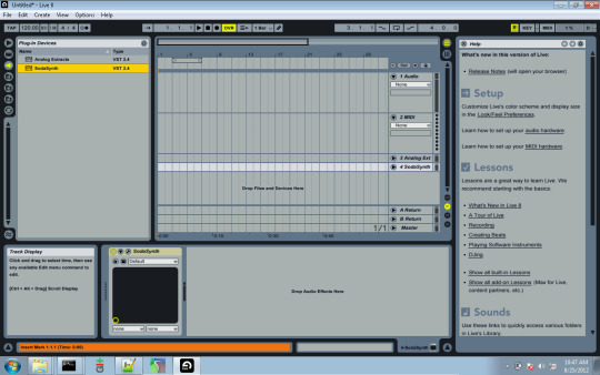
Best Vst For Ableton
Who is online
Ableton Live 10 Vst3
Users browsing this forum: No registered users and 20 guests

0 notes
Text
pretty stitches
its ON.
so i ordered the Lots of Looks frankie off of Amazon, because I’m not that hopeful about seeing it in stores. She was 18. bucks with shipping, which is really good considering i’m pretty sure she retails for 20. I think shes 19 now so grab her if you want.
Boring stuff first:
If you feel like trying your luck in stores, here’s the codes and such.
The doll itself id incredibly unremarkable. It’s basically the Emoji Frankie, in that she has no elbows, knees or wrists, and she has the same swayed torso. I’m almost positive thats the same makeup too. Not that it matters, though, because we all know the clothes and accessories are the REAL draw of this doll.
and what WONDERFUL clothes they are! I know a lot of us (myself included) are completely over the minidresses and patterns that dont continue on the back, and I am happy to report that these clothes are wonderfully made, and not a half-pattern article to be seen. These clothes really are reminiscent of say, Picture day or the I Heart Fashion line, in how well they seem to be constructed and just how interesting they are.
My ghouls spirit Frankie gets to be our model.
The blue stitched number that the LofL franikie is packaged in is a really nice piece, with white cap sleeves and a white pointed collar. You cant see it, but theres a stitch along the hem of the sleeves and collar.
The blue plaid bubble skirt is another very nice piece, even though I had to fuss with it personally to get it to look good. Its a simple elastic waist and hem, out of a semi-stiff fabric. so no closures on this one.
The silver belt is a really nice accessory, with a sheet metal bow/nut and some rivets. It has two closures i the back, so it can be worn higher or lower at your discretion.
These blue tights are also very nice, with yellow thread at the hem and an elastic waistband, plus faux pockets. The fabric is very nice too. If I had to compare these to other clothing, these are almost exactly Schools Out Clawdeens tights, in the way they feel.
Everything so far has been out of a very soft, t-shirt like fabric, and these shorts and the bubble skirt above are the only pieces included that are of a heavier weight. Its a nice blue and yellow lightning argyle. They’re a bit too loose for my liking, though they still fit rather well.
The sweater vest is a light grey, with blue and yellow at the collar and a blue and yellow zigzag at the bottom. What I like about this is that it’s not necessarily “Frankies”; this sweatervest would look great on Lagoona etc if styled right. It’s a little loose, but I’m pretty sure thats because it could ve worn over the blue stitch shirt up above.
The only dress, and what a slinky little number it is. This black and white zigzag dress has a yellow elastic bustline, and a yellow stitch at the hem. The red wavy belt is sewn into the side seams.
The pairs of shoes Frankie is packaged with are both new molds. This black pair are some strappy heels with three “zipper” straps, stitches and rivets on the toebox, spikes and rivets on the back, and a screw heel. I unfortunately got two left shoes, but since I ordered this from a third-party seller instead of buying it in a store, I’m not that pressed about it. Theyre still cute anyway.
Quilted sneaker heels are kind of Frankies new thing post-reboot. These are silver sneaker heels, with a stitching detail, and a textured sheet metal platform. I think these have faux socks with ruffles molded into them, but I don’t like thinking of them like that personally LOL
The purse she comes with is very nice too; it’s a silver wristlet purse with a zipper strap, and nut texture and closures.
And now a fashion show! Added a few accessories here and there, and now these three are ready to stun.
Final assessment: If youre lucky enough to get your hands on it, the Lots o Looks Frankie is a great buy. The clothes are well-made and dont suffer at all from the complaints that a lot of the Monster High clothes are getting nowadays. The doll herself is a disappointment, but she really isnt the main draw anyway.
66 notes
·
View notes