#was going to do some typography on these but. i am lazy
Explore tagged Tumblr posts
Photo
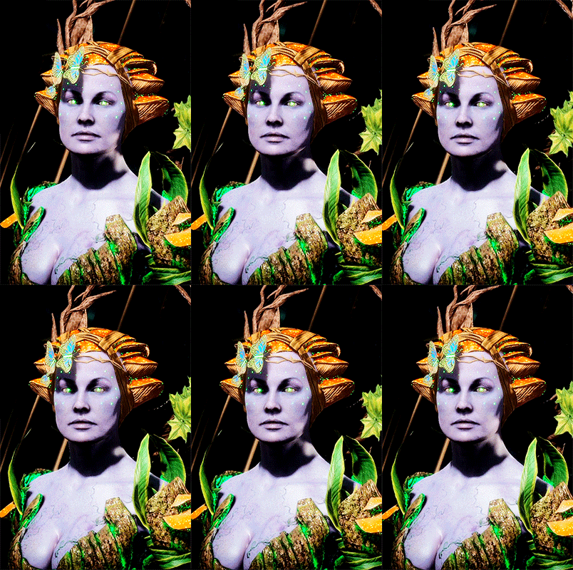
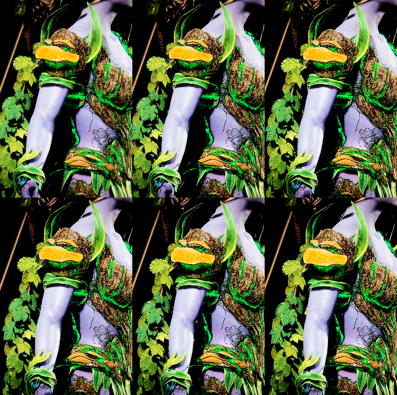
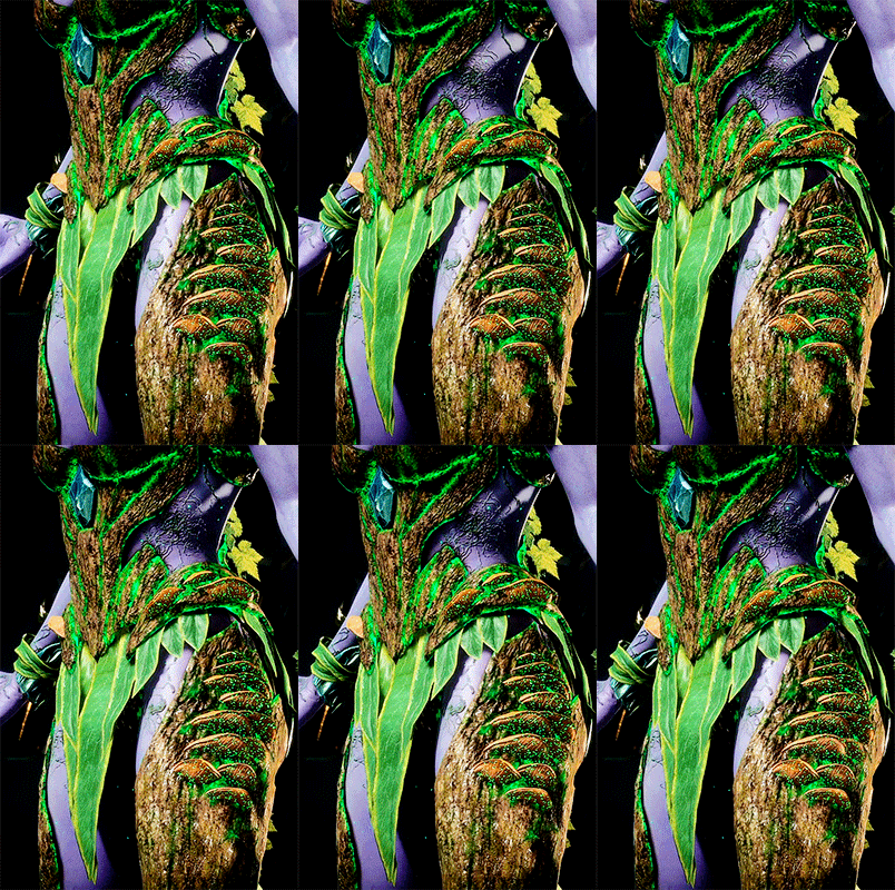
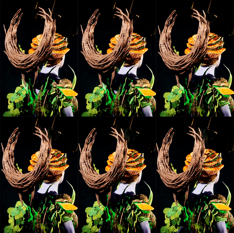
🍃 Cetrion Variation: Dryad ↳ Flutter Gems (Goddess Crown), Wrath Eternal (Eternal Corona), Bountiful Joy (Living Tendrils)
#cetrion#mk11#mortal kombat#mortal kombat 11#mortalkombatedit#gamingedit#olivia.gifs#*mkvariations#userdina#tuserautumn#usertravelllar#userbryn#biafrnc#was going to do some typography on these but. i am lazy
382 notes
·
View notes
Note
Hi!
I was just wondering if you have a tutorial on how you created this effect in your gifset, it's something I'd like to try but have no idea where to start. Your set is so pretty! Any helps appreciated x
https://www.tumblr.com/tawaifeddiediaz/712911415428743168/ill-take-you-with-me-then-well-both-die-you?source=share
Hey Nonnie, thank you! This is super late, but I don't actually have the psd for this set anymore (I delete them as soon as I post them), so we're just gonna wing it with a gif I made the other day. I think this ask is about the text, but if it's anything else, just drop me another line and I'll get to it when I can!
I'm pretty sure I got this tutorial from the wonderful @eddiediaaz but I then turned it into Lazy Girl Hours :)) anywho, here we go!
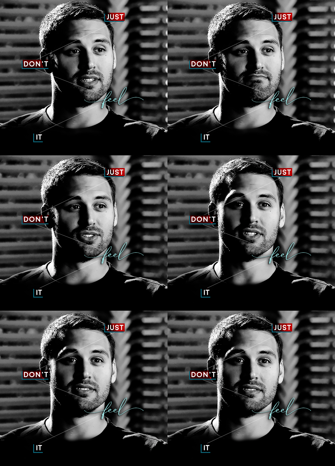
We’ll be making this gif:

This tutorial assumes basic knowledge of gif-making, Photoshop, and coloring. I’ve only described the typography tutorial in this, but you can reach out if you have any questions.
Tutorial under the cut:
Couple things to note beforehand:
There is a lot of trial and error involved when doing any sort of effect, and this is no exception! You might have to play around with the colors and the settings before you find something that looks good and readable and that fits your set!
This text effect works better on big gifs (540px width).
For this, I find that a simple font works better than a fully-cursive one, but play around with what you like. The boxes may need some adjusting if you use a font with too many tall or tail letters (i.e. text where all the letters aren't on one uniform line - that's why capital letters work so well.)
Movement works really well with effects like these, but again, it depends on your gif + readability. If you have a blended gif, it may take a little more trial and error.
I work in frame animation for all my text effects, but this works just as well in timeline as well.
We’re going to start with this gif:
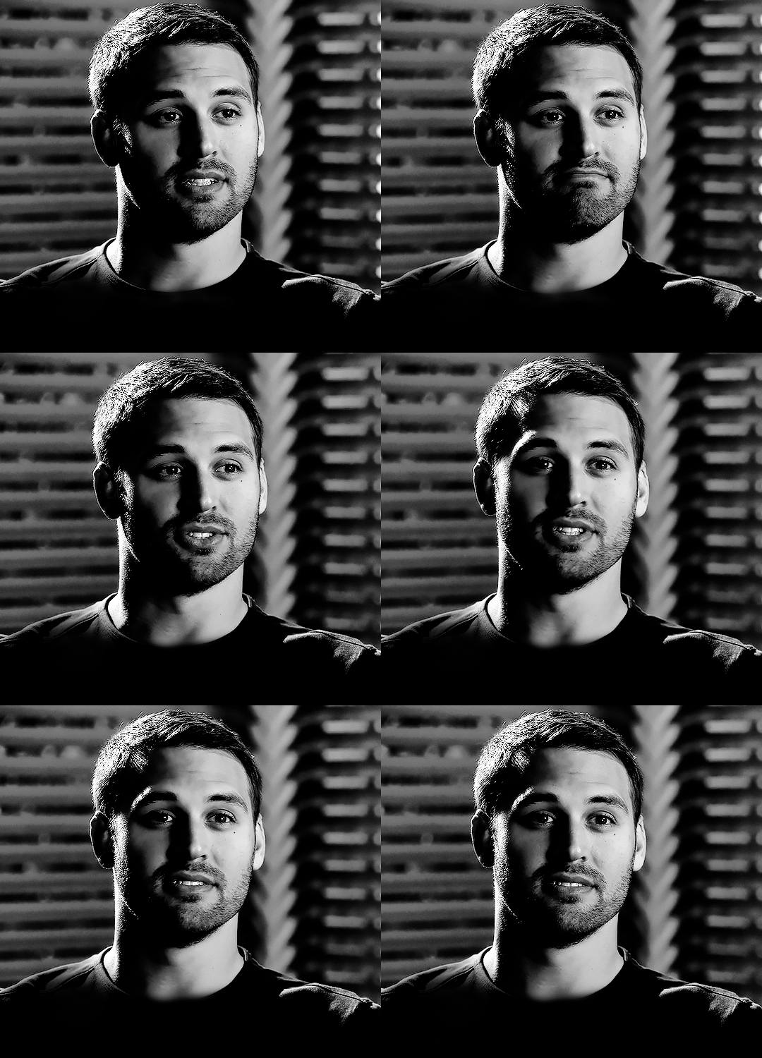
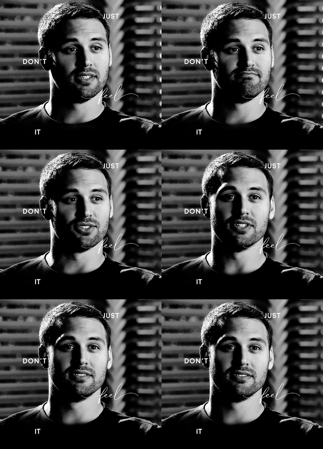
First, I like to put my text on the gif. You can obviously move this around later so don't worry too much about how it looks right now.
The dialogue is "Just don't feel it." "Feel" is one of those Big Words for this quote, so I'm going to emphasize it with cursive text.
I am using Moon for the sans serif text, and Santa Fe Spring for the cursive text. Keep both of these in white for now:
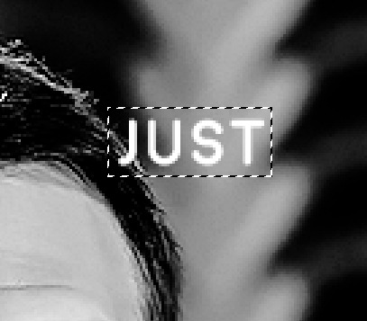
Next, we're going to use the rectangular marquee tool to draw our rectangles around the capital letters (we're not touching the cursive text right now). I just eyeball this, and then try to center it as much as possible.
(The rectangular marquee tool has a keyboard shortcut of M, and it's the second tool in that little toolbar on the left of most people's Photoshop.)
This is what that'll look like:
Next, we're going to go down to the icons at the bottom right of the layers panel and select the half-black half-white circle > Color Fill.... You should get a color dialogue box. Choose your color - I'm using #8d0000. Then, we're going to move that layer below the corresponding text layer, and set its blending mode to Difference. This is what that looks like (click the image for better quality):
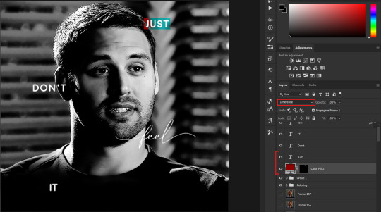
I'm going to repeat that with the other two boxes as well, using the same color. The boxes will look different with the Difference blending mode because of the shadows underneath.
For example, the box with "it" looks like a solid red square because it's against a completely black background, while the other two have some blue shading to them since there are some highlights behind them.
This is what my gif looks like now:
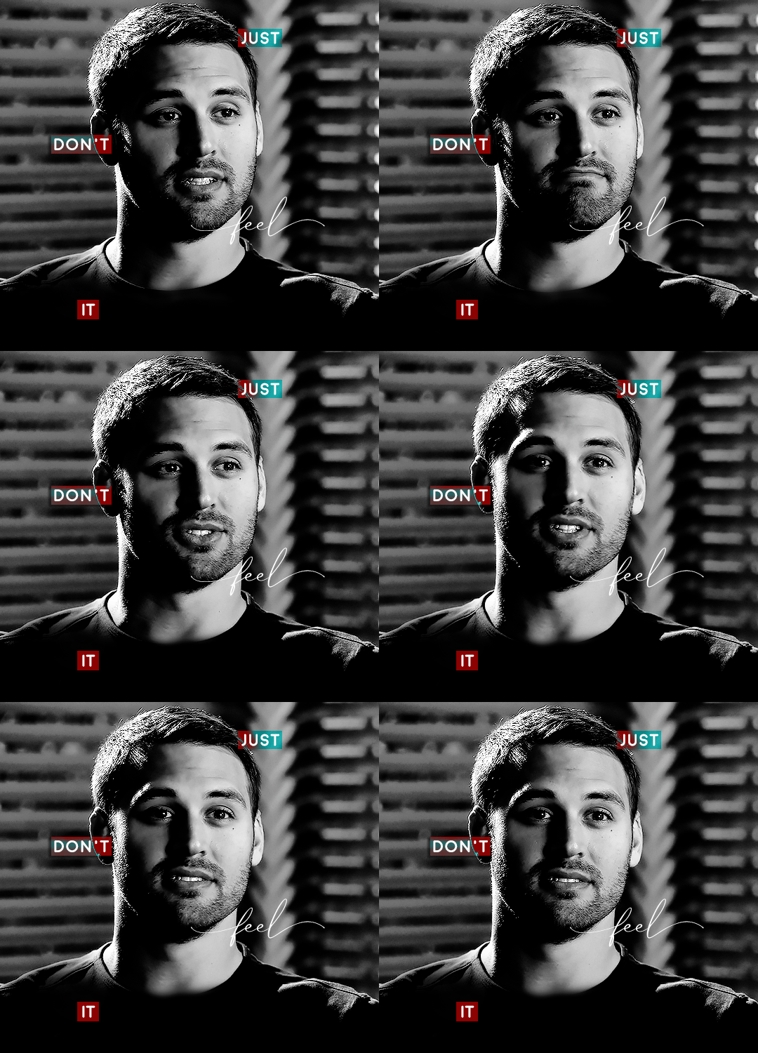
Next, I like to go The Lazy Girl™ route and put all three color-fill layers into one group underneath all the text layers. This just lets me edit the drop shadow of all three of them at the same time.
Right-click the group and open up the Blending Options. In Drop Shadow, these are the settings I'm using. The drop shadow color is #0c6477:
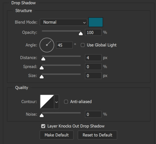
(Note: uncheck "Use Global Light" especially if you're working in frame animation to make sure all the drop shadow has the same angle on all frames.)
This is what my gif looks like now:
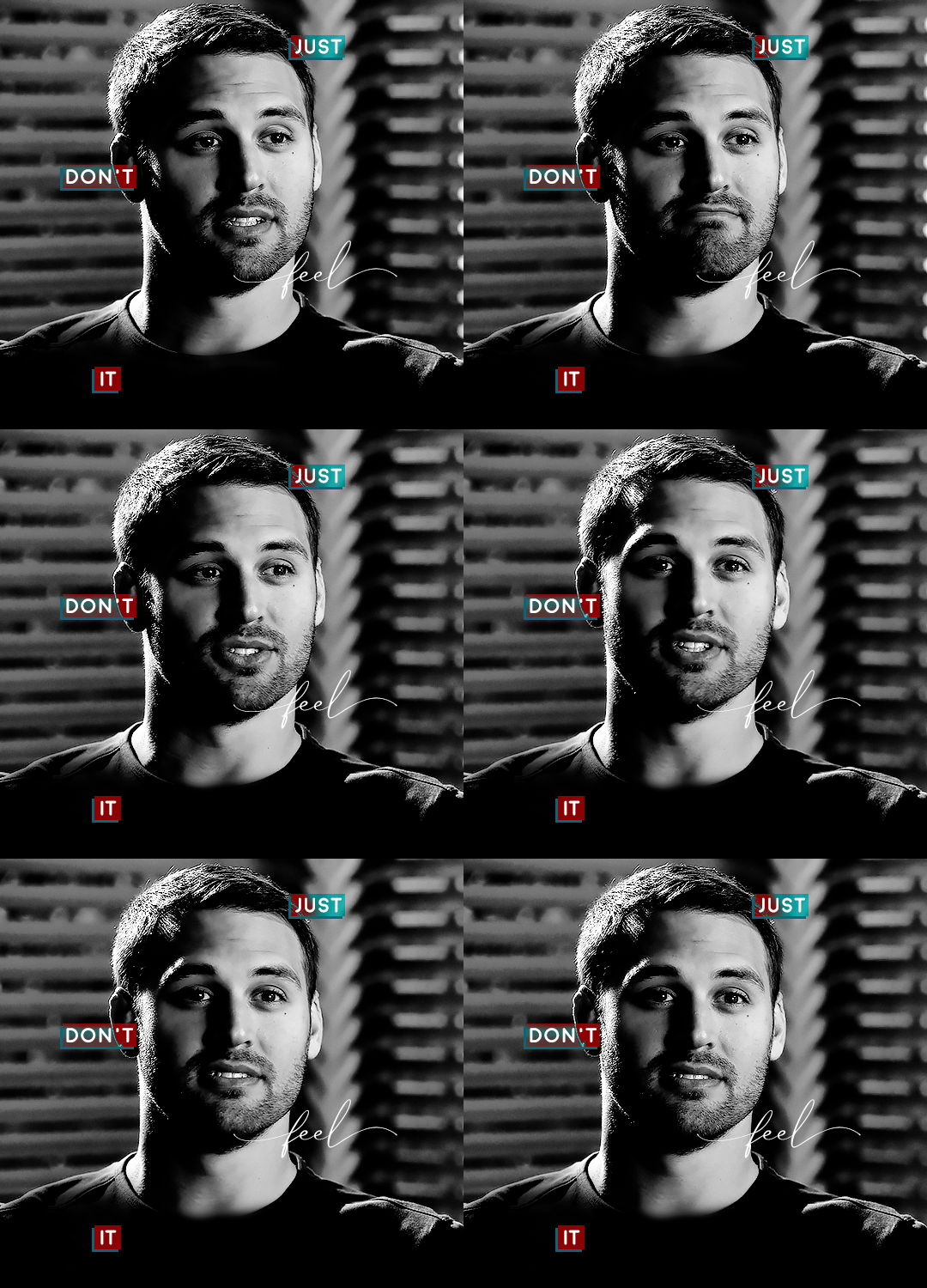
Now that we've finished that, time to move on to the cursive text.
I usually match the cursive text to the palette of the rest of the text, and since the drop shadow is our "accent" color, so to speak, I'm going to use a lighter version of that color. I am also going to add a drop shadow for readability.
The color I used for the text is #acfffe and I actually ended up adding two drop shadows, just because I needed something subtle that doesn't overwhelm the text, especially since it's a delicate font. Here are the settings for both layers:
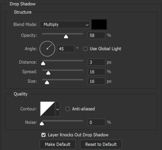
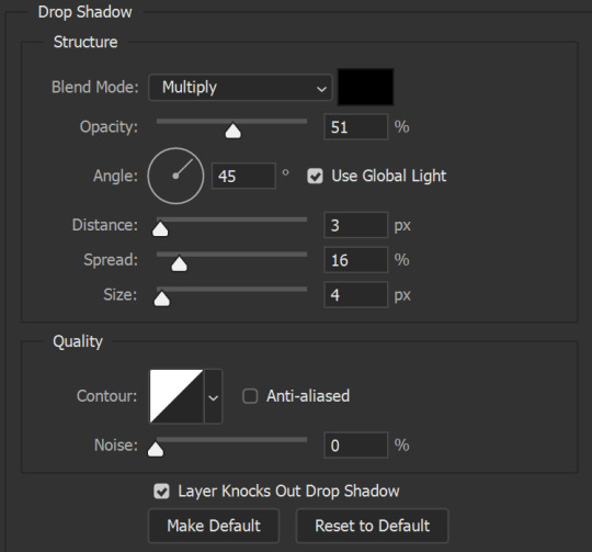
And here's what my gif looks like now:
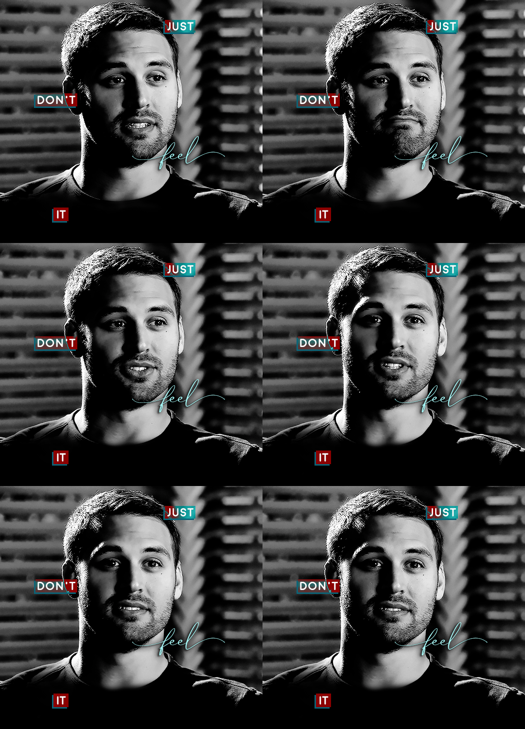
Now, before we move on to the lines, just check the adjustment of all these text layers, see if there's anything you want to change. It's easier to change now than after the lines are added, since you'll most likely have to redraw them if you move the boxes after the fact.
To draw the lines, we're going to use the Line Tool. I just freehand all of this, and I try to go from center to center of the boxes when I can. It all depends on your angles.
My lines are 2px thick, but you can change these depending on your preference. Here's what mine look like right now:

We're going to do the same lazy hack that we did for the color fill, and put all three line layers into a group. Move this group below the text layer and the color fill layers. The reason for this is so that the lines look like they're coming seamlessly from the box, rather than from on top of them or something.
Then, set the group to opacity 50%. I like more subtle, simple looks in my gifs, so I don't like super high opacities.
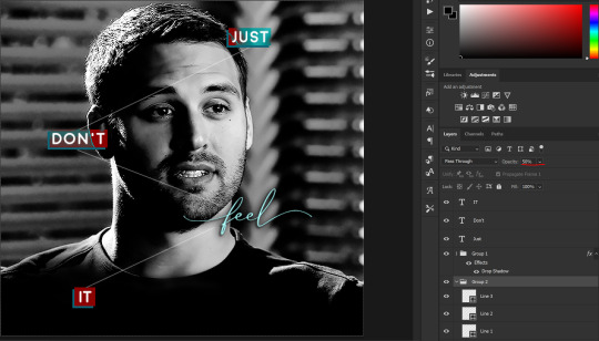
And that's it! This is our final gif:

Some final notes:
Absolutely play around with the blending modes of the color fill layers for this effect. These two gifs are the exact same color we've been using, just two different blending modes. You can see how drastically different they look. The first one is Linear Dodge (Add) and the second one is Vivid Light:
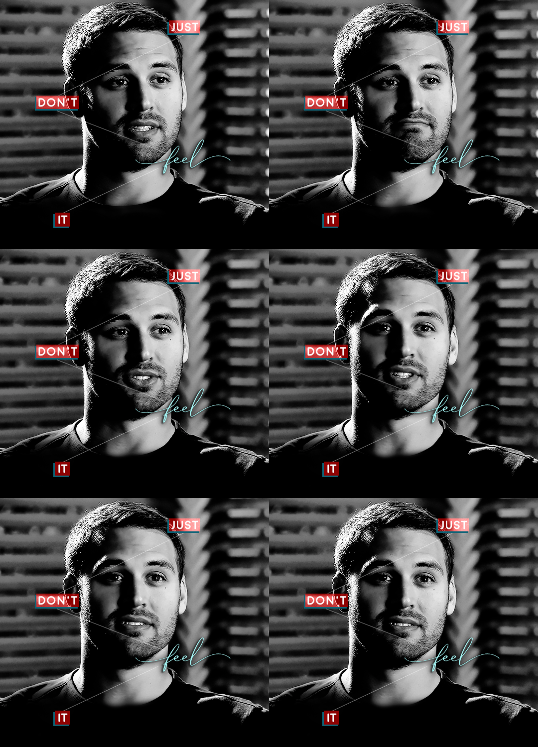
It can change how your gif looks in a BIG way, so play around with it, see what you like, especially if you don't really like the "two toned" thing going on.
Sometimes, I also like playing with the width and height of the text in the font settings, making it shorter and wider, or making it taller and more compact. You can play with the letter spacing as well. The world is your oyster, etc etc.
One other thing I've started doing is erasing the lines with a big brush, just to fade them from his face a little, like this:

To do that, use a layer mask on the line layer folder, and a brush that's 0% hardness, and at least 200px big. For this gif, I also changed the opacity of the lines back to 100% so the fading effect is a little more pronounced:
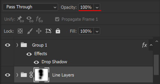
(this gif isn't the best example for this, but oh well. Anywho, hope this helps, Nonnie! Let me know if you have any questions.
Enjoy!
#zee's tutorials#tutorials#gif tutorial#photoshop tutorial#resources#dailyresources#completeresources#itsphotoshop#allresources#dailypsd#userisha#userdahlias#alielook#userabs#tuserheidi#userelio#userjaelyn#userisaiah#usermorgan#usergert#zee answers#im so pissed at myself for losing the tutorial the first time like you do not know how mad i am right now#i didn't even do anything tumblr just hates us all
206 notes
·
View notes
Text
Yeah so university isn't becoming any better, in fact, every day makes me hate it more.
Now picture analysis is different because for some reason they want names only to be named in the second part like wtf, if I recognise the person then I fucking recognise them and I put them in the first part that literally is "what do you see", yes im gonna change it maybe maybe not definitely not im pissed and livid
No I still don't think glorifying fascists and therealike in an ironic way is funny, fuck you professor who thinks it is, you straight white piece of bread.
Fuck that professor too who is too lazy to click on audio play on Google slides because "its not there" ots on fucking google you click play its there, it can't be not there because it was there for someone else too just because you're too comfortable to use google slides and had me and my partner redo the presentation, eat a goddamn brick and choke on it
To the other professor the same who thinks we all don't need guidelines but are supposed to do a presenting about our ideas and progress stage tomorrow like wtf we had our first consultation on Friday where some of us got literally torn a new one for daring to have made visuals of the ideas we had, and for having concrete ideas and not ideas that need eight bored geniuses to figure out.
That being said no im not going to change my whole dissertation again because someone said its not the structure of what a different professor said its ought to be, I got an okay on my structure, eat a brick as well, I wasted two entire days on that and im literally just boiling because guess what
I just stood outside and put something on fire as part of the project and its lame af but I don't care, I can't do anything great within 3 hours and limited resources and tools which the professor always keep forgetting nvm that were all in lockdown and nobody has access to the good stuff because we literally don't know what we even have, and oh yes, we still get graded on it after the criteria as if we had normal access to everything
I am livid, okay. And tomorrow I can sit there and argue with them all again and get told again that my idea is shit while I try to stay polite even though they don't reciprocate that favour and on Wednesday i have the lazy professor about the first presentation and on Thursday the one for the textual dissertation and somehow in between im supposed to get my main project done up to 50%, wrap up on a course because a new one starts,
Make a photo album for a different course and make an entire fucking alphabet for typography and design a poster but nobody knows what we should put on there and the teacher said whatever we want as long as its got to do with typography??? And then make that into a booklet, smh don't go insane, and have a review on Saturday on that already while also sitting in class again until 5pm and
I hate this. This fucking thing is making me want to throw everything against a wall.
Vent over.
#void#random#long text#sorry just yelling into the void becaude god i need ti make some air#i cant express how much i dislike all of this
21 notes
·
View notes
Note
Because i miss your design themed rants (it is good word here) i would like you to rank Rammstein album covers from designers point of view.
Ah, I love you. This got VERY ranty.
This is kinda hard because I tend to judge the entire packagaing/notes, and when I count that into it the ranking would be ever so slightly different. I’ll mention it for each I have Opinions (TM) on, but yeah, this is solely going on cover. I’ll only do the studio albums, not made in germany or the DVDs, or this will get too big.
7th: Rosenrot.
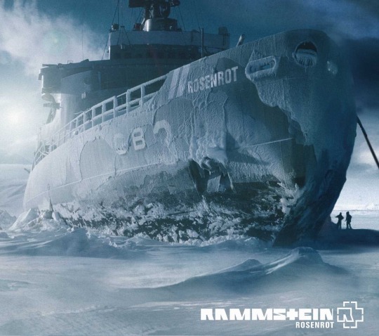
I know lots of you are gonna hate me for this. It’s not that I don’t like it, I do, it’s beautiful. Unfortunately it’s ... slightly lazy. It’s I think their most obvious cover and obvious feels like it’s good design but never truly is. It’s got that first idea feel, if that makes any sense. There is always that project where you go “uh can’t think of anything, but this works.” It’s not a bad thing, they clearly still knew what they were doing. It’s just ... that typical photoshop post apocalyptic composit that lost of metal/alternative bands did at some point. They all did it because it’s cool. No argument there. It’s just that I expect a bit ... more.
6th: Herzeleid
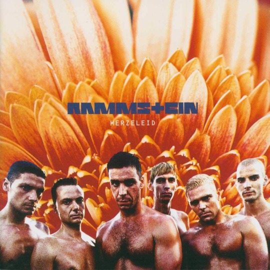
I know it’s iconic, but. The execution?! Terrible. The colours of their skin and that flower?! Too different to feel monochromatic, to same same to contrast nicely. Too much texture. What is that?! The positive bit is the placement of the typography because, neat! Most people fail at that. I like the blue-grey there aswell, how about you’d added that to their skin a little? No? Ok.
Also, this (Richard speaking):
“The bloody sleeve! What a crazy situation that was. We approved the photos in a car park without thinking what we were letting ourselves in for. When we saw what the designer had done, we freaked! We looked so… gay! All of us stripped to the waist. It was like an ad for a gay porno film. So we had to say, sort it out. Make us look straight again. Change the sleeve.”
Who in the fuck works like this?! Nevermind, I know it was a considerably younger Dirk Rudolph, but fucking hell, have some self respect, all of you. I know they didn’t know what they were doing, they probably had the management/record company comission it, and that was still the time graphic designers were seen as just pixel pushers from that time it took 3 days to layout a poster. Still. What was that brief?! Could you have sat down for 20 minutes and talk, perhaps?! Also, I hope this is how Richie learned to be the nightmare client I know he is. Don’t approve layouts in a car park, what the fuck is wrong with you.
It’s a pity because the concept? Nice. Sculpted men infront of flowers, what else do you want from life. Why crysanthemes, tho? Too textured in that macro shot. What is that photo angle?! Might try and redo that if I ever feel like it.
5th: Reise, Reise
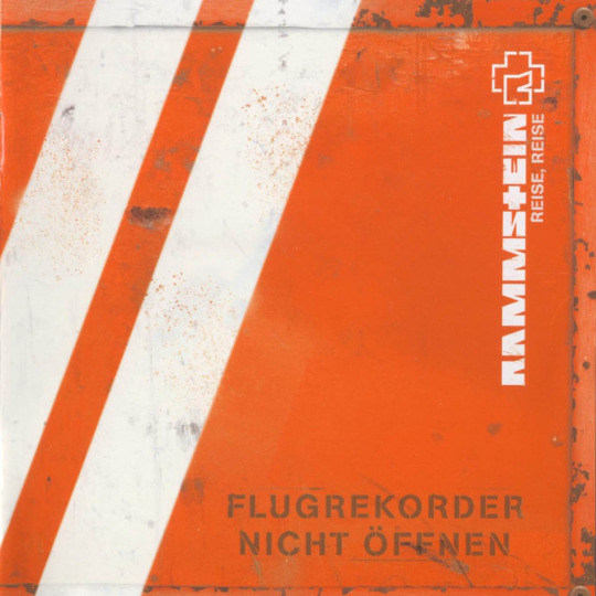
This breaks my heart a little, because it’s my lonely island album. And it isn’t bad by any stretch. Actually, their album cover game is ridiculous, can I have that established as a general benchmark? It would make for a lot less mental break downs. The thing is ... I like the idea. Make it look like the black box, cool. The problem is the type. It makes it look like “Flugrekorder Nicht Öffnen” is the album title. To be fair, Typesetting is my main thing, and album artists get it wrong (imo) 99 out of 100 times. I wish they would have comitted more and just left the titel off and solved it with a slide in, or a sticker or something like that. It’s just a bit ... weird. What works brilliantly is that it’s very memorable, stands out on the shelf, is unusual, all of that. It’s iconic. I do like it very much but I had to place something here.
4th: Liebe ist für alle da
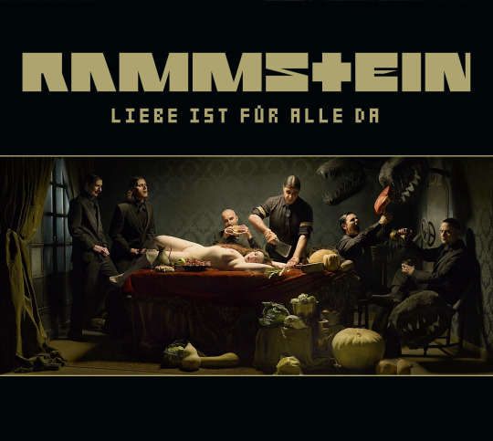
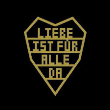
Now the thing with that album is that it has two covers. If I’d gone by the original one, I’d have to place it behind Reise, Reise. Everything RR has in impact, this is missing. It’s too dark, has too many pieces, it won’t stand out on a shelf. Especially not in the CD age when it was on 12x12 cm. Even on a Vinyl, it’s ... just not that impactful. Sure, the photograph is beautiful but meh. Luckily there is a second option. And that - is almost like a logo. It works as a symbol, and that makes it so strong. Less is more. Brilliant. You can draw it from memory. It’s so iconic, the kind of stuff that starts showing up in subways, drawn on the back of a seat and sprayed on walls. Tell me you never wanted to paint that on a flag and take it to a pride parade. I am sure some of us have.
I do want to mention the booklet in this, because it does bump it up a little too, because where the panorama image fails as a cover, the inside is done so beautifully with the fold out, the type setting, everything. It’s special, and done with love and it shows.
3rd: Mutter
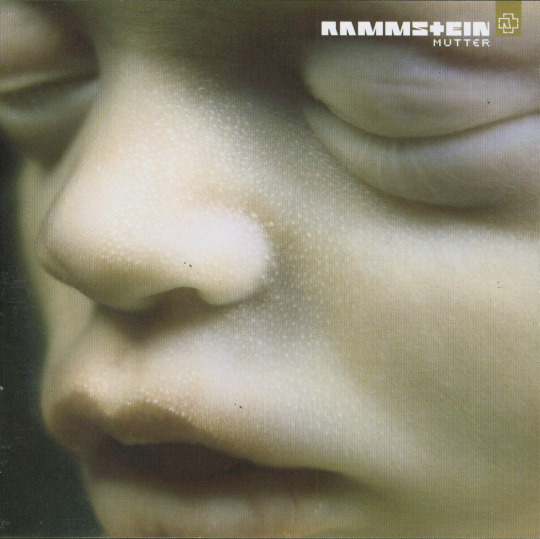
There is just something about this that is so, so, so memorable. Everyone recognises this. If you ask anyone over the age of 20 to describe Rammstein with an album cover only to someone less familiar, is anyone gonna say anything but “they’re the band with the embryo in close up”?! Maybe this is subjective because that’s how I first got exposed to them, but I don’t think so. It’s such a powerful image. It’s both beautiful and uncomfortable, the way Rammstein as a whole and that album in particular is beautiful and uncomfortable. It’s stunning. That’s it. Unfortunately, this one falls apart inside. The went too far with the whole Matrix inspired cyber elements. It’s trendy and trendy never stands the test of time, in that it has the same problem Rosenrot has, but much worse because it’s not even done that well. They could have just used the photos and kept it raw. The type setting on the cover is as good as it gets with albums tho, so I am happy.
2nd: Sehnsucht
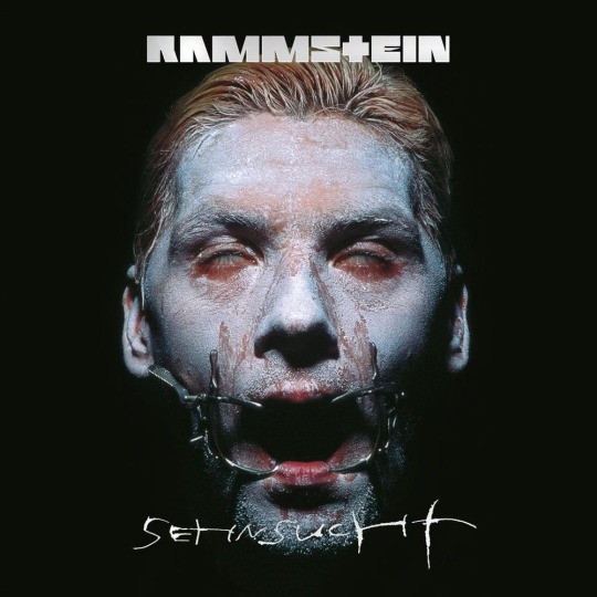
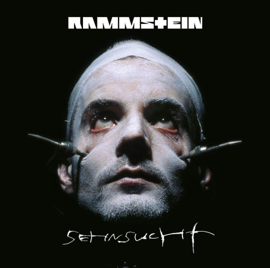
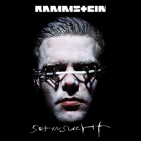
Ah, Sehnsucht. The most perfect band shoot they ever had. Helnwein just ... did it. I don’t know, it both defined and summed up who they are aesthetically for the longest time. It’s the visual statement that says “this is Rammstein”. It ... just looks like a band that sings about heartbreak and necrophilia is supposed to look like. Don’t you agree? How else would it look like? Even that omniously coloured beach. It’s as if the predicted the mood of True Detective, only less Hollywood. That darkness we don’t want to see, that can happen anywhere. And where they fell short with Mutter, where they added too much on to these powerful images, they just added the type. Granted, it was the 90s so it’s slightly experimental type. But unlike most type in the 90s it stood the test of time. Add the whole variable cover versions and chefs kiss! Beautiful work. Makes me happy and emotional and ugh.
1st: The White Album
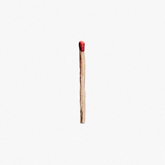
I’m just calling it that now. The Matchstick. You know, good design is made up from three components only: Concept. Commitment. Execution. The concept of this is so streamlined and clean. It’s the entire Rammstein story narrowed down to a single little thing. It’s small and ordinary looking but it can become dangerous and big. It’s underestimated. A little piece of wood with a head of phosphor and calium chlorit and yet you can commit the most legendary arson. It’s the personification of the thing that has become synonymous with them: Fire. It says so much with so little. And then they comitted to that. No useless typography, a simple but oh so well done photoshoot, the simple text on white. They didn’t ad too much additional ideas on to it, they trusted that one to carry and it does. They could have done without the black and white match stick arrangements inside, although I’m not even sure if that’s not just a limited edition thing, it’s a bit too much almost. They got scared a little there. The execution is also well done, I have very little to critique, only that I feel it lacks a tiny bit of love. The thing is, the more minimalist you go, the more love you have to put into each element. I feel like the spacing of the type should have been fixed in a few places but honestly that is being very very picky. Or not. Because if it wasn’t for that, and the teeeeny tiny commitment issue, this should have been a candidate for the packaging grammy. I mean it should be even the way it is, but we all know how those fuckers ignore our boys.
I’m done. Can I use this as application? Do you think if I send them a run down of basically tearing them apart they will hire me?
#my version of i will be a rockstar is i will win the packaging grammy#just you watch me#it’s roughly 35 years until the end if my career and just you watch me#rammstein#album cover#graphic design#i need a ramble tag#rammstein asks
61 notes
·
View notes
Note
hello, i hope you're having a good day!! i was wondering, do you have any tips for making amvs? like, what programmes you use, how you handle the timing, etc. thank you for all the fun edits you make!!
hi!! sorry for the delay in answering this, i just wanted to take the time to answer it thoroughly and i kept forgetting lol & thank you! i already typed this once and tumblr made it disappear so i apologize if anything i say comes out short ‘cause i’m just trying to remember all that i typed before lol
ok so ill just go through my general editing process in Vegas, i dont know any other program well enough to talk about it at length:
(disclaimer: this is just how i do it, i dont watch tutorials and my editing friends and i don’t watch each other edit often so i would assume that my way is very different from other ways you’ve probably seen! i might even do something in a very stupidly hard way, please feel free to tell me if theres an easier way to do anything lol)
1. Song: So skipping past the “choosing song and ship/character/show” theme, I’ll dive straight into CUTTING THE SONG! I’m not about that Editing The Entire Song life, and neither is most of the editing community anymore, so I cut it up into a shorter thing that I’m better equipped to edit to. I’m just using a random example but here I’ve taken this long ass song and turned it into this:

(the next step just kind of depends on my mood, or ill do both, doesnt matter)
2-A. Subclips: if im making a shorter video or a video where i’m not 100% super familiar with the footage, i will immediately start making subclips using the episodes ive already pulled into the project. if it’s a ship/character that i’ve edited before, i’ll just go to Import->Media from Project and import the subclips i made previously. either way, subclips are there!
2-B. Sheets: for ships that i know very well/have a lot of footage/im concerned about potentially repeating something, i will go to Google Sheets/Excel and take the lyrics im editing to and put them in column A, separating by pauses in the singing. then i put corresponding footage i think will go well in column B! im often not super specific because i know the beats are gonna be different than i remember, so i usually stick to referencing whole scenes instead of specifics moments. here’s an example:
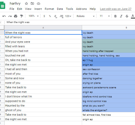
3. Clip placement: Then I start placing clips down! Below is how I organize my timeline tho I know a lot of editors who put the music on top, this is just how I like it. I also keep a single muted audio layer in between for the video footage’s audio and then I’ll delete that layer when I’m done (or sometimes I don’t, it doesn’t really matter)
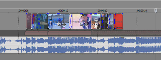
I think it’s good to hit the beats as much as possible, it makes for a more dynamic audio-visual experience! In general I try to make my videos so that, if I didn’t add any zooms or typography or coloring, it would still be a good amv. And don’t limit yourself to just one layer, you can have as many layers as you’d like and put clips on top of each other (cookie cutter/changing the layer to dodge or add or screen or whatever) is a good way to mix things up
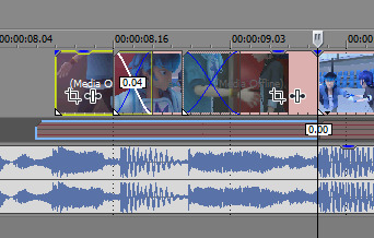
when I zoom in you can see I’ve got some variety already in my transitions, I know I use that motion-blur-zoom a lot these days but I still try to mix it up and keep my brain invested
4. Typography: After all the clips have been placed (or most of the clips, ofc sometimes I’ll want to add more later) I move on to typography! I’m lazy so the first thing I’ll do it just put down unedited text where I think I’ll want it to go. It just helps me organize myself. Then I’ll pretty up the text afterwards.
Typography isn’t necessary for a good AMV, but really nice typography can really spruce things up. I’ve only very recently gotten confident in my text editing skills, and I just kept watching typography done by editors I really like until I figured out what they were doing. My recommendation is to just KEEP ADDING EFFECTS! Convolution kernel, gaussian blur, mask the text so it appears from angles that the transitions wouldn’t be able to do - of course there’s gotta be a limit for taste, but just add stuff until you like how it looks. Also changing the blending style of the text layer is good, dodge and difference are my go-tos for typography layers.
5. Transitions: I don’t go crazy with transitions, but it’s fun to mess around with them. You don’t want too many crazy/different transitions, you want them to match the mood of the song and the type of beat you’re hitting. I usually ensure that all similar beats in the song have the same transition type on them, bbbbbbut that’s cuz I’m overly obsessed with parallel structure. There’s plenty of fantastic AMVs where they just go ham and do whatever types of transitions they want to in each part of the song and they make it work just fine
(next step, once again, kind of depends on my mood lol)
6-A. Zooms: Time for zooms! I usually just use the pan/crop for zooming, but often I’ll incorporate Sapphire FX BlurMoCurves or NewBlue AutoPan, especially if I’m trying to zoom typography with the footage at the same rate. I try to keep my zooms short and slower, I mean obv it just depends on the song but yeah. There’s a lot of different ways to do zooms so I recommend experimenting and just playing around with different effects
6-B. Zooms...but different: Another way that I’ll do zooms which is definitely pretty different (but this is what I do for crossovers like 95% of the time because I am laaaaaaaaaaazy) is I’ll drag the project into a new project timeline and start editing it there. It’s similar to how After Effects works and it makes it easier to put effects overtop of multiple layers without having to pre-render anything.
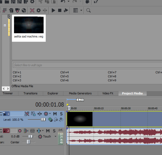
So you can see I’ve just pulled in the .VEG file and popped it in the timeline! So this way I can add zooms and transitions without worrying about layers. And if I see a mistake I need to fix, I can just go back into the original .VEG file and edit it, and it’ll be edited when I come back here. So it’s much easier than pre-rendering or trying to do zooms on a lot of layers. To be clear tho, this doesn’t work well if you have a lot of fade transitions, it’s best for sharp transitions and it’s great when you’re using Sapphire FX BlurMoCurves a lot.
7. Overlays: After that I’ll add more typography (or if you didn’t add any earlier, you can add some here overtop of the new project file) that kind of goes on top of everything. And then I’ll add any overlays or objects or whatever else I wanna add! I’m not someone who uses a lot of backgrounds cuz I don’t have a background-creative-brain so I stick to simple overlays at the most.
8. Coloring!!! This is very sad but I only JUST learned a few weeks ago that you can add coloring/effects to your entire video with this button here, so in case anyone else hates watching tutorials as much as I do here’s where I’m talking about:
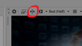
This shit would’ve made my life so much easier throughout the years lol But alas. Anyway so for coloring there are some effects that are popular for any colorings you’ll find on YT (but you can certainly just download some, Riverdale editors in particular share a lot of really great colorings but you’ll find them anywhere in the live action editing community):
Channel Blend, Color Curves, Color Blend, Color Balance, Convolution Kernel (best for live action footage or footage that isnt very crisp), Color Corrector Secondary
These are all just fun to mess with. Channel Blend in particular is something of a mystery for me, I haven’t studied it fully to understand what I’m doing so I mostly just mess with it randomly until I like what I see lol
9. Render time! First render, anyway. Usually there’ll be some random problem in the footage or something and I’ll have to either go back into the project and fix it OR if I’m feeling particularly sour (or maybe if I’ve rendered like 3-4 times already) I will just take the finished render and manually remove any errors, stretching out the good footage to cover my tracks. You’d be surprised how often I end up doing that lol
And then it’s good to post! I primarily render as .WMV but I also go for .MP4s every once in a while. If I want to upload it to Twitter I’ll do an .MP4 but it’s a new thing for me so I’m still stuck on .WMV mostly.
Anyway I hope this answered your question at least a little bit, I can go into more detail about certain parts of this if you’d like!
8 notes
·
View notes
Text
Janishacolors’ Art Goals
Happy MONDAY! I hope everyone’s doing alright! I will say last week was very productive but when the weekend hit I got super LAZY! I grilled some things for my family (I don’t comfort bake I comfort grill XDDD)My brother gifted my Desktop with Phantasy Star online 2 and it was first time in a while relaxed and played a game ;;;;w;;; It was honestly much needed because I tend to get wrapped up in my work but also feel that I’m not doing enough ^^;


(Baby’s first bullet journallll XDD wish I would have done this sooner LOL)
This week I’m going to do a little accountability check on my goals for this year and beyond. If you’re just tuning in definitely check out last weeks art blog about Managing Big Goals so you know what’s going on in this blog!
OKAY! Let me start by highlighting my BIG Goals in my Art journey
1. Complete My Graphic Design Major
2. Work on my Original Webcomic Series
3. Work for the Game Freak Company as a Graphic Designer
4. Social Media Shenanigans!
So right now these are my Major goals for the next few years in my art career. And looking at these as they are they look so crazy. But these goals have be chopped up into so many mini goals that there’s so much to keep me motivated and passionate about this journey! So here’s a general rundown!
1: Complete My Graphic Design Major
So aside from just graduating in this major I really want to take advantage of everything that we learned in this major at my university especially when it comes to web design and user interface so interestingly enough all my Pokémon related projects fall under this big goal.
- [ ] Study UI/UX (user interface/ user experience)
- [ ] Web design
- [ ] Continue search for Ux/Ui internships
- [ ] Improve on Simplified logo work
- [ ] PKMN Logo project (Eve’s Story)
- [x] Finalize Eve’s design
- [ ] Draft at least 10 PKMN logo designs from the sinnoh region
- [ ] Create at least 3-5 side characters and create character sheets ()
- [ ] Fall semester 2020(please stay remote lol)
- [ ] Typography,
- [ ] Pre Press Production,
- [ ] Illustration
- [ ] Spring 2021 classes (n/a)
- [ ] Make Senior Project my original webcomic series
2: Work on my Original Webcomic Series
So this has been a story in my head for 10 years now. it’s change so much but now I think I’m ready to finally share it! I’m sure most of you guys of seen my OC Astrid floating around X3 the story revolves around her and many others like her and their beautiful multiverse and the many theories about the cosmos that I have studied. Some things from this story will be featured in my future portfolio for the Game Freak Company.
- [ ] Original Story Stuff(Untitled Infinity)1st chapter
- [ ] Pick a name for Original Story (I’ve changed it so many time It doesn’t have a name anymore.)
- [ ] Create at least 10 different environment designs
- [ ] Create 20 creature designs
- [ ] Complete 5 unique Character Designs (sketches completed now to render them)
- [ ] Find more space related podcasts
- [ ] Watch animal documentaries (sea life specifically)
- [ ] Opening chapter pages for Original Story in July (final sketch work in progress)
- [ ] Webtoon setup
- [ ] Launch Webcomic pt1 July 25th
- [ ] Pinterest adssss
3: Work for the Game Freak Company as a UI/UX Graphic Designer
After doing some super homework on the requirements that the Game Freak company, I’ve learned What they’re not looking for is a portfolio full of art that is Pokémon XD they’re looking for all kinds of unique designs to see how creative and original you can get. Game Freak just finished up doing interviews at the end of June for new graphic designers and it seems like they do this every 2-3 years so I’ll be working my ass off during that time frame.
- [ ] Study/ brush back up on additional languages
- [ ] Japanese
- [ ] ASL
- [ ] Portuguese/spanish
- [ ] Portfolio Set Up
- [ ] character/Creature Design (in progress)
- [ ] Illustration (needs updating)
- [ ] Ux/Ui
- [ ] Written Works (TBA)
4: Social Media Shenanigans!
I’m trying to rebuild my social media and it’s been a fun learning experience. My main plan right now is to diversify my social media so you don’t get the exact same thing between all of them. May seem crazy to some but it keeps me very motivated to post! Feedback on how I’m doing on any of my social media is always appreciated. I’m just a shy kid trying to do my best LOL
- [ ] Diversify Social Media’s
- [ ] Facebook
- [ ] Character/Creature Design/Environment Design >w<
- [ ] Twitter
- [ ] Talk/share about fanart and original projects owo
- [ ] Instagram
- [ ] Focus on the day to day struggles of an artist XD
- [ ] Tumblr
- [ ] Artistic thoughts, process, and Art advice :D
- [ ] Pinterest
- [ ] Advertisement for Webcomic x3
I know it’s laundry list of goals but when I am hell-bent/determined to do something I will pursue it to the bitter end! It’s a gift and a curse LOL! But I can’t thank you guys enough for joining in on this journey with me!If you’d like to share your goals or need help with you art goals feel free to reach out or jump in on the colorful circle forum!
Since I am trying to meet a deadline for my webcomic I will not be updating my Weekly art blog for the next few weeks so definitely visit the forum I’ll be at least posting some motivational stuff while I finish up the first couple of pages
Till then stay tuned!
#artist#art thoughts#art goals#digitalart#art advice#artist advice#shenanigans#big goals#bullet journal
6 notes
·
View notes
Text
Editing tips, I guess?
Hey uhhhhh, so I've gotten lots of new followers over the past few weeks and wanted to do some kind of thank you?? Also, I have seen a fair share of "omg HOW" in the tags on my edits (which??? always make my day?? my week??? my life????)
Anyway, I thought I'd share some of my ~techniques with y'all? So here goes:
(lmao this got really fuckin long so cuuuuuut)
1. Make EVERYTHING a Smart Object
Okay, maybe not EVERYTHING, but seriously. Do it. It will save ur editing life. You ever shrink something down and then an hour later change your mind and decide you want it bigger? If you're not using a smart object, it’ll get blurry when you scale it back up and you’ll be fuCKED!
To make a layer/group a smart object, just right click on it in the layers panel and select "convert to smart object". This makes Photoshop store the layer's original data in a separate space for safe keeping (an embedded .psb file, to be exact) -- so you can shrink it and enlarge it as many times as you want without any lossiness.
As soon as I paste/place a screencap, texture, or whatever into my document, the first thing I always, ALWAYS do is convert it to a smart object!!
Why, you might ask?? Continue to item No.2 :)))
2. Harness the POWER of Smart Objects!!
The reason I am obsessed with Smart Objects is because I am obsessed with making any edits as non-destructive as possible. If you use “Image > Adjustments > Levels/Selective Color/etc” on a regular layer, that’s a destructive edit. Same goes for any Filters (such as blur/sharpen) and transforms (Warp, distort, perspective). You lose the original data that was there and the only way it can be undone is with ctrl+z. Might not seem like a huge deal at first, but if you keep chugging along for an hour and decide, “hmm, maybe i went too hard on that levels adjustment after all...” your only options are deleting the layer and starting over, or uh... hoping it’s still in your history panel.
However, it's really easy to avoid destructive edits when you use smart objects!! Because all those adjustments, filters, and transforms become “Smart Filters”. Smart Filters have all the non-destructive advantages of performing these adjustments via adjustment layers, but have the added bonus of ONLY effecting the layer they’ve been applied to, instead of cascading down and effecting all the layers beneath. (Which can be a good thing sometimes, but that’s a whole other topic)
Smart filters are attached to their ‘parent layers’, and can be hidden, deleted, or modified (by double-clicking their names) at any time:

Can I hear a wahoo???
Other cool things about Smart Objects:
You can copy a Smart Filter with all its settings to another layer by alt+click+dragging it over
You can change the order in which Smart Filters are applied by clicking and dragging them around
You can edit a smart object independently/in a sort of 'isolated' mode by double-clicking on its thumbnail!! I like to use this for edits that are specific to a given screencap-- like cutting out the background and any initial adjustments, like levels and selective coloring. Once you’re done editing the contents of the smart object, hit ctrl+s and it will automatically update in the main document!
But really, the biggest thing for me here is psychological. I know I’m much more willing to try things and experiment when I know that I can easily go back and tweaks things at any time. Otherwise, I’d stick with adjustments I don’t really like all that much simply because it would take too much time/effort to redo them.
3. Don't even THINK ABOUT using the eraser tool or I will STOMP YOU to death with my hooves!!
Use a layer mask instead. Please I am begging you. It all comes back to making your edits as non-destructive as possible. If you erase something, it's gone forever. When you mask something, you can make changes to which parts are visible/not visible as often as you want.
For the newbies or the otherwise unacquainted, a mask is a greyscale ‘map’ attached to a layer (or layer group) that controls its opacity. Black areas give the layer 0% opacity, white areas will give it 100% opacity, and you can use shades of grey to achieve partial transparency. You ‘draw’ on these layers with the your trusty brush and paint bucket tools.
You can create a mask by selecting a layer and then clicking the little mask icon at the bottom of the layers panel (it’s the one with the little circle inside the box). Draw black on the parts you want to hide, and if you erase too much on accident? Just paint back over it with white!
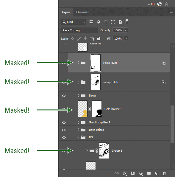
I love masks, and sometimes i will throw an already masked layer inside a layer group and apply a second mask to said group. This way I have two masks that can be edited independently from each other. Like layer mask-ception.
So anyway, yes. Eraser tool? Don’t know her.
4. Try using channels to create masks!
This is a technique that works REALLY well for cutting out complex shapes, such as wispy hair (or feathers!) -- provided there's strong contrast between the subject and the background, and the background isn't too busy.
This is also a fantastic method for capturing alpha transparency. For example: If you have a neato paint stroke/splatter/watercolor texture you want to use as a mask, but has a solid background that’s getting in the way of things. This method will capture all the semi-opaque areas flawlessly!!
While editing your image (which you had better have made into a Smart Object!!!) do the following:
Switch from the "layers" panel to the "Channels" panel.
Toggle through the R, G, and B channels, and decide which one has the most contrast for the areas you are trying to mask.
Ctrl+Click that channel's thumbnail. This will create a selection marquee.
Switch back to the layers panel
Click on the target layer/group (the one you are trying to mask)
Click the mask icon at the bottom of the panel (the one with the circle inside a box)
Release the selection and invert the mask if necessary
If you're using this method to cut out a subject from its background, you probably won't want alpha transparency. In this case, select the mask thumbnail and use a levels adjustment on the mask itself to bump the contrast until you have more of a cutout effect!
It sounds like a lot of steps, but it’s really simple! So I made this handy GIF: (click to view from beginning)
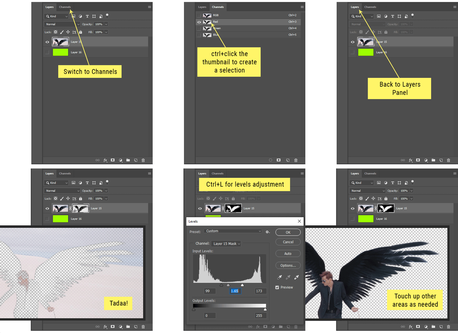
Sometimes you won’t want to use this method for the entire image, but just a specific part. For example, if you’ve cut out a character with some other method (magic wand, manual brushwork), but are having a hard time with their hair in particular. Use this method to create the selection, but instead of converting the whole selection into a mask, use the brush tool to apply the mask only where you need it! You can invert the selection itself with shift+ctrl+i.
5. Outlining text
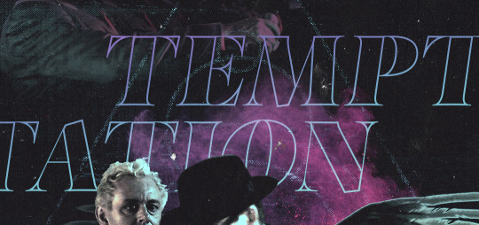
The font I used here is Salomé, which is actually a solid typeface with no outlined version. But you can make virtually any font into an outlined version if you so desire!
There's two possible methods here, actually:
The Easy Way:
Add a stroke layer effect to the text layer (by selecting the layer, clicking the little “fx” button at the bottom of the layers panel, and choosing “Stroke...”)
As far as settings go, aligning the stroke to the inside usually yields the best result/maintains the integrity of the letterforms.
Make the color of the text itself match the background.
If necessary, use the lighten/darken blend modes to create the illusion of transparency.
If you need true transparency (which I didn't until I decided I wanted to apply a gradient over the text), you'll have to try something else-- The Also Easy But Less Than Ideal Way:
Right click the text layer in the layers panel and select "convert to shape".
Now you can edit the fill/stroke the same way you would any other vector shape.
Again, you’ll want to set the stroke alignment to ‘inside’. For vector shapes, those settings are a little hidden. You’ll wanna open up that little dropdown in the toolbar with the line in it, and click “More Options”.
This is semi-destructive, so if you're working with a lot of text you might have to edit later, consider duplicating and hiding those text layers first so you'll have a 'backup' of it.
And while I’m on the topic of text...
6. Try breaking up your text layers!
I know a lot of people like to draw a neat little text box to put their text in, and then they center it all nice and neat and probably use a small font size to make it subtle and stuff... and that’s cool. Everyone’s got their different styles and things they like to emphasize in their edits and there’s absolutely merit to that sort of thing (case and point: the bulk of my dear @herzdieb’s work), but. Listen.
I love typography. I love a good typeface. The stroke widths, the letterforms, the ligatures, the serifs... I get like, horny on main for a good typeface. I like to make the text on my edits BIG, so that those details can shine. I also like doing interesting things with the text. Jumbling words/letters around, distorting them, deconstructing them and just... letting the text really ~interact with the rest of the composition instead of just kinda politely floating on top of it.
I’m not saying you have to do that kinda stuff. Or that I think neat little floaty text boxes are boring, or lazy, or whatever. It’s just... personally, I get really inspired by type. Fun type treatments are one of those things I LIVE FOR, something of a ~signature of mine, and I encourage everyone to just... try it? To use text as more of an integral Design Element and less of a... idk. A caption?
So if you have a quote, or even just a word... put each word (or letter) on its own text layer. And then: make ‘em different sizes. Make the words so big they don’t fit on the canvas. Rotate each one at a fun angle. Scatter them around. Go nuts. Use masks to chop parts of the letterforms off. Make ‘em overlap. Just have at it. Or, as the kids these days are saying: go absolutely fuckin feral.
If that really just isn’t your style, or doesn’t work/make sense for the edit you’re doing, fine. Delete all the layers and just do a text box or whatever. But. I’m tellin u.
Give it a try.
At least once.
Just... a lil taste.
7. Understand the difference between lighten/darken vs screen/multiply
For a while in my photoshoppin' youth, my understanding of these blend modes basically amounted to "darken makes things darker, and multiply makes things really darker", and vice versa for lighten/screen. But there's an important difference between how these blend modes work, and if you understand them, you can use them more... strategically? I guess?
Darken and Lighten are kinda misnomers tbh, because they technically don't really darken or lighten anything. What they actually do is make it so that only the areas of the layer that are darker or lighter than the content of the layers beneath them are visible. This produces some pretty nifty layering effects that you can't achieve with screen and multiply.
Here’s an example: (if you’re reading this on a phone with the brightness dimmed down you probably won’t be able to see the differences)
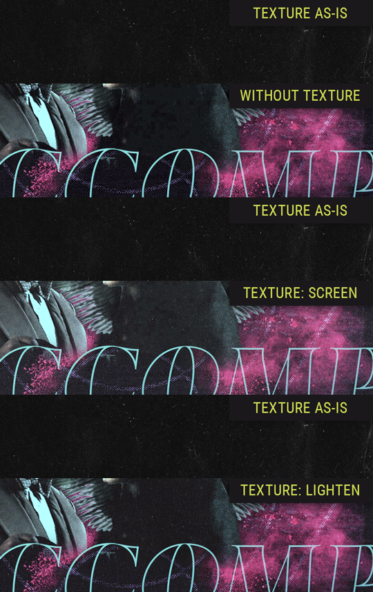
Without any the texture applied, you can really see the noise/graininess of Crowley’s jacket in the screencap. You can also see the ‘seam’ where Crowley fades into the background-- the jacket is a green-ish black, while the background it’s fading into is more of a purple-black.
With the texture set to ‘Screen’, the whole image becomes lighter across the board. Crowley’s jacket gets lighter, and so does Aziraphale’s jacket and the pink cloud thing. This does little to nothing to obscure the poor image quality and disguise that ‘seam’.
But with the ‘Lighten’ blend mode, ONLY the dark parts of the image appear lightened, and not only do they appear lightened, but they get kinda equalized. Notice how the patchy jpeg artifacts on Crowley’s jacket disappear, how that color seam smooths out, and how the brightness of Aziraphale’s jacket and the pink cloud doesn’t change at all.
This isn’t to say that lighten/darken are better and that you shouldn’t use screen/multiply. They each have their uses. But most often, I find myself using lighten/darken because the way they work is honestly really helpful? And just cool af?
8. Masking individual frames on gifs
If you ever feel like torturing yourself by making a gif that has frame-by-frame masking, my advice is don't try to mask each frame from scratch. You'll get patchy/wobbly results from the masks being slightly different on each frame.
Instead, mask the first frame, then alt+click and drag that mask onto the next frame. Make any minor adjustments to the new mask as needed, and repeat for each frame. This saves time and more importantly, keeps the masking consistent on areas with little to no movement, which makes a HUGE difference in how smooth the final product will be.

If you look at the edges of the animation, they’re nice and steady and consistent. It’s only the parts that have a lot of movement (like the back of his neck) where you can see any ‘ghosting’/wobbly-ness happening.
Sometimes the mask will move when I copy it to the next frame. Like, for the whole document. It gets nudged 20 pixels down or to the left or s/t every time. I have yet to figure out why, but I’m betting it has something to do with shooting myself in the foot with the frame 1 propagation settings at some point during editing?? ANYWAY, when this happens, just unlock the mask from its layer (click the little chain icon between their thumbnails) and move it back into place.
In these cases, I also like to pick a spot with a hard edge (such as the shoulder in the above gif) as a reference point of where it needs to be moved to. It kinda sucks having to do this for every frame, but you already signed up for some suckage when u decided to mask every frame of a gif, so I mean... 👀
9. Don't be afraid/too intimidated to do manips as needed!
Manips can be tricky if you're really striving for realism. There's light sources and color grading and perspectives to reconcile!! But when you're doing an artsy Edit with a capital E, odds are those kinds of discrepancies will be thoroughly camouflaged by all the levels, black and white, etc adjustments you're doing!
Something I run into often is, "I like this screencap, but the top of their head/hair is chopped off :(" But if I go back through all the screencaps from the scene, there's usually another frame where the camera is planned/zoomed out enough that I can steal the rest of their head/limb from it! And since it's from the same scene/shot, the lighting and color grading should already be a perfect match!
A super simple example:
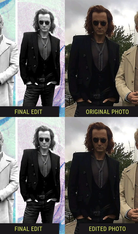
So I wanted to use this picture of David and Michael for this edit, but 1) They’re standing on the wrong sides for their characters, and 2) part of David’s arm is covered up by Michael’s.
Of course, the easiest course of action would be to just mirror the photo so they’re on the correct sides, but 1) mirroring faces tends to yield wonky results, and 2) that still wouldn’t give me a perfect, free-standing cutout of Crowley to place wherever I want in my composition (as opposed to being forced to awkwardly position him off the edge of the canvas to hide the fact that the other arm is missing)
Fortunately, it only took all of like, two (2) minutes to draw a crude selection around his good arm, copy and paste it into a new layer, flip it around, and add any necessary masking to get the shape right.
My point here isn’t to teach y’all how to do manips, or to pass this off as an impressive example of one. Because it’s really, REALLY not. My point here is to demonstrate that even something as tiny and simple as this can really open up your options for what you can actually do with an edit/composition.
So next time you’re feeling limited/inconvenienced by the crop of a screencap, just... you know. Consider whether or not it’s worth attempting a quick and dirty manip to fix it.
Another Example:

Sometimes you’re torn between two screencaps. You like one element from Screencap A but also want some other element from Screencap B. What to do? Just frankenstein ‘em together. Layer one on top of the other, get them lined up, and mask out the necessary parts.
It’s easy to get hung up on stuff like “Uh... should Crowley’s shoulder be doing that?” but let me assure you that like... the people looking at the final product are none the wiser to your butcherwork and will not notice. Especially if you’re going to add a bunch of contrast and color adjustments later on. (in fact, sometimes I’ll apply those adjustments first so I’m not distracted by any discrepancies that are going to come out in the wash anyway)
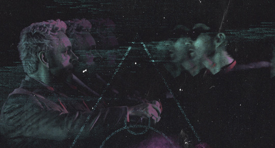
“I dunno... 🤔🤔 doesn’t seem anatomically correct... 🤔🤔🤔🤔” thought no one.
Point is... point is... dolphins you can get away with a LOT more than you think you can. Don’t let the desire to make these kinds of manips perfect get in the way of just... making them good enough. The bar isn’t that high, I promise.
10. Know what inspires you
What types of edits get you EXCITED? What kind of work do you see on your dash and go, "oh, I'm reblobbin' THAT!!1!"
I know for herzdieb, she's all about emotional pieces. She likes matching words/lyrics/poetry to on-screen moments and punching you in the feels with both. She hears a song, or reads a poem, and the lightbulbs go off for her, and she does her thing.
As for myself, I just live for the aesthetics of an edit. The colors, the fonts, the composition. I almost never know what text/screencaps I'm going to use when I start an edit. I just see a font I like, or a color palette, or a texture, and think, "I wanna use that!"
And once you know what inspires you, collect that inspo! I hoard textures and fonts. I have them organized into neat lil folders. When I wanna make an edit, that’s where I start. I just browse through them all until one or two start calling my name. Herzdieb collects songs and quotes and poems. Maybe your thing is color palettes, or aesthetic-y photos. Or whatever.
The point here is make the kinda stuff you like/want to see. Not the kinda stuff everyone else is making or the kinda stuff you notice gets the most notes.
11. Be able to let go of things that aren't working
I often begin an edit with a rough idea of the style, colors, or layout I'm going for. And I almost always end up doing... something totally different.
So don't get too fixated on what your initial ideas are. Be open to experimenting and just let the edit be what it wants to be. If something looks nice, do it. If it doesn't, don't try to force it just because, "well, I was inspired by this piece that did xyz and I wanna try it too".
When you see a certain effect that inspires you, just keep it in mind as a possible solution for the next time you make something-- don't make it into a benchmark, or some imaginary 'goal' you have to meet for This Edit You Are Working On Right This Moment. In fact, sometimes the elements I end up ditching are the very ones I started with, that initially sparked my inspiration. And that's okay. Inspiration can be a moving target, and if your vision for something changes, let it.
You wanna know what inspo reference I was looking at when I started that “Temptation Accomplished” edit?
Fucking this: https://search.muz.li/YTdiNjkwN2Rh
You might be thinking, “how the fUCK was that the inspiration??!! Your edit looks nothing like that at all!” ...and you would be 100% correct, and that is 100% my point. I spent a good hour or two trying to incorporate that cutout text layering effect before finally accepting the fact that it just wasn’t working for the edit I was making. And it wasn’t until then that it actually started to come together.
12. Be patient, and take the time to explore all your options!
I’m not gonna lie, y’all. I spend hours on my edits. I usually complete them over the course of 2-3 days/sittings. I rarely have a plan. 99% of the time I'm just throwing things at the wall and seeing what sticks. When I get stuck (when, not if), it helps to step away from it and come back later with a fresh perspective/set of eyes.
Every single edit I've posted, I have at some point felt like giving up on because I thought it looked like garbage (and not just because I was being self-deprecating/doubting myself, but because at those points, they simply weren't finished/something about the composition just wasn't working for me)
Work through those moments, and if necessary, take a break/sleep on it. It's always after I've exhausted my early ideas that the really good ones start to come to mind!
Here’s how the character poster edits I did progressed:

In Classic Me™ Fashion, I literally started off with just... textures I liked, and a font that I liked. Now, there were obviously a lot more ‘steps’ involved in both designs, but hopefully at the very least this gives a sense of how things get from point A to point B.
So uh... thanks 4 comin 2 my TED talk. I hope u learned at least one (1) cool new thing or maybe just feel vaguely inspired by this rambling mess?
157 notes
·
View notes
Photo
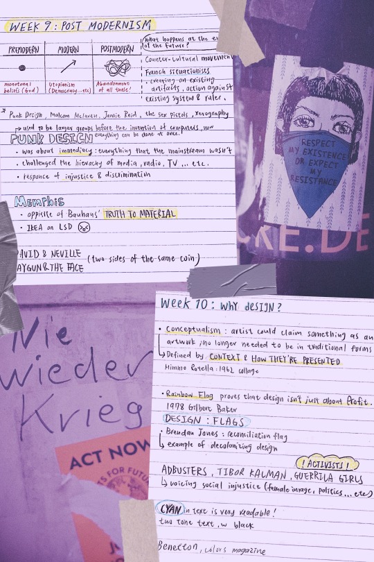
week 9 and 10 lecture
NIE WIEDER KRIEG!!! NO MORE WAR – ACT NOW – Urban street art sticker
RESPECT MY EXISTENCE OR EXPECT MY RESISTANCE - Urban street art sticker
photos from Markus Spiske
I was catching up on past lectures when I realized week 10′s content ties back to what is happening in the US right now, which made me decide to create my cover photo in relations to the event.
My intention is to pay my respect- as well as acknowledge- the rights of the community that is in pain at the moment, and reflect on ways of improvement when it comes to racial equality.
knowing that design is closely related to activism really gave me a new perspective, which is the power of design: the fact that we can make a difference by creating, expressing, and voicing an opinion. Design is so much more than just making a profit, it is a tool that comes with great responsibility and potential. Learning how to utilize it to spread importance is what I shall be thinking in my future years.
----------------
WEEK 9
PUNK: a counter-cultural movement
PUNK DESIGN, A SUMMARY: despise typesetter, prefer DIY
collage-style 1: ripping up and starting again
Takes a commercial image and repurposes it for revolutionary purposes.
collage-style 2: the use of stencils
stencils had frequently been used for their ease of use and acquisition, their association with the underground through graffiti, denoting something raw and urban, as well as its nature as simply being flawed by design.
zines: using illegible and garish styles to shock the viewer out of apathy, the punk movement gave little thought to the commonly perceived ‘good’ design practices.
parody and politics: using images from a media-saturated culture for a new purpose, they meant to trigger recognition in the viewer and include them on the subversive in-joke.
All ripped up: Punk influences on graphic design
MALCOLM MCLAREN: A multi-talented man
promoter and manager of bands the New York Dolls and the Sex Pistols
he was one of the first white music producers to bring hip-hop to a wider audience and one of the first to popularise world music in the west
partnership with fashion designer Vivienne Westwood: SEX
In a new, in-depth biography, Paul Gorman offers a vivid portrait of the postmodernist impresario who conjured up punk’s angry pose, the Sex Pistols, and much more.
Malcolm McLaren's Life of Chaos, Music, and Art
JAMIE REID Jamie Reid’s artworks
A GUIDE FOR ANYONE WANTING TO DO IT THEIR WAY, FROM REID:
Destroy Your Computer: The more we get drawn into this mad digital world, the more we lose contact with each other. “Most jobs are about enslavement, break free if you can”
Study Art: If I hadn’t gone to Croydon I would never have met Malcolm McLaren, not just for what he did with the Pistols but for everything else he did. The irony is that neither Malcolm or I would have got into Croydon if it was today. What does that tell you about what’s happened to our education system?
Have a Sense of Humour
Learn from the Past
Look to the Future: Radical ideas will always get appropriated by the mainstream, people in authority lack the ability to be creative, and they rob everything they can. you have to keep moving on to new things.
Iconic Punk Artist Jamie Reid Has Some Advice for Young Creatives
XEROGRAPHY ART: is an art form that began in the 1960s. Prints are created by putting objects on the glass, or platen, of a copying machine and by pressing "start" to produce an image.
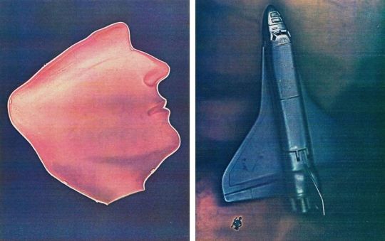
What Happens When a Photocopy Machine Becomes an Art Tool?
MEMPHIS DESIGN (MILAN 1980’S): its aesthetic embodies the 1980s
Simple geometric shapes; flat colours combined in bold, contrasting palettes; stylised graphic patterns defined by black-and-white stripes and abstract squiggles – these are the ingredients of Memphis-inspired design, fuelled by influences from earlier movements such as Pop Art and Art Deco.
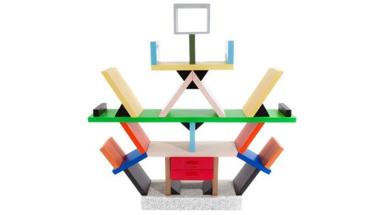
10 iconic examples of Memphis design
ETTORE SOTTSASS: One of the most influential and important figures of the last century, Architect and Designer, founded the Memphis group In 1981, a group that has radically changed the scenario of Italian and world design.
Ettore Sottsass’ works
DAVID CARSON: RAYGUN David Carson design
David Carson’s deconstructed style for Ray Gun, was very much a design aesthetic that blurred the lines of visual communication and challenged its readers to interpret the text in their own way. Much like the youths that he targeted throughout the 90s, they were rule breakers themselves that rebelled against society. His use of non-hierarchical text and visually complex, layered compositions, spoke ‘their language.’
“I’ve never used grids; I still don’t. I never studied or learned about them, and when I did I saw no reason to use them.”
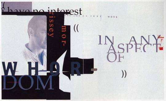
STREET PRESS ANALYSIS: RAY GUN COVER — David Carson, Anti-grid Design Icon David Carson Says Computers Make You Lazy, Contextual Studies: David Carson
NEVILLE BRODY: THE FACE
The Face, drawing freely for his visually exciting layouts and typography on avant-garde artistic ideas. Brody was thoughtful to the construction of its layouts, with blocks of texts often placed horizontally or vertically on the page, the layouts contrasting strikingly with hand-mediated imagery and photography. Such ideas exerted a significant international impact on the appearance of the magazine, advertising, and retailing design.
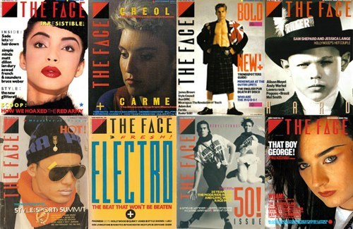
POST 14 – 1980's – 'The Face' Neville Brody – Monique
-----------------------------
WEEK 10
MIMMO ROTELLA
'With a Smile', Mimmo Rotella, 1962
Mimmo Rotella - 324
ROBERT RAUSCENBERG
Robert Rauschenberg 1925–2008
JACEK TYLICKI
Jacek Tylicki Art and Artworks
FISCHLI & WEISS
Fischli & Weiss: Flowers & Questions. A Retrospective – Exhibition at Tate Modern
GILBERT BAKER: RAINBOW FLAG
“Our job as gay people was to come out, to be visible, to live in the truth, as I say, to get out of the lie. A flag really fit that mission, because that’s a way of proclaiming your visibility or saying, ‘This is who I am!’”
Baker saw the rainbow as a natural flag from the sky, so he adopted eight colors for the stripes, each color with its own meaning (hot pink for sex, red for life, orange for healing, yellow for sunlight, green for nature, turquoise for art, indigo for harmony, and violet for spirit).
How Did the Rainbow Flag Become a Symbol of LGBTQ Pride?
FLAG IN DESIGN: the lecture talked about how flags influence to power of design, this is an interesting article of how flags can go beyond the rules of design, but still make it work.
7 fantastic flags that break every design rule
ACTIVISTS (ADBUSTER, TIBOR KALMAN, GUERRILA GIRLS, BENETTON: COLORS MAGAZINE)
A Review of COLORS
“Oliviero Toscani and Tibor Kalman launched “a magazine about the rest of the world” for United Colors of Benetton in 1991. It seems only fitting that an unconventional title like this should be documented in an unconventional way.”
“Toscani wanted a magazine without any stars, without any celebrities, and without any news. He decided they’d interview people nobody knew, and they’d use the internet to find stories. This approach- a combination of dynamic graphics, striking photographic imagery, provocative themes, and an unwaveringly global outlook—has become familiar to magazine readers now, they hope to firmly establish COLORS’ status as the founder not only of today’s independent magazines, but of mainstream media as well.”
SHEPARD FAIREY: HOPE POSTER Visual Analysis of Shepard Fairey's 'Hope'
Color: Red, blue and beige are representative of the American flag, illustrating his patriotism. Blue help to define his features, the beige on his face might be to say that race doesn’t matter.
Typography: provides the concept that the poster is trying to communicate. HOPE’s typeface used is Gotham, a strong slab sans serif, the use of Gotham in this work creates a sense of authority and a bold assertive statement in which there is no uncertainty. These clean letterforms grab the viewers’ attention and makes a statement, permitting for maximum legibility and objectivity.
4 notes
·
View notes
Text
tagged by the amazing @kizunah
rules: choose five of your own favourite edits and do a short commentary on each, what you loved about it. Tag ten mutuals of yours to appreciate their edits and spread love~
I’m lowkey on hiatus because work but! 8) this seemed fun. There’s no particular order.
1. Buckynat + Red / Gold - I was really into gold during this time and Buckynat’s my OTP. I wanted to showcase something simple just using those two colors while keeping the post balanced. Whenever I make a set, I think of how it flows in the post so I had to think about how I wanted to arrange it. I think it turned out okay.
2. KNYWEEK + Swordsman (fav side chara) - I was so excited for KNYweek for this one because i knew automatically that i was going to edit hotaru. I straight up cackle when he’s in the manga but then his face was shown and i was shooketh. I wanted to utilize a poster type of design and I think I did okay.
3. Editober + rengoku flowers - so I had this idea that I wanted flowers around rengoku during that scene in the manga. He’s generally very yellow so I wanted to use sunflowers since it’s usually depicted as a bright flower. Idk i wanted the scene to look soft despite of the fact that it was not a very happy scene.
4. Giyuu + gold / manga scan - I just wanted to color giyuu and that part in the manga, it took way too long because of the details but I really like this edit tbh. I thought it looked cool and at one point i wanted to do more panels (but i got lazy)
5. Red/Yellow + Tony stark - I used to do a lot of repeating and I thought, that’d be kinda fun to do. So I started out with that and kinda built off of it. I knew I wanted to use red and yellow because thats what iron man’s colors usually have ya know. I also really wanted to try that staircase typography, it felt like it fit with him a lot. I hadda google some quotes though because I’m not as well versed in the Iron man comics than I am for BW or Cap or Bucko.
i tag @tanchirou @zenitsua @flowerrsoffreedom @boahancokk
10 notes
·
View notes
Text
journal 1/ chapters 1-4 / the prologue to graphic design
initial thoughts
When I first received the textbook, the 6th edition of Meggs' History of Graphic Design (written by Philip B. Meggs and Alston W. Purvis) in the mail, I was immediately stressed out. I was unfortunately gifted the trait of being ultra stressed about a lot of things, but school always won first place in amount of stress. (My freshman year of high school I was so stressed I was getting a lot of gray hairs...so embarrassing!) In general, history has been my least favorite subject, and therefore was the subject I struggled with the most. Although I am passionate about graphic design, I wasn't super psyched to be reading about its history. Sorry Professor!
1 / the invention of writing
These terms! I believe I have only heard of pictographs and hieroglyphics before reading this. To read that there's petroglyphs, ideographs, cuneiform, and rebus writing. Wow.
"The symbol for sun...began to represent ideas such as "day" and "light"." (pg.9, Meggs.): You know, I never considered that. On my essay in quiz 1, I discussed how there were would be too many characters to represent every word, and that is why having an alphabet is more advantageous. Though I agree with my argument, I wonder how many symbols would have dual or more meanings, as that is the case for many words in the modern English language. For example, the word "die" could mean the verb of ceasing to exist, or it could mean the noun of a dot-marked playing cube / singular form of dice. So in cuneiform terms, would the symbol for "die" [noun] represent the idea of death? Probably not, but maybe with crazy English it might.
Whenever quarantine ends, I wonder how hard it would be to make my own cylinder seal. After reading this portion, I found the urge to make one. Obviously with modern technology, making a personalized stamp wouldn't be that hard, and I have seen some DIY artists make their wax seals. I think it would be fantastically ridiculous to have an obnoxious stone seal to go around "marking my territory" on.
Ah papyrus. I feel stupid for admitting this, but I didn't actually know papyrus was a plant. I didn't think it was not a plant, however I just never thought of it that deeply. I'm going to look up what it looks like right now. [...] Oh, okay. I suppose today is the appropriate day to say that it sort of looks like thin marijuana? Anyway, speaking of papyrus, the reason I never gave it much thought to it being a plant is because I have been too focused on everyone's hatred for the Papyrus typeface. Why does everyone hate it? I haven't found myself wanting to use it (yet), but I definitely feel this social pressure that I'm not allowed to use it.
I find superstition fascinating. I think if I could meet anyone from the past I would want to meet the illustrator of the Book of the Dead. That would be a morbidlly cool job to have, just feeling that some random guy named Bob has had enough days lived. AND WITH THE POWER OF THE PEN you kill hi- I mean let him enter the afterlife.
2 / alphabets
The definition of an alphabet is definetly something I have not thought about in depth. This definition makes sense, but I always took it for granted in terms of- well I know English, there's an alphabet. I tried to learn Spanish, there's an alphabet... it's almost the same except they're pronounced differently and there's another n- ñ. I tried to learn Japanese, and there's almost twice as many characters (as English), 2 for each sound.
Fascinating to learn that Hebrew and Arabic writing was the evolution of the Phoenician alphabet. I can very much see the resemblances. But it's crazier that different cultures took it in one direction, and then the Greeks took it in another direction, and the Romans took that alphabet in a completely different direction. It blows my mind to see how far we've come.
Ah yes, serifs. I love the whole argument over whether they originated at cleanup marks or sharpening-the-brush-tip marks. Can't we just be glad they exist? (I want to believe it's the sharpening origin, it sounds more efficient.)
Vellum paper feels amazing; no wonder it has to be made from that smooth baby skin. Yikes.
Scrolls are also an obnoxious thing I'd like to have. For instance, I probably will have my will written in a large scroll to represent how dramatic I am.
As someone who used to be obsessed with Kpop, I think it is absolutely amazing that Hangul is such a technical alphabet. It reminds me of how humans have that disk they threw into outer space teaching aliens how to speak English via the shape of your mouth and lips and what position your tongue should go for certain sounds. Obviously this is the origin and is way more impressive especially at such an early point in our history. It makes me appreciate the language and those that write in it much more.
3 / the asian contribution
I appreciated that this chapter starts off crediting the Chinese with creations forcertain things that I remember throughout middle school and high school, history class always seemed to gloss over. Like where did these Europeans know which way was north and to figure they could kill others by putting some powder in their guns. Paper also always came out of nowhere, but I'm glad I learned its origin sooner than reading this.
I have learned that Chinese calligraphy was more important that painting before, but in a different way. As I'm in a lot of art classes, I was taught that Chinese painters would usually also be calligraphers and viewers could tell that the same person who painted the painting wrote the calligraphy as the style of the strokes would match. Thinking about it more now, it would make sense why it would be more important as calligraphy was something you had to memorize AND learn where as with painting, anyone could technically learn how to visualize.
Referencing my earlier rant about cylinder seals, chops are also something I enjoy and would want to have one of my own. Personally I like cooler colors better, so maybe I would choose to have a blue ink instead... but I know that's not the point. I think this would make more sense to be the origin of printing as it is constructing something once and being able to reproduce it over and over just with the use of ink.
The Chinese also invented playing cards! How interesting that they were called sheet dice and a unique aspect of graphic design that you never realize until you actually think about it.
I agree with the authors, it is odd that languages with thousands of characters would decide to use such a tedious method like movable type. On the bright side, we wouldn't have our lovely lazy Susan's if it weren't for this tedious type!
4 / illuminated manuscripts
As someone who appreciates shiny things (my weakness is holographic) it was exciting to learn about illuminated manuscripts. I'm just imagining the gold leaf making the page glow from a couple meters away. Those kind of things make me like to pretend stuff is magical. And for your title to be an illuminator? Yes please. AND to learn that these were insanely portable for a lazy human like me? Perfection.
Earlier this year I learned about ascenders and descenders in typography, so it was nice to know their origin as well as how lowercase and uppercase letters came from minuscule and majuscule.
I am thankful for the Celtics for deciding to put spaces between words. Reading (especially something I'm not interested in) would be a much more painful task ifeverythinglookedlikethis. No wonder humans were evolving so slowly before this point. Howdoyouknowwhenonewordendsandanotherbegins?
All of these illustrations next to the text on the manuscripts make me wonder if they were still using hieroglyphics, would they even bother to illustrate these giant paintings or would it seem (or at least appear) to look repetitive? I particularly enjoy the page from Ormesby Psalter, a Gothic manuscript on page 61; it's very beautifully done.
While I'm not a religious person, I think the concept of aniconism is very interesting. Also how you could view illustrations of living things, but only inside. Can't deny that their commitment to an intricate and complex design in the Islamic manuscripts were not short of beauty.
The Limbourg brothers' story was interesting to me: how they were all illuminated book designers, how they all died before finishing their most well known project, just short of when the duc de Berry died.
This chapter was the roughest for me. I feel that it was a bit long for my tastes and it gave me a bit of anxiety that with it being so long that the professor told us to focus more on chapter 1 than this chapter. That's my issue though and it was still pretty insightful.
post thoughts
I understand the reviews for this book that I read, about how the writing is something I'm going to have to get used to. It is definitely informative, but oh my it is a lot. Will definetly not be doing this journal so late on Sunday night. Sorry professor...
Source: Meggs' History of Graphic Design, 6th Edition, Philip B. Meggs and Alston W. PurvisJohn Wiley & Sons publishers.
1 note
·
View note
Note
Hey, Laini, how are you? I don't know if you're still doing book cover requests, but if you are, I'd love to hear your thoughts on the covers for the Fallen Isles series by Jodi Meadows.
HI HELLO I took a break from doing these, but I’ll be finishing them slowly now.
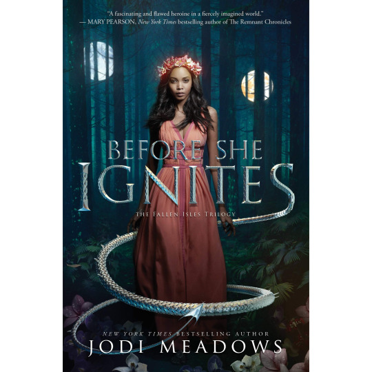
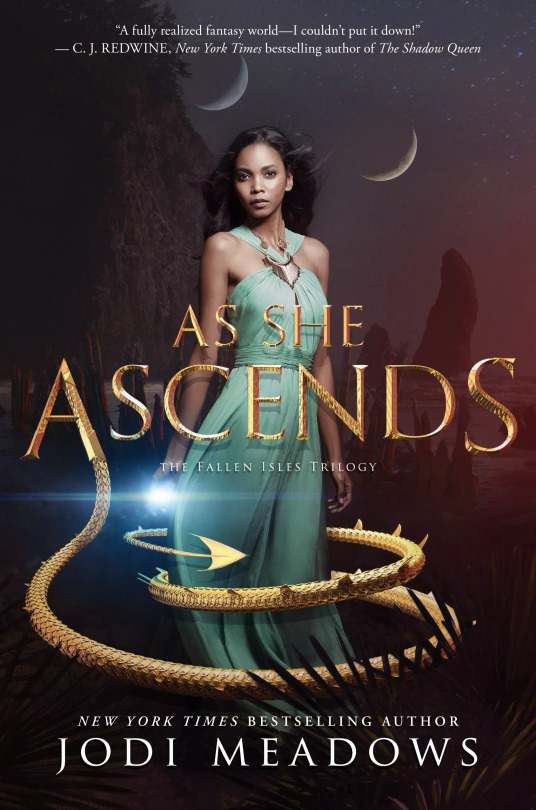
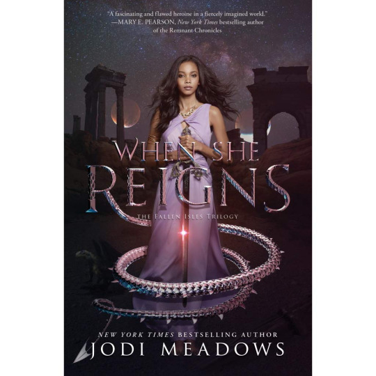
I couldn’t find any good crops for the 1st and 3rd, but whatever.
I’m really happy to see a black model on the cover, but I wish she wasn’t so badly lit? Her skin isn’t lightened, per se, but it has such a weird washed-out cast. Not as bad as some of the others we’ve seen, but still meh. And HER HAIR!! Like, I haven’t read the books so I can’t comment on the accuracy, but god am I tired of seeing black models with straightened hair.
Kay, moving on to the actual covers! I’m going to start with the typography because...ugh. Remember that critique a had about the crown made of vertebrae? And the excessive, repetitive texture it created? I have the same complaint for these titles. Like. Cool! Scales! Dragons! We get it! There has to have been a better way to texture those tails. Like, there has to be. I don’t know if it was conscious decision or laziness or shortage of time, but it looks tacky as hell. There’s literally no variation. Thank god they’re not all coiled the same way on every cover, but it’s not a good look. The texture is also poorly applied to the actual letters, and the tails’ connections to their letters of origin all look horribly awkward. I’m horribly anal about any kind of curvatures, and those tails are so...stiff.
That said, the editing on these is pretty good. Nothing particularly egregious in terms of blending or lighting, and the depth of field is reasonable. And there’s nice attention to detail with the drop shadow on the titles—there’s an attempt to make it wrap around the model, albeit a very flawed attempt. Decent colors all around, although the 3rd book is very, very mauve.
8/10 for not being anything particularly special, but having nice photoshopping.
16 notes
·
View notes
Text
5 tips to speed up your image heavy website
Growing any business is, well, powerful business. you've your hand in each pot whereas at the same time sporting each hat. you are worrying regarding promoting ways, product creation and growth plans, bushed constant day.
With such a large amount of in progress tasks, it may be way too straightforward to let a touch issue like digital presence fall by the edge. However, that will be a grave mistake.
The Harvard Business Review recently conducted a study on what specifically makes individuals wish to complete a sale from a specific web site, and also the results were a convincing "trustworthiness." By creating customers feel safe, comfy and relaxed once they visit your on-line destination, you stand a way higher probability of not simply encouraging them to complete a sale, however convincing them to become old users.
A strong web site style is overriding in making this trait. By presenting a web destination that's easy and straightforward to navigate, users can have a a lot of positive expertise throughout your web site, creating them a lot of doubtless to complete a sale.
So, whereas things like company transparency, nice testimonials, and a solid product area unit obvious ways in which to ingrain familiarity to potential customers, web site style clearly ranks notably high once determinant if a whole looks trustworthy or not.
In order to face out from the gang, there area unit a number of tried-and-true style parts which will rework your web site guests into loyal customers. don't be concerned, i am not attending to say one thing obvious like "responsive designs" -- parts like that area unit a given.
Here area unit 5 prime net style and wife trends which will grow your business quick.
1. Video landing page Incorporating video into your web site style could be a labor. I mean, seventy eight % of web users watch videos on-line each week.
But, do not simply imbed unspecified YouTube video. Instead, take your web site style to subsequent level by making a video landing page.
You could target this video to an immediate decision to action on a specific web content, a la Salesforce. otherwise you may take a page out of Baesman's book and make AN immersive video that auto-plays on your homepage. Either of those approaches will give data or drive home the brand's identity -- however each can improve wife and users' impression of your company as a full.
Not sold? The proof is within the pudding. consistent with Vidyard and Demand Metric's The State of Video promoting 2017 study -- that surveyed 159 B2B and B2C professionals and entrepreneurs -- it's expected that sixty nine % of web site traffic are going to be video, whereas seventy % of skilled participants according that video converts higher than alternative kinds of data and content.
2. optical phenomenon scrolling While digital experiences don't have any doubt improved several aspects of our daily lives, it's had one negative impact: individuals area unit lazy. So lazy, in fact, that clicking a button is commonly too way out of the realm of chance.
Enter optical phenomenon scrolling.
This uneven-like scrolling impact has combated consumers' general laziness whereas remaining participating and visually appealing. With a straightforward swipe (a la Tinder), users have simply consumed your data as they create their method down the page.
The popularity of optical phenomenon scrolling has conjointly introduced a lot of deep-scrolling and single-page web site styles, and renders what data is "above the fold" a touch less necessary, since it's easier to check what is below, too. Ultimately, that creates prioritizing content easier for you to manage and will increase your user's probability of seeing everything anyways.
Make Your cash Matter took its optical phenomenon scrolling to subsequent level, with effects spanning AN illustrated timeline that goes each horizontally and vertically, guaranteeing it captivates users.
3. Animated calls to action Calls to action area unit a necessary evil in web site style. the actual fact remains that your customers will not understand what to try to to unless you expressly tell them. Many. Many. Times.
However, merely telling your customers what to try to to simply is not enough any longer, either. they are seeing stimuli and directions from all corners of the online, therefore you wish a touch one thing further to assist your goal stand out.
Adding a touch animation to your necessary action things may well be simply the price ticket. whether or not it is a micro-mini interaction (such as "liking" a Facebook post and seeing the various reaction animations) or a straightforward impact to catch users' eyes, customers area unit a lot of doubtless to execute the action you are pushing once the decision to action grabs their attention and provides confirmation of completion.
Need some inspiration? Airbnb uses its animation app, Lottie, to include delicate graphics animations atop its calls to action throughout its web site and app styles.
4. Custom typography Every web site desires text, however the times of boring Times New Roman, Arial or the other basic stock font have long-since passed. Instead, take your message to subsequent level with distinctive typography that encompasses your whole identity whereas at the same time human activity to users.
This distinctive typography will take several shapes (literally) or be found in numerous areas of your style. Some brands could prefer to utilize this in their brand style, whereas alternative businesses (like mine) can sprinkle custom font throughout the whole style to draw attention to big content, like this article signup decision to action (below). Ultimately, the selection in however and wherever you utilize this trend is up to you.
5. AI Despite the surge in ecommerce sales over brick and mortar storefronts, individuals still crave connections, that is probably going one {in all|one amongst|one in every of} the explanations that AI in all its forms is therefore common.
AI in web site style will take several shapes, however some common examples embody machine learning, personalization and chatbots. Machine learning and personalization area unit cut from constant fabric to a degree and control a sense of "being special" with users that, in turn, fosters whole loyalty.
Chatbots influence user expertise far more directly, though. whereas they supply an enticing component, the largest draw to incorporating chatbots into your web site style relates to client service. Users will raise queries and receive answers in real time -- that is simple to ascertain -- and acquire data quickly.
Quartz could be a stellar example of chatbots inside immersive app style. Through a informal interface and humorous memes, users area unit a lot of doubtless to come back to consume the amusing content than they're to browse a run of the mill news story on another app.
1 note
·
View note
Photo





Sobrang mainstream kung magpopost ako ng ganto on the night of the 31st, so ngayon ko na gagawin. Besides, ayokong ipublicize lahat ng struggles ko sa FB, Twitter and IG...dahil ayokong magmukhang fragelita. char.ahaha. Himala na lang kung matunton to ng pamilya ko, close friends, or other people close to me. Hahaha.
Trigger warning.
This time last year, I was so close to ending my life because of too many things. Pero sa lahat ng yon, ang pakikipag tunggalian sa sarili kong thoughts ang battle na pinaka nahirapan akong harapin. Para sa akin, making decisions should not be a conscious effort, dahil natotorture ko ang sarili ko tuwing naiisip kong kelangan ko mag decide. I am very indecisive and impulsive. I rely on random energy spikes everyday. Pero hindi ko alam na ang ugali kong ganun ang magdadala sa akin sa despair.
Alam kong maling binabalikan ang nakaraan dahil masakit lang.. Pero I always try to look back kasi those struggles made me who I am now. My birthday last year was a horrible day. Halos wala akong kinausap, maski boyfriend ko nun. I was forced by my family to get out of the room..but I just can’t. I felt like a total piece of shit. Hahahaha. A few weeks after, I was molested and raped. Alam ko na sa sarili kong depressed ako at may anxiety, pero that night was the first night that I felt my whole being giving up. I deactivated my FB, said goodbye to my closest friends and told my boyfriend that “I’m just gonna go to sleep.” I was ready. Honestly ready... until after a few minutes, I saw a beam of light out of nowhere. Hindi ko alam kung totoo ang miracles o kung totoo ang Diyos dahil para sa akin, everything is just a social construct. Pero after seeing that light, bumalik ang diwa ko, I cried so much and put my airplane mode off out of nowhere. At ang unang nag appear sa notifs ko was Niko (a close friend). He simply told me, “Bumalik ka ng elbi. Magusap tayo.” And that was it. I apologized to myself and I kept crying and crying lang. When my heart was finally ready to go back to elbi, Niko was just there. And I cried to him. Inipon ko lahat ng guts para makwento sa kanya lahat ng nangyari. After talking to him, hinatid niya ako sa dorm ko at pagkauwi ko, nagset siya ng rules kung paano ako makakarecover. #1 was, wag ako mag airplane mode. Hahahahaha. Tangina nun. Then, we promised to let go of our toxic attitudes at magbabago kami sa 2018. Niko was there until kinaya ko nang makarecover mag isa. He’s the friend everyone wishes for. He’s an angel.
And then 2018 came. I met Kassi. Seatmates kami sa SFI 100 at groupmates sa lab. We instantly got close when one day, I told her I can’t go to our fieldwork because inaatake ako ng anxiety. Out of nowhere, she appeared in my dorm and talked to me about it. We talked and talked until hindi na namin napapansing umiiyak kami. Hahahaha. After that, we cooked food and slept and talked again until matapos yung araw. That was the start of our friendship. Just like Niko, Kassi was just there. She held me until I was ready to get back up again.
On the early months of 2018, nagkaproblema kami ng boyfriend ko. On-off kami. One day, okay. The next day, parang hindi kami magjowa. That went on and on until one day, nagising na lang ako sa katotohanang tama na. Di na dapat pinipilit ang wala na kahit last year pa dapat kami naghiwalay. Wala nang may willing mag effort sa amin. Wala na ring willing mangausap. We weren’t strong enough...the both of us. Although I tried working it out, pero one day, he cheated on me. He slept with a person who likes him, while flirting with another girl. Pinilit kong intindihin pero wala na talaga eh. Haha. We ended in good terms because hindi ko idedeny na isa siya sa mga dahilan kung bakit andito pa rin ako today. He has such a good heart and I hope one day, he finally finds the answers he’s been looking for since he lost his parents.
Kasabay ng breakup namin ni Lawrence, nanalo ako sa student council...again. Masaya, syempre. Because bagong mukha ang mga nakikita ko. At hindi ko inaasahang magiging ganun ang takbo ng eleksyon. From #1 last year, I became #3. Pero it was fine. Natuto akong tumayo sa sarili kong mga paa habang nagtuturo sa iba. For the first time, I felt the burden sa eleksyon. Hahaha. I had to train my slatemates while training myself at the same time. Isama mo pa yung acads, yung problema sa jowa, yung anxiety at yung lagi akong nagkakasakit physically. I was almost diagnosed with pneumonia that semester. I met people who broke my heart. I met people who healed it. The early part of 2018 was such a roller coaster ride. Pero I knew and I was certain that this year.... I am going to change. And I was right.
August. I resigned in my position sa student council. Napakabigat na desisyon, pero I had to do it for the greater good. I realized na maybe this sem should be a sem full of pahinga. Full of recovery. Dahil alam ko sa sarili kong kapag tinuloy tuloy ko pa, baka mawala na naman ako sa sarili ko. Baka maulit yung nakaraang taon. Dito ko naramdamang I should be mature enough to recognize my mistakes and be able to get back up without Kassi, Lawrence, or Niko.I went back to zero. Literally zero. I was lost, but this time, I knew where to start. I started with the question “What would Hannah do?” and bam. The only answer that I got was “She listens to her heart.” and there. I looked back to the things that I loved doing...na ang tagal ko nang hindi ginagawa dahil sa depression ko. I was ready to embrace them again. Siguro kaya malungkot ang mundo dahil tinatalikuran natin ang mga bagay na mahal natin para sa conformity. And that moment, I bent that rule. Because I wanted my heart to be completely happy. I got rid of my daily college routine. I went back to digital design, drawing, typography, photography and performing arts. I shared my passion to the world. I taught kids how to do public speaking, I created my portfolio, and I became open to freelance work.
On the same month, I met Spiro. No words. Just pure love. Our relationship for three months gave me strength and courage to be mature not only for the both of us, but for my life as a whole. He’s the best work of art I have ever seen and I don’t think anyone can ever measure the love and happiness I felt the moment I first knew that someone like him exists. Love. Just love. Always.
My birthday was simple lang this year. Tahimik. Pero masaya. I was with Spiro in the morning, I ate my favorite Spaghetti with Papa and Ate in the afternoon, and did some paperworks lang in the night. It was simple, but it was very meaningful.
After a few weeks, I decided to stop my freelance work and settle for a corporate job. I applied in several famous brands as Graphic Designer, and I was called for several interviews, but did not pursue them because 1) lagi kaming late nagigising ni Spiro (hahaha) and 2) one of my mantras is: if the universe gave you a sign, that’s it. Pursue it. And after how many days of indecisiveness, an online bag brand contacted me for an interview in BGC. I remember I was too lazy to go, since wala kaming tulog ni Spiro (haha) pero naging sign siguro yung pinipilit ako ng Papa ko sumama sa kanya sa Makati, so I decided to give it a try. And a few days after, I was called for a final interview. I still remember the feeling. Yung ang saya saya na bigla akong nagka breakdown sa CR. Nakakahiya. Hahahahahaha. Kasi alam mo yon. I was so close to death last year, at kung ginawa ko yon, hindi ko mamimeet si Spiro. Hindi ko makukuha ang trabahong to. Hindi ako matututong magpatawad, magsurrender at mag let go. Hindi ko marerealize na ang sarap pala mabuhay kahit systemic ang probolema ng mundo (charararat). At higit sa lahat, hindi ko matututunang sumubok ulit. Grabe ka, Hannah Ty. Dami mong pinagdaanan. Charz.
Sa totoo lang, hindi ko pa rin alam ginagawa ko. Hahahaha. Ngayong December, fucked up person pa rin ako at hindi ko itatanggi yan. Hahahahaha. May masakit pa rin somewhere deep inside me. Andyan pa rin ang fears ko. Nandyan pa rin yung confusion minsan. Andyan pa rin yung uncertainty sa future ko. Marami pang kailangang harapin, pero ang layo na ng narating natin, self. The simple fact na you were able to get out of your room on the day na you were supposed to kill yourself, that’s a big step for you na. Look where it brought you. To recovery. To Spiro’s arms. To Fetch Bella.
If there’s one thing that I could tell everybody, that is sometimes, we have to listen to what our heart speaks when all else fails to do so. Maski sa simpleng desisyon na “I don’t feel like doing it pa.” Then don’t. Do not torture yourself too much. If your heart wants to rest, rest. Pero don’t let it stay that way. Get up when you’re ready. Decide when you’re all good. Reach out when you’re finally ready to speak. Sometimes, we don’t have to decide impulsively. Sometimes, it’s okay to not know yourself yet. You will be fine. You will be okay. That’s for sure.
Now these are the memories I had for this year. Believe me, I tried my best to save the pictures and not cry. Hahahahahaha. At so far, wala pa namang luhang tumutulo. Lol.
To everyone na nasa photos, mahal ko kayo. Sobra. You have my admiration, always.Thanks for letting me be part of your 2018, and please remember that you made my year so memorable. I am always grateful for all of you.
Self, this is it. You’re getting older na... and getting more emotional. Hahahahaha. Buhay single ka na naman puta ka. Char. Hahahaha. I love you! Always and always and always and forever! You are so loved! Here’s to more kakulitan with you!
12 notes
·
View notes
Text
First response to my questions -
What’s your biggest struggle in day to day life with adhd?
Id say its time organisation and keeping my space uncluttered, and the guilt it comes from being a way that in society is perceived as “lazy” like you dont try hard enough
What’s the biggest challenge you have faced in ur life to do with your adhd ?
The biggest challenge id say would be dealing with the way it impacts your self esteem, dealing with self doubt even when you are successful, getting Impostor syndrome, its either luck or it was too easy because you have internalised that you can never try hard enough. Feelings of insecurity.
Do you feel understood by your education system or workplace as a female with ADHD?
Through primary highschool and sixth form, definitely not. When i specially struggled in sixth form and voiced it trying to get help, the fact you’re not behaving like a 8 year old boy with hyperactivity makes it so hard even impossible to access any help because you dont *seem* to have adhd. Even tho you’re are visibly struggling.
What could make you feel like your voice is heard/understood as an individual with ADHD?
something that would help people (especially women) with adhd feel more seen and heard would be taking the time to acknowledge individual differences without criticising and judging, genuinely care about how you could make something easier or more stress free with someone that struggles to focus/function in certain ways.
Do you feel as though females with ADHD are understood ? why/why not ?
So no, i dont think adhd in females is understood which is so dangerous as most women with adhd go underdiagnosed which just makes you feel like you must be the issue, that you’re lazy and trying to find excuses to not be as good as you could be in aspects like organisation/ academical achievent/ socially etc
Is not understood partly because women are expected to be so much more, must follow every rule, since being little we are specifically told to not be rude or too loud or too much. this clashes with the way a lot of women with (and without) adhd are, causing us to believe there is no option of being the way we are, because too loud or too much or too messy is considered as socially unacceptable. I remember as a kid i would compare myself wirh other girls and how neat and good at some things they were and no matter how hard i tried i was not like that, which would make me feel so bad about myself. Since i got my diagnosis I noticed I subconsciously stopped masking, i was proud of being the way i am. It helped me accept the fact that maybe i cant do some things as fast or easily as other people and that its not because of me, that im not flawed and useless because this is the experience of a lot more of people.
How would you describe your ADHD?
I feel happy to be the way i am most of the time, people with adhd are often creative and empathetic and caring about inequality as we have high sensitivity. Only when i experience a rough patch of dysfunction I feel embarrassed that i cant do some things like i wish I could. Then i feel powerless and useless but there is ways to manage this, specially by taking time to rest and take care of yourself every day.
From this response i was shocked with the answers . I found it interesting that this female felt quite similar to me and my experiences. Things i can take away from this interview that this individual feels as though the education system hasn’t understood her - the words “ the fact you’re not behaving like a 8 year old boy with hyperactivity makes it so hard even impossible to access any help because you dont *seem* to have adhd. Even tho you’re are visibly struggling.” really stood out to me . This has made me think about how i can translate this message using typography? I guess the focus of that message would be to make stereotypes change. So People can get properly educated . I could target my awareness towards the education system .
Thinking about what sort of typographic poster they would view i could research papers that are used in school . Maybe not even . But look at what sort of worksheets teachers use when in training . To grab attention . Maybe going at it in a ironic way trying to make the teachers feel how females with adhd feel by using papers in training layout.
Is not understood partly because women are expected to be so much more, must follow every rule, since being little we are specifically told to not be rude or too loud or too much. this clashes with the way a lot of women with (and without) adhd are, causing us to believe there is no option of being the way we are, because too loud or too much or too messy is considered as socially unacceptable. I remember as a kid i would compare myself wirh other girls and how neat and good at some things they were and no matter how hard i tried i was not like that, which would make me feel so bad about myself. Since i got my diagnosis I noticed I subconsciously stopped masking, i was proud of being the way i am. It helped me accept the fact that maybe i cant do some things as fast or easily as other people and that its not because of me, that im not flawed and useless because this is the experience of a lot more of people.
Using this sort of layout rule. ?
0 notes
Photo

02 March 2019 Not the best of days | To new beginnings So, This is my first attempt at having a daily blog sort of. Idk why I'm doing this. I always wanted to keep a diary but feared someone might find it. So decided to have an online blog. But was confused if I should make a website or do it on Instagram. As I am writing it, I still haven't decided where should I go (The over-thinker that I am). Also, I don't know If I will continue doing this. I hope I would. The day started with me getting up a little hungover, had too much to drink yesterday. Rushed to the class to have a meeting but no one was there. Waited. 1/3rd of the team came. Not one of the most productive meeting I would say. People just don't want to work. And I don't know how will I do it by myself. At least there's one friend I can rely on and somewhere I feel blessed. Wanted to go to this conference that's happening on Typography but couldn't which made me sad. It was the first day of it today and seeing their story I so wish I was there. Wanted to work on my project but slept through the day. Half being the reason that I was hungover still and other being that I'm fucking lazy. Why am I like this? A weird dream woke me up realizing that I am growing up too fast and I can't go back. I'm only going to get older day by day and that all this will be gone which somewhat made me sadder. Installed Tinder and uninstalled it after an hour. Felt like venting out to someone, but who? Sometimes, you don't know how to make people understand what you feel. You feel like they have an image of you in their mind for so long and if you tell them how you actually feel, that image will change. You want to stay a happy go lucky of a person to people that know you. But sometimes it's hard. Sometimes you want to know them that's not who you are. But somewhere you think they just wouldn't understand. Somewhere, you fear that you might lose them. And somewhere in the process, you die a little. Sometimes, I wish I could be the same person that people think I am. Not having a care in the world. Why did I have to be like this? Well, I think that's how it's going to be. And I should learn how to make peace with it. P.S. This is a picture from when I came here for the first time. At that time I never thought that I'll get to stay here and have some of the best times of my life. This picture is the beginning of a new journey.
1 note
·
View note
Text
Fabric Page

The background I chose for this page is a beige-pink, as it compliments the other colours I have used in the look book. The colour, also, links to the colour of the font on my cover page, linking those together in a subtle way. I added a bright orange box as a base for images that I am going to put onto the page, acting as a frame and reinforcing the colour palette.
The first image I chose to use was an image I found from Vogue. The model in the picture is wearing a baby blue and white knit cardigan in a houndstooth print, which is a print that has been featured in the background of the previous page. I cut the model away from the background using the ‘Polygonal Lasso’ tool, then placed the image on top of the orange box I previously put on the page.
To show the pattern of the clothing she is wearing, I placed an image from WGSN if a black and white houndstooth knitted fabric. the pattern of the fabric matches the clothing of the model and the colour matches the bag that is placed next to her, linking both images together.
To further demonstrate the colour palette, I added an illustration to the corner of the page, placing it on top of the fabric. This illustration matches the colour palette I included in the previous page, showing the viewer that these are the primary colours of this trend.
I added some typography to this page to give the reader a brief insight as to what the fabric is. I used the same font as the previous pages and simply typed out the word ‘Knitted’ on Illustrator and added it to the page. I chose to use the word ‘Knitted’ as each garment I have included in this look book has included some sort of knitwear, further demonstrating to the viewer the importance of knitwear in this trend. To add some more design elements to this page, I added a simple black box around the images. I chose black as it compliments the black included in the lettering, the fabric and the bag next to the model.
The next image I added was from Lazy Oaf. This image includes a chunky knit, oversized cardigan that fits in well with the trend. Although the bright pink of this cardigan does not fit in with the colour scheme. the contrast of it draws attention to the actual garment rather than the colouring. I cut away the background of the image by using the ‘Select Subject’ tool, then I duplicated the image and layered it on top of the original. This is similar to the previous page and gives some design links between the two pages. I made two copies of the image and used the ‘Brush’ tool to colour both copies in with the pink from the cardigan. I then layered both copies behind the images to act as a frame for the images, drawing the viewers attention to them. I used the ‘Eyedropper’ tool to select the yellow colour from the cardigan, and created a simple line around the pink silhouettes using the ‘Brush’ tool. This was simply to add interest to the page to ensure the viewer is entertained when looking in at the page.

I chose another image from Lazy Oaf that had different clothing items laid out on a plain background. I selected both the pink jumper and the blue and pink top to cut out from the background to use on the page. I used the ‘Polygonal Lasso’ tool to cut both of these garments out. I chose to include these items as it illustrates to the viewer what the key garment types are in this trend, linking back to the previous garment pages. I placed one behind the black box and one in front to add some variation to the page and make it engaging for the viewer.
For the right page, I started by adding a simple yellow rectangle, that shows the colour palette in the look book once again. I added three different images of fabrics that I wanted to include on top of the yellow. The top image is a thin patterned biodegradable elastane fabric that is finely knitted. This would be used for a lightweight jumper or cardigan within this trend. The middle image is a chunky knitted cotton-blend fabric that would be used for a thick jumper. This fabric would be similar to the fabric used on the second page of this look book to create the multi-coloured chunky knit jumper. The last image is similar to the top image, but made with slightly thicker recycled polyester wool. This fabric and pattern would most likely be seen on a knitted vest in this trend. I added three black boxes to the page, to add more focus to the fabrics and to link to the page on the left.
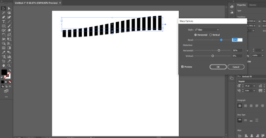
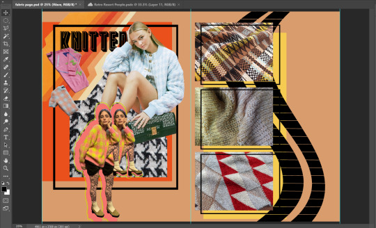
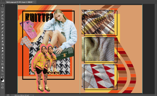
I used Illustrator to add some graphics to this page. I typed out the letter ‘I’ multiple times in the font ‘Bauhaus 93′ to make it look like simple black lines. I used the rise tool to create curves in the letters, and did this with two lines of the letters. I pasted this into photoshop and placed it behind and around the images of the fabrics. I used the ‘Magic Wand’ tool to select the individual black lines and used the ‘Brush’ tool to fill them in with different colours. The colours I chose are used within the fabric on the page and in the colour palette on the opposite page, giving the viewer another illustration of the colour palette.
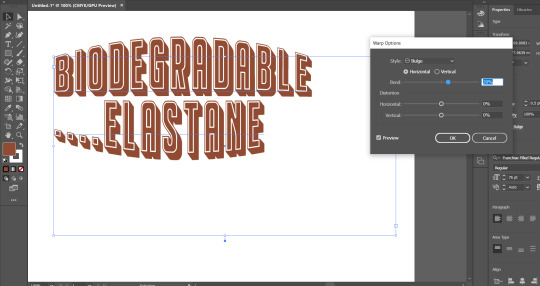
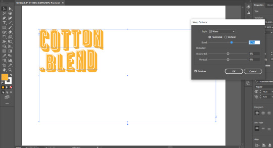
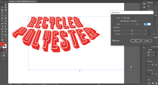
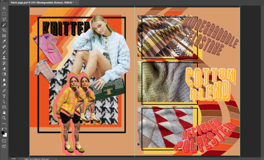
For the typography on this page, I decided to name the fabric that I chose to use. I used the font that has been consistent in all pages with various colours and effects from Illustrator. For the top fabric, I chose a brown colour with a subtle red tone in it to match the colour of the fabric. I used the ‘Bulge’ effect for this particular lettering. I then chose a sunshine yellow for the middle fabric, similar to the muted yellow that is on the fabric, with the ‘Wave’ effect on the words. For the bottom fabric, I used a red with an orange tinge to it to link with the darker red that is seen in the fabric swatch, and used the ‘Shell Lower’ effect to create the shape. I chose to use various shapes for these words to add some variation to the design of the page to make it interesting for the viewer and to ensure the page had adequate design throughout it.
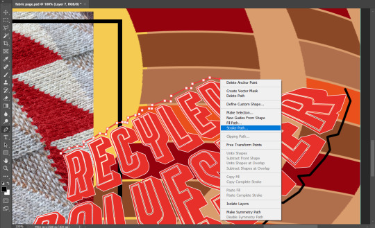
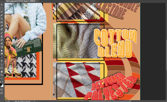
To finish this page, I used the pen tool to create paths along the top and bottom of the lettering. I then used the ‘Stroke Path’ tool to create a black line that followed the curves of the letters. I chose to do this as the page looked quite plain, so by adding this line, it creates a better design to the page. Also, I links to the black boxes that have been placed on the same and opposite page.
To improve these pages, I would add a better illustration in the background of the right page, as it is quite simple. Also, there is a similar illustration on the opposite page, as they are both showcasing a colour palette. Both illustrations may be too much of a demonstration of the colour palette and could instead be changed to something with more contextual reference, such as a pattern. Also, the clothing that both models are wearing on the left page do not directly link to the same colours that are seen in the rest of the pages. This could be changed by using other images that have the colours I have used in my trend, or using the ‘Colour Replacement’ tool to change the colours that do not fit in with the theme.
0 notes