#viking metal icons
Explore tagged Tumblr posts
Text
LyraGoth series Sons of Fëanor. Posting in age order.


Yay. First drawings of 2025 and first time rendering backgrounds.
Some hcs: The brothers are physically affectionate <3 but, like most siblings, they also drive each other crazy. They’re a mafia-like family, bound by blood and oath, with (pretty much) only each other to rely on.
For Maedhros’ hand, I imagine a magical-metal-prosthetic crafted by Curufin—no screws, just brilliance and enchantment *-* The reference was T-1000 from Terminator 2. Tyelko’s style mixes influences from Icelandic Vikings and native Brazilians—my home countries. He and Curufin wear matching Star of Fëanor jewelry.
Also, I did my best to give Carnistir his iconic red face XD
Lastly, Curufin is my favorite. I have countless hcs about him, many of which diverge from fanom (and that’s fine). But for now, I'll just say that I think he looks even more beautiful when he smiles.
#sons of feanor#silmarillion#silm art#maedhros#maglor#celegorm#caranthir#curufin#ambarussa#lord of the rings#lotr#hcs#lyragoth#This Maglor was a gift for dear Erendur because he is her baby
362 notes
·
View notes
Text
In my AU, one of the major aesthetic tweaks I make to the kaldorei is remove a lot of the metal in their armor and replace it with leather, fur, and cloth. They still use metal of course, but for a people who cares so much about and is presumably very knowledgeable about the environment, they'd know mining all that metal is super unsustainable and damaging. Also leather and fur and cloth is easier to move and sneak around in.
With that said, I wanted to do a bit of a redesign for Maiev Shadowsong my beloved. I didn't want to touch her overall silhouette, because that shit is Iconic As Hell, but I replaced the heavy plate with more flexible samurai-type armor. There's already some Japanese/Korean/general SE Asian aesthetic influence in canon, so I wanted to draw on that. Not so much the (fantastical) Viking aesthetic I usually lean into, but I threw some of that in as well (e.g. the winnigas wrapping on her legs).
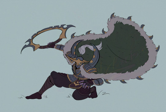
This isn't a "final draft" of her redesign, moreso a proof-of-concept for myself. So there'll be changes, as with all character designs lol
153 notes
·
View notes
Text
Halloween Playlist 2024
Party Monsters by The Haxans (whole album)
Demons by Icon for Hire
Flashlight (The Cullen Song) by eleventyseven
Enemies by Icon for Hire
Creepshow by Kerli
Werewolf by Motionless in White
Look What You Made Me Do by Taylor Swift
The Fountain by MYCHILDREN MYBRIDE (first half)
Skeletons by New Years Day
Nearly Witches (Ever Since We Met...) by Panic! At the Disco (after intro until halfway through)
The Ballad of Mona Lisa by Panic! At the Disco (first half)
Lolita by Lana Del Rey
Carousel by Melanie Martinez (until bridge)
Mad Hatter by Melanie Martinez (until bridge)
Zombie by Family Force 5
Halloweenie by Ashnikko (all 6 of them)
...Ready for It? by Taylor Swift
Mixtape 1 by Drama Club
Forget Forever (Boy Lightning Remix) by Selena Gomez
Mixtape 0 by Drama Club (an interlude between sampled tracks)
Next Level Charli by Charli XCX
Experiment on Me by Halsey
Cannibal by Ke$ha
Mixtape 0 by Drama Club (an interlude between sampled tracks)
The Hospital by And Then There Were None
Mixtape 0 by Drama Club (an interlude between sampled tracks)
Guess (Charli XCX song) remixed by Victoria de Angelis
Mixtape 0 by Drama Club (an interlude between sampled tracks)
If U Seek Amy by Britney Spears
Mixtape 0 by Drama Club
Mixtape 2 by Drama Club
I Wanna Be Your Slave by Måneskin
Techno Viking by Will Sparks (first half)
Automata by Midnite
Mixtape 0 by Drama Club (an interlude between sampled tracks)
Ghostride the Whip by Family Force 5
Live for the Night by Krewella
Heaven's Gate by Ari Mason
Sensitive by Mothica
RITUAL by Waterparks
Click by Charli XCX (just the outro)
c2.0 by Charli XCX (just the long intro)
Dogs Can Grow Beards All Over by The Devil Wears Prada (just the outro)
FUTURE METAL by BABYMETAL
pink diamond by Charli XCX
Who We Used to Be by Eyes Set to Kill (instrumental after second chorus)
Party at a Rich Dude's House by Ke$ha
Towers by Ari Mason
Not Sorry by Eyes Set to Kill
Bloody Mary by Lady Gaga
All My Bones by The Jellyrox
Mixtape 0 by Drama Club (an interlude between sampled tracks)
anthems by Charli XCX
Alice Cooper's Pool House by Hot Milk
Supernatural by Ke$ha
Ritual by Ari Mason
visions by Charli XCX
Lipslap by Kero Kero Bonito
Out Alive by Ke$ha
Cray Button by Family Force 5
Heavy Metal Lover by Lady Gaga
Get Wet by Krewella (rest of album except Human and Pass the Love Around)
#halloween#halloween playlist#halloween365#krewella#kesha#drama club#family force 5#the haxans#charli xcx#i would just make a spotify playlist but#spotify doesnt do portions of songs or have some of these songs#links provided for songs not on spotify
2 notes
·
View notes
Text
Review: Ensiferum - Winter Storm
It's been four years since folk metal icons Ensiferum released an album, 2020's Thalassic. This is not an intolerable amount of time to wait for new music but it is the longest of Ensiferum's career. Fortunately, the wait was worth it, as the band is releasing its new opus, Winter Storm, on Oct. 18.
The nautical-themed, and at times pirate metal, stylings of Thalassic brought some changes to the band's lineup and sound, with the addition of keyboardist and clean vocalist Pekka Montin giving the band a one-two vocal punch. If you enjoyed the changes, then Winter Storm will be an album for you as Montin's participation in the band has only increased and his epic screams have only gotten louder.
This time out, Ensiferum has ditched the open waters as an album theme and has instead turned to the realm of fantasy. All but one song was written by founding guitarist Markus Toivonen from a fantasy novel concept written by bassist Sami Hinkka (who wrote the album's one other song, “Fatherland”). This gives the album the feel of a rock opera, weaving a coherent narrative about two warring factions of Northern armies and the relationship between a nomadic shaman and a mysterious widow. In true rock opera form, everything is bigger on Winter Storm. The choruses swell, the harsh vocals belt out with an increased ferocity, and Montin at times channels Manowar's Eric Adams with his soaring vocals.
One of the album's anthemic highlights is “Winter Vigilantes.” Introducing the audience to one of the two warring factions that make up the story, “Winter Vigilantes” begins with harsh vocalist Petri Lindroos doing his best throat-ripping scream before belting the opening verse. Then Montin comes in with that epic scream and it just cements the viciousness of both the track and the tribe it portrays.
“Fatherland” is notable for being the album's most anthemic song. With an almost Steve Harris-esque bass gallop from Hinkka to anchor, “Fatherland” best features the big choruses where the entire band harmonizes and sounds like a Viking chorus singing an ode to Odin.
Another highlight track doesn't feature Montin or Lindroos on vocals, but Madeleine Liljestam from Eleine, who plays the part of The Widow and takes vocal leads on the entire song. Liljestam has always sung like an angel and her voice here anchors what is as close to a ballad as you get on Winter Storm.
If you enjoyed the addition of clean vocals and the move toward more of a power metal sound than their traditional folk metal, then Winter Storm is an album you're going to love. It takes everything that the band added on Thalassic and cranks it up to 11, leading to a
3 notes
·
View notes
Text
No. 16 - SAS (Scandinavian Airlines System)
I mentioned this was coming beforehand. Today we’re diving into a livery that has a lot more going on than you might think at first glance, a haunting portrait of what Lufthansa’s livery wants to be - the livery of the only airline to be mentioned in more or less every YTP ever made, SAS!

This isn't actually the modern livery, sorry. I'm a fraud. This is an anachronistic 2007 Avro RJ that apparently even back then had a livery basically all but identical to the modern one save for the lack of the SAS text. It still bodies Lufthansa and then some. I just had to find a place to slide it in because it's a very funny image that I love very much.
Legally known by the extremely catchy name “Scandinavian Airlines System Denmark-Norway-Sweden”, SAS was founded in 1946 as a consortium of the national carriers of Denmark, Norway, and Sweden. This makes it among the very few airlines to currently serve as the flag carrier of multiple countries.
It’s been around for nearly 80 years, but it’s only had four liveries in that time. I mention these because I think it’s worth contrasting with Lufthansa, which bled off traits over the decades until it was nothing but a dry husk. Unlike the slowly putrefying decrepit corpse which is Lufthansa, SAS is a young adult trying to find her identity who can't stop dyeing her hair different colors and deciding she hates it. Let's talk about those phases, and where we ended up at the end of it all.
1946 - The Original

image: Bene Robió
This picture is of a modern plane, OY-KBO “Christian Valdemar Viking” (all SAS planes have names ending in ‘Viking’) wearing a retro livery, but it contains the only part of SAS’s original livery of any interest at all.

If we zoom in we can take a look at the end of the cheatline, where it morphs into the figurehead of a Viking longship. This is a nifty little touch that represents their national identity and is itself sleek and nicely designed.

And it looks even better on the 747.
It’s also the only notable thing about this old livery, so it’s not worth lingering on for too long. I thought it was worth mentioning because it's neat, but this livery was literally adopted when they very first began flying - in 1946! At that point it was pretty rare to see airlines have any livery at all aside from their name painted on bare metal. This was actually above and beyond for the time.
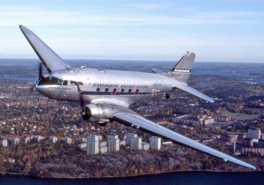
image: towpilot
It didn't look half bad on the DC-3, either. This was a consistently nice style and for its era I would say it was pretty good. But are we judging by the standards of the time? No.
So, for the time I would probably have given it a high grade. But it is not the time.
So I am giving it a C-.
There are still things to like about the longship design, don't get me wrong. But there is just literally nothing else going on, and it's not enough to have the only piece of your livery that's actually identifiable be so small and easy to miss.
1983 - Belly Stripes

image: Lars Wahlstrom
In 1983 they swapped to this livery, commonly known as “belly stripes”, designed by the iconic Landor Associates, prolific purveyors of liveries. It’s a pretty abrupt change, isn’t it? I like this livery, actually. It’s nice, if understated. The stripes are specifically the colors of the Norwegian, Swedish, and Danish flags. Apparently they worried the figurehead would be hard to understand (fair) and the association with Vikings might be bad optics (yet they continued to name their planes this way).
Like I said, it’s nice. It’s fine.
This, like the original livery, is something that can be evaluated by modern standards or by those of its time. In 1983 majority-white liveries weren’t as ubiquitous as they are now and planes still frequently had cheatlines and all-over color and even bare metal fuselages so the bare white plane with the tiny bit of color and the nice font was actually something of a statement. Even by modern standards it’s executed a lot nicer than many similar liveries, but the market is just so saturated that it only really works in the context of its time, I think. Having a plane be nearly all white is no longer an artistic choice. It's a non-choice. And that's the world I live in, and that has to color how I look at this. But all the same...I can't tear myself away from it. In photographs from the time it is as pristine as newly fallen snow.
So I'm giving it a B.
I like the belly stripes livery. It's a neat and unique way of showcasing the flags. It's cleanly executed. I like that the stripes are diagonal instead of straight and that they're aligned with the letters, which are also in a very nice typeface. I just wish it existed in a less Eurowhite-saturated environment where it could shine to its fullest.

I somehow never noticed how adorably stubby the pre -30 DC-9 models were. Thankfully this has been remedied. Just look at her. Like a really round bird hopping through the air.
I think it’s interesting how, while Lufthansa slowly lost creative interest but only ever became a different design altogether in a sort of Ship of Theseus way, SAS fully overhauled their livery multiple times. They’re definitely trying to find something that works for them, regardless of the cost. They refuse to rest on their laurels. I admire that mindset, and it’s not ended badly so far.
And then it was 1998.

If you look very closely you can see something horrible in the distance.
No, okay. It can't be as bad as you're making it out to be, you say. And you are a fool for saying this.

Oh no. Oh no. Sweetheart, what happened to you?
So, this is really really bad. Really really really bad. This looks like it was designed with the same philosophy I used to design original characters in middle school - oh, I like this color, let me add it without considering the overall balance or composition. This design was made by people who were paid to make it.
This has almost all the features I hate most in a livery, all the way up to the abrupt color transition at the tailfin, but an additional one: that absolute atrocity right at the front. If you’re confused what I’m referring to, I don’t blame you - they made it nearly invisible. If you squint very hard, though, you can see ‘SCANDINAVIAN’ above the windows and ‘AIRLINES’ below it, completely illegible due to being painted in a silver color barely darker than the main fuselage itself.

It looks amazingly funny with rear-mounted engines, though. That's her fanny pack.
All I can really say is: why. Why did you do this? Why.
I am actually somewhat ashamed of how little I noticed this when out in the wild. It’s a testament to the sheer saturation of mostly plain liveries with a hint of red and/or blue that this monstrosity blended into the background and evaded my notice. (And in my defense I’ve never been to one of their focus cities so sightings have only been in passing.)
This might sound harsh, but I'm about to say this and stand by it. Here is a better SAS livery from the same time period.

With the engine covers on it looks like one of those plastic tips they put on toy pistols. Also, doesn't keeping the red engine caps defeat the purpose if you also have red engines, since they're meant to be clearly visible so you don't accidentally try to use the plane with them on? Do they not have a different color available for red engined freaks? Many questions.
That's right, SAS's 1998-2019 livery fails the Star Alliance Test!
What is the Star Alliance Test, you ask? It's very simple. Star Alliance is an airline alliance - basically a club for the world's most elite carriers to hang out in and codeshare. The three major alliances all have special liveries that they might have a couple planes from each of their members wear.
I hate alliance liveries. I think airline alliances should be represented by a little symbol on the airline's standard livery, not the other way around. I would like to know what airline this plane is from before I know if it's a member of OneWorld or SkyTeam. And if I need to know that they usually have a symbol for the alliance somewhere on the plane anyway.
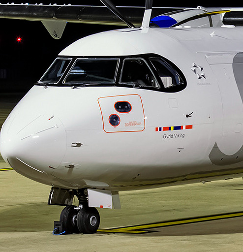
The Star Alliance logo on a SAS ATR 72, directly behind the cockpit window and in front of the door. If you really squint you can even see the words 'Star Alliance' written underneath it.
Star Alliance is my least favorite. SkyTeam's livery actually looks pretty good. OneWorld's is the ugliest at base, but it lets the airline keep some of its branding at the back of the plane, which makes me hate it less. So Star Alliance loses by default. (Let me know if you'd like a full review for these, though.)
The Star Alliance Test has exactly one question. Would I prefer that all this airline's planes were forcibly repainted into Star Alliance liveries instead of allowed to remain in their current state?
In this case, yes. I very much would. And that means there's only one grade I can give to this livery.

F. See me after class.

That's right. Fly away. Ideally to get repainted in something more presentable.
The 2019 Overhaul

(To clarify, when I compared Lufthansa to SAS in my post about them I did not want to imply that they literally copied SAS - their revised livery obviously came out a year earlier, and they were definitely developed privately around the same time to keep up with modernized trends surrounding livery - they’re just similar safe, non-revolutionary concepts that SAS executes a lot better.)
I don’t normally buy the whole ‘the darkness must come before the light’ line of thinking, but SAS clearly does. Because even here, in this abomination, are the building blocks for what would become something reasonably decent. And, in 2019, SAS made that happen.

Those are engine covers, by the way. There's no red on the engines. There's actually a tasteful silver trim under there.
So, this is what we've achieved. At first glance, it looks pretty similar to Lufthansa, but the closer you examine it the clearer the differences become.
First, the white fuselage. Well, actually, that’s not the case for SAS. It looks white in bright sunlight, but it’s actually an off-white beige (Pantone 9083C). You can see that in this picture of an SAS plane parked next to a SWISS plane, and when you put a bunch of Scandinavians in crisp white shirts in front of it.
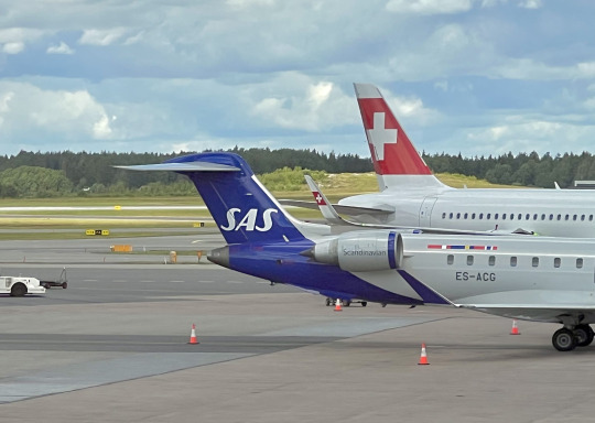

image source (left): Daniel Ross | image source (right): SAS
I mean, no, it’s not exactly neon pink or anything, but it’s still a noticeable change in tone relative to other planes, and that means it’s a decision someone made. And that makes me happy.
I think the world has begun to somewhat agree with me on the whole non-integrated-tail-colorblock being bad to look at, because SAS has also extended the stripe of blue down to loop under the rest of the fuselage. Honestly, if I were them I would have made it wider so it covered the full empennage on t-tail models, but that might make it look weird in its own way - I’m not here to design liveries, I’m here to complain about them. I just think it's still a bit too small to make the jet look fully balanced with the big SAS at the front.
The awful red engines have been replaced with a far more tasteful alternative - silver with a blue stripe at the front and silver trim on the very front edge. I like that a lot. No criticisms.
The silver text has been kept, but it’s been reduced from a bunch of small letters to just a very large SAS, which is a lot clearer even when in low contrast. It’s difficult to nail down my thoughts on this. Obviously it’s an improvement, and I wouldn’t want it to be removed entirely, and I’m not sure if a more solid, emphatic version, maybe in the same blue as the rest of the livery, would actually be better or not. I think I overall like the silver wordmark? As long as it’s not a really bad angle it’s visible enough, and it adds something a bit interesting. Even if it is illegible at least they also have the name on the tail. It probably helps that it’s only three letters long. Still, nobody is going to be confused about what airline this plane belongs to.

I think the wordmark looks its best on turboprops wearing the livery. I honestly feel like most good jet liveries look awkward on props and vice versa, but this transitions very well. Not many major airlines still fly props, and almost none of them adapt their liveries well to them, but the wordmark fills the space really nicely on the shorter fuselage of the ATR and the high wings break up the line in a way that looks pretty darn nice to me. More airlines need to fly props, and they need to take notes on how to make a livery work for them.
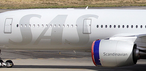
Aside from the too-small amount of blue, my one real outright complaint is the very small Noto Sans(?, unsure) ‘Scandinavian’ written on the engine nacelles. It feels pointless and looks out of place. It looks extra out of place because the rest of their livery is in Rotis semi-serif, and the combination really clashes. It’s a little baffling, because they certainly have the option of just using the SAS logo again - the only other place they use the full ‘Scandinavian’ is on the belly. My personal suggestion would be bringing back the longship figurehead for the engines, but that’s just me. It just looks more like a watermark than a design feature.
Look, I never said I loved the SAS livery, but someone clearly designed it. The implementation is still a little shaky in parts, as if the airline is regaining its footing after the red engine years, but it’s stumbling towards being good and it’s just short of the point where it can sit down and rest and reflect on its progress.
SAS gets an overall grade of C. Which is also what the GPA of the other three came out to, I think! My calculations are admittedly a bit improvised.

Makes Lufthansa look like chumps, though. I think we can all agree on that.
#tarmac fashion week#grade: c#grade: c-#grade: f#scandinavian airlines system#region: europe#region: northern europe#region: norway#region: sweden#region: denmark#landor portfolio#era: 2010s#deltalike#lufthansa declined#era: 2000s#era: 1990s#era: 1980s#era: 1970s#era: 1960s#era: 1950s#era: 1940s#era: 2020s#double sunrise#retired liveries#flag carriers
22 notes
·
View notes
Text
TAG NINE PEOPLE YOU’D LIKE TO KNOW BETTER!

favourite colour(s): purple
favourite flavour(s): savory, sugary, anything coffee flavoured
favourite genre(s): drama, thriller, horror
favourite music: nu-metal, darkwave
favourite movie(s): The Dark Knight, Sid and Nancy, Candy
favourite series: The Boys, Wayne, Skins UK, Vikings, AHS, TWD, Misfits, The End Of The F***ing World, Yellowjackets, Brassic, Gotham
last song: Bullet With Butterfly Wings - The Smashing Pumpkins
last series: The Sopranos
last movie: White Girl (2016)
currently reading: The Joker: The Man Who Stopped Laughing
currently watching: Succession (Season 2) and today I've started Riverdale...
currently working on: drafts/icons
tagged by: @sheldoney and @qu-tipie tagging: @jeannnius @fxntasmagoria @ygbsm @malka-lisitsa @freakarus @nightmarefuele @evildollface @miercolaes @atropineshot
10 notes
·
View notes
Text

@seimsisk I'm always happy to elaborate!
When you look at early heavy metal bands from the early to mid 70's like Black Sabbath, Rainbow, or Deep Purple it's very obvious that the leather-and-studs look that is now universally associated with the genre just Wasn't A Thing Yet. Most of these bands either sported a more subdued denim + tee + maybe a leather or denim jacket look, or in the case that they went for more extravagant outfits these were almost always inspired by the hippie aesthetics of psychedelic rock.
(Deep Purple:)

(Rainbow:)

(Black Sabbath:)


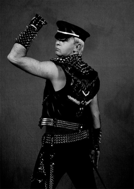
Studded leather wasn't established as THE look of metal fashion until 1978 when, coinciding with the promotion of their fifth studio album Killing Machine (renamed to Hell Bent For Leather for its U.S.A release), Judas Priest started sporting black studded leather outfits inspired by vocalist Rob Halford's admiration for the leather subculture (although according to some sources, even though Rob Halford was the one with an interest in leather fashion, it was originally guitarist K.K. Downing's idea to incorporate that look into their band image)

This look soon became iconic and went on to define the band's image from then onward.
This shift in Judas Priest's image was responsible for introducing not only black leather as a cornerstone of metal fashion, but also many of the elements that would be adopted by many metal bands during the New Wave of British Heavy Metal movement from the early 1980's, such as biker vests, chains, studded belts, and spiked armbands and gauntlets.
Of course, other bands would eventually continue to further develop upon these foundations, by introducing other iconic elements of metal fashion such as bullet belts, occult symbols, pagan/viking imagery, corpsepaint, etc., but Judas Priest (and especially Rob Halford) can be considered the first band to ever solidify leather and studs as THE look of metal.
I know it's a decently well-known fact nowadays that pretty much every foundational aspect of metal aesthetics was introduced by Rob Halford, whose outfits were explicitly inspired by the leather scene of the gay bars he used to frequent, but still. Sometimes I have to stop and think about how funny it is. Like. This one gay guy got entire generations of straight metalheads to start dressing up like gay sex perverts.
25K notes
·
View notes
Text
Celebrity Fits Sightings: Breece Hall Rocks 9dcc in Stylish Tunnel Fit at NFL London Game

This past Sunday, New York Jets running back Breece Hall made waves with his bold tunnel fit at the 2024 NFL London Games. Arriving at Tottenham Hotspur Stadium for the highly anticipated matchup against the Minnesota Vikings, Hall turned heads in a sleek 9dcc Satin Dobby Bomber in Sage, paired with a sharp 9dcc Premium Pinstripe Tailored Dress Shirt.
His effortlessly stylish look brought a fresh, cutting-edge vibe to the iconic stadium, blending fashion and football as American gridiron action landed in the UK. Hall’s fit wasn't just a game-day look—it was a statement, showcasing the fusion of high-end streetwear and the excitement of international sports.


9dcc Satin Dobby Bomber: The Ultimate Fall Essential
Looking to elevate your fall wardrobe? The 9dcc Satin Dobby Bomber (MSRP $600) is the standout piece you need this season. Part of 9dcc’s newest collection, this premium bomber is crafted from Japanese waterproof satin, blending luxury with performance. With its rich texture, refined stitching, and attention to detail, this jacket is the perfect fusion of high-end fashion and functional outerwear. Available in black, sage, and midnight navy, it's designed to keep you looking sharp while staying prepared for any weather.
Available now https://9dcc.xyz/products/9dcc-premium-satin-bomber


9dcc Tailored Overshirt: A Modern Essential
Complementing his bomber, Breece Hall rocked the 9dcc Tailored Overshirt, a bold statement piece in white with an oversized fit and sleek metal accents. This overshirt seamlessly blends technology with fashion through its signature '9' patch NFC chip, making it a must-have for the fashion-forward crowd. Combining timeless tailoring with a contemporary twist, this piece is designed to stand out both on and off the field. Also available in Blue Pinstripe and Glenn Plaid, the 9dcc Tailored Overshirt brings a fresh edge to any wardrobe.
Available now https://9dcc.xyz/collections/co-01-2024
0 notes
Text
Ah damn finally I finished my folk clothes concept of my fiction project work. I WOULD EXPLAIN THE WHOLE STUFF YIPPPEEEEE

Llora: The Home Galaxy of Gary
Llora is Gary's home galaxy, and it can be thought of as a space or alien version of Germany, though with some differences. The inhabitants of Llora are divided into two main races: Herzt and Norsk.
Norsk: This race is inspired by ancient Viking and Norse Scandinavian cultures. Most of them have blonde hair, and some (though a minority) follow Norse mythology, believing in gods like Odin, Thor, Loki, and Heimdall. They also believe that the capital planet of Llora, Minisk is akin to Asgard, the home of the Aesir gods. Norsk originally come from planets Minisk, Jerze, and Fjoshr. In ancient times, they were skilled miners, hunters, builders, and blacksmiths, capable of crafting vehicles and melee weapons.
Herzt: This race, with dark hair, has a distinct Celtic-Teutonic vibe. As you might guess from Gary's full name, Gary Erwin O'Fionnaghal, he belongs to the Herzt clan. They adopted a form of Catholicism brought by the Jesto people through trade. In ancient times, the Herzt were mostly farmers, experts in agriculture, medicine, and metal sculpting. They excelled in sculpting metal for tools, weapons, and infrastructure, including buildings and houses. They were also the first to create firearms and iconic musical instruments, like one resembling a Kithara. Interestingly, they are also credited with inventing beer. The Herzt originally came from the planets Vinz, Drien, and Nitz.
Both races share a writing system similar to ancient Norse runes. Over time, they developed a common language, now known as the Llora dialect of German, and these runes became their official alphabet. Culturally, both the Herzt and Norsk are known for being quite barbaric. A notable aspect of their culture is the normalization of same-sex relationships, which have been accepted since ancient times, long before Earth was struck by Theia.
---
Ida: The Home Galaxy of Johann
Ida is Johann’s home galaxy, and its people, the Elmaz, are like a space or alien version of the British. However, their culture is about 4.5/100 similar to ancient Rome and Sparta.
The Elmaz are known for their fighting skills and iconic martial arts. In battle, they are ruthless and fierce, similar to the Spartans. They train in special battle arenas with various challenges, such as spear duels, sword duels, climbing, and chariot combat. Even in modern times, these training grounds are used to test individuals aspiring to enter the military or intelligence academies. Johann himself trained in such an academy, which is why he's so skilled.
The Elmaz were pioneers in technology, developing it from the rich natural resources in their territory. They are hardworking and renowned explorers. Despite their fierce nature, the Elmaz are deeply loyal to their comrades and care deeply for one another, like brothers. If one of their own goes missing or dies, they feel a profound sense of loss. They also have their own mythology, with gods like Agnethe, the Goddess of War, and Tigenar, the God of Wisdom. However, with the arrival of the Jesto people, followers of the Elmaz mythology have dwindled. Their old language was Latin, which evolved into the British English they speak now.
---
Olimpa: The Alien Version of Greece
The race from Olimpa is called the Toze, and as you might expect from the name, they are devout worshippers of gods like Zeus, Hera, Artemis, Apollo, Athena, Ares, Hades, and Poseidon. Mount Olympus is located on their capital planet, and they have a temple there as well. Historically, this race was fanatically devoted to their mythology.
In ancient times, the Toze were a poor civilization. When the Ida (Elmaz) tried to help them, the Toze rejected their assistance, leading to a war between the two. The Toze were defeated and eventually apologized to the Ida. For a time, Olimpa became part of the Ida Empire. Even after Ida left the empire, Olimpa remained an ally, benefiting from their advancements in technology and civilization. Without the Ida, Olimpa would likely have remained underdeveloped. Sadly, in my current lore, Olimpa has been completely wiped out after being conquered by Llora, and no Toze remain.
---
Civilization Timeline
In my lore, the Ida civilization (Elmaz) is the oldest, followed by Llora (Herzt and Norsk), and finally Olimpa (Toze). The Ida are the most advanced technologically.
Unique Traits of Each Race
- Herzt: If one of their body parts is cut off, it will grow back.
- Norsk: They have three lives.
- Ida/Elmaz: They can live up to 200 years.
There are more other races in my lore , and I'm sure I will plan to develop them later!
Close-ups!


1 note
·
View note
Text
10 Best Viking Gifts for Dad: Unleash the Norse Spirit
If you’re on the hunt for the perfect gift for a Viking enthusiast or a dad who appreciates the rugged spirit of Norse mythology, you’re in the right place. This list of the 10 best Viking gifts for dad is designed to help you find something truly special that celebrates his love for Viking culture and history. From practical items to decorative pieces, these gifts are sure to make any dad feel like a true Norse warrior.
1. Viking-Style Hammer Pendant Necklace
For a gift that blends style with symbolism, consider a Viking-style hammer pendant necklace. Featuring the iconic Mjölnir, Thor’s hammer, this piece of jewelry not only looks striking but also carries deep Norse meaning, representing strength and protection.
2. Personalized Viking Drinking Horn
A personalized Viking drinking horn makes for an excellent gift for any dad who enjoys a good drink with a side of history. Customize it with his name or a special message to make it a memorable keepsake. Perfect for display or for enjoying a hearty ale!
3. Handcrafted Viking Beard Comb
For the dad who takes pride in his beard, a handcrafted Viking beard comb is a practical yet stylish choice. Made from high-quality wood or metal, these combs often feature intricate Norse designs and are a great way to keep a beard in top shape.
4. Viking-Themed Leather Wallet
A Viking-themed leather wallet combines functionality with a nod to Norse heritage. Look for wallets featuring Viking runes, symbols, or designs that capture the essence of Viking craftsmanship. It’s a daily essential that also tells a story.
5. Viking Warrior Figurine
For the dad who loves collecting, a Viking warrior figurine can make a fantastic addition to his display. Choose from detailed statues that depict famous Viking figures or mythical Norse warriors, and let his passion for Viking history shine.
6. Norse Mythology Book Collection
A collection of books on Norse mythology and Viking history can be an enriching gift. Look for comprehensive volumes or beautifully illustrated editions that delve into the rich tapestry of Viking legends and lore.
7. Custom Viking Shield Wall Art
Turn any space into a Viking stronghold with custom Viking shield wall art. This unique decor piece can be personalized with family names, mottos, or traditional Norse designs, adding a touch of Viking spirit to his home or office.
8. Viking Runestone Puzzle
For a fun and engaging gift, consider a Viking runestone puzzle. These puzzles not only provide entertainment but also feature intricate designs that reflect the artistry of Viking runestones, making them a great conversation starter.
9. Viking-Inspired Outdoor Gear
If your dad enjoys the great outdoors, Viking-inspired gear such as a durable camping knife or a rugged leather backpack can be both practical and thematic. These items combine functionality with Viking aesthetics, perfect for his next adventure.
10. Runic Norse Symbol Embroidered Jacket
A runic Norse symbol embroidered jacket is a stylish way for your dad to showcase his Viking pride. Look for high-quality jackets with subtle embroidery of runes or Viking symbols that make a bold yet refined statement.
0 notes
Text
The Best Handmade Viking Axes | Folding Knives Gift Item

Introduction
In the world of outdoor gear and collectibles, Handmade Viking Axes and Hunting Knives stand out as specific gadgets that mix records, craftsmanship, and functionality. These objects now not handiest serve realistic functions but also embody a wealthy cultural heritage, making them perfect gift gadgets for fanatics of records, craftsmanship, and out of doors activities. This article explores the iconic legacy of Viking axes, the meticulous craftsmanship worried in making them, and why they make exquisite presents.
Unveiling the Legacy of Handmade Viking Axes
The Vikings, seafarers and warriors of the early medieval period, are renowned for his or her skill in crafting strong and efficient equipment. The Viking awl is a prominent instance in their ingenuity. Originally used for combat, those axes additionally served as critical tools for ordinary obligations together with cutting wood and hunting. The craftsmanship of those axes has been exceeded down via generations, maintaining the strategies and traditions that make each axe a work of art.
Crafting Mastery: The Art of Making Handmade Viking Axes
Creating a Handmade Viking Axe is a labor-intensive system that needs a high degree of ability and precision. Blacksmiths begin with a excessive-carbon steel blank, which is heated till it's far malleable. The axe head is then solid thru a aggregate of hammering and shaping, a technique that can take several hours to complete. The blade is honed to a sharp edge, able to withstanding the pains of looking and outdoor activities. The take care of, regularly made from hickory or ash, is carved and suited to make certain a comfortable and secure grip. Each axe is a testimony to the blacksmith's ability and determination.
4. Features of Handmade Viking Axes as Hunting Knives Gift Items
Handmade Viking Axes, whilst tailored for use as looking knives, provide a completely unique mixture of ancient craftsmanship and modern-day functionality. These axes normally feature first-rate metallic blades which can be both sharp and durable. The handles are designed for a cushy grip, ensuring ease of use at some point of prolonged intervals. Many of those axes additionally include custom leather sheaths, which no longer best defend the blade however also enhance the general aesthetic attraction. The aggregate of capability and beauty makes those items ideal for gifting.
Why Opt for Handmade Viking Axes as Hunting Knives Gift Items?
Choosing Handmade Viking Axes as hunting knives gift gadgets is set greater than just practicality. These axes are symbols of strength, craftsmanship, and history. They are best for folks who admire the outside and cost first-rate, hand made gear. Whether used for looking, tenting, or actually as a collectible, these axes offer a completely unique present enjoy that goes beyond the normal.
The Symbolism and Cultural Significance
Handmade Viking Axes convey deep cultural and symbolic meanings. In Viking subculture, axes were no longer just equipment or guns; they had been symbols of electricity, resilience, and craftsmanship. Gifting a Handmade Viking Axe is akin to bestowing a piece of history and way of life upon the recipient. It is a gesture that recognizes the recipient’s appreciation for heritage, craftsmanship, and the brilliant outside.
Maintenance and Preservation Tips for Handmade Viking Axes
To make certain the toughness and performance of your Handmade Viking Axe, right renovation is critical. After each use, clean the blade with warm, soapy water and dry it very well to prevent rust. Regularly practice a skinny layer of oil to the blade to protect it from moisture and corrosion. The deal with must also be maintained by means of every so often applying wood oil to prevent drying and cracking. Store the axe in a fab, dry region, ideally in its sheath, to defend the blade and take care of from damage.
0 notes
Text
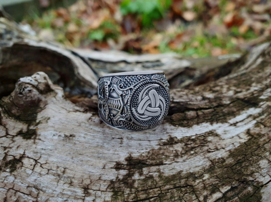
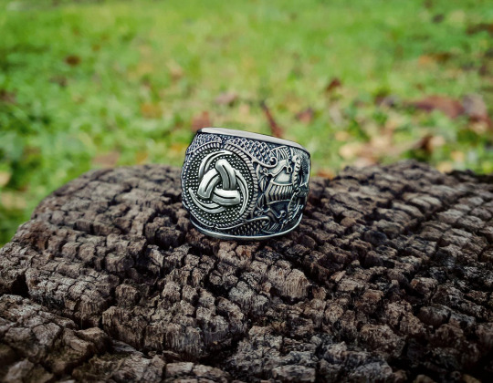
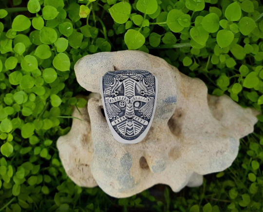
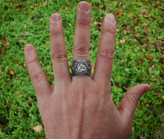
Odin horn ring Metal: sterling silver (925) Weight: approx. 17 g (0,59 oz)
Within the realm of Scandinavian Vikings, the Triple Horn of Odin reigned as a prominent pagan symbol, epitomizing the divine presence of the revered Norse deity, Odin. This emblem, comprised of three interlocking horns, held deep significance and served as a visual representation of Odin's might and sovereignty. The triple horn, commonly associated with wine, evoked connotations of strength and power, encapsulating the essence of Odin himself. Moreover, the symbol carried a profound message, embodying the relentless pursuit of wisdom, knowledge, and the thirst for discovery.
Steeped in ancient mythology, the origins of the Triple Horn of Odin can be traced back to the captivating saga surrounding Odin's quest for the legendary mead known as Odhroerir/Óðrerir, also known as the Mead of Poetry. The myth tells of a significant accord between the gods of Asgard and Vanhaem, aiming to resolve their conflicts through peaceful means. To solemnize this agreement, the divine beings contributed their saliva to a communal vat, giving rise to the awe-inspiring figure of Kvasir, renowned for his unparalleled wisdom and sagacity.
However, tragedy befell Kvasir when two conniving dwarves schemed his demise, extracting his life essence to create an extraordinary elixir. By combining the divine blood with honey, they fashioned a magical concoction capable of endowing those who partook in its consumption with the gift of poetry and wisdom. To safeguard this enchanted honey, the dwarves meticulously stored it within two vats named Son and Bodn, accompanied by a revered cauldron named Odrerir.
Driven by an insatiable quest for enlightenment, Odin, the supreme leader of the gods, embarked on a relentless journey to acquire this coveted honey. After an arduous search, he eventually stumbled upon the sacred cauldron, consuming its entire contents while simultaneously draining the two accompanying vats. Transfiguring into the majestic form of an eagle, Odin soared towards the celestial realm of Asgard, evading any potential threats or adversaries that might impede his pursuit.
This captivating myth left an indelible imprint upon Viking culture, permeating their customs and traditions. It ignited the popularity of mead, an intoxicating beverage crafted from the fermentation of honey and water, which became synonymous with their celebrations and rituals. Furthermore, the use of drinking horns became intrinsic to Viking practices, serving as vessels for the revered mead and playing a central role in ceremonial toasts. Consequently, Odin's triple horn became an iconic symbol, forever entwined with the transformative power of honey, embodying the realms of wisdom and poetic inspiration that it unlocked.
#vikingjewelry#exclusivejewelry#likeaviking#vikingstyle#norse#vikingring#ring#handmade#Odinmask#Odin#Triplehornring#Triplehorn#Odinring#Hugin#Munin#silverring#silverjewelry#vikings#handmadejewelry#OdinHornRing#NorseJewelry#ScandinavianStyle#VikingAccessories#HandcraftedRing#OdinsBlessing#VikingCulture#MythologicalInspiration#NorseMythology#VikingArt#NordicDesign
0 notes
Text
Decoding the Essence of the "Let The Bodies Hit The Floor" Shirt
In the ever-evolving landscape of fashion, certain garments transcend their materiality to become vessels of cultural significance, imbued with layers of meaning and symbolism. Among these, the "Let The Bodies Hit The Floor shirt" emerges as a striking emblem, encapsulating the raw energy and rebellious spirit of heavy metal culture. In this exploration, we delve into the essence of this iconic shirt, unraveling its origins, interpretations, and enduring appeal.
A Melodic Overture: The Legacy of Drowning Pool
At the core of the "Let The Bodies Hit The Floor" shirt lies a homage to the seminal heavy metal anthem "Bodies" by Drowning Pool. Released in the early 2000s, the song became a rallying cry for fans of the genre, celebrated for its pulsating rhythm and cathartic lyrics. The refrain, "Let The Bodies Hit The Floor," echoed throughout stadiums and mosh pits, embodying the unbridled energy and defiance of the metal ethos.
For aficionados of Drowning Pool and the broader heavy metal community, wearing this shirt is a visceral expression of allegiance and camaraderie. It serves as a tangible connection to the music that has soundtracked their lives, evoking memories of concerts, festivals, and shared moments of sonic intensity.
Seemore: https://www.scoop.it/topic/the-viking-t-shirts/p/4151432718/2024/03/07/unveiling-the-power-behind-the-let-the-bodies-hit-the-floor-shirt
Boldness in Manifest: Embracing the Intensity
Beyond its musical connotations, the "Let The Bodies Hit The Floor" shirt embodies a spirit of unapologetic boldness and rebellion. The phrase itself is a defiant proclamation, a rejection of societal norms and constraints. To wear this shirt is to embrace the visceral and the chaotic, to defy the status quo with unwavering conviction.
In a world that often demands conformity and assimilation, this shirt serves as a badge of individuality and defiance. It symbolizes the freedom to express oneself authentically, without fear of judgment or censure. It is a declaration of strength, resilience, and the refusal to be silenced or subdued.
Craftsmanship and Aesthetic: Where Form Meets Function
While the message of the "Let The Bodies Hit The Floor" shirt is undeniably potent, its allure is further heightened by its craftsmanship and design. Constructed from premium materials, it offers both comfort and durability, ensuring longevity and wearability. The unisex silhouette accommodates diverse body types, while a range of sizes fosters inclusivity and accessibility.
Moreover, the shirt's aesthetic versatility allows for seamless integration into various wardrobe ensembles. Whether paired with distressed denim for a casual look or juxtaposed with leather for a hint of edge, it adapts effortlessly to diverse style sensibilities. This fusion of form and function solidifies its status as a timeless staple for enthusiasts of heavy metal fashion.
Navigating Interpretations: Context and Consideration
Despite its resonance within the heavy metal community, the "Let The Bodies Hit The Floor" shirt may evoke varied reactions and interpretations. The phrase it bears carries potent connotations of violence and intensity, which may unsettle or offend some individuals.
Seemore: https://www.flickr.com/photos/thevikingtshirts/53571204987/
As such, wearers must approach their choice to don this garment with mindfulness and consideration. While it may serve as a source of empowerment and camaraderie within certain circles, it's crucial to acknowledge its potential impact on others. By fostering open dialogue and respecting diverse perspectives, wearers can navigate the nuances of this shirt with empathy and awareness.
In Conclusion: A Tapestry of Identity and Expression
In summary, the "Let The Bodies Hit The Floor" shirt transcends its status as mere apparel; it is a tapestry of identity, expression, and cultural resonance. Whether worn as a tribute to a beloved band, an assertion of individuality, or a catalyst for conversation, it holds different meanings for each wearer. By embracing its power with mindfulness and empathy, individuals can harness its transformative energy to forge connections, challenge conventions, and express themselves authentically in a world that often demands conformity.

0 notes
Text
TÝR Unleash 'Hammered' Video / Single from Upcoming Full-Length Album
Photo by Gaui H. Faroe Islands-based Viking metal icons TÝR today unleash their latest single and accompanying video for “Hammered.” The track comes by way of the group’s ninth full-length studio album, Battle Ballads, set for release on April 12th via Metal Blade Records! When TÝR teamed up with the Symphony Orchestra of the Faroe Islands on February 8th, 2020, to record the double-disc/DVD…

View On WordPress
0 notes
Text
Crafting Carnage: The Art and History of the Viking Battle Axe
The Viking axe, often associated with the Norse warriors of the Viking Age (approximately 793 to 1066 AD), was a crucial weapon for these seafaring people. The Viking axe came in various forms and sizes, each serving specific purposes in battle or daily life.

There were two main types of Viking axes:
Battle Axe: This type of axe was designed for combat and had a long, broad cutting edge. The blade could be single-edged or double-edged, and the length of the handle varied. Some Viking axes had a longer handle for two-handed use, while others had a shorter handle for one-handed use in combination with a shield.
Bearded Axe: The bearded axe was a versatile tool used both in battle and for everyday tasks. It earned its name from the elongated lower blade resembling a beard. The design allowed for a longer cutting edge while maintaining a lighter weight. This type of axe was well-suited for chopping wood, but it could also be a formidable weapon in combat.

Viking axes were typically made of iron and had a wooden handle, often reinforced with metal at the connection point to prevent breakage during battle. The design of the axe heads varied across regions and over time, reflecting different cultural influences and the evolving needs of the Viking warriors.
Viking axes were not only weapons but also practical tools for the Norse people, used in various aspects of daily life such as woodworking, farming, and construction. The versatility of the axe made it a crucial part of Viking culture and warfare during the Viking Age.
The history of Viking axes is closely tied to the broader context of the medieval weapons, a period that roughly spans from the late 8th century to the early 11th century. The Vikings, seafaring Norse people from the regions now known as Denmark, Norway, and Sweden, played a significant role in European history during this time.
Here is an overview of the history of Viking axes:
Functional Tools: Early Viking axes were primarily tools used for practical purposes in daily life. They were essential for tasks such as woodworking, building, and farming. Axes with broad, single-edged blades were common for these purposes.
Transition to Weapons: As the Viking Age progressed, the Norse people began to use axes as weapons in addition to tools. The practicality of the axe as a tool contributed to its effectiveness as a weapon, and Vikings adapted their designs for both purposes.
Battle Axes: Viking warriors developed specialized battle axes for combat. These axes had longer handles and larger, more menacing heads. The design allowed for powerful strikes, and the shape of the blade varied from region to region. Some had single-edged blades, while others had double-edged blades.
Symbolism and Rituals: Axes held cultural and symbolic significance for the Vikings. They were often decorated with intricate carvings or runes, showcasing the craftsmanship of the Norse people. Additionally, axes played a role in religious and burial rituals, with some buried alongside the deceased as grave goods.
Variety of Designs: Viking axes came in various designs, reflecting regional preferences and evolving craftsmanship. The bearded axe, with its distinctive elongated lower blade, became a popular and versatile choice for both practical use and combat.
Material and Construction: Viking axes were typically made of iron, and the handles were crafted from wood. The construction of the axes evolved over time, with some featuring socketed heads, where the axe head fit into a socket in the handle, providing a more secure connection.
Legacy: The Viking Age came to an end with the spread of Christianity and the gradual integration of the Norse people into medieval European societies. However, the legacy of Viking axes persists in popular culture and historical reenactments, where they continue to be iconic symbols of the Norse warrior spirit.
Overall, the history of Viking axes is intertwined with the dynamic and adventurous spirit of the Viking Age, showcasing the adaptability and ingenuity of the Norse people in both their everyday lives and on the battlefield.
0 notes
Text
Philly Hoagie Black Ck Met 666 Metal Mug
Cozy up with a mug with Philly Hoagie Black Ck Met 666 Metal Mug, welcome to the city of Brotherly Love, Philadelphia! Known for its rich history and diverse culture, Philadelphia is also famous for its iconic food scene. And one of the most beloved dishes that has become synonymous with the city is the Philly Hoagie. This sandwich, also known as the Philadelphia Cheesesteak, is a delicious combination of thinly sliced meat, melted cheese, and fresh vegetables, all packed between a soft roll.
Buy now: Philly Hoagie Black Ck Met 666 Metal Mug

More Post:
Philly Hoagie Black Ck Met 666 Metal Mug
Your First Mistake Was Thinking I Was One Of The Sheep Viking 2024 Shirt
Visit Store: https://bbcmug.com/
0 notes