#region: northern europe
Explore tagged Tumblr posts
Text
No. 55 - Finnair [+ Centenary Livery]
So I know I'm in the process of writing a bunch of longer posts and thus haven't posted in absolutely forever, but I had to let something cut the line very quickly because in this case it was somewhat time-sensitive. I've missed the actual date by two months, but if I get in a post while it's still 2023 (...in my timezone, at least, so sorry to actual Finns busy enjoying 2024) I think that counts, and this entire blog is about what I think, so that means it counts.
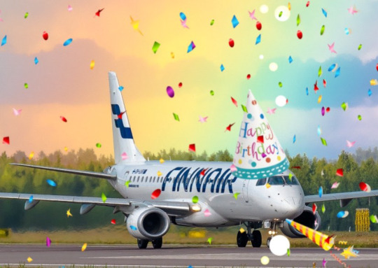
On 1 November 2023 Finnair became the sixth airline to turn 100 years old, consistent with its status as the sixth oldest airline in continuous operation. I wish I'd started this blog earlier in the year, or prioritized differently, because Aeroflot and Czech Airlines also turned 100 in 2023, but...well, I didn't. You'll probably see them both in 2024 instead. Finnair, however, was requested by @kuivamustekala - particularly their centenary liveries. Requested a long time ago, even. So I'm going to hope that late is better than never and throw Finnair one last birthday party to wrap up 2023 by looking at where they started, where they are now, and what they've been doing to celebrate.
1923: PROTO-FINNAIR
Finnair, obviously the flag carrier of Finland, was founded in 1923, but its first service was in early 2024, using a Junkers J.13 (fitted with obligatory floats, as there were no suitable airstrips in Finland at the time).
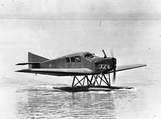
image: Joseph Eaton via US Navy National Museum of Naval Aviation This is actually the US license-built version, the Junkers-Larsen JL-6, but I couldn't find any pictures of actual J.13s on floats.
Unfortunately, Finnair was founded under the name 'Aero', which is probably the actual single worst name for an airline I have ever heard. We can jest and joke about things like Jet2 and Fly Air, but I sincerely do not think I have ever seen anything with worse SEO than an airline named 'Aero'. Even for 1923 this was fairly dire - back then, as for much of history, airlines were generally named for the area they served. Aero may have been a private company, rather than state-owned, but that didn't mean they couldn't name themselves for the area they served - private airlines have always done this and still do. Incredibly enough, there was a second 'Aero' founded in Poland in 1925, but that was quickly merged into what would become LOT Polish Airlines, shedding the name like a chrysalis.
Bafflingly, even when the Finnish government bought the airline in 1946 (they still own a majority share of it today) they didn't bother to change the name. They did begin writing 'Finnish Airlines[1]' on the fuselages, but as far as I can tell this appears to have been more of a stylistic flourish of sorts than an actual rebrand, or maybe even a clarifying subtitle on the very nonspecific name. In 1953 they began marketing under the much catchier 'Finnair', but the company remained legally named 'Aero' until literally 1968 and the fuselages still read 'Finnish Airlines'.
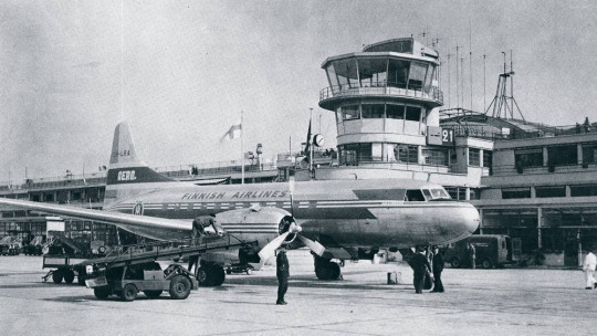
image: Finnair An Aero/Finnish Airlines Convair 340, photographed in 1953 in a livery which included both the large 'Finnish Airlines' wordmark and 'Aero' on the tail.
Early Finnair, like most early airlines, didn't have a particularly standardized livery for its fleet, and even where it did it's not very well documented. Finnair unfortunately has some of the poorest documentation for livery evolution of any large airline I've discussed so far, which really surprised me. That said, it's when the name became Finnair that things begin to be easier to find, and so that's where I'll begin.
1968: CLASSIC FINNAIR

This original logo[2], introduced in 1968, was designed by Kyösti Varis - at least, that's what every logo database I looked in said. I actually couldn't find either Finnair or Varis confirming this[3], but I still think it's probably true. Unlike designers like Vic Warren and Lindon Leader, who wrote and gave interviews about their designs for major airlines, Varis appears to have other preoccupations. He is enormously successful and prolific, to the point where his website doesn't even mention Finnair. According to the timeline he provides he would have either been creating this logo freelance or in his very last days at Advertising Agency SEK (probably the latter, since they did the two subsequent iterations), and based on his history as a typographer I think it's safe to say the letterforms are his creation as well. Also according to his timeline, he is younger than Finnair! And we almost have the same birthday.
I like the original Finnair branding. It's not ostentatious, but it's nice and sleek, with that forward slant I love in airline branding and a long unbroken line (both in the 'F' logo and in the even heights of the letters in the wordmark). It looks aerodynamic and the rounded, blocky letters have a hint of that 60s futurism while not being gimmicky. It's kind of incredible looking at it next to the '91-'94 FedEx wordmark, which occupies the opposite end of the sliding quality scale of TRON-looking text. The design as a whole is simple enough to easily reproduce but distinct enough to easily recognize. The shade of blue chosen is a fair bit lighter than the blue of the Finnish flag, but visually pleasing enough. They basically keep iterating on this general concept for the rest of their history, which I think is fantastic - no need to get rid of something that's working for you. It's nice to see an airline not feel pressured to reinvent its logo and livery every 20 years. That's about it for the logo[4] - what about the livery?
As mentioned prior, Finnair's liveries, before quite recently, were very poorly documented. Variants definitely existed between different types and different periods in the company's history, but the broad strokes of the branding seem to have remained almost startlingly intact for around thirty years.
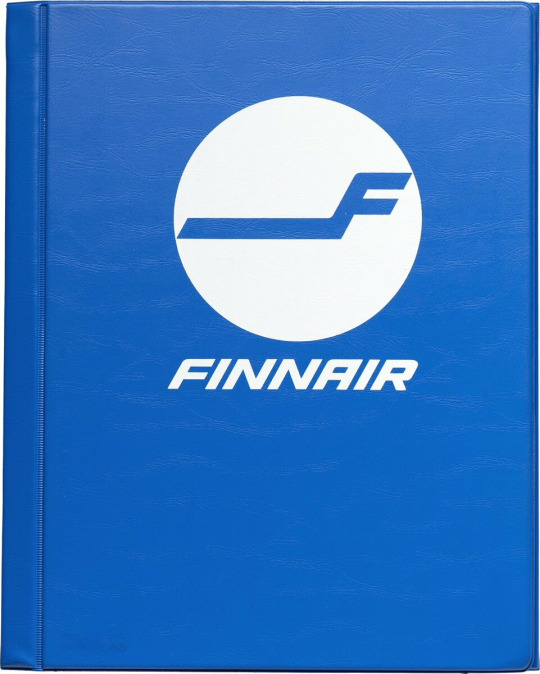
image: Letterform Archive The cover of a style guide from 1985. If it's changed from the 1968 original, I can't tell how.
But I'm really here to talk about one thing: the liveries.
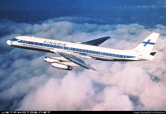
The above image was from Finnair's own archive and was taken in 1968[5], making it contemporary with the introduction of the Kyösti Varis branding, as well as lining it up with the 1969 addition of DC-8s, like the pictured airframe.
For the majority of Finnair's history, their livery is always going to look something a little bit like this. Primarily white, with a thick blue cheatline (in what I call the domino-mask style, where it's vertically centered around the cockpit windows) that lightly flips up at the very end and a blue cross on the tail to represent the Finnish flag.
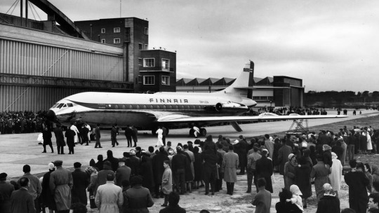
Finnair says this image is from 1960. If so, the livery was already well on its way to existing prior to 1968, with my guess being that it was introduced in 1960, along with the first jets in Finnair's fleet - the pictured Sud Aviation Caravelle, which pioneered the swept-wing, aft-engine format later seen on immensely popular jets like the DC-9 and Tu-134 - the latter of which was commissioned specifically because Nikita Khrushchev was so impressed with the Caravelle's aft engines and the quiet cabin experience they provided. It's a plane with a lot of unique visual features, featuring a nose that looks almost slanted downwards (a copy of the de Havilland Comet nose), a cruciform tail (instead of the more efficient T-tail used for future rear-engined designs), and triangular passenger windows. Most crucially, though, it was more or less the first short-range jet on the market. This made it perfect for an airline like Finnair, which at this point didn't really go that far from actual Finland.
This 1960 photograph provides a very strong blueprint for what was to come. It's the first iteration of the livery to say 'Finnair' instead of 'Finnish Airlines', and it's introduced a modern-for-1960 single-rule cheatline, although this early version was flipped horizontally, curling up at the front to frame the cockpit windows instead. (I think the white paint also cuts off behind it, leaving the space in-between the cheatline and painted nose blank metal, but in black-and-white it's somewhat hard to tell.) I do think I prefer the modern version. The use of the white downward curve with no blue hemming it in creates a really nice effect where it blends with the unpainted metal underside, due to the metal being right where you would expect to see a shadow anyway. (This effect is why I'm not quite sure where the paint ends on the Caravelle, and am just guessing based on which parts are noticeably reflective.) I definitely prefer the change made to the tail, where the single line of trim at the end of the rudder was replaced with a white canvas for the Finnish flag.

While I do tend to have a slightly pessimistic outlook on primarily-white liveries, I will say that if you're going to have a primarily white plane, and you are the flag carrier of Finland, this is a fairly understated and stylish way of incorporating it. While I probably would have done it on the main body, over where the first set of doors is, instead of on the tail, I think this is far from the end of the world. What they have is a nice, elegant taper where the tip seems to point directly at the tailplane, and it looks neat and intentional. A lot of airlines tend to just awkwardly slap a logo on their tail, which often looks really sloppy due to poor alignment or even just out-of-place entirely, and Finnair avoids that while keeping the tail from being completely blank. Having an element on the tail that's more horizontal than vertical, like the old 'AERO' rectangle or the tail rectangle on the one decent livery Lufthansa ever had.
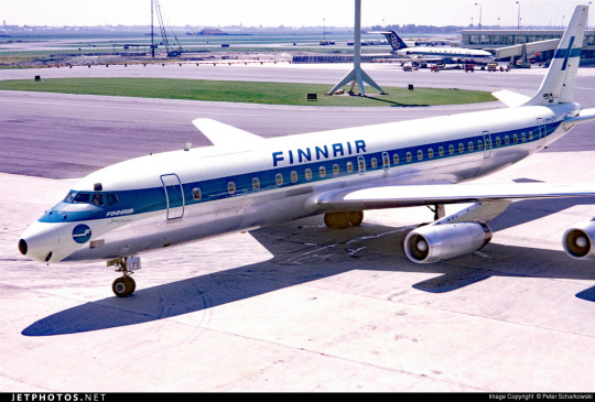
If you look in the background, you can see that wow has the Olympic Air livery looked like that for a long time! But that's a story for soon.
Additionally, some details were added on the nose. You can see on this DC-8, photographed in 1969, that the nose features an e-girl cheek stamp of the Kyösti Varis logo. Next to it is the name of the aircraft - in this case, Jean Sibelius - in really difficult-to-read thin text. (Finnair unfortunately appears to have stopped naming their planes by the late 1970s, but at one point they would frequently be named for Finnish people and places.) The 'domino mask' goes quite a bit beyond the cockpit windows to create a wider line from the side. I wish that the logo could have been integrated some other way, because the extra little blue thing just looks cluttered, but I can't imagine how they would do it without just replacing the cheatline. I mean, that would have been an option - indeed, it's what I would have done[6] - but assuming that they keep this general look I think the logo just can't fit in on the livery. The engine nacelles, maybe? Though that would still present issues on the Caravelle, where the engines are directly over the cheatlines. I also wish they would have made it a bit easier read the name, because I like to know what the plane's name is - thankfully, some later paint jobs actually do this before, tragically, Finnair stops writing names on their planes at all.
I believe this to be the strongest iteration of the classic Finnair livery, and it was pretty obviously optimized for the DC-8. Modern airlines tend to not bother adjusting their liveries between types, creating some absolute travesties of proportion, but Finnair boldly went in the opposite direction by modifying it for each airframe and yet still having it look worse.
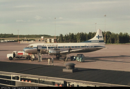
The sharpest deviation arises in the CV-440 version of the livery. This image is from 1971, just two years after the DC-8 liveries would have carried their first passengers, and it's wildly different. The cheatline is lowered sharply, sitting below the cockpit windows and wrapping around to contour the body of the airplane. There's a certain je ne sais quois to the domino mask that I find myself missing here. This design also has an unnecessary second 'Finnair' added to the tail, which kind of looks awkward stacked on top of the existing cheatline besides being redundant, and the Finnish flag on the tail is somewhat awkwardly made free-floating. It feels a lot less sleek and a lot more arbitrary.
On the other side of the plane the cheatline goes down quite a bit farther than on the jet models, probably because they thought it would be a better way of negotiating the Convair's rather bulbous nose, and I actually think I prefer the wide, upturned variant. This version, if anything, is too close for my taste to the livery VARIG operated in a similar timeframe. There are a lot of differences, yes, but in the 70s having one big solid cheatline on a white body and metal underbelly was the equivalent of the Lufthansa Line, so if you toed said line, be it cheat or Lufthansa, you risked becoming easily mistakeable for any airline with too similar of a color scheme. And blue-on-white was maybe the most common color-scheme at the time.
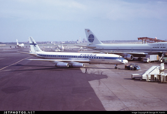
I doubt Finnair shared many tarmacs with VARIG, but here they are with Pan Am, and they could also expect to run into airlines like Sabena, Icelandair, and probably a half-dozen I've never heard of, all competing to be the one the others get mistaken for. It's a tricky position to be in.
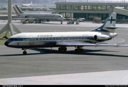
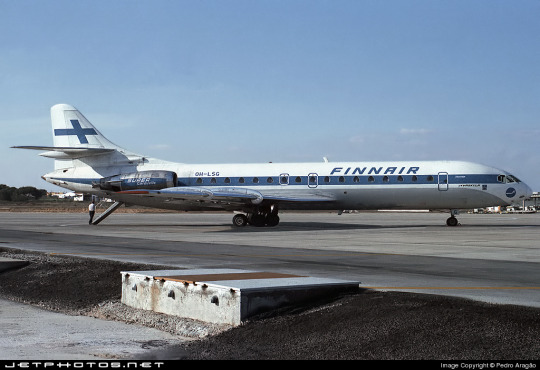
I do quite like the livery on the left, maybe even more than the DC-8 one, but I can't seem to find any other airframes painted like this. I'm not sure why this one is.
These images are from 1971 and 1969. They are both the same model of airplane - the Super Caravelle or Caravelle 10B. Their liveries are completely different. And that's just how it was back then - not even standard within the same airline, somehow still trying to stay distinct from dozens of other non-standardized blue-on-white cheatlines.
When evaluating classic Finnair, I have to keep myself tempered in both directions. When I think it's clean and well-proportioned I have to remind myself that it's just a complete nothingburger. When I think it's a lazy and cowardly non-design I have to remind myself that, no, at its best classic Finnair does look like it was designed with some thought, and it does have some traits that feel at the very least interesting enough to merit not being totally dismissed.
But...look, I have to give classic Finnair a D+. Because they tried, and they did something, sure, but it's ultimately not something especially memorable and the implementation is just spotty.
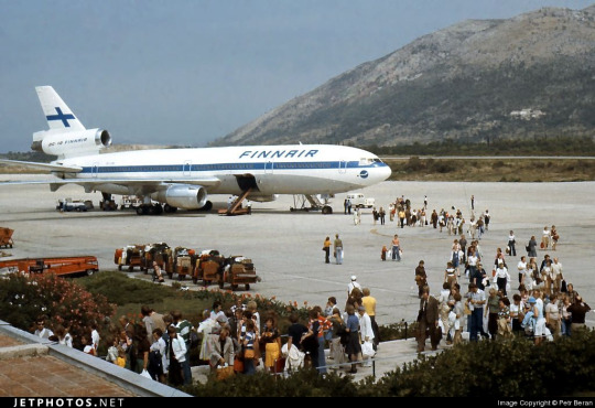
Even given a canvas like the DC-10, they fumbled. The DC-10, in my opinion, was a big test for them. And I do mean big. In the DC-10 is a plane with all the space in the world to add visual elements, and a space where just a couple lines can go from a detail to a fin that towers over anything that isn't a 747, showing off the Finnish flag as if someone had flown it from a building mast. The third engine, which I feel like a lot of airlines really struggle with on the DC-10, gets a nice horizontal line of writing that's not intrusive but helps prevent it from feeling like a giant gap. The wordmark gets larger, is moved forward, gets to really own the space it takes up instead of being squeezed in. And...they made the cheatline just....a really thin flat line that looks bad and stiff and boring. There's nothing setting them apart from Icelandair, and Icelandair's livery from this point in time was so boring that my only comment on it was that it looked like they forgot to paint the rest of the plane. You can do white planes well, but Finnair just really doesn't get there.
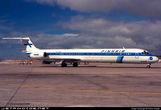
...hey, Finnair? You can't just decide to do belly stripes but worse, Finnair, you're literally next door to like two thirds of SAS and that livery was designed from the ground up. They have a couple of near-misses with SAS's toes but this is the one that makes me actually go 'is this allowed?'. It seems to have been exclusive to their late-80s MD-80 fleet, but it's just incredible to me that it ever happened. (That said, those three shades of blue are so nice together and I wish they had ever brought them back. I understand the appeal of sticking to the stark contrasted blue-on-white of the flag, but there's so much potential out there!)
1997: NEW TYPE, NEW LIVERY
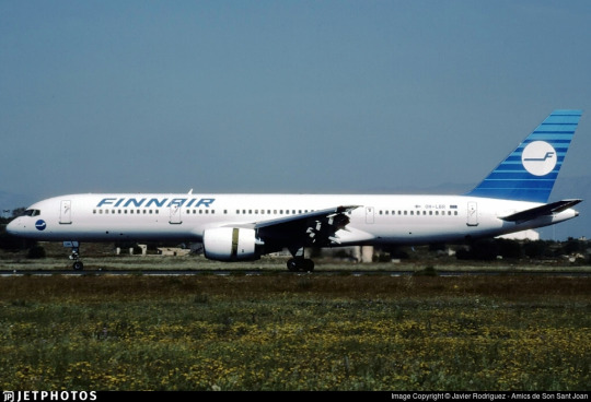
I really like the 757. It deserves a better livery than this.
Removing the cheatlines was a very trendy choice to make. This is the sad beast I call the Deltalite - a Deltalike but without the painted nacelles and belly that are usually slight redeeming factors. There's such a beautiful design on the tail that could have been put on the whole fuselage, honestly, and that's sad, but even on the most granular of levels...why keep the little cheek stamp if you have the logo visible on the tail now? Weird choice. Being so desperate to do the Deltalite thing everyone else is doing that you get rid of your country's flag on the tail is just a bad choice of priority, I think. There's not much to say about this. Honestly, I'd drop it to a D-. There's enough happening that it would lose something by being painted into Star Alliance colors, but it wouldn't lose terribly much.
2000: NEW FINNAIR

Oh, Finnair. Why? Did no airline resist the siren song of getting way too into airbrushing in the early 2000s?
Maybe I just have whatever the opposite of nostalgia is for the early 2000s, but this just makes me sad. They've made the wordmark look worse, overcomplicated the simplicity of the logo, and gone ham with the gaussian blur.
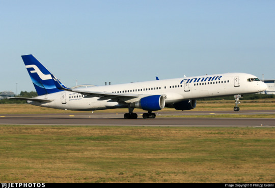
Look, it's not all that bad. The shades used on the actual plane are noticeably darker, and the colors at least don't look half bad now. And they've even bothered to paint the engines this time around! But...come on. You've changed 30 years of something that was working just fine for...this? Something which maybe climbs up to a flat D?
The 2000 brand overhaul, including the logo, was done by Finnish agency SEK & Grey. They're nearly as old as Finnair and have worked for brands as prominent as Coca-Cola and Kellogg's, but their about page puts Finnair front and center. They have an entire page describing their Finnair work.
Despite claiming to have included humanity and warmth and movement, I see none of this. I'll admit upfront I generally dislike what's dubbed 'Nordic' design. It's not the minimalism which I dislike but the banality.

What does any of this have to do with Finnair? What here represents the history of one of the world's oldest airlines? What here really speaks to the Finnish people? Why is just designing something generic and making sure it's all crisp (when you're photographing it fresh out of the plastic, before it's been tripped over and stepped on and yanked down staircases and accidentally sat on and stained with tea) considered a substitute for designing something that people will see years down the line and get nostalgic for? I'm nostalgic as hell for Alitalia, an airline that doesn't exist anymore. I still use the bag from an amenity kit I got on Alitalia nearly ten years ago to store small essential things like toothbrushes and medication while traveling, but I wouldn't know it was Alitalia by looking at it, because it's lovely and convenient and ergonomic but it's literally just grey. It evokes nothing, and it doesn't even say 'Alitalia' on it anywhere. Nothing here could ever be considered ephemera or memorabilia. I could steal Finnair's look at the Gap.
2010: SORRY, HERE'S NEW FINNAIR FOR REAL THIS TIME

SEK & Grey gave it another shot. This one's a lot better.
I like the change in the logo, first off. And this, the word 'Finnair', is the logo, but I'm comparing it to the earlier wordmark. 2000's attempt felt like it was taking the original and just trying to sand off the corners to make it more modern, but the 2010 take on it actually shapes each glyph into a neat little space-age thing that creates this curved shape by way of a lot of straight lines, in a way that feels visually pleasing and interesting. I enjoy the square holes in the A and R, the return of the crossbar on the N, and the extreme range of widths which gives the letters a real weight to them. This isn't a typeface - these glyphs exist in the context of the word FINNAIR in this exact configuration and one of four colorways. Finnair does have a proprietary typeface, Finnair Sans, and it looks nothing like this because this is not a font, it's a logo.
I think it is a shame that this is the logo now. I really liked the F. And they haven't gotten rid of it, but it's now been relegated to an official subordinate position, according to their branding guide:
The official Finnair logo is the text version of the logo, and it is primarily used. The F emblem is used as an additional symbol.
Look, I'll always think it's a shame when your main logo is just the name of your company. Some airlines do it, and it feels like an empty space to me. It can be satisfactory but not outstanding. When you start out with a nice little symbol and then take it away, though, I do feel somewhat robbed.

It stings extra because I really like the way the new F looks. It has that long brushstrokey look and it almost makes me think of Hebrew characters. The way it tapers now really adds to the feeling of movement I get from it, and it's a great base for a livery. Now that it's darker, even though this does bring Finnair into competition with airlines like SAS, LOT, TAROM, Lufthansa, and even Ryanair when it comes to dark-blue-on-white, it also contrasts better with the main body, and it's still light enough that you can recognize it as blue. Anyway, it doesn't take a genius to know how to integrate this into a livery. Long line for the fuselage, go up to match the tail...
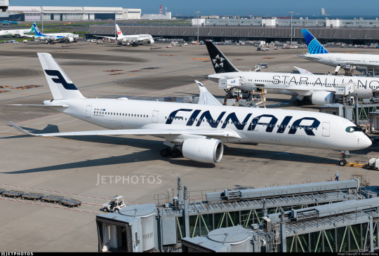
Finnair. Are you serious, Finnair?
Look! I get it! Billboards are in now, it's fine, I get it. it's probably the nicest billboard I've seen in a while, font-wise. It feels comfortable on the fuselage and it feels like it earns the space it occupies. The F is nicely centered on the tail, cuts off at a pleasant point. But...why?
I really can't be too mean about this. I want to be meaner than I actually can justify, because I think if any other airline made their plane this featureless I would hate it but Finnair's billboard livery is actually nice enough and everything is placed well enough that it's not at all unpleasant to look at. It's an acceptable livery. If maybe 25% less planes were basically all white it would shoot up in my esteem. I don't really like the fact that they put the little Fs on the inside of the wingtips of their A350s, but that's really my only nitpick. It's just sort of...bringing a really fantastic loaf of bread to a potluck when you were asked to bring baked desserts. You've done a very good job, but you didn't quite get the assignment.
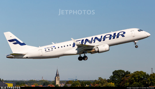
It's a bit hard to critique the modern Finnair livery in detail because I think it's executed fine. There's nothing really wrong with it except that it has a logo that could lend itself to all sorts of interesting shapes, it has 30 years of variants of a very specific design to draw on, and it's chosen to go tabula rasa just to be all clean and minimal instead of doing any of the interesting things it could have with this new start.
I want to dislike this take on the Finnair livery, but at the end of the day I just don't. I think it's completely satisfactory. A lot of airlines try to get this look and somehow end up seeming cluttered for it. Finnair is one of the only instances I can think of where a white fuselage with just a wordmark has looked okay. It isn't ugly. It hasn't failed at the thing it's trying to do, but I think that it should have tried to do something else.
At the same time, though, this is the most Finnair that Finnair has ever been. The blue cheatline and the Deltalites were stumbling over well-trod ground. The modern livery, at least, isn't sloppily tail-heavy and seemingly thoughtless.
I give modern Finnair a C. This took an excessive amount of deliberation, but it really is...good enough. It's satisfactory. It's fine! I would have taken a completely different direction, but they have done a good job with their sort of lackluster idea. It's alright. We'll check on them again in another hundred years and see where they're at.
2023: CENTENAIRY
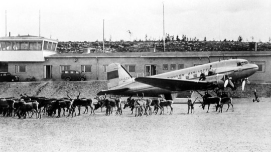
A century is a very long time. Finnair is older than my oldest grandparent. Finnair is older than over a dozen sovereign countries. Finnair is older than aerodromes in Finland. It's older than every currently operating airline except KLM, Avianca, Qantas, Aeroflot, and Czech Airlines. As of the first of November, Finnair is in triple digits.
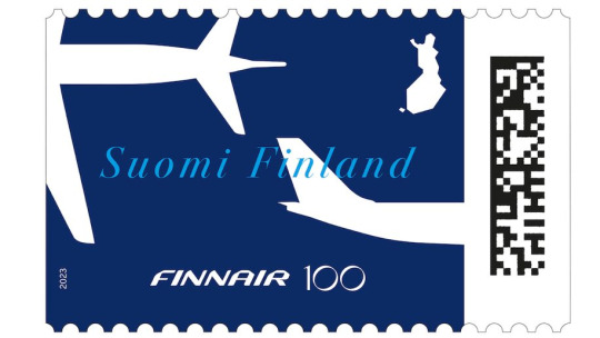
I adore this centenary stamp Finnair has put out, celebrating the long relationship between aviation and the mail. It's not complex, but it's not barren, either. It combines the dark blue of the modern livery with the light blue of the classic one, all with the white silhouettes of airplanes elegantly soaring over an outline of Finland. The outstretched white wings on the deep blue have the grace of a giant fish swimming beneath a glass-bottomed boat.
But of course it isn't just stamps. Finnair is an airline. Airlines do special liveries. Qantas and KLM both slapped a big 100 sticker on an airplane for their big anniversaries. Finnair has of course done something similar.
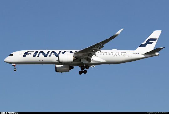
Three airframes - the pictured A350-900, OH-LWR, and two A320s - OH-LXK and OH-LXM - have had a 'bringing us together since 1923' sticker applied. Matching the rest of Finnair's branding, it's certainly quite minimal, but it's a nice gesture. It's not what people have been talking about. That's OH-LWO and OH-LWP, both A350-900s, who have been given something more substantial to wear.
youtube
I'm going to assume that after its renaissance on tumblr a few years back most people reading this are familiar with the Moomin franchise. I definitely am, because when I was in my larval stage my mother first taught me to read Russian using an omnibus book of Moomin stories. Creator Tove Jansson apparently designed both the shape of the eponymous white critters and the sound of the name Mumintrollen itself are designed to evoke a feeling of softness, and it's clear why these characters are so beloved.
It isn't the first time Finnair, which frequently collaborates with Finnish brands and highlights its Finnish roots, has featured Moomins.
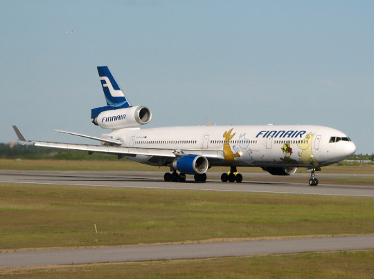
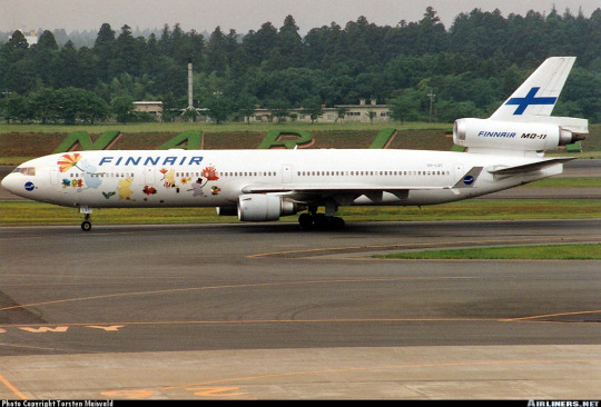
image on left: Antti Havukainen
In the 1990s, the airline first flew a Moomin jet. They had another in the 2000s. Both were withdrawn from service before 2010. It's been a while now since Finnair flew their last MD-11, but when celebrating their 100th birthday, a milestone that the vast majority of airlines will never see, they chose to do it by way of a soft Moomin embrace.
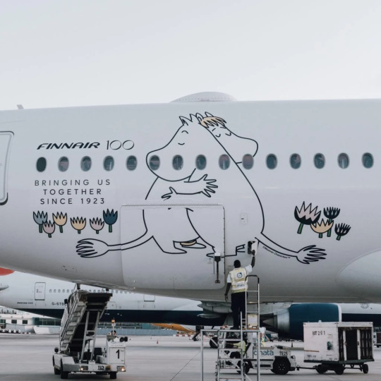
image: Changi Airport
And, I'll be honest, I think it's very sweet. It got an actual, sincere little smile out of me.
100 years is a really long time. In 1923 aviation was unrecognizable. What we would now consider an airliner didn't really exist yet - space for ten passengers, closed cockpits, and metal fuselages were the exceptions rather than the rule, and the Ford Trimotor was two years from its first flight. Cabin crew were barely even a concept. Airplanes, for all intents and purposes, were considered a type of boat. A nonstop flight across the Atlantic was a ridiculous concept. In a report published by the US National Bureau of Standards, it was said: 'there does not appear to be, at present, any prospect whatever that jet propulsion of the sort here considered will ever be of practical value, even for military purposes'. There were no aerodromes in Finland, so a small company called Aero attached floats to a plane just large enough for four passengers and took them from Helsinki to Tallinn.
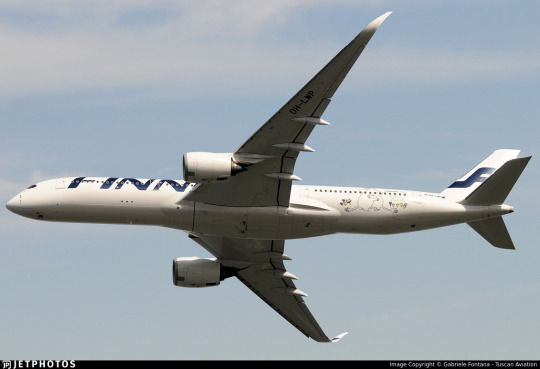
Look how far we've come.
Footnotes:
[1]: The Finnair website's history page, which I used as a source for much of the background and several images in this post, renders it as 'Finnish Air Lines', but on the airplanes themselves it clearly has no space, so I've corrected that seeming error for them. I don't know why this discrepancy exists, because as far as I know during this period they were marketing themselves as Aero so this text would only have existed on the livery itself. [2]: Actually, I very occasionally see this version where the F logo isn't fully surrounded by the circle and the F in the wordmark doesn't have the rounded top, and I don't know which came first or if the less round version is just somehow...not real? I did try to figure this out, I swear, but at some point I realized I am literally not a professional logo historian, and nobody is going to be let down if I don't brute-force an answer despite not even speaking Finnish, and I should finish writing the post before it's 2024. [3] The closest thing to an official source I can find is the descriptions of two listings for the centenary stamp including a quote from designer Ilkka Kärkkäinen attributing it to him. I don't at all doubt that he did design it, but I always like to find concrete attribution for things if I can and would hate to spread misinformation and the sparseness of confirmation here is something I find very strange. My best guess is that there's plenty of good sources on it in Finnish but nobody has bothered to make it as clear in English. [4] Admittedly this is a stretch, and I certainly don't think it was intentional, but it does remind me of the longship prow used in early SAS liveries. This motif was introduced in 1946 and continued to see use after the Finnair logo was introduced. The overlap is fairly limited in that SAS never used the longship in their logo (...I kind of want to talk about their logos one of these days) and the Finnair livery you'll see shortly doesn't look like SAS's at all, plus SAS has the extra pink on their liveries, but I couldn't get it out of my head that they do look sort of alike. [5] The absolute hero who uploaded it to jetphotos mentioned that Finnair had given him the photograph while planning to dispose of it, and this makes me wonder if the lack of documentation is just because Finnair doesn't hold onto their old materials, which makes me very sad. A lot of companies, more broadly, didn't bother to keep records until somewhat recently, but in Finnair's case it seems to be particularly egregious. As someone literally studying to be an archivist it makes me exceptionally sad to see history lost just because nobody cared enough to preserve it. [6] Maybe they didn't want to look like backwards SAS. Who can say?
#tarmac fashion week#finnair#grade: c#grade: d+#region: finland#grade: d#grade: d-#region: northern europe#era: 1960s#era: 1970s#era: 1980s#era: 1990s#era: 2000s#era: 2010s#era: 2020s#special liveries#commemorative liveries#requests
50 notes
·
View notes
Text
Recently extinct species make me sad for all the usual and normal reasons (loss of life, biodiversity and unique life forms that experienced the world wholly uniquely and acted in it like no other, to name three), but a big thing that also makes me so sad is the forgetting that comes right after. Many endangered species are greatly ignored to begin with whilst alive of course, which is awful, but the way that extinction also causes us to forget. A species could’ve been so abundant a hundred years ago, people would’ve used a fish species or a tasty plant for food, or parents would’ve warned their children to not put a poisonous toadstool or insect in their mouth, a diver would exclaim, “Aha!” after emerging from the shallows holding an especially big bivalve, or someone making a species diary would sketch out a local bird or fasten a single flower to the page. But.. then the species goes extinct. It doesn’t exist anymore. None of these events, these actions happen anymore. Not with these species. The people who had these experiences dwindle out and they may not even realise that their experiences were among the last of their kind. And we forget.
#i was thinking about the new zealand greyling which was once abundant#the maori people used to fish it and use it for food#for generations upon generations this fish species was their normal#but now it is just gone#could they have guessed that this will happen? that their everyday food item would go extinct one day#i was also thinking about the atlantic sturgeon and how it went regionally extinct in the baltic#the old northern europe people knew sturgeons. heck we had them less than a hundred years ago still#it was a native fish just like any other. just like salmon and trout#now? no one talks about them#they are forgotten#we dont learn about them alongside the perch and the pike and the roach and the trout#they are a mystery of a time gone by here#and it makes me so sad… how quickly we forget. we shouldnt
186 notes
·
View notes
Text

Survivors of the deadliest mine catastrophe of Europe, the 1906 Courrières mine disaster in the Artois region of northern France
French vintage postcard
#postcard#ansichtskarte#briefkaart#france#catastrophe#photography#survivors#carte postale#vintage#europe#northern#postkarte#photo#historic#postkaart#ephemera#deadliest#1906#disaster#sepia#courrières#courrires#region#french#artois#tarjeta#postal
11 notes
·
View notes
Video
Weathering the Storm by Jos Buurmans Via Flickr: Driving in Iceland presents an ever-evolving adventure. The scenery transforms continually, matching the ongoing shifts in weather. During our journey along the East Iceland fjords, we encountered particularly adverse conditions, subjecting us to the unforgiving elements – gale force winds and unyielding rain were our constant companions. Worst of all (at least for a photographer), we gazed at a perpetually overcast sky, draped in a monotonous, oppressive gray. However, as they often say, the weather in Iceland is among the most fickle aspects of this land. In a fleeting, magical instant, the sky defied its gloom and breathed life into the rugged terrain, casting a radiant light upon the mountain. Only moments later, the sky once again veiled itself, and we pressed on towards the next clearing on our journey.
#Atmospheric Nature#Austurland#Clouds#Daylight#Eastern Region#Europe#Iceland#Landscape Photography#Mountain#Mountain Landscape#Mountain Peak#Mountains and Peaks Photography#Nature#Northern Europe#Peak#Reyðarfjörður#River#Sky#Storm#Stream#Tiered Waterfall#Water#Waterfall#Fjarðabyggð#flickr
4 notes
·
View notes
Text
Jealousy Poll: would you consider this situation common?
I know two couples where the men are local (Bulgarian) and the women are from two different parts of Asia, and I've heard two separate stories of them being upset because of their boyfriends' female friends.
Story 1: A and B start officially dating after meeting at the same dance class. They are part of a dance group with several other people. A schedules a day to hang out with several girls from their dance class, as friends. When B finds out he's hung out with them, she becomes upset on the basis of him spending time with other women.
Story 2: C and D have been together for many years and even live together. One day, they run into E - a very close female friend of C. E hugs him tightly, and afterwards, D is livid - she straight up says she never wants to see that woman again and refuses to go out with C's friends if E is there.
This is all the context I have, and it's entirely possible that there are missing bits of information that upset these ladies. But I found this interesting because, in my experience, Bulgarian women wouldn't be as upset over these two specific cases, if at all.
So I'm curious if you think it's a common reaction where you're from or where you currently live?
Note: I have limited options for the poll so I tried to group regions by cultural similarities I've noticed. Feel free to correct me 😅
#p: poll#p: mine#It really didn't feel fair to group Southern European countries with the Northern ones based on them being 'west' so it took up more space#and my focus here is mostly Europe / Asia so I couldn't properly include a huge chunk of this planet#but I think most of my followers are from WE/EE and the MENA#I'm also not judging the women in the two stories. Just wondering if it's more of a personality trait or relatively common for their region
3 notes
·
View notes
Text
Not where you grew up. Not where you’ll be living soon. Where you’re living right now.
20K notes
·
View notes
Text
TAGS MASTERPOST
While most housekeeping is done on warmest-wishes-directory, tags have to be saved on the main blog or they won’t show up. The full list of current warmest-wishes tags is available here; if you don’t see what you need, please let the mods know.
All tag sets must start with “warmest-wishes 2024," and should follow this pattern: location, type of wish, fandoms in wishes [if any].
LOCATION:
ww-online only ww-usa ww-canada ww-greenland ww-mexico ww-central america ww-south america ww-caribbean islands ww-western europe ww-eastern europe ww-mena region ww-northern africa ww-southern africa ww-russia ww-indian subcontinent ww-western asia ww-eastern asia ww-southeastern asia ww-australia ww-oceania ww-pacific islands ww-area of conflict
GIFT TYPES
ww-big dreams [for wishes over $100] ww-thrifty gifts [for wishes under $10]
ww-teacher for classroom ww-caregiver for dependent ww-charity
ww-fandom ww-fanfiction and fanart
ww-cards and correspondence ww-homemade ww-handmade ww-craft supplies ww-fiber arts ww-sewing and fiber arts supplies
ww-hobby paint and gaming figurines ww-tabletop gaming ww-card and board games ww-video games ww-digital media ww-electronics ww-digital ww-physical media ww-books ww-music ww-photography ww-gardening and outdoors ww-collectibles ww-pet toys and supplies
ww-toys and decorative figurines ww-art ww-housewares ww-knickknacks ww-aesthetic
ww-jewelry ww-cosmetics ww-bath and body ww-clothing ww-food ww-sports ww-religious and spiritual
FANDOM TYPE
ww-ace attorney ww-agatha all along ww-arcane ww-attack on titan/snk ww-baldurs gate ww-beatles ww-bridgerton ww-bts ww-call of duty ww-chappell roan ww-critical role ww-dan and phil ww-danny phantom ww-dc comics and related media ww-dead boy detectives ww-disco elysium ww-disney ww-doctor who ww-dungeon meshi ww-fnaf ww-genshin impact ww-ghost (musician) ww-good omens ww-gravity falls ww-harry potter ww-helluva boss and hazbin hotel ww-hozier ww-interview with the vampire ww-jjba ww-jrr tolkien ww-jujutsu kaisen ww-legend of zelda ww-madoka ww-marvel comics and related media ww-minecraft ww-my hero academia ww-ofmd ww-one direction and members ww-one piece ww-pokemon ww-rwby ww-sailor moon ww-spn ww-star trek ww-star wars ww-stranger things ww-taylor swift ww-teenage mutant ninja turtles ww-undertale and deltarune ww-wwdits
#ww-online only#ww-usa#ww-canada#ww-greenland#ww-mexico#ww-central america#ww-south america#ww-caribbean islands#ww-western europe#ww-eastern europe#ww-mena region#ww-northern africa#ww-southern africa#ww-russia#ww-indian subcontinent#ww-western asia#ww-eastern asia#ww-southeastern asia#ww-australia#ww-oceania#ww-pacific islands#ww-area of conflict
1 note
·
View note
Text
The Cranberries - Zombie 1994
"Zombie" is a protest song by Irish alternative rockband the Cranberries. It was written by the lead singer, Dolores O'Riordan, about the young victims of a bombing in Warrington, England, during the Troubles in Northern Ireland. The song was released on 19 September 1994 as the lead single from the Cranberries' second studio album, No Need to Argue. While the record label feared releasing a too controversial and politically charged song as a single, "Zombie" reached number 1 on the charts of Australia, Belgium, Denmark, Germany, and Iceland, and spent nine consecutive weeks at number 1 on the French SNEP Top 100. It reached number 2 on the Ö3 Austria Top 40, where it stayed for eight weeks. The song did not chart on the US Billboard Hot 100 chart as it wasn't released as a single there, but it reached number 1 on the US Billboard Alternative Airplay chart. Listeners of the Australian radio station Triple J voted it number 1 on the 1994 Triple J Hottest 100 chart, and it won the Best Song Award at the 1995 MTV Europe Music Awards.
The Troubles were a conflict in Northern Ireland from the late 1960s to 1998. The Provisional Irish Republican Army (IRA), an Irish republican paramilitary organisation, waged an armed campaign to end British rule in Northern Ireland and unite the region with the Republic of Ireland. Republican and Unionist paramilitaries killed more than 3,500 people, many from thousands of bomb attacks. One of the bombings happened on 30 March 1993, as two IRA improvised explosive devices hidden in litter bins were detonated in a shopping street in Warrington, England. Two people; Johnathan Ball, aged 3, and Tim Parry, aged 12, were killed in the attack. 56 people were injured. Ball died at the scene of the bombing as a result of his shrapnel-inflicted injuries, and five days later, Parry lost his life in a hospital as a result of head injuries. O'Riordan decided to write a song that reflected upon the event and the children's deaths after visiting the town: "We were on a tour bus and I was near the location where it happened, so it really struck me hard – I remember being devastated about the innocent children being pulled into that kind of thing. So I suppose that's why I was saying, 'It's not me' – that even though I'm Irish it wasn't me, I didn't do it. Because being Irish, it was quite hard, especially in the UK when there was so much tension." The song was re-popularised in 2023 after it was played after Ireland games at the 2023 Rugby World Cup. It was picked up by fans of the Irish team, with videos of fans singing the song in chorus accumulating hundreds of thousands of views on social media. This offended other Irishmen, who identified it as an "anti-IRA" anthem, and said that that the lyrics failed to consider their experience during the Troubles.
The music video, directed by Samuel Bayer, was filmed in Belfast, Northern Ireland, in the heart of the Troubles with real footage, and in Dublin. To record video footage of murals, children and British Army soldiers on patrol, he had a false pretext, with a cover story about making a documentary about the peace-keeping efforts in Ireland. Bayer stated that a shot in the video where an SA80 rifle is pointed directly at the camera is a suspicious British soldier asking him to leave, and that the IRA were keeping a close look at the shoot, given "the British Army come in with fake film crews, getting people on camera.” While "Zombie" received heavy rotation on MTV Europe and was A-listed on Germany's VIVA, the music video was banned by the BBC because of its "violent images", and by the RTÉ, Ireland's national broadcaster. Instead, both the BBC and the RTÉ opted to broadcast an edited version focusing on footage of the band in a live performance, a version that the Cranberries essentially disowned. Despite their efforts to maintain the original video "out of view from the public", some of the initial footage prevailed, with scenes of children holding guns. In March 2003, on the eve of the outbreak of the Iraq War, the British Government and the Independent Television Commission issued a statement saying ITC's Programme Code would temporarily remove from broadcast songs and music videos featuring "sensitive material", including "Zombie". Numerous media groups complied with the decision to avoid "offending public feeling", along with MTV Europe. Since it violated the ITC guidelines, "Zombie" was placed on a blacklist of songs, targeting its official music video. The censorship was lifted once the war had ended. In April 2020, it became the first song by an Irish group to surpass one billion views on Youtube.
"Zombie" received a total of 91% yes votes!
youtube
#finished#high votes#high yes#high reblog#low no#90s#the cranberries#english#o1#o1 sweep#o1 ultrasweep#o234#popular
3K notes
·
View notes
Text
I really need to emphasize once again that neither coffee, tea, nor chocolate grows anywhere in Europe or Northern America (US/Canada).* This is why I'm so insistent with them in particular. Authors and readers from those places are perfectly willing to talk about them as commonplace items in their fictional worlds when they aren't even commonplace plants in their own regions, and the only reason they exist there at all is because of global trade and imperialism, and then they claim not to see the connection. Likewise with science fiction settings; to get any kind of food or manufactured items in our own society involves lots of global supply chains, imagine the same in space.
EVERYTHING you take for granted (and this includes my own daily life) is produced somewhere and somehow, and this has an effect in your life, and more importantly, in the lives of those who produce them. It isn't necessarily and always imperialism, but everything comes from somewhere.
*except maybe for very, very especialized cultivations that are not able to produce for the entire demand of those countries
707 notes
·
View notes
Text
No. 24 - Icelandair's Special Liveries


Congratulations to Icelandair's Hekla Aurora livery for being my first multi-request. And for a special livery, no less!
So, as a quick supplement to my main Icelandair post, I'm going to discuss the airline's three special liveries (excluding those which are crossovers with other brands). They've even been kind enough to provide a page for each, describing their various inspirations and how they relate to Icelandic identity.

Þingvellir
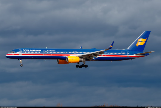
I'm starting with Þingvellir. Painted on a Boeing 757-300 registered TF-ISX, this livery was released in 2018 to celebrate 100 years of Icelandic independence and also something involving football, which in a very classic moment are treated as being equivalent in weight. I think Iceland may have won at the football? If you are aware of the context of the football, please don't tell me. I don't care about football.


Her colors are drawn from the Icelandic flag. It's really incredible how many flags out there manage to be red, white, and blue. It's honestly a kindness on Icelandair's part to not have those colors dominate their livery to begin with because it's incredibly saturated with flag carriers. (Red, white, and green are another similarly done-to-death scheme.)
Although I think the actual cross-shape of the flag could have been used to some decent effect, I have no real problem with where we ended up. I think this is recognizable as the Icelandic flag and visually pleasing. The first time I saw this I thought it was a heritage livery, because I didn't know off the top of my head what Icelandair's old liveries actually looked like. I think if they'd done this back in the day they would have been the talk of the tarmac.

Looking at it from the right angle, though, I can't deny that when you add in the glossy modern look of the Icelandair logo and the yellow nacelles it does sort of look like a football jersey somehow. Unsure if this is intentional, but all in all I just think this looks nice and I genuinely think if you did something about the yellow this would be a better standard livery for Icelandair than most airlines have. It's quite unique, as far as what's flying today.
Grade: C+
A few notes to close out: first, 'Þingvellir' is the name of the aircraft. Icelandair names all their planes after features of Icelandic nature, and Þingvellir is a national park known for being the site of parliamentary sessions. 'Þ' is pronounced roughly like 'th' in English.
Second, you may notice a distinct...how do I put this? Longness about her. This is because

('normal girl' here means 'narrow-body airliner'). image by @lobstersinmyhouse.
and I really like that.
Vatnajökull
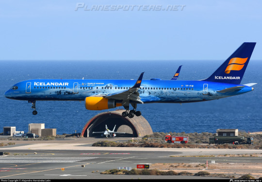
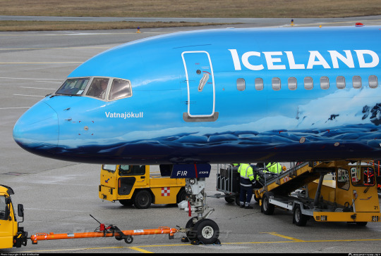
Vatnajökull is a slightly less long but still delightful normal girl, a Boeing 757-200 with the registration TF-FIR. Icelandair bills her as the world's first flying glacier. I don't think there was much of a risk of anyone else getting that record, but she...sure is!
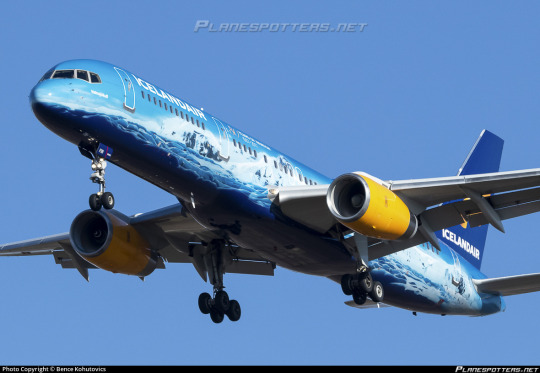
Vatnajökull is a fairly self-explanatory livery. It's an incredibly detailed glacier scene, representative of the very landmass for which the airplane is named. From Icelandair's website:
Even if you have lived in Iceland your whole life, the wonders of Vatnajökull never cease to amaze and enthrall. The largest glacier in Europe tumbles down the highest mountain ridge in Iceland, creating tremendous icefalls just above the southeast part of Route 1. The ice giant covers 8% of Iceland and is up to 1000 meters (3280 feet) thick. That equals 30 meters of ice evenly spread over all of Iceland – but we are in fact quite happy to keep it where it is. The Icelandic climate can be challenging enough without adding dozens of meters of ice on top of us.
It's actually somewhat difficult to find much more to say about her. This is just a very pretty glacial landscape drawn onto an airplane, and I think it looks very very nice.
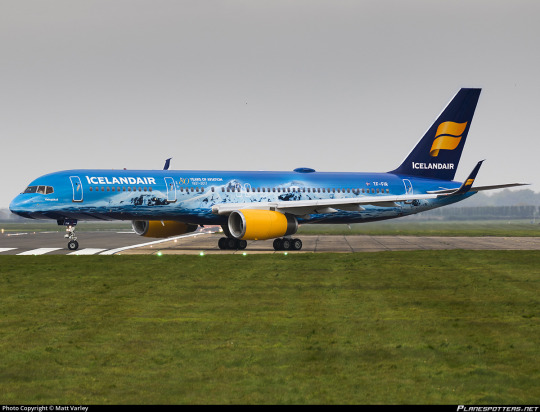
This paint job is undeniably both pretty and impressive. I do sort of wish the tail and engines had been integrated as well, but what we got is more than alright.

Vatnajökull also features a glacier-themed interior, including glacier-themed headrests and drinks carts and, of course, some lovely blue mood lighting. The whole package makes me want to go potholing in a glacier very badly. They've definitely put a lot of effort into making the world's first flying glacier, and they've succeeded in that.
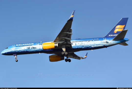
Grade: B
Hekla Aurora

It was very hard to choose pictures of this plane to include in this post. Hekla Aurora is stunning. She looks dramatically different depending on the lighting, but no matter which angle she's seen from she looks gorgeous and vivid.
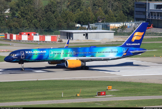
Hekla Aurora is named for the active volcano Hekla and the aurora borealis, two noteworthy features of Iceland's unique natural environment. Obviously, though, she leans a bit towards the latter part of the name. The plane even comes with special interior mood lighting like Vatnajökull.
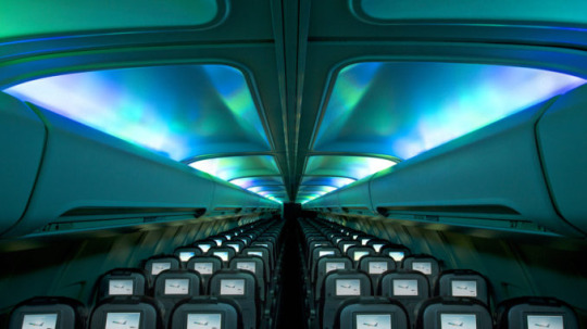
This looks so nice. It's even more striking than the simple blue Vatnajökull has. I want to fall asleep on this plane more than anything else in the world.
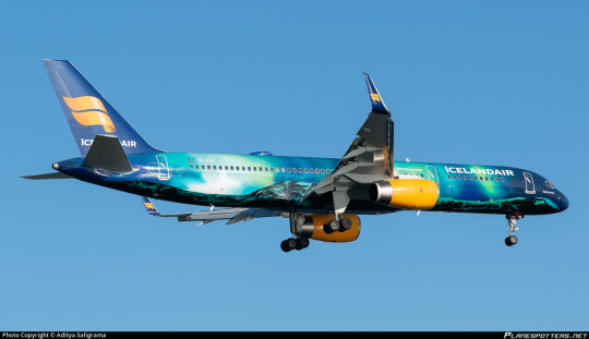
This plane is basically Icelandair's flagship. I swear this is one of the best-known planes flying right now. And she deserves every bit of it. This is a uniquely beautiful paint job and I am severely envious of anyone who has ever been able to fly on her.
I do, again, wish more had been done with the engines and the tail, but it's really hard to say anything about Hekla Aurora because this is just as much of an art piece as it is an airplane livery.
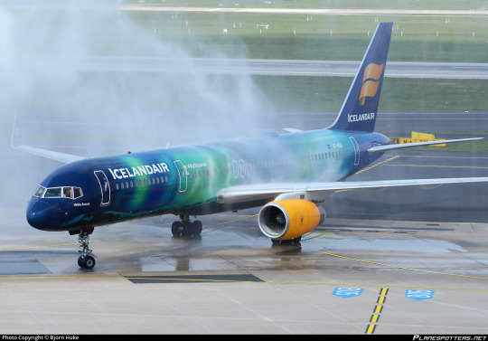
I have it as an active goal of mine to see her in person, even if from a distance, while she's still in service.
Grade: A
Unfortunately, this request was timely in the worst possible way. On the 7th of July, Icelandair announced their intention to acquire between 13 and 25 Airbus A321XLR airplanes. This is an interesting move from an airline which has up until now exclusively operated Boeing aircraft, but Boeing's refusal to actually build a 757 successor is a separate conversation. What's important to note is that Icelandair's special 757s are getting on in years. Hekla Aurora is nearly 30 years old. While far from derelict, that's definitely around the point most major airlines will begin to retire their planes. The confirmation of Icelandair's intentions to acquire a replacement model just makes it even clearer.
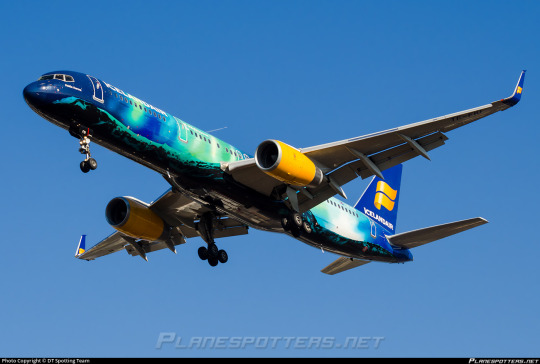
There is time to talk about what Icelandair will do going forward, what new special liveries they'll make. It's clear that all their existing ones are born from an appreciation for Iceland, and I'm sure they won't stop just because their planes are going to look a little different ten years from now. But It feels like an important time to voice my appreciation for TF-FIU, who has been bringing the northern lights everywhere Icelandair flies for nearly 10 years, even as those years finally begin to wind down.
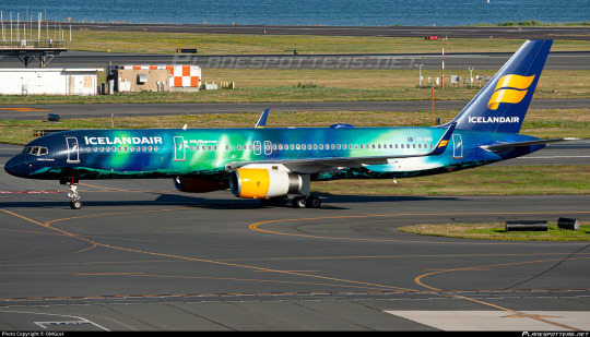
#tarmac fashion week#era: 2010s#era: 2020s#special liveries#compilations#region: northern europe#region: iceland#icelandair#cabin fever
36 notes
·
View notes
Text
Husband of former Scottish First Minister arrested over party finances investigation | CNN
London CNN — The husband of former Scottish First Minister Nicola Sturgeon, Peter Murrell, was arrested on Wednesday in connection with an investigation into the funding and finances of the Scottish National Party. Murrell, 58, stepped down as the SNP’s chief executive last month after more than two decades in the role following Sturgeon’s shock resignation as first minister in February. A…

View On WordPress
#arrests#brand safety-nsf crime#brand safety-nsf sensitive#conflicts and war#continents and regions#crime#criminal law#domestic alerts#domestic-international news#europe#iab-crime#iab-law#investigations#law and legal system#law enforcement#law enforcement and corrections#nicola sturgeon#northern europe#political figures - intl#political organizations#political parties - intl#scotland#scottish national party#separatism and secession#united kingdom#unrest
0 notes
Text
I am legitimately so upset, I don’t have very much longer at my current job and I only just realized that I have the perfect opportunity to casually but forcibly educate the public that earthworms are an invasive species in most of the northern half of North America. NOBODY realizes that earthworms are invasive because most of us grew up learning about how good earthworms are for the soil and finding them in the ground and there’s generally a lot of positive cultural messaging about earthworms*. While most people are generally aware of invasive species and try not to spread them, they don’t think of earthworms in that category. It can be really surprising to learn that earthworms can be bad for the environment - I know it was for me. So I’ll take advantage of my audience here:
Earthworms are an invasive species in large parts of the USA and Canada, especially notable in the Great Lakes region. They disrupt the normal ecological processes of hardwood forests by eating organic material (duff) that is needed for native species to survive.
Please be aware of this if you live in the region and use earthworms for fishing or gardening. Further resources can be found at the Citizen Science Project Great Lakes Worm Watch and the UMN Invasive Species page.
*Positive cultural messaging about earthworms is great - for the regions that they’re native to, such as Europe. Not so much in regions where they’re invasive.
6K notes
·
View notes
Text

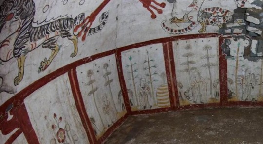
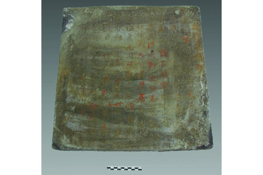
Stunning Tang Dynasty Murals in a Tomb Unearthed in China
A Tang dynasty tomb unearthed in China dates from the 700s, and the murals on its walls give an unprecedented view of daily life at the time.
Archaeologists in northern China have unearthed a centuries-old tomb decorated with stunning murals portraying daily life during the Tang dynasty, which ruled much of central and eastern China from A.D. 618 to 907.
The tomb includes never-before-seen depictions of daily life, including men threshing grain and making noodles.
One of the murals also depicts what appears to be a "Westerner" with blond hair and a beard who probably hailed from Central Asia, Victor Xiong, a professor of history at Western Michigan University who wasn't involved in the discovery, said in an email.
The tomb was discovered in 2018 during roadwork on a hillside on the outskirts of Taiyuan, the capital of China's northern Shanxi province, but archaeologists only reported on the completed excavations last month.
According to an article from China’s government-owned news agency Xinhua, an epitaph in the tomb states it was the burial place of a 63-year-old man who died in 736, as well as his wife.
The tomb consists of a single brick chamber, a door and a corridor. Scenes from life during the Tang dynasty adorn the walls of the tomb, the door, the corridor, and the platform on which the coffin was placed. The domed ceiling of the chamber is painted with what may be a dragon and phoenix.
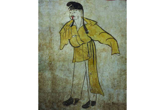

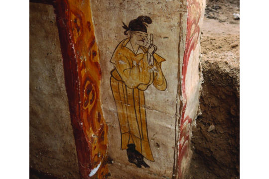
Tomb guardians
Several figures painted near the door represent the "doorkeepers" or guardians of the tomb; they are wearing yellow robes and some have swords at their waists, according to Xinhua. Other murals portray natural landscapes, as well as men threshing grain, women grinding flour, men making noodles and women fetching water from a well.
They are rendered in the traditional "figure under a tree" style that was popular in the Shanxi region at the time, the South China Morning Post (SCMP) reported. As its name suggests, the style features people carrying out activities underneath beautifully depicted trees.
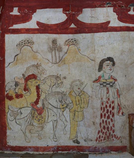
Many of the figures in the murals look like the same Chinese man and woman, and archaeologists think they may have been the two people buried in the tomb. The woman, in one scene, is dressed in a colorful gown and is leading four horses, alongside a bearded man holding a whip.
Other murals show mountains, trees and camels, and the series of paintings around the coffin may represent the Chinese tomb owner at different stages of his life, Xinhua reported.


Traditional style
The murals in the tomb appear to be well preserved. "The most familiar theme depicted in these murals is that of human figures under trees — a tradition that harks back to the Han dynasty [206 B.C. to A.D. 220]," Xiong said. Similar murals had been found in China's Xinjiang, Shandong, Shaanxi and Gansu regions.
He noted that the blond "non-Han" man leading camels has distinctive clothing. "Based on his facial features and outfit style, we can identify him as a 'Westerner,' likely a Sogdian from Central Asia," Xiong said. (The Sogdians were a trading people along the Silk Road routes between Asia and Europe at the time, living mainly in what are now Tajikistan and Uzbekistan.
He added that many of the murals gave "never-before-seen" representations of daily chores and labor during the Tang dynasty.
By Tom Metcalfe.

#Stunning Tang Dynasty Murals in a Tomb Unearthed in China#Taiyuan#Shanxi province#China#ancient tomb#ancient grave#ancient murals#ancient artifacts#archeology#archeolgst#history#history news#ancient history#ancient culture#ancient civilizations#ancient china#chinese history#chinese art#ancient art
550 notes
·
View notes
Text
This is the second part of the World Census. The first, more general part, is here.
Please, tag / comment your country and reblog for a bigger sample size! 🌍
+ Sorry, we didn't notice the Benelux and Alpine Region repetition.
#Europe#geography#the old continent#Balkans#Scandinavia#Slavic#Western Europe#tumblr polls#demographic polls#tumbler polls
2K notes
·
View notes
Note
I'd like to request color morphs/regional morphs, such as the Krider red-tailed hawk or the San-Francisco garter snake!
I've got a few of those for you...

Everglades Rat Snake (Pantherophis alleghaniensis), family Colubridae, found in southern FL, USA
This snake was once considered a subspecies of the Black Ratsnake, Elaphe (Pantherophis) obseleta rossalleni, but is n loneger considered to be a full subspecies, just a population of Eastern Rat Snake (P. alleghaniensis).
Some herpetologists have considered the Everglades Rat to be a population of Yellow Rat Snake, which is also just a regional variant and not a full subspecies.
They are larger and more orange than the typical Yellow Rat Snake.
photograph by Nathan Jordan Photography

Yellow Rat Snake (Pantherophis alleghaniensis), family Colubridae, Southern FL, USA
This is a color variation of the Eastern or Black Rat Snake.
It was once considered to be a subspecies of the Black Rat Snake, but no subspecies are currently recognized for that species, after recent taxonomic changes.
photograph by Dick Bartlett

Barred Fire Salamander (Salamandra salamandra terrestris), family Salamandridae, extremely high orange color morph, from Western Europe
Poisonous
photograph by The Bio Dude

North African Fire Salamander (Salamandra algira atlantica), family Salamandridae, northern Morocco
photograph by Frank Deschandol

Asturian Fire Salamanders (Salamandra s. alfredschmidtii), family Salamandridae, Asturia, Spain
photographs by Andrea Berardi

Shaheen Falcon (Falco peregrinus peregrinator), family Falconidae, found across South and parts of East Asia
This is a non-migratory subspecies of the Peregrine Falcon.
photograph by @sambathsubbaiah

“Ernest’s” or Indo-Pacific Peregrine Falcon (Falco peregrinus ernesti), family Falconidae, order Falconiformes, Philippines
photograph by Pardo de Leon
147 notes
·
View notes
Note
Does this mean we can have silk “scarf” or “shawls” in BB
bc that would make every scene so much better imagine Mistystar making a speech with silk accessories
I've been on-and-off looking at the possibility of the Clans making accessories out of silk for a few months now, but because of a lack of good historical examples to draw from, I've sadly had to rule it out for now.
Eastern silk production, which produces enough strong material to actually get used as a textile, is completely dependent on the fabulous, beautiful animal known as Bombyx Mori, the Domestic Silk Moth. What's amazing about this moth is that it's been domesticated for 5,000 years, and is so genetically distinct from its ancestors that they can't always produce offspring with their direct progenitor, Bombyx Mandarina!
In the west, we don't have any species (that I know of) which are capable of producing enough fiber. So far I've explored three kinds of animals, but hit snags with each one.
First one I started looking at was just some sort of alternative to bombyx mori, another silk-producing moth. While "wild silks" have been collected and used in the Americas, Africa, Asia, and even the Mediterranean and Middle East, it seems like central and northern Europe are like the one place on the planet where there's no appropriate wild silk moths.
At some point I encountered the Caddisfly and went down a small rabbithole for them. Caddis silk is VERY similar to that of a silkworm chemically, but also water resistant. Unfortunately, caddisflies cover their sticky cocoons in rocks and sticks, like bagworms. That would probably make the silk less useful.
The most promising was spider silk. Used as wound dressings since ancient times, briefly used to create paintings, plus several "proof of concepts" of modern humans applying silkworm techniques to create small amounts of textiles, several factors made me back off.
Spiders produce several kinds of silk, unlike insects which typically only make one per species. This means that you can't just apply "one technique" to turn all their silk from Bug Butt String to Useable Material-- you have to develop a technique for egg casing silk, dragline silk, capture silk, etc.
This means that I'd need to separately research every documented instance of spider silk weaving to understand what type of spider silk they were using, PLUS what species it came from, and if that species has any relatives in the modeled region, and if those relatives produce the right sort of silk, etc.
AND if these processes require too many advanced tools, all of that work would go out the window since Clan cats are working with sticks and rocks.
So, unless somehow unlimited money falls on me tomorrow and I get to hire a fleet of entomologists to conduct Silly Cat Experiments in tandem with, I can't find a path to silk textiles yet.
.....YET.
Because I can feel it in my bones that somehow, intelligent cats would be MILES ahead of human cultures in this technology. I think it would be just like humans and cheese. We didn't domesticate cows for their milk-- we domesticated them for MEAT, and THEN accidentally figured out how to make cheese by keeping milk in early "leather" (stomach) bags.
Likewise, cat cultures would be domesticating insects for food first. Silk would be a byproduct.
So someday I'd like to sit down and just explore what sorts of insects they would logically prioritize as food, which of those do well in captive conditions, and then work from there. Not only would it generally give me a good place to start with, but most importantly, it would feel more organic. As much as possible, I try to avoid working "backwards" culturally by starting with a tech and then figuring out how they got it.
Anyway! Mistystar can still have accessories
The primary textiles that Clan cats have is leather, linen, and yarn. Linen is the highest quality and most labor intensive material they have, worn by leaders, clerics, and other high-ranking cats as a sign of their status.
The shawl is actually canon lmao, a supporting character in Darkstar's Commandment is actually going to be wearing one. Xeir name is Smallstar, and they get to NOT die in BB because of the fact that Mapleshade's kittens are the ones who died to create Commandment 14. Runningstorm and Wolfheart also have very small cameos.
#clan culture#silk processing#so if the word 'Silk' pops up in a name it is currently referring to the natural fiber
96 notes
·
View notes