#era: 1940s
Explore tagged Tumblr posts
Text


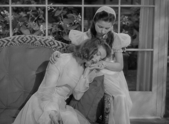

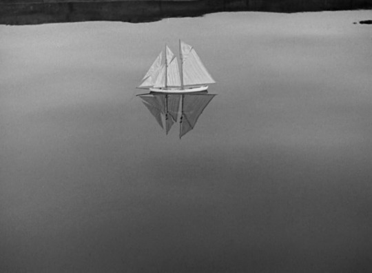
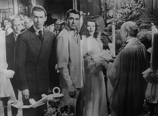

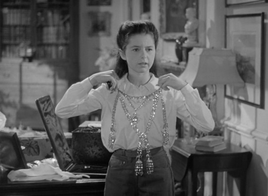

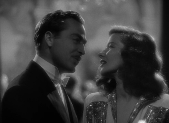
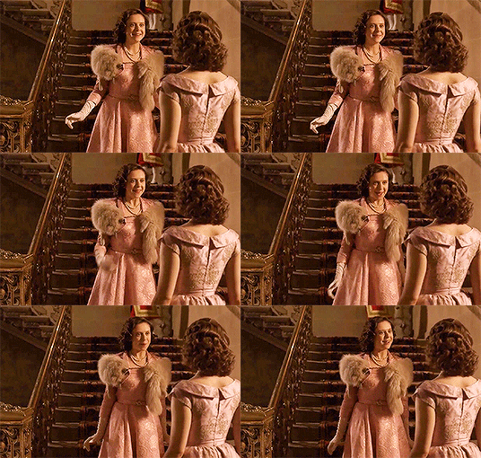
ten frames.
the philadelphia story (1940) — dir. george cukor
#the philadelphia story#movie log#march 2024 watch#10 frames#genre: comedy#era: 1940s#country: usa#film screencaps#katharine hepburn#cary grant#james stewart
46 notes
·
View notes
Text


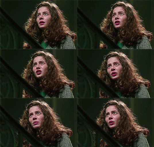


Jenna Thiam as Nina in The Collection
#surprise I'm still alive#I'm not just running this blog on queue#fc: jenna thiam#ch: nina#source: the collection#era: 1940s#mine: gifset#period fc#perioddramasource#perioddramaedit#perioddramagif
3 notes
·
View notes
Text
No. 47 - MALÉV Hungarian Airlines

MALÉV Hungarian Airlines (Magyar Légiközlekedési Vállalat) was the flag carrier of Hungary until its dissolution in 2012. I'm excited to talk about MALÉV for a couple of reasons. I'll get into those later, when they come up, so let's cut off the preamble and talk about an airline sadly lost to recent history after 66 years in operation, leaving in its place...
Well, nothing, actually. Hungary no longer has a flag carrier, thanks to MALÉV's rather catastrophic end, and Budapest is now primarily served by ULCCs like Ryanair and Wizz Air. It's a very tragic thing, in my opinion, for a country to lose its flag carrier, and I hope that MALÉV, or something else to replace it, will be (re)established at some point, but for the moment it's a beautiful relic of a less financially tempestuous time.

MALÉV's legacy is well-kept, with the Budapest Aeropark open-air museum containing many more preserved aircraft than a lot of extinct airlines will see. Clearly, this airline was dear to a country.
While I never got to fly on MALÉV, I'm excited to cover this airline's eclectic little fleet, which does one thing I can't pretend for a moment doesn't immediately make me eager to discuss an airline:
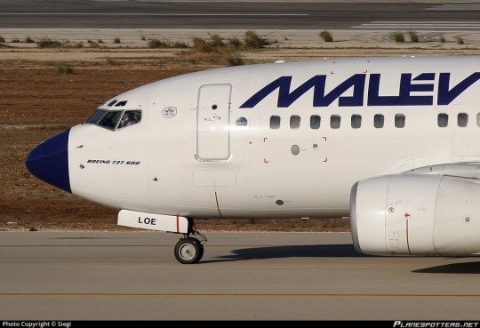
When MALÉV folded, Hungary lost a symbol of national pride, but the rest of us lost something too: one of the rapidly-dwindling number still fighting for the long-lost cause of the painted nose radome.
MALÉV was founded in 1946 as MASZOVLET (Magyar-Szovjet Polgári Légiforgalmi Rt.), born from the merger of a handful of similarly acronymic pre-war Hungarian airlines, plus the Hungarian branch of Aeroflot. It was renamed to MALÉV in 1954, when the Hungarian government bought out all the remaining Soviet involvement in the airline, making it a fully nationalized company. It was 'privatized' in 1993, but the majority of ownership was split between a government-owned holding company and the employees, with the government seemingly intent on privatizing it properly throughout. From 1999 to 2003 its CEO was actually József János Váradi, who is probably better known as the founder and CEO of Wizz Air. It was then sold to Russian airline-alliance-slash-joint-management-company AirBridge (later known as AiRUnion), a LATAM-without-rebranding-ish thing which existed for all of a couple years until it went under in 2008, all of its member airlines, classics like Domedovo and KrasAir also defunct. It was briefly under minority ownership by Vneshekonombank (now VEB.RF), a Russian corporation meant to invest in the development of urban infrastructure, but then renationalized by Hungary. During this period of privatization it underwent an elaborate game of CEO musical chairs, broadly struggling and being subsidized heavily by the Hungarian government. Once this happened the EU ruled that said state aid was actually illegal, and forced MALÉV to repay the years of assistance which had kept it above water - which of course promptly killed it, being more than a year of its revenue.
I dislike this pretty broadly. I'm actually of the opinion that flag carriers shouldn't be privatized at all, and it feels like it frequently makes things immediately and dramatically worse. This isn't really the place for pontification, but MALEV's downfall makes me genuinely sad. It feels almost vindictive in its drama and suddenness, and it killed something legitimately important to both infrastructure and national identity. (Also, I find it hard to wrap my head around the government's determination to privatize MALÉV when they ended up pouring so much money into it anyway.)
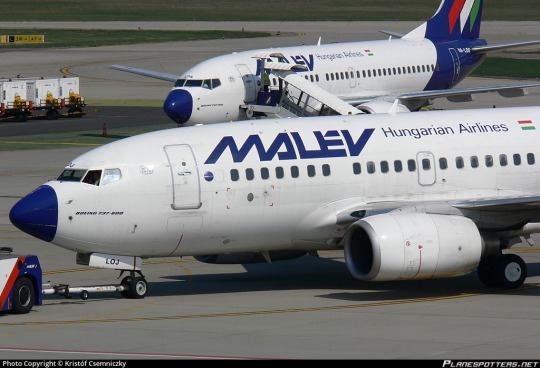
While other airlines eventually picked up the slack, in the immediate aftermath traffic at Budapest Liszt Ferenc International Airport immediately and drastically dropped, and now the only real choices, in a lot of cases, are Wizz Air and Ryanair. Which is broadly fine, I mean, I frequently can't afford anything else, but it's a bit uninspiring for the only option. It's just outright depressing when two airlines operate the vast majority of flights at any airport, with barely any other airlines offering even three, and those two airlines are Ryanair and Wizz Air, especially when you're just smack in the middle of Europe the way Hungary is and are a pretty easy place to route flights through. Increased range on airplanes is obviously a huge benefit to many people, but I'm getting the sense it may have been a cruel joke the universe saw fit to play on Hungarians.

There are three rows of Wizz Air destinations cut off, by the way.
But, okay, enough of that. I'm here for the livery. MALÉV has had three-ish main liveries, from their early days flying the Lisunov Li-2 (a Soviet license-built DC-3) all the way up to their final shuttering.

Yes, that's right - HA-LIX "Kármán Tódor" is in fact an airworthy Li-2![1]
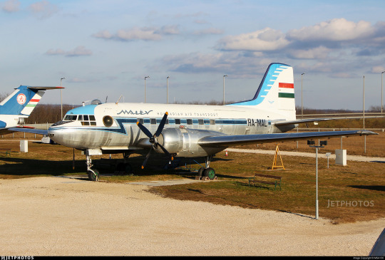
I'm trying to keep my posts at a length that is manageable to both write and read, so I won't be fully covering all the MALÉV liveries. I'm going to assume any requests are for the most up-to-date version unless specified otherwise. But I do just need to mention that I really want to do a follow-up post on MALÉV's original livery, which I think is a standout from its era - just brushing over it in a general history summary doesn't do it justice. It's modeled below on the Ilyushin Il-14 registered HA-MAL, preserved at Aeropark, while the 1968-1986 livery is modeled on this period photograph of Tupolev Tu-134A HA-LBG.

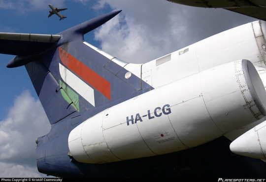
This is another reason I'm very excited by the MALÉV request. Hungary was, if you will, the sort of country which purchased Tupolev airliners, which means I get to use pictures of and talk about old Soviet models! MALÉV began switching to Western planes in the 80s and withdrew their last Tu-154s in the early 2000s, so they're not necessarily the majority of examples, but I do sort of favor the Tupolevs when I can. They're just very idiosyncratic for someone used to looking at mostly Western aircraft, which is to say basically anyone born in the 90s or later. HA-LBG is a Tu-134A, which you can tell because of the glazed nose. Why the glazed nose? Well, that's the classic Soviet navigator pit!
Unfortunately, the later MALÉV Tu-134s had modern nose radomes, visually indistinct from the fuselage around them. Thankfully, I am finally getting to the actual subject of the damned post, which is that in their last-ever livery, designed by László Zsótér[2] and introduced in 1986, MALÉV remembered where they came from and decided they were going to bring back a trend that should never have gone away.

Why did airlines stop painting the noses of their planes? That's a rhetorical question, they stopped doing it because technology had improved to the point they could use other colors on the radome without interfering with the weather radar's function, but, like, why did they stop doing it? Just look at this. The painted nose adds to a feeling of weight and forward momentum, and now the plane looks like a shuttlecock being launched directly at your face during a game of badminton against someone who dislikes you and is sincerely trying to cause you physical injury. She looks like a throwing dart for giants.

Or like a crayon, maybe, also for giants, especially with the stubbier 737 models MALÉV liked to use. The dark color is also very distinctly beaklike.
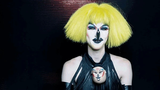
For some reason, it really immediately and vividly reminds me of the signature beak thing the drag queen Abhora (of Dragula fame) does. I absolutely love it in both cases, though thankfully to the best of my knowledge MALÉV did not embody horror, filth, and glamor.

It does, however, create quite a startling effect via the contrast between white and near-black blue. I will say that this color scheme makes the plane look a bit...villainous? I like that a lot because I'm twisted in the head. The thing that comes to mind is that this plane is haglike. And I love that for her. But I get that this statement could potentially read as insulting, so just, you know, I do mean it as a compliment. I like that she's a hag. I mean, I'm a Siouxsie and the Banshees fan, I'm no stranger to the power of big dark blocks[3].
I think the choice in color here is absolutely fascinating. You see, the Hungarian flag looks like this.

For a regular three-stripe flag I quite like Hungary's dustier take on the archetype, but we can't get around the fact that green, red, and white is an incredibly common combination. Probably in large part due to this, these are also some of the most oversaturated colors in livery design.

Here are just some of the examples that came to mind - and that's not including similar but not identical schemes[5]. These color schemes can obviously still work (two of these liveries are among my favorite examples of Eurowhite done Euro-right, guess which!) but I think MALÉV made the right choice in not trying to compete with it.
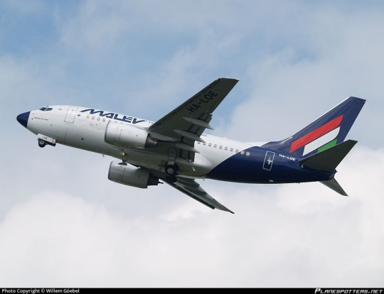
It's kind of interesting, though, how instead of just rejecting it altogether (as Mexican flag carrier Aeroméxico has done, as just one example) they picked a very dark off-black shade but then incorporated the colors of the Hungarian flag. This could very easily have gone phenomenally bad but I think it worked for them. It draws interest to the tail (while the blue background keeps it from being detached), the angular use of lines goes with the similar sharpness of the wordmark, and the muted shades Hungary in particular has to work with suit the generally washed-out scheme of this livery.
And to be clear, I don't mean washed-out as an insult. You could easily be fooled into thinking I dislike desaturation based on my reviews here, but I actually really love it and my main long-term non-Runway-Runway project has stylized desaturation as a core feature of its style guide, so to speak. So let me talk about desaturation! The reason desaturation is so frequently ugly is that people use desaturated colors the same way they would use vivid ones and expect it to get the same result, which it obviously won't. The most important thing for use of desaturated colors, in my own opinion, is maintaining very strong contrast. MALÉV does this, obviously, and the flag honestly lends itself to this via the white stripe's placement in the middle, and to a lesser extent the placement of these colors to break up the dark tail. Interesting designs can be subtle, but minimalism only works when it is an active choice designed to create an impression of minimalism (Vietnam Airlines) rather than a blank space (Lufthansa).
The more similar in hue and brightness to each other desaturated colors are, the more the entire thing starts to look flat. MALÉV avoids this by using green, red, blue, and white, which are completely distinct colors. It also creates a certain staccato impression via the sectioning off of the nose, the sharp lines of the wordmark, and the just-as-sharp lines of the tail. This is the point where I have to bring up that this livery was designed for, in large part, Tu-134s and Tu-154s, and these planes are themselves very visually sharp. While they have a very streamlined appearance without question, their planform actually, to me, suits the style of MALÉV's livery better than some of the other types they used, and may explain a bit more why it was designed how it was.

The wing sweep on the Tu-134 is 35 degrees, which is very unusually aggressive even for a rear-engined t-tail plane. I find that the less swept an airplane's wing is, the less it breaks up the line of the fuselage. The Tu-134 is also a bit of a short-looking plane, vertically, relative to a lot of other models, and the straight downward line blocks off the very square tail quite nicely behind the engines, which add some visual interest where they overlap. This sort of scheme looks pretty alright on the Tu-134, even if I think it could use a bit of an adjustment to the wordmark - make it larger, or maybe add an accent color. That would add a bit more weight to the front of the plane.
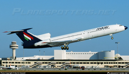
Unfortunately, on a somewhat longer-looking plane like the Tu-154 the white fuselage expanse becomes quite a bit more stark. That staggering just isn't enough to avoid the desolate feeling.


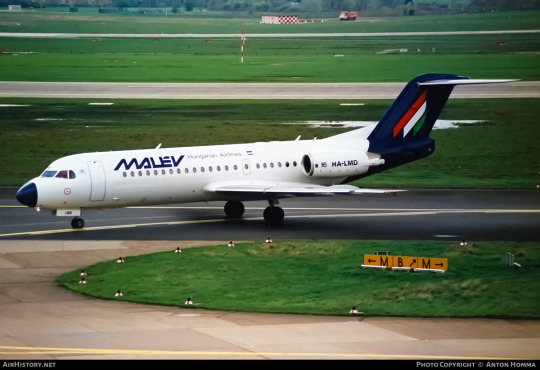
It gets even worse with modern Western planes, which lack the almost violent wing sweep, sharpness, and short fuselage of the Tu-134. MALÉV operated both the 767 and the 737-800, and these just don't have enough visual interest in the center to keep the plane from being a big white sausage. Plus, Boeing noses are pointy, but they're not as pointy as Tupolev noses, which means the nose paint covers less space. This is nearing the Lufthansa Line, which is my new term for the point where a plane has so little happening anywhere except the back that it looks distinctly rear-heavy.
(As well as crossing the Lufthansa Line as a sort of event horizon, the 'Lufthansa Line' can also refer to the literal shape of the straight line downwards. The similar practice which utilizes a curve instead of a straight line is the Lufthansa Line, SAS Variation. The Lufthansa Dec-lined - no, I'll stop. I need to maintain a tiny bit of dignity so I can still make fun of jetBlue without being a hypocrite.)

Like most liveries which straddle or cross the Lufthansa Line, this looks completely fine and proportional on a plane which is sufficiently short and/or stubby to reduce the ratio of rear to full body to around one-third, and the more stretch you add the worse it looks.

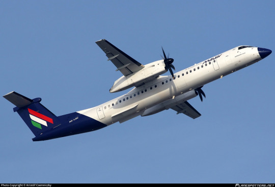
A short-looking fuselage like that of the Q400 also mitigates the effect a little. Plus, they do something I keep telling operators of planes with this sort of square tail to do - extend the paint to more of the fuselage, rather than keeping it a straight line. It just unfortunately isn't quite enough, though the pointy nose, shortness, and slight extension definitely mitigates the effect enough that I think it's...very nearly acceptable.
The incredible thing is that MALÉV actually solves this problem!

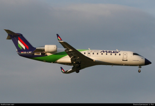
I love this little green swoosh upwards. Now, I think I would have chosen a different color for it - either a slightly lighter blue or maybe a darker green. I like how it tapers and fades towards the top. I like how it overlaps the bottom of the main blue section. I think it basically entirely solves the problem in an elegant way.

Unfortunately, this feature was used only on the CRJ-200 fleet. The CRJ is already a plane that's on the Lufthansa-proof side, particularly the shortest -200 variant, so it's a shame we didn't get to see this do some real legwork on a model that desperately needed it. Still, I think that Lufthansesque design could take notes from this, as it basically solves their issue! I don't get why this isn't something you see done. It's such a simple but satisfactory solution. Why, why did MALÉV not generalize this to their other planes?
Wrapping up my thoughts is the most challenging part of this. Normally I try to judge liveries by their weakest link - Lufthansa or TAM don't get let off because their liveries look better on short planes. But there's enough about the design choices that were made by MALÉV that I keep resisting tossing them into that same pit.
Nothing about MALÉV's livery really changes things drastically enough that it fundamentally deviates from the Lufthansa Line archetype, but it feels like the tiny tweaks change just enough that I actually think it's pretty okay. The painted nose, in particular, does a lot for me. I can't help but wonder if I'm being too kind to MALÉV because they operated so many pointy, angular, square airframes that really prevent the weaknesses of the Lufthansa Line from showing, and I try not to judge based on mitigating airframe factors if the airline operates types that aren't so lucky, but I just can't help but think the nose does add something very tangible, a sense of forward motion and a feeling of character that makes me hate it distinctly less, and the color choices are also nice!

And it's this feeling of character that keeps me...not really disliking this livery even though I will freely acknowledge it's lacking. There's something compelling accomplished just by painting the nose. I almost find that bizarre.

But, honestly...mostly white or not, I think these planes have enough color to them at the tarmac at Budapest wouldn't seem completely desolate. I think they'd go well with Wizz Air too. So, I mean...I think ultimately I like MALÉV, yes.
I'm going to give them a C+.
I can't justify going higher than that. But the main impression I've taken away is that I really wish MALÉV got a chance to overhaul their livery for the 2020s. What they had in their final phase actually looks quite contemporary, but that's because it was played out before it became an actual trend - introduced 1986, it predates even FedEx. I definitely can't rule out that whatever they redesigned this into would be worse, but as long as they kept the painted nose that's at least one thing I like a lot.

I've heard the Hungarian government would like to someday resurrect MALÉV if finances allow. To be clear, I do mean that I've heard it secondhand, but I can't find the actual source on it. This may be because I don't read Hungarian, but I think it would be nice to see. Even if there's a fifteen or even twenty-year gap, that's a better thing to see for a legacy which spans three-quarters of a century than for it to end there, and it's about time Hungary had a flag carrier again.
―――――――――――――――――――――――――――――――
Footnotes are so fantastic and useful. Why haven't I been using footnotes until now? I digress so much, why haven't I been making my posts more legible? I mean, tumblr unfortunately doesn't let you link to part of a post so they're not as useful as they are on other websites, but, like, no worse than endnotes in a book, right? And I deal with those all the time with very little grumbling.
[1] You can even still take a sightseeing flight on HA-LIX, or see her at airshows, where she looks fantastic for her 74 years of age (built 1949). She is operated by the Goldtimer Foundation on behalf of her owners, the Hadtörténeti Museum, still wearing the livery of her former operator, MALÉV. She even just got a round of restoration in early 2022, and is potentially the only airworthy Li-2 in the entire world of over 5,000 built, as it's thought the only other recent user, the North Korean Air Force, has mothballed theirs. [2]: I saw multiple mentions of László Zsótér as the designer of this livery, but cannot find any mention of whether he worked for an outside agency or was in-house at MALÉV. [3]: I mean, when you think about it, all of MALÉV's airplanes are painted birds. [4]: ie, schemes that are also primarily red and green but include other color(s) like blue, yellow, or black - see Ethiopian Airlines or MEA for an example - as well as honestly color schemes that are just red and white or green and white. It's honestly as bad as red, white, and blue.
#tarmac fashion week#grade: c+#region: central europe#region: hungary#malév hungarian airlines#flag carriers#defunct carriers#requests#era: 1960s#era: 1940s#era: 1950s#era: 1970s#era: 1980s#era: 1990s#era: 2000s#era: 2010s#region: soviet bloc#lufthansa line
13 notes
·
View notes
Text

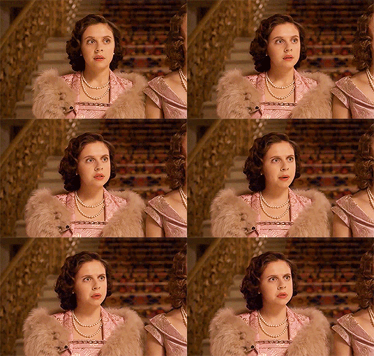


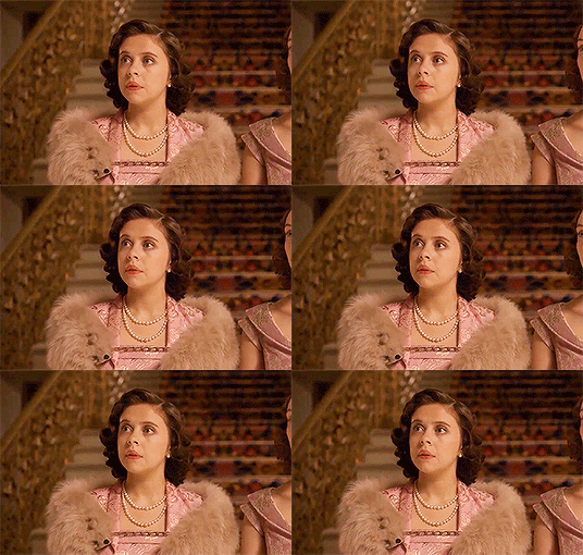

Bel Powley as Princess Margaret in A Royal Night Out
#cutest cutie#fc: bel powley#ch: princess margaret#source: a royal night out#era: 1940s#mine: gifset#period fc#perioddramagif#perioddramaedit#weloveperioddrama
31 notes
·
View notes
Text

19-year-old Ava Gardner photographed for her MGM employment questionnaire.
1K notes
·
View notes
Text


'Summer Underwear' for LIFE Magazine, 1949 Photography by Nina Leen
#girlblogging#lana del rey#vintage fashion#marilyn monroe#lana del rey aesthetic#girlblog#jane birkin#vintage aesthetic#this is a girlblog#life magazine#1940s style#1940s#1940s fashion#1940s vintage#40s#40s fashion#40s style#40s pinup#1940#party like it’s 1949#ww2 era#vintage photos#photography#black and white photography#fashion#art#vintage#vintage photography#coquette#coquette aesthetic
1K notes
·
View notes
Text

A US medic tends to the wounds of a German soldier - France 1944
#world war two#ww2#worldwar2photos#history#1940s#ww2 history#wwii#world war 2#ww2history#wwii era#usarmy#us army#1944#liberation#medic
553 notes
·
View notes
Text
Do you think that Danny would be mad that his lab accident was incredibly traumatizing and gave him superpowers whilst Jay Garrick’s (the first flash) lab accident that gave him his powers was breathing in hard water vapors after having a smoke and knocking over a beaker of hard water?
#hi this is bones here. as someone where hard water is the norm I WISH hard water gave me superpowers#I boil that shit all the time and stand next to the fumes while I wait to make tea and coffee#AND I STILL DONT HAVE SUPERPOWERS!!!! this is a tragedy and an absolutely wonderfully baffling bs superpower origin from the-#1940s era. truly a tragedy#bones prompts#dpxdc#danny phantom#dp x dc
473 notes
·
View notes
Text
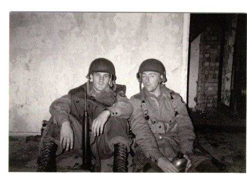
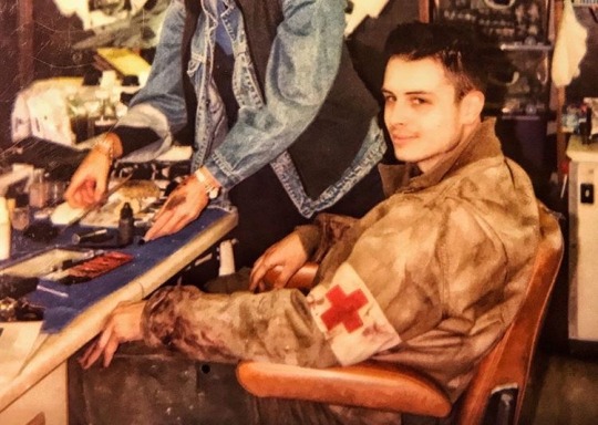

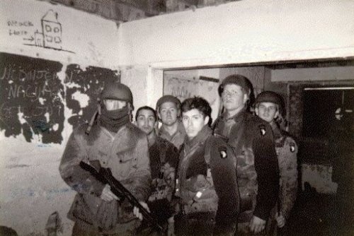
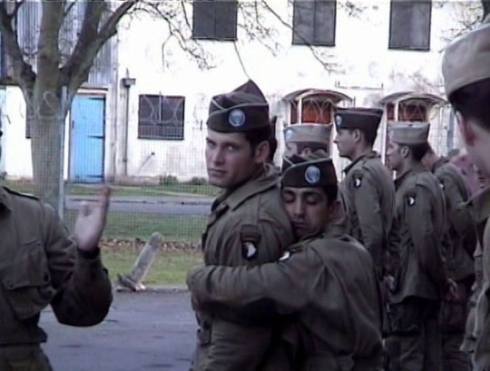
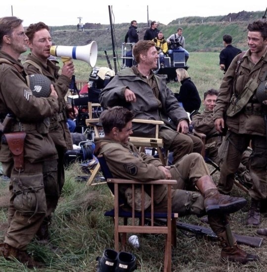
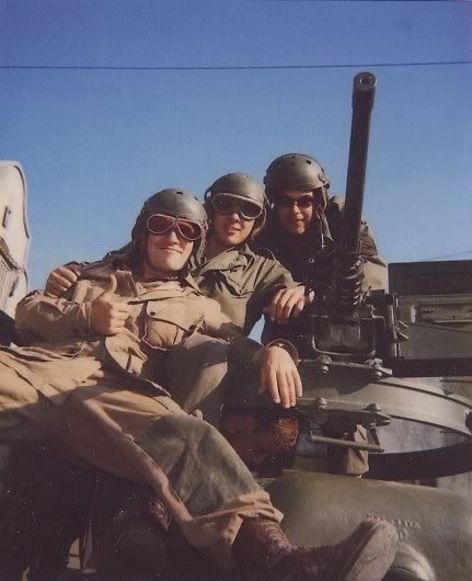
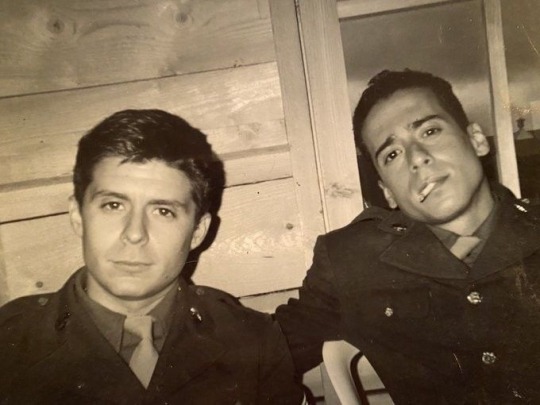
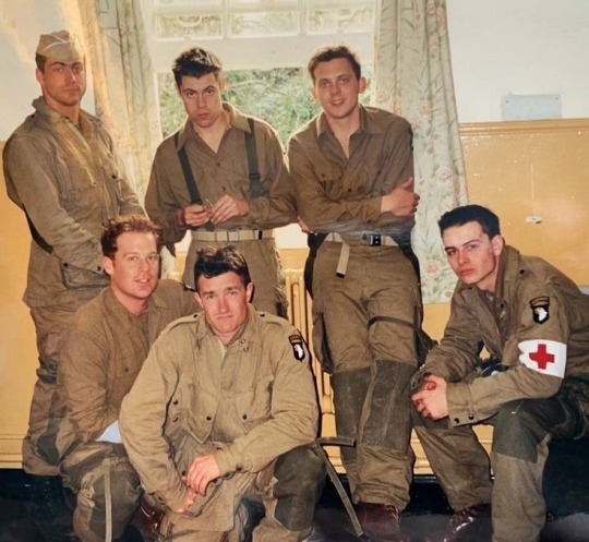
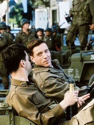
band of brothers • behind the scenes pt. 2
#band of brothers#band of brothers x reader#george luz#babe heffron#joe liebgott#joe toye#lewis nixon#richard winters#ron speirs#eugene roe#band of brothers behind the scenes#band of brothers aesthetic#bill guarnere#wild bill#skip muck#floyd talbert#alex penkala#david webster#webgott#winnix#wwii era#band of brothers hbo#hboww2rewatch#war hbo#1940s#easy company#carwood lipton#chuck grant#buck compton#frank perconte
499 notes
·
View notes
Text

Wehrmacht solider and his cup of coffee on the Eastern Front.
#ww2#eastern front#german army#1940s#wwii#world war ii#world war 2#second world war#world war two#ww2 germany#german#soldier#wwii era#world#war#2#war history#world war#ii#tumbler#tumblr#coffee#photo#wars#wars history#photography#german history#ww2 history#history
214 notes
·
View notes
Text

The beauty of Ava
#vintage#classic#old hollywood#old movies#classic movies#classicfilmsource#classic hollywood#old hollywod glamour#classic cinema#classic film#ava gardner#1940s vintage#vintage fashion#vintage glamour#old glamour#glam outfit#glamour#glamoroussource#golden era#golden age#40s film#40s life#40s#film noir#beauty#makeup#hairstyle#retro style
699 notes
·
View notes
Text

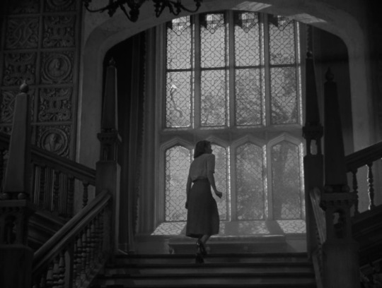
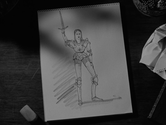
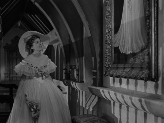
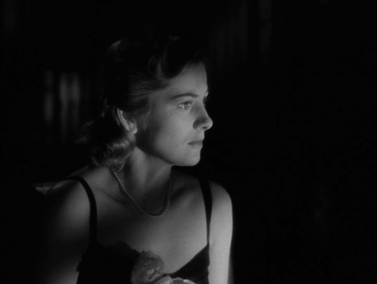

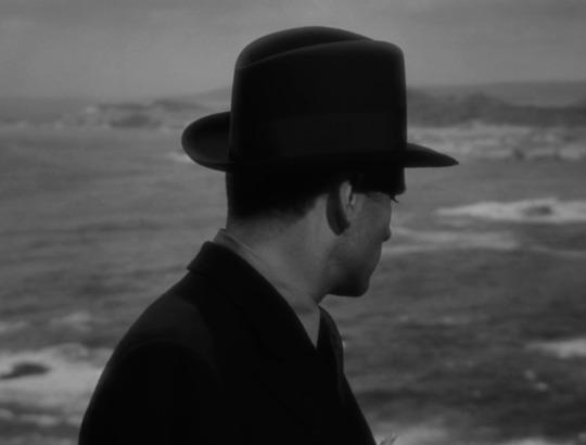

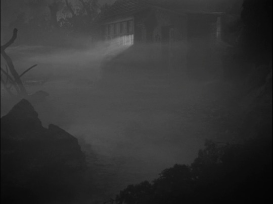

ten frames.
rebecca (1940) — dir. alfred hitchcock
#rebecca#rebecca 1940#movie log#june 2023 watch#pride watch#10 frames#genre: psychological thriller#era: 1940s#country: usa#film screencaps
112 notes
·
View notes
Note
Small scenario ask:
A kid version of Robin!Dick gets teleported into the present day of the DCU, in particular during one of those times that Batfamily are split up and at each other’s throats with only Tim(my) and Alfred sort of trying to keep the peace.
They don’t know he’s present until he jumps in from out of nowhere to help the Batfamily take on a Scarecrow attack.
How would they react to this tiny version of Dick and his more chipper and lively attitude especially once he starts asking Batman if these other guys around them are their allies or something?
OMG I AM SO EXCITEEDD!!
THE FUNNY THING IS IVE ACTUALLY BEEN THINKING ABOUT THIS TOPIC SEPARATELY IN MY HEAD!!
Not this exact scenario but just like how much Dick has changed over the years.
This is SUCH a good fanfic idea!!!
Okay so Dick would jumps into the future where the whole family is fighting and all of a sudden, a brightly colored boy just "POP"'s into the dark batcave.
Everyone at that point had been growling and snarling and screaming at each other over ethics and morals and course of action for a case that devolved into tearing at family lines and loyalties.
The tensions are high and no one is on anyone's side because as united as the batfamily is, they are just as divided.
They're seconds from coming to blows when - pop (goes the weasel. lol jk) - a 3 foot 2'' boy in the most canary yellow cape, scarlet vest, and emerald green scaled shorts blinks into existence.
The batfamily immediately goes for their weapons at the sound and most barely refrain from throwing them at the sight of a boy but some weapons slip out people's hands too fast for them stop.
They watch with their hearts in their throats and move as one to prevent it, their minds barely registering the sight in front of them, the only thought in their heads is - STOP! As if mere words could halt assailing weapons hurtling at breakneck speeds towards the child.
They've barely started moving when the small child - he couldn't have been taller than Batman's hip at the height he was - suddenly bounced on his right foot and used the moment to twirl horizontally in the air. The brilliant yellow cape swirled around his body as he turned, almost acting like a cocoon. The batarang sailed underneath their twirling body while two knives sliced the air harmlessly above him, all three weapons embedding themselves soundlessly into the cave walls behind him.
The batfamily makes an aborted move forward, halting in their tracks as the imminent danger passed and the walking traffic light of a child uses their split-second of decision to stop to take the time to gracefully land on his toes before flipping far out of reach. His back arched back into a perfect elegant little backflips which absolutely should not be possible or done so smoothly for a boy as young as he, but the kid manages anyway to land perched on a railing from the upper batcave level, looking down at them from his spot.
Duke glanced around to see if the rest of them had seen the same thing he did. Clearly not because Bruce, Tim, and Alfred looked like they'd seen a ghost. Jason and Damian looked grudgingly impressed. Steph looked openly impressed.
"So, we’ve got surprise visitors, huh? Gee, swell! You folks friends of B? Wait a sec-that can’t be right. B doesn’t have any friends except for me!" The kid chirped - and Duke swore, honest to god, chirped - with a cheeky grin, hands on his hips like he'd just cracked the world's funniest joke.
Duke just stood there, mouth slightly open, like his soul had momentarily left his body. The kid’s mask squinted as if narrowing his eyes at Bruce.
Duke blinked hard. Am I hallucinating? Did I eat bad takeout? He thought.
Bruce, meanwhile, stood frozen, looking like he was wondering where in his life he went wrong.
“Gee whiz, mister, I don’t mean to jump to conclusions or nothin’, but it’s kinda bad manners to go borrowin’ somebody else’s clothes without asking first!” He gave Bruce an exaggerated once-over, the grin on his face making it clear he wasn’t intimidated in the least. “I mean, that cape looks swell and all, but it isn't exactly screaming ‘your size,’ ya know?”
He tilted his head and piped up, “A friend of Catwoman’s?” His voice was light, full of curiosity and mischief.
Jason suddenly snorted. "A friend of Catwoman's, alright."
Cass gently smiled. Duke suspected she had known from the beginning who he was and thus had not moved a muscle during the chaos. Duke couldn’t shake the feeling it wasn’t because of uncertainty. Nope, Cass had known. She always knew.
He sighed internally. Why was he always the last to catch on to these Batfamily mysteries? On the other hand, maybe he should be grateful. He was still wiping off the remaining sludge off his suit from the last batfamily mayhap.
"Dick?" Bruce’s voice was raw, breaking apart as if it couldn’t decide whether to hope or mourn. It was the sound of disbelief and desperate longing, the kind of ache you didn’t just hear—you felt it. Duke’s chest tightened, a lump forming in his throat. He couldn’t imagine what it must mean to Bruce, but the pain was so thick it was almost unbearable.
"Who are you, mister?" Dick - holy fuck that was Dick. Wait- Duke whipped his head around. Where was their Dick?!
Tim was looking a little peaky in Duke's opinion and that was saying something since the other guy always looked pale.
Bruce raised a shaking hand to his cowl, dragging it down the back of his head almost looking like he wanted to do anything but. "Bruce. It's me, Bruce."
"I know you're a guy who looks like Bruce, but you're not my Bruce."
If his kids' previous deaths hadn't killed Bruce, then that one single sentence did, Duke thought, watching the man.
He saw a flicker of something break inside Bruce. The hardened mask Bruce wore cracked, revealing the raw, vulnerable man beneath. It was like hearing the one thing he feared most—that he wasn’t enough for them—and the way it pierced him was brutal. The light left Bruce's eyes for a moment, and Duke could almost feel the weight of that rejection.
It probably hurts to hear it from an 8 year old version of a person that adored you. Duke realized sadly. He wasn't there for Dick's childhood with the man - none of them were - but he was sure it wasn't called the Golden Ages by everyone for show by all those who had known them then.
"Wait, Alfred?" Dick asked, boring holes into the elderly butler.
So, he recognizes the same Alfred but not Bruce? Duke fought back a hysterical laugh. That's gotta sting. Sorry, man. Duke sent a silent prayer to the man who looked like he didn't know if he was going to start sobbing or glaring daggers.
Alfred cleared his throat, rather wetly in Duke's opinion. "Yes, son." He said and smiled warmly.
The boy gave a hoot of laughter that sent the bats in a flurry as he threw himself off the railing. Steph and Jason scrambled to catch him but mini-Dick (Duke was still half-panicking over where big-Dick went. Big-Dick. Haha) hopped onto Jason's shoulder used Stephanie's back as a personalized springboard and landed happily in Alfred's arms.
He hugged the man's neck like it was a plush toy and Alfred tightly held the boy with one arm under his thighs and the other around his waist.
Duke noted with no small amount of surprise that Dick perceptively didn't point of Alfred's suspiciously wet eyes and near-silent sniffling. It was damn loud for the cave though.
"Hey, did you whip up some cookies? I gotta say, that casserole’s a real knock-out, and your filet mignon? Spot on! Say, after we chow down, how about a rousing game of badminton? I’m on fire today! Let’s shake a leg, have some fun, and see who’s got the best swing!"
"Of course, Master Dick." Alfred said and the two continued conversing as Alfred carried the boy up the stairs of the batcave.
"Say, did you get to the next chapter of Lady in the Lake? I gotta tell ya, there's something fishy goin' on there, like a real gumshoe mystery. I can smell a twist coming a mile away, like a crook with a bad alibi! Whaddya think? There’s more to this dame than meets the eye, I betcha!"
Dick's voice faded as the rest of them dumbfoundedly realized they needed to follow after the two of them. Except for Cass, of course, who was already tugging a stiff Stephanie along.
Duke couldn’t help notice Tim. The guy was practically glowing in the corner like he was about to faint, his face flush with excitement. Duke knew all about Tim’s obsession with Grayson—Steph had spilled enough gossip to fill a novel. Tim had ranted about Dick for years, quoting everything from his acrobatics to his smile. But now, seeing the younger version of Grayson in front of him? Tim was this close to passing out. His eyes were practically sparkles. If there were stars in the Batcave, they were all shining in Tim’s eyes.
“Tim, dude, you alright?” Duke teased, but Tim couldn’t even form words. He just gave a thumbs-up so exaggerated it might as well have come with a marching band soundtrack.
Duke couldn’t shake the feeling that Damian was acting a little… off. The usually fierce, unflappable kid was clearly trying to maintain his tough exterior, but Duke could see the subtle signs. The way Damian’s eyes flicked over to Dick with just a hint of nervousness, his stance rigid, like he was bracing for something, but not quite sure what.
"Is it just me, or is Dick an absurdly happy kid?" Duke suddenly spoke, thinking about Dick's demeanor. The older Dick Grayson was so strict and while he joked, there wasn't a free-hearted levity in him that his child version carried.
The kid had been practically shining, bouncing around the Batcave as if it were his personal playground. This was the same kid who had grown into the stoic, responsible, and sometimes brooding Nightwing. The difference was like night and day. Duke could see the weight of the years had changed him, and as he watched this boy, full of energy and warmth, he realized just how much had been lost. This wasn't the Dick they all knew. This was a Dick that had never seen the kind of pain that had hardened him into the man they looked up to.
It was a version of Dick they would never witness - laughing so freely, so full of life - one that was locked away in Bruce's heart, his memories paying tribute to their god-like figure he'd embellished of their brother.
It was a homage Bruce had unknowingly clung to and fed into, and a part of Duke wondered how much of this Dick, too, had buried inside himself.
Duke felt an ache in his bones, realizing just how much was buried under the weight of Dick’s current life. The boy before him was a ghost of the past that no one would ever get back.
Jason groaned. "One depressing revelation at a time, Duke." He stomped his way up the stairs followed by near swooning Tim, and an anxious Damian.
Bruce hadn't moved an inch. It was as if the air around him had thickened, suffocating both of them with tension. Bruce, usually so composed, was now locked in a frozen tableau of silent agony. His face was unreadable, but his eyes - Duke could see them - betrayed a terrible storm. Guilt, loss, and a deep, unspoken grief. The kind of grief that didn’t make noise but settled in your bones and dragged you under.
But Duke was The Signal. He was the Light, that's what his emblem meant. While Bruce was drowning in his own anguish, Duke could not afford to drown with him. So he patted the man on the back and followed his brothers up the stairs, readying himself for more horrifying realizations about the loss of innocence and joy from their favorite brother.
#duke thomas#the signal#dick grayson#nightwing#robin dick grayson#1940s slang#i tried to style the way he talks after his golden age era#bruce wayne#batman#jason todd#red hood#tim drake#damian wayne#robin#damian grayson#alfred pennyworth#cassandra cain#orphan#black bat#stephanie brown#spoiler#cl paladin-of-nerd-fandom65 asks#cl asks#thanks for the ask!
189 notes
·
View notes
Text
Difference between Bruce and Dick as Batman.
So I know that there's a lot of temptation to compare Bruce as Batman to Dick or Damian, and Dick as Batman to Damian, often with a "oh well obviously Bruce was meaner/Dick was nicer", but I do think they have a neat contrast that fandom often overlooks (as well as some parallels).
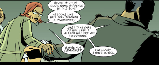
Robin: Year One #3
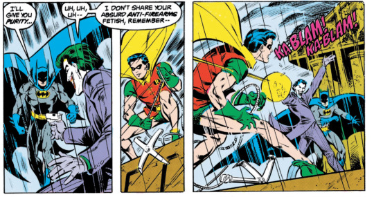
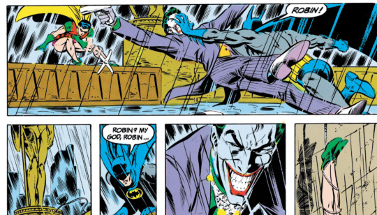
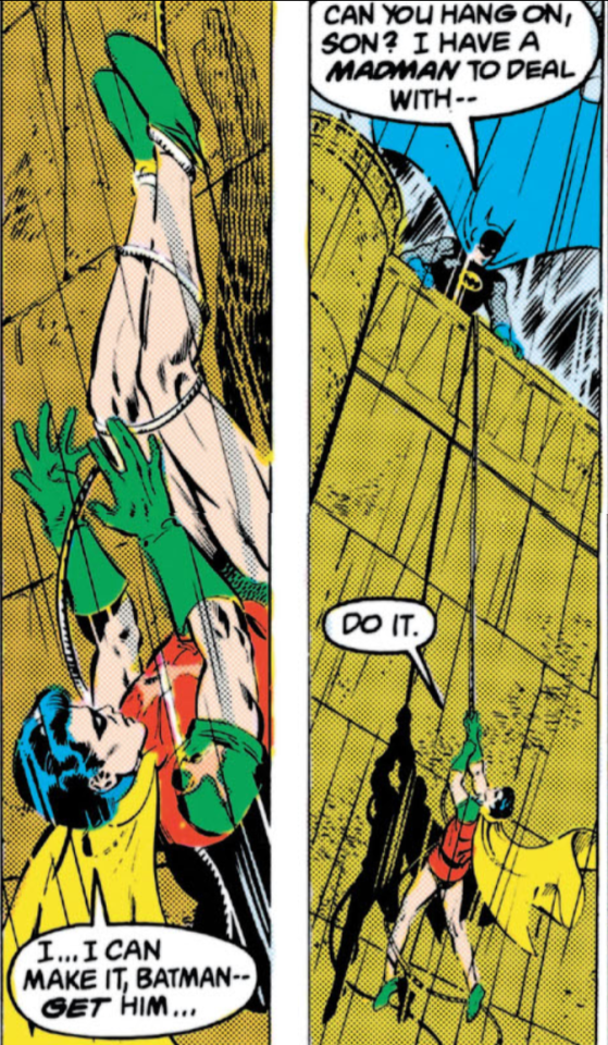
Batmatn #408
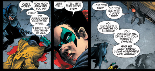
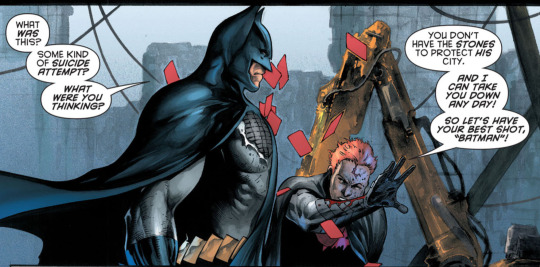
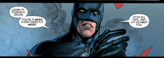
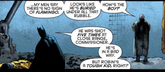
Batman and Robin #6
Dick and Bruce both will deal with whatever current threat exists, before fully helping wounded Robin, getting a verbal "I'm fine" confirmation. They clearly do care about Robin. But they also have an obligation to protect people Bruce tries to physically stop joker. Jason's not fighting Dick, but he is trying to talk him down and talk him into getting help, like he did in Battle for the Cowl. The characters also generally avoid a wounded Robin -- it's just easier to see for Bruce, because Leslie calls Bruce out on it "you're leaving (to go deal with this?)" whereas no one questions Dick leaving Damian once he's got medical care and doing his own mission to revive zombie bruce. I imagine this is partially from guilt (we do see Bruce blaming himself for Dick's close call, and Dick framing Damian as his responsibility in Battle for the Cowl) and also possible due to the whole 'batman has a job, robin's physically OK now so time to help protect people' thing.
A strong difference is after the character's get injured and treated. Bruce becomes overprotective, and continues being emotionally distant, which understandably upsets Dick. He is so overprotective he benches Dick each time he is wounded seriously, and that creates friction between them.
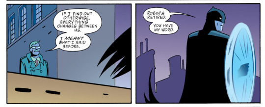
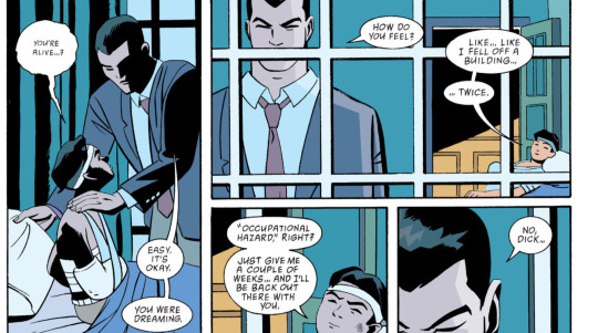
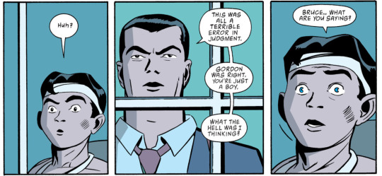
Robin: Year One
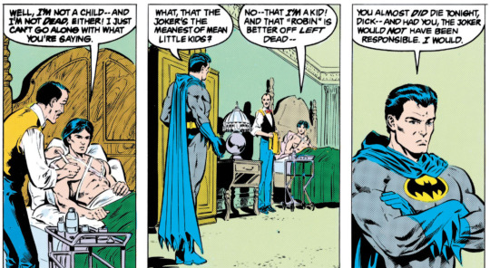
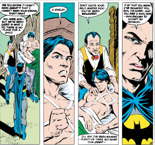
Batman #408
Contrast this to Dick's general lack of protectiveness. Nothing changes when Damian gets wounded as Robin. Which works well (emotionally) for Damian and it works for the conventions of the genre.
Dick is generally not portrayed as very emotionally overprotective when Damian is injured, and when Damian is captured, he often expresses more verbal concern for the people who captured Damian than Damian himself.
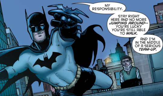
Batman and Robin #9 - Damian, with a new metal spine, got thrown off a building by the zombie batman dick accidentally revived.
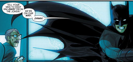
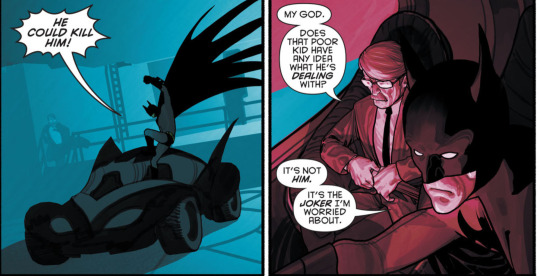
Batman and Robin #13
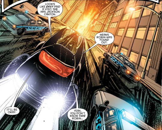
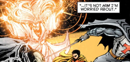
Detective comics annual #11
I should note: I think it would be uncharitable to assume that Dick expressing more verbal concern that Damian will hurt the supervillains who have him kidnapped means Dick doesn't care about Damian. We see in Batman and Robin some of Dick being worried when Damian is shot, and we see Dick telling Azrael they need to find a quicker way to get to Damian when Azrael is talking about how to find the guys who took him. And also, you know. I just don't think Dick would care more about the supervillains that Damian. But Damian is regarded as a tough kid, he'll be fine no matter what, and he represents a threat to other people (interestingly, something I've seen fans accuse... Bruce of doing to damian? Even though Bruce was much more protective and wasn't worried about Damian killing Nobody when Damian was going with Nobody, or Damian killing the Saturn Club guys when Damian let himself by kidnapped by the Saturn club guys to find civilians to rescue)
But I am analyzing here the actions he does and the words that he says, and what the writer dedicates panel time to. I think it's interesting that Bruce and Dick's similarities with regards to Robin getting injured involve emotionally removing themselves from the situation and focusing on cases, and then their differences are in the follow up. Dick often maintains a status quo, which is satisfying to the Robin character (he does not feel like he's being fired or judged) and fits with the conventions of the genre. Bruce often becomes overprotective to a degree where the Robin character feels estranged from him, and is excluded, resulting in alienation from robin and coming across as the "bad guy".
I find it very interesting that Dick avoids repeating mistakes of the past that Bruce made (becoming overprotective of Robin to an alienating degree and firing him) by doing things that would be read as callous or uncaring to the reader if he wasn't Dick, I guess.
P.S. I know some people say this is why they regard Morrison's Dick as OOC, but I didn't have any place to fit that acknowledgement in the above paragraphs, but I think it's important to note that this was not just Morrison's Dick. In general Dick as Batman era was way different than Nightwing Rebirth era Dick or even post 2011 Dick.
#dc comics#2009 era batfam stuff#detective comics 1937#batman and robin 2009#batman and robin#dick grayson#damian wayne#bruce wayne#batman 1940#robin#batman#we were the best#i dont have a bruce and damia interaction tag yet sadly#robin: year one#batfam#character meta
166 notes
·
View notes
Photo
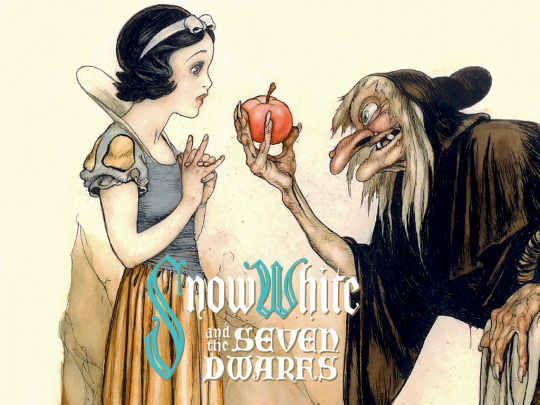
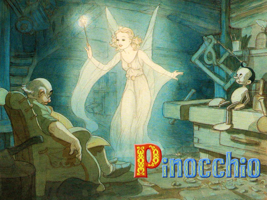
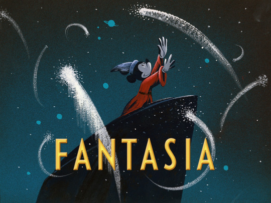
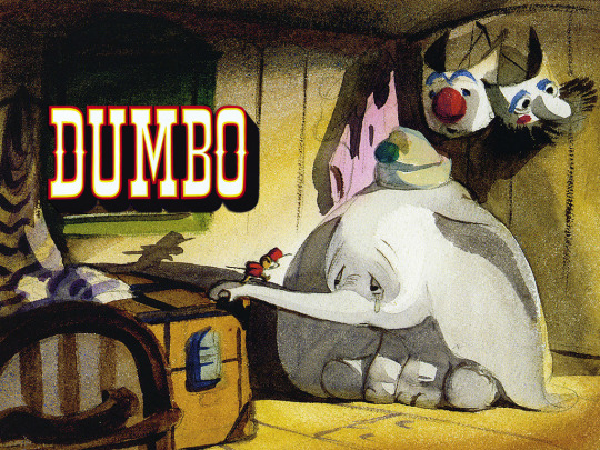

𝙳𝚒𝚜𝚗𝚎𝚢 𝚌𝚘𝚗𝚌𝚎𝚙𝚝 𝚊𝚛𝚝Iᴛʜᴇ ɢᴏʟᴅᴇɴ ᴀɢᴇ (1937 - 1942)
#ask and you shall receive#disney eras#disney#the golden age#disney animation#disney concept art#concept art#art#artwork#animation art#illustration#snow white and the seven dwarfs#pinocchio#pinocchio 1940#fantasia#dumbo#dumbo 1941#bambi#mine
3K notes
·
View notes
Text

Group photo of the MGM stars for the 25th anniversary in (1949). Who do you recognize?
222 notes
·
View notes