#ux-design
Explore tagged Tumblr posts
Visit Tumblr Blog
Explore Tumblr blogs with no restrictions, modern design and the best experience.
Last Seen Tumblr Blogs


Fun Fact
28.6 is the average number of monthly visits per US mobile user.
Text
Electrical Design Engineer
Job title: Electrical Design Engineer Company: Automation Experts Job description: and you have experience or interest in roles such as Electrical Design Engineer, Control Systems Engineer, Industrial Automation Engineer… and supportive environment. Senior LV Design Engineer £45-55k + Benefits Opportunities for personal & professional development… Expected salary: £55000 per year Location:…
#audio-dsp#Azure#business-intelligence#cloud-native#data-science#DevOps#edtech#embedded-systems#generative AI#GIS#hybrid-work#insurtech#iOS#Java#NFT#NLP#project-management#proptech#QA Automation Engineer#quantum computing#regtech#remote-jobs#robotics#scrum#SEO#site-reliability#technical-writing#ux-design#vr-ar
2 notes
·
View notes
Text
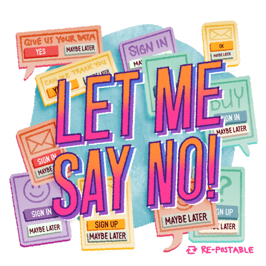
I'm fed up with "maybe later".
103K notes
·
View notes
Text
Website Designing
#WebDesign #WebsiteDesign #WebDevelopment #UXDesign #WebDesigner
0 notes
Text
It's kind of funny how Teams users have been complaining for the better part of a decade that the minimum width of the dockable chat windows is too wide, and Microsoft has basically been telling them to get fucked, then they discontinue Skype and tell all of its former users to switch to Teams, and within 72 hours of Skype going down for good, Microsoft suddenly pushes a "critical" update for Teams that gives it more flexible dockable chat windows.
4K notes
·
View notes
Text
Ninetyseventh Post
New chapter! I’m back in school. Today (August 21st, 2023) is the first day in my journey towards becoming a UX-designer.
1 note
·
View note
Text


Blame! (2017)
#blame!#cyberpunk aesthetic#scifi anime#user interface#anime#user interaction#graphic design#aesthetic#japanese animation#scifi aesthetic#japanese anime#anime gif#ui ux design#uidesign#ui#glitch video#glitch#glitch art#glitch aesthetic#robotics
1K notes
·
View notes
Text
I just noticed this on my phone's mail app. UI design is my passion.
655 notes
·
View notes
Text
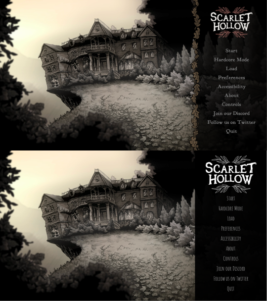
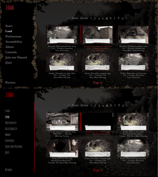
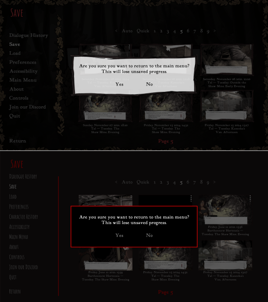
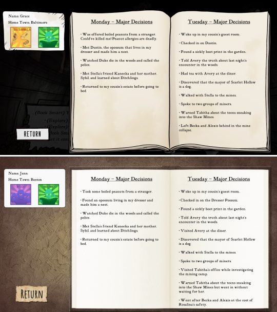
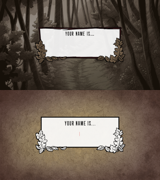
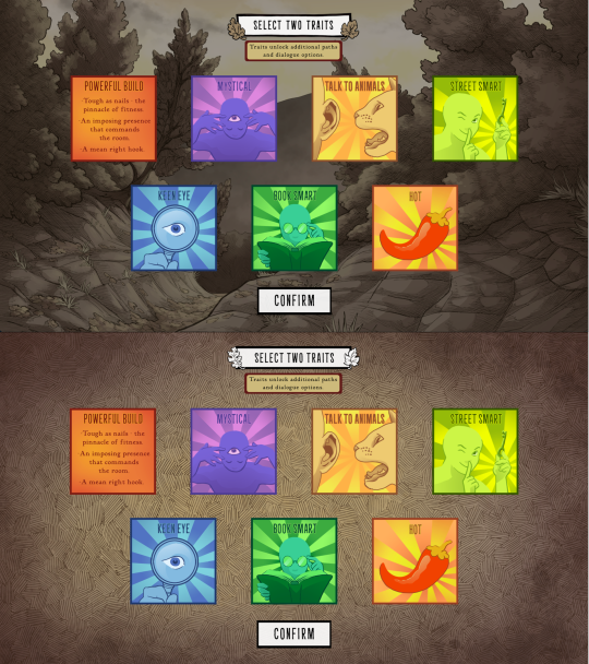
Scarlet Hollow UI Redesign Work In Progress
HELLO! As some of you may know we've been hard at work on a large overhaul patch for the first four episodes of Scarlet Hollow to bring the game closer to our ever-higher standards. While there are a lot of content changes and additions coming with the update, here's spoiler-free look at how the UI side of it is coming along. New UI on top, old UI on bottom. First, and most importantly is the updated textbox. We've been adding a lot of detail to small UI elements, and this is no exception — there are more leaves, and those leaves have some color in them now, which we feel makes the in-game art feel a lot richer. On the usability side, you'll notice that this new box is both taller, meaning that we can fit more options before you need to scroll, and that the scrollbar is located further to the right, meaning options can be longer before flowing onto the next line. (Again, meaning there will be less scrolling.) We've also moved the quick menu into the textbox so it no longer overlaps with any background art.
Next up, we've got the main menu. Not a ton to say here. Logo is smaller and has some color so it feels less stark. The font choice is tighter, and we added a border where the text options start to improve the feel of things. In general we're trying to make options that make the interface feel warmer, more organic, and less sterile.
Next we've got the in-game menu. Again, framing things with organic shapes to provide better flow and separation. We've also added a wooden "frame" around each save game thumbnail give them a more natural feeling.
Similar notes for the new confirmation screen. We're probably going to increase the opacity a little bit. At the moment is a little too transparent.
The journal has new assets, and instead of a generic cross-hatched background, we add a semi-transparent black layer so you can still see the game world behind it.
And speaking of generic cross-hatching, we've also removed it from character creation, instead replacing it with backgrounds from inside the game. Overall this should feel a lot more welcoming.
These backgrounds change with each new slide, too. Here's how trait selection works.
Anyways that's it for now! Happy new year :)
747 notes
·
View notes
Text
Hey, everyone! I've been experimenting with some ideas I had for improving Myspace's mobile navigation. These are just personal thoughts and prototypes—not official changes—but I had a lot of fun reimagining the experience. Would love to hear your thoughts!
489 notes
·
View notes
Text
Our UX engineers have been hard at work to deliver you the first experience that is entirely seams
170 notes
·
View notes
Text
Try Our App: It's Like The Web Site But You Can't Select Anything
246 notes
·
View notes
Text
Researcher/Senior Researcher in Computer Vision and Machine Learning
Job title: Researcher/Senior Researcher in Computer Vision and Machine Learning Company: Samsung Job description: Researchers in Computer Vision and Deep Learning to join the Future Interaction program. As a Researcher, your main task… with fast prototyping Deep Learning frameworks such as PyTorch. A track record of publishing at top-tier venues (e.g. CVPR… Expected salary: Location:…
#5G#agritech#Azure#Broadcast#business-intelligence#cloud-computing#cloud-native#Crypto#CTO#Deep Learning Researcher#DevOps#gcp#generative AI#govtech#HPC#hybrid-work#metaverse#mlops#Networking#proptech#Python#qa-testing#remote-jobs#rpa#Salesforce#sharepoint#telecoms#ux-design#visa-sponsorship
0 notes
Text
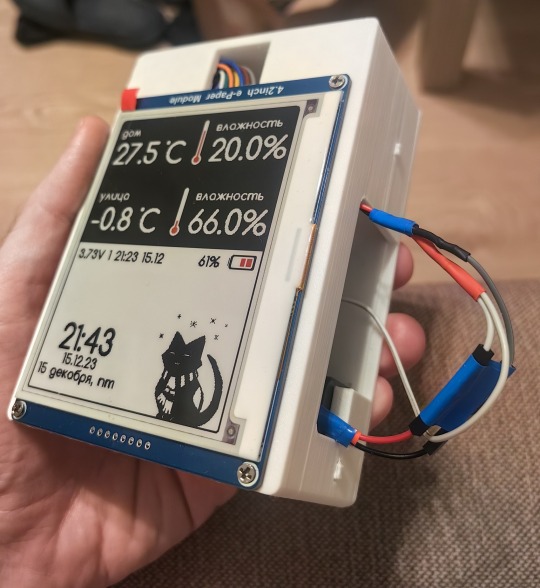
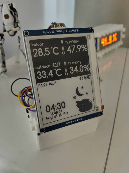

Released my open source weather station firmware, works with E-INK 4.2' \ 1.5' displays; compatible with ESP8266 \ ESP32 Default kitty icon is depends on time \ temperature; Upload custom interfaces is also available via web panel; Optional °F \ °C, English Source code : https://github.com/NC22/Volna42BW Documentation : https://volna42.com
632 notes
·
View notes
Text

#motion graphics#art#graphic design#ui design#animation#scifi art#cyberpunk#cyberpunk art#futuristic#ui#ui ux design#uidesign#black and white#monochrome#gif#dark aesthetic#dark scifi
1K notes
·
View notes
Text
I kind of love it when websites both display relative timestamps for an unreasonably long span of time before switching to absolute timestamps and use unreasonable units for the span in question. "This post was made 37 weeks ago" under what conceivable circumstance is this a useful way to communicate that?
4K notes
·
View notes