#used only the round brush with little to no opacity settings so i could just use the flat colours
Explore tagged Tumblr posts
Visit Tumblr Blog
Explore Tumblr blogs with no restrictions, modern design and the best experience.
Last Seen Tumblr Blogs


Fun Fact
The average Tumblr user visits about 67 pages every month.
Text
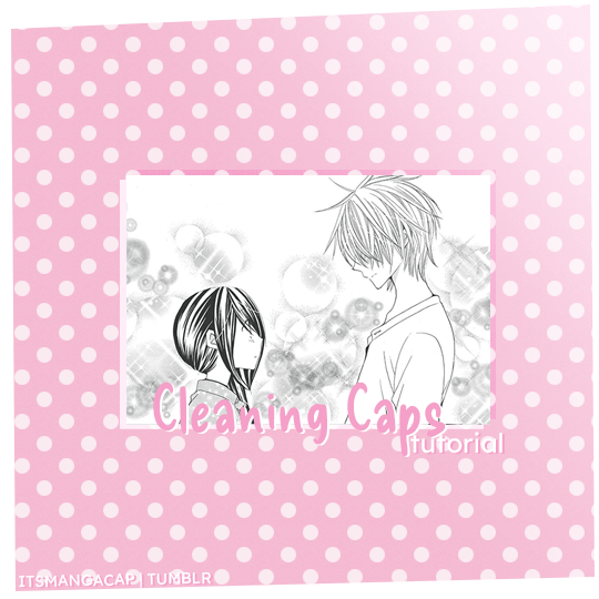
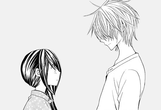
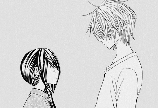
A manga caps cleaning tutorial. requested by @noctemys
Program: photoshop cc2019 but could work on any older or newer versions.
i’ve been working on this and a hard time choosing which cap should i work on, i decided to write it using an easy one to work on and writing the tutorial on, but you could work this one even in more challanging caps to clean! i’ll show examples of different difficulty at the end of this tutorial. i’m still a work on a process when it comes to cleaning caps!
*tip: always try to use a high quality files! i personally like to work on the official files if they’re available. they make a huge difference as seen between this old and newcleaned cap!
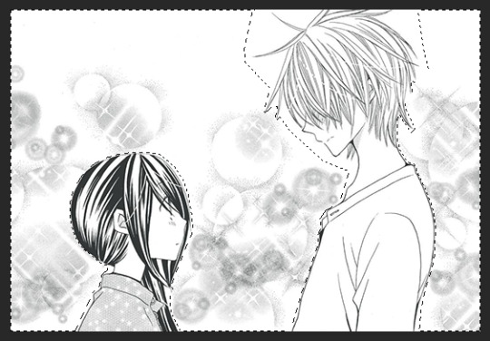
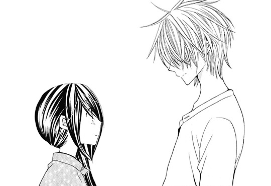
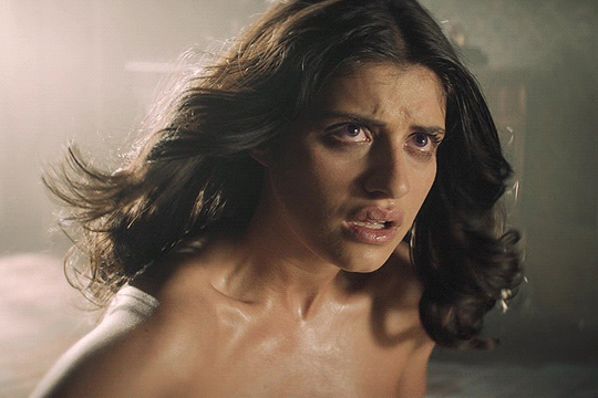
step.1 first step is choosing a cap of your choice and crop the panel that you like. mine is from Special A by minami maki.

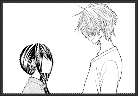
step.2 zoom in the cap, i usually go with x800! then using the lasso tool i select all the area i would like to erase and clean! this step could take a long time with some caps that have overlaying background effect with the characters. you could also use the pen tool or the magnet tool, whichever feel more comfortable using.
step.3 once you finish selecting the whole area you want to clean, with a white color fill the layer with white color!

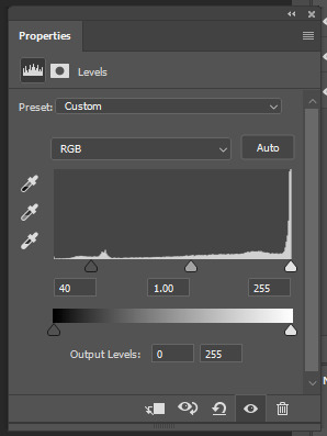
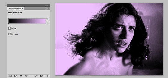
step.4 some caps do need to up the contrast in them just like this one, i usually use the levels to increase the blacks and whites by ticking the black point to the left to increase the blackness and the white to the right until i like the result i get. for this one as it leans more to the grey than black i only needed to increase the blackness.
step.5 some caps aren’t truly in black/white so i just add a gradient black and white!
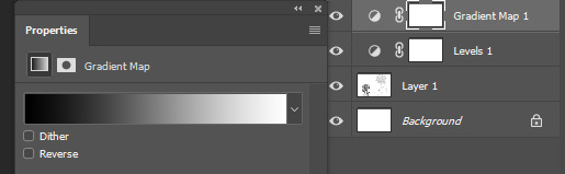
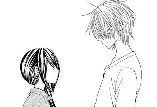
step.6 add a new colorfill layer and fill it with #f1f1f1 and set it to multiply. and delete the mask!!!

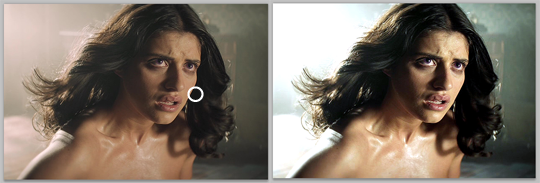
step.7 this step could be the last step or will need an extra step to make. and in this case we’ll need the extra step use magic wand tool select the background that i just cleaned you’ll notice the selection will include parts of both hikari’s hair and kei’s face.
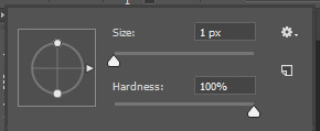
step.8 after deselecting, with a round brush with a grey shade color - my choice is shade is #373737 -, i would zoom in the cap again and notice where the gaps that’s causing the selecting mess is. and while in the cap layers i would redraw those tiny parts… sometimes the gaps are big and there’ll be many gaps.. you could either redraw by the mouse directly if the missing parts are small and tiny or use the pen tool to do that!
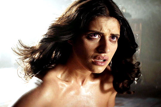
step.9 using the magic wand again select the area you want and select the colorfill layer click the mask icon from the layers box and you’re all set!
step.9 - optional- a last step i’ve been adding lately to my manga caps edits is adding this texture at the top of layers and lowering its opacity to 8% for a nice little touch!
the final layer box will look like this.
other cleaned caps before and after: before→ after | before → after | before→ after| before → after
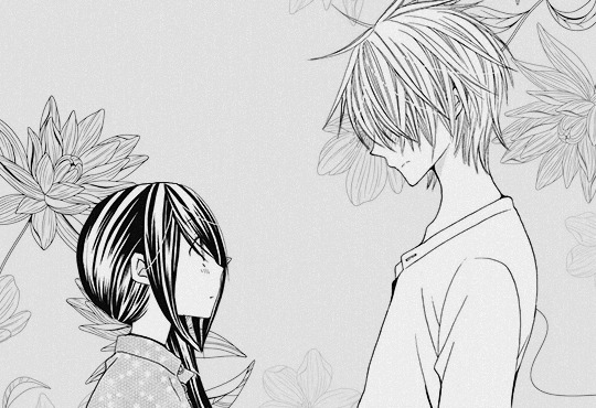
you could add any background you like at the end for a different ending result
#manga#manga cleaning#manga tutorial#ps tutorial#tutorial#photoshop tutorial#photoshop#ps resources#itsmangacap
31 notes
·
View notes
Text

--- Anon requested: Days go by and nauseous for zukka. From this palette meme.
#zukka#palette meme#avatar the legend of aang#avatar the last airbender#zuko#sokka#look i know you gotta practice something to improve skill but i hated every second of this#painting is PAIN#used only the round brush with little to no opacity settings so i could just use the flat colours#bc boyyy am i bad at colour stuff#i know all the theory and shit#but i just cant do it#does not make sense in my head#this is gonna be a learning curve that like... shows rollercoaster lovers a good time#:' )#oh and click the image for a better look#JUST NOW REALIZING I FORGOT TO USE THE BRIGHT RED JKDSJDGSFGD#Blue Art
455 notes
·
View notes
Text
becca’s mega coloring tutorial
i’ve gotten a lot of requests recently asking me to make a tutorial for my 'colorporn’ gifsets, and i think i’ve finally gotten over the traumatic incident 3 years ago, when i spent all day writing out a coloring tutorial only to accidentally hit backspace causing the entire thing to be wiped. so, here it is, buckle up folks! it’s going to be a long ride but here’s hoping it’ll be helpful.
so we’ll be going from left side (no coloring) to right (coloring & color porn):

let’s get started! you will need some sort of photoshop in order to do this, i use photoshop cs5 so this tutorial will be based around that, but i imagine you can adapt it for whichever one you use.
this is more of a coloring tutorial than a gif tutorial, but if you’re not sure how to make gifs then this is a pretty good all-encompassing tutorial, although i use 0.05 as my frame delay speed.
we’ll start from your have your basic gif, re-sized cropped and sharpened like so:
step one: curves
so i’m going to start off with basic colouring! the first thing i’m going to do is a curves layer to sort of ‘balance’ the gif out. to do that i go to layers > new adjustment layer > curves. on this window, right next to the graph, are three little droppers. i’m going to click the very bottom one right here:

this basically allows you to set your ‘whitest’ point in the gif, aka the point that should be the brightest. so i then go to my gif and click on the ‘lightest’ point. there’s a lot of light coming in from the top left hand corner of the scene i’ve chosen, so i’m just going to click it on that point (circled below) and that immediately brightens up the scene.

next i’m do something similar, but with the ‘blackest’ or darkest point on the gif. to do that i’m going to use the very top color picker:

and i’m then going to hit what the blackest point to balance out the light:
what this is basically doing is using your white and black points as color markers to not only brighten and darken the gif in places, but it also acts as a sort of color balancer. it’s very common that shows put a sort of colored ‘filter’ over their scenes, for example the scene i’ve picked has a sort of yellowish filter over the top. you might find that some scenes it doesn’t really affect, but others it makes a tremendous difference. personally i like doing this to get back to a ‘neutral’ ground on the scene, which is particularly useful when we are taking a scene with a warmer color tone (yellow) and trying to make it a cooler tone (purple).
if you are using a darker scene you may have to put a brightness/contrast layer on before you can complete this step, or even add an auto curves layer (hit the ‘auto' button on that same window) before you have a ‘white’ and ‘black’ spot to work on. i love this trick but this is precisely why i say i have no ‘general psd’ because it is entirely scene specific! but here we are at the end of step 1:

step 2: basic coloring
i’m just going to add a few adjustments to round off my basic coloring! i added just a little increase in curves to make the gif a little brighter (a), added a levels layer to enhance the contrast (b), and added some color balance. for this i worked with adding magenta and yellow tones to enhance the skin tones in the gif. i also made the midtones a bit more ‘purply’ (c) (as this is the end colour i want to achieve) and also did the same for the shadows (d).

for a darker gif i would probably add more curves and an additional brightness/contrast layer. color balance is also a really important tool to just play around with, ‘warmer’ scenes need more cyan/blue balance, while ‘colder’ scenes need more yellow/magenta balance. our final product is:
step 3: painting colors
if you wanted, you could probably leave your gif right there, but i like colors and i’m going to embrace them!
now there are three methods that i bounce between and they really depend on the type of gif you’re working with. an ideal scene would have a strong background color (see step 4) already for you to work with, but the truth is the majority of scenes don’t. as this scene is fairly neutral in background coloring, you’ll see we can’t just use selective colors to get the purple we want, so instead we’re going to do something a bit different. warning: this method won’t work for scenes with a lot of movement! for that you need step 4 or step 5.
first, something i always do with colored gifs, is i add a gradient map layer of black + a light shade of the final color i am trying to achieve, like so:
i then set this layer to ‘soft light’ and lower it to an opacity that i think suits. for this gif i lowered it to 20%.i think this makes the darker colors a little more ‘purply’ and overall gives a smoother affect what we’ll do next.
next is the fun part! we’re going to start adding in the purple. to do this, we want to create a new layer right at the bottom of all your coloring layers, so sandwiched between the actual gif and your first curves layer. then i grab my paint brush (you want one with the blurred edges, not a solid brush), use the same purple tone i selected for the gradient mask and paint around yen’s face and body.
i like to split my left and right side into separate layers. this is because i like to use a large paintbrush to solidly paint the left hand side of the gif, and then use a large eraser to get rid of the color from her face/body. the larger eraser you use, the smoother it looks (i’m not saying try and use a 600px eraser, just a 100px rather than a 10px creates a better effect). now it looks like this:
don’t worry that it looks very white, that’s just because it’s under all the curves layers! so now all i do is change it from normal, to multiply, and as you can see we have a nice purple background:
repeat this process for the right hand side:
you may find that if you’re working with a darker gif, setting these layers to ‘hue’ or ‘color’ is better. and again, the opacity may need a bit of playing around with. remember it’s ok to play around with effects and what might work for one gif will not work for another just because scenes and lighting vary!
then i just painted a line across the bottom, over her chest area, and lowered this to a 41% opacity. this just helped to enhance the purple feel of the gif. now we’re left with:

so a few finishing touches, i noticed that there was a spot by her right arm that as she moves, exposes a bit more of a ‘yellowish’ band. to fix this, at the top of all my coloring layers, but under the gradient map, i added a layer and just put a small purple dot on top with my paintbrush, and set the layer to ‘color’.

lastly, i wanted to make the right side a deeper purple, so i used selective colors to manipulate the magentas to the shade i wanted. then with the layer mask, painted black over the right hand side of the gif so it didn’t affect this coloring.
and there we have it! i have my finished gif!

tips: sometimes it’s nice to enhance lighter and darker parts of the gif further. i didn’t with this one as i already thought the natural lighting did it well enough, but of course this might not always be the case!
while i liked the coloring of this gif, i wanted a bit more variation in the purple tones. so, under all the coloring layers again, i painted some black on the right hand side, set this to softlight, and played with the opacity (it ended up on 65%). then added another purple layer on the right hand side, but set this to overlay instead and again lowered the opacity (to 58%) and got this:

you can play around with this to get different tones, and you can even change the color of what you’re painting on to create a gradient effect! for example, if i change the black softlight layer to a dark blue, and the overlay purple layer to a lighter pink, i get this:

and then you can use blue and magenta selective colors to play around with that even more. it’s all about experimenting and seeing what works!
step 4: selective colors
to do this method, you need to have a gif that has a strong background color. it doesn’t matter what that color is, or even if it has two, but it doesn’t work well with a netural background. for example this gif (which i’ve already done my base coloring on), is perfect to work with:

as we can see it’s very yellow in the background which is perfect! so the first thing i’m going to do is is create a new hue/saturation layer, set this to ‘color’ and then on the drop down menu change the color to ‘yellow’. from here i just dragged the hue bar till it was pink/purple.

because i’m working with yellow, which is a skin tone, we find that her skin has also gone pink. now i don’t really want this effect as i’d like her to look natural! so all i’m going to do is grab my black brush, paint on the layer mask, and erase this from her face. this won’t be so much of a problem if you’re adjusting cool tones, such as blues or greens.
i then used some selective colors to adjust the magentas and the same ‘tip’ i used for step 3 to add a little bit of gradient variation and all done!

step 5: all the time in the world
sometimes, you have scenes that won’t conform to either of the two methods listed. either they have too much movement for step 3 to work, or too neutral a background, or the selective colors won’t work for the overall color of the gifset. also, if you’re working with something of a yellow background with a lot of movement, the selective color method doesn’t work great because it ends up disturbing the skin tone of the person you’re giffing.
for example, for this gif i did all the steps in step 3, and got this:
now i love the coloring, but it’s messy. the movement of her hand means that her hand dips in and out of the yellow, but leaves background exposed.and the turn of her head means half her head ends up yellow. so instead of giving up, because i am a stubborn bitch, i take my yellow layers i’d painted on, merge them into one and start coloring them frame by frame.
to do this i adjust the timing of the yellow layer to fit each scene, and fill in/erase the yellow around yennefer as required. it ends up looking a bit like this:

i must say this can be pretty time consuming. it’s fine for shorter gifs, but it doesn’t work for a gif with a lot of frames. i don’t mind cos i just do this in the background while watching a movie, but it’s not for everyone. you might just prefer to play around with selective colors as in step 4, but you also might find if you’re adjusting warm skin colors, that you’ll need to use a layer mask frame by frame to still get the clean affect you want!
anyway, i added a slight yellow layer set to ‘hue’ over her dress to round it all off, and after coloring it frame by frame i got the affect i wanted:
obviously if you did all gifs like this it would take all week, but in mixing all three techniques i end up creating the sets i want!
the end
and that’s it, i hope this has actually semi-made sense and is of help. if you have any further questions or points you want elaborating on please feel free to ask! a lot of this takes time, practice and experimenting, so my biggest tip is just be patient and play around with what works for you :)
#fyeahps#completeresources#itsphotoshop#coloring tutorial#gif tutorial#i can't even remember who's asked for this except for everyone but i hope it actually helps?? and lives up to your expectations??#saved this every 5 seconds due to paranoia lol#tutorial#tutorials#ps help#1k
4K notes
·
View notes
Text
Background Text Effect Tutorial
Got asked by @owenpatrickjoyners how I did the effect for this gif:

First of all, let me preface by saying that this actually took a whole lot of time and it still came out really choppy, so the first tip I can give you is if you’re gonna do this effect, you better have a shit ton of patience and choose a gif where the character doesn’t move alot because it will make things so much easier.
I’m using photoshop 2020.
This is an advanced tutorial that supposes that you already know how to create gifs and add text (i’ve explained how to add text layers here, if you want), so the first thing you wanna do is make the your gif, resize, sharpen, add adjustment layers and whatever else you want to add and then save the psd files (just as a precaution).
Once you’re satisfied with the gif, open your animation timeline bar to the frames animation mode.
This is what mine currently looks like (I’m just doing 8 frames for the tutorial):
Now we’re gonna add the text layer that’s later gonna become the background. I’m choosing The Bold Font as my font, set to Bold, size 29pt, line spacing set to 30pt.
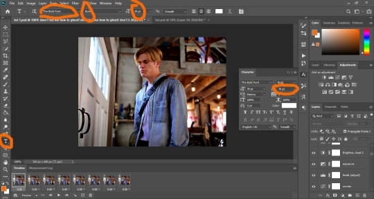
You’re gonna fill the page with the text so it fills the whole space, then you’re gonna make sure the first frame in your animation bar is selected and you’re gonna set the text layer’s opacity to 60.
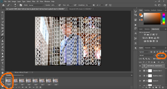
The first thing you’re gonna do is duplicate the text layer to match the number of frames you have. I have 8 frames, so I’m creating 8 text layers. Then you’re gonna hide them all by clicking on the small eye icon next to them:
Your text should now be hidden:
So, this is where it gets tricky, because to get a good result (which I didn’t really manage that well), you have to work the layers one by one.
Start with the first layer. Make sure the first frame is selected in the animation bar, and click on the small eye icon of the first text layer to make it appear.
For the first frame, if you make any change, it applies to the rest of the frames, so before we do anything else, we’re gonna make sure it doesn’t. To do that, just select all the other frames, and hide the text on those by clicking the eye icon:
Now, select the first frame again. Add a layer mask to the text layer by clicking on the mask icon at the bottom of the layer tray.
Your text layer should now have a small white rectangle next to it. Click on that rectangle, grab a hard round brush, make sure the selected color is black, opacity set to 100%, and use it to hide the text on Alex. You do that just by clicking and dragging the brush all over him. I’m starting with my brush sized to 37, but depending on what I need, I might change the size to make sure I get the edges.
If you don’t know much about layer masks and how to use them, I’ve explained it a little bit in this tutorial.
Basically, the black brush hides anything on the layer, and the white brush makes it reappear.
As you work and mask the text, you’ll notice the white rectangle start getting some black color in the shape you’re hiding. Once you’re done and satisfied, your frame should look something like this:
Now you’re gonna move on to the next layer. You’re gonna select the second frame on the animation bar (which should only show owen with no text). You’re gonna make the second layer of text appear by clicking on the eye, add a layer mask to it like we did before, and then start masking the text on owen the same way you did before.
Alternatively, you could just duplicate the original text layer and work on the existing mask, but you would have to go back and hide that layer from the first frame and all the other frames. It’s up to you.
And now you’re gonna repeat the process on each frame. Select a new text layer, add the mask, hide the text on owen. It takes a whole lot of time, energy and patience, and if you look closely at my og gif, I didn’t do much of a good job, lmao.
This is why I mentioned it might be better to use gif with minimal movement - if the characters are not moving, the edges stay aligned and you can use the same layer on multiple frames instead of having to do them one by one.
Anyway, once you’ve done all your frames and layers, your psd looks something like this:
And once I save (check this for more details on my save settings), my gif looks like this:

And that’s it!
If I skimmed over anything or you feel it’s not clear, just hmu and I’ll try to do a better job at explaining things :)
I hope this works for you! <3
#tutorials#resources#photoshop 2020#photoshop tutorials#gif tutorials#my edits#kinda#tuts*#owenpatrickjoyners
80 notes
·
View notes
Photo
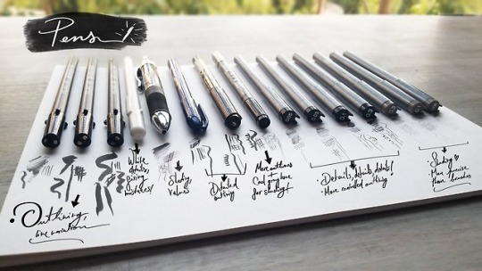
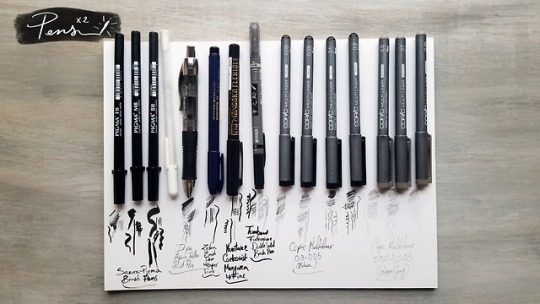
Another year, another Inktober materials post! WOOHOO!
We are have officially 7 days until Inktober starts, and you can bet I’m being a complete nerd and crossing the days in a countdown in my calendar.
So let’s move on to a bit of a more in depth look at the materials I’ll be using this year, shall we?!?!
(I also apologize for the long ass text post, but the Read More seems to not be working so we´ll have to deal with it. tumblrgetyourshiztogetherwillyou)
Ink & Brushes
Speedball Black India Ink - Oh yes ma’am! I broke up with Higgins Black India Ink this year and got myself a bottle of Speedball’s Black India Ink! From the few tests I have done so far, Speedball’s ink seems a bit more viscous, more opaque, and dries smoother than Higgins’s ink.
Pen Nib Holder - I’m mostly going to use it with different ink mixes to shade different areas in which I want a certain level of opacity that I can’t get with my other pens. And yes, it totally makes you feel like you are in the Harry Potter world writing about spells on parchment. Win win.
Round & Detail Brushes - As you can see, not much change in a year in regards to the brushes I’ll be using. I did find last year that I gravitated towards the rounded brushes almost every time, so I ditched the flat ones this time around and instead stole a detail brush set from my brother :3. Why buy when you can thrift? ;D I use these to shade my art with black India ink!
Calligraphy Bamboo Brush - Oh yis, I’m bringing back this bad boy! I mainly use it to cover large areas of the paper with water and then plop ink washes all over. It is like the grown up version of finger painting, but while looking stylish af and pretending you know what you’re doing.
Eye Dropper - My existence had absolutely no meaning until I started using an eye dropper to measure my ink washes. I know you might think you can do without it and just wing it, but for the love of the art Gods - just get one. It’ll make you happier than drawing hands easily.
Glass Bottles - Aha! What is this nonsense you say?! I often have leftover ink mixes by the time I’m done drawing, and you know what?! There is nothing better than having a little bottle in which to store your really dark, dark, semi dark, light dark, very light ink mixes. Plus, it makes you look like a bad ass witch ready to poison someone when you have them all together. Bonus.
Palette - Yes, it is the same cheap 60 cent palette from last year. Yes, it is still kicking like the little miracle it is. Yes, there is some golden ink that I seem to not be able to get off of some edges. I’m still not gonna spend another 60 cent on a new one. Come at me.
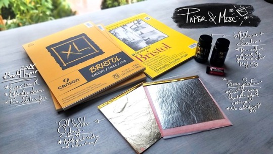
Paper & Misc
Bristol Paper - By far the best paper I’ve used when working with ink. Yes, it does warp a little. But I haven’t found a paper that is as smooth to work with in ink. It has the perfect texture for ink washes as well as sketching away with thin pen nibs without damaging them! No real reason as to having two different brands other than Canson was on sale at my local art store, and a girl’s gotta save the chaching.
Gold & Silver Leaf - OKAY. EVERYONE HOLD STILL. I might have been squealing about these every time I see them since I got them. I have always loved to incorporate little gold or silver accents and textures into my dawings, and I just think the way they combine with ink drawings is even more orgasmic. So this year I’ll be diving into the wonderful unknown world of leafing and I. Can’t. Wait! I have absolutely 0 idea of how to use them, but I can promise swords, crowns, and costumes decorated with these little beauties.
Adhesive & Sealer - These just came with the gold and silver leaf kit and since I haven’t used them yet, I can only assume they do exactly as they say they do. Shocker!
Sumo Grip Eraser by Sakura - I needed a new eraser for getting rid of the sketches after inking them, and saw a lot of people rave about this guy so now here we are! It promises to not smudge on the paper, and I’m all about that life.
Pens
Sakura Pigma Brush Pens - YES, THIS IS THE SAME SET FROM LAST YEAR. Yes, they still have ink in them. Isn’t that bonkers?! I seriously cannot recommend these enough for outlines and line variation. The little guy was the most heavily used last year, and while it is running a little low, I plan on using it mainly to create textured brush strokes.
White Gel Pen - I mean. Is there anything more satisfying than creating little white details on pitch black stuff? Probably not. This has also saved me multiple times from a sudden mistake that was able to be remedied easily.
Itoya Aqua Roller Ball Point Pen - I don’t use this dude as much as my brush pens or Copics, but there are certain moments when inking when you just wish you had a pen that you could lightly shade and control opacity with. That’s what this dude is!
Zebra Brush Pen (Super Fine) - It is even thinner than the Sakura Brush pen, which means even more neurotic detail making is definitely happening this time around. Yay!
Kuretake Cartoonist Mangaka Pen (Fine) - As I mentioned above, the little Sakura Pigma brush pen is running a little low, so I needed something to replace it with and I decided to try this one out! The ink is pitch black and the handling and line variation are just dreamy.
Tombow Fudenosuke Double - Sided Brush Pen - Okay yes, this was totally a compulsive buy, BUT IT IS TWO PENS IN ONE! Bless it. The black end seems very similar to the Kuretake Cartoonist pen, with the added bonus of a gray to quickly shade with on the other end.
Copic Multiliner 0.3 - 0.05 (Black) - Literally the holy grail of my Inktober materials. If you want to do Inktober but are on a tight budget (art materials are expensive af, I’ve been accumulating these over the last few years), get these! Don’t even think about it. I use them for literally everything from outlining, to precise and meticulous detailing, to shading. I completely ran through my previous set last year, and there was not a single piece I did not use these on. Just do yourself a favor and pick a few. Thank me later :)
Copic Multiliner 0.3, 0.1 and 0.05 (Warm Gray) - They are exactly the same as the above, but in a warm gray tone! I got these mainly to be able to shade certain areas of my drawings without having to deal with the in-yo-face opacity from the black ink set while maintaining total control and precision of the lines, unlike when I use brushes. I am literally itching to try these for little areas like eye lids, freckles, etc!
AND THERE YOU HAVE IT! That’s all I got for you beautiful creatures this time around. I’ll be posting a little intro video to this year’s theme just like last year, so keep an eye out for that! I’m also planning weekly giveaways, daily timelapses of each piece being created, livestreams so you can hang out while I do that day’s drawing and other fun stuff like that :D I’m literally so excited to step into the Inktober madness again!
Feel free to check out my instagram, where I’m the most active and post all of my art at!
#inktober#inktober2018#inktober materials#art materials#art#brushes#pens#ink#traditional art#game of thrones#stranger things#harry potter
1K notes
·
View notes
Photo

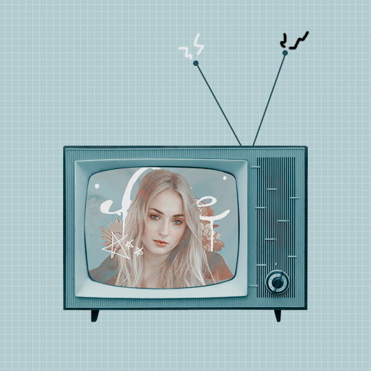
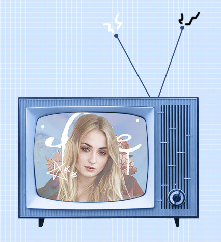
。・ tutorial four, graphic tutorial two by graphictutorials ゜+.*
-`. Hello everyone! In this tutorial, I’ll teach you how do make an edit/graphic with a TV and electricity doodles, like this: .’-
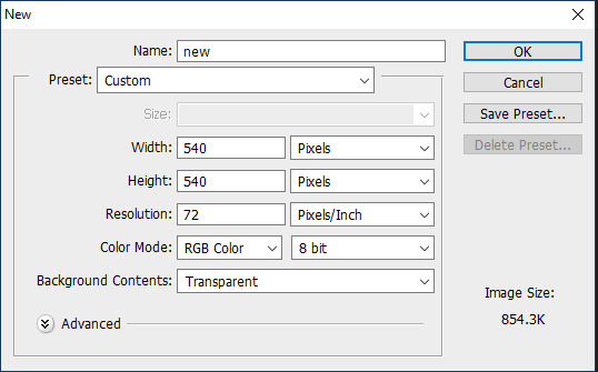
1. Open photoshop and create a new document with the size you want.
For this tutorial, I’ll be doing 540x540px.
2. Add your background. You can make it a solid color, use a pattern, gradient, texture, etc.
For example, I used the paint bucket tool to fill the background with a solid color (#d1ecff, to be exact), and I applied a pattern overlay (using the last one here) in soft light mode.
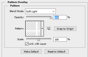
So my background looks like this:

A/N: I’m making the example pastel-ish, but you don’t have to!
3. Now make a png of a vintage-esque TV, or you can use one of these: 1, 2, 3, 4.
I’ll be using the 2nd png in the 1st pack.
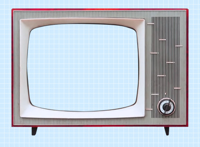
A/N: You’re going to want the screen portion erased if it isn’t already, because that is where you’re going to put an image.
4. This is optional, but if you don’t like the color of the TV, you can change it by:
Double-clicking on the TV layer, and go to the “Color Overlay” tab, clicked the colored rectangle, choose the color you want, click OK, and change the mode to one of the following: Overlay, Soft Light, Color, Hue, or Multiply. Choose which one looks best with your color and you can adjust the opacity if you want.
For example, here’s what I did:

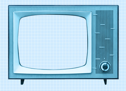
5. If you chose a TV that already has antennae, skip this step. If your TV does not have antennae, like mine, I will show you how to quickly make some.
Create a new layer, choose a foreground color to a color that matches your TV color, select the line shape tool, make the line 2px weight with no stroke, and click and drag a couple lines from the top of the TV to make antennae.


A/N: You might want to rasterize those shapes (to do so, right-click on each layer and click “rasterize layer”) or put those shape layers under the TV layer.
Now create another new layer, use the ellipse shape tool, click and drag a small circle to fit on top of one of the antennae (hold shift as you do so to get an even circle). Duplicate that and drag it over to the other antenna.

6. Now for the screen image.
Create a new layer and drag it under all of the TV/antennae layers.

Select the pen tool. You’re going to make some points around the screen portion and connect them.

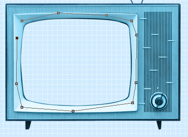
Once you connect them, It’ll make a line like this:
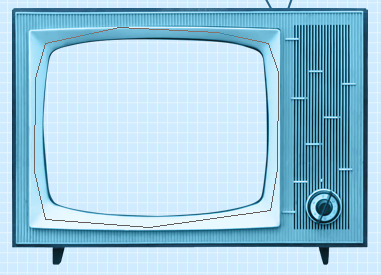
Go to the top bar and click the “Selection...” button. It will make the outline into a selection and that’s what you want.

A/N: There will be a dialogue box pop up, but just click OK.

Now it is a selection.
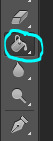
Click the fill bucket tool and click inside the selection to fill it. It doesn’t matter what color it is.

Click CTRL+D to deselect it.
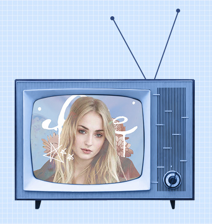
7. Now we will put an image/edit inside.
If you just want to put an image, open the image, drag it to the TV edit document, make sure it’s right above the screen fill layer, right-click on the image layer, and select “Create Clipping Mask.” It will be inside the screen portion and you can resize.


If you want to put an edit inside, I’d suggest making the edit in a new document, merge all of the layers of the edit document when you’re done, drag it over to the TV edit document, make sure it’s right above the screen fill layer, right-click on the image layer, and select “Create Clipping Mask.” It will be inside the screen portion and you can resize.
For example, I quickly made this edit in a new document and merged all the layers:

Then I followed the steps above and put it inside the screen.
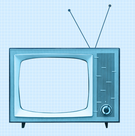
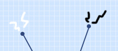
8. Creating the “electricity”.
Create a new layer and use the brush tool with a simple hard round brush in a small size and draw a couple little zig-zags coming from one of the antennae.
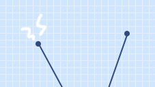
Create another new layer and make a couple more for the other antenna.
Now you could stop here, or if you want, you can make them into a little gif with the next step:
9. Duplicate one of the electricity layers, choose the select tool, right click on the document, and click “Free Transform”. Go to the top bar, and in the rotation box, enter -10. Hit the Enter key when you’re done.

It rotated the duplicate slightly to the left.


A/N: If it’s blurry around the edges, apply a Surface Blur with 5 Radius and 10 Threshold.
Duplicate the other electricity layer, Free Transform it, and apply a Rotation of 10. (Do the same number but polarize it. i.e., if you previously put -10, put +10 for this one. If you previously put +10, now put -10.)


10. Open the frame animation timeline.
For the first frame, hide the duplicated electricity layers. Only the original ones should be visible.
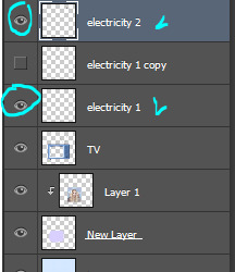
Create a new frame and in this one, hide the original electricity layers and un-hide the duplicates.


Set the speed of the gif to 0.5, or something around there. You don’t want it too fast because it’ll hurt people’s eyes!
Make sure the loop is on “Forever” as well!
11. Go to File>Save for Web.., and save the gif.
And you’re done!
Here is my edit, image version:

And here it is as a gif:

Other Suggestions:
> For the full effect, you can go to the screen fill layer (not the image/edit inside of it) and select it, double-click, and apply a pattern overlay with a horizontal stripe and put the mode on Soft Light and lower the opacity to create that line effect.
Result:
> You can also apply an Inner Glow to the screen layer and create a shadow.
Result:

Anyways, I hope this tutorial/guide was helpful. If you need any help or have any questions, feel free to ask!
#yeahps#itsphotoshop#completeresources#tutorial#tutorials#*#graphic tutorial#graphic tutorials#graphic#edit#photoshop tutorial#photoshop tutorials#edit tutorial#edit tutorials
814 notes
·
View notes
Text
Cleanup & colouring & editing spark
After completing my backgrounds, I then moved on to refining the linework. To do this, I used a very dark grey (as black may have stood out too harshly against the light background) and smooth brush.
I followed my rough pass pretty closely, though I did have to shorten the legs as they didn't have the stubby, rounded look I was aiming for, especially when she sits up. I also added some facial expressions to enhance the performance of the character- a bored look at the beginning to show she's disinterested in the blocks, closing her eyes as she falls to show she's bracing herself, and wide eyes as she sits up to suggest she's trying to process what just happened. Finally, I added some secondary movement to her hair, which I think gave it a cuter & more comedic feel.
I think these additions have greatly enhanced the animation- you can recognise Allie's emotional journey- making her feel more like a real person, plus her exaggerated expressions and secondary movement in the hair are cute & cartoony- reminiscent of the program that she is watching.
After that, I duplicated the line layer and used the one underneath to add colour- using the fill bucket. I also added some cel shading on the same layer, so that it was easier to stay within the outlines. Although Amber's style frame didn't include much shading, I wanted to indicate that there is a TV offscreen that's illuminating Allie's face.
In hindsight this has created a noticeable difference between our sections so I don't think I did a good job of keeping my style consistent with the group's guidelines. I did try to shorten the neck and enlarge the ears, but even still, this looks more like my own style. Plus, I'm also just realising that I coloured the eyes with black instead of the brown me & Amber agreed upon. In my next group project, I should take the time to sketch and practise the agreed upon style to make sure I can replicate it properly, before jumping into my own ideas.
In the next stage of editing, I needed to add a glow to the little bear. I've since lost my original photoshop file but to do this I just exported his frames as a png sequence, loaded them into Photoshop as a frame by frame animation, and applied the outer glow effect to all layers. Then, re-exported it as a png sequence.

To give Allie & the blocks some shadows, I duplicated their layer, tinted it to be completely solid grey, then used corner pin to distort it to the shape of the floor. Then I set the layer mode to multiply and the result was this. I'm so pleased that I've learnt this trick as I would likely have spent hours trying to draw the shadow myself in each frame.

After that I needed to add the bear cartoon in Allie's eyes. I had forgotten to make them transparent in these frames as I was planning on just placing the cartoon below her layer. So, instead I used masks (something I became more comfortable with by working on Jellytots) to match the cartoon to the shape of her eyes. This actually worked a little better, as I was then able to lower the opacity of the cartoon, to look more like a reflection.
Throughout this first scene, one of my main sources of inspiration has been my family's own VHS tapes. I love how the amount of noise and slightly-off colouring creates a warm, fuzzy look. It feels very comforting, especially since I have memories tied to these recordings.

I then wondered if I could replicate the same effect for this section- it could potentially make it feel more nostalgic and personal to the viewer. Using the tutorial below, I duplicated the entire composition 3 times and separated them into red, green and blue, then used position to slightly offset them, creating the off-colour effect. I also added a lot of noise in an adjustment layer.
youtube
youtube
I really like the end result, I think I was able to replicate the feel of a home movie & it gives the scene a nostalgic warmth. However, the effect doesn't work with the embroidery intro- it looks to bright & jarring and harder to read. Plus, I'm concerned whether using this effect in my scene will further differentiate it to the rest of the film- I want to maintain some level of consistency. So, I may try another pass at editing, this time only using the effect on the TV screen.
0 notes
Text
As. 3: Infographic

Date: 17 March 2021, Week 8
Brief: Identify some dataset(s) to work with. Apply necessary techniques to communicate complex information quickly and clearly through visual representation.
Introduction:
I've always been fascinated by charts, figures and data visualisation. Bar graphs, pie charts, donut charts... And eureka! I had a sudden stroke of inspiration - why not create an infographic with a donut chart on donuts?
(Initially, I also considered bar graphs about chocolate bars or pie charts about pies, but decided to go with donuts as I thought it would have the most variation in flavours, colours and toppings for visual variation and interest.)
Data set:
I researched various statistics about donut flavours and used Ranker's list of donuts, which contained a list of the number of upvotes/downvotes for each donut flavour.

I then compiled the data onto a spreadsheet, and calculated the overall score (by deducting downvotes from upvotes) for each flavour. Subsequently, I calculated the percentage to find out the proportion of votes each donut flavour garnered, and sorted them from highest to lowest.
Developmental process:
I explored various compositions and styles for the infographic poster, first with each donut's size being in proportion to its percentage of votes. In my sketch, I had originally laid the donuts out in two structured rows, but I played around with different arrangements, such as by placing them in different positions or placing them in a box to resemble a box of donuts.


Finally, I decided that it would be the best if I represented it with just one large donut in the centre of the poster. Although it may seem a little simple, but I think by having just one donut, viewers would be able to focus on it without having their eyes moving all over the place. After all, simplicity beats complexity, especially when distilling a complex set of data in an infographic. Furthermore, it would also be a clever concept to represent the donut data using a donut chart.

I first created a base of the donut chart, then split it into different segments for each flavour.

I used a variety of tools and techniques to illustrate each donut flavour. For example, for the powdered donut, I used splatter brushes to create the powdered sugar effect. For the double chocolate donut, I used the Curvature Pen Tool to draw the frosting. and for the Chocolate Sprinkles donut, I used the Rounded Rectangle tool to draw little rainbow sprinkles all over the donut. For the base of the donut, I added texture and depth by using multiple layers on Soft Light and different opacity, such as to create shadows or glossy highlights.

Using layer masks, I masked out the rest of the donut, leaving only the specific segment visible.

I added the title, text and a border in a frosted, pastel pink shade, as it reminded me of candy and fit the theme of donuts.

Comments raised during the critique:
During the critique, Aaron said that it was an "interesting idea about donut flavours because the thing is presented as a donut...I think it's quite clever." However, he also pointed out that "the shape looks a bit like a lifebuoy, rather than a donut" and a classmate, Jing Quan said, "Maybe the hole in the middle could be smaller to look more like a donut."
Aaron also said, “After looking at the pink colour for a while, it's a bit straining on the eye. Same for the border as well.”
How the work has improved post-critique:
Based on the feedback from Aaron and my classmates, I decided to tweak the shape of the donut by making the hole smaller, so it would look more like a donut. I also removed the border, and changed the font and line colours to a dark chocolate brown similar to the chocolate donut so that it would be dark enough to be legible, less bright and straining on the eyes, and also cohesive with the overall colour scheme and theme.
Reflection & Learning Points:
Even though the idea of infographics and data analysis may seem complex or intimidating at first, I found that I had a lot of fun creating this infographic.
This assignment taught me that being a good designer isn't just merely about visuals and graphics, but also being able to research, analyse and synthesise data.
In the 21st century, it is critical that we are able to comprehend big data, and carry out data analytics and data visualisation. Even though the data set I used for this assignment wasn't huge or complex, the skills I learned (such as compiling data into a spreadsheet, doing statistical analysis and designing a chart to present data in a simple yet compelling way) are lessons that will inspire me to learn and explore more about data visualisation even after completing this assignment and class.
0 notes
Text
Pop Art Workshop
The object of this workshop was to create a pop art style piece of work using the Threshold and Brush tools. The style of pop art that I have done below is reminiscent of Andy Warhol’s work, which I researched previously.
The first step was to open up the image below. This was a stock image so I was allowed to use it. With this image on the document, I selected it and pressed CTRL+J which produced a duplicate. It is often useful to have a layer with a copy of the original on it.

The next step was to apply the Threshold effect. I did this by pressing the circle icon in the Layers panel and selecting Threshold from the list. This produced a Threshold adjustment layer which will apply to everything in the layers below it.

I decided I wanted the image to be a little darker so in this step I increased the Threshold level. By increasing it from 128 to 174, more parts of the image are visible but much more of the image becomes black.

With the previous steps finished, it was time to start preparing to add colour to the design. The first step was to add a new layer, which could be done by pressing the square with a plus in it within the Layers panel. I then changed the blending mode from Normal to Multiply as you can see below. This will allow the colour to be only visible on the white of the image.

Here I am selecting the brush I will be using, which was a Hard Round brush with the Hardness brought down to 50%. I also set the opacity to 84%.

Just before I started applying the colour, it was important to reduce the Threshold opacity to see the image below. This is so I am able to see the details of the image not visible with the Threshold so I can see where to colour.

Below you can see where I have coloured the hair in green. This was easy as going over the hair with the brush tool, which I didn’t have to be too precise with. Any overlapping of colours will add to the pop art styling of the design.

Using the same method as before, I brushed bright pink onto the girl’s t-shirt. It was important to make sure every element of the design was on a different layer for ease of editing, so this pink was done on a new Multiply layer.

For this step you can see that I decided to use yellow for the skin. This was done by repeating the same process as the previous step with yellow selected as a colour.

The final part of this design was to add the background. I wanted to pick a colour that was slightly more contrasting to the colour of the girl, which was why I went for light blue. This was also done on a blank Multiply layer.

I also experimented with adding more colour detail to the background of the image. I did this using a blank Multiply layer and brushing using a bright pink/purple colour.

This was the product of all the previous steps after increasing the Threshold layer opacity to 100%. This stopped the original image from showing through, which left only the pop art style design.

After looking at the image for a while, I decided that I didn’t like the colour on the triangles. This was obviously the last step I did, and reversing this was as easy as hiding that layer. This emphasises the importance of using several layers for this design, otherwise this might not have been possible.

0 notes
Text
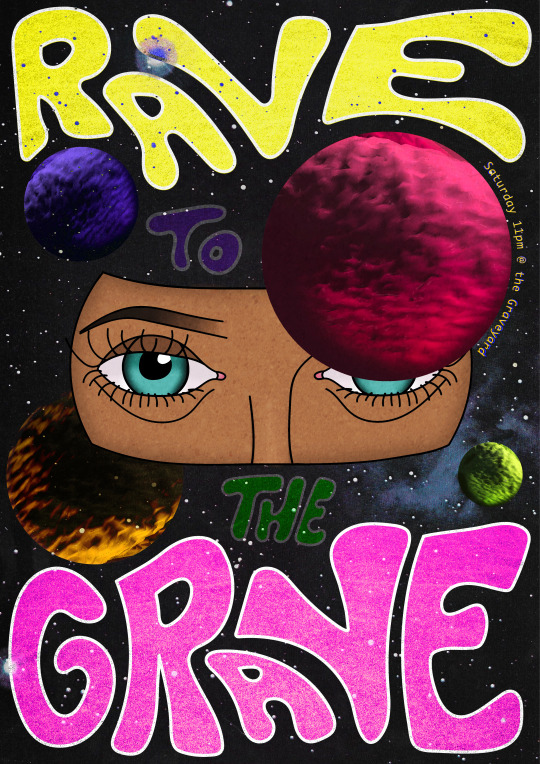
Creating my own Rave Flyer
I have created a rave flyer of my own, using 80s and 90s flyers as inspiration. It incorporates distorted typography, a digital illustration of eyes, CGI-like planets and a starry background. My main goal for this design was to look as appealing and intriguing as possible, I did this by producing strange imagery with bright and vibrant colours so it’s really bold. However this meant that when it came to communicating a concept, there isn’t any clear message I’m trying to put across. Instead I am leaving this piece up for interpretation, which in my opinion is really interesting because one person’s perception could be completely different from another’s.
Overall I am really happy with the outcome, I think it has a really effective retro look thanks to the textures and colours applied. I learnt to embrace experiments/mistakes throughout the process, because I could have never planned the planets to look the way they do without trying new things. I think I have balanced the colour pallet really well, because I was able to incorporate many different colours but still not look overwhelmed by them. Finally I am really pleased with the face portion illustration, many times I have showcased hand-drawings in my outcomes but this time I wanted to demonstrate what I could do digitally.
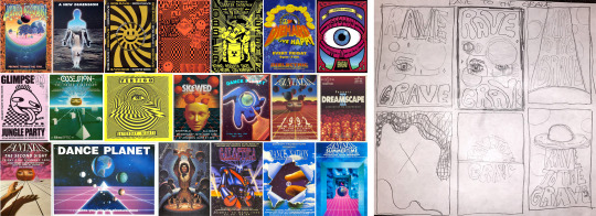
To come up with the overall design I sketched out some rough ideas, using a collage of 80s and 90s rave flyers as inspiration. I experimented with different typography, concepts and imagery, deciding to go with a funky styled outer space piece.
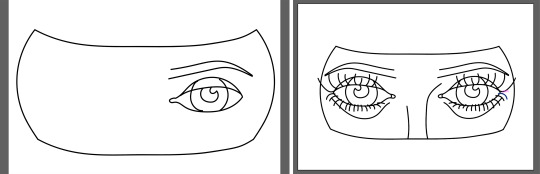
To begin with I digitally drew a section of a face using my drawing pad, the program I used for this was Illustrator as I could tweak and change my lines that I created. I used the paint brush tool to draw the lines themselves and the direct selection tool to adjust them, by making sure all of the lines are properly connected there are no gaps for colour to seep through and spread, plus it will look more tidy. After drawing one of the eyes I simply duplicated and flipped it for a perfectly symmetrical set of eyes, the only thing was the light reflection in the eyes so had to redo one of them to match.
Once I was happy with my illustration I grouped the lines and expanded its appearance, this assured me that the lines wouldn’t shrink in thickness when moved to another program. On photoshop I copied in the drawing and added in 4 circles in-front of and behind the face, this was the beginning of my layout process where the planets would fill the circles.
Next I filled in the face section with colour using a mixture of tools, this included the paint bucket, brush and mixer brush tools. Then for a background I took a faded image of space, it’s filled with stars which is a pretty and subtle touch.
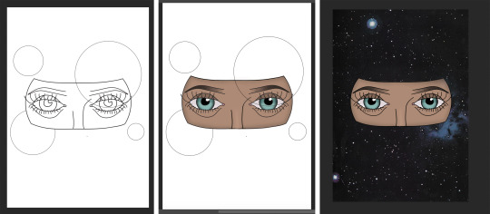
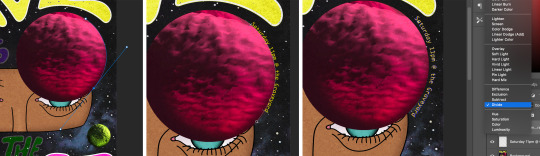
To create the planets I first tried filling in the circle selection with stripes of colour, with this I used the mixer brush tool to blend them together like Jupiter. However I thought this looked too flat so I wanted to see if there was a way to make it a sphere, to do this I clicked on the first thing that came up for ‘sphere’ but it turned into some strange 3D shape. Even though this wasn’t a sphere the texture of it looked perfect for a planet, so to make it one I rasterised the 3D which allowed my to then cut it into the space of a circle. I made sure that some of the shadow was displayed in the circle to help it look round, and I added a tiny bit more shadow by painting around the edge with the same colour.
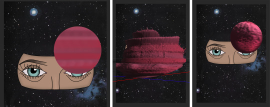
With this I duplicated the object and changed its colour through hue/saturation, I then experimented with different blending modes and put what I found appealing together. For example the yellow planet is made of two layers, one blended with overlay and one pin light. The two together display a clear round shape with a beautiful gold glow, and so I did the same thing with the other planets but choosing blending options that fit best.
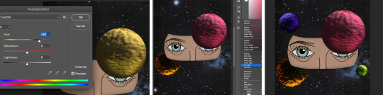
Once I had placed in the planets I also deleted the original circle lines, then I noticed that the face looked a bit too pale and colourless compared to the rest of the piece. Therefore I adjusted the vibrance all the way up to make the colours pop out even more, I also think the colours looked more pleasing anyway.

To add in text I saved the piece at how it was and transferred it over to Illustrator, I then locked this layer and added a new layer of which I would draw on. Using the paint brush tool I drew the words ‘rave to the grave’ with my drawing pad, fitting the ‘rave’ and ‘grave’ around the planets. I wanted to create a groovy kind of style for the type, drawing round and curvy lines that fit together like a puzzle. I also wrote out the words ‘to’ and ‘the’ put I planned to bled these into the art, therefore it can cover the objects and be moved around.
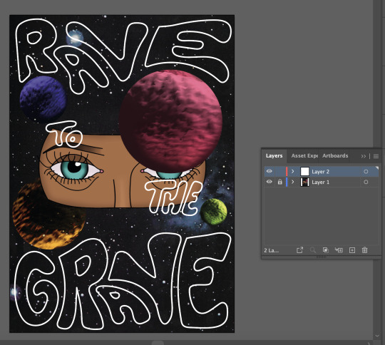
Once I was happy with my type I repeated the process to move it over to photoshop, where I placed it in the exact same position and put each word onto its own layer. Next I filled in the words with bright colours to match the pallet of the planets, the smaller words were then blended in so they stood out less than the main, large words. However as I looked at these words I felt that they stood out a little too much and looked a bit separate, therefore I searched for blending modes that will let specks through whilst maintaining its vibrancy.
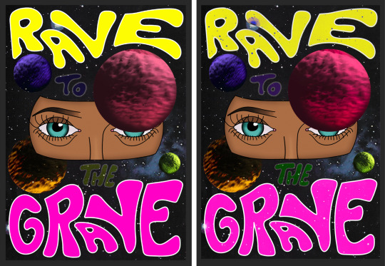
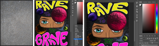
With the design completed I wanted the piece to look less smooth and digital, rather more old and worn looking. To do this I laid a textured image over the entire piece and blended it using the overlay mode, this alone was too prominent so to mellow it down I lowered the opacity to just 26%. I repeated the same process using a grainy texture but only for the large words, this was because they still looked conspicuous and modern in comparison.
At first I was going leave this flyer as it is, however I then realised I hadn’t added any information on the event itself. I had to think of a way to incorporate it into what’s already there, so I thought having the text curve around the large planet would work perfectly. To do this I used the pen tool (path selected) to create a curved line around it, and then I clicked on the line with the type tool which allowed me to type along the path of the line.
I chose to display the days, time and location which is all you need for event information, I used ‘the Graveyard’ as the location for this design because it linked with the name of the event ‘Rave to the Grave’. This gives the name another meaning on top of a saying, it is now a literal sentence to match/promote the location.
The font was chosen for its wide gaps and straight lines, I feel this gives is a retro-digital feeling which is the aesthetic I was going for. I started off using yellow as the colour of the text but thought it looked too bland, therefore I played around with duplicating, blending and layering until it fit perfectly.
0 notes
Text
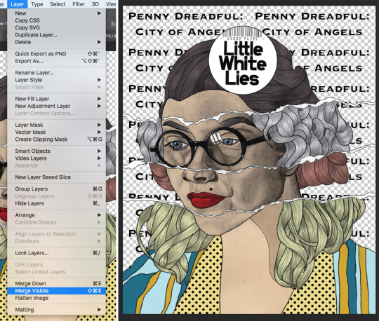
Series Inspired LWLies Cover - Digital
I have created a Little White Lies inspired magazine cover for the series Penny Dreadful: City of Angels. This piece is a combination of a pencil drawing and digital elements, which I think creates a really effective mixture that’s eye-catching and impressive.
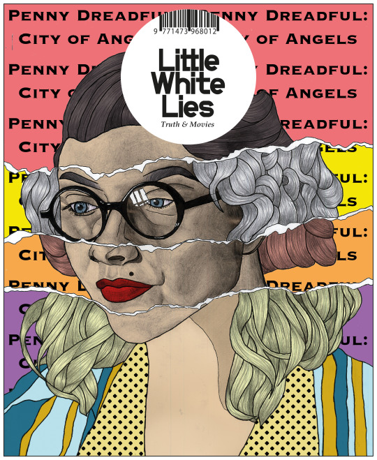
To begin with I scanned in my drawing onto photoshop, and drew on any unfinished lines with the brush tool. I then adjusted the image’s brightness/contrast using the legacy tool so the blacks were darker and the whites were brighter, however because I had a lot of shading I couldn’t adjust this too much otherwise I would lose detail in the shading. Next I selected the background using the quick selection tool, and deleted it so it became transparent.
With this I changed the opacity to multiply and added a layer behind it, the multiply opacity allowed me to show colours on the layer underneath without completely loosing the tones of the drawing. This was super helpful because it made it easy to colour in as the blacks remained completely black even when coloured over, and for the shaded parts I could use just one colour for the whole of the sections as I had already done the shading with pencil. Before I actually filled in the colours I had to decide what ones I would use, I did this by choosing a LWLies cover that I thought had an attractive colour scheme and selected them using the eyedropper tool.
Once I had sampled all my colours, I filled in the sections with the brush tool on the bottom layer. As I did this I resized the brush size with ‘[’ for smaller and ‘]’ for bigger. I only used these colours on the clothing which worked well together perfectly, however I did almost use the skin tone from the inspired image for the skin but it was too light so darkened it slightly, though it did help as a starting point.

Next I wanted to add a halftone to the collar of the clothing, for this I used the brush tool but selected the halftone brush from ‘special effects brushes’. However when I used this straight away the dots were so small you could barely see them, to fix this I opened ‘brush settings’ through window and on ‘texture’ I upsized the scale until I had the preferred size.
Filling this in rather than carefully going round the edges I selected the sections with the magic wand tool, allowing me to easily brush over the whole shape. This helped because the halftone is less obvious to see as there’s a lot of empty space, whereas a solid colour is full and clear. Even though I could have done this technique with most of the piece, I wanted to practice using the brush tool accurately especially as I was using a drawing tablet. I saved this as it was because I wanted to see what would look better, the original pencil drawing for the face or filled with colour. So for the coloured version I repeated the brush tool technique onto the skin and hair, separating all these sections with different layers so I could easily edit them.
For the background I wanted to create a repeating pattern of the title of the series, I did this by typing out the title with a chosen font using the type tool and rasterised it. Then with the rectangular marquee tool I selected around the type, making sure the background is transparent. With this I used the define pattern edit which made it so I could repeat the selected area as a pattern, and by clicking new fill layer > pattern on layer I could edit how big or small of the pattern I want it repeating, leaving me with the page being filled with the type. The reason left space around the type when selecting is so that when the pattern was created the writing would be clear to read, otherwise the lettering would’ve been too close together and look messy and unclear.
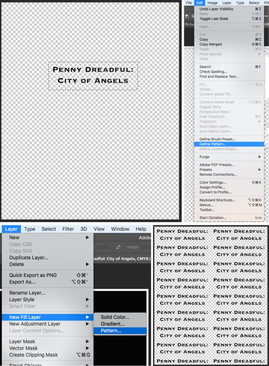
To add the drawing to the background I first had to merge the visible layers of the face, making it easier to move over to the background. I then moved both of these layers onto the Little White Lies template, that gives the right size and title of the magazine. Finally I added colour on a new bottom layer so the background wasn’t just transparent, however I wanted to show different colours for each section separated by the rips. I did this by creating a selection with the polygonal lasso tool, and filling it in with the paint bucket tool.
0 notes
Text
On giving up (or is it listening?)
I set a 2018 goal of going camping at least once a month, year round. I’m 0 for 2, in my attempts so far. I’m still counting them, because I think the attempt is the important aspect in the winter months. But I’d be lying if I said I wasn’t disappointed. I don’t like quitting but I am getting better at it (or at least, I am doing it more often). Back in January, Becky and I planned a quick overnight backpack in Moraine State Park - we’d planned a short hike on account of the limited daylight, and aimed to stay in the backpacker shelter off of Link Road. Temps were warming up after a long deep freeze, and it felt so great to be out. But a big, wet, heavy sky loomed, and the whole day felt like we were living in black and white. We were both out of sorts, and kept trying to brush it off. Becky was feeling crappy and couldn’t eat in the morning. I somehow left my house without hat and gloves (how??!!). Rather than head back, we stopped in Slippery Rock to get a sandwich, a dollar store hat, and gas station gloves. What a stupid start to the day. We got to our trailhead and felt disoriented. Which spur trail goes to the main trail? Why do we feel so unsure of ourselves, of our map skills, of the day at large? Were we being cavalier about a winter camping trip? Doubt set in.
We hiked a few gray miles in, and as the rain started, we decided to stop for a snack at a point that looks down over the lake, which was full of fog and mist and dampness. We talked about our misgivings, about how even though we’d be able to get out of the rain in the shelter, we wouldn’t be able to dry our wet clothes around a fire, since the rain was forecast to continue all night and into the next day. It was in the 40s while we were hiking, but was going to drop below freezing overnight, and it just seemed like a bigger risk than it was worth. It’s one thing to take risks when you are sure you understand them, but we both felt so out of sorts that we didn’t know if we could trust our decision making, and it felt important to listen to that uncertainty. And so we scratched.
It always feels so stupid to carry all your shit when you’re not camping after all. Like, we had fun, but would it have been more fun if we didn’t have a big backpack, or a fully loaded bike? But why am I even worried about maximizing anything? We had fun, is that not enough? Am I being greedy?
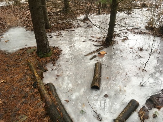
This past weekend, I met up with my friend Helena out in the Quehanna Wild Area. We’d initially planned for two nights and three days of nosing around, finding all the modern ruins we could find. Literally nothing went according to plan. It had rained or snowed for 21 of the first 25 days of February, and was forecast to rain an inch and a half our first day out. We almost bailed on going out for the first day, but decided to spend it hiking and then stay in a murder hotel rather than sleeping in the rain. We found the abandoned hunting camp built into the boulders, saw lots of elk and coyote scat, some trees with antler rub, and a few elk tracks in the mud, but only saw deer. The jet engine test bunkers were pretty wild, and felt a lot like the section of abandoned turnpike near Breezewood -- just woods and nothingness, but with crumbling asphalt underfoot. Something was here. Where is it? There’s a heaping mound of earth, with a vent in the back -- the whole bunker has been consumed (or buried). The other bunker is totally above-ground still and has surprisingly little graffiti on it, though what is there is pretty potent.
Peeking into the mostly-buried jet engine test bunker
Helena log-hopping over a stream.
Kunes Camp - the side walls of this cabin are boulders, and the trail goes in one door and out the other! We strung up a laundry line in our motel room and blasted the heater to dry our soggy clothes, attempted to eat some garbage pizza, and fell asleep with the heater still blasting.
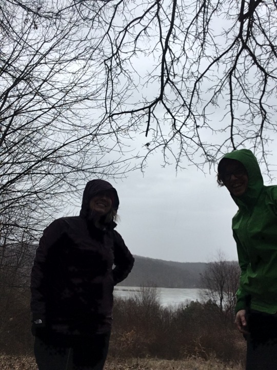
I woke up feeling kind of queasy and dehydrated. I hadn’t been able to eat much at all the previous day, and started to feel nervous that maybe I was getting the horrible flu that’s been going around this winter. Choked down a clif bar and packed up my bike anyway, pleased that the rain had stopped. By the time we were fully packed up, the rain had started again. We rolled slowly up the rural highway, and my legs felt heavy. My body felt heavy. I felt exhausted. We got off the pavement and onto a side trail, which just looked so great! Slippery with wet leaves, wet clay, running water, lots of sticks trying to hitchhike in my derailleur, normally so fun for me, but I was feeling locked fists in my belly. We did a small climb and I started to see spots and my vision clouds and becomes dark, briefly. I don’t think I’ve ever felt worse on a bike in my entire life. I was sure I was going to throw up, but breathed through it. What is this? Why do I feel like this? Helena asks me the same question I ask everyone else when they are miserable: did you drink enough water? I laugh. Of course I haven’t. It’s so hard to drink enough when it’s wet and cold. But I also probably haven’t eaten enough, and I don’t know what else is going on with my body. I wait for my heart to stop pounding, and we ride on, expecting to come out about a mile up the road. But in a surreal X-Files moment, we discover that we’ve come out about a mile back DOWN the road. How is this possible? We are both good map readers! What just happened?
The face of a girl trying not to puke on her bike.
We try again to cut in on a side trail, and ride it down to the bottom, where a stream is running fast and high and cold, and we decide that we don’t want to cross it. Back up we go. On that climb, I decide with certainty that I am not camping tonight. I don’t know if I am just slow to warm up and maybe I can work through feeling so shitty, or if I am getting sick. I really don’t want to be throwing up at camp. But I don’t feel so dead that I can’t ride at least a little more, so we ride the pavement up to Reactor Road, which is a charming little paved offshoot to the site of the former nuclear reactor. There’s nothing there anymore, just a sign at the edge of a grassy field. Here, we decide to split up -- Helena will continue riding the dirt and gravel, and I will just take the pavement back to the car, and head home.
It’s disappointing on so many levels -- the weather has finally cleared up, and there’s even a ghost of the sun in the sky, trying to burn through the opacity of a month-long cloud. It’s the first time I’ve gotten to ride with Helena, and I hate to bring anything other than my A-game and usual sunny disposition, especially with new friends. It’s my second scratched camping trip in a row. I am so disappointed that I forget to be gentle with myself, forget to be proud of even trying to get out in such shitty weather, almost forget that it was a super fun weekend and I loved all of it, except for the almost-puking and almost-passing-out parts. I slept for ten straight hours at home. Obviously I was Not Well in some capacity.
But what I don’t know is … am I getting soft? Am I scratching because I’m not as tough as I think I am? Has some weird pride aspect turned up, like I’m trying to prove something to myself, or to somebody else? Or am I tougher than I ever used to be, so I’m going out in sketchier conditions, going out more often, encountering situations in which a person really ought to scratch? I don’t like the not-knowing. I don’t like being unable to tell if I’m sick or if I just did a bad job of managing calories and hydration, because it means I don’t know what I can do differently or how I can prevent feeling like that in the future. Can it be, that not everything is a learning opportunity? Or maybe the lesson is just in going easy on myself.
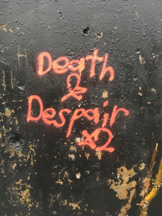
Graffiti on one of the jet engine test bunkers at Quehanna. I was sad to get sick but I did not despair!
1 note
·
View note
Text
Portfolio Breakdown: Pollution
Cyclops Spraypaint Can:
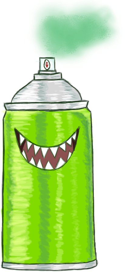
This was another very early design and so is a little rougher than my later ones. There was only one version of this made, as it was unclear whether or not this concept would be included. It was a bit of a shot in the dark for ‘pollution,’ but I sectioned off my work in this way as I believed in the beginning that we would have an entire level dedicated to pollution, and so the designs here have that in mind. I figured it could be a very low level pollution enemy. If I were to change it, I would design another version with a larger cyclops eye, as this is meant to be its main feature and I would like to exaggerate it a little. This version is more similar in size to what the actual top of a spray can be like, but with a cartoon-like character, a larger spray tip/eye would look better. I am otherwise pretty happy with this design and like the cyclops theme and how the red and green work together.

This was also an original test version before I had decided to incorporate the cyclops element.
Progress:

I blocked out the general shape for the can first and placed the silver and the green flat colours into two separate layers. I went around the shape with a loose outline.

I added some shading to the can to give it a more metallic appearance.

Here I went in another layer and added shine to add further to the effect.

I then added in the cyclops eye and mouth in more layers, painting over the top.

For a final touch, I used a special brush and lowered the opacity to create the green spray paint cloud.
References:

(Somsanitangkul, N/A) This was my main reference for shading the can, although mine was stylised. It was also a good reference on how to lay out the cap of the can.

(Networx, N/A) This was how I got the idea for the colour. I felt one bright block colour would match well with the game. I also tried to look through cartoon images of spray cans but surprisingly did not find anything which matched the type of style I was going for, in particular for the expression of the can as a character.
Factory:

As part of pollution, I felt that a factory may be a great choice for this. I tried to incorporate the expression of the character into a nuclear symbol on the factory and felt it somewhat worked but could do with some tries at redesigning. This is the only version of this concept that I created. I feel that it turned out just ‘alright,’ not amazing but not bad. It is not very memorable. If I were to redesign it, perhaps I would not have the two towers as the exact same, maybe differing them somehow would help, maybe in expression or colour, to make them pop. I do feel that having the towers as white here is perhaps a bit boring and I could have referenced better tones for this.
Progress:

I started off by getting two differently sized rounded rectangles for the main body and the top of the first factory. I set on horizontally and used the Warp tool on the larger vertical one to push in the sides and make the top and bottom thinner and thicker from each other. The main body rectangle was white, so I am using a grey background here to make it visible.

In a second layer, using layer constraints, I used a soft brush to paint the shade of the main body in soft lilac. I also added in a nuclear symbol. I did this by creating one of the three ‘leaves’ then duplicating them around the centre circle.

I added an outline and set eyes onto the nuclear symbol, incorporating it into the face. If I had more time, I would experiment with different eye shapes more here.

Finally, I grouped the layers of the first factory and set them under the first group, using the Transform tool to shrink down the second factory. I then used a special brush for the smoke from the factories.
References:

(Jemastock, N/A) This was my main reference for the factory design. It is very similar, but factories do tend to look very similar. I wanted to remove the centre part and only focus on the main ‘pillars’ in the design, rather than as a whole building.

(Serj, N/A) I figured something more like this would be a good reference, with one bigger than the other. I decided to remove any platform from my design.
Works Cited: Networx, N/A. Networx. [Online] Available at: https://www.networx.com/article/the-greenest-way-to-use-aerosol-sp [Accessed 5 May 2019]. Jemastock, N/A. Vectorstock. [Online] Available at: https://www.vectorstock.com/royalty-free-vector/factory-cartoon-fla-vector-15247812 [Accessed 5 May 2019]. Serj, N/A. ColourBox. [Online] Available at: https://www.colourbox.com/vector/factory-cartoon-icon-on-white-background-vector-17935320 [Accessed 5 May 2019]. Somsanitangkul, S., N/A. 123RF. [Online] Available at: https://www.123rf.com/photo_20326843_blank-aluminum-spray-can-isolated-on-white-background-aerosol-spray-can-metal-bottle-paint-can-reali.html [Accessed 5 May 2019].
0 notes
Text
Short Story: BH #2
Short Story: BH #2
By D. Aleks Alhambra
Block Head #2A39002 (BH #2) walked on the scene, eager to yell at someone on the spot. He found the receptionist, eating her wafer-thin water crackers, and he became filled with even more anger. Pounding his square, midnight black feet on the ceramic tiles, BH #2 bustled over to the reception. He stopped in front of the desk, testily laying one little square hand upon the aluminum surface, and anticipated the receptionist’s attention, of which he did not receive.
The receptionist munched on the water crackers, staring at a blue sheet of paper just a few inches away from the little square hand of BH #2 as if it were a small television displaying a mesmerizing but unemotional scene of drama. The desk worker’s square jaw would barely agitate as the crackers were ground down and then swallowed into the depths of her dehydrated but invariably square stomach. BH #2 reasoned (fumed) that if the eating of water crackers had affected him so much, being ignored would most assuredly cross a whole new line. He raised the square little fist of his and slammed it down on the turquoise aluminum desk.
Pain seared across his hand as he hit the wrist bone against the edge of the surface, and chaos reigned in his mind as the blue sheet of paper fluttered onto the ground with prominent papery noises. For a moment, the receptionist stared into the paper’s absence and then resigned herself to look up at her current social captor. Squarely beaded eyeglass chains tinkled as her head moved slightly upward to take in the image of BH #2.
“Is there an issue, sir?" The receptionist's eyes peered through his chest.
“I think the slamming of a hand on a desk should signify multiple issues, madame!”
“And what is the issue - or issues -sir?”
“I am truly and utterly angry! My little block hands and big block head are unsatisfied with being blocks! I renounce this Block Head lifestyle!”
BH #2’s monologue was brief but poignant for the others in the waiting room, who had already switched off their square tablets when this angry character had embarked upon stomping over the ceramic tile floor — hushed murmurs began to bounce off the stony floors and walls, reverberating to the ceiling and corners of the room, finally reaching BH #2’s square ears, but he could only hear the repeated phrase “peas and carrots, peas and carrots, peas and carrots”, which was found to have little immediate meaning. He was livid; turning around, he horizontally jabbed his index finger into the air as if a square finger could effectively berate the waiting room denizens for their impropriety.
“You stare at me—“
The receptionist had made another slight facial movement to cut him off.
“Sir, I empathize with your misgivings about your current situation. My heart goes out to you and those also affected. I wish to give my condolences. I am fully understanding of…”
Fed up with this receptionist and these waiting room inhabitants, BH #2 proceeded in stomping fashion to the entrance as the receptionist’s listless voice wandered off to her bag of water crackers. Twice over, he rapped four square fingers against the handicap door button, making sure that the effect of his frustration could be heard and seen by all currently involved in his circumstances, and also to make up for the half-second delay that occurs between pressing the button and the actual movement of the door, which can easily misinform users that it had not registered the initial activation. The square handicap door swung itself outward into the sunlight, and with three crinkles of a mass-produced water cracker bag, BH #2 produced a glare for his peers and left.
Block Head #2A39002 covered his eyes against the glare of the setting sun; his block of a hand seemed to be surrounded by rays of light. He positioned the hand closer to his squarish brown eyes and observed his field of vision becoming limited to his periphery, of which he could see little due to the sun’s glare. Maintaining this hand position, BH #2 turned to his left and took several steps forward. With a pause, his hand lowered, and he took in the new sights of the grey-brown street and the concrete sidewalk stretching out in front of him, and also the green-tinted building in which he had just entered, stomped around and yelled.
Raising the hand again and placing it closer than ever to his eyes, the street, sidewalk and building disappeared from his vision, along with any hint of light. Then the hand lowered, then rose, and lowered again. Similar -- if not identical -- results followed each and every time. BH #2 became so upset by this new finding that a new stomping session had commenced upon the concrete sidewalk, lasting several blocks and at least two ignored red lights. Arriving at bar with failing neon signs and at least three empty whisky bottles being used to prop open the square metal entrance, Block Head #2 decided that the first eight of his eleven dollars would be dedicated to two cheap beers, with the last three finding themselves in the hands of a bus driver that would take him from this nightmare.
Entering the drinking establishment, an initial environmental scan produced five tables and one very traditional-looking bar, adorned with three shelves full of liquors varying in colors and sizes but shaped in a familiar way. A mirror was placed behind these liquors, doubling the perceived amount of alcohol at hand. BH #2's hand found its way to his eyes, quickly consuming his entire vision; this bar was no different from the rest.
With furrowed brows, he lowered the hand and claimed a bar stool near one of the other patrons of alcohol. Perhaps the outrage of BH #2 was tangible: this other patron wished to engage in conversation on the matter of emotional disposition. The sound of an old leather jacket's squeak and some loose metal bits coincided with this man's interest in the new entree. His withered square lips puckered and opened as language poured out into the musty air and reached BH #2.
“Sonny, your face is red and your posture is haphazard at best. What’s the matter? Need this old pappy get you the first round? Lucky for you, some of my funds have already been allocated for a predestined and strange passerby this evening.”
Startled by the kind gesture, BH #2 stuttered out his first few words. ("Gesticulations abound, hands were not only a tool for obfuscation but for expression," he later thought to himself after recounting the day's events over and over in his mind while lying in bed, searching for what went so wrong and why he could not sleep, with fluttering eyelids and a restless square leg.)
“This morning I found my head to be squarish in shape, as well as my neck, knees, toes and tits! And when I cover my eyes with these square hands, my vision is obstructed by its opacity! I wish to know why or at least how I have become this way, and most especially what I need to accomplish in order to reverse this unfortunate situation!”
The old block-shaped man stared at #2 for a moment. With a blink, he turned back to the bartender and rapped his knuckles against the wood surface.
“My highly esteemed barman! Get this fellow a medium-grade canned beer. He seems to be facing some rather peculiar issues. It’ll be on my dime that this youngster can get the drink he deserves.”
The overseer of alcohol snapped open a tallboy of a particularly branded beer, handing it over to BH #2. Flustered, he could only give the overseer a small glance of thanks, and mumbled another one to the old man.
“You are very welcome my block-headed friend. And now I shall be departing.”
The bar stool squeaked as the stranger shifted his weight back in to his feet. He gave one small look at BH #2 and then again to the overseer with his hand cutting at his neck like a silent and drunken plea for mercy.
“Wait, you’re not gonna give me any advice for my current predicament?”
“What advice can I give for the batshit crazy things you just told me? I’m contented enough with my own life that I will not be engaging in matters that very unsurprisingly don’t matter. Enjoy the beer you nut.”
The old man slapped eight square dollar bills on the table and hopped off the stool, his square boots clicking out of tempo with each step. As he limped toward the exit, BH #2 was flipping his hands up and down, up and down. His face would disappear and reappear amongst flailing limbs.
“You’re here! You’re gone! You’re here! And you have no control over your body as you morph into the black! Boom, you’re back! Boom, bye bye! And one close of that door and you’ll disappear forever!”
Turning on his heel, the shriveling square head of the old man peered through BH #2.
“Aye, that may be.”
Heading out the door, the sunset blared back into BH #2’s eyes, lighting up the mirror behind him. He hid himself again behind then square hands. The square bottles of liquor flared up; green, brown, red, and blues twinkled throughout the bar, and rays of light brushed the corners of the door. Through slits of his fingers, BH #2 witnessed the mixing of colors: browns, turquoises, purples danced on the walls. A shadow descended upon the mirror; the rays disappeared, along with the old man.
1 note
·
View note
Text
How to Create Twinkle Lights for Christmas Tree Portraits in Photoshop
The post How to Create Twinkle Lights for Christmas Tree Portraits in Photoshop appeared first on Digital Photography School. It was authored by Jackie Lamas.
Christmas is almost here and like you, many photographers are getting ready to photograph their holiday sessions and are likely using Christmas trees. In this article, we’re going to show you how to add a little more twinkle to your Christmas photos so that you can wow your clients. Even if your trees have lots of lights, this will show you how to create twinkle lights in Photoshop so you can add more cheer to your photos!
Learn how to add twinkle lights to your holiday photo sessions in this article.
Step 1. Create your twinkle lights pattern
In order to add the twinkle lights to the lights and create more lights, you’ll need to first create the brush preset. This isn’t as difficult as it seems. Of course, you could download brush presets online, but there’s nothing like having the perfect brush you’ve created for your photos.
1.1 Create a new document. It doesn’t have to be a large document. Use a predetermined one and make sure you aren’t using artboards and that your resolution is at 300dpi. A white background will help you see what you’re doing.
Create a new document. It doesn’t have to be large since you’ll end up with a brush preset that can be sized after.
1.2 Next, go into Brush Settings. If you don’t see this on the icon menus on the left (or where you have your tools), you can open it by going to Windows -> Brush Settings and the window with the settings will pop up.
Choose the round brush with zero hardness – it should be brush 30 in the brush menu. It’s a predetermined brush.
Here, you’ll want to select the roundness of the brush to around 8%. This will make sure your brush is flat to make the different strokes of the twinkle.
For this tutorial, we’ve made our twinkle with 5 points, but you can get creative with the size and add in additional points if you like.
You can see how the brush is flattened.
1.3 Choose the angles of your brush. Respectively, they are 90-degrees, 180-degrees, 45-degrees, and -45-degrees to make the five points. You can set a ruler to help guide you, making sure the lines intersect in the middle. For this one, I just painted with the brush by eye.
1.4 Once you have all five points or as many points as you want for your twinkle, go back to the Brush Settings and change the roundness back to 100%. With this brush, go to the center of your star and fill in the middle with a couple of clicks to add more to the middle.
This will give the twinkle a little more fullness and make it look like an actual light in the Christmas tree.
1.5 We’re almost done! Finally, we’ll add in a nice Gaussian Blur to the twinkle so it looks more real in the background and the points on the starburst aren’t too harsh when you’re adding them into the images.
Of course, this is preference and you can make one brush with the blur and another brush without so you have options. We’ve added the blur to our starburst. Go to Filter -> Blur -> Gaussian Blur and choose how much blur you want.
1.6 Now you have a nice full twinkle light! From here, we’ll need to create the Brush Preset pattern so that you can use it in the future on any image in Photoshop. Go to Edit -> Define Brush Preset -> Change the name to what you’d like to call it and click OK.
This will create your brush pattern! Now you have your twinkle light brush ready to use and you can change the color and size.
Step 2. Clone lights to make the twinkle lights look more real
If you add your twinkle lights to the photo, it will look oddly out of place. This is because it needs an actual light to shine off of an actual light source. The best way to do this is to clone a light in the original photo to other parts of the tree before using the twinkle light brush.
While you could just paint on dots, they don’t have the same color and gradient as a light that is already in the tree and may look out of place.
2.1 To do this, first create a new layer so that your twinkle lights can become moveable after you’ve added them. Also, this will keep you from cloning and using the brush on the original image in case you need to start over, you can simply delete the layer.
2.2 Now go to the layer of your original image, click on the Stamp Tool. In the menu bar at the top, make sure that you uncheck where it says Aligned. This will make sure to only clone the light as you click on various parts of the layer.
Click on ATL and click a light. Make sure the brush is just large enough for the light tip so you don’t clone too much of the tree/background.
2.3 Once you’ve made your selection of which light you’ll clone, go back to the new layer and click on the parts of the image you see that you want to add the lights in. Don’t worry, you’re not cloning on the image itself, this layer is transparent and that’s why you can see the photo in the layer below. It helps to see where you’re putting the extra lights.
2.4 All right, now that you’ve added more lights to the tree, you are ready to add in the twinkle lights brush! Go to Brush and choose the brush you just created. Usually, new brushes show up at the end of the brush list.
Choose your twinkle light brush. Make sure that the color for your brush is set to white. Alternatively, you can choose the color picker and get a warmer yellow color that matches the lights. It’s your choice! You can also add colored lights if you wish!
Leave the hardness and opacity at 100%, go to your new layer where you’ve cloned the lights on. Go to each light and add in the twinkle onto it. Adding the lights and the twinkle makes the twinkle look real and not too fake.
Change the size for a few of the twinkles so they look more random.
3. Add in additional colors
The great thing about doing the twinkle lights this way is that because you’ve added them onto a transparent layer, you can move them around and resize them as you need.
The amazing part is that you can duplicate the twinkle lights layer, move it around, and add colors to it to create colored twinkle lights. Here’s a break down of how you do that for multiple colors:
3.1 Duplicate the twinkle lights layer.
3.2 Move it around and transform it so that it’s not directly on top of the other twinkle lights. If you’re going to add in more colors, I suggest that you don’t add in too many twinkle lights in the original layer so that you can fill in those empty spots with the colored twinkle lights.
3.3 Go to Layer -> New Fill Layer -> Solid Color. Choose a color. I did blue, green, and red. But you can add in any color.
3.4 You’ll end up with a solid color onto your images. Don’t worry, right-click on the layer and choose Create Clipping Mask to clip it to the twinkle light duplicate layer.
3.5 Go to Blending modes at the top of the layer window and choose Color. This will overlay the color on the twinkle lights and make it look more real.
3.6 A great tip is to merge each color to the twinkle lights layer. Then add a mask so that you can go into the layer with your brush and take out the twinkle lights for that layer without having to deal with the color clipping mask and all that.
It’ll make removing them easier. This is ideal in case you need to remove one from an ornament or face.
You can also add a clipping mask to the original twinkle lights layer to help brush out unwanted twinkle lights as well.
Using a mask on the layer can help you to take out unwanted twinkle lights.
And that’s it! That’s how you add in additional twinkle lights in color to your image!
Before and after with the twinkle lights in color. You can make it more subtle by adding fewer twinkle lights.
Use in non-holiday images as well
Use this tutorial on other images where you’d like to add in some twinkle too! It doesn’t have to just be for holiday sessions, simply just use the brush only with a color set.
Use the twinkle lights brush on other portraits that you’d like to add some sparkle to.
Make sure you’re working on the transparent layer and play with opacity levels and additional colors.
In a new transparent layer, I selected the twinkle lights brush and added the twinkle lights to various parts of the layer in white in different sizes. Then, set the blending mode to Overlay to get the right look. I also lowered the opacity.
Twinkle lights with more than 5 points
The great thing about adding in twinkle lights is that you’re creating your own brush preset! This lets you create different types of brushes, and one might be adding more points to the twinkle light.
Here’s a comparison of no twinkle lights, a five-point twinkle, and a multi-point twinkle light.
Go through all of the steps in Step One, only this time add more angles and add in more points. It also looks great when you change the size within the same brush.
In the close-up, you can see that the brush preset has more points than the five-point twinkle light brush we made previously.
It’s really all about preference, so play around and see what look is the right one for your portraits.
In conclusion
Before and after on another photo. This is more subtle and only uses white twinkle lights.
It may sound complicated the first time you give it a try, but with time it gets easier! Adding in additional twinkle lights can give your holiday photos a little more twinkle and pop that will make your clients very happy to see in their final images!
Will you be using this tip to add in twinkle lights to your images?
The post How to Create Twinkle Lights for Christmas Tree Portraits in Photoshop appeared first on Digital Photography School. It was authored by Jackie Lamas.
Read more about this at digital-photography-school.com
https://coolarticlespinner.com/how-to-create-twinkle-lights-for-christmas-tree-portraits-in-photoshop/
0 notes
Text
18 incredible light blonde hair color ideas
A light blond hair color is a color that moves throughout the brighter and whiter end of the blond spectrum: vanilla, ash, platinum, white, champagne, silver, and much more among those muted tones.
The most important thing first – note your skin tone! Brighter blondes generally match light to medium skin tones with pink to yellow undertones. Working with your complexion is very important in order to know which shade suits you best!
Among the best blond babies are Nene Leakes, Amanda Seyfried and Eva Marcille, who give up their natural hair colors and opt for brighter and more edgy tones! Pennsylvania colorist and blonde specialist Danielle Hess shows how beautiful the resulting dimension can be when the process of healthy and well-groomed hair is performed.
The removal of a color of this light could be detrimental to some, especially those who are unnaturally blonde. Here, the home care helps with the best and the stylist recommended products! Monthly meetings with your colorist are also essential.
There is a blonde for anyone who has the confidence to wear them! Below is my selection of the most popular photos of professionally made pale blonde hair on the internet this season for you to see!
Dark brown to golden blond hair
How would you describe this look?
This is mahogany to a golden blonde ombré. My favorite part of this look is to see the darker tones as they change to the lighter hue. Long layers and textured ends, and adding a small wave pulls everything together.
Any advice for someone considering it?
It's a slightly more care-intensive look, but that's great if you want a more vibrant color and plenty of brightness. This customer is really bubbly, so this look fits her so well. It's always good when you get blond to hydrate well with a mask, make low temperature settings on your hot tools, and use sulfate-free products.
strawberry blonde
How would you describe this look?
This is a soft strawberry blonde achieved with Redken Shades EQ in a light copper tone. We applied it with a bowl and a brush to clean dry hair for optimal longevity and opacity. I have cut 6.5 "scissors with my Olivia Garden, which go deep into the depth and cut long layers to give it texture and movement.
Then, I foamed with Kevin Murphy's Heated Defense for his ability to protect her hair from temperatures up to 450 degrees F, and our volumizing help was Kevin Murphy's Anti Gravity Spray for his ability to remember our style and our weightless lift. Finally, with my Paul Mitchell Express-ion XL, I styled Curling Iron, which gives her long hair a lazy wave with a 1.5-inch barrel.
Any advice for someone considering it?
This color has been tinted over previously blonde hair with Redken Shades EQ, so it will need some care. Gloss levels only last 4-6 weeks, depending on your home care. If you use cool water for the shampoo at home, shampoo 1-2 times a week while using dry shampoo in between, you can keep that color alive and beautiful longer.
Summer time is fun in the sun and that can also cause some colors to fade to age. If you go outdoors for baseball games, for cooking or just for a drink on the patio, I always recommend using a product with UV protection first. My favorite sunscreen for my hair is Shimmer Shine or Shimmer Me Blonde by Kevin Murphy. I love the fact that it not only protects your hair from the sun, but also has super pretty, opulent mica pieces that sparkle in the sunlight.
When I get into a chlorinated pool or the sea, I also recommend using a leave-in conditioner before I wet the hair. The use of a leave-in conditioner helps to balance the porosity, to trap the color and to prevent the color from fading so much.
I always recommend wearing a hat in summer and trying not to put your hair underwater. Our final form of getting that particular color for this look would be to come back for a quick shine and an outburst when it begins to fade.
This particular shade is beautiful on light skin tones with a warm undertone to look as natural as possible.
Blond hair with highlights
How would you describe this look?
When my customer Ashley came to the salon, she wanted an icy but still bright blonde. She still had some faded under-lights from the last time we dyed her hair, and we loved the dimension she created. I made a full head of baby lights in slides to create this look. Then glaze with Redken Shades EQ to give it a frostier tone.
Any advice for someone considering it?
If you take that look into account, just remember: Blond can be very caring. The lightening of the hair will dry it out and damage it, so you need to look after it at home with the right products to make it look healthy. Olaplex is one of my favorite products to keep the hair in top shape. Olaplex is a multi-step system that restores the broken bonds in hair that result from coloring, styling, etc. Ashley comes every 7 weeks to take care of this icy blonde.
White blond
How would you describe this look?
I love to create timeless beauty looks like this – pearl white hair color with a touch of modern, classic, long-structured bob. Not only does the color stand out, but also the hair is easy to maintain in terms of length, where the hair is just above the shoulder.
Any advice for someone considering it?
This look is best for women with self-confidence, strong character and someone who loves to be brave. However, it took a long time for this result to be achieved if you had a dark natural hair color like black or brown. It took 2-3 sessions to get this end result. Once you have achieved this result, the most important thing is how to maintain it.
I always recommend to my clients that, before every shampoo, some home care products such as Use bonding agent, so that the hair becomes stronger and does not break. Also, the frequency of shampooing is very important. I recommend washing the hair weekly or twice a week for a longer lasting color with blond / purple shampoo.
Beige blonde
How would you describe this look?
I would call this look soft and natural, with just enough smooth, hand-painted highlights to accentuate the natural hair color of the client. I love how the waves really make the highlights burst, and the cut is just a few shifts to make styling easier.
Any advice for someone considering it?
This is a great option for first time color buyers to immerse themselves in the world of color because the look works with its natural color rather than completely changing it. It's also a great option for someone looking for a little pop of color but wanting something easy-care that looks great when it's totally styled or thrown in a ponytail.
Brown to fair-haired ombre
How would you describe this look?
Going lighter with summer around the corner can sometimes be expensive with many trips to the salon, so for that busy mom of 2, she needed something with less maintenance.
Balayage is adaptable to every mane and can create many different looks. My favorite thing about this is the lived seamless mix of their own color and those light blond finishes.
When we raise her natural color, she usually tends to be warm, so rather than fighting her, we've refined her with a Redken Shades EQ Gloss to give her this milk-honey blend. In this way, their natural hair can grow without sharp lines at the root. Improving your own naturalness will be healthier for your hair and prevent breakage in the future.
Any advice for someone considering it?
Of course, your cut and style can also be easy to care for. Less is more with a length and long layers. Blowing with a round brush brings more shine and volume, then finish the ends with a slight bend of your curling iron. A perfect everyday style.
Honey blond hair
How would you describe this look?
This look is an effortless blend of natural tones, complemented by a hand-painted balayage that creates a glowing sun-cooling effect. The tone is neutral and sandy, which is perfectly balanced by an elongated cut to underline the soft blonde dimension.
My favorite part of this look is that it requires minimal maintenance! The growth line of the hair color is very diffuse, so that the customer can stay longer between the salon color visits. The color grows out beautifully, and the refreshment of the color while improving the gloss is easy to achieve with a toner and shine treatment!
Any advice for someone considering it?
Perfect for almost all hair types and lengths (except for very short / cut hair), this blonde look is versatile and does not make a difference! It complements surfaces of all kinds, long, round, square or heart-shaped.
This look is also an intelligent solution for all customers with natural gray hair, as it allows the colorist to specifically target the specific strands without directly touching the scalp. The balayage technique has evolved and is widely used in the industry to create a tasteful dimension, texture and tone! Freehand painting is the best way to achieve unrivaled results that look natural and feather-light!
Bright golden blond
How would you describe this look?
This look is a soft honey-like blonde. My favorite thing about it is how multidimensional it is, especially if it's curly.
Any advice for someone considering it?
I love a style that enhances your own natural curl and body. This is the perfect color and style for someone who needs to enhance the look of his hair.
natural Blonde
How would you describe this look?
This look is foliage, and my favorite pastime is the natural blonde I gave her. I also did a color correction on her because she had 3 different hair tones. It took about 6 hours, and I could not be happier with the result.
My favorite styling products are Amika & Sebastian, because I love the quality of both and always give the hair of my customers a fresh, odor-intensive touch.
Any advice for someone considering it?
Do not use dyes 6 months before your salon visit. Sulfate-free shampoo is also a must.
Advice is important to find the perfect blonde for every single lady in my chair. I like to look at the skin color, the eyes and the face shape of my client.
My goal is to make sure my clients are satisfied with the result before they leave my salon.
platinum Blonde
How would you describe this look?
This is a pure platinum blonde. Her name is Tanya, and she actually has Danish roots, so her natural hair color is pretty light, so for me as a blond specialist, it's not all that hard to achieve that look. One thing I'd like to point out to anyone who shows me this picture is that we've been doing their hair like that for about five years.
This is a pure platinum blonde. Her name is Tanya, and she actually has Danish roots, so her natural hair color is pretty light, so for me as a blond specialist, it's not all that hard to achieve that look. One thing I'd like to point out to anyone who shows me this picture is that we've been doing their hair like that for about five years.
Any advice for someone considering it?
Platinum blonde is not cheap. You need to get your roots done at least every 4-6 weeks, and you have to be vigilant about your home care. This means that only the best products are used. I would not recommend this style for the low-maintenance girl or for someone who hates to come to the salon.
Even if you look at the shades of blondes, there is an equation that I like to use that works for everyone. Warm + warm = cold and cold + cold = warm. What this means is, if you have warm eyes and warm skin tone, I would suggest cool or ashy tinted hair, and for cool colored eyes and cool colored skin, I suggest warmer tones in the hair. It's the perfect equation that complements every skin tone.
Light blond highlights on brown hair
Colorist Marina has created this breezy, brunette-brown blonde to give thin hair a dimension.
Light blond hair with low light conditions
To add contrast and make your hair look more three-dimensional, some stripes have two shades darker with great help in achieving that look.
Light blond hair with dark roots
Like an elf waiting to cast a spell in the forest, you should opt for a mystical look with a solid platinum look.
Bright ash blond
Tans and shades of gray with yellow and platinum tones. Speaking of color combination!
Light blond hair with red highlights
Very light blond hair color
Fragile, wheel-polished hair straight from the fairy tale. Rapunzel must be so jealous of this shiny takeover of ashen platinum blond.
Light blond balayage
It feels really ecstatic when you see a new color on his gorgeous hair. With that said, why not try this bright half-platinum blonde and see how much more beauty you can emit.
18 incredible light blonde hair color ideas
0 notes