#unfortunately no green in the palette :(
Explore tagged Tumblr posts
Text

spiraling
#my art#jujutsu kaisen#jjk#jjk fanart#jujutsu kaisen fanart#jjk art#megumi fushiguro#fushiguro megumi#gojo satoru#jjk spoilers#jjk manga spoilers#the minute i realized how tg coded the composition n colours were i decided to turn it up to 11#i was racking my brain trying 2 figure out how to get the layered tissue paper look tht i talked abt ishida's cover art having#cycled through all my usual layer modes n nothing ws Quite right#until wouldnt u know it . divide n subtract!!!!! i NEVER use divide or subtract bc theyre impossible#but fr this??? its like they were made for it oh my god#it makes the greys look translucent n all my textures pop in a way that makes them appear splotchy n Bruised#which ws the whole point thts the Look god i am so PLEASED#when the layer modes tht notoriously get No love finally find their niche <33 peace and love <333#filing this away fr later i am going 2 have a lot of fun with this new information i think#im very happy w how the colours look n i dont think anything else wld have kept the right Mood#but i am always so >:/ when i have to use a palette tht forces me into giving megumi blue eyes#had to set aside th green eyed megu agenda fr the Aesthetic unfortunately#anyway i knew from the minute i saw it that i wanted to do smth involving the opening panel of 268#bc that panel is S tier#i figured tht if nothing came 2 me i wld just redraw it as-is bc it's alr so good but as i ws sketching i was like#u know what u havent done in a while? art tht looks like u r going Insane#art tht makes ur family ask whether everything is ok#so i once again tucked megumi's knees up 2 his chest and apologized insincerely to him fr making the third megumi angst piece in a row#:)
3K notes
·
View notes
Text


Observed that there's a lot of similarities between the Aspects and the Fears as cosmic forces/magic systems and instead of doing anything intellectual with that I did this. I couldn't sleep until I did this.
(Edit: bumped up the greens for the Eye's color scheme.)
#eye strain //#YES i made two three brown three muted green and three grey/white. thats what you get when you ask me to do color palettes unfortunately#homestuck#the magnus archives#wg creates#KIND OF?#anyway GOODNIGHT#if i misspelled of misremembered the name its becasue i get extra dazed after 10pm#fearspecting
95 notes
·
View notes
Text

Can you tell I wanted to do exactly One (1) thing, here. That I was sooooo caught up in The Concept of The Guy and then just. Oh god. Fuck all that other shit. Fuck that shoulder armor in particular. Anyways! Say hi to Zephyr! 👋😊
Some doodles, various levels of got too smudged and didn't clean up. Rip


I do completely adore xyr attitude though... I imagine xe came from a strict family. Wasn't really "a choice" to pursue higher education (presumably at a particularly prestigious university), just an expectation. Performed... excellently? At least until xe broke under a lifetime of pressure. Also at the first taste of autonomy xe speedran one thousand piercings got huge chunky goth boots and then decided xe needed to go die in I mean Explore the labyrinth.
And finally! For reference!

The Determined voice has a bit of a soft-spokenness, to it. Which. Combined w the portrait's very somber expression, makes Zephyr's range of expressions I doodled extremely funny tbh. The serious-silly balance..... at xyr fucking limit. Sooooo put together about it, though (lying). With an award winning smile! (TRUE! Very cutes!)
#etrian odyssey#fuck it i'm not letting those hours spent on this go to waste. and i do geniunely like this little guy a lot!#unfortunately misc ocs don't tend to have a lot of insane staying power w me though. they're really fun!#but def tend to be one-offs you know. moe only gets rights bc it's directly tied to the askr siblings.#MAN maybe it's the silhouette but zephyr looks like xe could be a really cute summoner oc too though#but tbh i got my hands full in that regard. this is just for funsies. and bc the design concept was soooo striking for me#i TRIED to do a little purplish shading but i think i got the wrong pencils for it. but the purple undertones are important#the color palette was FASCINATING to work with. dark military green orange and golds. w space colors.#AND futuristic neons for good measure. really funky if i refined this it could go hard#THE PIERCINGS WERE THE MOST FUN!!! the sunray three rings in the cartilage#the shooting star eyebrow and industrial. and the purply gauges. also the ring on the lips (a crescent moon maybe?)#... also ignore the fact that zephyr's ordeal is damn near identical to moe's. i just love the trope so much.#catastrophic burnout identity crisis case. goes hog wild as soon as you get a taste of agency.#blows everything up and then fucks off forever. beautiful 10/10 no notes.#zephyr (eoc)#my art
11 notes
·
View notes
Text


(wearing a shirt that says "I LOVE FEMALE VILLAINS") hey guys can you guess which characters i like.
#[cherry on top]#nebula and quasar#a collection of phone doodles i did for funsies :)#can you tell im doing whatever the fuck i want when i draw these characters lol#i gave queen buzzbeamer scars + more spikes because i think that helps with her punk rioter persona.#and also they look cool.#vernex also gets scars /only/ because they look cool. she fucking rocks with scars do you see that shit.#cephla gets to be all sparkly because i think it makes her seem more like a sea creature <3#plus you can probably see the fact that she can glow in the dark leak into her color palette lolll#and pokie. yeah she becomes more unrecognizable by the day. did you know shes neon green in canon. hex code 00ff00 looking ass.#sorry. i like talking about pointless shit. unfortunately you are all locked in this room with me and theres no hope of escape <3#[cosmic heroes of dubious alignment]
8 notes
·
View notes
Text

overcome with the insatiable need to make a new ponysona. meet doodlebug its a pony that really likes bugs. their special talent is finding bugs
#i have only 1 color palette for my sonas huh#who cares. i like green! and pink! and yellow! good colors!#havent even watched mlp in years but it is such a fun universe to play around in#is my sona just fluttershy but to the left? oops#fae isnt as shy as flutters tho its actually very chatty and loves meeting people#unfortunately its difficult finding ponies as into bugs as them#bug autism BLAST#uhh what else can i put in the tags#faer hair is supposed to look like a flower bud :)#the bug speaks
8 notes
·
View notes
Text

spirit of London at night using a specific color palette!!!!
click for better quality I think
#my art#tgs hyde#tgs#the glass scientists#tgs fanart#unfortunately no green in the palette :(#but hopefully it still works
30 notes
·
View notes
Text

thinking abt how blues base palette works after the pixel reply.. its a quickie doodle but its fun. basically the RGB palette (blood and all) comes into play when Blue is existing in one of the Gameboy games (Red, Green, Blue, Yellow, as well as Gold, Silver, and Crystal), while his FRLG palette is supposed to be how he looks in FireRed/LeafGreen and everything after. But he looks like the middle design instead. The Palette Glitch on his RGB palette only occurs when that palette activates outside of a Gameboy game.
Why would that happen? idk man its not like i write the story lol
fun fact: in Descent, blue's palette is the FRLG one- just can't show it there, since the illustrations are in greyscale.
#missing numbers#blue gary oak#funny little bonus feature for fun to explain why hes Bloody in pixels game AND for future reference#i debated having the old palette apply only to red blue green but#the official redesign only came in as of the kanto remakes so i decided that in the johto games eyes (and yellow)#he'd still be the 'old' version which unfortunately means blood
6 notes
·
View notes
Text
so uhhhh. that blood sure is in the bayou, huh. and those sure weren’t cicadas… <- has stayed up all night listening to bitb and promptly got jumpscared by cicadas outside my window at daybreak
#dandy talks#jrwi#jrwi bitb#blood in the bayou#bitb spoilers#??? ig#jrwi spoilers#losing my MIND over this btw#i knew i would ADORE bitb but i didn’t expect to like it this much#probably my favorite campaign like. ever???#i had such a blast#i’m saying that like i’m done#i still have two hours left of the last episode#and then the rolled#i’m so exciteddddddddd yall#posting fanart soon lol#might even try some funky little background compositional stuff :D#which is wildly out of my comfort zone but that green red color palette is CALLING to me yall#which will be very unfortunate for any red green colorblind people i’m now realizing#uhhhh if i do it digitally i’ll do some other versions with alternate color palettes to compensate for that ^^#anyway yeah#fucking love this podcast dude lol
4 notes
·
View notes
Text
so in regards to some recent community events
there have been some events happening in the community that unfortunately remind me of old happenings in previous fandoms, so I'd like to just put my two cents out there about the situation.
Mewtwo is overall pretty simple character design wise with a pretty simple palette. You'd seen how I have made some variations with a limited palette and they all still have some connection to the original purple and pink, or green and yellow. Because of that I know that I can't honestly expect someone out there might make a similar mewtwo character with colours close by, assuming that can never happen by coincidence is just unreasonable on my part, even when you add stripes as a nod to mewtwo's clone starters
So with that being said I think one needs to be reminded in this community that similarities are going to happen, be either colours, stripes, spots, accessories like glasses or scarves and not one of us owns that aspect of a design because sometimes you can only do so much with them while still trying to stay true to the original mewtwo
If there IS ever a situation where you might think perhaps there is another person out there who's designs lean closer to yours you should ask yourself first, is this a common thing? Does this artist have a history of copying everyone else, do they copy story ideas too or is it just in terms of appearance?
Once you consider that one should ask themself, how do I approach this? Simple, you send them a private message and you ask them. I can guarantee this community for the most part is pretty reasonable and I doubt the receiving end will bite your head off for asking. What shouldn't you do? smear them, making public call out posts accusing said person of theft with no evidence
That is what people did in my old community for the Lion King, and believe me when I was much younger I fell for the trap of making call out journals on thieves myself but that will never make the problem better, it just escalates the situation and makes it more complicated and stressful. I have dealt with genuine copycats in the lion king community, I have someone who has leeched onto both character aspects and story beats from me for fifteen years and counting at this point so at this point in my online career I've gotten better at telling coincidence from purposeful copying or theft. And the Lion King fandom has devolved into a sea of finger pointing and accusations, stealing and fighting. I've seen it happen every now and then here in the mewtwo and mew community now
Do not turn this community into what the Lion King turned into, we can be better than that, we can be adults and face the matter like adults, we can't be reactionary, we can't be twitter
1K notes
·
View notes
Text
I know it would probably be a logistical nightmare to also make this accessible to the actual people represented, but I think it would be cool to have a game where the whole point is that every character has different limitations, that make it impossible or at least incredibly difficult to get past the whole game without switching them every once in a while, and the way you switch is by going to another character and asking their help with something.
Like you start out the game with one character and go "oh huh, the colour sceme of this game is really cool, really interesting use of such a limited palette", play through the puzzles for a while, and then encounter something where you're supposed to arrange some slightly differently coloured puzzle pieces to the right order by shade or something, and it's goddamn impossible. No matter how many methods you try, it's just not clicking, no matter how logical your solutions seem, no matter how clearly they can't be arranged in any other way that'd make more sense.
And maybe you go online to ask people "hey I'm stuck in the colour puzzle, what the hell am I supposed to do to get past this?" and someone tells you to go find one of the other playable characters and ask for their help. Which sounds patronising and stupid but you're stuck so you might as well give it a try. You go to one of the other characters, choosing the dialogue option to go "hey I need a hand with something, I can't do this on my own", and when they go "sure, let's go", your controls now switch to the other character.
And the colour scheme switches immediately. The aesthetic limited palette has changed to a far wider range, there's details in the environment that you hadn't noticed, like the muted faint flowers on the ground are actually bright red, the greyish shirt that your first character was wearing is actually striped with orange and green. The first POV character is colourblind, this whole time you haven't been able to perceive the difference between green and red. Solving the colour arranging puzzle with the other character is a breeze.
And this is the repeating theme of the game - every character has their own limitations, and while none of the puzzles are easy, you learn to think "maybe I should ask someone to help me with this" whenever you've been stuck for an unreasonable amount of time. You need to grab a buddy along for the quests, or you'll need to go back to get one eventually, and the way the game is structured somehow ensures that you can't just tactically dodge the limitation puzzles beforehand. Deaf character's POV doesn't have the audio clues that different pieces of the same puzzle make a different clicking sound, the puzzle with garbled numbers on it stops being garbled when you're not playing the character with dyscalculia.
You slowly get to know the whole cast, and occasionally help them out with things, too. You know which character could probably help with something you're stuck with, but while they'd be glad to come help, they're unfortunately stuck doing some task that could take you 20 minutes but is going to take them all afternoon, and you can offer help. Sometimes the helping-a-buddy-out minigames don't come with any direct transactional reward, you can just help a friend with something just because you can.
And the game's whole goal isn't to just illustrate how different people have different strengths, and sometimes things that are easy for you are hard for someone else, and vice versa, but to condition the player to think "maybe I should just ask someone to help, instead of wasting time struggling on my own."
3K notes
·
View notes
Text
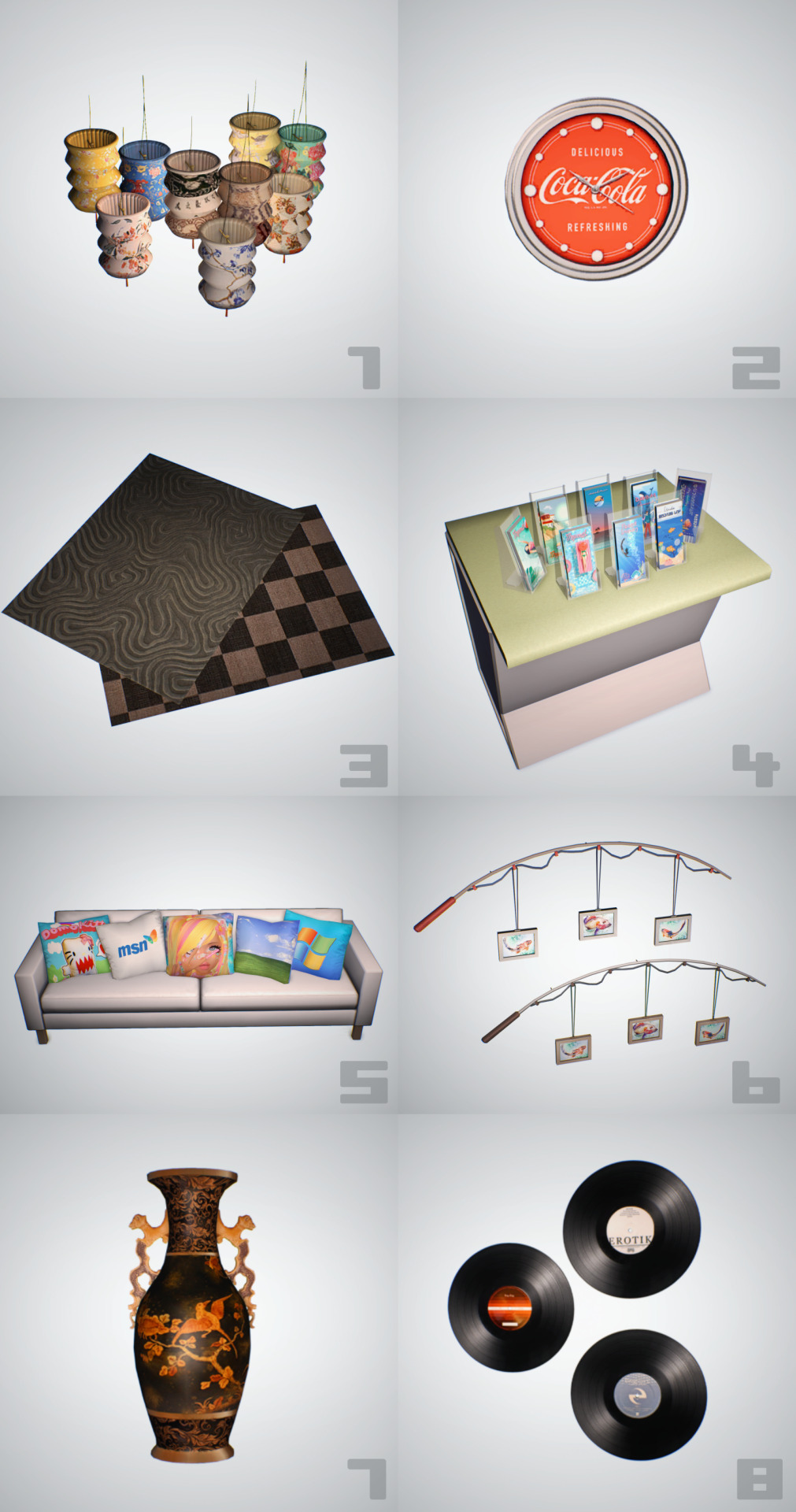
making cc to cope haul
here's a set of conversions/recolours/creations over the last month or so, swatches as always will be under the cut. u can open the img in a new tab and zoom in to see them as it is a fairly large img
1 - Sims4Life lantern. A merged file, I've never solo'd making a lamp before so any problems let me know! Found in Ceiling Lights. It's quite high poly at 3.8k but textures remain 512px. (wont show swatch below as they're all on display there) - DOWNLOAD
2 - NICKNAME's coca cola clock. Single package, doesn't have animated hands unfortunately. Found in Small Electronics. 252 polys, 512px texture. - DOWNLOAD
3 - Wrenmie's Rugs 4t2. UPDATE 15TH DEC 2024 MESHES HAVE BEEN FIXED! THEY ALL SHOW IN RUGS NOW Includes both the neutral and green ones so far. I also recoloured the checkered swatch from the neutral set in Poppet's Lonesome palette. On meshes by Nengi65, included. 512px textures. - DOWNLOAD
4 - Pamphlets by Simdertalia. Includes vacation and aquarium recolours, 182 polys. 512px textures. Found in Sculptures. - VACATION / AQUARIUM
5 - Cushionz. I made my own addons for these pillows by MysticRain, I just made the existing pillows more square rather than stretched/rectangular. Was something that could not have been fixed by usual remapping, apparently. 40 swatches, 256px textures and 100-200 polys for the meshes. Don't even ask what the textures are, I just know we need some cushions that are unusual and defo from Redbubble. Found in Sculptures - DOWNLOAD
6 - iyaS Fishing Rod wall deco - I have plans to recreate Coral Island in TS2 at some point and these were a must for the beach shack. Even put a lil detail on the two recolours with Jim and Sunny's name on them respectively. 919 polys, 512 x 1024px texture. Found in Sculptures. - DOWNLOAD
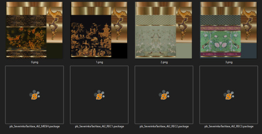
7 - Severinka Tao Vase - Something of course I needed for Jim's house that I am building with great pain and suffering atm. The texture is so pretty even at 512px omg! Too bad it is 2.2k polys. Although I kinda get why (the animal detail on the neck of the vase). I blended the normal map with the texture for extra oomph. Found in Sculptures - DOWNLOAD
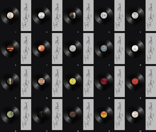
8 - Records On The Wall - Here's some Vinyl textures I made and put on Aikea-Guinea's half-height wall mesh. Includes my brand new fresh addons I've made for the mesh too, which I will showcase better with a later CC I have that didn't make the cut here. The addons are just versions sized down of the original in Medium, Small and Xtra Small. I also tweaked the mapping a tiny bit so that the mesh displays the texture true to the aspect ratio without having to stretch it. 512 px textures, around 20 swatches for you to use. - DOWNLOAD
credits - Aikea-guinea, Severinka, MysticRain, Simdertalia, iyaS, Nengi65, Sims4Life, Wrenmie, Nickname, Poppet
swatches in order of appearance!!! 👇
THE RUGS

checkered lonesome palette swatch
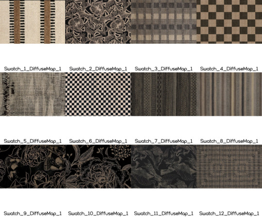
neutral swatch
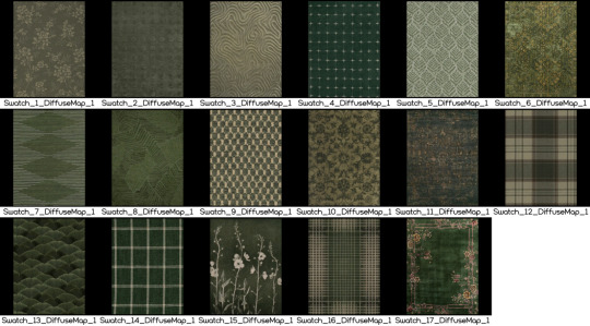
green swatch

PAMPHLETS
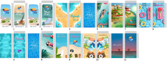
Vacation ones

Aquarium ones. Note btw these share the same mesh

CUSHIONZ


TAO VASE

RECORDS ON THE WALL
#ts2#mycc#ts2cc#HOPE U guys like this preview style because im 1) tired and dont have the energy and 2) its easier to see what ur getting#dl:buy#dl:buildbuy#dl:rugs#dl:recolours#dl:wallhangings#dl:cushions#dl:deco
182 notes
·
View notes
Text
Danny Phantom ghost things i'd want in a hypothetical reboot
so like the rest of the fandom, i've had my own ideas for cool ways Danny's ghost powers could operate fermenting for over a decade. not all of these are wholly original-- i'm sure they've been influenced by a bunch of other fanworks over the years. but while it'll (probably) never happen, i'd love to see them depicted in shiny, professional animation
ghosts are ideas, manifested. their appearance and powers are all directly linked to the shape and powers of that idea.
when Danny first turned, his 'ghost form' was barely anything at all. wispy, insubstantial. he was still weak from his [near] death experience, confused and scared, and these moments where he's apparently lose all visibility and corporeality were as confusing as they were terrifying, creating an awful negative feedback loop
Gradually, as Danny came to understand and anticipate these ghostly transformations, his form solidified. by the time the show starts, his ghost form is basically identical to his normal human form, just with the expected palette swap
Danny starts to realise his body is malleable in that form, and experiments a bit. mostly with realising he turn his legs into a wispy tail to go faster, or maybe changing his body for a goof
but there are subtler, gradual changes.
as Danny becomes more confident with his Phantom persona, as it becomes a genuine alter-ego, Phantom's appearance changes.
Phantom's a little taller. A little more muscular. His jaw a little more chiseled. His hair goes from "mundane dishevelment" to "anime protagonist spikiness".
yes, this goes great with transguy!Danny, thanks
these changes are gradual, maybe a single tweak to the character design per episode. enough that by episode 13 or so, if you were to put images of Fenton and Phantom side-by-side, you'd realise they were no longer just palette swaps
unfortunately, there are downsides to this ghostly nature
Danny's ghost form (and sometimes even his human form) is directly linked to his mental state.
if Danny's insecure? Phantom can become weak and insubstantial. Scared? Small and childlike. And if he's angry? Well...
Twisted claws for fingers, teeth contorting into fangs, strange waving tentacles emanating from his body...
Maybe there's a reason people don't recognise Phantom as human. Let alone as that Fenton kid from down the street.
sometimes, though. someone swears they'll see Danny Fenton's eyes flash green in the darkness. just for a moment.
being a ghost isn't just cool super powers. have it be, in a very real way, eldritch.
444 notes
·
View notes
Text

Well I also did this today. Sketches so I could try and figure out that skystar fankid since as mentioned earlier, I’ve been trying to think about him
I’ve been trying to draw other stuff today, but honestly after drawing Jazz, my creative juices have not been flowing as much. I tried to do more color palette drawings, but Megatron’s shoulders give me so much trouble I couldn’t figure them out, and I tried to draw Ironhide but he wasn’t turning out right proportion wise and I realized by them I was kind of just forcing it
But then I was bored and needed something to do creatively, so I tried to at least attempt some amount of designing this kid. Though first I needed to try and draw Starscream and Skyfire’s helms (since that’s on of the main things that don’t rely on alt mode) to see how I could combine them
I mean, I think I did all right. It is very much still a work in progress though
Probably shouldn’t have even posted it, just kept it to myself for future reference, but I have a problem of wanting to share literally everything I make with very few exceptions, so here we are
I have multiple alternate color schemes here as well because I just didn’t know what to pick


Honestly my biggest problem here for me is that Skyfire doesn’t have any design in Transformers One, at least not as far as I can tell. And he doesn’t really appear in much outside of that, so I’m really just stuck with his g1 design to base off of. So most of what I do have to work with comes from Starscream and the other Seekers
So like, I feel like this kid looks too much like Starscream, but I don’t know how to fix it
By the way, while I haven’t settled on a name for him yet, the one floating around for me right now is Overdrive? I don’t really know why, and it unfortunately is already a character’s name, but shush
It may change, but for now, in this post, his name is Overdrive
There’s also the problem of the color scheme for him here. Because like, Skyfire and Starscream technically have almost the same color schemes, just that Starscream also has black/grey and they’re dispersed differently. So I’m trying to find a balance here that works without looking too much like one or the other
I had a brief idea to base Overdrive’s color scheme on the original Jetfire toy, and honestly I do think it could work, with the mainly white with red and black accents, it's just that for whatever reason, I don't like how it looks when I make his middle part red. Maybe I've been watching too much g1, because there's a lot of red Autobots, and characters having white and red on their helms isn't that uncommon either. So I just keep it blue so he looks distinct in my head. I might switch it over to the Jetfire color scheme later though
Also you see that for one of the visors I toyed with him having green eyes (his eye and visor color match btw, the eye's only there so you can see it), because some people decide that pre-betrayal Starscream had non red optics. But I didn't just want to stick with plain blue, and I knew that we see a number of miners with green eyes, so why not green? I changed it because I thought maybe he didn't look Starscream enough, but eh
Oh yeah, I do have a few other notes on his design here, since I'm realizing I've mostly just been complaining
Why did I give him a visor? Eh, why not, Skyfire and Starscream don't have them. But I based it on how it looks on Thundercracker and Skywarp
As for his side vents, I wasn't really sure how to do them, but I didn't want them to be the same as Starscream. I tried to base them off of Slipstream's, but the way the vents folded looked weird to me, and I ended up cutting them off and making his face into what you see in the bottom left there. It didn't turn out exactly the way I wanted in the colored version though, and I think I ended up circling back to Starscream's vent shape. But oh well, things to change later
Oh yeah, pictures of Thundercracker, Skywarp and Slipstream to know what I’m talking about. Or more accurately, this is what I used
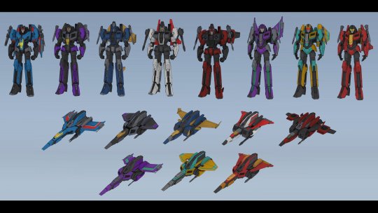
Also those things on his sides? They were supposed to be like Skyfire's side cheek things he has in g1, but I also made them puff out for some reason. I don't know why. I'll probably tweak it, but I want to keep some aspect of it I think
*sigh* to be honest, I really don't know what I think of this design. It really isn't finished at all. I'm really not even sure why I'm showing it, other than to say I'm working on it and I didn't just abandon it? But I mean, we'll see how long that lasts
Do I have anything I added on to Overdrive's character at least? Well no, not really. By this afternoon I think I had mostly creatively drained myself, I mostly just wrote what I had originally again
Namely that he came to be after Sentinel's betrayal, and as such Starscream doesn't know he exists and Skyfire thinks Starscream's dead. Overdrive still has his cog, it never got stolen, either because Sentinel hadn't thought of it yet or he didn't have a believable means to have it taken without it being suspicious. All I really know is he's a jet, but isn't outfitted for military work of any kind, his profession probably being closer to Skyfire's
As for Skyfire, I'm stealing his role here from another fanfic I read, where he's a scientist who was trying to figure out the cause of the Energon shortage and the lack of the miners' cogs (unaware that latter part is a lie, but he was growing suspicious with the discouragement of that line of research), though he also races occasionally. So maybe Overdrive's a scientist too? I don't know, I don't think he needs to be, but I don't know what to make him
Also a note that isn't new to me but I don't think I ever mentioned, due to Skyfire's research, he's met the miners plenty of times and was generally considered one of the nicer cogged bots to them. Overdrive has by proxy met them on occasion as well, including D-16. So as it happens, Megatron does in fact know about Overdrive and the fact that he's Starscream's kid (Skyfire probably mentioned his former conjunx at some point), but he doesn't know that Starscream doesn't. So he hasn't told anyone because he assumes everyone already knows
But yeah, I have Overdrive's backstory, but I really don't have anything about his actual job or personality. To be honest, I think some of it's me being paranoid I recreate Locket in some way, since I like seeing stuff on the Locket AU. I suppose I try making him closer to Skyfire's personality? But for whatever reason, my brain can't rectify that in my head. I don't know
Still don't have an answer on his alt mode either. And it gets even trickier now because they don't have Earth alt modes, they're Cybertronian (even if they don't all look the most different from Earth vehicles here). I did learn about the existence of triple engine jets today, and I kind of want to do that, but I don't know if I will. I also don't know how to draw planes yet, or how they entirely translate to robot mode
But yeah, I think I'm done here, just updating you on what I've been up to this latter half of the day
#I don't really know what to put here#it's a work in progress that's what he is#transformers#transformers one#transformers oc#skyfire#starscream#skystar#my art#fankid#I guess#I feel like I'm tagging my requests right now tbh#overdrive#my OCs
60 notes
·
View notes
Text
one amiibo i really wish i had is the green variant of the splatoon 1 inkling amiibo. it's just a recolour but i think it looks cool. plus it matches Agent 3's palette in octo expansion. unfortunately it seems really hard to find.

195 notes
·
View notes
Text
Random theory while i was rewatching khux,
So all the dream eaters are Chirithy's wrapped around the sleeping hearts of the dandelions waiting to be awakened, and we know dream eaters are connected to regular people outside of the realm of sleep, the spirits consume nightmare and the nightmares consume good dreams of people, Riku becomes Sora's dream eater ect, and Chirithys are connected to people aswell, each being given to and assigned to a keykid (? daybreak townie? child soldier-) by Mom/the foretellers, and last but not least Kairi is connected to chirithy in some way, having chirithy ears on her kh3 outfit hood and all
But theres a connection were forgetting, Ventus Of the unique dream eaters we know of, we have Riku: Sora's dream eater, Chirithy: the first dream eaters, the boss nightmares, Nightmare Chirithy: both the purple version and the fused with Darkling version, the Anti Black Coat (i hate that name lmao): the physical manifestation of Sora's nightmare And Armoured Ventus Nightmare Ventus unconsciously wrapped his armour around Sora's sleeping heart to protect it, taking on the darkness and thus a nightmare form in the process, Ventus wraps himself around the sleeping Sora to protect him until he could be awoken, exactly like how the Chirithy's saved the Dandelions If Riku is Sora's Dream Eater then Ventus is his Chirithy Bonus design overanalyzing:


Ventus' colour is green, his wayfinder is green, his armour is green, his heart station is green, his colour on the trio heart station is green


But Ventus himself isn't very green until bbs, specifically the only green on his outfit is the keyblade armour


His colours line up more with Chirithys colour palette, curiously it is majority Spirit Chirithy's but i would say the black undershirt and specifically the red inside of his jacket actually remind me of Nightmare Chirithy's red cape underside, he may be majority light but darkness was lurking beneath him from the very beginning, becoming so intertwined with him that he gave that formless shadow a body and a mind


unfortunately i am now thinking about poking a ventus and vanitas redesign because the world is cruel and never lets me rest
66 notes
·
View notes
Text
fashion taste head canons
(because we usually only see them in t-shirts and jeans/shorts and it hurts me. unfortunately my irl fashion taste sucks so eheheh)
ashlyn: flannel overtops/jackets, fishnets, darker tones, signature black boots, tote bags, neutral-to-dark green palette, looks earthy, earth tones


aiden: cargo shorts, almost everything has some sort of pattern or design, not any specific palette, colorful, shirt/jacket patches, almost all are thrifted
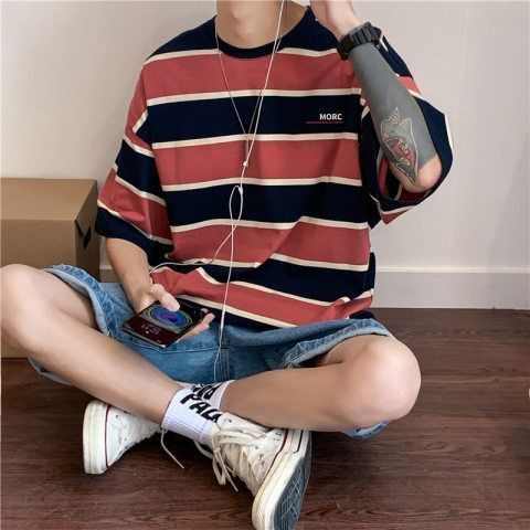


taylor: pinterest girl vibes, color-coded closet, large sweaters/jackets, matching outfits w/ tyler, no specific aesthetic, dresses in her current mood, keeps up with each fashion trend


tyler: hoodies underneath demin/other jackets, go-to letterman jacket, one-to-three colors in a whole outfit (besides shoes), either white air forces or jordan's, track/sweat pants


ben: little to no designs, color palette consists of lighter grays/white, plain white shoes, wintery colors, larger shirts, doesn't usually wear jackets but will if needed/cold, outfits are usually pretty simple, not really any layering
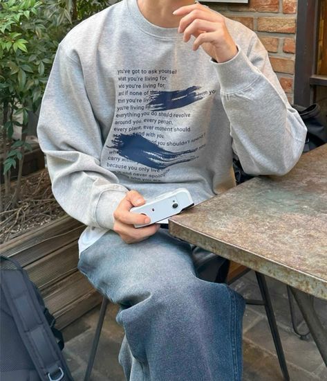


logan: almost everything is hand-embroidered, sweaters are usually larger, at least one pattern per article of clothing, color palette is on the dusty side of the colors, converse, beige or brown pants


#sbg#school bus graveyard#webtoon#ashlyn banner#aiden clark#taylor hernandez#tyler hernandez#ben clark#logan fields
68 notes
·
View notes