#under layers and layers of bright patterns lol
Explore tagged Tumblr posts
Text


The OUAW brain rot continues.
I love their designs! And I wanted to have a little fun figuring out how I want to draw them, with my own little tweaks and self indulgent details. :)
Originally, I only meant to draw Frost, to figure out what kind of body type I wanted to give him. Then I ended up drawing the whole part, partially as a reference to myself. Also got their canon heights on a chart and put them all together for fun and for reference. c:
Some design tweak notes under the cut, if anyone’s curious! These aren’t redesigns or whatever, I just had some ideas in mind while sketching them in a way that fits my art style.
Design notes copied directly from my server:
🔥Gid THICK BOY. He's not really a bodybuilder but he exercises and is very muscular. And he eats! A lot. So, thick boy. Scars from all the fighting. The wrists and ankles are because of his past.
I like giving his hair and beard a lot more fire. Body hair also glows fiery, it's just less bright.
🐊Kremy I figure he's the skinniest of the group after Torbek. Most of what I did is a happy medium between references of alligators, the official art, and just my art style. Mostly game him scale patterns, more alligator-like feet, and changed the tail a bit, but it's hard to tell from this angle. Not much body definition because he's a squishy magic user and a gator lol
🐯Frost Fit but not defined. Kinda thick-ish, since he's a tiger, so there's loser skin and thick layer of fur. Digitigrade because I say so.
☹️Torbek Not much changed, mostly gave him more tubes, gave him bald patches where they connect to his skin (and didn't make those are infected looking as I imagine tbh), made him fuzzier, and gave him bigger ears because I like em. Also you can't see it in this angle but I like giving him a small fuzzy tail.
🐾Gricko Fit arms, but he doesn't exercise, so he gets a bit of a tummy. Scars because of his interest in monsters, and his various accidents. Wilder hair. Freckles and moles because I say so. Decorated hair (including feathers from Hootsie!)
🍄Twig Not much really?? Went by her description, the plushie and an emote of her that exists. Made her chubbier because I wanna. Originally made her hair all curls…might go back to that. Also freckles because cute.
Do you have your own headcanons for details of what they look like? :)
-- [BTW I do commissions]
#legends of avantris#once upon a witchlight#gideon coal#kremy lecroux#morning frost#torbek#gricko grimgrin#twig toadspring
681 notes
·
View notes
Text

medical malpractice. ‿✷。
pharma x human! gn reader.
warnings: medical play. sharp objects. temporary blindness/sensory play.
nsfw under the cut. this is a bit darker but this is pharma we are talking about here. not enough of this rat on my feed.
"are you sure ratchet isn't available?"
the cooling bulbs shine bright in your eyes and you itch the sleeves of your uniform, gaze wavering between the flawlessly polished floors and an elaborate monitor with a screen that easily dwarfed you lengthwise.
the fucker doesn't speak for an uncomfortable five seconds. you are convinced he purposefully does this just to have the pleasure of your wariness wither.
"yes, my dear. he has far more pressing matters than a simple organic check-up. i do apologize if my cycles of experience in this profession is.. lacking for your standards."
his back is all you see when your face twists, mouth slack as you struggle to seek a response.
sarcasm must be a species thing. almost every cybertronian on this ship seems to have a snippy remark.
"it's not that."
you don't know how to describe it. pharma is sardonic and precise. the crew members don't seem to have too negative of an opinion as his performance precedes his mannerisms.
when he first laid optics on you, there was a tiny voice in the back of your head that itched.
he did not share the warmth of his companions. granted, it was not as if you were adored by all mechs — plenty still had their reservations of allowing such an easily harmed creature aboard on a personal journey that they could not even hope to relate to.
however, unlike the other medics, you felt trapped under his leer. vivisected no matter the layers of insulation and nylon hiding flesh that blazed under unrelenting attention.
he never strayed far from your thoughts after that introduction. you can hear his croon at night and see those genuine, icy stares when you close your eyelids to toss and turn to sleep.
he's dangerous.
no one shows to share your beliefs. you don't speak of them out of fear of alienation. he triggers your survival instincts so strongly it starts to make you angry, because he hadn't done anything to warrant the disapproval.
he's a voyeur to your discomfort. sooner or later, you learn his subtle language and realize he's pleased.
you make efforts to avoid him. it's easy, given your skills don't overlap with his duties. you're just an engineer and more than half of the technology they possess is outside your education. you forget about his stalking frame and find members that treat you nice, treat you gentle.
this very situation is nightmarish.
"distracted, little dove?"
a yelp leaves your lips. his helm is eerily close and his smug smile remains firm on his dermas. you're so alarmed you don't notice the velcro round a forearm until he clasps the straps, tight.
the iv bag is clear. you breathe shakily.
"please keep in mind i do have your best interests in consideration."
"... just get on with it, doctor."
he hums, doesn't react to the bite. his digits graze your elbow. when did he yank up your sleeve? goosebumps freckle up your skin and he pinches.
consideration. the gravity of that word sinks in the pit of your gut. too easy to miscontrue.
"i understand your.. unease. alone, far from home, far from your own kind. under the scrutiny of what you cannot predict."
the medical stretcher slowly creaks back. the rusty pop of cogs startled you. a giant light nearly hides his calm demeanor, just the shadow of himself and a halo of sterile white behind him.
the electricity sparkling in your veins runs blood hot. faint beeping climbs in measure — you assume the thumping pattern of your heartbeat is what that is.
suddenly, your mouth is coaxed open.
metal - tool and him - slide across your tongue in a practiced sweep. it clinks against your canines and molars, scraping inner cheek until you feel just shy of pink, sticky sinew shredding.
a swab is after. it isn't rough but far from tender. this is no lollipop ending appointment and you become faintly aware of a chemical stench starting to waft around your vicinity.
"healthy. teeth all accounted for. funny, how these bones work. brainstorm had spoken to me about ah, what is it called for you. cavities. fascinating, your inner workings aren't close in nature and yet it can poison you, just by chance. find that small, plump heart and send it right into failure."
this conversation tinges dreadful again. you make a protesting noise that careens into a groan before he shushes you, sifting through equipment. having him in your mouth has your jaw throb sore.
"yes, yes, i know, keep it quick. while we are on the subject of brainstorm however i want to be frank. he has assisted me in creating a method to better examine your parts. you're just so.. fragile. small. i would hate to hurt you."
".. and what exactly does that entail?", you whisper dubiously, twitching at the thought of anything from brainstorm being near you in a ten mile radius.
he laughs.
"well", you blink and he is still difficult to see with all the lights and proximity, something wet and slimy dropping in both of your eyes. you squirm with a gasp and go to rub out of nature. he stops you.
"it's difficult to explain on your terms. but it's dropped into your eyes. microscopic cameras are effortlessly mixed with the solvent. it'll adapt to the shape. almost like a thin casing. it connects to my screen aaaand.."
you can't see. confusion driving the monitor to grow louder and louder.
"you put fucking cameras in my eyes? wh— what?! i can't fucking see! does ratchet know-"
"ratchet is not here. i suggest you find your bearings before you scare yourself to death, dear."
he sounds unapologetic. you fully drift to panic and think about the crawling sensation around sclera, unsure where your imagination and reality separate.
pharma sounds distant. this very room is almost closing in and your senses heighten in natural hopes to extend your survival.
his voice is charming and thick with something you can't identify. whispers hot in your ear. a cut has been made.
"excellent, little one."
this is torture.
one by one, the pain of an incision you can't even detect when it was sliced sutured with practical movements. unwoven, stitched again. you start to huff.
thumb catches moisture. you hear a rumble and it isn't the ship engines, it's him.
"just what else can the human body do?"
your throat closes up.
"how much could you take, hm? i simply want to know. there is no... allure of a broken body. perhaps in a dream. perhaps in my fantasies."
in and out, you fade. body trembling, hair sweaty on your forehead. he is an issue you cannot solve.
"perhaps, perhaps."
------------------------
"how did the examination go?"
ratchet doesn't pull from his work. the gruffness and bitter edge you have learned to navigate and know his inquiry is made out of concern, not forced.
"i... fine, i think. i can't remember."
ratchet keeps working, though his pace has slowed.
"... mm."
#tf mtmte#mtmte#transformers#maccadam#first contact au#transformers x reader#idw pharma#pharma x reader#pharma#dark content#/nsft#/nsfw#valveplug#HELLLO EVIL DOCTOR LOVERS#come get yalls juice!!!#i will get to requests soon!#mtmte x reader#transformers mtmte#tf pharma
157 notes
·
View notes
Text
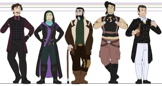
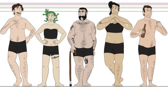
after 500 years, im back to working on line-ups for the oxventure PCs for each campaign, this time the hobby horses :3 as with the oxventurers guild, i put a good amount of thought into this, though maybe not as much as the guild haha but regardless, i'll go into more detail under the cut for anybody curious :]
once again, they all have their own eye shines (or, in barnaby's case, are dead behind the eyes lol), though theyre simpler shapes this time. edvard gets stars, lilith gets a squiggle, kasimir gets a hooked shape, and zillah gets hearts.
edvard - i see him as just kind of. soft around the edges from his rich upbringing, but generally is on the thinner side, kind of rounding out in the middle. very Just A Guy with his build and body hair. i went with brown hair rather than black because otherwise, everyone besides lilith would have black hair and it was just to monotonous for me XD still, i tried to keep it dark and not too bright so it would fit the vibe. also, for some reason i thought his vest was floral until i started coloring this, but it totally is not in canon??? :') i liked it too much to not do a floral pattern anyways.
lilith - i really adore her canon outfit, i just get very confused about the layering of everything. so i tried to do distinctive color-blocked for her outfit, while also restricting her outfit's palette to just purples and teals/blue. i am so bad at drawing snakes. i am so so so bad at drawing snakes XD also, i decided to give everybody at least one tattoo because i just thought it would be fun and im taking advantage of the gritty setting. theyre all cool and tough so they have tattoos and totally not because i just love drawing tattoos lmaooo
kasimir - kas is not much of a leap from canon. i love kasimir's design. i just gave him plenty of tattoos under that massive jacket of his. based vaguely on johnny's tattoos, i did my best to reference their arms but ended up more going off of the vibe rather than copying anything specific. johnny's tattoos are simply too intricate and beautiful for me to do repeatedly djfgbdfhd and okay i say this constantly but my faaavorite kasimir design element is his whale belt buckle. its so cute. i love it
zillah - she was also easy for the same reason, i just adore zillah's design. its simple and very fitting. so i just gave her exactly what she has, but like lilith, i simplified the color palette. since my art style is much more cartoony than colin craker's, especially when i dont hatch or shade, restricting the colors makes the designs look cleaner. i almost forgot to color in zillah's hand wraps by the way and i literally put my hand over my mouth, i only caught it as i was typing this XD it was so needlessly over-dramatic
barnaby - i dont know fully how to explain it, but barnaby is definitely the design i am most pleased with. not because i think he has the best design here necessarily, but because hes just so perfectly what i picture in my head. with a lot of my designs, ill adjust small details based on my mood or i just won't fully be confident in my decisions, but with this design? thats just barnaby. chef's kiss. like edvard, i gave him brown hair instead of black for some diversity. i also kept his very thin hair and high forehead because it makes him so endearing to me <3 no five o'clock shadow though, he has to keep himself looking young
#oxventure#oxventure blades in the dark#edvard lumière#lilith cappellanaga#kasimir jones#zillah bruseau#barnaby fortescue iii#i cant believe i said 'ill finish these tomorrow' on my last post for these. oh my god.#its been over half a year and this took me 16 hours LMAO though i am a bit rusty w lineart and full color
32 notes
·
View notes
Note
hello! in awe of the way you render metal and armor ... any tips for how you get it to look so defined and shiny? or just like your process in general? much appreciated ty!! and i love your art!!
Hiiii ty Anon (づ๑•ᴗ•๑)づ♡
I'm bad at describing stuff with words but I'll do my best with some screenshots from the process :'D (apologies for my handwriting in advance lol)
First I sketch the silhouette of the armor/prosthetics etc. with a dull dark shade that will be the middle tone of the armor. On this silhouette I draw the approximate location of the highlights with a lighter tone.


(Btw I'm usually drawing render all on one layer, and mixing colors/tones with a flat brush, so it makes the piece look more alive idk)
Next step is sketching details, this is done in a darker shade, mixing black, also adding some cold tones in accordance with light
And then my favorite part :3 I highlight the “convex” parts of the armor with a bright light tone, as well as parts that fall under the lighting. Brush pressure and mixing with already applied colors also matter here. I also highlight elements such as armor joints, seams, and patterns in bright colors.


And then I add some stripes or scratches with a bright color used for final highlights rendering (I usually do this with a standard brush textured with "Jeans" and some random lines).

All done :D
Ah and these are colors that I mixed during the rendering process


22 notes
·
View notes
Text
Thank you for tagging me @iri-vail, tag games are fun!
rules: share the first line of your last ten published works or as many as you are able and see if there are any patterns!
pictures from a flood (harry potter)
James’ shout was abruptly washed away in the bright flash of green light downstairs, followed by a muffled thump, and she knew distantly what that meant but her mind refused to process it.
self-plagiarism (scum villain's self-saving system)
“Zhangmen-shixiong.” Shen Qingqiu was perfectly polite, expression tucked carefully away behind his fan as he made his way to his seat.
tame every monster with light (scum villain's self-saving system)
Shen Qingqiu didn't take as many night hunts as his martial siblings, being the Peak Lord of a peak more known for scholars and artists.
these autumn hands (scum villain's self-saving system)
“My king.” The words were spit out like a taunt, Shang Qinghua grinning with bloody teeth as he wiped his face on his sleeve.
two drums in the grey (mdzs)
Had she thought about it more, Lan Wangji would have left Cloud Recesses under the cover of night.
a small spark (mdzs)
It had started, as many things did, because Wen Qing was worried, and Wei Wuxian had learned early on that she wouldn’t budge until she’d gotten her way.
the big moon needs the tree (mdzs)
Desperation drove him, when he should have collapsed.
underneath your teeth (it feels just like home) (mdzs)
Jiang Wanyin was both exactly what Nie Mingjue expected and nothing like he’d thought.
my fears tell me I'll never win (hockey rpf)
Claude is young and stupid, with his missing tooth and unkempt ginger hair, and Danny wants him in a way that he hasn’t wanted anyone since he and Sylvie split.
limned in gold (hockey rpf)
It’s a story, more than anything else, less a fairy tale and more the kind that starts religions.
Apparently I like to make it clear who's POV it's in and/or sort of set the stage for the fic, I kind of knew I did this but it's fascinating seeing it laid out like this.
Also I need to finish and publish more of my scum villain fics, I've definitely written more but apparently it's all sitting in my wips folder. Though once you get past the mdzs layer it's alllll hockey rpf fics lol.
(For full disclosure I skipped one mdzs fic because then I could include one of my favorite hockey pieces I've written. Limned in gold is one of those fics that I was delighted to write and reread a lot because I love how it turned out.)
I'm trying to remember who I know who writes, tagging @theonceandfuturequeenoftarts @theeternalghost and whoever else wants to do this.
3 notes
·
View notes
Text
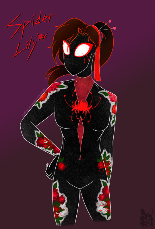
Guess who fell into the trend ever since the ATSV release-
Anyways here's my spidey-sona! I dont have a lot going on for her, but I wanted to blurb a bit under the cut:
I wanted to go for a more Eastern-Asian designed spidey, I was originally gonna go for a hanfu-styled design but it looked a little wonky with the layers, so I decided to go for the classic skintight suit but with embroidered flower patterns as one would see on a hanfu.
Also idk if others used the spider lily design yet but I thought it would be a funny play on words- and naturally I wanted to give her a design that kinda followed like...themes? Like spider lilies, themes of life and death, but also making her web bright red as a theme of embroidery and the "red string of fate"
She doesn't have any special powers compared to the others in the spider society (partly because i never read the comics lol) but I wanted to give her enhanced healing over other spideys, so that if injured she could stitch/embroider/web(?) her wounds back together.

Never the less this leads to interesting interactions--


#spidersona#spiderverse#spiderverse oc#itsv#atsv#across the spiderverse#spiderverse fanart#moonies makings#tbh it was fun playing around with the different brushes lol- i wanted to emulate a different ''style''#i was originally gonna make the flower patches more detailed to look like actual thread but it clashed too much with the textures#so i just slapped a bunch of firealpacas pencil and pencil fabric brushes lol
38 notes
·
View notes
Note
☀️ I LOVE Z
I LOVE HER SM. She's so fun, I love her paranoia and at the same time, stubbornness to give up how she sees the world, her desire to narrate it all.
ALSO I KEEP NOTICING THINGS IN HER DESIGN THAT MAKE HER LIKE A BUG AND IM LIKE HOLY SHIT
Also!! Z- Her name is Z, and she uses Z themed tags in her ask games and posts.... I don't know if the name is intentional to sound like a buzzing sound that flies make but!! but!!
Aughghuaghu biting and chewing
YEA YEA YEA YEA!!!! she sooooooooo!!! forgive me for being probalyb a bit incoherent but its like almost 1am and i have school in the morning but i wanna fuckinnnnn answer this ask before i go to bed yippee yay
her name being z isnt inherently bug-related NOR is it totally porygon-z related (its a factor but its not the sole reason lol). and while the Z-theming in her tags and posts is more related to the porygon-z than the bug thing, its a silly side effect that i think she gets a kick out of!!!!
OUGHOUGHOUGH im so in love with z's character design!!! a lot of it is based around bugs, particularly flies! aghgahgahgaghgh actually ykw lemme fuckin. rant for a moment abt z's design
putting this under cut for insect imagery!


overall color scheme inspired by common green bottle fly
her bright deep-pink glasses are reminiscent of the big, red compound eyes that flies have
Grey face mask with zigzag line down reminiscent of mandibles
Scarf that goes down behind her back meant to look like the wings of a bug
Kind of hard to tell from this reference alone, but both the backpack and the winter vest are kinda meant to look almost metallic like a bottle fly. The backpack is meant to give her silhouette more of that fly-like appearance.
Black pants and arm warmers meant to be reminiscent of fly legs. The hexagonal patterns are kinda just meant to break up the monotony of the design
BUT! the use of hexagons in particular is meant to tie into both her motifs with tech AND with the bug typing, as it alludes to the shape of honeycombs.
also its a bit hard to see on the colored version but if you look at the doodles on the side you'll notice that the strands of hair that fall to the sides of her face kinda curl into themselves a bit. this is another thing meant to tie her back to her being a bug specialist because this is something you kinda see with some of the recent bug trainers in the games. its meant to be kind of reminiscent of either bug antennae (viola) or a proboscis (katy), but i focused less on what it represents and more on the fact that it is intrinsically connected to bugs and bug type trainers. i tend to draw a lot of inspiration from character design philosophies from the games to make my own trainer characters, so seeing a pattern like this established within the games and implementing it into my own designs can help to add another layer onto the established motifs.


and last but not least...

even her shortass height is meant to tie back to bugs. bugs are small and hard to notice. she relates to them a lot. she wants to be a fly on the wall: small and hard to notice
2 notes
·
View notes
Text
LimGuda WIP doodles
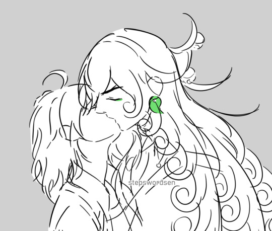
I wanted to compile my collection of LimGuda doodles mostly from 2021 ~ 2022. They’re rough WIPs, but I wanted to post the ones I still like. I’ll put them under the cut, along with some rambles I have on LimGuda wearing Việt phục, traditional Vietnamese clothes! I’ve been meaning to redraw these sometime in the future.
LimGuda my comfort headcanon NBLNB couple!!! 🥺 💚 🧡 God I love them so much it's unreal.

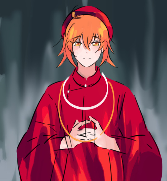

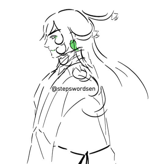
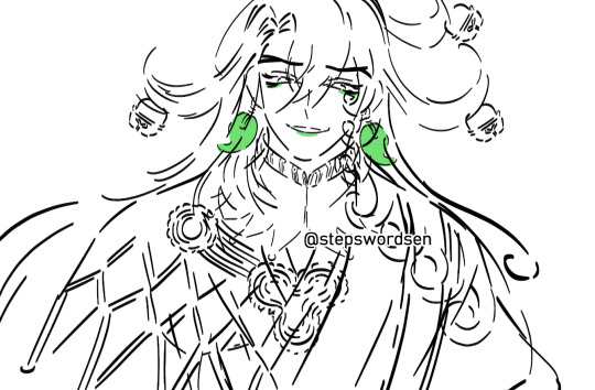
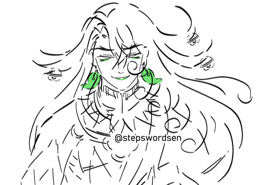
Việt phục talk
I’m planning for Douman and Ritsuka to wear matching Việt phục (“Vietnamese traditional clothing”). The specific type of Việt phục they’re wearing is called áo tấc (“10 cm dress”). It’s also called áo tế (“Ritual/Ceremonial dress”). Tấc is a unit of measurement. In modern times, 1 tấc = 10 cm, and it’s the width of the hem of the dress or bound seam.
Áo tấc is the historical predecessor to Vietnam's national dress, áo dài (“Long dress”). Áo tấc is also called Áo ngũ thân tay thụng (“Five-panel robe with loose sleeves”). It’s a type of Áo ngũ thân (“Five-panel robe”) with large loose sleeves. Áo tấc was worn by all classes for various occasions.
I have an art idea of Douman and Ritsuka wearing green and red áo tấc... Red is a colour worn by Vietnamese brides. I usually see Vietnamese brides wear red, pink, or gold, etc., or bright colours at their weddings. Red, blue, green, and pink are common Vietnamese wedding colours! So that’s why I want LimGuda to wear green and green áo tấc.
That reminds me, I've had the idea of LimGuda wearing áo tấc in my head for the longest time and I haven't refined the rest yet because I haven't been able to decide whether I want Douman’s hair in braids or ponytail LOL. These are my ideas for them:
Douman
Green áo tấc with black trousers, hair based off his 1st Ascension design, but styled into braids or a low ponytail. I think I’ll end up going with the braids! I’m also thinking of another version with him wearing black and red áo tấc with black trousers, based off his 3rd Ascension design.
I think for Douman, I'd use the same muted emerald green he wears. Áo tấc are usually simpler in style compared to outfits like áo nhật bình (“Square collared dress”).
Ritsuka
Red áo tấc with white trousers, maybe a red khăn đóng (turban headpiece), white and red beaded necklaces, and elaborate gold hairpins. As for their hairstyle... maybe I can have their tied back in a bun with some loose strands (the common Vietnamese bride look). Or their hair could just be let down loose.
LimGuda in in Việt phục… wearing my culture’s traditional clothes??? I AM ON THE FLOOR. The Nguyễn dynasty's áo tấc and áo nhật bình make great wedding attire. Red is such a classic colour for traditional wear and weddings to, and Ritsuka would look so kissable in red áo nhật bình~ My wifey wife wife...
I wanna draw them in áo nhật bình eventually, but the patterns on nhật bình are more colourful and detailed, so I'm saving that for another time.
Extra rambles
Douman has such a good design. Their design is amazing, but it’s so detailed and complex, so I wanted to draw LimGuda in áo tấc so I can have simpler designs to refer back to whenever I want to draw them quickly.
I still have to redraw the áo tấc Ritsuka though, it's an old doodle from 2021, and I improved a lot since then, so it’s outdated compared to my current art style. Somewhere around ~2022, I started using a weighted inky brush instead, and I think it suits my art style more! I love using weighted inky brushes! I've been using it as my sketching/lining brush ever since.
I read an article before that talked about how combinations of green and red in Viet weddings were considered a symbol of courtship and marriage... and romantic with erotic symbolism... Oh my god... LimGuda...
I read a post by @/lotusinjadewell that in Southern Vietnam, Viet brides would wear 2 áo ngũ thân on top of each other, with the outer layer being green, and the inner layer being red. That reminds me of Douman colours...
LimGuda wearing green and red Việt phục (Combusts) I wanted to choose those colours because green and red are also notable wedding colours! Anyways I'd have many more things to say about them, but it'd be an essay, so I just wanted to let people know about my immense love for them!!!
I wanna draw them more, since they’re one of my top favourite ships ever and incredibly important to me, but Douman’s design is the most detailed and complex out of my faves. Still, I'd like to become powerful at drawing them someday. Plus, I wanna give myself simpler outfits to fall back on whenever I don't want to draw their canon outfits (especially Douman's which has too many details)
They give me constant brainrot I think about them every single day. I’ve been down bad for them since December 2020. LIMGUDA
#fgo#fate grand order#ashiya douman#caster of limbo#fujimaru ritsuka#fate series#fate go#ritsuka fujimaru#alter ego limbo#limguda#douguda#limboguda#doumanguda#douritsu#ringuda#gudarin#リンぐだ#ぐだリン#道ぐだ#蘆屋道満#リンボ#my art#stepswordsen#stepswordsen art#doodle#wip
12 notes
·
View notes
Text
In my last couple of Batuu bounding prep posts, I've referenced my latest sewing project for that upcoming trip (3 weeks from now!!) but I've been buzzing along on it so well that I haven't done more than pause to take a picture now and then while I work. It's getting close to finished, so I figured it was time for a post about it!

Last sewing update, I was working on my blue linen vest, drafting the pattern and fitting the lining. The issue with the bust seam that was driving me crazy turned out to be a mistake with my notch markings, which didn't transfer correctly between patterns, so the two edges were mismatched. Once I figured that out, I was able to correct the error, get that bust seam sewn, and try on the lining for fit.
There are a couple of small things I want to change before I cut out the exterior layer of the linen, but the major thing that fitting revealed was that I needed to decide on which shirt I'm going to wear under it -- or at least, the thickest shirt I'm likely to wear under it. I tried a couple of things in my closet to see what color and texture looked best with the blue linen of the vest and the gray and black herringbone of the hooded wrap. The white shirt was too bright, the black shirt was too dark, the gray shirt too flat, the green waffle knit okay but still not quite right.
And while I was going in and out of my closet looking for options, I kept seeing the Solstice dress I sewed in December, with its pretty blue-gray cotton sweatshirt knit fleece. Since all the shirts I tried on just weren't working, I put on the Solstice dress instead and put the linen vest and the hooded wrap on with it. The color was perfect, just a lovely mid point between the blue of the vest and the gray of the hooded wrap. The dress itself wouldn't work, but maybe a shirt made out of that fabric?
The only problem was, I didn't have very much fabric left over after making the Solstice dress and the wide-legged pants I layer underneath it on especially cold days. I had a couple of pieces that were a yard or yard and a half long, but only one scrap with that sort of length that was 14" wide. Everything else was in the 6" to 12" wide range, and all with curvy uneven edges left over from the princess seams of the dress. I thought about maybe ordering another yard of the same stuff, but that would mean waiting for it to ship, then washing and drying it before I could even start on this shirt. And everything else I'm sewing for this Batuu day are all stash-busters, using fabric I already had on hand, nothing but a zipper and some thread bought new.
So I decided not to order more, and just draft my pattern around the blue-gray sweatshirt knit fabric that I do have on hand -- and thus the 'scrappy sweatshirt' was born. After looking through all the scraps I had, I drafted a pattern based on a fitted rashguard I made in 2021, which had princess seams (because that's the only way to get something actually fitted on me, lol), and a narrow contrast stripe on the body under the arm and a matching one on the underside of the sleeve. I used the neckline from the Batuu vest so those V-neck angles will match, made a couple of adjustments to the bust shaping, then cut out the pattern and started looking for scraps big enough for all the pieces I needed -- 14" wide center front and center back, shaped side front and side back pieces, narrow rectangular side pieces, and six pieces total for the long sleeves.
I decided to do lapped seams throughout the project, for a couple of reasons: First, I know from sewing the Solstice dress that regular old plain seams end up being a bit bulky in this fabric, especially on places like the bust seam where both sides of the seam allowance like to fold to one side, creating an area that's three layers of heavy knit fleece stacked together. Since this shirt will be going under a fitted vest, the less bulk the better. And secondly, since I was working with so little fabric, I knew that I'd get more mileage out of what I do have with lapped seams rather than plain seams. With a plain seam, I lose 1cm on each side of the seam, but with a lapped seam it's only about 1cm total -- and with fabric scraps this narrow, every centimeter counts, lol.
I tried a couple of techniques on some scraps that were too small to be much use in any other way, and decided on a tiny raw edge on the exterior, with one line of stitching, and 1cm of seam allowance on the pieces that go underneath in the lapping process. I had to use chalk to mark out that 1cm from the edge distance on every under piece, and then draw on markings for any notches, but besides that being a bit tedious, the seams went together nice and easily, and I very quickly had a front and back of three pieces each, connected at the shoulders with an under-lapped piece about 2.5" wide.

I cut similar 2.5" wide strips for the side seams and for the tops of the sleeves (since I'd had to split the sleeves down the middle just to be able to find enough fabric to cut them out of). The sides of the body went on easy as can be, exactly the right length -- and then I started in on the sleeves and realized that I had cut four strips to the shorter length of the body, rather than two at that length and two more at the ~5" longer length for the sleeves.
I had one moment of feeling like I'd screwed the whole thing up and wondering if I could possibly find enough fabric to re-cut those long thin on-grain strips. And then I realized, wait, this is the scrappy sweatshirt project, and the unusual piecing of the whole thing is half the point. So rather than even try to find enough fabric to cut out new sleeve stripes, I decided to do some intense (and decorative) piecing on the wrist end of the sleeve. The hooded wrap covers to about my elbows, and the vest will cover the main body of the shirt, so really that lower section of the sleeve is the thing that will be most noticeable, anyway.
I cut out 16 little rectangles at the same 2.5" width, and about 3.2cm tall (literally just the width of my metal ruler I use as a cutting guide, lol) and marked the 1cm overlap so I could start sewing them together. My plan has been to do an edge facing in that same ~3.2cm length at the neckline, hip-level hem, and sleeve hem, so making those all match seemed like a good idea.
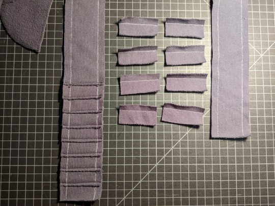
I really like the final effect of this funny little shingled detail, especially for something that came out of a mistake in my pattern drafting and the restrictions of my very limited fabric. Once I had the shingles all added to the end of the long strip, I sewed them into the center of the sleeve, what will be the outside of the arm, with that same under-lapped style I'd done at the shoulders and the side panel of the body of the sweatshirt. It's a little bit similar to the pleated panel I'm adding to Jack's jacket, but without the pleating and with more raw edges.
With those panels set in, I then trued up both sleeves so that they match each other and the long seam is the same length on both sides, then added that 3.2cm wide hem treatment, for this final look:
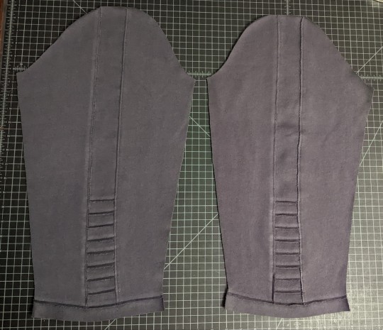
The shingles end just below my elbow, so even with the relatively tight fit of these sleeves and the extra stiffness from all that stitching, I'll still have full comfortable range of movement. The strip at the hem is cut with the grain of the knit running perpendicular to the sleeve, which means it won't curl up or fray as much as the knit going the usual up-and-down direction.
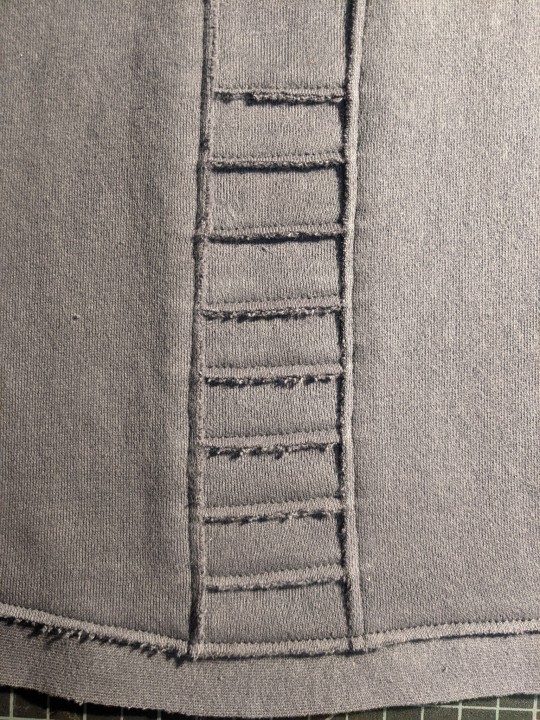
The only place I couldn't do a lapped seam is in turning the sleeve into a tube -- or, I could have, but I would have had to handsew it, and I am so not about that right now, not with three weeks to go and Jack's jacket still needing handsewing too, lol. So I did a regular old plain seam with the raw edges facing inwards, but it's so normal looking that it really just melts into the background of all these other interesting looking lapped seams and raw edges.
So to repeat the first pic in this post, here's the current state of the sweatshirt, with my little leather gloves as an accent:
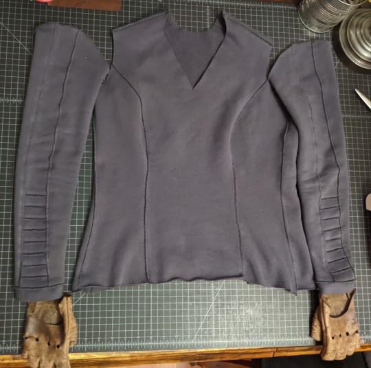
Tomorrow's tasks will be to attach the sleeves to the shoulders with another lapped seam (after possibly bringing in the edges of the shoulder top under-lap a little bit, so it matches the sleeves perfectly). Once I can try it on with the sleeves attached, I'll mark any changes I want to make to the neckline, then do the same hem facing treatment there as I did on the sleeves, with the narrow on-grain strip. The very last thing will be to even out and level the lower edge of the sweatshirt, and apply a similar hem treatment there, too.
I'm hoping to be able to get through all those steps tomorrow, and officially be able to call this piece of my Batuu outfit done. Then I'll be able to wear it while I do a final fitting of the vest lining, make any changes to the vest pattern based on those changes, and cut out the exterior fabric. After that point, I'm hoping the vest will come together pretty quickly, and we'll see if I have any time for adding little detail bits like functioning pockets or loops for code cylinders.
At the very least I would love to have a pocket specifically for my pilot's license, just so I can keep it both handy and safe from getting scratched up. But that's the sort of thing I can think about once the sweatshirt and the vest and the pleating stripes on Jack's jacket are all done. Three weeks isn't a ton of time, but on the other hand, three weeks ago I hadn't yet started on the pleating for Jack's jacket, much less these two other scratch builds. So if I can keep up a good rate of progress, I think I'll be able to get through all the projects and detail work I want to finish before our Batuu day.
And with that, I should wrap this post up and go get some sleep, lol.
1 note
·
View note
Note
what are your choices for element accent colors
here's mine
fire: shades between red, orange and yellow
earth: shades between orange and brown
electricity: yellow, straight up
wood/nature: green with some amount of brown
ice: ranging between cyan and white
water: deep blue to indigo
wind: purple, assuming greens, blues or yellows aren't already taken
darkness: black with some purple or red
light: white with light blue or gold
Accent colors? These seem more like predominant/main colors than they are accent colors. Like an accent color would just be something on the trim that contrasts the main colors. A very small amount compared to the main colors that just give that extra POP!
With fire for example, the main colors should be reds, oranges, and yellows. Very warm colors to represent fire and heat. As a small accent color, usually I would go with a bright gold, but that is if I am just using mainly orange and reds. If I am using all three of those colors then I think a purple that is still warm but leaning towards the cooler side would be nice.
Earth: Main colors would be browns, greens, and some of the more muted oranges. I think a strong bright yellow or red could be a good accent for this palette.
Electricity: Yellow for the main color, but maybe a blue or white for the accent colors. OR, you can have the main color be a very dark blue or purple, even just a charcoal or black. And the accent color could be a very bright yellow.
Wood/Nature: I was thinking earth was this. This and earth are the same for me. I guess with this added section I would change earth to some silvers/greys and have those accents be red/oranges. Making earth kinda look like magma but not as fire-y. Wood/nature will get the description I gave for earth from above.
Ice: Main colors being a lighter blue with darker green-blues as a secondary color. White would be the accent Possibly some very minute pinks can be added to this palette I think.
Water: Green-blues for the main colors. Maybe a gradient into a deep sea green. A water pattern with some light teal and hints of light purples/violets could be nice (very light hints of the purple). A layer of just dark blue or an average blue over the deep green-blues could be nice (I am thinking of these colors as wizards for some reason, so like an under robe with the deep sea green-blues and an upper robe/cloak with the dark solid blue).
Wind: It's hard to think of wind for colors. Usually I think blue, but that's from Avatar the Last Airbender I think lol. I also think just going with light greys and whites, maybe silvers would be good for main colors. Then you can have accents of very light, pastel colors. I'm mainly thinking of mixing warm and cool colors on the red and blue side. So reds, purples, and blues. Mainly leaning towards reds and purples, maybe some oranges and some blues. All of these very light pastels and in patterns that are broken up, no solid colors (like wisps of winds or fallen leaves).
Darkness: Depends really on the vibe you want. Cold darkness? Dark blues as the main with purples and greens as accents. Suffocating darkness? Very dark cool grey/black with the tiniest hints of dark colors. Probably like a very dark red. Just keeping the colors dark, not really having that high contrast is what you would want for darkness.
Light: Basically the opposite of darkness. Which would basically be what I explained for wind lol. Maybe wind can keep what I said but just have all the colors be matte colors. Light on the other hand is a dark silver that reflects all kinds of light. Basically think of those holographic fabrics used for skirts, jackets, and bags.
But yea. It all really depends on the vibe you want to go for. Like with water, I was going for like a swamp or deep ocean vibe. But you can also go with a waterfall or crystal clear lake vibe, which would be more of light blues, whites, and maybe some moss greens. You can change the accents to show different feelings and effects while still having a cohesive theme.
3 nature/wood characters could show off something like fruits and berries, flowers, or trees just based on their accents (as well as pattern/designs). As long as you keep the main colors the same or at least similar, you can have fun with the accents and still make them all look related to nature/wood.
Accents are just supposed to be hints in a design, not take up the whole piece. It's why they are called accents and not main colors/primary colors (primary colors as in the most prominent, not as in red/yellow/blue).
#eritalks#noart#asks#these color accents are just my opinion#you can do whatever you want#just look at t/atiana#she had very limited red on her for the most part#but that was to hint to her connection to fire#that was revealed later on#it was an accent of red#not the main focus of the design
0 notes
Text

Cyprus absolutely could have Maria von Trapp'd this out of some spare banquet tablecloths and no one would be the wiser.

Miss Czech Republic was like, I want to celebrate our national heritage of making gingerbread, but I also want to encourage people to become bone marrow donors. Rather than choose one thing, I'm going to get a seventh-grade art class to decorate a bunch of kraft paper hearts about both. It's a bold move, Miss Czech Republic.

You know what, I'm a little unnerved by the the face on the mask (?) at her hip, but I love Miss DRC's makeup and everything else about this is great. Interesting silhouette, bold pattern, easy to move in.

This is the second year in a row that Miss Denmark has tried to pass this sort of thing off as somehow Viking-inspired. I'm not saying Vikings wouldn't have liked to have access to this many rhinestones and bright red feathers, I'm just not sure the historical record shows that they did.

Miss Dominican Republic is not breaking any new ground with this Sea Queen, but it's still a solid effort.

Holy shit, Miss Ecuador. In addition to wearing a model of the entire capitol of Ecuador, AND multiple transforming elements (the big feather wheel unfolds in back and the skirt had a mural hidden under the top layer), the birds are motorized so their wings flap. I hope that thing has wheely supports in back to take some of the weight.

Is Miss Egypt breaking new ground here? No, but it does have a giant blinged-out King Tut mask that flips back over her head, and it's ornate as hell, and I like her makeup. Again, one step closer to drag.

The flavor text for Miss El Salvador's costume was some word salad about transformation and The Future. Sadly this is just making me nostalgic for the year Miss Puerto Rico was the Sexy Arecibo Radio Telescope.

This does feel a bit ticking-off-a-checklist to me, but I will say that Miss Equatorial Guinea's doing a great job walking in it, so either the headdress and backpiece are super light or her balance is good as hell.


Ugh, I wish I had a higher-res picture of Miss Eritrea's costume. She looks gorgeous, and I love when these costumes are actually made of nice fabric. This would have killed at the Catholic Met Ball, too.

Somehow Miss Estonia is evoking a Valkyrie and a football cheerleader in exactly equal amounts. She does have a sword, at least.

I think this is fine? except I can't tell whether Miss Fiji's bodice is badly fitted and showing her strapless bra, or if that's an intentional design element, and it's distracting me from her actual costume.

Miss Finland, wearing a look rejected by the Rings of Power costume department for being "too plain, even for us."

Miss France, voting "Present." This is so "generic Concept Of France" that I'm just gonna move on.

lol Miss Germany this IS a drag look. Like fully. Come on now.
it's that time:
Miss Universe National Costume 2024
is Here!
that's right! Everyone's favorite justification for the continued existence of beauty pageants has returned. with Looks!
Some of this year's top Themes include:
foliage!
gold!
weapons!
giant birds!
letting seventh-graders make your costume, apparently!
I did watch the video, but the most complete version I could find is missing a bit at the beginning. So I can't tell you what the inspiration was for anything before Bolivia; on the bright side that's fewer shitty rhyming couplets I had to suffer through.
Let's begin with:
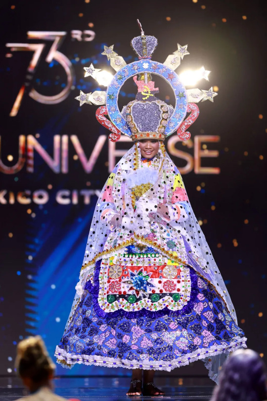
Miss Angola! Tone down the color palette a little, and this honestly could have worked for that year the Met Gala was Catholicism- themed.
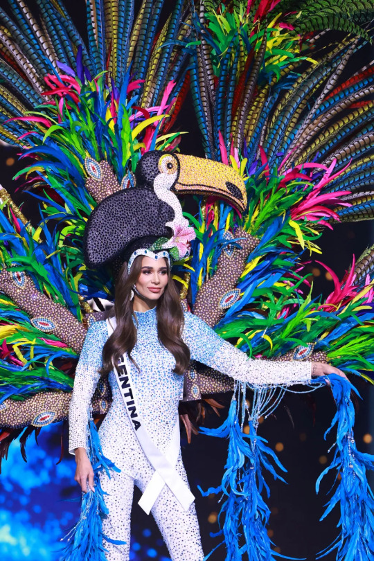
Miss Argentina, looking just thrilled about the sparkly toucan on her head. I feel like this is supposed to read as some combination of jungle/river/waterfall but this is from the part that I couldn't find on video.
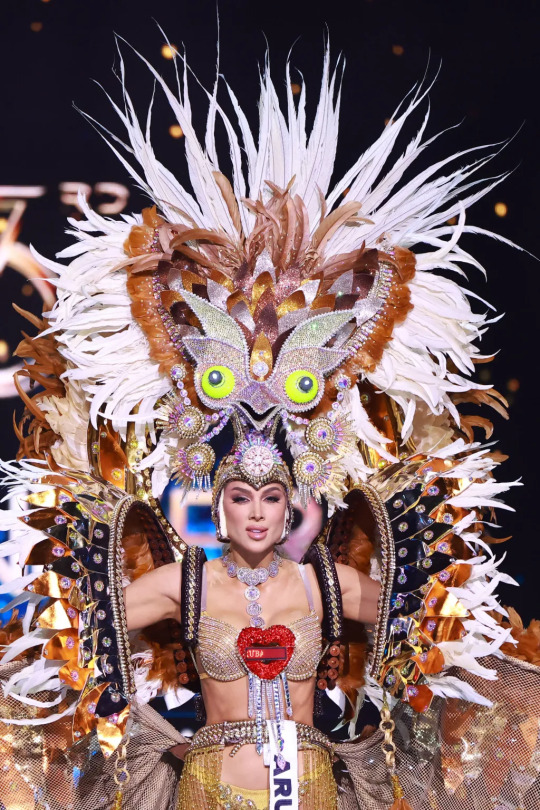
Miss Aruba, I don't know if your giant spangly bird headdress was supposed to look like a potoo, but I am choosing to believe that it's on purpose and I love that for you.
(okay I checked, it's an endangered Aruban burrowing owl. even better!)
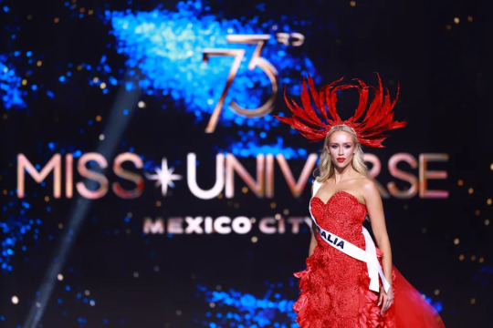
This is like the fourth year in a row Miss Australia has just worn a regular-ass gown. Do better!
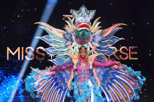
You know who's doing better? Miss Bahamas, is who. Look at that giant fish. I wish I had video of this, I bet it moves.
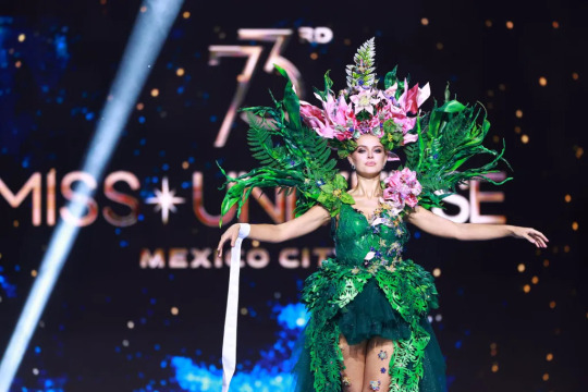
Ah yes, when I think of Belarus I definitely think 'verdant tropical foliage.' also is it just me or is does the bodice fit very weird.
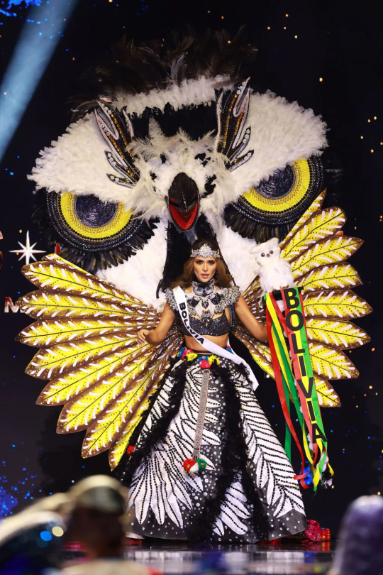
Holy shit, Miss Bolivia. This is where the video kicks in, so I can tell you that she somehow managed to dance in it. I'm a little afraid that this costume is going to eat Miss Aruba.

Miss Bonaire is from a Caribbean island that I don't think has ever competed in Miss Universe before? They have a national marine park that this costume is based on, which is is nice!

Miss Botswana's costume is made of leather and cowrie shells, and she is clearly having a great time being able to move freely without 75 pounds of headdress or platform heels. She did a very cute dance that kind of felt like a flex on her more heavily encumbered competitors.
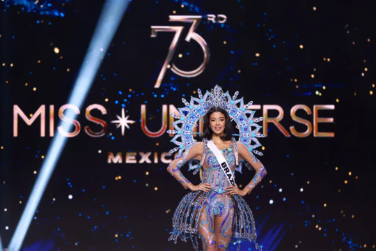
Miss Brazil is wearing a tribute to Brazil's mineral wealth, which is something that basically every country with a mine in it has done at some point. I like the pannier-esque things, I guess.
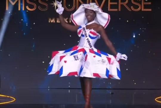
Love a Tribute To A Weirdly Specific Thing, and Miss British Virgin Islands' mail-themed costume is a wonderful example of such.
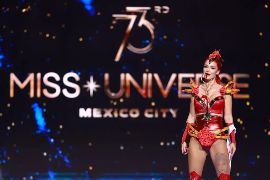
Miss Bulgaria showed up dressed as a supervillain, her outfit is vaguely themed around 'the strength of women' and she just spat out a MOUTHFUL of BLOOD? on stage??? No idea how to react to that, frankly.
I'm going to pause to get the next batch of images together, and also to recover from the 'spat out a mouthful of blood' thing, because I was NOT prepared for that.
3K notes
·
View notes
Text

So I heard there was some talk about Zen needing more of a happy ending in the obiyuki verses! Very well, challenge accepted! My friend @bubblesthemonsterartist and I sat down to fix precisely that! Anything for some world-building and character creation 😈
Here we go! Zen marrying a foreign queen! I agreed with Joanna that he would surely do really well as a prince-consort, as excitable and driven as he is! He’ll be the easygoing to her strict, the extrovert to her introvert, the blush to her smirk~ It would do him well to humble, but also be humbled.
More to come later, bc this impulse design of ours has already garnered some interest on the discord 😘
AnS (c) Akizuki Sorata
Art: More
#akagami no shirayukihime#ans#snow white with the red hair#zen wisteria#zen wistalia#zen x oc#original character#myart#sovereign queen of a southern nation#zen: omg this cape makes me look broad-shouldered yay#i tried to emulate sorata’s color restrictive style with their clothing#also to avoid zen disappearing#under layers and layers of bright patterns lol#like it was either this or doing an atri survives twist somewhere
69 notes
·
View notes
Note
Can you give me the simplest explaintion on how to make gifs. It’s literally 2022 and I’ve no clue lol
Hi! Hope you're doing great :) Hahah there's nothing wrong with that, I personally don't think learning to make gifs is something you'll regret being late for :D First off, I don’t think I can explain it simply, this is a complex process that requires constant practice. When I started making gifs again after 5 years, I realized that I actually knew nothing and I was never open to learning at that time. Now I’m constantly exploring every feature in Photoshop and reading blogger's tutorials on coloring and various other features to improve myself. I also will try to explain this process but if you want, you can check out this amazing tutorial made by one of my very dear mutual Nia <3
First you need to download Photoshop (I use CS5, I tried CS6 but not my type), you can buy it if you can, but here in my country, it's extremely expensive, so I downloaded it from t*rrent with a crack. Then you need to install MPV video player to take screencaps from videos (MPV is literally the best video player I’ve ever seen in my life when I started giffing again, like, it’s not just for giffing but other stuff as well ‘cause you can adjust it as you wish) Here’s a tutorial from this precious person I’ve never met (x) You download the first link (x) then you install it and you create a config folder (you can make as you wish but here’s mine x,) Also you can change jpeg to png if your pc doesn’t crash like mine :D

You need to download HQ videos if you want HQ gifs. I again use t*rrent to download videos, and after setting up and creating a folder for MPV player, you can start taking screencaps. As I said, screencaps are saved in a folder called “Stuff” in my PC, you can create a folder with a different name if you want but make sure to change it in config file too. After taking screencaps, open Photoshop and go to File > Script > Load Multiple DICOM Files.

I take multiple screencaps of multiple scenes and I create folders where I put these screencaps to put them in order. Here, there are lots of screencaps in my folders, I choose the folder with the scenes I want to gif and open it. By the way, Tumblr gif sizes are:

You select Window > Animations. Animation section pop up at the bottom. Now everything should look like this:


And then you should select all frames to change the speed of gifs.


After converting the frames below to timeline, select all layers on the right side and right click > Convert To Smart Object. Now everything should look like this:

Crop the gif from the edges and zoom in 100%. Select Filter > Sharpen > Smart Sharpen. These are basic sharpen settings that everyone uses. I also add Unsharp Mask before that, you have to practice these things to find out what’s best for you.

Also there’s something called Actions to make things much more easier and quicker. You record and save some steps when you’re making a gif and later you can just click it and it does everything for you, it’s literally God’s blessing. Select Window > Actions, and it should appear on the right side.

As you can see, I have various actions for various steps which saves me from 15 minutes. After that, we colour the gif.

For this gif > Brightness: 80 / Contrast: 10 > Levels: First box = 10 / Last box = 230 > Selective Colour: Reds = +15 -3 -5 +5 / Yellows = +5 0 -5 -5 / Blacks = 0 0 0 +5 > Brightness (again): +15 > Colour Balance (lastly): Midtones = -5 +3 +3
And yay, we’re done with this part! Now you select File > Save for Web Devices. (or Alt+Shift+Ctrl+S, so fun to do this) My settings and my gif looks like this.

You should select Adaptive always, and I personally love Pattern but you can also select Diffusion. (that’s what most people do to reduce MB size ‘cause it should be under 10 MB) But my work hasn’t finished yet. I open the gif again because Photoshop somehow changes the speed of gif from 0.05 to 0.07 so I should change it to 0.05 again. (I searched every single forum to find the answer but nothing) I do one more Save for Web Devices and yay I’m done!!! It’s complicated and tiring, isn’t it but once you figure it out, it’s so fun and easier <3 Here’s my gif:

Well, colouring looks like shit but this isn’t the case... That’s pretty much it, I really wanted to explain it simply but it’d be literally impossible :D If you have any questions, feel free to ask :) Have a good day.
23 notes
·
View notes
Note
If you don't mind answering, what's your gif making process/apps?
tumblr deleted my response the first time, but it’s under the cut!♡
i don’t mind at all, i use cs5! i have CC too, but i don’t like it so i don’t ever use it.
i think my process is what most people do, which is import video frames to layers, delete the layers i don’t want or need, convert for smart filters and timeline and then sharpen and color.
when it comes to sharpening, i know a lot of people prefer that kind of “smooth” 0 sharpening look, but i don’t, i like it to look really sharp and “defined,” so i use 2 unsharp masks at 40%, radius 1.0, threshold 0.


this is what it looks like before (top) and after (bottom) sharpening.
as for coloring... i’m probably not the best person to ask about that lol i use about 40 selective color layers and i don’t have any artistic sense, i just like bright and vibrant colors. i tend to focus more on aquas and pinks because i like those colors.
i will say though, i personally think gradient maps usually look good. on the above gifs (and most of my other ones) i use a pink to white gradient map at 60% soft light at the very top of all of my layers which really helps in brightening it.
sorry that i’m super unhelpful, i don’t really do anything special so i’m not sure what else to say😅
edit to add: i also don’t use pattern when saving. i think diffusion looks much better and cleaner, especially on anime gifs.
#💌#have you ever seen that post that's like ''my gif making process is trying not to have a meltdown'' that's how it is lol#i find mewkledreamy incredibly hard to color for some reason like every time i gif it it takes me hours to make it look even slightly good
16 notes
·
View notes
Note
hello i have fallen i love with your charlie fic (❤❤!!) and i want to ask if you could you write some angst where barnaby has a crush on mc and they're super oblivious and later they start dating someone else ans barnaby realizes he lost them?
My dearest anon, let me say: I AM SORRY. Writing your ask took me forever (literally, lol) even though I had it in my head the moment I got your asks all those months ago. But I never felt the right inspiration to actually write it down until today. Today it just hit me. I do hope you're actually still around and reading what I made out of it.
I'm really truly sorry. 😅
So, without further ado, I present to you:
Missed Chances
Barnaby Lee x Reader
Barnaby Lee wasn’t the smartest kid around.
He was by no means dumb, he just wasn’t as clever or booksmart as most of his peers, a fact he was well aware of. But it didn’t bother him that much, really. He had found his means of getting by during classes and ever since distancing himself from Merula Snyde back in their third year, he had been able to gather a circle of friends around him he could fall back upon.
There was popular Penny Haywood for Potions, shy but gifted Ben Copper for Charms, and ever so patient Rowan Khanna when he had troubles with Transfiguration.
Barnaby’s favourite study sessions, however, were those for Defense Against The Dark Arts. Not because he was particularly bad at the subject; on the contrary, he was a skilled duelist and most charms and jinxes came naturally to him. No, the real reason those lessons were his favourite was because it was you who was teaching him.
Ever since he’d been drawn into your close circle of friends, his above average DADA marks had been plummeting, since he kept getting distracted during class. The professors weren’t impressed but neither surprised at his apparent lack of academic skills and under normal circumstances, Barnaby would have tried everything in his power to prove them wrong, that he could do better, that he wasn’t as stupid as everyone made him out to be.
But when you offered your help in catching up on the subject, Barnaby had changed his mind. You were always top of your DADA class and what better way to spend some time alone with you while listening to your beautiful voice explaining the differences between a curse and a hex.
Barnaby knew most of the things you were telling him already, so he had ample time to just watch you talk during your study sessions. He knew no one else could get so excited over dark creatures and cursed objects like you did. The way your eyes were sparkling when lecturing him on the differences between a werewolf and regular wolf had him enthralled every single time and the proud smile you gave him when he answered one of your questions correctly never failed to make Barnaby’s heart beat hard in his chest.
He would have loved to see that smile more often, but he made sure to let his real knowledge of the subject shine through sparingly. He was afraid that if he got too good, you might want to drop studying with him and that was something he couldn’t risk; spending time with you had become the highlight of his day. No one he knew rivalled the warmth you radiated and the unbroken faith you had in him, a sentiment that was completely new to Barnaby.
When the big news of the Celestial Ball was announced, it was all his peers could talk about. What to wear, how to look and who to bring were the questions dominating all of the four common rooms.
Barnaby never had to think twice who he wanted to be his date for the dance. He thought about how to properly ask you out for days on end; you were no common girl after all. You were the most extraordinary girl he knew and thus deserved an extraordinary invitation. But when he finally plucked up the courage to ask you out, you looked at him sheepishly.
“That’s so sweet of you, Barney. I’m so flattered, really. But I already promised Rowan and Ben to go with them. You know, just as friends.”
His heart sank at the words. Why hadn’t he acted sooner? Maybe people were right about him being stupid after all.
Seeing his disheartened look, your face changed into something softer. “But I’m sure Rowan and Ben wouldn’t mind if you came along with us? As another friend?”
Barnaby beamed at her. “I’d love that. We’re going to have such a great time together, as friends,” he added, not quite sure whom he wanted to reassure, you or himself.
He would probably never forget the night of the Celestial Ball when he saw you in the dress André Egwu had designed for the first time. Rowan and Ben had arrived at the ball before you and when you stepped into the Great Hall all on your own, Barnaby’s breath stopped for a moment.
You were dressed in a beautiful, burgundy dress with intricate patterns embroidered around the neckline. Your waist was accentuated by a small belt and the skirt of your dress flowed around you in several layers of fabric. You looked like an ethereal being to him as you walked through the crowd over to him, Rowan and Ben, your skirt trailing slightly behind you.
His eyes didn’t leave you for the whole evening even for a second. He could hear you laughing when you danced with Rowan and Ben, the sound like silver bells to his ears. When he asked you for a dance with him, your hand just happened to fit perfectly into his and your bright smile made Barnaby forget everything else around you and him. He did take great care to not step on your dress, however. You looked so perfect, he didn’t want to ruin it with his own clumsiness; although he pretty much doubted anything could have taken away from your beauty.
When the Celestial Ball was over, Barnaby took the chance to walk you back to your common room. You had your arm linked with his and marched in step with him. As he was taller than you, it required some effort on your part, the strange walking rhythm making you giggle. The sound had Barnaby’s heart beat faster.
Barnaby was almost reluctant to let you go when you had reached the concealed entrance to your common room. He wasn’t quite sure what to do; all he wanted to do was put his arms around you, drawing you as close to him as possible and never letting go again. But he hesitated; what if you didn’t feel the same?
To gain some time, he cleared his throat. “I had a lot of fun tonight.”
“Me too,” you smiled at him. “I’m glad you came along. You just have the most fun with your friends, right?”
The word ‘friends’ put a damper on the butterflies that had been swarming in Barnaby’s stomach until this point.
“Yes, friends,” he echoed, “because we’re friends.”
A look of confusion crossed your face for a moment. “Are you alright?”
“Of course I am,” Barnaby lied quickly, glad that the flickering light of the torches hid the blush spreading on his cheeks. “Just exhausted from dancing, I guess.”
“Oh, alright. I’d better get to my common room then. Good night.”
There was a short, awkward pause, before you smiled at him, waved and vanished into your common room. Barnaby sighed; at least for night, he had definitely botched his chances.
Ever since the Celestial Ball and the anticlimax of its ending, Barnaby had made it his mission to convince you there was more to him than being your friend. He’d ventured into the library on his own and gathered together all books on romance he could find and read every single one of them. Most of them, especially the older ones, had given him quite some headaches, but he knew you enjoyed reading old love stories, so maybe they had some useful information to offer. How someone could spend their free time reading things like Jane Austen for fun, however, remained a mystery to him.
And apparently, the tips he had sourced weren’t that helpful either. Barnaby tried it all, he complimented you, he brought you flowers and small gifts that reminded him of you and tried connecting with you over things he knew you loved. Whenever he saw the chance to ask you out he tried. But as soon as he had gathered his courage, you had already promised one of your numerous friends to go with them instead. It was exasperating, really.
All the while, the study sessions with you continued. Barnaby had stopped pretending to be as oblivious as he made himself out to be in the beginning; he knew it was risky, in case you might want to drop studying with him if he got better, but he was too addicted to your smile at this point. No matter how hard his day had been, a smile from you and everything else was forgotten.
Barnaby wished you would finally notice just how much he adored you, but as long as he could spend time with you, listen to your voice and hear your laughter, everything was fine with him.
Until it was not.
He had noticed you were distracted lately and not as talkative as he was used to. Today’s Potions class was no exception. Professor Snape, who was even moodier than usual, was lecturing the class on the importance of knowing potion recipes by heart.
“You will not always carry a textbook with you,” he droned, “and while I wouldn’t trust half of you to brew a potion even with proper instructions, maybe some of you will be able to produce something remotely resembling a proper concoction by sheer luck. If I see one piece of parchment on the table, you will clean your classmates’ cauldrons after class. Begin.”
Dreading the next two hours of guessing which ingredients to use in what order, Barnaby glanced over to you. But you hadn’t been listening to the instructions, it seemed. Your attention was focused on a piece of parchment in front of you, hastily scribbled lines running across it. Barnaby tried catching a glimpse but when you noticed, you blushed deeply and quickly covered the parchment with your hand.
Barnaby, however, wasn’t the only one who had noticed the piece of parchment. Before you could do anything, Professor Snape had appeared next to you and snatched the parchment out of your grip.
“I thought I said no notes allowed, or didn’t I express myself clearly enough for your convenience?” he snarled.
“No, Professor, you misunderstand,” you gasped, “these aren’t Potions notes, it’s private. Can I please have it back?”
You reached for it, but Snape jerked his hand up so it was just out of reach. “That gives it even less reason to be present in my classroom,” he said coldly, a cruel smile stealing onto his face. “Let us share with the rest of the class what is distracting you from my lesson.”
Your cheeks were glowing bright red as Snape started reading the content of your note.
“Do you like me? Yes or No. Circle your answer,” he read out loud. “How droll,” he sneered over the chuckle of your classmates, “I suggest, next time you concentrate more on your potion and less on your silly personal bearings. Perhaps the result will be more decent then. 10 points from you and detention tonight.”
As he swept past your table, Barnaby noticed your hanging head. You had your hands clasped tightly together in your lap and seemed so small all of a sudden that he felt furious. Even though Snape was his head of house, he had no right whatsoever to embarrass you in front of everyone like that.
“Are you okay?” he asked you gently.
Not looking at him, you shook his head. “Why did he have to do that?” you whispered. “He could see I wasn’t taking notes. There was no need to read it out loud.”
“There wasn’t,” Barnaby agreed. He hesitated for a moment before reaching out and lightly placing his hand on your arm. “He’s just a big, old, mean bat. Everyone says so.”
You sniffed, a small smile already spreading on your face again. “That’s true. Thank you.” You covered his hand with yours and squeezed it lightly. The touch sent jolts of energy through Barnaby from where your hands connected. His skin was still tingling when you turned towards your cauldron again, breaking the contact.
“Who was your note for, anyway?” Barnaby asked, trying not to sound as if this wasn’t the question burning red hot on his mind.
You looked at him wide-eyed. “I can’t possibly tell you.”
“Why not? Do I know him?”
Blushing again, you could only nod before dropping your gaze.
“It’s someone I’ve been friends with for a while now, but I don’t know if he feels the same. I don’t want to ruin our friendship by making a stupid move.”
Barnaby held his breath. You couldn’t possibly be talking about him, could you?
“How could it ruin your friendship?” he asked. “If he’s your friend, he’s your friend and nothing can change that.”
He took a deep breath. “Maybe you should just tell him,” he said deliberately casually, “who knows, maybe that friend of yours has been feeling the same for some time now, too.”
You looked up at him in surprise. “You think so?”
Barnaby nodded in agreement. “Definitely. Just try your luck, maybe you’ll be surprised.”
After the class was over and you had parted ways for the rest of the day, Barnaby counted the minutes until the evening when you had agreed to meet for another study session before your detention. He was positively bouncing with energy ever since lunchtime. You had come over to him with a nervous smile on your lips to ask him to meet up with you later.
“Chances are, I’ll need to tell you something,” you had said with a shaky laugh before joining your other friends for lunch. Barnaby had swallowed the lump in his throat, trying to look unfazed, but his insides had been burning with impatience ever since.
That was why he had arrived earlier than usual at the library that evening. He picked all the books out you would be needing and stacked and restacked them several times at the table you were usually working on.
It felt like an eternity until you finally entered the library, each second dragging into an eternity of its own. Barnaby saw you first. You stood in the entrance to the grand room and all of a sudden the library seemed to be a little brighter just by you being there. You scanned the rows of bookshelves with your eyes and a wide smile appeared on your face as they fell on him, waiting for you between books and quills in your favourite spot.
You quickly bounded over to him, a spring in your step that was a stark contrast to the miserable mood you had been in this morning. Before Barnaby even had a chance to ask what made you so happy, you had flung your arms around his neck in a tight embrace.
On instinct, Barnaby put his arms around your waist and held you for a sweet moment that he wished would last forever. He could smell the flowery scent of your perfume and breathed it in deeply, trying to commit every last detail of how you felt in his arms to memory. He was sure you had to feel his heartbeat; how could you not with how hard it was hammering against his ribcage?
“He said yes, Barney! He really said yes!” you squealed, not caring one bit about Madam Pince’s indignant shush.
The sheer happiness coursing through his veins turned into ice that froze him from the inside in a matter of seconds. Confused, he loosened his hold on you and pushed you far enough away from him to look you in the face. The joy visible on it almost broke his heart.
“What?”
“My crush!” you beamed at him. “I followed your advice and asked him out, just now! And he said yes!” you repeated, hugging him again.
“You’re the first person I wanted to tell,” you said. Barnaby could feel your breath on the skin exposed by the open collar of his shirt. He hated himself for the shiver running down his spine.
“Why?” was all he managed to whisper in response.
“Because without you, I’d never have the courage to talk to him upfront. It’s all thanks to you that I have a date now. You’re really the best friend I could ask for.”
Every word you spoke was like a dagger pushed up to the hilt into his broken heart, every second he saw you smile at the prospect of going out with the boy you wanted to be with - the boy that wasn’t him - a twist of the blade until he felt like he couldn’t breathe anymore. His heart, that had beaten so wildly just moments before when he had held you in his arms, could have stopped beating right there and then; Barnaby doubted it would have felt much different to the consuming emptiness he felt at this very moment.
You were rambling on and on about where you wanted to take your date and what you would wear but Barnaby wasn’t listening. He didn’t even know who you were talking about; all he knew was that it wasn’t him and that thought was louder in his head than your words could ever be.
“What do you think of that?”
Barnaby realised you had come to the end of your explanations and expected an opinion from him. He forced himself to smile apologetically at you, when all he wanted to do was scream.
“Sorry, I didn’t quite catch that,” he croaked out.
Your brow creased. “Are you okay? You’re so pale all of a sudden.”
“I’m good,” Barnaby answered with a hoarse voice. He cleared his throat and started again. “I’m good, I just caught a cold, I think. I should go see Madam Pomfrey later.”
You made a sceptical sound and raised one eyebrow. “If you say so. So what do you think? Is Madam Puddyfoot’s Tea Shop a good idea or not?”
Barnaby had never heard of this tea shop before, but he’d go to Knockturn Alley for a date if it only was with you. “It doesn’t matter where you take him. He’s lucky he gets to go with someone like you in the first place.”
“That’s sweet of you to say.”
“I’m just happy you’re happy,” Barnaby said and even meant it, in a way. He just wished the source of your happiness was him and not somebody else.
You hugged him once again and he was glad that you couldn’t see the pained expression crossing his features for a moment. “You’re the best, Barney. I’m so glad to have you in my life.”
You let go and turned towards the table laden with books Barnaby had so carefully set up. “Shall we?”
He sat down with you and watched as you started taking out your notes on objects cursed with minor jinxes. Your eyes were sparkling even more than usual and even now, you were so beautiful to Barnaby it hurt.
With a sigh, he concentrated on what you had to say for a change. His time spent daydreaming about you was over for good now, so he might as well do what the two of you were here for and study.
No, Barnaby Lee wasn’t the smartest kid around.
But even he knew that when it came to you, he had missed too many chances.
#hphm#hogwarts mystery#harry potter hogwarts mystery#barnaby lee#anon ask#fun fact#this is exactly what happened in game for my mc lizzie#went to the celestial ball with barnaby#and ditched him afterwards#whoops#and for talbott of all people#because yknow#that old let us date the quidditch kids discussion#but we're not getting into that now
60 notes
·
View notes
Text
Big ramble about character design, especially in FFXIV.
One thing I love a lot in character design is visual storytelling. I think with FFXIV there’s a lot of room to just chase what we find exciting and do wish-fulfillment regardless of practicality or background, which is legit. But for me personally--I know I tend to think about individual personality/relationship with body and presentation, background culture/climate, present culture/climate, job, social class, body type/tradition surrounding body type, composition/color theory/silhouette, etc. Loads and loads of info basically.
It feels a little like I get to play Sherlock Holmes with presentation, where I’m trying to discover and communicate as much as possible. One layer I learned growing up in terms of fashion is that you basically need to acknowledge the body shape that exists, then add additional elements or shapes through hair/clothing/makeup according to what you want to emphasize or de-emphasize. For example, if elezen have broad shoulders, long necks, and small heads--I’m going to want hair styles that frame the face and add volume so that the head doesn’t look small and does look balanced. I’m also going going to want to avoid anything that makes the shoulders look broader because that will make the head look small (unless I want a disproportionate effect), and ideally will want clothing that focuses on vertical visual focus over horizontal--face-neck-torso-legs rather than shoulder-to-shoulder. If I want an hourglass shape, that means more volume at the hips for legwear. If I want a dorito, that means less volume at the hips. For femroes, I know it’s broad shoulders/larger chests and muscular builds. If the desired shape is an hourglass, emphasize the narrowest point in terms of cinching--likely under the bust. Low cut top is better and will elongate the neck/de-emphasize shoulders and bust compositionally, while a high collar risks making the bust and shoulders look wider. Some exceptions apply--the ruffles and collars of certain outfits (ex. high house justaucorps and most sky pirate gear) are designed in such a way that still creates vertical as opposed to horizontal eye direction, and so still works. The songbird top’s cut creates horizontal direction emphasizing shoulders though, so bust and shoulders look wider.
All techniques mentioned are ultimately tools to communicate. If you want to create a broader impression with emphasis on muscles and bulk, you can do that. If you want a character to look like they are uncomfortable with their body or hiding in their clothes, there are options for that too. Although final fantasy as a series gives a hell of a lot of wiggle room, I do think it’s slightly less important whether a design is fashionable when OCs are concerned than that it communicates information about the character effectively. On color palettes and weather, we as players can do funny stuff like running around Coerthas in cherry pink bikinis lol. But if the goal is to create specific impressions of character, background, or relationship to the environment--that takes a bit of thought. Besides color theory stuff (how you use color families or complements for eye direction) and playing with patterns/textures, it makes a difference whether your character goes bright or muted in their palette so far as impression goes. Is this someone who is commanding attention or sinking into the shadows? Are they loud or quiet, sheltered or weathered? And the style of clothing also reflects this--does this person look nautical in a way that would indicate involvement at Limsa Lominsa? Are they wearing leathers, furs, feathers, and beads that scream Black Shroud? List goes on, and it’s worthwhile to pay attention not only to what NPCs in the area wear but what cultures that shaped the region might include. And then there’s like... ‘is this a character who moves a lot or is more stationary’ type questions, which can also inform choices depending. Idk like this is just me geeking, but basically I think design and fashion are their own types of storytelling/communication. I think the whole process of creating an impression of who a character is/what personality and origin they have before they’ve said a word is completely exciting!
3 notes
·
View notes