#ui guide
Explore tagged Tumblr posts
Text
did someone say update?

This was the last step on the Update everything because SugarCube broke everything with the last update tour: the templates. As of today, all the templates are now compatible with SugarCube 2.37.3 (passage code + APIs!).
The changes also include some fixes in the explanations, as well as reformatting the interface (a bit). The whole log of all the edits can be found by clicking on the link below:
The older versions of these templates (2.36 compatible) have been archived on my GitHub. And as of today, any new template created for SugarCube will only be available for 2.37 (too many changes).
If you liked a/some template/s, consider sharing the following posts:
User Interface Template:
Simple Book
One Page (à-la-Chapbook)
Space/Tech Double Whammy
VN-lite RPG
Title Page
Code Template:
Settings
Character creator (+ Guide/Tips)
Also, don't forget to change the IFID when using a template!
#template#coding in twine#sugarcube#twine#ui#manonamora#templates#free asset#coding in Twine#interactive fiction#guide#character creator#title page#menu#code#tweego#coding support#help#javascript#css#pls share with other peeps#you never know who might need it#reblog
44 notes
·
View notes
Text
Joined the UX Reddit community and already engaged in discussions about conversation rate formulas and quarrels about off-putting weird as shit details in Spotify's interface + shadows on buttons lol.
I've officially gone so nerdy :-) this is 30 so far
#Yet the UX field is so comfortingly tangible and concrete and clear to me. It keeps me focused and down to earth#I think this is what draws me in most about it on the level of execution#I am so creative but only when guided and molded a little. I think UX/UI is the perfect sweet spot for that#It keeps me grounded and also creative#personal#I have a passion and it's buttons and interactive design elements lol
12 notes
·
View notes
Text
youtube
Is your website accessible? (Beginners Guide)
Making your website as accessible as possible is not just a legal or ethical requirement, it’s also a practical concern—allowing everyone to benefit from your content. Here are four areas to review.
#beginners guide#ui ux design#ui design#youtube#ux and ui design#web design#education#free education#How to Design Accessible UX#web accessibility#ui design inspiration#ux design process#ux research#ux designer#ux ui design#breaking barriers#accessibility#accessibleliving#accessible design#accessibility for all#website accessible#app developers#Youtube
4 notes
·
View notes
Text
great news! 2% of my current research project has been completed
it took me a total of six hours and at least six of those hours were spent fiddling with the insanely stupid and not-user-friendly-in-the-slightest user interface
I did not get mad at all. I did not yell at a wall. I had a great time ^-^
#it's one of those ''college that lends you a professor to guide you to do a research project'' programs#(no but seriously though Illustrator has the worst UI in the world)
2 notes
·
View notes
Text
Why is UX Design deemed necessary?
In our modern-day, technologically advanced society, competition grows fiercer as user demands evolve endlessly – amidst this environment, UX design takes on unprecedented significance.
increase user satisfaction
drive business success
save company's time and money
achieve their goals more effectively
coherent brand experience
strengthens brand identification
interesting experiences
Get in detail info about UI/UX design in Guide to UX design.
4 notes
·
View notes
Text
It's gonna be really bad if I get hooked into arena like I'm going to become a whole new breed of weird guy posting
#twist rambles#^ in the way of my habit of being like wow this character is so cool looking (they are like 30 pixels at most)#i have slept a few hours and being in the VERY last home stretch of the guide has made me really excited for it... did u guys know there are#2 kha/jit replacement mods that replace them with Garfield... i will be getting one of them altho i dont think ill play one bc man they look#so bad in arena... prob hi elf or lizard guy as i AM a little Argo lover... but hi elf seems to be a rly good race esp 4 the first 2 games#but itll be bad im sorry i think playing only ps1 games lately has done shit to me bc minus the kinda clunky ui... the first 2 games dont#look that bad... btw doing all of this bc i was so scared of playing morrow/wind (played Sky/rim first#so i figured if i start w the most difficult/biggest/hardest games itll seem like nothing by the time i get there. but yeah very excited for#it when im free of editing the guide and like... everything else w it... I'm excited to get it all modded tomorrow bc theres barely any mods#so it's not as overwhelming as DF is mod wise like... looking at mod recs for that game is terrifying. but anyways yeah:) if i do commit to#the bit im sorry. also tags extra censored so i dont get random ppl liking a personal post like last time lol
3 notes
·
View notes
Text
damn no one told me the Skywind team dropped a vid today? smh I was counting on yall /j
#im just happy to see the compass in skywind and i hope they dont axe the guide markers cus i struggle telling areas apart#and have the directional memory of a rock#my blind ass needs the hand holding#the skyrim compass specifically i dont rlly like MWs ui all too much***
7 notes
·
View notes
Text


Literal game of Spot the Differences
and I hate it so much
#neri.txt#good thing i rb'd that one post yesterday that had guide on how to get the old ui back#since staff are cowards who refuse to accept they've made a bad decision
4 notes
·
View notes
Text
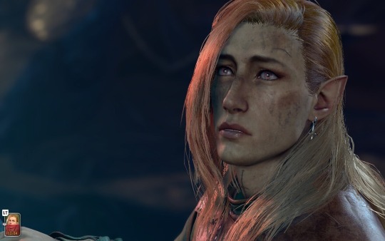
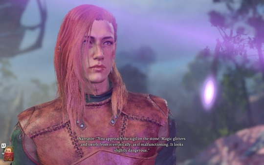
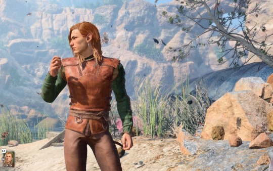
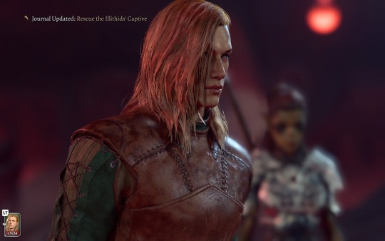
i’ve been staring at them for five hours now 👁️👁️
bonus screenshot of my guardian! the only one i got before rushing to get my steamdeck to the charger r i p
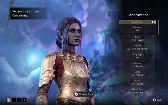
#baldur's gate 3#bg3#fuck it why not throw this in the tags so you may all be blessed by my tav’s beautiful cunty little face#i did literally get to the five hour mark while playing yesterday lmao so i mean…. i’m not lying 👀#and i’ve been staring at them all day today just WAITING until i get to go back home and play hrrngh#even though i am SO so insanely bad at it#i think i have a decent grasp on the UI after watching a guide but i am just so bad at the actual combat of it all#and that’s on explorer difficulty too!!#it’s a sad life to live when you need to see the video game man but you are so so bad at it#ah well we will persevere for my girl here and for GALE!! fucking loving gale so far#twirling my hair and batting my lashes at this loser wizard man 💕#okay i’ll stop rambling i just have THOUGHTS i must free….#oc#limited edition post
2 notes
·
View notes
Text
click/tap the blank space of the header around their icon & url, it takes you to the og post/that specific reblog
not joking I would kind of like to brutally murder whoever thought it was a good idea to take away clicking on a person’s name to see their reblog and make it borderline impossible to get to the original version of a post without spending ten minutes scrolling with ctrl f
67K notes
·
View notes
Text
The update Space UI is here!! I forgot to press Save Page yesterday...

Hello person of the internet,
It is me again, your totally legit supplier of very good assets {100% GOOD!!! NO BUGS!!!}. I am back with another template for you! This whole affair is still scam free and no bug included! Download another funky folder to make your projects even more greater! A simple template, still in exchange for nothing {YES, THIS IS STILL 100% FREE!!!} but your love and adoration for my help. What a steal!
I PRESENT TO YOU THE...
Space/Tech UI Template!
Not just one, but TWO different sci-fi interfaces, with mobile compatibility, and optional stats bars. Perfect for space settings or more tech-inspired stories! Includes basic settings and annotated passages and sections!

Itch.io Announcement - GitHub Repo - Rate on Itch.io This template is free-to-use under the CC-BY license.
If you are looking for the 2.36 version of this template, it is archived on GitHub.
#template#coding in twine#sugarcube#twine#ui#manonamora#templates#free asset#coding in Twine#interactive fiction#guide#character creator#title page#menu#code#tweego#coding support#help#javascript#css#pls share with other peeps#you never know who might need it#reblog
39 notes
·
View notes
Text
Google Ads UI: From Overwhelm to Expert in 10 Minutes
Lost in the Google Ads interface? Don’t worry, we’ve got the ultimate guide to navigating this beast like a pro! 🚀 #GoogleAds #DigitalMarketing #PPCMastery
Stepping into the Google Ads User Interface (UI) for the first time can feel like walking into a room full of buttons, charts, and tabs that all scream for your attention. But fear not! By the end of this guide, you’ll navigate Google Ads like a seasoned pro. Whether you’re setting up campaigns for e-commerce, local services, or even a plant-selling business, the UI is your toolbox to…
#digital marketing tools#Google Ads beginner tutorial#Google Ads for plant businesses#Google Ads UI overview#Google Ads user interface guide#how to navigate Google Ads#PPC campaign management
0 notes
Text
⭐ So you want to learn pixel art? ⭐
🔹 Part 1 of ??? - The Basics!
Edit: Now available in Google Doc format if you don't have a Tumblr account 🥰
Hello, my name is Tofu and I'm a professional pixel artist. I have been supporting myself with freelance pixel art since 2020, when I was let go from my job during the pandemic.


My progress, from 2017 to 2024. IMO the only thing that really matters is time and effort, not some kind of natural talent for art.
This guide will not be comprehensive, as nobody should be expected to read allat. Instead I will lean heavily on my own experience, and share what worked for me, so take everything with a grain of salt. This is a guide, not a tutorial. Cheers!
🔹 Do I need money?
NO!!! Pixel art is one of the most accessible mediums out there.
I still use a mouse because I prefer it to a tablet! You won't be at any disadvantage here if you can't afford the best hardware or software.
Because our canvases are typically very small, you don't need a good PC to run a good brush engine or anything like that.
✨Did you know? One of the most skilled and beloved pixel artists uses MS PAINT! Wow!!
🔹 What software should I use?
Here are some of the most popular programs I see my friends and peers using. Stars show how much I recommend the software for beginners! ⭐
💰 Paid options:
⭐⭐⭐ Aseprite (for PC) - $19.99
This is what I and many other pixel artists use. You may find when applying to jobs that they require some knowledge of Aseprite. Since it has become so popular, companies like that you can swap raw files between artists.
Aseprite is amazingly customizable, with custom skins, scripts and extensions on Itch.io, both free and paid.
If you have ever used any art software before, it has most of the same features and should feel fairly familiar to use. It features a robust animation suite and a tilemap feature, which have saved me thousands of hours of labour in my work. The software is also being updated all the time, and the developers listen to the users. I really recommend Aseprite!
⭐ Photoshop (for PC) - Monthly $$
A decent option for those who already are used to the PS interface. Requires some setup to get it ready for pixel-perfect art, but there are plenty of tutorials for doing so.
Animation is also much more tedious on PS which you may want to consider before investing time!
⭐⭐ ProMotion NG (for PC) - $19.00
An advanced and powerful software which has many features Aseprite does not, including Colour Cycling and animated tiles.
⭐⭐⭐ Pixquare (for iOS) - $7.99 - $19.99 (30% off with code 'tofu'!!)
Probably the best app available for iPad users, in active development, with new features added all the time.

Look! My buddy Jon recommends it highly, and uses it often.
One cool thing about Pixquare is that it takes Aseprite raw files! Many of my friends use it to work on the same project, both in their office and on the go.
⭐ Procreate (for iOS) - $12.99
If you have access to Procreate already, it's a decent option to get used to doing pixel art. It does however require some setup. Artist Pixebo is famously using Procreate, and they have tutorials of their own if you want to learn.
⭐⭐ ReSprite iOS and Android. (free trial, but:) $19.99 premium or $$ monthly
ReSprite is VERY similar in terms of UI to Aseprite, so I can recommend it. They just launched their Android release!
🆓 Free options:
⭐⭐⭐ Libresprite (for PC)
Libresprite is an alternative to Aseprite. It is very, very similar, to the point where documentation for Aseprite will be helpful to Libresprite users.
⭐⭐ Pixilart (for PC and mobile)
A free in-browser app, and also a mobile app! It is tied to the website Pixilart, where artists upload and share their work. A good option for those also looking to get involved in a community.
⭐⭐ Dotpict (for mobile)
Dotpict is similar to Pixilart, with a mobile app tied to a website, but it's a Japanese service. Did you know that in Japanese, pixel art is called 'Dot Art'? Dotpict can be a great way to connect with a different community of pixel artists! They also have prompts and challenges often.
🔹 So I got my software, now what?
◽Nice! Now it's time for the basics of pixel art.
❗ WAIT ❗ Before this section, I want to add a little disclaimer. All of these rules/guidelines can be broken at will, and some 'no-nos' can look amazing when done intentionally.
The pixel-art fundamentals can be exceedingly helpful to new artists, who may feel lost or overwhelmed by choice. But if you feel they restrict you too harshly, don't force yourself! At the end of the day it's your art, and you shouldn't try to contort yourself into what people think a pixel artist 'should be'. What matters is your own artistic expression. 💕👍
◽Phew! With that out of the way...
🔸"The Rules"
There are few hard 'rules' of pixel art, mostly about scaling and exporting. Some of these things will frequently trip up newbies if they aren't aware, and are easy to overlook.
🔹Scaling method
There are a couple ways of scaling your art. The default in most art programs, and the entire internet, is Bi-linear scaling, which usually works out fine for most purposes. But as pixel artists, we need a different method.


Both are scaled up x10. See the difference?
On the left is scaled using Bilinear, and on the right is using Nearest-Neighbor. We love seeing those pixels stay crisp and clean, so we use nearest-neighbor.
(Most pixel-art programs have nearest-neighbor enabled by default! So this may not apply to you, but it's important to know.)
🔹Mixels
Mixels are when there are different (mixed) pixel sizes in the same image.


Here I have scaled up my art- the left is 200%, and the right is 150%. Yuck!
As we can see, the "pixel" sizes end up different. We generally try to scale our work by multiples of 100 - 200%, 300% etc. rather than 150%. At larger scales however, the minute differences in pixel sizes are hardly noticeable!
Mixels are also sometimes seen when an artist scales up their work, then continues drawing on it with a 1 pixel brush.

Many would say that this is not great looking! This type of pixels can be indicative of a beginner artist. But there are plenty of creative pixel artists out there who mixels intentionally, making something modern and cool.
🔹Saving Your Files
We usually save our still images as .PNGs as they don’t create any JPEG artifacts or loss of quality. It's a little hard to see here, but there are some artifacts, and it looks a little blurry. It also makes the art very hard to work with if we are importing a JPEG.

For animations .GIF is good, but be careful of the 256 colour limit. Try to avoid using too many blending mode layers or gradients when working with animations. If you aren’t careful, your animation could flash afterwards, as the .GIF tries to reduce colours wherever it can. It doesn’t look great!

Here's an old piece from 2021 where I experienced .GIF lossiness, because I used gradients and transparency, resulting in way too many colours.
🔹Pixel Art Fundamentals - Techniques and Jargon
❗❗Confused about Jaggies? Anti-Aliasing? Banding? Dithering? THIS THREAD is for you❗❗ << it's a link, click it!!
As far as I'm concerned, this is THE tutorial of all time for understanding pixel art. These are techniques created and named by the community of people who actually put the list together, some of the best pixel artists alive currently. Please read it!!
🔸How To Learn
Okay, so you have your software, and you're all ready to start. But maybe you need some more guidance? Try these tutorials and resources! It can be helpful to work along with a tutorial until you build your confidence up.
⭐⭐ Pixel Logic (A Digital Book) - $10 A very comprehensive visual guide book by a very skilled and established artist in the industry. I own a copy myself.
⭐⭐⭐ StudioMiniBoss - free A collection of visual tutorials, by the artist that worked on Celeste! When starting out, if I got stuck, I would go and scour his tutorials and see how he did it.
⭐ Lospec Tutorials - free A very large collection of various tutorials from all over the internet. There is a lot to sift through here if you have the time.
⭐⭐⭐ Cyangmou's Tutorials - free (tipping optional) Cyangmou is one of the most respected and accomplished modern pixel artists, and he has amassed a HUGE collection of free and incredibly well-educated visual tutorials. He also hosts an educational stream every week on Twitch called 'pixelart for beginners'.
⭐⭐⭐ Youtube Tutorials - free There are hundreds, if not thousands of tutorials on YouTube, but it can be tricky to find the good ones. My personal recommendations are MortMort, Brandon, and AdamCYounis- these guys really know what they're talking about!
🔸 How to choose a canvas size
When looking at pixel art turorials, we may see people suggest things like 16x16, 32x32 and 64x64. These are standard sizes for pixel art games with tiles. However, if you're just making a drawing, you don't necessarily need to use a standard canvas size like that.
What I like to think about when choosing a canvas size for my illustrations is 'what features do I think it is important to represent?' And make my canvas as small as possible, while still leaving room for my most important elements.
Imagine I have characters in a scene like this:
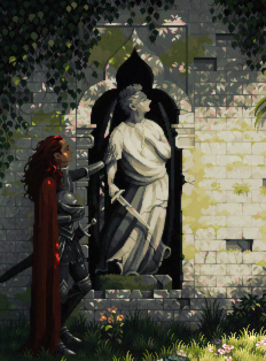
I made my canvas as small as possible (232 x 314), but just big enough to represent the features and have them be recognizable (it's Good Omens fanart 😤)!! If I had made it any bigger, I would be working on it for ever, due to how much more foliage I would have to render.
If you want to do an illustration and you're not sure, just start at somewhere around 100x100 - 200x200 and go from there.
It's perfectly okay to crop your canvas, or scale it up, or crunch your art down at any point if you think you need a different size. I do it all the time! It only takes a bit of cleanup to get you back to where you were.
🔸Where To Post
Outside of just regular socials, Twitter, Tumblr, Deviantart, Instagram etc, there are a few places that lean more towards pixel art that you might not have heard of.
⭐ Lospec Lospec is a low-res focused art website. Some pieces get given a 'monthly masterpiece' award. Not incredibly active, but I believe there are more features being added often.
⭐⭐ Pixilart Pixilart is a very popular pixel art community, with an app tied to it. The community tends to lean on the young side, so this is a low-pressure place to post with an relaxed vibe.
⭐⭐ Pixeljoint Pixeljoint is one of the big, old-school pixel art websites. You can only upload your art unscaled (1x) because there is a built-in zoom viewer. It has a bit of a reputation for being elitist (back in the 00s it was), but in my experience it's not like that any more. This is a fine place for a pixel artist to post if they are really interested in learning, and the history. The Hall of Fame has some of the most famous / impressive pixel art pieces that paved the way for the work we are doing today.
⭐⭐⭐ Cafe Dot Cafe Dot is my art server so I'm a little biased here. 🍵 It was created during the recent social media turbulence. We wanted a place to post art with no algorithms, and no NFT or AI chuds. We have a heavy no-self-promotion rule, and are more interested in community than skill or exclusivity. The other thing is that we have some kind of verification system- you must apply to be a Creator before you can post in the Art feed, or use voice. This helps combat the people who just want to self-promo and dip, or cause trouble, as well as weed out AI/NFT people. Until then, you are still welcome to post in any of the threads or channels. There is a lot to do in Cafe Dot. I host events weekly, so check the threads!
⭐⭐/r/pixelart The pixel art subreddit is pretty active! I've also heard some of my friends found work through posting here, so it's worth a try if you're looking. However, it is still Reddit- so if you're sensitive to rude people, or criticism you didn't ask for, you may want to avoid this one. Lol
🔸 Where To Find Work
You need money? I got you! As someone who mostly gets scouted on social media, I can share a few tips with you:
Put your email / portfolio in your bio Recruiters don't have all that much time to find artists, make it as easy as possible for someone to find your important information!
Clean up your profile If your profile feed is all full of memes, most people will just tab out rather than sift through. Doesn't apply as much to Tumblr if you have an art tag people can look at.
Post regularly, and repost Activity beats everything in the social media game. It's like rolling the dice, and the more you post the more chances you have. You have to have no shame, it's all business baby
Outside of just posting regularly and hoping people reach out to you, it can be hard to know where to look. Here are a few places you can sign up to and post around on.
/r/INAT INAT (I Need A Team) is a subreddit for finding a team to work with. You can post your portfolio here, or browse for people who need artists.
/r/GameDevClassifieds Same as above, but specifically for game-related projects.
Remote Game Jobs / Work With Indies Like Indeed but for game jobs. Browse them often, or get email notifications.
VGen VGen is a website specifically for commissions. You need a code from another verified artist before you can upgrade your account and sell, so ask around on social media or ask your friends. Once your account is upgraded, you can make a 'menu' of services people can purchase, and they send you an offer which you are able to accept, decline, or counter.
The evil websites of doom: Fiverr and Upwork I don't recommend them!! They take a big cut of your profit, and the sites are teeming with NFT and AI people hoping to make a quick buck. The site is also extremely oversaturated and competitive, resulting in a race to the bottom (the cheapest, the fastest, doing the most for the least). Imagine the kind of clients who go to these websites, looking for the cheapest option. But if you're really desperate...
🔸 Community
I do really recommend getting involved in a community. Finding like-minded friends can help you stay motivated to keep drawing. One day, those friends you met when you were just starting out may become your peers in the industry. Making friends is a game changer!
Discord servers Nowadays, the forums of old are mostly abandoned, and people split off into many different servers. Cafe Dot, Pixel Art Discord (PAD), and if you can stomach scrolling past all the AI slop, you can browse Discord servers here.
Twitch Streams Twitch has kind of a bad reputation for being home to some of the more edgy gamers online, but the pixel art community is extremely welcoming and inclusive. Some of the people I met on Twitch are my friends to this day, and we've even worked together on different projects! Browse pixel art streams here, or follow some I recommend: NickWoz, JDZombi, CupOhJoe, GrayLure, LumpyTouch, FrankiePixelShow, MortMort, Sodor, NateyCakes, NyuraKim, ShinySeabass, I could go on for ever really... There are a lot of good eggs on Pixel Art Twitch.
🔸 Other Helpful Websites
Palettes Lospec has a huge collection of user-made palettes, for any artist who has trouble choosing their colours, or just wants to try something fun. Rejected Palettes is full of palettes that didn't quite make it onto Lospec, ran by people who believe there are no bad colours.
The Spriters Resource TSR is an incredible website where users can upload spritesheets and tilesets from games. You can browse for your favourite childhood game, and see how they made it! This website has helped me so much in understanding how game assets come together in a scene.
VGMaps Similar to the above, except there are entire maps laid out how they would be played. This is incredible if you have to do level design, or for mocking up a scene for fun.
Game UI Database Not pixel-art specific, but UI is a very challenging part of graphics, so this site can be a game-changer for finding good references!
Retronator A digital newspaper for pixel-art lovers! New game releases, tutorials, and artworks!
Itch.io A website where people can upload, games, assets, tools... An amazing hub for game devs and game fans alike. A few of my favourite tools: Tiled, PICO-8, Pixel Composer, Juice FX, Magic Pencil for Aseprite
🔸 The End?
This is just part 1 for now, so please drop me a follow to see any more guides I release in the future. I plan on doing some writeups on how I choose colours, how to practise, and more!
I'm not an expert by any means, but everything I did to get to where I am is outlined in this guide. Pixel art is my passion, my job and my hobby! I want pixel art to be recognized everywhere as an art-form, a medium of its own outside of game-art or computer graphics!

This guide took me a long time, and took a lot of research and experience. Consider following me or supporting me if you are feeling generous.
And good luck to all the fledgling pixel artists, I hope you'll continue and have fun. I hope my guide helped you, and don't hesitate to send me an ask if you have any questions! 💕
My other tutorials (so far): How to draw Simple Grass for a game Hue Shifting
27K notes
·
View notes
Text
+40 sites de freelance para UI/UX designers
Olá, pessoal!
Todo profissional freelancer sabe que existem tempos de fartura, e outros de seca quando se trata de demanda de serviços.
Mas, pensando em aumentar as chances de encontrar bons trabalhos a todo tempo, criei essa lista reunindo os principais sites de contratação para freelancers nas áreas de design gráfico, UI / UX design, desenvolvimento de sites e apps, entre outros serviços da área de tecnologia.
Vale lembrar que a maioria destes sites está disponível somente na língua inglesa, mas as vagas são de várias partes do globo. Portanto, você tem a oportunidade de trabalhar literalmente para o mundo todo!
Agora, sigamos com a lista.
Os principais:
https://www.facebook.com/
https://www.instagram.com/
https://www.linkedin.com/
https://www.workana.com/pt
https://www.coursera.org/
https://br.pinterest.com/
https://www.behance.net/
Os demais
https://www.peopleperhour.com/
https://dribbble.com/
https://www.designcrowd.com/
https://www.fiverr.com
https://workinestonia.com/job/
https://www.toptal.com/
https://www.codeable.io/
https://wpmudev.com/
https://www.freelancer.com/
https://www.upwork.com/
https://hired.com/
https://wpriders.com/
https://jobs.wordpress.net/
https://career.proxify.io/
https://webflow.com
https://freelancer.com.br
https://www.twine.net/
https://www.nuvemshop.com.br
https://www.designerhire.com/ui
https://www.crossover.com/
https://ddiy.co/
https://99designs.com.br/
https://www.valuecoders.com
https://upstack.com/
https://arc.dev/
https://www.guru.com/
https://www.truelancer.com/
https://decemberlabs.com/
https://uxstudioteam.com/bizleader-career
https://weworkremotely.com/
https://uxhires.com/
https://www.flexjobs.com
https://solidgigs.com/
https://www.simplyhired.com/
https://wellfound.com/
https://www.yunojuno.com/
Em breve farei um artigo com dicas para encontrar os melhores trabalhos enquanto preserva sua segurança online.
Boa sorte a todos ;)
publicado por: Bruna Vendramini
#marketing#guide#lists#freelance#freelancing#brasil#são paulo#oportunidades#sucesso#dinheiro#collage#art#digital art#painting#aesthetic#brazil#ui ux design#uidesign#ux research#jobseekers#jobsearch#jobs#remotejobs
0 notes


