#ugly ugly
Explore tagged Tumblr posts
Text
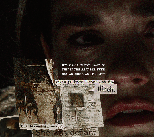
you're not disposable, callie. private callie adams foster of freeform's good trouble. you're not worthless. # undispose

2 notes
·
View notes
Text
throwing out my weekly hate for sukuna on dash
#im gonna dislocate all his shoulders#i could beat him in a fight#so fast#30 seconds or less#just two punches#🥊🥊#bap bap#thats all i need to knock him out#ugly ugly#the unknown talks
10 notes
·
View notes
Text
That noriko tox picture is a crime against humanity and mutantdom. What the fuck is going with her boobs in there. Omg.
5 notes
·
View notes
Text
Should I write on the stinky, ugly boring boring boring report on conservation ethology or should I write a fic I've had in the back of my mind for days?
#stinky#ugly ugly#booooring!!#fanfic time fanfic time#You will find me writing about the baobab tree in like 5 minutes
2 notes
·
View notes
Text


the wildest derek dieworkwear series of events so far and that’s saying something
45K notes
·
View notes
Text


36K notes
·
View notes
Text

31K notes
·
View notes
Text

The bride and the ugly ass groom
#art#my art#horse#pony#equine#equine art#fanart#artist on tumblr#mlp#mlp art#princess cadance#cadance#mlp cadance#shining armor#mlp fim#mlp fanart#mlp g4#my little pony fanart#my little pony#The bride and the ugly ass groom
57K notes
·
View notes
Text
Poor little guy. So sad, so pitiful.
Forced to go run errands while it's raining and windy.
Poor little puffball who was nearly swept away by the wind.
He sits in the stores having flashbacks to the war he fought with the wind on the way here

#dog#king the pathetic#chihuahua#ugly dog#dogs#long haired chihuahua#dogblr#dog blog#dog clothes#id in alt
17K notes
·
View notes
Text

win for traumatised individuals! local eldritch horror is here to rip it all out free of charge
#i’m begging youse stop liking the bedtime sketch version it is ugly bugly#hear me out the more jon uses the eye the green external eyes begin perment scarring#also he starts losing his eyesight the more reliant on the eye he becomes#hello please let me into the tma fandom#digital art#the magnus archive fanart#jonathan sims fanart#jonathan sims#digital painting#digital illustration#the magnus archives#artist on tumblr
12K notes
·
View notes
Text


Uncle Gojo!!
#I’m doing great guys!! /lying#He should get to watch his students thrive!! He should get to hold their ugly babies!! He should be present and a bother!! 🥹🥹🥹#my art#bluebeesart#jujutsu kaisen#jjk#satoru gojo#yuta okkotsu#maki zenin
9K notes
·
View notes
Text
we've found it folks: mcmansion heaven
Hello everyone. It is my pleasure to bring you the greatest house I have ever seen. The house of a true visionary. A real ad-hocist. A genuine pioneer of fenestration. This house is in Alabama. It was built in 1980 and costs around $5 million. It is worth every penny. Perhaps more.
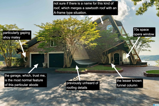
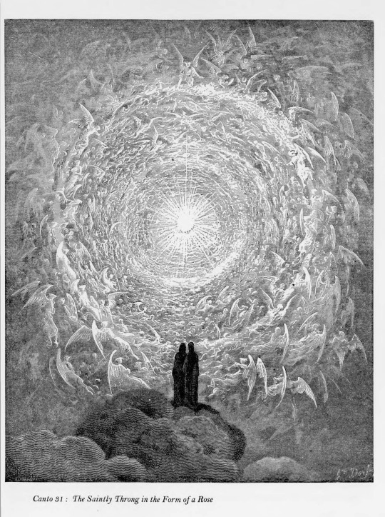
Now, I know what you're thinking: "Come on, Kate, that's a little kooky, but certainly it's not McMansion Heaven. This is very much a house in the earthly realm. Purgatory. McMansion Purgatory." Well, let me now play Beatrice to your Dante, young Pilgrim. Welcome. Welcome, welcome, welcome.
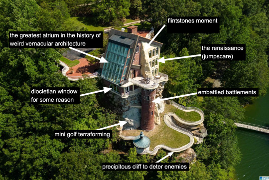
It is rare to find a house that has everything. A house that wills itself into Postmodernism yet remains unable to let go of the kookiest moments of the prior zeitgeist, the Bruce Goffs and Earthships, the commune houses built from car windshields, the seventies moments of psychedelic hippie fracture. It is everything. It has everything. It is theme park, it is High Tech. It is Renaissance (in the San Antonio Riverwalk sense of the word.) It is medieval. It is maybe the greatest pastiche to sucker itself to the side of a mountain, perilously overlooking a large body of water. Look at it. Just look.
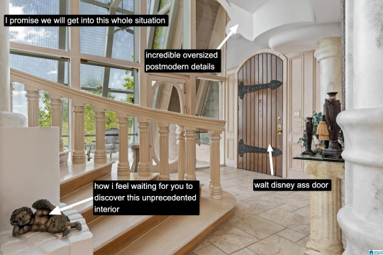
The inside is white. This makes it dreamlike, almost benevolent. It is bright because this is McMansion Heaven and Gray is for McMansion Hell. There is an overbearing sheen of 80s optimism. In this house, the credit default swap has not yet been invented, but could be.
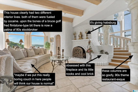
It takes a lot for me to drop the cocaine word because I think it's a cheap joke. But there's something about this example that makes it plausible, not in a derogatory way, but in a liberatory one, a sensuous one. Someone created this house to have a particular experience, a particular feeling. It possesses an element of true fantasy, the thematic. Its rooms are not meant to be one cohesive composition, but rather a series of scenes, of vastly different spatial moments, compressed, expanded, bright, close.
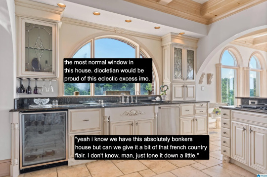
And then there's this kitchen for some reason. Or so you think. Everything the interior design tries to hide, namely how unceasingly peculiar the house is, it is not entirely able to because the choices made here remain decadent, indulgent, albeit in a more familiar way.

Rare is it to discover an interior wherein one truly must wear sunglasses. The environment created in service to transparency has to somewhat prevent the elements from penetrating too deep while retaining their desirable qualities. I don't think an architect designed this house. An architect would have had access to specifically engineered products for this purpose. Whoever built this house had certain access to architectural catalogues but not those used in the highest end or most structurally complex projects. The customization here lies in the assemblage of materials and in doing so stretches them to the height of their imaginative capacity. To borrow from Charles Jencks, ad-hoc is a perfect description. It is an architecture of availability and of adventure.
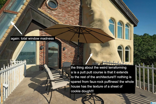
A small interlude. We are outside. There is no rear exterior view of this house because it would be impossible to get one from the scrawny lawn that lies at its depths. This space is intended to serve the same purpose, which is to look upon the house itself as much as gaze from the house to the world beyond.
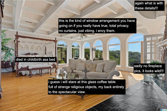
Living in a city, I often think about exhibitionism. Living in a city is inherently exhibitionist. A house is a permeable visible surface; it is entirely possible that someone will catch a glimpse of me they're not supposed to when I rush to the living room in only a t-shirt to turn out the light before bed. But this is a space that is only exhibitionist in the sense that it is an architecture of exposure, and yet this exposure would not be possible without the protection of the site, of the distance from every other pair of eyes. In this respect, a double freedom is secured. The window intimates the potential of seeing. But no one sees.
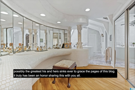
At the heart of this house lies a strange mix of concepts. Postmodern classicist columns of the Disney World set. The unpolished edge of the vernacular. There is also an organicist bent to the whole thing, something more Goff than Gaudí, and here we see some of the house's most organic forms, the monolith- or shell-like vanity mixed with the luminous artifice of mirrors and white. A backlit cave, primitive and performative at the same time, which is, in essence, the dialectic of the luxury bathroom.
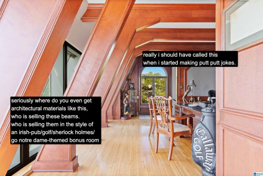
And yet our McMansion Heaven is still a McMansion. It is still an accumulation of deliberate signifiers of wealth, very much a construction with the secondary purpose of invoking envy, a palatial residence designed without much cohesion. The presence of golf, of wood, of masculine and patriarchal symbolism with an undercurrent of luxury drives that point home. The McMansion can aspire to an art form, but there are still many levels to ascend before one gets to where God's sitting.
If you like this post and want more like it, support McMansion Hell on Patreon for as little as $1/month for access to great bonus content including a discord server, extra posts, and livestreams.
Not into recurring payments? Try the tip jar! Student loans just started back up!
42K notes
·
View notes
Text
My favorite thing about “the bride and the ugly ass groom” tweet is that it is very indicative of their real relationship.
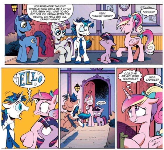
#the bride and the ugly ass groom#mlp#mlp fim#mi amore cadenza#princess cadance#shining armor#read the IDW comics I beg of you
32K notes
·
View notes
Text

#disco elysium#disco posting#harry du bois#harrier du bois#i can fix him#yassification of Harry du bois#no more ugly protagonists
12K notes
·
View notes
Text

The ugly ass bride and groom
#art#sketch#drawing#fan art#fanart#my little pony#the bride and the ugly ass groom#unicorn#mlp art#mlp
40K notes
·
View notes