#tutorial on the replies!!
Explore tagged Tumblr posts
Visit Tumblr Blog
Explore Tumblr blogs with no restrictions, modern design and the best experience.
Last Seen Tumblr Blogs


Fun Fact
Tumblr was attacked by a cross-site scripting worm deployed by the Internet troll group GNAA on Dec 3, 2012.
Text
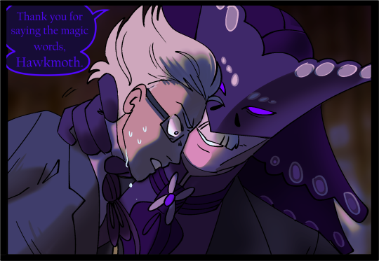
quick romantic shoot with xav 🥹 my mc is a two-timer but that’s okay, sylus isn’t looking gahahaha
#tutorial on the replies!!#on how to do this#in case you’re figuring it out#i have so many ones with sylus drafted :))#i’ll try raf and zayne’s next too!#l&ds: gallery#l&ds xavier
106 notes
·
View notes
Note
Hi! Can I ask how you did the double exposure gifs for your merlin set? They're beautiful btw!
heyy, thank you!! of course!
it's actually not very hard, the trick is to find the right shots for this. here's how i did it (reference gifset), under the cut.

for this tutorial i will be: — using photoshop cs5 on windows — assuming you know how to make gifs using the timeline — have basic coloring, sharpening, groups, and layer masks knowledge
I. CHOOSING THE RIGHT SHOTS
the ultimate trick to pull this off is to choose the right image. in order to do the double exposure, you need a silhouette shot that has these:
a defined and dark silhouette with a background that is not too busy
enough contrast between the silhouette and the background
the silhouette should take at least 50% of the space
not too much movement
here are a few examples of why they work and why they won't:
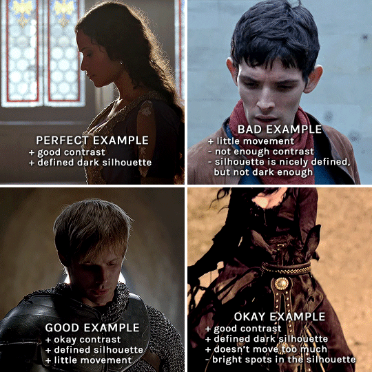
gwen: perfect example since this shot is already quite contrasted with a defined silhouette. there won't be a lot of work needed to make this one work.
merlin: not a great example because even tho there's a somewhat good contrast between him and the background, the silhouette is just too bright, not dark enough.
arthur: another good example, even if there are some bright spots on his face and armor. since he's not moving too much, you can definitely brush some black over him to make his silhouette darker (i'll explain/show later)
morgana: this one could work because the contrast is great, but of course her skintone is very bright against the black clothing. that being said, since the movement is not too bad, it could be possible to brush some black over her and move these layers with keyframes (as mentioned for arthur's example). i haven't tried it tho, but i think it would work well enough.
once you have your silhouette shot, you need another gif for the double exposure. what works best, in my opinion, are:
wide, large shots
shots with no to little camera movement (no pan, zoom, etc), but the subjects in the shot can have little movement of course
pretty cinematography/scenery shots
i find these are easier to find and make it work, it's not as "precise" as with silhouette shots. it's mostly just trial and error to see what works best with the silhouettes.
II. PREPPING THE SILHOUETTE
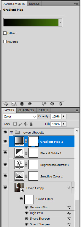
for the effect to work, we want a silhouette that's dark as possible. i'm gonna use the gwen and arthur shots as examples.
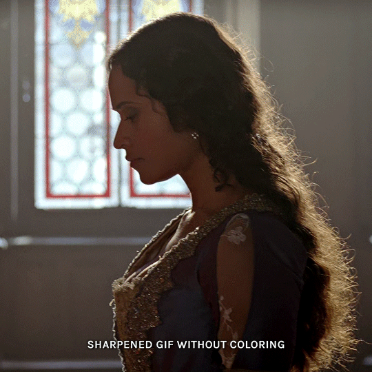
for the gwen gif, i started by sharpening, and then upped the contrast by quite a lot so her silhouette is mostly black, while retaining some nice details. i've used only 3 layers here:

selective color layer: in the blacks tab, playing with the black slider (value: +10)
brightness/contrast layer: added a lot of contrast (+61) and a bit of brightness (+10)
black and white layer: on top, its blending mode set to soft light and at 20% opacity. gives a bit more depth and contrast

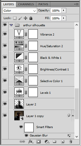
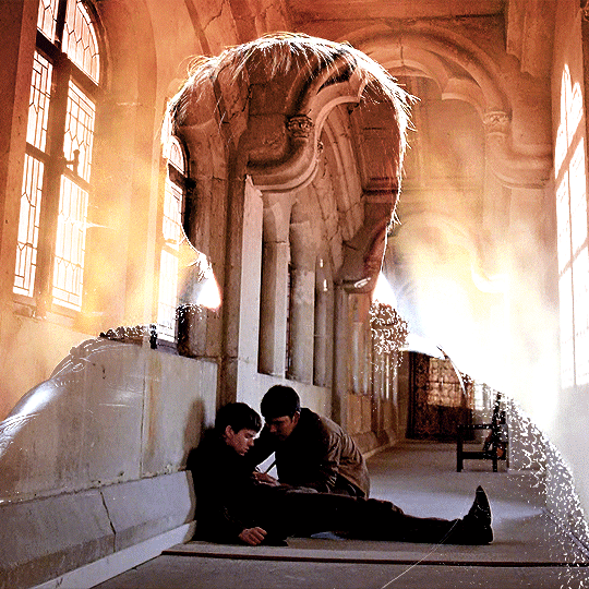
then for the arthur example, i've also sharpened it first, and added contrast layers in this order (the skintone looks horrible, but it won't matter soon lol):
levels layer: black slider at 0, grey slider at 0.76, white slider at 104
selective color layer: in the blacks tab, black slider at +10
brightness/contrast layer: brightness at +1-, contrast at +47
black and white layer: on top, its blending mode set to soft light and at 20% opacity. gives a bit more depth and contrast
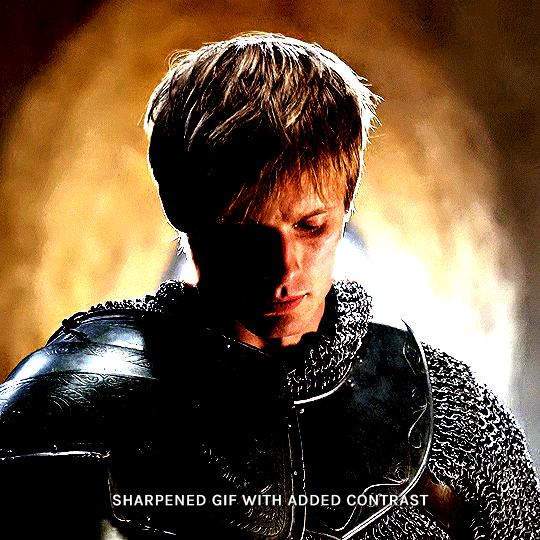
as you can see, half of his face is still quite bright. to correct that, create a new empty layer and put it between the gif and the coloring layers.
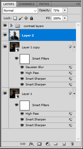
using a really soft brush and the black color, brush some black over his face and body on that new empty layer. you can edit the layer's opacity if you want, i've set mine to 71%. since arthur doesn't move much here, there's no need to keyframe this layer's position. for the morgana example, this is where you'd need to play with keyframes to make it work. here's where i'm at now after this:
you can always edit this layer later if you need, after doing the double exposure blending.
once the silhouette is all ready, you can put all layers in a group and rename it (i've renamed mine silhouette).
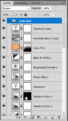
III. BLENDING
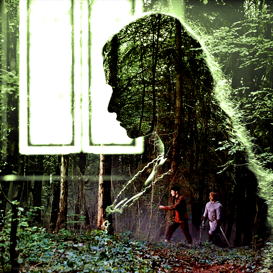
now the fun part! import the wide/scenery shot in photoshop, then resize it to the same height of your silhouette gif. make sure the gif is a smart object layer, and sharpen it. finally, bring this gif onto the silhouette canvas (by right clicking the smart object > duplicate layer). once you have both gifs onto your canvas, put the wide shot gif layer in a group, and set this group's blending option to screen.

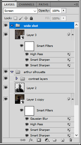
you can then position the wide/scenery gif the way you like it in the canvas. this is how it looks for both examples after i've done that:

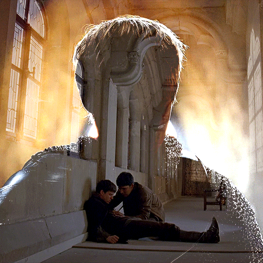
if the blending mode screen doesn't give you the best result, so you can play around with other blending modes (such as lighten and linear dodge in these particular cases), but generally speaking, screen is the real mvp here haha.
IV. COLORING
now that the double exposure effect is done, we need to color the gifs to bring them together. i went with simple coloring here, simply enhancing the colors that were already there. just make sure that the coloring layers for each gif are in their respective groups. here's how i've colored both examples:
gwen silhouette group: i added a gradient map layer on top of the contrast layers in black to green and set the blending mode to color
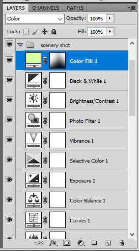
scenery shot group: multiple coloring layers, with a green color fill layer (blending mode set to color), with a layer mask so it only affects the top half of the gif
for the arthur gif, i did something very similar but with warmer colors. i didn't use a gradient map for arthur though:
arthur silhouette group: i made the yellow warmer, closer to orange/red, with a hue/saturation layer, and added more vibrance. didn't feel like it needed a gradient map layer here though.
wide shot group: basic coloring layers to enhance colors from the merlin & daegal shot, and an orange color fill layer set to the color blending mode.
at this point you're pretty much done. just need to add some final touches and typography (if you want).
V. FINAL TOUCHES
a small and completely optional detail, but i wanted to soften the edges of the wide gifs. to do so i've duplicated the smart object gif layer and removed the sharpening filters (right click on smart filter > clear smart filters). put this layer on top of the other smart object layers (but still below the coloring).
then with this same layer still selected, go to filter > blur > gaussian blur... > 10px. this will give you a very blurry gif, but we only want the edges of the canvas to be softer. so add a layer mask to this layer. with a very large and soft brush (mine was at 0% hardness and about 800px size), brush some black onto the layer mask to remove the blur in the middle of the gif.

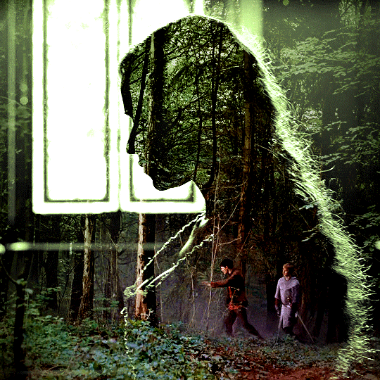
you can play with this layer's opacity or gaussian blur amount if you want (by double clicking on the gaussian blur smart layer filter). here how both examples look with this gaussian blur layer:
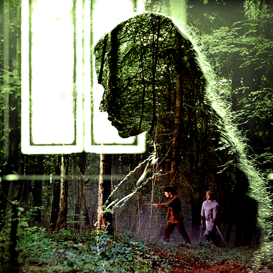

you can also mask some of wide/scenery gifs if you'd prefer, so it shows less outside of the silhouette. just put a layer mask on that whole wide shot group and brush some black or grey on the layer mask. it's what i did for the gwen gif, with a very soft brush and i set the mask density to 72% (i kept the arthur one as is tho):

and that's how i did it! hopefully that was clear enough :)
#alie replies#*ps help#resource#tutorial#allresources#*gfx#usercats#usersmia#userrobin#userfaiths#usertina#usermoonchild#userchibi#uservivaldi#usertreena#userraffa#userriel#userelio#usermadita#usersmblmn
1K notes
·
View notes
Note
Hi there! I was wondering if you would mind explaining how you do this, please? I'd love to try it! "Adoption: Adopted children have combined genetics of two townies who are chosen at random to act as the ‘biological parents’" Thank you in advance!

Hello lovely! No problem, sorry for the delay but here's a tutorial :) ⬇️
For anyone curious, anon is referring to my 'gameplay rules' page for this ask!
Important Note: Since I installed LazyDuchess's Random Sim Fixes this method isn't really an essential for me anymore, as pudding face is no longer an issue (which was my main reason for doing this in the first place) - however, making a note of an adopted sim's bio parents can still be quite a fun way to enhance your gameplay, as you can create storylines where they meet their bio parents later in life etc. So I do still prefer it over adopted sims just spawning in w. no previous family relations lol
To get started, you’re going to need Nraas Master Controller to follow this (here’s a tutorial for how to install mods if you’re new to TS3)
Adopt the new addition to the family as you normally would - this sim can be any age or gender

Once the adopted child arrives on your lot, click on them, bring up the NRAAS menu, then follow this string:
Nraas -> MasterController -> Advanced -> Play with Genetics
This is now going to bring up a big menu where you're selecting the parents for the sim - you can select from any sim in town by choosing '(Test Full Family)', however I like to use townies because they usually have no other relations - if you're selecting from the whole town I still recommend filtering by age using the 'Type of Sim (and)' menu detailed below:
You can choose one of the other options, or to only bring up a list of townies, choose:
Type of sim (and) -> 'Homeless Non Service'
This is going to bring up a huge list of townies, I literally just close my eyes and scroll my mouse around a bit to pick one 'randomly' but you could also use a random number generator or something similar if you wanted to!
You're then going to be brought to a little screen where it shows the two chosen parents & your adopted sim - just like if you were creating a child of two parents in CAS
Randomize the genetics however many times you wish to get the outcome you want
It's worth noting that altering the 'age' of the sim on this menu has no affect on them in-game, so if you want you can randomize the genetics w. the sim as a young adult to see what they're going to look like when they get older
When you're happy, press the 'tick' button to accept the changes
It might take a second in-game to load up the changes, but your adopted sim should now have the genetics of the two townies you'd chosen!
The only thing it won't change is the hair colour - so make sure you make a note of what the hair colour you want for them is and change it in CAS
I'd recommend making a note of the parents somewhere, so if you do want to incorporate them into your story at a later date you can do so
I hope this was helpful, if you have any other questions feel free to send me another ask / comment and I'll try and help! :)
115 notes
·
View notes
Text
@mxbuster replied to your post “Being a part time alterations tailor may be a very...”:
Omg you are amazing. If you ever want to do a tutorial…….
Sorry for the delay, I put the photos in a folder on my desktop and immediately forgot they existed.
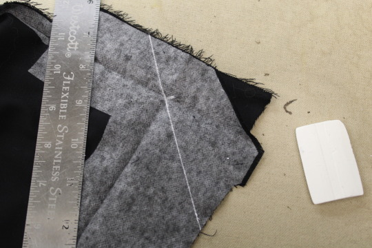
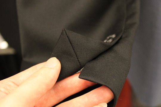
Alrighty, here is how I shorten modern jacket sleeves.
First I should note that:
I work for a suit store that doesn't take very many outside alterations, meaning almost everything I alter is from the same few brands and I'm used to a specific construction. Other jackets from other brands may have different construction, but it shouldn't be too wildly different.
All the jackets I work on have false buttonholes, or none at all. If you've got one with functional buttonholes (statistically unlikely, but not impossible) you're kind of screwed, unless you need to shorten it by so much they'll all be turned to the inside.
The amount you need to shorten it by should already be marked on the sleeve, or you should have a measurement written down. The salesmen leave a little chalk line for me.
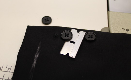
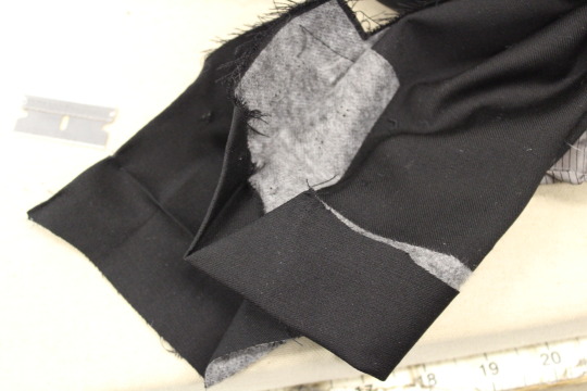
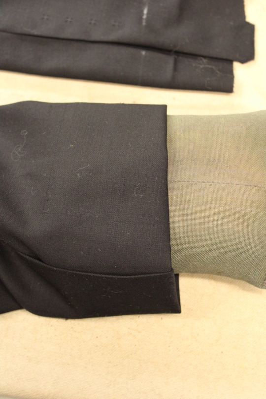
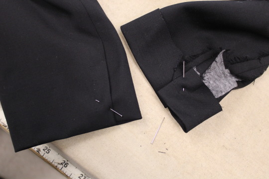
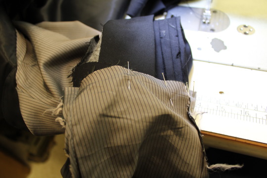
Start by cutting the buttons off. (Both this shop and my previous job use razor blades for this kind of thing, so I can only assume it's common in the professional tailoring world.)
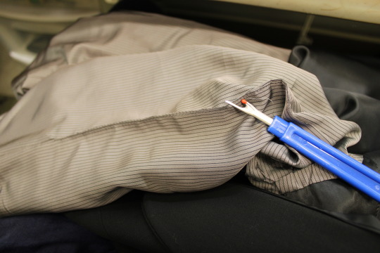
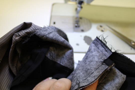
Then turn the sleeve inside out. There will probably be a section on the lining seam where the 2 edges have been topstitched closed. Carefully pick this out with a seam ripper on both sleeves. If it doesn't have this, just open a section of the seam, but not too close to the end of the sleeve.
Often the sleeve lining will be tacked to the outer sleeve's seam allowance in a few places, and you can cut these if they're in the way.
Now you can easily pull out the threads that were holding the buttons on, and can remove the false buttonholes if there are any.
Most of the buttonholes on the jackets I do at work are chain stitch, which means they're easy to pull out quickly once you get one end loose and can un-chain them, but some of them aren't and take a lot longer. I especially hate the ones on the sport coats that have a little contrasting bar tack at the end, those ones are the WORST and take forever to pick off.
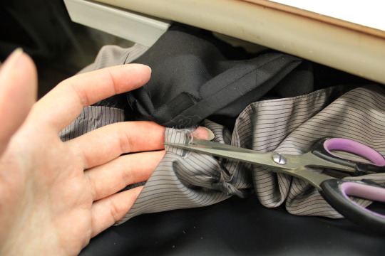
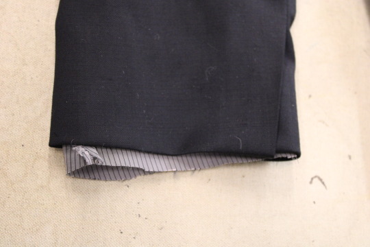
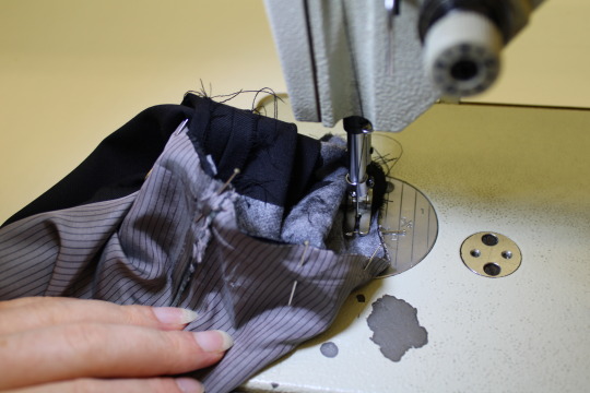
There's a seam holding the ends of the lining and outer fabric together. Cut it off.
On jackets with a particularly loose fabric there may be a bit of blindstitching around here holding the end up, same as there is inside a dress pants hem, and you should remove this first. It's big and loopy on the inside and you can find the end and pull on it to make it come apart, just like the string on a potato bag.
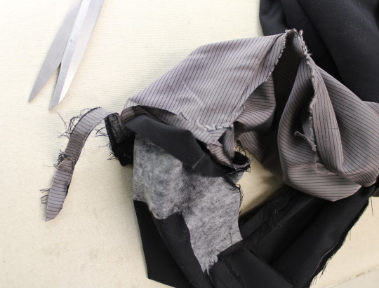
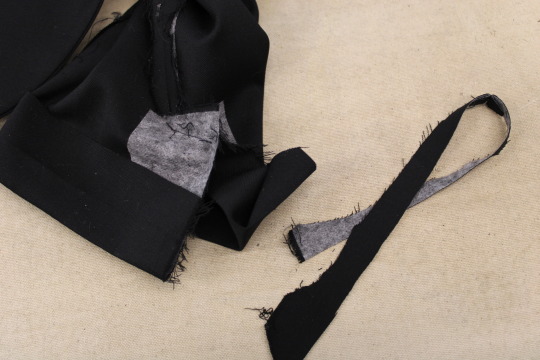
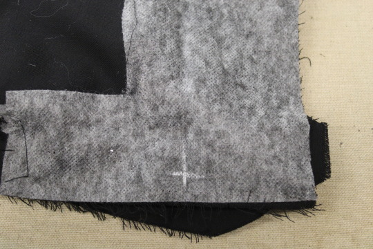
There's probably also a bit where the edge of the jacket sleeve is stuck in place with a bit of fusible tape, so pull that apart. Cut through the threads where the seam allowance is sewn to itself, and pick apart the seams that form the corners of the vent.
(I use the razor blade for this too, by pulling the 2 halves of the seam in opposite directions and cutting the threads in between, but you'll probably want to use a seam ripper.) Don't cut the top part of the seam on the vent though, that bit where the seam allowance juts out to provide extra material for the overlap should still be sewn shut, as you can see at the top of the photo below.
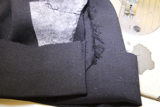
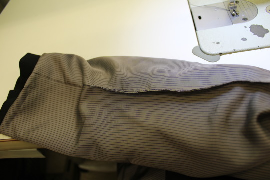
Turn the sleeve back right side out and mark the new line all the way around. At work I mainly use wax chalk which disappears as soon as you iron it, but regular chalk works too, it'll just take a bit more work to brush it all off after.
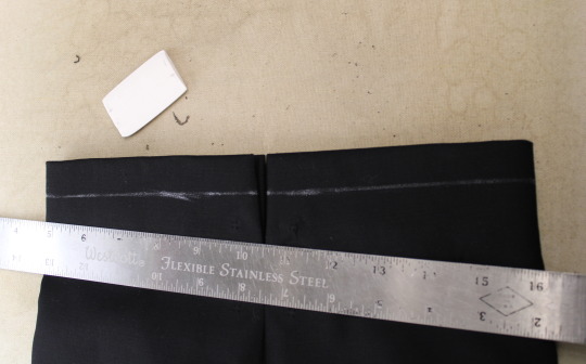
Press out all the creases from the old seams at the corners. (I have to be careful not to get steam on my wax lines, or else they'll disappear.)
Now press the end of the sleeve in and make the new crease. Sometimes I press out the old crease first, if it's far enough away from the marked line, but sometimes not.
I like to press both layers of sleeve at once in the middle, avoiding squishing the sides, and then I press each of those side bits using this little dense pillow thingy we have at work. It's kind of like a tailor's ham but small. You could easily make one and fill it with scraps, it's a useful thing to have. Make sure the overlap & underlap are facing the correct way.
I then straighten out the sleeve and see how the lining length looks. The end of the lining is usually quite wrinkled, so I press it first.
Here the lining is barely protruding, so I didn't trim anything off, but if there's more than about 1.5 cm sticking out past the sleeve then I'll trim that excess off.
Turning the sleeve back inside out, trim any excess off the folded up bit. I try to keep this bit about 4.5 cm wide, so this one just needed a little bit removed.
At this point you may want to add a bit more fusible interfacing to the button area, but it usually goes pretty far up, so I only do this if I'm shortening the sleeve by a LOT. (And if I'm shortening it by that much then there probably isn't enough overlap left to redo the vent.)
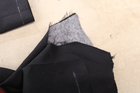
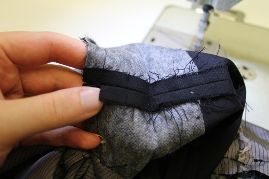
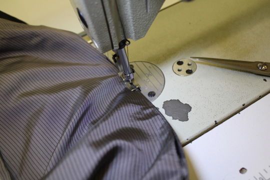
Now there should be creases showing where the new vent corners will be. On the underlap side I mark a little + right where I'll start sewing there.
And on the overlap side (the one with the mitred corner) I mark a diagonal x and then draw a line over the whole corner with a ruler, like so.
That is NOT your stitching line!!
This corner isn't perfectly square, it's a slightly wider angle. So when I fold that corner right sides together and match up the lines I start sewing from the tip of that marked line at the fold, but I veer off at a slight angle (in the direction of the seam allowance) and end about 4 mm out from it.
It's not very clear in the below picture, but you can hopefully see it.
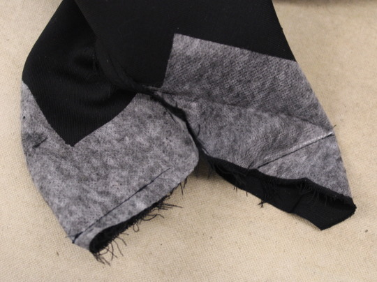
Flip those 2 corners right side out, turn the whole sleeve right side out again, and press those corners nice and flat. I use the little sleeve pillow for this too.
Then you can pin the overlap shut just the way you want it to sit, turn it inside out again, and carefully re-pin it so the pin is on the inside, before removing the first pin.
(I actually skip this step and just pin it from the inside and go straight to the rest of the sewing up, and then press the corners after the lining is closed up, but I've done hundreds of these at this point so you'll probably want to do it this way.)
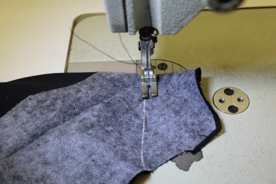
Sew the two halves of the vent together so that it'll stay closed. Just a tiny spot of backstitching on the seam allowances, like so.
Now you can match up the ends of the lining and outer sleeve and reattach them. I always start with the seam opposite the vent, since the vent side doesn't line up precisely.
I put them together like this, right side to right side, and pull those ends out through that opening in the lining before pinning it closed.
Then sew it, starting and finishing on either side of the vent.
There will likely be a small gap between the ends of the seam, since the vent is in the way, but this doesn't matter.
On the non vent side, clip into one of the seam allowances right below the seam.
Fold that seam allowance right sides together, keeping the rest of the sleeve out of the way, and sew it to itself. This is the same bit of stitching you removed earlier in the process, and it helps to keep the end of the sleeve from sagging.
If the seam allowances are too small or frayed you can also just turn it back right sides out and stick a bit of fusible tape in there.
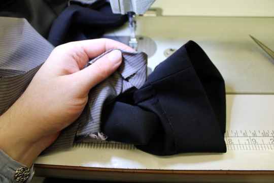
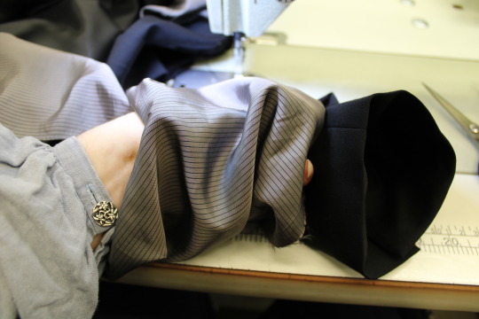
Stuff everything back so that it's right sides out but the sleeve itself is still inside out, and redo that topstitching on the linings. (Or do it for the first time if there wasn't any. You may want to press the lining first if you don't have two nice creased edges.)
If this is your own personal nice jacket you might prefer to slipstitch it closed by hand, or to instead machine sew it closed from the inside and hand sew the lining back to the end of the sleeve, but I'm obviously not going to do that for my very low paying alterations job.
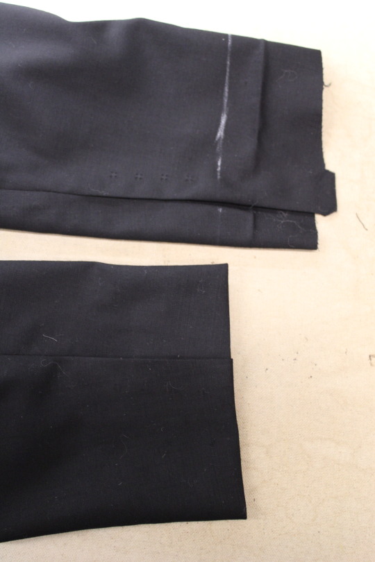
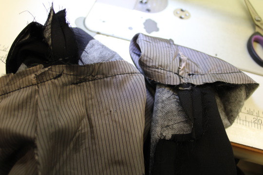
Turn the sleeve right sides out, sew the buttons back on, and you're done!
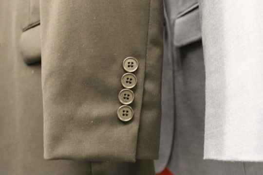
Nice mitred corner and all!
The first time I did this it took me over 2 hours because I didn't know what I was doing, but 5 years later I've got it down to about 45 minutes.
If the sleeve needs to be shortened by so much that there isn't enough overlap material left to redo the vent, then I just sew it shut and fold the whole thing up. I have to add new interfacing behind the buttons, as mentioned. For this I also need to turn it back right side out before I close up the lining, so I can stick the not-vent-anymore area to itself with some fusible tape.
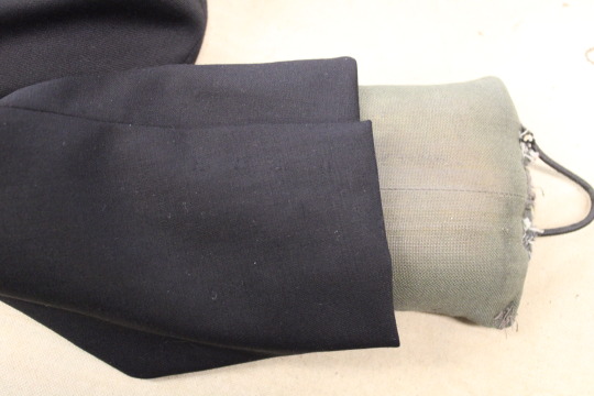
Sometimes I have to lengthen sleeves, and for that the process is fairly similar, except of course I have to carefully unpick the seam at the end of the sleeve instead of cutting it off, and I sew an extra strip of fabric to the end. (I keep a box of cut off ends from some of the pants I've hemmed for this.)
For that you also need to use fusible tape for both seam ends, because when you've added an extra bit on you can't sew the seam allowance to itself. The amount you can lengthen a sleeve by is limited, since you need to make sure the new piece of material is entirely folded to the inside and out of view.
I hope this helps and makes sense!
222 notes
·
View notes
Note
would you be willing to share your process with drawing curly hair? as someone with curls myself i struggle super hard with it and its frustrating when i want to see my hair type and tighter curls in my art and i cant make em look good 😭 i admire the way you do it sooo much
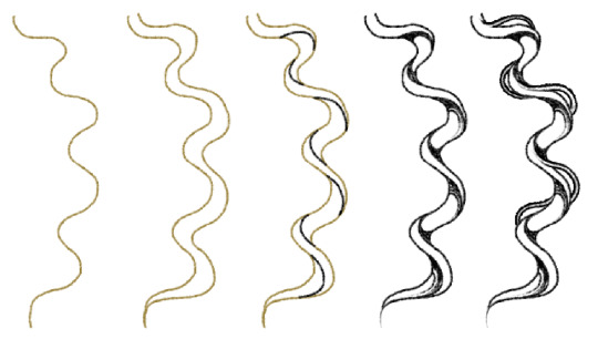
I hope this helps!! As you get used to doing it you can make more uneven shapes of curl and such. I also section hair like this to prevent getting confused, bullshitting my way through hair makes it harder to me so plan the chunks.
Thank you and good luck!!! 🥺
2K notes
·
View notes
Note
Hello! Would you show us a screenshot from your game without re-grading (I think that's what you said it was called) vs. using that shader please? I'd love to see how much of a difference it makes before I attempt to work it out myself lol. Thank you in advance! <3
Hello Nonny, sure. Ray-Tracing is what I use. It makes all the difference.
01 - vanilla

02 - color settings

03 - light (re-light)

04 - depth (ray-tracing)

Voila.
#replies#pxl answers#faq#reshade#tutorials#sims reshade#ts4 faq#sims faq#also this is my new favorite room so be prepared to see a spam of it#*dogwood drive#tutorial
103 notes
·
View notes
Note
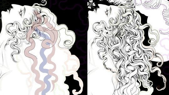
Hey I was wondering if you would do a post about how you make your feralnette au? I really like how you color it and was curious about your process.
Yes this is absolutely for plagiarism purposes /j
(I want to incorporate something similar on a smaller scale within my artwork, I don’t plan on posting anything but I can run the art past you if your worried about me actually stealing your style)
sure! as a note I'm not a pro or anything, this is just how I render my comic for ease of access
as a general note I draw everything in black and white first

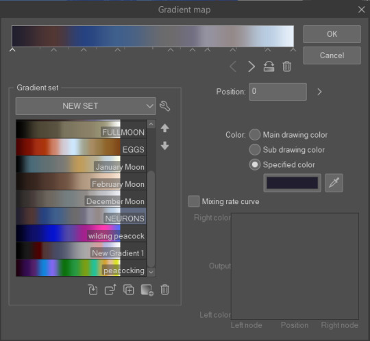
I use a LOT of texture heavy brushes for effects, and specifically because I render with gradient maps a lot. people ask me why I do AU's in different styles - usually anything outside of feralnette is done in color - but that's because the rendering process is different.
for instance in the dad villain au, I do basic linework and chunky colors. if I was to do Feralnette in the same style, the gradient maps wouldn't nearly have the same effect, as you can see up there ^
when a gradient map is applied I can fiddle with the color values to set a Tone for the update I'm going for, while also making it really pretty, bc textures can really bloom the subtle colors in a gradient map. I get a lot from the CSP page itself, but I also MAKE a lot too. this specific map I made by color picking off of a neuron map from a brain scan I thought was pretty~
I don't do the feralnette AU in full color because generally, anything IN full color will have significance - either to show that a scene is important character development,
is a flash back,

or to put emphasis on something supernatural happening.
with Feralnette, when something is colored purposefully, its to emphasize it, whether that be to highlight character moments, or to stress that something eldritched and unnatural could be occurring, as its colors that do not exist in the pre-existing gradient map. Color out of space, yknow?
((SOMETIMES I put gradient maps on my colored chunky stuff, but once again, for the purpose of creating a tonal shift, like when papa Tom shows up in the dad villain AU!))
anyway I hope that helped!
#replies#tutorial#sort of#im answering a lot of questions bc im bedridden w/ ms rona herself#my kitty retail sis caught it too (she's a champ so she's beating it like a fuckin pro)) and nudibranch sister remains unscathed!!!!!#we stay winning even if im dying!!
806 notes
·
View notes
Note
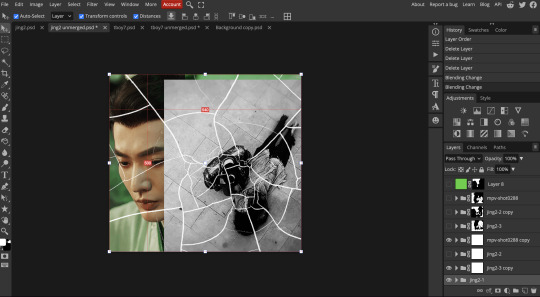
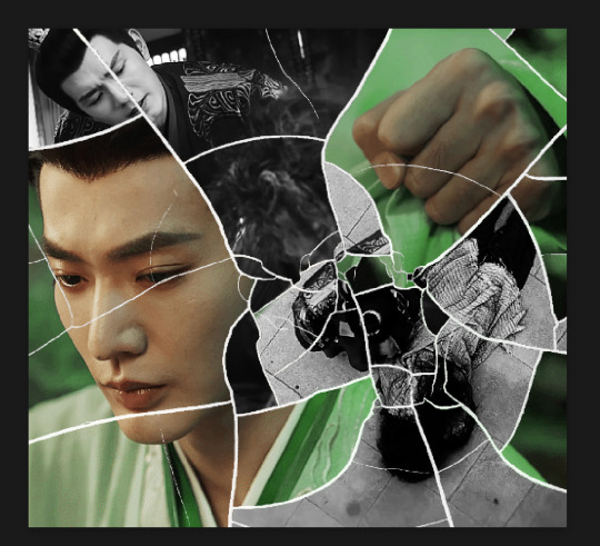
your gifsets are perfect, I'm always in awe of what you can do and you're creativity!!! Could you please explain how you made the broken glass gif with different gif in it on photopea? https://www.tumblr.com/dengswei/754916132337729536/userdramas-creator-bingo-green-asiandramanet?source=share and would it be possible to do something similar with other shapes? Thank you for your lovely creations <33
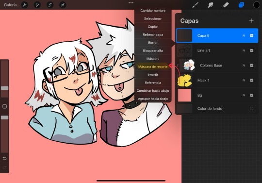
heyy thanks so much!! and of course! i have to admit the way i do it might be a little bit tedious compared to like everyone else (though i don't know how photoshop users or other photopea users might do it 🤣) okay this is gonna end up being so long because of the way i do it so i'm sorry about that and i hope it makes sense 😭
okay i have to admit i couldn't find the texture i've seen people use for the shattered glass effect so i actually used a photopea default brush from this pack
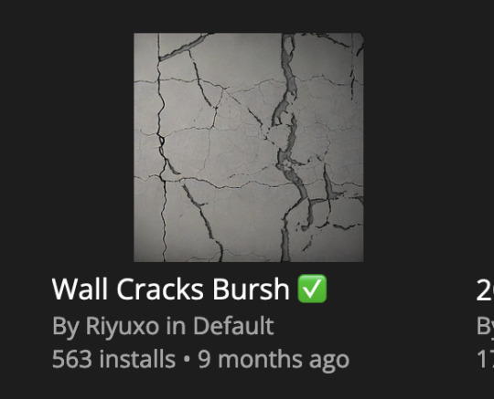
to download the brush set go to window -> plugins -> brush and then search for wall cracks brush (it's literally the only wall related brush set in photopea so it'll show up the moment you download it)
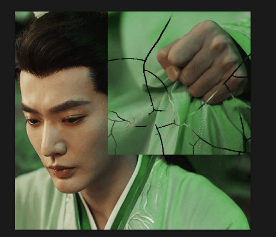
so for the gif i did above i did my giffing the usual way of creating & colouring for different gifs seperatly and then adding them all to one project (it doesn't have to be 4 gifs i just chose 4 because that's what i wanted to show in this gif)
i've done this twice once for this set and another time for this the blood of youth set and i have to say the most important part of this is keep multiple versions of the brush in the position you want as you can so once you've used it to test it out and you like that version keep it because unless you can manage to position the brush in the exact same place every time you're gonna need to reference those (or even use the magic wand tool for it later) and also you need to keep at least a white on black background version for the outline
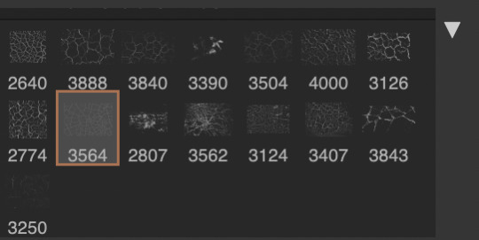
in the brush pack the one i used was this one: (3564, crack b 9)
for this part i just say play around with both positioning and sizing of the brush, it automatically opens with the size 3000+ which is fine i think with the tushan jing one (the green gif above) i stuck with that size and just kept clicking around until i got the positioning i wanted (this is another reason why i said what i said in the paragraph above because if the brush size is bigger than 1000 it's doesn't come out in the exact positioning as you expect it too
i decide the positioning of the gifs on the way i like the brick brush looking rather than the other way around, this is the positioning i went with if you're curious & would like to use it if that's easier 🤣
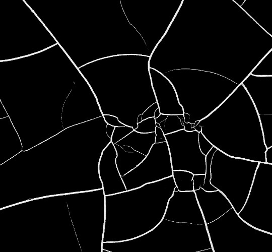
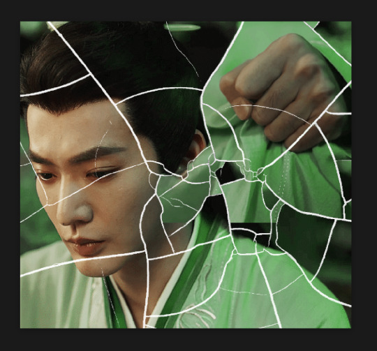
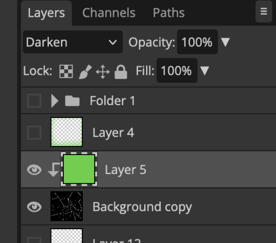
you'll need to keep this as a seperate layer at the top, i had it set to screen and then added a colour fill layer clipped on later so that i had the outline for when i was masking
so to start off i have the base gif which i do nothing to, that stays as it is, with the brush layer above set to screen
next is where you want to position your other gifs it may benefit to figure this out all at first before doing any of the masking so you know which parts you want to erase and which parts you want to keep
so this is what i decided with my positioning looking at where each of the cracks are
now comes the tedious part, in some ways the way i do this is a lot similar to how i do grid but it's not as easy (for grid photopea automatically locks onto the squares making it easier to mask, here you have to do it all manually)
first put a raster mask on all of the other gifs except for the base gif & use the magic wand tool on the brush layer so you get the outline of the brush and you mask that away from your gif (so if you turned off the brush layer it should look a little something like this: (it's not perfect but it won't matter that much because you should have the original turned on at the end anyway) (you don't have to do this step tbh i just did it because i thought it looked better)
so with the brush layer turned on you can use that as a template to which parts of the cracks you want to erase, you can either use the magic wand or the paint brush tool it really depends on how much of a perfectionist you are and whether or not the sharp edges bother you (plus some of the cracks have small openings so it might erase another part you don't want if you use the magic wand tool so it really is another instance of playing around and seeing what you like, and it might also change once you add the other gifs too)
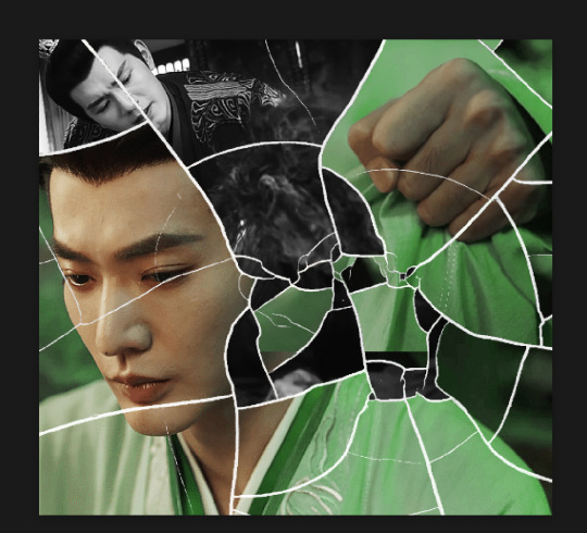
so this is how it looks after i've done that (notice in the middle you can still see the edge of the gif? that won't matter because one of the other 2 gifs i still have yet to mask will cover that) & just repeat the same thing for the other gifs you want to add
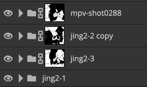
this is how my masking folders look if you're curious
& last but not least i added a green colour fill layer clipped to the brush layer and set that to darken to get the green effect (make sure that the brush layer is still set to screen)
& once you've merged all of the gifs together you should get your desired outcome like the gif above (make sure that all the gifs have the same amount of frames too)
when it comes to other shapes i'm sure you can! like i did a tutorial with the grid version here, i guess it'll just be a lot of trial and error & finding a texture or brush with different shapes to try it out with kinda like how i did with both versions of this (i definitely did it a lot better this time around compared to the first version i did of this)
hopefully this wasn't too long or too confusing, if anything is please feel free to ask me again and i'll try and explain it a little better 🤣
#replies#Anonymous#photopeablr#usergif#tutorials#photopea tutorials#completeresources#mine | tutorials#gif tutorial#photopea#resources#gif resources#gifmakerresource#photopea tutorial#tutorial#gif tutorials
96 notes
·
View notes
Note
how do you sharpen your gifs???? they're insanely high quality!
Hello, Anon dearest, and thank you so much! ✨ To answer your question properly, I would first have to know which gifset(s) of mine you're referring to because I've made a lot over the years and I often change my sharpening settings, too. It totally depends on what I'm working with at the moment, to be honest. 😅
But, as for the last few sets of mine (this, this, and this in particular), I used these settings:
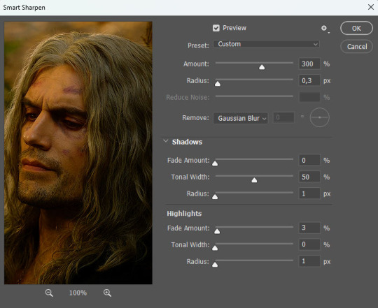
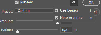
After converting my frames/layers into a smart object, I applied the settings above. Remember to click on the gear icon in the upper right corner and check both 'Use Legacy' and 'More Accurate' as well. This will make your sharpening look more 'natural' and less cakey imo.
Below is a comparison of before and after:
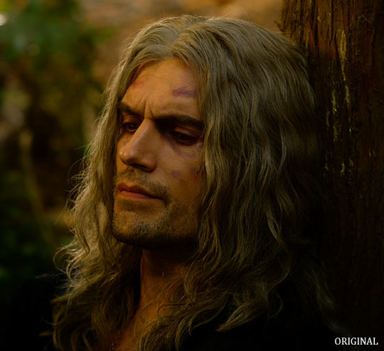
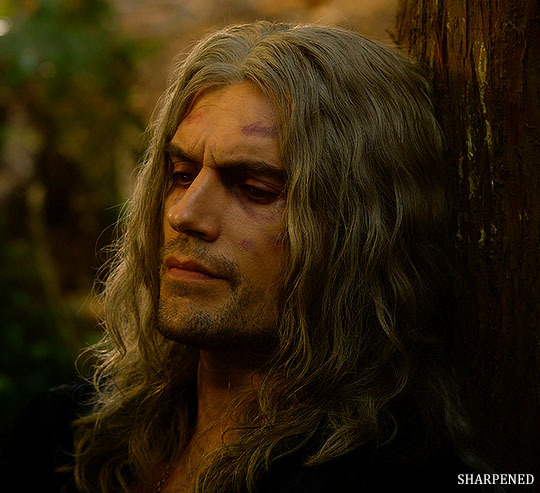
Note: This Geralt screenshot was taken from a 4K (2160p) video. Most videos I work with are at least 1080p or 720p because quality matters.

And here's the final result: colored, brightened, and sharpened.
—
I hope this answers your question. If not, feel free to send me more questions about this kind of stuff. I'm always happy to help out :)
#replies#anon#photoshop#tutorial#resources#ps help#sharpening#gifs#giffing#completeresources#allresources#chaoticresources#my gifs#my tutorials
299 notes
·
View notes
Note
hi! :)
I’ve been getting into Grandmaster of Demonic Cultivation, and bc of that I want to do illustrations of the characters. Sadly I know almost nothing about these types of clothings. I just thought to ask because they seem to have similar headpieces in Avatar too.
I’m thinking of headwear like Ozai wears in his hair. Do you happen to know what that kind of headwear is called? And maybe, how does it work? 0-0
Fortunately for you, there's a huge crossover between Grandmaster of Demonic Cultivation (more commonly known by its Chinese name of Mó Dào Zǔ Shī or MDZS on the internet) and Tumblr's historical Chinese fashion scene.
https://www.tumblr.com/ziseviolet/tagged/modaozushi
As for the headwear, they're called guan (冠). The little stick that keeps the guan in place is called a ji (笄). As for how they work, you just slide the guan on top of the topknot bun, then stick the ji through the guan and top knot. Below is a tutorial on how to do the kind of topknot hairstyles you see in MDZS and other Chinese media:
youtube
I think the first one looks closest to what you see in MDZS media.
#replies#off topic post#mdzs#mo dao zu shi#Grandmaster of Demonic Cultivation#Also a good tutorial for doing Ozai and Ursa's hairstyle
93 notes
·
View notes
Note
Crow i have a small request, could you explain how you draw kremy? I have a hard time figuring out how to make him look cute
Good question!! I uh. Kinda don't know how to explain it so I made a video
I guess my main thing is don't be afraid to break his lizard proportions a little, and also USE REFERENCES AND TAKE INSPO FROM OTHERS!!
I HEAVILY referenced @/mischieviem and @/paesthethyc when I was initially figuring out how to draw the guys, and then I worked my way from there!
#my art#artwork#crow does art#digital art#// crow tutorial#new tag?? ig??#// crow answers#// crow replies#// crow responds#kremy lecroux#ouaw kremy
68 notes
·
View notes
Note
Hi! Would it be possible to post a tutorial of how you created the white text in this set /post/695221752725422080/buckpendragon-911-verse-coc-week-day-1 thank you :)
hiii! you mean the text in the first gif, right? it's actually a pale green so i hope that's what you meant 😅
i somehow still have that psd so i was able to go grab the exact settings for the two text layers used here:
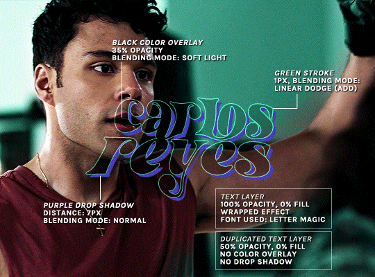
(if you meant the little white text, it's simply the font candara with different values of tracking/letter spacing)
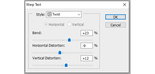
the font i used is called letter magic, and i've given my bare text a bit of warp (right click ont the text layer > warp text > style: twist). by the way, the color of the text doesn't matter, so no need to pick one.
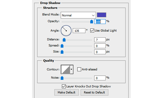
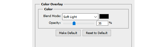
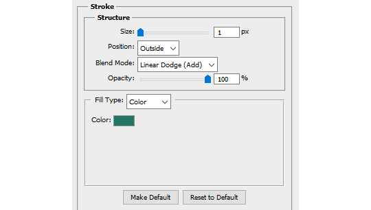
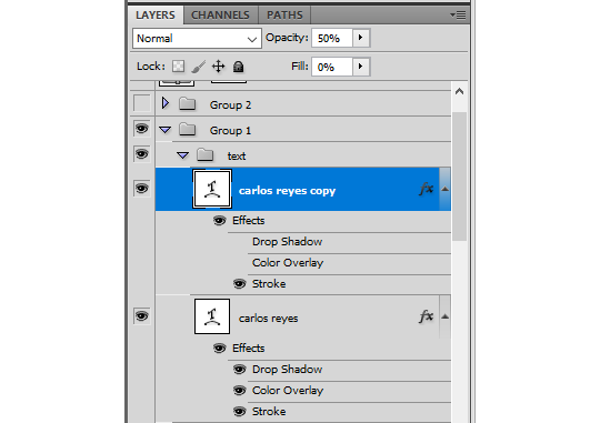
BASE LAYER
first, put the text layer's opacity to 100%, and the fill to 0%. the text will become transparent, it's what we want. then double click on the layer to get to the layer style options. you'll want to add a drop shadow, a color overlay, and a thin stroke:
DUPLICATED LAYER
i found the stroke a bit too thin on my gif, so i duplicated the base layer (right click on the layer > duplicate layer > destination should be the same canvas), put its opacity to 50% and kept to 0% fill. and disable the drop shadow and color overlay by clicking on the little eyes on the layer:
voilà :)
#alie replies#Anonymous#*ps help#photoshop#tutorial#resource#photoshop tutorial#typography#mialook#tuserzee#userabs#usertj#userchibi#userhella#userkarolina#usertina#quicklings#userraffa#usercats
450 notes
·
View notes
Note
how do u draw eyelashes like that??
I dont actively think about my process BUT since you asked I figured out a tiny tutorial just for you Anon! <3

65 notes
·
View notes
Note
Hello! I am super in love with your linework. I adore the softness of how it looks when you have the lines all colored to match the object/color they represent. I was wondering what your method is for drawing it this way? Do you draw it all in one color and use overlays to adjust it based on the base color later?
Hi hello! Thank you so much! Actually this is something that I saw artist do in comic books and wanted to copy it, it also took me forever to figure out how to do it quickly so here’s a mini tutorial for you so you don’t have to go through the same as me to find out, it’s really super simple!
(I work on procreate but this is a feature that exist on every drawing program, also my procreate is in Spanish but ill translate what’s important )
STEP ONE: have a layer with all your lineart, I always do it all with black first

STEP TWO: Create a new layer on top of your lineart layer and on the layer settings select “Clipping mask”
STEP THREE: Now in your clipped mask layer you’ll be able to color the lineart AND ONLY THE lineart without it being super complicated and time consuming

FINALRESULT
169 notes
·
View notes
Note
I LOVE YOUR ART SM, ESPECIALLY THE MIKU ONES, YOUR SHADING ALSO REMINDS ME OF STRAWBERRY SHORTCAKE(the old one) IF YOU DON'T MIND CAN YOU A TUTORIAL ON HOW YOU MADE YOUR ART LOOK SO.... SOFT??? AND LIKE BRIGHT?🫶🫶🫶🫶🫶
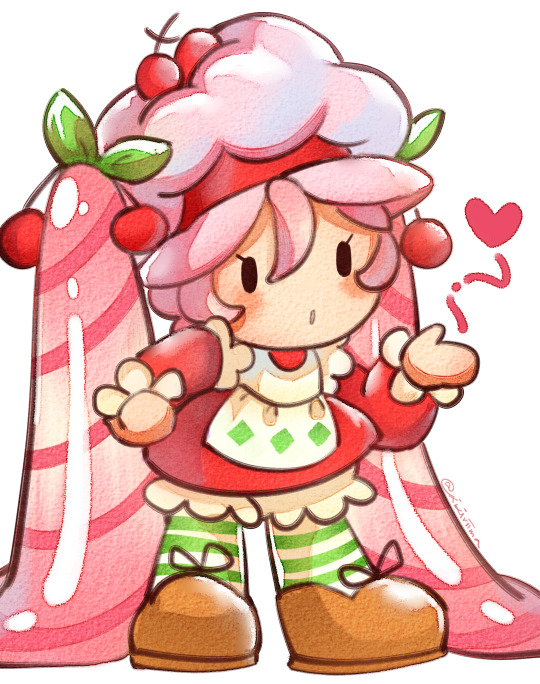
Awe thank you! Have a Cherry ShortMiku
I rushed the loose "Tutorial":
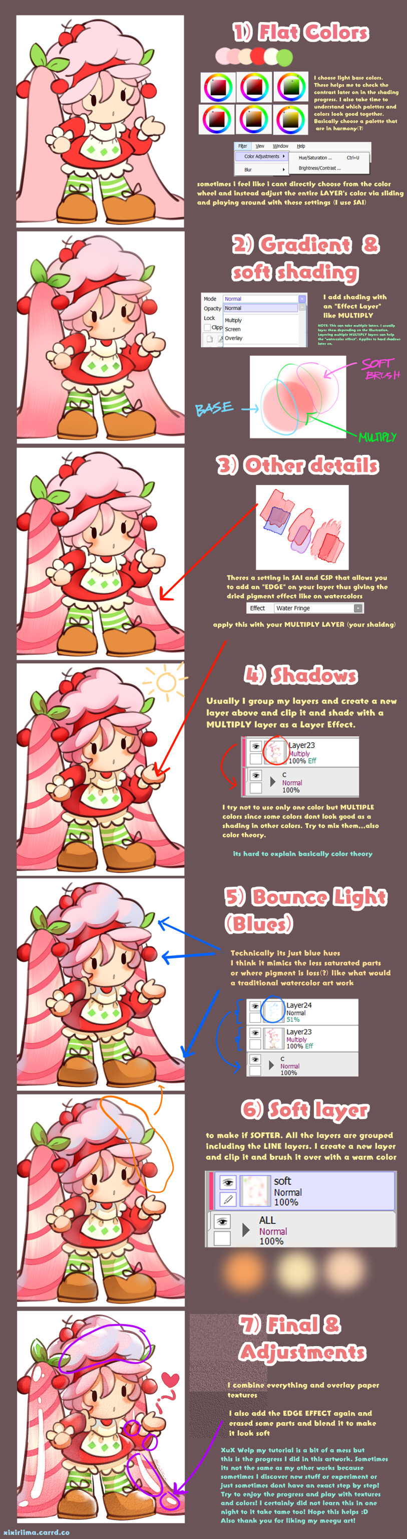
Its a bit messy Its 8:30 am i havent slept yet hahhaaha! So basically colors right? IiiIII also am not knowledgeable with color theory but if it looks good it looks good ya know? I sometimes dont get satisfied with the end game so sometimes I adjust the overall illustration's HUE/CONTRAST/BRIGHTNESS/SATURATION etc. These adjustments are crucial imo! To make the entire illustration homogenous, adjustments are necessary! anyway
all of my illustrations most times arent just a fully step by step thing. Sometimes I go back to a layer, I adjust, I get frustrated that sometimes it doesnt look the way it should be in my head. I think people have been asking me how I draw but honestly couldnt find the energy and time to do so until now granted its a bit of a mess ;-; I think its just that I couldnt give a step by step since I myself am chaotic with my layers and progress which is the FUN part imo -u- so thats it- hopefully it explains the basics(?)
#meegu#strawberry short cake#miku#reply#anon reply#reply ask#ask reply#ask#tutorial#?#fanart#hatsune miku#saskura miku#cherry miku#crossover#xixiriima#my art#art#anime art#ebi noodle doodles#VOCALOID#vocaloid hatsune miku#vocaloid miku#art tutorial#miku related#chubby miku replies#chubby miku#miku related tag#miku related post#vocaloid related post
353 notes
·
View notes
Note
Hey pxl! Loving your recent builds ❤️ Can I ask what your general bokeh settings are in reshade? I’ve been struggling :/
Hello nonny, thank you =)
Here is a quick guide I put together, along with my default DOF settings for qUINT_DOF:
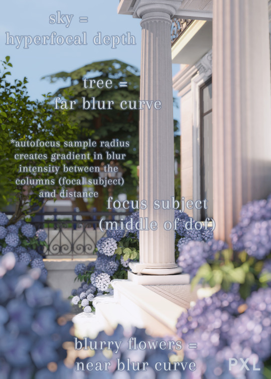
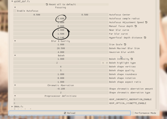
Autofocus Sample Radius adjusts the immediacy with which your depth of field blur settings begin to take effect. 0 = intense immediately after focus subject, 1 = gradual intensity after focus subject.
Near Blur Curve adjusts the blur from the closest perspective, i.e., from your focus subject. 0 = intense blur, higher values lower the blur, 6.000 = no blur.
Far Blur Curve adjusts blur from the mid-point of your depth of field to the farthest point from your focus subject, 0 = intense, 2 = no additional effect.
Hyperfocal Depth Distance adjusts blur farthest from your focus subject 0 = no additional effect, 1 = intense.
Hope this helps!
188 notes
·
View notes