#tumblr hate tag
Explore tagged Tumblr posts
Text
i'm all for welcoming twitter and reddit users but you guys have got to leave your unsolicited argumentative dickheadery at the door. why are you reblogging fanart or people's original writing or people's goddamn personal posts like "ew this is gross" or "lmao cringe"? reblogging is not a quote tweet, it's not a comment we can downvote into oblivion, we can see this shit, it contributes nothing but pissing off you and everyone else. don't like something? block op and ignore it. the majority of tumblr stopped throwing shit at each other in 2019; you should too.
13K notes
·
View notes
Text
does tumblr have a thing where it decides that if you’ve struggled with an eating disorder in the past all of your ads are going to be about weight loss or is that something they did for me specifically
#like seriously i’ll take the manscaped ads over this shit#jokes on them the focus of my ED was not weighing ENOUGH or having enough meat on my bones and not the other way around#losing weight is a legitimate fear of mine though so i’m not enjoying the ads either way!#vent#tumblr hate tag
25 notes
·
View notes
Text
@staff please listen to us. Every social media site ignored its users in favour of shareholders. Now look at Reddit, at Twitter, and why those users joined Tumblr and not Threads or Mastodon.
Tumblr’s Core Product Strategy
Here at Tumblr, we’ve been working hard on reorganizing how we work in a bid to gain more users. A larger user base means a more sustainable company, and means we get to stick around and do this thing with you all a bit longer. What follows is the strategy we're using to accomplish the goal of user growth. The @labs group has published a bit already, but this is bigger. We’re publishing it publicly for the first time, in an effort to work more transparently with all of you in the Tumblr community. This strategy provides guidance amid limited resources, allowing our teams to focus on specific key areas to ensure Tumblr’s future.
The Diagnosis
In order for Tumblr to grow, we need to fix the core experience that makes Tumblr a useful place for users. The underlying problem is that Tumblr is not easy to use. Historically, we have expected users to curate their feeds and lean into curating their experience. But this expectation introduces friction to the user experience and only serves a small portion of our audience.
Tumblr’s competitive advantage lies in its unique content and vibrant communities. As the forerunner of internet culture, Tumblr encompasses a wide range of interests, such as entertainment, art, gaming, fandom, fashion, and music. People come to Tumblr to immerse themselves in this culture, making it essential for us to ensure a seamless connection between people and content.
To guarantee Tumblr’s continued success, we’ve got to prioritize fostering that seamless connection between people and content. This involves attracting and retaining new users and creators, nurturing their growth, and encouraging frequent engagement with the platform.
Our Guiding Principles
To enhance Tumblr’s usability, we must address these core guiding principles.
Expand the ways new users can discover and sign up for Tumblr.
Provide high-quality content with every app launch.
Facilitate easier user participation in conversations.
Retain and grow our creator base.
Create patterns that encourage users to keep returning to Tumblr.
Improve the platform’s performance, stability, and quality.
Below is a deep dive into each of these principles.
Principle 1: Expand the ways new users can discover and sign up for Tumblr.
Tumblr has a “top of the funnel” issue in converting non-users into engaged logged-in users. We also have not invested in industry standard SEO practices to ensure a robust top of the funnel. The referral traffic that we do get from external sources is dispersed across different pages with inconsistent user experiences, which results in a missed opportunity to convert these users into regular Tumblr users. For example, users from search engines often land on pages within the blog network and blog view—where there isn’t much of a reason to sign up.
We need to experiment with logged-out tumblr.com to ensure we are capturing the highest potential conversion rate for visitors into sign-ups and log-ins. We might want to explore showing the potential future user the full breadth of content that Tumblr has to offer on our logged-out pages. We want people to be able to easily understand the potential behind Tumblr without having to navigate multiple tabs and pages to figure it out. Our current logged-out explore page does very little to help users understand “what is Tumblr.” which is a missed opportunity to get people excited about joining the site.
Actions & Next Steps
Improving Tumblr’s search engine optimization (SEO) practices to be in line with industry standards.
Experiment with logged out tumblr.com to achieve the highest conversion rate for sign-ups and log-ins, explore ways for visitors to “get” Tumblr and entice them to sign up.
Principle 2: Provide high-quality content with every app launch.
We need to ensure the highest quality user experience by presenting fresh and relevant content tailored to the user’s diverse interests during each session. If the user has a bad content experience, the fault lies with the product.
The default position should always be that the user does not know how to navigate the application. Additionally, we need to ensure that when people search for content related to their interests, it is easily accessible without any confusing limitations or unexpected roadblocks in their journey.
Being a 15-year-old brand is tough because the brand carries the baggage of a person’s preconceived impressions of Tumblr. On average, a user only sees 25 posts per session, so the first 25 posts have to convey the value of Tumblr: it is a vibrant community with lots of untapped potential. We never want to leave the user believing that Tumblr is a place that is stale and not relevant.
Actions & Next Steps
Deliver great content each time the app is opened.
Make it easier for users to understand where the vibrant communities on Tumblr are.
Improve our algorithmic ranking capabilities across all feeds.
Principle 3: Facilitate easier user participation in conversations.
Part of Tumblr’s charm lies in its capacity to showcase the evolution of conversations and the clever remarks found within reblog chains and replies. Engaging in these discussions should be enjoyable and effortless.
Unfortunately, the current way that conversations work on Tumblr across replies and reblogs is confusing for new users. The limitations around engaging with individual reblogs, replies only applying to the original post, and the inability to easily follow threaded conversations make it difficult for users to join the conversation.
Actions & Next Steps
Address the confusion within replies and reblogs.
Improve the conversational posting features around replies and reblogs.
Allow engagements on individual replies and reblogs.
Make it easier for users to follow the various conversation paths within a reblog thread.
Remove clutter in the conversation by collapsing reblog threads.
Explore the feasibility of removing duplicate reblogs within a user’s Following feed.
Principle 4: Retain and grow our creator base.
Creators are essential to the Tumblr community. However, we haven’t always had a consistent and coordinated effort around retaining, nurturing, and growing our creator base.
Being a new creator on Tumblr can be intimidating, with a high likelihood of leaving or disappointment upon sharing creations without receiving engagement or feedback. We need to ensure that we have the expected creator tools and foster the rewarding feedback loops that keep creators around and enable them to thrive.
The lack of feedback stems from the outdated decision to only show content from followed blogs on the main dashboard feed (“Following”), perpetuating a cycle where popular blogs continue to gain more visibility at the expense of helping new creators. To address this, we need to prioritize supporting and nurturing the growth of new creators on the platform.
It is also imperative that creators, like everyone on Tumblr, feel safe and in control of their experience. Whether it be an ask from the community or engagement on a post, being successful on Tumblr should never feel like a punishing experience.
Actions & Next Steps
Get creators’ new content in front of people who are interested in it.
Improve the feedback loop for creators, incentivizing them to continue posting.
Build mechanisms to protect creators from being spammed by notifications when they go viral.
Expand ways to co-create content, such as by adding the capability to embed Tumblr links in posts.
Principle 5: Create patterns that encourage users to keep returning to Tumblr.
Push notifications and emails are essential tools to increase user engagement, improve user retention, and facilitate content discovery. Our strategy of reaching out to you, the user, should be well-coordinated across product, commercial, and marketing teams.
Our messaging strategy needs to be personalized and adapt to a user’s shifting interests. Our messages should keep users in the know on the latest activity in their community, as well as keeping Tumblr top of mind as the place to go for witty takes and remixes of the latest shows and real-life events.
Most importantly, our messages should be thoughtful and should never come across as spammy.
Actions & Next Steps
Conduct an audit of our messaging strategy.
Address the issue of notifications getting too noisy; throttle, collapse or mute notifications where necessary.
Identify opportunities for personalization within our email messages.
Test what the right daily push notification limit is.
Send emails when a user has push notifications switched off.
Principle 6: Performance, stability and quality.
The stability and performance of our mobile apps have declined. There is a large backlog of production issues, with more bugs created than resolved over the last 300 days. If this continues, roughly one new unresolved production issue will be created every two days. Apps and backend systems that work well and don't crash are the foundation of a great Tumblr experience. Improving performance, stability, and quality will help us achieve sustainable operations for Tumblr.
Improve performance and stability: deliver crash-free, responsive, and fast-loading apps on Android, iOS, and web.
Improve quality: deliver the highest quality Tumblr experience to our users.
Move faster: provide APIs and services to unblock core product initiatives and launch new features coming out of Labs.
Conclusion
Our mission has always been to empower the world’s creators. We are wholly committed to ensuring Tumblr evolves in a way that supports our current users while improving areas that attract new creators, artists, and users. You deserve a digital home that works for you. You deserve the best tools and features to connect with your communities on a platform that prioritizes the easy discoverability of high-quality content. This is an invigorating time for Tumblr, and we couldn’t be more excited about our current strategy.
65K notes
·
View notes
Text
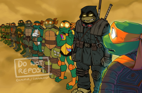
When you meet your past lives but they're all ignoring you and freaking out over this one guy?
I've seen a few versions of this floating around with the different Leos and I wanted to have a go at doing one for Mikey. They're all collectively realising what a bus sized bullet they dodged by not ending up as messed up as Ronin
#art#artists on tumblr#Just realised the fucking nightmare I'm about to have tagging all these guys. Fml#tmnt#The Last Ronin#TMNT Mutant Mayhem#rottmnt#tmnt 2012#mikey#MM Mikey#Ronin Mikey#rottmnt mikey#2012 mikey#tmnt idw#idw mikey#tmnt crossover#I'm not tagging the others I don't wanna clutter up any more tags than I already have#I like to imagine Ronin is just telling MM Mike the most horrific shit and everyone else looks round like What The Fuck#Also if you're wondering where Bayverse Mikey is: I didn't include him because I hate him so goddamn much ^^#He's in interdimensional turtle jail for 6 million years#the last ronin spoilers#I GUESS LMAO
18K notes
·
View notes
Text
okay listen. i know there's already one video about The Fucking Creep out there. but i NEED to share one of my favourite Creep Moments.
#buckshot roulette#hollowtones#kuueater#shinigamieater#spark talks about nothing of relevance#now that's what I call shitposting#stream is kuu's VOD of it on youtube (tumblr hates links). go watch The Creep in action#dollip daze#dollip#lynn#<- i would tag these two properly but i can't find channel sources. wailing crying etc#but this will find it's audience. i believe.#we NEED creep to be canon lore in buckshot. just like in the back.#people would rather face dealer than creep so dealer just lets them chill in the basement 👍
2K notes
·
View notes
Text
Pokémon but I once again badly edited Onion Headlines onto it


Part 1, Part 3
#pokemon#pokémon#shitpost#onion headlines#pokemon sun and moon#pokemon xy#pokemon oras#pokemon platinum#pokemon scarlet and violet#scarvio#red pokemon#mewtwo#team yell#pokemon sword and shield#pokemon swsh#silver pokemon#lusamine#cyrus pokemon#i hate tagging posts#you’ll find this post if tumblr wills it#giratina#lysandre
2K notes
·
View notes
Text
this new dashboard is really bad. i've submitted feedback through the form but i just want to make my voice heard here as well: this new dashboard sucks ass. please give us the old horizontal one back.
A new way to navigate Tumblr
If you use Tumblr on a web browser, you might have noticed us testing a brand new navigation on your dashboard in the last month. Now, after some extensive tweaks, we’ve begun rolling out this new dashboard navigation to everyone using a web browser. Welcome to the new world. It’s very like the old world, just in a different layout.
Why are we doing this? We want it to be as easy as possible for everyone to understand and explore what’s happening on Tumblr—newbies and seasoned travelers alike.

Labels over icons: When adding something new to Tumblr in the past, we’d simply add a new icon to our navigation with little further explanation. Turns out no one likes to press a button when they don’t know what it does. So now, where there’s space, the navigation includes text labels. Since adding these, we’ve noticed more of you venturing to previously unexplored corners of Tumblr. Intrepid!
What’s already been fixed? Thanks to feedback from folks during the testing phase, we’ve been able to make some improvements right out of the gate. Those include returning settings subpages (Account, Dashboard, etc.) to the right of the settings page instead of having them in an expandable item in the navigation on the left; fixing some issues with messaging windows on smaller screens; and streamlining the Account section to make it easier to get to your blogs.
What’s next? We’re looking into making a collapsible version of this navigation and improving the use of screen space for those of you with enormous screens. We’re also working on improving access to your account and sideblogs.
That’s all for now, folks. For questions and suggestions, contact Support using the “Feedback” category. Please select the “Report a bug or crash” category on the support form for technical issues. And keep an eye out for more updates here on @changes.
27K notes
·
View notes
Text

THEYRE HERE AND THEYRE REAL
#sonic the hedgehog#sonic#shadow the hedgehog#sonic generations#sonic x shadow generations#sonadow#IM FREAKING OUTTTT#AAAAAAAAA#peachys art#2k#this INSTA BLEW UP#THANK U TUMBLR... UR A REAL ONE... TWITTER ALGORITHM HATED THIS ONE (got around 50 likes in the same time as this one)#maybe i will ... draw them more. who knows.#3k#THIS IS INSANE#U GUYS ARE INSANE#/POS#4k#ok this is getting long this is the last time im updating the tags
8K notes
·
View notes
Text

joel being a Disney princess
look everybody my art is arting properly again! also pls send me any asks as i'm awfully bored lol
#i mean look at that smile#look at that cat#look at that fox. the birb is fine but i mean wow it feels so good being happy with me art again lol also guys guys dija notice the dimple?#ldshadowlady#lizzie ldshadowlady#ethoslab#etho#hermitcraft#trafficblr#hermitblr#life series#life smp#empires smp#ethogirl#etho tag#jimmy solidarity#solidaritygaming#boat boys#jizzie#shadowbeans#what's jimmy and joel duo#like do i tag smallidarity???#or is that a ship only basis kinda deal#sic months on tumblr and i'm still dumb to the ways of this site lol#oh well#smallishbeans#joel smallishbeans#me art#nvm ty han!!! wait i cant tag them y do u hate me tumblr?#Disstrack duo
3K notes
·
View notes
Text
PSA 🗣️ another scammer using genAI without disclosing it
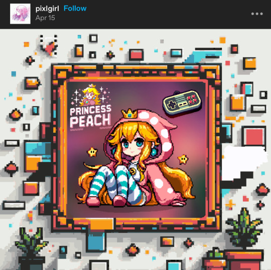

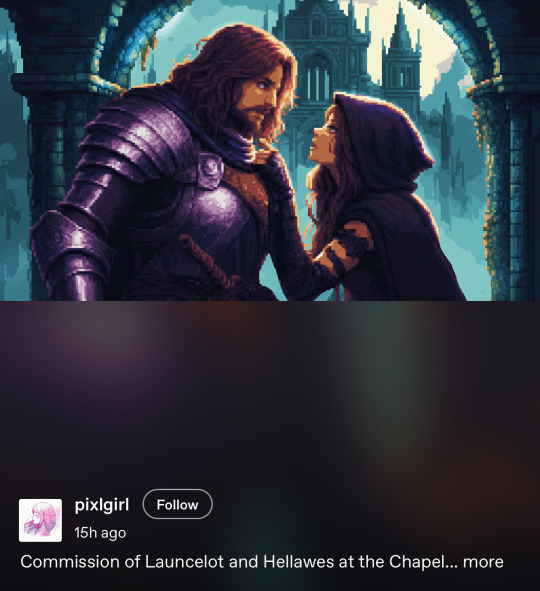
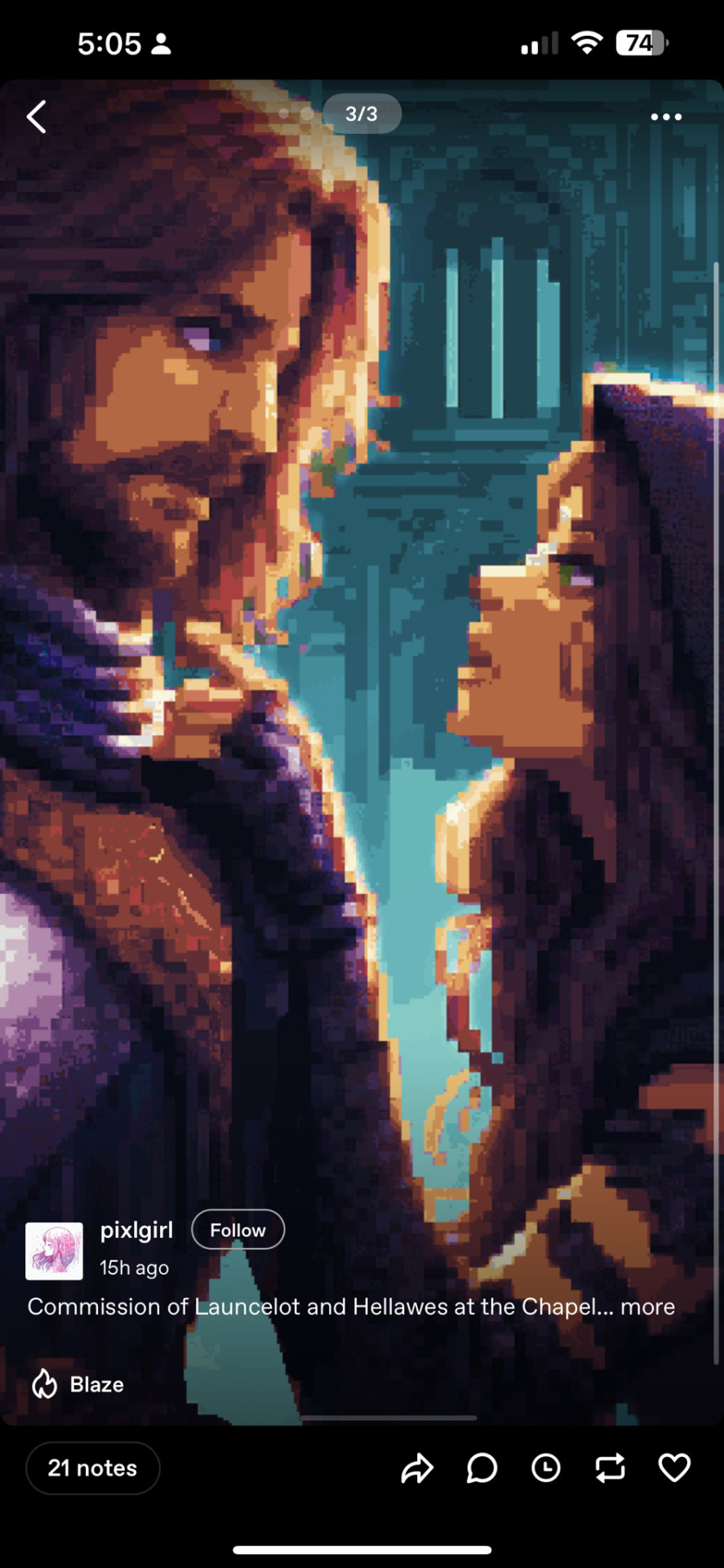
pixlgirl has been posting generated AI (targeting fandoms) without disclosing it, passing it off as their genuine art and has apparently scammed at least one person into ‘commissioning’ them. this is a public PSA so yall can block them, and not interact. please do not harass them!
it’s incredibly shitty to be disingenuous while posting AI but even shittier to scam people with it 🤢 stay diligent yall
#i hate making ‘call out’ posts but kinda feel obligated since so many people have trouble spotting it#pixel art#pixelart#anti ai#i’ve been seeing them in the tags for a few weeks but saw they’re now scamming people so i thought id make a post#the animations they’ve posted are just filters on the AI lol#please don’t harass them#this is for those who don’t want to interact with AI#genAI#fuck genai#fuck ai#fuck ai art#zelda#pixel aesthetic#text post#these types of losers always just block me lol#art drama#drama#artist on tumblr
3K notes
·
View notes
Text
they fucking nuked dykearchive we can't have shit on this website goddamn
24 notes
·
View notes
Text
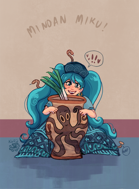
she loves her octopus jar!!
i had to draw her again lol - here's my first drawing of her (click) and more of my minoan art (click)
#minoan#minoan miku#hatsune miku#international miku#every country miku#vocaloid#greek miku#miku hatsune#artists on tumblr#crete#kurjdraws#my minoan art#tagamemnon#art#bronze age aegean#brazilian miku trend#miku around the world#miku art#country miku#cretan miku#ancient greek miku#ancient miku#ancient greece#miku worldwide#octopus vase#octopus jar#oof i hate tagging#snakes#the snake is burping#sorry for quality it was supposed to be a doodle
2K notes
·
View notes
Text

jizzie as flynn rider and rapunzel,, ignore the shitass quality i dont know why its so bad im gonna tweak out
#smallishbeans#ldshadowlady#jizzie#shadowbeans#joel smallishbeans#smallishbeans fanart#ldshadowlady fanart#lizzie ldshadowlady#what else do i tag#my art#im gonna tweak#ignore the hands#i hate hands#I STILL DONT KNOW WHY THE QUALITY#IS SOOO BAD#tumblr hates me
2K notes
·
View notes
Text
Sorry for the lack of art, existence is very hard lately... anyway, have some FunnyBunny

#my art#artists on tumblr#the amazing digital circus#tadc#tadc pomni#tadc jax#pomni#jax#funnybunny#rambling in the tags#I stand by the opinion that Funnybunny is ONLY good if they violently hate each other's guts#also pomni HAS to be the “top”#no exceptions#...then again that's with all pomni ships#to me anyway
1K notes
·
View notes
Text

#girlblogger#aestehtic#girlblogging#hell is a teenage girl#doelette#lana del rey#girly stuff#idk how to tag this#fawn#localy hated#sweet lolita#pink blog#cinammon girl#couqette#creepy cute#tumblr 2014#tumblr girlies#pinterest girl#pink aesthetic#pinkcore#girlhood#girl interrupted#girlcore#manic pixie dream girl#the feminine urge#soft feminine#female hysteria#im just a girl
2K notes
·
View notes
Text
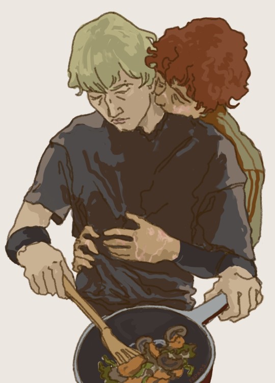
He was hungry :)
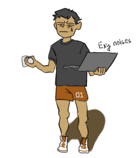
He was hungry too. Came to check when it would be ready. Regreted it.
#based on me trying to cook more this week even though i hate cooking#andreil#aftg#all for the game#andrew minyard#neil josten#all for the game fanart#art#artists on tumblr#artist in the wild#again forgot kevin so kevin tag at the end#kevin day
2K notes
·
View notes