#those kind of cartoony patterned textures
Explore tagged Tumblr posts
Visit Tumblr Blog
Explore Tumblr blogs with no restrictions, modern design and the best experience.
Last Seen Tumblr Blogs


Fun Fact
Tumblr’s website traffic is steadily declining.
Text
The Light Fury: A Needlessly Thorough Character Design Analysis
Let me start by admitting I'd actually quite like the Light Fury's design if only it were completely removed from the context of HTTYD. If I saw the piece of concept art below in a freelance artist's portfolio, I'd think it's wonderful; same with a lot of the fanart I've seen. And for the record, I also have a soft spot for SilkWings from the Wings of Fire series and Skydancers from Flight Rising, so it's not like I expect every dragon design to be spiky and ferocious-looking.

But in the HTTYD films specifically, dragons being spiky and ferocious-looking is consistently a key part of the art direction, so the Light Fury looks extremely out of place compared to literally all the other dragons. Toothless was always somewhat sleeker and more mammal-ish than the other dragon species, true, but not to such a jarring extent. Unlike the rest of her kind (Toothless included), the Light Fury has completely smooth skin with no textured scales or spikes; all her features (even her teeth!) are completely rounded with no pointy or rough edges; her wings are shaped more like a seabird's than a bat's; her tail fins are distinctly heart-shaped; and she literally has pink glitter on her hide, for fuck's sake. Juxtaposed to the films' art style for every other dragon species, she sticks out like a sore thumb, hardly even resembling a dragon at all -- more like an alien invader from Planet Gender Roles.

…Yeah, about that. In the art book the filmmakers explicitly stated that they didn't want her to look reptilian like other dragons, because she's a feeeeemaaaaale and therefore has to look like one. Never mind the fact that the other female dragons in the films like Stormfly and Meatlug have never had that issue.
So let me be blunt: the Light Fury's visual design is misogynistic. She is designed with the sole purpose of being "feminine" and "pretty" as a male character's love interest, and on top of defying the films' art direction just to make her more conventionally beautiful, her design checks off the majority of the clichés used to impose human gender stereotypes onto animated female animals: lighter color, blue eyes, heavily rounded features, smaller paws/claws and nose/snout, less cartoony exaggeration, and an inexplicable smoothness in the way she is drawn/rendered. (Once you're consciously aware of those clichés, you'll start noticing them in nearly every animated animal film, so HTTYD is far from unique in that regard… but that just makes this widespread pattern in Hollywood all the more concerning.)
All these design choices are also counterproductive to her supposed narrative purpose of being the "wild and untamed" foil to the "domesticated" Toothless -- if that's the case, shouldn't she look more reptilian and ferocious, not less? Many of her traits like big blue eyes and a short rounded snout are actually associated with domestication, so shouldn't she resemble a wild animal instead? Nah, gender roles are clearly the priority here.
And no, despite the popular fan theories, the filmmakers have never confirmed or even hinted that the Light Fury is aquatic or based off belugas. The head of character animation has stated that the design was largely inspired by snow leopards as a contrast to Toothless having been inspired by black panthers; this is more evident in a piece of early concept art which depicts her as pale gray with a dappled pattern, but she ultimately ended up being pure iridescent white, very far removed from the most recognizable features of snow leopards. Reportedly this was because leopard spots look too much like scars, and scars are obviously unbecoming of a giiiiirl dragon… you can't make this shit up!

Axolotls were also cited as an influence, which would explain the smooth skin and unbroken dorsal sail, but the extreme smoothness still grossly clashes with the rest of the films' dragon designs and her own supposed personality so I don't think that actually justifies it. It's also worth noting that axolotl features are much more apparent in the below piece of concept art, with gill-like head appendages and cleft wings to match, but those didn't make it into the final design either, because I guess anything even slightly pointy-looking isn't "female" enough. (Terns were the final cited inspiration, which purportedly explains why her wings couldn't have a batty shape like literally every other dragon in the films.)

As I've said before, if they just wanted to have the black/white contrast for the night/day yin/yang motif (which isn't necessarily a bad idea on its own) the least they could do is still make the Light Fury look properly dragon-like even with white scales. There have been tons of fanmade drawings and edits of what that might look like, as well as examples of well-designed white dragons both in the films themselves (Valka's Bewilderbeast) and other media (Queen Snowfall my beloved).
So why does this all matter? Is a crappy design really that important? I'd argue yes, because despite many fans looking at the franchise through rose-tinted glasses, HTTYD has never treated its female characters particularly well, and the Light Fury is the most obvious/egregious culmination of that. In addition to the sexist tropes in her visual design, she exists for the sole purpose of being Toothless's beautiful love interest and "call of the wild" to separate him from his human best friend, with no depth to her character -- "Why is she so wild/aggressive to humans?" and "How has Grimmel's cruelty affected her?" are just two examples of basic character development points the film is uninterested in exploring -- and almost no screen time to herself. She doesn't even get a canon name, supposedly because she's just so wild, but all three of her children get names despite being equally wild so that's just a cop-out. (And even if she would never live with humans, Berkians could have still referred to her by a nickname, since real wild animals are often nicknamed by the locals who see them or the zoologists who study them -- shoutout to my favorite California Condor, 1099 "Yarrow".)
This is all part of widespread misogynistic patterns in fiction: animated films designing female animals with human gender stereotypes in mind, and fiction in general constantly mistreating and neglecting female characters. I love the HTTYD films so much, but at the same time, there are some aspects that legitimately warrant criticism, and misogyny is definitely one of them… and the Light Fury exemplifies that better than anything.
90 notes
·
View notes
Text
Thank You
I'm so happy about the overwhelmingly positive response to my African Ankara Fabrics pattern collection post!

Thank you for all your reblogs, likes, and kind comments. I want to recap a bit and talk about my process and the struggles that led me to this moment. This was such a tough collection to publish, for several reasons. Picking the Patterns I made a lot of different kinds of fabric patterns and felt a bit overwhelmed by the amount and how I would fit all of them into one collection. Then there were designs that I couldn't get happy with and tweaked over and over. Something felt off about them even though they were done right. I finally made the decision to remove them for now and only focus on including patterns I felt good and confident about. Since there are different techniques used to make African fabrics, I decided to split my collection by type. I plan on having a wax print, batik, and mudcloth collection (though I am not making any promises because they will just give me anxiety and guilt for not meeting them). Creating the download overview graphic I had a hard time envisioning an overview graphic for these patterns. I started several attempts but they were not "it". I put off even working on the preview, which led to more anxiety and guilt. Initially, I wanted to post my collection in June, but time ticked relentlessly by. I created even more patterns to distract myself which meant I had to abandon my overview graphic WIP because now I had even more patterns to fit into those frames. Maybe because I thought I had already failed, it got easier to pick up the work in July, but I still had the problem that displaying all the patterns in different directions and sizes just did not look aesthetically pleasing and it was hard to focus and take in the individual designs. While talking about my struggles with my boyfriend, the solution presented itself: I would use only one thumbnail in the preview instead of showing all sizes and orientations. Since I always include the individual preview thumbnails for each pattern in my downloads anyway, I felt this was okay to do. You can still see all the individual designs and it is easier to grasp what designs are included, plus it is less work for me because I was able to reduce three images to one and also only had to puzzle 19 thumbnails into their frames instead of 69! That also made it possible to space out the patterns more to give each of them a bit more individual room to shine. I went with an unusual ultra-realistic design which was a bold move and in my mind would definitely stand out between all the cartoony previews I see a lot these days. I did not exactly plan this design, but it just evolved into that, as my previews often do. I just tweak colors, fonts, and textures until I see something I like.
What do you think about the realistic design and the choice to only display each pattern once?
In-game previews
I know, I have my same-old sims presenting my patterns in the same old way. I do want to spice things up in my in-game previews as well, but I had a choice to make, spend another month or two revamping my game, trying to add new sims, new styles, and all that only to get lost in the process, or JUST RELEASE THIS COLLECTION ALREADY. Also...I actually think YOU can style my patterns better!
I would really love to see your take on styling, recoloring, and applying my patterns in your games. Simply @ me if you do so I can reblog your pics and show everyone your styling and decorating skills!
28 notes
·
View notes
Note
how do you feel about the new kirby game that’s been announced?
completely unsurprised, if i'm going to be honest, a true 3D kirby game was the logical evolution for the franchise. hyped though. hoping we get some kirby 64 references!
#specifically shiver star... factory inspection my beloved#i don't know yet if i'll buy it at launch (given how disappointing star allies was pre-dlc)#but i'll definitely be following its development#tbh though i wish they'd gone for a more interesting visual style?#the modern kirby games haven't been BAD looking they're just kinda... samey...?#that kind of slightly bland plastic-y 3D#not to sound like a 'blah blah blah new games suck old games are better'#but kirby 64 had a really nice visual style that i don't think the newer games have ever quite matched#those kind of cartoony patterned textures
9 notes
·
View notes
Photo

ok soooo... I’ve never played Pokemon or watched the show or anything, but my dear friend @cobwebbing got into SWSH a while back and infodumped a lot of interesting trivia onto me, including the thing about fossil combinations. we were both horrified by the implications, to the point that she wrote a fun fic exploring the concept (HIGHLY recommend it), and I got invested in speculating the ACTUAL original Pokemon (also, these designs are technically ‘canon’ to her fic)
I tried to mimic some of the official art in lining/shading, but I don’t think I stuck fully to the ‘cartoony’ vibe of Pokemon. ah well, good experience either way
for ease of reading, I’ll be slotting both the image descriptions AND the extra “Pokedex” info about these guys under the cut-- I thought a LOT about their behaviors lmao. for the image descriptions, please assume that the style of all pieces is a mix of ‘cartoony’ and realistic in form, with solid lines and base colors
+bonus! to see the belly <3
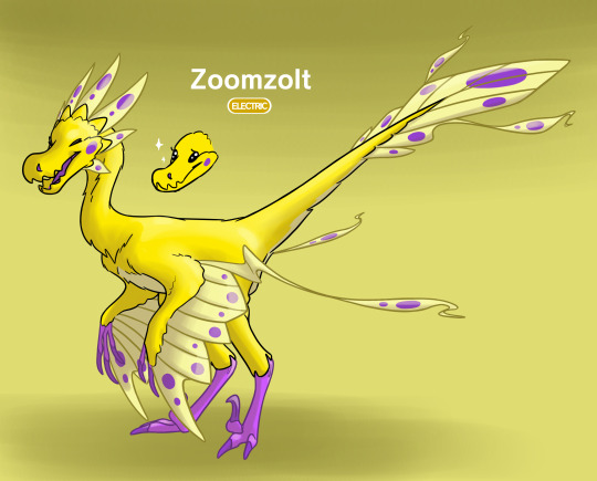
[IMAGE ID: text above the Pokemon reads “Zoomzolt” with a yellow button underneath reading “Electric”. the background is a dull yellow with some areas of shade.
this Pokemon is shaped like a prehistoric raptor, with a small/round horizontal torso, a thin neck curved upright, small arm-wings, lithe digitigrade hind legs, and a thin tail held stiffly out at an upward angle from the body. most of the body is bright yellow with small areas of purple, as will be described. the Pokemon is standing cheerily, facing to the left.
the head has a long snout with a prominent bump emphasizing the tip, where a small purple nostril sits on the visible side. the mouth is held open in a happy gape, showing a purple tongue. the front half of the upper and lower jaws have serrated edges resembling sharp teeth, which seem to interlock. the eyes are closed, the lines of the eyelashes turned up with the smile. a small doodle to the left of the head shows the head with jaw closed and eyes open, showing off glossy black-button eyes with tiny eyelashes, and sparkles floating around the eyes. the head is framed by a crown of large, decorative feathers, all of which are a lighter yellow than the body and sport a couple spots of purple. each cheek also has a single purple spot.
a pair of small arms are held loosely to the sides of the body, each with three bare-skin purple talons with long claws, peeking out from under the fluffy yellow feathers of the arm. each arm sports a set of primary feathers resembling a simple wing, ending at around the elbow. these primaries are a lighter yellow than the main body, with a couple spots of purple near the edges. the overall outline at the trailing edge of the primaries forms a lightning bolt shape. there’s a long decorative feather on each of the wings, close to the body, which extends out into a simple zig-zag, before ending in a rounded tip which resembles a peacock feather with a small wisp and a couple purple spots.
the bonus image removes the closest wing primaries, better showing the lighter-yellow underbelly, and the hind legs. the hind legs are long and lithe, covered in yellow feathers up until the ankle, below which the skin is bare and purple. each foot has three toes, two of which are based flat on the ground with mid-length claws. the third toe closest to the body is raised high, sporting a large, sickle-shaped claw, curved sharply compared to the other claws.
a fan of long, light-yellow feathers spans out from the tip of the tail, resembling both the wing feathers and the crown of feathers on the head, adorned with purple spots. the overall outline resembles a diamond, with a vague zig-zag formed by a few feathers on the sides. two long decorative feathers resembling those found on the wings sprout from the sides of the fan as well.
END ID]
Name: Zoomzolt
Type: Electric
Animal Inspirations: road-runners, cockatoos, microraptors in general
Extra design notes: since the spots on the cheeks canonically match the other fossil in the pair, that gave me free-rein to choose whatever color I felt like, and I eventually landed on purple. I also redesigned the arms/wings b/c the shape was just kinda awkward and dull? I think the new wing shape adds more flair to the design, especially in combination with the tail. btw I only thought of the partly-arboreal lifestyle halfway through the piece, and I didn’t feel like changing the claws to fit it better. just know I’m aware that the wing claws should be curvier, and the toe claws (sans sickle) shorter, lmao
Pokedex entry:
Zoomzolts are a highly social species, roaming the moors and forests in groups of 20 or more. while individuals aren’t particularly strong, their tight social bonds more than make up for the lack-- several Zoomzolts can combine their electric powers and deliver devastating blows to even the fiercest opponents. if this isn’t enough, Zoomzolts are a quick and agile species-- they can race away across the plains or climb up nearby trees before their opponent can recover. their unique feet provide an advantage here-- a marriage between an arboreal lifestyle with the curved sickle-claw for climbing, and a grounded lifestyle with the rest of the flat toes for stable running.
besides scaring off predators, Zoomzolts mainly use their electricity to attract and capture prey. at night, packs of Zoomzolts will gather in the upper foliage of tall trees, settle down, and allow small sparks of electricity to arc across their purple spots-- from one part of the body to another, and from one individual to another. this creates a dazzling light show that many nocturnal Bug Pokemon simply can’t resist. when these bugs venture close, the nearest Zoomzolt will quickly snatch them up before returning to formation.
Zoomzolts are friendly and curious to a fault, known for snooping among human belongings if left alone for too long. they’re very easy to train and bond well with humans, but a Zoomzolt will always need more of their own kind to truly thrive. at least 3 or 4 other Zoomzolts are needed for an individual Zoomzolt’s social/mental health, but not all trainers are committed to keeping that many of one species.
~~~
[IMAGE ID: text to the right of the Pokemon reads “Dunkovish” with a tan button and blue button underneath reading “Rock” and “Water”, respectively. the background is a light blue with some areas of shade.
pictured is a fish-like Pokemon, with a typical torpedo-shaped body and a stocky, blunt head. most of the body is blue, with areas of orange and pale yellow, as will be described. the body is positioned in a downward curve, as if the Pokemon is poised to strike at something off-screen.
the head is heavily armored, with most of the main skull forming one large oblong-dish shape. much of this armor is dark blue, while other sections are a bronze-orange color. the jaws are formed out of large, jagged plates, creating massive interlocking orange teeth. the jaw is gaping slightly open, showing a pale blue inner mouth. the visible jaw hinge is rounded and prominent on the cheek. two small, round, bulging eyes sit just above the jaws, on either side of the head near the hinges. the eyes are pale yellow with black, vertical, rectangular pupils.
a few other large plates of armor (some dark blue, some bronze orange) extend out past the main head piece onto the body, arranged like overlapping scales. these plates all have lines at the trailing edges, implying a simple texture. the main body beyond these scales is pale blue, with splotches of dark blue and smaller spots of orange splattered across the body, arranged in a pattern to imply small scales.
there are two sets “limb fins”, one directly behind the lower jaw, and the other near the tail. both sets are built on prominent lobes extending from the main body and matching the main body colors, before the spines of the fin extend out from the ends, flaring out in a pale yellow. the front set of fins is medium-size, smaller than the head, while the back set is much smaller.
the tail fin starts on the back, in the middle of the spine, and extends down to the tip of the tail, then underneath into an extra lobe of spines. visually, this means the main fleshy part of the tail extends into the upper lobe of longer spines, while the lower, shorter lobe of spines flares out underneath, unsupported. this tail fin is pale yellow.
END ID]
Name: Dunkovish
Type: Rock, Water
Animal Inspirations: dunkleosteus, coelacanth
Extra design notes: added in a rock type b/c of the whole “armored fish” thing, and some orange to complement that
Pokedex entry:
this Pokemon roams the open ocean, traveling dozens of miles every day in search of large prey to attack. once spotted, Dunkovish will swim off an appropriate distance, then charge the prey at full speed, ramming their rock-hard skulls into their prey. these charging attacks can easily shatter bone and internal organs, leaving their prey weak and defenseless as Dunkovish feasts.
Dunkovish aren’t typically a danger to humans, as they usually steer clear of shorelines. small shipping vessels are more at risk, as Dunkovish can mistake the ships for prey and ram into them, causing shipwrecks and major losses.
while their power makes them dangerous for the inexperienced, Dunkovish are shockingly easy to train. they’re very food-motivated Pokemon, so all a prospective trainer needs is a lot of tasty chum and a bit of patience.
~~~
[IMAGE ID: text to the upper left of the Pokemon reads “Arctoise” with a light blue button underneath reading “Ice”. the background is light blue with some areas of shade.
this Pokemon looks to be a cross between a tortoise and a plesiosaur, with a large, rounded shell, two sets of long fins, and a paddle-like tail. the shell is mostly snow-white, while the rest of the body is mostly blue with areas of white, as will be described. the body is floating at rest, fins spread-eagle from the body for balance.
the shell is fairly tall and dome-shaped, with the lower half wrapping underneath the torso, between the front and hind legs. the shell has some ridges at the back implying “layers” of snow, which smooth out as they reach the front of the shell. the base color is snow-white, while the lower two “layers” get progressively darker, into a blue-ish light grey. this grey peters out into spots as it reaches the front of the shell.
the head is long, thin, and sharply pointed, making for a thin spear shape. the snout resembles a dolphin beak-- long and rounded at the tip. the eyes are sharp and triangular, with visible white sclera, light blue irises, and round black pupils. the nostrils are based at the center of the beak, raised up along with a small ridge of bone at the center-line of the beak, meeting the forehead. the nostrils are merged together into a small heart shape. a set of small spiral shapes frames either side of the cranium, implying some kind of auditory system. the neck is tucked into the body in the main art, but a small doodle to the side shows the neck fully extended-- long and serpentine like a heron. while the main body (outside the shell) is an aqua blue, the head itself is mostly dark blue, with a few stripes of aqua blue at the tip of the beak.
there are two sets of long, pointed fins, the front set slightly larger than the back set. the front set of fins sit to either side of the neck, settled into the open body cavity of the shell. the back set extend from the shell as well, just in front of the tail. each fin’s base color is dark blue, with white tips and white spots that vaguely follow the inner bone structure of the fins.
the tail is thick and somewhat short, smoothly transitioning from the wide main body-shell down into a pointed tip. lobes of short cartilaginous fins sprout from the top and bottom of the tail tip, the top lobe taller but not as long, and the bottom lobe shorter height-wise but longer. the main tail is aqua blue, while the fins are dark blue.
END ID]
Name: Arctoise
Type: Ice
Animal Inspirations: sea turtles, tortoises, plesiosaur, herons, anhingas
Extra design notes: in retrospect, the ‘shell’ is prolly meant to be a mane of fur, but I like my shell idea too much to change it (if I were to redo it tho, I might’ve gone for like... seal inspiration? selkie lore?? hm). also certain restorations of plesiosaurs shaped the ‘paddle’ on the tail like I’ve shown, which makes more sense to me.
Pokedex entry:
this Pokemon is closely related to the modern Lapras, as seen in their many shared structural features. many researchers even believe Arctoise to be a direct ancestor to Lapras due to genetic similarities, but this question hasn’t been fully resolved.
Arctoise are very successful predators of the frigid southern pole, utilizing a unique hunting technique. they float patiently out near glaciers, necks tucked into their shells and staying perfectly still for hours on end. when other Pokemon see the Arctoise’s shiny white shell, they’re fooled into thinking it’s a snow-covered glacier, safe to rest on. when the Pokemon settles comfortably on the shell, Arctoise snaps into action, quickly flipping over so their prey is thrown into the water. sometimes this is enough to drown the prey (often true for Flying Pokemon that dropped down to rest), but usually this only stuns the prey. this gives Arctoise the chance to snap out their long neck and capture the prey in their powerful jaws. once subdued, Arctoise will right their body in the water and enjoy their meal.
despite the ponderous size/shape of this species, Arctoise are still able to float quite easily due to air sacs located near their spine (thus, near the top of their shell). these sacs allow Arctoise to carefully control how they float, and help hold the large dome of their shell above the water.
communities of small Water Pokemon often form around Arctoise. the large shell and quiet demeanor makes for a stable underwater haven, and a steady source of food from the scraps that Arctoise leaves behind. they’re usually safe from Arctoise’s appetite, as they’re too small to be considered a proper meal. additionally, these small Pokemon often attract larger prey to the area, providing Arctoise more hunting opportunities.
Arctoise is an aloof species, and won’t respond well to “overly-affectionate” bond-based training. but as long as their space and solitude is respected, an Arctoise is willing to cooperate with a trainer towards mutual goals.
~~~
[IMAGE ID: text to the upper left reads “Dracoleon” with a purple button and magenta button underneath reading “Dragon” and “Poison”, respectively. the background is a light purple with some areas of shade.
there are two Pokemon in this image, one to the left with a “female” ♀ symbol, and one to the right with a “male” ♂ symbol. both Pokemon resemble stocky, low-set herbivorous dinosaurs, with short/thick legs, and round/heavy torsos. the female is far larger than the male, and sports two rows of large spikes along her back. the base color of both is a dark green, with large swathes of magenta patterns, as will be described. both are poised with their heads low to the ground, and the female’s tail raised in a defensive position.
the heads of both sexes are wide and triangular, with sharp points at either side of the skull, and a pointed beak at the tip. their round eyes rest underneath the flat top of the skull, facing outwards to either side. the female’s eyelids are pointed down in an angry expression, while the male’s eyelids are pointed up in a worried expression. their visible sclera are white, and their irises are dark magenta. their nostrils sit on either side at the point of the beak. there are prominent bumps on either side of the skull, just behind the eyes, implying an auditory system. the flat top of the skull is bright magenta, while the rest of the head is dark green.
the small head transitions into the larger body via a thick, short neck, held low to the ground. the torsos are both round, heavy, and somewhat horizontally flat like a lizard. the base color is dark green with a light green underbelly, while the magenta pattern on the head extends all the way down to the tail, covering the full back. several pointed spikes of color stick out from the pattern, trailing down the sides of the torso and legs.
the female has two rows of light magenta spikes sticking out from the upper-sides of her torso, 7 pairs in total. the front-most spikes are the largest, with a horn-like shape that curves out in a wave of out-up-out into a sharp tip. the shape of the spikes gradually transitions from round horns to triangular plates at the end of the tail. the sizes transition from the largest at the front, smaller on the torso, larger at the center of the tail, then small at the tip again. all the spikes point at an angle out/up from the body, except for the very last pair on the tip of the tail, which stick out flatly from the sides of the tail.
the legs of both sexes are short and stocky, with thick underlying muscles. the feet are all digitigrade, but the foot/”hand” sections are very short. the feet all have 3 main toes set flat on the ground, while the front feet have a dew claw set higher on the hand, above the ground. all claws are short/thick and hoof-like, though the female’s are slightly longer and sharper. the hind legs are longer than the front legs, pushing the hips higher than the shoulders. the legs are all dark green with light magenta claws. the female has extra magenta stripes running horizontal across the legs.
the tails are both thick, transitioning smoothly from the thick body down to a pointed tip. the male’s tail is short and stubby, while the female’s is longer, sporting the spikes.
END ID]
Name: Dracoleon
Type: Dragon, Poison
Animal Inspirations: stegosaurus, ankylosaurus. (also.... Kaim from Devilman......)
Extra design notes: I mostly color-picked for the other Pokes, but I shifted Dracoleon’s color a lot from the canon colors. the og colors were just a bit too much for me-- hurt a lil bit to look at. so I shifted the red more magenta, and the green to a duller, more subdued saturation. I’m hoping the purple-shifted red conveys the Poison type better. also added a couple more spikes to the tail for flair.
Pokedex Entry:
due to their heavy sexual dimorphism, researchers originally identified male Dracoleon remains as juveniles of the species. it wasn’t until this Pokemon was fully restored in the flesh that this misconception was corrected.
female Dracoleon are highly territorial, aggressively defending their territory against anything they perceive to be a threat. thus, females are generally solitary, only tolerating the presence of male Dracoleon. this aggression only increases during breeding season, when females compete for male attention, and then nesting season when defending their hatchlings.
male Dracoleon are much smaller and more docile than their female counterparts. while females will actively protect males when the males are still within their territory, males usually find protection in numbers by banding together into small groups. males are as attentive to nesting needs as the females, but since they end up mating with several females a year, they roam in small groups across several territories. they’ll visit one female’s nest to help with food and nest protection for a while, before heading off to the next territory for another round of nest-duty. these transition periods from one territory to another are where males are most vulnerable to predation, so they try to travel quickly.
females’ spikes are covered in a toxic oil which is mostly an irritant to fellow Dracoleon and Poison-types, but can easily kill other species if it penetrates the skin. their magenta patterns build an association between their bright coloring and toxicity, which helps protect the males from predation by association, despite the males not having toxic spikes.
while Dracoleon are herbivorous generalists of thick forest regions, they seem to prefer roots and tubers over foliage. Dracoleon territory is easily identified by scattered areas of dug-up soil and holes.
while male Dracoleon are generally easy to befriend and train, females are very stubborn and aggressive towards most training attempts. however, if an experienced trainer is determined enough to prove their worth to their Pokemon, Dracoleon can become one of the most loyal and trustworthy companions a trainer could hope for.
#pokemon swsh#arctozolt#arctovish#dracozolt#dracovish#pokemon#pokemon sword and shield#WHEW... that was a task
69 notes
·
View notes
Note
Hello! I’ve been reading your comic for a while now and I LOVE it. Can I ask you how you design the outfits for the characters? They always have rlly nice textures and details even when the outfits are pretty simple how do u do it?
THANK YOU!!! I love drawing fashion and stuff it’s one of my big loves
Mainly I think of the character themselves, and what kind of wardrobe they would have. For example, Alice like romantic frills and dresses, and keeps herself pretty well styled. Edith is more of a utilitarian type and goes for simple pieces with small details since she’s a Diamond. Hatter I just google straight up “mori boy fashion” and draw inspiration from that.
I can give you an example with this Rougina outfit, since she’s a character with so much mythology behind her I love designing her outfits
So this dress at the end of Chapter 7:

The situation? Rougina coming to lay down the law with Alice in public, so the style calls for something governess-esque, so I made it very tight and business-like. I drew inspiration from Bloodborne hunters costumes for the half cape. The skirt train itself is something signature to the Red Queen. In the Tenniel illustrations the Red Queen has a large skirt and the White Queen has a shawl, so I made those staples of their costumes.
The colors? Dark and grey since she’s a Queen in mourning over the White Queen, but with pops of red since that’s her signature color. The yellow-white triangle on the neck is meant to symbolize the White Queen, an empty gesture for the public.
As for textures I LOVE using my sand brush, or what I call the “Chowder method” which is just, overlaying a pattern with no care for where it would fall on the fabric realistically. It’s so cartoony and appealing to me I just love it.
Thinking about a character’s personal style, what season it is, and what they think of their own appearance/how they appear to others is all a part of the thought process. Fashion is just an extension of character.
Thanks for asking!
39 notes
·
View notes
Text
i’ve been thinking a lot recently about like
the kind of clothes that i currently wear, and the kind of clothes that i actually want to wear, in terms of like... my every day. i have certain clothes and i wear the same things a lot, and certain things are beginning to wear out, especially my jeans and some of my favourite shirts
and i want to make my wardrobe more... me. bc in recent years i’ve not been dressing all that flamboyantly, because a lot of the flamboyant things i like are just too cold to wear, and i’ve not stuff to appropriately layer
and i’m thinking about like... what my ideal wardrobe would look like, and what i actually want to wear
in general... i like brocades and i like patterns - especially paisley, florals,and snakeskin, and i love anything that just looks like a grandmother’s wallpaper.
i like reds and greens and golds; i like black and brown. i love mustard yellow and venom green, i love crimson, i love dark, luxuriant purples, and i love different browns - dark chocolate hues, lighter leathery ones, dark tans... the only browns i don’t like are like, camels.
i don’t like to wear silver, although grey can be alright; i don’t really like blue that much, and i like burnt oranges that tend toward brown, but not really bright oranges. i also don’t really like brighter yellows or neon colours.
i like leathers and silks; i like embroidered fabrics and brocade; i like to feel the weight of fabric, whether it’s multiple layers or one. i like furs and fleeces. i love lace and i love ruffles, and i love being able to look at something and just see the volume. i love military bits and pieces, i love pockets, i love little chains and i love textured/carved buttons.
i like cinched waists, i like to be able to show off my wrists and my ankles and my neck; i like things with a stark silhouette; i like exaggerated shoulders and i like wide skirts on coats versus the narrow waist. i like to billow when i walk, especially because i walk with shoulders back and hips swinging.
and i like shoes that make a noise, i like to make a noise when i walk, and i like to feel the weight of everything i’m wearing, and have that pressure on my shoulders especially, but i want everything to be warm, and to be very comfortable to walk in no matter the weather.
in general, if i were to pick like... specific styles, i would pick the obvious dandy, for more understated things; i like rogueish/piratical styles, but especially piratical a la dustin hoffman’s costuming in hook (or jason isaacs’ in the ‘03 peter pan); i like sailor’s clothes in general, especially when it comes to jumpers and shirts for wearing around docks or on a ship; i... to my own surprise, i’m actually pretty down with a lot of elements to cowboy gear, but especially, you know, like sidney zweibel style Gay and Cartoony about it.
outerwear:
i like coats with brocade and colour - i like bold reds and golds, i like blacks. i love old-fashioned military style, like of the 18th and 19th century military styles, especially with big sexy epaulettes and a lot of brocade fronting. i like long coats, with big sleeves.
i think i would like to wear a cloak, or like, an inverness style coat with a cape - i love the victorian style of coat-with-cape, and i’d be well down for that. i also like brown leather, and as well as the brown suede coat i already have, i’m gonna try and nick my da’s brown leather coat with paisley lining
i also like. desperately want a yellow oil coat, like you wear on a boat. you know like if you imagine a lighthouse keeper in a yellow mackintosh? those are perfectly easy to buy, because i live beside the atlantic ocean, i just haven’t, because i’m kind of dim
general wear:
i like jeans. i do like jeans. but with that said, i think i want like... heavy jeans? like i want workman’s jeans, i think - i want the kind of jeans that if i went to a farm and expected to be working with horses and riding and jumping fences, they’d be perfectly serviceable, you know?
i also like trousers with patterning, with front-flaps or with buttons etc; i like trousers that have designs around the pockets and i really like to have them high-waisted that accentuate the hips and the ass, and remind me to keep my posture. i don’t know if i’d wear a corset, but i do like the victorian figure, and i don’t think i’d be opposed
i want more shirts with like... detailing. i really like shirts with lacing and ruffles; i really like shirts with exaggerated cuffs. i like bright patterns, and i like bright colours. i thin i also want to get some engineer’s shirts and heavy cowboy shirts that you wear undershirts beneath - again, workman’s shirts that are made to take some wear and keep you warm, but look very bright and sexy?
i want to wear the waistcoats i own more often. way more often. i want to wear suit jackets more - in general, i like things with embroidery and brocade, and i like to wear ties and bowties, and i should wear them more often, because i like them.
in general, i like cinched waists, i like to accentuate my wrists, my ankles, my neck; i like plunging necklines; i like tight-fitting stuff that’s warm, and i like to layer clothes, which is why it makes sense for me to transition toward wearing more suits
as for jumpers and cardigans, i like the ones i already have - i like sailor’s patterns and i like corded wool.
shoes and accessories:
i want some hoops for my ears. i tend to wear one earring on the left side, but i want some more sexy dangling ones - a gold hoop would do perfectly well, and i want stuff along those lines, like the smaller hoop with something dangling from it. i like it. it’s camp, it’s gay, it’s a little silly, i like it a lot
i think i’d also like a new pocketwatch, because mine gave up the ghost like seven years ago and i never got around to replacing it. i think i’d like to wear more rings???
i need more gloves, and i’m going to invest in proper leather gloves for the winter, ideally lined with fleece or cashmere or something - i want proper gloves that you can work in, and that i can like, keep on to do things. i want more scarves, i think - i only really use three? two are red, and one is mustard yellow, lmao, because i’m Predictable Like That
and for shoes... i want cowboy boots. i love them, and i want them. i had cowboy boots before and i will have more. in general, i think that i prefer boots to shoes - i like wearing steel toe boots for work, i like the weight, and i like how they fit to my calf. i LOVE chelsea boots, and i like snakeskin, i like red leather, i like brown leather.
white leather is... very sexy, but i think the BDE is a bit more than i’m ready to pretend i have just yet lmao
i favour chelsea boots and cowboy boots because i’m shallow about how short i am and i want the added boost - in a pair of good heeled boots, especially in like, cuban heels, i go from 5′6″ to 5′8″ which is like, average height rather than a little short
also SPATS???? yeah......
underclothes:
broadly happy with my choices of underwear, actually, but i want to wear more vests and thermal undershirts, and i think that also like... i want some long johns. i wouldn’t get a load of sets at once, but i would get one set and just... see how i go. i think i’d like them.
honestly, for formal occasions, i think sock suspenders are extremely sexy and i should wear them. i don’t need them. i just. i like them.
15 notes
·
View notes
Text
Overdue Replies
Holy crap, this is long, OMG. I’m so sorry.
For @pensblr, @bunsblr, @shaonharryandpannisim, @newlibertysims, @fuzzyspork, @littleblondesim, @kayleigh-83, @penig, @damask-wallpaper, @acquiresimoleons, @sim-pudding-faces, @digitalangels, @celebkiriedhel, @unoriginalkirsten, @alicephant, annnnnnnnnnd @landgraab.
pensblr replied to your photoset “More paneling because I wanted some with narrower individual boards. I...”
Thank you! Love the high-res textures. Lately, I have been on a swap-out as many low-res textures as possible kick.
Ohhhhhh, then you are either going to love me or want to murder me in my sleep. Possibly both. :)
But yeah, I decided I wanted all the things high-res for this new Strangetown project. Mostly because I’m going to be photo-editing all the pictures and I want things as nice-looking as possible to start with and not have to worry about pixellation in the background if I’m taking close-ups and stuff. So, that means I have to make a lot of crap since I’m pretty much building a downloads folder from the ground up for it. Build mode first, since I’ll be building lots for the place soon...
bunsblr replied to your photoset “More paneling because I wanted some with narrower individual boards. I...”
One can never have enough paneling!
That’s my feeling! It’s versatile! You can use it inside as paneling or outside as vertical siding. Both were big mid-century, which is pretty much what I’ll be building so...yeah. One sets of walls, multiple purposes.
shaonharryandpannisim replied to your photoset “More paneling because I wanted some with narrower individual boards. I...”
I had resisted the pull of those sofas. But I can NOT, for the love of Maxis, resist THESE.
Resistance is futile. You will be assimilated. Your biological and technological distinctiveness will be added to our own.
newlibertysims replied to your photo “Napoleon, not being an asshole. For once. He actually got along quite...”
That street needs a Cat Licking sign.
Orrrrr the cat needs to stay out of the road. Then again, cats like roads. Nice and waaaaaaaaarm.... :)
fuzzyspork replied to your photo “Napoleon, not being an asshole. For once. He actually got along quite...”
It's a good thing random cars don't drive past the lots in TS2. XD
They do when you have that fire hydrant that makes car pool vehicles drive by occasionally! I’m not using that in this neighborhood, though. Not yet, anyway. I don’t reckon it has much vehicle traffic, what with there being only three households and all. :)
littleblondesim replied to your photoset “Meanwhile, over at the pool hall, schmoozing with Review Guy has its...”
http://www.wordlab.com/name-generators/ :)
See, I knew someone would point me at one! :) *is lazyass* Thank you!
kayleigh-83 replied to your post “Your game is so ugly. Maybe it's about time to step it up to 2017.”
In which my eyes roll so hard they fall out of my head and across the floor...... lmao honestly anon, get a life.
They have a life! IT IS FULL OF CHEAP WHISKEY! ;)
kayleigh-83 replied to your photo “I can’t be the only one who thinks the poses that Sim-kids strike...”
So agree! I kind of wish Sims retained some of it as they age, like maybe more active Sims stayed more "active" sleepers? Would have been extra cute!
It would have been! I mean, some people never grow out of being restless, flailing, bed-hogging sleepers. *side-eyes husband*
kayleigh-83 replied to your photo “Heh. Took a break from hurling invective at the game’s lighting to...”
That's such a creative idea to make Sim paintings out of it! I love hanging art or photography in my Sims homes that are of their own world, it adds a kind of realism I appreciate! Just like we would hang photos or paintings of our own world.
I have always kinda wanted to do the “take in-game pics and turn them into family pictures” thing...but I’ve never actually done it. One, because I just don’t have the patience to do posing. Two, because even if I had the patience I’m utterly bewildered by poseboxes. Like, how on Earth do you keep track of which box has what poses? Especially because most of them “helpfully” give the poses names like “Pose 1.” I’m just all WTF when it comes to them.
But I can do scenery pics as paintings/photos, yeah!
fuzzyspork replied to your photo “Heh. Took a break from hurling invective at the game’s lighting to...”
NICE! Also, if you ever want to hate something that used to be fun for you, just do it as your job for a while. XD
Exactly! That’s why I really didn’t want to be a musician when I grew up! I wanted to be an architect! Unfortunately, math and I have that whole hate/hate relationship going on, so no architecture degree for me! And, as it turns out, music is the only bankable talent I have, given that I have no interest in having a “real job” with bosses and stuff because I’d just get my ass fired if I tried to have one. So, here we are! Thankfully, it didn’t kill my lurve. Probably because it’s such a wide-ranging field, so if you hammer on one aspect of it as your job, there are all sorts of other things you can do for fun.
penig replied to your photoset “OK, game-graphics nerds! I haz question! (Yes, @celebkiriedhel, I’m...”
I had to look intensely to see what you were talking about. I do notice that in my game and I think of it as realism. Because you can see the lines between panels and breadths of wallpaper IRL.
Well, yeah, I can see that with wallpaper. It does have seams IRL, at least. But for flat painted walls, where the “gradient thing” is the most noticeable because there’s otherwise no pattern to distract your eye? Yeah, that doesn’t work as well. :) *still busily hurling invective at Maxis and their stupid lighting calculations and going why, why, WHYYYYYYYYY?!*
damask-wallpaper replied to your photoset “Technicolor was a series of processes used in filmmaking mostly...”
What a fun idea! Who doesn't love the technicolor look?
I love, love, love old movies, with a special fondness for B-movies from the 50s/60s done on the cheap with bad Technicolor when Technicolor was no longer cool. So, yeah, I love the look, myself, whether it’s done well or badly. I think it’ll be fun to photoedit pics for retro-Strangetown.
I kinda wonder if it might be possible to get ReShade to make the game itself look like it’s in Technicolor, but I’ve never managed to get ReShade to work with my TS2 install, so I can’t experiment with that. :(
acquiresimoleons replied to your photoset “Since his mama had decided to visit, Steven made a special dinner....”
Yaaay werewolf! (I'm pretty sure that's what's happening anyway lmao)
Yup, he’s a werewolf! :) I’ve always liked the transformation sequence in TS2. It’s so drama-ful. :)
sim-pudding-faces replied to your photo “And then it was time for Baby Aaron to grow up… Ermagerd, he’s cute!...”
Aww.. lil guy is trying to be stud at an early age, eh?
It’s all about the laydeez! Or maybe about the bois! Or maybe both! Dunno what he’ll like yet. But yes, a stud from infancy, he is. ;)
digitalangels replied to your post “Your game is so ugly. Maybe it's about time to step it up to 2017.”
I'd love to see how anon's game looks to see what is "stepping it up" in their books but I bet they're too much coward to give their name for us to see. And anyway, isn't half of the point in Sims games customizing it to look how *you* want *your* game to look like or have I been doing it wrong all these years?
Yeah, it’s kind of funny how such people who leave such messages don’t give you any points of reference. “Stepping it up” is meaningless without such things. I mean, how else are we to know if we’re “stepping it up” properly?
No, really, I think some people are just really offended by non-Maxis-match and/or using older CC and/or shinier hair/skin textures these days. But, I’m uninterested in Maxis-match (for my own game; I like looking at other Maxis-matchers’ pics, though!), and I like a bit of shine because we do not live in a matte/cartoony world, so such folks and me will just never see eye-to-eye when it comes to game aesthetics. And that’s OK by me, but apparently not by them. Or something. I’m still going with “bottle of whiskey + nothing better to do on a Friday night so let’s *hurr hurr* try to make people angry” theory. To each their own!
newlibertysims replied to your photo “GilsCarburg, in moody Technicolor. ;) OK gotta stop fiddling with this...”
Reminds me of lazy, hazy, crazy days of...fall. XD
Fall! Fall is good! I can’t wait to get this whole summer business over with! I need to live in a place where it’s fall year-round. Which pretty much means another planet, but hey! I’m game for that!
newlibertysims replied to your post “Your game is so ugly. Maybe it's about time to step it up to 2017.”
Nothing wrong with being 2008 hot. Just ask Jenna Marbles!
*had to look up Jenna Marbles because I’m totally un-hip to the whole “youtube personality” thing* But yeah! Totally! Other than finding my soulmate in 2013, I think this decade totally bites, personally. Actually, now that I think about it, so far this century ain’t so great, IMO. Tonight, we’re gonna party like it’s 1999. ;)
penig replied to your post “Your game is so ugly. Maybe it's about time to step it up to 2017.”
I think, from the voice of certain anons you've responded to lately that you've picked up my stalker. She doesn't like taking responsibility for what she says by putting a face on. And she is persistent as heck.
O RLY?! Oh, the fun we will have, then! Bring it on, anon, bring it on!
fuzzyspork replied to your link “Tips For Manipulating The Sourness Of Your Sourdough”
Ah! I needed this too! I always hated the sourdough we used to make because it was way too tangy (hubby loved it though). He works for a German company and one of the managers offered him some of her 100+ year old starter. I'll have to give it a shot.
Oh, yeah, totally. I’d definitely take her up on her offer. Even if it’s not to your taste to start, you can futz with it. You could even split it and develop a tangier starter and a not-so-tangy one, to suit both your tastes. ‘Course, then you’ve got double the upkeep, but it might be worth it...
fuzzyspork replied to your post “Your game is so ugly. Maybe it's about time to step it up to 2017.”
TS2 is 13 years old. I have no idea what "step it up to 2017" even means.
Right? I mean, TS2 is almost from the last century and all. Why must we force it into crappy 2017? I think it would make it cry. ;)
...Unless we’re talking 2017BCE. That would be cool...
celebkiriedhel replied to your photo “Steven does the annoyed potty-training faces, too. Yes, it’s an...”
But what a manly hairy chest!!
Yeah, the GilsCarbo men are hairballs. ;) Well, the three of them so far, anyway. ;)
celebkiriedhel replied to your post “acquiresimoleons replied to your post: ...”
I used to keep mine on top of the fridge - the top of the fridge was warm from the motor. :)
That’s a good spot, too! The fridges in our places are built-ins, though, so you can’t put stuff on top of them. Which actually sort of sucks, but on the other hand the aesthetics of built-ins please me, so....Rock, hard place. ;)
celebkiriedhel replied to your link “Tips For Manipulating The Sourness Of Your Sourdough”
Thanks for this! I used to make my own bread when I was younger, and I miss having a sourdough starter living in my house.
It is rather fun when the oldest thing in your house is a living being. :)
celebkiriedhel replied to your post “Your game is so ugly. Maybe it's about time to step it up to 2017.”
LOL. Lets play 'How old the anon is'! My guess is early teens, with an entitlement phase of a toddler.
Yeah, if the “whiskey + lack of social life” theory isn’t correct, then I’m going with Age ~15. (No offense to sane 15-year-olds out there, but some of y’all...) Of course, being 15 and the “whiskey + lack of social life” theory aren’t necessarily mutually-exclusive, so...
unoriginalkirsten replied to your photo “And then it was time for Baby Aaron to grow up… Ermagerd, he’s cute!...”
That is spectacular baby balancing right there!
Like those folks who can balance spinning basketballs on their fingertips! Of course, balancing a spinning baby is far more impressive...
alicephant replied to your post “Your game is so ugly. Maybe it's about time to step it up to 2017.”
Lol how dare you have a game that you find aesthetically pleasing �� anon is a poo head.
Is it just me, or is “poo head” just a way better insult than “shithead?” I mean, the former, when done right, is just so much more condescending. (And not in the Regency-era sense of the word, either. ;) ) But yeah, I agree. :)
landgraab replied to your post “Your game is so ugly. Maybe it's about time to step it up to 2017.”
"I don't like *your* game, so change it!!!"
Pretty much, yeah. Ya gotta wonder how anyone would think that such a demand would actually work, that anyone would just change everything about what they do in the game because some people don’t like their aesthetic. I mean, it’s not like those of us who don’t conform to “popular” trends are somehow unaware that we’re not conforming to popular treads. Especially when our general pattern in life is being deliberate in our refusal to conform to popular trends about anything, not just a silly game. ;)
#pensblr#bunsblr#shaonharryandpannisim#newlibertysims#fuzzyspork#littleblondesim#kayleigh-83#penig#damask-wallpaper#acquiresimoleons#sim-pudding-faces#digitalangels#celebkiriedhel#unoriginalkirsten#alicephant#landgraab#replies
12 notes
·
View notes
Text
Shadow Tactics – Finding the Perfect Art Style
From colorful to rather dark and realistic: finding the right art style for Shadow Tactics took time, but it was worth every second.
Since the company’s founding in 2012 we developed two big games for PC and consoles as well as several mobile apps, with these two games being »The Last Tinker« and our recent release »Shadow Tactics: Blades of the Shogun«. In this article we want to take you behind the scenes of our quest to find a fitting art style for both The Last Tinker and Shadow Tactics. First off, we will introduce both titles and their art styles to you. After that we’ll dive right into the development process before we talk about problems and challenges we encountered along the journey – and of course about how we solved these issues.
The Art Style of The Last Tinker & Shadow Tactics
The Last Tinker is a third person jump ‘n’ run in a colorful world, inspired by games like »Banjoo Kazooie« and »Jak & Dexter«. As Koru, you must defeat the Bleakness that threatens Colortown by using the power of colors. The game’s style is defined by round and smooth shapes, bright colors and a warm light setting. Everything is made from paper, color and glue which combined results in papier-mâché. As a contrast, we added some cardboard elements to create edges and make the world look more interesting. No straight lines, no 90 degrees, rather playful than super accurately drawn patterns – everything looks like it’s made and painted by children. The game’s characters are cartoony and funny, showing their attributes in their looks.
Shadow Tactics is set in Japan’s Edo period and it’s quite the opposite of The Last Tinker. It’s a hardcore realtime stealth game in which you control five different characters with individual skillsets. Basically, it‘s »Commandos« with Ninjas. You kill or sneak around enemies to accomplish your missions. Theme and story of this game are darker and grittier, that‘s why we decided to create a more realistic style and combine it with non-realistic elements like outlines imitating ink, that typical Japanese paintings are famous for. We included many details and each map has its own interesting light setup to catch the mood of a level. In comparison to The Last Tinker, we used more desaturated colors. All characters are human but they all have their own unique silhouette, so you can instantly identify and recognize them. However, they have longer legs than normal humans – a design decision we made because the perspective made them look smaller and somehow compressed.
Finding the Style for The Last Tinker
The Last Tinker started as a project while we were still at university and we had three to four weeks to complete it. It had to be in 3D which was a problem for us at that time. When we started developing the style, our artists had nearly no experience in 3D modeling – our strength clearly lied in creating 2D graphics. So we thought about how we could use our skills in creating 2D graphics for a 3D game. We didn’t have the time and experience to make high detailed models so we thought about what we could create with the help of simple shapes and if we could create details with the help of textures. That‘s why we started with a 2D image that we projected on a plane and roughly cut out the shape of the image. Then we extruded the face and voila – we had a 3D model. Now we just needed the right material to realize this style, ending up with cardboard. [6]
6
So we decided to create a world made entirely out of cardboard but we weren’t really satisfied with the early outcome. It looked sort of boring. Plus, we felt like cheaters because our 3D models were so simple. Still, we needed 3D models with plain shapes that could quickly be created and animated. Then we had the perfect idea: Papier-mâché! It’s perfect for beginners in 3D modeling. Plus, at university we were five artists. After starting the real production, we were two artists, then four. By only having to handle one or two materials we were able to create a world fully made of papier-mâché. Material handling was crucial, as creating different good looking materials that look good and real costs a lot of time.
Everybody loved the idea and since we had proper 2D skills, we decided to use textures to add detailed hand-painted patterns.
Now we had a base to work with. To get to know the material better we came together with artists and game designers in tinkering sessions [1], testing different shapes and patterns. We had two or three of these meetings and in the end we really knew the material and its potential. The figures we made were nice references. Some were really good, some were pretty ugly. Oh, and we still have them in our office. One of them sits right next to me and watches me … creep … [2]
Anyway, after having decided on a direction, we wanted to get a clearer vision for our design, which we eventually found in the works of Hundertwasser and Niki de Saint Phalle. Both focus on round and smooth shapes which colorful textures. Plus, we looked for papier-mâché figures made by kids because we wanted the world to look like kids built it. Those references gave us a good feeling for how the world and characters should look like.
First Steps in the Right Direction
After graduation, we occasionally experimented with the prototype, got a lot of feedback and wondered how we could improve it. When it became official that we could make The Last Tinker a complete game, we developed a story and reworked the gameplay which both influenced the style of the game. The first thing we noticed was that everything looked too clean and not very lifelike.
So we added some color splashes and dirt to make everything look a bit more used. Along with the story came Colortown’s different districts, which served the gameplay well. Prior to that, the world was so colorful and chaotic that players often got lost. Introducing the districts and with them some coloring rules helped solving this issue. As already mentioned, we initially used only two materials. After starting the development, however, we considered adding more materials like water and paper hills [3] to make the world more interesting. We struggled a long time with the water because it never really fit into the world.
Then we had the idea to add patterns that you can see on nearly every asset: spirals. They appear as ripples in the water and as splashes in waterfalls. Honestly, I love spirals and I loved drawing them. After some time though, I was so fed up with them that now, every time I see a spiral, I’m about to scream!
Of course, not all of Tinkerworld is friendly and colorful. The Bleakness wants to erase everything in it. The player sets out on an adventure to defeat the Bleakness and the monsters it created – so much for our vision of the first prototype. Style-wise, they needed to fit into the world, so we gave them round and simple shapes. Still, we wanted them to look like something totally strange and foreign to the world. So we decided to make them out of some kind of goo, however, they seemed like being made out of porcelaine. Again – with the story we added in the later production, in which whole colortwon is covered by bleakness – we needed to find a design for this new material. We had an overall feeling and look for the creatures but we still struggled with the Bleakness that wasn‘t lifelike.
We had so many concepts [4] and it took us very long to get the Bleakness’ style right – also because of some technical problems. We ended up with a mix between a less shiny form of goo, and something that you can‘t touch, something that isn‘t really quite there. We also added some patterns on every bleak object to give them a little bit of a mystical appearance. [5]
Finding the Style for Shadow Tactics
The basic idea for Shadow Tactics formed during our time at university. Our Creative Director had always been a huge fan of “Commandos”, so he thought “Why not revive this genre?” So, what’s cool and fits a stealth game? Exactly: ninjas! So we pitched a Commandos-like game with ninjas, with the very first draft being a mobile version. And as we all know, it‘s always common to reuse skills you acquired in prior projects to do something completely different … not. Shadow Tactics was supposed to become a mobile game [7] , so we had a rather cute and cartoony style in mind, which we were already used to. Or in other words: we were – artistically speaking – kind of stuck and pretty much too influenced by our work on The Last Tinker, but we knew that this wasn’t the style we wanted to go for. We wanted to reach these old fans of Commandos which were used to a much more realistic style with tons of details and crispy textures.
8
We analyzed the spiritual predecessor [8] and tried to understand what made Commandos … well, Commandos. We wanted to keep its core elements within in our own style to keep the old fans of the game happy – for us artists, however, finding the right style became a real struggle. We had our concept artist overpaint some Commandos screenshots [9] [10] to get a better feeling for a more realistic style while trying to add our touch to it. We never wanted to create some super realistic style, because that just wouldn’t have been us. Plus, for only four artists it was nearly impossible to make a realistically looking game, so we mixed realistic elements with non-realistic elements. We started to concept and model some buildings because somehow the concepts we had created so far didn‘t get us any further. In the beginning, we reduced the complexity of the models and again used textures to obtain detail, which based on photographs that our artists painted over to give them a painted look. We experimented with different non-realistic elements like outlines and canvas patterns [11]. The outlines worked best ingame and fit the Asian style the most, while the canvas patterns created too much noise and simply didn‘t look good. After finishing the first playable prototype [12] [13] , we already knew that we also wanted to include numerous interesting light-settings for catching different moods.
Shadow Tactics’ pre-alpha
For our vertical slice we created polished assets to get a feeling for the style and the quality we wanted to reach, so a lot of time went into one level [14]. Between putting up the prototype and this pre-alpha version we had time to get used to the perspective that brought its own challenges with it. We changed the color palette and various little details, because the prototype seemed a bit to cheerful and idyllic. Shadow Tactics’ story included wars and tragedies, so we developed a better fitting style, using more desaturated colors, but still keeping it very painty, though with reduced details and thick outlines.
From there on out we received some feedback from friends from other games companies, many of them asking „Oh, is it a mobile game?“ Just what you want to hear when you’re developing a big PC and console game … it really bothered us. We realized that our current version was too far away from the original Commandos style, lacking detail, crispiness and realism. We used no normal or specular maps which therefore had no depth and small surface details – everything was kind of plane. This particular level admittedly wasn‘t the best choice for a vertical slice, because it was one of our most colorful ones – not the best basis for finding the right art style for a game that’s getting darker and darker in the long run.
From Pre-Alpha to Alpha
When we created our alpha version [15], we added some normal as well as some specular maps for metallic assets, also adding further details to textures like on stones and thatches. We changed the way that nature looked, from a very painty to a more realistic style, with small leaves instead of big spots. We also removed the outlines from all foliage. Additionally we used the new lighting system from Unity 5. However, we first wanted to get the overall setup right, so we lost the interesting lighting at that stage. And still, it wasn’t what we were aiming for …
From Pre-Alpha to Pre-Beta
In our pre-beta version [16] we decreased the overall number of outlines and made them thinner. We even considered deleting them completely but lost that thought because they created a nice depth and contrast between asset and terrain. We also added dirt to the textures to give everything a gritty and used look. And our shaders learned color variations which you can see on the stones. At that time we didn‘t have a good setup, that‘s why it looks a bit out of place. Besides making the scenes more realistic, however, it kind of masked the fact that we used the same assets over and over again. We tweaked a lot of small things in this phase of development and improved our terrain by adding normal and height maps. These height maps did a better job in blending textures, so the transition between two materials like grass and dirt looked rather crispy than blurry. Eventually, we gave every level a nice light-setup and used color mapping to create more variety between the levels thus creating the proper mood. Ambient particles like in The Last Tinker made the world more lifelike. Well, so much for finding and creating the right art style for Shadow Tactics.
Problems and Solutions
On our quest to find the right art style for both The Last Tinker and Shadow Tactics we certainly had to overcome quite a number of challenges. So, let’s take a look at what these problems were and how we managed to solve them.
The Last Tinker
As mentioned earlier, the first version of The Last Tinker was too colorful and chaotic. Players got lost on a regular basis and didn’t know where to go. Since we used every color to paint the assets and usually had a bright light-setup, we couldn’t use color or light to guide the player through the world. As we developed the story we divided Colortown into different districts. That helped us bringing some order into this colorful world. Bye reducing the number of colors per district and, at the same time, adding specific shapes and patterns as well as some coloring rules, we were able to help players navigate better. Plus, every district is inhabited by different races [17][18][19]. The whole game uses the same house assets. So by giving each districts its own attributes and uniquely designed assets, we could create enough variety and saved a lot of time by not modeling different house types.
Another way to facilitate navigation was adding unique landmarks like a big windmill [20] or unique fountains or maybe special buildings like taverns, that draw the players’ attention and thereby help them remember certain places. Unfortunately, we never managed to completely solve this issue so eventually we gave our companion Tap a guiding feature. Whenever you call him, he shows you the way before you get lost again. Anyway, we just yellow to mainly mark relevant gameplay assets climbable walls, pillars you can jump on or specific landmarks. So, whenever you see something yellow, that’s where you want to go!
20
The Challenges of Creating Shadow Tactics
21 – time was scarce … so was a good night’s sleep.
Shadow Tactics confronted us with a whole set of different problems, the biggest being the style itself. On the one hand we weren’t sure on which platform we’d release the game. On the other hand our artists were still too influenced by our previous projects that were all cute and cartoony. »Realism« was another big thing. Not only did we want to make a more realistic looking game, we also wanted it to be historically correct. For that we had to do a lot of research and research takes up a lot of your time! Time – unsurprisingly – was a big problem, but well … when isn’t time a problem game development [21] ? As mentioned in the beginning we switched between styles a couple of times, until we were told it looked like a mobile game and we started to increase the quality, added normal and spec maps, better lighting and more details overall, which resulted in a ton of additional work. And with us still being only four artists, time was crucial. Also, we lacked experience in many ways, e.g. when it came creating high-detailed terrains and proper lighting setup, so we had to get to know a lot of new tools which – again – cost us a lot of time we didn‘t have. Oh, did I mention the time problem? Well, luckily we have a lot of comfortable couches in our office.
When we had finally developed the first style-prototypes and started with the creation of assets, we encountered a new problem.
The Perspective
23
In the beginning we had really large curved roofs that took up a lot of screen space which made it difficult for our level designers to place enemies the way they wanted. It also made it difficult to navigate the player characters because you couldn‘t see what was behind the buildings. It was possible to rotate the camera but with all these roofs the player wouldn’t have been doing much else, which would have eventually killed the fun. Also, the big roofs looked kind of out of place, so we iterated them a couple of times until they fit. We minimized the roof sizes and flattened [23] them so they wouldn‘t hide the enemies on the ground.
The Architecture
24
(56.) Another problem was the Asian architecture. We wanted our characters to be able to climb roofs to generate that sneaky ninja feeling. But Asian roofs are rather bent and curved and these shapes collided with our animations. The feet of the characters didn‘t adapt to the ground beneath them, so it always seemed like they were floating. Also, you could never tell where you were supposed to go because the shapes were too undefined – you never quite knew where you could climb up and where you couldn’t.
So we designed three types of roofs [24]: – flat and completely walkable rooftops – rooftops with obstacles protecting you from your enemies’ eyes – inaccessible rooftops – Sadly, we lost a little bit of the Asian feel and typical design but in this case proper gameplay was more important.
Readability
The third challenge was readability. Being able to instantly recognize enemies and usable objects is a must. In the beginning we struggled with this topic because we didn’t have enough contrast between the different assets. For example, every wood asset mostly had the same color. There was no real eye candy drawing the player’s attention. Enemies kind of disappeared within the environment because they were designed in the same color scheme like everything else. To solve this issue, we created some landmarks, made the shadows darker to create depth and added different color shades to give the assets more contrast [22].
22
Then we developed a slightly different, more saturated and brighter color scheme for enemies. We also provided them with fake lighting so the environmental lighting wouldn‘t affect them as much as the assets surrounding them. The fake light was a gradient that made enemies look brighter from above while usually, they would look brighter on the bottom, to separate them from the ground. In this case, however, they are wearing dark trousers, so it wouldn‘t have had any visual effect. Thanks to the lighting, they wouldn‘t completely merge with the environment and were therefore a lot easier to spot.
Summary
Every game needs its own process of creating a style. You will encounter different problems and will have to find individual solutions for all of them, no matter if your following project is similar to the first. Problems might occur because many reasons, a new setting maybe. I think, what‘s always important when creating a style, is that you use the skills your artists have. Don’t try to create something you can‘t identify with or that doesn‘t fit your skills just because it would be so much cooler. When you don‘t create something that you can absolutely relate to, you will get stuck and be very unhappy with the result. That said, it doesn’t mean you shouldn’t leave your comfort zone. We definitely left ours in order to make Shadow Tactics.
After The Last Tinker and some other cute looking games we wanted to develop something different and in the early beginnings we struggled a lot – the style simply wasn’t like anything we were used to. After some long discussions, reworks and iterations, however, it turned out quite well. The Last Tinker and Shadow Tactics are two completely different games with completely individual styles. Sure, we could have gone for a super realistic style, but it wouldn’t have made us happy. And if that had been the case, maybe we wouldn’t have put that much heart and effort into it to make it look great.
About the Author:
Bianca Dörr
is Art Director and Texture Artist at Mimimi Productions.
In her position as Art Director, Bianca is with Mimimi Productions since 2012. She’s not only in charge of leading and coordinating the art team, but also works on game asset textures and develops the art styles for every major project. On top she is responsible for the quality of all graphics and artworks. @Katzenviechle
The post Shadow Tactics – Finding the Perfect Art Style appeared first on Making Games.
Shadow Tactics – Finding the Perfect Art Style published first on https://thetruthspypage.tumblr.com/
0 notes