#tho these are not the character designs from the film
Explore tagged Tumblr posts
Photo


Haunting of Hill House, but make it in the style of 1950s lesbian pulp thrillers
#haunting of hill house#eleanor vance#theodora#1950s pulp#lesbian pulp#shirely jackson#yeah this was inspired by watching that bonkers 60s film#tho these are not the character designs from the film
454 notes
·
View notes
Text
Lassen shoots his shot right out there in front of the entire crew and Freddie’s only response is “Hmmmmm….try harder :) :) :)”
#what’s funny is how Lassen is 100% ready to take that challenge#like sorry on the list of most unhinged ways to respond to a crewmate’s sudden interest in you#’you’ll have to catch me first’ is way up there#ministry of ungentlemanly warfare#anders lassen#i also laugh so hard every time at appleyard’s incredibly loud ANYWAY#hey can someone help me i’m developing brainrot over two characters in a guy ritchie film and their ten seconds of flirting#guy ritchie when i find you…#how dare you just give me *ONE* scene of intense flirting between the two most unhinged members of the crew#played by two incredibly attractive actors#costume design went crazy in that film- alan ritchson always looks one flex away from busting through his shirts#someone stop me from seeing it again…even tho i just saw it again
241 notes
·
View notes
Text
Sometimes I forget that Flatland is something I can interpret as my own thing so I'ma do that now.
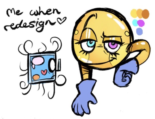
Ik these look very inspired by Flatland 2007, cuz they lowkey are, but I just really like how A. Sphere looks I'm sorry (ik the creator is bad but I can't help the brainworms). I wanted to add quirks tho so it's better imo. My versions of the characters if you will. More fun to draw for me and less ugly (on A. Square's end).
They have actual names and design purposes for each thing. Abel's glove to prevent contamination into himself from Flatland, Anthony's glasses and front hairs being makeshift arms, all that has a reason lol.
More explanations of stuff below cut:
The Flatland parts of Flatland the book stay the same mostly. I'm not changing much there. I do want to flesh out Spaceland tho, so I'ma do that cuz I'm super self-indulgent.
In my version of Flatland, I think it would've been fuunier if out of frustration, Abel Spherious ("A Sphere"), grabbed Anthony Squaur ("A Square") out of Flatland and yoinked him out without thinking about the consequences. He realizes shortly after that he probably shouldn't have done that, and it will probably have horrendous consequences later down the line.
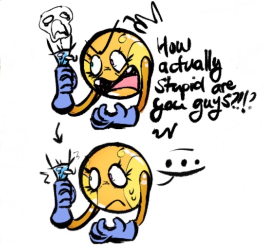
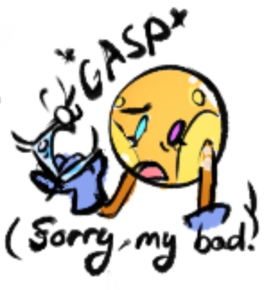
Abel almost kills Anthony on accident, so uh, yikes. But then after bringing him out of Flatland, he decides to work with it, taking him back to his office to do his report on Flatland. He sorta keeps him hidden, but on the last day Anthony gets leaked to the public and the war starts over it rip. However, the span that this is like 3 days, so they get time to chat and develop communication skills n stuff.
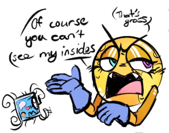
Also, since the gravity is so harsh on Anthony's body, he struggles with talking, only emerging little squeaks. Eventually he's able to use a device to get his thoughts across (probably like a telegraph or smth), so the first day or so of being out of Flatland was a terrible time for communication. Especially when you're so entranced with the idea of seeing your "god's" insides.
Also, Abel just kinda finds Anthony gross in general (cuz he looks like a bacteria) and rejects all advances until Anthony learn to properly yap though morse code. When Anthony writes the Flatland novel, Abel translates it for the world of Spaceland to read and not want to obliterate Flatland. However, that is after his misadventures in the fourth dimension (boo a Heightlander's Escape reference tomato tomato).
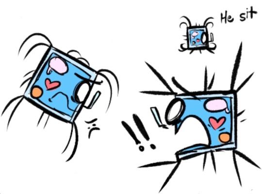
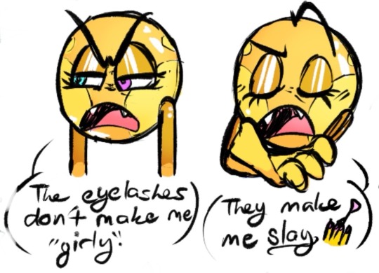
These are some studies of the two. I really like the hairs on Anthony, it makes him so much more expressive. Also, Abel is a slaying king, I love him sm.
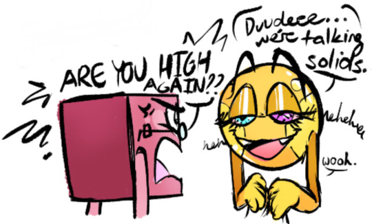
Also, Abel is like the last person who should be in charge of a company. That shit goin down the drain in a week I swear (he came to work high every day his first month of being CEO). I'll probably change the name a lil I just have to cook.
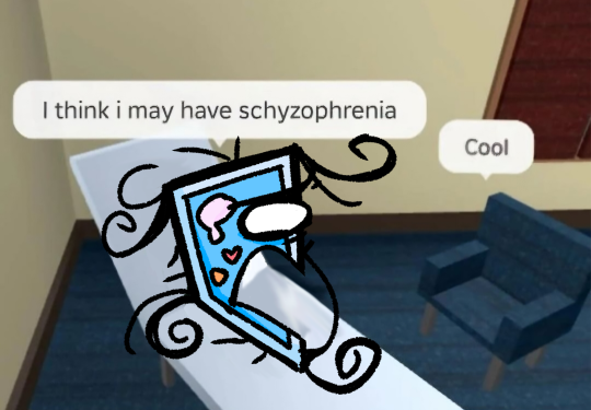
Also, silly joke of how Anthony and Abel met lol.
Have a good one broskies :)))
#why must all the creators i admire end up being shitty people like UGHHHHHHHHHH#oh well ig that means i can adopt their characters and make them mine <3333#this is how ima be drawing my flatland-related content from now on#ig this is a kind of reclaiming? similar to what got me hooked on the movie in the first place lol#and yes this leads into a heightlander's escape whatchu think i am? loyal to the source material?#i mean i kinda am but i like the sphere more than a square in the book anyway so womp womp#i love these designs tho i think i cooked#koy's flatland#flatland#tagging extra stuff for reach lol#flatland au#flatland 2007#flatland the movie#flatland the film#a square#a sphere#abel spherious#anthony squaur#doodles#a heightlander's escape#katiekatdragon27
110 notes
·
View notes
Text
the saw movies are good. dont tell me otherwise
#no fr tho the cinematic themes are god tier#and the way they designate specific colors to certain characters is sooo beautiful#for example in the third movie they put extra emphasis on john and his influence over amanda being green all arounf#we see her backstory with john washed in green#but in the present shes RED everything about her is red. her emotional state is red.#she wears a red shirt and even her little 'room' inside johns workshop is washed in red. her drug box is red inside.#red being the exact OPPOSITE of green. showing shes pulling away from john's ideology#shes too emotional shes slipping away from johns ideology and shes falling into old habits#no longer controlled by his influence but creating her own path again#film#saw#will.txt
5 notes
·
View notes
Text
The biggest crime Sing did besides having two people I don't like in it is the fact they had John C. Reilly but did NOT get him to sing when he did pretty good in Chicago.
#yeah i'm talking about that singing animal movie#some of the covers from both films i enjoy#i still forever hate moon's design tho sorry#something about the way he looks and those human teeth.......#terrifying lol#him as a character is okay i dont mind him#his design scares me
0 notes
Text
Animation Night 189: Nonphotorealistic
There is a funny trend in animation-related terminology to define things by what they aren't. Animation is any technique for creating film that isn't live action. Limited animation is any style of 2D animation that doesn't follow the conventions of Disney's 'full animation' on 1s and 2s - a category that includes a wildly diverse range of approaches and techniques, as this wonderful history by Animation Obsessive describes.
In 3DCG circles, there is a similar term: nonphotorealistic. Which describes, naturally, anything that isn't trying to look like a photograph of a real scene. There has been a real boom in this of late, and just like the other terms, it really doesn't narrow it down very much. Other terms like 'hybrid animation' add a bit more hints.
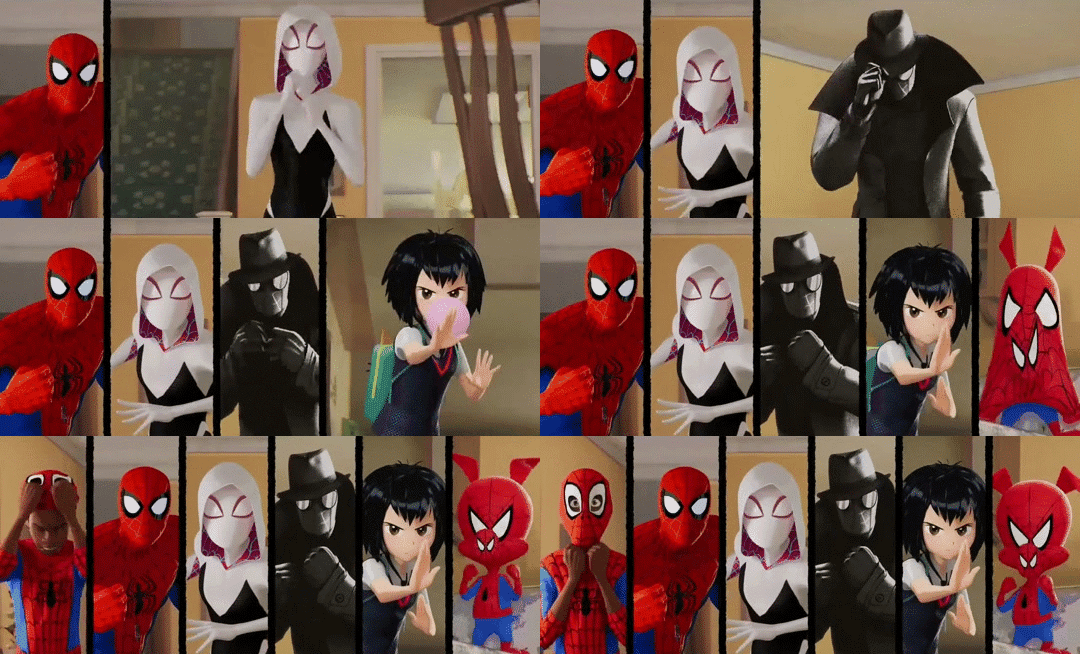
Of course, if you've been anywhere near animation in the last few years, you'll probably know another term: 'Spiderverse style'.
There is no denying that Spider-Man: Into the Spiderverse (2018) by Sony Pictures Animation was an absolute landmark for animation. (I wrote about it way back on AN21, focusing more on the cultural angle.) The ludicrously stylish film pretty much set the direction for animation in the 2020s - making a bunch of money and awards and thus finally throwing open the door to 3DCG animation that doesn't look like the style set by Pixar/Dreamworks in the 2000s. Its sequel, Across the Spiderverse (2023), was even more ambitious and successful (despite a troubled production involving a lot of needless crunch). We'll be showing that soon in a Spiderverse double bill so look forward to it!
So perhaps not surprising that when people see the use of graphical styles, 2D elements, limited framerates and the like in 3DCG these days, Spiderverse comes to mind. In its wake have come various films and series that apply these and related techniques: 3DCG animation is more varied than ever, and it's cool.
It isn't really a style, tho.
youtube
Here I'm indebted to youtuber Camwing who has made a nice video overview breaking down the animation of recent movies in this vaguely defined paradigm. Among them we have The Mitchells vs the Machines (2021, also Sony), Puss in Boots: The Last Wish (2022, Dreamworks), and Teenage Mutant Ninja Turtles: Mutant Mayhem (2023, animated at the French/Canadian studio Mikros animation), and of course over on Netflix you got the wildly popular League of Legends spinoff series Arcane (2021, Fortiche Productions), and the romance film Entergalactic (2022, DNEG), tying in with an album of the same name.
None of these films has exactly the same style, but they all pull from a related bag of tricks. The core techniques are animating on reduced framerates for a 'snappy', high-clarity feeling, the combination of 2D and 3D elements in some fashion, and taking inspiration from traditional media such as paintings or comic books.
For example, Arcane and Entergalactic both use the trick of 2D backgrounds/projecting paintings onto 3D geometry, inhabited by 3D characters with a stylised shader. Arcane is dripping with 2D visual effects. Puss in Boots drops the framerate during its action scenes - the opposite of the old paradigm of full animation, where fast actions would get more frames. Spiderverse draws 2D expressions onto its 3D models to push them further, and is full of all kinds of colourful stylised rendering - screentone effects, kirby dots, outlines, the works.

It's tempting to link this to 2D-in-3D animation, and certainly many of these films apply this technique - this is the major niche where Blender has found its way into industry pipelines. But using 2D isn't mandatory to count here. For example, TMNT Mutant Mayhem has an incredibly striking storybook-painting style, accomplished largely by clever shader work and a strong sense of graphic design. Genndy Tartakovsky's canned 2014 Popeye project was planning to use a ton of 2D-style posing and squash-and-stretch, accomplished largely with rigged 3D models. There are many paths to take!
And mind you, I haven't even covered one of the biggest angles here. Search for nonphotorealistic 3DCG on Youtube and what you'll probably find most is information about cel-shading - aka 'anime style'. This has also advanced considerably in the last few years, with the techniques pioneered by Arc System Works in Guilty Gear such as editing the normals of characters for more precise control over shading, and minute adjustments to break up the mechanical feeling of 3D, becoming widely copied in both games and films. (And particularly, animated porn.)
youtube
Vtubers in particular have really run with this technique, generally speaking using cel-shaded models with edited normals, inverted eyes, etc. etc. to try and get the feeling of an anime character come to life. [You can see a lot of these state of the art techniques if you download Pixiv's free VRoid Studio software and import the model into Blender using the VRM plugin.]
Naturally this kind of cel-shaded approach has found a particular home in Japan. In anime, the biggest champions of it are certainly Studio Orange, whose hybrid approach involves planning out shots with 2D animation before matching them with the rigs. We've covered their adaptation of Houseki no Kuni in great detail on Animation Night 97; their Trigun reboot was perhaps even more popular. But cel-shaded techniques, 3D previs and the like have also made their way into big films like Eva 3.0+1.0 (AN66).
Although this type of rendering aims to recreate the look and feel of 2D animation as much as possible, it always ends up being something new: character models that would be too complex to draw, an ease to 3D movements and camerawork that would be challenging in 2D, and generally a new hybrid style. This is good! 2D animation is already very good at being 2D animation - it's fascinating to see what 3DCG becomes with that inspiration.
So with that brief overview, where does that take us tonight?
I'm not quite ready to do a Spiderverse double bill tonight, so instead the plan is to check out a couple of recent American franchise films that are taking on the new suite of techniques. I've mentioned them up above, but let me introduce them more fully here.

Puss in Boots: The Last Wish is a sequel to a fairly unpopular spinoff about a side character of the Shrek franchise (AN75). Not, on its face, very promising - which is why it is all the more striking that I was told on all sorts of sides that I must watch this movie. I'm finally going to make good on that.
The title character is a kind of feline musketeer type, now facing the end of his swashbuckling career as he's lost 8 of his 9 lives. Not wanting to hang up his hat, he goes on a quest to restore them. What makes it stand out its the action scenes, which go all in on the anime-influenced, extreme perspective and lighting, limited framerate style that we're discussing above. Apparently it looks sick as shit.

Teenage Mutant Ninja Turtles: Mutant Mayhem is a fresh reboot of the venerable TMNT franchise, which pretty much describes itself in the title: four turtles (named after Renaissance painters, of course!) live in a sewer as ninjas, led by their aging master who is a rat. Starting as a comic book, it became one of the iconic toyline-driven TV shows of the 80s - but it's still going! Indeed, Turtles has been on a roll of late (at least going by animator scuttlebutt), with Australian studio Flying Bark Productions turning a lot of heads with their neo-Kanada School style (and for really stretching the definition of 'storyboard').
This new film takes a different approach to the bombastic action of Rise. It focuses on a new origin story for the turtles, telling a kind of coming of age story - but what makes it unique is the animation style and cinematography. Cinéma vérité is not a phrase you really expect to be associated with ninja turtles, but the film seems to really go all out in a way you wouldn't really expect from a franchise movie, shooting the young turtles in a handheld style and focus heavily on character. Marcel Reinhard's shader work, allowing the animators to isolate lights to specific objects and characters and introducing graphical elements of cross-hatching, stippling, etc. etc. to the lighting, gives it a uniquely painting-like feeling, augmented by a lot of 2D creativity in lighting and effects.
Turtles has never really been my thing, but this film looks unique enough that I really want to see it - and I hear it's a good film too.
So that's our bill for tonight! Puss and Turtles. Let's see what the big studios have been cooking of late...
Animation Night 189 will be starting around 10pm UK time (roughly three hours hence) and carrying on til about 2-3am same! We'll be on twitch.tv/canmom as usual. Hope to see you there!
147 notes
·
View notes
Note
I know Sonic was inspired by lots of characters from Mario, to Mickey Mouse to the president, but was Eggman based on another exciting character or characters? Or was he original
Oh great question, fun dive time!
Eggman was initially designed as early concepts for Sega's new mascot but was looked over for the role when passerbys in New York responded more positively to Sonic's initial designs over his. That coupled with more internal structuring on the story led to the team repurposing him as the main villain.
One of the major inspiration bases for Sonic as a series is the massive cultural impact that is Laputa, Castle in the Sky (1986), especially in Japan. You watch that and you'll note numerous references that act as the source DNA influence for the whole series such as:
Ancient yet Advanced Technology
Remains of long dead civilizations
Robots that seem to have souls and gentle dispositions
Progress/Technology versus Nature (prominent in all Miyazaki films)
Mysterious Floating Island
Magical gemstone that grants one's wishes and carry a deep resonating connection to ancient history
A central, giant version of these gemstones that powers the whole island and keeps it afloat
Miyazaki's influence on Sonic cannot be overstated and a great example is this character motif that popped up a couple times in his works. Specifically the husband of the female pirate captain in Laputa. (If you're interested in more about Laputa's impact on Sonic, this blog sums it up quite well!)
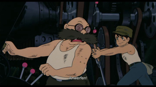
And below is an even earlier example of this kind of character design from Lupin the Third Wings of Death: Albatross, which Miyazaki directed in 1980. Another note is that Lupin influenced Sonic too, as Fujiko Mine inspired Rouge! And this particular film is a goldmine of Fujiko moments that really give that Rouge feel.

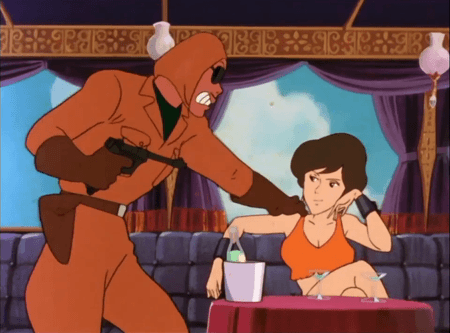
(Gif's to further accentuate the point on Miyazaki/Lupin's DNA in Sonic. She's literally Rouge.)
These influences are more evident in his earliest designs than current one.
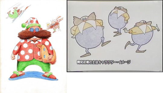
(Not sure about where the sleepy motif's came from tho?)
I think considering how prominent airplanes and flying machinery are in Miyazaki's works, it informed quite a bit of Eggman's vehicles as well. Not to mention Star Wars and Gundam also heavily influencing his creations!
Supposedly he was also meant to invoke Teddy Roosevelt which I can see honestly and would line up with Sonic's Clinton influence. Sonic Team reaaallly wanted Americans to like their game lol

Ohshima mentioned too that Eggman's classic design's cape is based on collars of Sea Cadets.
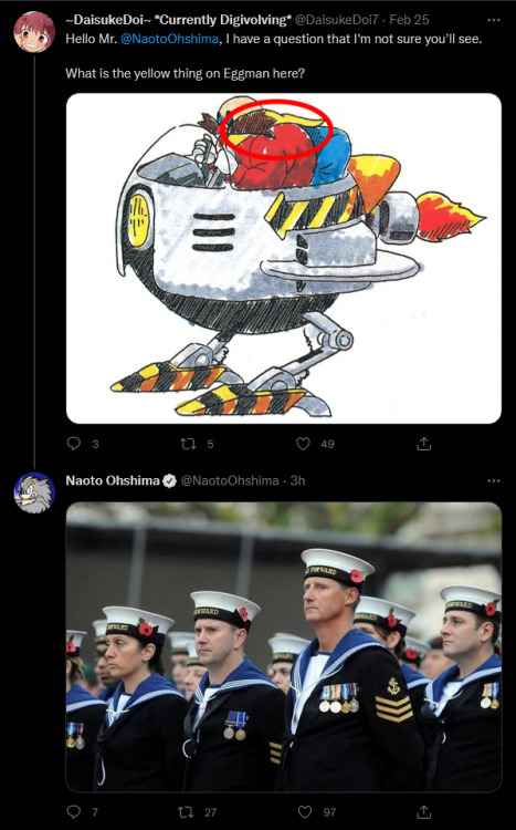
So yeah, guy's got a richly dense influence pool. It's fun diving into things like this because you see how much careful thought, consideration and just crazy creativity went into these characters and the world around them. Thanks for the fun question Anon!
#Dr Eggman#Dr Ivo Robotnik#character analysis#character design#art help#ramble#text#anon#asks#Sonic the Hedgehog
105 notes
·
View notes
Text

Shadow High series 3 my new beloved
I didnt even like most of em until i saw them in person, but the knowledge that they'll probably never be in the show has my brain in a "well its free realestate" kinda mood
Random list of information cuz ive been plotting out friend dynamics and background lore
-i like to pretend Rainbow High/Shadow High are actually Rainbow University/Shadow University cuz im in art college Right Now and i think it makes more sense with the whole dorm room situation. And also major makes more sense than focus IMO
-I changed Pinkie's major from film to just undeclared. I think she eventually does land on Film. She just has a lot of interests! Her dream has always been to one day direct films, and I think she comes to love them even more while developing ideas her with the group as she winds up in a Director/Producer position for most of them. BUT also every time she takes a class in a different program she cant help but fall in love with that way of making art too. So she has a hard time picking for a while and changed her major a couple times before landing on Film.
-Pinkie and Berrie bond a lot over a shared interest in vocal synths (tho Berrie knows more about them than her).
-The two made Pinkie's vtuber model together!
-the fandom wiki says PJ is from germany?? Idk how canon that is tbh but ive decided to embrace it i guess
-Rooney's canon name is Scarlet Rose, but i thought it was kinda lame especially when Rosie Redwood is also in this line sooo I renamed her! Stuck to the color name puns tho. Mar Rooney. Maroon. Haha
-Speaking on her though i love that shes from texas and likes writing scifi mystery type stuff and that being said i just Know deep in my bones that she was a Voltron Legendary Defender fan and Keith was/is 100% her favorite. She has a continued fondness for mothman specifically cuz of this.
-PJ and Rooney actually talk about fandom and shows/movies ALL the time. They dont have a ton of overlapping interests, but where they do? The two literally never shut up.
-Rosie is such a random character, like outside of her design she feels very poorly considered. So I scrapped the cosmetology thing and made her an illustrator instead! I think it works better with her love of making art in nature. I can see her being really into illustrated guide books. I think shes a bit snooty when it comes to art too. It takes being friends with other artists to become more open minded.
-I like the idea that Rosie is mainly friends with Rooney and Berrie ontop of that. The three of them often tag team storylines and how theyd interpret them into different mediums. Rosie will draw up a bunch of concept stuff while Rooney writes up a pitch bible and Berrie will start making shit move and throwing in her own ideas on camera angles and character designs.
-as an animation major Berrie was required to take a sound design class early on, which is where she met Oliver! Hes very laid back, and likes to go with the flow, but functions a little like the "mom" of the group. Often reminding the girls to take breaks, drink water, stop looking at their screens lest they get eye strain etc. He's multi-talented tbh but Music is his one true passion and he likes how the girls are always giving him collaboration opportunities.
-Oliver and Rosie like to talk sports a lot, both having played a bunch when they were younger and throughout high school.
-Lavender Lynn is Oliver's number one "person who needs constant reminders to settle down" she is in a constant buzz of trying to get the best shots and is utterly obsessed with the process of artistic documentation. Everything must be documented.
-the whole school loves her for this actually, she has a whole side gig where other students hire her to help photograph their projects. She saves everything she earns from this for her future dream plans to visit paris. She has it set really, many of the artists who she helps photograph now will remain steadfast clients of hers forever onward.
-PJ and Lynn actually took a print media class together at one point. Which didnt at the time spark an everlasting friendship. But it did give PJ an easier in to ask for Lynn's help documenting a project the group was working on. One of Lynn's first times photographing them work happened to fall on a day where Rosie had planned to trick everyone into going on a nature walk sans devices... Lynn wound up really appreciating this outing and decided to continue hanging around the group even after that project had ended.
#shadow high#rainbow high#my art#fanart#i had to write down all my ideas just to get them outta my head#now im free
239 notes
·
View notes
Text
So just came from seeing Wild Robot and a few things, SPOILERS for books and movie ahead btw
I will preface this by saying it was a fantastic film that I absolutely loved, the visuals were mindblowing and made me jealous of the practiced skill of the animation team
Anyway my biggest complaint for the movie (and I get why they did it) was the moment where the literal power of love wakes up the deactivated Roz, I really liked the book Roz that genuinely was still a robot to her core, emotionless and robotically logical but nevertheless falling into the patterns of motherhood due to her AI learning from nature
They did the power of love in the books too, it helped the animals overcome their fear and work together to pull off some epic battle tactics which weren't in the movie, like for the final fight of book one they had Nettle the bear's self sacrifice to take out the RECO only to be saved by the river fish was awesome, and all the birds raining bird poop all over the sensors of another one only to lead it blind into a muddy bog so it can be kicked to death by the moose, final battle in movie (while visually fantastic) lacked any of that strategy the animals learned from Roz
I had hoped they'd have focused more on the "helping others is a survival skill" aspect and the learning curve that took her from robot to wild robot, but the themes of motherhood were beautifully done
Oh and ROZ's camouflage skills, where was the intentional mud and moss coating of her body making her look like a cyborg treant, I mean they do the character design with moss and dirt by the end but they just accumulate over time naturally... instead of Roz just slathering herself with it and being a bush around which the animals all gossip
Also one last note, in the book Longneck is killed by a human with a rifle, Robots can't harm living creatures is a major plotpoint in the books, its a barrier Roz has to overcome and the RECOs are even subject to it which is why the animals had a shot against them in the first place, this is a plot point that the movie Brightbill even states out loud right before a robot pops out and shoots Longneck, like wtf
Other things I wish they kept from the book:
Brightbill turning Roz off and on again and temporarily thinking he committed matricide
Roz vs the bears during the learning curve
The learning curve
Roz and Brightbill bonding over the shared experience of being the only surviving "egg"
Roz being the goddamn prometheus of this islands critters literally teaching them to harness fire
Things the movie added that I liked
Brightbill acting like a robot
Fink the fox being a fully realised character (tho at the cost of some other favs)
Felling the tree to redirect the river to stop the forest fire
Vontra, just everything about it
The stickers for 10% off your next universal designs purchase
Brightbill helping build the lodge
"I am low on power, have made unsanctioned alterations to my code, and have been damaged in ways that have likely voided my warranty" "what she means is she loves you"
Pinktail Possum was great and so were her kids
"Are you here to kill us?" Whether your answer is yes or no, you're about to get yeeted by a moose
"HELLO I AM ROZZUM UNIT 7134 DO YOU NEED ASSISTANCE!" While chasing down random animals
Roz "I am not a mother I am a robot, I must be recalled at once"
Pinktail "no you're a mom now"
Roz "understood I am a mom now"
Still a great movie just wish they kept Roz a robot through and through and just kept with the whole "she doesn't need to have emotions to be a good mom" thing
Definitely recommend a watch of it
90 notes
·
View notes
Text
He's finally done I think. WOAW! Radio demon time!!!

Okay time for comparison + breakdown rant ^ - ^ another SUPER long one I had a lot to say about this silly guy

ALRIGHT. So. Atp all that can be said has been said about Alastor but I'll gloss over it anyhow. Grossly historically inaccurate hair and clothing. Invisible deer theming. One of the main reasons he's got one of the most clowned on designs in the show is bc he's a pretty good representation of the worst it has to offer. He's absurdly red and has the waspiest waist in town. Also gotta zero in on the coat for a second bc I find it incredibly stupid that he went to that tailor bc of his coat being ripped and then left the shop with the exact same torn coat on oh goddd that felt like a complete joke who wrote this
Also his "redesign" was pointless. He stayed pretty much entirely the same except his colors got pinker and grosser and now he has this?? White trim on his lapels??? Even less 1930's accurate and it only serves to hurt the pallate in my eyes. It's the only spot of white on his entire design, it doesn't appear anywhere else so it throws it all off. And it's so bright. Is it supposed to be a focal point?? His tits????
Anyways onto my guy who I love so very deeply. I'm pretty sure sepia film was outdated by the 1930s but I gave him a palette inspired by it to emphasize how dated and stuck in old ways he is. Added blood red accents bc. Well. Cannibal murderer. Also bc I redid the sin colors so red is wrath and it seems like a fitting sin to pair him with.
After looking into 1930's men's fashion a tiny bit (thanks anon, this video was helpful!) and gave him a double breasted coat but wider and pointier so he looks a little less like just some normal guy and really emphasize how prideful and egotistical he is. "Ooo look at me I'm super big and imposing and powerfulll". I think it's a fun character trait of his. Definitely keeping it.
I liked him wearing gloves bc I feel like he wouldn't like getting his hands directly dirty and would always be covered when committing his murders. Maybe he's a germaphobe even. "I can excuse murder but I draw the line at dried blood on my skin". Also the gloves being white would contrast really well with blood so. Love that
I gave him a long tie to free him from the Vivziepop bow tie uniform and a fedora to add to the 1930's vibe and serve as something that can occasionally obscure his face in shadow. His glasses are also opaque and I imagine his eyes would rarely be shown if ever to make him seem more inhuman and off-putting, disconnecting him from personhood a bit. Wanted to add to that with his smiling mouth never opening and just being a static grin that can only occasionally widen or lessen, his voice cracking out of his "speaker" with fuzzy radio static. Seen multiple ppl use that idea and it always eats
I love Alastor's silly theatric nature (primarily in the pilot) and I'd probably keep it, but I'd add a layer of uncanny-ness to him where when he's not putting on his silly jovial facade, he gives off an unnerving vibe. Trying to appear approachable and charming and pleasant to lure people in before he's revealed to be less than human. Loveee thattt
I love Alastor being a deer. Predator becoming prey (animal) + "prey animal" lulling people into a false sense of security before striking. Love it. We should be CAPITALIZING ON IT❗So I gave him deer like legs, visible deer hooves, and more readable deer ears + the ham radio tower antenna antlers (sorry 4 calling them horns 💀)
Tried to make it a little more obvious that he's a mixed man of color by giving him dark wavy hair and the faintest hint of lip definition Viv uses in her style. I think it works. He's still not dark skinned tho
LASTLY the mic. Also not an original idea as I've seen tons of others turn it into a carbon mic but turned into a pentagram shape and I love the idea a lotttt so I joined the crew.
AND THAT DOES IT!!!! hope u like him as much as I do hehe. Just 1 supplemental doodle this time sorry :/ showing off how his face is probably obscured most of the time. He's. So hard to draw. I'm just bad at men but I'm tryinggggg guys

Alsoooo I've already finished the drawings for Niffty, Angel, and Husk! Once I've finished their breakdowns I'll add em right to the queue, and then I'll make a post with all of the main 6 together :3
#my art#digital art#hazbin hotel#alastor#alastor redesign#hazbin hotel redesign#hazbin hotel rewrite
100 notes
·
View notes
Text
I think the reason why I almost cried over the boy and the heron's animation is because it's hand drawn in a world full of 3d animation that tries to impress you at every stage.
(Minor spoilers for the boy and the heron, no plot points tho)
Encanto's animation was impressive for the first few minutes, then it looked every other animates movie from the 2020s. The boy and the heron does a lot less than western (and 3d) animated movies for most of the movie (excluding the backgrounds because those were paintings. Like, actual paintings.) But when it needs to, it can do more than you thought possible. They clearly spent more time on making the movements human than making it colourful and flashy.
This subtlety is also extended into the character designs. In anime especially, but to some extent pixar as well, they make regular people look like humans have sexual dimorphism, but I couldn’t tell what gender Kiriko was supposed to be until she started to speak and until my suspicions were confirmed that the clothes she wore were in fact the same ones she wore in the other world. I am also a big fan of old wrinkly people so I'm glad they were once again present in a ghibli film. I think they have a knack for portraying people from different stages of life realistically. Also a big fan of how Mahito had so much personality, especially for a 12 yo protagonist of an adventure movie. Those tweens are usually given the cookie cutter hero personality, but robbed of actual humanity.
#the boy and the heron#hayao miyazaki#studio ghibli#ghibli films#movie critique#for the record i dont think disney/pixar/dreamworks movies are all bad or sth#theyre just so not for me. like i am the opposite of their target audience#there are movies from those studios that i can respect for doing new things or some that i enjoy but atp i just ignore everything they do#or have done#i will always prefer ghibli because of their different approach to storytelling
234 notes
·
View notes
Note
Pleaseeee tell me more about that homescryption au
A little something between you and me and everyone else who happens to look at this post. Im working on a lineup for the four scrybes :D
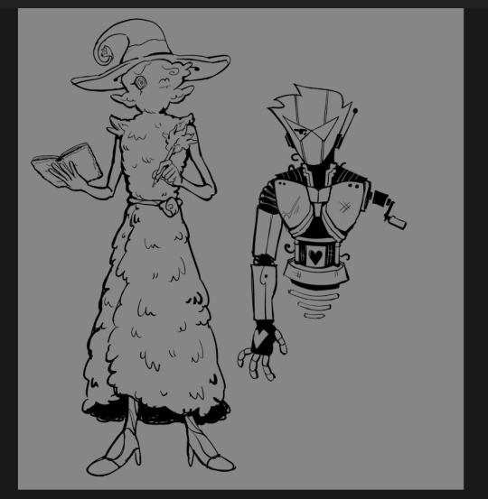
Roxys design is subject to change and you guys have already seen D1rk. Jane and Jake are in progress!!! (Also D1rk and Harley are the names for dirk and jake but weve been struggling to come up with appropriately fantasical/magical names for Jane and Roxy that align with magnificus and grimora😞 Harley feels old-manish enough that it fits in well… im sure well get there but if anybody has ideas feel free to comment ✌️)
But yes i can tell you more!!! ILL PUT IT ALL UNDER THE CUT THIS POST IS GOING TO BE LONG o7
Working with cyrus repliiku to flesh it out x3 he was the one who got me into the game and im CRAZY NOW!!!!
The four alpha scrybes methods of inscribing cards are that Harley uses his magic blunderbuss and the things he shoots become cards, Roxys cards are the fantasical characters she creates in her stories, Jane will be a detective of death, uncovering how cards die and writing up a casefile in her detective agency about them (might give her a magic magnifying glass. Well see), and D1rk were trying to figure out something with Sburbs captcha card + ghost captcha system like how Po3’s cards are printed from real robots
The students/the scrybes underlings are going to be other homestuck characters or splinters!
D1rks will be the robots (aradiabot, arquius (wanted him to me more unique than just brobot + hal so he gets to be a robot) and jadebot.
Harleys will be jake-ish splinters rather than new characters. Thered be the Adventurer (prospector), the Hunter (trapper/trader), the Sailor (angler), the Ectobiologist (mycologists), and the Actor (woodcarver) and his campaigns would be more Action packed like jakes action movies type stuff hehe
Janes will be the dead trolls, nepeta, equius and feferi. Not much to say besides them being dead lol 😭
And roxys were still figuring out but nerm. Viceroy/Casey, Rose (maybe goobert but they are actually nice and kind to her) and Eridan….(lonely wizard he was banished to the shadow realm for being annoying 😁👍)
Luke Carter is going to be Calliope and Satan in the greater scheme of the daniel mullins-verse will be Caliborn/Lord English because i think itd be very funny for him to just. Be making video games and thats his evil plot. LOL and Sado would be Gamzee. (Will not expand to pony island or the hex this is just clearing up the ending of inscryption)
Kaycee would probably be Aranea but like just some normal girl. Not all that sure abt the OLD_DATA tho ??? Maybe just all the wrong doings Lord English has committed and influenced culminated into the files or the code that brought him into the universe I DUNNO.
Retconning the drawing i did when i first scribbled this AU, i believe when harley turns the other scrybes into preexisting cards d1rk would become a seagull (kingfisher replacement) roxy would become a jaguar (wolf replacement) and jane would become a jackalope (pronghorn replacement) 😁
And the way harley would be defeated would be using his blunderbuss on him with a special bullet instead of film. Po3’s decapitation fulfilled the Dirk prophecy too LOL
I think that of the gameplay/card gimmicks themselves would work basically the same but i might try and come up with more creative homestucky twists on them
Im planning on finishing the designs and making sprites and more mockup screenshots :3
I might write up or draw a comprehensive ref sheet for this au someday but for now heres what weve jotted down 👍
#homestuck#inscryption#homescryption#my art#zan0tix#daniel talks#IM GLAD PEOPLE ARE LIKING IT SO MUCH ITS SO FUN TO THINK ABOUTTT
187 notes
·
View notes
Text
So this is the part of my island in Animal Crossing based on the game Life is Strange...

👆 This is the entrance to Arcadia Bay. Please notice the rainbow above the sign 🌈

👆 This is Chloe's room. I had a hell of a time making that Blade Runner poster on that wall, tho. Rachael (a character from that film) still looks derpy af.
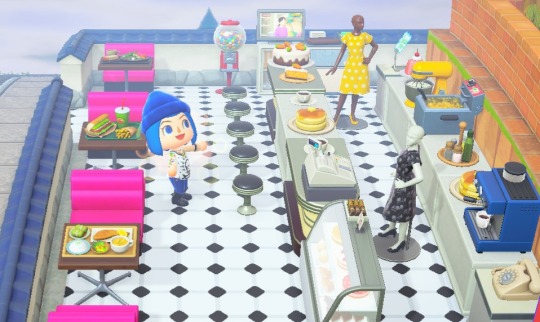
👆 The Two Whales diner... I tried.
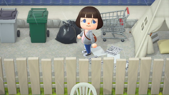
👆 Next to the diner is the homeless lady's tent. She's not there, tho.

👆 The entrance to the junkyard. Notice the green bottles that Max had to find in that dump.

👆 The school's parking lot. Frank's RV is in the back. While Warren's car is right next to Max. Frank's dog, Pompidou, is next to the RV. Speaking of which, I couldn't find custom designs for the RV. Most of the designs that people make are too damn cutesy (with flowers or hearts on them). So I had to make my own design for the RV.

👆 Blackwell Academy... again, I tried
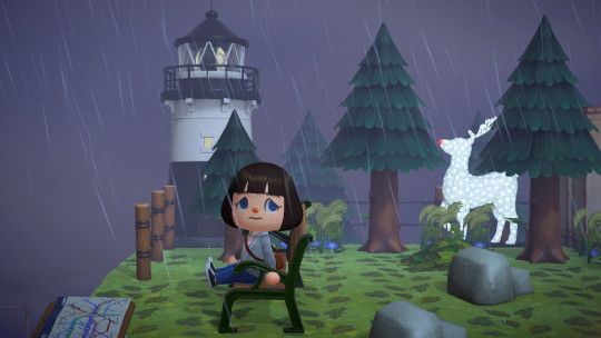
👆 Behold the lighthouse. BTW, that glowing reindeer in the back is supposed to be Max's spirit animal, the doe that haunts her day-dreams.
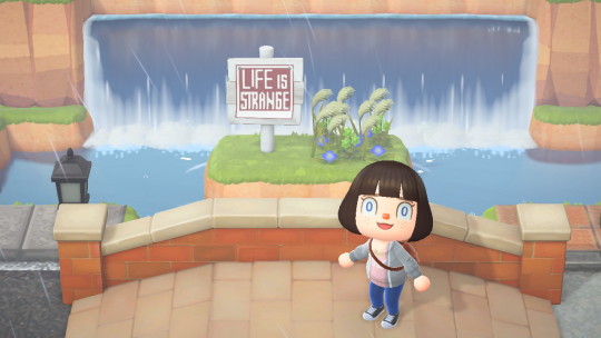
Just in case it wasn't obvious, I even added another sign indicating what the theme for that part of the island is.
UPDATE: Here's the Dream Address
DA-7125-6003-7296
NOTE: The other parts of the island have different themes, tho. Its not all about "Life is Strange". When you get there, the main part of the island will be just a regular town dedicated to a family member that passed away during the pandemic. The other theme is based on the "Alien" movies with Sigourney Weaver.
P.S. The island is still in a work in progress situation. Stuff might change in future updates.
Anywhoo, happy dreaming! ✌️
#animal crossing#acnh community#acnh island#acnh inspo#life is strange#max caulfield#chloe price#nintendo#video games#blade runner#harrison ford#lighthouse#animalcrossingdesigns#cozygaming#jedzelex#paragon
395 notes
·
View notes
Text
everyone who writes and supports miles smut can block me, that includes 42 btw.
PLEASE SHARE THIS TO ANYONE WHO SUPPORTS AGED UP MINORS (SPECIFICALLY MILES MORALES)
TW: BELOW THE CUT IS DISCUSSION OF P//DO, UNDERAGE CONTENT. (I don’t go too far into detail but I know some people have been affected by it).
elaboration on why aging up (for sexual purposes) is bad
miles is canonically 15 and dont even pull that “he’s aged up” shit with me cause you know damn well on aged up fanfics they use pictures of CANON MILES. so its pretty obvious u have the teen in your mind. and you know what the ones that are around his age are annoying too but it doesnt put nearly of a bad taste in my mouth as the GROWN ASS ADULTS who make that shit.
and btw dont go and say “oh, it’s hormones and plus miles has hormones” and to that i have to say:
1. if you are a child who likes miles like that, fine, deal with that shit in private tho. you posting s*xual content of a minor is catering to creepy adults online
2. if you’re an adult saying that shit then i can say nothing less that you have the mindset of a groomer. You’re not very far from the mfs who say that “teenage girls are at their ripe age at 16.” you as an adult SHOULD NOT be using teenagers having hormones to your advantage and excuse. That’s disgusting.
“they’re just a fictional character” 😟 can you get a grip? go outside. Miles is a fictional character who is BUILT and DESIGNED to look like a teenager. And astv aint that unrealistic that you can say he’s ambiguous. He’s not. And even if he was he does activities that I do as a teen—I go to high school, I’m nervous about my future—miles is literally a relatable teen, as he was designed to be.
“Then stop looking for the smut posts.” I DONT NEED TO! It infiltrates my ASTV tag and at times the Hobie Brown tags too. You act like your tags aren’t public. If someone wanted to read a Miles fic that was normal fluff they would have to scroll through some smut too!
anyway thats all and dont even both coming up in my comments and reposts throwing a hissy fit you niggas r weird asf and can block me. maybe then id see less weird shit on my tag page. do us all a favor and log off.
+ Update: His ages from any other media isn’t a valid excuse. If you were clearly writing for canon adult miles you wouldn’t have astv miles as the icons and astv as the tag.
+ Update: Miles is CANONICALLY 15 in the first movie, and somewhere in the last movie he was YOUNGER. As mentioned above, mentioning other media as an excuse is bs when in the movies your writing for (itsv, atsv) he’s clearly a minor.
+ The thing that pisses me off the most is how ya’ll act like the people who are uncomfortable are weird. Are you not writing s*xual content about a 15 year old on a daily basis? please.
+ Fiction DOES affect reality. Why do you think people have nightmares after horror? Why does a sad film make people cry? Why does a deep movie change perspective?
+ In the scene where Miles argues with his parents, he says something along the lines of “I’m 15!!!” So if you think he’s not underage, you either didn’t pay attention or don’t have google. Plus what 18 year old discusses college that late? (without any other discussions prior?)
+ if you like little boys stop tryna hide that you like little boys it makes you even more manipulative and gross. no but in all seriousness telling minors that behavior is okay has gotta be SOME form of grooming on a more subtle scale. sorry if that’s too bold for ya’ll but as someone who’s been tricked into thinking content like this was okay when I was younger, I can confirm that this isn’t okay.
+ If to prove character that’s canonically a minor isn’t one you have to pull up seven different source materials that barely correlate to the one you write for, that character is still a fucking minor! It’s giving “she’s actually 3000!!!” when she looks 8.
yeah. kay bye!!!
#astv x reader#miles morales x reader#42!miles x reader#42!miles morales x reader#earth 1610 miles x you#aged up miles#hobie brown x reader#miles is 15#miles morales smut
222 notes
·
View notes
Text
DWK Iceberg

Tried to make it as full as I can, but there could be stuff that I'm missing or simply can't remember, but I hope it's good enough
I think first two layers are clear: the sky is for general information that most people expect to see when finding this media, and the top is for those who watched the series. I think I should break down some points in the rest.
Layer 3
Book version of s1. That's all it is. It has a map and character descriptions, but nothing interesting beside that.

Level 2.0 books. Haven't read them, so I can't tell what's happening there. I'm not sure if it's even based off the animated series, I think it bases on the original books, but it uses the series characters designs.


Markus' mother, Raban's aunt. In s1e5 you can see Markus' mother, Tamara. Raban's aunt is mentioned in s2e4, she lives in Höchstadt.
Surnames. Only a few characters have canon surnames in the series, the rest are taken from books and movies.
Layer 4
Map. From the book that I've mentioned in layer 3.

Beta designs. Honestly, I have no idea what that is and where it came from. I assume it's old designs, but I'm not sure.

Absence of s1e10 in Finnish dub. I heard it was banned due to depiction of cruel bullying.
Spanish Deniz. So they've changed his name to Rico Perez in eng version and now many Russians and probably English viewers who don't know about the original think he has spanish roots instead of turkish.
Layer 5
Marlon without dredlocks. There's merch where Marlon is depicted with loose hair.


Nerv and others in lvl 2 books. They're litteraly on the cover. Also would like to mention a different cover for that book that I've found.


Arabic intro. Nothing special, you just get to see this lil thing at the beginning.

April. A girl from lvl 2 books that seems to be Marlon's love interest or something???

Layer 6
Conny had alcoholism. A theory about the reason why Jojo ended up in a orphanage. It appears to be canon in the books, as far as I know.
Surnames. Natasha's surname comes from the 6th film I think, there was a niece of Mickey with that surname.


The holy apple vodka. A local meme in Russian community from, like, 2019 or 2020 I guess.
Censorship. You can see the full clip here.

Shimeji Leon. This guy.

Layer 7
Weird implications. It's just... The Mayer thing.
Franz is Jojo's dad. I mean look at them.

Refences to serial killers. In s1e10 you can see doorbells with the names of some serial killers/rapists, cult leaders and tyrants. Why would they put that in a kids show? Idk

Deleted animation meme. ''Untrust us'' meme based off Benz' dark AU and created by her as well.
Layer 8
Here assembled things I think very few people know about or seen??? Even I don't know what are some of those.
The play. No Idea what this is, but maybe a play of some kind...

DWK website. Or a game?? Idk, I just found this pic like 5 years ago or so.

Deleted tributes. Clips that I've made at the age of 11, inspired by those mlp slideshows and posted it on YouTube. You never gonna see it tho.
Mettaton Markus. Yeah, that happened.
Leon/Sailor Moon. Oh, deviantart, thank you for having people that do these edits.


#die wilden kerle#dwk#dwk animated series#die wilden kerle animated series#dwk leon#dwk deniz#dwk vanessa#dwk marlon#dwk markus#dwk natasha#dwk willi#dwk jojo#dwk raban#long post#meme
28 notes
·
View notes
Text
Thoughts on Alien Romulus(my first Alien film)
If You're afraid that the trailers showed too much, 95% of the shots from the trailer were from the first third of the movie.
Practical effects were horrifyingly amazing. Special shoutouts to the chestburster with every layer of bone, muscle, and skin individually showcased. Horrible.
Biggest problem was the editing. Every pratical effect showcase would cut away every half second. Personally, it was so fast it pulled me out of the moments, and it obscured the amazing effects.
The silent opening didnt work with how loud my theatre was. Cant embrace the vast emptyness of space when all you can hear is recliner gears and rustling popcorn
Prometheus was name dropped. I thought that movie was disowned by the fandom.
MORE MOVIES WITH BAD JOKES IN CLIMATIC BATTLES! A grasshopper walks into a bar is now joined by i don't understand cloning!
More spoilery thoughts below
Love the true meaning behind the name Romulus. Early in the movie there is a plaque stating(paraphrasing) "Son of the God of War and a Vestial Virgin, nursed by wolf, and went to create the grestest human empire."
Now "greatest human empire" is definitely an exaggeration, but from the minds of Waylon and Rook it makes since.
So, with Kay taking the place of the Vestial Virgin, she and her baby are "nursed" by the "wolf" aka, the greatest predator of humans currently
HOLY FUCK ROMULUS WAS SCARY! The person Romulus, not the movie. The movie was good but Romulus's design was the standout nightmare fuel.
Loved Andy so much, and his Bitch stutter was great, but kinda ruined the moment. But Rain calling Romulus a Motherfucker made up for it.
Speaking of Andy, Androids have a long history of being standins for nuerodivergency, but Andy shows different quirks than others. Love it.
This movie messes up vaccuum seals so much. Wouldn't complain if it wasn't such an important part in multiple action scenes. Gravity use was great though. Not sure about ring science, tho. That felt off but i don't know enough. Insert always sunny meme here.
Man, fuck Bjorn. Just fuck him. Ah, this is why I don't like slasher movies. Seeing him die didn't make me feel better, though the effects were great.
Someone just told me Ian Holm is dead. He shouldn't have been in the movie. Now, i haven't seen the others, but there are clearly different faces for androids, and this isn't one he portrayed before, so just use a different actor. Sometimes i approve if it's important to the character or story, but it wasn't. Shouldve been a different actor
31 notes
·
View notes