#this was an excuse to redesign us suit
Explore tagged Tumblr posts
Text
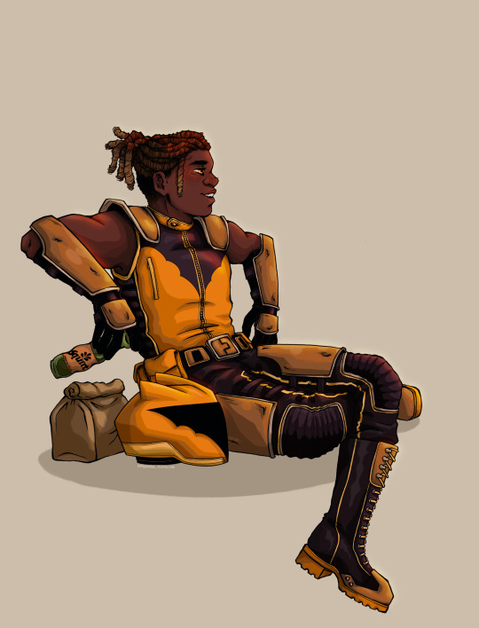
Gotham’s beloved day-time hero; The Signal!!!!
#he’s my special boy#this was an excuse to redesign us suit#I hate how bulky and clunky it is in the comics#also he deserves a suns out guns out look#duke thomas#dc the signal#ambrose art#dc comics#batman comics
2K notes
·
View notes
Text
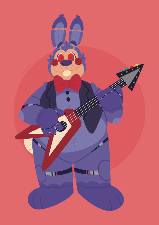
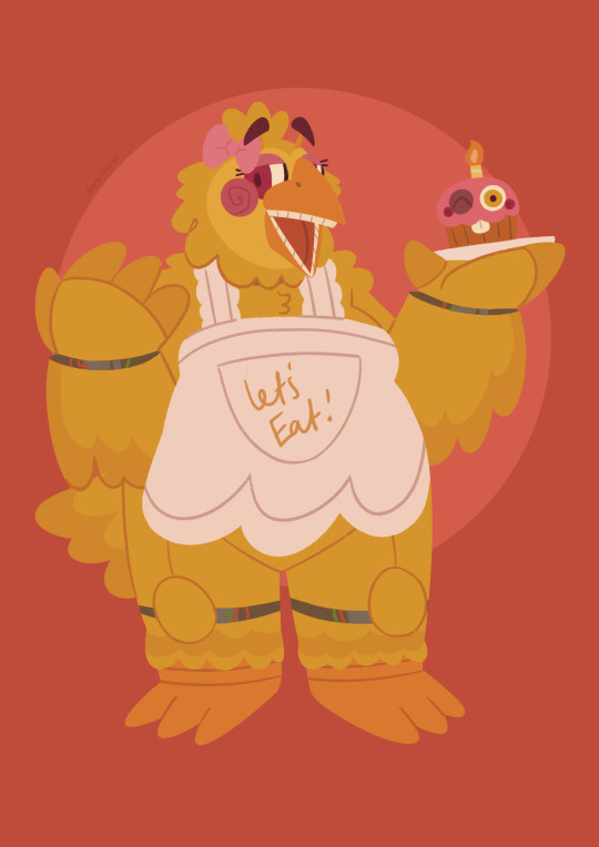

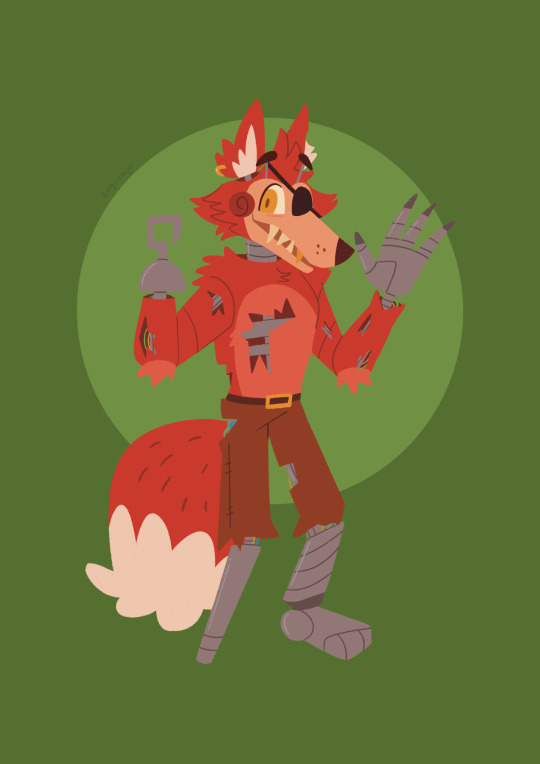
To celebrate the upcoming release of the FNAF movie, I’ve been drawing my versions of the sillies, starting with the OG cast! Lore notes under Keep Reading!
- The FNAF1 animatronics are the heaviest/bulkiest of all the generations. Before this, William and Henry designed the springlock suits to fit both bulky endoskeletons and fully grown adults inside. Therefore, although they were downsized somewhat, this aspect continued into the new generation.
- Due to their size and heaviness, they are slow moving. Foxy however is small and has a lighter endoskeleton, as he was originally designed to play with the kids. Therefore, he is the fastest by default.
- The FNAF1 animatronics use cloth and other material for the fur, with some parts like the stomach and arm areas sagging. Such material is prone to getting stuck in the moving endoskeleton parts, resulting in rips and damages. To combat this, the group was somewhat themed around cuddly toys, and in later iterations received clothing to cover up any damages.
- Foxy’s wear and tear was never covered up, as management was able to use the excuse of him being a pirate to their advantage. In the early days, he was also most prone to causing accidents. Combining these two factors, in the last few years of the restaurant's life, Foxy remained stationary in Pirate’s Cove performing on stage rather than moving around the restaurant as he used to do.
- Chica is based on Henry’s wife. The original unveiling of her design was a present to her from Henry and William. Surprisingly, she was flattered! Chica is prone to causing internal damages, as she was originally programmed to ‘pretend’ to eat food. Of course, this would backfire when said food would get stuck and start to rot. There have been more than a few instances in which cockroaches have crawled out of her at kids birthday parties.
- Freddy and Bonnie are essentially redesigns of SB and FB. Originally, they were made as substitutes for when the springlock suits would need maintenance, but following the Bite of 83 their place in the main cast was cemented, with Freddy becoming the new face of the restaurant.
#my art#fnaf#five nights at freddy's#fnaf movie#freddy fazbear#foxy#foxy the pirate#chica#chica the chicken#bonnie#bonnie the bunny#fnaf1#fnaf 1#animatronics#fnaf redesign#tw eye contact
532 notes
·
View notes
Text
Hazbin Hotel Sketchbook Tour Part 10
Masterpost
I need to preface this one by saying that Vox(while not my favorite character) is my favorite redesign. I've made him look so wonderfully stupid, and it makes me laugh every time I look at it.
But first, Angel Dust.
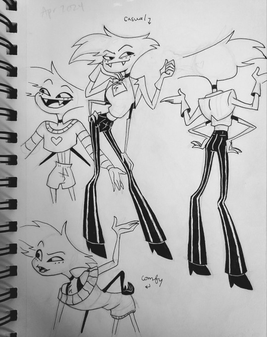
Design notes will be under the cut.


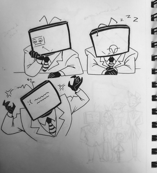
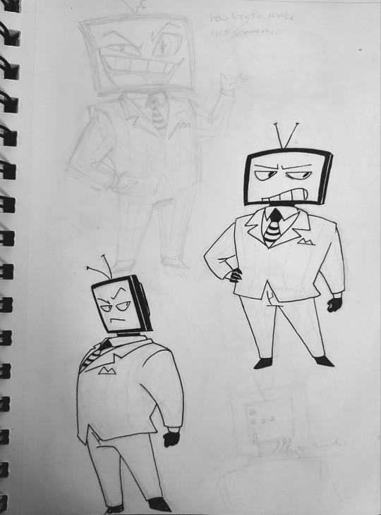
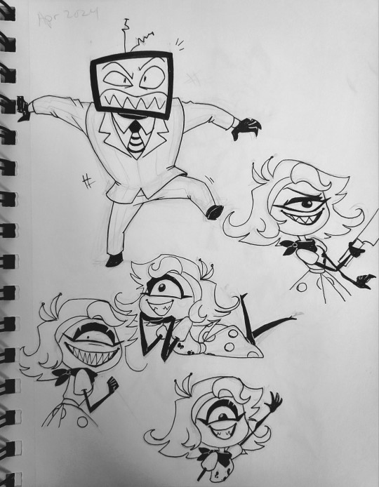
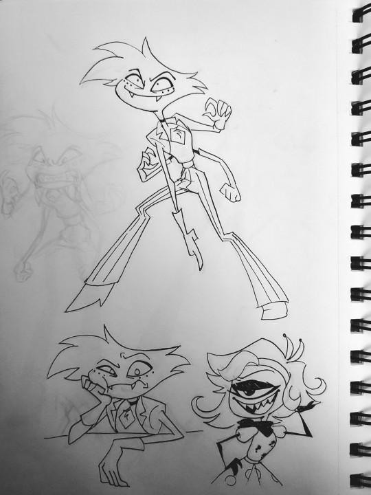
Design notes under the cut
Angel Dust: So Angel makes me uncomfortable. The innuendos and raunchy jokes are not my cup of tea. It's part of why I struggled with his redesign so much. But I think I've finally managed to balance it while also alluding to his mobster roots.
I remember reading somewhere(not sure how canonicallt viable this is but I'm running with it) that Angel doesn't dress super provocatively outside of work. He's more inclined to dress comfy. So I gave him some lounge attire.
But I'm sure he would still want to dress up when out and about in town. So I gave him an outfit vaguely reminiscent of a mobster with the pinstripes and pseudo suit jacket, but also diverts away from it by leaning more into the fashion. He may keep up with modern fashions decently, but he's still a product of his time and upbringing. He's still got some mobster in him. I also preferred the look of his shorter gloves from the pilot, at least on his main set of arms. The second set has long ones like in the series, which would help the animators differentiate them. Tbh, I'd scrap the second set of gloves entirely if only it didn't feel in character.
Overall, I like this outfit for him. I think it balances his femininity and masculinity.
Idk if anyone noticed, but I don't like drawing characters with only 4 fingers. Something about it bothers me. So I've been doing everyone with 5. But I make an exception for extra limbs. Angels' second set of arms has 4 fingers, and the third has 3. Also, the extra sets are black and more bug-like than the main set. I do this to others, like Valentino, as well.
I've also noticed a lot of redesigns give him prominent spider fangs, and I just never liked how any of them looked on him. Instead, I gave him normal teeth fangs
Vox: To begin, Vox needed more bulk so his body could concievably support the old TV models. Twink size wasn't cutting it. The change also had the side effect of making him shorter, which just works better proportionately.
I liked the idea that Vox could never get rid of his original bulky 50s TV, but also wanted him to be able to upgrade. So I decided his true body is the 50s TV, and he adds an upgraded monitor as a head as technology improves. He's hates that he's stuck as an old fashioned TV, so he hides that under his suit. Since the monitor is just an addition, it can be swapped out easily. It can be damaged and he's technically unharmed. But he has to reveal his true body in order to see without the monitor. Unless he wants to use surrounding cameras and move via third person view.
Next, I don't like that everyone seems to have sharp teeth. I want more variety. (Similar to the whole bowtie deal) So I gave Vox "regular" teeth, which help him look more trustworthy. It fits the corrupt businessman vibe. Because his head is a screen, his face can change appearance based on both what he wants and what mood he's in. When he's angry, his face may glitch out, become too big for the monitor, and/or his teeth can become sharp. He might have to reboot after a Blue Screen of Death if he gets too worked up. When he's bored or tired a Voxtech logo will bounce around like the DVD logo, or display a screensaver. When hes feeling sheepish his face will get smaller on the screen(not that he'd ever feel ashame about anything, of course), etc. So many possibilities. I really want an excuse to give him a troll face at some point. It may be an old meme, but it feels appropriate.
Anyway, I love how stupid not having a head makes him look. He looks like SpongeBob and it's hilarious.
#hazbin hotel#hazbin hotel redesign#angel dust#vox#niffty#a3 art#fanart#traditional art#sketches#sketchbook tour#sketchbook tour 1#hellaverse
55 notes
·
View notes
Text
The Mayor - Chapter 3
Lucy Bronze x Ona Batlle

Alternate Universe: Mayor and Architect
Words: 1200
Masterlist
———————————————————————
15 days later, while I was driving, my phone rang.
"Hey beautiful, I just wanted to see how your day went? I had to stay out all day for the Guijarro site, sorry!"
“Don’t worry, Alexia, everything went fine. I’m just about to head to the worst part of my day: Cruella’s site visit, a.k.a. the Mayor.”
“Oh, stop! She can be really pleasant—well, at least with me! No jokes, alright? Remember, if she’s happy, it means more projects lined up!”
I shrugged, knowing she was right. I was in for an hour of pure joy!
I arrived at the site, in a neighborhood near the city center, bordered by a forest of oaks. The house was a large, single-story structure with massive windows in a very modern style. Since the interior didn’t suit Madam’s taste, she had decided to have everything redone—or rather, have us redo it all. We had redesigned the entire layout with her and selected decorative items, from furniture down to the smallest trinkets. More choices would be made over the coming weeks. She was very involved in this project. Many clients let us handle the bulk, just approving or glancing briefly at the project’s progress. Lucy Bronze was involved from start to finish.
It was 7 p.m., so I took a moment to chat with the guys on the site who had been working there for 15 days. I’d visited several times, but so far, it was mostly demolition work.
She arrived at 8 p.m., in a sharp gray suit and a white silk blouse. Very attractive, I thought immediately, which made up for her being half an hour late.
She approached me, looking stern.
“Hello, it’s a mess here, isn’t it?”
This woman was unbelievable. She arrived half an hour late and had the nerve to make a remark as her greeting.
I tried to keep my composure and replied with a small smile:
“Well, it’s a construction site; the guys are tearing down the walls you didn’t want, breaking up the tiles, removing the wallpaper… If you insist, I’ll roll out a red carpet next time!”
I wasn’t sure if she appreciated the humor, seeing how her lips tightened. I continued, giving her a brief update on the progress and the next steps. Then we reviewed various options for living room furniture, which we hadn’t finalized yet. She criticized my lack of selection for the furniture choices.
“Excuse me,” I replied, “you made this list with Alexia and approved it. I only added that piece there.”
“Yes, not the most tasteful addition!” she retorted with a mocking laugh.
My blood boiled. I simply couldn’t stand her. When I told my friends about our first encounter, they told me she was well-liked in town for her professionalism and empathy. Empathy? She must be a great actress or just have a real grudge against me. I couldn’t keep putting up with her sarcasm.
“Excuse me, do you have a problem with me? I mean, personally?”
“And why would I have a problem?” she replied, with a big, provocative smile.
That smile completely threw me off. I regained my composure.
“Maybe because I was on the opposition list a few years ago, in the municipal elections, for instance.”
“Hmmm, really? No memory of that!” she replied, that smile still glued to her face.
She exasperated me to no end. Of course, she knew who I was; I could feel it, especially since that first meeting when she threw that slogan at me. There was no way it was a coincidence.
“Oh, wait,” she continued, staring at me. “The little brunette in the back of the room, on the supporting list, that was you?”
The comment was meant to be dismissive.
“That’s a bit vague, but yes, it might have been me. And with the slogan as a goodbye, you knew who I was!”
“I had my suspicions, yes, some memory of a tense brunette. I see that hasn’t changed much.”
What a provocateur she was—I had to calm down and regain control of the situation. I continued.
“Alright, I just wanted to clarify: I wasn’t particularly against you, but I was supporting the opposing candidate, who’s a longtime friend…”
“I’ll stop you right there; I couldn’t care less. That you supported that incompetent man who spread countless lies about me is your problem. My finding myself here with you is another matter entirely; it’s nothing personal. I just want you to do your job, if that’s alright with you.”
I was fuming, unsure how to respond to that jab. I merely replied, “Of course.” But I was clearly on edge. And I couldn’t stand up to her the way I would with anyone else—she was a client, and a major one. Alexia was counting on me. But my impulsive nature was bound to get me in trouble if things continued like this. She was trying to provoke me, I could see that. She wasn’t like this with Alexia at all, so why? Election grudges? Or just a chronic incompatibility? In any case, I wasn’t going to let myself be walked over. I’d keep calm but wouldn’t hesitate to respond to provocations!
The end of our meeting turned out to be less tense; we joined the workers and all talked together. She immediately became more relaxed and warmer. I couldn’t believe it. She even treated us to some wine she’d brought from Portugal. The workers left, and as I helped her tidy up, my phone rang. It was a message from Alessia, my ex, asking what I was doing tonight. Friday night. Free as a bird, badly needing to unwind and end up in her arms. I smiled at the thought.
“Is that your personal life calling?” Lucy’s voice snapped me back to reality.
“In a way, yes,” I mumbled.
“Still with your friend, the surgeon?”
I was speechless. How did she know that? My stunned look amused her, and she continued:
“It was highlighted quite a bit, your sexual orientation, by your former candidate. He didn’t hesitate to mention having a lesbian on his team, who was dating a surgeon!”
“I… I never tried to flaunt that, though I certainly don’t hide it!”
“I never said you did, Ona.” It was the first time she’d used my first name. “I was talking about your candidate, and it’s irrelevant in the end, though I don’t find it to be an interesting electoral argument. I think it’s entirely natural to have both heterosexuals and homosexuals without it needing to be highlighted every time…”
“Well, it can still help break old political codes and encourage others to get involved!” I replied with a challenging look.
“That’s certainly up for debate!”
I had no desire to discuss this with her, at that moment, at this point in my day. I gathered my things and took my leave from Lucy, politely.
The handshake was firm, and she said, “I hope I didn’t destabilize you too much; that wasn’t the intention. See you in 15 days, same time!”
Of course, that was the intention, Lucy—to provoke and destabilize me. But there was no way I’d let her get away with it.
#woso#lucy bronze#woso community#ona batlle#barca femeni#lionesses#sefutbol fem#woso soccer#ona batlle x lucy bronze
44 notes
·
View notes
Text
Blake - Atlas Design Critique.
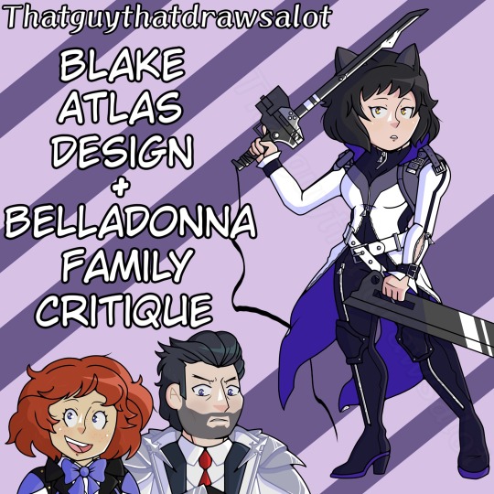
Yippee I have more to say about character designs, this time it’s Blake’s turn with her Atlas look, there isn’t going to be a redesign but instead my OCs to prove a point. I promise next time there will be a redesign.
RWBY Archives
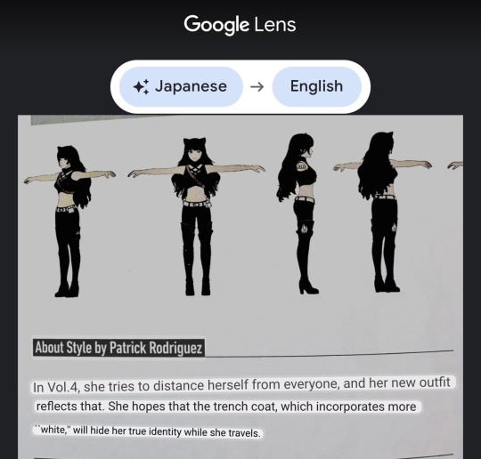
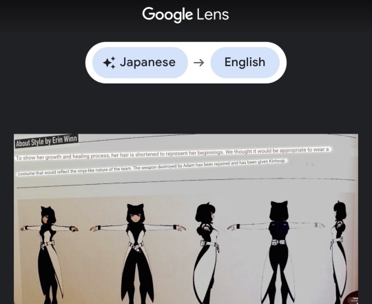
This is gonna be interesting because before I can talk about Blake’s Atlas look I gotta briefly talk about Blake’s Menagerie design. This is all gonna culminate into the huge mess that is Blake’s Atlas outfit. Now this look has some meaning to it, by what it says Blake was wearing more white to hide herself, which makes sense for her arc at the time. It may look bad but the white coat had significance, when she ditches the coat and faces Adam to be in more black again it has a meaningful impact that she’s no longer running/hiding… plus the look with the white coat gone makes her look stunning! So tell me why she regressed her arc of hiding to be back in another uglier white coat to hide her ‘not dark enough purples’? It’s because the designer took the Menagerie look but made it sci-fi. They had no idea what to do for Blake other than to exemplify all the bad decisions in her previous look. Silly zippers that are reminiscent of Adam, a cat suit that’s impossible to put on and to take off, and ugly belts clamping her wrists for no good reason.
And one other thing, why ditch the gold for silver? Wouldn’t it be nice for someone in team RWBY to wear yellow/gold? Why not the girl who’s going to be Yang’s girlfriend???
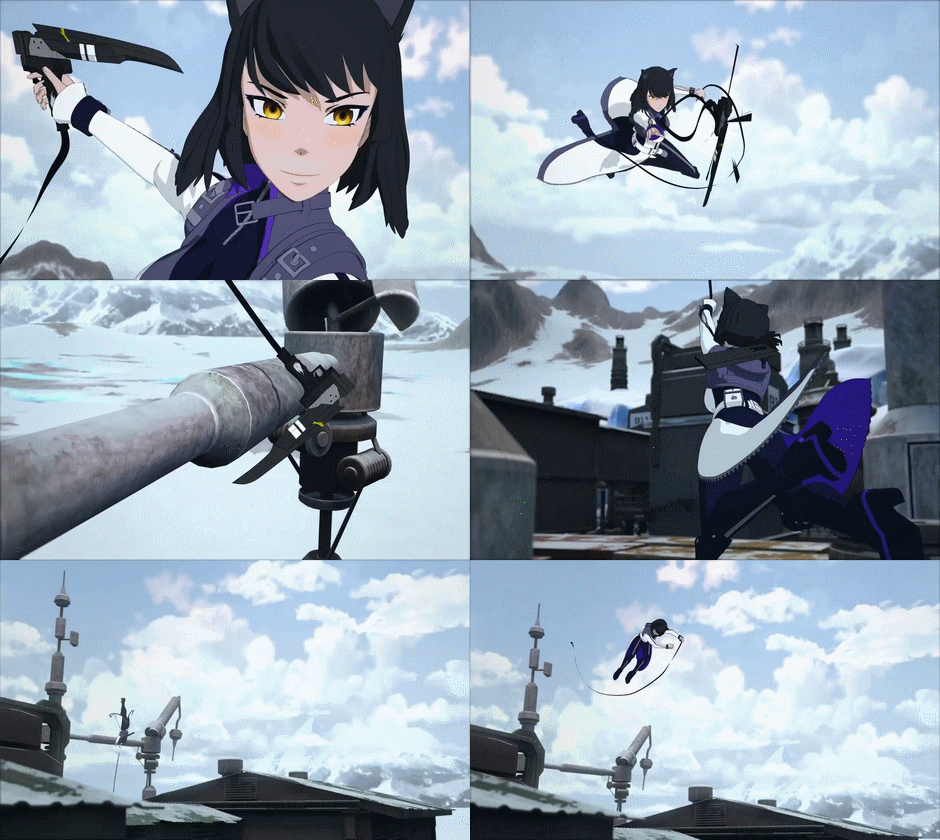
She’s the second one to freeze to death in team RWBY.
Hair
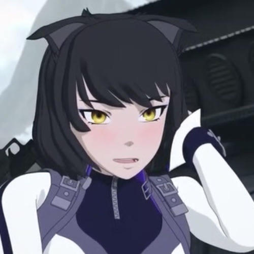
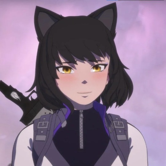
Again, I never want to direct hate towards a modeler, end of the day it’s the people who make the final decisions for the product who are at fault. When Volume 7’s poster came out nearly everyone was super excited to see Blake with short hair, it looked really cute and framed her face adorably. When the teaser/trailer for the Volume came out… everyone lost their mind at just how ugly the hair looked. False advertising at its finest. Blake’s hair was one of the ugliest examples of modeling I have ever seen in the show proper, it beats Weiss’ chunky braid. I cannot comprehend how Blake’s model got the approval with the hair alone. The hair was a droopy blanket/helmet. When they tweaked it, it still didn’t look good or even like the concept art.
Primary Color - Black?
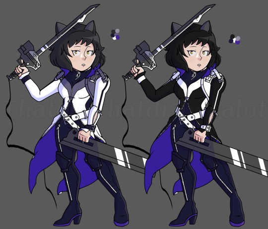
I’ve already mentioned that White has overtaken her color palette to regress her character development and her primary color along with purple. There is no ounce of pure Black on Blake. You can have Blake stand next to Cinder, Penny, Ruby, and Yang and they’ll have more Black than her. They try to compensate for the lack of Black with her GRAY hair, and Blake’s INDIGO catsuit.
It’s ridiculous how the showrunners turn the B for Team RWBY into the representation of the color purple/white than BLACK. Are they afraid of having Blake be a black blob on screen? The reason she had limited black in the past looks was because of her long hair, but she cut it! Put as much black as you want now! Actual black! Stop overdoing white and purple. The black I used was from a direct screenshot of Blake in the DC movie, one where she had on her old outfit that represented her color and looked good- Positives?
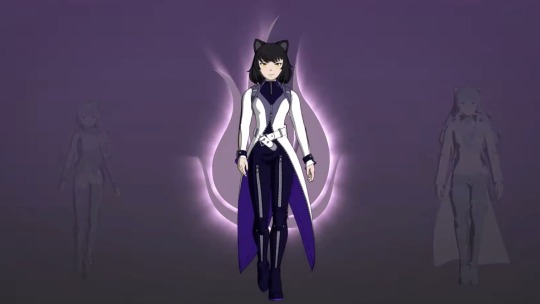
I think Blake tops Weiss’ Atlas outfit cause I really can’t think of anything positive to say. If there was a lack of zippers and the concept of Blake was regulated to being a background character rather than a main character, the outfit could stand on its own. Or just MAYBE this would’ve been a better look for Ilia. It can be better for any other character than for Blake. I can just imagine Blake’s excuse for wearing this being “It looked better in the picture.”
Bonus Round - Ghira and Kali
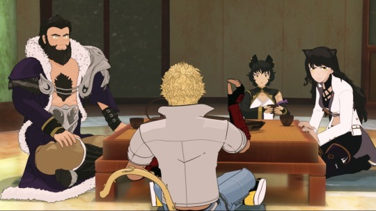
You can skip this and go to the conclusion if you want, this is just me talking about how much I dislike the ‘Spitting Image Of Parent’ trope in fiction, as this always nagged me about Blake, Ghira, and Kali’s design. Alright so I don’t mind Blake being a cat faunus, I just hate the uncreative reason as to how she became a cat faunus, this was a trait inherited by her mother. Kali is a cat faunus. In the World Of Remnant series, an episode dedicated to the Faunus had a rundown that if two faunus’ of the same kind had a kid together, it’d be the same faunus. If two faunus’ were completely different, their child would be completely random. Kali is a cat, and Ghira is a panther, both felines technically but they really couldn’t just make her parents be human/faunus? They instead just increased the odds of Blake being a cat than something else or even her parents? They made her parents similar… a little too similar. Blake’s parents read to me as brother/sister by just how similar their colors and appearance are. It feels like two artists were tasked with making a mom and dad but didn’t communicate with one another on traits Blake could inherit from the other. I appreciate that they made Kali tanner with better-looking animated cat ears but seriously they start with black hair, yellow eyes, and end with a color palette being black/purple.
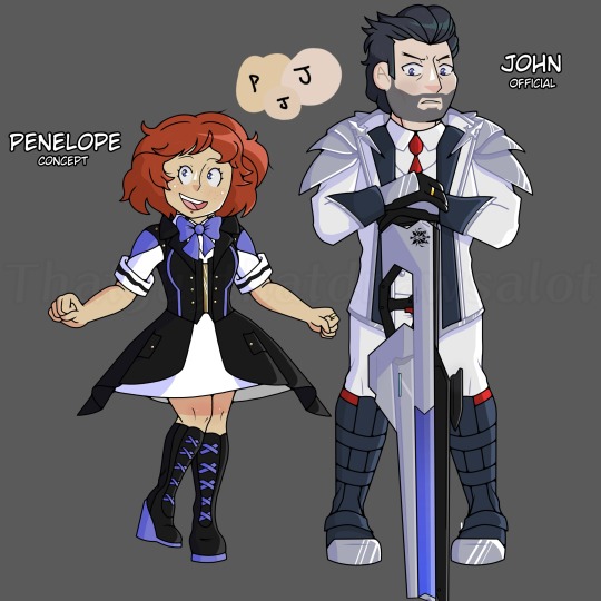
I don’t understand how Yang and Ren’s parents can feel like parents with their appearance but then drop the ball for Blake’s. It isn’t that hard, up above are my OCs; John and Penelope Ironwood aka James’ parents. You can argue that I made John be a spitting image of James but at least I TRIED. I had James inherit his mother’s navy eyes and curly hair. Whenever I draw/color James I just mix John and Penelope’s skin tones to make it James’ skin color. I tried to make them look like independent characters who could look like James’ parents but still unique. Conclusion
I don’t think anyone at RT can make Blake stunning, I hope Viz Media gives Blake a good outfit.
From the teaser image it looks like Blake is wearing black, only downside is the gold piercings. I like the idea of gold piercings but my god she looks way too much like her mother… and I really don’t like that trope.
However I’m gonna keep having my hope be alive for character designs than the story. Out of team RWBY I’m most excited to see Blake’s looks, if she looks awful for the final season I’m going to cry-
But of course, it’s just my opinion. If you love this design or hate the design, please share your opinion. I’d love to hear it! :D
#rwby#ruby rose#weiss schnee#blake belladonna#yang xiao long#rwde#rwby oc#ghira belladonna#kali belladonna
45 notes
·
View notes
Text
It's Kawaii~Chan time
I am gonna ramble about my rewrite so yknow, enter the theater with caution
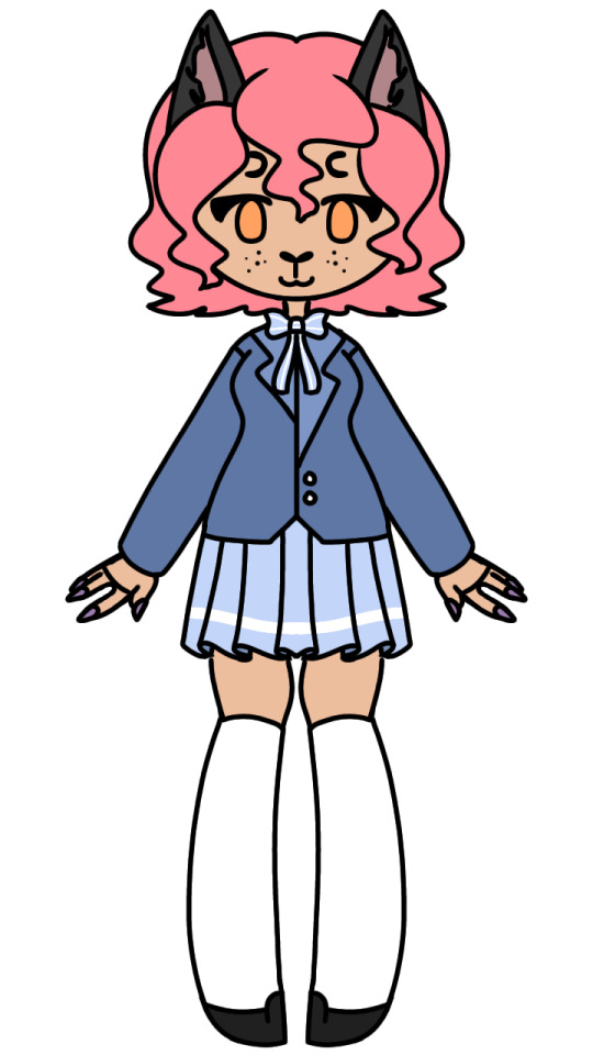
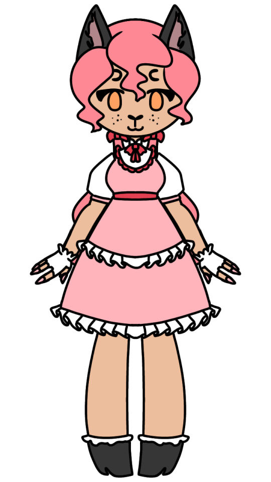
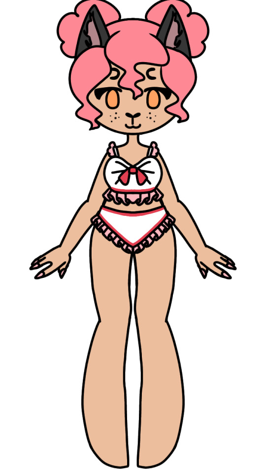
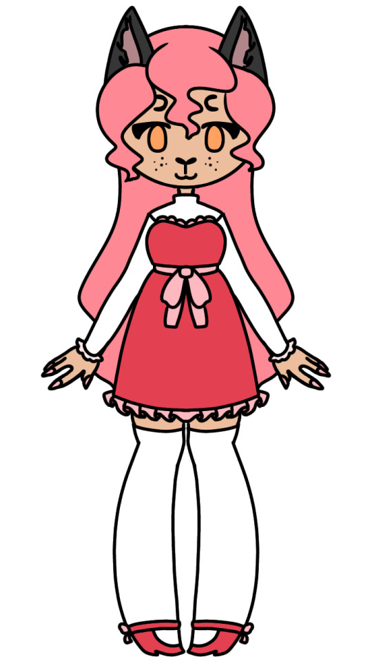
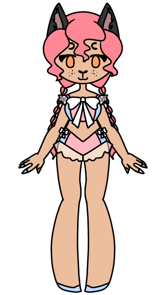
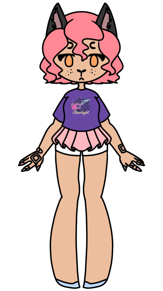
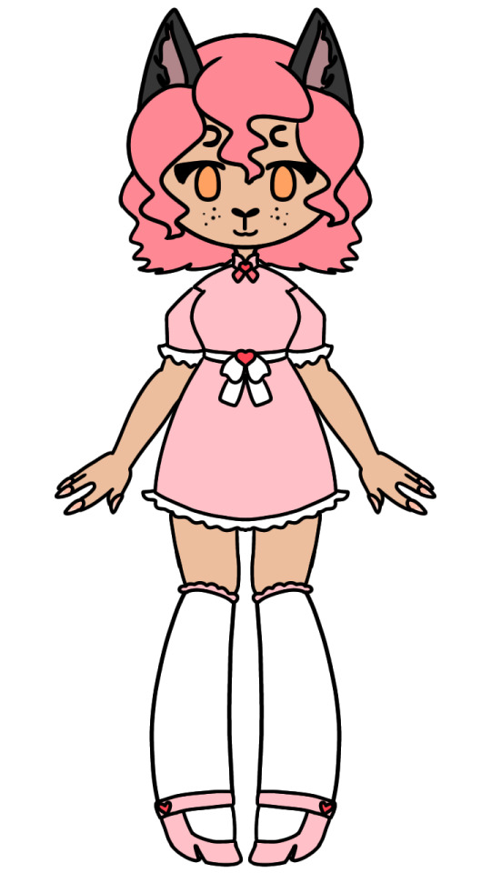
I just wanna start off by saying I renamed her to Hanami, which is the Japanese word for flowers viewing, more specifically viewing cherry blossoms. I figured this fit her more "cutesy" design as well as her usually pink and white color pallette. Also excuse me if they look bad, these were made a bit ago and I, for some reason, decided it'd be best to use the mirror tool the entire time
So, for her Phoenix Drop High uniform I just redesigned the uniform and gave her the same every girl will have. I changed it to have a blazer and a longer skirt like actual school uniforms in America although I kept the socks, loafers, and bow because those all fit, I'm just also giving everyone the same pair of socks.
Her season 1 outfit has been drastically changed. I decided I wanted her to have a more lolita-esque style instead of just vaguely cute, and let's all be real here, her season 1 outfit sucked. So, I gave her a longer, puffier skirt, a shit ton of ruffles, and some cute gloves. I think now is also the time to have a little fun fact section about meif'was. Their nails and hair grow faster than humans, with their nails growing than both humans and werewolves. That's why Hanami has long nails and freakishly long hair
Next up is her adorable Love~Love Paradise outfit. I'm actually super happy with how it turned out and I'm in love with her little buns. Her bathing suit with all its ruffles was made up by me :D
Her Lover's Lane outfit is the one that went the most unchanged because it's honestly my favorite outfit of her's. It just looks the most visually appealing with the addition of dark pink being a primary color. I just changed the dress up a bit with the neckline and added ruffles
Starlight is honestly my favorite. There's just something about color block clothes that itches a scratch in my brain. The giant bow and see-through ruffles also added a lot. You cannot thank me though, I took this design from someone else's swimsuit. Her nails changing for the first time since season 1 and now having blue with the pink is also a nice nod to how she opens up to Zane about not really being herself
When Angels Fall. Oh God, When Angels Fall. I fucking *hate* their "disguises" in When Angels Fall. Buy I'll get into that later, right now, it's just Hanami. I didn't like her outfit much because she had literally never worn pants in the series before and to just suddenly toss her in a pair of jeans and t-shirt? Like it's supposed to show how drap everything is but why would she just have a t-shirt and jeans packed?? Starlight is an island resort and theme park, so most people will be wearing bathing suits, much more breathable fabrics than *jeans* and Starlight merch. That's why I gave her a different bathing suit bottom and a Starlight shirt. It's the least you can do when you're the most visually distinct character. She also is covered in bandages because cats, when stressed, will over groom and can injure themselves. So Hanami picks and scratches at her skin often due to stress so she has very chipped nail polish and is covered in bandages. Also she cut her hair (sad violin noises)
Her final outfit is for my "season 7". Jess hasn't made it but I want to eventually tie up my rewrite, so I'm making one. Me and my girlfriend refer to it as the "epilogue" although it's not really an epilogue, she just called it that once and I can't think of a better name. I gave her essentially a mix of her season 1 and Lover's Lane outfits because why not
Now that her designs are done I get to infodump about her personality (hehe)
She's basically the same as Kawaii~Chan, but I make her a better person. She doesn't manipulate Aphmau into joined her bakesale! She also tones down a lot, so while she still struggles with boundaries, especially when it comes to shipping, she doesn't have a fucking shipping shrine in her basement. She's also autistic in my rewrite, so her not getting boundaries, baking being her special interest, and her masking her behavior to fit what she thinks people want/expect of her all comes from that. Will I maybe end up projecting on her? With the shipping stuff yeah, but only because Aphmau and Kawaii~Chan made me think shipping people together until they stopped being friends with you was normal
So thats it, the exit to the theater is on the right, make sure to throw your trash away on the way out. Have a good day
#aphmau#aphblr#aphmau mystreet#aphmau rewrite#aphverse#aphmau fanart#aphmau kawaii~chan#aphmau phoenix drop high
37 notes
·
View notes
Text

Charlie Morningstar Redesign! (4/7)
It’s the girl herself!!!
I could NOT stand the red in her suit so i made it a much nicer soft cream colour! I think red is a lovely colour but in the case of someone like Charlie who wants to brand herself as approachable and welcoming, a strong harsh red all over is not the way to go. The red of her horns and lower hooves and vest is already more than enough red and it pairs very nicely with the yellows and gold accents in the rest of her design in my opinion!
I always tend to draw her with this big hopeful eyes to contrast the kind of scary look that rectangle pupils give and I think it reflects her character pretty well. Charlie is absolutely a sweetheart but when angry her eyes become flatter and more threatening. She’s literally offered to kill a guy for Angel once so she has to have some kick in her, plus horns are good for stabbing! And accessories!! Like cute chains!!!!! My original Charlie redesign had her with a little apple cuff on her horn and I do miss it a little, but I think she looks alright without it too :3 she keeps it in a dresser somewhere
I’ve never drawn or designed a character with cloven hoof hands but I think I might do it more often after this. Thinking about her writing or typing with the little clicky sounds makes my brain happy and honestly walking with hooves has that special flair that heels just cannot achieve. Since she’s the hotel owner/staff she also gets her own custom little nametag like Niffty (the rest if the staff have them as well but not all of them wear them all the time like Husk, Van/Vaggie, or Alastor) I personally think Charlie made them all herself and let everyone write their own names, but she enjoyed picking colours and all that :)
Her red cheek things were a bit strange to me and I gotta be honest I didn’t like them very much so I replaced them with a softer peach gradient on her cheeks and hips to give an extra warmness to her. I want her to seem like the kind of person that can give a REALLY firm handshake and also a very good hug and talk about anything. Oh her little wave is supposed to look kind of like that weird royal wave I see those royal people do sometimes. I thought it’d be a cute little thing to add slightly-off regal mannerisms where I could.
I hope the goat motifs came through well enough, I really like abnormal legs (you will begin to notice this soon) and they really just add so much personality to me I love working with them. I wanted Charlie to be kind of chubby and soft looking hence the colour choice leaning more towards warm rather than hot and trying to use less pointed shapes with her like the little gold ball tassels on her bolo-tie. About the bolo-tie! The little gem on the inside is purple to symbolise the pride ring, but it also allows direct transport to other layers of hell. Sinners cannot use this even if they get their hands on it, but it’s still incredibly rare and valuable because of materials and such. It’s like an eco friendly private jet. Maybe Taylor Swift should get her hands on one of these! :)
And if anyone was wondering yes I did want the purple to also look a bit like a nether portal.. it was a good opportunity.
The last little details I want to note are the faint heart motifs on her ear and hooves. For the hooves it’s really cheesy but I think the metaphorical idea of leaving a tiny bit of love wherever she goes is cute and I like being sappy. The ear heart being a tear has always meant some kind of “hurt to get what you love” thing to me. I don’t fully know how to describe it but it’s not in a toxic mentality, she just does a lot of stressful stuff to get her dreams and passions going and I think shes great for that.
I plan on drawing her true form eventually and maybe showing a little animation of transformation (I just want an excuse to draw her tail again)

Overall Charlie is one of my favourites to draw and write for, shes just such a sweetie and I love her to death 🩷 she is quite literally the heart of the hotel and she is doing her best! Excited to post again later today :3 📻
#hazbin hotel#hazbin critical#hazbin hotel criticism#hazbin hotel critical#charlie morningstar hazbin#charlie morningstar hazbin hotel#hazbin charlie#charlie hazbin#charlie hazbin hotel#hazbin hotel charlie#hazbin hotel redesign#hazbin redesign#hazbin rework#hazbin hotel rework#hazbin rewrite#hazbin hotel rewrite#my art
31 notes
·
View notes
Text

Like promised in my Lucifer and Lilith post: here's my redesign and character changes for Charlie
Like always, notes under the cut. Drawn in Clip Studio Paint and with Photoshop CS6 for final touches. Okay to reblog, Feedback is encourage.
Charlie's character in the Pilot/canon:


Honestly, I really don't have any complaints about Charlie's design in the pilot. I think it's cute. I can't say the same for for the show itself though. Her hair is fine, but I don't like the outfit at all. Too much red and within a show that already has too much red, it all blends together and honestly isn't pleasant on the eyes. Honestly, I can't imagine what it'd be like for color blinded people heesh.
However, her design is the least of the problems I have with Show!Charlie. My major grip with Charlie in the show is how she's written.
There's a lot of things you can say about Charlie in the Pilot but what you can't say about her that she was unrealistic. She had good intentions and while she did come across as naïve, she wasn't stupid. She knew that her idea for the Happy Hotel could end up in disaster and maybe was dead in the water from day one; but she liked to believe that there's good in everyone and people deserve a second chance, or at least a chance to change for the better.
She also didn't come across as sheltered or a pushover like she did in the show neither. Charlie knew why people are sent to Hell and some are truly horrible people; some that she may have found out aren't worthy of redemption, let alone want to be redeemed. Also she knew when to put her foot down and not take shit unlike in the show where she just doesn't want to use her power as Princess of Hell because 'that's too mean' like giiiiiirl...
A part of me likes to believe that Pliot!Charlie would have no problem standing up to Valentino and get Angel Dusk out of his clutches if it meant not just for a chance Angel becoming a better person, but because he is her friend and believes no one should be abused like Val does to Angel.
(She also wouldn't call Angel Dusk a loser for being SA'd and R*ped like the show did with Husk. I know what Loser Baby was trying to do with it's message but it comes across as tone death being you can't really compare Husk's problems to what Angel is going though but I digest. There's better people to speak about this topic than me, honestly. I highly recommend Limus' video in regard to how Angel Dusk is written if you want to hear from an SA survivor's PoV)
About the redesign and character changes:
Honestly? I didn't change much from her pilot design because there really wasn't much to change in my book. Why fix perfection after all? If anything I just added onto what was already established plus added features from her redesigned parents. I gave them more golden hair with red hues along with Lilith's little horns that also grow when angry or in full demon form. I've seen a lot of people drawing Charlie with goat like features and couldn't help but not find that adorable so I ended up going down that route as well. (my Lilith also had animal ears but my Lucifer has more goat features in his demon form) They do still have there red suit jacket which they likely wears most of the time but I just really like her suspenders I want to show them off. Look I just think they're neat.
Her personality is closer to the pilot than it is the show, with her world view slowly changing as the story goes on. They also grow closer to the tenants of the hotel so that she can help them better suppose to doing day camp activities and thinking that's enough to get someone redeemed. I mean there are a few things from the show like trust excuses that I can see her putting the cast in being trust can be a virtue, but otherwise her methods become slowly just...talking and listening and finding the root of why they are the way they are with some of them perhaps tried to do good when still alive but always gotten dragged back into whatever sin or horrible thing they got themselves for what ever reason it may be. The only expectation of this is Alastor who doesn't really change much outside of growing fond of Charlie and some of their better qualities possibility rubbing off on him but considering he was a serial killer and cannibal when alive, I don't think there's anyway he's getting anywhere close to Heaven. XD
Her and Vaggie (who I will be renaming to Agatha, or Aggie for short in my AU) aren't a couple. At least at the very beginning of the story as I plan on going a more slow burn approach with their relationship suppose to them being a couple from the get go. I like the idea of Chaggie but found their relationship in the show was kinda wasted potential and (that seems to be the underlining theme of Hellaverse at this point) boring honestly. They had some chemistry and cute moments but I feel like the writers had really little interest in their relationship to begin with outside of wanting a wlw romance and from my understanding the reason why Chaggie is a thing is because a few people on Viv's team shipped it while none of the writers really cared much idk? It being slow burn in this case is more of a personal preference than it is to fix the problems with the pairing as a whole. Honestly for a show who claims to be 'female focused' it sure doesn't seem like it cares about it's woman characters at all? It's like the showrunners wanted to pull an excuse out of their ass to avoid taking accountability for poor writing in Helluva Boss' female leads...

They're non binary and go by she/them pronouns. Why? Well, Why not?
Honestly I don't have much more to say about Charlie being I'm basically taking what was given in the pilot and working with that as a base. Maybe I'll talk more in depth about her relationship with the tenants later but as of now I think I may have said everything I needed.
Next on my design agenda will be Archangel Michael (replaces Adam), following redesigns for Kesha!Bee and Stolas. I also need to finish up my second part of my Pride Ring post. It's about done but I need to clean it up a bit...
#here goes sweets off her bullshit again#hazbin hotel rewrite#hellaverse rewrite#hazbin hotel redesign#Hazbin Hotel: Redemption Arc#sweets helluva redesgin#sweets helluva rewrite
16 notes
·
View notes
Note
I think another problem I have with MHA is just how hit or miss a lot of their designs are. Like, Midoriya and Bakugo have some really really cool designs but then I look at Overhaul and literally just laugh. Overhaul is a young, yakuza plague doctor boss who wants to rid the world of works so the yakuza can rule again (still think his reasoning is dumb and Horikoshi missed the chance to have a "get rid of quirks bc they harm ppl more than they do good" plot, but w/e.) and THAT'S how he dresses? Oh my God, he looks ridiculous. Everytime I see Overhaul I laugh because his outfit is so fucking ugly. I showed my friends who aren't into MHA the outfit and they could not take him seriously. Like Horikoshi, you have a plague doctor yakuza boss character, and that's ALL you can come up with. Someone needs to redesign Overugly because while Overhaul is a competent villain, I just want him to actually look his part. Or just- half of the girls' outfits are just spandex suits. No cool costumes or practical purposes- the only one who has like a cool outfit that is a girl is like Lady Nagant.
Yeah MHA's designs are either really good or really bad. Like Shoto's costume is so bland and Hori for some reason refuses to fix it (yet another reason why I think he really doesn't put much stock into Todo past his involvement with his family/Dabi). Like jeez give the kid some sort of gimmick even if you have to keep it simple.
And we've gone over the girls' designs. Jirou's and Tsu's are probably the only ones that aren't sexualized in some way and it gets across how they're trying to appear.
This might be controversial, but Midnight's costume isn't bad to me. I mean, obviously it's fetishizing and fanservice but at the very least it's part of her gimmick. It has personality (despite what you might think about that personality).
Now compare it to Momo's costume and Bubble Girl's costume. Momo's gimmick is supposed to be "practicality," but it's just an excuse to use her for fanservice, as she has virtually no protection and her bookcase thing could break her spine if she falls on it. Bubble Girl's is even worse because it's almost completely unrelated to her quirk/personality. Plus, both costumes just look dumb, there's no style.
(I actually like Momo's winter costume better because it gives her a fancy flair, it kind of makes her look like a general/commander)
Mina and Uraraka's suits aren't terrible. Uraraka's for the whole gravity/space suit thing going on and Mina's fits her personality. Obviously I could do without the sexualizing, but hey🤷🏾♀️
And don't even get me started on Hagakure. There's absolutely no reason to have her naked on a literal fucking battlefield. Hori could have written around that, he chose not to for a cheap joke
32 notes
·
View notes
Note
*cracks knuckles* Get ready for a long ask As an animator/artist myself, I have a lot to say about the character designs. I'm sure you've heard this before, but these characters are not animation friendly. More detail just makes it harder to animate. (While Bee is a notorious example, nearly all of the characters suffer from this) When designing a character for animation, you need to pick and choose the key parts of their design, because you're going to be drawing the same thing over and over. Another thing: The characters have so much freaking red to them. I won't dwell on this for long, but they don't stand out from the background because there's so much freaking red (Another thing that bugs me is that the characters don't look like what the artist wanted them to be like) Ex: Charlie doesn't look like a doll Vaggie barely has a moth resemblance Angel Dust doesn't look like a spider Alastor doesn't look like a deer Niffty doesn't look like a bug or B-movie styled aliens Ozzie doesn't look like a rooster Beelzebub doesn't look like an animal trainer (you would think with all the suits and shit she likes to use, an animal trainer's outfit would be perfect for this)
Another thing: Her characters reuse the same design tropes. Bow ties, suits, fingerless gloves, gold tooth, stick thin figure, top hat, etc I'd excuse it if this was a beginner artist (heck, I used to do this, but eventually learned and grew out of it) but this is a woman in her 30's who graduated art school. TL;DR The designs are bad and hard as heck to animate
Couldn't have said it better myself
I feel like, when Viv sits down to design a new character, her personal preferences come first and everything they're actually supposed to represent second. Sort of tacked onto the final product like "yeah sure that'll do it"
As for the details, if I may add on: not long ago I've studied screencaps of a character from Helluva for redesign purposes. The amount of inconsistencies I came across was surprising! I'm pretty sure he didn't even have an official ref sheet (nor has one been posted to date), but I've heard that even for more prevalent characters the animators only have the most basic turnarounds? Also stuff like Millie's hair and spots tend to be inconsistent. With so much gratuitous/weird detail and apparently lack of proper reference, consistency suffers
Everyone is also very spiky and full of triangles; I'd love a more soft or even square character. Also some different body types... I mean, remember Mimzy from Hazbin? I don't know if Viv does. I wonder if she's still gonna appear at some point. But anyway
On a more positive note, there's a lot of background character designs that I find really cool & enjoyable! Maybe I'll make an appreciation post for them sometime
#confession#you know what also bugs me? somewhat less prevalent than the bow tie. and relatively harmless. but#c h o k e r s#a lot of characters have them. Millie. Loona. Verosika. Angel Dust. Vaggie. Crimini (pretty sure she was retconned but still)#and they're just there... because. no particular reason for it#(except for Loona I suppose. bc spiky dog collar)#it annoyed me because I was gonna give said redesign a choker to symbolize something. but then it felt redundant#also remember when they gave us a green environment for most of the episode where the imps stood out for a change#and then a new character with a wholly green design. and his ass was completely camouflaged for a significant number of scenes#it was almost funny#(but man I sure did NOT enjoy that episode)#helluva boss critical#hazbin hotel critical#helluva critical#hazbin critical#OOPS HAHA FORGOT TO ADD THE TAGS I am silly
37 notes
·
View notes
Text
Tim Drake Vigilante Redesign
(excuse my inconsistent artstyle and the way I haven't figured out how to draw sth else than skinny twinks)
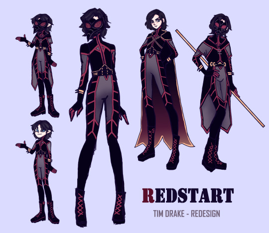
I based the design off of a painted redstart (cute bird, btw), also the name itself would be perfect, considering it keeps the red theme going
don't mind the drawings on the left, they were the base for the suit (and the model I use everytime I design sth tbh)
and the other three are the variations of the suit, one with cape, one without any additions and the one with a different take on the cape
when I design suits I always think of how easy it would be to put it on and how it can be useful in other ways (like the hoops in which sth can be hooked in for extra stability when climbing stuff) etc.
also the mask is technically his symbol now (bye bye cowl head)
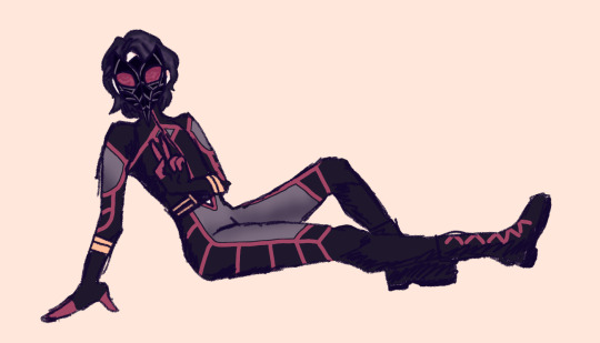
hopefully i will improve in art, so I can do the design justice as well as start drawing Tim with actual muscle defintion
#tim drake#red robin redesign#tim as redstart#drawing#sorry for making him look so twinky#apparently i can't draw muscles#which is bad cause like jason is my fav#red robin#can i even tag it as that?#excuse also the multiple errors in the artwork itself
53 notes
·
View notes
Note
I don’t know how I missed the fact that padawan’s braid have beads of colours affiliated to their area of study but just learnt that Anakin had both a red and a blue one for piloting and mechanics. Even when he grew up, he still was most attuned to what he knew best from his childhood. And I think it becomes something quite sad when looking at Darth Vader because it’s such a split from what Anakin enjoyed as an infant and until he was a master… it made me quite sad to think on that
- skyguythings
if it helps, DV does still get to pilot things he prefers it actually. in the movies he has his personal ship he goes after luke with. in rebels he goes after hera in his ship :) the man is always like “prepare my ship i will go after them myself”
he also got to redesign his suit. (in the comics). after his palps gave him his mark 1 suit which was too weak for vader’s power and disrupted what was left of his agility. so after vader came back from obtaining his new saber, his suit and limbs were pretty banged up. so while he was in his bacta tank, palps was like “i laid out all the shit for you, i know you want to redesign it your way, so here you go.” and vader got to remake everything using the force while inside his tank. it was sick af.
he maintains his hobbies and is still very skilled at them even during his time as darth vader.
being darth vader, he’s simply anakin skywalker uninhibited. sure palps keeps him on a leash, but vader accomplishes what anakin could not. vader is how anakin’s evolved. he’s not that much different, traumatized beyond belief and more finely tuned and such. he detaches himself from his past because its easier to excuse his behaviors, and to let people know he’ll never devolve back into who anakin was trying to be. anakin was the mask. vader is the being in the basement. he keeps palps around cos hes useful, and he cant defeat him without help. which is why any chance he got to overthrow palps he fucking took lmao. his sworn loyalty to palps is a mask.
i didnt know about the beads though, that’s so fucking cute! i love that sm. i didn’t think the beads had any meaning, that they were just part of the culture. to serve a diff purpose is so fascinating to me
#skyguythings#indy shoots the shit#dv#anakin#darth vader#aotc!anakin#star wars#sw#darth vader comics#thanks for the msg!!
62 notes
·
View notes
Text
Let's talk about Intigrelt Technologies Corporation.
Founded in 4985 on Krilnikath III, Intigrelt quickly made a name for itself with various improvements on existing technologies such as starship propulsion and specialized nanite production.
In 4980, only 5 years after its founding, Intigrelt found itself at the center of a scandal. An experimental biotechnology based crowd suppression technology was on a ship that crashed on a barren frontier world, XJ-986 IV.
This technology was later found to not only be the direct cause of the crash but also highly dangerous and nearly impossible to fully eradicate. Thus, the XJ-986 system was redesignated XJ-Z7-Q, a quarantine system. No traffic in or out. Only the seventh of its kind.
As one can imagine, the Federal Interstellar Commission government wasn't happy about this, and Intigrelt faced a years long legal battle, ultimately paying massive fines for their negligence.
Nonetheless, they continued to innovate, creating new technologies and improving older ones. Over the next forty years, Intigrelt became a massive corporation, one of the largest in human history.
They continued to engage in dangerous experimental research, but did so quietly, in secretive black sites on uninhabited worlds on the frontier.
Though they were a massive corporation, their name wasn't well known to the general public.
They preferred to work with governments and other corporations rather than directly with consumers. In 5011, this would change, to an extent.
The year prior, a small company known as Filitri Fabrication invented the first general purpose nanites.
Before 5010, nanites were very specialized machines, only useful for limited applications they were built and programmed for. General purpose nanites, which could change their programming on the fly, and rebuild each other to suit different tasks, had long been a pipe dream.
Filitri Fabrication was founded in 4995 by nanite researchers for the express purpose of creating general purpose nanites. When they succeeded in 5010, it was celebrated around the galaxy.
Filitri Fabrication was on track to become a household name.
Intigrelt saw this, and wanted a piece of that pie. And so, they bought out Filitri Fabrication in 5011, making it their subsidiary.
Filitri Fabrication did indeed become a household name, but much of the fruits of that small research team's labor went to the invisible giant that was Intigrelt.
And so Intigrelt grew ever larger and more powerful from the success of a technology invented by others.
In 5030, Intigrelt Technologies Corporation is an infamous, important part of galactic politics, more so than most people know.
The deaths they've caused, the lives they've ruined, all excused in the name of progress. Just another terrible result of the FIC's existence.
3 notes
·
View notes
Text
In my search for info about the Oldsmobile ad campaign, I came across this blog post:
----
The story of “not your father’s Oldsmobile.” Or how some really bad advertising changed the culture forever!
October 14, 2008
Time for a story boys and girls. It’s a tale that requires we go back 20 years, before copywriters had Macs, before email, before I lost my hair. This story harkens back to a day when Oldsmobiles roamed the earth. And their commercials filled the airwaves. I should know; I made some of them. Including the campaign that served as Olds’ final and famous (infamous?) death gasp: “Not Your Father’s Oldsmobile.”
Dad’s was better.
The line has become a pop culture catch phrase, in the same ilk –albeit attached to worse advertising-as “Got Milk?” Both slogans have been co-opted literally hundreds of times, far outlasting their original intent. Try reading your morning paper and not finding a variation on either line. For example, about a candidate: “This is not your father’s Democrat.” About a technological innovation: “This is not your mother’s sewing machine.” And so on. Sadly enough, more Americans are familiar with the Olds’ slogan than of Shakespeare’s finest sonnets. Way more.
A soft-spoken creative director by the name of Joel Machak wrote that famous line. I actually came up with the campaign’s tag: “The New Generation of Olds.” Both pieces were intended as lyrics. That’s right, a jingle! As a matter of fact, I was brought in to help Joel come up with the refrain. The piece went together as follows (sing along):
This is not your father’s Oldsmobile…This is the new generation of Olds.
Pretty spiffy, eh? The word “generation” was key. If you recall, each commercial featured a celebrity and one of his or her offspring. This is why the campaign is so damn silly. Outside of a morbid fascination with ogling Ringo Starr’s purple-haired daughter or Dave Brubeck’s motley looking brothers, placing the kin of “B” and “C” celebrities on camera was pure folly. Though I will concede we anticipated Reality TV by 10 years! If you do nothing else today, go to the above link. Trust me.
Where’s my Cutlass Supreme?
The very first spot was for the ���totally redesigned Cutlass Supreme.” The protagonist for this commercial was none other than William Shatner, appearing as; you guessed it, Captain Kirk! Riding shotgun was his lovely college-aged daughter, Melanie Shatner. A middling actress, she was pretty darn cute. She also was well endowed. And this became problematic given her wardrobe and where we were shooting. It gets damn cold in the Palm Desert at night. The diaphanous gown provided Melanie was meant to be futuristic a la Star Trek, but it did nothing to warm her up. Subsequently, her nipples went completely rigid, sticking up like Spock’s ears.
beam me up, Scotty!
While this may sound lurid and comical now, at the time (3 AM) it was a “situation.” Imagine the middle-aged suit from GM, replete in a satin Oldsmobile Racing Team jacket, making his way over to the director. “Excuse me, but we can see her nipples!” Given we’d already shot scenes of Melanie in the gown, a wardrobe change was not possible. The solution? Duct tape. And thus her cleavage had a silver lining.
The other moment I’ll never forget was a captured piece of dialogue (unscripted) between William and his daughter. Between takes, they were side by side in the white Cutlass. Unbeknown to either, the mic was still on. Listening to Captain Kirk school his daughter about the virtues of pep and sleeping pills as a key to nighttime shooting was priceless. What a Dad. What a cad. In a way, it preceded his Emmy-winning turn as Danny Crane by some 20 years.
I know this is trifling gossip, and long past its vintage. But like everyone else, I’m beaten down from our grim economy and an evermore-depressing election. Not to mention the woes of Chicago’s sports franchises… When I was new I used to love listening to the old-timers tell bawdy stories from their shoots. Now that I have a few under my belt, I figured we could all use a respite.
----
As a post-script: in 2021 the writer returned to his blog after fifteen years away. He explained that he had dropped out of the advertising biz and become a substance abuse counselor. He began work just as Covid broke out. Wow! I find that inspiring! He also has a Youtube channel devoted to his aquarium hobby, check it out here!
9 notes
·
View notes
Text
Maliha Saurcas: The Fusion-Spider!
Some of the armour on her suit got a slight redesign, but I finally got around to mimicking the spiderverse style for her. Or at least it could her style in the movies if she was there, like her universe consisted of gouache painting-like themes. It was my excuse to use the gouache brush I like using for painting pieces XD


#spidersona#spiderverse oc#spidersona art#into the spiderverse oc#across the spiderverse oc#oc x canon character#climb her like a tree! She's 6'4!
5 notes
·
View notes
Text
AIM

Warnings: None
Copyright: I do not own any Marvel characters or locations. However, I do own my OC Elizabeth Lightwood. I do not condone any copying of this.
"You're welcome." Harley's voice greeted Tony as he came around the corner with the file in his hands. He saw the kid was wearing a sort of disguise with a gray cowboy hat and colourful poncho. There were police cars parked outside of the bar, Officers come to bring their loyal dead back.
"For what? Did I miss something?" Tony asked casually.
"Me, saving your life." Harley clarified. He also punched Tony in the arm.
"Yeah. A, I saved you first. B, thanks. Sort of. And C, if you do someone a solid, don't' be a yutz. All right? Just play it cool. Otherwise you come off grandiose."
"Unlike you?" Harley asked as Tony unlocked the car with the stolen keys. Tony looked at the kid. "Admit it, you need me. We're connected."
"What I need is for you to go home, be with your mom, keep your trap shut, guard the suit, and stay connected to the telephone because if I call, you better pick up. Okay?" Tony asked. "Can you feel that? We're done here." He patted the kid on the shoulder once, "Move out of the way, or I'm gonna run you over. Bye kid."
Tony started up the car and then rolled down the window. He sighed, "I'm sorry kid. You did good."
"So now you're just gonna leave me here, like my dad?"
Tony thought about it. "Yeah." He paused, "Wait, you're guilt-tripping me, aren't you?"
"I'm cold." Harley scrunched up his shoulders.
"I can tell." Tony said in the same mocking sad voice. "You know how I can tell? Because we're connected." And with that, he drove away.
🎃 ::::: 🧡 ━━━━━━━━━━━━━━ 🧡 ::::: 🎃
"You ever had a chick straddling you and you look up and suddenly she's glowing from the inside out, kind of a bright orange?" Tony asked.
"Yeah, I've had that. Who is this?" Rhodey's voice spoke on the other side.
"It's me, pal. Now, last time I went missing, if I remember correctly, you came looking for me. What are you doing?"
"A little knock-and-talk, making friends in Pakistan. What are you doing?"
"Your redesign, your big rebrand, that was AIM , right?"
"Yeah."
"I'm gonna find a heavy-duty comm sat right now. I need your login."
"It's the same as its' always been WarMachine68." Rhodey replied.
"And password, please?"
"Well, look, I gotta change it every time you hack it, Tony." Rhodey said, avoiding the question.
"It's not the 80's, nobody says 'hack' anymore. Give me your login."
Rhodey sighed, "War Machine rocks. With an X. All caps."
Tony laughed on the phone.
"Yeah, okay." Rhodey sighed.
"That is so much better than 'Iron Patriot.'"
Tony did an illegal U-turn in the middle of the road, in order to drive back to the parking lot of the building in front of him that was holding a Christmas pageant.
He managed to sneak in to one of the New vans and started to. . . for a lack of a better term. . . hack the system. "That ain't gonna cut it." He muttered, seeing the 9.5 FPS with a 74 Ping and a download speed of 9.1.
"We talked about this," Tony heard someone say as there was a clattering sound and the van door was opened a little bit. "Excuse me sir. I don't know who-"
Tony turned around in the spiny chair with a finger pressed to his lips. "Shh."
The man's mouth dropped and Tony lowered his finger, grinning. "Mom, I need to call you back. Something magical is happening." Tony attempted to make sure the man stayed quiet by making various shushing sounds. "Tony Stark is in my van!"
"Shh! Keep it down."
"Tony Stark is in my van."
"No, he's not."
"I knew you were still alive!"
"Come on in. Close the door." he hissed.
"Wow, can I just say sir-"
"Yeah."
"I am your biggest fan."
Knew it.
"Okay. First, is this your van? Is anyone else gonna come in?"
"No, no, no. Just us."
"Great. What's your name?"
"Gary."
"Gary." They shook hands.
"Oh wow." Gary sighed, putting a second hand over Tony's.
"Right there is fine." Tony grinned awkwardly. He was used to this, but it was still just a little weird.
"Okay."
"Okay? I get a lot of this, it's okay."
"Oh, good. Can I just say?"
"What do you want? Yeah."
"I don't know if you can tell, but I have like, patterned my whole look after you. My hair's a little-"
"It's fine." Tony cringed.
"It's not right, 'cause there's no product in it."
"Right." Tony said, trying not to get to frustrated.
"I don't want to make things awkward for you, but I do have to show you- Boom!" He held his arm out to show off the Tony Stark tattoo on his arm.
Wonderful.
"A Hispanic Scott Baio. I'm sorry. Is that me?" Tony asked, pointing to it.
"Yeah. It's- I mean- I had them do it off a doll that I made, so it's not like it's off a picture. So it's a little bit-"
Tony had reached the end of his tether, grabbing Gary by the shoulders. "Gary. Listen to me, okay? I don't want to clip your wings here. We're both a little over-excited. I got an issue. I'm chasing bad guys. I'm trying to grab a little something from some hard-crypt data files. I don't have enough juice. I need you to jump on the roof- right? Recalibrate the ISDNs. Pump it up by about 40%."
"Got it." Gary barley breathed out.
"All right? It's a mission."
"Yeah."
"Tony needs Gary."
"And Gary needs Tony."
Ew. No. He'd stick with Y/N.
"Be quiet about it. Go."
"Yeah."
Once he got the go ahead that the power was up, he managed to get into the files. He fought against the restrictions, before he finally found some files in the AIM section. There were a bunch of faces with audio recordings, and the first one he turned on was the one of Mrs. Davis' boy.
"What would you regard as the defining moment of your life?" A voice that was off camera asked.
"Well, uh, I think that would be the day I decided not to let my injury beat me."
Tony clicked next on the woman who had attacked him outside the bar. In the video, her right arm was cut off at the elbow, healed over. But it was very obvious from the fight that she had both hands.
"Will you please state your name for the camera?"
"Ellen Brandt."
"Okay. So the injections are administered periodically." The voice sounded somewhat familiar and when the camera changed, Tony saw Aldrich Killian' there. "Addiction will not be tolerated. And those who cannot regulate will be cut off from the programme."
Tony found his next clip, which was a cleaner version of Killian speaking, his hair pulled back in a ponytail. "Once misfits, cripples, You are the next iteration of human evolution."
Tony hit another key and saw four different cameras of doctors and patients moving along a hallway. "Everybody, before we start- I promise you, looking back at your life, there will be nothing as bitter as the memory of that glorious risk you prudently elected to forego."
They were put into what looked like standing gurneys. Metal plates came down around their shoulders, as though there were about to go on a roller coaster ride. "Today is your glory. Let's begin."
He watched as Ellen's arm started to grow, her screams of pain echoing, making him flinch almost. Her arm looked as though it was forming out of molten lava, while the rest of her body glowed orange.
The boy next to her started to scream, his entire body lit with orange. "We gotta get out of here! We gotta get out of here!" Killian demanded, turning away from the man who was screaming in agony. "Get her out! Get them out of here!" The man glowed so brightly that he exploded.
"A bomb is not a bomb when it's a misfire." Tony whispered under his breath. "The stuff doesn't always work, right pal? It's faulty, but you found a buyer, didn't you? Sold it to the Mandarin." Tony snapped his fingers. "Got you pal."
🎃 ::::: 🧡 ━━━━━━━━━━━━━━ 🧡 ::::: 🎃
"What happened. Fun fact. Before he built rockets for the Nazis, the idealistic Wernher von Braun dreamed of space travel. He stargazed. Do you know what he said when the first V-2 hit London? 'The Rocket performed perfectly. It just landed on the wrong planet'. See, we all begin wide-eyed. Pure science." Maya smiled. "And then the ego steps in, the obsession. And you look up, you're a long way from shore."
"You can't be to hard on yourself Maya." You said softly as you carefully put Everleigh down on the chair.
You had taken a nap while Maya had driven. You had left the directions for Clint and Natasha's cabin in Colorado on the dashboard. When you'd woken up, it was off and you were pulling into a hotel because Maya said the both of you needed sleep.
Couldn't really argue with that, your entire body hurt from sleeping in the car.
Now the two of you were going to share a hotel room tonight and hopefully make the rest of the journey to Colorado tomorrow. You shouldn't be to far away. You had really thought you'd make it tonight.
Of course, your phone was still on recording mode. You wanted to make sure that Fury had every scrap of information available. You'd slipped outside to call and had talked to Nat, Fury, Clint, and Steve all at the same time. Steve was supposed to get to the cabin tomorrow, he was waiting for his second flight. You'd both probably get there around the same time.
Fury wasn't joining the rest of you, going to stay at one of the SHIELD bases, but regardless, he wanted to be kept in the loop.
"I mean, you gave your research to a think tank." You continued, tucking a blanket around Everleigh now. There was no crib in the room and the chair was the next best thing. She was tiny enough that she could sleep comfortably on the chair, the chair was comfortable, and she also wouldn't fall off.
"Yeah, but Killian built that think tank on military contracts."
"That's exactly what Tony's company used to do." You shrugged again. "So don't judge yourself."
"Thank you Y/N. I really appreciate that."
There was suddenly a knock at the hotel door. You quickly went to the door, knowing that it was room service for the three of you. You needed to feed Everleigh soon, and to make sure you had ample milk, you yourself needed to be fed.
"Hi, good evening. Come on in." You said happily, opening the door as wide as it could go to make sure that he could get the cart in.
"Good evening." He said back.
You turned to look over your shoulder for one second, and saw Killian standing behind the server, his hands snapping his neck.
"MAYA RUN!" You shouted, leaping backwards towards Everleigh. You screamed as he caught you around your upper arm, his hand burning hot.
"Hello Y/N." Killian said smoothly as he tossed you against the wall. You crashed against it, landing on the floor next to your phone. His hand came down, holding you around the neck to the floor. He looked up and over at Maya. "So you want to tell me why you were at Stark's mansion last night?"
"I'm trying to fix this thing!" Maya said angrily. "I didn't know you and the master were gonna blow the place up."
"Oh I see. So, you were trying to save Stark when he threatened us?" Killian asked.
You struggled in Killian's grasp, feeling both scared and frustrated. How could you fail to get out of this life-threatening chokehold when you had fought aliens only a year before?
Lack of training, you realized. You hadn't done any Agent training in months. You were out of practice.
"I've told you, Killian, we can use him." Maya huffed.
You grasped at Killian's face, but his arm was longer, leaving you at the disadvantage since he could hold is body further away.
"Y/N. Y/N. Y/N." He said, inching away from your fingers.
"Look, if we want to launch product next year, I need Stark." Maya continued. "He just lacked a decent incentive. Now, he has two."
🎃 ::::: 🧡 ━━━━━━━━━━━━━━ 🧡 ::::: 🎃
"You heard all that, right?" Steve asked harshly as he delayed getting on the next plane.
"Yes, Rogers, I heard that." Fury said in an exasperated voice. "And I will track her down. Barton, Romanoff, be ready to leave when Rogers gets there."
"Yes Sir." Natasha's voice was soft on the other end of the group call.
"We'll see you when you get here Cap." Clint's voice was friendly on the other side.
"Right." Steve sighed, hanging up with a bit of difficulty before boarding the plane. He looked out the window, feeling nauseous. These airplanes were definitely different from the quinjets. He didn't like them as much. They felt to. . . vulnerable.
And it wasn't as fast as the quinjets. Speed was needed. What if he got there to late to do anything? He tried to text Clint and Nat to go without him, that he'd catch up, but he wasn't sure if the text sent. It was hard enough dealing with new technology with the weird airplane interference.
Steve tried to relax into the plane, running his fingers along his own tattoo, a little golden retriever.
He closed his eyes, trying to remember the feeling of wind through his fur, and the happy feeling that came with his soulmate. Of running, jumping into-
Steve was jolted out of his peaceful thoughts as the plane took off. His hand dropped from his soulmate mark. It didn't matter anymore.
He just had to focus on saving Starks'.
#Braveclementineworks#BraveclementineNovels#Novel#xreader#Pumpkin#Tony Stark#Y/N#Tony Stark x reader#Harley#Iron Man#Tony Stark x Y/N#Pepper Potts#Steve Rogers#Nick Fury#Natasha Romanoff#Clint Barton#Natasha Romanoff x Clint Barton#animal soulmates#avengers soulmates#Marvel!au#avengers!au#soulmate!au#James Rhodey#Happy Hogan#Everleigh Maria Stark
1 note
·
View note