#this is not really advice on what art program to use I just wanted to share my views ok lol
Explore tagged Tumblr posts
Text
My personal views on art software as a hobby artist
So lol the next art post is text based.
But considering this is my art account and art related I figured that this post should go on this art blog.
But aware these are my own views and other artist views may vary.
Ok I swear I'll try to upload some art on this blog soon!
So what I look for in a art program (free or paid) when I draw stuff
For colored illustrations
Be able to draw straight into the program or process lineart from tranditional media well
To be able to fill color with the bucket tool on different layers with ease
To be easily blend/render coloring
For manga/comic panels
Make panels easily
Apply tone easily
Have a lot of free use/references/assets (ie backgrounds) to be able to be used
Have a good text insert tool
General
Be able to transfer illustrations back and forth easily (ie from ipad to laptop)
Have a good basis of tools, ie brushes, line tool.
Bonus points if they have a good intergrated soical media platform.
So I was going to go through some art software (free and paid) that I currently use for my illustrations, go through some postives and negatives.
Before that..
Software I am not mentioning
Photoshop (because I think it's too difficult to render plus I mostly use it to alter image sizes)
Gimp (never used)
Krita (Never used)
Sketchbook (hardly used)
Many other programs I don't mention
Medibang Paint (Mobile + Desktop, Free + paid)
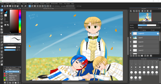
I feel like this program does'nt really get a lot of attention. It's free and always requires so many "updates" but it's a program I use a lot currently. Mostly on ipad I use this program.
Positives
Really easy to draw on and simple to color on
Bucket tool is the best in this program works on every layer
The text tool IS AMAZING to use (I use it currently for my fancomics)
My artwork looks really bright and colorful when I finish coloring on this app
Negatives
The uploading on to their soical media platfrom is bad
Cloud upload is a little slow/glitchy
Text tool needs online/internet to work
The desktop version is not as good as ipad version
Not good for drawing manga/comics
When online, ads are really annoying
Color blending/rendering is not really good apart from using the watercolor brush
Even though there's so many things I don't like about this software. I USE THIS PROGRAM A LOT. I think it's been 3-5 years snice I've used this program up to this day. Still very under-rated this program is.
IbisPaint X (mostly mobile but there is desktop, free + paid)
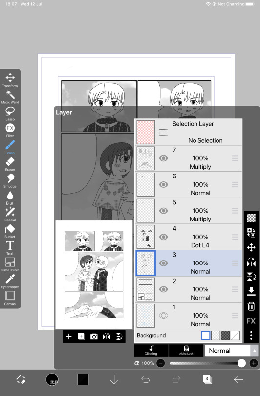
The "alternative" to procreate for android users. I don't see many users talk about this program neither.
Positives
AMAZING for manga/comic drawing. It's my current default program to draw my fancomics right now
Screentone layer is amazing
Really good bucket tool, works on different layers
Good resources/assets for manga/comic creation
Negatives
A pain to transfer files back and fourth, snice this program is mobile exculsive (unless you pay for desktop)
It's not really good to do colored illustrations on (no good blending tools, no dual colors can be used)
Text tool is not good.
A new program I came across and I honestly was SO IMPRESSED with the manga tools that I bought the ad free version. I honestly recommend this program for manga/comic creation over clip studio paint.
Procreate (paid and on ipad only)
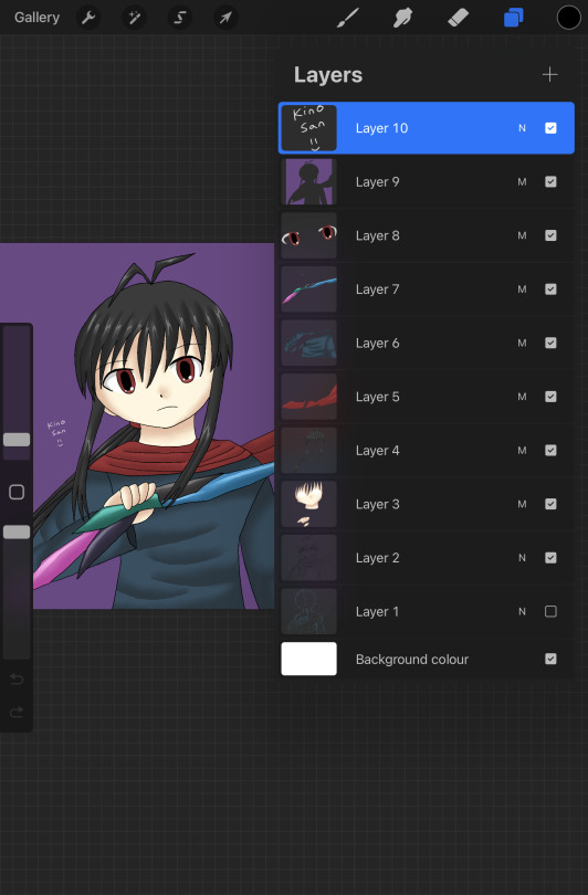
Speaking about Procreate I have it! I also don't use it as much as Medibang + Ibispaint lol. I honestly think procreate is over-rated.
Positives
Animation is the most simple and easy to use (I did my own test animations on them)
Good customisation with brushes
Good blending tool
I like the timelaspe function
Amazing color palette creation
Negative
THE AUTOFILL/BUCKET SUCKS BAD (the main reason I hate drawing on this app, every drawing I do I have to color in manually like a 5 year old and it takes me ages to finish a drawing on this app)
For some reason every drawing I do on this app my colors are dull and washed out compared to medibang
Transfering files back and forth is a pain as well
I mostly don't use procreate because for me the bucket tool NEVER works on my lineart (even setting reference on the layer) which results on me keeping the drawing simple because I have to manually color every section myself. I don't understand why it's so popular. I rather use medibang than procreate for my drawings.
In my view apart from it's animation features it's not really worth the price. Considering I bought it and hardly use it.
Paper by WeTransfer (Free + paid, on ipad only)
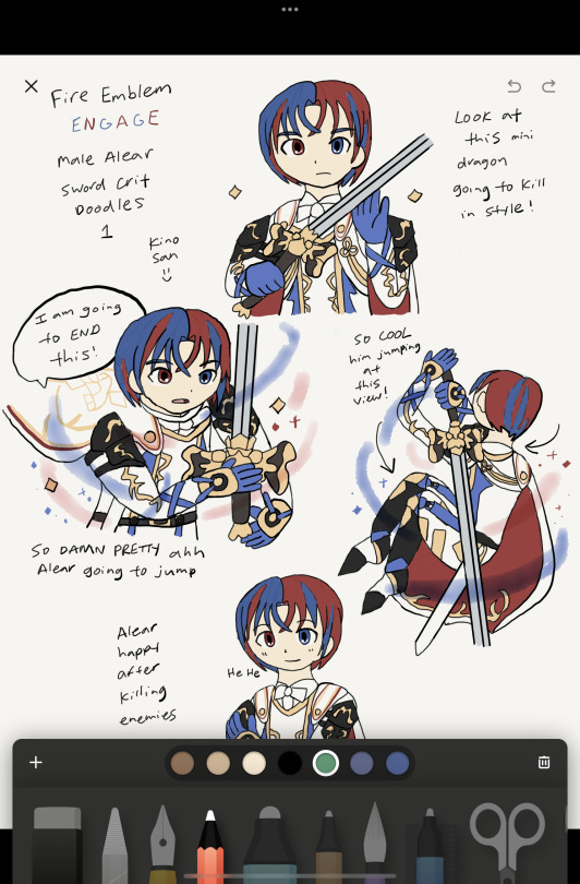
I BARELY see any artists use this app, I think I might be the only person who uses this app lol. It's got good/bad features and I still use this app for rough ideas/doodles
Positives
AMAZING organisation of art (can make unlimited journals with pages to add to them)
Can hold unlimited art pieces, don't have to name files.
Good color mixing/color picking
Takes little space on your device so I hold all of my doodles in here
Negatives
Barely/never updates
Outdated/limited tools
BAD AT MAKING FINISHED COLOR PIECES OR EVEN COMICS
NO LAYERS
Color palette is REALLY BAD
washed out/dull look when doodles are finished
So because I DRAW A LOT, I use this app to draw rough doodles/ideas. I mostly use it as a art reference for my OC designs or dumb doodles like the one above. But yeah I understand why it's not popular, no layers is like art mode HARD. But I enjoy drawing on it.
Clip studio paint (mobile and desktop ,paid + limited free?)
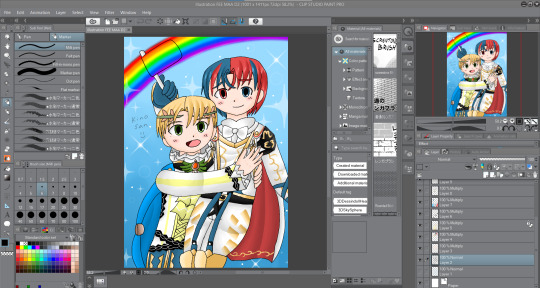
I recently got this program because I heard so much about it from soical media. So..I acutally think this program is over-rated lol!
Positives
AMAZING for colour illustrations, bucket tool is great, color picker good, great blender/render
MASSIVE online/asset resources the most I've seen so far
My finished drawings look bright and colorful and just as good as medibang
Negatives
You have to pay monthly for ipad version/ newer version (which I don't have)
I don't think this program is good for manga/comic drawing (restricted screentone layer, limited material layer, bad text tool)
I am disapointed with the manga creator, I think it's BAD! I can't FIGURE how to add panel or even draw on a manga page, I had an headache trying to figure out the way screentone works. I personally think Ibispaint is WAY more simple and better program to create manga than CSP.
But I understand why it's good and worth paying for. The blending tools are amazing as well as resources/assets. I have yet to test the animation feature.
Programs I don't use much/anymore
Paint Tool Sai (paid, desktop only)
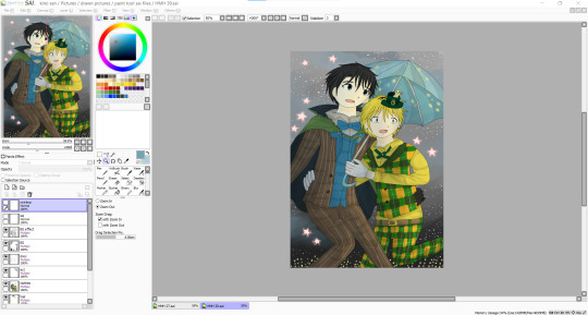
A program that existed before procreate or clip studio got popular
Positives
Working Bucket tool
Good blending tools
Amazing color palette creation
Negatives
limited assets/resources
only good for colored illustrations
I honestly did use paint tool sai for a number of years before moving on to medibang. I think this program is good, but it felt outdated as I moved on to other art software.
Overall
I just wanted to say this is my own view and so please don't get angry lol. I mean every artist is different and have their own program they like to use. This is from my own view.
I am not saying to use medibang more and use procreate less. It's just in my view sometimes I don't see why certain programs are more popular than others.
Don't take this as advice on what art program to use either. I don't know just use the one you like.
#artviews#clip studio paint#procreate#medibang paint#ibispaintx#this is not really advice on what art program to use I just wanted to share my views ok lol#paint tool sai#paper wetransfer#art software
1 note
·
View note
Note
What are the questions you hate??
Okay so I don’t really HATE anything (so far) but how bout an FAQ? There are some asks I’m kind of tired of answering lol. Such as;
• “FEED ME” For one thing, it’s not even an ask 💀 So I don’t love this energy, it’s -2 charm for me. Whilst I’m grateful that folks really like the art I share (like SUPER GRATEFUL!!) I am not particularly enchanted by a demanding aura
• “when is ____ coming out”? The answer is always “I don’t know” because I draw for FUN and I draw in my FREE TIME and that varies. So for the foreseeable future, unless I EXPLICITLY state otherwise, you can expect my next post to appear on your screen whenever I post it 🥰😘
• “what programs do you use”? I don’t have a problem AT ALL with inquiring minds, I just get this ask a lot and I’ve already answered it a few times (for the inquisitive minds, please consider checking the tag ‘answers’ on this blog to find information. I’ll tag this ‘faq’) Anyway, I use pens, paper, my iPad, Apple Pencil, and Procreate. I often use brush packs made by Shiyoon Kim and Kyle Webster. I find brush packs on the creative market as well. wanna learn Clip Studio Paint, but haven’t gotten to it.
• “advice on improving in drawing”? This is a beautiful question, and I’m happy there are people who want to improve their drawing skills! I am one of you. I frequently use “YouTube university” where I will find drawing focused channels that teach you this very thing. Andrew Loomis books on drawing are like textbooks that break down the fundamentals really effectively. Like any skill, you have to research, study, and practice. The more you do of each, the better you will get. I’m trying my best to improve and master the craft eventually. (A fool’s errand haha) anyway, have fun!
• “can I fandub this”? The answer is yes!! And I hope you have a lot of fun!!! Please credit me and no monetizing. 🥰 Also, please no posting on twitter (X) or meta (instagram, facebook), as I feel uncomfortable with the Gen AI social media platforms.
• “can I make fanfiction/fanart/cosplay based on your fanart?” FUCK YEAHHHHHH!!! I LOVE people being creative. We’re all having fun in this fandom and I think it makes life more exciting when we create! Same with fandubs, please credit and no monetizing 🥰
• “do you do commissions”? I am not accepting any right now, but that can change! Please trust that if/when I do start taking commissions, I will be letting y’all know!! And I really appreciate that you’d want to commission me 🥹♥️
• “in your comic, will ____ happen?” I’m not just gonna TELL you that lol. But clarifying what’s ALREADY happened is always a welcomed ask :)
I just want to thank everyone who tunes into this blog!! I really have a great time creating fanart, fanfiction, and comics and I’m VERY SHOCKED that what I’ve made has had the reception it has. It’s fun to be in this fandom with you all!
THANK YOU TO EVERYONE WHO SENDS ME SWEET ENCOURAGING MESSAGES ILYYY 🥹💖💘💞💓💝
750 notes
·
View notes
Text
"versioning" your files
i have an extremely dull tutorial i want to share with you. i never think to share this advice and i think its because it's really user-unfriendly and dry. but today i can teach you how to make automated back-ups of your art files.
download freefilesync.org, a program for automating backups. its freeware and very useful if you have a lot of art to back up. everyone say "thank you freefilesync".
make a new "configuration". this is a settings file that will remember your back-up specifications.

3. make back-ups! select your files you want backed-up on the left and instruct where to put the generated back-ups on the right. save to an external drive or a google drive folder or something. just back it up! i do both just to be safest.

4. click the green gear on the top right. these are your synchronization settings. specify the type of back-ups you want. i do "mirror" because i just want them copied. you can hover over the icons for more info on what they mean to further customize your copy settings. these are mine to make basic copies.

you can also fuck around with the blue gear (where you can specify what changes should prompt the computer to make a copy) and the filter if you need to exclude something from being backed-up.
5. select "versioning" and browse/create a new folder anywhere (external drive or primary, your choice). call the new folder something that indicates the files are outdated. select "time stamp [file]" for clarity's sake.

you will now have automatic back-ups every time you make a change to your file and save it.

save your configuration settings.
6. set freefilesync to run 1x a day at a time most convenient to you using windows task scheduler. instructions here
sometimes you really fuck up a file. maybe it gets corrupted or you save it at the wrong resolution. well now you have a parachute. previous versions of your file will be saved here. every time you make a change to the file and save it, a new back-up is generated.
hopefully you will never need this.
but you might
289 notes
·
View notes
Note
Hello! I love your art! I am starting to get back into art after many years, and wanted to animate it. What app do you use to animate things? Do you have any recommendations how to get started? Thank you!
Hey thanks so much! I use a program called Krita, it's free, it's great, it's got the basics of frame animation which is all I really care about. I guess my best advice is that whenever you start an animation project you might benefit from starting simple and adding complexity later. Animation gets frustrating fast whenever something is off and it gets tricky to fix or "get right" when it's in the context of all the frames surrounding it. In my fish loops I started with drawing a ball that stretched and flattened as it moved around and then went over it and added eyes, fins etc. to fit the movement. I think I would have gotten frustrated if I started with a whole complex shape and wouldn't have known where to go next. It's a muscle though and gets easier as you do it.
Pretty much everyone getting into animation I think finds this ancient series of chronophotographs by Eadweard Muybridge showing a horse in motion
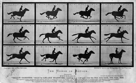
It's great and a cool bit of photography history, and I made an exercise of it to try and copy it when I wanted to get into animation. I felt it helped me make sense of what is important in making an image move in a fluid way. It's a fun and not too daunting task, you might want to try it yourself.
Tilting at windmills
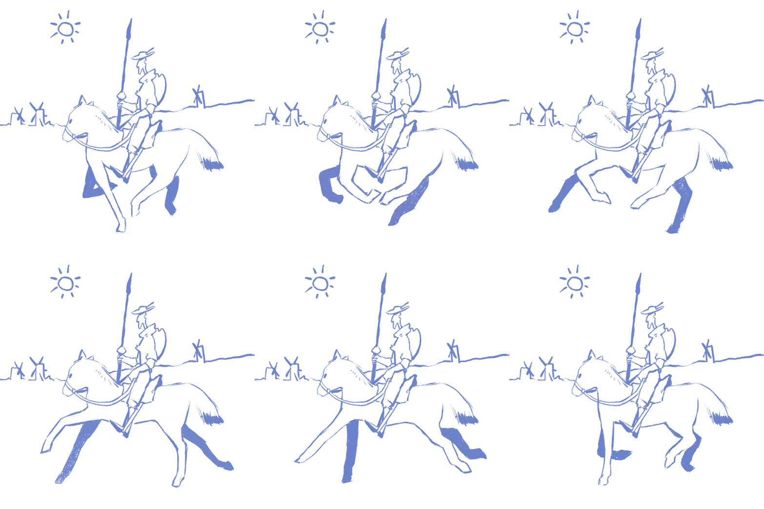
Also, if you just animate the bottom half of the horse you won't have to do as much work, so you should do that
As for the program itself, you can make layers static or add keyframes to them to make stuff happen, click window > animation to change the screen to access that part. Make a drawing, hit next frame and turn on onionskin so you can see where you were the frame before
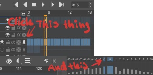
The krita forums are also really helpful if anything technical goes wrong
Hope this helps! And also wasn't too much or too little information :)
273 notes
·
View notes
Note
Hellooooo! I’m working on a clangen blog of my own, so I’m going around asking my favorite clangen blogs some questions. I’m happy to get answers to whichever you feel like answering (or none at all if you don’t feel like it!)
What program and file size do you use?
If you use a font, what font is it?
How far ahead do you recommend playing?
Do you have any advice for layouts?
Do you have any tips for lighting/drawing fur?
Do you have any tips for making cats look more unique?
If you do backgrounds, do you have any advice for creating them?
If you use them, where do you recommend finding reference images?
hi hi! Thank you for the questions 1. Clip Studio Paint, my comic pages' size is 1600x2900 pixels when I'm working on it, but that includes empty space on the sides where my lines can go over the limits when needed
2. "HP Simplified Hans Regular"... I sort of want to hand-write all of my text tbh, but I thought I shouldn't make things too energy-intensive for myself
3. Depends what you want the structure of your story to be like. For me the important part was the setting that was generated for me so the moons going forward & the brisk pace that that gives you have less importance for my story than they would for most Clangen stories, and therefore I didn't go very far in the moons before I started sketching down pages
4. nah, i'm a newbie on that
5. can't think of anything, sorry
6. I think looking for uniqueness itself can be kind of a trap, and i think it's most important your characters are distinct from their surrounding cast of characters than them looking unique when looking at the wider art community. Any kind of design can be recognizable if it makes an impact. I think using patterning especially can be something people might fall back on too easily to make characters distinct. These are the other ways I like to try make a cat character recognizable and interesting (among their cast): - Experiment with different, even subtly different whiskers, ear sizes and shapes, fur texture (sleek, puffy, curly, spiky, flowy etc) and where that fur might be most prominent in each character (one fluffy cat might have a huge puffy chest fur, another long hair cat might have their long coat look more heavy and pulled by gravity, another cat might have the puffiest tail but less in the chest, etc). Also of course the usual, like different eye and nose shapes. - Use color contrast to make the character demand more attention to itself. If a cat has a big white patch on their face when the rest of their body is dark, it immediately brings your attention to their face. I often like to play up and heighten the contrast of a warm-toned body against cool-toned eyes like Whisperingpaw's reddish body against his deep blue eyes, but it works just as well in reverse or with other color contrasts. This can be muddied though if the design is full of highly contrasting small elements in unimportant places of the body which instead can just become confusing to the eye. It's why I don't really like designs from for example Genshin Impact
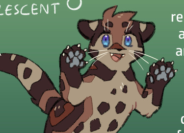
^ Whisperingpaw, I even made his grey pawpads more cooltoned than usual for some extra contrasting details - Try designing two characters at once instead of one at a time. When you design two at once, especially if they have some connection to each other, you can already start laying out some opposing or just different physical traits to them. If you make a huge cat next to a small cat, both of their sizes are immediately noticeable traits about the cats that you can perceive and build on. If you only drew one huge or one small cat, you might not really even register their size as part of their design because there is nothing to compare it to. Let their relationship & direct comparison be something that contextualizes them and gives them something more than an empty paper to relate to - Continuing on the "let the characters have something to compare to", a character will always look more beautiful if they are surrounded by more bland or even "ugly" characters. A character's intricate patterns will be more noticeable if surrounded by very simple-style characters. Use this to your advantage and let things like beauty or cuteness be character-specific traits instead of something expected of each design. This is just another benefit to having a diverse cast, it doesn't just give representation to less charismatic styles of characters (which already has so much value by itself), it lets the "beautiful" designs be more convincing to the eye.
for 7. and 8. i don't have an answer to!
Hope that helps :3
80 notes
·
View notes
Note
Hi! I really like your art, and it inspired me to get into pixel art myself. I know you already posted about how to start making pixel art, and that tutorial was very helpful, but do you have any advice? I see all your art and I can’t help but wonder the process.
hello, first of all thats very cool and sweet, i hope u will continue and thank you for telling me
as for the question hmmmmmmm
its very hard to answer because i don't know where you are at in your journey or what your goals are but
i just finished a piece for artfight and made a timelapse gif which may help you understand my process if you are interested in that (even tho its a more simple piece) (sorry for flipping canvas sm)


this is the character btw. some things that i think are important:
getting stuff on the canvas even if it looks shit (my sketch phase is FUGLY) but its digital art so we can just make it look better and move stuff around. its literally not a big deal
flip a LOT (flipping lets u see ur mistakes easier) (it might hurt your soul at first but eventually you get used to it) (reaching full artistic ego death is the end goal)
i dont have a strong minds eye so i cant visualize my piece very well so i just try things, you will notice i try different poses and expressions
what i rly care about is mood and conveying some emotion and i'll try lots of things until i get what i want. once its on the canvas i can evaluate how that works for me. if it looks bad JUST CHANGE IT !!!! 😤👍
GET LOTS OF REFERENCES !! when i got just 1 ref i ended up copying it too closely, but you can get a bunch and combine them together. that log in the foreground i stole that from princess mononoke. take elements from stuff nobody will miss it
for beginner advice i think, just draw a LOT and try not to get sucked into the details for too long. u can learn a lot by just doing a ton of throwaway stuff. rendering is important for sure but it can TAKE A LONG TIME so just be aware of what youre spending your time doing
and PLEASE look at other pixel artists who are really good. take their art into your program and look at it and study it, see what they are doing. its not cheating we have all done it.
look on pixeljoint for pros!!
114 notes
·
View notes
Note
So when I do finish this book I am writing (speaking it into existence bc adhd is a BITCH) Like what's your experience with publishing? How much does it usually cost? What kinda income does one get? I don't really care about making money but it would be super neat to make something since I cannot work. How do taxes work on that also? Google is confusing me
So far i have an idea and half a first chapter with thrilling notes such as " add a cat" and "insert spell here"
So I self publish, so that's the world I know. If you want to find a traditional publisher, you'll need to query agents and do a bunch of other stuff. My only advice for traditional publishing is that when going that route, money should always flow towards the author. If they're asking you to pay for something, they aren't a traditional publisher and there's a good chance it's a grift.
So let's talk about what I do know.
(And this turned out to be long as hell, so I'm putting in a "keep reading")
When you self publish, you are effectively acting as the publisher. If you want someone to do edits? You'll have to hire an editor. If you want someone to do the book layouts? You'll have to hire someone to do it if you can't do it yourself. You need a cover? You get the idea.
Now I don't pay an editor, so I can't really give you a price range on how much they cost off the top of my head. I do know they can get expensive though.
I also do all my own interiors, but I have a graphic design background and have been doing print layouts for decades. If you want to hire someone to do the interiors, that can run you $100-500, so I recommend just... learning to do it yourself.
Frankly, it's not terribly hard. I do mine in Apple Pages on my Mac for my paperbacks and Amazon has a free program for formatting eBooks (which you can export both as the Kindle format OR the more universal ePub format). With your print version, you just want to make sure you get your margins right, along with using a standard font like Times New Roman.
Like, literally just pick up a book and study the layout. Look at the front matter (copyright page, title page, etc) of a handful of books and mimic what you find there. I don't know why so many self published authors get that bit wrong. It's a book. Format it like a book.
Now the cover... this is where you'll probably end up spending something. I do my own covers for my comics, but hire out for my novels because I can't do the kind of covers expected of my genre. And you do want to match your genre, because you want a potential reader to know what they're getting into. I've seen so many self published books with terrible covers and it drives me nuts.
Cover design can run you anywhere from $35-$400 depending on who you choose to contract, and this is where I recommend you spend your money. On the cheap end you have companies like GetCovers. Now they primarily do covers made from edited stock photos, and I've honestly been pretty satisfied with their work... but you have to hold their hand and be very clear with what you want.
GetCovers is a part of Mibl Group, and it's pretty much all of their most inexperienced employees. The whole point of it is to get them the experience to work on bigger projects down the road. They have cheaper packages, but for their best work you'll probably only spend like $35-$45. If you're working in a genre that mainly uses stock images, that's who you want.
I often end up retouching the covers they do though, because I'm impatient. Like there are edits to The Witch and the Rose and Shadowcasting I made after they handed me the completed files. You're going to have to be very specific with what you want. The first version of the Bloody Damn Rite cover they did... was awful. But they did the revisions I asked for, and the version they delivered in the end was great.
Now if you want, like, original art or just more complicated, custom stuff? You're looking at at least $250 on the cheap end, but sometimes you end up in the ballpark of $700-$1000. Like on their regular site (just to use the same company as GetCovers for comparison), the Mibl group charges like $300 for a more complicated stock photo based cover (that requires more complicated edits) and at least $700 for covers that require digital painting, 3d modeling, etc.
There are a wide range of prices depending on what you're asking for. But, y'know, you're paying that once for a commercial piece of graphic design.
I'm cheap and can do some of the work myself, so I go for the $35 cover. I also figure out what fonts they used for the covers, so I can go buy my own commercial license for them and replicate a similar logo on my title page. You don't need to do that bit, I'm just finicky.
Actually publishing the book is easy. You'll want to use a self publishing platform like Kindle Direct Publishing or IngramSpark (or, if you're like me, both). I sell KDP books on Amazon, but all other distribution is through IngramSpark. You make more money on Amazon by using KDP, but even though they offer distribution, no book store will ever order through them. So I turn that option off, and then I take the same book and I make it available through IngramSpark.
On amazon I make a little more than $2 on a $3 ebook, and about $4.00 on a $12.99 paperback. When a bookstore buys an IngramSpark version, I make about $2.50 on a $14.99 book (if you wondered by my books cost more when not buying it through Amazon... that's why). Now if you buy yourself author copies, they cost way less -- in the end I think I can get them for like $5 a book? So when I sell them in person, my margins are much higher.
But, y'know, you have to actually sell them.
Because that's the hard part. When self publishing, you only have you to market it. I don't know how many books I'd be selling if I didn't have a pre-existing audience -- and even then it's not a huge amount. I've sold about 200 books this year? Which isn't nothing, and I appreciate every single person who's purchased one of my titles, but it's obviously not enough to quit my day job for, y'know?
That said, I've known people who do sell enough to make a steady living. So it's possible for sure.
But it's not going to happen overnight, and it won't be easy.
As for taxes, you'll need a 1099 and do stuff with the Schedule C. I always forget exactly what until I'm actually doing them, but it's not super hard, just annoying.
68 notes
·
View notes
Note
Hello! Sorry to bother but do you have any digital art tips? I’m quite new to it and any tips, tricks or advice would be helpful! Your coloring style is very beautiful and I love it a lot!
thank you! 💚💚💚 sorry this is a bit late, hopefully there's still something helpful in it!
(also, it got pretty long, sorry!)
I think the biggest thing is to just take things slow -- digital art feels different than drawing traditionally, and it's SUPER easy to get overwhelmed by the billions of cool features that the digital world offers. (I say, as someone who spends a lot of time downloading cool brushes and textures...and then never using them ever.) there is a ton of really cool stuff you can do digitally, but because there's so much, I think it's really important to take time to figure out what is and isn't working for you. spend some time doodling without any intent to do a finished piece, figure out how you like to hold (or not hold) your tablet, what keyboard shortcuts you end up using a lot (and therefore might want to map to your pen/tablet buttons for quicker use)...that kind of thing!
everyone's workflow and preferred program and style are different, so it's hard to give hard-and-fast general advice. but the things that I think of as the essentials for learning digital art programs, and what I think of as a good order to focus on learning them in (although YMMV, especially depending on what kind of art you're doing):
brush customization (e.g. flow, opacity, softness)
layers and layer masks
selections and transformations (e.g. scale, rotate, flip horizontal/vertical, skew) (skew is underrated and I will die on that hill)
blending modes (e.g. multiply, screen)
adjustments/adjustment layers (e.g. hue/saturation, curves)
and I think most stuff after that is gravy! often very good gravy though! but yeah, as overall advice I recommend just taking things one little bit at a time, spending some time just drawing and messing around with each feature and what you can do with it. whether or not you end up incorporating any of it into your workflow, it's always good to try things out and just see how they feel! :D
and just so there is at least a little more concrete helpfulness in here, here's a few more specific things that I think are super important to keep in mind!
use! your! tablet/pen buttons! I mentioned this earlier, but they are extremely useful for keyboard shortcuts that you use often! most programs will also let you create new shortcuts for other things -- personally, I use the magic wand tool to fill in big color blocks a lot, so I made shortcuts for 'expand selection' and 'fill' and then mapped them to my tablet buttons.
flop your work horizontally often! when you're working on something, you get used to the way it looks, so seeing it mirrored is a quick way to see it with fresh eyes! in my experience, it often feels like this:
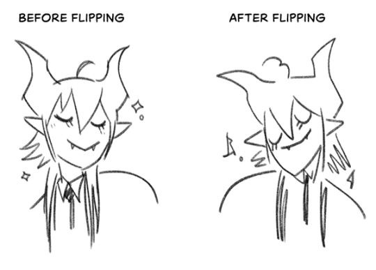
(a common thing is to find that everything is sort of 'leaning' too much one way, which is where skew really comes in handy!) (seriously, I love skew, it is my savior)

if you're working with color, keep a hue/saturation adjustment layer (or a layer filled with black or white and set to Color) on top and toggle it on occasionally to check your values! a lot of people who know a lot more about color than me (and are better at putting it into words) have written about why values are so important, so all I'll say is that the rule of thumb is that your image should still be readable in greyscale:

there are some exceptions and grey areas (do ho ho), but it's a good general rule to keep in mind! (some programs also have a colorblind mode, so you can check to see how your work will look to someone with colorblindness!)
and finally, here's some digital art programs I recommend, if you're still looking for a good one!
free: krita, FireAlpaca
paid: ClipStudio, Procreate (iOS/iPad only)
#art#...sort of#horizontally flipped mal isn't my favorite drawing i've ever done of him#but it's up there#anyway i do personally use photoshop#but i absolutely do not recommend it when there are better and free-er art programs out there#it is the equivalent of texting with a giant 90s-block phone that has been jury-rigged to somehow install whatsapp#because i don't NEED a new phone i KNOW how to use this one it's FINE#(oh god i've become my dad)#someday i will have to actually switch to clipstudio and learn new keyboard shortcuts :(
407 notes
·
View notes
Note
Your art so surreal, did you take inspiration from African masks it’s amazing. You have probably gotten this question before but what’s your process and how do plan these beautiful pieces out. I am a beginner artist and would like some advice on how start doing digital painting.
thank you for bringing me back from the dead with your kindness, (i was so sad today ughhhh i think watching vampire diaries starting to affect me hjkhjk), i really, really deeply thankful that you spend your time to write something so sweet (also sorry it took me literally ages to reply phphp THE USUAL)
yeah, in buryatia shamanism like the big thing, so when i went to search what's out there in the masks department - google's mess of the results for once was helpful and showed this massive collection of beautiful african masks. the one that was inspo for tiisha lived in my head rent free for weeks before the character was even born phphph now i cant even imagine her without it
(here is little tiisha for you before i'll proceed to be not helpfull phphphph)

oof advices are not my strong side , like..........my process mostly is just sleep through the whole thing i guess..........................i very rarely do sketches, i hate study anatomy and perspective, drawing cubes makes me physically sick etc etc my approach to drawing were "fuck around and find out", always about chill and fun and barely ever about learning. imho thats why im so shitty at drawing simple things but not bad at coloring. so yeah, my biggest advice always and forever will be - be gentle to yourself, please
digital or traditional or whatever else is out there, dont forget you make it for yourself and for yourself only okay? it supposed to be fun, not sad tiring and competitive
advices for digital specifically tho - very objective, apply with caution
learn all the keyboard shortcuts, ideally to press them without thinking
explore more instruments than just brush. it will be tedious and sometimes feel like a chore so mb pick one victim once a month and browse youtube for a stuff like SECRET ULTIMATE TIPS ABOUT MAGIC WAND TOOL THAT WILL SAVE YOUR LIFE (they indeed will save your life)
check if your drawing program has artboards - turning it on will give you more freedom over canvas positioning and your refs will always be there and not in the separate window
idk about others but using auto tone, auto contrast and auto color often gives me well needed perspective on what im doing
in 99% cases be sure that you can reanimate even the most messiest artpiece you ever did. working in digital gives you the chance to mess with shapes, colors and perspective at any time so if you dont want to gave up on something - you absolutely didnt have to
from time to time while you are still learning - go out there in the wilds and search for the new brushes. tweak with them if you want. i have like ~500 and i use 6 max, but those 6 i found by at some point trying to draw with all of the 500
MADE. BACK UPS. and i mean not like save layers just in case before merging them (tho that's too will help) no, i mean click SAVE AS once an hour and create A NEW FILE. PLEASE. i lost so much stuff to sudden power outage. its never pretty and you loosing will to work for days
watch at least one tutorial about the whole rgb srgb and cmyk thing - i did, understood not a thing, but at least im not playing dora the explorer with my colors after the export now
uh idk think thats it? tried to think about those that id hope i knew when i started so hopefully something will help
have fun with your drawings!!
62 notes
·
View notes
Text
MO'S FANFIC BEAUTYFYING MASTERCLASS!👩🏫
So it seems like you guys like how I do my banners and layouts on @xxsycamore ! I wanted to share a few tips about making similar ones, along with some of my observations on their importance! Be warned, some of the screenshots I'll use to illustrate my point will be of my smut fics! This post is intended for the ikemen series community. While the tips could be found useful for other fandoms as well, it's important to note that it's only this fandom that I've taken into account and because of that my observations could be unreliable if you chose to follow my advice outside of the fandom!
The importance
First of all, a good layout is a subjective term. Second, a "good" layout is not guaranteed to boost your fic's popularity. Not all of us are able to put the time and effort into fancy banners and dividers, but the good news is, you don't really need them! You should always strive to do only as much as you can without straining yourself. Here you can see a minimal effort fic layout vs one that took 30~ minutes to put together, both posted around the same time, both having a similar reception when it comes to notes! Keep in mind that a layout is just one of the many factors to take into account for your fic's popularity status, and you shouldn't obsess with it either way.
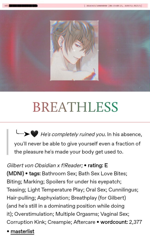
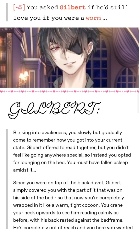


2. The minimum: Banner + Title
Not everyone checks out every single post on their dash while they scroll! I follow around 1100 people and while not all of them are active, it's easy to miss a post that could as well have been the best thing I'd see that day. Your brain recognizes what a typical fanfiction post looks like - a rectangular picture with a title above/underneath, followed by text. As long as you scroll past a post with a similar construction and you're interested, you might want to scroll back and check it out.
3. Banners
The information that you get from a banner is typically about the character(s) featured in the fic. Using the example above, you'll see that a simple cropped picture of the character gets the job done! (an in-game sprite at that, not a fancy card photo)
If you decide to use a card, you can browse google for a good one of your character(s). I try to select a card that depicts something similar to what's happening in my fic, either the action or the "vibes" (daytime or nighttime, outside or indoors, canon or modern, etc.), but sometimes it's better to choose the one that will look good instead of the one that's more fitting.
Finding cards of good quality is also challenging, and I'd advise you to avoid blurry/low-quality banners even if those would be best fitting.
Stick to the rectangular horizontal format if possible. I like square banners sometimes, but it's better when you can see the whole layout at once!
4. Editing the banners & photo coloring
If you decide you want to go out all, you'll need a photo editing app or a program. I use one called Snow which is mainly for selfies but gets the job done. It has many filters to choose from, but inputting text there could be a hassle sometimes. Another one I use is Pixlr. Yeah, I couldn't let it go ever since the days it was just a website...it's been about 10 years but I still rely on it (now as an app) for some stuff, like cropping down images with very big height to width ratio (like thin strips for dividers). In very rare instances I use my (paid) art program, Clip Studio Paint. I know that many people use Canva for their banners but I can't get used to it, I guess it's not my thing, haha. That's why you should see what works for you. I prefer a certain amount of limitation, like having filters to choose from, simply because I don't want to think too much about it and to be able to spend too much time on it (I'm a perfectionist)...
Maybe you just want to give your picture some nice coloring, nothing too much, just a slight change of tone that it's noticeable but not in a screaming way. There are still some things to avoid, mainly old-looking filters. I'm talking about the ones that were mainstream on Instagram during the last decade, the pinkish sepia one for instance. Ones that have too high exposure value and make the bright parts practically glow are not a good look either, same for the too dark ones. Making the character unrecognizable is also not good, and some filters can do that, especially in the case where they have fair hair and the filter makes it appear as another color. Again, those examples are bad only in my own opinion and could look good in certain circumstances or if it's a desired look!
Here's the collage for the banner used for my fic Nine Nights (MDNI) before the filter (first picture), a variation I did but scrapped (second pic) and the one I went with in the end (third pic). While the bottom pic is in contrast with what I said about making characters unrecognizable, here I rely on the fact that it's enough that it's obvious this will feature all of the Crown members just by looking at the bunch of them. I liked how the colors pop up, almost as if each one gets assigned a theme color (interestingly I didn't pick the cards for that purpose), and it's just a pretty coloring in my opinion as a whole. I achieved this by tweaking the RGB values from the "Curves" tool in Snow.


Another cool thing to do with your banner is adding transparent elements in it, like how I did with this one (see it from the link below, it's not depicted here on the pics). The thing is, this could be very energy-consuming, you'll need an app/program that can do that as not all of them work with transparent images, and in the end, it could be just barely noticeable. But it can be fun from time to time.
5. Titles
A title is the other main element of your fic's layout and it should stand out. If you hate coming up with titles (understandable...) you can just put a "(character) x reader fluff", for instance. If you look at the example in point 1, I simply used the character's name in place of a title! It doesn't have to be a stressful aspect of putting your fic out there. As a side note, you can try centering your title simply by putting some spaces at the front, but leaving it aligned to the right could be a stylistic choice.
6. Colored text
This one is very optional but good if you want to fancy it up. Tumblr already gives you a bunch of colors to pick from and you can make use of them if they fit the style of your fic, but they're very limited. Luckily we can use just any color we want. (This only works on the fonts tumblr supports! The ones you can choose from when you highlight a text) Unfortunately, the way to do this will make you work with the HTML editor which you can access at the top right corner of your post editing screen (from desktop, click the settings, scroll down to Post editor) and things might seem pretty scary if this is your first time looking there. It's not too hard! You need to use a site that takes your desired piece of text, lets you select colors, and then gives you a code that once pasted in the HTML editor will make it colored when switching back to the Rich text editor. Here's the one I use because it also allows me to blend colors. At the bottom right of the page, I put the text in the first box, select the colors, and upon clicking Run it gives me the code in the bottom box. I use colored text for my title, and sometimes for my information tags.
7. Information tags
This is how I refer to the part of your layout dedicated to showing the pairings, genre, content warnings and wordcount of your fic. This is all optional even to add in the first place. I personally don't bother too much with beautifying that part, but a good tip is using some kind of symbol to separate these pieces of information if they're all in the same paragraph (I use big dots), or to place in front of them if they're in different rows (like bullet points). This gives a lot of creative freedom for text art, you should explore it if that's your thing!
8. Fonts & font size
You can experiment with Tumblr's fonts, or you can look for more fonts online - here's a handy site. It's good to find one that is legible enough. 𝐓𝐡𝐢𝐬 𝐨𝐧𝐞 𝐢𝐬 𝐚 𝐟𝐚𝐯𝐨𝐫𝐢𝐭𝐞 𝐨𝐟 𝐦𝐢𝐧𝐞. Again, be warned, those fonts that are outside of tumblr's post editor cannot be colored (as far as I'm aware of)
You can spell your title in all caps if you deem that's a good look for your fic.
Play around with bolds and italics instead of making everything a different font.
The "Biggest" font option here on the editor is not the best one to use as it's simply too big. Big title fonts should be avoided if your title doesn't fit in a single row.
Having different font sizes for different things in your layout can be eye-catching! Besides the obvious upscaling of the title, you can also upscale your information tags. Using small text is also nice and prevents your post from getting too long, but this should only be done for the part of the fic that is not the fic itself. Small text could be harsh on the eyes if it's in big quantities.
9. Dividers
Dividers are another crucial part of a fancy layout! They divide different parts of your layout, like the information tags and the fic's body. There are tons of styles to choose from. Some people like to use dividers that spell out something, like a "minors DNI" warning, a "support your creatives" reminder, the name of the character featured in the fic... You can make your own set of dividers for repeated use. I like to use very thin lines which I color differently according to the fic's theme colors. I also find dividers online, mostly here on tumblr, as there are tons of them if you look them up. It's important to use dividers which are marked free to use, or to otherwise credit their creators.
10. Additional tips
Use gifs. Everything that moves is eye-catching. But don't go overboard with it - one or two moving objects on your layout is plenty. They shouldn't be put too close to the fic's body too, as people might find it distracting. Avoid flashing and glitching gifs, or if you use those and you deem it necessary, tag the post with an epilepsy warning. You can make your banners into gifs by putting a moving filter on them, making it into a video, and turning the video into a gif (the site I use for this is called ezgif and it has plenty of other options for working with gifs and videos), and you can also make or find gif dividers.
Banner themes are nice, but they don't always look good. I'm talking about making a series of banners (like for a bunch of fics made for the same creative challenge) look the same, with the same coloring and filters. I used to make all my banners purple to follow my blog's tumblr theme but I realized not everyone looks good in purple...
Try adding a synopsis for your fic! I know, this is worse than coming up with a title, but we love flipping the book over to look at the synopsis before jumping into it. Keep it very short and try beautifying it with symbols or fancy quotation marks.
Use the "intended" font from the tumblr post editor to make your information tags or synopsis stand out and shrink the overall length of the post!
Put the body of your fic under a "read more" (the last option when you hit a new row in the post editor). This is very important, especially if you're writing smut - you wouldn't want to make people scroll through all of that if they're not in the mood for it. Putting your whole fic on the dash doesn't make it more likely for people to stop and read it, or at least that's just how I see it.
Use emojis! Emojis stand out!
Take inspiration from other people. Get out of your bubble and look at how other fandoms do it, but obviously don't steal.
11. Final thoughts
Making this post felt weird to me! I was motivated by my mutuals complimenting my layouts but also because some of them said "they can't do that" and I wanted to show them it's easy. I also wanted to show them it's not that important and that they shouldn't stress over it at all! At the end of the day it's your fic that matters, not how pretty you can make it work. But instead of simplifying it, I ended up with this massive post of 11 parts, and now it looks scarily big. It's not, okay! I went too much into detail at times, and I want to stress once again that it's all optional anyway. I, personally, don't follow all of this advice. I don't go through the 10 steps of constructing my layout every time I'm about to post a fic. I typically post my fics just before going to bed, and 99% of the time I need it to happen ASAP because it's that late in the night. It's a way to beat my perfectionism, really, and I find it to work for me. I also already have these steps tested and memorized so it all happens quickly and mechanically for me. Making the layout is extremely fun for me and this is my sole driving force for putting in the effort. At the same time, I remind myself not to go overboard because it's stupid to focus on it more than on the fic itself. I love ao3 because everything looks equal on there, but I also love tumblr because I can unleash my creativity in one additional way.
In the process of making this post, I started to wonder if it seems like I'm making this out to be way more important and difficult than it really is, and I want to assure you that this is not my intention at all!
My only hope is that this proves to be helpful for whoever feels like they can use some of the information above. If it leads to just 1 additional note to those criminally underrated fics I see, then I'd be beyond happy!
Have fun posting your fics :)
#ikemen series#ikeseries#ikemen vampire#ikemen villains#ikemen sengoku#ikemen prince#ikemen fanfci#ikemen fanfiction
57 notes
·
View notes
Text
How much should it cost to be a writer?
It depends what route you’re taking. If you are planning to go for traditional publishing, which looks like you finishing a manuscript and then querying agents who will then take your book to publishers, you should be paying for basically nothing. One exception would be if you decide to hire an editor to get a pass over your manuscript and/or query package before sending it off, but this is not required.
If you are in the process of trying to get your manuscript traditionally published, you may be approached by a “publisher” offering to publish your manuscript for a fee. THIS IS A SCAM! An author should never be paying for “publishing services.” Anyone asking you to pay for your own printing, marketing, etc. costs is taking advantage of you. These are called vanity publishers and they will not turn you a profit, help you attract readers, or provide you the prestige of being published.
Always check on Writer Beware - search for the name of the person or company. You can also just google that name along with the word “scam” or “reviews.” In general, don’t let yourself be blinded by dreams, or let yourself be convinced that something is a good idea because you really want it to be true. Never, ever, ever pay a publisher.
If you are going the self-publishing route, you will be paying for certain things, but none of those should be payment to be published. You are the publisher. Uploading your manuscript to Amazon or other marketplaces is free. However, you will be paying for things that a publisher typically pays for. This could include:
-Cover art - you could do this yourself, though this isn't recommended. A good cover is key to a book's success, so budget to purchase a pre-made book cover, or hire a professional cover artist.
To find pre-made book covers, you can just Google "premade book covers," or check one of these sites: BookCoverZone RockingBookCovers Beetiful
And here's a list of places to buy both custom and pre-made cover designs that's a good start. You can also check Reedsy and Etsy for people listing cover design services. If there is a self-pubbed author whose covers you love, try asking them what artist they use.
-Formatting - you could do this yourself using a formatting program like Atticus, or you could hire someone who does professional e-book formatting.
Here's an article on the turbo-DIY route. Here's a list of formatting programs you can use. To hire someone, you can simply search for book formatting services or look at places where people list such services for hire, like Reedsy, Fiverr, or certain Reddit boards.
-Ad campaigns - you may want to pay for ad campaigns on platforms like Meta or Amazon. More niche, author-specific platforms like BookBub, Book Funnel, or Book Sirens also come with certain costs.
-Author services - you may wish to hire an expert in things like marketing, blurb copy, social media metrics, newsletter management, etc. You can find information on that here.
Be aware that scam publishers might try to pitch themselves as "author services" - you should be paying someone to help you with specific aspects of your self publishing work, NOT paying to be published.
-Software and platforms - whether it's a subscription to Duotrope, a paid Scribophile account, access to pro Canva features, etc. you may decide to pay for tools that you will use to do your work well.
-Expert advice - some people offer courses, books, or other resources on how to do specific things like write a compelling blurb or run an effective ad campaign. You may notice that a lot of the links I shared here will include upsells from people doing exactly this!
Be very cautious about this, as most of these people claim that they make tons of money on their self published books, but really, they make their money selling this stuff to people like you. Always check out a person’s free resources first, and wait to invest in this sort of thing until you have a specific question you need answered or are trying to do a very particular thing that you need granular guidance on.
One thing you should NOT pay for is a review, feature, or interview. Self-published authors will be approached by a lot of scammers who claim that, for a nominal fee, they will share information about your book to their huge audiences. These are completely useless and a waste of money. Never spend money on this.
Always keep track of what you are spending on all of this. You may be able to deduct it from taxes you pay on your income from writing, and you will want to really understand what your profit margins look like.
60 notes
·
View notes
Note
What advice would you give beginner artists?
it's fine to want to do more stylized art, but nothing will help you improve quickly like studying from life. even if you want to draw very stylized figures, life drawing is still going to help you understand how the human body works and then you can build your stylization off of that understanding. I also recommend studying specifically things you're looking to improve--if you feel like your poses aren't dynamic, ask your model to do some quick (1-2 min) dynamic poses and work on getting the gesture down. if you're looking for anatomy, ask for longer, more static poses and really study the contours of the body. this also applies for portraiture and character art--my expressions and facial structure improved like CRAZY when i started doing portrait studies from life! (note: i know live model sessions aren't accessible for everyone. i'm a huge advocate for nude models, if you can find a studio nearby that's affordable to you that offers sessions, that's the best you're gonna get. however, there are sites that will give you photos of nude models to draw from, too, or you can even just ask friends or family to pose for you when they aren't busy, that's what i did before i started getting model sessions from my school!)
materials are not everything but sometimes a good material can make a difference. it's important to know what's worth it and what isn't for your skill level. invest in some decent-quality supplies or a good art program, but understand that you're still going to need to work to understand your materials and use them to their fullest potential. (if you're a digital artist buy csp. trust me on this. get it on sale. it will change your life. also do not fucking use photoshop)
tracing is ok. listen to me. TRACING. IS. OK. tracing is how you learn. don't trace other people's art and pass it off as your own, obviously, but there is literally no problem with tracing real-life reference photos. I routinely trace references for backgrounds and the like. there is no reason for you to kill yourself trying to make complex perspective and shit up from your head when you can very easily just overlay a photo and get what you need.
in that same vein, USE REFERENCE PHOTOS. find pics online or take pics of yourself and USE THEM to see how your poses work. it makes it SO SO SO much easier. the understanding that you need to create a pose out of nowhere will come with time but you're not going to get that skill unless you have a foundation of understanding how the real human body works, and the easiest way to get that understanding is by copying photos of real people.
last but not least, there's generally a sort of 'rulebook' that new artists are expected to go by, especially online, when it comes to digital art. when i was first learning, it was all about lineart and cell shading, two things that I didn't really like. Nowadays it seems to be all about rendering. the single most important thing i can tell you is if it sucks you don't have to do it. if you hate lineart just color your sketches. if you hate shading don't shade, or find a different way to shade that you enjoy more. if rendering is annoying or difficult for you DON'T BOTHER!! art is supposed to be fun. if part of your process is annoying or upsetting to you, cut it the fuck out. don't torture yourself just to do art the "right" way. i guarantee your art will look better when you're having fun making it anyway!
#asks#ALSO don't go in expecting to monetize your social media presence/go viral as an artist. make art for YOU and make what you want to make.#if your art has passion behind it then attention will come naturally!
331 notes
·
View notes
Note
Hii what is your best advice to younger adults trying to make it independently and make a living? In art, savings or anything you think of. Thank you in advance!
dont be too hard on yourself. its tough out there right now in regards to like everything regardless of what old people say. also this is going to be a lot so im slapping a read more on here
⭐️ first thing id recommend for anyone is to start figuring out a budget. figure out how much youre making monthly. keep all your food receipts for a month or two to see what youre spending on food. find out what youre paying for thats necessary like utilities and whats not
the goal for a budget (or at least mine) is to find a good balance of earning vs spending. im paying off my credit card right now because i ran through all my savings after we had to move last year but my goal used to be to save 1/4 of what i earned after bills and putting money into an emergency fund (usually an emergency fund is 3 months worth of expenses). but it depends on how much you can comfortably put away. if you can put more away do it. but if you never spend money and deprive yourself of joy youre going to burn yourself out regardless of what your job is
⭐️ if youre not already buy store brand for as much shit as you can. if its an ingredient i promise as someone who cooks and bakes you probably wont notice the difference. if its an actual snack it depends. again both from a money perspective and to boycott pro-isreal companies we get a lot of snacks from aldis and theyre awesome. i dont miss anything from mars, oreos etc when i have my chocolate coconut wafers
⭐️ if you have any subscriptions and you need to get rid of something you can probably cancel them. for *most* things theres some kind of free alternative. but again just like with a budget. there are going to be some subscriptions that make your life easier and while youd save money without them it would lead to extra work and burning out. ex willow has kofi gold because it has really cool extra features that help with running the shop. but for streaming services? im going to be so honest. both to save money and with how cheeky streaming companies (in a bad way) have been getting… you can find whatever you want to watch online for free
if you need to use anything from the microsoft office suite, but youre not required by youre job to specifically use microsoft, libreoffice is a free alternative that i actually like better. its what i use to help willow run their shop and its free
for art programs. if you still have photoshop switch. not just for money reasons. adobe is getting bold with what they can claim as their content and use from what people produce in their program. the switch isnt the easiest but there are a bunch of alternatives. some free some like csp offer one time licenses which are so much better than subscriptions. will has spent almost $2k on photoshop and after effects from using it as long as they have. when csp is $50 and they like csp better anyways. i also know of krita and fire alpaca which are free
⭐️ also theres stuff about being an adult that i thought you had to pay for but you dont? like for car insurance i went through an independent insurance agent and they found me a cheaper plan than i could find myself. i didnt pay the guy. they get a cut from the insurance company for finding them another customer. some banks or credit cards offer financial advising sessions to users. its boring but if you can get a copy of your health insurance see if they have any free shit on there thats available for you. my brother gets free doctor finding? like i can call them, tell them what specialist he needs and instead of me calling around to find one that can take him, they connect me with someone. my work offers 3 free therapy sessions (better than nothing) and free food that i take advantage of
⭐️ i think one of the biggest things that makes an impact for us is researching before buying stuff. sounds like a no brainer but you dont just want to find the cheapest deal. you want to find the best bargain, the best bang for your buck. whats the best quality thing you can get that you can also afford? itll prevent your from having to replace stuff all the time and by extension spending more than you need to. we have nonstick pots and pans that are scratched and starting to peel (which apparently can cause cancer??) that were cheap because of being on sale. now after looking into what makes quality cookware i know i should of just slowly bought stainless steel
⭐️ last big one. credit cards. unfortunately we need them so find one with a low apr and that offers decent cash back. use it up to like 20% of your limit and pay it off every month. focus on using it on things that will get you cash back so you can essentially get free money
im sure i could ramble more but this is already super long
84 notes
·
View notes
Text
2023.08 ~ Top 10 longest fics posted on AO3
1. Good Intentions by Gloworm13 [E, 382k]
►Harry never expected a conversation over returning Draco's wand. [...] Harry can't cope, especially when his group of peers is sent back to Hogwarts to finish their interrupted Seventh Year. And Draco Malfoy is wholly unprepared for facing the love of his life every fucking day now that he knows.
2. About Everything We Fucked Up and Tried to Fix by @zoooooey0610 [E, 246k]
►The time is the Dark Middle Ages, even with Voldemort defeated, the Wizarding world is still a place where Omegas are seen as properties. Couldn’t sleep, Harry came across ‘The Slytherin Wall of Sluts’ that changed the rest of his life, but the cog wheel of destiny may have started to move long before that. Twelve years later, he was confronted with the presents of destiny, and struggled to deal with the mess. However, every step he took seemed to be another mistake.
3. Cut From the Sky by @mallstars [E, 150k]
►"I'm stuck in a time loop, reliving November 2nd. This is the 111th time I've lived through today." Draco stilled. His moody eyes, the tension in his hands where he gripped onto his umbrella, the careful mask of blankness flickering over his face — everything about him was so difficult and so very dear to Harry. "Ah," said Draco, "and?"
4. After the Rain Falls by @shinigami714 [E, 95k]
►After the events of the war, all Harry wants to do is forget. For everything to return to normal. But things never were normal for him, and the war left many marks on him not so easily forgotten. When he receives a surprising offer to return to Hogwarts in a continuing education program, Harry jumps at the chance, and despite his best efforts to deal with his problems alone, discovers along the way that quite often, two minds are greater than one.
5. guard dog by chrismare [?, 63k]
►The first thing Draco ever loved was the Manor. Not the house- it was too big, too quiet, too cold- but the grounds that surrounded it. He grew up on stinging soles, running barefoot through his own little world. One of the house elves had cleaned the tiny cuts on his feet once and told him that he'd get used to it, that he'd grow calluses and it would stop hurting. It never really did.
6. Dating Draco Malfoy by @queenofthyme [M, 60k]
►Draco Malfoy is dating his way through Harry Potter’s endless pool of ex-boyfriends. With the help of Harry’s expert dating advice, he just might find exactly who he’s looking for...
7. Snogging Lessons by Revolocard [T, 58k]
►Harry Potter thought the hardest part about being the Chosen One would be preparing to fight Voldemort. He didn't expect it might actually be missing out on all the normal teenaged stuff. Now in sixth year, Harry feels like an outsider, too worried about being the subject of another Witch Weekly article to try to take part. When he and Draco Malfoy land in a semester's worth of detention, Draco is delighted and horrified to discover the Boy Who Lived is not only a virgin, he doesn't even know how to snog. Secret snogging lessons. It's not like it's anything more than just catching Harry up a bit. What could go wrong?
8. That Marriage Contract by Umeko [E, 54k]
►What happens when the forced marriage and male pregnancy trope combine to spring a surprise on the Boy Who Lived and his arch-rival turned unwitting fiancé? And they all have two dearly departed grandfathers to thank for the mess.
9. Terrible People by @wolfpants [E, 52k] --- ART by @getawayfox
►What happens when Harry and Draco end up on the same Muggle gay cruise? They certainly didn't plan for it to happen (but their friends might have). They're stuck with each other for a week, they might as well make the most of it, right? Featuring a holiday-long game of Truth or Dare, a very ill-judged FWB proposition, decades-long pining, lots of gin, and a small pair of green swimming trunks.
10. and i ignite by @pixiedunhoff [M, 51k]
►Draco Malfoy loves attention - and the Muggle world has given it to him in spades. Through a surprising and humbling series of events, Draco has achieved tremendous success in the music industry. He has recouped his fortune, earned legions of adoring fans, and gets loads of attention. Over the years, it has still never been quite enough… Until the subject of his more sizzling songs abruptly barges back into his life, demanding answers.
—
※ Word count: 1k ~ 10k
※ Word count: 10k ~ 40k
The Best and Worst of Times after the War (aka A Tale of Two Soldiers) by WriterwithaWindow [M, 11k]
chasing embers by ryyss [M, 29k]
Firestarter by Justlikewriting [M, 22k]
For each time I see you, things change a little bit by Writelikethat [M, 10k]
i think i might be gay by @stvrlvghtwrites [T, 10k]
Just Nice Things by wodnica [E, 31k]
No One Likes a Mad Woman by @thomasbrodiesandwich [T, 17k]
only the brave by slytheringoddess945 [T, 10k]
Possibly, perhaps be my boyfriend? by @23ster [G, 16k]
Seek, And Ye Shall Find by @nami-writes [T, 14k]
The Switch by @ashiiblack [M, 11k]
Take Me Back (To The Night We Met) by @onelatenight-longago [T, 12k]
What’s Mine is Yours by @fluxweeed [E, 17k]
—
Ongoing Fest/Exchange
※ Fics would be listed elsewhere.
HD Wireless 2023 | @hd-wireless
HP Bodice Ripper Fest 2023 | @hp-bodiceripper
HP Law of Attraction Fest | @hp-lawofattraction-fest
260 notes
·
View notes
Note
Hello! I just want to say your blinkie style is a huge inspiration for me! I love how everything looks, and its making me consider using aseprite instead of clip studio :D Do you have any tutorials, beginners guides, or other advice you can give to someone who's specifically wanting to make blinkies in the program? Thank you for all your cool art <3 - @m0dem0n (its a side blog so i cant ask from it OTL, pls @ me when you reply!)
THAT'S SO AWESOME, I'm so happy to have inspired you, @m0dem0n !! :'D
I've got a very quick and rough guide linked in my pinned post, but it's really basic and doesn't touch on any sort of 'advanced' techniques, so I'll go a bit more in-depth below the cut. I'll also include a 'speedpaint' of how I make my blinkies!
Before we get started, just a quick disclaimer: I am not really a professional! I love pixel art, but I really am just a hobbyist. Everything I've learned about Aseprite has been through trial and error. That said,
I've put enough hours into it to have picked up a few tricks, LMAO.
The pacing in this video is... bad. You'll need to pause to read all the text, sorry ;o; I'm not really familiar with making videos, but I did my best. (there is no audio, jsyk!)

A few things I didn't mention in the video:
If you plan on drawing any sort of pixel art graphics for your blinkie, CHECK THE "pixel perfect" BOX AT THE TOP!!! it's a magical option that helps you avoid 'doubled up' lines. example:

If you want several color versions of your blinkie (like how I tend to upload 2-3 versions of the same blinkie in pink, blue, green, etc), select every layer you'd like to change the color of (usually it's background, border, and text, but usually NOT the image), then use ctrl+u to open the hue menu. shift the hue here (it's the slider labeled "H"), and once you confirm, all of your selected layers will shift colors! Note that the preview may only show a single layer updating colors, but when you confirm, all selected layers will update.
You can use the alpha slider under the color wheel to select a fully transparent color. Combine this with the gradient tool for cool effects, but remember that you cannot have a *partially transparent* pixel on a *fully transparent* background and still save it as a gif. So if you have a partially transparent red on a solid black background, it'll work! But a partially transparent red on a fully transparent background will not.
When you save your blinkie, make sure you use the "save as" feature, not the "export" one.
I HIGHLY HIGHLY HIGHLY recommend you save every single blinkie as BOTH a .ase and a .gif. A gif will not save layers!! So if you want to edit your blinkie later, the .ase file will save your layers and make your life so much easier. Learn from my mistakes. ;O;
Aaaaand here's the speedpaint! This is what my process of making a blinkie looks like in real time, starting with my little flashing border template.


i had to shrink that speedpaint gif down so much to get it small enough for tumblr to accept that you can't really tell what's happening in it anymore LMAO, but it IS still real speed at least! also the weird distortion on the color picker is what happens if you have a non-dithered gradient with too wide a range. it clumps different values together to reduce colors and makes it look bad. that's why i recommend using dithering, or using a *very slight* gradient!
I know that was a lot of text but hopefully some of it is useful! o/ i'm gonna go lay down now LOL
22 notes
·
View notes
Text
that's the other reason I really really discouraged any serious aspiring digital illustrator from getting used to working (exclusively) in anything except Photoshop, which is free btw you should just pirate it: Krita and especially fucking GIMP are not getting you jobs if you want to go work in the salt mines, which a lot of you do. if you put GIMP on your CV when you're applying to Valve they will take you out back and lower you into the septic tank
if you don't want to work in the salt mines or at any point interact with the salt mine world (for example by doing spot illustration for professional publications, or anything out-of-house artists do for work that involves actual professional clientele) and you just want to do independent illustration like on FurAffinity or whatever, then none of this matters, do whatever you want that gets the results you need. however even then you're eventually going to hit a ceiling where GIMP can't do what Photoshop can do. so just in my professional opinion, learning Photoshop from the very earliest opportunity is the most efficient and smartest investment of your time. that's my advice, take it or leave it, how useful it is will depend on completely unpredictable factors anyway 🤷♀️
edit: facility with multiple programs will always benefit you, however. most professional occupations involving digital art will require two-three primary application specialties and then passing familiarity with a dozen others.
59 notes
·
View notes