#this WAS just a sketch but i kept adding to it lmao
Explore tagged Tumblr posts
Note
I have a request for how the Arcane characters (Viktor, Jayce, Jinx, Vi, Heimerdinger, Ekko) look so that the reader can access their cuteness. Maybe they are doing or saying something to the reader and the reader suddenly starts hugging and petting them, calling them cute. How would they react to this?
Note: So... I'm the only one who thinks Heimerdinger is really cute. Why aren't there fanfics with him? Mysteries of life..
Arcane characters being called cute by their s/o while they're working
Writer's note: Thanks for requesting! It took longer than I expected because I kept deleting some of the dialogue from how cheesy and cringe it sounded lmao. Heimerdinger is not on my list of characters I write for, but I figured I'll write him this one time. I hope you don't mind that I also added Mylo, cuz why not?
Request/s: Open!
Warning/s: Get a dentist. This is some tooth-rotting fluff. Not proofread and english isn't my native language.
Character/s: Viktor, Jayce, Jinx, Vi, Ekko, Heimerdinger and Mylo
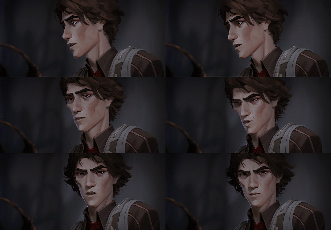
● Viktor tends to get lost in his work, mumbling equations or sketching out blueprints for his projects. You find this incredibly endearing, but not when he gets so absorbed that he forgets to eat or sleep.
● If you suddenly hug him or call him cute, he’ll freeze in shock at first. He blinks up at you as if you just said something in a language he doesn’t understand. Then, his cheeks will flush a light pink, and he’ll chuckles softly. “Cute is... not a term I hear often. But thank you."
● Over time, he grows more comfortable and secretly enjoys the affection. He may even lean into it, but he’ll never outright admit it. Instead, he might deflect with a shy smile and, “You should focus on more important matters."
● Yeah no, that's a sign for you to keep doing it.
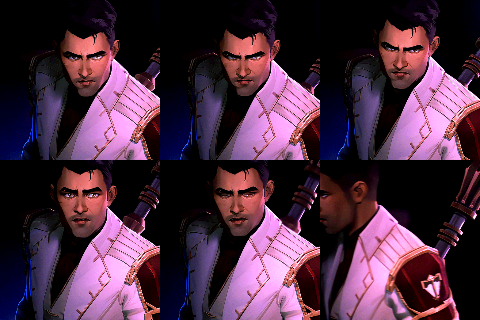
● Jayce is the golden boy—confident, charming, and ridiculously handsome. He likes to appear professional and put-together, but you know him well enough to see through that exterior to the dorky, hardworking man beneath.
● When you hug him out of nowhere while he cooks and call him cute, he blinks for a second but chuckles as he turns to look at you. “Cute? Babe, I’m going for ruggedly handsome and sweet here. But I'll take it."
● Still, he's flattered and loves the affection you give him. And unlike Viktor, he's not afraid or shy to show you he wants more of it. He might pull you closer and say, "You're one to talk." He's a romantic and albeit cheesy guy.
● Now, you probably might be thinking about why and how is he cooking, but that's for another headcanon! (I just realized how I'm not even sure whose side am I on. Can he cook?? Cuz I feel like he can. But I also see him burning food-)
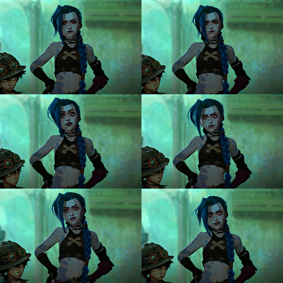
● Jinx, as we all know, is pure chaos, always working on something explosive or messing around. She has a habit of humming and singing off-key to herself while she works, which makes you think she’s oddly cute in her own... quirky way. To be honest, it’s hard not to find her enthusiasm contagious, even if it’s a little dangerous.
● One day, you catch her doing exactly that while painting her trademark designs on one of her grenades. The sight just makes you smile as you walk up and wrap your arms around her, telling her, “You’re so cute when you’re focused like this,” or something of the sort.
● She’ll throw her hands up and turn to look at you, trying to play off your compliment as a joke. “Woah, you might be crazier than me!" She grins and laughs softly, before making her voice sound more gruff, "Ya buttering up the author nightmares with your mooshy stuff!”
● But after her initial over-the-top reaction, she’ll soften. “Fine, soak it all in.” She shrugs and continues working. But deep down, she really loves the affection and she's getting more and more attached to you. You're giving her the kind of love that she thinks she never deserved in her life, so she really appreciates these little things you do. She might even snuggle up to you later, claiming it’s to “soak in all this ‘cute’ energy.”
● Oh, by the way, she'll make this happen a lot more often. By how, you ask? Well, by doing the same thing to you, of course! It becomes a little challenge betweem the two of you who calls the other one cute first and catching them off guard with it.
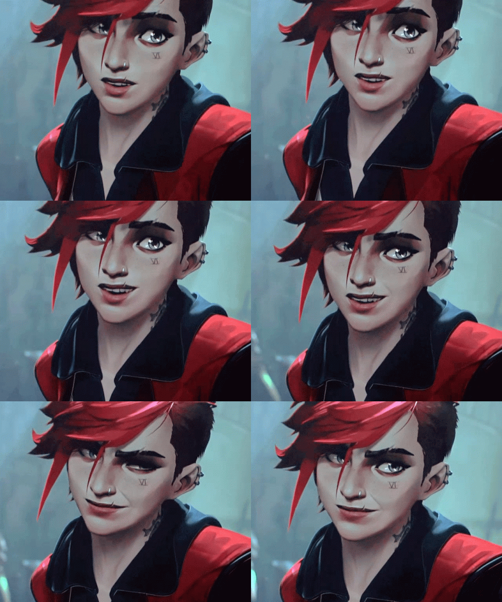
● Vi is all tough love and sass, but there’s a soft side she shows only to the people she really cares about. You notice this when she’s being protective or just in those peaceful moments when you're both alone together.
● If you call her cute, she’ll raise an eyebrow and smirk. “Cute? Babe, I think you’ve got the wrong person.”
● Later, she’ll definitely tease you about it, saying something like, “So, how’s it feel dating the cutest person in Zaun?” or "Am I still cute?" with a playful grin. She'll be teasing you and making you smile with that while she's half naked and flexing her biceps (she knows you love them), or when she just got done with a fight and is still holding her gauntlets.
● She loves it, don't let that teasing fool you.
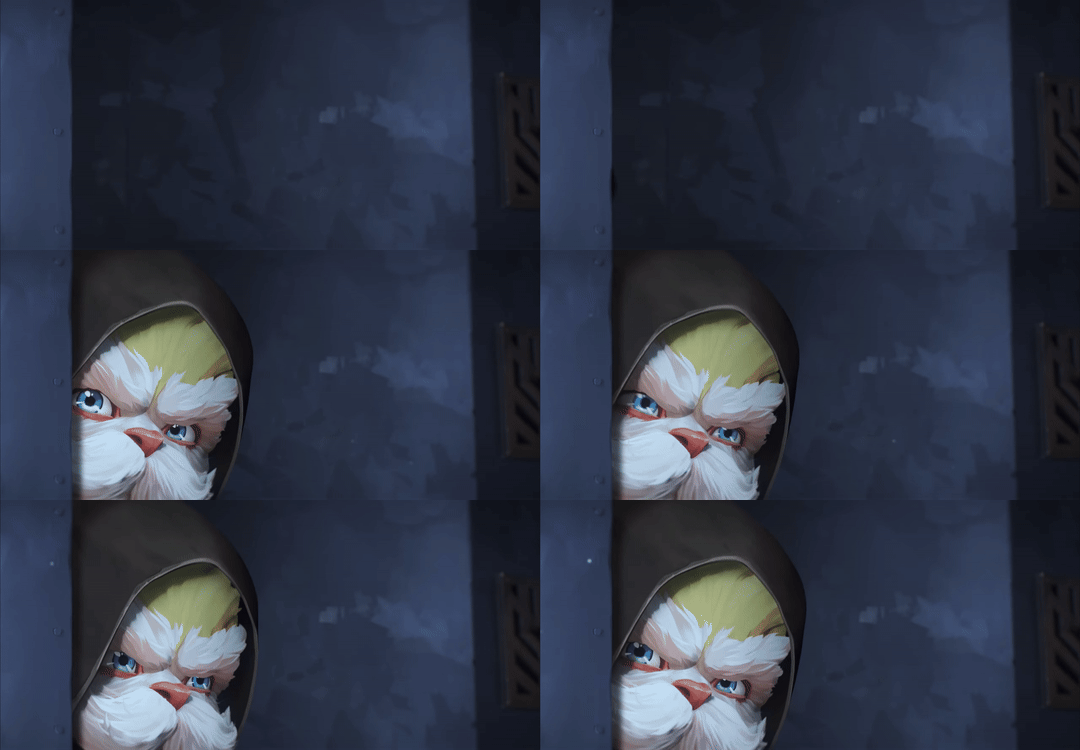
● Heimerdinger is an adorable bundle of wisdom and fluff. You often catch him rambling about science with such enthusiasm that you can’t help but smile. Look at him! He's just adorable!
● One day, as he’s showing you a tiny contraption he just finished, you can’t help but reach out and pet his fluffy head, saying, “You’re the most cutest genius ever.”
● Heimerdinger chuckles, his mustache twitching with amusement. “Ah, well, I suppose I do have a certain charm about me, don’t I?”
● He pretends to be unaffected, but you notice the way his tail swishes slightly when you hug him. “I must say, your affection is quite... energizing! Perhaps I should study its effects further.”
● From then on, he might start subtly seeking out your affection—like casually leaning into your hand when you pet him or “accidentally” bumping into you while working.
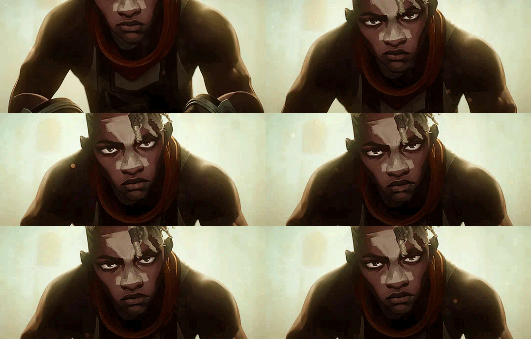
● Ekko is talking to you about his plans for the Firelights while sketching upgrades for their hoverboards.
● You were quietly admiring him, the way his eyes light up and the focused furrow of his brows, when you suddenly blurt out, “You’re so cute when you’re focused.”
● He freezes for a second, then looks at you with a mixture of surprise and amusement. “Cute? Me?” He grins, a soft laugh escaping. “You sure you’re not talking about yourself there?”
● He rubs the back of his neck, trying to act nonchalant, but the smile gives him away.
● “You’re not getting away with saying that,” he teases, leaning in to nudge you lightly with his shoulder. He goes back to doing his work before playfully adding, “But if you keep looking at me like that, I might just start believing it.”
● It's these little things that matters. These moments, even if simple, it gives him hope and motivation to make the world a better place. The way his eyes soften when you look at him in that moment, and how he lets his guard down just enough to show you he cares — it’s clear that, while he teases, he loves the attention, and he loves you even more for it.
● Dude's got lines fr fr
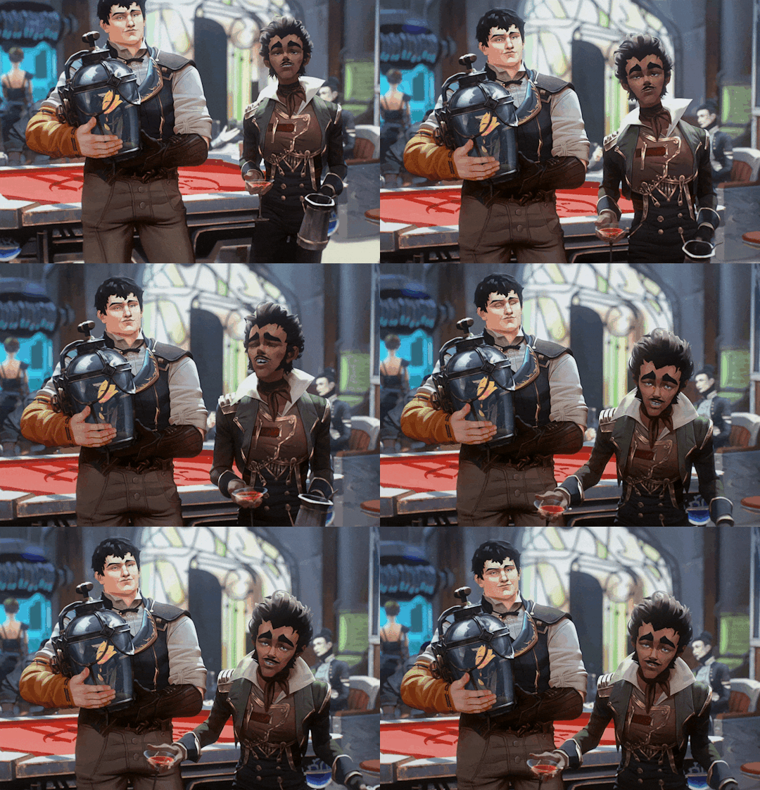
● Mylo has always been the type of guy who had a sarcastic, sassy remark ready. We all know that from how he treated Powder.
● When you suddenly hug him and call him cute, he freezes for a second, unsure of how to react. “Cute? Me?” He scoffs, trying to play it cool, but it's very obvious he's a bit flustered by it. “Out of all the compliments you could’ve picked, you went with cute? I’m more like... cool, and handsome.” He throws a dramatic, exaggerated pose, trying to hide his nervousness.
● Despite his teasing, there's a small, pleased grin tugging at the corners of his mouth. He tries to act nonchalant, but the way he keeps glancing at you shows how much he’s secretly enjoying it.
● “Seriously, though. I’m cool, alright?” he continues, trying to regain his confidence. “I don’t do cute. But, uh... thanks. I guess.” He says softly as he shrugs, clearing his throat.
● Later on, when no one’s watching, you might catch him glancing at you from the corner of his eye, a small smile on his face, clearly still flattered.
Can you guys guess which is my favorite based on how long their headcanons are
#viktor arcane#Viktor x reader#Jayce arcane#Jayce talis#Jayce talis arcane#Jayce x reader#jayce talis x reader#Jinx#jinx arcane#jinx x reader#vi arcane#Vi x reader#Heimerdinger#Heimerdinger arcane#Heimerdinger x reader#ekko arcane#ekko x reader#mylo x reader#mylo arcane#arcane x reader#league of legends x reader
527 notes
·
View notes
Text


@obscurelesbianartist this was supposed to be just a quick sketch because the mental image was super cute but I got a bit carried away😅lmao
#charlie also deserves a sandwich#this WAS just a sketch but i kept adding to it lmao#thats why is a bit wonky#dead boy detectives#payneland#dead girl detectives#my art#edwin paine#charles rowland#edwin payne#dead boy detective fanart#they get ghost sandwiches after helping a very sad ghost get their headphones back or something#who knows? maybe they even make another living friend and race snails
323 notes
·
View notes
Text
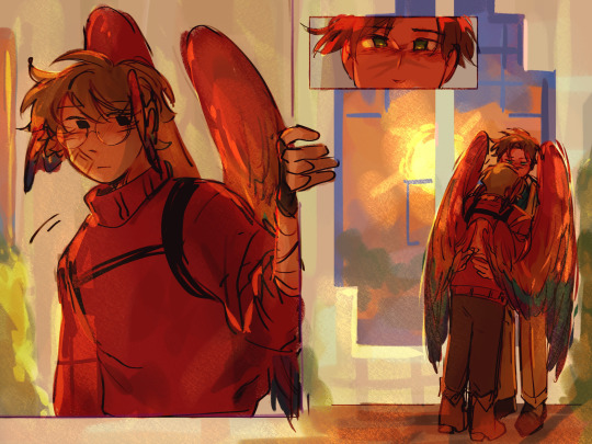
[Day 205]
🫂
(Doodling whatever on the canvas with no plan and yoloing part 2. except I got too invested HDKEJRKJTKQK)
#dddaily4sherin#grian#goodtimeswithscar#desert duo#hermitcraft#more or less after secret life probably#hermitblr#trafficblr#my art#The og sketch only had that one grian then it just kept expanding help me LMAO#then i remembered scars epic window and added that. also yes glasses grian#idk these are just like. letting my brain take over and drawing whatever LOL
1K notes
·
View notes
Text

Thank youuu
I love them too, I'm thinking of having them as a big brother/little brother duo maybe?? Anyway here's them buying tea for the base like stereotypical Brits
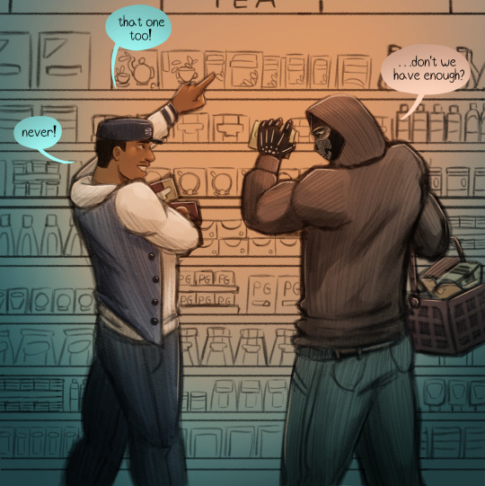

Ok first time I read this my heart melted because it's so sweet :]
I keep thinking up aus for mw2, but they're all too complicated for a one-off comic, and I just finished a series so I'm not doing another one for the time being. But I had a superpower au for them, that I'm gonna explain under a read more because I know it's gonna be long lmao
But before that thank you for everyone again! I read all your lovely comments and they warm my heart <333
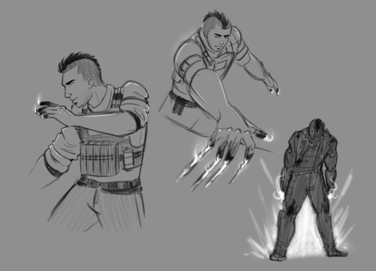
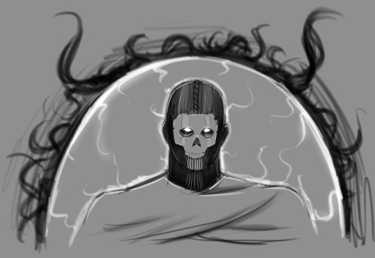
SO in this au, some people gain powers the first time they die. The powers are based on how they died (also when they die they meet these cool eldritch beings called reapers that have a little chat with them to decide if they're worthy of those powers).
Soap died from an explosion. Got blown out of a building. So his powers are explosion resistance and creation. His fingertips are always on fire because he's practically blowing the air around them all the time.
Gaz fell off a helicopter :( so now he can manipulate gravity, either objects around him or himself. He also floats a few inches off the ground most times.
Price was kinda hard for me to decide but I ended up making him die by abandonment. Now he can telepathically communicate with people.
And Ghost... he died in that coffin. Got pulled out by a reaper and received the powers to control limbo, the space between life and death. He's not authorized to use them unless he's alone, so he gets sent on solo missions only, until Price recruits him to the 141.
That is, until he pairs up with Ghost.
Before being recruited to the 141, Soap mainly defused bombs. Since, even if it's too late, he won't die. Thing is, Soap still gets hurt. His bones get crushed, his heart stops, his limbs get torn apart. He does heal, but the worse the injury, the longer it takes.
That made him kinda depressed. Because he felt like a glorified bomb robot. Except he's cheaper, since it doesn't cost the military any money when he fails to defuse on time.
Ghost isn't immune to bombs. He himself doesn't enter limbo, since that traps anything alive.
He and Soap go on a mission where intel suggests the enemy has rigged various explosives around the intel they need. They split up, Soap goes to defuse them and Ghost slowly makes his way through the facility.
And Ghost does help him. But he treats him like he would a regular, non-powered human. Stops when he's in too much pain, encourages him through it. Does his best to stop the bleeding.
Ghost completes his objective, but Soap gets spotted by an enemy and detonates the bomb he's working on to save himself.
Ghost find Soap after he fails to sitrep, impaled by a rebar. He whimpers and begs Ghost to help him off it, since he can't heal.
Because Ghost sees him as human. He watched as Soap kept trying to make jokes with him, but more importantly, how he treated him no differently from anyone else.
Soap, for his side, isn't used to that... gentleness. And that's how his interest in Ghost begins.
They exfil and return to base. A few months pass, and Ghost keeps an eye on one Soap MacTavish. Looks through his medical records, past missions. Finds out just how much he suffers through.
But Ghost isn't his commending officer, so he can't do anything. Until he's approached by his captain, John Price. He brings up the option of adding a new member to the taskforce. He gives Ghost the candidates he considered, Soap was brought up, Ghost stops him and states that he would agree to a new member if it was Soap.
Now if I had like, better writing abilities I would have absolutely written this as a fic. Butttt I don't and even if I did, I don't have confidence in them so I won't. But this idea is now out there and you can do whatever you want with it.
Also I got like a lot more sketches of this au but I only posted the ones I made for the ask.
#call of duty modern warfare 2#cod mw2#cod fanart#cod ghost#cod soap#cod gaz#asks answered#john soap mactavish#simon ghost riley#kyle gaz garrick#sorry this took a while uni really kicked me while I was down#it's getting better tho#also if more ppl wanna request you can always want i dont mind#revenant au#<new name
450 notes
·
View notes
Text

MORE ALCOR DOODLES!!!!
-there was a good handful sketches that didn't make it to the final, some of them I plan to finish as solo drawings or on another doodle sheet
-once I decided to do the galaxy for the coat tails there was a number of failed attempts, and I questioned whether to go with a teal tinted or magenta tinted galaxy up til the end (the contrast and use of complimentary colors with a more purple/magenta tint was lovely and kept up the warm hues but in a similar manner the more teal and blue hues blended in while also standing out with it's cool hues: both were great options)
-the reason why I added those random pokemon team hcs was because that space there was too big to just fill with stars but too small to draw another something: so I just added the first thing that came to mind lmao
-tbh sorta nervous bout posting this cause I don't exactly put in the effort to be canon compliant: like I've sorta been formulated my own take on the tau in my head, as evident by my creative liberties taken with Alcor's design, I figured 'whats the point of a loose canon if you cant play with it' plus like 'i'm already cringe I might as well be free'
-speaking of the transcendence au canon though! if you're not familiar with the transcendence au the official tumblr ( @transcendence-au ) explains pretty much everything and is well organized :3 it's pretty much just so cool and epic and poggers, I love like, fandom-of-a-fandoms so much (like the utmv fandom and phandom's expansive fanon) , nothing more swag then a bunch of cool and creative people making something new out of something they love together!
-anyway back to art notes!!!!
-i love love love to use the coat-tails to show gravity: it's so fun
-the color yellow is both a dear friend of mine and a mortal enemy: tbh probably could've pushed the contrast between the main yellow and the more orange hue i used to shade here
-I draw so many fanged characters I forget how fun drawing shark-teeth style fanged characters is
-another uncertain decision was making the shoes brown: the thought was that it would help tie back in a warm hue on the lower half and bring the colors full circle but i'm not sure how i feel about it: i don't hate it at least.
-I like to think that Mabel would wear a few small goth-adjacent accessories as to signal to the goths that she is their ally
#kyukyudraws#alcor the dreambender#tau#transcendence au#dipper pines#gravity falls#the transcendence au
132 notes
·
View notes
Note
I LOVE YOUR ART!! <3
I'm sorry if this bothers you but is there any tut for lineart?
Have a nice day!
hello!! no there isnt, but i can talk about it quickly!
Let's talk about how I did the lines for this dazai drawing below:
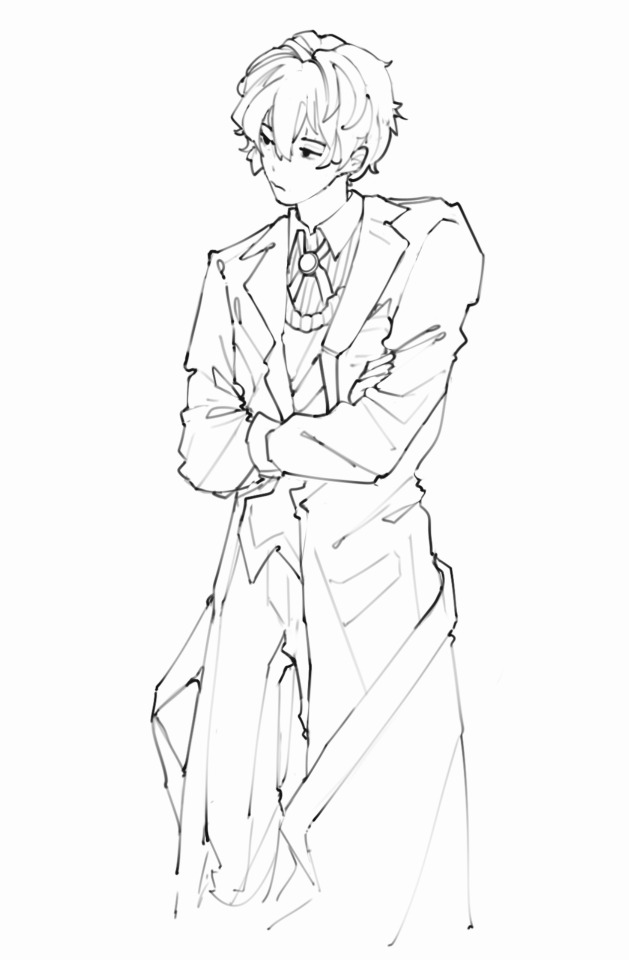
I acutally don't do lineart, I just clean the sketch 😭 All my lines/sketches are done using the regular hard airbrush and just erase using that same brush to create different line widths.
First, let's talk about pen pressure and line width. To create depth, I like to make certain parts of the lineart "heavier" in pen pressure:
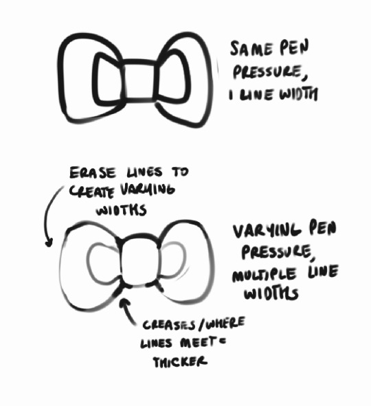
You can see in the lineart above that stuff like where the hair meets other roots, creases in the jacket, etc. all are heavily lined, while other stuff is left more detailed. I think it helps draw the eye in to parts you want to focus on?? just something I've picked up from habit and i liked it so i kept doing it hahsdh
I usually just start with a really rough anatomy sketch, and make a new layer to start the actual drawing:
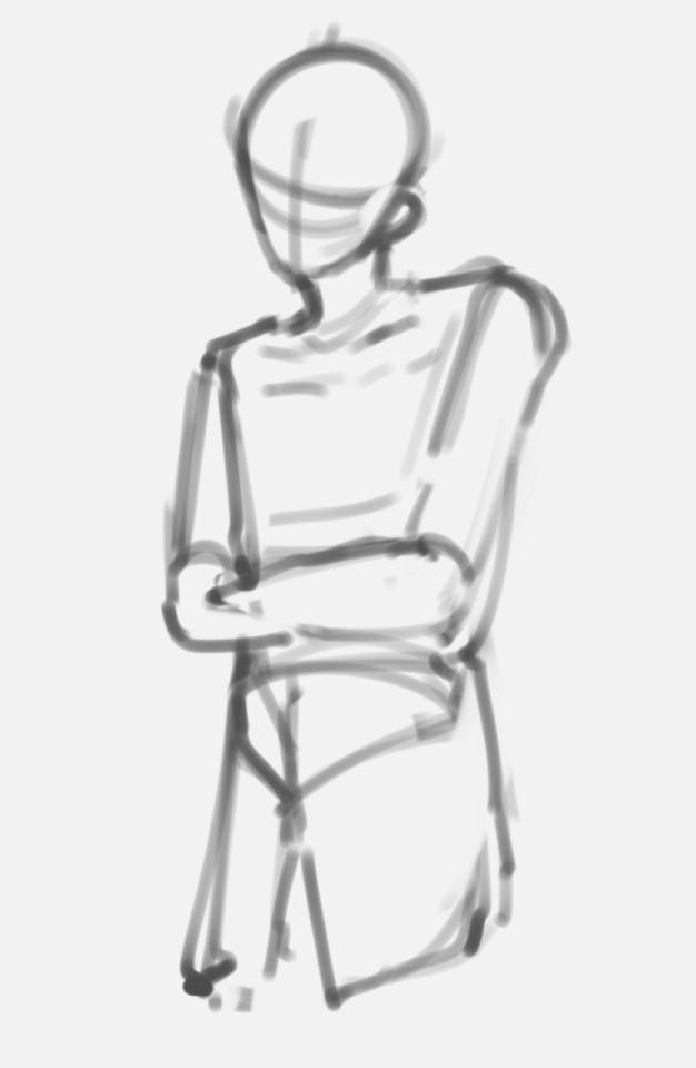
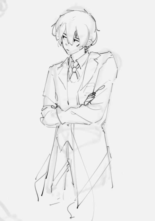
Looks nothing like the finished drawing (or my usual style), right?? And like, yeah that's normal, at least for me. I approach lineart as a way to refine something I've drawn into my own style, it doesn't just like. pop straight out as soon as I start doing lines 😭 (also probably why my art looks so inconsistent lmao)
Then from there I refine the sketch! Because of this, I'm working all on one layer, by erasing and redrawing portions of the sketch using that like pen pressure variation technique:
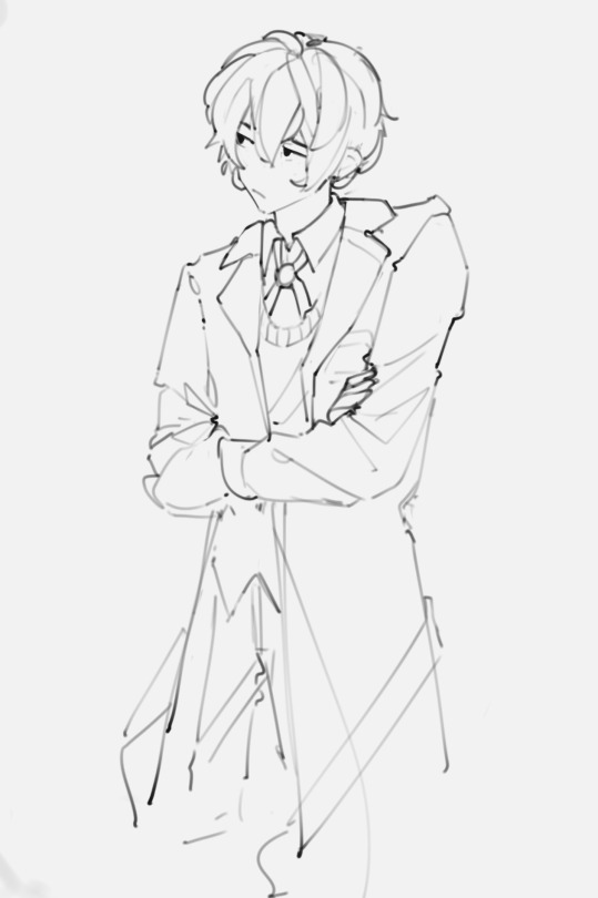
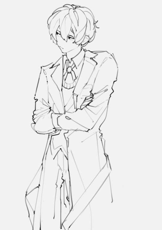
Usually I just make a mental note of how something looks, erase it, and redraw it. At this point I'll also start adding more detail or fixing posture/anatomy etc. as I go to make something closer to what I want.
Eventually this refines into what you see as the final lines!! Because this process is probably not the best. it takes me a long time to sketch, but I actually really like cleaning the lines! I find it refreshing to put so much detail in them :D

This is probably an incredibly wrong process in professional work, but I'm self taught and this is just what I enjoy doing :D I wouldn't recommend really doing this if you're trying to sketch quickly, but it's just what works best for me!
Happy sketching!
223 notes
·
View notes
Text
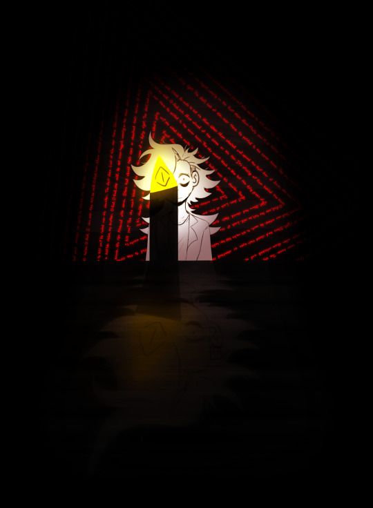
Mom finally saw it, a hellish vision, my brother. O God, O God, she said.
My Brother at 3 A.M. by Natalie Diaz
JaxTober Day 2 - Beginnings
i have feelings about Jaxston and that poem man. anyways yo!! kinda vague ass interpretation of the prompt yippee!!!!!!!!
tbh i added this prompt in so i could do this one teehee :3c
ok explainin time!!!
HERE is the first doodle i did when i wanted to make Jaxston. i was inspired by someone's fnaf fanart and really liked the spiraling words and limited palette and went "Y'know I've really been wanting to make a Bill's vessel oc..."
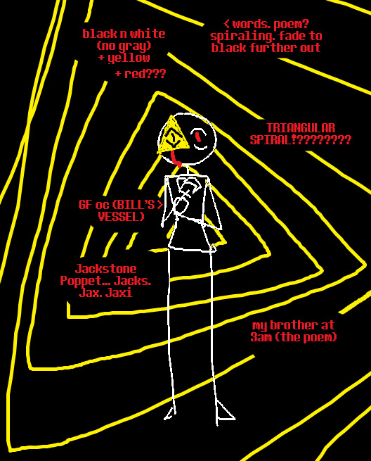
Made on ms paint ! i think its fun bc he is no longer Bill's vessel at all and never is at this point in me creating his lore and stuff (idk yet im always so indecisive about fandom oc lore lmao) lol !
so i took the prompt as "Beginnings of the idea of the character" teehee
then when i was drawing it i was not in the mood to do any fullbodies bc i had JUST finished day 1, which took longer than i wanted so i just. kept it simple! aka i sketched the full body, hated it and then deleted the entire lower half of the body lmao
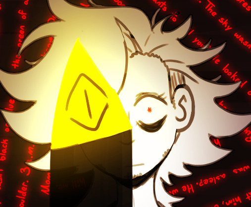
i didnt do any sketch past this lol, i really liked how it felt and just kinda kept it. i tried lineart, but i couldnt get it to fit the vibe the og sketch had so i decided not to ^_^
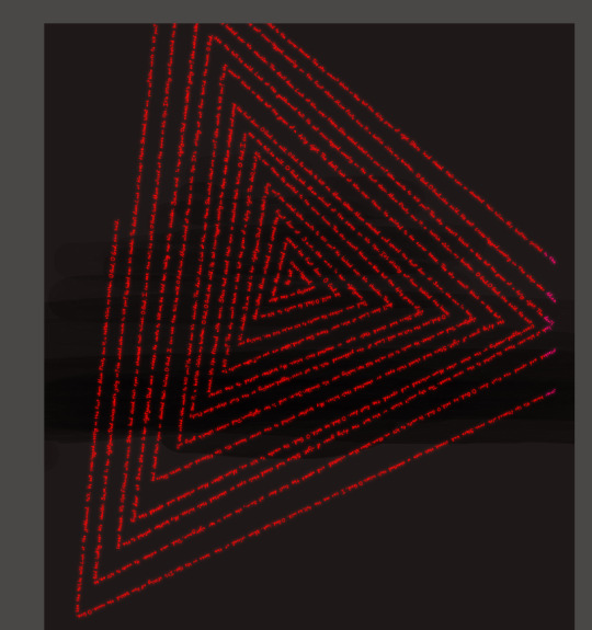
also i spent 3-4 hours writing the poem over and over and ove again for the spiral lmao
anyways i like yapping about my art.
this one is my lockscreen now on my phone, and it and day 1 are my monitor backgrounds (i have 2, my laptop (day 1) and my art tablet (day 2))
very proud of this one especially <3
now what the FRICK am i doing for day 3 what-
#my art#jaxstober#digital art#inktober#october art prompts#gravity falls#gravity falls oc#jaxston poppet#can i tag bill in this ?#bc its supposed to be him but...#ehh#bill cipher#fanart#gravity falls fanart#i am so sick of tagging things lmao#anyways im gonna try and have these finished so i can post 1 a day? so im gonna stay behind like. 4 days posting wise lol.#actually. might just make that my insta schedule and post them here when the fuck ever#yeah ok quing this for like. idk an hour from writing this tag lol#eye contact
27 notes
·
View notes
Text
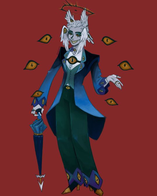
I finally finished the piece for @prince-liest's OC, Tzafael! this really reminded me of how fun character design is (and also that I've completely forgotten how to make digital art, but that's besides the point...) <3
credit to @hogbogglerspirits for the umbrella design! I kind of butchered it so please look at the original and throw lots of love at them
LOTS of notes, draft sketches, brainstorming, etc. below the cut. enjoy!
(note: a lot of what I'm talking about is based on posts prince made under their #tzafael tag, so take a look at those if you haven't yet!)
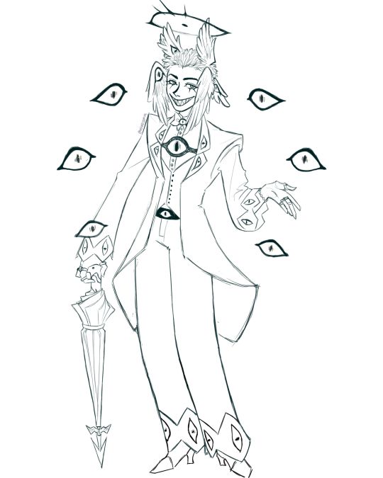
thanks for joining me below the cut! here's the sketch without the colors as a treat (in case you want to color it yourself or something, idk).
notes about making the digital drawing:
holy shit this took me forever -- I was not kidding about forgetting how to make digital art lmao. I forgot how much less forgiving digital lines are and genuinely lost the spoons to even attempt lineart, hence just a sketch below the colors.
some of you might've seen the original sketch I sent to prince, which the digital version diverges from just a little. it's mostly the halo which I'll explain later, and I finally caved and drew the sixth eye (you can tell I drew and erased it multiple times in the sketch lmao -- still don't know if I prefer it with or without)
here's the original color ref by the lovely @gendermeh! my color scheme ended up looking really different, so some notes about that:
I was looking at references for magpies like this
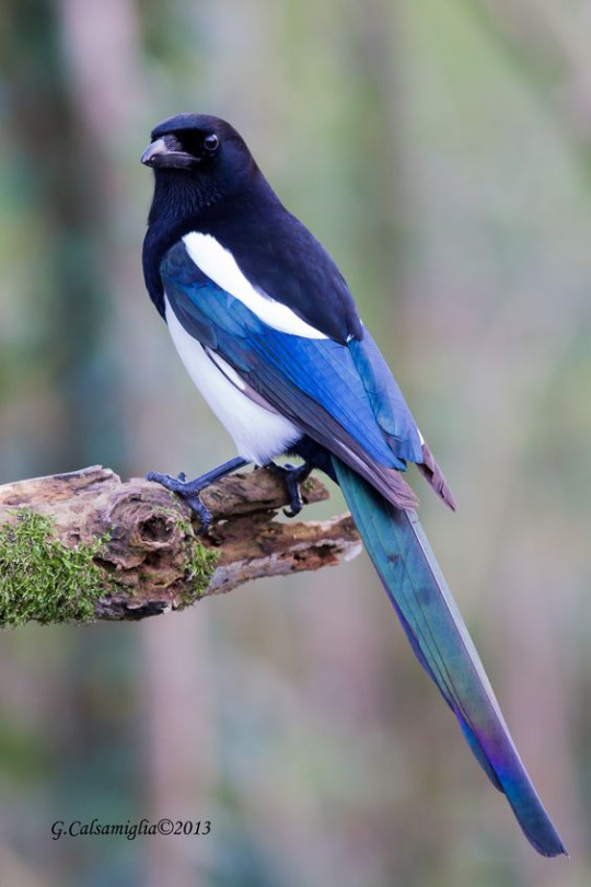
and I wanted to basically follow that color scheme while also being somewhat similar to the original -- dark head/shoulders --> dark top of the jacket, bright blue wings --> bright blue bottom of the jacket, greenish tailfeathers --> green pants, hints of purple --> purplish sleeve and pant ends
I also tried (and mostly failed, let's be real) to capture the iridescence of the feathers -- they look like oil spilled on the pavement or iridescent hematite to me! I think the key ended up being adding bright greens/purples and roughly blending them into the blues or vice versa but I didn't really figure that out until I got to the pants lol.
I'm gonna be honest; I don't remember why I went with this shape for the tailcoat. I just remember being unhappy with the sketch and then trying a bunch of different shapes that mostly looked worse lol -- I think I landed on this because a split tail kind of looks like wings?
KEPT the shoes -- absolutely magnifique. I wish I knew how to color gold better.
added lots of jewelry! they like shiny things :)
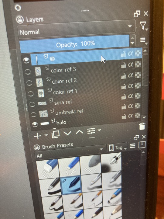
ALSO PLEASE LOOK AND APPLAUD ME. I FINALLY REMEMBERED TO LABEL MY LAYERS!! NO I DON'T REMEMBER WHY THE HALO HAS ITS OWN LAYER.
alright, time for some more design notes/explanations + draft sketches!
but first, a couple disclaimers:
I want to make it very clear that I LOVE everything about the original design. I made a lot of changes based on personal preference/the way I interpreted the character. I was actually planning on making a digital piece that was more faithful to the original design too, but I was just out of spoons for it cause of life stuff.
you probably shouldn't try to read the notes I made in the sketches I'm about to show you unless I say otherwise. most of it is incoherent brain vomit in illegible artist handwriting and I'll transcribe/explain the stuff I think is important :) (the stuff in quotes are direct transcriptions of my notes)
I know my sketches are very messy lol. I only draw for fun, so I usually don't force myself to make stuff any neater than necessary unless it's supposed to be a formal piece. try to bear with me.
1:
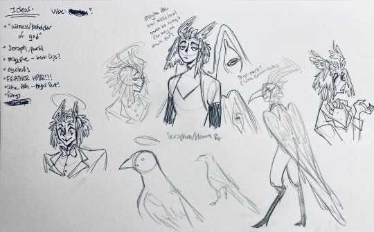
my first few sketches of them! (I think?) this was before I sent prince a laundry list of questions so I was still trying to get a vibe
"magpie -- beak lips?" -- you'll see this in a few sketches; I considered giving them the lipstick design that velvette has since it looks like a beak. I still kind of think it's cute, but 1) I'm pretty sure velvette is the only character that has them, so I didn't want to make it seem like they were related somehow and 2) I thought it might be distracting with how much other crazy stuff I ended up including in their head/face
also, sidenote since it's relevant to what I said about vel: something I realized was important is how one character's design relates to the designs of the rest of the cast. I wasn't sure how much I should've gone for what looked good in a vacuum, how much should be based on what other characters looked like canonically, or what other characters would look like if I also designed them. it ended up being mostly the second option, but it was honestly still a struggle. should I take away some of the tumblr-sexyman-ness (no shade to tumblr sexymen; I love them) because there are other characters that already have it? should I relate their design to sera's and emily's in the show or should I think about how I would've designed sera and emily? should I follow some of the design philosophy of the original show and just throw stuff on there because it looks cool (the answer is yes btw)? decisions, decisions ...
I don't think this showed up really well in most of the drawings, but they actually have a black line down their nose! let's take a look at sera:
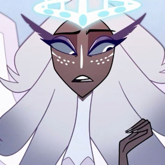
since they're siblings, I wanted to include some similar facial markings. the nose line ended up being the only thing I kept though -- I was going to include freckles, but I have a compulsive need to give every character giant bottom lashes so there ended up being no room T.T I like that the magpie's hints of purple kind of match hers tho!
the wingification of the hair begins! I was still unsure of it at this point, but it was an idea I had since I was kind of struggling with how straight the feathers were in the original.
"maybe the ones on their head count as wings (so only one main pair)" -- I originally just had the 2 pairs of wings on their head, so I was thinking of just giving them 1 pair on their back so there would be still be 6 total. also this middle drawing of them is meant to be their exorcist outfit (I wanted it to be a cross between what the other exorcists wear and sera's outfit)
at this stage, I was thinking of giving them more magpie-like characteristics, so I looked at some references and tried to emulate them in a more human design. this ended up being really awkward so I scrapped it, but I still like the idea that their exorcist mask looks like a bird (kind of like a plague doctor's)
2:
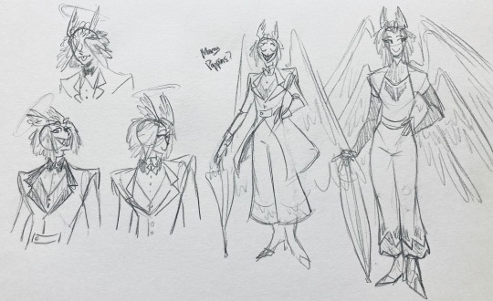
peekaboo! I love the idea of them using the wing hair to cover their eyes lol. (ended up using that idea for my own seraph OC since that's their biblically accurate purpose: to cover their eyes/faces in reverence/humility -- doesn't really fit with tzafael tho lol, so they show their face most of the time)
an eyeball in the bowtie -- pretty self-explanatory. the eyeball motif is important.
the one in the middle is just me practicing drawing the original design, and the one on the right is another exorcist outfit I think. I wanted to include the diamond motif/points that sera has on her dress (the diamonds on the bottom turn into eyeballs, which is why the final design also has eyeballs on tzafael's sleeves/pants)

3:
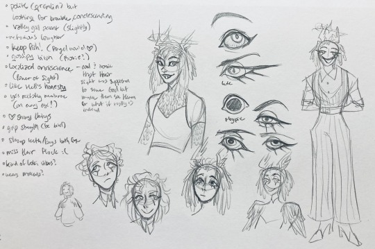
lots of notes on the side based on what prince said in response to my ask
"localized omniscience (power of sight) -- cool + ironic that their sight was supposed to serve God but made them see Heaven for what it really is instead"
another exorcist outfit, this time including the feathers
I was also experimenting with the halo; I was trying to make it look sort of like sera's crown, but that didn't feel right ...
some practice with eyes -- my style is pretty flexible with eye shapes, so I try to make them suit the character. I drew lute's eye and also an actual magpie's as references -- lute's because of the exorcist background and also because they looked appropriately sharp, magpie's for obvious reasons. once again, my compulsive need for giant bottom lashes strikes
there was honestly a lot to balance with the eyes -- I wanted them to look condescending/bored (lowered top lid) but also amused (raised bottom lid) and like a magpie (round) but also harsh/mischievous (sharp, maybe slit pupils like a snake) and similar to sera's (but not too decorated -- also does it make sense for them to look like sera's if emily's don't even look like sera's?)
considered having wings on the shoulders -- the magpie pattern is super cool, so it would've been nice to have that somewhere more explicitly in the design. I still think that might fit in an outfit they would wear in heaven (maybe for formal occasions)
the introduction of the sweatervest! honestly I kind of love this for the way it captures more of the preppy, spoiled old-money upper-class vibe some heaven residents have, but it was scrapped since I couldn't imagine them wearing that while trying to scare the denizens of hell. maybe something they wear casually though.
"yes nictating membrane (on every eye!)" -- AHH I'm so sad I didn't end up putting this to use. I just feel like the whole effect is based on actually seeing them blink, and I don't animate lol.
4:
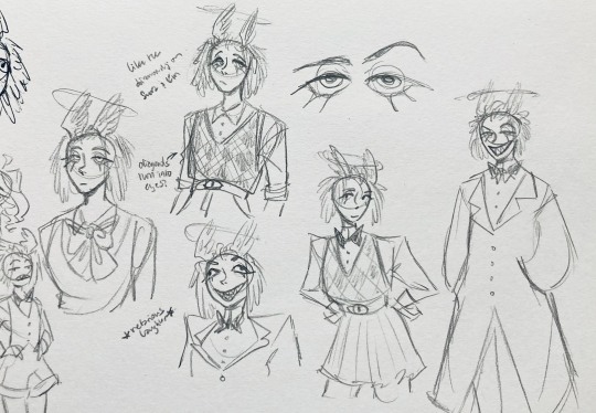
ugh, the nefarious laughter one ... don't worry I tried harder on a sketch later on lol.
"like the diamonds on Sera + Em" + "diamonds turn into eyes?" -- I draw the diamonds on the sweatervest turning into eyes later.
tried an actual bow instead of a bowtie -- very cute but didn't fit the vibe.
a skirt! I think they would wear a skirt sometimes.
5:
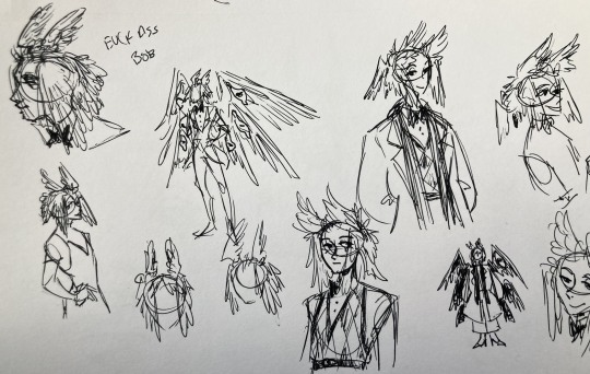
"FUCK ASS BOB" -- asghdk the wingification of the hair continues. unfortunately, I'm realizing at this point that the silhouette of the hair is starting to look a lot like alastor's. I gave a very half-hearted attempt at mitigating this, but it goes back to the thing of how much I am obligated to the original show's designs and what looks cool to me -- I think the wing hair fits them and I didn't want to change it because of alastor, plus my alastor design actually has completely different hair anyway. I did add a third pair to the back to look like a ponytail though.
introduction of the scarf! I was actually going to include this in the final design but uh,,, I forgor. are you starting to see a pattern.
the reason for the scarf is that the "tzafael going to places they know they'll draw attention/can incite chaos" reminded me of that scene in avengers where loki walks into a fancy building looking pretentious af and just casually stabs a guy's eye out. not really the same thing but I felt like the vibe matched. hence, loki's funny little scarf fit.

6:
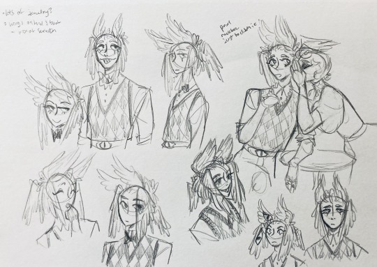
uaoughdfjh it was SO FUN to draw the wing hair, and it was at this point that I realized they had to stay even though I wasn't sure if it was too different from the original.
gossiping with rosie cause that's the first person I thought of -- tzafael also summoned a pearl necklace to clutch because of the sheer drama of it all (your ex-husband did what??)
also started drawing the rings on their hands. magpie like shiny.
7:
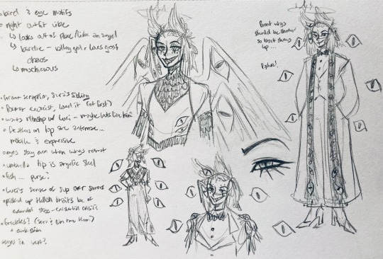
lots of notes cause I was trying to compile the things I still needed to think about/incorporate into the final (I thought this was gonna be the last draft ... haha)
trying to include more bird/eye motifs
"fish ... purse?" -- ha! I forgot I was gonna give them a fish purse. I think I drew that in a later sketch, but not them wearing it.
"picked up Hellish traits bc of extended stay -- existential crisis?" -- I asked prince about the sharp teeth, and their answer implied that they became sharp as they stayed in hell longer, which got me thinking ... I feel like that's actually a great body horror concept. lucifer falling and looking like a normal angel at first, eventually waking up to more and more devilish features and feeling more and more like he's lost his home and his past self ... spooky.
another exorcist outfit -- I actually really like the eyes on the ribs! I never made a final draft for the exorcist uniform, but it would probably look close to what I drew here.
the one on the bottom was meant to be similar to the feathered shoulder pad idea, but this time with the whole magpie (with giant eyes). tried putting the "freckles" (really just dots in this case) over their brows, but that ended up looking kinda weird.
the eye is pretty close to the final design
the one on the right was supposed to be the full final design, but I was totally off lol -- the long trench coat really doesn't give off the right vibe at all
8:
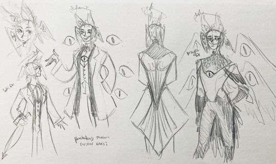
playing around more with the loki vibes of the scarf, also added an eyeball to the chest
I never got happy with the design of the back of the coat -- I think it should probably just be blank at this point. but the sketch here is meant to look like wings/tailfeathers.
yet another exorcist outfit, this time with more magpie motifs. I actually like this one a lot, but I probably should've added the eyes on the ribs from the last sketch. I think I also considered giving them actual tailfeathers at this point.
9:
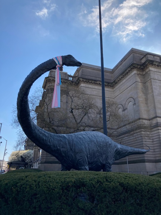
thanks for sticking with me! I promise we're almost done. have a trans dinosaur I saw while I was travelling as a treat <3
10:
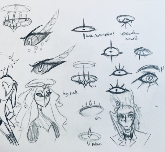
this is after I finished the sketch for the final piece and realized I didn't like the halo design. I drew lute's, sera's, em's, and adam's as refs. (honestly I love the show's idea that each person/people of each rank have a different kind of halo -- I wonder if they can switch them out?)
my main inspiration ended up being the exorcist halo, but I made it look more like an eyeball -- since it always points toward heaven, we can say it's always "looking" at heaven.
(also sera's feather lashes! they're so cute)
11:
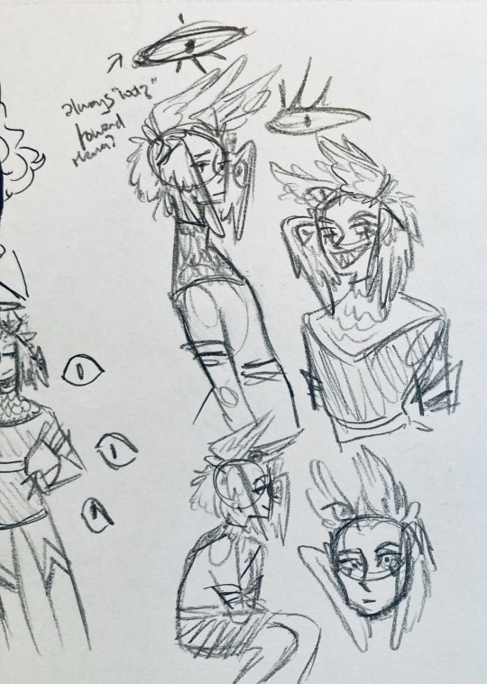
EVEN MORE EXORCIST DOODLES
12:
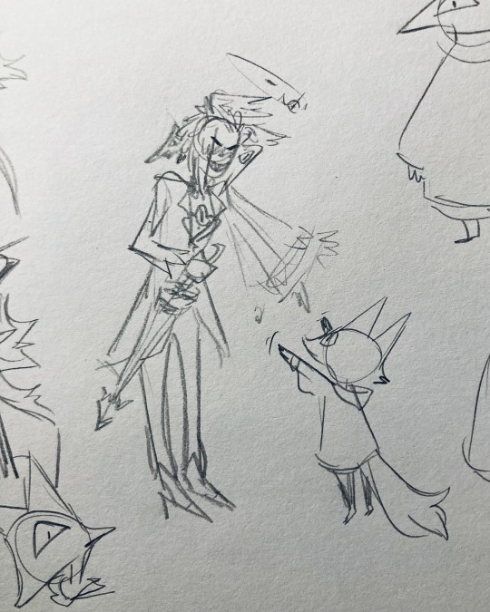
tzafael shooing away my fox demon OC
13:
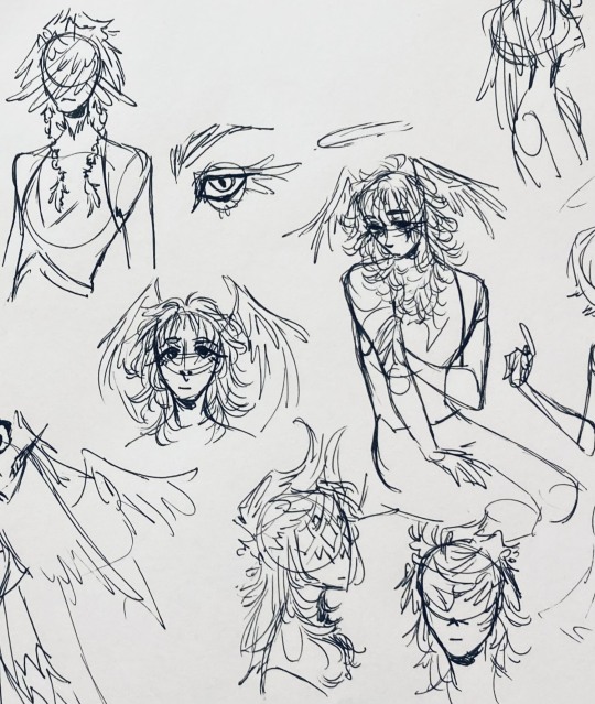
these are actually sketches for my own seraph OC (raguel), but I wanted to include it since it has even more wing/feather hair variations. I also think the idea of the eyelashes being feather-like could've been cool for tzafael.
14:
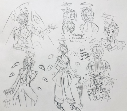
some more OG design doodles
tzafael and raguel together because self-indulgence is the name of the game babey (also wanted to draw tzafael freaked out with their wings flared)
(raguel's blind btw, hence asking for eyes -- tzafael has so many!)
you can probably read the dialogue here so give it a shot. I believe in you.
15:
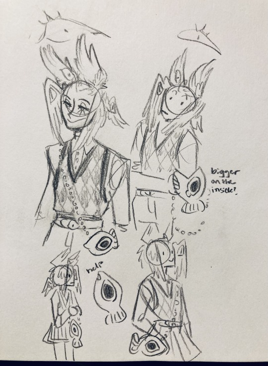
you know what? the fish purse deserves some doodles
16:
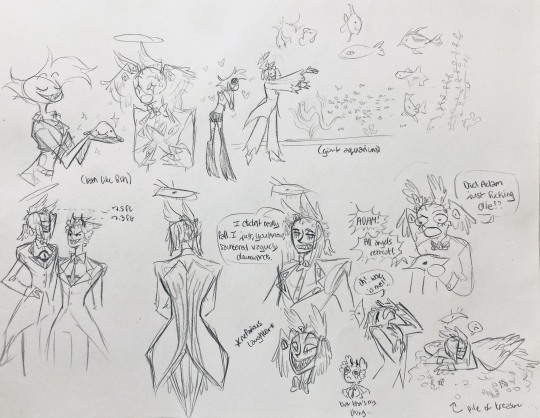
putting them in Situations! I was reading over prince's posts again and I realized there were some funny things I could draw them doing/saying
again you can probably read the words here
angel dust also loves fish (but is apparently bad at taking care of them, hence the suffocating blobfish), so tzafael shows him their aquarium (complete with live fish and flora ofc)
I thought alastor was 8 ft but apparently he's 7.3 ft? so tzafael is enjoying the .2 ft they have on him
trying and failing again to come up with a design for the back of the jacket lol
THE crowley quote
apparently the halo still sends signals from the exorcists -- thought their reaction to the battle at the hotel would be funny
the nefarious laughter (take 2) that I promised -- based on a doodle of alastor viv did that I found
them being sad and curling up in a pile of shiny things like a dragon
OKAY I'M DONE. huge, huge thank you to prince for sharing their OC! this was a lot of fun and clearly inspired me a lot haha. please check out their writing; it's literally so good that I can't read anything else these days. I am chewing on their thoughts constantly.
this was an absolute monster of a post, so if you're still reading, I am both impressed and bewildered at your patience. I hope you enjoyed! (I certainly did!)
#prince (because they are very sweet): I'm excited to see your thoughts!#my thoughts: magpie like shiny hehe#hazbin hotel oc#prince-liest#hazbin hotel#my art#character design#sera hazbin hotel#em hazbin hotel
56 notes
·
View notes
Text
Holy shit I should preface I AM TERRIBLE at remembering I have socials to keep up with and forgetting to post whenever I've finished drawing something aksjdlaj but here I am putting my foot forward to hopefully start using my Tumblr more!
I've been wanting to use my Tumblr more because I really enjoy being able to write and talk about the characters I draw and my thoughts on story elements and yadda yadda.
Anyway, I had been drawing every day since the beginning of my spring semester for my classes and had kept that up even after school ended. I stopped though when I started packing my apartment and travelling, and when I got back to a place where I could draw... I couldn't like AT ALL.
I think my brain FORCED me to give myself a break. The idea of drawing at all was just BLEGH and after doing other things to relax and destress, I found my groove again and this piece was made!

At first, this was supposed to just be a simple headshot sketch of Ghost, but as I got into my rhythm, I returned to my usual habit of being a bit extra lkajsdla so I added on more until it became this really cozy piece featuring Johnny's tired confusion and Ghost uh... day drinking! :)
One of my favorite things to do with characters is put them in scenes that feel almost like game cutscenes and since MW is y'know a video game, I think it fits the environment and characters well! Also laying out comic panels is a bit tiresome sometimes LMAO
I hope y'all enjoy and please please I promise I'm going to post more laskdjalj
#art#ghost mw2#ghost#ghost cod#simon ghost riley#soapghost#ghost x soap#soap x ghost#john soap mactavish#soap mactavish#mw2#mw3#mw2 fanart
36 notes
·
View notes
Text
(Cracks knuckles) Alright folks I remember how to draw
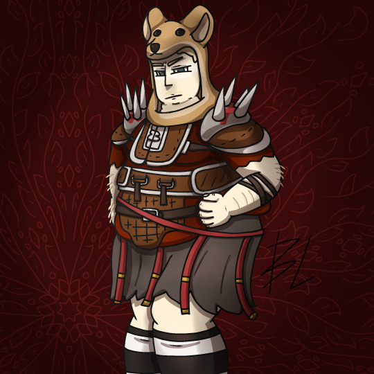
Fat fuck Vulpes by yours truly, Blaze Lander. Inspired by the lovely drawing by @yourmateyoya ,egged on by @legions-top-dog , and because i force you to deal with all my shitty drawings, @noomycatz
Yes, once again, i have put too much effort into a shitpost. Roughly 2 hours as I reused a canvas on ibis paint for a 5th drawing lmao
Yall can burn me at the stake later lol
Process below hehe i like to ramble
And just because i like to talk about my drawing process for characters with complex outfits, this is how my lobotomy brain does it:

First i do silly fun colored sketch. I use different colors to differentiate the "skeleton" from the, euh, fleshy bits, and the clothing. You can see lots of lines that would not be shown in the final product so it makes it confusing to look at.
Next i do a clean sketch.

This is where i clean up everything before doing the final lines. I use one color and a thin brush to make it easier to line over. Here i add any extra bits (like the top football armour) and "render the physics" as i call it, so properly drape cloth and the uhhh squish of stupid fat fuck vulpes' boobs and stomach. I also will balance the drawing here by flipping it and redrawing or using the drag tool.
Next is lining.

For this drawing, i used a 9.0 digital pen with a taper. Its my standard :þ. I kept my pen at the same size for this piece. Sometimes i line the outside darker to make the drawing stand out more. I decided not to as i wanted to give the drawing a more "serious" tone. (How serious can this be though lol-)You may notice on the arms little bits of the lines are missing, thats because i gave him some arm hair. I like make little details like that show over the lines. But since the one shading technique i used works with clipping masks, i had to but the arm hairs on a layer lower than the line art. Next is colour:

I colour in the drawing with midtones. Simple as. I tried to stick with warm colours besides his eyes, which are grey blue. Idc if they arent, im too lazy to google it. I mostly use flat colors but i did make his shirt a gradient. Next is do simple cell shading:

Depending on how i feel i shade with or without the colours in the back. I went with a sorta "non decrepit" light source here. Didnt want too much intensity. I used a deep marronish orange on a multiply layer on 45% opacity. Soft shading/lighting next:

I get intense with the soft shading. I use the airbrush with a deep maroon to add dark gradient and airbrush with a light pink to add a bit more depth. I usually use less light and more dark because im evil i like the intensity. I keep the layer the same amount of opacity and multiply it with the darks and soft light for the lights. Next are the shine highlights:

I use the dip pen hard with a taper to add light highlights of white on shiny bits like metal and eyes. I uses pure white, set the layer to 25% opacity, and use normal blending.
I also shade the lines because it makes the lines softer. I use a clipping layer on the line art, set the whole thing to a dark grey, and airbrush in darker and lighter parts. (I felt like a picture wasnt needed cuz its hard to notice.
For the background, i used a dark red i stole from the cell shaded layer, drew a vine pattern with the kaleidoscope ruler, and added a vignette. Vignettes are my cheat code for background hehe~ it makes the subject stand out while keeping suave, seriousness and formality. To make a subject pop out more, put the vignette behind the character but in front of the background. For more intensity but it on top of both.
Also- I usually draw with a level 10 stabilizer (i got shaky hands) but i drew with a 2 stabilizer so im surprised it came out so smoothly-
Also i gave him goggle tan lines because if i have to have them from playing tennis with sunnies, so does he.
#fallout#fnv#new vegas#drawing#digital art#fallout new vegas#vulpes inculta#shitpost#i put way too much effort into this#dont ask why i draw this type of shit good i swear i will blow up in a million pieces and cry if you do
21 notes
·
View notes
Text
TWST Process!
So I got a comment this morning asking if my Ignihyde piece was a Memoji---a thing I immediately had to google to even know what that means lol I'm not mad, no shade to OP but it really threw me for loop to be asked if my art is a customizable avatar.
I know this blog is mostly my fun little sketches or side projects but I am a professional artist! Even if this is a silly little side project to keep my brain from falling it the abyss, it's still my art I drew with my own hands and it's important to me for people to know that!
Process breakdowns below the cut! it's not very detailed but figured i'd be fun to show a peak behind the curtain!
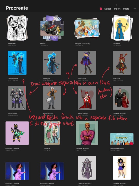
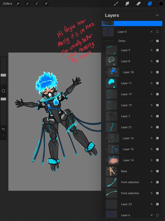

First things first! I do all of these in Proceate on my iPad! These are very casual and just for me to have fun--I'm very burnt out after my associate art direction job on Hit Monkey so I'm just trying to give myself a tiny piece of joy so I can get myself back to drawing my web comic and merch for cons/my store.
I draw each dorm in their own file just to keep things from getting too cluttered. The group shots I do separately in another file. So I'll finish them, flatten them and paste them into another file to size them up together/add backgrounds/effects. I included screenshots to show the breakdown of the original drawings along with the group shot. Nothing too fancy. Also forgive all the unnamed layers x_x I am usually incredibly organized but typing on my iPad annoys me so I tend to not name Procreate layers. You can see where I thought about it by naming ONE layer.
Here is the timelapse for The Ignihyde boys! You'll notice I keep Ace+Deuce in the file--I use them as a base reference for the stylization. I stylize everyone a bit differently but I try to maintain some consistency. I also reuse some bits of their palette as a piece of that consistency. You can also see me go 'oh yeah Ortho's hip thing goes all the way around so we should see it behind him........oh no. nvm that looks bad.' lol
What was most important for me to sell with these two was the difference of their personalities. I was aiming for that 'Someone will die' 'of fun!!' vibe haha So I wanted Idia very compact and to himself while Ortho is energetic and friendly. I also wanted to bring some design elements of Hades face to Idia's face. His bangs cover it up but I gave him a long nose that starts right from his brow the way they stylize them in the movie. I also gave them more color to their skintone but kept Idia more ashen/desaturated--I liked the idea of him looking kinda grey to match Hades instead of just pale.
Here's the non-default brushes I use--Jingsketch brushes are available here and the free comic brushes I got from Di Brushes. I'm usually a default brush kinda person but Procreate's default textured stuff wasn't really doing it for me anymore. I really like using stuff that looks more like pencil or pastel. I've also been addicted to adding noise a lot to my pieces. I know that's not the most original thing in the world but idk, it looks cool. My group shots always get a layer of noise.
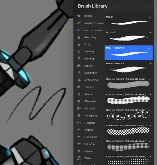
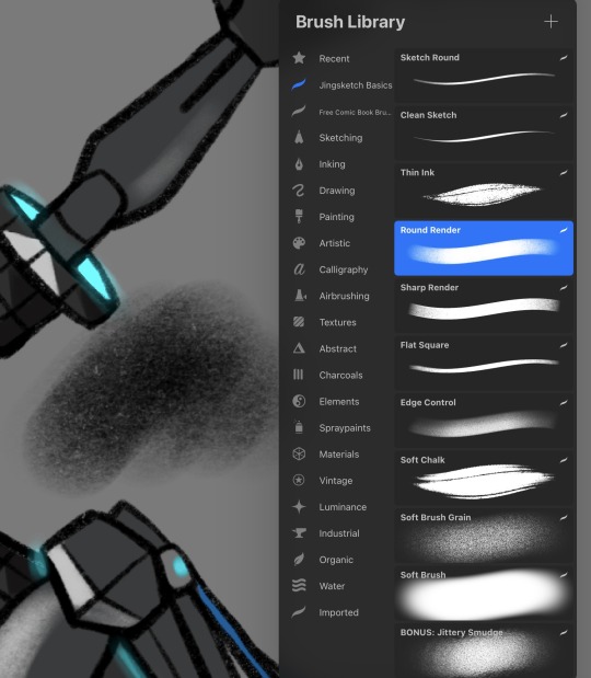
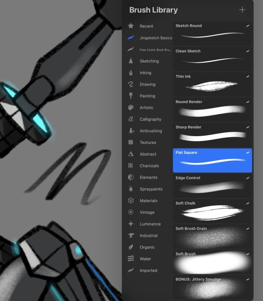
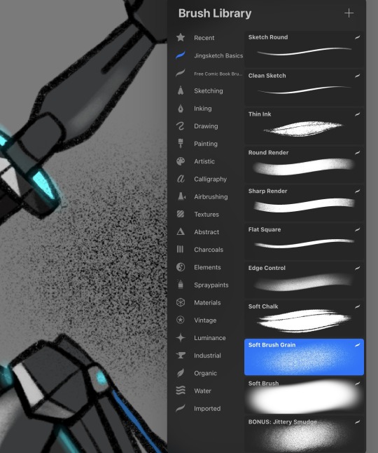
But yeah, that's it! These are purposely kept pretty simple so I can knock each one out in about two hours or so. More detailed dorm outfits obviously take longer--I hand drew all the patterns on the Pomefiore kids like a mad man. Every time I erased the edges, I went 'I should probably copy and paste this' and then never did. I love making things harder for myself lmao
See y'all in Diasomnia! (I also have plans to draw my MC and Grim so Diasomnia won't be goodbye~)
19 notes
·
View notes
Text
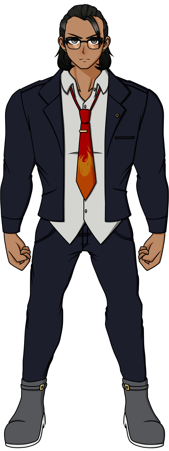
This is for my mutual that requested that I do Kakeru next, so I did! I actually had this finished all in one day but it was very late where I was by the time I was done, so I had to shelve it for today instead.
Kakeru's OG design is just...funny, when you find out his Ultimate Talent. This man does not look like a lawyer and looks like any other muscular guy that probably does sports. Which makes it even funnier when you find out that, no, he doesn't actually do sports, he was literally just born like this! This man was blessed with the best health possible, and yet he feels ashamed for this because his sister was born very sickly, so he blames himself for "taking away her health" when it's not his fault. It's just how life goes sometimes. But anyways, back to his redesign. I chose to base this redesign off of his splash art as he actually looks like a lawyer in that than his in-game sprite, but changed it up and added details to it since I didn't want to straight up copy it. Based off of his OG design, he was dressed pretty casually, so I decided to have his shirt collar slightly unbuttoned and kept it untucked, his suit jacket open, and his tie a little more loose. I gave him boots to add a bit of flair to his design, gave him small earrings, an attorney badge, and a tie pin to keep it attached to his shirt and prevent it from flying off. It's to show that while he's casual, he's still a professional. Also, in his splash art, he's shown wearing glasses, so I'm questioning why LINUJ didn't let him keep that??? What, are those reading glasses, fake glasses to make himself look smarter, or are those glasses that he actually needs to see from? Imagine that those are prescribed glasses, and he's walking around the killing game with blurry vision the whole time he was alive, lmao. But seriously, it's weird cause in one of LINUJ's sketches where he drew what the 79th class would look like if they survived, he has his glasses again so the state of his eyesight is just one big question mark. So I just said, "Fuck it, he has glasses" and that was it. It honestly adds to his professional and smart aura, which actually adds to his intimidation since you'd expect him to be very serious...and then it turns out he's super sweet and shy outside of court. And what helps hint to his softer, sillier side would be the flame design on his tie, as ties with goofy designs like that can show that this person can be silly if they want to be (at least, character wise). And I didn't want to get rid of the flame design on his shirt completely, so I decided to call back to it by moving it onto his tie instead. A tie that his sister probably chose for him, so Kakeru would wear it all the time, hehe. His hair barely changed, I just adjusted it so that it has a better shape. As for the colors, I made Kakeru's tanned skin a bit more obvious, and kept his colors quite monotone aside from the tie and gold metal of his earrings, tie pin, attorney badge, and the buckles of his boots. Fun fact: I originally made his suit blue, but decided that he looked too much like Phoenix Wright and desaturated the colors to look more gray, haha.
Anyways, I love Kakeru. I just wished he acted more like a lawyer in-game, you know?
#DRA#Kakeru Yamaguchi#Danganronpa Another#DRA Spoilers#sprite edit#Star's Art#kakeru is probably gonna be the most changed design yet#cause his OG design just does not look the part of a lawyer at ALL#at least with everyone else you can kinda get an idea#of why they look the way they do#especially when you're given the context of what their talents are#with kakeru you just don't#so him being a lawyer becomes a big surprise#and ends up tanking his design as a result
40 notes
·
View notes
Text
just realized I forgot to post this
istg the one thing I have a schedule for that I actually adhere to and I mess it up
either way here’s the redesign, and for clarity, I didn’t give him a title because I feel like he’s… just Deku. that’s been the whole thing, regardless of whether it’s a negative or positive context, he’s just Deku. (yes my head did start singing I’m just Ken but shhh)
but here you go here’s Deku

it looked a lot better as a sketch on paper so shush
bodysuit is now a hoodie and pants
is he wearing a shirt that just says ‘hero costume’ on it under said hoodie? that’s up for you to decide
hood does have the little all might ear things, I kinda wanted his silhouette to be reminiscent of koichi(the crawler)’s, so I kept the all might ears
he does still have the mid-gauntlets, they’re just covered by the sleeves
knee and shoulder pads
no elbow pads bc of the mid-gauntlets
same shoes as canon
yes they look weird it’s because you can’t see the outline due to the dark color
idk why those leg brace things make his ankles look so fuckin skinny man
he’s probably got some sort of leg brace under his pants
didn’t like the respirator but added it anyway bc he’s going to be working with baku for sure and like hell am I letting this boy run around breathing skome from explosions
lmao ‘skome’
more freckles than just the diamonds on his face
kept the ulitily belt
tiny reference to his post-war design but it’s not super noticeable to avoid spoilers
HOT WEATHER VERSION:

lighter pants
short sleeves
no the white bits are not part of the sleeves that’s the cap off of the mid-gauntlets
yes it is a tshirt, yes it has a hood, yes I was very tempted to add dumb ironic text to the shirt, no I will not shut up that is a canonical running gag and I love it
COLD WEATHER VERSION:

darker hoodie
black gloves
thicker material
turtleneck
does it look weird that it’s a turtleneck hoodie? shut up
I considered giving him boots of some sort but the sneakers are honestly iconic
yay there’s my redesign, I honestly don’t really like it too much, but I’m posting it anyway.
as always, tips and advice are appreciated
#bnha#mha#bnha redesign#bnha redesigns#redesign#mha redesign#mha redesigns#deku#mha deku#bnha deku#midoriya izuku#izuku midoriya
13 notes
·
View notes
Note
One of my siblings brought back the Nintendo switch and I had an idea that I should try to make Legacy's room but in animal crossing new horizons sketch room
I ended up getting a small headcanon that Legacy took Rik's office room after he left. It was empty and semi dusty at first until legacy came in and surprisingly kept it nice and organized when him & his brothers were first introduced. Later on, he ended up trashing it once he started to lack self-care and became the person he is now. He also used to sleeps on top of the pile boxes, but I think he mostly prefer his chair nowadays. (Maybe him and his brothers came from the manufacturing box before they were let out and him sleeping on it is just another display of how he wants to be recalled.) Also also, I would've added a mug somewhere but had no space (he's probably sleep deprived despite being a robot.)
Let me tell you, I got so mad when I found out that the security monitor wallpaper is a thing in this game cause I don't have it and it was so fitting. I had to use those small TVs as security monitors instead 😭


Bonus edit I randomly made when I was on YouTube the other day:

OUUUUHHHH THE LAYOUT IS SO CUUTTTEEE
I could definitely see him being more neat n tidy at first, but losing all motivation for it pretty swiftly. He's definitely a chair sleeper too LMAO, he's usually leaning back in it or leaning on the desk to sleep
3 notes
·
View notes
Note
i found some sketches i did, they're messy plus they're traditional so i'm not sure i wanna send but!!!
bless my mind for drawing geto with a crazy back arch.. and piercings.. yeah that's it that's all i wanted to say
i think this man is just.. perfect... (i wanted to add more about him but it's getting long just know he stands amongst my fav characters of all time and i need him as a husband)
i love him so much actually plus i noticed a blog that does too and they post fanfics as well i think their user is hayakawalove? i dont know i hope i didnt make a spelling mistake but anyways i love their characterization of geto and how they like him a lot because i dont often see geto fans,, a few on twitter but otherwise it's mainly gojo, toji, nanami and choso.. or maybe i'm in denial because i want more geto content 😞😞
so their + your thoughts about him ☺☺ i am well fed, it's keeping me afloat right now
OH I READ AN SMAU TODAY. actually there was another smau that kinda went like this too where reader wanted to peg jjk men and i love how in these 2 smaus i read toji hasnt a problem with it but just straight up doubt reader's dicking skills instead and yeah,, i'm thinking thoughts... imagine that happens and then the reader is so good at railing him it turns his brain inside out and he drools and he just looks at them full of love but also is just so dumbified at this point he feels like he's melting... yeahhhh
(also, i thought maybe i could just make a post with all my jjk sketches even if they're messy and tag you if you want? because i wanna share but i'm hesitant still even after all the reassurance 😭
sorry that ask is messy cuz i kept adding more stuff (as usual)(i still love me some context and bonus thoughts)
~ ☀️
SUGURU WITH PIERCINGS AND A CRAZY BACK ARCH ARE YOU KIDDING ME SUNNNYY????????!?!?!??!!?!?!? WHAT THE FUCK I NEED TO HAVE HIM ASAP. him having many many piercings is canon here in loserville like yeah ear piercings, lip and brow perhaps even a nose piercing. dick piercings. yeahh................... he's so fucking hot fuuck fuck fuck
HAYAKAWALOVE!!!!!!!!!! REM MY BELOVEDD!!!!!!!!! I LOVE REM!!!!!!!!! rahhh omfg i remember when me and rem and kairo aka @/gothsuguru were all going insane abt suguru wearing lingerie lmao i need to get back to that bc holy fuck that's hot...... also him being called mommy? yeahhhh i NEEEED. to do that i love him so much
oh but if you want more of suguru you can also check out summy aka @/ohimsummer and @/lxnarphase and @/ohsuguru and @/13curses they all have some delicious stuff for him!!!!!!!!!! aaaaaand then i have seen @/tojipaws talking abt fem!suguru and i know you like that soo:333333333333 ANDD if you by any chance are open to reading some sfw stuff abt him then i highly recommend checking out @/twentyfivemiceinatrenchcoat!!!!!!!
TOJI LOVES GETTING PEGGEDD!!!!!!!!!!!!!!!! it's so fucking hot i need to dick him down so bad i feel dizzy just from thinking abt it ooh my goddd............ he deserves it!!!!!!!!!! he deserves to get his brains fucked out he deserves to be a lil pillow princes!!!!!!!!!!!! i am veery very into that and this is also smth i want to write more abt WAHH SUNNY I LOVE HIM SO BADDD:(((((((((((((( i'm gonna die if i don't talk abt him for more than five minutes it's so bad
ALSO YESS I WANT YOU TO TAG MEE!!!!!!!!!!!!!!! i know it's hard to share smth you've made but please believe me when i say that i would absolutely LOVE to see your art!!!!!!!!!!!!!!! ALWAYS!!!! no need to ask me either really you could just tag me in anything and everything aaand i'm gonna eat all of that up every single time!!!!!!!!!!!!!
#HEHEHEHEE ILYYYY!!!!!!!!!!!!!!#god i had the tastiest convo abt suguru yesterday oooh my godd#i'm slowly but surely getting more and more into cult!geto..#so be ready for that lmao#BUT YEAH ILYY#I WILL TRY TO FEED YOU SOME MORE SUGURU STUFF SOON#bc i love him so much too#i know i still talk more abt toji n satoru but suguru is the person who got me into this in the first place so he is VERY VERY important#like awfully important..#i want to punch him i want to kiss him#SIGHHHHHHHHHHH#he's perfect...#☀️ <3#friends!!
4 notes
·
View notes
Note
Can you tell more about your Fate redesigns? Like your Penth, Hektor, Paris/Apollo, and Astolfo?
*FOAMING AT MOUTH* YES I CAN.
WARNING FOR A SUPER LONG READ
OKAY so first Imma talk about Paris/Apollo because Alexander-Paris is one of my most in-depth designs ATM and also explains some of Hektor's concepts!

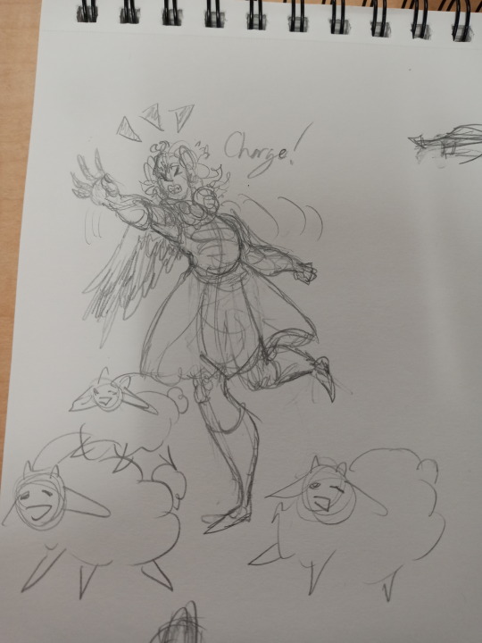

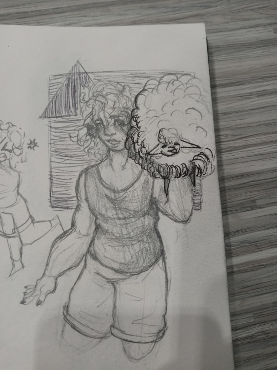
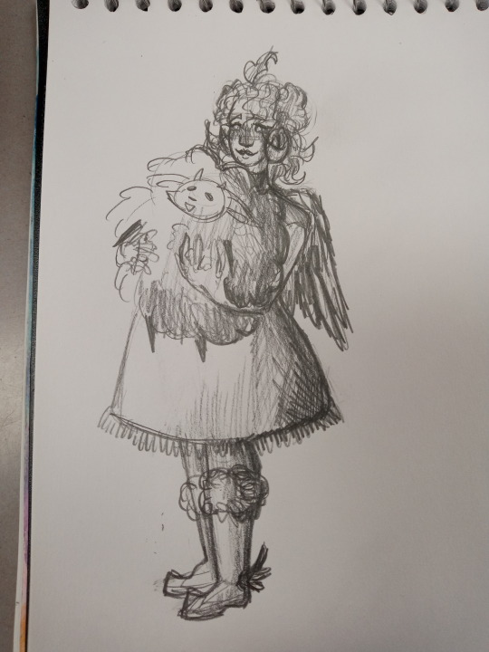
Ignore that all I can in find my camera roll are SUPER old doodles of him lmao XD this ask really making me go through doodles from last year
So firstly is the color symbolism! I noticed in FGO that his design is very light-colored, and while that's interesting, I thought it would be more symbolic to have the main colors be dark as to point towards how he inherently can't escape his fate and actions as an adult, even in a child/teenage body, and also as a sort of symbol of how dark his future is. Adding on, Paris is VERY SPECIFICALLY summoned as having a child's body but the memories of his entire life, and I had the idea that the darker colors also show that he knows more than he lets on/he isn't innocent. The gold and such are to point towards him being a prince and technical demigod, and the blues are just in general for color diversity
With his horns and wings: Both Hektor and Paris in my AU are biologically Apollo's children (reference to some versions of the Troy Boys actually being his biological children instead of Priam's), so the horns and wings symbolize that (which Hektor doesn't have, more on that later). Apollo-Sheep's "humanoid" design concept actually has the wings and horns too (just bigger and more fancy lmao). Another Fun Fact: Both Hektor and Paris have some sun/fire related abilities in my AU, although it's slight
Next Paris and Hektor's eyes! Yep! I put thought into eye color! Paris' eyes are orange, while Hektor's are black. HOWEVER, when they use their NPs, Paris's eyes darken to black and Hektor's glow orange! Prominently, I honestly just thought Hektor having glowing eyes when using his NP would be Fun and Sexy XD However then i was like "...Okay but what if... Paris had opposite? What if... Symbolism?" And this idea is so cool to me because of how they can connect!!!! Hektor's glow because he's deemed to be Troy's hope, while Paris's darken because he's deemed as Troy's downfall!!! Sorry I just love how I can make the brothers contrast each other and how they can be interpreted AAAAA
I also made Paris's hair darker while Hektor's hair lighter so that they would look more similar to each other/look more like brothers, same with them both having wavy hair and the eyelash part on the bottom eye (it's kinda hard to see in the pictures RIP). I just wanted them to be a lil match-y. They also both have beauty marks that mirror each other! I imagine both of the Troy Boys to have thicker bodies
I gave Paris some armor parts as well as to look more similar to Hektor, while I also kept the cute dress parts because the cute stuff just seem to be more of his own style and I think That's Neat. The symbol on his skirt piece is Romeo's command spell symbol, matching with a headcanon I had posted some time ago about the command spells appearing somewhere in a Servant's design
Paris also has these sorta long-sleeve glove things due to me originally adding it to my Jekyll/Hyde redesign (which I need to remake) and Paris, in my AU, is one of Hyde's best friends, so I thought it would be cute for them to have a lil match-y thing XD
With the black wool, I thought it would be interesting to show physically of Paris being more of the "black sheep" of his family, especially considering he wasn't raised as a prince, he was raised as a sheep herder. And how he was sorta cast aside as a baby due to the prophecy of him becoming Troy's downfall
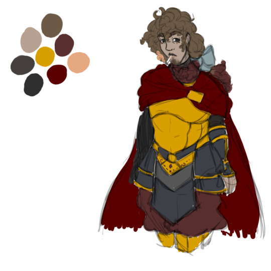
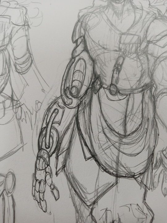
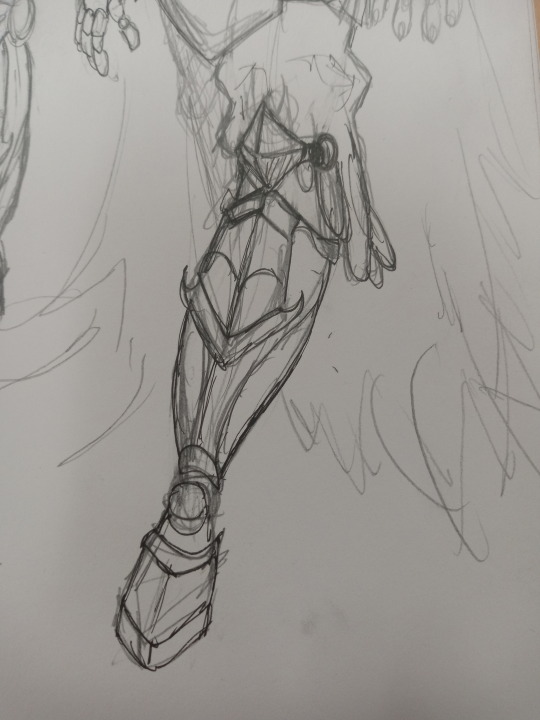
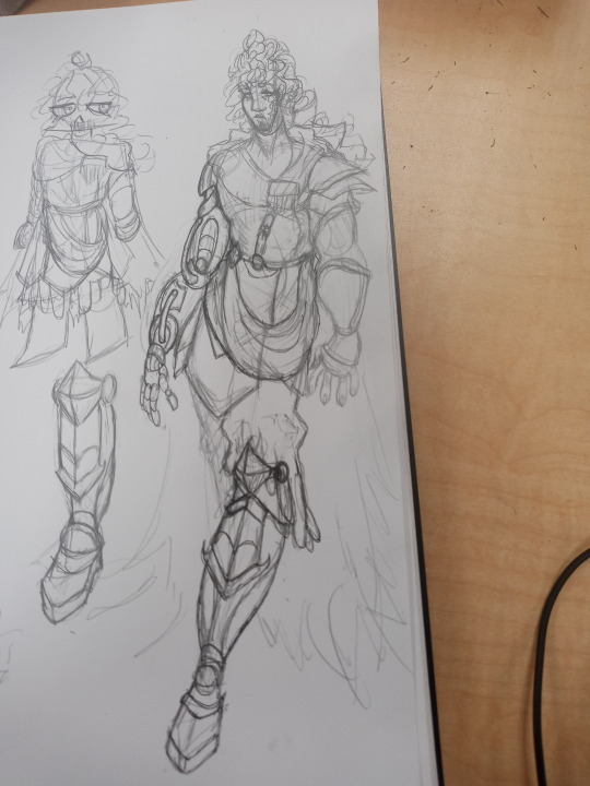
This is my current concepts for Hektor (the graphite sketches are a lot older than the digital btw, but good a good idea about his arm and shoes design), but it needs some work XD I want to add a lot more later on, but this is a good start I think
with Hektor, color-wise I tried to make his pallette somewhat a mix between opposite and similar to Paris. For him, the dark colors represent more of his death. He doesn't have the horns or wings anymore due to Achilles dragging his corpse, too. I think I posted some old sketches before of the back of his head having the broken bases on his horns. I would imagine his back having scarring and some skin disfigurement where his wings once were as well
With the red, specifically the red wool and the red gradient in his hair, I wanted it to represent the blood that was shed during the Trojan War. Plus, it also contrasts against Paris's blue colors, pushing more of that contrast between the two
With Both the Troy Boys' personalities, Paris still has that childish demeanor about everything, but he's definitely fully Aware and could manipulate if he really wanted to. However he doesn't really, unless if he wants to get away with childish things (like sneaking candy). He's a bit cheeky at times, and in general is A Lot like his canon FGO self. He likes being helpful when he can. Although something I added is that he Hates romance/romantic things. He thinks it's gross, but also his view point is due to the Trojan War and his whole thing with Helen.
Hektor is a mix of things that's hard to explain. He's similar to his canon FGO self. The thing is that FGO itself states that he has a facade going on, which pretty much is what For Funsies AU also does, so there isn't much for me to add XD Although I think in my AU, his facade is a bit different. Other than that, he's silly goofy as usual
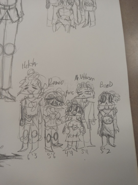
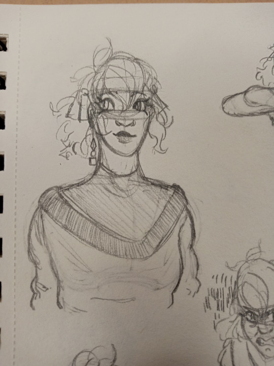
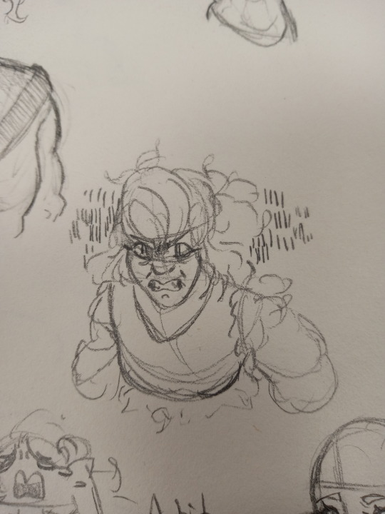

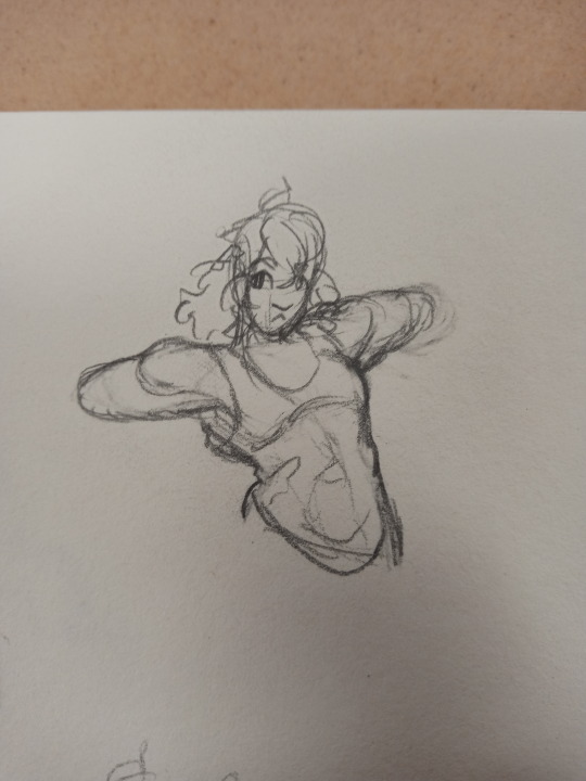


i could have sworn I had pictures of her that are more recent/go more in-depth with her design ideas, but I can't find any TwT I'll talk more about her personally redesign since there isn't much physically I can exactly say
Next with Beserker/Penth, her concepts are still definitely a WIP. The general idea I have for her is this 16 year old being very elegant yet absolutely able to kick your ass with the slightest provoke. She's beefy, I would imagine (I really wish I had better sketches of her). I kinda want her to lean more towards having a "royalty" look yet also young and armored up. Iirc in Canon FGO she literally has herself be summoned at a younger age so Achilles can't flirt with her, so I decided to lean on her looking young. I also gave her more furs and armor coverage since she's a warrior and also the whole thing with her fighting in a bikini just. Doesn't sit right with me.
Personality-wise, I think she would try to act very mature and serious, but she's Not immune to Acting Her Age. Aka being a goofy teenager. She definitely tends to butt heads with Paris because he keeps stealing her hair comb. I definitely think she's super smart though, considering the business she has going on in Canon FGO. However, even smart teenagers can be silly (as a treat). She's definitely still has that Extreme personality trait, like tending to take things too far and being rather hot-headed. I like her dynamic with Mr. Utterson because he'll be like "Thank God you're here. Maybe you can talk some sense into Paris" and immediately Penth is trying to knock Paris out with her fist because it's faster and more efficient XD (also as revenge for stealing her comb). She's wonderful, although I'm still working on her dynamic with others and how she generally acts
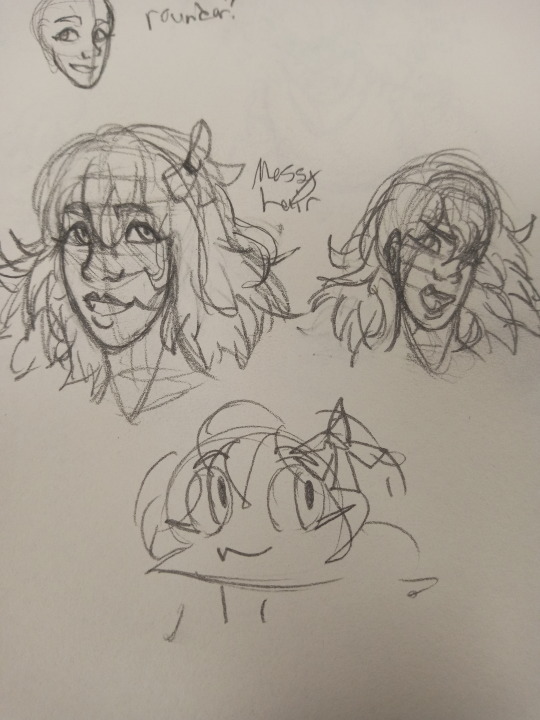
i can't find any of my Astolfo doodles other than this Really Old One TwT (HELP IM BEING SUBJECTED TO MY OWN DRAWINGS)
In general, color-wise I'm thinking of making their outfit+armor VERY vibrant with Many colors to the point it's gaudy and dramatic. I kinda still want a cutesy look with them, but also messy and disorganized to show more of the sorta "frantic" and "can't sit still" vibe they have. It's hard to change anything about Astolfo because they're already a pretty interesting character with a solid design and personality. Anyway, as you can see in the drawing, I tried making their hair Super Messy. I imagine them being so energetic that their hair is never done in a "proper" way
So yeah! Yippee! Thank you for the ask <3
#forfunsiesau#alternate universe#fgo#fate grand order#fate go#fgo fate grand order#ibis paint x#character design#character redesign#Obviously you can see I have favorites in this AU lmao#But also that I really need to draw more XD#sketches#doodles
14 notes
·
View notes