#they're monocolored
Text
finally had some time to draw and ink the next oc

what a week
11 notes
·
View notes
Text


i am not dead i just have nothing to post really but i need to stay active online ehh
#scethbook#scetch#monocolor#doodlies#doodlings#?#ocs#might as well make a tag for the universe they're in#yeah#kohuke#why is everything green ghhh
0 notes
Text

Slowly but surely I'm making designs for TFR scugs
General Lore:
- All artifical slugcats have monocolored eyes, naturaly born slugcats have pupils(Exept Rivulet, he's special)
- Slugcats inside countries are anthro, and more advanced than slugcats that live in wilds of wastelands
- Most of artifical slugcats were created by Seven Red Suns, or at least they're based on his blueprints
- All of the artifical slugcats are always loyal to the iterators. Artificer is the only exeption, she combusted herself to almost comatose state to break this taboo

Artificer, Leader of the Rebellion
Arti is a leader of rebellious group of scavs and scugs that are against of current government. Her reasons to go against her own creators were the facts, that her children were sentenced to death by execution by fabricated case.
She was created by Seven Red Suns and Five Pebbles as Soldier Prototype, but her abilities were considered too dangerous not only to enemies, but to allies, so this project was discontinued.

Hunter, Assassin
Hunter was created for NSH as his own bodyguard, but showman gave them more duties to perform, like butler work and assassinations, the last ones being performed rarely. He dedicated his whole life to serving iterators, and his believe in them is unshakeable.

Spearmaster, 1st class agent
SRS' slugcat soldier unit, brought to perfection. They isn't fully mute, they just speak way less than others, and only if it's important. His believes in iterators is very strong, so when news about Suns being the leader of the rebellion got confirmed, they immediately renounces their creator, taking the side of iterators.
Although, when in beginning of 3rd act Suns gets revived, Spearmaster gets punished for turning back on their creator, and SRS cuts his tongue out.

Rivulet\Ruffles, Double Agent
Moon created hersef a perfect spy, a two-faced slugcat, which is very quickly insinuated into trust with others. He works on both sides of the conflict, remaining the neutrality 'till the very end, where he betrays rebels, giving out all the information to iterators, sabotaging their plan.

Saint, Prophet of the Asentsion
Saint was created by SoS as ultimate controllabe weapon. He posesses the abilities of levitation, future foresight and asention. In certain circumstances he can asent even iterators, like in case of Seven Red Suns being sentenced to death through execution by him.

Gourmand, First-class chief
He is a simple guy, Gourmand is a chief in very expensive restaurant and he has many awards for his success in cooking. He just lives his happiest life, not caring enough about regime being unfair.

Monk, Religious Outcast
He is an old priest who began to openly express outrage towards the government, which "disturbed the balance of nature." The execution of the priest would have attracted too much negative attention, so he was expelled from the country, covering it up by the fact that he voluntarily went into a pilgrimage.
Some time later, he and his brother Survivor found an oasis in the middle of a scorched wasteland, Outer Expanse

Survivor, Protector of Outer Expanse
Younger brother of troubled priest. When his brother gets exiled, he follows him, to make sure that he won't get in trouble. He helps to protect Outer Expanse from any danger, slowly becoming very skilled fighter.

Enot, Far Gone Enigma
A slugcat with Murphy's law in his life, that have nothing to lose. Becomes a love interest of Saint somehow.
#artists on tumblr#drawing#rain world#rain world art#digital art#sketch#rw fanart#rain world au#the frostrot#slugcat#rain world artificer#rain world hunter#rain world spearmaster#rain world rivulet#rain world saint#rain world gourmand#rain world monk#rain world survivor#rain world enot
95 notes
·
View notes
Note
A grundo neopet review, perhaps? For the soul?
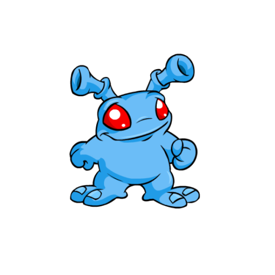
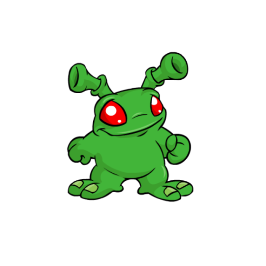
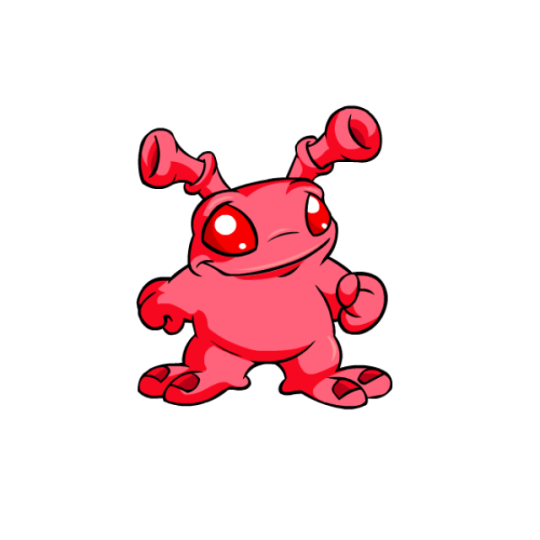
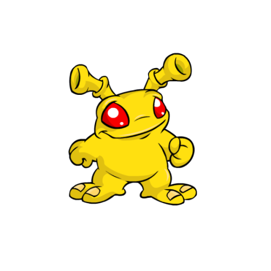
Grundo are somewhat under-appreciated in my experience, which is a shame, because I really like them. They occupy a specific niche in Neopets, being the only alien species (save for Aishas, but they seem to be related to aliens rather than just straight-up being aliens) and serving an important role in many of the original Virtupets-based plots.
Their designs are nothing fancy, just being monocolor (save for their eyes, which are often though not always red) and lacking any noticeable markings. However, their solid-color eyes, fairly rare among Neopets, pop really nicely, and their ears have this really nice doubled-tube shape that is one of the most memorable things about them. They're pretty cute looking overall, and I really like the facial anatomy on these guys, which is almost frog-like in a weird way.
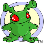
Grundos also faired really well when it comes to customization, in that they're exactly the same save for some standard unification stuff like shading adjustments. The bad news is that they were saddled with not one but two fists, but the good news is that they look at least somewhat natural and it's not like their hands were ever particularly well-drawn to begin with.
Favorite Colours:
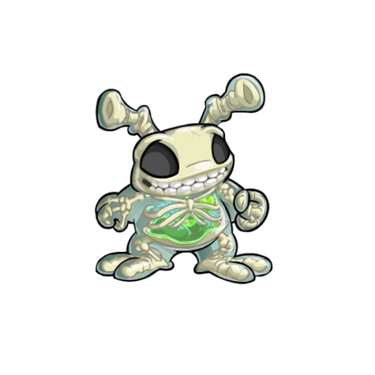
Transparent: Transparent is usually a pretty good-looking color by default, but the transparent Grundo goes the extra mile by embracing their alien nature and giving them these really cool looking glowing green organs, the only pet to get this treatment. The organs go great with the pale blue body color, and most of the anatomy looks solid. Granted, I'm not totally sure if the ears would have bones in them or not, and the ribs don't actually connect to anything... but then again, you can always say that's just because they're an alien and move on.
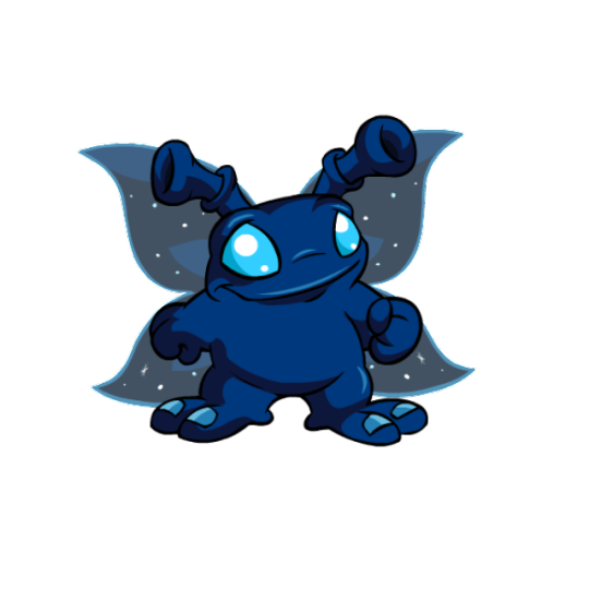
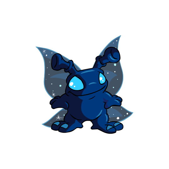
Faerie: Solid-colored faerie pets are usually a miss for me, as they often just look like regular pets but with wings. The faerie Grundo, however, is abosolutely beautiful. The dark blue base with cyan eyes and toenails is unique (or at least it was until the stealthy Grundo came out, but I digress), and the dark color helps cover for how plain the body is. Most importantly, though, are the wings, which are designed to look like the night sky. It's a great nod to the Grundo's space origins and is super different than the standard faerie fair (say that five times fast).
A UC/styled version is available, though the design changed so little that the differences are pretty negligible.
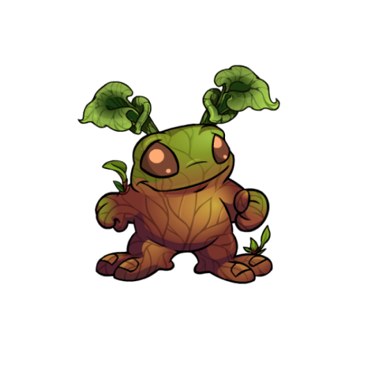
Woodland: I literally just went over this one in my woodland review so I'll keep this brief, but the woodland Grundo is super pretty. The leaf ears are absolutely perfect and the subtle gradient and leaf-like veins over the body are lovely.
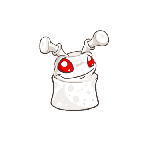
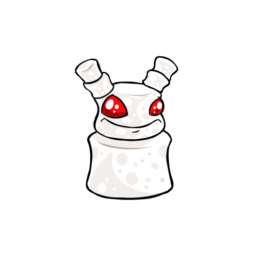
BONUS: It's always neat when pets get a species-specific color. In all honestly I have no idea why the mallow Grundo exists because there seems to be no rationale behind it and Grundos don't usually get food colours (unlike, say, Chias), but hey, I'll take it; its fun and silly.
Strictly speaking the UC/styled version is better because it looks way more marshmallow-y, but there's something just deeply uncanny about the face that I can't place but I really don't care for.
50 notes
·
View notes
Note
I agree that basic land type matters effects require a crafted limited environment, but there's so few of these, and you have other avenues for printing them while sidestepping limited now: Commander products, Universes Beyond, bonus sheets, fixed slots in boosters, etc. There's already a big disincentive towards running monocolored in most Eternal Constructed formats, twice so for Commander, so why not give monocolored a big shot in the arm?
We do make them from time to time, but they have to fit in the set we release them in. For example, they're an odd fit in anything but a monocolor Commander deck, and we just don't make many of those.
27 notes
·
View notes
Text
No. 33 - Vietnam Airlines


@twtd11 has asked me to cover Vietnam Airlines! And also two other airlines, but those don't need mentioning in this post, because this post is about Vietnam Airlines.

Vietnam Airlines is part of a very interesting trend. Inexplicably, it is very popular for airlines to make the top of their planes blue and the bottom white. Specifically blue. But unlike the more comprehensive sort of trend like...cheatlines, or Eurowhite...this phenomenon, which I'm sure I'll come up with a catchy name for in a timely manner, never manifests the same twice.
There are a lot of examples of it, and I plan to cover all of them if I can. I've already talked about Korean Air, but other examples on the docket include KLM, TUI, Azal Azerbaijan Airlines, Aerolíneas Argentinas, Air Tahiti Nui, and of course Vietnam Airlines.

I'm not surprised that they got requested fairly early on in this blog's lifespan for the simple reason that they're very striking planes. When I first saw a Vietnam Airlines plane I'll admit it - I was pretty wowed.

I mean, just look at these planes. There is something so absurdly captivating about the blue they've chosen for their livery's primary shade, and I just can't wrap my head around it fully. Even more than other planes, it looks entirely different in different lightings, going from a sort of metallic teal to a sharp cerulean.
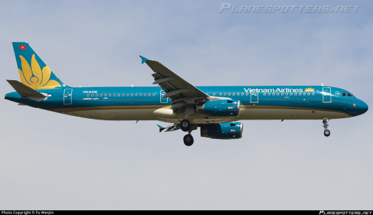
Of course, blue alone couldn't accomplish that. The choice to pair it with gold was really what made this livery coalesce, but once they have this gorgeous color combination, this vast untouched blue bordered by gold, the colors speak for themselves.

The emblem on the tail is very simple in terms of its shape, easy to recognize from a distance, It requires no detail save what can be expressed with negative space and thus doesn't need much to tie it into the rest of the fuselage - the gold stripe more than succeeds in making the integration smooth. It provides a large image that can be seen from far away, and I think it's both distinctive and elegant. I would say it could be improved by replacing the white with a lighter gold, but I actually did think that it was a lighter gold until I looked closer because of the crazy things this livery does with color.

Allowing the blue to take up most of the fuselage was absolutely the right move. It looks like a completely different color in every picture of it I've shown so far but it's always absolutely gorgeous. The interplay of blue, gold, and light hitting it is just spectacular to the point I've gotten this far in without even mentioning, say, the wordmark, which is fine but absolutely doesn't matter. Because this plane is a sea of whichever blue is your favorite, if you catch it at the right angle.

Nothing on this plane is detailed. Everything is large-scale, big sweeping lines and massive blocks of color, like it's all painted on with a massive brush. The logo isn't limited to the tail but it also isn't integrated into most of the fuselage. It just takes up the amount of space it takes up, not recognizing any sort of arbitrary boundary between tailfin and fuselage. There is a near absence of straight lines. Everything is curved and flowing and perfectly placed.

I hadn't been able to tell for sure if the underside of the plane was cream or white, but I have been informed that it is, in fact, a light cream. It's perfectly chosen. It lets the gold seem like the trim it is instead of a discrete block of color. It accentuates, similar to KAL's grey dividing line, but instead of facilitating a transition from blue to white it facilitates the blue's constant metamorphosis into something that's so much more than an essentially monocolor plane has any right to be.
Also, it makes the plane look a lot more fishlike, which is always good.

I think too much more detail would overwhelm this color combination, just because of how much of a statement it is upfront. It is an incredibly confident move to release a plane that clearly is trying to get away from the pack but has barely any features, and have those features it does have collide so elegantly into something so much larger than the sum of its parts.

There is a part of me that keeps fighting my conclusion, insisting to myself that it's mostly blue space, and ultimately it's inevitable. The fact that I'm having so much trouble limiting my selection of pictures because each one feels like it's a discrete different shade of blue kind of proves that to me. It's so simple, yet every single angle shows it off in a new way. If I ever saw one of these planes in person I wouldn't be able to look at anything else while it was within eyesight, and that just ultimately has to speak for itself, doesn't it?

And of course they had to put this livery on Dreamliners, too.
Grade: A
#tarmac fashion week#grade: a#era: 2000s#era: 2010s#era: 2020s#region: asia#region: southeast asia#region: vietnam#vietnam airlines#blue side up#flag carriers#requests
79 notes
·
View notes
Text
Split Decisions
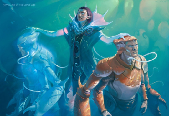
Choices matter all the time—and that includes the choice of card options. Sometimes you want to include a card that can go in either side of your deck depending on your choices, and sometimes those modes are definitely designed more for the limited crowd. What on earth am I talking about? Well, without splitting hairs, let's take a look into the past and check out some halves for this whole week..

Design a split card based on ANY* ONE previous mechanical precedents of split cards, which is as follows:
Invasion splits (uncommon, different colors, same type, related "&" name)
Dissention splits (rare/uncommon, multicolor cards that share one color, same type, related "&" name)
Dragon's Maze fuse splits (uncommon color pair OR rare multicolor-with-shared-color cards, same type, related "&" name, inclusion of Fuse mechanic)
Amonkhet/Hour of Devastation Aftermath splits (uncommon/rare cards with Aftermath mechanic & frame, can be different types, monocolor on both sides, "X to Y" name)
Guilds of Ravnica/Ravnica Allegiance splits (uncommon/rare split, two-color hybrid on one side & same multicolor on the other, can be different types, first three letters are the same on both sides)
Modern Horizons 2 splits (uncommon, same monocolor, different type, related "&" name)
Murders at Karlov Manor splits (uncommon, both sides hybrid with one shared color, can be different types, related "&" name)
What I'm excluding:
The Planar Chaos vertical cycle (because you'd be designing three cards, and I don't want that headache this week)
Doctor Who story cards (not that they're bad, but they're not about a mechanical identity)
WWWWW (No.)
What I'm looking for:
In the card name/flavor, a clever application of whatever world you choose (doesn't have to be its first appearance!) that's still sensible even if you have to stretch a little. Maybe a "with" or an "or" instead of the usual "&" name, or lingo that's a little more contemporary?
In the mechanics, a demonstration of how split cards affect limited both with their speed, castability, general archetype, etc. What decks want to play these cards, and why? How do they function on their own at the rarity and complexity you chose? Is it functional? Is it legible?

Anyway, see you later. I gotta split.
@abelzumi
>> SUBMIT to the INBOX
>> DISCORD and CHAOS
12 notes
·
View notes
Text
eyes fixed, yippee for consistency
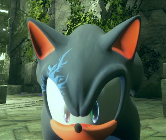
the fix was also the stupidest thing known to man: i simply re-exported the base game textures with the same settings i used for the red eye. i have 0 idea what paint.net did to the textures but i guess it somehow slightly affects the way they're shown in-game
also there is a little bit of Fuckery going on with the gradient and the transition in it is not fully smooth after all, probably because the area where they are in the image is mildly small
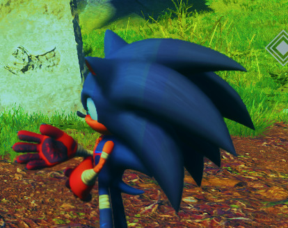
i added saturation to make the lines more obvious but yeah they are there unfortunately, i think it's also visible on the legs as well. i don't really know if there's a good fix for that, it might have something to do with the way dds images are compressed and the way frontiers handles them and that might make gradients way too tricky to implement. hella unsure if i wanna try to bruteforce them anyway or give up and have him be solely monocolor
#soda offers you a can#at least the eyes are fixed and those were the largest offender#i don't know why my paint.net exports change the eyes' appearance in the game and i have no answers for you#like im pretty sure my export settings are the way they should be but fuck if i know anymore lmao
9 notes
·
View notes
Text
Custom Magic Cards: Forgotten Companions Pt. 1
I've decided to design some custom Magic cards for the various Doctor's companions who missed out on getting cards for various reasons. My main rules I gave myself were that:
1) They should fit the design constraints of the official Doctor's companions, chiefly in that they're all monocolor.
2) They should try and synergize with both the deck their corresponding Doctor is in, but also synergize with the card of their respective Doctor as well when possible.
3) I'm holding off on designing the cards until after I get to know the companion in question, so I'm waiting to finish the bulk of a companion's run to make the card. I started my Classic Who watching with the Third Doctor, so I'm skipping any of 1 or 2's missing companions for now, and I haven't even finished 3 yet so it'll be a while before I hit the other classic companions.
So without further preamble, here's my cards!
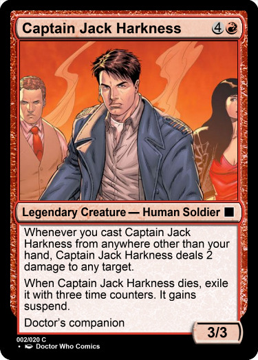
Notes: I was really disappointed to see Jack get left out of the Commander decks, which is kind of what kickstarted this project. I knew my biggest motivations going into this card were to find some way to represent his immortality that didn't rehash how they made Me's card and to make him mostly compatible with the 9/10/11 deck (he's chiefly a 9/10 companion) but try and make him compatible with the 12/13 deck as well (he appears a few times in 13's run.)
I picked red for his color identity both because it let him fit into both decks and because I felt like Jack as a character is pretty strongly driven by his emotions (lust is an emotion.) Plus, red gets phoenixes so it can get creatures that can revive themselves. After giving it some thought I remembered that there's usually a few second delay before he revives himself, so I came up with the idea of him suspending himself whenever he dies. This let him synergize with both 9/10 (extra upkeeps and time travel letting you revive Jack faster) and 13 (suspend causes him to cast from exile.) I then added the "cast from anywhere other than your hand" trigger because I felt like I needed to give him something other than the revival effect so he could be more than an infinite chump blocker. Direct damage felt appropriate for Jack's heavy usage of guns.
Jack was also the only character I could find a piece of official art for from the comics that looked decent as a Magic card.
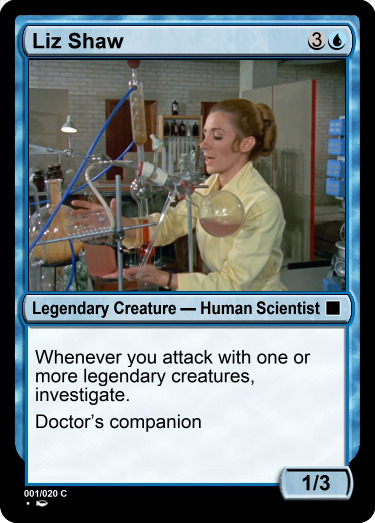
Notes: Ah, poor poor Liz Shaw. The Third Doctor's oft forgotten original companion. Fun fact: some later EU stuff revealed that she eventually married a woman, retroactively making her the Doctor's first ever gay companion!
I knew she'd be blue because the entire core of her character is that she's a scientist. I wanted her to make artifact tokens to let her work well with 3's card, and I decided on her caring about legendary creatures attacking to tie into the historic matter theme of the classic Doctors deck. I wound up specifically using investigate because it fit well with her role as the Doctor's lab assistant, often helping him analyze clues to figure out a mystery at hand.
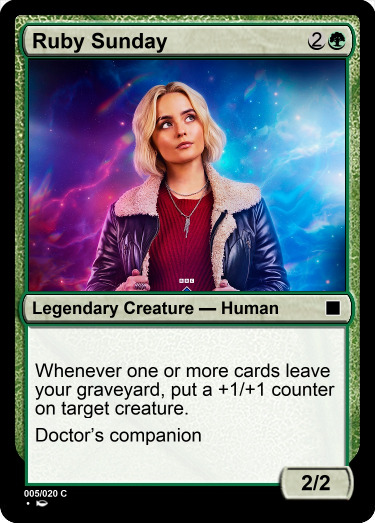
Notes: With 15's first season over and done with, I feel like this is a perfect time to pay tribute to Ruby. I rather liked her as a companion, and I really wish we had more than 9 episodes with her. Here's hoping she makes some fun return appearances in the future.
Ruby presented an interesting challenge because 15 was from the Secret Lair and didn't have an associated deck. This meant I had to focus entirely on trying to synergize her with 15's card and couldn't lean into the themes of the deck to help fill in the gaps.
First up was figuring her color identity. I thought it would be a nice touch to let the 15/Ruby pair lead a 3-color deck, so I knew I would be leaning towards green or white, which both felt appropriate given the strong emphasis on family Ruby's character has. I ultimately wound up leaning towards green, both because the recurring motifs around memory that surrounded Ruby felt more green than white and because I wanted to lean into 15 being a self mill/reanimator type deck and green felt like the better support color. This also influenced what direction I wanted to take Ruby's mechanics. I decided to mostly riff on Ruby's role in the finale and theme her card around the idea of "digging up memories." Caring about cards leaving your graveyard felt like a good way to do this, and I went with a fairly straight forward for green reward with the +1/+1 counters. I felt like this added some nice synergy with 15 because his effect triggers on both ETB and attack, so with Ruby you can potentially buff 15 when he sends artifacts he mills back to your hand, making him more likely to survive when he attacks.
And there you have it! These are all the ones I've done so far. As I get further in my Classic Who watching I'll probably make cards for more classic companions. I definitely want to do a Mel Bush card, but I want it to be based off her appearances in Classic Who rather than necessarily her New Who appearances so I'm waiting for now. Plus I can do something for the new companion we're getting next season.
#lexi rambles on#Lexi makes some magic#Custom Magic Card#MTG card design#Magic the Gathering x Doctor Who#Card mockups courtesy of Magic Set Editor#Jack Harkness art stolen from an official Doctor Who comic
5 notes
·
View notes
Note
You like dolls right? Monster high, MLP and stuff. What's a good one to get for Christmas
OKAY SO.
It really depends on WHAT you are looking for and maybe what age group, yadda yadda yadda. And here are a few doll series I love to see when I go out.
MONSTER HIGH
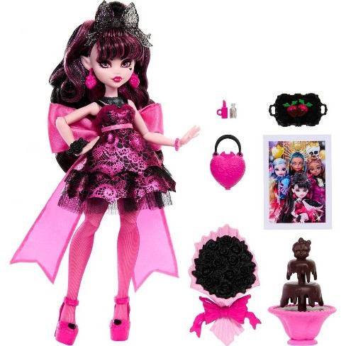
I think the new gen of monster high dolls are SOOOO good and very cute. They have nice variety in body types and so much color. I have multiple of them just because they are just so cute. And their pricing is decent.

RAINBOW HIGH
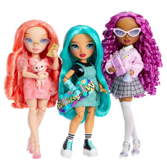
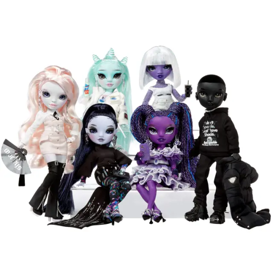
IDK, something about the rainbow high doll's faces is just...so appealing to me, i love them all being kinda monocolored and having their own fashion styles. and i- IDK THEYRE JUST RLLY BEAUTIFUL TO ME ESPECIALLY FOR LIKE-- A BASIC ON THE SHELF DOLL LINE. THEY COME IN NORMAL SKIN TONES, COLORED TONES, B/W IDK. THEYRE JUST CUTE.

LOL SURPRISE
so im gonna break this down into 2 lines as i DO NOT like the babies but I LOVE the fashion dolls.
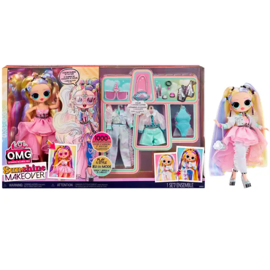
*LOL OMG
Besides their bug eye'd faces I think the fashion styles of these dolls to just be... so popping idk. They're fun to look at. If it's for a young kid/or you have a more conservative family who wouldn't be happy with brats I'd say be careful as they can come off as 'saucy' but tbh I think they're fine, the girlies are just fashionable.


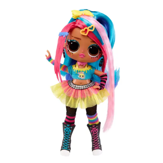
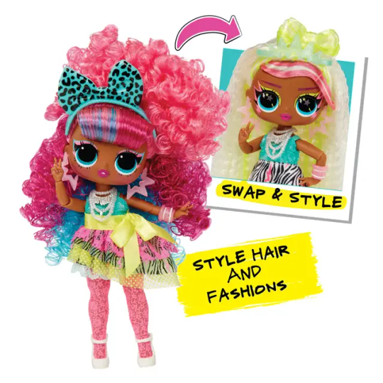
*OMG TWEENS
So like I stated before, if maybe theyre a younger kid/have a conservitive family who may get pissy I think the tween series is a good alt as they are very toned down but still SUPER CUTE and tbh the faces fit alot better with the shorter bodies.

I'm more of a casual like... doll fan but I do know there are alot of doll channels that do talk about new releases (I personally like Darling Dollz on youtube) If any more hardcore doll fans would like to suggest some for anon feel free to reply/reblog w/e with some of your favorite doll lines for a nice christmas gift.
12 notes
·
View notes
Text
Today I'd like to talk about probably the best designed card in magic the gathering and how much it teaches you about the game on arena, this being the humble Gigantasourus

This is a part of the arena base set, so every new player has it.
Off the bat a new player will notice a few things, firstly it's devotion. Five devotion to green means that this can only really be used in a mono green deck, and considering you are a new player that's ok as multicolour decks are a little daunting.
The other thing is those stats, a 10/10 for five is incredible, you haven't seen a 10/10 before and this is at half the usual price for power and toughness, 2 hits from this can kill a player!
You immediately throw 4 of them into a mono green deck, only to find out this isn't the game breaking card you thought it was, you notice it lacks all evasion and doesn't even have trample. Your opponents can just toss a 1/1 at it each turn to block.
Your opponent has a 3/3 flyer which is doing way more work than your 10/10, although they're running out of chump blockers.
And then your opponent uses another card from the arena base set.

Typhoid Rats, for a mere one mana can trade with a 10/10! a broken and annoying rat why was this even in magic? and soon their flyer has whittled you down.
And a new player has just learned that a 10/10 withought trample is often only as good as a 5/5
And flying creatures don't have to worry about blockers
And my god they need to get their hands on that rat, so they add black to their deck, which allows them to make a lot of use out of the high power creatures green gives them with cards like Eternal Thirst.
Giganotosaurus is a master class at show don't tell, it's a meh card locked into monocolor, that to a new player looks, like the best card in the game and shows them why it isn't.
48 notes
·
View notes
Text

2022, A year in minis
Well we're almost at the new year so I decided to drag everything I've painted out of its many boxes and lay it out to see what I've done. Overall I think this is the most productive year of painting I've had yet, with 123 figures finished in total. I crossed some big milestones with my admech, surpassing 1,000 and 1,500 pts of total painted models. I also started collecting necrons, started collecting battletech, and finished the last few stragglers from my cursed city box. My speed at painting increased this year considerably and I've definitely improved my confidence in my own skills- I've started using basic freehand and weathering techniques on my models and my airbrush is becoming a significantly more used tool even if my motor coordination isn't good enough for it to be a tool for anything more than monocolor base coats.
My favorite 2022 projects
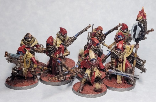
Scrap-mech. Equal parts infuriating and awesome. Cawdor bodies have some of the jankiest connection points I've ever seen but their aesthetic is top notch and slots right into admech. This was the first project I did using citadel contrast paints, and while I don't think they're the one stop replacement for normal techniques they were billed as they work fantastically as like an 'extra thicc' wash.

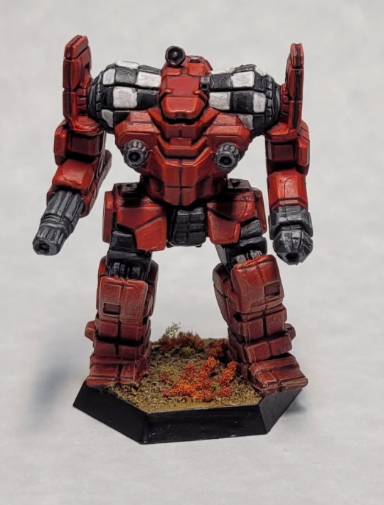
Battletech. I really did not expect to have as much fun as I did with these big stompy murder bots. The models are appropriately chunky and gave me a lot of practice with panel lining. I also discovered how much fun flocking is!
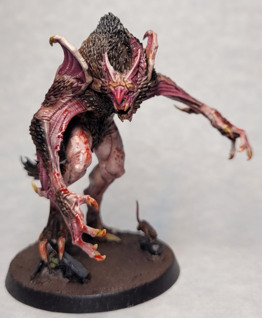
Vargskyr: One of my favorite monsters that I've painted and my absolute most favorite piece from cursed city. I had a lot of fun getting the hair to blend in with the skin on this big chunky boy.
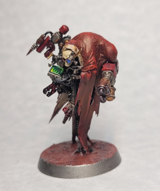
Tech-wraith Kitbash. This was an idea that came like a bolt from the blue while I was buying discount models that went from notion to build to done in less than 3 days. It's mostly bits and pieces from a kataphron kit welded into a cairn wraith but I'm super proud of it.

Flayed One Kitbashes. Flayed Ones are one of my favorite necron things period and after my initial spooktober idea hit a roadblock I fell into my backup plan, a flayer killteam. The lord is probably my favorite model I built out of the mix- he's mostly a primaris intercessor mashed together with an old warrior sprue.
Goals for 2023
Pile of shame busting: holy shit do I still have a lot of bare plastic to get rid of. My biggest goals for next year are going to be finishing my warcry and infinity starters that I've left to molder in their boxes and building/painting the rest of my admech backlog. In total I believe this is about 60 models
Spooktober project: last year I recieved a Seraptek heavy construct second hand that's been hiding in a box in my attic ever since. After reading twice dead king I've decided to make it the Seraptek from That Scene (you know the one) but life and the overwhelming size of the project meant I wussed out for spooktober this year. With another year of experience and time to plan ahead, it's gonna happen this time.
Advanced techniques: I've been experimenting recently with non-metalic metal and its absolutely nerd sniped me. I suck at it, but I see a glimmer of something I could get better at that I'm gonna try to claw towards. I'd also like yo try messing around more with various blending techniques in general.
Model photography: so far all of my models have had their photos taken using a desk lamp, a piece of calligraphy paper, and the phone camera on my Samsung. They're OK but I want to devote some time and resources into upgrading my kit and skills here.
#hobby#mini painting#miniatures#warhammer#wh40k#warhammer 40k#admech#necrontyr#adeptus mechanicus#battletech#year in review#2022#goals for 2023
48 notes
·
View notes
Text
i fink the logo or icon for stuff is like obviously not life or death but pretty important, both its value as an identity and its reproducibility, and endeavouros is so weird in like how much it seems to care about its perception including curating heavily configured versions of the desktops it ships with (very good too, at least for xfce) but its icon is just absolute dogshit. its literally not iconic. like its basically unrecognizable in monocolor ascii except that nobody else has a soft featureless blob as their icon, the color thing is literally the only recognizable element. its not connected to the name and its not even like, themed like anything. arch's icon is one of the best, you can recall exactly what it looks like from memory and its got pleasing angles and its connected to the rest of the identity of the design and you can make such heavily constrained versions of that graphic and it looks awesome. honestly really bumps down my feelings about eos which like objectively is so shallow of me but they market themselves on their user experience & modernity so like, this feels like meeting them where they're at. if it was a like, no refunds no returns dinky little dev project i wouldn't mind* but if you're the kind of brand that wants a good icon you have to have a good icon
*tux and the GNU icon are so fucking bad though. so fucking bad. i wish they were anything else
0 notes
Note
Play around with shapes!! What I've noticed along the line is that you can "copy" styles (e.g., the long coat) and make them look good on you if you cheat a bit. The coat is long and straight but you're kind of disappearing and it gives you no shape? Try a coat with a belt, or at least with a bit of a waist. This goes the other way around too!! Also play with colors and different coat styles in general, buttons, no buttons, monocolor, multicolor, pattern, no pattern etc. /and/ different length. Long coat isn't equal to long coat. Hope this helped!!
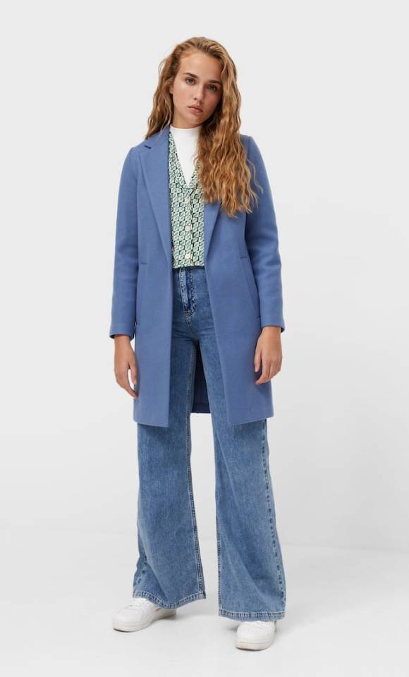
thank you anon!! <3 this is the coat i tried on yesterday (in black but you can see it better in this pic) and the style that i like, basically the most basic one lol the problem i have with these coats it's that they're all huge on the shoulders, so even if the rest of the coat looks great it doesn't matter because it throws the whole look off, if that makes sense?? this one was a size bigger than what i usually use, but it's the same problem i have with others I've tried so I'm starting to believe my body shape just isn't made for this type of coats lmfao
#i tried SO MANY coats last year and none of them fit me so i gave up in my search for one#i just wanted something more ''adult'' because all my jackets are either winter/hiking gear or 'hi im almost 23 but still emo wbu' jdhsjwhd
2 notes
·
View notes
Note
chia pop chia reviews, maybe? is there even a better name for those because chia pop chia sounds unwieldy but they aren't all fruit. potato chia pop when
(Note: I already covered a bunch of Chia-specific colours in my Chia review. To avoid redundancy, I'm going to list a few secondary favorites in this colour review so the entire thing isn't a repeat. Also, I'm doing my least favorite colour instead of species for obvious reasons.)

Chia pops are basically just those cheap ice pops where they come in liquid form and you toss them into your freezer. There are a bunch of them and for the most part they're normal food items... except for a few with the handful of "magical". For reasons that have never even been remotely explained in the lore, Chias that eat magical Chia pops change into a matching fruit/veg form, most of which are unique to them specifically. These additional colours give the Chia some flavor (both literally and figuratively) and are their main gimmick.


Conversion is a weird topic for these Chias. The bulk of them got redrawn and put into standard poses for customization (which is a particularly strange choice as they can't wear clothes anyway)... except for some that just didn't, for no clear reason.
Because the conversion was so uneven there's no way to make a judgement call for all colours, but on average I'd say that they looked better pre-conversion, as they tend to just look strange in the default poses—though on the plus side, most of them lost the weird lower lip that Chias used to have. Hopefully TNT will consider doing pet styles for these colours in the future so people can pick and choose what they like best.
(Secondary) Favorite Species:
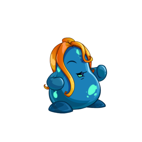
Agueena: Chias that are based on Neopets-specific fruits are always neat, and the agueena was already a good-looking item, so unsurprisingly the agueena Chia also looks pretty good. It's less fruit-like than some, but the cyan-on-blue splotches make for a good pattern that works really well with the orange hair-like "leaves". The shading on this one's also really good.

Banana: I like my fruit and veg Chias ridiculous, and this is a ridiculous colour all right. The elongated body is immediately distinct and fun, and I like how its partially unpeeled, which adds a bit more visual interest to it than it would have otherwise.
My only issue with it is that I wish the face lineart was colored so it matched the rest of the design. Also, the arms and legs don't seem to actually line up with the body quite right; I kind of feel like the legs should've been redrawn and the arms dropped entirely ala the onion Chia.
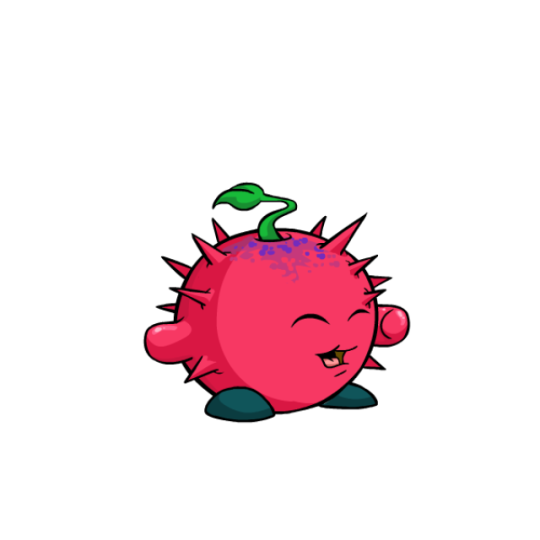
Thornberry: Another Neopets-specific fruit, this design is pretty similar to the tomato Chia, which is its only major drawback. However, I find myself liking the thornberry Chia more, as it has a bit more contrast with the dark feet and the texture at top breaks up the otherwise monocolor body.

This is absolutely a colour we could use a pet style for though, as the unconverted version was much better. Aside from having better face proportions, the variable sizes of spikes really added something to it.
Least Favorite Colour:
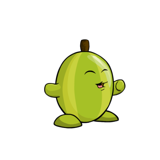
Gooseberry: Just kind of a strange pick of fruit to begin with (for those wondering: gooseberries are an actual thing, look it up), nothing about the gooseberry Chia has ever looked good. The colors are drab and low-contrast, the body is weirdly off-kilter and has poor shading, the face placement is odd (it used to be lower down on the pre-conversion art, which was better but not by much), and ironically the thickness of the stripes make it not look much like an actual gooseberry. Honestly, all this does is make me want a watermelon Chia.
20 notes
·
View notes
Note
Why do we see so few cards that reward playing specific basic land types in Standard, such as Blanchwood Armor, Armored Ascension or Flow of Ideas? These seem like a slam dunk for encouraging monocolored decks in Constructed, something that we see less and less of as dual lands are released. Take the Darksteel Affinity for Land Type golems for instance: they solve the high mana value playability issue very well while asking for a meaningful commitment.
Those effects work best in uncommon, especially if that's all they're focused on. At uncommon, those cards are draft traps though if the set doesn't support monocolor play. So, they're not something we can just drop in most sets.
32 notes
·
View notes