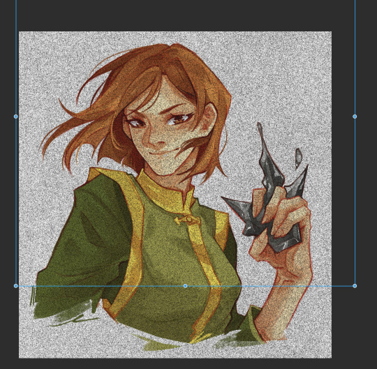
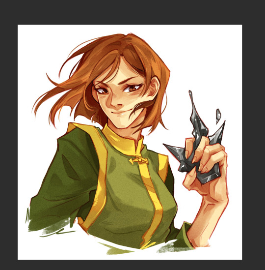
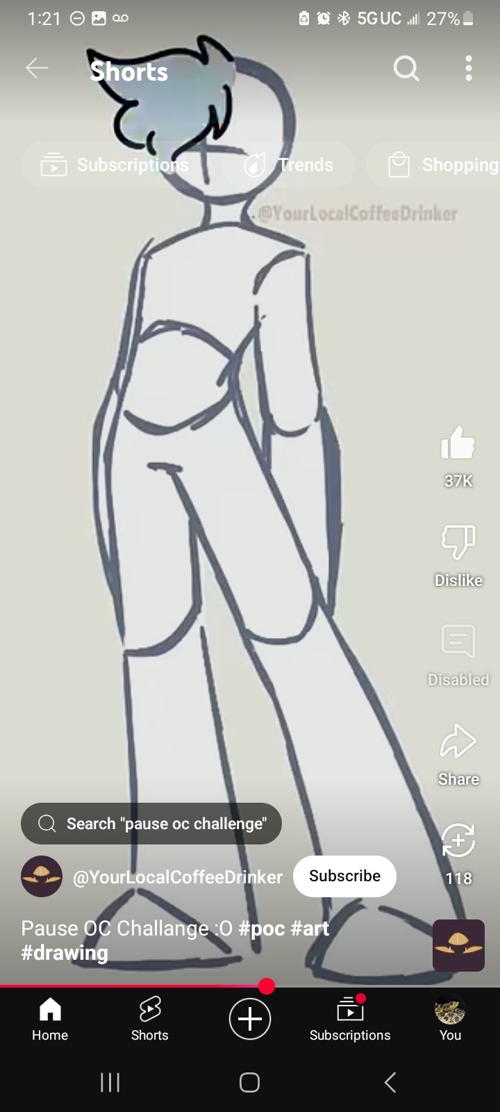
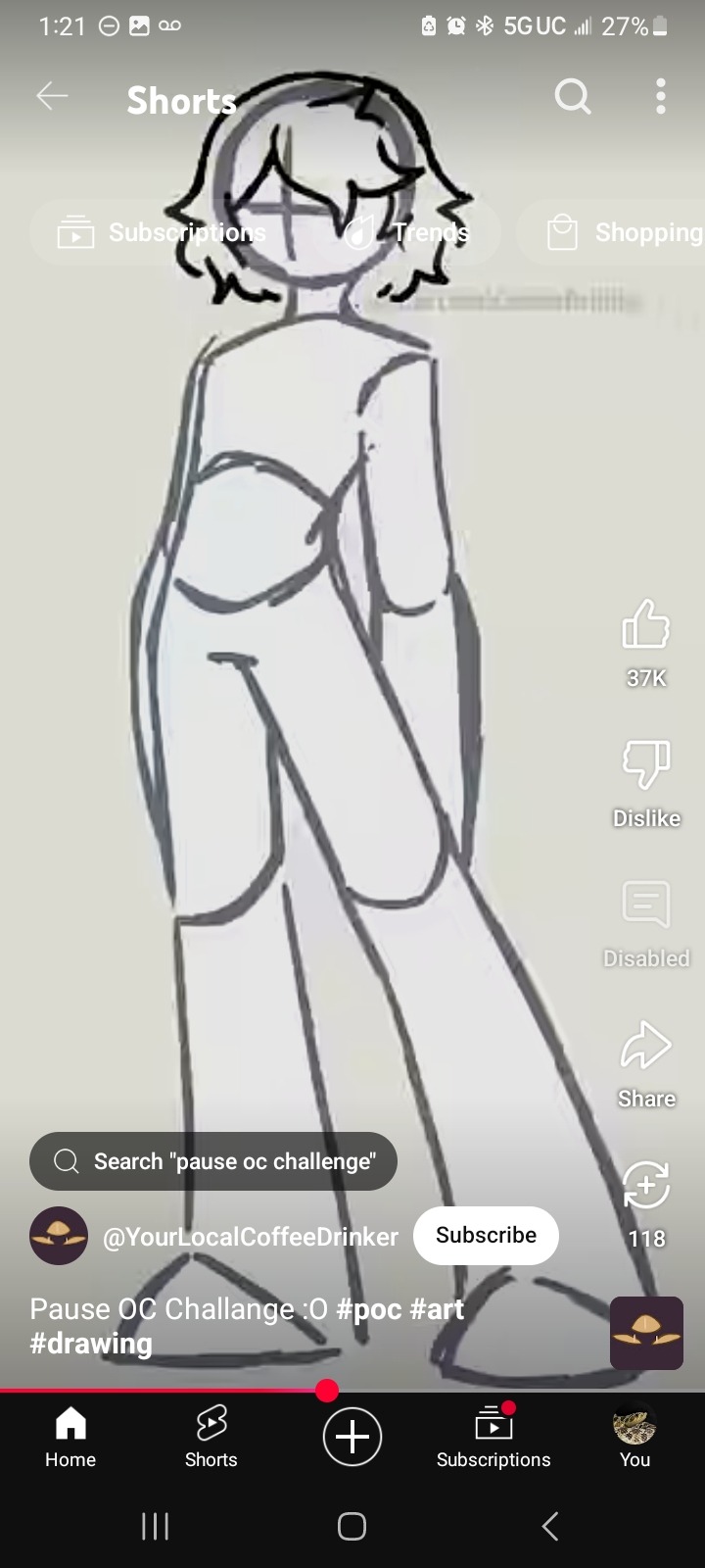
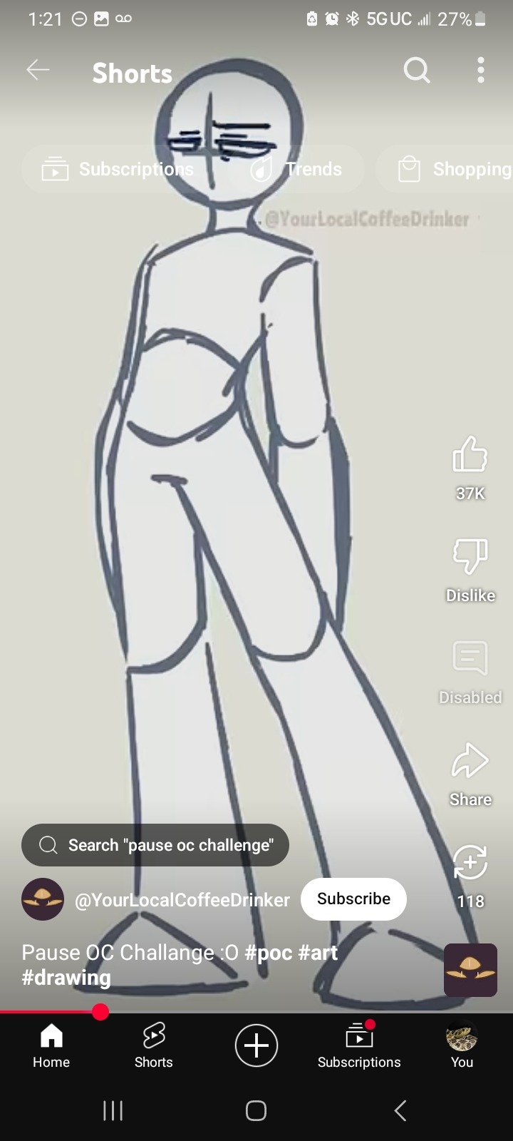
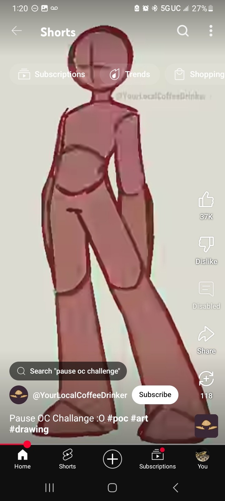
#there’s no lasso tool so it’s a little sketchy
Explore tagged Tumblr posts
Visit Tumblr Blog
Explore Tumblr blogs with no restrictions, modern design and the best experience.
Last Seen Tumblr Blogs


Fun Fact
In Q3 of 2020, 31% of US users access the Tumblr app daily.
Text
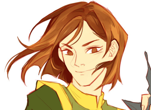
testing out procreate dreams :)
#jrwi fanart#there’s no lasso tool so it’s a little sketchy#but the app is suprisingly fun to use once you mess around long enough#jrwi the suckening fanart#my art#prince shilo#jrwi the suckening#jrwi#just roll with it#video#the suckening#shilo bathroy
156 notes
·
View notes
Note
sorry if youve talked about this before, but do you have any tips relating to your coloring process? i ADOREE the way you render things and it looks soso cool and once i saw a post where you said your art typically only took a couple hours and i was in SHOCK. cuz ive been working on a yuji piece that has a similarish (not really but idk how to describe it…) coloring style and ive been working at it for. about a month now…sorry this is rambly i hope u have a good day!!!
hi!!! first of all thank you so much I'm happy you like the way I render! honestly it Is still the aspect of drawing that takes the longest for me, I've only recently started to come up with ways to streamline my process (mainly through keeping my layers/brushes limited and overall being less anal about details) . these days my average drawing does take about 2.5-4 hours I'd say, with Big Illustrations obviously being the exception
i wouldn't beat yourself up too much about taking longer to finish a drawing tho ! it took me. a While to learn how to speed up and honestly my biggest piece of advice is loosen up and let certain things look imperfect or unfinished ! and if you're like i was and want to work at getting faster then i would recommend practicing churning out sketchy/rough pieces and see what tricks and habits you can implement or adjust to save time
all that being said I realize haven't done an updated overview of my colouring/rendering process so I guess this can be that ! I'll put it under the cut because i too like to ramble and this Will get long
lineart and base colour/underpainting


my lineart is nearly Always on multiply. it helps the lines stand out less starkly against the colours and makes it so that I don't have to change the colour of as many sections of lines later on
the base colour layer is honestly completely optional, tbh i sometimes skip it so you don't Have to have one but i like it for a few reasons: - I like to keep all my colours on the same layer so if i'm going for a painterly style this serves as an underpaint layer of sorts . having this means that when i paint, whatever colour i have here will blend with all the other colours i use and help them look cohesive - even if I'm not painting, i still like to work with all my colours on the same layer and it helps me make sure I'm not missing any spots, which helps when it comes time to section individual areas off in the next steps
2. flats

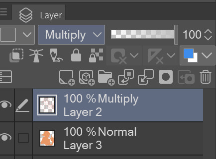
lock transparency button my beloved . this makes it so that you're only able to paint on areas where there is Already colour (which is where having an underpaint layer comes in handy)
not much else to say about this step, just choosing colours rly !
3. shading
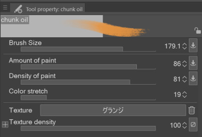
here's where the fun starts ! since i'm working all on one layer, i use the wand or lasso tool to section off whatever area I want to work on, then go in with (usually) one of the three brushes below: from left to right 1. my favourite dry brush that i use to cover large areas, it has an amazing dry paint stroke-y texture and i use it in everything. great for skin/clothes/hair/fur/organic material...she does it all 2. smaller, blendier/smoother brush that I use to soften out the rougher edges left by the first brush. I find it's really good for hair and small clothing creases 3. rough pen brush that I use to add little bits of flavour in the form of crosshatches or stray lines, usually to hint at individual hair strands! I also use it to line sometimes but I'm using it less for that recently
also, since the lineart layer is set to multiply, it's super easy to colour directly under the lines on my colour layer and use that as a way to make certain lines Darker . it's most obvious at the eyelashes and under the jaw but I do it everywhere

4. finishing touches and texture overlay
here I add another layer above the multiply/lineart layer and use it to add highlights and other details! this is also the layer i use to paint directly on top of any areas that got messy or need extra definition
my texture overlay of choice is just a rough monochrome static file that I got on the csp assets page but use whatever you'd like tbh ! set the layer mode to overlay and adjust the opacity to your liking (I also like to rasterize the layer to make it easier to work with but it's not too consequential if you skip that step since you're basically done by this point anyway)
And done ! slap a signature on that bad boy and send it <3

#answered#flowingredscale#art advice#my art#i rly hope this was helpful!!!#best of luck with your yuuji piece <3
34 notes
·
View notes
Text
I don't really know if this will resonate with anybody but something I've had to come to terms with as a disabled artist is that perfectionism is super harmful.
Leaning into incomplete or sketchy works has definitely saved me from spiralling and leaving art behind. It was hard though, and sometimes it still is.
But I think it's better to have made something than nothing, and as I've progressed I've grown really attached to figuring out what the intent of my drawing is and focusing on that alone.
I've made works where I spend a long time on anatomy and colour and details. It is/was super fun and during periods of time where I can trust my arms to work I will keep on with them.

But last year I committed to making a comic (that I cannot put online for some time yet because of contracts (sorry 🙏 )) and I knew that if I didn't manage my art and my body simultaneously it would never happen. I also unfortunately picked up a more strenuous job than expected during that time so it became doubly important to manage time as well as the two other things.


I forced myself into a silly little style (lovingly) where details only existed where it mattered and straight lines were unimportant. It feels wrong to call it bare-minimum but it kind of is.
I made a complete comic and that's pretty cool. Afterwards, I began taking a similar approach to my personal art, the stuff I didn't put online. Just 2 layers, a sketchy brush, the lasso tool, and gradient fill.


It felt wonderful to create. I'd had my autonomy in so many areas of my life reduced or removed but I had won this small, integral part of my identity back.
I still didn't think, though, that this art had much merit beyond self-satisfaction (which is SUPER valid, don't get me wrong). That was until I posted some of my silly Stardew Valley comics on tumblr and


Just, wow. I cannot express how amazing it felt to receive all of the kind words and cute comments about my little guy, about my art. I'm super anxious about responding to comments but you guys have really changed how I view my own art.
So yeah, closing statements are thus: -Some drawing better than none drawing.
-Expression is better than perfection.
-Scribbly little drawings of your favourite guys are good for your health.
-Thank you for every comment, no matter how small


7 notes
·
View notes
Note
any tips for non-stiff poses?
Here’s a couple things I do
If you’re taking from reference I think that you should attempt to use it as a SUGGESTION not as a 1 to 1 I see that a lot and it looks “correct” but often it can come off quite stiff. Try breaking down the drawing into the very basic direction it’s going in and those shouldn’t move and use those as guidelines

and this is typically if you don’t need much help with anatomy I think if you still struggle with basic form you should break the body into shapes first before you do “suggestion” one stiffness also depends on the pen you use use I use a pen that has zero line weight on it because I like the sketchy look so in that case I will add my own weight to it by adding shadows to make it a little solid(?) so I will manipulate the drawing by erasing likes adding stuff it make it blockier
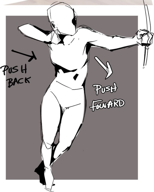
This can add a direction to the drawing kinda like a purpose if you ask me! Depending on the color of the background you can back light it but if it’s like a darker than the subject black shadows can make it less borinf by pushing those parts back into space~
Another thing that takes seconds just make it more interesting is like changing perspective if the pose is already stiff as hell is raising of lowering the “camera”
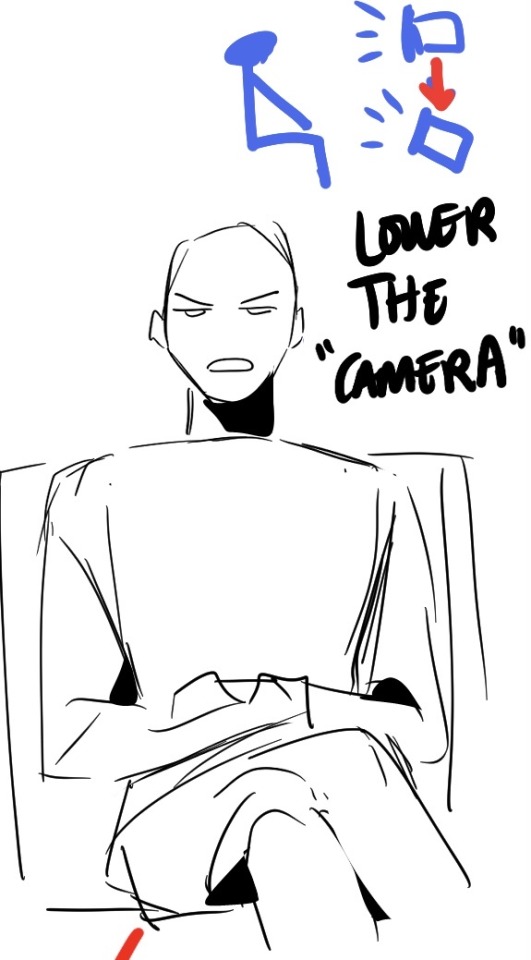
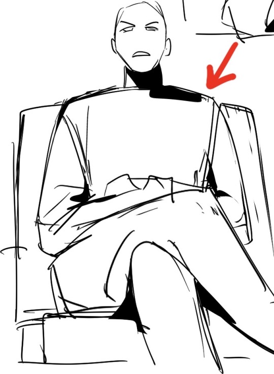
all you gotta do if lasso tool it and make things bigger and somethings smaller and change to face and stuff it LITERALLY takes like 2 seconds and makes it a little more dynamic and makes it more interesting
Hope this helps! :) I have a couple other things I do but these are like the simplest to explain!
88 notes
·
View notes
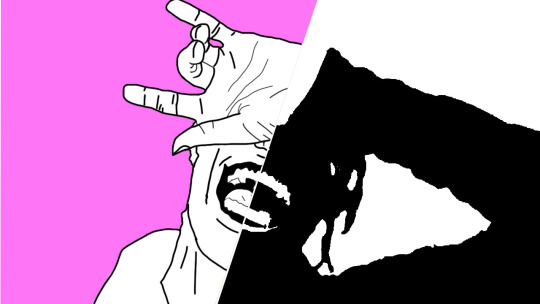
Photo

self portrait. digital art.
Image ID:
digital art self portrait of myself, Luna, a beautiful fat trans woman with circular-rim glasses and black curly hair with a plaid dress and sweetheart neckline shirt. The drawing is rendered with sketchy lines and looks kind of like a 'traditional' pencil drawing.
End ID.
Here’s something I drew last night! I haven’t done this kind of rendered grayscale portrait style in months, but this one might be the best one I’ve done so far! I’m really happy with how it worked. Doing this in digital art is easy mode though because you can lasso tool and change the proportions. (The tool isn’t a one-step fix of course, there’s a lot of stitching to do, but as it stands I’d be lost if I were doing this on paper)
The last time I did renders like this I exclusively used sketchy lines. But since then I’ve also done rendered color digital paintings. Maybe I should try rendering a face at some point, without being so sketchy.
reference photo and a work in progress below the cut.

This shows both how important drawing on a midtone gray and using highlights are (the drawing looks flat without the highlights, even though the highlights aren’t that bright and noticeable in the reference) and how difficult it is to get the proportions right on the eyes. It’s always the eyes that I struggle with more than anything--they usually go through two or three iterations as I work on one of these. If the eyes end up too big, they will not look cute, they will just look wrong.
you can even use the lasso tool and some stitching up to fix an entire drawing after you’ve decided you’re finished.

I shared this version on twitter and discord before I realized that I’d drawn my eyes too high and it was bugging me. So I decided to go back and fix it! The hair rendering is a little better in this version but whatever.
4 notes
·
View notes
Text
look at my oc boy

[rambling + extras under the cut. it's long. be warned.]
HOOLLLYY SHITTTTT THIS TOOK AGES AND I CAN SEE AFTERIMAGES OF IT WHEN I CLOSE MY EYES. I HAVEN'T HYPERFIXATED ON DIGITAL ART THIS HARD BEFORE . I AM A GOD
mk but in all seriousness i'm super proud of how it came out??? i did a lot of things differently and i think i've got the hang of it now tbh. i actually like the pose and the proportions aren't as bad as most of the digital stuff i've tried, and the folds in the clothes ended up looking okay!! color scheme isn't super coherent but oh well
no, i did not use a reference for the prosthetic, i know it looks weird but this took more effort than it should have. shading looks a little weird, and a lot of the details got fucked up [you'll se why] but hey!! i'm riding the high of success
timelapse nd shit:
observe!! the chaos of my drawing process lmfao. this is 6 hours and like. 15 mins. of pure motivation. i did the math. each second is about 30 minutes of work. three hours per minute. kill me
closeups:
tumblr killed the quality but it was already dead. turns out using the lasso tool and moving them makes the details blurry. oh well
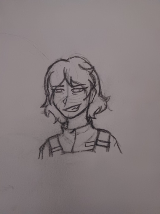
sketch:

i actually likd the lineart for this lmao. i'm definitely a fan of the sketchy/uneven style and the brush i use is semi-transparent so it's fun to work with
original/references:
^ the headshot i posted a while back, made at midnight in like 20 minutes. still like this one so y'all get to see it again.
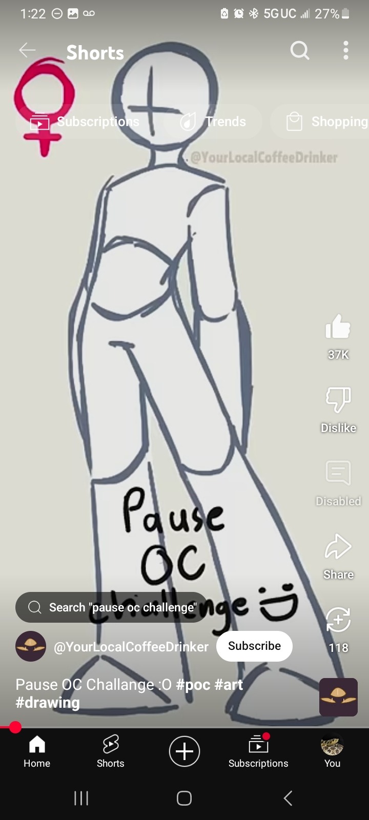
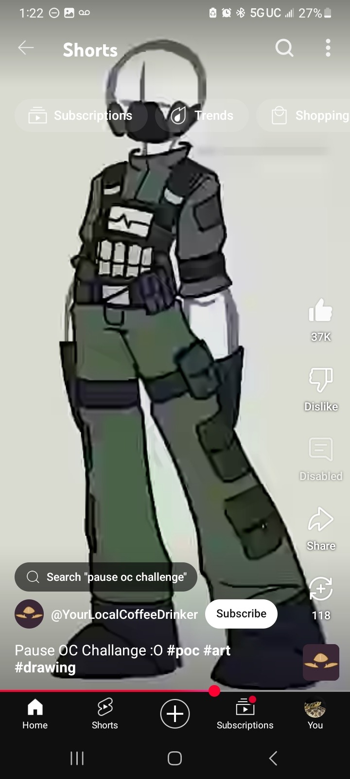
and, of course, the pause oc challenge that i used!!! credits to the creator, obviously, and shoutout to the gas mask that i fucking forgot about lmfao. no the tactical vest doesn't get details because there are Too Many Pockets on those things.
also everbody say thank you @specss00 for triggering this. i would NOT have made this otherwise but her blorbo ask reminded me i never made a reference sheet [or name] for this guy and it turned into 6 consecutive hours of drawing so. thank you specs i owe you all the cheese in the world
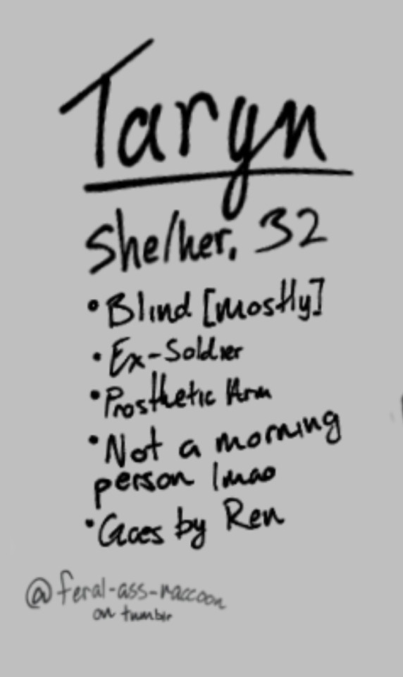
#raccoon's thoughts#raccoon's art#drawing around the hole in my phone screen protector is a BITCH#also. my hand hurts. ouw#i have 0 plot for this woman btw.#i just know she's a little shit and the self-proclaimed best friend of The Other Guy#[still need a name for him LMAO]#anyways. yeahg. i'm shaking rn this scared me#how did i do this#oc: taryn gray#bonus fact: she has a service dog!!!#didn't draw him but he does exist. his name is luke and he's a german shepherd/belgian malinois mix because i said so#and i didn't want to make him a holden retriever lol#i'm going to be incapable of drawing for the next 3 months aren't i#anyways uhh do not repost don't use for ai blah blah blah
0 notes
Note
do you have any tips on streamlining your comic/art making process? I colored in a doodled comic and the whole thing took me hours, I just feel like there's something I'm missing that would make the whole thing go faster? I know a part my own struggle is just learning the program i work with in the first place. apologies if this is somethin too specific to myself lmao
laziness, ultimately.
I think it's pretty universal for artists to assume they're doing something the "wrong" or "difficult" way, and that there MUST be some secret everyone else knows that you somehow missed. I know I definitely feel this way, especially about painting and layout design.
I think once I realized that the amount of time you spend on a comic =/= how much people like it, I stopped caring if I left things sketchy or uncolored or anything besides the bare minimum of what it takes to say what you need to say. I've been trying to practice skills I'd use in storyboarding, except I don't really think about it like "practicing storyboarding skills", I think about it like "what can I do to communicate this scenario as efficiently as possible". How clear are the poses? The order of dialogue? The pacing? The tone? Does the punchline land? Is the setting and placement of characters clear? What can I do to vary the perspective and angles to keep it interesting and aid the tone, without it being too confusing? Sometimes, I DO need to do a bit more with value or color or backgrounds, but I try to get away with conveying as much as I with as little as possible.
I skip a lot of steps. I don't do lineart, I just clean up my sketches. I rarely color things (but I'm trying to get better!) and when I do it's really sloppy and not at all in the lines, but it doesn't really matter. I don't think anyone cares much (not in a self-deprecating way, but a "most people are only going to look at this for a few seconds so fuck it" way)
Beyond that, keyboard shortcuts help a lot. I know screen tablets are the Hot Thing and seem like the industry standard for animation and illustration, but I can't imagine not having my hand on my keyboard the entire time I'm drawing. I use wayyy too many shortcuts to ever use the ones on my tablet, or one of those controller things.
Certain things like the polygonal lasso tool or CSP's nifty "close gap" feature on the bucket tool sure help a lot. There are somethings you'll always have to brute force, so you just have to practice getting faster at brute forcing it.
238 notes
·
View notes
Text
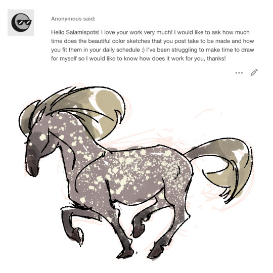
Hullo anon, and thanks very much! : ] The color sketches are spitpaints! There’s a group on Facebook called Daily Spitpaints where they post daily topics and you basically pick a topic and draw something in 30 minutes based off that topic. I don’t do them everyday haha (more like every other day?); there’s days where the topics don’t really interest me so I skip them. On the days where I do do them I try aim for at least two or three mainly so I can post stuff for yall on sundays haha. Tbh even if it’s a little bit of time to draw for yourself that’s progress :0 I know some people say draw every day for a certain amount of time but I’m definitely not one of those people haha so I think it’s more of figuring out what works for you and also not putting pressure on yourself (idk when I had the ‘oh no I have to draw something today’ thinking it ended up putting more stress and made me not want to do any art). Unless you were talking about more of time constraints and less of of what I word barfed above hahaha in which case again maybe a little bit of time like 5-15 mins of doodling for yourself while you’re watching a show or something can help getting into the habit? huahah hope that was helpful on some level anon
SO I actually have an ipad 6th generation (no cellular, 128GB, 9.7 in) because expensive hahah and after talking to other friends who got the same one; I got mine off of ebay for $325 w/shipping (the seller was chill to lower the price a little when I sent them a counter offer message) but then you gotta add in the apple pencil and if you get a case plus a screen protector. I use it for all the linework stuff and sometimes sketchy things; coloring and painty stuff are still on photoshop. It’s definitely worth it for me haha; still like photoshop way more in terms of painting plus they have the lasso tool which is kinda a must for me haha, but if you’re looking to get an iPad I guess it’s more of what your budget is? like if you have enough for a spankin’ new one then nice :0 but if not looking at older models is an option; I know Bestbuy for a while would have sales where they sold the 6th generation for $299, not sure if those are still happening. So I guess keep in mind size, how many gigs, if you want cellular or not, if you’re cool with one that’s refurbished or new or used, and model/make? hope that was a little helpful anon!
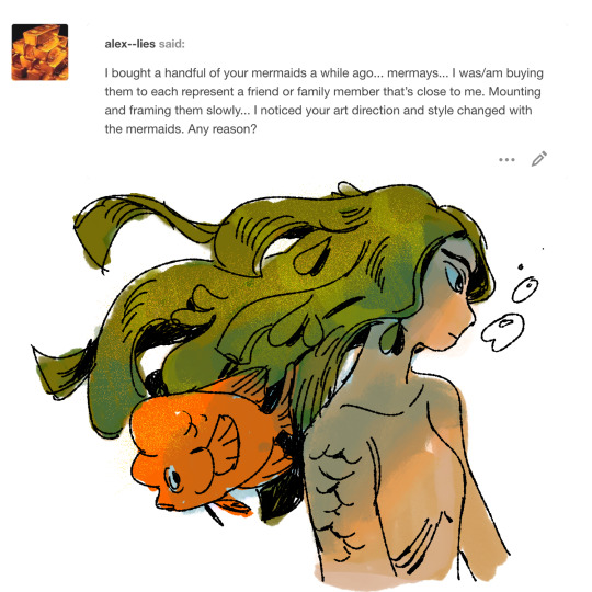
@alex--lies oh thank you! :0 and if you’re talking about for this year got a bit of art anxiety/frustration hence the style skipping all over the place (and now I’m just viewing this year’s mermay as more experimental/do-whatever-I-want haha). If you’re talking about in general hmm I like trying to do something different each year? Or at least change or alternate styles every mermay.
#technically this year's mermay was supposed to be a painty style but uhhh that's postponed to next year haha#also me getting an ipad has made drawing in line art style a LOT more convenient/fun haha#saturday asks#art asks#sweet potatoes#wAOW I talked a heckin lot today hhhjffd#come back later for a merm#wanna squeeze one in before tomorrow if not it's on monday
200 notes
·
View notes
Text
I wish I could draw a story. and I don’t mean a comic or something, here me out.
I’ve learned recently as I’ve started writing more that drawing and writing aren’t so different. you start with an idea, and its grand, and you can never make the finished product quite that. it’s because your mind’s eye isn’t the same as your normal eyes. you see the picture in your head, but you cant image the exact colour that the backlighting would create, you can’t see the detail on the leaves in the background in your head. you see the story, it’s huge, its emotional, its vibrant, and its not in words, its in concepts, and you can’t put concepts on a page.
so you stare at a blank page. and once you’ve put something down it feels more manageable. you’re not thinking about your grand idea anymore, you’re thinking about what’s in front of you. that eye needs to move over a bit. that sentence is a little wordy. where does the arm go in this pose? how should I transition to the next scene?
and most of the time, if your idea is ambitious enough, you work yourself into a corner. the painting’s a muddy mess. the details have been fiddled with too much. the story feels crammed or cobbled together.
it’s at times like that I wish I could draw a story.
because I think visually. and when I take a water break, zoom way out and flip the canvas, I can see whats wrong. I can get the lasso tool and go to town on it. trace or resketch and transform and paintover until it looks right.
but when I have a problem with my writing I find myself zooming way out in word and getting the highlighters, trying to colour code, trying to translate the cracks and blurs and sketchy lack of fullness into something I know.
I wish I could draw a story.
I’d draw character arcs in flowing lines like the one my wrists make without a thought. I’d align my pacing with the golden ratio, and I’d braid colour-coded plotlines together. I’d use movement to draw the eyes through the action scenes and I’d use detail to let the eyes settle on the sad moments, the quiet moments. I’d show my character’s lowest point in vibrant reds and blues against rich black, and after a climax of saturation and movement it would settle into complimentary colours, fade into pastels to set a mood of peace well earned.
#yammering#long post#never have i made a post that the tag 'yammering' was more accurate to#im just stressing my lads.#I feel like an idiot when I write. it feels so wrong and far away and messy and incoherent.#art is about communication. when i write i need to make you feel what i feel#I want to take something I love something that makes me emotional something that rips my heart out and heals it and sets it back in#and I want to give that to you. put my emotions in you and let you feel that catharsis and see why I love it so much#but too often it feels like the equivalent of just explaining why i feel these things instead of putting them in you#I can't make you understand on an intellectual level why its deep thats what essays are for I want to make you understand in your bones#but like with most communication methods i seem to struggle#anyways tell an artist if their work makes you feel things because thats all an artist really wants at the end of the day
2 notes
·
View notes
Text
ZINE - La Flame
In all honesty, I first thought I was going to just stick to the theme “CUT-COPY-PASTE” but the more I started to create my zines the more I wanted to be creative and make my zines truly outstanding. In total, I covered three themes for my zines. I covered “CUT-COPY-PASTE”, Layered chaos and Sparton zen. With my first zine that I created, I did not use the theme cut-copy-past. I ended up doing my own illustration and doing a sparton zen themed zine. I wanted the zine to be aggressive but peaceful at the same time, or dark / gritty and show enlightening hope. Because my zines involved around the artist Travis Scott, I thought it would be a good idea to portray his dark and gritty albums ( RODEO / DAYS BEFORE RODEO ) to his new bright up beat albums ( Birds In The Trap / ASTROWORLD ). With this idea in my head I thought it would be cool to illustrate a drawing of him with half of his face being blacked out with white sharp teeth. That would portray his old albums that were dark and gritty. On the other side of the face, It would still show sharp teeth with him smiling but with his face not being blacked out. This would portray his current album ASTROWORLD. He would still have the sharp teeth because In ASTROWORLD it still has slight dark themed meanings in some of the songs. I thought having a pink background would look cool as well and make the face pop out. In the beginning the split Travis Scott face had more detail in the creases of the mouth and chin but I wanted to make it more mundane. I ended up using the level tool and darkened one side while keeping the teeth bright and sharp. I wanted to use this as a front and back cover for the zines. The front would be the dark themed (Travis Scott) and the back would be the light themed (Travis Scott). I am happy about how my front and back cover looks but I think I feel like I could have added something more like a simple text.
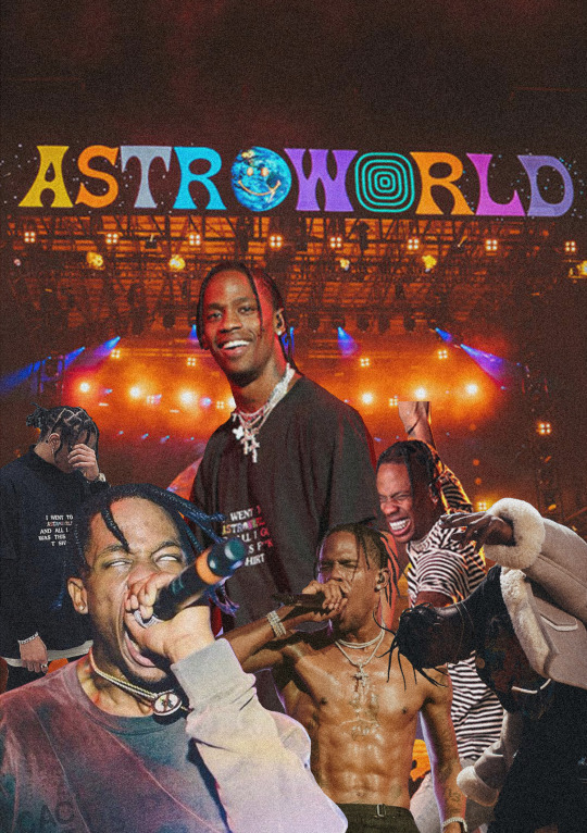
The second page that I had created ended up being a mix of layered chaos and CUT-COPY-PAST themed zine. I looked for images where Travis Is performing and going all out in performing. I got about three where he is live and looking intense. I wanted to use three to show his energy and craziness but also show that he is not just some crazy person. I got a pictured of him smiling to the fans as well. I used the magnetic lasso tool, magic wand tool, quick selection tool and move tool. This allowed me to take the images and cut out anything that I didn't want. I overlapped the images of Travis over each other and had the ASTROWORLD concert in the background. Because this page specifically has to do with ASTROWORLD, I tried to make it not look super dark or gritty. Hence why the biggest picture out of all the Travis's is him smiling looking over all the other Travis's. The last thing that I added was a grainy effect. I wanted it to look a little like an advertisement for a magazine ( just a little ). I thought it looked amazing and was not to complicated to create. It took time and patience to make sure I cut out each of the Travis Scott pictures. I have no regrets as to how this page came out for the zine. It was fairly easy compared to the other pages that I had to create.
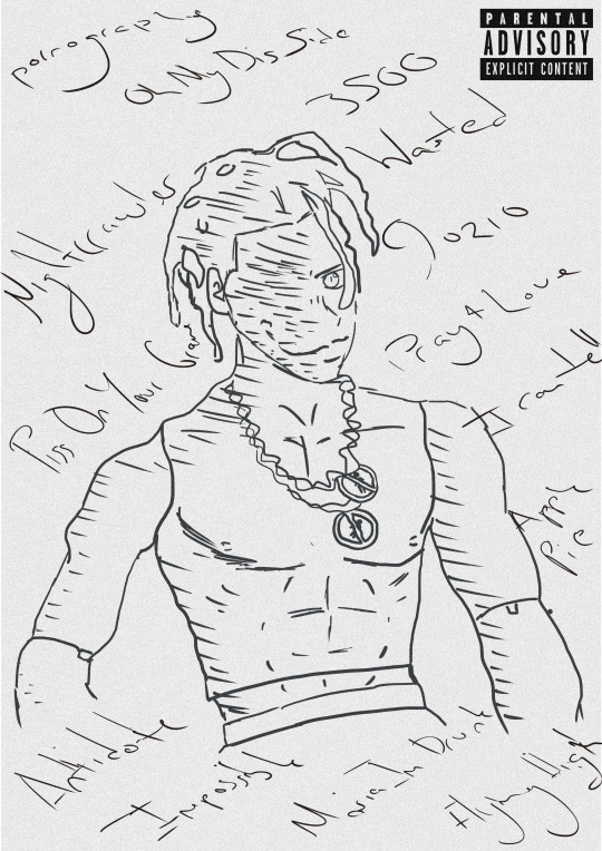
Moving on to the third page for the zine, It was now time to create A RODEO themed page. In the album rodeo, there is a very significant and recognizable figure in the album. The doll of Travis Scott is heavily shown for the cover of the album. I thought it would be a good idea to now base this page as a sparton zen themed page. I would then draw the doll with the names of the songs in the album around it. I wouldn't draw to much detail nor add colour. Why not add colour? I thought it looked better and would stand out more if it didn't have any colour. I kept that sketchy draft look of the doll by not erasing to much of the outline of the doll. Mainly used the brush tool and changed the hardness and texture of the brush to a more flow look. I added a grainy texture to it all to make it look even more cooler. If I had not added the grain, I feel like it would been to plain. I added the parent advisory explicit content box to make it look like an actual vinyl cover, or cd cover. I love this page because of its simplicity. I am indeed happy with this page. Because it is rodeo and sparton zen themed, I wanted to have the doll staring at you to indeed portray it as creepy but at the same time peaceful. Once again, I was trying to have all my ASTROWORLD themed pages not as dark and grimy as the RODEO themed pages.
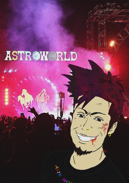
The fourth page that I had was pretty fun to make. I was on face time with my friend in my country, who listens to Travis Scott as well. We were talking about cool ideas and interesting things that a photographer could see at a Travis Scott concert. He started to talk about mosh pits and I instantly thought about what others don't see unless they down and dirty in the mosh pits. I decided once again to do a sparton zen theme page which would show aggressiveness but peaceful vibes. A person can indeed get a bloody nose and bruises on their eye in the mosh pit but they could also be enjoying themselves and have the adrenalin so they could possibly not even feel the bruises that they have. All true Travis Scott ragers know that If you go to a Travis Scott conert, there are no bystander's. You best be jumping and moving like there aint no tomorrow. I decided to illustrate a person who is at an ASTROWORLD concert a little bloody and bruised from being in a mosh pit but having a great time. This was very fun for me because I was able to draw a character from my imagination. Because I love drawing characters and in a manga style, I decided why not add a little manga inspired illustration to the page. I ended up with a character who had brown hair and wearing one of his merch t shirts. I got the ear piercing an nose piercing inspiration from myself. When I had initially finished it, I didn't like how the character looked unnatural and unrealistic. I added a grainy effect to it and also made his hair transparent a little bit and flow with the background lights and strobes. It shocked me as to how it looked way better than just him having brown hair looking at the photographer. Because it is sparton zen, I did show that it could be dark and gritty with the blood and bruises but I also wanted to show he is not angry and is actually enjoying himself. He is smiling. The main tools I used to illustrate this page was the brush tool, magic wand tool and quick selection tool. I also played around with the curves to change the darkness of his hair and transparency. I am extremely happy with what It looks like. I didn't expect it too turn out as good as it looks. I originally didn't like that he stood out that much because he is a manga inspired illustration but I think that when people draw non realistic drawings into realistic photos it looks eye catching. I had to fiddle around with the transparency and blending mode to get the proper colours set for his hair skin and t shirt. With the drawing tablet I have at home, it allowed m to draw it better than a mouse. But because it is a very tiny and cheap one, its not easy drawing like how I do on paper. I am currently saving money for one that the college provides or better.
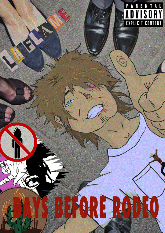
For this page, it has to be by far my favourite out of all of the pages for the zine. I personally like Travis Scotts old albums where his music was dark, grimy and gritty. Because this next page had to be RODEO themed I decided again to pick sparton zen. I also did a little bit of layered chaos for this page. This pages illustration was way harder to draw than the previous page. The previous pages illustration had slight bruises and blood but because this person went to a Travis Scott concert where mainly rodeo and days before rodeo songs where playing, the moshpit was a lot more aggressive with day one OG Travis Scott fans. I had to step out of my cum fort zone and draw a different perspective of a person lying on the floor chin up and thumbs up looking ok. I am terrible at for shortening so it was difficult drawing and SHADING the hand. I find shading hard but I tried best. Another thing is that I am very unused to drawing on a drawing pad compared to a good old pen and paper. The main reason why I ended up drawing on my pad Is because I didn't have enough time to copy and render anything where I could colour it in the computer. I did enjoy drawing the character though. In the page it shows the illustrated character ( wearing Travis Scott RODEO merch t shirt ) lying down on the floor with a bloody nose, swollen eye, bloody lip and dazed but HAPPY. You have other people around him enjoying the the party. This specific page took me a good set of hours to create. In total it took me about 8 hours straight no break to finish. The main tools that I used as the brush tool to draw the character, quick selection and magic wand tool to cut out the images that I would layer on top of each other. I also thought it would look sick as either an album cover, vinyl cover or CD, so once again I added the Parental Advisory image. I used once again a grainy layer over everything to make it even more grimy and dark. I honestly love this page a lot because I am proud as to how I am being aware of the importance of layers. Separating and creating new layers for each and every important thing. This shows that I can step out of my comfort zone and illustrate things I wouldn't usually. So yes I am extremely hay with what I created for this page. Love it!
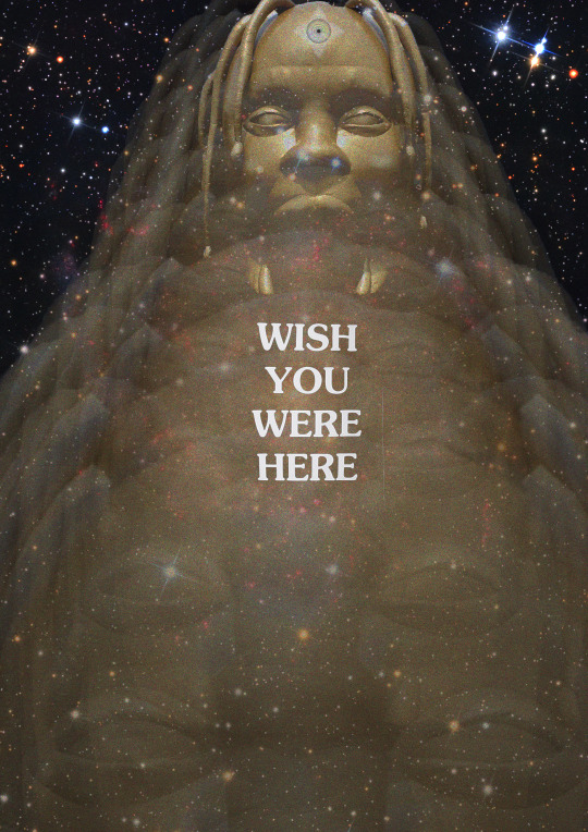
With the 5th page coming along , I wanted to create something pretty eye catching and tripy to look at. Because this page had to be ASTROWORLD themed, I thought it would be cool to implament a songs meaning. One of the songs of the album is STARGAZING. I thought it would be cool to have a galaxy looking page with the golden Travis Scott head fading towards the person. At the very end I made the Travis Scott Head pretty visible but bright. I also made sure there was a alaxy with sparkling stars and distant plants. I ended up putting the same text tat you get on the back of a t shirt if you get on of his merch T shirts. I decided to put it directly in the middle because It grabs the viewers attention. The eyes might wonder all around the page to see and view everything but in the end the main thing that will immediately grab their attention is the test “ WISH YOU WERE HERE”. I kept the text bright and white. In order to create such A cool page for my zine I had to duplicate the head, make them transparent at a certain limit and make them smaller as they move towards the back ( top of the page ). I left one of the heads not as transparent as the others and changed the blending mode. I also used the quick selection tool, magic wand tool and the magnetic lasso tool. This allowed me to cut out the golden Travis Scott head. The zine theme that I had chosen was layered chaos. Each head was being layered on repeat. I thought that this zine page was unique and outstanding like the others as well. It was simple but eye catching. I honestly do not really have any regrets o
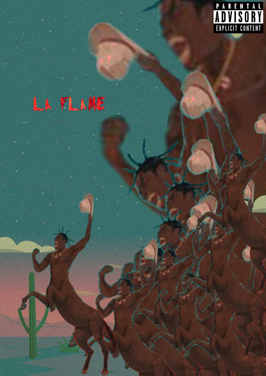
Coming to the last page of the zine, It had to be Rodeo themed. If you look closely you can notice a pattern. Rodeo themes page, astro themed page, rodeo … astro... etc. I decided to make the last page not only rodeo themed but also layerd chaos. I feel like the picture of Travis Screaming or galoping, what ever you want to call it , its a good representation of layers chaos. Truthfully when I finished this page, I thought it was a good way to end it. It shows a bunch of crazy, chaotic Travis Scott raging off into the Texas night. I put the text La Flame there in bright red letters because it is another name fans call him. Its red to implement ( flame/fire ) as well. I didn't want to add to much texts or random objects in it. I decided to put the main Travis Scott horse slightly away from the others to represent leadership. It looks like its Travis leading his loyal fans into the night to rage and party to the end. There is no size or gender that Travis will deny to follow him into the night. Creating, I used the magic wand tool, quick selection tool and move tool. This allowed me to cut out Travis and duplicate him. With the colours that you see that fade into the night, I made sure it all faded smoothly and pretty by messing around with the blending mode. I kept the parental advisory explicit content icon because once again it look kind of like a vinyl or cd cover. Because Travis Scott is from HOUSTEN TEXAS and names his album RODEO I thought it would be pretty smart to implement that into a zine page. In Texas the first thing that comes to my mind is cowboy hats, horses, bulls, cactus etc.
0 notes
Note
hi hina! i love your art so much i can't stop staring at your megumi and yuuji piece 😭 how do you usually render your paintings? do you use the lasso tool? how long do pieces like that usually take for you to finish? and when do you consider a piece to be done, like when do you stop working on it? sorry if these questions are a lot, or if any of these were already answered! please feel free to ignore, thank you!! i hope your 2021'll be a good one 🙇♀️🤍
hello anon!!! im so happy u like my art omg :’))) and no need to apologize at all <3
here’s a colouring tutorial I made a while back, my general process for painting hasn’t changed all that much ghfgs. Sketch>flats>details>effects using minimal layers if i can help it! I’ll also link a recent timelapse I did so u kind of see the full start to finish, you cn hopefully see a bit more of the rendering for yourself rather than just hav me try 2 explain :’>
whether or not I use the lasso tool usually depends on the amount of detail I’m going for with a piece though lately I have been making more frequent use of it. like if there’s Lots going on in a given area that I’m trying to render I’ll lasso it off so that I don’t fuck up anything else I’ve already worked on! I’m also getting into the habit of using it for blocking in initial hair shadows
my sleep schedule is so fucked so its hard 2 guess accurately but i think usually if I’m rly focused and in the Zone with like. ur average drawing it’ll take me a little under 24hrs? N for bigger pieces with more than 2 characters it can take anywhere from 2-4 days I’d say? u know oddly enough tht megumi/yuuji piece didn’t take very long at all I actually finished it all in the span of one evening i was really surprised at myself :’)
I consider a piece to be done when there’s no more sketchiness or glaring mistakes n I’ve had my fun playing around with the saturation/colour balance/contrast settings :’> slap a textured overlay on that bad boy and call it a day cast it into the void of tumblr n wait for validation frm strangers on the internet
thank u for asking and i hope this helps a bit!! happy new year to you as well~
20 notes
·
View notes
Text
Zine Evaluation
Before I started my zines I was required to look up what a ZINE is, collect a variety of visual zine examples and annotated why did I like it, what methods have been used in the design what it’s about, research into other graphic and illustrative styles, find at least 20 examples and annotate 3 in detail, why did I like it, what methods have been used in the design, what is it about, which style theme was I thinking of using , find visual references and influences online that helped me develop a style and consistent aesthetic and annotate.
In all honesty, I first thought I was going to just stick to the theme “CUT-COPY-PASTE” but the more I started to create my zines the more I wanted to be creative and make my zines truly outstanding. In total, I covered three themes for my zines. I covered “CUT-COPY-PASTE”, Layered chaos and Sparton zen. With my first zine that I created, I did not use the theme cut-copy-past. I ended up doing my own illustration and doing a sparton zen themed zine. I wanted the zine to be aggressive but peaceful at the same time, or dark / gritty and show enlightening hope. Because my zines involved around the artist Travis Scott, I thought it would be a good idea to portray his dark and gritty albums ( RODEO / DAYS BEFORE RODEO ) to his new bright up beat albums ( Birds In The Trap / ASTROWORLD ). With this idea in my head I thought it would be cool to illustrate a drawing of him with half of his face being blacked out with white sharp teeth. That would portray his old albums that were dark and gritty. On the other side of the face, It would still show sharp teeth with him smiling but with his face not being blacked out. This would portray his current album ASTROWORLD. He would still have the sharp teeth because In ASTROWORLD it still has slight dark themed meanings in some of the songs. I thought having a pink background would look cool as well and make the face pop out. In the beginning the split Travis Scott face had more detail in the creases of the mouth and chin but I wanted to make it more mundane. I ended up using the level tool and darkened one side while keeping the teeth bright and sharp. I wanted to use this as a front and back cover for the zines. The front would be the dark themed (Travis Scott) and the back would be the light themed (Travis Scott). I am happy about how my front and back cover looks but I think I feel like I could have added something more like a simple text.
The second page that I had created ended up being a mix of layered chaos and CUT-COPY-PAST themed zine. I looked for images where Travis Is performing and going all out in performing. I got about three where he is live and looking intense. I wanted to use three to show his energy and craziness but also show that he is not just some crazy person. I got a pictured of him smiling to the fans as well. I used the magnetic lasso tool, magic wand tool, quick selection tool and move tool. This allowed me to take the images and cut out anything that I didn't want. I overlapped the images of Travis over each other and had the ASTROWORLD concert in the background. Because this page specifically has to do with ASTROWORLD, I tried to make it not look super dark or gritty. Hence why the biggest picture out of all the Travis's is him smiling looking over all the other Travis's. The last thing that I added was a grainy effect. I wanted it to look a little like an advertisement for a magazine ( just a little ). I thought it looked amazing and was not to complicated to create. It took time and patience to make sure I cut out each of the Travis Scott pictures. I have no regrets as to how this page came out for the zine. It was fairly easy compared to the other pages that I had to create.
Moving on to the third page for the zine, It was now time to create A RODEO themed page. In the album rodeo, there is a very significant and recognisable figure in the album. The doll of Travis Scott is heavily shown for the cover of the album. I thought it would be a good idea to now base this page as a sparton zen themed page. I would then draw the doll with the names of the songs in the album around it. I wouldn't draw to much detail nor add colour. Why not add colour? I thought it looked better and would stand out more if it didn't have any colour. I kept that sketchy draft look of the doll by not erasing to much of the outline of the doll. Mainly used the brush tool and changed the hardness and texture of the brush to a more flow look. I added a grainy texture to it all to make it look even more cooler. If I had not added the grain, I feel like it would been to plain. I added the parent advisory explicit content box to make it look like an actual vinyl cover, or cd cover. I love this page because of its simplicity. I am indeed happy with this page. Because it is rodeo and sparton zen themed, I wanted to have the doll staring at you to indeed portray it as creepy but at the same time peaceful. Once again, I was trying to have all my ASTROWORLD themed pages not as dark and grimy as the RODEO themed pages.
The fourth page that I had was pretty fun to make. I was on face time with my friend in my country, who listens to Travis Scott as well. We were talking about cool ideas and interesting things that a photographer could see at a Travis Scott concert. He started to talk about mosh pits and I instantly thought about what others don't see unless they down and dirty in the mosh pits. I decided once again to do a sparton zen theme page which would show aggressiveness but peaceful vibes. A person can indeed get a bloody nose and bruises on their eye in the mosh pit but they could also be enjoying themselves and have the adrenalin so they could possibly not even feel the bruises that they have. All true Travis Scott ragers know that If you go to a Travis Scott conert, there are no bystander's. You best be jumping and moving like there aint no tomorrow. I decided to illustrate a person who is at an ASTROWORLD concert a little bloody and bruised from being in a mosh pit but having a great time. This was very fun for me because I was able to draw a character from my imagination. Because I love drawing characters and in a manga style, I decided why not add a little manga inspired illustration to the page. I ended up with a character who had brown hair and wearing one of his merch t shirts. I got the ear piercing an nose piercing inspiration from myself. When I had initially finished it, I didn't like how the character looked unnatural and unrealistic. I added a grainy effect to it and also made his hair transparent a little bit and flow with the background lights and strobes. It shocked me as to how it looked way better than just him having brown hair looking at the photographer. Because it is sparton zen, I did show that it could be dark and gritty with the blood and bruises but I also wanted to show he is not angry and is actually enjoying himself. He is smiling. The main tools I used to illustrate this page was the brush tool, magic wand tool and quick selection tool. I also played around with the curves to change the darkness of his hair and transparency. I am extremely happy with what It looks like. I didn't expect it too turn out as good as it looks. I originally didn't like that he stood out that much because he is a manga inspired illustration but I think that when people draw non realistic drawings into realistic photos it looks eye catching. I had to fiddle around with the transparency and blending mode to get the proper colours set for his hair skin and t shirt. With the drawing tablet I have at home, it allowed m to draw it better than a mouse. But because it is a very tiny and cheap one, its not easy drawing like how I do on paper. I am currently saving money for one that the college provides or better.
For this page, it has to be by far my favourite out of all of the pages for the zine. I personally like Travis Scotts old albums where his music was dark, grimy and gritty. Because this next page had to be RODEO themed I decided again to pick sparton zen. I also did a little bit of layered chaos for this page. This pages illustration was way harder to draw than the previous page. The previous pages illustration had slight bruises and blood but because this person went to a Travis Scott concert where mainly rodeo and days before rodeo songs where playing, the moshpit was a lot more aggressive with day one OG Travis Scott fans. I had to step out of my cum fort zone and draw a different perspective of a person lying on the floor chin up and thumbs up looking ok. I am terrible at for shortening so it was difficult drawing and SHADING the hand. I find shading hard but I tried best. Another thing is that I am very unused to drawing on a drawing pad compared to a good old pen and paper. The main reason why I ended up drawing on my pad Is because I didn't have enough time to copy and render anything where I could colour it in the computer. I did enjoy drawing the character though. In the page it shows the illustrated character ( wearing Travis Scott RODEO merch t shirt ) lying down on the floor with a bloody nose, swollen eye, bloody lip and dazed but HAPPY. You have other people around him enjoying the the party. This specific page took me a good set of hours to create. In total it took me about 8 hours straight no break to finish. The main tools that I used as the brush tool to draw the character, quick selection and magic wand tool to cut out the images that I would layer on top of each other. I also thought it would look sick as either an album cover, vinyl cover or CD, so once again I added the Parental Advisory image. I used once again a grainy layer over everything to make it even more grimy and dark. I honestly love this page a lot because I am proud as to how I am being aware of the importance of layers. Separating and creating new layers for each and every important thing. This shows that I can step out of my comfort zone and illustrate things I wouldn't usually. So yes I am extremely hay with what I created for this page. Love it!
With the 5th page coming along , I wanted to create something pretty eye catching and tripy to look at. Because this page had to be ASTROWORLD themed, I thought it would be cool to implament a songs meaning. One of the songs of the album is STARGAZING. I thought it would be cool to have a galaxy looking page with the golden Travis Scott head fading towards the person. At the very end I made the Travis Scott Head pretty visible but bright. I also made sure there was a alaxy with sparkling stars and distant plants. I ended up putting the same text tat you get on the back of a t shirt if you get on of his merch T shirts. I decided to put it directly in the middle because It grabs the viewers attention. The eyes might wonder all around the page to see and view everything but in the end the main thing that will immediately grab their attention is the test “ WISH YOU WERE HERE”. I kept the text bright and white. In order to create such A cool page for my zine I had to duplicate the head, make them transparent at a certain limit and make them smaller as they move towards the back ( top of the page ). I left one of the heads not as transparent as the others and changed the blending mode. I also used the quick selection tool, magic wand tool and the magnetic lasso tool. This allowed me to cut out the golden Travis Scott head. The zine theme that I had chosen was layered chaos. Each head was being layered on repeat. I thought that this zine page was unique and outstanding like the others as well. It was simple but eye catching. I honestly do not really have any regrets or thoughts of changes to it. I didn't want to add a whole lot to it and wanted to keep it like it is.
Coming to the last page of the zine, It had to be Rodeo themed. If you look closely you can notice a pattern. Rodeo themes page, astro themed page, rodeo … astro... etc. I decided to make the last page not only rodeo themed but also layerd chaos. I feel like the picture of Travis Screaming or galoping, what ever you want to call it , its a good representation of layers chaos. Truthfully when I finished this page, I thought it was a good way to end it. It shows a bunch of crazy, chaotic Travis Scott raging off into the Texas night. I put the text La Flame there in bright red letters because it is another name fans call him. Its red to implement ( flame/fire ) as well. I didn't want to add to much texts or random objects in it. I decided to put the main Travis Scott horse slightly away from the others to represent leadership. It looks like its Travis leading his loyal fans into the night to rage and party to the end. There is no size or gender that Travis will deny to follow him into the night. Creating, I used the magic wand tool, quick selection tool and move tool. This allowed me to cut out Travis and duplicate him. With the colours that you see that fade into the night, I made sure it all faded smoothly and pretty by messing around with the blending mode. I kept the parental advisory explicit content icon because once again it look kind of like a vinyl or cd cover. Because Travis Scott is from HOUSTEN TEXAS and names his album RODEO I thought it would be pretty smart to implement that into a zine page. In Texas the first thing that comes to my mind is cowboy hats, horses, bulls, cactus etc.
Overall, I think that my zine looks eye catching. It inst a bunch of flashy pictures on the front cover. Its got a simple face in the front which would possibly encourage others to open it and see what its about. I am profoundly happy as to how it came out. I was nervous because I originally created my zines as an A4 document but I was later able to change it. With my zines, it leaves the person not knowing if every single page will look the exact same. For example, If I had a zine about fruits. You could possibly assume that each page would have an image of a fruit. For me its different. The person would flip the page and see Travis Scott but automatically assume that it will be photos of just him page after page. As they flip though the pages they would see that it is Travis Scott inspiration illustrations and graphic designs. So YES, I do think that I have visual consistency. When the person flips to the next page its not something that they should possibly expect. With my zine, It actually ended up better than what I wanted to achieve portray. I am very proud of what I have created.
0 notes