#then final lineart (refine second sketch)
Explore tagged Tumblr posts
Note
First of all omg thank you for updating today my sign ups at uni took the entire morning and part of the afternoon and I spent it reading the chapter on and off 💜 beautiful timing
Do you happen to have drawn the drip for the clan meeting from any of the other clans? 👁️ 👁️ Or also alternatively do you have a doc or visual aid for the different clans and their representatives? I know it's probably silly buy I love knowing more or less who's who and I'm having trouble keeping track (• ▽ •;)
and THE CHAPTER WAS SO GOOD GAGSJSLLAKSJA that bamf zhongli tag is preening rn
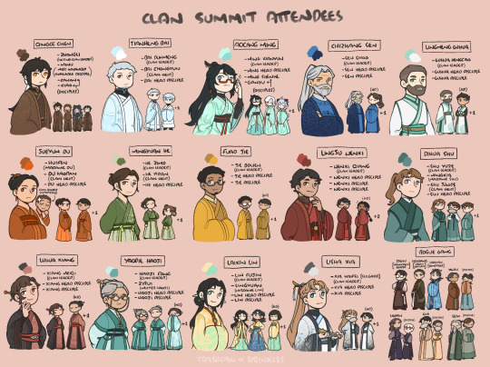
i had a color chart somewhere and some doodles so i've cleaned them up and compiled them + added those who were missing
edit: here's a version with the locations of their territory
#good luck on uni cofi 👍#it might look like a lot but that's honestly my second sketch. hence the diff brush n sometimes off proportions#it would've taken forever otherwise#by second sketch i mean step two not final lineart#i do first sketch (shapes) second sketch (the actual drawing but freehand)#then final lineart (refine second sketch)#also obviously all the robes would have better patterns etc etc y'all know the drill already hahah#sea gazer and mountain shaper have matching tassels bc old man yaoi#i don't make the rules i just enforce the weird details the game gives us#tell me why they made both old men birds friends and both old men stag friends like specifically above all the other adepti#why point out they were closest between themselves if not old man yaoi#this is even worse given sea gazer and skybracer are both dead in game LMAO mountain shaper and moon carver are widowers#anyway uhhhhhh yeah#ily <3 <3 <3 <3#thank you <3#fujin my beloved
99 notes
·
View notes
Text
Gonna try and see if I can smash out a 2-page comic in 4 days

[Image ID: A 3-panel sketchy comic snippet. The first panel has Saracen Rue looking down sadly. The next panel has him looking up, and the third is a wider shot of him standing with his back to the viewer, looking at the moon. The text "I hope that you are free now" is placed above him. / End ID]
It's not going to be a happy one.
#skulduggery pleasant#fanart#saracen rue#he's not gonna be the only character#that's as much as I'll say for now#also yeah this is what my rough sketches look like#after that it's first refine#second refine#then lineart#colors#and finally shading
13 notes
·
View notes
Text
art journal: Neve
Final image here: hey Trouble
Keeping notes as I try to refine my digital artwork process. This is my first full colour piece this year with proper steps :)
I'm not a professional artist; whatever I've learnt is from books, online tutorials and lots of trial and error. (This is the start of my second year of drawing regularly as a hobbyist.) The general artwork steps are: Construction > Line art > Shading > Colour
1. Assemble the ref board: I'm drawing from this reference photo for the pose. My board has this along with screenshots of Neve and official face sculpts.
2. I start out by sketching on my Android tablet with the reference board open on a larger monitor.
The anatomy sketch helps me figure out where the torso and limbs go under the clothes. I find it helps to keep the arms/hands and head on separate layers so you can resize and scale them after you're done.
3. Draw the clothes over the sketched figure, taking into account how different materials hang off the frame. (The shoulders of the suit jacket are padded and the wool is stiff, in contrast to the dress shirt that wrinkles more easily. Her arms press against the drape of the sides.)
Not pictured: work up to a full values test then decide your lines are too messy.
Then I go over it all again on a new layer to get my lineart very neat.
4. Next, block out the clothes, skin and hair on different layers with flat colours. (Couldn't resist and did her nails too). On a clipping mask, I add shadows in a very desaturated purple. This is helpful for figuring out overall images values without colour first.
5. I move the file into Photoshop on my laptop, select and fill the colours for my flats and adjust the shadows.
Colour is a brand new topic I'm tackling in 2025, so I'm learning as I go, but here's an excellent tutorial I've been following.
I add additional post-processing by playing with the blending modes of different layers and parts. (This is the most fun part!) For example, I move all the finer detail lines (nose bridge, collarbones, hand joints etc) to a separate layer set to "Overlay" so the base colours can peek through.
6. For the layout, I decided to zoom in more on Neve and adjust how much of the canvas she takes up. I add a simple graphic element to the background, as well as green highlights and bounce light for interest.
Check the levels one last time and make adjustments as needed to avoid extreme areas of pure white and black.
Then she's done!
Total time: about 12 hours over 3 days.
11 notes
·
View notes
Note
Can you do a step-by-step process of how you draw Link or Zelda?
i can try my best! hope this will be a good enough explanation😅
1. First sketch

I always start with with just a circle as a guide to create the shape of the head.
I use very simple dots for eyes just to see where to place them, which also helps me figure out the rest of the face.
Then I block in the general shape of the hair, shoulders etc.
2. Second sketch

Once you have those initial guidelines, its pretty easy start adding lineart on top. It can still be messy at this phase since the next step is to refine the lineart and fix any mistakes.
3. Line weight

I consider this the most important stage in my process. Line weight is very important! Its the step that can sometimes take the longest for me because I'm constantly adjusting lines, erasing them, adjusting again etc etc until I feel it looks good. Take your time and figure out where to put more/less line weight until you're satisfied with it!
4. Flat colors

If I'm being completely honest, I don't have a particular process for choosing flat colors other than just eyeballing it 😅 I like to use trial and error to figure out what looks good. I use references to figure out the colors, but I don't like to just use the eyedropper tool to pick the colors from the ref since I feel it never works well with my art. I just try to match as close as I can just by using the color wheel, and try to pick colors that go well together overall in the composition.
5. Cell shading

For shading and lighting I try to use cool colors like purple for the "dark" areas and warm colors like reds and yellows for the "light" areas. It gives this really neat effect where it looks like there's shading, but really its just a bunch of complementary colors working together. Occasionally I use the Harmony color wheel on Procreate to figure out which colors are actually complementary or analogous to one another.
6. Final render
The last step is to color the lineart with a clipping mask and add any final details, then you're done!

I hope that was a satisfactory explanation, I've never done a tutorial like this before 🥲 Thanks for the ask!
33 notes
·
View notes
Note
What brush do you use for your final lineart ? How do you color your sketch ? i struggle so much with this ;(
I can only tell you my brushes and process for Paint Tool Sai because it's the only program I know, but I'm sure it'll be very similar for other programs as well, you'll just have to find where to change your layer modes/clipping mask and for the brushes try different settings until they look somewhat the same I guess? :)
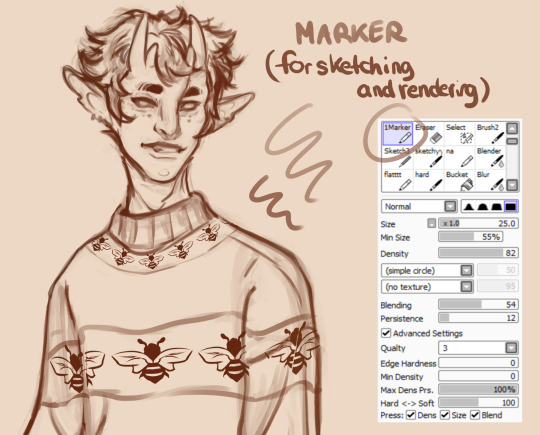
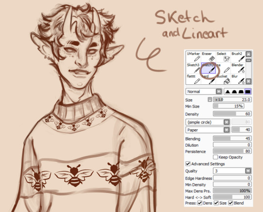
So first, my brushes : I only use two for my whole drawing and rendering process lol. One for the first sketch (a marker brush) that I also use to shade/render. And a second one to refine my lines, darken the lineart ↓
Now for changing your lineart colors, there's several options but the one that works for me is to keep your lineart layer in multiply mode, then add a new layer on top of it and clip it to the one underneath (it's called Clipping Group in SAI but I believe they call it Clipping mask in other programs) ↓
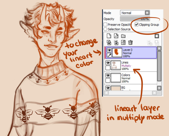
then you just have to paint in the clipping mask layer whatever color you'd like your lineart to be :)
Also as a note, if your Lineart layer is in multiply mode, you'll want to have layers with colors/shading/rendering always under your lineart layer or the layer effects won't work anymore. (You can see the exact order I keep my layers in the picture above)
Hope this helps! ❤️
44 notes
·
View notes
Text

Thanks for the ask, @strrwbrrryjam ! i'm flattered that you think I do a good job of that, because I'm still learning! (and I also struggle heavily with proportions. I have to resize my heads and arms so, so much...)
I'm afraid I don't have any secrets. I think the answer is to just practice, over and over again. But specifically, this is what I try to focus on as I'm learning:
references
quick practices - 30 second to 5 minute studies that help with getting a full scope of the shape and energy of the body, not meant to be perfect
studies - deep dives into certain anatomical structures (videos linked below)
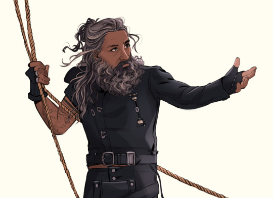
Below the cut is how I use references go from this to this:

References:
Use a bunch of references! Pictures you take, stock images, from shows--practice real people. Even if your style is heavily stylized, it all starts from an understanding of anatomy.
How I Use a Reference When I Struggle With Proportions:
The first step I take while looking at a reference is to just draw a very loose sketch with a line of action that goes then entire length of the piece, and I try to section it out. I find if I don't think about the body as a whole, and just start drawing a head, the head will be way bigger than the rest of the image. So my first step is just really boxy and basic, just to get all appendages on paper. My first pass could look like this:
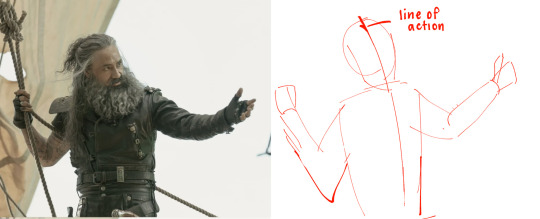
Okay, not bad. But the right arm is going way too far down--the forearm is really long. The head is too big for the style I want, and the left arm is at a 90 degree angle, unlike the picture. But, I have the general scope of everything on the page, so it's easier to adjust and look at the full picture!
Then, I try to focus on landmarks. I look at where certain body parts fall in the reference. For instance, Blackbeard's right elbow doesn't reach his belt, so his elbow shouldn't be near his waist. I can tell that his left arm is closer to being straight than at a right angle, and I can see that his head isn't as big on his shoulders as I have. I can also look at the negative space and see that the gaps between his right arm need to be smaller. So my next pass might look like this:
(I don't usually draw on the reference image, and I just "draw" the lines in my mind, but the for sake of things...)
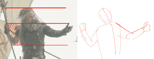
Now it's looking a bit closer!
The next is the harder part. It's making things shapes, and is closer to the lineart stage. I try to follow curves, separate the chest from the torso, get the angle of the shoulders and head, etc. I have some video links at the end that explain this step much more in def.
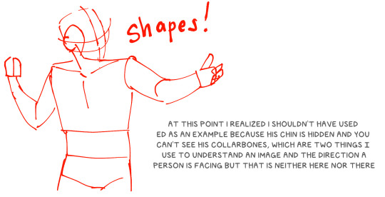
You may notice that the head angle is a bit different than the image, and the shoulders are a bit lower. Sometimes, following a reference image completely either doesn't fit your style or, in some cases, the more accurate drawing following a reference can actually look "wrong" (anatomically) when drawn. Figure out what works best for you, and for the message you're trying to get across in the piece!
[sliiiight flashing in timelapse]
And here is the final timelapse, with a little refining and polishing of the anatomy. Not everything is completely accurate to the reference image, but I've created a believable image in the likeness.
I hope this helped! This was a quick and dirty post of something I'm still learning. Here are some youtube tutorial artists, resources, and books that I use to learn!
Youtube:
-ModerndayJames has lots of videos on creating shapes and understanding anatomy, and placing people in perspective. He has a lot of free videos, and then some cheap ones on gumroad that go more into it.
-Proko has lots of videos on anatomy!
Practice Resources:
-Pose Maniacs - figures in different poses. You can move the camera around to see different angles.
-QuickPoses has images for figure drawing and quick gesture drawing! You can even have different timers.
Books:
Morpho Series. There used to be the one on "Fat and Skin Folds" that was a free PDF download that was on tumblr for a while, but I don't believe the books are that expensive.
Taco's Books, published by Lezhin. This is heavily anime styled, but talks a lot about anatomy, and is a great resource!
#art tutorial#asks#mytutoirals#myart#proportions#turns out you can't add videos to asks and if you try it makes the post uneditable#so i couldn't answer your ask directly. hope you see it sorry!#anatomy tutorials
60 notes
·
View notes
Note
Do you have any advice how to draw as fluidly and free handedly like you? You art feels very "free" in a way
hii this is one of the best compliments I’ve gotten because I’m always so worried about my art looking stiff <3 I wish I could give you a lot of Good Advice but mostly I’m doing processes I don’t understand.
Mostly I think of things as Basic Shapes and Lines. Usually not refined at all because I don’t worry about any details until later.


That’s why a lot of my sketches look like this. No worrying about correctness or detail or anything. These are my Form Creatures. I am getting down a Pose as quickly and messily as possible


ALSO. A lot of the time my first sketch is actually my lineart I just clean it up a bit. But also a lot of the time I do a Second Sketch, which is NOT lineart because it’s just as loose-handed and messy, but I can comfortably clean it up along the way. I don’t know if that makes sense though.


and. If I’m doing poses I’ve never done before I go through the extremely tedious process of literally drawing them over and over and over again until I finally feel like the result is not stiff enough. I frequently draw the same drawing/pose 3-5 different times. It helps me get more used to it so it’ll come more naturally, I guess??
I’m really sorry I wish I could give more advice but again I’m Mostly fucking around. I would say Be Messy with it. Also sometimes I do gesture drawings or form studies and I think those probably help. But who is to say
#I hope this uhhhh makes any sense#BUT THANK YOUU#asks#all except one example being mob psycho…I’m in so deep help…
7 notes
·
View notes
Text
So recently I had the pleasure of designing this pin and sticker for @innbetween's season 5 crowdfund! Which (as of posting this) is ALMOST OVER! Go support them!!!


[ID: Two similar circular designs of the quote "If you don't like what you've become, you may change again." The first only has the second half of the quote. The border is made of branches, with leaves sprouting from the branches on the left and empty branches on the right. One acorn hangs from one of the empty branches. Along the bottom of the border, plants sprout on the left while mushrooms grow on the right. The background is dark green. In the first design, the text and all the lineart is gold, and the leaves, plants, acorn, and mushrooms are colored in simple flat colors. In the second design, the text is gold, but the branches are brown, and there is more detail and texture in the various parts of the design.]
Since the crowdfund is wrapping up I wanted to share some of the early designs and some of my thoughts on the finished design, because honestly i loved a lot of them.
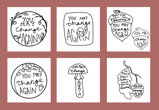
[ID: Rough sketches of a variety of designs, all featuring the "If you don't like what you've become, you may change again." Some feature only the second half of the quote ("You may change again"). The first is a sketch version of the design above. The second is a rounded rectangle, with the "I" on again being dotted with sprouting mushrooms. The third is a pair of acorns, one with the full quote and one with the half quote. The fourth is a circle with a tree with an acorn falling from it. The fifth is a mushroom. The sixth is an acorn on a branch, with the first half of the quote on a leaf and the second half on an acorn.]
You might've guessed it, but considering Tode, who says the quote in the show, is a druid, the designs are all heavily nature themed.
Fun little note! On all the designs, the leaves are oak leaves to tie into the acorn, and the mushrooms are based on Amanita muscaria, which is among the mushrooms most frequently called Toadstools (see what i did there).
In all honesty, when Hannah came to me with the quote, the first design that came into my head was the one that we ultimately settled on. We actually took another design (the other circular one with the oak tree) to a more refined stage, but the final design just clicked in the end.
And here's a little breakdown of that design! There's a lot of elements going on here, but in general I wanted the details to represent that no matter where you are in life, you still have the potential to change. Thus, the 'cycle', so to speak.

[ID: The final design, this time annotated. There's a circle of labels around the border, with arrows pointing to the next label. The cycle is "Sprouts: New growth" → "Oak leaves: Life, thriving" → "Bare branches: Death/dying" → "Acorn: Seed (potential/rebirth)" → "Mushrooms: Decomposers". At the bottom, there's a horizontal line that's split down the middle. To the left is "Life" and to the right is "Death"]
Here's the thing: I had so much fun with this design. It was fun to think through all the little things I could include, and it was so much fun to work on a design for a show and a sentiment that I love with my whole heart.
So once again, if you want a sticker or pin with this design, or if you just want to support an incredible podcast, go support Inn Between's crowdfund! And if you do get one of my designs, tag me in it when it gets to you, I'd love to see 👀!
#inn between#han doodles#also if people are interested i also have a bunch of alternate colors for the design that i could share#and some more refined sketches#the behind the scenes stuff is interesting to ME but idk how much other people are into it and this post was very long lmao#anyway i'm so happy with this design and if you get the pin or sticker you should tag me in it <3
32 notes
·
View notes
Text


First three: progress (lineart, flat color, shading)
Fourth and fifth: Plain black lineart vs Coloured lineart!
Sixth and seventh: my layers!
I don't typically show my progress/process on art, so I thought it might be fun to talk about this piece a little!
My pieces usually start with a loose/messy sketch. Then I either clean it up and turn it into lineart, do thick lines over the messy sketch, or I do a second more refined sketch for higher detail lineart.
This piece was a bit different! The original sketch was Grian, but after not that much thought I decided to draw Pearl instead! I didn't do a second sketch, just jumped right to lineart. So, the lineart for the hair was done with no sketch!
I did the base lines then added the finer lines for more detail. I don't usually draw hair this way, so it was a fun challenge! I drew the hair like this because I really wanted this to be reminiscent of statues of fallen angels, kind of an ethereal vibe. I've been struggling with art block lately, so this is some experimentation to hopefully get back into the flow of things!
After the lineart was done, I returned to my usual process. I used a clipping layers to add in all of the base colors, and then used multiply, overlay, and soft light layers to do the rendering. This piece is lightly rendered, I didn't do anything too high detailed with it.
After that was all done, I used another clipping layer over the lineart to color it. I find that it adds a lot to the piece and makes it come alive!
Finally, I added the background and my signature over it. Viola!

her.... OTL
52 notes
·
View notes
Note
Out of curiosity, what's your art process like? I've never quite gotten the hang of digital coloring, so I've been studying a bunch of my fave artists to try and figure it out lol.
I adore how you draw The Boys, and you're super cool in general 😎 also it's nice to see an openly trans artist online (I too, am a trans guy)
Llap, fam!
Hiya anon!!!! That's a bit of a tough question to answer, as it's very dependent on the type of drawing I'm doing! But it usually follows the flow of: gather reference if needed > loosely sketch out overall shape > second more refined sketch > lineart if needed > flat colors > shading if needed > highlights/detailing > colors correction > final touches!
sometimes I'll skip certain steps, or do some of them out of order, but that's basically it? I think so at least!
I made a timelapse video of the last drawing I did of Bones in the toga if you'd like to check out, it shows my overall process for a more complete illustration from start to finish;
#reply#anon#also THANK you anon!!!!!!!!!!!!!!!!!! <3333333333#i'm glad you like my art!!!!!!!!!!!!!!#stars ur trek
150 notes
·
View notes
Note
Okay as a fan of your art I have a question for you. How do you get your line perfect? And how do you keep your style consistent. I have the hardest time with those two things, what is your secret???
I'm not sure I'd be much help because these questions have been bothering me as well.😅
Sometimes I would draw a detailed sketch, between the figure and the final lineart.

Most of the time I would not.

In this case, I just refining the rough sketch, tidying up the lines with the eraser tool. To be honest, it takes a lot of time.
So I always admire people who can draw smooth lines quickly. 🥺
Regarding the second question... I'm normally not trying to keep my style consistent, but I do use specific ways to draw different characters (like facial features, how I want these characters to look).
Here are some examples:

I'm not always in full compliance with these concepts, but still not stray far from them.
I think it could help me to differentiate the characters. Even being helpful when I draw the clones, who have different personalities but (almost the) same face.
227 notes
·
View notes
Text
COMMISSION INFO BY PIXENNON
COMMISSION ARE OPEN!
Please is you´re interested note me with the form Remember, you´ve the option of urgency, if you cannot wait, it means that I start immediately with your commission.
STATUS YCH/CM | COMMISSION TOS
FORM
Please, once you're sure you want to commissioning me, include that part in your note (via Deviantart) or message (via Tumblr) or mail ([email protected]) as you wish, also if you´ve any questions, don´t hesitate to ask.
Type of commission: for example 1.2 CG portrait chest lenght (The types you can find below)
Visual references: all the visual content that you consider necessary.
Textual information: that accompanies the visual, for example preferences for the pose, expression, other details that you want to highlight (example, it has freckles, it has a scar, it has hair up to the ankle, its musculature is such, etc.)
Urgency: About that below.*
Paypal info: For invoice.
Other info: What you want to add that doesn´t fit in other categories.
GENERAL INFO
We could classify the commissions in three ways:
A. From images B. From textual description (no images, but with a clear idea something custom type) C. From textual description (and images if any), visualization search (Character design)
About Work in progress, normally if we have it clear after the sketch both, me and the client, I usually show him the commission when I finished, however if you aren´t sure you can always ask for a WIP in a semi-finalized state for example. In case of character design and custom adoptable WIPS follow some stages like sketch ��� lineart (if any) ⮞ flat color ⮞ final for example.
About references and design. Please notice the difference between custom and character design. Character design is a broad option to visualize an idea, it incorporates a design search with several sketches, color search, etc. While a custom (or a normal commission in which you want me to design an outfit from your description or / and visual references) is a more concrete design with a single sketch (subject to partial or total changes).
The payment currency is in EUR , but if the client has an express preference to pay in USD, he can mention it in the commission note. In parentheses the guidance cost in USD is expressed (as it´s subject to course variations, you can always check it on the pages dedicated to it).
Customer satisfaction for me is a top priority, so please if the deadline is extended it´s by necessity and not by whim or forgetfulness.
TYPES AND PRICES
1. CG PORTRAIT
1.1 Shoulder lenght - 50 EUR 1.2 Chest lenght - 70 EUR - Simple BG included. - BG extra + 20 EUR. 1.3 Halfbody - 85 EUR - Simple BG included. - BG extra + 35 EUR.


2. FULLBODY
2.1 Color Sketch - 40 EUR 2.2 Soft shaded - 80 EUR 2.3 Fully colored- 110 EUR - Simple BG included. - BG extra + 40 EUR.

3. CUSTOM ADOPTABLE
Themes: Theme: Supernatural Offices, Vampire Gangs [Theme] Blood Moon Cafe Theme C-Dj. Corp Theme
Also is available independent design, not based on the top themes.
3.1 - Zircon tier A) Fullbody - 130 EUR B) Fullbody chibi - 70 EUR

3.2 - Emerald tier A) Fullbody + portrait 180 EUR B) Fullbody chibi + portrait 120 EUR

3.3 - Ruby tier A) Fullbody + portrait + side face + fullbody other pose - 400 EUR B) Halfbody + portrait + halfbody other pose - 300 EUR


4. CHARACTER DESIGN
I. Concept Pack - 80 EUR (6 - 8 uds) II. Color search + 30 EUR (6 - 8 themes) III. Final refining + 40 EUR IV. Final character + 70 EUR
- It´s not necessary to go through all the stages, if you only want a concept pack, then you stay in the first stage. - However to access the 3 or 4 stage it´s necessary to go through the second. Stages 3 and 4 are complementary, you can choose both or only one. - The 3 supposes refining of the sketch character with the color theme chosen in the 2 stage, while the 4 stage supposes a new drawing of the character in the pose that the client wants in full color.


5. OTHER
5.1 Lineart Bust - 15 EUR 5.2 Bust soft shaded - 35 EUR 5.3 Halfbody soft shaded - 60 EUR

5. 4 Environment illustration -160 EUR - That include environment + character + pet/creature - + 45 EUR for extra character + 15 EUR for big creature
The difference between the environment illustration and the CG halfbody/fullbody + detailed bg is in the leading role of the character respect to the environment.

5. 5 Halfbody rough sketch (B/W) - 20 EUR

EXTRAS
The section refers to all the content to be added to the types of commissions: details, pets, etc.
Urgency-priority: if you need the commission urgently and there is a queue before +25 EUR
If the character wears intricate heavy armor with many details + 30 EUR
If you don't have a fixed outfit for the character and you want me to design it (custom type) + 30 EUR
If the required BG has many details, for example a magic laboratory full of details + 25 EUR
Little pet extra(for example cat, dog, bird, little magic pets, etc.) + 15 EUR*
Big pet extra (for example gryphon, dragon, horse, tiger, big magic pets, etc) + 30 EUR
* The pet size is more related to what it occupies on the canvas, for example if it´s a baby gryphon or tiger, then it´s a small pet.
Thank you for attention! If there is any question, don´t hesitate to contact me via message.
#commissioninfo commission artwork artistinfo pixennon#pixennoncommissioninfo#digitalIllustration#illustration#artwork
20 notes
·
View notes
Note
Any tips for someone who just started digital art? how do you get clean lineart? I love your art sm
Thank you very much!
Congrats on starting digital art! I came from traditional art so it took me a while to get used to digital, but now it's basically all I do. One of the things I've found most helpful is doing multiple sketches. I use photoshop, but the setup for most programs will be similar.
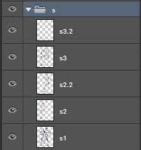
My sketch layer breakdown looks like this (bottom to top):
S1 (sketch 1) looks like this (very rough, just to get the layout and pose on the page):
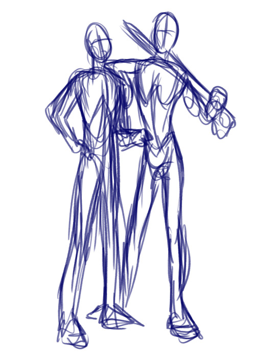
S2 and S2.2 are for a more refined sketch. I use one layer per character if there is any overlap whatsoever. This way it's easier to move or resize anything without having to erase and start over. S2 layers are for getting the basic anatomical shape of the characters because then it's easier to lay the clothing on top and find out where the folds would be.
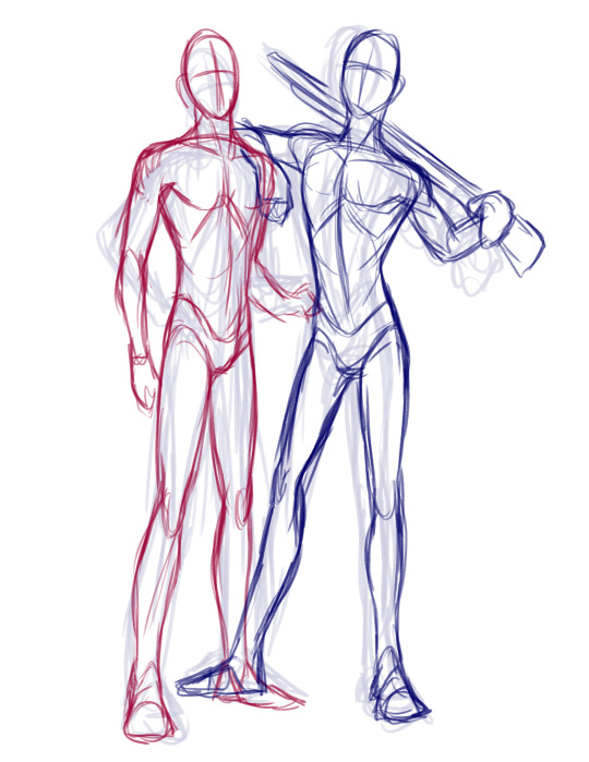
S3 and S3.2 are the final sketch layers for me. This is where I'll add the details – face, hair clothing, etc. I use the first (S3) layer to get the basics down and will add layers (S3.2) for extras, such as the weapons – because again, sometimes it's easier to be able to move or resize a single item or area without having to redo an entire section.
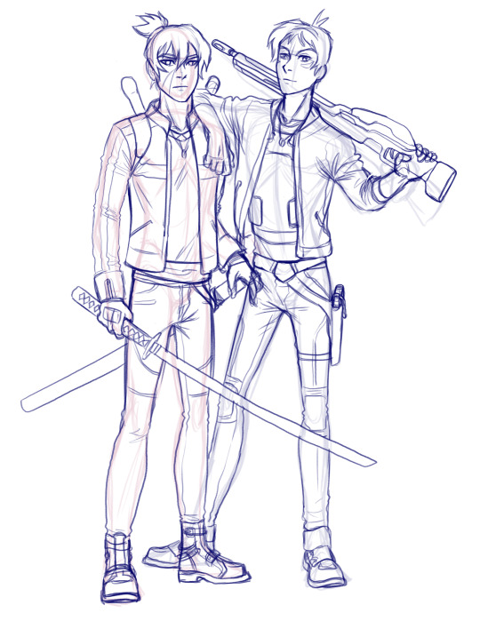
Once I have the detailed sketch layer, I'll lower the opacity and trace over it with the lineart on it's own separate layer. One thing that's really helped me is keeping all layers to the bare minimum. Putting all sketch layers in a group, keeping lineart on one layer, colors on another, etc. One of the most chaotic things in digital art is when each separate item or area is on it's own separate layer, and it all becomes overwhelming.
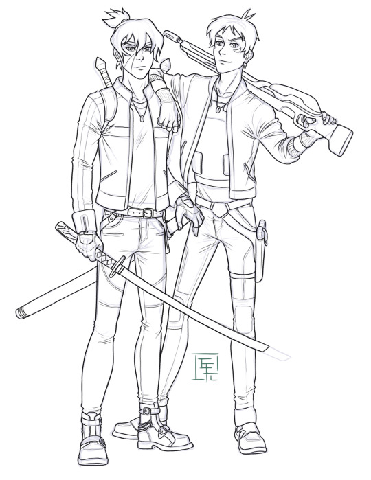
Taking art in steps/stages has been the most helpful thing for me, especially since I started doing freelance – and that's why this sketch process works for me. If you breaks things down to stages like this, you can still feel as though you are accomplishing something even if you don't have a finished piece yet. You did the first rough sketch layer? Great! That means you have the positions down on the page, and can move on to the next layer to clean it up and refine it. You got that second sketch layer done? Amazing – you're one step closer to being done.
One more important thing I've found with lineart is to find the right brush. The basic photoshop brushes never worked for me because they were too...hard and clean. I felt like my lines had to be 100% perfect with absolutely no wiggle (which is very difficult without a stabilizer). So I started looking for brushes to download that imitated more traditional art materials, since that's what I was used to.
These are the brushes I use now, and I absolutely love them! There are a ton of brushes to download for free, but just make sure they are free and the creator intended them to be so, as pixelstains does for the ones I use.
For lineart, itself, I like to do a base layer down and then go over it, thickening and defining the lines where I feel necessary.
That process looks like this.
Base lines:
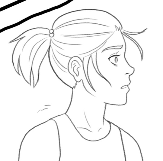
Defined lines:
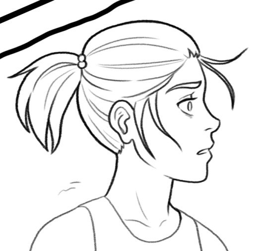
To get dynamic lineart, remember that the outer edges are the thickest lines, and anything that overlaps are the thinnest lines (or even a break in the lines). You want to show someone gripping something hard? Where the fingers press into that object, you should use thin lines. Want to show someone biting their lip? The point where the teeth meet the lip, the line should be almost invisible.
I hope this makes sense and maybe even helps a little. I've got more detailed tutorials (anatomy breakdowns as of right now) on my Patreon.
104 notes
·
View notes
Note
would it be possible for you to share how you sketch things ? im working on being able to do a sketch without melting from perfectionism and also your art is amazing ans I love everything you create
ok first off, thank u 💖 and absolutely! i mean i have no idea if any of this is going to be helpful. with the arting process... i don’t necessarily have, like, a single Method. but i’m gonna try my best here to explain with like, prior stuff i’ve done. i wish i could show you a start-to-finish-sketch but i don’t save my progress enough during the sketching process, so i hope these are ok enough explanations
so, for this one below, i did a quick initial sketch with the general pose i wanted them to be in. i didn’t worry about too many details, but i’ve done it so much by this point that i tend to give the sketchy bois some weight. i like getting an idea of musculature and hand/finger placement, sometimes hair and facial expressions––absolutely none of it has to be perfect or proportionate, it doesn’t even have to be what i want or expect the final product to be. like, as you can see, the end result is pretty different from the initial sketch. sometimes i will do a dozen of these little sketches on the same canvas before i end up doing one i like enough to continue working on. sometimes all i do is the sketches and i never continue with any of them (which is fine! every single sketch is practice, and practice is always good)
i do a second sketch on a separate layer, using the first sketch as a vague guideline. i shifted them a little here, changed up the hair, added clothes, yada yada. and once i finished sketch number two, i did the final “lineart” layer, still adjusting details, making zuko’s shoulders broader and more natural, cleaning it up. this, i’d say, is probably the most familiar process to me, one i’ve been doing since i was a kid, using inital sketches as a guide, a reference, instead of as the expected end result

for that first kiss i drew from Blue? i did SO many sketches. i hated them all. i’m only sharing a couple here because this is already a long post (sorry 😩) but i promise you there are many more. i did the background first on its own layer, tried sketching a few different ways, including the sketch-over-sketch thing i mentioned in the above example. i even got to coloring on some! but i still disliked them so much that i scrapped em and started over. and then did it again. and again. it took weeks. just stuck in the sketching process. the second to last panel here, in all its messy, vague glory, is what i ended up painting over for the final drawing. you can see the beginnings of the painting in the last panel. so sometimes sketching is.... a nightmare. but look at the final sketch lol it’s got no details at all, but i was happy with the proportions, with the angle of their heads, with the weight, and like.... the Vibes, you know? and it took so many failures before i got here. so believe me, i understand all too well that desire for a sketch to be Perfect. what really helped me? walking away from it. i drew other stuff for like a week before i came back to this and tried again. i cannot recommend that enough, just taking a break from something if it’s not turning out the way you want it to, or it’s causing you stress

something i’ve been doing a lot lately is just like..... sketching and then refining the sketch as i’m drawing it, and not even bothering with an oversketch or lineart. i will literally sketch and erase until i have clean(ish) lines. i very often draw heads and faces before moving on to bodies, and i wont even necessarily draw the entire pose first. i sort of figure it all out as i go along. so, you see, sometimes my sketches are messy and just there to get an idea of what i want to draw, and sometimes my sketches are... like this. i didn’t even know what the arms were gonna be doing until after i drew their bodies 😬 this is also the method i used when i drew the first SWT zukka art, just all one sketch that i refined on the same layer until it looked ok, and then color on separate layers

sketching is kinda... whatever you want it to be. i experiment sometimes if i see art tutorials or speedpaint/process art videos that intrigue me, and i think those are always excellent resources if you wanna get an idea of how someone creates a piece from start to finish, and what techniques you can try and incorporate into your own creative process. it’s also probably a good idea to use reference pictures for poses or expressions or whatever if you need to
82 notes
·
View notes
Text
my art process: a simple(ish) guide to how i (kinda) do things
okay!! so, i said i was gonna post my art process after i finished doing the danny phantom piece so... here it is! the drawing i used for a step by step process explanation is actually... simpler? less clunky than how i usually do things. i must preface this entire post by saying that i am fully self-taught for anything to do with art so if there are some things here that are exceeding no-nos... very sorry OOPS
The drawing took an estimated 4 hours total and for software I used FireAlpaca. My tablet is One by Wacom (aka the tiny ass red one). Without further ado... here’s my narrated guide on how i kind of do art!
1. Sketch Layers
sketches, are ofc, one of the fundamental steps in art. Some artists do them differently, whether they do color blocking/splotches first or silhouettes or your standard messy-lineart-before-the-actual-lineart
i personally do 2-3 different lineart/sketch layers, each layer specializing in different aspects. i took this technique from julia lepetit, a host from the drawfee show--a channel that i really recommend watching if youre an artist, like art, or just generally like having fun background noise while you work on something because... untreated adhd lol
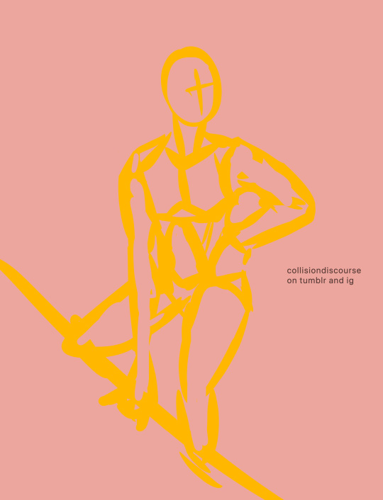
this is the first sketch layer! i color coded them for reference and i use the yellow sketch layer to figure out poses. i use this gesture sketch layer to figure out where i want limbs to go and how i want the body to twist.

after i figure out the posing, i move on to my second sketch layer. the green layer is my refined sketch layer where i figure out the form and anatomy of the sketch. this is also where i start planning how expressions, special costume bits, and hands work!!
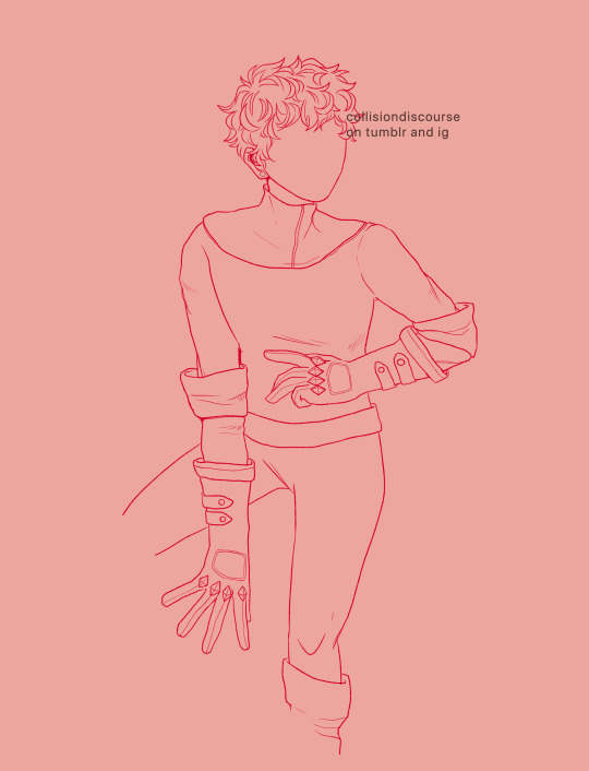
the red layer is my last and final sketch layer. technically, the red layer sometimes also doubles as my final lineart! the reason why i do this final step instead of doing the final lineart simply is so i can work on details of the costume. i end up refining certain portions, or even stretching/free transforming the whole body.
The red helps with the refinement of the drawing bc the ink being a color that isnt black kinda,,,, tricks my brain into not believing that its all permanent. its easier for me to go back and erase/change some parts when my brain doesnt think that everythings final. when im finished, i simply go back and change the color of the lineart to black with the protect alpha function.
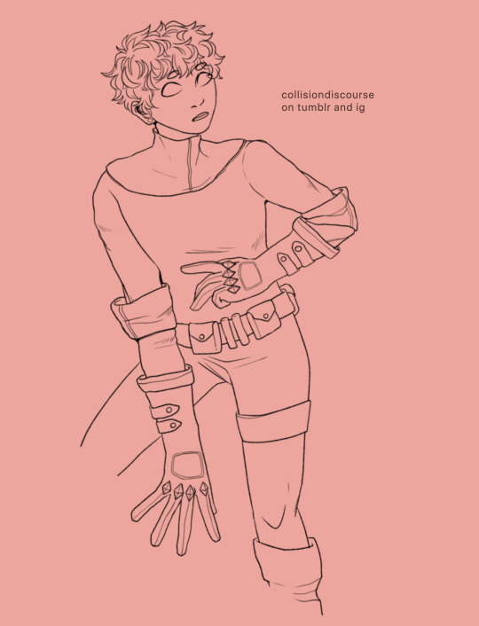
this is how the final lineart looks! be sure to close the lineart (aka make sure that everythings connected) so that the bucket tool can work and make your life 2000% easier.
2. Coloring
my coloring process is kind of... a mess LMAO its super dependent on how i feel like coloring on that day, but this is the usual method i use when im not thinking too much about it.
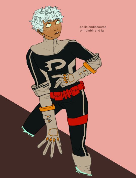
first are the flats! i use the magic wand tool to select all the areas around the lineart and reverse the selection so that all the areas inside your lineart is selected. color it with a base color, turn on protect alpha, and begin chunking in all the colors.
all of the flats excluding the pupils, background, ectoplasm rings, and danny phantom logo are on one layer. once that is done, we move on to shading!

for shading, i use a combination of the normal pen tool and the airbrush tool to smooth out the edges of the cell shading. since all the flats are on one layer, i simply set this one to clipping mask so that i dont have to worry about coloring within the lines. I only use one color really for shading (here, i used purple) and then protect alpha and add splotches of other colors (pink, orange) in relevant areas.
once i finish doing that, i set the layer to multiply and adjust the opacity so that it looks softer and more attuned to the colors of the actual piece
its at this point that i fiddle with the hue/saturation/brightness settings on the flat color layers to my taste, seeing what works and what doesnt.
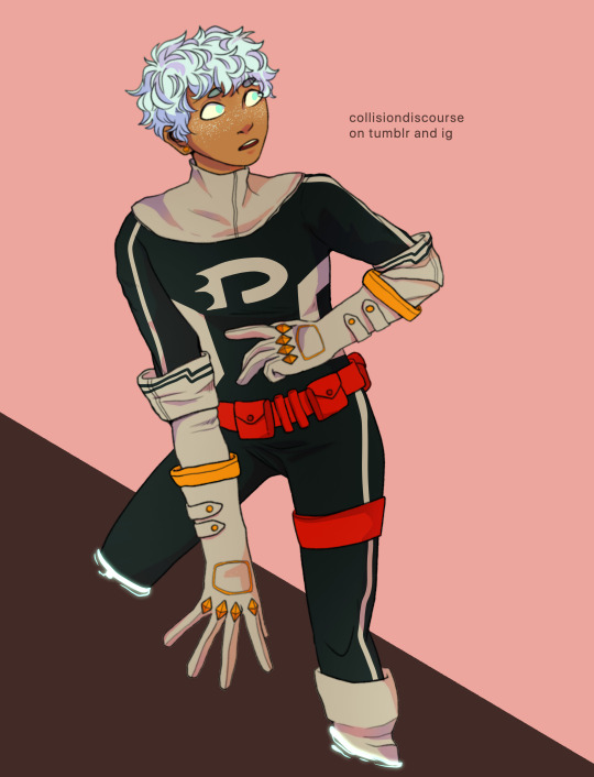
i then lightly go over the piece with a bright color (very very very light cyan) and put focus on the areas i think should glow like his freckles, eyes, and ectoplasm rings from where he’s coming out of a wall.
i rlly rlly love layer effects, so i set that one to add and again adjust the opacity to how i want it to look.
3. Finishing Touches
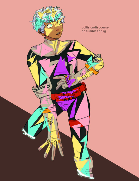
...yeah i know it looks like a hot mess but hear me out.
on a new layer, make a CRAP TON OF GEOMETRIC SHAPES. ALL OF THEM IN NEON OR PASTEL. i get comments about my coloring methods sometimes and honestly im pretty sure its all due to this step. i make all these goddamn weird shapes, colored according to levels of lighting (yellow in lighter areas, turquoise in areas affected by the glow, purple in shaded areas etc. etc.) and also clip this layer.
i then set the layer effect to either hue, overlay, or add and set its opacity really low to make it unobvious and cleaner to look at. this is a method that i learned from tumblr user zephyrine-gale who is... exceedingly talented and pulls this off way better than i can WKSDJSKKS
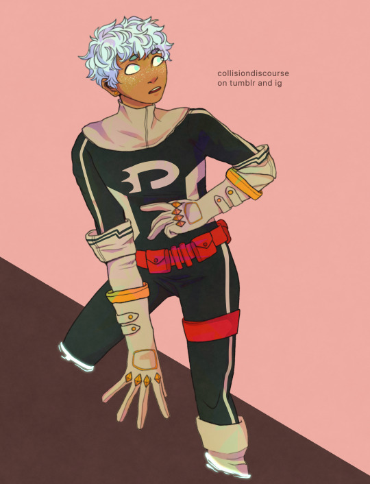
after that... ur basically done!! i add a few more layers like the noise layer for extra texture and sometimes some very light gradients (usually yellow to purple bc of something something color theory)--but after that, the piece is basically finished!
thanks for sticking around and reading this monstrous thing!! i might do more posts like this in the future, so who knows?
if you enjoyed this tutorial, want to support me and my art, or just wish for a way to pay for me to shut up... you can tip me 3 dollars or commission me here at ko-fi
(also reblogs are much appreciated. thanks <3)
35 notes
·
View notes
Photo


I'm completely stunned at my pace in drawing. I always felt so stuck at a certain skill level because it just repeated and repeated... When finally, it became more and more clear to me, "No, do it proper. Construction lines, sketch, refine, then color." The results kept getting better with every layer, and I'm enjoying my own art style that's finally forming. Such an exciting milestone for me! ^_^
Color choice was absolutely important too, I felt I always chose colors that drowned out my art, so finally I went for a lighter and softer approach.
As a critical point to make though, I feel the “tone” was nicer in the second photo, but when I cleaned it up and redrew it on the third, it lost a lot of good quality. What do you think? How can I avoid this in the future?
To all artists, please never give up on your artistic skills! I still struggle in lineart with my shakey hands, but it gets better! You learn with every piece, for instance, in this one, I stopped myself when drawing hair strands, I drew banana shapes in one stroke which increased the volume of “shakiness” in the lines. So finally, I decided to do two strokes for every hair strand, and it already looks much cleaner!
I’ll post my completed piece with all the details in my next post! :)
#art#anime art#anime#oc#original character#drawing#my draws#draweveryday#character design#my art 2021
7 notes
·
View notes