#then digitally redrawn and coloured
Explore tagged Tumblr posts
Visit Tumblr Blog
Explore Tumblr blogs with no restrictions, modern design and the best experience.
Last Seen Tumblr Blogs


Fun Fact
The most popular pages on Tumblr are about Minecraft, GIFs, and David J. Peterson.
Text

jay ferin come home
#art#my art#allkindsoface#artists on tumblr#digital art#artwork#digital illustration#drawing#sketch#jrwi#jrwi riptide#jrwi fanart#just roll with it#jay ferin#jrwi show#sketch page#these were all originally done with pencil in my sketchbook#then digitally redrawn and coloured#lots of iterations before we got to the final colours#idk i still don't have a design for any of the albatrio
219 notes
·
View notes
Text
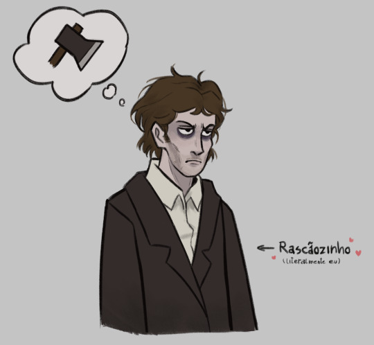
Blorbo from my book that I haven't finished yets
#me when minor inconvenience#digital art#fanart#coloured doodle#doodle#raskolnikov#crime and punishment#crime e castigo#literature fanart#pt#inside of my mind there are a hundred drawings of rodya being all fucked up and actually emoting twisted fucking cyclopath style#but I suck at drawing expressions so for now you only get to see digitally redrawn class doodles of him standing in 3/4 position
29 notes
·
View notes
Text

More memes of the magical girls and chaos gang
#memes#redraw#actually coloured and shaded this time#I mean it’s shittily shaded#but still#win for me#dude I worked so hard on that goddamn eye beam#magical girl#original comic#oc art#oc meme#I have a collection of memes waiting to be redrawn with the gang#Im so exited#I have so much motivation#and it’s to fucking draw memes#why can’t I have this motivation when I actually need to fucking draw#fuck#digital art#help#meme redraw
0 notes
Text
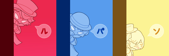
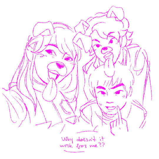
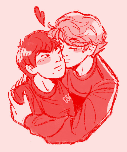
assorted lupats i dont think ive posted here
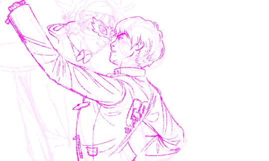
[ID: a series of digital Lupinranger VS Patranger sketches.
the first image is a three-panel sequence of the lupins in a cartoony style, popping out from behind a wall, descending in position, each in their respective colours. in the first, Kairi says "ル," followed by Touma saying "パ," and Umika saying "ン."
the second image is of the patrens taking a selfie together, in pink lines on a white background. Tsukasa and Sakuya are both smiling with the Snapchat dog filter over them, giving them ears and a long tongue, while Keiichiro points to himself and says "Why doesn't it work for me??"
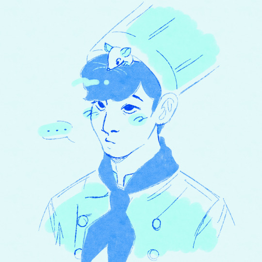
the third is a red monochrome sketch of Kairi kissing a grumpy-looking Keiichiro on the cheek. the fourth image is a bust sketch of Touma in various shades of blue. he is wearing a chef uniform and staring up blankly as a rat peaks out from under his toque.
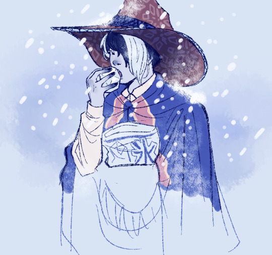
the fifth image is a drawing of Zamigo standing in the snow and eating a block of ice. his skin is blue and frostbitten. this drawing is partially coloured, but below his chest it is sketchy, unrefined, and uncoloured.
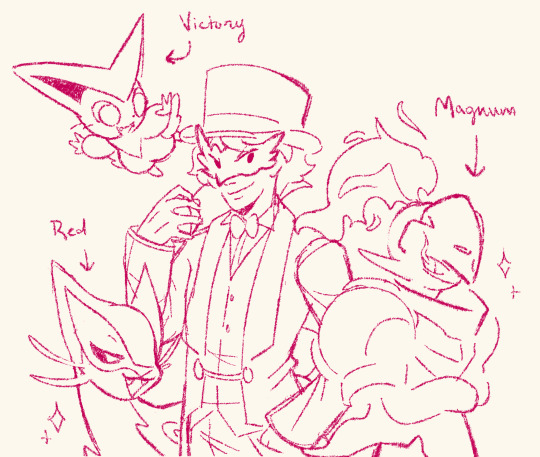
the sixth image is a doodle of Kairi, red lines on a pale yellow background, in his Lupin Red disguise, standing with three pokemon. to his right is a shiny Armarouge labeled "Magnum," while to his left is a Victini labeled "Victory," and a shiny Liepard labeled "Red."
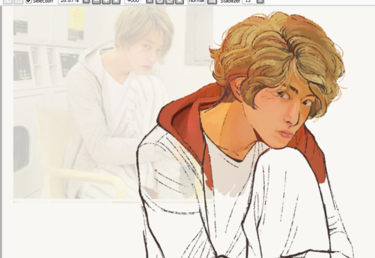
the seventh image is a screenshot of a canvas with a photo of Ito Asahi behind a partially-painted sketch of the same image, redrawn as Kairi. he is sitting with his chin resting on his knee and looking to the side.
the last image is an unfinished sketch of Kairi, in his Lupin Red disguise, dancing with Keiichiro. it is done in pink lines on a white background and Keiichiro has more details filled in than Kairi. /END ID]
#first two are redraws of cast videos#last one i plannn on finishing eventually so that's just a crop of the full thing#ive had these drafted for a bit but finally posting now that ichigo got his order from me ^v^ third was the draft for the sketch i included#lupat#tokupkmn#🎩#🍽️#🧵#💢#🔰#🐼#🧊#🤍#✉️#🖍
57 notes
·
View notes
Text
A lot of redrawn/reimagined art
For an art prompt. We were allowed to submit redrawn versions of five pieces. New ones (all from this month) posted before old ones; all pen on paper coloured digitally.


Right is from 2021 using the free trial of my copy of Illustrator CS3 I'd been using since 2010 that I got after my computer died.


(Right from 2019 with the same copy of Illustrator but before my computer died; same applies for the next two)


(2015)


(2012)


(2011 (probably; other art in the same artbook looks like I was cribbing from the type of stuff I'd have seen around where I lived at the time), pencils)
#artists on tumblr#traditional art#wizard#anthro#robot#dragon#fantasy#knight#creature art#old art#redraw#patterns#redesign#creature design#character art#sword#fantasy art#wasp receptacle
2 notes
·
View notes
Text

Krow belongs to @thekrows-nest.
I probably won't finish this because the hair and skintone have me stuck. It may even have to be completely redrawn.
However. This picture was one of the the first detailed pieces attempted after buying Procreate Pocket in August and trying digital art out for the first time. It began as a low effort repaint of the 'toddler with gun' meme but then I started using it to properly learn the tools and went ham.
What I like: The detail of Krow's design and the blending of their skin tones. The realistic style. Their expression. This is before I read anything about facial proportion or expressions so I drew that face instinctively by eye, but the anguished emotion of the original still somehow came through.
What I don't like: It began as a lazy repaint over a toddler so the body proportions are off for an adult. Far too chunky.
I chose a default base colour that was too warm and light for Krow's skin and used a reference picture with harsh overly bright lighting that lightened and distorted the colours. This, in combination with overzealous blending of highlights into the mid tone, ended up whitewashing their skin. (I didn't know about changing brush opacity then.) In canon art and other fanart Krow has darker cool toned skin. (Krow is Indian/Bengali.)
Attempts to darken the shadows to put the lighter 'overexposed' looking parts of face in context and paint over with a more appropriate shade only orangewashed them, and adding more details to try and tone their skin down darker just turned their cute freckles into muddy hyperpigmentation. I wish I had known or knew how to just colour adjust the original. Ps. Those round dark shadows are from their headphones.
I'm sorry king. I'm still learning, studying guides and source material now and will try to do better next time.
Also all this was done on a smartphone with a cheap stylus so even with the fineliner brush tool as small as it could go I couldn't write small enough for the allotted space on the buttons - so the details on there are blurry approximations.
I also didn't Glaze it because the artifacts of the filter were highly visible, a problem I'm having a lot. I'm sorry for the watermarkish writing - don't want someone to repost it with no context and get me dragged.
#ksa unhatched#ksa art#ksa caws#art caws#anti whitewashing#anti orangewashing#yanart#the krow's nest#long post#ksa memes
2 notes
·
View notes
Text
(I've been very busy since the second year of my third course has started, very sorry for lack of updates)
Before I post anything relating to the last major project in the first year of the third course, I am side tracking to a smaller project that was done just before the last project.
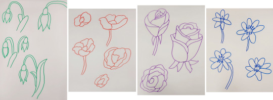
This smaller project was to design a risograph print that would be sold in another pop-up shop. This time I could choose whether to have an A3 print or smaller prints to sell.
For this I chose to produce 4 prints that were A5 sized where my theme was to be different flowers in a range of layouts and patterns. After creating a range of mood boards for inspiration, I drew the main flowers I was going to use for the prints which I had a variety of different 'poses' I was going to us.
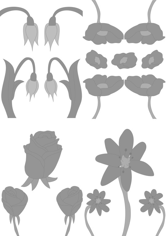
The linework was redrawn digitally in Adobe Illustrator before they were coloured and aligned in Adobe Photoshop. All the prints were placed onto an A3 document to make printing on the Risograph Printer easier.
I gained advice for colour options as I had a form of idea as to what I wanted to do but wasn't too sure. After doing some colour tests, I printed the final prints and cut them to be the correct size for them to be sold. I fortunately printed a lot so I had some copies spare to showcase the final products.
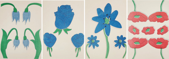
The finalised colours were burgundy, blue, green and red. They were meant to be more aligned but they came out uneven however I still liked these as the unaligned areas created a more unique effect.
That's all for now.
If you have any questions don't be afraid to ask.
0 notes
Text
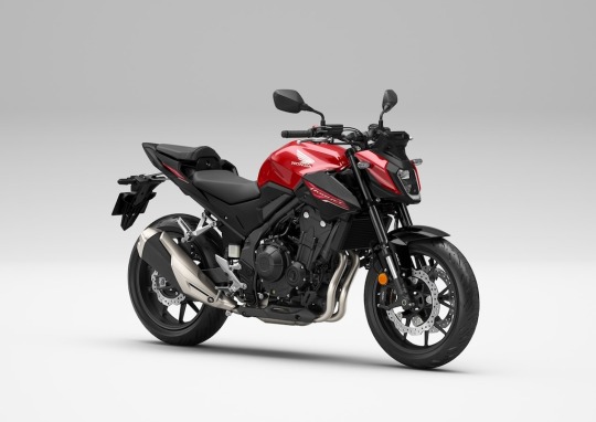
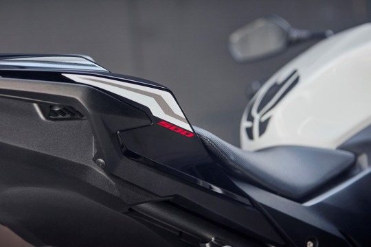
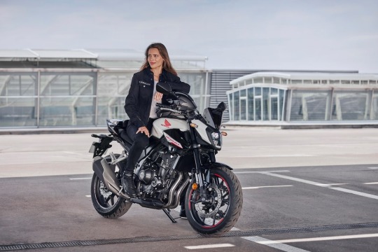
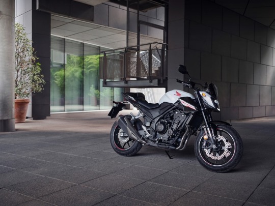
2024 Honda CB500 Hornet
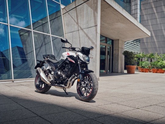
Honda’s A2 naked twin-cylinder streetfighter joins the Hornet family, with aggressive new styling and aerodynamic improvements befitting the iconic name. Power and torque for the 471cc engine meet maximum A2 licence requirement– at 35kW and 43Nm – while an ECU update improves acceleration feel and Honda Selectable Torque Control is now standard. The high-quality chassis specification includes 41mm Showa SFF-BP USD forks, Showa rear shock and dual discs up front with four-piston calipers. A brand-new LED headlight opens up better visibility at night, while a new 5-inch TFT screen offers Honda RoadSync smartphone connectivity, operated by a simplified and backlit 4-way toggle switch.
- Introduction The naked CB500F – originally launched in 2013 alongside the adventure-styled CB500X (now NX500) and fully-faired CBR500R – quietly proved that one of Honda’s tried-and-trusted formulas for building popular motorcycles had an enduring relevance. That formula? An entertaining twin-cylinder engine wrapped in a simple, lightweight, sporty chassis. And, while a 35kW peak power output made it suitable for A2 licence holders, the CB500F always offered so much more than ‘entry level’ performance. Sure, it was an easy machine to manage, ride and learn on, but those same attributes also made it a genuine pleasure for those stepping up from a 125 or coming down from a bigger machine. Sensible running costs, whatever the situation, added strongly to the appeal. In 2019, the CB500F was redrawn with uncompromising lines that elevated its technical and mechanical aspects and 22YM saw it receive high-quality suspension in the form of Showa 41mm SFF-BP USD forks and dual front discs, plus new lightweight wheels and swingarm. For 24YM Honda’s formula for the 500 streetfighter continues to evolve. Joining an iconic Honda family, the new CB500 Hornet follows in the wheel tracks of the impressive CB750 Hornet with aggressive new styling, high-end technology and a variety of detail upgrades that are sure to make it one of Europe’s most popular motorcycles.
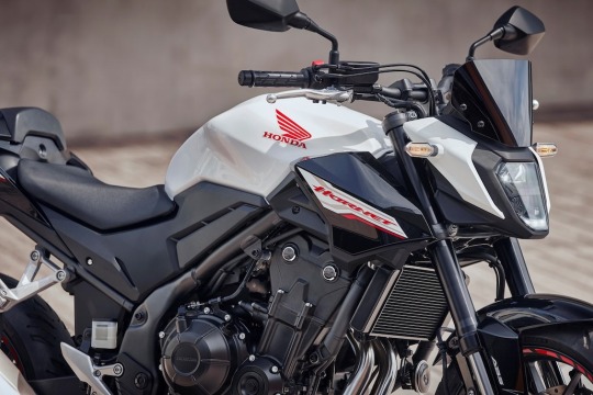
- Model Overview A new name and new look give the CB500 Hornet a fresh edge as it rides into 24YM. Premium new tech too, in the form of a 5-inch TFT screen – operated by an intuitive and easy-to-use lefthand switchgear – features the smartphone connectivity of Honda RoadSync. The A2-compliant, slipper clutch-equipped twin-cylinder engine benefits from the addition of Honda Selectable Torque Control (HSTC) as well as ECU updates to improve acceleration. Chassis specification includes Showa 41mm SFF-BP USD forks as before, with dual radial-mount four-piston brake calipers. The 24YM CB500 Hornet will be available in the following colour options: Matt Gunpowder Black Metallic Grand Prix Red Pearl Himalayas White
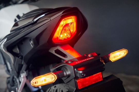
- Key Features 3.1 Styling & Equipment - New streetfighter style incorporates aerodynamics that improve steering and agility - New LED headlight and taillight - New 5-inch full colour TFT screen includes Honda RoadSync connectivity for on-screen turn-by-turn navigation and access to other smartphone functions - New, simplified left hand switchgear is easy to use and backlit for night-time The CB500 Hornet’s aggressive new look is inspired by the streetfighter DNA of its big sibling and was led by the design banner ‘Digital Dynamism’. A sensual form front to rear, it also offers mass contrast, with a ‘wedge’ silhouette weighted forward with very slim rear section, muscular fuel tank and sharp new nose cone fairing. And there’s function to the form; the geometric angles of the fairing also incorporate headlight side ducts that channel airflow smoothly around to the upper fuel tank area. This aerodynamic package contributes to a linear steering feel with increased handling agility. A new LED headlight design maintains beam penetration but throws out wider light distribution, for increased visibility when riding – and cornering – at night. It’s matched to a new sleek taillight, and all lighting is LED. Premium technology, in the form of a brand new 5-inch full colour TFT screen inherited from the CB1000R, uses optical bonding to improve visibility in bright sunlight, a first for a Honda motorcycle. By sealing the gap between the cover glass and TFT screen with resin, glare is reduced and backlight transmittance improved. It’s customisable between Bar, Circle and Simple display patterns and also offers the IOS/Android smartphone connectivity of Honda RoadSync. This new feature – alongside a simplified, easy-to-use, backlit 4-way toggle-switch on the left handlebar – allows straightforward, on-screen turn-by-turn navigation as well as the option (via a Bluetooth helmet headset) for the rider to make calls or listen to music. All an owner has to do is download the Honda RoadSync app from either the Play Store or the App Store, connect to the CB500 Hornet, and go. Tapered handlebars offer intuitive feel and leverage. Seat height is low at 785mm, making the CB500 Hornet very easy to manage and its neutral riding position comfortably accommodates riders of any height. Purposeful-looking aluminium footpegs are lightweight and add a sporting feel. Overall dimensions are 2080mm x 800mm x 1060mm, with 145mm ground clearance. The fuel tank holds 17.1L including reserve and combined with the engine’s excellent 3.5L/100km (28.6km/litre) fuel economy, gives a range of over 485km.

3.2 Chassis - 41mm Showa Separate Function Fork Big Piston (SFF-BP) USD forks - Dual 296mm discs, Nissin radial mount four-piston calipers - Lightweight wheels and swingarm Light, strong and unchanged for 24YM, the 35mm diameter steel diamond-tube mainframe has a tuned degree of yield that gives plenty of feedback to the rider as road surfaces change. The shape and position of the engine mounts, plus the frame’s rigidity balance, keep vibration to a minimum. Wheelbase is 1410mm with rake and trail of 25.5°/102mm, and front/rear bias percentage is a perfect 50/50. Kerb weight is 188kg. Like its sibling the CB750 Hornet, the CB500 Hornet features Showa 41mm Separate Function Fork Big Piston (SFF-BP) USD forks which divide the functions – Big Piston pressure separation damper in one leg, spring mechanism in the other – and reaction and ride quality are top draw. The swingarm is constructed from 2mm steel and employs a hollow cross member; it is stiff rotationally, and flexible laterally to improve handling. The single-tube Showa rear shock absorber, with its large-diameter piston, ensures excellent response and temperature management and features 5-stage preload adjustment. Dual 296mm front discs are worked by Nissin radial-mount, four-piston calipers; the rear 240mm disc by a single-piston caliper. Lightweight rims use 5 Y-shaped spokes; the 3.5-inch front wears a 120/70-ZR17 tyre, and the 4.5-inch rear a 160/60-ZR17 tyre.
3.3 Engine - Lively twin-cylinder powerplant now equipped with Honda Selectable Torque Control (HSTC) - New PGM-FI settings improve low-rpm acceleration and power delivery across the rev-range - Assist/slipper clutch eases upshifts and manages rear wheel through downshifts Delivering maximum A2-licence performance, the friendly 471cc, 8-valve liquid-cooled parallel twin-cylinder layout offers a well-proportioned balance of physical size and willing, enjoyable power output, with an energetic, high-revving character and zappy top end. And it's very much an engine whose overall performance and character belie its relatively small capacity; peak power of 35kW arrives at 8,600rpm, with 43Nm torque delivered at 6,500rpm. A 24YM addition is HSTC to manage rear wheel traction for increased peace of mind and a real boost for rider confidence. The system compares front and rear wheel speeds to detect rear slip and controls the fuel injection to smoothly reduce torque. HSTC can also be turned off completely if the rider wishes. Feeding the PGM-FI fuel injection is a more-or-less straight shot of airflow through the airbox and throttle bodies. Optimisation of ignition timing and air/fuel ratio equals more powerful acceleration feel from low rpm, with linear power delivery and throttle feel. The exhaust muffler features dual exit pipes, giving a sporting edge to each pulse, and a rasping high-rpm howl. Bore and stroke are set at 67mm x 66.8mm and compression ratio is 10.7:1; the crankshaft pins are phased at 180° and a primary couple-balancer sits behind the cylinders, close to the bike’s centre of gravity. The primary and balancer gears use scissor gears, reducing noise. The crank counterweight is specifically shaped for couple-balance and its light weight allows the engine to spin freely, with reduced inertia. Acting as a stressed member, the engine complements the frame’s rigidity with four frame hangers. Internally the cylinder head uses roller rocker arms; shim-type valve adjustment allows them to be light, for lower valve-spring load and reduced friction. A silent (SV Chain) cam chain has the surface of its pins treated with Vanadium, reducing friction with increased protection against wear. Inlet valve diameter is 26.0mm with exhaust valve diameter of 21.5mm. Piston shape is carefully designed to reduce piston ‘noise’ at high rpm. Friction is reduced by striations on the piston skirt (a finish that increases surface area, introducing gaps in which oil can flow for better lubrication). The ‘triangle’ proportion of crankshaft, main shaft and countershaft is efficiently compact and the crankcases employ centrifugally cast thin-walled sleeves; their internal design reduces the ‘pumping’ losses that can occur with a 180° phased firing order. A deep sump reduces oil movement under hard cornering and braking; oil capacity is 3.2L. A slick-changing six-speed gearbox is managed by an assist/slipper clutch, eliminating rear wheel ‘hop’ under hard braking and downshifting.
- Accessories A range of Genuine Honda Accessories are available for the CB500 Hornet, as individual items or grouped in packs, and ready to bolt straight on: Style Pack For enhanced sporty looks, the Style Pack includes a Meter Visor for the instrument display and added wind deflection, a protective Tank Pad prevents paint damage to the tank, a Seat Cowl for the passenger seat that matches the colour of the rear panels of the bike, and a Wheel Stripe kit for a flash of extra colour. Comfort Pack Commuting made easier with the Heated Grips for colder days, an ACC socket to conveniently charge electronic devices while stored under the seat and a Main Stand that makes for easy chain maintenance and safer parking on uneven surfaces. Travel Pack Includes the 3L Tank Bag with see-through pocket for smartphones and a rain cover and the 15L Rear Seat Bag, expandable to 22L, which provide flexible and convenient carrying capacity for the weekend trips. Outside of the main packs, a 35L Top Box and the Rear Carrier required for its installation are also available. All the accessories featured in packs can also be purchased individually.
- Technical Specifications ENGINE Type Liquid-cooled 4 stroke, DOHC parallel twin Displacement 471cc No of Valves per Cylinder 4 Bore & Stroke 67mm x 66.8mm Compression Ratio 10.7: 1 Max. Power Output 35kW @ 8600rpm Max. Torque 43Nm @ 6500rpm Noise Level (dB) Lurban 73.5dB Lwot 76.8dB Oil Capacity 3.2L FUEL SYSTEM Carburation PGM FI electronic fuel injection Fuel Tank Capacity 17.1L (inc reserve) CO2 Emissions (WMTC) 80 g/km Fuel Consumption (WMTC) 3.5L/100km (28.6km/litre) ELECTRICAL SYSTEM Battery Capacity 12V 7.4AH ACG Output 23.4A/2000rpm DRIVETRAIN Clutch Type Wet multiplate, Assisted slipper clutch Transmission Type 6 speed Final Drive Chain FRAME Type Steel diamond CHASSIS Dimensions (L´W´H) 2,080mm x 800mm x 1,060mm Wheelbase 1,410mm Caster Angle 25.5° Trail 102mm Seat Height 785mm Ground Clearance 145mm Kerb Weight 188kg Turning radius 2.7m SUSPENSION Type Front Showa 41mm SFF-BP USD forks, Type Rear Prolink mono with 5 stage pre-load adjuster, Steel hollow cross swingarm WHEELS Type Front 5Y-Spoke Cast Aluminium Type Rear 5Y-Spoke Cast Aluminium Rim Size Front 17 x MT3.5 Rim Size Rear 17 x MT4.5 Tyres Front 120/70ZR17M/C (58W) Tyres Rear 160/60ZR17M/C (69W) BRAKES ABS System Type 2-channel Type Front Dual 296mm x 4mm disc with Nissin radial-mount four piston calipers Type Rear Single 240mm x 5mm disc with single piston caliper INSTRUMENTS & ELECTRICS Instruments 5in TFT Meter with customisable layout, including but not limited to Speedometer, Tachometer, Clock, Gear position, Shift UP Indicator Headlight LED Taillight LED Connectivity Yes (Honda RoadSync) USB No 12V Socket Optional Auto Winker Cancel No Quickshifter No Security System HISS (Honda Intelligent Security System) Cruise Control No Additional Features ESS All specifications are provisional and subject to change without notice. # Please note that the figures provided are results obtained by Honda under standardised testing conditions prescribed by WMTC. Tests are conducted on a rolling road using a standard version of the vehicle with only one rider and no additional optional equipment. Actual fuel consumption may vary depending on how you ride, how you maintain your vehicle, weather, road conditions, tire pressure, installation of accessories, cargo, rider and passenger weight, and other factors. Read the full article
1 note
·
View note
Text

Redrawn art <3
This was a piece I had originally made when I was feeling more comfortable with my digital art and started experimenting with what I could do to make my art stand out from others. I was haveing very bad dysmorphia in general and decided to take a very unsymmetrical and geometric take to my art. The thought was that nobody is perfect, so my art was just showing that the things I didn't like about me were beautiful. So I decided to redraw my older art, it's a beautiful reminder that everyday in my art journey I am progressing. Not only has my style developed more, but I understand colour and the ways things interact in a environment.

0 notes
Text
W10: Objects redrawn. x5
Origins and storys
I wasnt liking the previous lineart style of the objects. It was too empty and falling into the splash design (which also might be changed). I wanted to incorporate more of my style and preference into the illustration, so i have started to draw the objects digitally, with colour and more detail.


0 notes
Text


this scene touched my heart more than it should have
#samurai flamenco#hazama masayoshi#and this week's random anime marathon goes to...!#i haven't redrawn anything digitally and i wanted to experiment with colours#also he is the goodest boy
279 notes
·
View notes
Photo

happy ten years of welcome to night vale! here’s some old art i made way back in 2017 to celebrate :)
[ID: Digital art of the nightvale logo, redrawn with more texture and slightly lighter colours. There are added stars in the sky and lights along the horizon. end ID]
349 notes
·
View notes
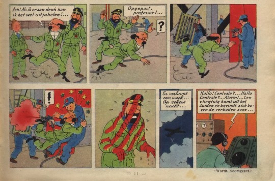
Text
Tintin Destination Moon Paint gag Comparison
Objectif Lune (Originally serialized as On a Marché sur la Lune)
Written by Hergé
Drawn by Studios Hergé (Hergé, Bob de Moor et al.)
In this blog I attempt to show the key differences between this gag in the original serialized version and the later collected edition. I originally wanted this to be a short and simple post but when analysing the strips more closely I started to notice many other differences between the two versions, and I started to write those down as well. Obviously, the colouring is very different between the two versions something which is to be expected and I won’t really comment on.
The original serialized version of the story has only ever been rereleased in French in Hergé, le feuilleton intégral tome 11 and Tintin Les premiers pas sur la Lune both of which can be purchased on the official Tintin store. Unfortunately, the Dutch translation of the original version was never rereleased, and it has never seen a release in English at all. The images I use for this blog are scans of the Dutch language versions of these stories.
On a marché sur la Lune, Le Journal de Tintin Year 5 #27/Mannen op de Maan, Weekblad Kuifje Jaargang 5 #27 was originally published by Le Lombard on the 6th of July 1950.

Objectif Lune/Raket naar de Maan/Destination Moon originally published in Dutch and French by Casterman in 1953 (This Dutch edition is from 1981).
I will be going over these pages panel by panel, describing what’s different and sometimes explaining why. The first panel has been completely redrawn, so all the characters fit in the now slightly shorter panel. Tintin’s position is unchanged, but Haddock and Calculus were moved more to the left. The pockets and folds in their clothing is slightly changed, Tintin’s eyebrows are more pronounced in the redrawn version. The biggest change in this panel is Haddock’s positioning, his head is now turned more to the left (our left). At first glance panel 2 seems to have only been shortened, cutting out Calculus’ question mark balloon, Haddock’s dialogues is shortened to “Watch out!...” dropping the word “Professor”. But on closer inspection we can see that Haddock’s head is drawn differently, Calculus’ pupils are also in a different position. The third panel is now longer and a Haddock chasing after Calculus was added. The man holding the grate has been completely removed from the comic, instead we now see a signpost with a sign saying “Watch out! Freshly painted!”. But these are not the only differences in this panel, when looking closer one can see the painter has also been redrawn slightly. His overall has more folds and is a bit more detailed, his neck has also gotten an extra line and his overall also doesn’t cover his shoes as much as it used to. When looking closely at his head we can also notice that he has a new cap in the redraw which is more spherical. The last difference surrounds the man walking in the background, his original position is now covered up by the sign, so he was moved to the left and is now walking the opposite direction. Panel 4 was also changed significantly. Obviously, the man holding the grate was removed again his exclamation mark balloon was also removed and instead the painter now gets a question mark balloon. The panel is also wider now, so we actually see Haddock getting hit by the paint. Calculus falling into the painter now also has the added side effect of knocking over the signpost, causing the sign to leap through the air. The painter was redrawn again for this version, his face was redrawn in a style much closer to Bob de Moor’s personal art style and his cap now has 129 on it instead of the double-digit number it had before. Panel 5 is also quite different, in the redrawn version Haddock no longer has the striped pattern because the man with the grate was removed and is instead completely read from the shoulders and above. The original panel shows us a medium shot of Haddock which the redrawn version changes to full shot. In the redrawn version the paint blast has also knocked over Haddock’s captain’s hat which can be seen (painted red) on the floor in the bottom left corner. The sign has also landed on Haddock for added comedic effect, the knocked over signpost can still be seen in the bottom right corner. Panel 6 was completely removed from the collected edition, its text now having been added to panel 7. The seventh panel is the only one not to have been redrawn, the only changes were the added caption from panel 6 and that the text balloon was moved down to make room for this.
The main differences between the two versions are that the grate was removed from the joke and Haddock was more present in the drawings as extra set up. This last bit caused some panels to be widened which in turn caused others to be shrunk. Although Bob de Moor worked on both versions, it’s obvious judging by the style that he redrew the pages largely on his own.
Destination Moon and its companion book Explorers on the Moon have many differences from their original serialized version. Certain pages were added, others were scrapped, certain panels were redrawn, reordered, or slightly enlarged. Most of this was done because the original 118 page* story had to be divided over two collected editions each holding 62 pages of comic strips. Most of the new pages were added to Destination whilst about 2,5 pages were cut for Explorers. The reason I decided to focus on this paint gag specifically was because it looks very different from the original yet there seems to be no obvious reason for the change. Both versions take up the exact same amount of space on the page. Perhaps Hergé wasn’t happy with the original gag, the grate does make it a bit more contrived or perhaps he wanted Haddock to be more present in it. But this is pure speculation, in any case I’m happy it got redrawn. I personally find the version in the collected edition much funnier because there’s a bit more anticipation in this version; we see Haddock chasing after Calculus and then we actually see him get hit by the spray paint. That said I really like the original drawing on panel 5, I like Haddock’s expression and figure more in that one. The paint dripping off his fingers is a nice touch too. I hope you enjoyed my comparison of this short gag from Destination Moon, as mentioned before the story has many differences which I might delve into in the future!
*The exact number of pages depends on whether or not you count the cover pages especially made for the story and the summary page, I excluded these from my count (none of these made it into the collected editions anyway) including them the total would be 125 pages.
#tintin#captain haddock#hergé#bob de moor#bande desinee#comics#franco belgian comics#adventures of tintin#professor calculus#moon#comparison#le journal de tintin
7 notes
·
View notes
Note
For the req, how about black Hilda?

yeas <3
[id: a digital and coloured drawing of Hilda from the chest up. She’s redrawn as a black girl, with curly dark hair, blue streaks at the tips. She wears her canon outfit, red sweater, yellow scarf, and black beret, and she whispers to Alfur on her shoulder. End id.]
85 notes
·
View notes
Text
The Tale of getting Hawk and Flo Made Part 1
Greetings dear reader, I am HeaddyPidgeon. I make a webcomic series currently called Hawk and Flo 2: Ice Cream Truck of Doom. Now you may have read my comic before or you may be someone who has never even heard of me until now (that being the more likely case). Now you may have noticed the eponymous 2 in the Hawk and Flo 2 and come to the conclusion that there is a Hawk and Flo 1. Well you would be correct dear reader there technically is a Hawk and Flo 1.... It just isn’t finished even though it technically was finished 2 years ago.
What the heck does that mean. it’s finished and it’s not finished at the same time? how is that possible?!. Well the reason why is because during the Pandemic I completed Hawk and Flo: Last Space Wizard. It was Inked, coloured, lettered with all of the bells and whistles added from the comfort of my own bedroom. The physical manuscript version is finished. The digital version which I sometimes refer to as the webtoon edit is still in production. When I made the physical version I thought I could just scan the pages and then upload it on the internet, but that sadly didn’t work which meant that over 200 pages then had to (and still have to be redrawn all over again from scratch. Ouch
This is but one chapter in the story of what might be one of the worst production hells in the history of fiction writing let alone comic books. Behind every piece of art there is an artist, behind every novel there is a writer and behind every story there is the story of how it gets made. Let it be known throughout the cosmos that whilst in the year 2022 we’re getting to see the brother and sister from Bermuda fight space armies and crack jokes. Getting it up and running in the first place was a daunting, absolute, nightmare of a quest undertaken by an individual with absolutely no clue what he was doing and whose only credentials were..... ok basically nothing.
I’ve only really been at the process of trying to make my comics for a few years now, Last Space Wizard may have had it’s first chapter in November of 2021 but before that I was pretty terrible. So Terrible that I realised I needed to practice at making comic books before I even got onto the internet. if I was aware of how truly awful I was at doing it all The Internet was certainly going to have had a field day with many of my earlier attempts at comics. Now the (not so) strange thing is I studied English so the stories themselves were pretty well written. The Jokes landed the characters were likeable, it’s just everything else was terrible. The art was terrible, My Lettering was completely Illegible, I couldn’t even draw anyone moving. So my first ever attempt at a Hawk and Flo comic was a script I had from a complete Turkey of an episode I had called ‘My Worst Fear’. I considered it the worst script I had ever written for anything but because the characters mostly stood around and talked I threw caution to the wind and gave it a go. i Showed it my friends and they found it hilarious which is what encouraged me to try learning to draw on my own. I started with A3 sketchbooks I'd buy from the Range. I would then turn on them on their sides then draw all of the action (or lack thereof in my case I was so bad it wasn’t funny) big and bright because I struggled a lot with drawing small and my consistency was awful. So when I very first started I drew character design sheets then I would trace my own drawings so it would turn out consistently LOL.
We all have to start somewhere If somehow someway I one day take off as some kind of famous writer/artist know this I had no idea what I was doing I’m just as clueless as anyone else. It’s just I understand I'm getting older, after trying and failing so many times to look for artists to draw my comics, whether it be my ex girlfriend, or friends I knew from High school I realised the only way any of this was ever going to get made was I had to do it myself. It came with some heartaches, i’m still gutted that I wasn’t able to get my comics off the ground at the time the storm Area 51 event happened in 2019. it would have been so perfect if a series about space armies invading planets came out that day... but It wasn’t to be I wasn’t ready to be out there. When I tried to scan my sketchbook art I just wasn’t able to do anything with it, the pages weren’t edited out properly and none of it was the right format. So when I got better I started drawing on A4 sheets of paper which I then couldn’t get to upload due to file size limits and such so I had to start doing everything digitally. I couldn’t figure out how to scan and upload my A3 books or A4 manuscripts I still don’t know how XD. Shout outs to anybody who did figure that out I still haven’t to this very day.
3 notes
·
View notes
Text
#ShowYourProcess
From planning to posting, share your process for making creative content!
To continue supporting content makers, this tag game is meant to show the entire process of making creative content: this can be for any creation.
RULES — When your work is tagged, show the process of its creation from planning to posting, then tag 5 people with a specific link to one of their creative works you’d like to see the process of. Use the tag #showyourprocess so we can find yours!
I was tagged by @milkcrates for the ‘Yanli visits the Burial Mounds’ piece. Please have a look at her process post and basically all her gorgeous art if you haven’t already.
I don’t follow all that many people and I think most have already done this, plus tumblr likes to hide people’s stuff from me, plus I’m really bad at remembering usernames and connecting them to creations, so I couldn’t come up with five (but I’m almost certainly going to have forgotten people so please don’t be offended, wow who knew tag games could be so anxiety-inducing) - but:
@heuheu-art for this piece
@sketchyscribbles for this piece
@shuang-hua for this piece
No obligation, of course!
1. Planning
I don’t tend to do a lot of pre-sketches, though it’s probably a habit I should get into. Instead I mull over scenarios/composition a lot in my head before putting anything down ‘on paper’. In this case I’d seen a lot of Yanli content on my dash for the birthday event, realised I’d never drawn her, and decided I wanted to. Then I went through a number of different ‘scenes’ before deciding on the most bittersweet, because that’s just who I am. I think I’d seen more than one commentary on how she had never met Yuan (but would love him), and that’s what stuck.
Originally I’d thought about something much more ambitious - more characters, I think I’d contemplated the Wen siblings and/or Lan Wangji being around at various points - but for the sake of my sanity I scaled it back, and I think it ultimately worked out better for it.
2. Creation
I do everything in Krita on a Cintiq 16, using the in-built brushes (a couple of pencil ones, and most often a pastel one for colour). I’ve only been drawing digitally for just over a year, after decades of using traditional media, so my methods are still very traditional with the additional perks of cleaner erasing, resizing, and having separate layers for line and colour.
The very first thing I think about before drawing a line is the colour palette. I try to keep this pretty limited, and always start with the background - sometimes I pick a colour to suit the scene location, sometimes the mood I’m going for, but mostly as in this case it’s a combination of the two.
My preference is actually to block out figures with a single flat colour first and then sketch over the top of it - I find this works best to get a sense of space and proportion as quickly as possible - but in this case the foreshortening and position of the figures made that difficult (ie. the silhouette of Yanli and Yuan is basically just a blob) so I went straight into the sketch:
I think this contributed to the proportional...issues I had, later on, but oh well.
I tend to look for references on the go, or make do with ones I’ve collected for previous drawings, and can be pretty lazy about it - for this one I had several references to hand of Xiao Zhan/Wei Wuxian in profile, so that was easy enough, but hardly any of Yanli. This meant her face got redrawn a lot - a lot - before I settled on something I was happy with.

The above is the final linework layer minus the colour layer. This went through some painful corrections, mainly of Yanli’s position and clothing, even after colouring. I’m very shy about showing WIPs to other people but this was the first piece I’ve actually asked for feedback on at the WIP stage, and I do think it really helped.
When the broad linework is done I put colour on a layer underneath: a fairly flat ‘wash’, followed by a second shade to mark out areas of shadow, then third for highlights.
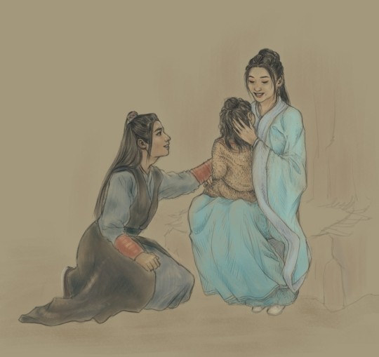
(You can see some of the things I changed later after applying colour in the image above, RIP me)
Then I go back to the line layer and work up the detailed shading on there:

Lastly are final, sharper highlights with a pencil brush.
I tend not to mess around with image effects or any of that clever post-production stuff: maybe one day I’ll learn how to make images look their best when viewed on a screen, but today is not that day.
3. Posting
My worst habit is chucking a piece onto the internet immediately after finishing it (or thinking I’ve finished it) and then panicking hours, sometimes days later when I notice something I want to change. With this piece I vowed not to do that, and did manage to let it sit for 24 hours, allowing me to come at it with fresh eyes to fix various things before presenting it to the world.
Of course there are still things I think I could have done better when I look at it now, but I’m trying to see this as an ongoing learning experience so that the next piece will be better, rather than a reason for self-flagellation.
Anyway this is already way too long, so I’ll leave it there!
28 notes
·
View notes