#the rest was individual pixels
Explore tagged Tumblr posts
Text
did i just spend 3 hrs messing with the work skin feature on ao3... yes
like half of that was spent on making a purple version of the logo

#ýr rambling#i used code by a bunch of other ppl and then put ittogether/edited it to work better for me#it was mainly colours but its very cool#also for the logo i used 3 shades of purple and could only use the fill bucket on the main one#the rest was individual pixels
2 notes
·
View notes
Note
How do you make your stamps? :0
Disclaimer: this is an obscenely long explanation, with pictures. Efficiency is stupid
So, for the static ones, I make a 99x56 px file on ibis paint x. Other programs are probably available online but I don't use them.
After that, I either upload an image I want to make into a stamp, or I draw one.
Then, I find a frame I want to use. Ill upload them here but let it be known I stole all of these right from deviantart


Most of them are from Lil-Devil-Melii on deviantart. The rest i have no idea. They're not all 99x56px but you can crop the canvas it's fine
Make sure to erase the edges of the picture , so they're transparent. It's not as cute otherwise
Upload those frames over your image in whatever art program you're using and viola, stamp.
For moving ones, it's a lot harder. Mostly because I refuse to download Photoshop.
There are a couple ways to do this. Some are simple animations, like with flashing text and whatnot. For these, you download the individual animation frames from your art program. Make sure it's transparent.
Then, upload each frame to ezgif.com under the option "GIF maker." You can play around with how fast each frame goes and whatnot but in the end, it'll be a stamp with some rad text that moves. This is easy, and doesn't make me want to shit my pants and cry. If you're new, do this. This is fun. This is good. This does not kill me inside
I made that↓ stamp with this method :)

this next one is how we turn gifs into stamps. This one makes me sad. It involves math and sucks. But we gotta do it. For the vibe
First, grab your gif. I'm using this cow gif because it's awesome

Then, I resize it using ezgif. Literally everything for this will be using ezgif. I am a simple man
At this point you should decide what frame to use. I'm using this one because its the first one I clicked

Figured out what size the inside of the frame is. That's what I resize the gif to, so the edges can be transparent. The inside of this one is 93x50 px, so those are the dimensions I'm making the gif.
Figure it out by putting the frame into ibis paint and realizing the canvas to fit just the inside of the frame, then seeing what the dimensions are. But there could be easier ways

Woah it's so small now
Then, still on ezgif, I go to the "crop" option.
Make sureeee to upload the smaller gif
press the button that says "extend canvas size", and then put the "width" and "height" as the dimensions for your FRAME. This'll put a bit of a transparent border around the gif. For this frame, I did 99px and 56px.
The "left" and "top" boxes show how many pixels the cropping happens from the edges of the canvas. The formula for finding that is
(width of gif / 2) - (difference between gif width and frame width / 2) = left box
For me it's (93 / 2) - (6 / 2) = 43.5
Then you do the same.for the height, which for me ends up being 22 from the top
This is reallyyy touchy and annoying though
Here's my result , with no visible difference

Okay so THEN you go to the "overlay" option, under "effects." And upload your frame. If the cropping was done right, you shouldn't have to move the frame at all and can just download it
Here's my result:

if you don't care about transparency, you can resize your gif to be the same size as the frame, and then put the frame over it. But I'm a slut for transparency
Anyways. I'm sorry if anything was unclear, it's two am. And I hope this was helpful :) these really are fun to make once you get it down
also if anyone has an easier way to make stamps from gifs, please god tell me
#web graphics#old web#neocities#custom#custom blinkies#stamps#page decor#web resources#da stamps#deviantart stamps#blinking gif#How to#tutorial#How to make stamps#Spacehey#deviantart#rentry graphics#old internet#early internet#stamp collecting#ezgif#stamp making#stamp template#Stamp frames#blinkies
4K notes
·
View notes
Text
In Defense of Curly (Again)

This post is not about absolving Curly of his “sins” or anything, Curly is not an innocent angel that has done no wrong, no, he is morally grey as they come. But I will not stand for slander on my wife NO MORE. Curly is not as guilty as you would think, but neither is he Innocent. Anya is so much more than a victim, Curly is so much more than a bystander, and Jimmy is so much more than a rapist, they are multifaceted characters in a very multidimensional game. They’re all characters that have been individually crafted to tell a story, and everyone is avoiding that by reducing them to a singular note of events rather than their entire personality and even going as far to twist their dialogue and character to fit their own bias, ignoring whats actual factual and canon for the sake of projection.
So with that out of the way, let us begin.
────────────────────────────────────────────
A sense of timeline for better understanding.
Curly's Psych Eval (and by extension, Jimmys) was 7 Days before the crash. Curly does not know Anya is pregnant here.
The birthday Party is 6 Days before the crash. Curly doesn't know here either.
The Dead Pixel scene is 2 Days before the Crash. Curly doesn't know here either.
Anya stealing the gun is 1 Day Before the Crash. Curly Finds out Anya is pregnant here and that Jimmy is responsible. Anya tells Jimmy about the pregnancy and tells Curly about it. 0 Days before the crash (The Same Day)
────────────────────────────────────────────
Pony Express’ Abuse
As for the first subject, I want to make it very clear about Pony Express’ Failure to comply and have any standard safety measures (most noticeably in the lack of locks) and the fact that they very often penalize their employees by taking from their pay and that they’re extremely lazy and known to cut corners for everything. The poster in-game tells us a lot about this if not backed up directly by the dialogue.

"Proper preparation prevents accidents, it is your responsibility to keep yourself and the crew safe. Medical expenses will be docked from person credits."

"Punctual delivery is our pride and promise- No matter where you are! Late deliveries will be docked from personal credits."

"Teamwork is the soul of success! When you have completed your tasks, always check on other tasks! HR complaints about poor team synergy may result in collective punishment"

"Sleep is the best rest after a long day of work, earn that rest! Don't overdo it or fall behind! Do not indulge in over 5 hours of forest, including leisure time. Sleeping over the allowed budget will result in disciplinary actions."
Neither Curly nor Jimmy are getting anything close to the required amount of rest for such a demanding job, with only 5 hours compared to the IRL guidelines for pilots to get an average of 10 hours of rest between shifts with 8 hours of sleep, it's also implied by Anya and Curly's own dialogue that he struggles to sleep. Which all together implies that they're both working 19-hour shifts every day. Every. Single. Day.
We see them both on shift at the same time multiple times during the game and Curly is the only one with clearance to make certain extremely important navigation decisions (like turning off the autopilot) and we can easily come to the conclusion that they are both extremely overworked, Curly Especially.


We can easily see that Pony Express are not shy to punish their employees and even goes as far as to routinely engage in collective punishment, and this is shown to be the drive behind a lot of Curly's decisions in particular, especially with how he reassures Anya that her stealing the gun case will not go on the performance log and reducing the chances of her being punished at all and to probably put the pressure onto himself in case Pony Express does find out. Given her precarious financial situation, she literally cannot afford to have her pay docked and Curly knows this.
Pony Express is known for its laziness, negligence and its ability to cut corners, they are also seen to not trust its employees by making everything have to go through him from axe usage to making a cake. To not supplying enough medical equipment, a fifth cryogenic pod to account for Daisuke or even to account for him at all. Curly himself even commented on how he should have made a bigger “stink” about the situation of Daisuke being thrown on the Tulpar last minute, which implies that he did raise this as an issue and a safety risk and was ignored.

I'm not going to take this as seriously but it is worth mentioning regardless because it is just absolutely Kafkaesque levels of absurd, They actively make it borderline impossible to report anything, so even if Curly or Anya were able to get ahold of Pony Express to send in a report, they never could due to the requirements and the prerequisites. It also implies that if you apply for a job there but refuse the medical evaluation, they can fine you despite the fact that you don't even actually work there yet.
Another classic example of Marx's theory is of the alienation in capitalism, wherein workers are estranged and separated from the products of their own labour. The crew had absolutely no idea what they were delivering, and judging by how much was put in place, they were never supposed to.

Marx's theory, the implementation of automation would negatively impact workers by depriving them of job opportunities that could have been filled by humans. This is strongly suggested to be the primary reason for the downfall of Pony Express and why the crew was fired.

────────────────────────────────────────────
Anya’s Assault
Anya being assaulted is never outright said, with an intentional layer of vagueness layered over the top with how she talks about it and how she mentions it to Curly. The words “Assault” “Rape” or even “Attacked” are not mentioned at any point, we only learn this through visual imagery and subtext of Anya mentioning the lack of locks on the doors, how unsafe she feels around Jimmy, and she would rather him not have the gun at all—fawning at his every response in a panic of upsetting him or escalating the situation. The words are never explicitly said as many other victims can sympathise with, saying the words out loud can be very difficult sometimes, and Anya’s vagueness was intentional on the happenchance that Curly did take Jimmy’s side. She was trying to put distance between herself and that possibility by being as cautious and as vague as she could, in hopes that Curly would pick up on the signs himself and come to that conclusion himself instead of Anya babying him and dumbing down the situation.
This is a believable reaction, especially when your abuser has any kind of power over you or other people, and he isn’t the only one either. Curly has just as much power, if not significantly more over her, which adds more to the fear of even mentioning such a thing, as mentioned earlier in my section of Pony Express' Abuse towards them, the possibility of being penalized with her– and everyone else –pay being docked because she made a simple complaint, was a very real threat, and even more dangerous after finding out about the whole crew being laid off. Jimmy tears her down every chance he gets, makes her feel little and even compares her to Polle in his hallucinations. And Anya knows that he and Curly have a very lengthy history, so her caution and anxiety about even mentioning the incident, let alone saying the word “rape” is borderline impossible for her. It’s a manifestation, it’s a verbal acceptance and confession that it’s even happened. Something she has been trying to avoid coming to terms with.
And when she does eventually tell Swansea what happened, as much as you want to think she told him- she most likely told him to not do anything, to try and keep the peace for as long as possible.
Again, her vagueness is not her fault, nor is it her responsibility. It was Jimmy’s responsibility to not abuse and rape her.
It’s also very present that Jimmy is verbally abusive to her, putting her down at every opportunity by ignoring her very talented medical skills by saying Pony Express only hired her to cut corners in an attempt to reduce costs because she failed Medical School and that she’s not a “real nurse” because of that, and how he constantly questions her skills despite keeping Curly alive for such a long time in such a state.

After being insulted by him multiple times, she fawns to get him to actually do something beneficial because she knows he responds well to praise, and he complies, all while still insulting and belittling her for being "weak" and "sentimental"


────────────────────────────────────────────
The Dead Pixel In The Room
Going to immediately preface this with a very big obvious “Curly did not know Anya was raped” warning sign to hopefully weed out the weak that don’t want to actually read this. You can leave now if you’d like, no hard feelings. This scene is supposed to be your first clue as a player, as well as Curly's. It's intentional to be like that, it makes the most sense chronologically as well because up until that point, we don't even know.
Okay, we can start now. First, off the bat, I want to talk about that dead pixel scene. And how both Anya and Curly have their own individual meanings behind It, and how both play into each character’s relationship with Jimmy. With Anya’s being a constant reminder of Jimmy’s presence, how it affected her and how it’ll always be there no matter what. And Curly’s is something that he knows exists, but cannot see for himself, because he’s too busy looking at the bigger picture. Even if he knows it's fake, even if he knows it’s an illusion.


He doesn’t doubt her here either, and even though he admits he cannot see it. He believes that it's there, despite this, and that it doesn’t ruin the image. Choosing to see the good, the beauty, of the bigger picture. The Dead pixel scene isn’t just about Anya, it’s about the both of them. And you’re probably asking how Curly hasn’t gotten the point Anya is trying to make, and thats again because she’s being intentionally vague here, and her comment about the lack of locks ties up pretty well with the previous two conversations she’s had with Curly directly. Complaining about Jimmy being weird during the psych evaluation and then her pithy comment about Pony Express’ cutting back expenses on their food and the comment she makes about the code scanner during the birthday party.

All of her previous conversations with Curly have been about their work or something going on in the ship or even with Pony Express directly. So it’s not unusual for her comment about the lack of locks on the sleeping quarters, it’s not random, it’s pretty on theme with the direction of how their conversations go, Curly wouldn’t pick up on that alone because it’s not a strange thing to say.
It's also very much shown that Anya trusts Curly, trusts him enough to not only confide in him first about the pregnancy but also allow herself to be open and friendly with him, even going as far as to try and get him to open up to her during his psych evaluation. She is also hiding behind his seat when she steals the gun. She feels the safest when she is with the real captain and how uncomfortable she is listening to Jimmy's orders to strip Curly of that title.


Every single time that Curly and Anya speak directly, he is always reassuring her, attempting to calm her down and her safety is the first thing he's concerned about when he finds out she's taken the gun.


And once she mentions the pregnancy, his priorities flip, again to her safety, reassuring her that she won't get punished for this. Once again telling her that everything is going to work out, that WE will fix this, WE WILL figure this out TOGETHER. He and Anya.

A key important word here is "what would you have done"
Would. Not, what will you do, no she's asking in past tense. The assault has already happened, she is reassuring herself here before telling him about the pregnancy that he is on her side, that he believes her and that her trust in him isn't misplaced.
And when he does find out she's pregnant, he still doesn't know exactly how. And it's important because it reflects back onto how Curly does ultimately behave when he does approach Jimmy. He doesn't know he's confronting a rapist, and his dialogue here proves that he does just think it was ultimately her choice, her decision. And the most painful part Is the very blatant unwanted pregnancy, not anything else.

Anya is still being intentionally vague here as well, as mentioned earlier. Curly did not actually know that Anya was raped, as the only thing that's mentioned is the pregnancy and that Jimmy is involved. Which is absolutely something to be worried about, regardless of how it happened, because they're on a ship. In the middle of Space.
Someone who knew would not react like that. Curly never once doubts Anya's words or her truth. And after Anya tells Culy about how she told Jimmy about her pregnancy, Curly says that she should have waited for him because he wanted to be there just in case.
Curly even does it literally. The most important part that everybody overlooks is how determined he is to get to the cockpit as the ship is crashing. He knows it's crashing but all he can do is try, he could have run away, but he didn't.
Curly took responsibility multiple different times which is easily overlooked because so much happens in such a short time span that people literally think he had months between knowing about Anya being raped and then the crash when it was barely a day. Just like how people easily overlook the dead pixel scene and how it also represents something to Curly as well, and just like how people overlook Anya's "I told you so"
Curly's kind, forgiving and trusting nature is not inherently bad. It was how it was used against him in an extremely difficult situation, which is exactly what Abusers do time and time again. He failed Anya in such a delicate way and in such a difficult situation, but it's something to understand that Pony Express failed her first, failed her in all the most important ways by even allowing a situation like this to happen. It was Jimmy's responsibility to not be a rapist, but it was Pony Express's fault for even enabling that in the first place.
────────────────────────────────────────────
Curly's Trauma
A very common thing that people tend to overlook, and this is either because they subconsciously forget that men can be victims of abuse, or simply because they don’t care enough to consider Curly to be one– his relationship with Jimmy and what we can glean from is very abusive, emotionally and verbally and then soon later on physically. Curly is just as much a victim of Jimmy's mistreatment and abuse as Anya is, in their own unique and parallel ways, they both had everything taken from them. We can tell in Jimmy’s behaviour and the way he intentionally isolates Curly in the Birthday scene and the Psychological evaluation in the cockpit, Jimmy takes Curly’s weakness and anxieties and twists them around to isolate him from receiving any help or support from others.
Curly’s biggest weakness is his forgiving nature. We all talk about how Anya is a victim of Jimmy, and she absolutely is, but so is Curly. His first immediate response Jimmy's reaction to Anya announcing her pregnancy is met with immense fear and anxiety with the added soundtrack of what could be equivalent to the sound of Curly's heart racing. He freezes, he fawns, he panics.
Curly's good-natured heart, being lax, trusting and a constant mediator isn't inherently a problem. It was the circumstances that turned that so volatile. If Jimmy wasn't who he was and so readily abusive then Curly's character would not be that detrimental, and his actions would not have such a catastrophic impact. And everyone immediately boiling down those harmless traits and villainising them does much more harm than good, especially since the character they should be targeting is Jimmy, not Curly.
He is beyond terrified, and when he does finally get to Jimmy, he immediately fawns and freezes. He makes absolutely no mention of Anya or anyone else because all that mattered in that panicked situation was easing Jimmy down and resolving the situation. There was truly, absolutely nothing that Curly could have done that wouldn't have resulted in either direct consequences or collective punishment. All of Curly's thoughts, behaviour and actions were as carefully thought out as he possibly could in the short 24 hours or so that he was made aware of Anya's pregnancy and Jimmy's involvement.

He is trying to eliminate all potential problems in the situation so Curly can take the full front of Jimmy's rage. This again furthers the point of exactly why Curly wouldn't recognise the signs of Anya being abused as well because this is all so normal for him. He’s terrified of Jimmy, and an abuser's main tactic is to make sure that their victims never feel confident to speak up against them, or to ever seek out help from others. It’s why he never rushes to defend himself, he just lets Jimmy do and say all of these horrible things.
And Jimmy immediately stabs back putting him down. Twisting the blame and putting it into Curly. Like he somehow was a part of it all and that it was his fault.

Curly was and has been a victim of Jimmy's abuse for a very long time on an emotional and mental aspect that clouded his judgements and perceptions in the scenario which devolved into physical and medical abuse very quickly once Jimmy got his chance. And it is also true that Curly had a responsibility to protect Anya as a crew mate and Captain that he failed due to bias towards his abusers, and his kind and forgiving nature of simply wanting to see the good in Jimmy, which is also another aspect of what victims believe. Curly enables Jimmy's behaviour towards himself and even goes as far to completely blame himself for everything that happened in How Fish Is Made.


A lot of victims tend to surround themselves with excuses of why they’re abused, that it’s somehow their fault and that he’s done something awful to deserve it, that this a normal thing that happens, that Jimmy has his reasons to be like this and it isn’t his fault. People argue that Curly should have done more and that he "failed" in any regard is putting a huge expectation onto a victim like him of someone like Jimmy's relentless abuse and how it takes such an impactful toll on someone like Curly. Everyone who plays or watches the game looks over the very easy and subtle warning signs of this abuse and is too busy claiming Curly to be the antagonist here and holding him responsible instead of Jimmy.
────────────────────────────────────────────
Conclusion + Other Comments
Curly is not perfect, but he is not as guilty as everyone wants him to be. If you go into mouthwashing anticipating Curly as a cruel, selfish monster, of course, you're going to interpret him that way and twist everything he ever does or says to fit your narrative although he very obviously isn't that way at all and get upset when someone tells you you're wrong. You need to remember that he had a whole crew to think of, Curly is not judgement, nor is he the executioner. His hands were absolutely tied and for one reason only: Because Pony Express does, did, and will not care. Pony Express has it explicitly like this so you cannot do anything. So people like Jimmy who manipulate the vulnerable can prey upon his co-workers and get away with it.
The situation on the Tulpar is not as straightforward as people would like, I understand it's extremely cathartic to think of a situation where Jimmy gets what he deserves but it isn't realistic, and thats what this game is trying to say. Abusive corporations, exhausting capitalism, this environment breeds Abusers like Jimmy and victims like Anya and Curly. There was nothing that could be done. Pony Express is what doomed them all, they're the catalyst.
At some point, you have to understand and accept the fact that certain scenarios are simply just cathartic fantasies that simply couldn't have happened. They were all doomed, right from the start. It wasn't just Jimmy's actions (Although they significantly influenced the outcome), and it sure as hell wasn't Curly's inaction. It was Pony Express. I think something that a lot of people get mixed up in their interpretations of Curly is that he's not us, and we're not supposed to be him. Constantly projecting your own fears and experiences onto him to sway your interpretation of his words takes away from the already written-in-stone character he is. You saying "He didn't mean it" when talking about Curly saying he cares about Anya is not only incorrect, but it's YOUR projection onto a character that is already extremely upfront and honest about his intentions and kind personality. He is not malicious, evil, cruel, selfish or misogynistic, so saying that because you interpreted his words to be half-truths or him lying through his teeth to Anya and that his kindness is fake is literally obstructing his character.
Everyone wants them both to be perfect examples of victims and refuses to understand or even believe Curly's situation. Curly DID fail Anya but not for the reason everyone thinks he did.
They're both victims to the same man, they both believe in the best of people (although to their own detriment in a way) they want to find peace, and fulfilment in their career and life. They're so alike in such delicate and intimate ways, that trying to constantly paint Curly as this great, horrible oppressor over her does way more harm than good.
Curly's character is painfully obvious, very very upfront and honest. He is kind, constantly weighed down by guilt and anxiety about his future and career and is being abused by his so-called friend and the company he's working himself to death for that he absolutely hates that just discarded him like he was nothing. Like a lame horse.
Thank you so much to the Mouthwashing Mania Discord server for helping me with this thread! Specifically Mogs for their amazing analysis on Capitalism which can be found here!
Thank you for reaching the end of the thread, please don't be scared to share your thoughts in the tags or in my inbox, I'd love to hear them! good job! (っ˘з(˘⌣˘ ) ♡


#mouthwashing#mouthwashing anya#mouthwashing jimmy#curly mouthwashing#mouthwashing curly#anya mouthwashing#daisuke mouthwashing#mouthwashing analysis#jimmy mouthwashing#analysis#long thread#long post
201 notes
·
View notes
Note
I recently started learning to use rpg maker (vx ace!) and as a result have become increasingly interested in pixel art. I hadn't really done pixel work since my teens - I do more digital painting and vector art - so while I'm a little familiar and can do passable editing, there's a lot I don't know.
One thing that's kind of perplexing for me is understanding the differences in style between two creators of pixel art. I studied art history and I'm used to the differences being things like brush stroke length or degree of realism... I feel like I'm lacking in lexicon in this new frontier lol
What nuances of an artist do you think are most important to style in pixel art?
This kind of stuff is not really officially studied (yet) so it's all a bit of opinion from me.
Usually in pixel art the biggest differences in styles are which limitations the artists choose to impose on themselves; colour count, resolution, palette... Or more stylistic choices like hue shifting, anti-aliasing style or no, dithering or no, etc.
I personally think there are a huge variety of styles in pixel art, as it's literally just a medium, and I hope you'll agree by the end 8)
Also (imo) there is some seperation between the styles of art for art's sake, and art for videogames, where things have to be clear and readable to be actually playable.
🎮 Old school games:
Sometimes referred to as something like '8-bit' or '16-bit' (relating to the NES era / SNES era consoles), these artstyles usually follow the rules and limitations of the hardware at the time.
This all falls under retro art, most popular styles include: NES, SNES, GB, GBC, C64
Notable artists: Nickwoz, Sandy Gordon, Franken, Cisco
📚 Old school art:
There were also events called Demoscene (still are), where developers would go to a big convention and share their demos. A lot of pixel art competitions were held here, where artists would draw live.
Generally they used to favour a high realism/semirealism style, with lots of texture/dithering, fairly high resolution (if the hardware allowed for it), and adjacent pixels mostly being different from one another.
There are even older styles than this but they are fairly niche and I'm not that well educated. If interested look into some of the old PCs/consoles.
⭐ Modern pixel art:
Usually using more colours and higher resolution, larger clusters of pixels instead of individual ones. Strong use of art fundamentals.
Artists to look at: Adam Ferguson (yes it is pixel art), Snake, Slym, 6VCR, Yes I do Pixels, Gijotto, SovanJedi, JoeCreates, Franek, @8pxl
the rest below are "modern" pixel artists too but I think they have other things in their style that are a bit different!
🎨 Painterly:
Some artists choose to emulate the natural brushstrokes digitally, and keep their clusters large and loose. Usually don't focus on the minute details as much.
@makrustic, @hexh-pixel, Umbohr, Gawrone
🟦 Dithering
These artists all use dithering / texture in ways that make their styles totally unique.
Deceiver, Night, Reo,
💥 Experimental
These artists are always trying new things and honing in on their unique style.
AJ, hby, @ilta222, Alphons
I could really go on for ever, there are so many different styles, cute pixel art, horror pixel art, 1bit (2 colours only), and then adding animation takes it even further, but I think you get the idea
If you want to learn more, the Masters of Pixel Art books have works /interviews from pixel artists of different eras, including demoscene and contemporary.
😊👍
249 notes
·
View notes
Text
Victory Kiss
Turns out Graves gets very passionate when celebrating a successful mission. And when you’re nearby you end up facing the brunt of it.
Pairing: Phillip Graves x GN!Reader
Reader Aliases: Chief
Genre: Fluff, Comedy, Pre-MWII
Word Count: 1.5k
Warning: Graves kisses reader without prior consent (not malicious but please read at your own discretion)
A/N: Probably OOC Graves but imagining this was too entertaining to me 😋

You’ve gotten used to this.
You’ve gotten used to Graves’ infectious energy after a hard-earned win. He was a natural leader, cunning and brimming with charisma, but carefully restrained as to not be impulsive in high stakes situations. But when the stakes were low - such as times like now - Graves was free to be as expressive as he wished. And as second in command to Shadow Company, required to always stand by his side, you got front tickets to watch it unfold.
Shadow Company had offered unofficial air support in the depths of Kastovia. With every operation the stakes were getting higher and higher. After deploying all ammunition until resources were depleted, it seemed the entire aircraft waited with bated breath as you surveyed the ground through a heads up display. You sensed Graves beside you, his looming shadow gave more contrast to the monochromatic screen. Each pixel flickered from the daylight, the movement of trees and friendlies through the screen setting false flags in your mind.
You pulled back to look at Graves. His face was stern, the muscles in his face taut, eyebrows slightly furrowed as he tried to read your neutral expression. You shook your head.
“Confirmed hit, all hostiles eliminated.”
And there it was, like a switch flicked inside of him, you felt a little proud that you were the one who triggered it. Graves slammed his hands on the front console, pushing himself off to stand tall, brimming with energy. He was now adorning that familiar smile, a little wonky but charming all the same. With a heavy arm, he gave you a hefty slap on the back in congratulations, one that would’ve sent your head through the display if you weren’t prepared.
“That’s what I’m fucking talking about Shadows, this is how you get the job done!”
The entire atmosphere of the compartment lifted, you wouldn’t be surprised if the aircraft itself increased in elevation. There were sighs of relief, cheers of joy and hugs of a job well done. You never got sick of this sight, it reminded you what you were fighting for, to bring these boys home and secure victory.
It was a familiar sight, but it was comfortingly predictable. You watched with amusement as Graves paced around the room, praising each individual member in a voice so loud it damaged your ears once, then bounced off the walls to hurt your hearing for a second round. Each recruit responded with the signature ‘yup-yup’ and beaming smile. With each comment given, Graves was getting more and more drunk off the adrenaline which after months of observing him, came with some interesting habits of his.
It was fun hearing him swear like a sailor when he usually keeps his language so restrained he could be put on a children’s show.
“I saw your shots Erikson, that was the shit.”
“Vance you saved our fuckin’ asses with that extra fire.”
“Send this mission report to Shepherd and your dads will be back with the milk before you fucking know it!”
You’re pretty sure Graves has no idea what’s coming out of his mouth at this rate and to be fair neither do you nor the rest of the Shadows.
You stifled a snicker as you watched on. He continued with his questionable praise, not even stopping at the aircraft itself to which he gave an encouraging spank to the metal wall, only to recoil his arm when it unmistakably hurt his palm. Even on the other side of the aircraft, you caught snippets of what he said and you were sure the cheerful laughs of the Shadows were out of respect and not because they understood him. Although with an accent and voice like his, he could make a nonsensical string of sounds and you’d be nodding along.
Graves had gone full circle and made his way back to you.
“And to the soldier of the hour.”
He reared his head to you with such a leading force that the rest of his body had a hard time keeping up. His arms swayed from the momentum.
Just like every routine celebration, he planted his hands securely on your shoulders. His face is graced with the same charming smile he’s given you for months. Even under the red lighting of the aircraft he looked nothing short of a budding hero, the blue of his irises shone against the shadows cast over his face.
You expected the praise.
“Beautiful fuckin’ work, Chief.”
What you didn’t expect was the kiss that came straight afterwards.
You didn’t even have time to reply as Graves used his leverage on your shoulders to pull you in, lips crashing against yours. It was chaste, but the sheer strength he had made you sure your lips will bruise. Your mind blanked, adrenaline numbing any potential pains. The whirring of the aircraft’s turbo engines were drowned out, your vision dimming at the edges as all your senses honed in on Graves’ lips pressed into yours. It lasted no more than a single second until he separated from you, lips parting with an exaggerated but unintentional mwah.
“Dunno what I’d do without you,” he breathed out, only for you to hear. He watched you innocently, the skin around his eyes wrinkled in excitement, hands drifting down until they were on your biceps, rubbing your arms affectionately. However, you had to tear your gaze away from him and to the rest of the aircraft.
Graves just kissed you…
… in front of Shadow Company.
Your stomach dropped as you made eye contact with the entire team who now watched the two of you like teens tuning in to the hottest new flick. They were here for the drama, quiet as they waited for your response but smiles of anticipation creeping onto their faces.
“Eyes off, Shadows.”
Graves’ voice returned to its usual commanding tone, as though you were back in the mission. There was the grumble of ‘yup-yup’s’ as the rest of the team made the show of focusing on their stations (but you knew they were still sneaking glances whenever possible). Graves reoriented the two of you until you were against the wall, using himself to obscure the company’s view of you.
“Fuckin’ beautiful,” Graves muttered absentmindedly. He sounded more grounded, but he still needed to catch up on his breath, chest heaving in and out.
“It was a damn clean mission, Graves.”
“I ain’t talkin’ about the mission.”
Graves gives you his signature cocky smirk, waiting for a few moments for you to reply with your usual reassurance. But no thoughts were crossing your mind, instead it was aimlessly swimming in his attention. His arms that latched onto you were getting stronger, fingers tightening and burrowing into the narrow space between your tactical gear and shirt. His pupils were blown out, puppy-like as they searched you. But you couldn’t reply, not when you were drinking him in like he was to you. Your silence started to become overwhelming, crashing against Graves’ confidence and his smile fell, bravado collapsing with it.
“No good?” He faltered, letting his head hang low. He let out a quiet curse under his breath. “You put up with a lot of Shadow bullshit, both from them and me… I got lost in the moment.”
His attention turns to his hands that are on your arms. The pads of his thumbs rub your shirt fabric soothingly before dropping his hands to his sides. He gives you one final reassuring pat on the back, half-hearted and lacking its usual strength.
“I misread us,” he pursed his lips as he reflected, eventually shaking his head and tutting his lips disapprovingly at himself. “This is on me.”
“What?” You force yourself out of your stupor upon noticing Graves’ dejected form. You hurriedly try to pick him up, now you were the one putting your hands on his shoulders. “No, I just- I didn’t expect it. It was a surprise.”
“… you like surprises?” He looked up at you through his lashes, eyes brimming full of hope. You sometimes forget he’s your superior when he dials up his boyish charm.
“If they’re all like that then yes.”
“Then there’s plenty more where that came from, darlin'.”
His smug grin was back in full force, he only allowed himself a split second to memorise your shocked expression before turning away so you couldn’t respond. He rouses the rest of the Shadows up with an authoritative clear of the throat. He stands tall, back to the restrained commander role but not without a hand sneaking up to settle on the small of your back. Even as he assumed his professional role once again, the zeal in his voice was unmatched.
“Excellent work all ‘round boys. Let’s bring this aircraft back home.”
There were affirmative responses all round, but a curious Shadow couldn’t help but poke their head out of their station.
“So, uh, Graves. Are you and Chief a thing now?”
“Speak outta line like that again and you’re on cleanin’ duty for the next month, Sergeant.”
“… yup-yup.”

Call of Duty Masterlist
#cod x reader#cod x gn!reader#cod x you#call of duty x reader#cod fluff#phillip graves#phillip graves x you#phillip graves x reader#philip graves x reader#cod mw2#cod fanfic#call of duty modern warfare#/*avery actually writes*/
2K notes
·
View notes
Note
could you tell me more about spoonflower? i'm interested in uploading my own designs, but i'm not entirely sure how it works or how much it pays. thank you!
Sure! When you first upload your design, it'll look like this.
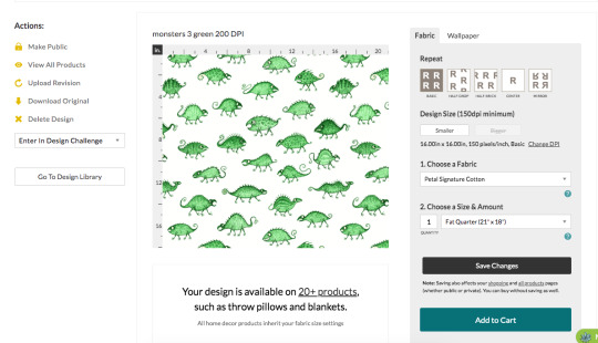
The standard DPI for printing on all the fabric sites I've seen is 150, and since I made this pattern at 200 DPI that means Spoonflower will print it bigger than I want it unless I change it here. So I click on the "change DPI" thing, type in "200" and click "change". Sometimes I find it doesn't save, so I always go back later to check and make sure it did save the right DPI.

(You can avoid this by just changing your image to the right DPI before uploading, but sometimes I want the option to make it a bit bigger, just in case.)
If you want to make multiple sizes of the same pattern available you'll have to upload a different version for each one and change the size individually. For example, I drew my Bathroom Dinosaurs pattern pretty large and at 150 DPI, and left that as is for the big version.

But I wanted a small version too, so for that one I changed it to 670 pixels per inch so it'd print much smaller.

You write in the title, tags, and description, and you can put any links to other pages or references in the "Additional Details" section.
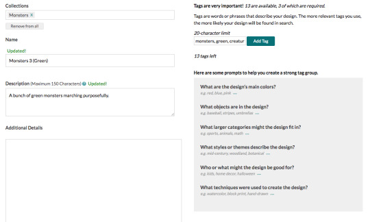
(Leaving links isn't usually necessary, but sometimes it is, like how I wanted to leave a link to the original 1760's teapot for my crinoid fossil pattern.)
At this point, you can order things printed with your design, but nobody else can yet. You have the option to show the design publicly, but I like to keep it private until I've ordered my proofs and can sell it.
Now, to order proofs! DO NOT GET THE CUT SWATCHES!!! They are SO much more expensive than getting a fill-a-yard, because cutting and packaging all the little pieces is a lot of extra labour. Wether you have a few designs, or a lot, just get a fill-a-yard.
To make a fill-a-yard you first need to make a collection. Collections can be either public or private, so I keep a private collection called "new designs to proof", and I put all my new designs in there until I've ordered them. You can also add other people's patterns to a collection, so if you have extra space to fill up or you want little bits of a bunch of other people's patterns for a quilt or something, add whatever you want to your collection.
On the collections page when you hover your mouse over one you'll see a little patchwork symbol show up in the middle along the bottom edge, and you click on that.

That'll take you here, and you choose a layout and a fabric.
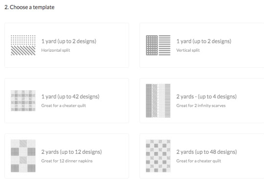
For some reason the fabric options here are a bit limited and vary depending on the layout. I like to get either the 1 yard/42 designs in cotton poplin, or the 2 yards/48 designs in cotton sateen, but there are plenty more you could try.
I'll click the latter for this example. (The squares in this one are the perfect size for pleated face masks, and I have a few made from mine and my friend's fabrics.)
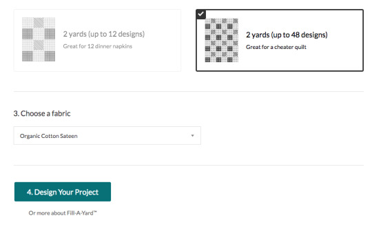
Then you just click on a design and click on however many squares/rectangles you want it to fill. It usually takes a few seconds for them to show up.
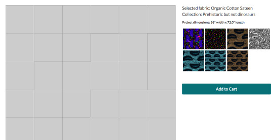
You can have just one little sample of each, or you could make half the fabric be one design and fill up the rest with little samples. (That's what I did for my brown monster waistcoat - I printed juuuust enough of a fill-a-yard to cut out a waistcoat from, and the rest was other samples.)

You can change it around if you want. Once you're happy with it, put it in the cart and buy it!

I'm not going to order this one since it's an example with designs I've already proofed, but here's what my monster patterns looked like when they arrived.
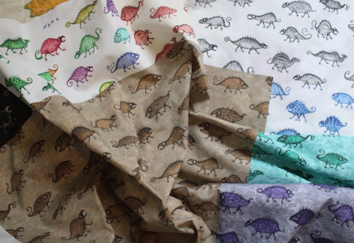
Also, I want to point out that you could VERY easily make some really fun pride flags using the fill-a-yard! You might have to have it be only part of the fabric, depending on the number of stripes, but you could make it be any texture or pattern you want. Here's a quick example I did with other people's patterns by searching "(colour) marble texture".
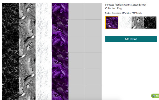
With only 4 stripes I'd have to fill the rest of the space in with something else and cut it off, but it would still be pretty big! (The edge of that purple stripe looks jagged in the preview, but they print perfectly straight.)
I have not done this, but someone should! Just wash it, trim the blank edges off, hem it, and you've got a flag!
(Don't do this with the 2 yards/4 designs option though, it looks like nice stripes in the thumbnail but it's made for infinity scarves and there's a gap and dotted line down the middle for cutting. Bleh.)
Anyways, once your samples arrive you can make the designs available for sale! If you have any changes you'd like to make, to the size it prints at or the pattern itself, you can make them now.
I found the small version of the Bathroom Dinosaurs print was too small when I first got my proofs, so I just reduced the DPI a bit.
And you can replace the image with a new, edited version by clicking "upload revision".

So when my brown coffin pattern printed really washed out and grey, I replaced it with a more saturated version and was good to go, no need to order another proof.
Down at the bottom of the design editing page you can now click on the options to list it publicly, and to sell it on fabric and/or wallpaper. I make all of them available on fabric, and some on wallpaper if I deem them to be appropriately large.
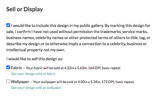
They'll pay you 10% of the sales price of the fabric, or slightly more if you sell over a certain amount in a month. There's a whole page of questions and answers about it.
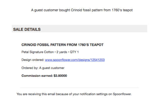
You also get a 10% discount if you order fabrics with your own designs. (Although, personally, if I'm ordering my own designs on fabrics for me then I'd prefer to get them from somewhere like ArtFabrics, since they use reactive dyes instead of inks, so their blacks actually print black and don't make the fabric stiffer like Spoonflower's do. And also because they're here in Canada so there's less shipping cost. Sadly they don't have an option to sell your designs though.)
Spoonflower also has weekly design contests which are announced a few weeks in advance and have pretty big store credit prizes (the first place one is 200 USD), and I've entered a few times, but I don't vote often because Spoonflower is such a huge site that there are frequently over a thousand entries and it's really time consuming to scroll through them all.
Ok, that's everything I can think of! I also put all my patterns on sone things on Redbubble, since they have options for repeating patterns on some things.
2K notes
·
View notes
Note
Since you are a gamedev, do you notice any difference in how you play and critique games in comparison to how non-game developers do it?
Sometimes, yeah. I pay attention to details a lot, especially if it's something that inspires me for my own work. With pixel art games, I pay a lot of attention to where the devs choose to use bespoke sprites and scenery. I also tend to pay attention to when changes in mechanics are used to underscore a story beat. That sort of thing.
In general, I think that actually making a game and studying game design can make you better at gauging how individual design decisions contribute to the overall intended experience of a game. This can sometimes make me more understanding or even appreciative of little things that annoy the average player.
For an easy example: Lots of people complain about how you have to backtrack to a goddess statue to upgrade your health in BotW and TotK, rather than just being given a Piece of Heart. But even setting aside any discussion of the choice between upgrading your health or your stamina (or neither, if you're a masochist) that the goddess statues offer, as a designer I understand the value in making players go back to town. Maybe while the player is backtracking to town to use a goddess statue they also see that the NPCs are doing something different now due to a change in the state of the world, or a new side quest has unlocked, or they're reminded to stock up on items and use their cooking ingredients. But there's also just value in down time, offering a tonal contrast between the safety of town and the excitement and danger of the rest of the world. And the player is more likely to grow attached to a town they visit repeatedly, their home away from home within the game world, compared to a location they pass through once or twice and then never have any reason to revisit. I think as a designer I'm able to appreciate these sorts of things more, rather than just judging them as a player based on whether or not the game is "wasting my time."
This can go both ways, though. I think I've become more picky with JRPGs because I've spent so much time analyzing their specifics in the process of making my own RPG. A lot of people will look at something like Bravely Default and see them as faithful throwbacks to classic Final Fantasy with a few modern twists, but to me the differences in how those games are structured and paced and balanced are glaringly different in a way that just makes me appreciate the way the classics did things more. Or like I'll play Octopath Traveler and just hyperfixate on how the areas are all structured identically.
Granted, I don't think you NEED to have made a game to get into this sort of mindset, but it's a factor.
137 notes
·
View notes
Text
everyone suggesting alternatives for Photoshop is inevitably not actually using most of the Photoshop functionality, which to be fair is probably the vast majority of the potential Photoshop userbase.
the reason Photoshop has been industry standard for 30 years is that it does almost everything and has almost always done almost everything. it has had a few weird slow adoptions, for example it didn't support basic live mirroring while drawing until the 2010s (ish). it didn't have recovery saves or auto saving until about then. it's never been the absolute last word in real media synthesis, that was Corel Painter for years and now I think CSP is probably the king. illustrator is better at vectors. etc. but Photoshop can do all of those things well enough to prepare a professional grade, print-ready artwork from RAW file to layout to text to retouching to total from-scratch illustration, in one step, with layer and channel separation, multiple types of masking, adjustment layers, lossless file object placement, vector text transformation including all standard print layout tools like kerning, like spacing, comprehensive font support, and both true font variation and faux transformation like fake bold and fake italic. and clients and print workflows are expecting PSD files and file preparation for this reason. Krita, as an example of a popular program suggested as an "alternative to Photoshop" which I have used for hundreds of hours to do professional and personal work, is great for drawing but has a completely unusable text engine, you can't make a webcomic with speech bubbles easily and quickly in Krita. it was like pulling teeth even trying to put "BABY SLUT" on my Lethal Company skin with Krita. but you can lay out an entire magazine in Photoshop in an afternoon, and people do (print preparation is whole other topic I'm not saying vogue is prepared solely in Photoshop, it isn't, I'm saying you CAN do it in Photoshop)
I have never paid for an Adobe product, I am not pro Photoshop, I am pro getting my work done. I would absolutely love for there to be an actual Photoshop alternative, but there isn't. there are individual alternatives for individual features of Photoshop, and if you are working in a limited professional scope or you just want a drawing program or just want to make your webcomic or just want to do pixel art then one or two programs will replace Photoshop for you. everyone who, like me, has to do RAW editing, fashion retouching, print and web layout, pure digital illustration, vector illustration, text and graphic design, and all the rest of the crap I have to do in a format that's accepted by publishers and the rest of the various workflow destinations it's just not realistic. which is why it's great that Photoshop is completely trivial to pirate at any stage of its development you care to install,including versions prior to the introduction of the AI crap, the cloud crap, and the rest of the crap no one serious is actually using unless their manager is forcing them to
131 notes
·
View notes
Text
"B-but what Curly could have done?? There was nothing to do!! (not affecting him or rest of the ship or-...)"
nothing could have been done and that's the most infuriating thing
This isn't about 1 or 2 sick individuals. It's about the whole system that allows and encourages violence.
How assaulter can be convinced of his innocence or redemption until the very end. How victim of assault has noone and nowhere to turn to. How the "good ones" and ones responsible won't do a thing because they either don't care or are tied up by the system that values comfort of men over lifes of women. (choose your favorite!)
yeah, beating up/killing/locking up crew member would definitely destabilise relationship between the crew. and rape fucking didn't
funniest thing is, it almost isn't false. I bet if Anya didn't get pregnant everyone would make it safely, because Jimmy wouldn't get caught or care otherwise. Damn women, always screw up everything!! /ironic/
The whole thing was doomed from the start. Pony express doesn't care about safety at all (4 fking cryopods) not to mention safety of women. Curly is too afraid to do anything, because the moment he intervenes any outcome becomes his responsibility. It's easier not to risk, not to change anything. Jimmy is still his friend who just messed up, he has his back, I can't see anything broken I look at bigger picture.
And person like Jimmy thrives in those conditions. A single broken pixel brings down the whole ship and gains more and more power over others the lower they go. And able to do that without any bad taste in his mouth
#btw not native english sowwy#spelling is weird lol#mouthwashing#mouthwashing game#mouthwashing curly#mouthwashing jimmy#mouthwashing anya#our civilisation is tulpar and noone is going to salvage us in 20 years#we all doomed#we were always doomed#nothing could have been done differenty#i cant breathe#will bash my head on the wall after this#captain curly#curly mouthwashing
75 notes
·
View notes
Text
Tutorial: How I Render Accents
PART 2: COLORS
I usually do not recommend 'pixel hunting' aka going over your work with a fine tooth comb and picking out stray pixels to erase. However, for setting up a proper base layer for accents it is imperative to do so.
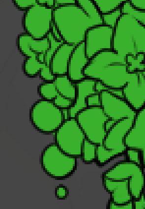
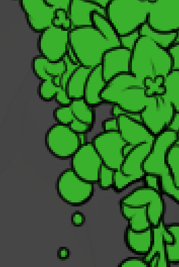
To explain my method of color blocking: I select everything outside of the lines, invert that selection, then fill in. This does a more accurate job than going into each and every section and filling them all in individually, and is also significantly faster. Only downside is small sections like above where you can see bits of the green (which I use bright green against a dark grey background to contrast the base color, lines, and background) poking out, as well as the inner section where it filled in a spot I did not want filled in. Getting all of this right in this stage will make your life easier as you go. (It's also the method I use to color block all my work, even beyond accents)
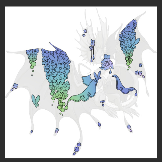
Now this where my style of rendering color may come off intimidating and, tbh it might be. I do gradients first and then I color over them with "normal" blend layers. I typically don't use multiply layers unless I'm shading something that has a lot of textures. If this scares you, it's okay I'll keep walking you through it. Here, my gradient goes from a pastel but deep periwinkle, to a soft more cyan blue, then to a lighter pastel green. Skipping steps and going from the periwinkle to green will give it a different look. There's also hints of a pinkish tone as an accent color.
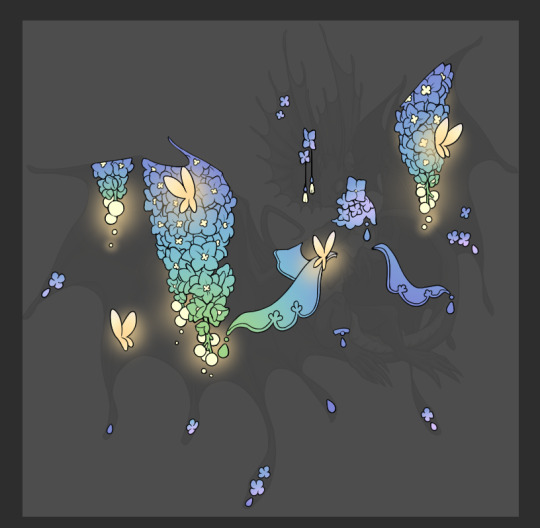
So as I said, these additional layers are done with regular "normal" blend mode layers. I've placed one in between the butterfly line art and the line art for the rest of the flowers, and then an additional layer under everything else. This allows me to create a glow effect specifically around the butterflies, and then specifically under the flowers. Going back and forth with the proper amount of opacity (by using the airbrush transparently) helps to make it glow but not be Too Loud. Also checking it against a dark background can help to check for spots where it spills past the borders, as well as really gauge how Bright it is. I've also color matched the butterflies with the flower pits and the bulbs. This adds extra cohesion and makes them all look uniform but different enough with the gradients.

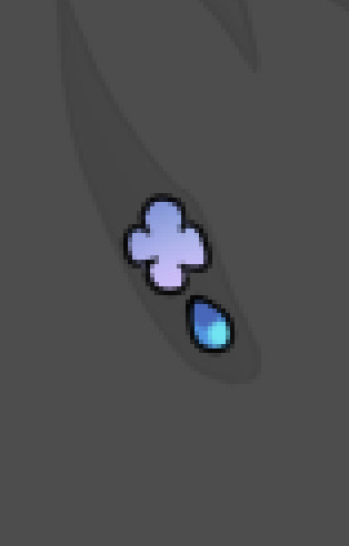

The stages of how I render gems/dew drops. Take the base color, make it a bit darker and less saturated (as well as changing the hue a bit depending on what the default color is. For yellows I go more orange/red, for blues I go more purple or even pink. It depends), add a small drop light at the bottom thats a fairly saturated version of the base color, and then a stark white/ near white highlight. That's it. Don't over complicate it, it will not matter when it gets shrunk down. Note that I do not use multiply/overlay/screen layers for these types of things as it adds too much bulk to the files and doing it manually helps to strengthen your color theory skills.
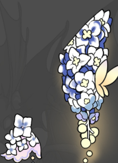
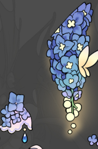
For shading and rendering, again, I create a "normal" layer and simply. Draw over what exists. Color picking and hand blending allow me to create the exact shades and effects that I want that multiply/screen/overlay layers may not be able to achieve. (which isn't to say I dont use them! i just don't use them for the main meat and potato part of my coloring) All of what is shown here is also achieved with the CSP asset SOIPEN (which can be found for free in the asset store)
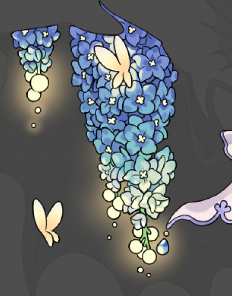

another example. The one on the right is showing how the layer looks without the gradient base layer under it. All of this is rendered by hand. I also specifically put a highlight color around where the butterfly is sitting to give a better illusion that it is properly sitting on the flowers rather than just in front of them.
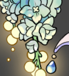
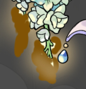
Next is changing the color of the lines, if needed. A method i'll use is I color just the sections I want (on a separate clipping layer) then lock that layer's alpha setting to them add in a gradient. It's a small and subtle effect that adds more depth without doing a lot of effort. (work smarter not harder)
Now we get to the Polish Layers!
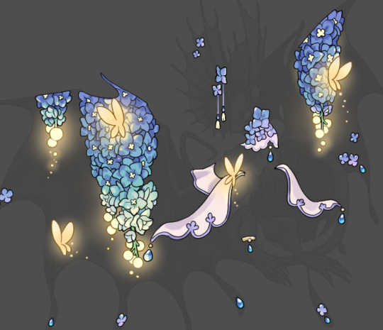
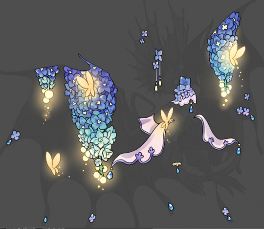
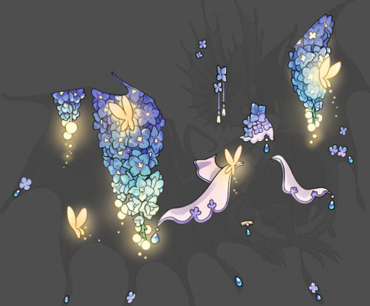
first image is how it looks as a base. second image is with an overlay layer applied. I've used some dark purples and mid tone desaturated greens to push the values a bit further (especially evident on the top left wing) Third image is with a screen layer applied, highlighting the inner most part of the flowers and adding some additional bounce light.
An important thing to note about making accents vs making full coverage skins: OPACITY AND LAYER TYPES MATTER OVER TRANSPARENT SPOTS. What I mean by this is that if you use a soft, light grey to shade with a multiply layer, don't clip it to anything, and have it go outside the lines - that will no longer appear as a 'shadow' when it comes to the final result. Instead you will have a section of soft light grey that is simply laid on top of whatever the image under it is. The same applies for overlay/screen/add layers and so on. If i use a very dark color on a screen layer (to give a soft highlight) and airbrush it over a bunch of stuff and don't clip it, it will end up with this horrible dark splotch over everything that isn't opaque. To this end, mastering normal layers is imperative to having well rendered and convincing accents.
Another thing of note: when it comes to sparkles/small details, note how 'large' the sparkles behind the butterflies are. They seem a bit chunky, yeah?
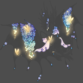
this is what they look like at proper size. If anything, I could have gone larger on the small metal beads connecting the dew drop jewels to the lace.
Another trick I also like to do is this:

a slight hint of transparency! It's just enough to let the dragon's lines underneath show through but not enough to be super noticable. I like to do this a lot when it comes to sparkly and magical effects.
Next is the worst part of all: destroying all that beautiful hard work with the shadow and line art layers! (sobbing)
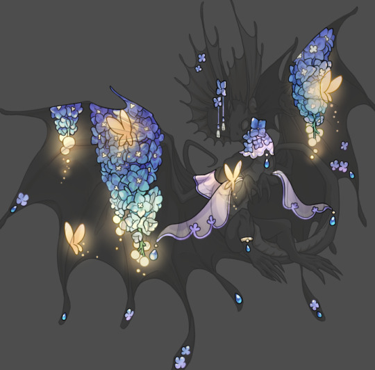
This stage always agonizes me. This is my first pass of the shadow/line layers and let's hope it's dark enough.
But yeah that's a start to finish look at how I create my accents. Unfortunately a lot it devolves into needing to know, yknow, line weight and silhouette importance, color theory and the ways that drawing applications actually apply color to a png vs how its rendered in app. All of these things impact the finesse of the accent, and are things you do have to learn gradually over time, but hopefully this has given yall some additional insight and perhaps some helpful tips.
And this should also explain why I get so mad when people go 'hey can I get this accent in another color' no! no you literally can't!
155 notes
·
View notes
Note
id be interested in seeing you rank plane emojis from different platforms (by their livery, or by whatever else) just for fun, if you want!
You're right. I WILL do this for fun, because this is fun. Not based on livery, since they're mostly white with blue wings - just how much I like them. I'll be adding a rating out of 10 for each one because I think that's the tradition for this sort of thing.
Apple - 4/10

I mean, because I have an iPhone this is my default conception of an airplane emoji - I think it's fine, I just find it a bit offputting how they model the individual flaps and cockpit windows but the rest of it is a white airbrushed tube. It's a weird contrast.
It's fine, I think. Acceptable. I maybe think emojis by default aren't the most aesthetically pleasing.
Google Noto Color Emoji - 4.5/10

I think this is a slight improvement over the Apple version because of the more consistent stylization. It's also a little more contemporary, since most airliners that are flying now have two engines. I like that they added a few windows and highlights to keep the cabin interesting, and I think it's a bit...something that they took off the flaps but added flap track fairings. Cockpit windows look awful though.
Samsung - 2/10

This is a bit more of a realistic shape for an airplane but for some reason I don't like it. Maybe it's the fact that you can barely recognize that there's a tailfin at all, or the cockpit window looking weirdly...shiny? I think what gets me the most, though, is that those engines look like Super Mario pipes.
Microsoft - 1/10

She's a little...phallic somehow. I just think a top-down view of an airplane is almost always going to look worse if you make it super round and blobby. On the bright side, it's still recognizable as a plane.
WhatsApp - 7.5/10

I really like the way this one is red. Way to stand out in a crowd. It's also quite realistic without giving up on being stylized. My one issue is with the cockpit windows, which look a bit out-of-place and weird. This seems to be a common point of failure for this sort of emoji. Also, I'm unsure if this is meant to be a two-engined 747, but if it is points off for those not existing.
Twitter - 6/10

I hate to ever hand it to Twitter but this is just solid. That's an airplane, just a very simplified and round one. Even the cockpit windows on this one look okay.
Facebook - 3.5/10

Maybe airplane emojis with airbrush shading just look bad to me. There's nothing fundamentally wrong with the shape of this but I don't think they differentiated the tailfin from the fuselage enough. It looks like a stub. Also, what is up with that miserably short wing chord?
Telegram - 7/10

I mean, it looks like a 3D version of the Apple one, but it's surprising how much making it 3D improves it. Plus, gotta hand it to them deciding their emoji was being flown by Tex Johnston. I admire that sort of verve.
Microsoft Teams - 0/10

On the flipside, animating this one and making it 3D makes it so much worse! It looks like it was made right when people just figured out that 3D animation was a thing that was possible to do, back in the 50s or something. And boy are those pixels crunchy - I wouldn't mind this if it weren't already heinous. Seriously, how is that tailfin even attached?
Skype - 10/10

Now this I really like. Most of these are impossible to assign a model to but this distinctly looks to me like one of the earlier, stubbier 737s, just really short with a pointy nose, and she's waving at you. Crisp, nice smooth animation, just fantastic.
Twitter Emoji Stickers - 0/10

Looks bad. One of the few of these which are very easy to recognize as a specific model of airplane - this is clearly a 747, based on the inclusion of the hump. There is a reason basically none of the others are trying to be a 747. Adding a weird lump to the front of your emoji doesn't really make it any less weird-looking, and rendering a plane from above tends to be weird-looking already. It looks like she was stung by a bee.
JoyPixels - 6.5/10

As with the WhatsApp red, I appreciate anything setting itself aside in color, so I have to compliment the choice of this sort of toothpastey green. This is one of the better simplified airplanes we've gone over today, and the only thing I really dislike is that it has the same issues with the tailfin Facebook does.
Toss Face - 0/10

I can barely tell this is supposed to be an airplane. It makes me want to, excuse the mental image, toss face.
JoyPixels Animations - 10/10

Now THIS is what I'm talking about! Just a nice little pixel aircraft, doing the same sort of smooth wriggling as the Skype airplane - no criticisms.
Sony PlayStation - small/10

Adequate, but too small to really assess further - but the fact that I don't dislike anything about it is honestly a credit at this point.
Noto Emoji Font - 3.5/10

This just looks like the Samsung emoji but rendered with plain lines. Removing detail from these tends to improve them.
OpenMoji - 0/10

Oh, no, I take it back! Too few details! It's like a torpedo with wings awkwardly stapled on. A really phallic one at that.
emojidex - what the hell/10

I think this more or less looks fine, and the livery it has also looks fine, but I'm so thrown off by the fact that I don't think this is a real airplane. I am obviously not an authority on every model of airplane ever built but I'm reasonably sure this isn't a real one. It most resembles a BAe 146/Avro RJ, the only four-engined t-tail plane intended for passengers rather than heavy cargo. But the 146/RJ has high wings, located above the cabin windows, so...what is this airplane? What does emojidex know that they're not telling us?
Messenger - 7/10

While not ugly per se, it's a bit futuristic for my taste. Still, the choice to model it from a position other than directly from the top avoids a lot of the pitfalls that make many of these so bad to look at.
LG - 4/10

Boring? Yeah, without question. But this is just a good representation of an airplane, and at this point I'll accept that. Does the tail thing, though.
HTC - 3/10

Something about the way this is shaped makes this look more like a rocketship than an airplane. Or a Convair Pogo.
SoftBank - 5/10

A decent pictoral representation of an airplane. See: LG. Fixes the tail thing.
Docomo - 5.5/10

Also a decent pictoral representation of an airplane, but I think rendering it in silhouette gets rid of many of the pitfalls associated with airplane emojis. No details to mess up, just the shape of an airplane. Why do the majority of these have four engines? Seriously, there are only three four-engine airliners in passenger service right now. Have the people designing these not flown since the early aughts?
au by KDDI - 2.5/10

Okay, I know I've been saying being a good representation of an airplane is good enough but this is just simplifying too far. This isn't an emoji, it's a unicode character.
Mozilla - 1/10

Why pointy but only sometimes? Why does the tail pinch in like that? It's ugly, Mozilla, you made an ugly one.
482 notes
·
View notes
Text
SIMDEW VALLEY SET 🍄👩🏿🌾🐷🐴🐄🧙🏿♂️🌻🌽
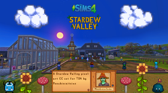
Stardew Valley Pixel Art Floors/Walls/Deco (TS4) Download Below
Aside from a couple most of these pics are just the demo pics showing what's included, more CC in game pics can be seen here
🍄Misc Large Decals


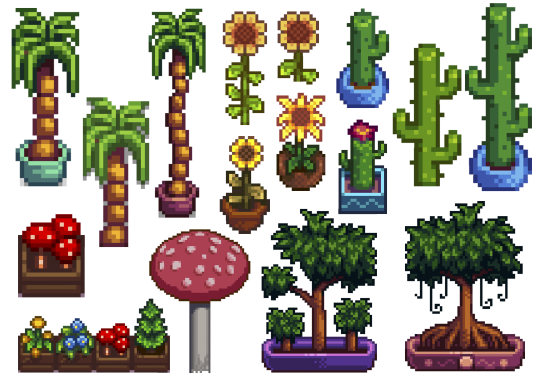
In order: Junimo huts + large Junimos, Holdiay Decor and "sky decor", furniture items, rarecrows, plants.
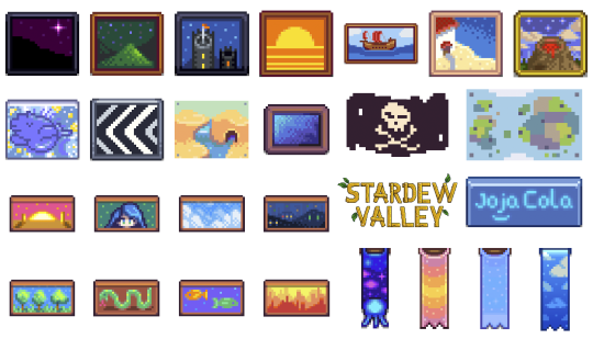
🍄Wall Decals Paintings and Banners:
🍄Wall Decals Misc small:
Adventure stuff and boots, small junimos, random furniture items slime monsters different expressions
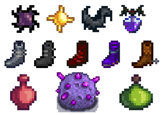
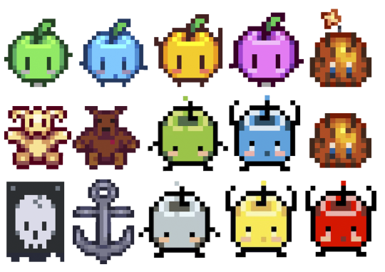

🍄Wall decals Gems and Minerals:
I didn't do them all, just some that I liked.
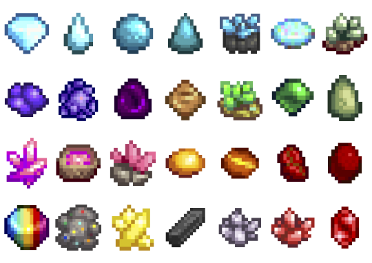
🍄Wall decals farm animals
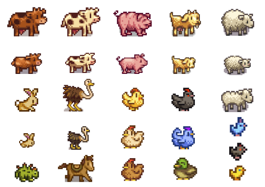
🍄Wall decals Fishing
Again just the fish I wanted to do, not all:

🍄Wall decals Harvestables, Crops, Products:

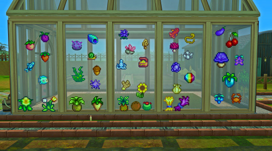
Here's a random in game pic (see more in links provided at top or bottom of post), all decals show through glass too!
🍄Stardew Valley Villagers (yes the bear is a villager I refuse to accept otherwise) portraits
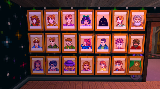
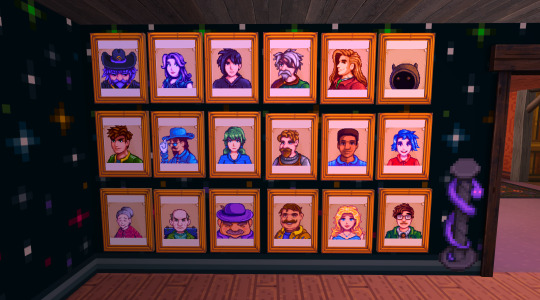
The portraits are the only item with actual dimension, I recoloured a base game framed painting, so these are not flat like the rest of decals. (they look a bit orange but that's just my mood lighting)
🍄Walls and Flooring (indoor and outdoor flooring)
I did all the ones you see here:

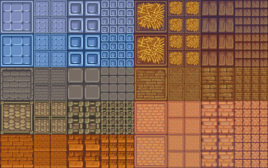

For the floors I made a large and small version of all:
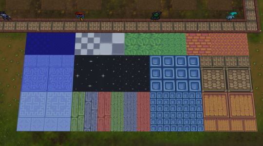
🍄You can see more CC in game pics in my wip post here
Are you sick and tired of those smooth graphics from Sims 4? Do you wish you could replace those pesky curves and detailed HQ textures with nothing but square pixel heaven and flat colours? To be finally rid of all those 3D bump/light effects and replace them with volume-less cardboard cut-out illusion and imagination? Do you want your build/game to look just like Stardew Valley? Or do you simply think that if the sims team are gonna give us low poly and low quality meshes and textures might as well do it properly? Fear not! The solution is here! I made a new Stardew Valley save (why I need yet another save that I'll never have time to complete I don't know) and tried my first build, the recreation of my current (and only) farm. It was ok but I got frustrated at how "Sims 4" everything looked, and checked for stardew valley cc conversions, art, decor but only find people making it using sims 4 stuff, which is probably the most logical thing but not for me! So I made this as there are plenty of game assets from Stardew Valley available online and however tedious and time-consuming resizing the tiniest of pixel art images is to fit Sims 4, it is fairly easy and doable, so I did it. I did skip some items in each category as there are way too many and just did the ones I like, sorry if there was one I didn't include. Also there are some floors in the game or icons that I couldn't find. Some Junimos were taken from the internet but most are individually resized game assets. INFO: all decals in wall deco, all are zero simoleons, and the portraits are 10. You can find my stuff typing "moonbiscuitsims" or "stardew". All have correct colour filter tags and removed "talk to object (insane)" and "can be struck by lightning" (these things annoy me or could cause more distractions for my sims, sorry if you like this though I'm sure there are plenty of objects to talk to/ lightning strikable objects). I don't know if this has an effect. All the portraits are just tagged as brown. All are resizable to your liking. Forgot to mention the floors i think are in wood flooring and outdoor flooring; and I think the walls in panelling. REQUIREMENTS: Nada, nothing. Just base game. (though I did accidentally make one item from a get to work decal by mistake, I remade it to fix it and I've play tested everything, but let me know if something doesn't show up.
PLEASE READ AND RESPECT MY TOU AND DO NOT ❌❌❌: - ❌ Reupload - ❌ Include in sim downloads - ❌ Put behind paywall of any kind no matter what. - ❌ Claim as yours. If you wanna use the texture files to make other different original content that is fine as long as it is different from mine and NO PAYWALLS and no reuploading my stuff. The images are from Stardew Valley, but I spent ages editing every single one to fit the sims, and this took me days to do. All my stuff is free. I don't care about conversions to ts2 or ts3 but NO PAYWALLS and please tag and credit me. If used for screenshots please tag me too, I'd love to see <3 🍄DOWNLOAD (including a pick and choose or a merged file with everything, don't get both) 🍄ALT DOWNLOAD PATREON Enjoy! Happy Simming/Farming
🌵🥥🌴NEW!! Calico Desert Addon🌴🥥🌵
Stardew Valley fav music playlist 🎵🎵🎵
#moonbiscuitsims#moonbiscuitsims4#moonbiscuitsimsstardew#moonbiscuitsimscc#moonbiscuitsimsphotos#mbsdownload#stardew valley#sims 4#the sims 4#ts4#sims cc#sims 4 cc#ts4 cc#stardew valley sims 4#sims 4 stardew valley#sdv#sdv fanart#stardew fanart#stardew#stardew valley fanart#sdv farmer#ts4cc#sims4#sims 4 custom content#the sims 4 custom content
137 notes
·
View notes
Text
ibis paint mogai headcanon icons tutorial / splitting flags
hi! bit far from my usual content but I came up with my own method of making perfectly split mogai icons on ibis paint x and wanted to share as I have only seen tutorials with other software. this is the method I personally find the easiest!


to start pick the size of your canvas. the number of this is important - I would personally go for 600 by 600 px. if you are choosing a number of flags which is more difficult to divide by, say 11, pick a number divisible by 11 which is closest to your desired size. E.g 605 instead of 600
I will be using 600 x 600 and 4 flags in this example
click “canvas” and “resize”. you want to ensure the “keep aspect ratio” setting is turned off. then divide your width by the number of flags you have. In this case, 600 divided by 4 is 150, therefore I’ve changed the width to 150.

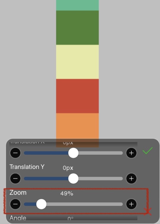
your canvas will now be the exact width you want one flag to be. insert your first flag and scroll to the bottom of the little menu, and turn off “show frame around object”. this will make it easier to see what we are doing. as a note, if you want to zoom in or out the entire canvas you will have to do so before adding the image.
use the zoom function to fit the flag to the exact height of the canvas. I would advise using the scroller to get the approximate size, then using the + and - symbols to get the exact pixel match. you may need to zoom to the top or bottom of the canvas before adding the image to make this step easier

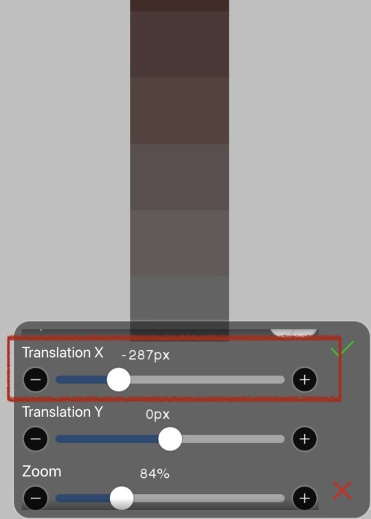
once the image is lined up, save it as a photo. you can then delete or hide this layer and repeat with the rest of your flags, saving each as an image.
if you add a flag with a symbol and want to see the plain section only, use the translation X scroller to move the flag side to side
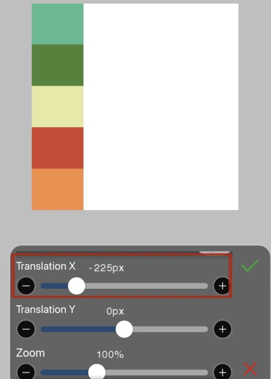

once you have all your flag segments saved as photos, revert your canvas back to 600 by 600 either manually or using the undo button. insert your first flag segment image, which will perfectly line up at the top and bottom.
using the translation x scroller, move your segment so that it lines up exactly to the side of your canvas. again, if you have to zoom in before adding the image this makes it easier to see the individual pixels.
repeat this step with every flag, making sure that it does not overlap the previous flag or leave a small gap. if you are careful and do it right, all the segments will exactly line up to make 600 by 600 pixels.
if you have any queries feel free to leave a comment or dm!
#— jacks raging bile duct#mogai#mogai flag#mogai term#mogai headcanons#ibis paint x#ibis paint#ibis paint tutorial#mogai tutorial#flag tutorial
78 notes
·
View notes
Text


Wasp Nest (Bald-Faced Hornet)
While I yearn to showcase other types of insect nests found in the natural environment, it seems that all I've been able to easily find are Bald-Faced Hornet nests. Akin to the previous live nest showcase, the nest found here isn’t on my property. I was alerted to the presence of this nest (while only a few feet away) while on a long walk as the sun's heat began to relent. A large returning worker of the colony buzzed past me, flying straight to the entrance hole (which begins as a long, woody tube) at the bottom of the structure! I immediately leapt to the side to put some distance between myself and the nest, especially with the amount of workers at the entrance hole and walking along the nest's surface! They were likely on alert, but not necessarily agitated. Nevertheless, it's for the best not to get any closer to a nest than necessary while unprotected, even to take pictures. With the weather being so warm, I was fairly sweaty that day, and that can be very alluring to Wasps. It sounds strange, but sweat can be a good source of salt (an essential nutrient for a populated colony). That in mind, and given that the nest is just hanging from the tree so close to this house's porch, mailmen and pedestrians should trend carefully, as this large nest likely house hundreds of large Wasp individuals!
Generally speaking, Bald-Faced Hornets construct their nests such that the eventual entrance hole is situated at the bottom of the nest. Many individuals are returning there to prepare for the night's rest, but this nest also appears to have other passages in which Wasps can exit through or patrol. Specifically, the vents that run along the surface towards the top and bottom of the nest. Typically, vents in a structure like this would be used to manage airflow and heat, and provide a refuge to flying workers during rainfall, but it seems that this colony is also using them to allow individuals to navigate through other parts of the nest! While only an educated guess, it is unlikely that the workers would swarm from those ports as the entrance hole is wider with more room to take off immediately, rather than crawl to the nest's outer layer. Finally, it was only once I looked at these pictures at home (with no interference from inquisitive workers) that I noticed the array of colors of this nest. Generally Wasp nests are seen as grey or mottled brown, but the intricacies of this nest make it appear like it was stylized like a water-color painting and added into these pictures. The nest's color may have resulted from the different woods and plant materials gathered to build the nest. If that's the case, the layering work is quite neat and organized. Considering the coordination required of a colony to build the layers, it's a very impressive (and artful) feat!
Pictures were taken on July 28, 2024 with a Google Pixel 4.
#jonny’s insect catalogue#ontario insect#wasp nest#bald faced hornet#wasp#hymenoptera#bald faced hornet nest#hymenopteran nest#nest#insect#toronto#july2024#2024#entomology#nature#invertebrates#arthropods#photography#animals
39 notes
·
View notes
Note
Thank you for getting me to finally try pixel art! I‘ve always wanted to get into pixel art but I never knew what to start with and always ended up procrastinating. Your blog and the post you made on learning pixel art were what finally pushed me to give it a go. It was really helpful and I managed this little animation in Libresprite.

I definitely want to improve and your art is like the ultimate goal lol. Do you have any tips or instructions for how to get better or on what to focus on in the future? I‘d appreciate any kind of criticism/input you are willing to give! How do you manage to make such gigantic and beautiful landscapes?
thank you!! and i'm so happy you decided to give it a real go, you're doing great already!! the rendering on the body and the pink shading is really nice.
i can help a little with animation stuff but i'm not an expert, ill write something out about backgrounds at the end
i hope you don't mind but i edited the sprite a little, just to illustrate some stuff
🤺Animation stuff

i added an extra frame near the top of the arc so it slows down. this is called ease or slow in/out and usually happens at the beginning and end of movements. u can do even more slow but this is just a quick version
i also removed the middle frame (where the tail is straight down) to make the swing appear a bit more powerful. this could be the principle of timing in the same video. you can exaggerate smears if you do this, its up to you!! lately i tend to exaggerate stuff a lot, things arent super noticable in motion
i also got a good bit of advice from nickwoz that helped me, basically when you begin to animate, it really puts the rest of the sprite being still into focus. try to think of how you could animate other parts of the body, even subtly. and sometimes if individual pixels stay still they can catch the eye in an unintended way as well, just keep it in mind!!
if you want to learn animation more, you could take a look at duelyst sprites, they have incredible idle and ability animations, i study them a lot

heres one i downloaded a long time ago. i recommend just downloading stuff you like and looking at it!! i have a huge collection of pixel inspo. slowing animations down can really help you understand whats going on. its just a bunch of simple elements put together that makes it look so good.
IF U WANT MORE RESOURCES/ARTISTS I REOCMMEND TO GO AND STUDY LMK!!! IM LIKE A WIKIPEDIA, I AM A BIG FAN of pixel art and love to share
🌿 OK lets talk about landscape stuff
it looks like you have art experience already, but im gonna talk as if youre a complete noob cos it might help some other people who read this!! ur doing great 👍
❓ how to learn: study (and practise a lot)
what i mean by study: draw it, copy it, try to understand it. you can try to change characteristics about it. changing the angle or lighting can help u understand how something works in 3 dimensions.
sometimes it takes time, dont worry, you will figure out your own style through doing studies, its all a process
❓ how to draw landscape details?
study pixel artists and how they do it recommendations: fool, slym, jubilee, deceiver
also please look at real world references!! you got to build that visual library
❓ how to learn composition?
study traditional artists or animation. i did a ton of studies of ghibli backgrounds which i think helped my growth a lot recommendations: arcane, studio ghibli, traditional painters
im gonna break down a piece as well and maybe that will help. this is one from 2022 but its still one of my most popular and its pretty simple too!!


if we remove all the fancy stuff what we have is actually really simple. just a few large, overlapping shapes that all point towards our focal point. it's the brightest area with the most contrast and many edges point into it.
go to pinterest or google and just search "pretty landscape" or "mountains" or something and you can see what i'm doing is nothing special or unique!! break it down into bigger shapes to begin with, its just different areas of material mostly.

and heres how you can make any landscape from any colours. purple sky or mountain? orange grass? ok !! it all works, it doesnt matter. i just blend the colours.
when parts of the landscape are in the distance they become closer to the sky colour as there is more "sky" in between you and it. its called atmospheric perspective. so if the sky was red, the clouds would fade towards red.
OKKK i dont know what else to say so i hope that helps!! honestly 90% of what i do is intuitive and hard for me to really explain, so you dont have to know The Rules, you just kind of pick up stuff as you go.
GL and thanks so much for showing me your art!! please keep going!! 💕💕💕💕
180 notes
·
View notes
Note
Anon here!! How did you make the heart graphic for the power rentry?

hi!! i’ll put it under the cut since there’s quite a few steps. lmk if you need a more specific tutorial or images for any of the steps!!

1) finding the base
find the shaping mask you wanna use. you can look up “shaping mask png” or “mask png” on pinterest to find some. this is the one i used:
2) removing the background
to remove the background, use the selection layer in ibis paint x. to find this layer, go to the layers panel and it should be the one all the way at the top. it is titled “selection layer.” to remove the white background, select the bucket tool and select the white background. it should turn blue. then switch from the selection layer to the layer you’re removing the background from. look at the top middle of the screen. there should be a square composed of dotted lines that looks like this:
click on it and select “cut.” this will remove the white background. click on it again and select “remove selection area.” now you’re ready to continue!
3) creating a cleaner base layer
you might want to do this if you plan to add a stroke, as once the background is removed from the mask, it tends to leave some remnants behind. this makes the stroke look choppy and pixelated. to do this, take the paint bucket tool on a new, blank layer, and fill in the black part of the base with black. then, delete the base layer underneath the new layer. the hearts will become transparent (to see this better, change the canvas from white to transparent in the layer menu) and the base will hold its shape. you can also remove the hearts in the previous step, but this tackles two birds with one stone and (in my opinion) looks cleaner.
4) filtering manga panels
to make the manga panels pink, i looked up “pink manga polarr code.” pretty much any one will do, but this is the one i used:
for the rest of this step, you’ll need the app polarr. once you get the app, go to the edit section of the menu on the bottom. click “open photos” and insert the manga panels you wish to change the colors of. then, click “filters” and “import filter.” from there, click “import qr code” and click on the filter in your gallery. the filter will go into polarr, and you can just click instant export or you can save it and then export it. it’s up to you.
5) masking the panels
import the images you just filtered into your canvas. now we’ll use a clipping layer to have them take the shape of the base. click on the image layer you want to do this with, and then hit the clipping option in the layer menu. this will have it take the shape of the base.
6) coloring the hearts
now we’ll add a new blank layer atop the clipping layers. i color picked the pink color from the image, and then used the bucket tool to fill in each of the hearts.
7) adding the extra pngs
for this step i used the sticker option in picsart and a transparent canvas to collect the pngs. i believe i looked up “pink png” in the search bar, but i’m not sure. then i imported them into the ibis paint x project and positioned them where i wanted them to go. download transparent pngs of the project (one of each image you added). toggle the eyes on and off so that you can save the different versions (not individual layers. i just mean if you added two manga panels, make sure you get one with one manga panel and one with the other).
8) creating the gif
search up ezgif animated gif maker. it should be the first option that comes up. for this, i typically switch to “manually ordered upload” opposed to “alphabetically ordered opload” (the default) so i have more control over the order of the images in the gif. once you upload them into the site and you get to the editing menu, set the delay time to 100 and click the box that says crossfade frames.
andddd you’re done!!! i hope this was somewhat comprehensible and i didn’t miss any steps xD

190 notes
·
View notes