#the original version I made of this actually had a picture of me on the mug instead HAHA
Explore tagged Tumblr posts
Text
01/07/24, 3:43 PM EST: At this time of day, I saw "the dress" as a white and gold dress that appeared to be in the "shade," (which to me gave the "white" part of the dress a "light bluish" tinge).
UPDATE 01/07/24, 4:50 PM EST: I had originally reblogged this post in the late afternoon. It is interesting that when I revisited this post later to add to it, it was in the early evening, so my blinds were closed and no more sunlight was coming in my window behind me to shine on my computer screen. Consequently, at first glance, the dress looked darker, with it almost being a very light blue (especially the photo on the Wikipedia link above), and a dark gold or mustard color. 🤔
For more information on what the colors of "the dress" actually are and why some people see the dress as "blue and black" and others as "white and gold," (and a few as "blue and brown" or "other), see below the cut.
Yes, the actual dress is blue and black, which I can clearly see in the photos below.

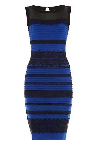
Both photos above are from BuzzFeed. Above left is a photo of the dress worn to a wedding by the mother of the bride (who started the whole thing when she took the original photo and showed it to the bride and groom before the wedding). Above right is a photo of the dress from the company it came from: Roman Originals.
Roman Originals (now just Roman) also has an image on its #THE DRESS That Broke the Internet website that fades from the blue & black to the white & gold dress, represented below by this (edited) gif:

Fun facts from the Roman's #THE DRESS website:
"The dress" is a viral meme that launched to stardom on 26th February 2015, when the world disagreed over whether the item of clothing below was black and blue or white and gold. The phenomenon revealed differences in human colour perception which have been the subject of ongoing scientific investigation in neuroscience and vision science, with a number of papers published in peer-reviewed science journals. In popular discourse, the disagreement over the colours was sometimes referred to as "dressgate". But to us it will always be our Dress that broke the internet. After 7.6 Million tweets it's time to seperate the fact from fiction
* 3,622,960 visitors to our website in 48 hours * 2,214,343 uses of #thedress * covered on over 150 networks including BBC Worldwide, Sky, CNN, Fox, ABC, CBS, Globo TV, NTN24, Nippon TV and more... * 70% of people asked actually saw white and gold instead of blue and black * 73 million views of #thedress across all social media channels * 34 minutes was the amount of time it took for our website to sell out of #thedress We even made a #WhiteandGold version that was auctioned off for Charity
It appears that some of the illusion might have been caused by "the dress" having been photographed with yellow-tinged lighting. According to Wikipedia:
Daniel Hardiman-McCartney of the College of Optometrists stated that the picture was ambiguous, suggesting that the illusion was caused by a strong yellow light shining onto the dress, and human perception of the colours of the dress and light source by comparing them with other colours and objects in the picture.[40] [...] The first large-scale scientific study on the dress was published in Current Biology three months after the image went viral. The study, which involved 1,400 respondents, found that 57 per cent saw the dress as blue and black, 30 per cent saw it as white and gold, 11 per cent saw it as blue and brown, and two per cent reported it as "other".[44] Women and older people disproportionately saw the dress as white and gold. The researchers further found that, if the dress was shown in artificial yellow-coloured lighting, almost all respondents saw the dress as black and blue, while they saw it as white and gold if the simulated lighting had a blue bias.[33][44][45][46] Another study in the Journal of Vision, by Pascal Wallisch, found that people who were early risers were more likely to think the dress was lit by natural light, perceiving it as white and gold, and that "night owls" saw the dress as blue and black.[47][48] A study carried out by Schlaffke et al. reported that individuals who saw the dress as white and gold showed increased activity in the frontal and parietal regions of the brain. These areas are thought to be critical in higher cognition activities such as top-down modulation in visual perception.[49][50] [emphasis added]
The yellow-tinged light hypothesis might account for why the dress seemed to change colors for me slightly from the time I first saw it with sunlight hitting my computer screen through the window behind me, to when I revisited it in the evening, when my blinds were closed.
I'm also an older woman, so I fit in the demographics of those most likely to see the dress as white and gold. However, I'm not a particularly "early riser" (although I do have to get up early for work🤷🏻♀️).
Optical illusions are always fascinating.
[edited]
In February 2015, the "The Dress" debate had everyone weighing in on what color it was.

9K notes
·
View notes
Note
Pretty pretty please tell me you have pictures of the other Winx’s dorm bedroom like you did flora and I love your art by the way it’s so cute and detailed
Hi @spectrum-007 ! I’m glad you liked it, I have the doodled out plans for the other girls rooms but if I’m honest backgrounds and environment design is something I really don’t think is my forte. The flora room sketch was me forcing myself to practice lol. I’ll share the rest of them but I might redesign the dorm rooms a bit more (I really tried to base the floor plans on the original canon but I think I might change it for my own version)
Clean version of flora’s without her in front of it:

And the ‘base’ dorm I saved without flora’s stuff in it. One of the changes I made is I decided I wanted to make the Alfea dorms have standard furniture provided, like most dorms irl. This is a fun contrast from Cloud Tower, where rooms aren’t assigned and it’s a lot more freeform.

Here’s Bloom’s half of her and Flora’s room. I imagine they keep these suites the whole 3-4 years at Alfea so they get pretty lived in, but I did my best to keep Blooms side feel more……earth-y

i know getting rid of Musa’s piano bed is a sin but honestly who brings their own bedframe to a dorm situation. I really like her little mixing station at the desk there and idk how legible these doodles are to anyone else but there’s some little easter eggs and story things hidden around

Tec’s side of the room. I was a little less certain about what I had going on over here but in combination she and Musa have a lot of mood lighting lol

STELLA!!!! I don’t remember if I forgot that her room gets a little loft area or if I Decided to make it the same layout. I love it in here. I didn’t get to Aisha’s but I actually intend to have her move in here with Stella - I always thought that was a missed opportunity! They have princess stresses in common but are so different in almost every other way, and Stella particularly is the one who accidentally rubs up against Aisha wrong when she’s new and insecure in the group - having them share a space would be so sweet…

((As you can see, Stella is the only one who brought her own bed frame. Because she Is That Extra))
I’m probably gonna redo these and custom floorpan their suite so I can understand the internal consistency.
#winx#winx club#winx club redesign#winx bloom#winx stella#winx flora#winx musa#winx tecna#winx alfea#asks#spectrum-007
61 notes
·
View notes
Text
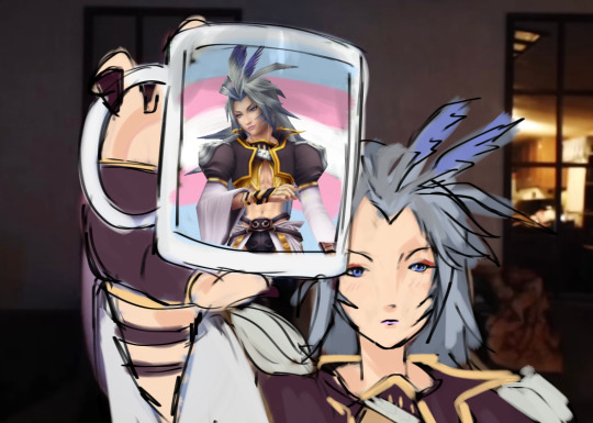
an oldie but a goodie
#the original version I made of this actually had a picture of me on the mug instead HAHA#I’m insane over him#kuja#kuja ffix#kuja ff9#ff#final fantasy#ffix#ff9#final fantasy 9#final fantasy ix
64 notes
·
View notes
Note
I remember a friend of mine had some LPs that were Star Wars themed disco albums, and it brought back a very weird memory from back in the 70s (yes, I'm old!) of listening to a Star Wars disco mashup on the radio. What was all that about? I also remember something like that for Close Encounters, too.
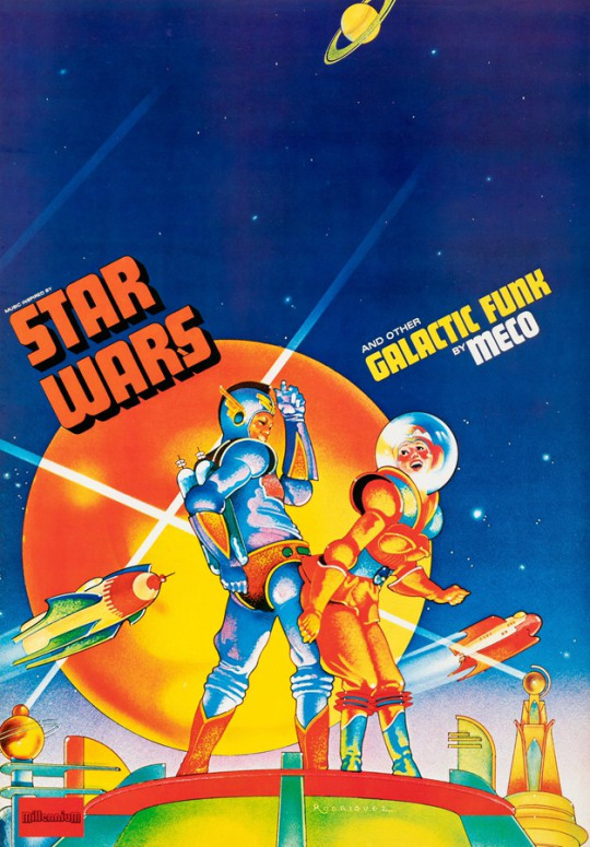
You remember correctly, and this went on for a long while. In 1983, disk jockeys around the country played a record that involved an Ewok rapping the plot of Return of the Jedi in Ewokese. This made it to #60 in the Billboard Top 100.
youtube
This is hard to explain to people who weren’t there….but in the wake of Star Wars in the late 70s and early 80s, scifi was so beloved and mainstream that the orchestral music for nerdy scifi and fantasy movies about outer space were remixed and sampled into Giorgio Moroder-esque Italo-Disco dance numbers. And the most astonishing thing is, instead of being consigned to convention acts the way “horse famous” Brony dubstep acts are, this received national airplay on the radio, reached the pop music charts, and were played in discotheques. And incredibly, this continued for years and expanded from Star Wars into Star Trek, Wizard of Oz, Black Hole, Close Encounters….
All of this was the work of one specific person: Meco (or Dominico Monardo). The term “ahead of their time” is thrown around a lot, but Meco really was: a combination producer-songwriter and Italo-Disco pioneer in the style of Giorgio Moroder, he did several things that are now absolutely standard: he used remixes and sampling before hiphop made that standard for musicians, he wrote “fandom music” on a Moog synthesizer decades before Bronies turned their conventions into cringey dubstep concerts with songs like “Everypony Dance Now.”
It's stunning to me that Meco has not been rediscovered, considering every single trend in the culture essentially went his way.

The most startling thing about Meco’s Star Wars disco album, the one that got the ball rolling on this trend, is this: I always assumed it was some kind of cash in created by a record label mandate, a label executive’s completely cynical choice to hop on a hot new trend. That isn’t a crazy thing to think at all, since Star Wars is and always has been the most merchandized and sold out scifi property ever. But it wasn’t! You see, it was all the product of a single man’s specific vision: Meco had to convince his record label to make the record because they were skeptical.
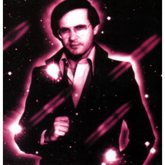
When Meco went to see Star Wars in 1977 on Opening Day (what an experience that must have been) with his friend and fellow Italian chest hair/gold medallion enthusiast Tony Bongiovi, he was already an experienced producer-songwriter who had worked with Gloria Gaynor, Diana Ross, and formed DCA, the Disco Corporation of America. If you've ever listened to Diana Ross's "I'm Coming Out," Meco actually played the trombone solo in that song. Seeing the Star Wars movie for the first time, though Meco thought the movie was nothing short of a religious experience. Originally, he wanted to do Star Wars music as a b-side on a Gloria Gaynor album, but expanded the idea into an entire album.
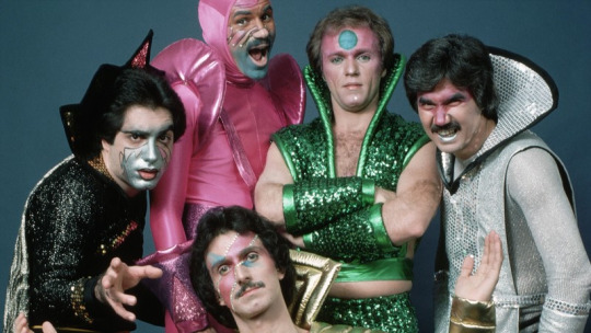
In Meco’s own words:
"When I think about what I did, nobody came to me, nobody said 'Meco, why don't you do this.' Nobody says 'Here's some money go make a record of this movie.' It was just my own... It was magical, it was just out of this world when all that happened."
Not only did this album hit platinum, not only did it actually outsell the Star Wars soundtrack, his remix of the Star Wars theme also went to #1 in the charts. It’s actually the best selling instrumental single of all time. A record, that, incidentally, it holds to this day.
Dick Clark, host of American Bandstand, had this to say about Meco:
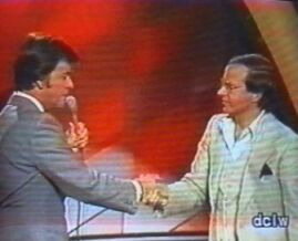
"In 1977, Meco Monardo accomplished something no one else has ever done to the best of my knowledge. He was the first one in history to out-sell the soundtrack of a motion picture with his own distinctive version of a film's music. The music was totally danceable, and broke new ground. It's no wonder the STAR WARS THEME went to # 1. I loved his treatment of music from THE WIZARD OF OZ. Again, Meco created something innovative. The fun and the excitement gave a whole new feel to that totally familiar and well-loved music."
Like a lot of studio producers, Meco had an insane work ethic and hit when the iron was hot: he did an album about Close Encounters that exact same year, but also did a Star Wars Christmas Album, one of the strangest pieces of Star Wars kitsch around.
youtube
One of the most interesting things about the Star Wars Christmas album is that one of the songs, “R2D2’s Wish You a Merry Christmas” is the first professional vocals by John Bon Jovi, who was Meco’s friend Tony Bongiovi’s seventeen year old younger cousin (he was initially known as John Bongiovi). It's incredible to hear a squeaky voiced teen Bon Jovi on a kitsch album about a robot Christmas.
1978-1979 was really his best year. Meco made an Italo-Disco remix album entirely devoted to Superman, and at this point, Meco had the pull to get access to John Williams's sheet music for the score before the music even came out. In my personal opinion it's the best of them because he has to recreate it entirely with his own instruments, leading to a very unique sound.
He also did an album based on the Wizard of Oz:
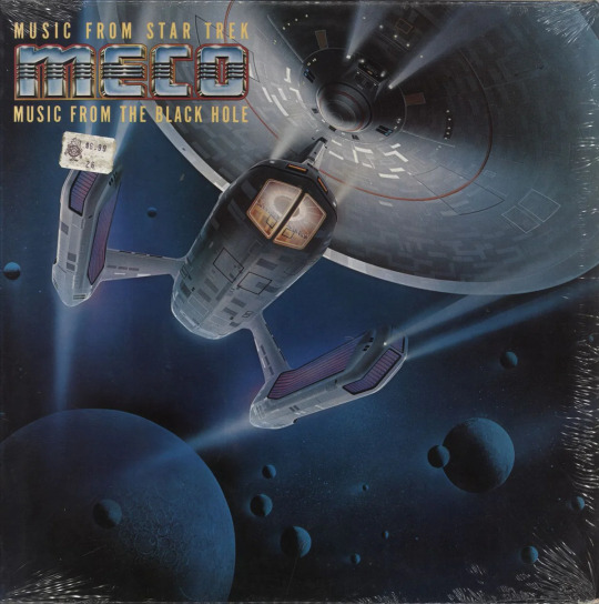
And a combination album of Star Trek/Black Hole. It's probably the earliest remixing date of Goldsmith pieces of music: the Motion Picture Theme (which is now associated with the Next Generation - hearing it done in Italodisco is uncanny) and the Klingon Theme:
Incidentally, I think the design here of the Meco Enterprise, which had to be modified for legal reasons, would make a wonderful canon starship if anyone wants to be inspired by it. It reminds me of the same concept that would be used in the very next film for the Reliant-class of ships.
Meco eventually retired from music in 1985, but unfortunately he is no longer with us, as he passed into the next dimension in 2023. I think he showed us that creativity is often about transformation, and was inspired to make his art by a legitimate awe of space, the cosmos, and human imagination that the scifi movies of the 1970s and 80s provoke.
524 notes
·
View notes
Text

Good fucking day, Robot enjoyers! Gaze upon the updated semi-accurate height comparison of Bumblebee across the multiverse.
This is an updated version of a chart I made a few months ago. I had gotten some feedback and then TFOne came out and I kinda had to update it. I also added a Gen 1 Optimus Prime for scale, for fun... no other reason... (edit: slight adjustment made, just corrected a slight mistake in the order)
I am also working on at least two more character charts and one universe chart, so hopefully I can finish those soon (for some fucking genius reason I decided to do the characters that show up EVERY FUCKING UNIVERSE so I'm s u f f e r i n g)
*PST! Optimus, Megatron, Shockwave, Soundwave, Ratchet, and Ironhide ones are done now*
Master Post
Listed Heights, Explanations, and Justifications below the cut, bc you couldn't shut me up if you tried and I had shit to say.
Gen 1 - ~10 feet (TFwiki says greater than 3 meters so I rounded up to the first whole number because round)
Netflix Cybertron Trilogy - ~10 feet (He looks identical to Gen 1 so... the reason his photo looks weird is because I couldn't find a good full body photo with him standing straight up facing the camera so I put two images together to make the worst looking photoshop job you have ever seen)
Earth Spark - ~10 feet (There is no confirmed height yet, but using this screen shot (see below) of him standing in front of a barn door, I was able to make a reasonable guess, bc I'm so smart.)

One V1 - ~13 feet (I am well aware of what the TFWiki says: 26.429 feet. And I fully reject that number. A: These numbers are sourced from the Walmart Promotional AR Experience that came out before the movie. B: There are three decimal points, and that number does not convert into a whole number in meters (which is originally what I thought was weird about it). C: The director has said that this movie is both canon to the LA movies and its own separate canon, and Bumblebee in both sets of LA movies does not exceed 20 feet tall. Ever. So, for sanity's sake, I have used the KCV numbers as my baseline. Bee grows when he gets his t-cog so shrink this one down a few feet. Look, I'm working on the Optimus chart rn, and one of the numbers from Beast Wars on the wiki was very observably wrong, and if I can dispute numbers older than me, I can dispute numbers 2 decades younger than me from fucking Walmart. Also, yes, his picture is 3 images sandwiched together)
Animated - 13 feet 3 Inches (There is no actual given heights, but in the comments of the previous version, @phoenix-inanis told me that they had done their own analysis of TFA heights and, gonna be real with you, I am blown away by all of their work and how detailed it is. Go marvel at how much work they put in -> https://phoenix-inanis.notion.site/TFA-Height-Chart-f6ad2960ca8c4c5b859ee4958723aaa4?pvs=4 )
One V2 - ~15 Feet (Please see reasoning above. Since this is as tall as we see Bee get, he's the same height as KCV Bee. Sweet fuck, I have put way too much effort into this shit)
Knight/Capel-Verse - 15 feet (No actual numbers, but Mirage is stated to be 15 feet tall (TFWiki), and he and Bee are like the same height, so... Capel directed the ROTB movie if you're wondering why his name is there)
Bayverse V1 - 16 feet (TFWiki. This is like the first 3 movies minimum, I don't remember when he hits his growth spurt. Also mr bay is king, we have numbers for nearly every character in BV)
Cyberverse - 18 feet (I'm gonna be honest, the only info we have is from a really shitty screen shot of a magazine. SO if any one has a copy of this book from the video below, a high quality scan would be greatly appreciated and I will kiss the ground you walk upon. Yes I found the video where the screen shot comes from leave me alone)
Bayverse V2 - 18 feet (TFWiki. Movie 4-5 I can't remember which one, I'm not re-looking this up. I fucking love the bayverse tho, this is the only universe with concrete and consistent this-character-is-this-height info)
Aligned Cont. WF/FOC - 20 feet (TFWiki/Fandom. Video game info screens you godsend, kiss me sweetly)
Aligned Cont. TFP/RID15 - 21 feet (These two designs are canonically identical, like in ALC canon, Bee has not changed visually at all...Ok, yes I got this number from fandom and they give literally no source for where they got these numbers. But, I can fully believe these are accurate. Just by looking at these characters on the show I can verify these numbers in my mind. Here, let's Compare.

This is Sam compared to Bee from one of the BV movies, I'm too lazy to check which one. Sam is average size for a human and we know Bee is 16 feet tall in the first three movies. Checks out. Let's now look at a TFP Character who is also 16 feet tall.

Jack is average size for a human, and the size difference is about the same. Can you see why I can't question the Aligned heights, even if they don't have a source??!?! They specifically made this universe to be full of freakishly tall robots for some fucking reason.)
Not Pictured: Aligned Cont. Rescue Bots and Rescue Bots Academy Bumblebee - 21 Feet tall. Look, did you want to see all 5 versions of ALC Bee? No, you don't. They're all the same height anyway; the back row would have just been a wall of redundant yellow. 5 different fucking art styles in one universe, why is that one my favourite.
Here's the front row and the back row separated into their own jpgs. I know it's kind of hard to tell which Bumblebee is which when they're all together.


#i like comparing the universes like pretty rocks#all of them are good but look at them together#If anyone makes a tf/tf crossover thing please let me know I eat that shit up#Transformers Height Charts#personal stuff#aka the adventures of a mother fucker with the power point program#transformers#bumblebee#tf bumblebee#g1 bumblebee#earthspark bumblebee#tf bee#bumblebee 2018#tfo bumblebee#tfa bumblebee#tf one bumblebee#tfp bumblebee#rid15 bumblebee#aligned continuity bumblebee#transformers bumblebee#knightverse bumblebee#wfct bumblebee#wfc bumblebee#macaddam#macadam#bayverse bumblebee#if i hear anything about tfo bee's height i will riot#Those numbers are bullshit and you know it I do not trust them as far as i can throw them
363 notes
·
View notes
Text

There is Something Seriously Wrong with this Logo..... Chapter Two
So. Lots of you have seen this post by my dear partner ( @lailau7904 ) in which the Williams F1 design team get absolutely torn to bits. In the case you haven't read it yet I highly recommend you do because a) it's really fucking funny and b) it makes what I'm about to tell you even funnier. Though you don't have to, this post touches on entirely different things still regarding this one goddamn logo.
The original post starts like this:

Innocent enough, we made an assumption in good faith that the logo displayed on the Wikipedia page would be the same one as the official version used by Williams. Buckle the fuck up because I'm about to tell you why that was the worst mistake we could have made.
Please. Please I beg of you keep reading this took YEARS off our lifespans. Like the original post was fun and all but it was merely the top of the iceberg. If this were an hbomberguy video this would be the part where he reveals that the background was a greenscreen the whole time. More below the cut!!! :333
The Truth
Already after only a few hours after hitting "post" on the dissection, people started pointing out to us that we'd missed an absolutely crucial detail on the Wikimedia page we got the logo from, pay careful attention:

See THIS?

Yeah this means that that image is not, and never was, the official logo of Williams. All along it had been the work of a Wikipedia user by the name of Juanchocarbonero. Here you can even see the (admittedly painful) history of the file as provided by Wikimedia, this image was uploaded all the way back in 2016, it even underwent an update when the team changed their colour scheme to a lighter blue without getting fucking fixed.

But to me the absolutely most painful part about this page is the "File Usage" section. Which gives you a quick preview of just how deep the goddamn disease that is this piece of graphic design sin really spreads.

And just to clarify: the official version of the logo used by Williams on merch etc is perfectly fine. It's a nice piece of graphic design. I still quite like it. But the story doesn't end there. Not even close.
Consequences
When you look up "williams logo" on Google the image provided by Wikimedia the very first result that pops up, if you're looking for a high-quality .png of this logo that, logically, is what you'll end up using. And I mean, why wouldn't you? What reason do you have not to use it? As long as you don't look to close (oops) it's a perfectly fine, high-definition, clean and transparent image of the logo! No shit people are going to use it!
But this raises a question: Why IS it the most widespread version of the logo? That's fucking weird isn't it? Surely if the actual logo used on ex.: the official Williams F1 website (which, again, is perfectly fucking fine) was available they would've just used that, right?
Now. Small problem. If you want you can go ahead and open whatever search engine you use, if you do that I'm gonna need you to type in "Williams logo" into the search bar, and just try finding a picture that is
of the actual official logo (you can tell the bootleg from the real thing by checking if the middle segment of the W has spiky ends or flat ones. We're looking for flat ones here)
high quality (no pixels or blurring visible to the naked eye)
a transparent png (none of that chequered background bullshit)
NOT a logo with any words (such as: Williams or Racing) visible in it. those don't count.
If you didn't feel like doing any of that, I'll just tell you the answer: you fucking can't. Nothing like that EXISTS. The closest I could get are these two, both of which are mid to ass quality, so they don't count either.


No sensible individual is going to scroll google search results for 5 minutes straight just so they can use a 200x200 image, especially when they think a perfect alternative is right there.
I even found several recoloured versions of the diseased logo, including one as a sticker on Redbubble! Fuck me that's a horrible sight!


The Search
Because I wrote the previous paragrahps after we'd figured out exactly what had happened, you might be under the impression that by this point in trying to answer the question "Why the fuck is that image on Wikipedia instead of, idk, the real fucking thing?" we'd at least established the existence of said "real Williams F1 logo". You'd be wrong, because for somewhere around 24 hours after we'd made the initial, horrifying discovery of just how fucked the Wikipedia version is, we genuinely could not tell if that was the official logo or not.
The ones displayed on their website weren't at all downloadable or even copyable, a non-ass quality of the damn thing just didn't seem to exist anywhere, so we didn't dare draw any conclusions. And we were still foolishly operating on the assumption that Wikipedia wouldn't just lie to us. (this is why your teachers hate it when you use it a source btw. like this is the ONE time it's actually been reasonable)
So, in the hopes of finding the offical Williams Racing logo, the non-scuffed one because clearly it exists, somewhere, we consulted an expert on Intellectual Property: my mother!
What this "consultation" actually roughly looked like was: we went on a walk and I started rambling about the Situation from Last Night before she cut me off and pulled up the website of the World Intellectual Property Organisation, aka the place they store all the Copyright information of like, everything.
BEHOLD:

(pictured; THE ACTUAL FUCKING LOGO I CANNOT BELIEVE IT'S EXISTED THIS WHOLE TIME)
Link to the actual real official legal document because goddamn this rabbithole just kept getting deeper so I like, have that now.
For refence, here is the official copyrighted version and the Wikimedia file overlayed on top of each other. As you can tell, it's disgusting. It's a poor, eyeballed imitation at best.

The copyrighted logo is horrifically low quality because, guess what, that image also isn't downloadable or copyable from the page. I really really cannot blame Juanchocarbonero for uploading his own version to Wikimedia because there legitimately does not exist a version of this logo that is freely available to the public. Like that goddamn abomiation is all we have. It's the effort that counts I guess.
My mother suggested that a possible reason for this could be avoiding the production of knockoff merch, or at least making it recognisable in case it is sold. Think about it, when your logo Doesn't Exist online, no one can use it without a license! It's kind of genius! I'm also about 99% sure they didn't orchestrate it so, it was good luck I guess?
interlude: How the FUCK does Copyright even work
I did immediately think to myself "we should REALLY fix the wikipedia version, like, stat" because I cannot in good conscience have this information available to me and not do anything with it, for the good of the people. However, this poses an issue: was the logo really not scuffed on purpose? Could it be that that version uploaded to Wikipedia isn't a 1:1 of the official logo because of copyrighting issues? To find out I had to look deeper, by comparing the official, website-available logos of various other F1 teams I came to conclusion that: [........................]
Yeah so I wrote that paragraph before actually checking for refences, but even after probably an hour of trying very hard to make sense of the copyright documents and copyright law in general we could not make sense of any of it. According to my mother (again, the closest we have to an expert, like she actually works with copyright in the context of companies but she's not specifically an IP expert. just to clarify) it's actually a lot worse for Wikipedia to have a falsified version of the Williams logo, than it would be to use the copyrighted version. This is because they're spreading misinformation by pretending that's the actual logo. And yet.

According to the Copyright Tag (the one on the top) in the Licensing section of the Wikimedia page for the thing pretending to be the Williams F1 logo, it's fine to use it because just a bunch of shapes. The thing is however, that it says that for pretty much every F1 team's logo, most of which are sourced straight from the official website. So this doesn't really mean anything tbh. According to our local expert (still my mother) it's fucking confusing. So I've decided to leave that at that.
update October 20th: as far as the Wikimedia pages on copyrighting tell me, uploading the official logo could, potentially, get me into serious legal trouble with Williams because of copyright laws. Which is still confusing because as said, every other team's logo is sitting uncontested on their respective Wikipedia pages. So basically we still don't know.
Okay. Backtrack. We forgot to ask something very important:
HOW?
HOW does one fuck up a perfectly fine logo THAT BAD.
WHY does one make their own scuffed tracejob and HOW does it end up like THAT. Clearly something must have gone horrifically wrong for it to end up like that.
I have a theory as to what might have happened:
It was either drawn or painted by hand, for a physical paintjob it's actually sort of impressively precise, but still objectively fucked. For a while I outright refused to believe that it could have been done in a digital program with the types of mistakes that were made, but you'll see this theory (partially) disproven later on so I retract it for now.
Operating on the assumption that it wasn't done digitally, a likely theory could be one involving a picture of scan of the paintjob. If the picture was taken at an angle or the logo itself was on a curved surface that COULD potentially explain the weird sort of slide everything has to it.
From then the picture might have been inserted into a digital art program, and the area of the logo might have been automatically selected using the magic wand tool, which could explain the weird growth at the top and that odd rounded off corner.
We also drew the conclusion that the file itself had been "tampered with" (aka cropped manually) by a human, because no computer would generate a resolution of 3356x2543 (you can that this is the original resolution on the Wikimedia page)
WAIT HOLD ON IS THAT IT?
The question of how the Fuck this guy managed to mess up the logo, and even more specifically why some edges were fine and some weren't (ant colony looking thing on the top left) bothered us so much that I at one point started just looking up "WIlliams logo" with the results filtered down to pre-2017 in an attempt to find when exactly the messed up logo was created. As if that would be any help.
Now what I definitely didn't expect to find was THIS

ENHANCE

Yes, you're seeing it right, THAT is the original 'Williams logo with the fucked up arm angles and lenghts'. Which PROVES that, contrary to our previous belief, Juancocarbonero was NOT the origin of the mistakes. Instead it was [checks notes] a DeviantArt user by the name of Nerdkid56?
The original DeviantArt post, which as of 9:47pm CET on the 13th of October 2024 I am about 90% sure is the actual first appearanace of the scuffed logo, is from May of 2015, which lines up well with the original upload date of the fucked up logo onto Wikipedia (November 2016). At the time that DeviantArt post was almost the only source for the logo.
And in the case you needed any convincing that those two logos are the same, here they are overlayed. You may notice that it's one shape (excluding the rounded corner which isn't visible at this resolution.)

This discovery is essential to understanding why the current scuffed version is the way it is. You might remember our confusion about the way some edges are fine while some are attempting to leave the image, the whole thing is a weird Frankensteinian amalgamation of vectors and magic wand mistakes. With this knowledge we can now assume that the mistakes happened in 2 layers:
Nerdkid56: likely just eyeballed the proportions. I'd guess he drew one arm before the other and flipped it around without really checking the angles. Also didn't give a shit about whether the arms lined up with the base or not. Legitimately bad design made in a digital program.
Juancocarbonero: why he used the scuffed W logo instead of the normal ones that were also perfectly accessible by 1 goddamn Google search is a mistery. HOW he even got access to it is another question I do not think we'll have answers to. And I've already explained some of the things we think may be responsible for the uneveness and bumps. Point is he fucked it up even more.
My theory for why Juanchocarbonero used the scuffed version instead of any other available picture goes like this: it was the only png he could find. Practically every other search result for "Williams Logo" that predates 2017 is a jpeg or absolute ass quality (sometimes both for good measure) so, despite it's flaws, Nedkid56's trace of it could have been the best option available at the time (the quality is actually very very good since it's a vector image, and I guess our friend Juanchocarbonero doesn't have an eye for design considering he didn't notice uhm, everything that is wrong with that model.)
Conclusion
The only way to right these wrongs is to go back, to the very beggining of this saga. Wikipedia. Williams I'm so sorry for what you've had to endure. I know what I have to do now. When I eventually make a proper vector image of the official logo and upload it to Wikimedia it'll all be over. And I WILL do it (but not rn this has already robbed me of like 3 whole days of my life. soon)
All of this is, admittedly inconsequental, but also absolutely fucking hilarious. Like imagine. you. one single guy, you make ONE mistake in a silly little "tracing this logo" project because you couldn't be arsed to check the angles of a silly little W. And some other guy, who you likely don't even know, over a whole ass year later, takes your flawed piece of design, makes it even worse somehow and uploads it to a site from which your little tiny innocent mistake becomes the most widespread version of a logo used by an actual real company worth over 700 Million US Dollars. HOW. HOW DID THAT HAPPEN. WHY HAS NO ONE FIXED THIS??? IT'S BEEN 9 YEARS
Just to give you a final look on just how widespread this plague is, here are some examples of media the fucked up version of the logo is featured in:
this Mr V's Garage video (the original reason we started this conversation in the first place)
the thumbnails of these two videos by Tommo, this one by FP1Will, and this one by RicksF1Addiction
such an amount of random places. likely fanmerch and fanart, and like, pretty much any place someone wanted to use the logo. it's everywhere. if you've ever had the Williams logo displayed in anything you've made I can guarantee you 99.9% chance you used the fucked version


and late thank you to everyone ( @bumblewyn @mid-nighttiger @vro0m @lemonsgovroom @mikraas @leclerced fucking hell I kept needing to add people to this list because compiling all of this took absurdly long) who pointed out our misconception in the reblogs of the original post and contributed to us actually looking into this further. and sorry to everyone for accidentally spreading misinformation lmao (it's too funny not to have been worth it tho) (ALSO it's not really our fault is it)
and to keep the tradition of ending on a live discord reaction:

#please please consider reblogging this if you read through considering the original post (as funny as it was) was just spreading misinfo#williams slander themselves enough already they don't need us to do that#f1#formula 1#williams#williams racing#williams f1#james vowles#williams formula 1#f1 analysis#technical#lai core#nebrain#neb50#neb100#neb200
291 notes
·
View notes
Text

[WIP] Lyralei's Pose addon - Part 2
(See previous post: Click me!)
First things first, MASSIVE thanks to @thesweetsimmer111 for all the help to make this work better and sharing her knowledge on Track masks with me (and the world!)
👀 Better Look at (with reactions!)
Maybe it’s just me, but I used to get endlessly frustrated when Sims wouldn’t properly turn their heads to face an item. So, I set out on a little mission to make their head movements more natural! Unfortunately, that didn’t go as planned—turns out EA’s code for the “Look At” feature is completely deprecated and no longer functional.
Knowing I couldn’t just code a fix, I had to explore other approaches. That’s when @thesweetsimmer111 came up with a brilliant solution: blending left, right, up, and down poses to create a more convincing look-at effect! 🎉
(See: Post)
What's different?

Here's the original pose, without Look at turned on....


On the left, we got VA's original look at.
On the right is what Savanita and I came up with! :)
don’t want to make it seem like the original Look At feature was awful—it actually works pretty well in some cases! For example, in this pose, if the plant were on the other side, the difference wouldn’t be that noticeable since her head is already tilted slightly. 😊


(Same layout again: Left = VA's, Right = Me and Savanita's approach)
Plus, maybe you do want something more subtle, then VA's Look at is great!
Anyways! Of course, I couldn't stop there! Now, your sim has a few options of turning towards the object:

(Note, this list will get 10x cooler in the next feature ;D)
This list is what the "trackmasks" are. :)
Okay, let's give "Eyes Only" a try. So, we expect Morgana to ONLY look at the plant, with her eyes.


(Left is before using look at, Right is with look at, and one up for fun-cies)
And, to please @nocturnalazure's wishes, yep! It now accepts Facial Expressions! :D

(I never would've thought I would see Evil Morgana lmao)
���Blending Poses/Reactions
After Savanita's amazing idea of using Track Masks, I found out that I can apply that same technique on, well, poses! And this is a feature I'm SUPER proud of (And honestly, it's taken me an entire week to get working 🙃)
First things first, when we choose the interaction, we will first be greeted by our "trackmask" list with all the selections on it


So, I made a few examples to show of what you could do, but in all fairness, it's endless!

Here I chose the option "Both Arms".

Here I chose "Head And Neck". Look! She even has the expression! (Don't worry though, i also have an expression-less version in the making ;))
What about... Animations?!
While blending poses has the ability to also type in your pose names by name, rather than list, you can also use EA's!
The list is pretty long ( believe 200 entries?) but here is a sneak peek:


Though, as far as I've been able to tell, EA reactions aren't as flexible, where I can tell it to only use the arms, or the eyes. Instead, we got these options:

So, unless I found a way to get around it, this is the only way to do it.
But without further ado....

Here I used the same pose(left) as the last 2 pictures, but with "OverlayHead". And chose "Boo"
(I just realised it looks like she is about to get hit by a ball lol)
🕰️ History List


The Add-on now remembers your pose history!
Whether you’re a dedicated “Pose by Name” user or prefer the simplicity of “Show by List”, both options now display your pose history for quick reference.
Note: Each Sim has their own individual history list. This means you’ll only see the pose history for Sim X when clicking on them, and not for Sim Y.
📓What's up next?
Adding all the trackmask. (I still need add the hands and legs ones)
Adding an in-game Category maker, so you don't have to edit the XML. It will mean you need to replace the XML file in S3PE yourself. But I can always make a quick How-To for guidance 😉
(Note to self) Optimize the Categorisation code. It's currently taking 1 minute up from the loading screen 😬)
Fixing some minor bugs where Look at will still turn the sim's head back to it's original position.
Fixing some issues where Blending poses with certain track masks aren't working well or at all.
Fixing an issue where the dialogs can crash the whole game (woops!)
Sooo, I think a release date is pretty soon! I think within a week :)
Any VA Addon Bug Fixes?
Of course! It's the mod that inspired me to make stories, and even get to make this mod! I couldn't just... leave it to collect dust while it's other child mod is getting all the attention. :p
Changelog:
There is now an interaction that uses both look at & reaction simultaneously. (In case you don't want to use my look at interaction).
Fixed an issue where reactions would sometimes or never show on the sim.
Fixed an issue where using "Random Quick Poses" would occasionally show a breathing sim, doing nothing.
Fixed an issue where certain poses get called twice, making it harder to keep reactions or even look at history data.
Some minor code changes that aren't worth mentioning honestly.
#the sims 3#ts3#sims 3#the sims#sims#ts3 simblr#lyralei's pose addon#sims 3 wip#ts3 wip#the sims 3 wip#wip
248 notes
·
View notes
Text
A little piece of heaven [Part 1]
Pairing: Wade Wilson x Original Female Character x Logan Howlett. Summary: In Wade's timeline, Iris is his supernice upstairs neighbor. In Wolverine's, she's his beloved dead wife. A/N: This is a Wattpad Fic with an original character of mine that you can find here. This is just the first chapter that I wanted to share with you. Warnings: Deadpool & Wolverine spoilers, kinda.
Chapter 1: Refraction.
When they entered the room she was in a corner, elbows resting on the table as she talked passionately to Vanessa. Logan's gaze was instantly hooked on her, ever since he realized how her delicate features were exactly as he remembered. He froze, inhaling sharply as the memories came back flooding. Her gentle touch, her soft melodic voice, her cute laugh.
This wasn't, of course, his Iris. He tried to pinpoint each difference as soon as he could but both her beauty and her lively nature were tearing him apart.
Her silky blonde hair fell in blowout waves and her lips were a glossy crimson color. She wore a strange piano pleated skirt that barely covered anything and a mesh blouse that showed the bright red bralette she wore underneath. It felt like a desecration to his wife's memory. A sexier, younger, messier version of what she used to be.
Yet she laughed, her eyes crinkling, her small tooth gap showing. And her shoulders shook, and she talked, and her voice was gleeful and melodic. Iris swayed to the music delicately, timidly and then smiled at her friend in front of her.
She was a sight.
Logan felt Wade's hand gently tap his back and understood that he knew. Rage filled him. The little fucker knew, even back when Logan had told him about his dead wife. The little fucker knew and he hadn't told him that it wasn't like that in every universe. Wade knew that in his, Iris was alive and well. He was going to stab him as soon as she was out of sight.
Logan turned to leave but Wade put a firm hand on his chest and pushed him into the picture, acting as if he didn't know what he was doing.
"Wade!" Iris turned around, smiling sweetly, "I thought for a second there that you weren't going to make it! This is actually my outfit for your funeral!"
"It's the most hideous thing I've seen in my life and yet you managed to pull it off!" he answered snappily, with a smile as sweet as hers, "I came back and I brought you a gift."
Logan frowned, not remembering Wade taking anything from the void. Then, he felt his hand firmly press against the back of his neck, like he was some kind of kitten being carried by it's mother, as he dragged him and pulled him onto Iris.
He was actually going to stab him right there.
"For me?" Iris followed him suit, putting a hand softly on Logan's shoulder, but giving him an apologetic look when they made eye contact, "I've always wanted a Wolverine!"
"Oh, sweetheart" Wade pressed his hands together and tilted his head, "I know."
"You shouldn't have..." And then she laughed, and extended her hand out for him to shake, "Iris Finch, a pleasure."
She looked up through her lashes and Iris had always had such plump, soft and inviting lips that, despite knowing it wasn't his wife, he wanted to kiss her.
He managed a nod, his voice barely audible, "Pleasure."
And Logan tried to avoid her for the rest of the night. Emphasis in 'tried', because Wade didn't seem to respect the fact that that was not his dead wife. No, this Iris had dirty blonde hair and she never got her teeth fixed. This Iris used a different perfume, a cheaper one, and seemed to like Wade's jokes far more than what Logan was comfortable with.
But just like his Iris, she had an impecable intuition and every time he wanted to take a look at her, she stared back, giving him a smile. Just like his Iris had, she timidly approached, a known curiosity in her eyes that he missed dearly. And he was back there all over again, feeling endearment for her already.
"I know this is sudden, and maybe a bit forward, but I don't remember you."
"Oh, I'm not from..." he tried to explain, his voice rough, "I'm from another..."
"Timeline, I know" she nodded, fidgeting with the beer in her hand, "I meant..." she looked back at Wade, who was finally talking to Vanessa, and then gave Logan a bashful smile, "What was your Iris' abilities?"
Logan frowned. His Iris. He knew the distinction, he knew the distinction, but how did she know he had a Iris? He licked his lips, feeling uncomfortable, yet he answered "Lucid dreaming."
Iris nodded, "And she never told you what dreamwalking was?"
He felt his nostrils flare and anger start to get a hold of him. He didn't understand why yet, but Iris' existence alone was starting to enrage him. Felt like an impostor, uncanny and profaning.
"No."
The girl, oblivious of his annoyance, smiled widely and started explaining in depth the abilities of his beloved dead wife. To be fair, she was explaining her own abilities but Logan didn't want another version of Iris telling him something about her.
"...And that's why every time I fall asleep, I usually see a Wolverine." she continued, making him raise his eyebrows "And of course I don't think I've met every single one of them, but I'm pretty sure I would've remembered you if I had!"
"In order for you to dreamwalk into another universe, you need another you inhabiting it, right?"
"Yeah."
"Well, my wif... Iris" he corrected himself, making sure that he was staring straight into her eyes and making himself clear, "Has been dead for over twenty years."
Iris's smile faltered, replaced by a look of genuine surprise.
"I... I'm so sorry. I didn't know. I thought..."
Logan's anger was slowly simmering down, replaced by a cold, hard realization. It wasn't really her fault that she was another version of the love of his life, however fucked up that was.
A long silence stretched between them, filled only by the soft murmur of the crowd. Iris was the first to break it, smiling yet again.
"So, you're my new downstairs neighbor, huh?"
A/N: I hope u guys understand where I'm going with this... And yes, I'm going to make a side fanfiction where I write the sweet, tragic story of Logan and Iris of his timeline.
NEXT PART.
#deadpool & wolverine#deadpool#wolverine#logan howlett#wade wilson#logan howlett fanfiction#wolverine fanfiction#deadpool fanfiction#marvel#logan howlett angst#logan howlett fluff#kind of a soulmates au#soulmates au#logan howlett smut#wade wilson x logan howlett#deadpool x wolverine
367 notes
·
View notes
Note
DIRECTORS COMMENTARY PLEASE I LOVE HEARING YOUR THOUGHTS AND PROCESS <3!!!!!!!!
YEAHHH lots to say for this update
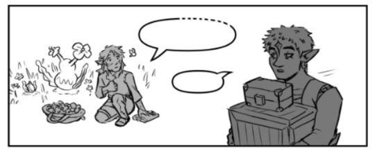
there's a scene I didn't so much as cut from the beginning of this update as significantly shorten: Wolf, Loft, Wake, and Slate are changing into their lighter outfits. Loft says the same line as having the party, Wake begs them for this one day with his Gran Gran, and they all agree they can wait. I've been trying to get better about like, not putting a ton of work into unnecessary connecting scenes, which is why I cut it down. Wake sounding more cavalier also works better for the overall chapter. But i was sad to leave this joke out lol:

may I present to you, Slate's picture gallery! he was mostly on task documenting flora and fauna but he gets a little sidetracked sometimes
I love the idea that he's just, like, kind of terrible at photography. he documents stuff for Zelda and it's always weirdly cropped and kind of out of focus, but she appreciates it anyway.
Slate is also picking flowers for the party! so he is still helping out on that front lol
idk if i've mentioned this before, but beetle does still have pincers! they're just. idk what the right word is. retractable maybe? yeah. like the ancient weapon blades
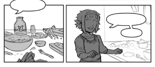
the filling of the half moon pies is pineapple :-) i was. so worried about it looking like an egg HAHA.
I thought way too hard about how they were going to cook these pies. I was originally going to draw a clay oven or some other setup, but ultimately I thought the Zelda tradition of only having pots over fires to cook was a funnier nod lol. So, they're frying the pies
believe it or not, I wrote this scene before reading dungeon meshi HAHA but it certainly served as good reference for how to set up shots for it
Aryll did in fact eavesdrop on Wake telling Tetra The Situation
That's Champion's little sister in the memory! I like the headcanon that her name was also Aryll.
Champion and his sister are making meat pies instead of pineapple ones.
One again, made a bunch of layout mistakes I ended up having to fix, except this time I didn't catch them until I had already gotten to rendering :-( if you're a patron, you probably saw these versions in the WIP:
problems here: Wolf is walking the wrong away. I was sad we'd be losing his expression but alas. And for the panels with Champion's sister, the angle is too low to be an actual POV shot. I could've left it and said he's just sitting or something probably but it was really bothering me lol so I redrew everything. and then recolored all of it. woof.
as a general rule, if he has scars, that's Slate. No scars is The Other Guy
I understand the complaint about this in BOTW, but I actually kind of like that weird moment that occurs after you finish a memory cutscene, and it just abruptly goes back to Link looking blank-faced like nothing happened. It implies this kind of....distance from the memories that I find interesting. Slate has complicated feelings abt the memories of Champion's life he gets, but like. there's pies to make
shout out to peony she's a real one
464 notes
·
View notes
Text
The Fall Out Boy 2001 Demo... and the fact that there's actually two of them!
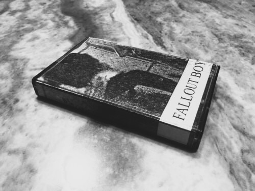
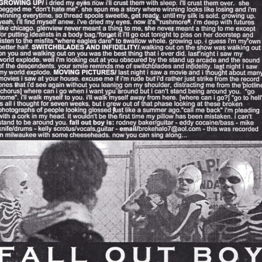
A few years ago, the wonderful Dave Hofer, who owns the DuPage County Hardcore Archive, uploaded the first Fall Out Boy demo from 2001 onto his archive, revealing its existence to the world. Dave was able to locate both a copy of the CD and the cassette versions of this demo, finding out that limited amounts of CDrs and around 100 cassettes were ever made. The CDr has uncut and unmastered versions of the recordings that later appear on the Project Rocket split, but the cassette contains completely different recordings for the first two songs, while an original song that is found nowhere else called “A Nice Myth” replaces Moving Pictures. The truth is that these are actually two separate demos: the cassette recordings came first. These demos were both made in 2001. For the first demo, the band consisted of Patrick on vocals, Pete on bass, Joe on guitar, and two other members who only lasted for a short time in the band: Ben Rose on drums, and John Flamadan on rhythm guitar. It was recorded on an 8-track in Ben’s basement. That 8-track was later turned into the cassette, of course. Both Ben and John left shortly after, and Jared Logan and TJ Kunasch replaced them on the CDr recordings respectively. What you may not know is there was an even rarer version of the CDr demo made: two types of lathe cuts.
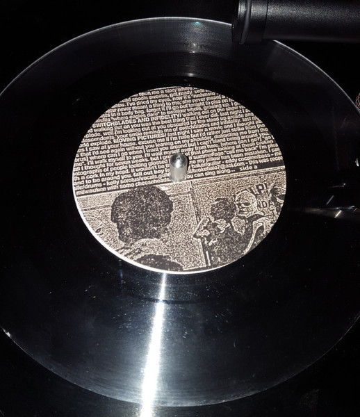
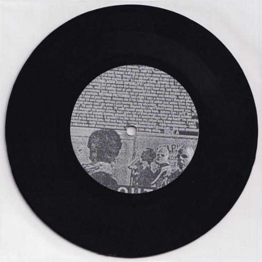
These lathe cuts were posted on Discogs as pictures years before Dave’s discovery, so they sat dormant and undiscovered by FOB fans for a long time. After researching the cassettes and CDs for our archive, we stumbled upon these pictures and were perplexed that nobody has mentioned this version elsewhere before. Although this was not really a “new” discovery, we were still intrigued. We contacted the uploader of the picture, and this is what he had to say:
Hey!! Yeah it's honestly a crazy story on how I acquired it, but I believe it's legit. Basically, a few years back (I think 2018 or 19? The listing on the page for the clear version that sold for $0.50 or something crazy was from me, that's how I bought it). I messaged a guy on here that had the CD added in his collection if he would be willing to send me the mp3s/WAV files for his copy, and he did. We talked for a bit about the band and he said I seemed knowledgeable about the band and asked if I wanted his second copy of the lathe (he had two, one clear, one black). I obviously was like "hell yeah dude" and he said he would ship it to me. Fast forward a few weeks (he lived in Australia or some shit) and low & behold, I actually got the damn thing in the mail, plus two promo trading cards from the TTTYG album cycle, one with Andy & one with Joe. A few years later he messaged me that he got in touch with the dude that made the lathes for the band (he was based in Chicago which makes sense). Apparently 26 copies were cut & only 20 got labels thrown on them, members of the band slapped them on themselves. They were only in white paper sleeves, not any picture sleeves unfortunately. The sound quality on them is actually pretty decent for a lathe made in 2001, which is what leads me to believe it's legit. Also, like you had mentioned, the songs didn't leak until a few years back, when I got it I had never heard these versions (it's just the Project Rocket split versions uncut & unmastered essentially, same versions as the ones that leaked from the CD version. That is pretty much all the info I have on it, I hoped that helped some!!
Cheers from Florida - Jake
He later followed up with:
If I'm not mistaken, I believe the guy I got it from got both the clear and black copies verified to be legit by the guy that made them. Also small detail I forgot to include before, he obtained both copies through a lot of FOB merch from eBay. He was looking to get a complete set of TTTYG trading cards, which is why he bought it. But I know in the lot he also got the two lathes & a demo CD, I forget what else he had mentioned. It's odd that the band hasn't spoken of their existence, maybe they forgot? The lathes were probably more of a novelty item than anything, considering that vinyl wasn't very popular in 2001 & they weren't packaged as "properly" as the CDs & tapes, plus they made a lot less of them. I'm assuming they just kinda got tossed around between friends of the band or got sold at random at their early shows. Either way, it's been one of my prized possessions since I've acquired it, let me know if hou have any other questions on it haha


Currently we have no idea who this elusive Chicago lathe maker is, but maybe we may find out one day. These lathe cuts may possibly be the rarest FOB merch in existence.
Side note: The fact that the top title on the cassette specific insert says "Fallout Boy - Growing Up" and then later lists Growing Up as a song below, it may have been intended to be the title of the cassette, and the song was a title track. This is unconfirmed though.
#fall out boy#joe trohman#patrick stump#pete wentz#andy hurley#fob#chicago hardcore#evening out with your girlfriend#eowyg#fob patrick#fob pete#fallout boy#fob andy#fob joe
189 notes
·
View notes
Text
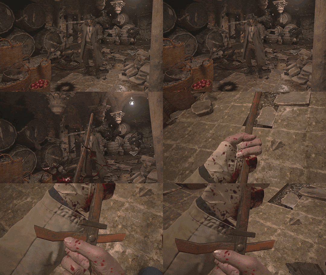
That time Heisenberg stabbed Ethan with a rusty fencepost
Thanks to this one fic project that needed a pornographically detailed list of Ethan’s most memorable injuries, I've spent some time trying to figure out exactly what Heisenberg stabs him with when they first met. Working mostly from a free-camera version from youtube, I settled on calling a metal pipe with a square profile.
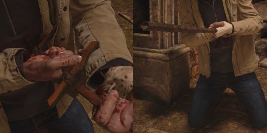
Tumblr: I was wrong. The reality is so much worse.
Having cracked the game files and installed my own free-camera mod, I tracked down the original asset for this thing, and, well...
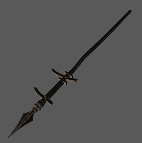
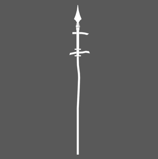
No, really, this is it! Check out those matching cross-bars if you doubt me.
FWIW, it isn’t actually a spear. Those semi-mangled crossbars flag it instead as a spear-headed fence-post. (This may not be a distinction that Ethan would find very comforting after being stabbed with the thing, but there it is, regardless.)
In fact, if you poke around the cemetery area just outside the castle gate, you can even find the fence it presumably came from.

Look in on the cemetery near the church from the lane leading up to the Duke's shop beside it, and this is what you'll see.
It's not a perfect match (in fact, it's even worse viewed from the opposite side, because someone has clearly stuffed up the textures on different sides of the same asset). I'll also note that if you go back to this fence again after meeting Heisenberg, you won’t find any suspicious gaps in it where a post was recently ripped out. So I’m going to just go ahead and assume this particular piece was lying in a pile of surplus scrap in the cellar somewhere, and Heisenberg did not, in fact, drag the thing all the way there from well outside the whole damn building. I mean, at that point, you’re just showing off.
The fence post is, admittedly, pretty hard to get a good look at in the actual game. Unlike all the other crap Heisenberg already has levitating around him in this scene, the fencepost doesn’t appear at all until Heisenberg stabs Ethan with it. It actually seems to emerge at speed from between a couple of barrels at the back. But if you’re enough of a lunatic to play around with the various slow motion/rewind settings that came with the free camera mod, you can get a decent shot of it in flight, cleaning up any remaining doubt that this is the same asset that was used in game.
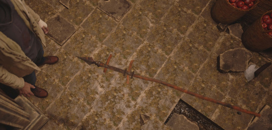
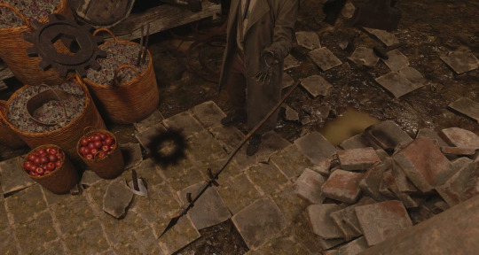
It even freaking spins in the air as it moves. FTR, yes, it does go in pointy-end first. And the whole fucking spearhead ends up buried in poor Ethan. (Please feel free to insert your own dick-joke here.) Those paying really close attention might even note that the blood on Ethan's shirt is present even before the spear hits him, but that's just going to be virtual-stunt-coordination having a normal one.
I can offer you no similarly definitive insight into why Heisenberg would think stabbing Ethan with this thing was a good idea. I can’t even tell you if he knew for sure that it was Ethan Winters he was talking to at this point (maybe he's just playing dumb, pretending not to recognise him. Or maybe he legit didn't know that Ethan himself had made an appearance until Miranda told him. Sure, he's already got that whole conspiracy board, but finding real pictures of this Ethan-guy is surprisingly hard.) But whether Heis was already testing out Ethan’s ‘interesting body’, or whether he’d just generally assumed that anyone who could survive a full lycan assault on the village wouldn’t be too seriously inconvenienced by a little stabbing, hoo boy was this one way to make a first impression.
I’m not even sure which of these losers is the bigger idiot here: the one who imagined Ethan might still agree to work with him even after inserting a very convincing imitation-spearhead into his intestines, or the one who never thought to seriously question how he keeps shrugging off injuries just as exciting as this one.
They probably deserve each other.
#Karl Heisenberg#Ethan Winters#RE meta#winterberg#Resident Evil Village#Resident Evil#RE assets#not to soapbox but that's also why the popularity of AO3's 'soft' Heisenberg tag makes me roll my eyes so hard#this dude is 'soft' like a fencepost to the gut
718 notes
·
View notes
Text
I was watching a video analysing how the Yiga clan were handled in botw and how the person analysing it lamented the fact that Kohga was a joke character who totally destroyed the much more threatening image the yiga clan had all throughout the game. Although I do understand the sentiment (I felt that way for a long time) I’ve come to realise that we might not be viewing it in the right perspective. I ended up writing a comment under that video explaining how I saw things, and realised that maybe it could interest people here too? So here is the fleshed out version of it:
I think part of why they made Kohga extremely goofy compared to a way less goofy clan of literal assassins is to emphasise how even though the clan originally held some understandable beliefs, it has become a cult of personality over the years, and like most cults, the leader is way less charismatic than his followers make him out to be. Indeed, from the outside, it seems absurd how anyone could take Kohga seriously, let alone kill under his command, but from the inside, Kohga is the Beloved Leader That Guides Them Towards Victory, and anyone threatening him deserves to die.
In a way, yiga clan members feel like vulnerable, impressionable people who were enrolled into a cult and given a Big Family and a purpose (and a lethal weapon) by their lovable Master Kohga who wants the best for them… Except if you want to get out, then you’re a filthy traitor who also deserves to die. It’s especially visible when you beat him and they all get personally mad at you for killing him. They didn’t care about Ganon, they didn’t seem to actually understand the bigger picture, they only cared about Kohga.
It also shows how, like the rest of Hyrule, the Yigas are very much disconnected from their own history, seemingly holding on the grudge their ancestors held more as an excuse to continue to enact violence and perpetuate the cult of personality than fighting for a “noble” cause. Only Kohga seems to actually care about Calamity Ganon, and the rest of the yigas seem to be just tools to him. Wether or not he’s actually conscious of what he’s doing is unclear. Is he a fully aware con artist, or is he purely another product of Yiga indoctrination?
So yeah, to me it feels like a parody/critic/mockery of cult dynamics. It shows that this gang of assassins are indeed a real menace, but for seemingly no reason other than “that one lunatic they admire told them to” and “if they go away they get killed”. The reason why the clan was originally created becomes almost anecdotal. Under the current leader, no one is required to actually know what they’re doing, they just need to follow orders.
In the end, I think it is the intention the developers had because cults are a rampant problem in Japan. At the very least, even if it’s not a actually conscious critic, it’s a concept that is much more present in their cultural landscape than ours and that almost certainly influenced how they handled the Yiga clan. Basically, cults are not cool and can even be dangerous both for the public and their members. Cult leaders especially are not cool and often are con artists. Therefore, Kohga couldn’t be badass, he had to be a doofus getting beaten in the most unexceptional way possible.
#botw#breath of the wild#master kohga#yiga clan#kohga#loz#the legend of Zelda#tloz#meta analysis#i purposefully didn’t talk about kohga’s change of heart in AoC because to me this game is not canon#one could argue it proves that Kohga is actually not aware of how catastrophic enabling Ganon would be#but for the sake of keeping it focused on botw I didn’t mention it#cult mention#valictini talks
2K notes
·
View notes
Text
Dirges in The Dark by WixWrites
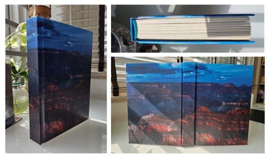
Before I start, let me just say: Ranchers! Scarian! Hermits and Life Series and Empires characters! Sheriff Jimmy! Sheriff Scar! Criminal Tango! the Wild West! Treebark and Ethubs!
RANCHERS. THE WILD WEST. CREEPING ELDRITCH HORROR.
Whoo, that was a rush.
I'll be honest; I think this book would have come out much sooner if not for my decision to add-in a whole lot of stuff into the text and pages. It got to the point that the original cover would have been a wanted poster at the front and a sheriff's report at the back!
I had to restrain myself, lest this book would never get finished at all. It's already been 59 days since my last post, and doing the original cover would have stretched the days even further. So I had to follow the mantra: Finished, not perfect. Besides, nothing says I can't make another version in the future...


From the moment I finished this fic, I knew it would become a book. But at 143,412 words, Dirges in The Dark by @twodiamondhoes would stretch my ficbinding skills to the limit and would be the second-ever bind that would reach past 250 pages (the first was an MCYT Sleepy Bois fic that predates this blog that I want to redo).
Eventually, the full typeset took up 520 pages! And as such, I finally decided to use extra support for the entire textblock. From an old pair of pajamas, I backed strips of fabric with glue and paper before cutting it into tapes, forming a crucial support for the various weaves along the spine. I then covered the entire spine in brown wrapping paper for even more strength.
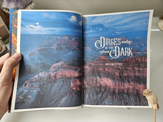
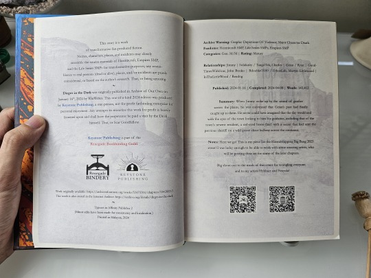
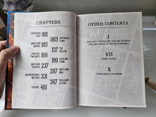
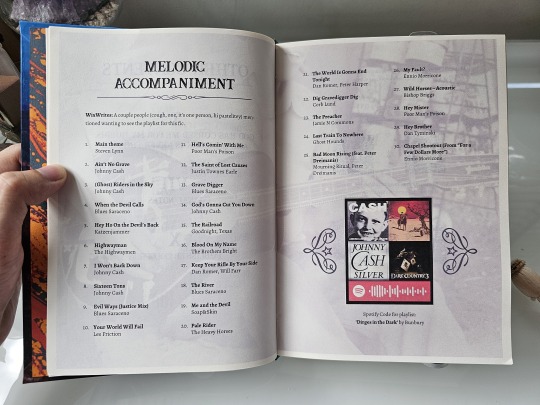
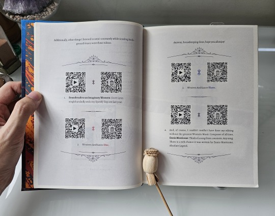
For the title and headings, I scoured for and found several typefaces, dingbats, and vector graphics which really evoked the fic's Western and Gothic vibes. I also took some inspiration from fellow ficbinders in the Renegade Publishing group for the style of layout and formatting throughout the book, such as using faded images in the background of these pre-story pages.
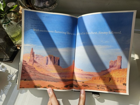
I wanted the reader to be immersed in the Wild West from the get-go, so having such images from the start — before the story even begins — felt very appropriate. I tried to make them thematic to the information presented, like a singing cowboy for the music playlist pages, but I think I made the image too faint to be seen!
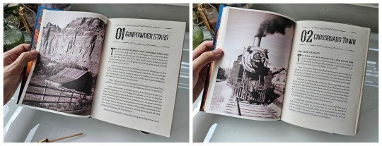
As for the chapter openers, I experimented with some layouts before finalizing on what you see: photos taking up one entire page on the left with the chapter titles and opening paragraphs on the right.
Just like my last bind, I want to make the reader feel immersed in the story and also bring out the mood of that particular chapter. This, however, led me to entire days of scouting and scouring stock photo sites just to find the right pictures for 11 different chapters. 4/10 would not recommend for sanity.
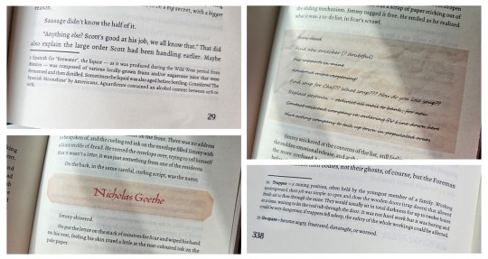
Given that the story uses a number of foreign words, old slang, and specific Wild West-era terms, I added a plethora of footnotes at the bottom of some pages for extra context and meaning.
I also wanted to be playful and make certain story parts, such as characters receiving letters and notes, really look like they're a part of the story. So I cropped old paper textures and fished out old fonts from the past to make them look as if they're actually there, pasted against the paragraphs!
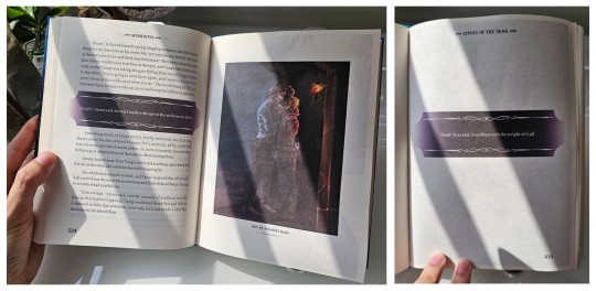
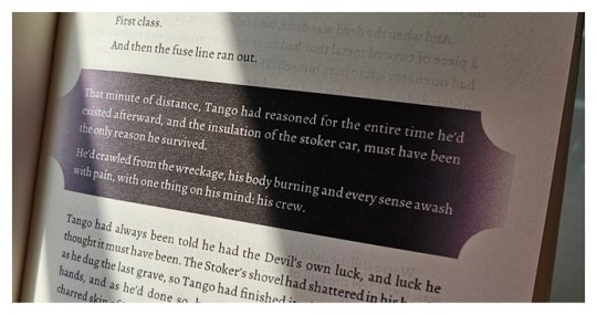
More importantly, there were some specific parts of the fic that felt super important and I wanted to highlight these passages, especially the Deals made by the characters throughout their arcs. Given DiTD has a certain affinity with eldritch darkness, I decided to highlight such paragraphs by backlighting them against a band of pure black. Besides being thematic as hell, I made the bands have curved edges and decorative lines to add a certain western-gothic touch!
It was from this that I begin to think "what if I can color entire pages to convey the mood and setting?"
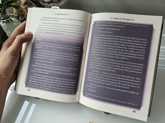
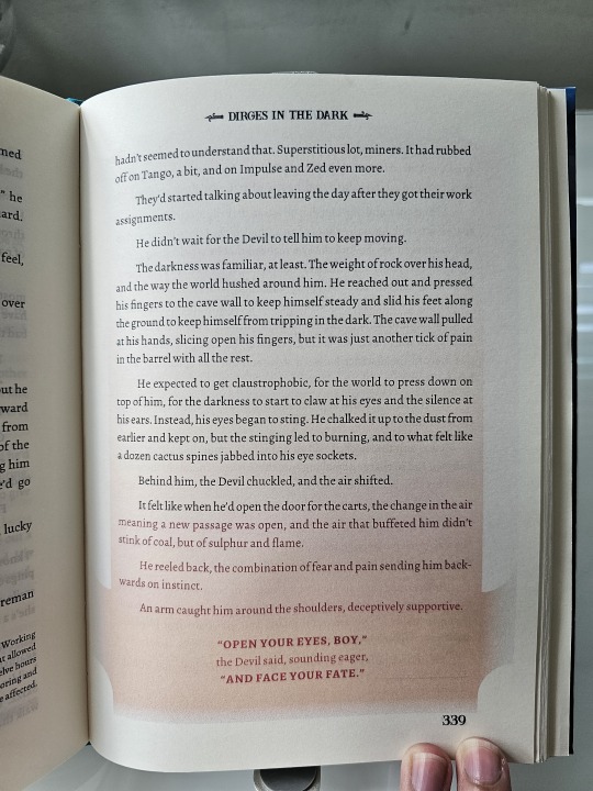
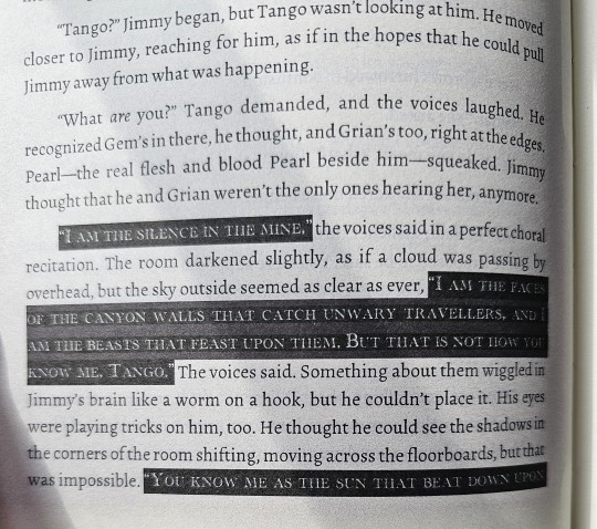
...Which led to the madness in these pages. I can't reveal too much because of spoilers, but there are certain times when the characters end up in situations where the very light turns to dark. Or they end up in hellish situations. Or the eldritch creatures began to speak.
It took some creative brainstorming to figure out how to show the mood of such scenes in printed pages, but I eventually figured out that I need find the right fonts, change their colors from black to white, and then change their backgrounds from white to dark to highlight them all! The power of formatting!
There's a lot more pages where I went wild with such shades and fonts, but I ain't revealing in public because spoilers!
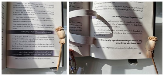
But undoubtedly, this is the biggest experiment I have made with this bind. There is a certain part where Grian and Pearl spoke in eldritch R'lyehian / Cthuvian, and I want to convey the sheer strangeness of the speech and it's meaning. Something outside the box.
Luckily, I have an inspiration in fellow fanbinder @mythrilthread, who made an amazing fanbind that used vellum overlays to showcase the speaking of alien languages and what they mean in English. AND IT LOOKS SICK AS FUCK. When I finished reading Dirges, I knew I had to emulate this form of language translation, so I printed the eldritch speech, cut it, and pasted it onto the spine to give a similar effect of strangeness, and IT LOOKS SO COOL!!!
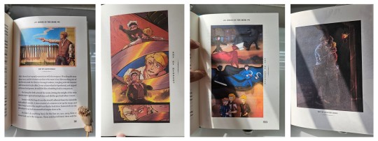
And lastly, I just had to include some of the amazing fanart made by readers into the book! All of these are placed by their corresponding text and chapters, and they all look so cool!
So I want to give a special thanks to @azzayofchaos, @leafdoodles, @hybbart, and @foxyola for granting their permission for me to include their incredible works into this bind! The dark shades and page formatting is one thing, but these works truly make this book feel so much more alive!
All in all, this bind was an odyssey in the making. I experimented with page formatting, layout wizardry, and bookmaking methods that I haven't tried before. While I know I could do better, I am beyond happy to see this work finished!
And once again, a thousand thanks to @twodiamondhoes / WixWrites for crafting an amazing story!
#bookbinding#fanbinding#ficbinding#my bookbinds#mcyt#Hermitcraft#Life SMP Series#Trafficblr#Empires SMP#Dirges In The Dark#jimmy solidarity#tangotek#team rancher#solidaritek#Wild West#Old West#American West
177 notes
·
View notes
Text
Spoilers for TBHK - Especially the more recent chapters
Do you ever start thinking about stuff like how Kou and Mitsuba haven't exactly realised that this is a new/wrong timeline yet. Which is odd, considering Mitsuba is supposed to be dead (and a supernatural) and that Kou is an exorcist. Surely they would notice something is up? But, they don’t. They have the faintest clue, through “dreams” or doing things that they would do routinely without thinking about it - yet it’s not the right way of doing it. For example, when Kou set the table up for only three people (him, Teru and Tiara) instead of five people.
However, one of the biggest, glaring issues about this timeline - one that surely both of them would realise,
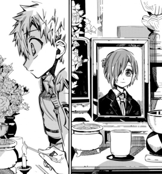
That Mitsuba Sousuke died. He, quite literally, shouldn’t be alive. Yet, somehow, in this timeline he is. The funny thing is, that Kou hasn’t realised yet or called it out - despite the fact that in the picture perfect arc, Kou knew something was wrong, even going as far as confronting mitsuba about it. But he hasn’t even noticed anything wrong. Even when Mistuba is going on about these dreams he’s been having during chapter 115, Kou is startled as he’s obviously been experiencing the same; he just shrugs it off, telling Mitsuba they have something else to focus on at the moment.
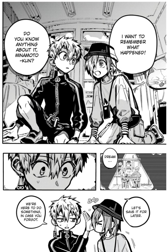
I know that within the next few chapters, due to Teru and Akane finding them, they’ll most likely find out about the whole timeline situation and quickly connect the dots. However, this got me thinking.
Why haven’t they realised yet?
And that’s when this one thought crossed my mind:
This timeline is something that the two of them have both practically wished for at one point or another in the story.
Let’s start with mitsuba,
Not long after he’s introduced (and dies for the second time), we find out that the wish he made to Tsukasa was for someone to remember him, or to actually have a friend; which was found in the form of Kou, who decided that it didn’t matter if Mitsuba was alive for them to be friends and realised that it was the same boy who sat infront of him during their first year. Something that Mitsuba really wanted.
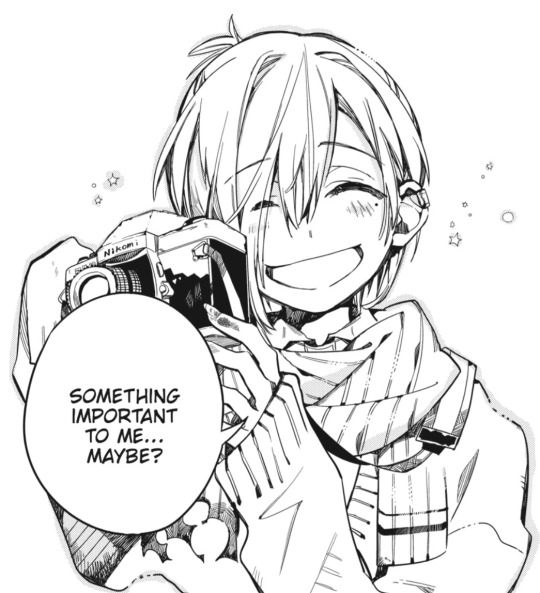
And then, once he became one of the seven mysteries, he desperately wanted to become, or live a life as close to being, a human. Hence his actions during the Picture Perfect Arc. It’s clear that he doesn’t quite like what’s he became, due to his new and more inhumane tendencies. Additionally, nobody will really ever understand him despite how much anyone, including Kou, tries to help him. Which leads to his want of wanting to be human again and be able to live a normal life. A life that he can spend around his friends and what’s left of his family. A life where he’s closer to the other students, as seen through his worry for the group of younger girls in the photography club which prompted him to ask Kou to check the place out with him.
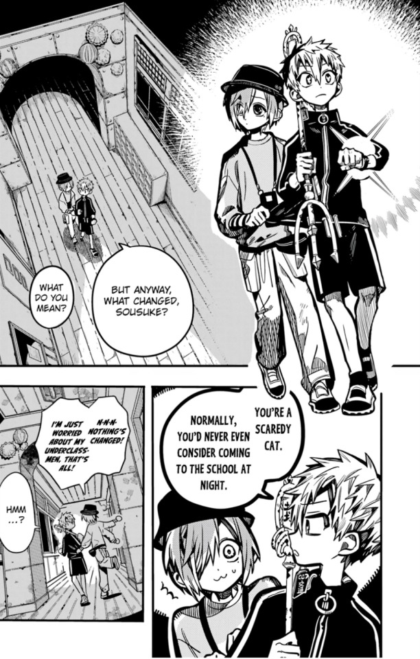
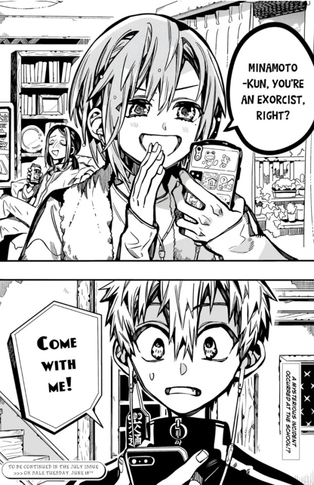
To add to this, it’s clear that if Mistuba hadn’t died (like in this timeline) that he and Kou would be even closer than they were in the original timeline. This can be seen through the fact that Kou refers to him as Sousuke a few times.
Now let’s have a look at Kou,
During the red house chapters, we end up seeing quite a few of the things that Kou really wants - his desires I guess. Amongst these wants, is two specific people.
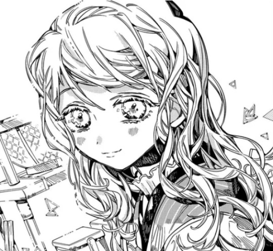
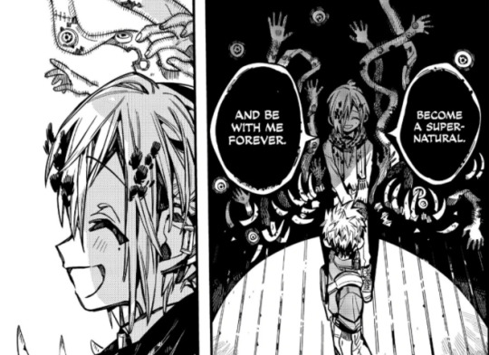
His late mother and Mistuba Sousuke. (I do know that this version of Mitsuba that he sorts of wants is really clingy and is acting like he can only rely on Kou and that he, himself, is useless etc. However that is a complete other ramble about Kou and how he feels about Mitsuba- but I think you get the point on why I mention him-)
In this new timeline, both his mother and Mitsuba, are present and alive. The exact thing that Kou had wanted.
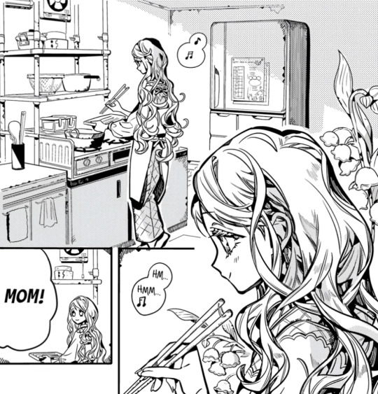
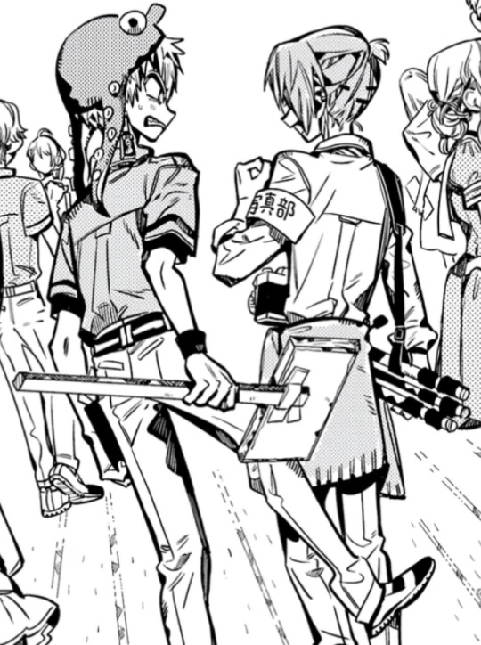
He doesn’t even question how they’re there. No remarks, or concerns or visible confusion. He’s acting as if this is his normal every-day life.
Perhaps this is why the two of them haven’t quite realised that this isn’t where they’re supposed to be. That this isn’t their place in reality. After all, for the first time in a while, things have gone mostly their way (even without them having any hand in causing this situation) without things being too devastating.
This timeline is practically their ideal world.
A timeline they won’t be able to stay in.
A timeline only good for them.
Once again sorry if this isn’t written too well- I just kind of get thoughts about the characters and start rambling without thinking about what I’m writing- lmao
#mitsukou#kou minamoto#mitsuba sousuke#toilet bound hanako kun#jibaku shounen hanako kun#tbhk#jshk#robin rambles
179 notes
·
View notes
Text
H&M Banner improvements
A somewhat odd creation from me, but! I have been really enjoying posing and creating poses, and in that process it dawned on me that it would be fun to have pictures of actual Sims in my clothing stores instead of the semi-ugly stuff that EA gave us. My friend at @kashmiresims was kind enough to pose out a bunch of her lovely townies for some recolors, but when I went to recolor the banner I discovered EA made the texture square. And to fit the Sim in that square, they chopped the legs off and placed them horizontally. I refuse to continue this folly, so off to fix it I went! I have three things for you today :)
1. A default replacement of the original banner, with improved mapping so that the texture is straight and easier to recolor. It was 256x256, now it is 128x512 so same total amount of pixels, it is just long instead of square. I've included redone versions of the original recolors, so they will look the same. However, if you had other custom recolors, they will be broken. Sorry, can't do anything about that unfortunately.

2. I made an add-on mesh that hangs lower because I find the original sits too high to be easy to use in most stores. It is repositoried to the original. Required the default, mapping will be wrong if you don't use the default.
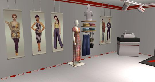
3. 10 additional recolors sporting various sims from the lovely region of Kashmire, coming to your hood with their newest ad campaign. Seen in a store above, swatch below.
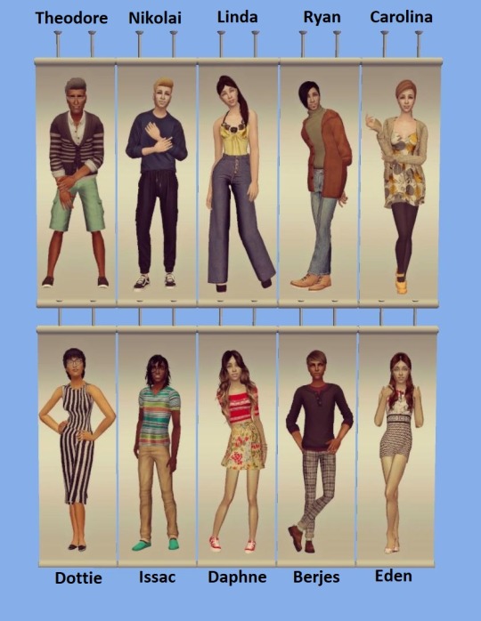
Installation instructions: Default file goes in zCEP-EXTRA folder in your documents The Sims 2 folder, recolors and add-on mesh goes in Downloads. Can place default in downloads too, but you won't be able to make recolors.
Download everything - Dropbox (SFS is down :() Download only meshes - Dropbox
Credits: Kashmiresims for the lovely pictures used for the recolors, as well as helping me fix the maxis recolors without them getting blurry. Thank you! :) @gayars who gave info on and tested getting SimPE to pick up on the new texture. @latmosims and @morepopcorn who taught me how to map things in Blender making this creation a possibility for me to do :)
97 notes
·
View notes
Note
https://twitter.com/parkjmwins/status/1782358915939774874
Idk whether you will even answer this ask or will block me but this is exactly why JK had similar concept pics like Jimin. Jikookers made it to be romantic while Fandom made it to a joke 'JK always copy Jimin' (ofcourse). I've seen you making multiple posts about Jikook concept pics being match is a proof of them being a couple when in reality Hybe don't even take permission of original artist before using their ideas for another. One hybe label just got into trouble for copying newjeans and according to CEO min heejin it was BANG SHIHYUK who wanted to copy newjeans to create a second version of them through illit. And guess what he made sure illit gets 10x more success than newjeans, a 2 day song was already charting in different charts including hot 100. The same bang shihyuk who ignored every bit of Jimin's success but shamelessly copied his ideas and visions of concept pics for another favorite member. He shamelessly asks staffs to copy original ideas of artists who created them and use them for a cheap version of the said artist, Newjeans and Jimin are just examples.
Was it JK's fault ? Not necessarily but unlike rookie Illit he had power and capability to make his own decisions and use his own visions instead of doing what he was asked to do by the staff (his words) but he didn't and sat comfortably while using another person's hardwork. If you still think those similarities were because they were couple then idk what to say because in that logic Newjeans girls and Illit girls are dating.
Talk about TikTok generation ask.
Linking me to a tweet that has zero actual information and/or proper discussion, just stating a fact that isn't necessarily even a fact. Ignoring the full picture (like y'all do when it comes to Jikook as well, btw).
And I also find it so so funny how you are basically hanging your all on something that a very problematic figure within the Kpop industry is claiming, all to try and deflect from despicable behaviour she's being accused of, including using and revealing private info of Hybe idols obtained in illegal and despicable manors, perhaps including having to do with certain private info leaking of certain BTS members (including the one person that you so vehemently claim to love and stand in defense of).
You think that by sending me this link you are proving something?
You say that you read through my posts. Well, obviously you've missed those many posts I've written explaining how JM and JK being a couple can be deducted not from one action or one behaviour alone, but the combination of many many actions or behaviours. A puzzle built of not 10 or 50 or 100 pieces, but one built of so many many more.
I find it funny how with everything that has been going on with JM and JK you guys are still at this.
We're back to JK copying JM.
Like seriously.
Like even if the whole NJ Illit thing was true there was some kind of a comparison to be made with these two men.
Like JK, who's album concept is 180 degrees different than JM's doesn't have stylists at his beck and call to create a concept that isn't a full on copy of JM's. Right down to the studs and colours and minutiae details of some of the outfits.
Like if he did copy JM, that same scorned poor JM (that's how you guys love to portray him, as a damsel in distress awaiting you to swoop in and save him) CHOSE to fly to NY to be with JK and spend Silver day there with him, travel with him multiple times and spend his entire 18 months in the army with that awful copy cat JK.
Your ask tells me that you have zero understanding in human interactions and relationships. JM saying time and time again, JOKING time and time again, about JK copying him, it's a tease but also something that he LOVES. How he inspires JK, how JK perceives him as his catalyst.
But this here, the photo concepts and the whole of JK's wardrobe while promoting, claiming it's all about copying JM is just bull crap. This was planned. And it was planned by the two of them. It's not a coincidence that JM happens to wear the bottom part of a two piece outfit months before JK wears the top part of the same exact outfit.
And if we are talking about copying, is it the concept he's copying or is he so far gone that he's literally copying down to the smallest of details?
Like seriously. You think that's about copying JM?
Or because it worked for JM so he thinks it will work for him? Literally same hairstyle rocking as JM had in Face? Cause why not use a concept that works? Seriously? JK's all "I should do this cause it worked for JM so it will work for me"?
Was that what he was thinking when he rocked a highlight of JM's hair colour over the years? That the colour works for JM so I should have a strand of that colour in my hair as well, copying his success? Is that the theory you're working with?
Or when JK wore the same jacket as JM on Valentines day, you know, in a clip that JM himself records and uploads, that JK also copying JM?
Babe, this isn't just about the concept pics either. And it's not just about Face and Seven or Golden. Wearing the actual same black leather or leather-like pants just because he couldn't find any other pants? That level of copying? Or perhaps it wasn't about copying and more about mirroring.
About "You are me I am you", which they have been screaming at the top of their lungs for years now!!!
It amazes me how you have zero issue in taking an over decade long complex super close relationship (no matter how you perceive it they are super close) and simplifying it into "JK copied JM's concept because JM's concept worked for him", or to even compare whatever went on with JK and JM and those similarities to a claim made (by a disgruntled and caught red handed employee of Hybe) about one new GG copying concepts and whatever from a GG that's been around for 2 years now. No connection between them. No long term relationships between the groups. One group supposedly copying from another. Yeah, definitely the comparison needed to be made between that and Jikook's behaviours or decision making.
How infantile of you.
Oh and that paragraph of yours at the end. Laughable really.
Like I already said, go compare 2 GGs in two different companies to 2 men that have been close for over 10 years now. And let's also disregard the long history of those two doing the similar and same outfit (during official shoots, performances etc, or during their free time) thing and look at this one single concept.
Probably styled (funny how the styling seems to be similar for years now on many occasions, and just with the two of them)
Not styled.

These are just examples of MANY MORE instances.
Oh, and I suggest you go read this post too. Not mine, but recently written and oh so relevant to the conversation.
I can't help but wonder how different your pov would have been if one of those two young men was a female. Just thought I would throw that in here too.
But I gotta give you an A for persistence. You guys, you never give up, do you? No matter what JK and JM will throw at you, you will find a way to twist it around to fit your narratives. I guess you also think that JM was forced into enlistment with JK, ah? And their trips together and the content that will drop, also forced on him? I guess him saying otherwise isn't enough to convince you guys either, right? I love the way how you guys are so intrenched in your belief of victimhood that you don't even listen to what JM himself tells you. You love him so much that basically call him a liar. Good for yous I guess.
So, to clarify my answer to you, just in case it wasn't as clear as day already...
You do you, cause nothing I tell you, or show you, or you know what? Nothing that even JM himself will tell you or show you will satisfy you. Because you are living in a self built fantasy of what and who JM is and what and who those that surround him are, all to fit that narrative of yours in which he needs you guys as his saviours and knights in shining armour to swoop in and save him from the big bad JK.
One more thing.
JM's Face was a masterpiece.
We all agree on that. JK included.
He adores JM, he's his no. 1 fan and he's been showing us this throughout 2023.
JK is not a person that would callously copy a concept used by a bandmate just because it succeeded for his bandmate and might work for him too.
Let alone from JM.
His person.
Not even if, as you put it, he was told to do so by the powers at be (which yeah, he'd tell to go shove it up their asses if they ever did 'tell' him to do that btw, and they wouldn't do it anyway seeing that they know that would be his exact reaction).
So, no.
That is my answer to you.
Just a whole big fat NOPE.
No to copying. And surprisingly no to blocking you.
Yet.
224 notes
·
View notes