#the new dashboard is hideous
Explore tagged Tumblr posts
Text
No offense to these blogs but... what is this bullshit and why is it littering my dashboard on PC?!

#tumblr#tumblr fuckery#tumblr dashboard#the fuck is this thing#i don't want it#how do i disable it?#also#the new dashboard is hideous#thank god for pixiel and their script
0 notes
Text
that fuckign pirate clown!!! WE HATES IT!!!!!
#i hid it and i've got that dashboard unfucker but it's like....#why is it that everyday there's something hideous and new to look at
1 note
·
View note
Note
I was about to send in a request and noticed that I went through your work already because one after another is on my dashboard. So little side note: your work is so damn good, it’s amazing and I really and enjoy and love it.
For the request: how about some sweet mob Bucky? Not sure if you’re up to write mob but I have a soft spot for him so I just ask hehe. Maybe she’s new in town and he visits her little bakery more often than not becuase he takes an interest in her?
Characters/Pairings: Mafia!Bucky x Reader
Content/Warnings: none that I can think of?
Author Note: This took me forever to get too! I am so sorry. Hope you still like it. :) My first time writing mafia. Hopefully I got the tone right.
Direct Benefit
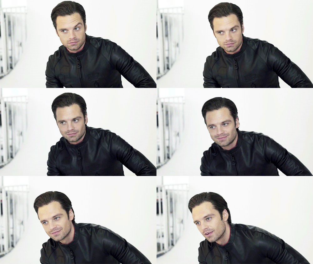
L'endroit Le Plus Doux was one of the only places in this borough that had authentic french pantries. Sure, Bucky could have gone across town. Over to long island or into Manhattan to find the treats he was looking for but he liked to support local. At least that was what he told his men when he saw him coming in week after week with boxes from the same little place in Dumbo. What could he say, he's a giver like that.
It had nothing to do with the sweet thing that worked behind the counter. No, he came here for the Pain au Chocolat, and the Almond Frangipane. Of course. Her sweet smile and innocent giggles are just a lovely by product. He would never admit that he pays you're boss extra to know you're schedule ahead of time, or that he make sure his tips went toward upgrading the floor mats so your feet don't hurt. Or that he paid for new uniforms so you could get out of that hideous orange apron that didn't do you're skin justice. no, keeping his office stocked with delicious fresh pastries was the ultimate goal. Which was why he came in precisely at 8 am every few days, pocket book at the ready to place his order for next week and pick up his goodies himself.
Could he have sent Sam or Steve to do this. Absolutely. Was he going to do that? No. Never, this was his little treat for himself. His own little bubble of happiness. And his men were never going to lay eyes on you until he had you locked down and claimed. Preferably with the deed to this building in your hand and a rather large rock on you're finger.
He lets himself in through the back door of the bakery, not bothering to let Alphonse know he was coming. He owed him enough money keeping this place afloat that he best be on his best behavior all the time.
"Good morning Mon rêve." he greeted, voice warm and dripping with mirth as he watched you, your eyes focused tongue poking out between your teeth as you concentrated on filling tiny copper tins with a thin custard like batter.
"Good morning James." you chimed back but didn't so much as lift you're eyes as you focused on the task at hand. You had been awake since 3 am, in here trying to get this recipes just right in time for the mid morning rush. It wasn't an uncommon bakery schedule. Pastries were often prepped over night so that they were ready for the next day. But this particular addition to the menu was taxing, seeing as you were currently the only chef here that knew how to make them properly. And the bakery had dropped a pretty penny on the tins that allowed them to be made at all.
"Good morning James? Good morning James… that's all I get today?" he grumbled, sliding his hands into the pockets of his slacks as he leans on your counter. "That's not very polite of you Mon rêve."
you sigh but still continue to fill the molds. "I'm sorry I would jump for joy but as you can see I am in the middle of something."
Bucky lifts a brow and scans his eyes over the trays of tin molds in front of you, each about the size of the palm of your hand and all made very specifically from copper. "I can see that, but I figured you can at least spare me a glance. I come here very especially for you, you know." When you don't look up he sighs again, his frustration mounting. Picking up one of the molds he turns it over in a tattooed hand. "Is this where all my funding is going. For cute little tins? I would figure Al had better things to spend my money on. Maybe we will have a conversation today…"
Finishing your first few trays you set down your ladles and look over at the moody man who is eyeing your canele mold suspiciously. He looked lovely as always. In a dark impeccably tailored suit and well maintained leather loafers. A simple sliver chain hanging around his neck beneath his maroon dress shirt. And you know as soon as you step close he will smell just as good as he looks. The patron of the bakery, and the man that makes you melt like butter every time he comes in. James Buchanan Barnes.
You don't know what he does, and you've never bothered to ask because judging by the way your boss stumbles over his words and blanches like a sheet every time he stops by, you can assume it's something untoward. "That…" you say leaning forward and taking the tin. " …is a canele mold. And once you try one of mine you will understand why we payed so much for them."
Bucky easily lets go of the little mold but grabs your arm with a swift hand, gently tugging it to his mouth. Placing a tender kiss to you're wrist bellow you're glove. the blush you give him seems to balm whatever irritation he had at his lack of greeting. "He bought the tins for you?"
"Well, sort of, I learned how to make caneles when I studied abroad. They are my favorite treat from Paris, but they are really hard to make and not a lot of people know how. So, when I mentioned that we should add them to the rotation because they are rare in the area and might bring traffic in. Alphonse dropped some cash to add to may collection of tins so I didn't have to bring my own."
Bucky listened intently as always. It was like every time you spoke his attention whittled down to you and you alone. It was insanely hot. Not that you've ever told him. "Well, in that case. He can spend however much he wants."
You rolled your eyes, but Bucky was serious. Alphonse knows that his funding comes with two caveats.The first being that all his money had to directly benefit you in someway with receipts. And the other being that he turns a blind eye to how much time he spends back here flirting with his favorite pastry chef. "I think I need to try one of these, what do you call them, Caneles…"
You smile, knowing that he would insisted on a bite. He always did. Every knew confection and treat was ran by Bucky. If nothing else because he was always here when they hit the cooling rack. "They are a simple custard like pastry, but they are baked in these tins with a coating of beeswax and butter that give them a texture unlike anything else." You explain, leading him over to a rack full of the little bunt looking pastries. "I have done three flavors for this first trial run. Classic vanilla, a coco variation, and a matcha which I think will sell well with younger patrons."
"You have put a lot of thought into these little chef." Bucky watches the way you move. Even in your uniform you are stunning. The sway of you're hips, the lilt of you're voice, the passion you put into everything you do. It sets him on fire. It makes him want to dominate that passion and bring it to heel just for him. To hone it and condense it, and demand its full focus.
"Well like I said, they are my favorite." You chatter on, unaware of the laser like focus of the man behind you. Looking you over like you are the most delicious thing in this kitchen. "What flavor do you wanna try."
"Vanilla, have to start with the classic so you know where to go from there." the innuendo seemed to go over your head as you popped one into your hand.
"Here you go." You hand every intention of handing him the treat but when you turned to face him Bucky was far closer than intended. His tongue darting out over his full bottom lip before dipping into take a bite out of the treat in your hand with a definitive crunch. You pause as you watched his calloused finger wipe away the crumbs from his mouth with low moan of appreciation.
"Delicious, as always." he purred, so close you could almost feel the rumble of his chest. "You should try a bite, Mon rêve."
Plucking the pastry from you're hand he held it out to you're mouth. The sweet smell of honey and brown butter mixing with the subtle notes of lemon and sage in his cologne. Your body trapped between the warmth of him and the cold metal of the cooling rack as you parted your lips to let him slide the treat inside. You had tried them already, you have to while baking for quality assurance but… this one seemed to melt in you're mouth as you drowned in the icy blue pools off his gaze. Unwavering, instances, and completely trained on you.
You hadn't realized how long you had been staring when you heard Bucky speak again. "Are you going to swallow?"
That time the insinuation was too blatant to ignore as you pushed the pastry down, covering your mouth as your ears burned hot red.
"Good girl."
#bucky barnes#sparks picks up#sebastian stan#bucky barnes x reader#mafia au#mafia!bucky barnes x reader
51 notes
·
View notes
Text
ok you know what i lied i wanted to REALLY fucking complain
there is SO MUCH wasted space on either side and it makes the dash feel fucking claustrophobic, it’s disgusting and it literally makes my back itch
there was absolutely nothing wrong with the old layout and trying to emulate twitter in ANY way shape or form is laughably stupid, jesus fucking christ WHY would you want to be like THAT it’s like saying “hey, you know that kid that eats worms for attention? i want to be a cheaper imitation of that guy”
god, it’s so gross. and again WHAT is all this dead space is it supposed to fit on a CRT monitor or something? fuck
who seriously thought this was a good idea? this had to go through multiple levels of people who also thought this was a good idea and then to actually implement it. what the fuck, y’all
oh my god i dont look at this site for a while and when i come back my dash is so fucked up looking if i wanted to feel cramped and squished i wouldve stayed on twitter god fucking damn this is awful
looks like i'm not using this bullshit for the forseeable future
#new dashboard#it's bad folks#it's absolutely hideous#it makes me want to barf#it literally makes me physically uncomfortable
2 notes
·
View notes
Text
What the hell is this new dashboard layout tumblr ??? EXPLAIN
It's hideous and it looks like twitter ew please let me go back to the old one please please please
#tumblr change#dashboard#layout#tumblr dashboard#changes#ew#help#fuck go back#i hate it#so much#aaaaaa#tumblr update#update#tumblr layout
21 notes
·
View notes
Text
Currently finding the new dashboard so unbearably hideous and chaotic that I can’t even use tumblr- Tumblr Savior isn’t catching anything and Xkit hasn’t been updated in 2023- what are you guys using to fix this disaster???
11 notes
·
View notes
Text
i'm really glad this new dashboard makes sure to show me the top 5 posts from the past 3 hours of the people i follow. i don't really care if people are saying things. please, completely fail to show posts from people i follow that you deem unsatisfactory Content for me. i'm a baby bird and i need a mommy to vomit crop in my hideous beak.
10 notes
·
View notes
Text
oh i just had the new desktop dashboard layout inflicted on me. absolutely hideous
15 notes
·
View notes
Text
oh good, i've been favoured with the hideous new dashboard layout now, have i? how nice for me.
4 notes
·
View notes
Text
tumblr finally forced the new dashboard on me, it's absolutely hideous
2 notes
·
View notes
Text
the new dashboard is so hideous this is what they used the money those people spent on stupid badges and crabs and whatever the hell else on. not even twitters layout is this wretched¹
¹ Author has no knowledge of layout of site rebranded to "X" from Twitter and cannot comment on that UI in relation to tumblr
2 notes
·
View notes
Text
The new tumblr dashboard layout is hideous. I'm going back to playing Baldur's Gate 3
#yes i know i'm way behind on 234243 different gifsets#but i gotta romance the vampire ok#and maybe the dream visitor (why did i make them so sexy)#in the meantime#save us xkit you're our only ho
4 notes
·
View notes
Text
Okay, changed from one version of Firefox to another for Linux reasons, and did a new login into tumblr, and now I got the new hideous dashboard look. Don't regret what I did exactly, but nasty surprise nevertheless.
(the linux reasons is that the distro I'm using, Debian deliberately ships the extended support release of Firefox, which is not frequently updated except for security reasons and is multiple version numbers behind the regular version. They do this because Debian in general follows that update schedule, because they focus on system stability. So feature updates don't happen until they have been thoroughly tested for any bugs. This is good, I like this philosophy of debian in general, and Firefox ESR is fine.
But I have installed flatpak capability on my version of debian. Flatpak is an alternative format for software packages for linux, which are more frequently updated than debian's own .deb software packages. And so I installed firefox as a flatpak to get a more up to date version with regular updates. Due to how flatpaks work and handle dependencies, these updates are unlike to cause any major issue on my system, so it's generally safe to install flatpaks, at least from trusted sources like Mozilla. and I'll keep the ESR version of Firefox as a backup.)
3 notes
·
View notes
Text
modern cars suck
i was browsing at the dealerships trying to replace my car today and is there some kind of new law for car manufacturers that no one in a car is allowed to be able to see? The bows on almost every car they have completely blocks the entire road. It's ridiculous.
The bow bends up in front of you, blocking the entire road, and the rest is blocked by the dumbass massive immovable touchscreen poking up a foot over the dashboard .
I want to be able to see like I could in my Honda Fit.
I hate these hideous sarcophagus blobs
0 notes
Text
first post from the new laptop oh god i forgot how hideous the dashboard is without my extension that fixes it send help
0 notes
Text
(untitled)
October 19th, 2007
hello hello hello to anyone who actually finds these interesting, we just like having an excuse to look through our photos.
here’s some photos from ireland: just to prove we went
thats us chillin’ (haha ellen is a comedy genius) in the fridge in belfast
there were bad omens for the tour in belfast considering the power went off as soon as we started our set. but we feng shuid and cleaned our chi and started the tour anyway. we also made tom felate a banana…

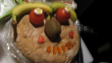
The first memorable thing to have happened was the bread face we made in bristol…(on another note Ollie is currently continuing his quest to try and fit into as many small spaces as possible. This week he is attempting to get into the kitchen cuboard in The Cockpit. He is currently in the cuboard. He just fell out of the cuboard. People are laughing, i think he may be crying in pain. Possibly concussed.) Back to the bread face, all appreciate the glory and wonder of its kiwi eyes and banana smile. We were so proud of the success of this initial experiment that we thought we would make him a brother. He is closely modelled on his siblings, apart from the additional banana eyebrows and extra detail (note the lifelike haribo eyes.)

We have been touring with the wonderful You say party! We say die! and dead good Sky Larkin, who have been brilliant company and have been fairly embarassing to play after due to the fact we suck bottoms compared to them. The photo below is a example of YSP!WSD! majesty when we all played in Manchester together, although you cant really tell she is wearing a amazing gold dress. Krista is a shining star in a dark night. Devon is a dark knight mounting a shining star. Derek is an explosion of stardust onto the face of Steve who is painting glitter on Becki. (Their words not ours.)

Before the gig in Manchester Neil decided to try and to prove that we are the second most punk rock band in England by letting us write on him in eyeliner. He then removed his shirt during the second song prompting his mum to worry that he had got a rather hideous new tattoo. We also did a interview in Manchester with a certain someone who wasnt very careful when texting a friend during the show and a mutual friend reported to us afterwards that this certain someone said that some of the band were fit, and perhaps dirty and looked like they like to experiment in bed due to their appearance. The bands response to this is that we are all very hygienic and extremely boring in bed.

In Glasgow we were given some brilliant Fan art which is Niall’s own interpretation of our little faces, and bodies. He has also included himself in the picture, but at first we just thought he had mispelt Neil. It is now sitting on our Dashboard, and if anyone wants to make us some more to perk up our van we would be very grateful. I would also like some febreeze to save time on washing. If we get two we might be able to set up a fan art page on our website….
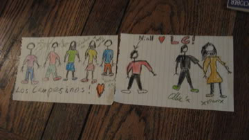
We had a aftershow party in Glasgow (our very first organised aftershow party) at the Garage, we think however the staff are perhaps….muppets. They took our whisky off us at the door, they searched Ellen to the point of sexual abuse asking her to tell them where her Weed was because “they were going to find it and throw her out.” Ellen does not smoke weed, but the fact she roaches her rizla packets for rollies because she cant be bothered to buy filters made the security suspicious. This also makes them stupid. But the party was extremely fun despite the music of Good Charlotte/30 Seconds to Mars being continously filtered through to the area we were in.

Doug from Sky Larkin and Gareth demonstrate their gunts in Newcastle. This show was possibly the most rock n roll one we have ever played. There was a stage invasion, and someone tried to steal the melody horn. Someone suceeded in stealing the glock beater, and the korg was knocked over. The glock beater has been passed down for many generations in the Campesinos family, so I am asking the person who borrowed it to turn themselves in to their nearest police station before things get ugly. Yep. Alek is Russian, Tom is Italian and between them they can summon enough mafia to make you feel very uncomfortable.
To add to the Rock n Rollness of the evening Harriet and Ellen thought it would be appropriate to don their best bread hats as they headed to the aftershow DJ set which we all did just down the road from the gig. An exclusive album track was played much to everyones apathy, and the classic “Gravel Pit” by the Wu-Tang clan was pulled out. Gareth played M.I.A like 8 times.
To make everyone leave he had to play the most requested song of the night, which was deemed some Pixies song, and was counted by a show of hands from the eight people remaining.

and that is a runthrough of all our adventures so far. we’ll keep you updated. lots of love and hugs, ellen and aleks and the rest of LC!
0 notes