#the ink brush at 100% opacity
Text

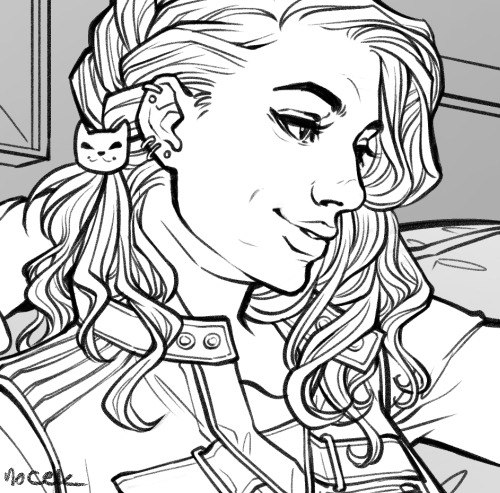
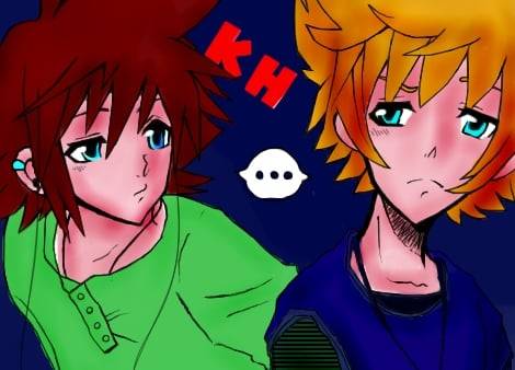
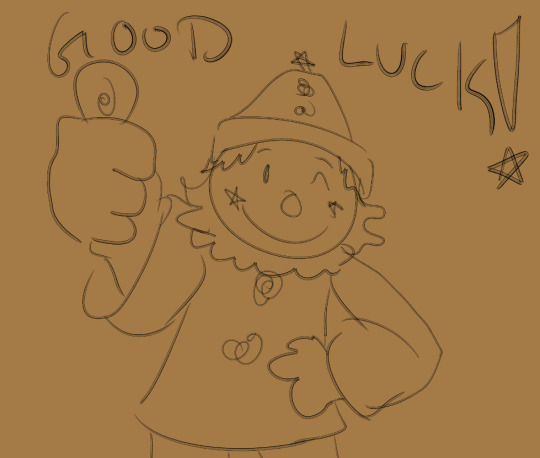
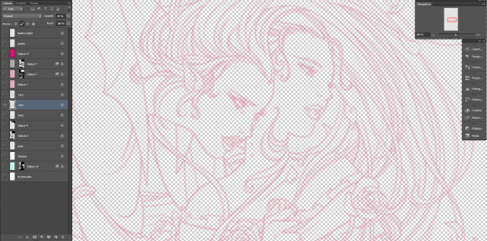
#arthur lester#malevolent#just a little sketch of arthur#as a treat#no idea if i'm going to do anything further with this sketch or not#just had an overwhelming urge to sketch him#as he looks in my head#one day i will do a sketch with something other than#the ink brush at 100% opacity#but today is not that day#i just love those hard crisp lines#it's all those comic books and alphonse mucha prints i mainlined in college
14 notes
·
View notes
Note
omg, your style is just... WOAH!
can you please tell, if possible, which brush (and app) you use?
(p.s. OMG FOXFLIT AND GLOWCALL! GOOD FOR THEM, GOOD FOR THEM)


@straysylveon @ghostycanine
i'm gonna reply to all these together because the answer is the same lol first of all thank youuuu<3
I draw on Clip Studio Paint (pirated) on my pc and i only ever use these two brushes for everything because they're my favorite
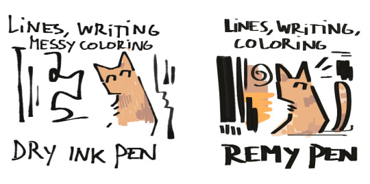
Dry Ink Pen | Remy Pen
And i have a wacom intuos drawing tablet if that's anything. Hope this helps 👍
#i tweak every brush to take away the stabilization because i don't like it aaand i think i maybe turned up the dry ink pens opacity to 100%#so i can't promise these will look/work exactly the way i use them but it's really small stuff so they're mostly the same#i like messing around with brush settings and i recommend everyone do the same too :)#asks#faq
115 notes
·
View notes
Note
I just want to say I love how you do your lineart, it looks so good! ahhhhhhhh!!
I'm gathering a lot of advice about the topic of lineart and I just wanna know how you get it to look like that? My line weight is getting better but the drawing itself just comes out a bit.. weird.
Thank you so much! Lineart is probably the thing I've been working hardest on as I am not a lineartist (and still struggle a lot) but it's something I really need to get better at for my job.
UM there's honestly so much that could be said on the topic of lineart. Big things for me are:
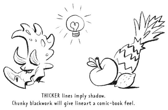
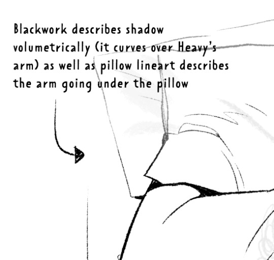
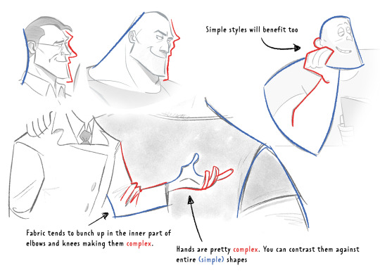
Weight -> Use line weight (aka thickness) to describe form, lighting, contact and scale. Thick lines imply shadow, contact and nearness-to-camera. Thin lines imply tension, recession and light.
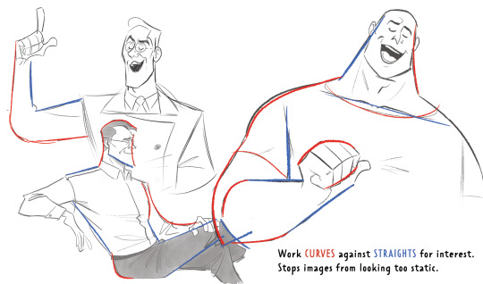
Straights vs Curves -> Use straight lines against curved ones for maximum interest. This is partly a character design thing but as we're using lines to describe our characters it's worth mentioning :)
Complex vx Simple -> Use complex lines against simple. Faces are always complex so therefore the backs of heads should always be simple. Chests are quite complex so backs should be simple. Dorsal sides of the arms are complex (Delt, tricep, bicep) whilst the ventral side is more simple (tricep...mainly) etc.
'Think in Ink' -> Lower your sketch layer almost to 0% opacity so you're not getting hung up on how nice/energetic your sketch look and instead are approaching the piece from an ink mindset. BUT it's digital! So if there's something in your sketch that you like just bring it forward (copy and paste) into your ink layer. I sketch and ink with the same brush so I can use this workflow
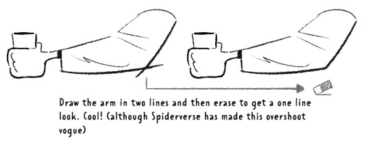
'Confidence' -> small hesitant feathery lines will look nervous compared to big swooping lines. Less is always more. I'll redraw arms/limbs until I can get the appearance that it was done in one brush stroke. Again it's digital so you can erase to cheat this look : )

MISC 01: I always hear 'draw from the shoulder'........meh............it's digital so draw from your wrist...it's fine honestly. If we were working at A1 in a life drawing class then we could get some shoulder action going but most of us are hunched over 16inch tablets. I think this advice aims to pull people away from feathery-nervous lineart honestly which you can improve on without relearning how to draw from your shoulder.
MISC 02: For a 'smoother' look do your lineart at a larger canvas size than you need. Once I'm happy with a sketch I usually double the canvas size and do my lineart then.
MISC 03: In PS (at least) anti-aliasing goes funny at any zoom level that isn't in the 5 times table. So try not to look at your canvas when you're zoomed in to 87% or 71.39% or something crazy. Just stick to 25%, 50%, 75% and 100% if possible.
UNFORTUNATE TRUTH: Lineart is incredibly based on raw draughtmanship I've discovered. When you're working with colour you can hide a lot in rendering (shadows, highlights) or post-processing (depth of field) but in lineart all your mistakes are just...there for people to see.
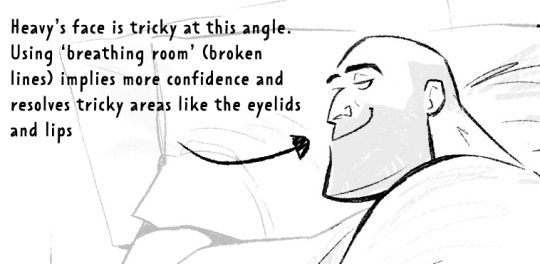
There's ways round this...which I use A LOT. 'Flourishes' (I use 'flourishes' to mean over-confident lineart where it veers particuarly thick or particuarly thin in contrast to your approach in the rest of the image) can sort of trick people into thinking you're more confident about an area than you actually are.

As well as leaving 'breathing room' within your lineart instead of actually...resolving the area. I do this the most around the face and hands.
Hopefully some of this helps? Honestly there's a lot of deep dives that could be done into indivudal things and there's also the massive caveat that all of these are 'guidelines' and not strict rules.
I also favour a more...concept-arty? animation-y? storyboard-y? look to my lineart which favours flourishes and breathing room for a incomplete/work-in-progress feel which would make methodical colouring (ie: for a comic or something) a pain.
Keep up pratice is the main thing and doing studies of artists who you like that have great lineart - you'll pick up draughtmanship skills along with the lineart studies. Here's some of my lineart from a year or two ago...it varies between very 'standardised' (which makes it difficult to read volumes and to be honest, it's boring) and 'TOO EXCITING' (which...also makes it difficult to read volumes and for the eye to rest).
I'd like to share my brushes at some point as I've found 3 that I really like and use for everything more or less. I discovered that a shocking low amount of people use PS on tumblr (shocking to me I guess as i'm so used to PS being the standard) and everyone seems to use Procreate or Clip Studio Pro...so I want to check that the brushes are Procreate compatible at least before I share!
#sorry if none of this makes sense. im on day TWO of a hangover...kill me now#asks#art tutorial#tutorial
737 notes
·
View notes
Note
What pens do you use on procreate?
as of now I just use a normal round brush on a small size (2% I think) with size pressure sensitivity turned off at 100% opacity. I add line weight by drawing the shadow shape and filling it in with the fill bucket, used below

before that I used this free comic inking brush set if you're more of a pressure sensitivity type person, used below (brush I used from that pack was called "the fading edge").

I changed the way I did lineart purely out of personal preference, I feel I get more flow/control out of using the small pressureless round brush and I just think it looks livelier and I work much quicker
I do experiment with lots of random brushes just for fun though and y'all probably should too bc consistency is overrated
508 notes
·
View notes
Text
✱ frequently asked questions!

hey there, the name’s den/sun! i’m a filipino artist with too many ideas and too little sleep! i mainly post and draw ace attorney and disco elysium with the occasional dungeon meshi drawing. i also like good omens, danganronpa, tmnt 2012, undertale/deltarune, mob psycho 100, splatoon, fairly odd parents: a new wish, haikyuu, and pokemon! :^]c

rest of the faq under read more (because it's very long lol) | dividers from here! | faq will be updated every now and then
what program do you use?
old answer: i use clip studio paint ex!
as of 06/24/2023: i use clip studio paint pro v3 for illustrations and clip studio paint v1 ex for animatics
what brush do you use?
old answer: i mainly use the gasa gaya line pen for sketching and the t-pen for both sketching and inking
as of 09/22/2023: i use the koya pen for sketching and inking and the gasa gaya line pen for inking occasionally.
as of 12/19/2023: i use the a pen that feels like a pencil (鉛筆を感じる液だまりペン) with the pen pressure opacity turned on for sketching (i also use it for inking occasionally). i don’t ink that much right now but i still also use the gasa gaya line pen for it.
as of 03/07/2024: i use both the a pen that feels like a pencil (鉛筆を感じる液だまりペン) and calish ink for both sketching and inking.
as of 07/08/2024: i use the dry ink brush on clip studio paint.
do you do commissions?
yes, i do! currently closed right now because i’m a student and art school is hard but feel free to take a quick look here if you would be so interested! :^]
however, i do occasionally open 2 slots for sketch commissions whenever i’m in need of some money so watch out for that pftt <3
do you sell prints?
yep! i have an inprnt!
where else can we find you?
you can find me both in twitter, Instagram, and art fight! i also have a youtube where i haven’t posted in 4 years pftt
can we use your drawings?
you can use my drawings for profile pictures, banners, even your little tiktok video edits as long as i'm credited (with a link back to my art account, please!) (also if you did do little tiktok edits with my art can you please send them to me i would be so delighted to see them)
just so we’re clear too, i don’t allow reposting of my art on other social media without my permission or credit. thanks!
can you draw [insert thing here]?
i don’t do requests! and usually, when i ask for things to draw, it depends if i’m feeling up to it so sorry if i don’t!
can i draw fanart of your au’s/oc’s?
YES! please, i’d be so dang honored! and please tag me too if you ever post it so i could see it and reblog it here! :^D (and also gush wail cry and scream about it forever and ever)
what does your username “u3pxx” mean?
it’s just my name den upside down, the x’s are because my old selfsona design had x’s for pupils and i wanted to incorporate that.
what does your tag “pampabait” mean?
pampabait (pam‧pa‧ba‧it) is a tagalog word that loosely means “to make [something] kind”, since the prefix “pampa-” is used to denote the causing of a state and “bait” means “kind”! the way i use it is also kind of referencing the phrase "nasisiraan ng bait" (losing one's mind/starting to feel insane).
it's just a tag i use for some wholesome stuff i see that would stop me from going I HATE EVERYTHING FORVEVERRRR
have you played all the ace attorney games?
i have not! only because i got into ace attorney via let’s plays, instead. me and some friends are however trying to finish dgs though we haven’t been able to play for a long time pftt. we’re currently still on dgs2-1.
who’s your favorite ace attorney character?
look at me in the eye, boy.
wheezes but it is apollo justice, trucy wright, and klavier gavin.
TAG DIRECTORY
✱ GENERAL TAGS
#sunnysidedraws - all of my polished drawings or doodles i consider high-effort
#sunnysidedoodles - stuff that i wouldn’t consider polished but hey, they’re cute lmao
#sunnysideanswers - all of my answered asks
#sunnysiderambles - my general thoughts, rambles, or whatever
#sunnysidetutorials - answered asks on how i do certain art stuff of mine
#sunnysidelb - liveblogs of whatever i’m watching/reading
#sunnysideplays - liveblogs of the games i play (it's just pokemon right now lol)
#sunnysidepolls - whatever polls i make up
#sunnysidezines - for previews and the finished pieces of all the zines i’ve been in
✱ ART TAG DIRECTORY (in case you just only wanna see the stuff i drew for a specific thing)
#sunnysideattorney - ace attorney art
#sunnysideomens - good omens art (includes bad omens)
#sunnysidedisco - disco elysium art
#sunnysidemeshi - dungeon meshi art
#sunnysidepotions - potionomics art
#sunnysideprom - monster prom art
#sunnysidemons - pokemon art
#sunnysidefairies - fairly odd parents: a new wish art
#sunnysideball - haikyuu art
#den’s gavinners tag - includes all of my gavinners ocs art, rambles, asks i’ve answered about them, and other posts that reminded me of them
#den’s aa roleswap au - what it says on the tin, includes my art and also art that others made for the au! :’^D i also have a sideblog specifically for it
#den’s bad omens - has all my stuff and art others made for my good omens roleswap au!
#disco femlysium - art of fem!harry and fem!kim (and everybody else)
#den's disco swap - art of my disco elysium roleswap au
#disco meshi au - art of my dungeon meshi au for disco elysium
#sunnysiderambles#i dont know if i tag this one with anything lol#bc tumblr mobile won't let me link my old faq sighs
40 notes
·
View notes
Text

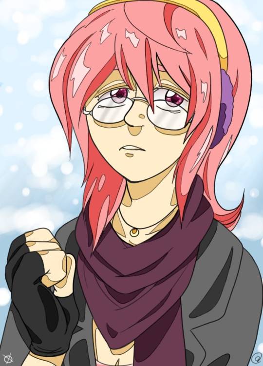
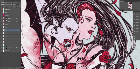
Little illustration I wanted to test colors with. I painted it with a 100% opacity inking brush so we have that!
#my art#illustration#oc#sona#digital art#sona art#it took a little while phew#it was lots of fun though#hope you enjoy!
95 notes
·
View notes
Note
omg what brushes and program do you use?
Oh I'm not sure this answer will be very usefull from amount of brushes listed. I have very few faves actually and mostly like them because they help me circumvent my perfectionism.
So right now I'm using Clip Studio Paint but I've been using Photoshop for a looooong time. Till they pissed me off too much with adobe adobeness. That's why part of my brushes are originally photoshop ones I've ported to CSP.
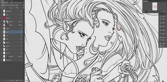
I mostly do linearts, like overly detailed ones, like this closeup:
Which I used DAUB FunnyGranny2 and back in PS times (and also now sometimes) I've used Kyle's Drawing Box - Animator Pencil 2016 from Kyle Webster (now available for free with PS as far as I know? still I had bought them ages ago and just ported it to CSP, works ok)
I like those two brushes because they are slightly grainy and aren't 100% smooth which helps me not to be as precious about smoothness. Otherwise I'd be smoothing it over and over again. Also they loose a bit of opacity with lighter touch which I like :)
I also like the Belgian Comics Smoother from Kyle's Inbox. It's very smooth but has a nice shape so I use it for touchups on color flats and lettering.
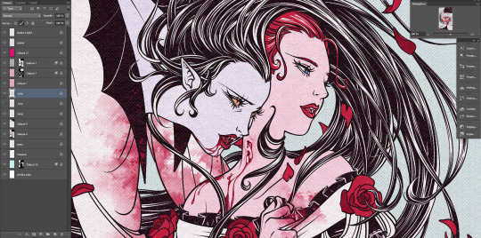
As for my more recent spiderverse comics of following close up:
I need to make them quick so everything is on 2000x2000 canvas and is linearted with DAUB - Fluid Ink Chisel 2 set permanently on size 30 so I won't be tempted :D It may not be grainy but I like how it changes it size and opacity with pressure and how it changes it's shape with direction of line.
Besides that I mostly use flat colors (I love the Lasso Fill tool in CSP) and regular soft airbrush too add some gradients.
I don;t use them that often but I also like Mirre's markers + blender if I do some actual shading but I also use Kyle's gouaches then.
And that's about it :)
56 notes
·
View notes
Text
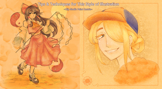
I wanted to start giving some insight into how I draw certain things (and also I just really like talking about why I do certain things the way I do), so after finishing this illustration of Reimu earlier today, I thought it'd be a good time to show a bit of my process when it comes to this yellowed-paper style. Keep in mind that this is Clip Studio Paint centric, because that is what I use to draw, but if you use another program a lot of this advice should still be applicable.
The defining aspect of this compared to my other illustrations is usually a much lighter/washed-out color palette, utilization of textured brushes (surprisingly, a lot of what I use is default Clip Studio Paint tools!), and using a noise/paper texture on an overlay layer at some opacity depending on how dense it is.
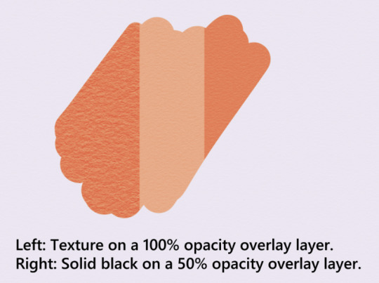
(Image is of a color swatch being affected by 2 different clipped layers. On the left, is an overlayed paper texture at 100% opacity. On the right, is an overlayed solid black layer at 50% opacity.)
Firstly, you don't have to use yellow/orange specifically for this, but it lends to a certain appearance I like a lot, so I find myself using this range of colors the most. You do want to make sure that it will look good with an overlay layer set over it.
How one goes about lining the character (you don't even really have to) doesn't matter that much ultimately, and a lot of times I'll set the line art layer to a lower opacity or make it multiply/linear burn.
I use a lot of overlay layers. It helps contribute to the appearance of the overall piece if everything sort of bleeds together. However, when coloring, I'll also alternate between linear burn, linear light, and glow dodge layers. Sometimes color burn as well, but it's quite a bit more finicky to use. Glow dodge specifically is good for making highlights that stand out. For some colors, using a normal layer at reduced opacity also works. The important thing when coloring a piece like this is to make sure the colors mesh well with the paper color you chose!
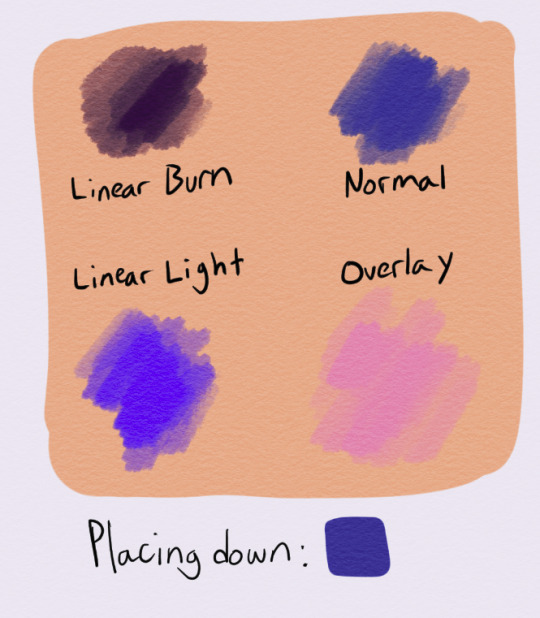
(Image is of a selection of swatches for the color blue on an orange-yellow background. The top left swatch has been applied on a layer that uses Linear Burn, top right is Normal, lower left is Linear Light, and lower right is Overlay.)
Lastly, here are some assorted techniques for decorating your piece.
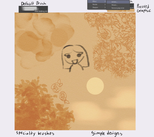
(Image is of a selection of effects added to 1 layer. The top left is captioned "Default Brush", the top right is captioned "Pressed Graphic", the bottom left is captioned "Specialty Brushes", and the bottom right is captioned "Simple Designs.")
Wet blotting ink is a default Clip Studio brush you can find under the India Ink tab, and creates a nice water-stain effect on your piece if you use overlay + a solid black pen color.
You can also make complex designs by either running an image through the artistic effect and setting it to "Lines Only", or by using specialty brushes made for creating specific designs, like this leaf brush I use.
Lastly, you can just create basic designs. It really just depends on what you need for your image!
This is the process I generally go through whenever I draw these pictures. I hope it helps you!
18 notes
·
View notes
Note
Hello, I love your art! I was wondering what kind of brush you used for the lines on the posing-with-scion drawing, it has a really nice crayon-y vibe
oh god. glad u like it but ur gonna see how disoragnized my brushes are. its from me messing around a bunch with the gesinski ink brush, i tried screenshotting what i think are the important parts? +if theres anything dropping opacity below 100% turn that off


30 notes
·
View notes
Text
Remembering My Roots - Rest in Peace, RateMyDrawings
I've talked about my old art before on here, but never really fully in-depth about the site that hosted it. I was reminded of it today while going through my FB memories and felt like I should actually write a true eulogy towards what once was.
Once upon a time, before LORE | REKINDLED, before Time Gate: [AFTERBIRTH], before I had even started drawing webcomics, I entered the world of digital art through one website - not DeviantArt, not Pixiv, but a little site called RateMyDrawings. Back in the day, it was one of the most popular browser-supported art tools, offering multiple different art tools that were, at the time, revolutionary. A flash drawing tool which could replay the progress of your drawing (but the tradeoff was that you had a limited amount of 'ink' aka recording data), a Java-supported tool that was essentially Photoshop Lite (but didn't come with the recording), and later, a more refined tool supported by HTML5 (?) that offered more 3D-like brush tools. There was also DrawChat, a live drawing flash tool where you could draw with others and chat.
And on that site, I created my first works of digital art. No drawing tablet, just a mouse and a loooot of patience. They'd host contests every now and then to win budget Wacom tablets. Sometimes I'd enter, I'd never win. I did eventually get my first drawing tablet, but by then, I'd moved on from RMD onto actual software such as GIMP and Photoshop Elements.
That site is gone now, one of the first art site deaths I'd ever experience in my teen years. I was around 12-13 when I started using this site and I adored it. When people talk about missing the 'tight-knit communities' of old, I don't think of DA, I think of RMD, my first home. Unfortunately, the site couldn't survive in the 'modern' era of the Internet, overshadowed by more advanced tools and art-sharing sites like Deviantart, Facebook, and Instagram.
But I did manage to backup some of my old art pieces before the site finally became completely shuttered in the early 2020's. For a while the site was awake but lacked any content or features, with a message from the site's creator Mick that it might come back, it might not.

It didn't. The old ratemydrawings.com URL now redirects to the inactive FB page. Any attempt to bypass that kill screen like before leads to an Error 404.
But while the site was in its comatose state - before it was shuttered permanently - I was able to access my old profile and extract some of my art pieces of old. I posted them to my FB about 3 years ago, and today they showed up in my memories.
I share a lot of art pieces from creators like Rachel Smythe in an attempt to preserve media. But I also need to remember to preserve my own. So here are a handful of the 100+ pieces I drew on RMD. Enjoy ( ´ ∀ `)ノ~ ♡

Don't be confused by the '1987' part of the username, I picked that number because I was a huge Zelda weeb and 1987 was the year the first Zelda game was made. Whoof.

What's ironic is I actually didn't have the Featured Artist award last time I was actively on the site, so it clearly happened while I was inactive in its final days. The one award I wanted the most and I wasn't there to witness getting it. RIP.


Unfortunately that's all I really have in the way of high-resolution drawings as I wasn't able to preserve much else (though if I find anything more I'll definitely add it to this post!) That said, I was able to nab some screenshots of my homepage via the Wayback Machine where you can see more of the pieces I did back then:

There are so many dorky ass drawings here, some from Time Gate (because it's that freaking old!!!), some are screenshot recreations from anime that I enjoyed (a very common trend on RMD), some are collaborations. There was a point where I learned how to color with the mouse by using low opacity colors and layering them one at a time. Really upped my game there LMAO That Ocarina of Time Link drawing was the first one I ever did that made it to the front page of RMD and y'all, I was so proud, the site back then I think had 50k users total which is nothing compared to the Internet today, but achieving that was one of the greatest things ever LOL The Skyward Sword drawing that followed was one that really felt like a milestone in terms of my art evolution, I felt like I was finally creating something good. I believe I did that Skyward Sword drawing off another DA piece at the time, it was really common to do redraw challenges on RMD what with the technical limitations of the site - I suppose redrawing stuff I liked back then should have been foreshadowing LMAO
That feeling wouldn't last forever ofc once the art high wore off, but even to this day I look back on the pieces from that era fondly. It's where the mysteries of digital art finally started to 'click' in my brain, and I had still barely gotten started.
I also have a few drawings preserved that were done after I got my first drawing tablet, and you can really tell with the improvement of the lineart LOL That said, I think I was around 18-19 when I did these:

Now, one thing that I really enjoyed doing on RMD were collabs - specifically, trading collabs where users would exchange drawing files through the RMD PM system with one another to do steps of a drawing together. Often times I took the role of coloring other people's lineart pieces, which is probably where I started to really learn digital art coloring and come into my own with it.
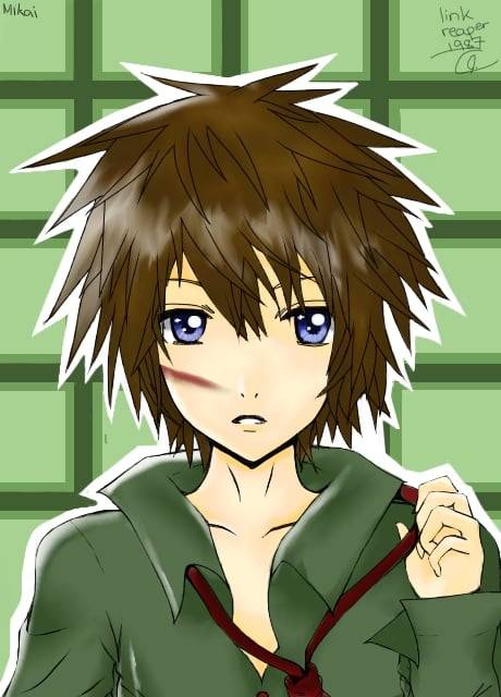
A collab with user "lime":
Collab with user "Mikai":
A collab with user "Overik", which I specifically remember struggling with because, at the time, my computer monitor's screen was messed up resulting in the entire thing basically being a fluorescent pink:
A collab with "Mist04" that I don't remember doing lmao:

Collab with "Adzumi" (?). I'm fairly certain that's who it was, I definitely remember the process of painting this one, I had loads of fun with it:
Collab with user "ForgottenArtist", IIRC this one was more of a coloring page where they gave out the file freely for others to color, so this was my version. The forums on RMD were great for that sort of thing, people would literally just upload their drawing files for people to have fun with:

So I guess I drew this next little thing in 2021 when the site was still 'live' but not functional, I completely forgot I did this though LMAO Basically the main URL took you to that kill page I showed above, but if you knew any of the extension slugs, you could bypass that kill page and get into the rest of the site, which I was able to by using my username URL. So I got into the Java drawing tool and made this little thing in the hopes I could upload it. Of course, it didn't work, but hey, it was worth getting a screenshot, I suppose:
It's equal parts nostalgic and bittersweet to go through these drawings. Life back then feels so far away and yet I still remember it so vividly, the hours I'd spend drawing on the family PC, feeling more at home with the friends I made online than the ones I had in real life, listening to music that I still listen to to this day. It's far away now, but it still lives through me, in the work I do today. Even someone like me can go from being a complete noob drawing with a mouse to a professional making their living stabbing ink into other people while still drawing the same stories they drew as a child.
There is one piece I had to dig up outside of FB memories, fortunately it wasn't hard to find because I knew I had shared it ages ago on my FB so the search bar saved my skin. My very first digital art piece, of Sheena Fujibayashi from Tales of Symphonia, one of my favorite games of all time.
My very first digital art drawing:

Recreated in 2019:

Past me went through a lot, and they'd be doomed to go through even more still (they hadn't hit the plague yet). And yet they're going to survive, they're gonna keep getting better and better with each passing year. Thanks past me - you've done a lot of dumb shit in your life, but sticking with your craft wasn't one of them. Thank you for walking - through all the good and the bad that you've had to weather through - so that I could run for us both.
#i have other things i wanna mention about old RMD as well but they're better for another post#self post#old art#media preservation#digital art#ratemydrawings
39 notes
·
View notes
Note
I’m sooo obsessed with the brushwork in your sketches! What brush do you use if I might ask? It looks like something on Procreate but idk which exactly 😮💖
Hai anon i am very inconsistent with my brushes on procreate but i usually use this brush called the fashionist from rusty nib. This pack has 100+ ink brushes and they’re all really good. (Also works w photoshop, csp). For coloring i just use the default pen tool w color jitter and varying opacity)

7 notes
·
View notes
Note
how do you do the alternate colorways??? are you using like layer modes or ?
nope i never touch layer modes for anything but tiny effects (like the ink stamps on the postmaster drawing) because they frighten and appall me but each of those drawings i used different Methods
first one i used the curves tool to manually shift around the colour curves, resulting in a more warm-toned final piece. that one was soooo close to being posted but because that piece was based off of a real sunset i'd seen i decided to use the unaltered version which was closest to the real sky
second one, not really an alternate colour way i just drew that one with black pencil brush on a white bg. then for the one i posted, i just changed the pencil layer to blue and the bg to pink. done
third one is actually the original painting, i did that in sai. the one i posted had a gradient map applied at a low opacity to turn it more purpley and also a bloom and noise effect on top for a blurry glowy look iirc
fourth one was a gradient map at 100% opacity, this one was the earliest of the four drawings and i hadn't really learned much about procreate and just jammed the colours on because the original was not wowing me. but what the original needed more than a totally different colour scheme was just a saturation and contrast bump to make it more vivid
bonus alt colour under the cut
here's a headwreck: this is sun eater when i was done painting it, in the colors i originally hand picked for the drawing. i finished this and then i was like hey this is Not good so i went back and changed the curves to make it all nice and actually legible. but yeah this is the original painting. sometimes i get it right first try with colours but this time i didn't. it's also an illustration of how screen brightness can mess up a drawing because if your ipad or tablet screen is too bright, you will select colours which are too dark without even knowing
to keep my colours good i often just take screenshots as i go and look at them on my phone (with vibrant colour mode turned off). the ipad screen is also especially bad at yellows to a noticeable degree
#info asks#also if anything this should show that you can never RUIN a drawing with a bad colour scheme. nothing is unsalvageable#you can alter it or gradient map it or i guess use layer modes (??) before you should consider repainting it#and even then repainting it isn't the end of the world#i've done it loads of times
105 notes
·
View notes
Photo

Aight, so this’ll be the major answer to what brushes I use and will link to. Thank ya’ll for questions!
---
PROGRAMS
I mainly use Clip Studio Paint and sometimes Krita for inking. Clip has honestly been great to use and its let me explore animating and 3-D spaces with their modeling program.
SKETCHING
I use 2 brush packs with sketching. The first is Intoxicate Pencil Set by ×ェ×
Below are the brushes I use. “Intoxicate Pencil Normal x4″ is the one I use mainly for sketching and refining.


The second is 15 Natural Pencils by saturn_days
I use the “Y2k Graphic Pencil” for mapping in areas for shading. (rough sketching and ideas) “Static Chalk Pencil” is used for when I wanna do more detailed shading or blacking things in. Same thing applies to the “Carpet Pencil” but I sometimes use it to outline my sketches to look more clean. The “Asphalt Pastel Pencil” is mainly for sketching with bolder lines. I like using that for clothing or sketching details.

INKING
When I use Krita, I only use “Pencil-3_Large4b”, comes with the default brushes. I set it 100% opacity and around 6-15% for size.

In ClipStudio, I’ve started using Casa Gneo by 墨佳遼
I use both (1 & 2) , but I like the feeling that Casa Gneo has. Scratchy and like a regular ink pen.

COLORING/PAINTING
Finally for painting, SU Cream Pencil by Yuriky has been my Ol’ reliable when it comes to blocking in flat colors. It’s also great for shading and hair shine. It use it for a majority of my drawing process, from lighting to clothing, etc.
Other brushes I haphazardly use are:
Real Pastel Arch by ARCHV
Was there an analog art supply? by 弥阪 (which is also where I get most of my paper textures from for my drawings)

Grunge Dot by Marredae
rake painter/oil Paint by PokiHan
Highlighter marker by ghostpajamas
Dirty brushes by ぱーらめんと
---
Aight, enjoy these crunchy crunchy brushes!
124 notes
·
View notes
Text
helloooo i wanted to share the way that you too can make wall graffiti digital art like the one i posted because it is genuinely fairly easy and simple ! :]
lets hop right into it!
so first u are going to need the art! my process was to make lineart first and then paint over it but the lineart isn't necessary - I just ended up getting frustrated with the lines and decided to scrap the lineart and go in a different direction than my original plan for the piece LOL
for the painting, find a brush that looks chalky or spray painted. the brush i used is one i made myself, normally used to look like a marker thats running out of ink but I messed with the settings to end up with what I used for this piece. now slap some colours on your canvas!

keep it messy! leave gaps in the colouring for the bg to show through! depending on if youre going for a chalk/chalk paint or spray paint look, you can use different techniques here. keep details to a minimum (or don't! do what feels right!) if u want to achieve more of a typical wall graffiti look!
okay now that you've got your art, time for the wall!
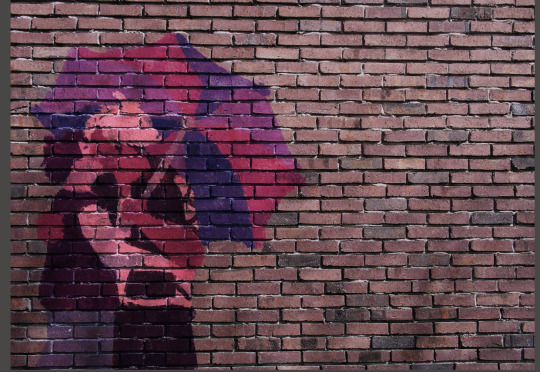
stick a free-to-use photo of a brick wall into your layers under the paint layer (first image):

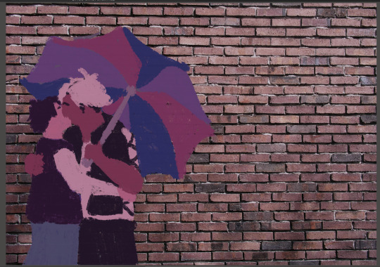
(second image) the wall looked too bright and brown for paint colours i'd chosen, so I put a fill layer of dark purple (colour picked from the painting) and set it to "hard light" and turned the opacity down a bit to get a more cohesive colour.
okay time to get your paint looking more like it's on the wall properly - we're going to go from A to B here:
this is where i give the disclaimer "you can do whatever you want but here's what i did" LOL. here's what I ended up with for layers by the end of this part of the process:
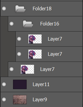
first (bottom) layer7 is my base layer. i set the paint layer to "overlay" at 100% opacity. the second (middle) layer7 is set to "multiply" at around 30% opacity. the third (top) layer7 is set to "screen" at around 20% opacity. do i know what any of these do in proper terms? nope! i learned a little bit of photoshop in grade 11 and 12 and barely remember any of it so I'm just flying by the seat of my pants 🙂👍
base layer alone (just overlay) VS with the added folder 16 (multiply and screen layers) - the difference is barely noticeable but in the second one the colours are a little bolder and more opaque.


screen seems to brighten it a little and multiply seems to darken it. why did i add both? who knows!
for the shadows on the wall, it's pretty easy:
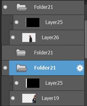
i found free-to-use (and free-to-modify etc) photos of people walking, used "motion blur" in filters on that, added a fill layer of black/dark purple and set it to be a clipping layer over the person walking so they were now a silhouette, and set the motion-blurred person layer (19 and 26) to "multiply". play with the opacity to your heart's content and boom-shaka-laka we've got a shadow (or two) on the wall!


i think it adds a little bit of something extra to it! :]
that's the long and short of what I did to make that piece - if you want to do more stuff like this, mainly I just suggest getting somewhat acquainted with layer filters and then you can have some real fun messing with textures and incorporating photo elements into your digital art!
#this is so disorganized SORR-EE this is a fair representation of my brain lately though LOL#the actual art process is much more chaotic but i tried to organize it a little bit to make sense for yall fdsjkl#dandy.cmd#doodlebug.jpeg#i guess? idk what to tag this with tbh
5 notes
·
View notes
Note
I love how your art is always so textured, from the lineart down to your renders! What kinds of brushes do you use?
Thank you Anon! I use brushes from the ClipStudioPain Asset store, here are the ones I use most frequently!
(Icons for reference because finding specific brushes in CSP is really hard imo)
For Lineart:
Ballpoint Pen or Good pen!


Examples from me:


Sketching:
Intoxicate Pencil Set (I love these so much, the creator also has some great inking pens as well)


Colouring:
I mostly fill in with any 100% opacity brush and then do a lot of blending with textured brushes!


The grain effect like on this Orym is edited with an app from the app store called prequel! CSP also has a grain filter, but it's not quite fine enough for me

This is a pretty lengthy post, but I hope it helps! 💛
37 notes
·
View notes
Text
Hi! @velvetcloak asked me to do some kind of lineart tutorial/step-by-step, I'm by no means an expert so don't hesitate to ask if you need some things clarified! Always glad to help.
I use three different methods that are pretty much trial and error, depending on what works best for the artwork but I'll do my best to explain with screenshots - these were taken on photoshop, I draw with procreate, but I'm guessing the layer modes are similar on other softwares. (Also mine are set in french, sorry in advance for the confusion.)
If you're already familiar with digital lineart and softwares, this probably won't be of much use, it's very basic stuff.
Otherwise, more below the cut! (It got a bit long.)
I. Solid black lineart, with this illustration used as reference.
I used the basic gesinski ink brush in procreate, 100% opacity in normal mode to get pure black. Very basic, it's set on top of the colour layers, everything above that is just additional effects and filters + textures. Note that I always draw separate elements on different layers and fuse them later, it's easier to deal with details this way.
The isolated layer looks like this (I changed the colour of a disappearing hair lock, more on this later):
And the colours without it, like this (my style relies heavily on lineart, lol):

Both:
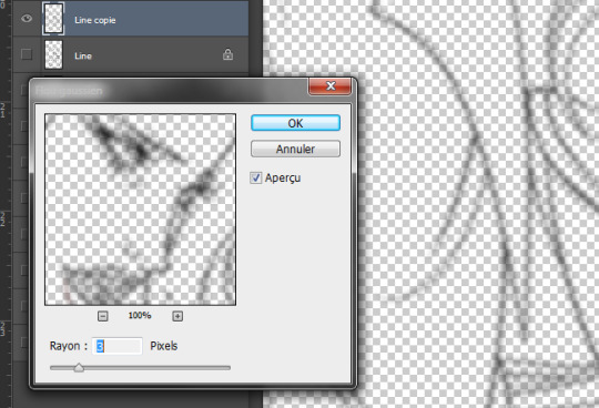
Good! It's a bit harsh though, I like to add a second layer to soften things up, set in 45% opacity multiply mode right under that. I duplicate the main lineart, and add a gaussian blur to the copied layer (between 3 and 5px, values vary from one artwork to another, same with the layer modes.)
Not done yet! I use the blured lineart as a colour filter by locking it to pixels only and filling it with the tone I want. In this case, red. Isolated layer:
And the end result:
The second method, I tend to use more on sketches and loose drawings to get a better blend of lineart and colours:
II. Semi-transparent lineart, with one of these sketches.
Basic 6B brush in procreate (my fav), quite thin here but you can get great results with a larger brush. It's not really obvious looking at this scale, so here's a comparison between a black solid lineart (1 layer, normal 100% - the scars are on a separate layer because of the colour, otherwise it's the same setting) and a semi-transparent one (2 layers), especially visible in lighter areas, note how the second one lets hues show through. I find this to look a bit less stiff.
Now for the method! Since this relies on the layers underneath, you want your colours to a bit more precise than the previous example. Without lineart:
TBH it's also a two layers solution, super easy. Once you're statisfied with your basic lineart, set the layer to overlay 100%. You'll get something like this:
Then duplicate this layer, put the copied layer above the overlay one and set it to normal 70% (or whatever looks best, this is 67%) and you'll get the final result as previously shown! In this particuliar case, I erased the black circle around the iris in the normal mode layer to keep the blue of the overlay one. You could also skip step two depending on the desired rendering.
The third method is a blend of the other two result-wise:
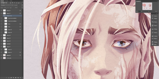
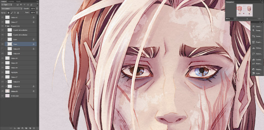
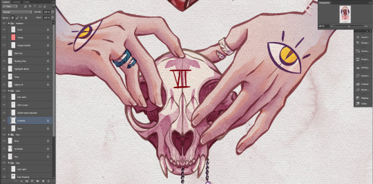
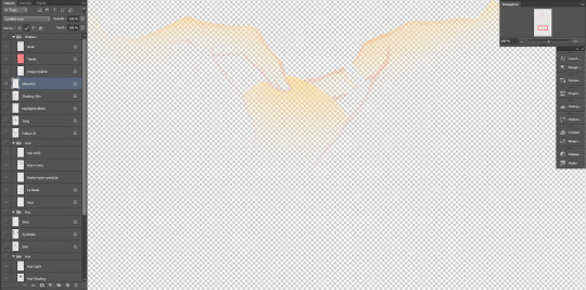
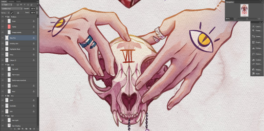
III. Coloured lineart, with this illustration. (tw: a bit of gore and blood in the full artwork, I'll crop it out of the screenshots. Poor guy can't get a break. It's the only file in this style with a semblant of organization, don't be like me, rename your layers and use folders.)
Fountain pen toothy brush, from the MaxPack watercolor set. It has a bit of a texture to it, and isn't entirely opaque so it blends nicely with the layers below. The lineart is set to normal 100%, for this method it's preferable to have separate layers for each elements, since you'll be recolouring them individually. Here, the hands, skull and additional details are all on individual layers.
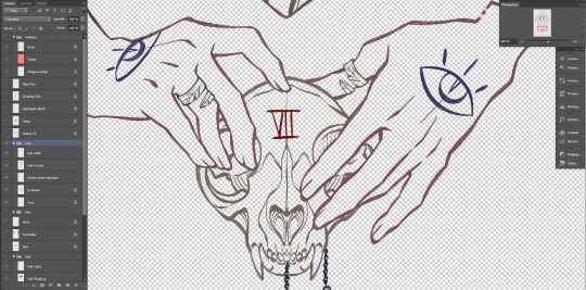
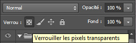
Just like the blurred layer in the first method, you need to lock your pixels (the little grid to the left on photoshop):
And either fill you layer with colour, or paint on it with an opaque round brush/a soft one depending on the desired outcome. (Some zones might need a gradient, or various colours.) You can also use another normal layer on top of a black lineart and set it as a clipping mask, same result, different method. But I prefer to keep the layers count to a minimum when possible.
With the layers below, it will look like this:
You can notice a bit of lineart transparency over the skull colour layer, cool stuff. (The shading of the skin is set on top for some reason, I don't remember why but surely there was a reason.)
However! In this illustration, I need a yellow glow for the fire so let's create yet another layer, shall we? This affects the whole rendering. I painted a diffuse light source using a soft gradient brush, and set the layer to hard light. Isolated layer:
End result:
All done!
Now go create!
9 notes
·
View notes
Last Seen Blogs

becomingscarlet-blog
Princess of the Tower

themoneybuff-blog
The Money Buff

hazyhund
howl 🌀✨🖍️

arvi7p-blog
Untitled
calamitousdreams
Calamitous Dreams