#the design of the bag is bad.
Explore tagged Tumblr posts
Text
a reenactment of me scrolling through all the Indiana Jones announcements today

it ends exactly the way you think it does:


#this is so bad!#it's so bad i don't even have words for how bad it is#i'm just stunned really#anyway i'm having a normal one. can you tell.#like. the quality of the art is bad.#the design of the bag is bad.#the illustration is bad.#the WEIRD LITTLE IDOL ART is a DIFFERENT kind of bad.#this is THE ONLY design (alongside a matching wallet) that loungefly released for some reason.#just absolute garbage#not that i expected anything from funko! but my god. this might be the ugliest piece of merch i've ever seen#ever.#anyway.#indiana jones#i'm fine. how are you?
8 notes
·
View notes
Text
Princess Killer of Velegore
(yes, i know i spelt it wrong on the image. the text version is written correctly!)

Killer is quick-witted, flirty, and sly, with a dark sense of humour and a tendency to push boundaries. He as a habit of pushing and pushing people until they snap; Nightmare doesn’t know if he doesn’t realise does he this, or its its some kind of sadism. He often tells jokes, and though many may seem dark or cynical, there’s an undertone of genuine humour in them he’s even got CROSS with the odd good one!. He gents bored VERY easily, cant sit still, cant pay attention to CERTAIN things, and has a love of telling jokes -
Initially, Nightmare is intrigued and a bit wary of Killer’s flirtatious and teasing nature, unsure if he’s being genuine or manipulative. But as time goes on, Nightmare realizes that Killer’s provocative behaviour is a shield against vulnerability. Nightmare finds himself growing fond of Killer’s sharp wit and his loyalty beneath the teasing exterior.
Killer’s relentless teasing sometimes bothers Cross, who takes things seriously, but he learns to use humour to deflect Killer’s jabs. Killer is drawn to Dust’s odd behaviour, possibly both fascinated and disturbed by his hallucinations, which he sometimes finds darkly humorous, though he never laughs at Dust directly. With Horror, Killer has a unique bond - Horror’s straightforward sweetness balances Killer’s intensity, and Killer finds himself inexplicably protective of him.
Killer, on hearing what his potential partner was like, found him quite sexy. He quite liked the idea of being bossed about by this man with all the power, and was keen to work with him. He wouldn’t say he’s DISAPPOINTED when he met Nightmare for real, but he isn’t what he was expecting.
-
Velegore is a mysterious kingdom famous for its dark, intricate art, masterful weapon craftsmanship, and elite assassins’ guilds. Its people are known for their strength and wit, excelling in strategy and subterfuge. Velegore exports high-quality armour and rare gemstones found in its extensive mines.
Customs & Culture: Velegore has a tradition of intense, often theatrical displays of strength and wit, where challenges and contests are common among nobles. The kingdom celebrates the Night of Masks, a midwinter festival where everyone, from peasants to royalty, wears masks and mingles anonymously, embracing a night of freedom and mischief.
Religion: Velegore worships the Umbral Pantheon, a group of deities representing darkness, shadows, and hidden knowledge. It’s believed that these deities protect secrets and grant wisdom to those who can navigate the shadows.
Royalty: The King of Velegore, King Sable, is known for his pragmatism and ruthlessness. His reign is secure through careful, almost paranoid control, making him wary of threats even from within his family. Killer, being one of several siblings, is the second-born son, raised in a family with many potential heirs due to the kingdom’s hazardous political landscape. Having many siblings indicates the kingdom’s need for a secure line, as heirs are occasionally lost in the internal conflicts that arise among Velegore’s cut-throat nobility.
Architecture: Velegore is known for its dramatic, imposing architecture, with squat, angular buildings that seem to meld into the shadowy landscape and slanted roofing. The buildings are constructed from dark wood and iron, with narrow, barred windows and tall, thin watchtowers that cast ominous shadows. The kingdom values defensive structures, with walls and gates hidden by thickets of thorns and barbed plants.
Clothing: Clothing in Velegore tends toward black, red, and gray, often adorned with silver. Silks and cotton are rare, so most fabrics are thick wool, leather, or flax, providing some protection while remaining lightweight for quick movement. Jewellery often includes polished iron, rubies, or garnets, and some choose to wear protective talismans made from animal bones or metal.
Climate: Velegore’s climate is cooler, with harsh, misty mornings and short, dim days. The overcast skies give the kingdom an eerie quality, with rolling fog that suits its dark forests and murky marshes.
Diet: The people of Velegore rely on game, preserved meats, root vegetables, and foraged berries.. Meals are basic but intensely flavoured, with heavy seasoning to balance the somewhat meagre diet available. Fresh food is often scarce, as they lack the agricultural bounty of other kingdoms. Killer himself is fond of strong spices, though they all come from trade, and are VERY expensive.
Fauna & Flora: Velegore’s wildlife includes nocturnal creatures like bats, wolves, and owls, all of which are symbols of strength and stealth. Local plants include wolfsbane, nightshade, and thorn bushes, often used in Velegore’s folk remedies and warding charms. Dyes from local berries and plants are used to create deep crimson and midnight hues for their clothing. All ‘black’ dye is actually a very dark blue.
this is gonna be the last post for a few days, cus like, busy time and al that lololol
#undertale au#undertale#undertale au fanart#killer sans#killer!sans#something new#something new sans#something new au#killertale#undertale something new#bad sans gang#betrothal au#bad sans poly#betrothal!au#bad sanses#betrothal!Killer#no he doesnt wear his soul over his head to pretend its a daring part of his crown...#like hes daring them to 'aim here'...#okay#yes he does#shhhh#i love this shit bag#anyway!#there are designs for the whole poly minuse Horror out now!#wooo!#ill get him sone soon#as well as a better one of Cross
63 notes
·
View notes
Text

af attack for @nenchuu! — kaori was so much fun to draw, she's so cute and pank! also gotta respect a fellow kara lover. 🫡
#i need to read through her tag on your blog some more i wanna know more about her so bad 😭#i based some of the badges in her bag on real can badges they've released ( one of them is kara's host matsu design! )#it's 2 am here so i'm gonna schedule this for later aaa#artfight#osomatsu-san#osmt#yumematsu#others ocs#nenchuu#karamatsu#mj draws
61 notes
·
View notes
Text
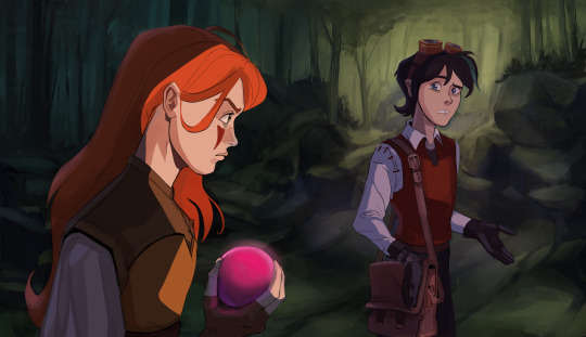
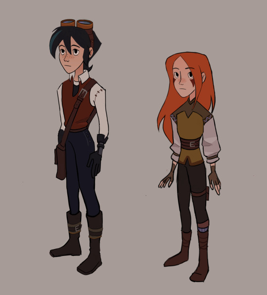
Baron strikes. Varian is the only person avaible to help Catalina although he's kind of sceptic the whole way through.
#sheerak#Catalina isn't really fond of Varian at this point too#it's like a year or two after the finale#I had this short story in my head since 2020 and I will probably do nothing with it for another few years.#fun fact sometimes a random person starts texting me out of nowhere on ig and I use it as an opportunity to pitch my story ideas like this#she stole the pink bomb from his bag and he's like ok don't do this and I'm sure this is a bad idea#designs are from 2021#I have no idea how old catalina is in canon ??? she's like 4 years younger than V i guess?#please I will practice backgrounds I promise#tangled the series#varian#varian tangled
315 notes
·
View notes
Text
my favorite brandon blackwood trunks


#i want one so bad#brandon blackwood#designer fashion#designer bags#luxury#black tumblr#fashion#black girl aesthetic#fashion aesthetic#black girl fashion#black girl luxury#luxury lifestyle#black owned business
8 notes
·
View notes
Note
i saw ur tags earlier and i have, a controversial take for all the stays out there, but. i'll be honest i don't like LVs designs and i feel like they have Not #slayed with a lot of the styles they've put lix in

Me reading this
#No but largely i agree? idk the best theyve put him in was the womems wear one piece which i think was for that mag last yr?#like they dont dress him bad but a lot of what he wears FOR MY PERSONAL TASTE at LV is very....#if it werent LV i think most people would be like Hmmmm.....#like at least the head designer is very nice to him so thats nice#but like yeah overwhelmingly they are still a designer brand that burns clothes and bags that dont sell bc they could never discount#and yk... also owned by evil mega conglomerate lmao its easier to shit talk tommy hilfiger bc the clothes are boring but p much all these#big brands have Questionable Things Happening#but also celebs always work with them and imma still reblog a picture from a fashion show bc i am but a man#and sometimes i like to say things about the fashion outside of any moral standing#<< its 7am you cant get me in trouble for any of these takes#what even were the takes? clithes are questionable but the brand is also questionable but the guy is nice but i am questionable#like i dont begrudge felix his little brand deal but i wont pretend they didnt put a boot on his head#i think the same about lee know and gucci as well and everyone knows my feelings about loewe.... lmao#bye
14 notes
·
View notes
Text

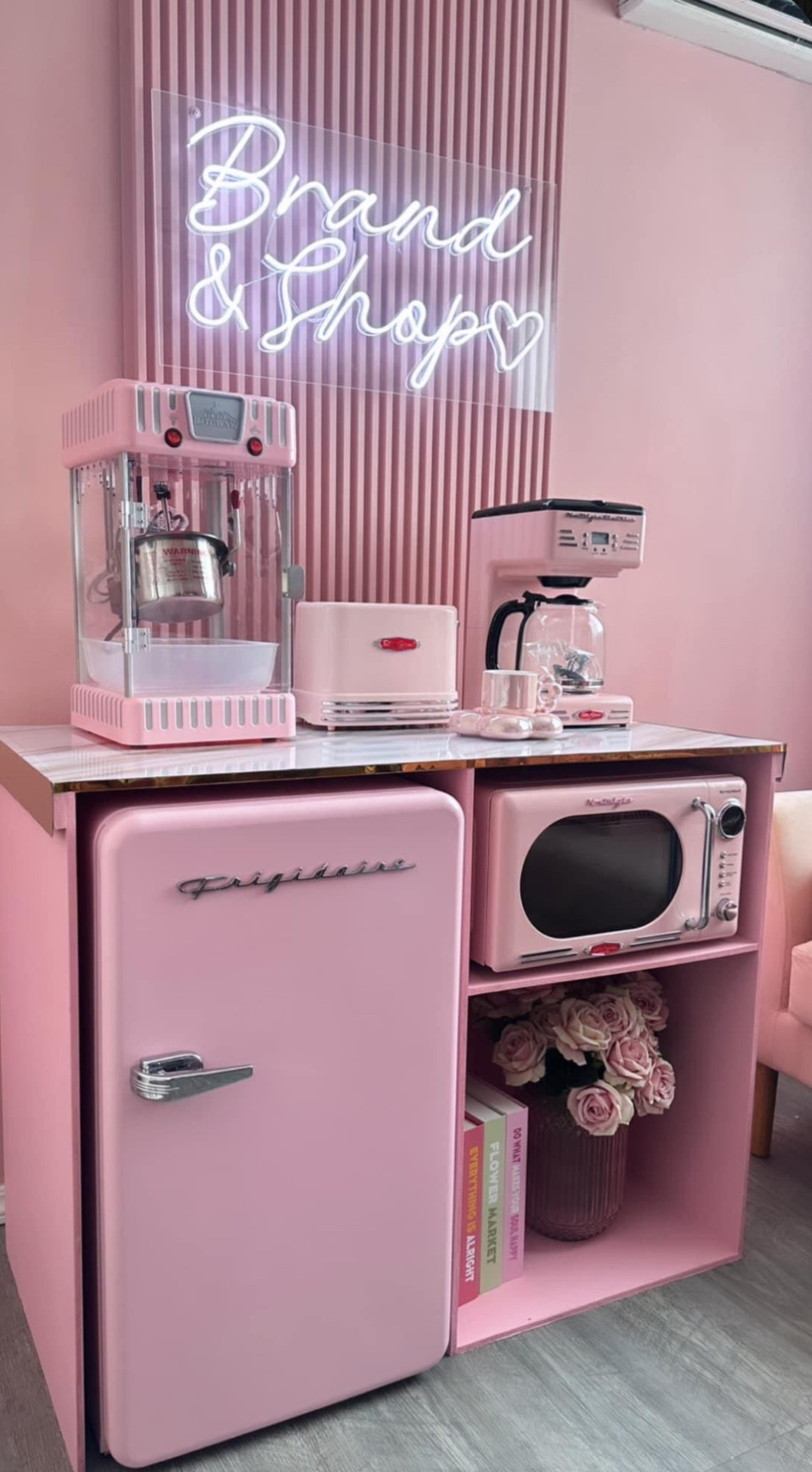
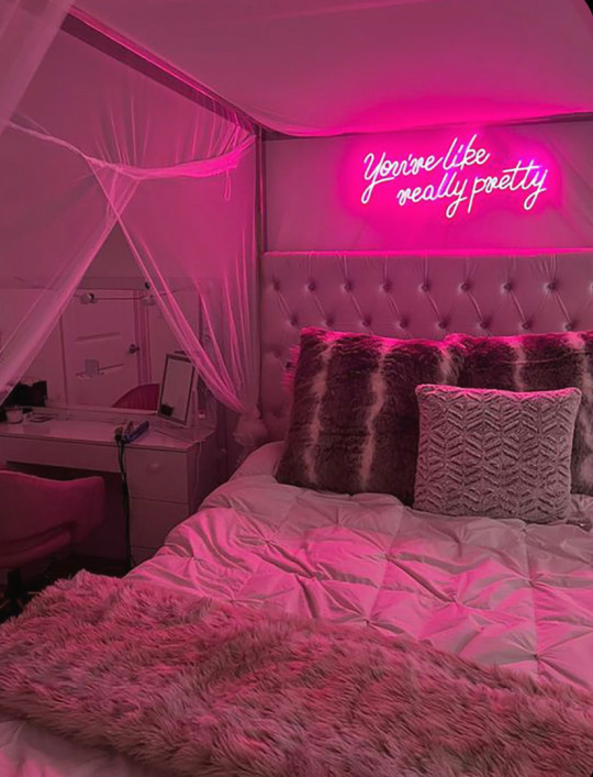


#cute aesthetic#aesthetic#pretty pink#pretty#pretty girls#omg#pink#followforfollow#funny#memes#pink room#pink pilates princess#pink aesthetic#y2k bratz#y2k aesthetic#y2k style#fashion#divine feminine#diva#designer bags#that bitch#gorgeous#life quotes#forever and always#coquette#it girl#love yourself#self worth#self love#the bad batch
27 notes
·
View notes
Text


ITS FINALLY HERE AND IT LOOKS SOOOO GOOD I LOVE IT
#touchstarved game#touchstarved#for that person who asked about the standee it’s transparent so you can see the design through the back#loooove the quality of the packaging and love how even the little bag the tote bag came in has the game logo on it#felt bad cutting the ts logo sticker on the box#the pins and the charms and even the standee are so much bigger than i thought they would be!!!!#the prints are so nice#the ais ks award is definitely going in a frame#as soon as i get another bookcase im making a ts shelf 🫡#soooooooo worth the money and the wait#ty past me for doing 2 part shipping#can’t wait for the art book now 😭💖#they did such a good job on the merch!#i hope the merch shop doesn’t take too long to open after the game comes out for everyone who didn’t get a chance to order :)#AND on lesbian day 🙏🏾#perfect timing
18 notes
·
View notes
Text
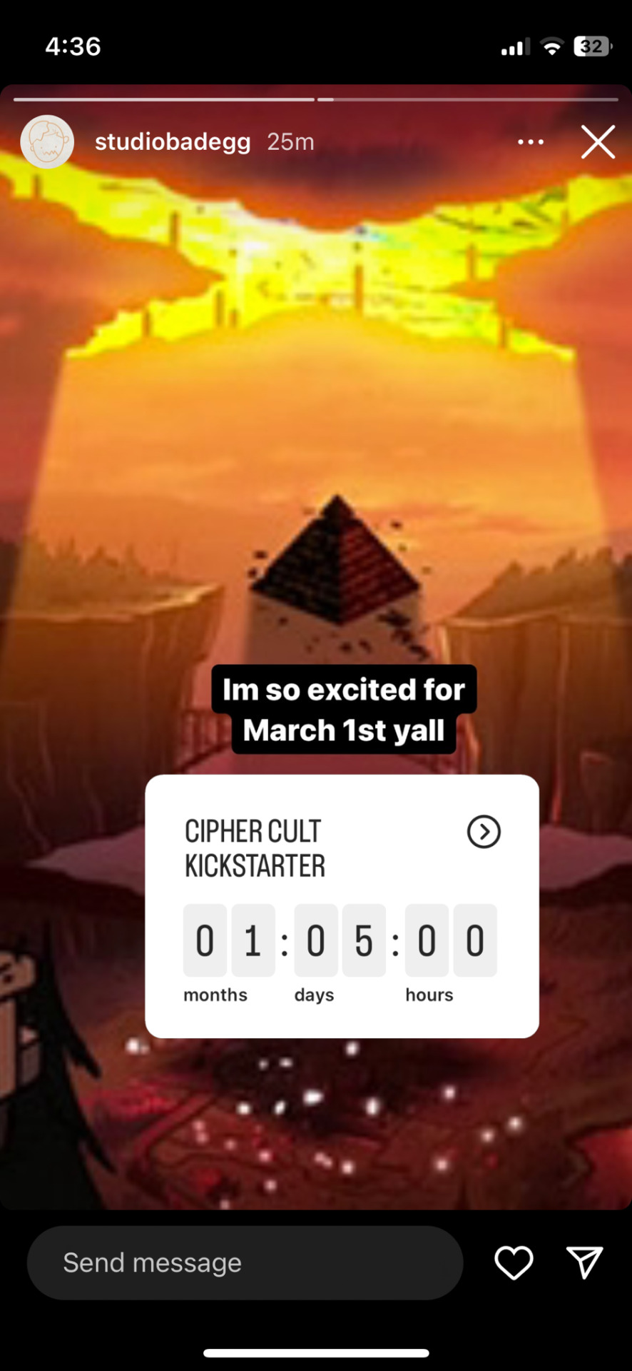

RICHMOND I AM LOSING MY MIND!!! PLEASE START PEOMOTING THE KICKSTARTER! I WILL GIVE YOU SO MUCN OF MY MONEY FOR BILL ITEMS
#gravity falls#bill cipher#studio bad egg#for context this guy made a gravity falls merchandise collection with alex hirsch last year#and it was excellent; now he’s doing another#on one of his livestreams I said I hoped there’d be Bill jewelry and he responded with something vague about the jewelry designing process#I said something like ‘if you made Bill jewelry I’d die of happiness and invoke the Axolotl so I could come back and wear it’#(jewelry is not confirmed I’m just REALLY hopeful)#he might have said there’d be about 10 items but that might have been wishful thinking/misremembered#he’s posted polls for a second Bill bag design#I’m really excited for this#now I’m waiting 180 days for The Book of Bill and 36 days for the Cipher Cult Kickstarter
26 notes
·
View notes
Text
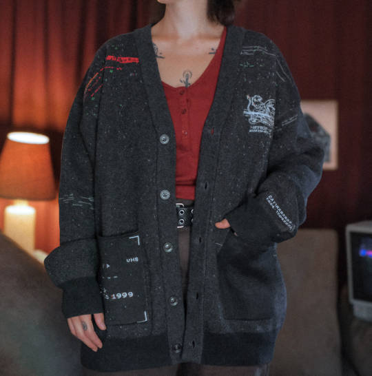
Staring longingly at this cardigan right now. Will be doing that every day for the foreseeable future. I need this cardigan desperately. Unfortunately it will be many moons before I see it come home to me, travel safely tmagp cardigan my beloved 🥲
#they made it for me they designed it specifically for me this has everything I love in a cardigan#and it's tmagp merch like come on now#is this something I should be buying? probably not its expensive#will I be buying it though? yes. yes I will.#it remains to be seen whether I make bad decisions and also buy the cool messanger bag#the magnus protocol
12 notes
·
View notes
Text
semi-annual tradition of roasting HeR's questionable fucking merch because all their designs are bad again let's goooo ->->->
remember how for a bit there it felt like HeR was putting some effort into making their merch good? desirable? well-designed?
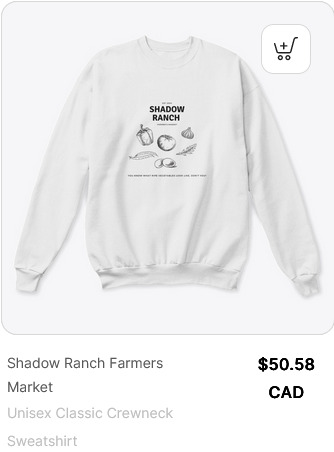
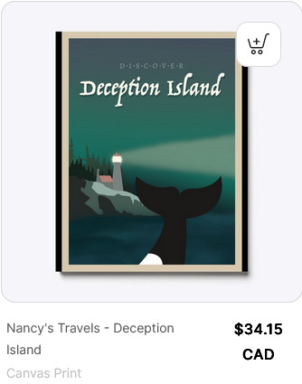
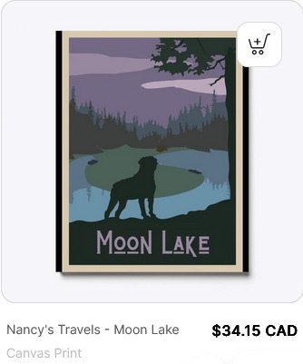
welp it seems pretty clear they're done with that, because i'm sorry but this just looks awful. the font? bad! the horse/lasso clipart? bad! the layout? very, very bad!
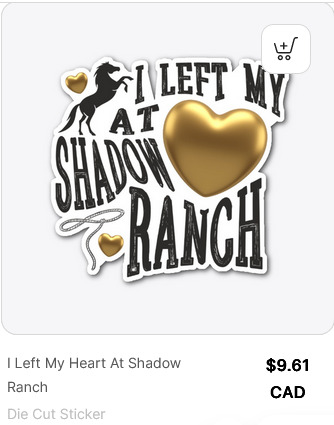
"I left my at Shadow 💛 Ranch" are you serious rn? bad! i don't think you tried at all!
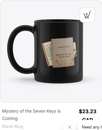
actual Mystery of the Seven Keys merch ffs why isn't it called Case of the Seven Keys that sounds so much better has dropped - and while it's nothing special (though some of it is weird - hey do you want an 8x10 metal print of the game 'cover' awkwardly centred on a blurred, indistinct background? 'cause HeR made 'em!) it seems like they can't decide what nancy silhouette to use? because while most of it uses the new exorcist-head-turn pants-y drew silhouette, they've also got a couple pieces with the classic silhouette - the one they haven't used since Stay Tuned for Danger. because who needs brand consistency.
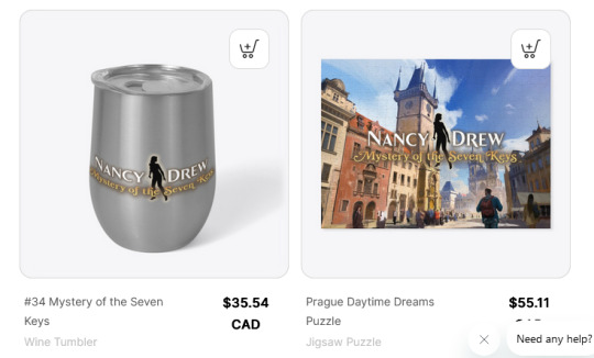
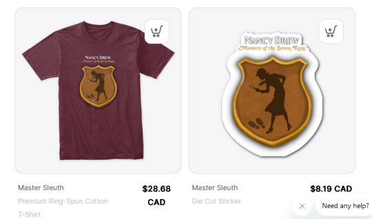
(the nancy silhouette use from mhm to sea - aka for nearly 90% of the games - has not resurfaced.)
the presence of actual KEY merch raises the spectre of who they think is gonna buy all the merch they made during the lead-up to the game - seriously is there any reason someone would buy this now?
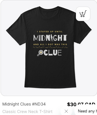
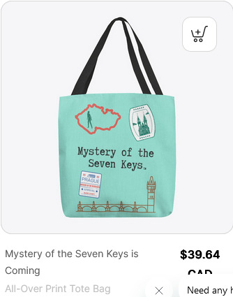
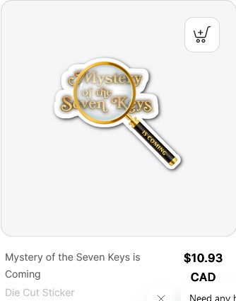
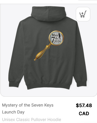
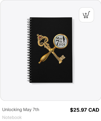
i would also argue there was no need for anyone to buy any of these before, but now? $60 for a hoodie with your fucking launch date?? really???
does anyone know what separates the 'classic' icons on the left from the 'deep cut' icons on the right? also wow they're really just never going to acknowledge ran at all anymore huh.
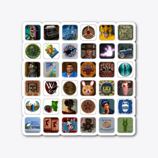
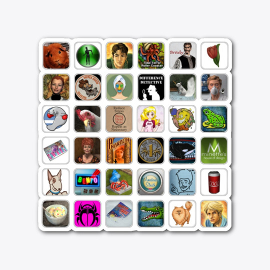
ah yes. noted 'deep cut' references. like henrick. and ethel. and hotchkiss.
these next designs are clearly not the worst things in the store and while I guess they're not awful though I don't like the font they are blatant Bess and George erasure and thus I hate them on principle.
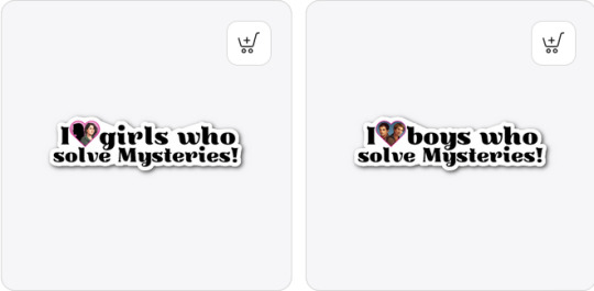
Bess + George > Deirdre. Also, Bess + George > FrankenJoe. hope that clears things up.
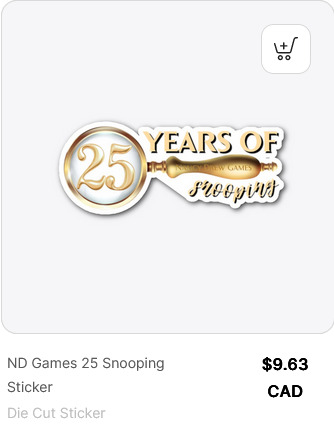
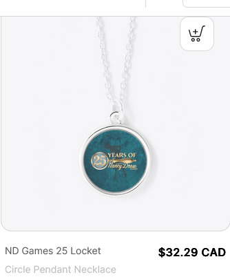
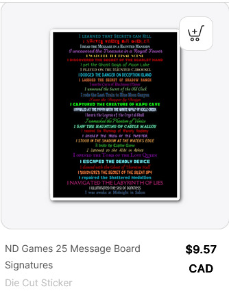
the 25 year anniversary merch is a whole load of bad - the 'and all i got was this lousy _____' trend is lame, and has been for 10,000 years, but there are worse crimes. the mug is just boring in a way that looks unfinished rather than minimalistic. font crimes from the magnifying glass - every time i see it i think it says 'snoopers' not 'snooping'. i actually thought the teal callback designs were kind of neat in a nostalgia-bait kind of way until i realized the necklaces were the only option without all the text under the magnifying glass? maybe folks who were more active on the boards get a nostalgia kick from that last one but i'll be honest, it does nothing for me.
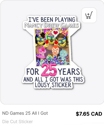
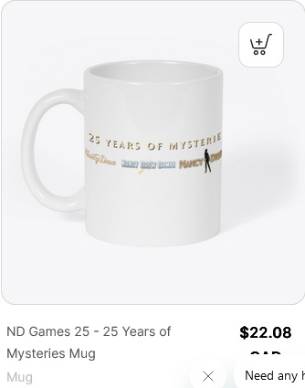
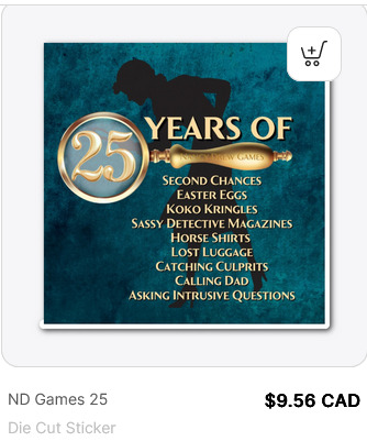
i don't mean to be an exhausting pedant but. no sassy detective until trt, no koko kringles until ssh, no easter eggs until dog, no horse shirt until ddi, can't call carson until clk, no lost luggage until dan. also the placement of the text is just. weird. doesn't look right.
and jenna's whale t-shirt still isn't available in green. bye.
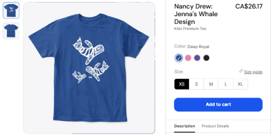
#nancy drew#clue crew#my god it is 5am#the cutest coffee cat designs are okay but also someone should have slapped it on a tote bag#elka's shirt is is okay too#but talking about the bad stuff is more /fun/ lmao
13 notes
·
View notes
Text


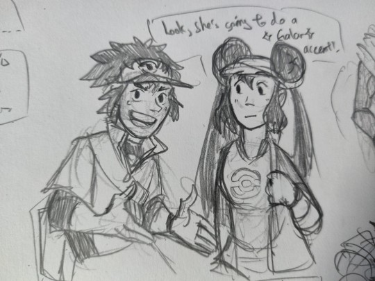
Assorted doods of Master ex and BW stuff
#pokemon bw#pokemon bw2#pokemas#pokemon#doodles#I see Rosa and Nate being twins due to their side bangs begin the same to each other and their mum#also I am all for older sibling being more hyper active and chaotic type#i mean rosa is active too she literally throws her duffel bag like shes about to beat you senseless personally#but Nate is more extreme#I also loooove Elio and Selene#both their names and designs including usum#hilbert just kinda sits like that because in b4 his jacket's hood is comfy#but it soon proofed to be a bad long term habbit
63 notes
·
View notes
Text

Nefarious bleach testing
38 notes
·
View notes
Text
Rewatching the god-awful Eragon movie and it's so frustrating that they bungled it so badly for no reason... a whole book in front of them and they went "I'm Jared 19-"
#did they think they did something after speed running the plot (if not straight up cutting or changing it)#it's sooooo bad and it's not fair bc i feel like some of the casting was actually decent but they were WASTED#Saphira magically aged up and wise pls... and Arya.... just Arya.#that era of movies was truly cursed literally nobody was interested in doing a good job- PJO. ATLA. ERAGON.#apparently it's getting a disney show but PJO tv was such a mixed bag I'm still worried#pls don't mess this up... GOT and HOTD has given us such cool dragons pls let the dragon designs slap. let the script and acting be good....#tumblring by moonlight#Eragon
7 notes
·
View notes
Text
hot prof having us write class journals and him writing notes back is just sooooo intricateritualsy it's driving me nuts. i can feel the way the pages have warped from the way you held it + we're literally writing each other like bro oh my god. it's literally a semester long journal and like at this point this thing is becoming an archive an art project like kshsjsjs thats intimate
#ALSO. DURING CLASS HE WAS LIKE ONE OF YOU SAID SOMETHING THAT STUCK WITH ME AND THEN PULLED MY JOURNAL OUT OF HIS BAG ALREADY OPEN#I WAS LIKE OH GOD#also help i'm reading the notes i have to catch up on in my current journal and he referenced something i said IN CLASS that i totally#forgot that i said. like it was not relevant to the journal at all#guys this is bad for me this whole situation is soecifically designed to make me go insane#karinyo.txt#college
6 notes
·
View notes
Text
Hot take: I'm no expert, but I think the new Catholic mascot character is C-tier character design.

"Luce," a mascot character from the Catholic Church, just dropped today. And absent of any criticism of the religion itself - although there are many fair ones to levy - the design is mid. Maybe even bad.
The simple colors of yellow, green, and blue are then muddled by the addition of red and brown. The rosary breaks up the design in an awkward way, but not as badly as the very out-of-place logo on the rainslicker. It feels like the sort of thing they slap on a squeeze ball to make it into promotional material. The varied line weights also feel like they came back and added things later, realized they wouldn't fit at all, and then proceeded to do it anyway.
I realize they want all this iconography on here but they've put way too much noise and made the whole thing into an overdesigned mess. And her friends get additional accessories, which. Doesn't help.
My opinion? Ditch the mud and the logo, and abstract the rosary, or at least blend it into the color scheme better. The rosary is probably the most iconic aspect of Catholicism to the layman. Well, probably a bunch of Virgin Mary stuff too, but details.
The crook(?) can stay because it doesn't interrupt the flow of the design. Hell, it arguably enhances it by having something distinct. Though I will say, as someone who was raised Catholic - it didn't stick, mind you, but details - I have no idea what that is.
#hot take#Luce#Catholicism#Catholic Church#mascot#character design#I don't feel too bad criticizing because I think famous blind bag character design firm Tokidoki can probably handle it
4 notes
·
View notes