#the art style and their character design are very satisfying
Explore tagged Tumblr posts
Text
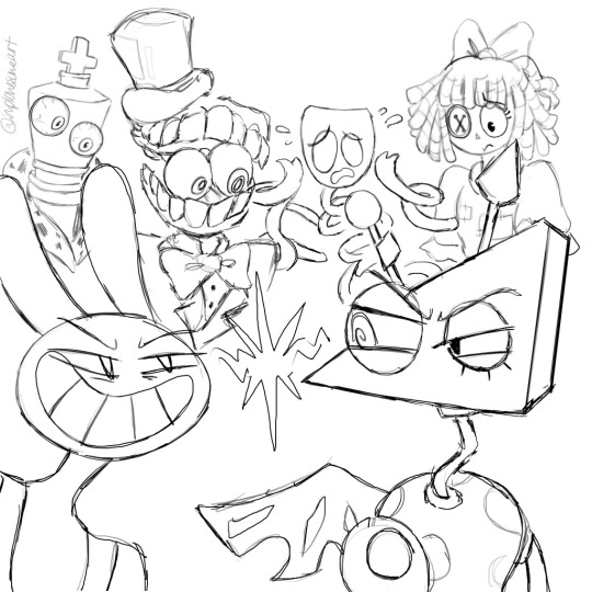
Whoops hand slipped here’s some TADC character fanart. Apologies for the severe lack of Pomni in this one idk where she went off to…maybe she got lost on her way to find the exit. The lines are incredibly choppy & rushed, I know, but it was still fun art practice! I don’t draw these guys nearly enough anyways so this is a nice change of pace. Support indie animation :3
#you wanna know a secret? don’t like how I draw Ragatha I wish I could do her better 😔#like I don’t know if I make her hair straight or if it’s kinda wavy?? and her eye too idk how to draw it in a satisfying way :((#but that’s a normal dilemma when I’m trying to blend my artstyle with the shows artstyle#keeping the characters on model/recognizable and consistent but also my own style ya know?#making those adjustments takes time and usually I need to draw a character 7+ times before it looks good#JAX ON THE OTHER HAND—OH BOY GOODIE HE IS SO COMICALLY EASY TO DRAW HALLELUJAH LOL#I think the Puzzle toothy grin & toon eyes just automatically agree with me#then Kinger I also struggle with personally#Gangle’s mask shape is confusing at first but then you adjust fairly quickly#Caine is neutral party to me—I know how his design is but I’m not confident without reference material#and then the artstyle translation is another hurdle to juggle <<#his top hat especially like HOW U DRAW 😭 I can manage Puzzles bowler hat just fine but NOT top hats man#Zooble is lovely Zooble peace and love they did nothing wrong just pleasant to draw uwu#Jax & Zooble conflict oh noooo the bitches are fighting /j#Actually this initially started only with Caine & Zooble but I just kept adding others lol#Ragatha & Kinger we’re the very last additions#hplonesome art#tadc characters#the amazing digital circus characters#NOT GONNA PUT ANYMORE TAGS BECAUSE THEN IT’LL GET SWEPT UP AND PEOPLE WILL ASSUME I DRAW THEM ALL THE TIME 🥲#I can’t be held liable for serving TADC fanart content because that isn’t me right now sorry
19 notes
·
View notes
Text
Thinking abt the random card au again. Why must it go so crazy hard I miss it sm
#rat rambles#random card au#no matter how far I drift from my bndori and sekai peak days the random card au keeps hitting me like a truck every now and then#it just scratches an itch that I havent been able to satisfy since my cr days years and years ago#I wouldnt say the random card au has super similar worldbuilding to my old cr stuff as that was much more large scale#but it still has a similar appeal to me I think#I think its the building entirely new worldbuilding based off of designs and general vague starting concepts and bringing them all together#that gets me invested as it feels so satisfying slotting it all together and then actually getting to play out the story in this new web#I loveeeee jumbled webs of worldbuilding and characters that all tie together in a way that makes it almost impossible to completely#seperate one cast of characters from another#I love the feeling of a world with a bunch of intertwining plots like that even if it makes it near impossible to format a normal story#like my cr stuff was just so much man I still miss it sometimes even if I hate cr itself#Ive become a much better story creator too now so I know I could make what I had so much better nowadays and I already like my old stuff#it just makes me all the more sad that I went so crazy hard on worldbuilding for a franchise that sucks ass </3#it may have been two of the worst years of my life but Ill also never reach that worldbuilding high again I think#oh also it made me actually start the slow slow process of getting more ambitious with my art and doing more digital stuff#rly thats the biggest reason the random card au pains me so since I wanna post stuff for it but man do I not wanna draw anyone from it#first of all human characters so already eh but also Id have to adapt the cards theyre based on into a design I can actually draw#so as much as I wanna make a billion random card au animatics I cant even bring myself to draw them normally#you see olivia and jackie are easier to draw because I just made shit up for their designs and as such made their designs very simple#but I cant just make shit up for bndori and sekai characters they actually have designs and hair that Id have to adapt to my style it sucks#I just wanna draw doggy arisa is that so much to ask for (yes yes it is I dont wanna figure out her hood)#also rip mygo yall will probably never get in but who knows maybe one day Ill have my second bndori era and then y'all will get in#its rly just the fact that they likely wont have enough cards to properly add them for another few years#especially if that other band also gets in if that happens neither are getting enough cards until the servers shut down lol#like I Could just pick and choose but thats boring#kinda ruins the point of the au y'know?#like tbf Ive cheated in the past by reroling two and limiting my options with several sekai characters#but thats just because at the time most sekai characters had almost no usable cards for this au and the two I rerolled were also unusable#like Im sorry but I couldnt just add normal ass hagumi and masking it wasn't happening
0 notes
Note
i don't know if you've ever been asked this, but which game do you like drawing for the most? Scarlet Hollow or Slay The Princess?
I'm absolutely in love with your STP designs, and I've been studying it for weeks :3
Aw, thank you!! I had sooo much fun designing Princess forms, I could gladly do it all day honestly. It's like designing digivolutions...
As for which is my favorite, I love all my children equally. They both bring different things to the table, and I found I usually missed working on one while working on the other!
Scarlet Hollow has:
• Characters and backgrounds that are rooted in reality, so I can do my favorite thing of adding 10,000 little details to backgrounds and outfits to help reveal more about who they are, as well as adding easter eggs for Hollow-heads to hunt for. It's so satisfying when they find one of the little clues I hid for them :3c

• I feel very connected to the characters, who are like my friends.
• It's all in pen and ink, which is my favorite medium by a country mile. Pencils are fun and fast, but are a little stressful considering the smudging that can happen. It also gets my hands covered in graphite, so I'm constantly washing my hands, which get all dry and crackly as a result. I don't like to get messy... I do not like to use messy tools....
While Slay the Princess has:
• More opportunities for dynamic art, which is the really big exciting one for me. The player and Princess are constantly doing things, interacting, changing position, which leads to really interesting comic-style posing and blocking.
• More opportunities for drawing horrific things, since the player can die. This was the other major fun bit of working on Slay the Princess. I could really go ham on the body horror! Which ties into the other major difference/benefit to StP:
• I can draw the player character interacting with the world, which was a big relief compared to the un-bodied player in Scarlet Hollow. It is definitely tricky to draw a lot of things from a first-person PoV, but at least I didn't have to juggle that AND work around the fact that you can never see your body.
#slay the princess#scarlet hollow#process post#my nightmare is having to use chalk or oil pastels#those are my least favorite#paint is okay but I'm not amazing at it and it can get on my clothes which is evil
178 notes
·
View notes
Text
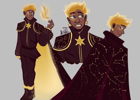
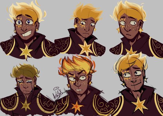
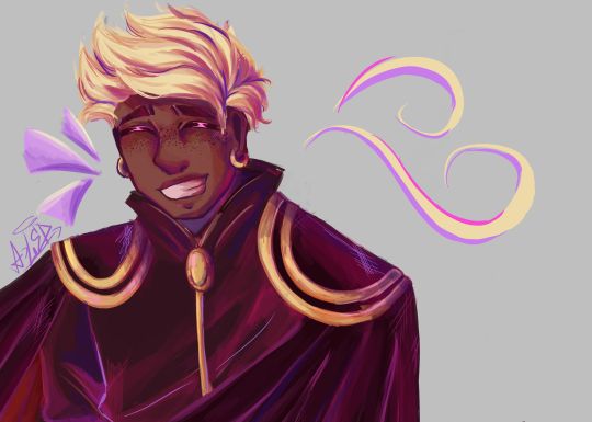
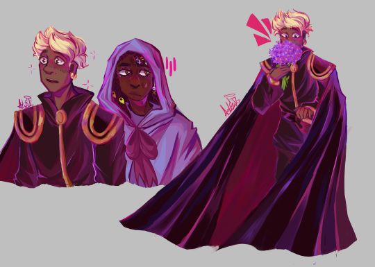
THE MOMENT WE WERE ALL WAITING FOR, FINALLY FINISHED THE DESIGN OF ASTER YESSSSSS ✨✨✨✨✨✨❤❤
This design belongs to the Wish rewrite called "The kingdom of wishes" (Written by @annymation and soon illustrated by @emillyverse and me)
Sorry for the delay, but this guy had so many things to draw and I also had a thousand ideas that it took me a while to capture them all (4 drawings wow, even I'm surprised lol)
Now after this introduction I will tell you the procedure of its design :]
2D MODEL:
-Maybe some don't notice it, but for the 2D drawing of Aster I didn't add many shadows, because in the classic Disney movies the animation doesn't have many shadows if we look closely, this is for several reasons (at that time they had to inking FRAME BY FRAME, can you imagine how much longer it would have taken to add detailed shadows? I really have respect for the animators)
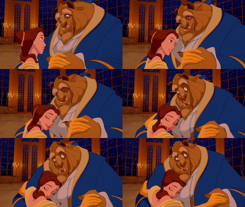

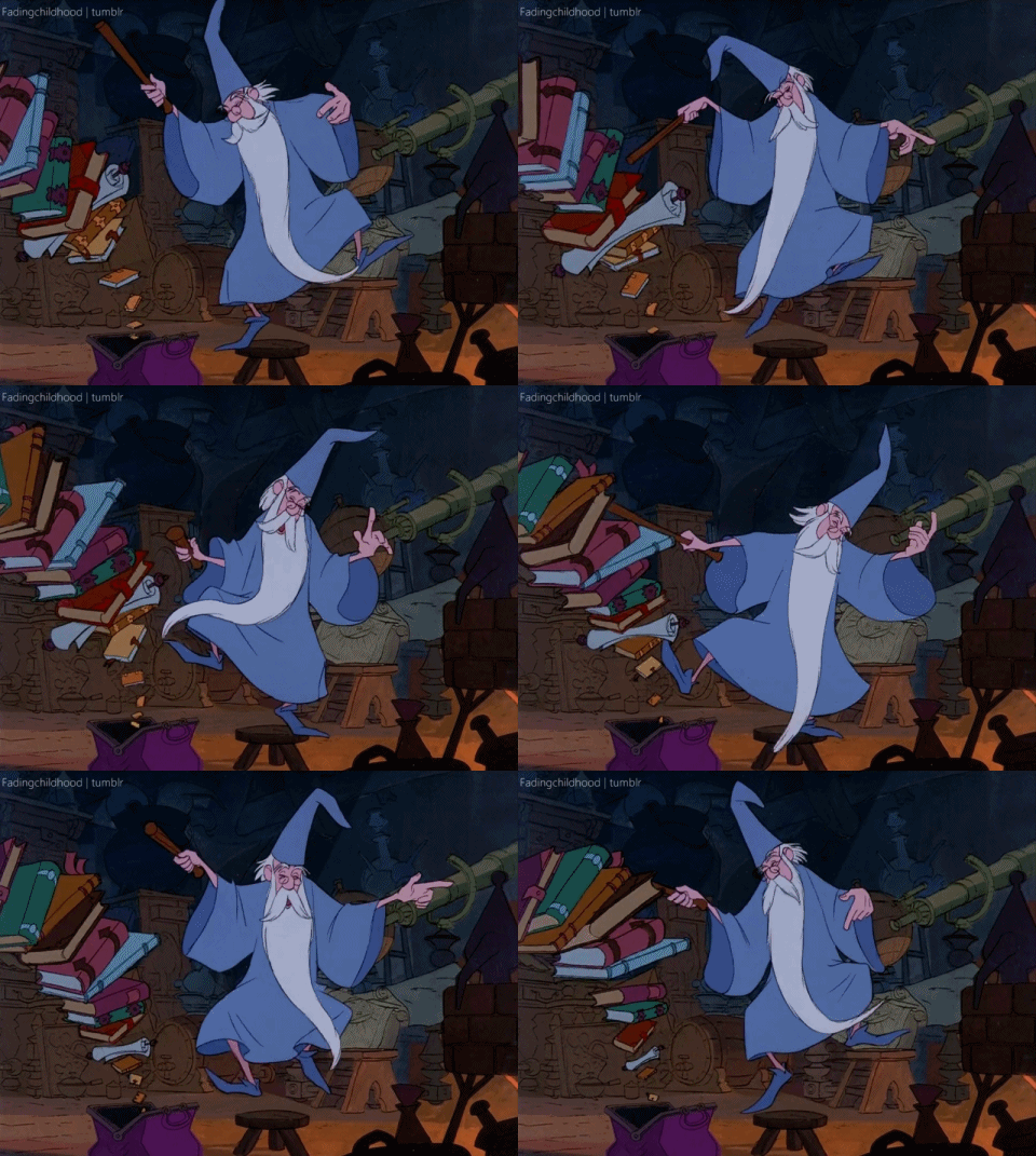
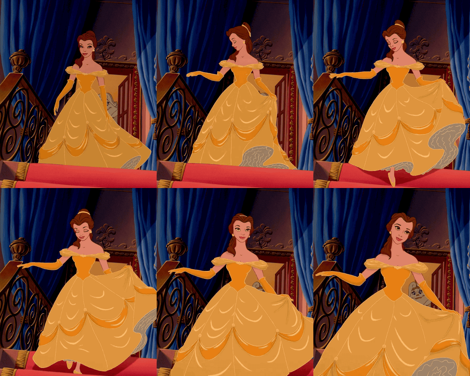
(Here are some examples of what I'm trying to explain)
-As I said before, I didn't detach myself much from the concept art of the movie, I just added some other details that occurred to me, Anny and Emy.
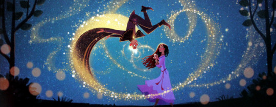
-We decided that his cape would have the constellations of the signs of the zodiac (It was Emy's idea), which in the final result are on the cape, the constellations are noticeable more or less depending on Aster's mood.
-In the Wish rewrite it is mentioned that Aster's hair is like a candle (Reference to Hades) so I decided not to add the lineart in that part
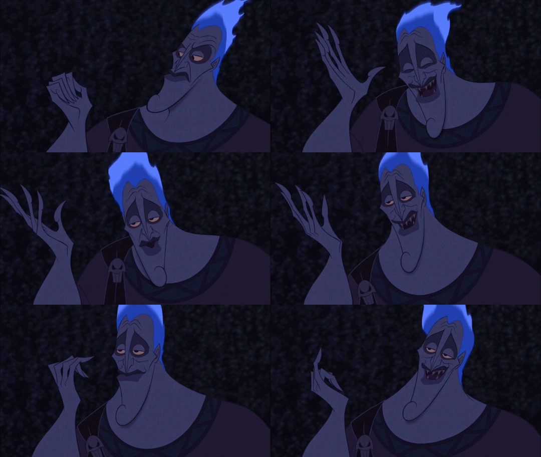
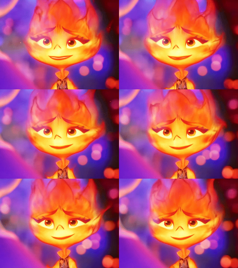
His hair changes depending on his emotions, but not only that, but also his lineart, the calmer he is, the cleaner his animation will be, however with strong emotions (anger, sadness, nervousness) his details will be more neglected, especially when He is REALLY angry, by the way I made his hair look like a flame to give more drama to his design and also make a reference to Ember from Elemental
And as a final detail, the star-shaped gem that she has as a brooch changes color, just like her earrings.
3D MODEL:
-When Aster disguises himself as a human, his details on his clothes would disappear and the shape of his accessories would change to ones without a star shape, also the tone of yellow would look duller, you know so as not to draw attention (although he is dressed like a prince with a giant cape, the boy doesn't know how to hide the truth very well lmao)
-In general, it's just that the design becomes simpler, the only thing that changes is her hair that is no longer a flame, her freckles that are no longer little stars, her clothes no longer have so many details and her mark on her eye disappears( ̄▽ ̄) .
By the way, I wanted to thank @the-autistic-idiot for giving us the great idea of Aster having a star-shaped mark on his eye :D.
-Also, I think that those who have seen my other Wish redesigns are wondering why it seems like I had spit a rainbow at Aster's 3D drawings, what happened is that when I was painting my neurons said ✨Change your coloring✨ and well, The drawing in the end came out like this, although I honestly like it better, it better represents how I draw in a traditional way
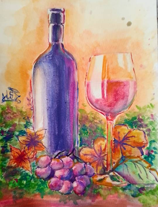
Yes, basically the coloring of my drawings is as if a unicorn had spit on them lol
FINAL COMMENTS:
-It was very fun to draw Aster! The boy really has a lot of changes, but thanks to him I already discovered my digital drawing style so I am satisfied.
-Again sorry for the delay, I know that for many Aster must be their favorite character so I hope your wait was worth it :]
See you next time!✨✨
#disney wish#wish 2023#disney#wish movie#sketch#wish#art#artists on tumblr#artwork#drawing#star wish#starboy#human star#wish star#starsha#star redesing#the kingdom of wishes#the kingdom of wishes fandom#the kingdom of wishes au#starboy wish#starboy x asha#asha and starboy#wish concept art#asha x star#wish asha#wish disney#disney fanart#disney movies#disney animation#walt disney animation studios
552 notes
·
View notes
Photo

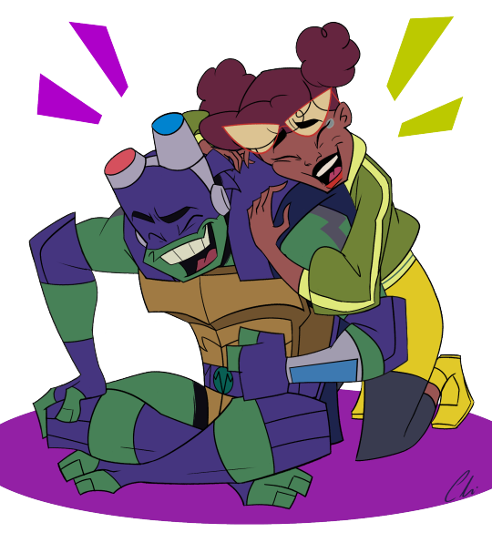
I’ve been binging Rise of the TMNT with my sister lately and we’re both a little bit obsessed. This show is so good and the movie is just amazing - we’ve rewatched it like 10 times already. I especially like the art style of the show, it’s so shape-y and colorful and comic-like; the character designs and color palette are just really satisfying to look at imo.
Donnie and April have one of my favorite dynamics on the show (possibly tied with Donnie and Mikey, PB&J is just so wholesome). I knew I would love them from the very first moment I saw them interact and then episodes like the Purple Jacket and Donnie vs. Witch Town just sealed the deal for me. They have such great chemistry and anytime I see them sharing the screen, I become twice as invested. So I just had to draw this awesome pair having a good time and laughing about something together idk what, specifically, you decide - suggestions welcome. It’s what they deserve. 💜💚💛
Expect plenty more Rise art to come, ‘cause I’ve got a lot of ideas for these guys that I’ve been dying to share :> (As well as more TTS, now that my love for it has had a resurgence, lol)
#I have very obvious tastes when it comes to art style I guess LOL#rottmnt#rise of the tmnt#rottmnt donnie#rottmnt donatello#rise donnie#rise donatello#rottmnt april#rise april#donatello hamato#april o'neil#chiscribbs
2K notes
·
View notes
Text
The kitties are here babyy!

It was so much fun finally making one of these, hope to repeat this someday!!
Note to the kitty owners: Hope I didn’t mess up anyone’s design too much :]
Everyone exclusively detailed below, starting from left corner:
First up, Graydrizzle from @nettleclan-clangen. Someone needs to give this guy some weed immediately… Jokes aside, a very funny character, the same with the blog! I love how unhinged it is <3
2. Next, the best girl-boss Lakefrost from @a-song-upon-the-waves-wishclan! She’s just so cool an’ all, and I tried to have as much fun as I could with her heterochromia. What else to say? Great blog with a great person running it
3. Charpaw from @lostkitsclangen! Even if he was supposed to be my Anglerhaze, I just couldn’t resist drawing such a cutie!
4. @echoes-in-echoclan’s Jewelsbeam up next! C’mon it’s echoclan, and in there every character is just purely marvellous ✨. Our precious Jewel cannot be taken away from us!
5. Second to last we have Monkeypaw from @circus-clangen! It was so much fun drawing this beautiful little gentleman, since Lynx has such a unique art style. Hope he doesn’t know what’s happening with his mentor down in that shit show
6. And lastly, it’s @withintheferns turn! Coalnose was the only one requested, but I thought it would be a sin not to draw her with Tinysight <3 You still broke my heart with both of em dropping dead, but what can I do apart from loving them even more😭😭
That’s about it for this round, hope everyone is satisfied with their kitties!
#clangen#clan generator#clangen challenge#So many fantastic creators in one place#A-song-upon-the-waves-wishclan#neetleclan-Clangen#lostkitsclangen#echoes-in-echoclan#circus-clangen#withintheferns#Other clans
68 notes
·
View notes
Text
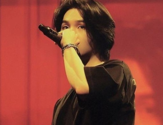
💌 She's an overachiever. "Pressure"? What pressure? ⋆₊˚⊹🔖
«───────── « ⋅ʚ♡ɞ⋅ » ────────»
My second year of college is coming in hot guys. And I'm talking the 3rd of September, in TWO WEEKS TIME HOT.
But you already know your girl has BEEN locked in with her subliminals for the next term, cus I've had a whole thing going on since my first term to my second yk. so come a little closer so I can show yall what my game is on
p.s.a!! I am an animation and games art student, so most to all of my work is research and art based. And when I say most of my work is research based, I mean there is an ungodly amount of writing that is expected from the students and it's not even just the amount it's WHAT you write about that gets you the grade and how well your art conveys your ideas.
Also "Ex." = Example
╰┈➤ " My average college day experience as an art student/loass babe " click here!
«───────── « ⋅ʚ♡ɞ⋅ » ────────»
"What? Like it's hard?" At the top of her class, always ontop of her work, never slacking off, always locking in.
── .✦ ┆ 𖤐 ┆ ␥
|| Perfect focus, super attentive, always pays attention and makes notes. I am never afraid to ask for help or advice and I always receive the answers I need to understand the work; no room for confusion here.
|| Very strong, clear memory, perfect photographic memory.
|| Studies so much, it's my hobby, never underestimates myself or downplays my work, has always prioritised my work and has always understood the importance of doing work at home. Studying has never been a struggle for me because I don't struggle with discipline. I actually find so much fun and enjoyment doing homework. I always feel so productive and proud of myself whilst managing my time and looking at the amount I have done afterwards. Especially with the amount of validation and points I earn from teachers. It is always so satisfying seeing my high grades after a complete project. It's like a treat.
|| Creative genius, always brainstorms with words or loose sketches; not a single idea goes to waste. Research enthusiast, I could never shy away from making a thorough, detailed, and well planned out analysis, moodboard or mindmap. And multiple of them at that. I always know EXACTLY what to write and never wastes precious time and space yapping.
|| The life of an art student is exciting, fulfilling, flourishing, inspiring and strict. In the healthy way of course. My parents and teachers are always understanding of my burnouts and art block which are very rare thank god; and it's a good thing I have my closest friends to comfort me through my work. They are always so supportive, encouraging and honest with me as I am with them. We always travel together to the college (when I don't feel like being alone) and we always travel back home together. I mean we are our own personal friend circle so of course we buy snacks for each other and meet up for lunch; it's not even like we need to worry about price since we have more than enough on us. College is 100 times better when my best friends are with me, everything feels so comfortable with them
|| Perfect, cunty, and ideal artstyles. Always chooses the ones most appropriate for a certain design, and never forgets how to convey a certain look. I know, understand and draw human, animal, vehicle, clothing anatomy and terminology, enviromental composition, colour theory and terminology, the 12 principles of animation, the 7 fundamentals of art (Line, pattern, colour, texture, tone, shape and form), and the fundamentals of character design like the back of my hand
|| I know how to layout a design page appropriately, I always know how to theme and colour co-ordinate. Written placement and art placement are always perfect to the T and nothing looks off. All together, I show off my own unique style of work and impress my teachers of classmates
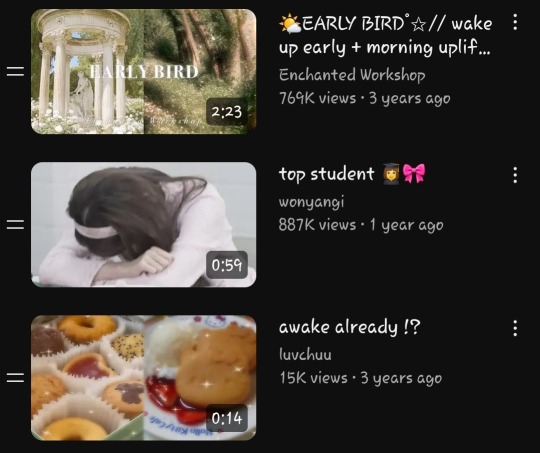
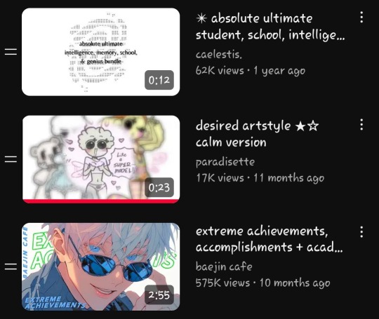
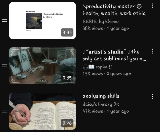
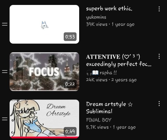
Ex. Subliminals in my art student playlist
"Over achiever", "Desired art skills", "Desired (college) life"
«───────── « ⋅ʚ♡ɞ⋅ » ────────»
"Ugh she is always doing the most with her work😒-" And she always looks good doing it. She's got the looks and the discipline; she's got it all
── .✦ ┆ 𖤐 ┆ ␥
|| Gorgeous, curly, and ideal (3B to 3C) hair. My hair never gets greasy, dry, breakage, damage, frizz, dandruff, or split ends. My curls are always moisturised, soft, bouncy, and defined. I never experience a bad hair day, and my hair is super easy to manage. Detangling my hair is a breeze, and styling my hair is even easier; every style looks exactly the way I want it and never loses the volume or shape throughout the day.
|| Ideal, fit, slim thick pear. Short shoulders, small ribcage, medium-sized chest, 20 inch waist, wide hips and slight dip, long legs, fat ass but not too fat, chubby but fit thighs, slimmer defined calves and small feet. The perfect pear. And every outfit looks exactly the way I want; I never look awkward but I always look put together and stylish.
|| Craziest face card. Ms. Face economy infact. I have a round heart shaped face with dark brown bambi eyes and long fluttery lashes, a medium straight nose bridge, plump pink "keyhole" lips, and the clearest, softest brown skin ever... Yet I still put make up on- yes I do because it's fun and I like it, so it's always awesome knowing I can do my make up flawlessly and nail my looks perfectly
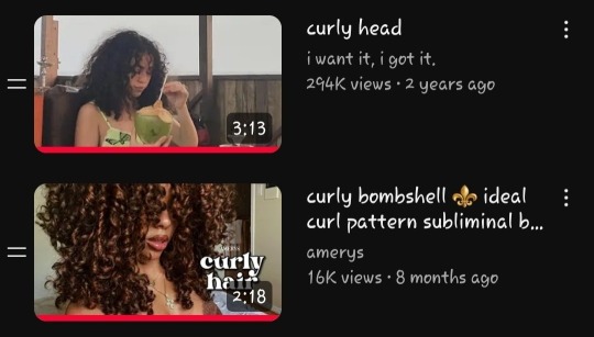
Ex. Subliminals in my ideal appearance playlist
"3C hair type", "Pear body", "Desired face", "brown caramel skin"
∘₊ ✧───────────────────✧₊∘
I'll probably add smore later :3 k bye
#martini yaps!#shiftblr#loa blog#loablr#desired reality#master manifestor#law of assumption#4d reality#desired self#desired appearance#desired life#desired body#dream life#shifters#shifting#loa
88 notes
·
View notes
Text
Interview with Mad Rupert, author of Sakana
September 2023

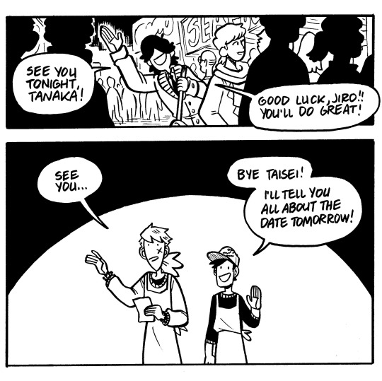
Sakana, the story of life and love in a fish market, is coming back from its hiatus soon! The strip comic style webcomic began in 2010 and follows Jiro, Taisei, Yuudai, and Chie as they navigate their relationships and learn to face their feelings. We asked creator Mad Rupert, author of Robber Robert and artist of Bunt!, for an interview to celebrate the series return.
Read Sakana | Shop books & merch | Read more Hiveworks comics
Sakana has been your baby for 13 years. What has the webcomic journey been like for you over the past decade?
It really has been over a decade, hasn’t it! There have certainly been ups and downs, periods where I was updating as much as I could, and also long hiatuses. I feel like webcomics have always been an amazing space to practice my craft and stretch my writing and drawing skills alike. You can kind of do anything you like with webcomics, and oftentimes people come up with wackier, and imho more interesting concepts than if they were beholden to a large publisher. Not that I haven’t made my fair share of traditionally-published comics and graphic novels… but there’s just something so gratifying about coming up with your own wild story and working towards its end on your own time. Webcomics are incredibly tough and time consuming, but also the ultimate form of self expression.
What is the origin of Sakana? What made you want to tell this story?
Sakana actually started as a class project when I was a junior at the Savannah College of Art and Design. I had been accepted into the Sequential Art department’s yearly Japan trip to study comics and cartooning in Tokyo for a few weeks, and our final project was to create 11 comic strips based off of something that made a strong impact on us during the trip. We had visited the old inner market (now demolished) of the Tsukiji Fish Market at 4am one morning, and it was the most incredible place I’d ever been, so I decided to craft a short story that took place in the market. Beyond the first 11 strips, I decided to continue the story for as long as I could as a way to practice the comic techniques I was learning in class. That was over a decade and 600 strips ago! It really has become the most ambitious project I’ve ever undertaken.


Do you have the ending already written? Do you see a conclusion in sight?
Yes! I’ve always had something at least resembling an end in mind throughout most of the comic’s lifespan. For a long-format comic like SAKANA, I think it’s very important to have a rough ending planned out as early as possible, otherwise it becomes difficult to keep the narrative moving in a satisfying direction, drop little tidbits of plot that will pay off later, or even maintain your enthusiasm for the project. To be clear, the details of Sakana's “end” have changed many times, which is only natural with a very long project like this. But I’ve always kept crucial details the same: basically certain characters in a certain place at a certain time doing certain things (to keep from getting too spoilery haha.) HOW they get there, WHY they’re there, and WHAT exactly they’re doing will ebb and flow as the years go by and I myself get older and older. But having a general sense of the end in mind has kept things moving all this time. The story’s got one more volume to go, and then I’ll be done!
Your hiatus is a result of working on a traditionally published graphic novel, coming in 2024. Is there anything you can tell us about your book?
My new graphic novel is called Bunt! and it’s a collaborative effort between myself and my dear pal, Ngozi Ukazu (author of popular webcomic Check, Please!) Ngozi wrote the book and I drew it, and we’re both really proud of what we’ve made! It’s already available for preorder all over the place and it will officially be out in stores in February 2024. We’re really looking forward to getting out there this fall and winter and spreading the word about it!
You recently successfully completed a Kickstarter for an 18+ comic, Robber Robert, as well. What is it like balancing these different narratives, genres, and mediums of publishing comics?
It’s definitely been a struggle at times to balance everything, and I definitely don’t recommend working on 3 giant projects at the same time! I finally had to admit that I couldn’t do it all at once, which led to me putting Sakana and RR on hiatus to finish Bunt!, and then keeping Sakana on hiatus while I finished up RR. I really burned myself out on comics for a while, and it’s been a huge struggle to get myself back to a good place with my work. Finishing Bunt! and RR Chapter 1 has really helped reenergize me, but I can always feel myself trying to overload my work schedule again and again. It’s my greatest weakness as a professional artist.

What keeps you inspired?
Making something for myself, practicing my craft, and putting my own stories out there are all huge driving forces in my life. Learning to stop overwhelming myself with work has also helped a lot. Looking back on all the art I’ve made and all the different things I’ve tried makes me feel like I can do anything I put my mind to, so long as I give myself the time and space to enjoy the process.
Do you have any webcomic or graphic novel recommendations?
I’m a big fan of anything fantasy or sci-fi, especially if the narrative approaches the fantastical elements in a weird, unique, and kind of gay way haha. My favorite manga is currently Delicious in Dungeon, but I’m also a fan of historical series like Golden Kamuy and Bride’s Story. For webcomics, I love anything by Evan Dahm, like his long-format series Rice Boy and Vattu. As for Hiveworks comics, there’s too many to list individually but my current favorites are Fairmeadow by KP, and Tiger, Tiger by Petra Nordlund.
Any advice for new readers of Sakana?
I would say…despite its high page count, it’s not that long of a read! The strip format keeps it moving at a pretty quick clip when read all at once (but it certainly didn’t feel like that over the last 13 years updating one page at a time!) I know that the format and the black and white rendering might feel a little dated in the current era of Webtoons and full-color stories, but I’m too stubborn to change now, and I really appreciate anybody giving it a shot! Also, no matter who you are, or how much you dislike him in the beginning, Yuudai will probably be your favorite character.
You can read Sakana for free at sakana-comic.com and print books are available at hivemill.com
450 notes
·
View notes
Note
Cabi! Big fan Joffrey here!
I wanted to ask, every time I see your art not only am I stunned by the quality, but also by the sheer uniqueness in style and character design. I've never seen a lamb designed quite like yours, it's so perfectly yours. What went into the inspiration behind the characters design, especially facially? Did you try and mimick a real lamb, or was there a more fantasy-element that you veered toward?
I can't specifically put my finger on it, but it gives me vague Warframe vibes. It's such a beautifully odd design and I can't get enough.
Love your work, love everything you do, can't wait to see what's next!
Hope you're well, stay safe, take care!
First of all, your ask is one of the biggest compliments I ever had in my life, I will keep it forever. You're an absolute chad! Second of all, those are very interesting questions, and I will be very happy to answer to them!
It started more or less with this drawing I made *look at the date* 2 years ago apparently. Way before I even thought of an AU- I didn't had much in mind, beside doing something that looked cool tbh.
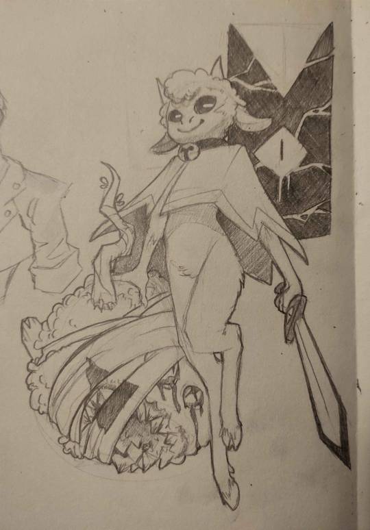
I was very happy with the flow of it, and how it came out. And when I drew the Lamb again, I would try to nail THIS design.
The thing is, with time, I had a really big problem: Lamb looked way too young when I thought of them more as an adult. I had too much of the original game design guiding me, making a Lamb that was too cute and childlike for what I wanted. (And also, the head did not go well with the rest of the body holy shi-)

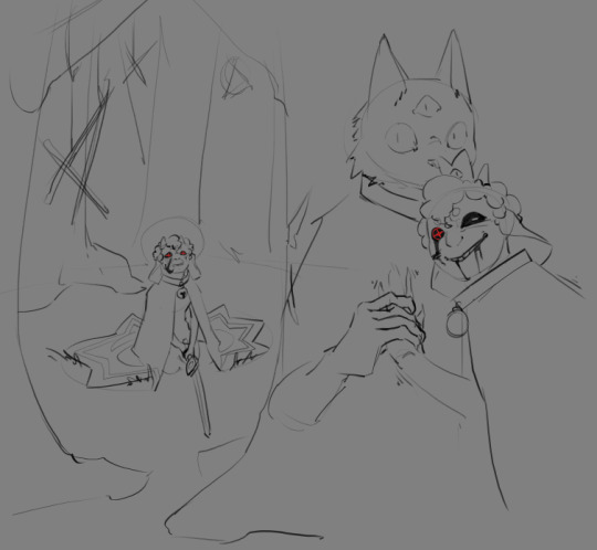
Came those drawings! I was happier with the look, Lamb was older! And I found the colored design quit nice! (I used a sheep picture as reference, but I don't think I used it well, compared to now. I used the reference for details, when I should have gone for overall shape first.) I still wanted something simpler to draw tho. The colored design was nice for an illustration, a one time gig, but I got pretty annoyed pretty fast at trying to nail the face every time. And from those attempt, you get the sketches on the right. (I also wanted to get away from other artiste's interpretation of Lamb, and at the time of those drawing, I didn't felt like I was away enough)
From those previous sketches, the idea for THaB started to emerge. I also still had problem with Lamb's design. Especially the hair. I was inspired by black hair, which is usually not a problem, but I was never happy with how it looked on Lamb specifically. I can draw black hair, I can draw black characters, but this mother-fucker would never feel satisfying to draw or finish 👀
And one day, as THaB was solidifying in my mind, I made a series of sketches that I posted! And one of them was the most important in Lamb's final design. This lil guy! (this design didn't came out of nowhere tho, Lamb was evolving into this as I kept trying. But I wont show those sketches, because those are spoilers =3)
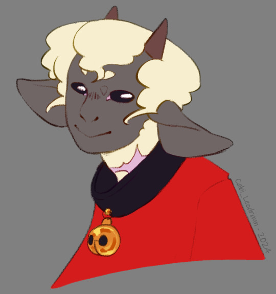
And soon after, I made a comic that was supposed to only be a one shot, just a POV of Lamb and there reaction to Nari' telling them to die for him. But you know, things got out of hand lol
As I continued the comic and doodles on the side, I finally made myself a reference board, with real life images that were close to the vibe of this head drawing. (And I cannot stress enough how those references solidified Lamb's design as a whole. Draw with references, it is life changing. The more reference you get, the more your visual library will get diverse, and the more interesting detail and shape you will add to your art in general.) (I'd also add this: understand what you are drawing, make research and stay curious for every bit of info on everything. You never know when these nuggets of knowledge will help you as you create)
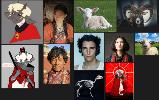
As I kept drawing the Lamb, they evolved! Things changed, slowly, like the shape of the nose, the shape of the eyes, how the hair flowed. You see those change at the face, but also on the body! As the idea of THaB's Lamb got clearer, the design got more specific. (I also got better at drawing! This comic make me draw way more often then before, and it shows)

Something before I finish: the other Cult of the Lamb character's design are way more inspired by their animals, when Lamb is more in the human spectrum. I thought of changing Lamb at some point, to make it fair/coherent, but I loved the design too much to change it again. This AU is something I do for fun, and even if it would have been more logical to change them... I don't want to-
As for the vague Warframe vibes: I play the game! And I found the character design absolutely stunning. So I am definitely influenced by the game without knowing it lol
Thank you very much, again, for your kind words! I also wish you the best, and see you next post =D
TL;DR: Lamb design, at first, wasn't inspired by much, beside the game and my style at the time. But as I retried to make them, added more intent, they got more refined. What really nailed the idea was to have real life references on the side.
#cabi ask#long post#cotl lamb#this took a lot of time to write holy shit#but it made me take a look at older drawing and made me realise how much I got better in 2 years#so it was worth it#and again Thank you Thank you Thank you Thank you
65 notes
·
View notes
Text
Pebbles In order of appearance.
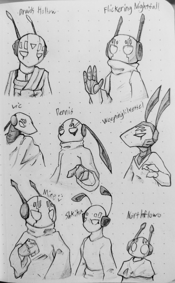
@druidshollow lore lore lore Dune lore lore
@flickering-nightfall whole reason I draw Pebbles the way I do since first exposure
@toxictoxicities b u f f
@dennis7231 still waiting on them dropwigs >:)
@weepinglilvessel ant snooooot
@mudkirby me :> 🔫
@shkika love your Suns
@northflowerowo Sorry I shoved him so far down lol
Honourable mentions/ shout outs: @trashiiplant Howwow Knight and Wainwowld :D
@kelnexia is lurking.
@daszombes Thank you for explaining lore, giving us peak story telling and characters to simp for in the form of the Iterator Logs. What? No Pebbles? Don't care. You're on here now.
Druid's Hollow, the first time I ever saw your YouTube channel was with the Distant Frontier video after just having gotten into Iterator Logs. One of the most pivotal pieces of media you've made in my life was God- Jake Daniels. That single video alone gave me the push I needed to make my first Rainworld oc Parting Clouds. The stories surrounding your characters (and Dune) are creative beyond my ability to write stories. Keep up your top tier memery.
Flickering Nightfall, I'ma put this in a nutshell. Duckdance. After that I found your blog via Google before I made a Tumblr and became enthralled by your content. From something as obscure to me as Infinity Train to Pebbles ragdolling, you were essentially my gateway into liking Iterators. I love the purple. I need moar.
Vic, b u f f I haven't known your blog long and was introduced to you through the My Goodbye animation. Since I was sort of entirely new to Rainworld at that point, I had no idea what was happening. I just saw a well drawn thing and went "oooooo". I'm all for Suns' antenna twitches and NSH box head. Also, body pillow 💀
Dennis, one of the first blogs I found when I first started Tumblr. I found you through the @iterator-ask-blog and found bullying Pebbles hilarious. I love the way you draw the yellow things on his head and I just appreciate that you do digital in general. I do not, will not and proceeds to die if I must. I've seen quick progress with your art style as well. Keep going.
Vessel, I barely know you. Who da heck are ye? I saw your art style once and knew I needed to follow. The way you draw Pebbles and Moon are so satisfying to stare at for minutes and I had way too much fun replicating that s n o o t. I don't know what you're up to with them aside from chaos. Murky Seas' story and design are fantastic. RIP
Shkika, I only found you through the @ask-looks-to-the-moon blog and love the way you draw the Iterators. It's very stylistic without straying too far. The three fingered hands to the goofy faces Moon expresses makes me smile. B a l l s. My Suns design was more so inspired by the way you make him as you were somehow the first Suns exposure. You're the only reason I can't see him without fluff. How did you make Pebbles cute kavvkatkcfadal
Northflowo, way back in 2022 in my first exposure to Hollow Knight, I found your channel through the Baby Mantis skin video with Nosk along with the lore in a nutshell video. Any other content I saw I forgor. In any case, your channel was there in my search for knowledge on that game. Fast-forward to the near conclusion of 2023 when I was first introduced to Rainworld. In my hunt for memes and more knowledge, I found the other lore in a nutshell video and realized you were the perfect channel for me as you had plenty of other content on that subject. Your art still manages to astound me, especially with the shot you did in the map Pliocene and the Warrior Cats redraws like with the waterfall. I'm trash at drawing backgrounds and might learn something from you.
And of great importance to me, @bornt-urnge/@zigmatism
@kitterjitters /@offended-dragon
Thank you for every moment of drawing from Pokemon to Kirby to Mire (oc) and anything else. You have made some of the largest impacts on my life, drawing, game choices and I've enjoyed every moment. I want to have more ridiculous sessions like that in the future and look forward to it.
Some of you have been around in my life for some time and others I've just found. All the same, every single art piece you've made has inspired me no matter how polished, memed or "trash". All of you have made an impact on me, no matter how miniscule. I look forward to the future with anticipation for all of your art. Have a terrific year, and with my deepest gratitude, thank you. Thank you for being here. Thank you for reading this.
#rain world#iterator#five pebbles#fp rw#art#me when when uhhh me theeeeee uuhhh umm me when the#adhd/add#man#pinned post#mud rants#i wrote this at like 1 am#i felt really generous#looking at it now i regret nothing#at least 1 am me was licid enough to make this good
341 notes
·
View notes
Text
HERMIT A DAY MAY - DAY 10
Stressmonster x Cucumber Quest
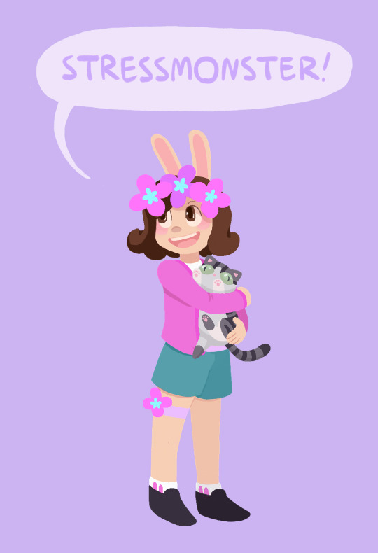
For Stressmonster I chose the wonderful webcomic Cucumber Quest!
I chose this design for her because I thought her colors and aesthetic would work wonderfully with the art style. I also think she would probably appreciate how cute the comic is if she were familiar with it.
This one was very difficult for me and I'm still not entirely satisfied with how it turned out. The rendering for this comic uses a very different style than what I'm used to, and I had some trouble reverse-engineering how the visuals are created, so it didn't turn out as on model as I would have liked. But, that being said, I think she looks adorable anyway. I also totally made up how the kitty would look, since as far as I can remember there aren't any kitties in Cucumber Quest, so I came up with her design from scratch.
To learn more about Cucumber Quest and see my style references, adventure below the cut! (The funds are still raising for Gamers Outreach!)
Cucumber Quest is sweet, beautiful webcomic by the artist Gigi D.G. It follows the adventures of a young rabbit boy named Cucumber and his sister, Almond, as they go on a quest to defeat the Nightmare Knight. Unfortunately Cucumber Quest will not be finished as a comic, due to changing circumstances in the authors personal life, but the story will eventually be concluded as an illustrated script and every one of the over 800 pages of the comic is more than worth reading.
I cannot say enough good things about Cucumber Quest. It has a charming, engaging story, beautiful art, and fun, memorable characters. Please give it a read if you have the chance, you will not regret it. Style references:
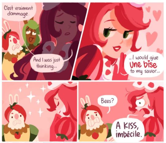
The comic uses a lineless style and soft color palettes. The shading changes drastically with the lighting, but I tried to mimic the style as it looks with flat lighting (such as in most panels of the above example).
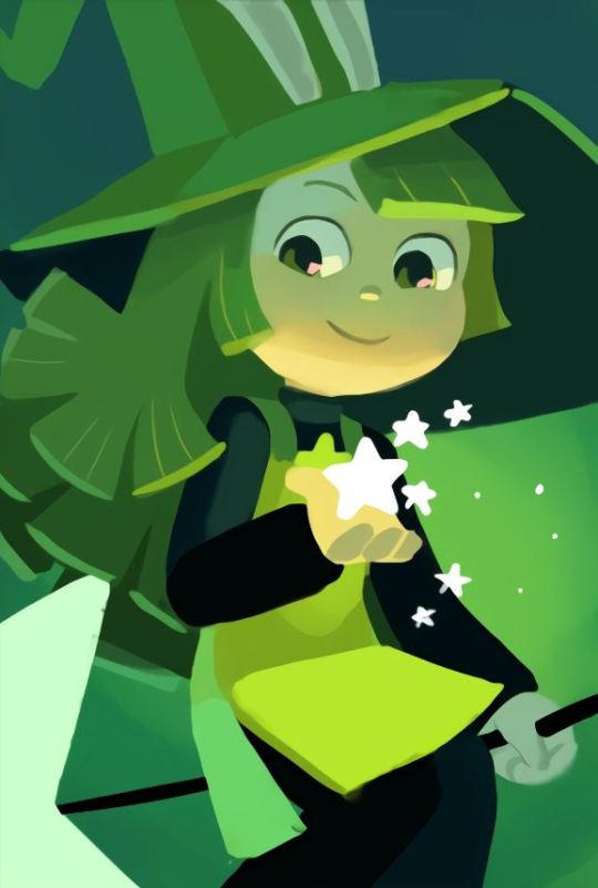
Here's an example of a character rendered with more dynamic lighting (this is Peridot, she is a witch)

Cucumber Quest title banner
#I think one of the issues here is that I do not know the best brushes for this style#but I am still glad I attempted it since I love the art in this comic so much#I also think the original artist might block the characters in with shapes then add detail over top#which I am not very good at and do not have much experience in#since I am a big sketching and lineart guy lol#And yes the kitty is a Jellie cat#hermitaday#stressmonster#stressmonster101#hermitcraft
105 notes
·
View notes
Text
Fantasy Games - And My Struggle With Them.
This might be a surprise, but I struggle with fantasy games, especially high fantasy. I come across them a lot when I’m browsing Itch.io, and after a while, they start to blur together, more so than any other genre. I understand that for many folks, games like D&D were their entry into the hobby, and making a fantasy game is often the first step a game designer makes when they try to develop their own system. But I didn’t get into ttrpgs via a traditional fantasy game, and I think that regardless of the rules that accompany the game, I don’t get very excited about games that have knights and elves and dwarves and wizards.
As you might imagine, this can sometimes make things difficult when folks ask for fantasy-related ttrpg recommendations. Fantasy is a genre that encompasses so many different styles of play and genre, from gritty dungeon crawling to super-powered adventure to sad and tragic epics. Yet, because most of those sub-genres rarely appeal to me, I haven’t looked closely at very many of the games in my Sword & Sorcery & So Much More folder, which means trudging through the items there takes a lot longer when answering fantasy-oriented asks.
That being said, I don’t want to ignore fantasy games completely; I know that so many people find joy and fun in games set in a traditional fantasy world. So I’m going to talk about a few fantasy games that are very different from each-other and have very specific goals in mind, and I encourage people who see this to re-blog with their own favourite fantasy games and tell us what makes them special.
Also - if you have a fantasy game related request, please be kind if my response isn't all that you hoped it would be!


Tacticians of Ahm, by Meatcastle Games.
Tacticians of Ahm is a tactical combat-focused tabletop roleplaying game in the corrupt3d fantasy world of Ahm.
A bit-rotten blight has appeared in the Northern Sea and from it flows the Corrupt1on, fractured light and shattered shapes sowing chaos across the realm. As Tacticians, you alone are prepared to face the darkness spreading across the lands and reunite the scattered peoples of Ahm.
Tacticians of Ahm is for players who like a really satisfying combat, inspired by games like Fire Emblem and Final Fantasy Tactics, with grid maps to help you keep track of positioning and distance. This doesn’t meant that combat is long - it’s still fast-paced, using visual indicators like color to help you assess what kinds of things you can do in play: healing, damage, and special effects. Characters have interesting abilities that they gain as they level up, so this game is also probably good for folks who like watching their characters get more and more competent. Right now Meatcastle is grinding away at the game to make it more playable, and more full of art - so getting in on it now means that you’ll get to watch it grow.
Nexalis, by Cezar Capacle.
We invite you to step aboard your enchanted vessel and set sail on the ethereal ocean known as the Nectar. Nexalis calls you on an awe-inspiring journey across a universe filled with countless uncharted islands, each teeming with unique cultures, mysteries, and magical phenomena.
Nexalis is an otherworldly realm where islands drift amidst an endless cosmic ocean of magical plasma, the Nectar. The Nectar, pulsing with vibrant, ever-shifting colors, mirrors the celestial patterns that guide adventurers on their thrilling journeys. At the heart of this sea lies the Celestial Nexus, an entrancing vortex of astral energy that births islands and renews the world in a constant cycle of creation.
Nexalis is a fantasy game, but it’s an example of setting that feels vibrant and unique from traditional fantasy games - and yet it is also highly customizable. The game comes with oracles and random tables that you’ll use to generate interesting locations and problems to deal with as your drifters move from place to place. Characters are packaged in playbooks, compact tropes that will provide players with everything they need to know on a brochure. Finally, the game uses phases, moving from one kind of storytelling to another dependant on the kind of scene you’re about to play through.
Shadow of the Demon Lord, by Schwalb Entertainment.
The End Is Just the Beginning
Sometimes the world needs heroes. But in the desperation of these last days, the world will take all those it can get: heroes, blackguards, madmen, and whoever else is willing to stand against the coming darkness. Will you fight the demons or will you burn it all down and dance among the ashes? Who will you become when the world dies?
Shadow of the Demon Lord opens a door to an imaginary world held in the grip of a cosmic destroyer. Enter a land steeped in the chaos and madness unleashed by the end times, with whole realms overrun by howling herds of beast-men, warped spirits freed from the Underworld, and unspeakable horrors stirred awaken by the Demon Lord’s imminent arrival.
For fans of the grim, the gory, and the gritty, the setting of Shadow of the Demon Lord is post-apocalyptic, chaotic and messy. The presentation is representative of a traditional RPG: a big book with high-end full-colour art and plenty of lore to accompany the rules. You create your character using pieces of Ancestry to help you determine your attributes, and your Profession to determine your skills. The game is based on the d20, and relies on stat modifiers to try and get you over most rolls, and a milestone-like levelling system that ensures that everyone who plays levels up at the same time.
Shadow of the Demon Lord is very clearly a vehicle for horror, so if your table is one that likes being confronted by all kinds of horrible things in a hopeless quest to save… well something of the world, then you might like this game.
Songbirds 3e, by snow.
Songbirds 3e is a tabletop roleplaying game about undeath, supernatural powers, and the blue dreams of the moon. In the game, you create a strange survivor of the world who was chosen (or cursed) by Death. Spirits aren't able to pass on to the afterlife and grow monstrous with each passing day. You know the songs to send them on. You have the abilities that help you find them. You are the canary in the coal mine.
Songbirds is full of danger. It carries with it a tried and true method of OSR world-building in that the world makes itself known in the pieces of the game that you decide to pick up - the character curses you roll for, the ways damage can hurt you, the gear you carry, and the roll tables that answer so many questions about different steps of the game. Combat is meant to be simple but also deadly, and much of the fun of the game is in discovering what’s around the corner or what’s in the treasure chest in front of you. Songbirds takes inspiration from both fantasy and sci-fi, so if you like weirdness mixed in with your dungeon-crawls, you might like this game.
Trilogy, by Ben Moxon.
Trilogy is a tabletop RPG designed for epic fantasy campaigns. Build your world at the table, create characters to explore it and let the adventure commence.
Trilogy is designed specifically for players who want to discover their world in play rather than having to consult settings guides and books of existing lore. A world that lives and grows around you, shared by everyone at the table.
The media listed that inspired Trilogy include series such as Lord of the Rings, Malazan Book of the Fallen, and the Storm-light Archives; vast and detailed worlds full of complex cultural relations and heavy with conflict. The rules are derived from the PbtA framework, which means that much of the action is going to be character-driven and character-focused. This game is least likely to have puzzles a la dungeon-crawl, but what it does have is character arcs.
Character arcs are guiding lights for players, providing them with loose archetypes that they can use to help advance their characters. Each arc comes with positive and negative qualities that you can turn to when your character is at their best or at their worst. It also has an opening moment (which helps define your character to the audience) and a series of checkpoints in the form of narrative moments that generate character growth. I think the Arcs part of Trilogy is what makes it stand out, looking at character development at a new angle, and giving players plenty of prompts to help them get from point A to point B.
Jack Kills Giants, by Andrew White.
There’s no shortage of vagabonds who take coin for killing, but Giant Slayers… they’re a special breed. The coin is unfathomably good, you’d be more or less set for life should you bring one of those colossal beasts down.However, you’re just as likely to find yourself a quick and nasty death and a pauper’s funeral.
Those who decide the reward is worth the risk form up into small companies of strangers, spreading out the risks and sharing the spoils.Brought from all walks of life, those who survive past their first kill and choose to continue on the path grow into tight-knit bands, comrades in arms fighting for gold and glory.
But you aren’t one of that pantheon of successful slayers just yet. You’re just flat broke.
JACK KILLS GIANTS is a game of giant-slaying in the Fantasy Gig-Economy written and illustrated by Andrew White, with valuable contributions from Nakade & Cosmic Orrery Games. In Jack Kills Giants you won't play hardened adventurous heroes, you'll play everyday people, forced by a need to make cash to survive to chase after giants in exchange for generous bounties.
Jack Kills Giants does away with the broad possibilities of a generic fantasy game and zooms in on one particular element that the designer is interested in - a gig economy. Giant-killing is terrifying and horribly dangerous, but life is so brutal that you decide that it’s still worth doing. The game also focuses on the ways a world that has giants in it works that makes it special - for instance, some folks make a living carving up the bodies of slain giants and distributing the fat, bones, and other pieces into products that the world can use. For lovers of thoughtful world-building and purposeful adventuring, maybe check out Jack Kills Giants.
Also...
If you found these interesting, you might also like my Non-Western Fantasy recommendation post, as well as my general fantasy tag.
#game recommendations#indie ttrpgs#tabletop games#dnd#fantasy#wow mint there's so many non-ask related requests lately#sometimes it's nice choosing my own topic#ironic that I chose this one though I guess
37 notes
·
View notes
Note
Hi Indie !
First of all, I truly love your version of TMNT. Your dialogues are so good and the designs are great. In terms of writing it kind of reminds me of the Webtoon comic: Batman, Wayne Family Adventures in the way that it’s a brilliant take on a famous franchise.
Also, I kind of had a question and a request.
I noticed a change of style with the color scheme you have now compare to your previous sketches. Like before, Mickey’s stickers were colored and blood was red when those elements are now in black and white. My question is why the change ? Not that it’s a bad choice or it doesn’t fit in you aesthetic, I was just genuinely wondering😁.
As for my request, well I’m French and I really enjoy doing translation either from French to English or from English to French. Therefore I was wondering if you were okay with me doing a French version of your comics ? If you’re not, I totally understand so no worry😁
I can’t wait for the next chapter !!! I wish all the best !
Aw thank you so much! I’m so glad you love the art and the writing! I’ve never read that webcomic, but I’ve heard about it before! I’ll take it as a compliment! ^v^
That is an excellent question! Basically I wanted to reduce the colors on the pages to just the colors of one of the characters items.
I’ve actually been cutting down on color usage since TMS (April’s hair and Casey’s under shirt were colored red and mauve respectively in ROTP but not in TMS) since I felt that it made for some very odd color things, like it felt like too much color be stylistic, but too little to be fully colored? Idk I just didn’t like it, so in TMS every character was allotted two colors: one eye color and one outfit color. That made it a lot simpler and drastically decreased the feeling I had about the colors.
That reason is also why I cut Mikey’s sticker colors. I did think about it, but I decided against it because it felt odd to give Mikey three colors and everyone else one. He’s not the MC, so like, it just seemed like an odd design choice to continue with.
The removal of using red for blood is a bit more complicated. I actually considered making it red in Indie TMNT, but I ended up not because of a few reasons.
1: Red is Raph’s color, it should be used as such (every character only got one color anyway, reusing the color makes it feel less special that it’s there)
2: flushing, whether because of love or illness or embarrassment or whatever, was also being shaded with red because it’s caused by blood, and I just didn’t really like the way it looked? I dunno probably a personal thing? I won’t say why cause I don’t wanna put the thought in your heads, but specifically with Donnie’s face being red from his fever in TMS, I just didn’t like it.
3: I found that the color red makes wounds more graphic. Not sure why? I found with TMS I was having to censor Leo’s wounds more than I anticipated. They were originally so much more disgusting when the red was added that I had to add a lot more black to be comfortable with the drawing. I’m satisfied with my results, I think I struck a good balance, but it did kind get me thinking since I plan to make Indie TMNT just as gory.
Its original purpose for being added was because wounds were key plot points in both ROTP and TMS and I wanted you to pay attention to them and remember them. Now, that’s not to say they’re not important in Indie Tmnt, but I found with the increased violence I was adding (because murder is okay in this comic) it felt unnecessary. Almost every fight scene has splatters of blood that aren’t really that plot related, so it’s not the same as TMS which follows 2012’s no blood or injuries in fights rule until it’s shattered. So in addition to all the other reasons listed, I felt it was fine to get rid of the usage of red for blood and other injuries in this comic.
TLDR: I want each character’s color to be special and they only get one cause I’m lazy and I think it looks cooler. Red blood makes people squeamish but black blood doesn’t 🤷♀️ also less important in this comic
As for your request: YES!! I’m totally okay with it, you absolutely may! I would love that! However you decide to do it, just be sure you credit me as the original author of the comic and send me a link when your done so I can post it on the comic masterpost for anyone who wants the translation to read!
Good questions! :]
#tmnt#q&a#indie tmnt#indie’s turtles#That was a lot longer than I thought it be lol#Wow who knew I could rant about the meaning of color for like 4 paragraphs 💀#Guess it comes with the job??#If you read all that here’s a cookie 🍪
51 notes
·
View notes
Note
What are some ideas you've wanted to draw/write but haven't?
Oh man. I've got so many. A handful of ideas include:
A semi-animated series titled "My Pal the Paladin" about a kidnapped princess and the final boss who join forces to track down the legendary hero who's failed to slay even a single mook months after the plot kicking off and yell at him for taking so long. It's based on my oldest original characters and has a lot of sentimental worth to me as a result. Idris, Pal, and Katherine are my babies. I've considered making it similar in production to Dingo Doodle's Fool's Gold series, but I haven't actually made it because I'm really nervous about it turning out poorly ^^; I'd love to post a pitch bible for it someday!
A gothic picture book tentatively titled "Cover the Mirrors" about a woman killing a monster that has haunted her since girlhood, and inheriting the curse that turned the monster from a normal man into his current twisted looks. It would end with the monster's appearance going from being seen as a Boogeyman figure that stalks kids who play outside after sundown while the original monster was around, to a vengeful beast that hunts people who prey on children once the woman inherits the curse. It would play with the idea of trauma giving you unique abilities to help those who have gone through similar terrors, while also warping you into something you can't recognize and find inherently repulsive. I haven't made it because I don't know how to render the painterly style I envision for it.
A mixed media visual novel titled "Cradlehead" about a woman who finds herself serving as the unwilling vessel for an eldritch entity that will destroy her mind when it finishes germinating within and exits her body. She has to escape the pocket dimension it trapped her in to develop within the optimal conditions in order to save herself. The visuals would incorporate clay, digital art, traditional art, 3D models, pixel art, and photography. The game would center around the woman's desperation as she tries to escape while her ability to perceive the new world around her decays more and more over time. I haven't made it because I doubt my artistic abilities to make something like I have in my head come to life.
An untitled magical girl webcomic about an unwilling magical girl with a giant bee familiar named Queenie and issues controlling her powers because of her insecurities. She feels bad about being a not very girly individual while surrounded by hyper-feminine young women who have a handle on their powers she could never dream of. It revolves around her character arc where she eventually stops worrying about meeting the arbitrary standards she imposes on herself to be "girly enough" and decides to just be herself, whoever that is, unlocking her true powers and entering her ultimate form during a climactic battle— taking on a design less like a queen holding a scepter like she'd been dreading, and more like a princely knight holding a stinger-like spear. Her rejection of others' expectations as well as her own helps the world-ending threat, a shapeshifting eldritch being that absorbs people into itself so it can become someone other than itself but is never satisfied with the new faces it obtains, to accept itself and stop trying to steal people's souls in order to find one that would make it love itself. I haven't made it because I worry if it would come across weirdly to the average viewer, as it deals with gender dysphoria as a subject in a very atypical manner.
#my two sides: unspeakable eldritch horror and cutesy goofy cartoons :>#sofie answers asks#stuff by sofie#(kinda. I'm talking about things I want to make at least!)
28 notes
·
View notes
Text

in the process of of designing a new oc :] (that started as an alastor redesign because of course)
her name is thérèse and she’s my ultimate tumblr sexyman except she’s a woman kind of
will make a part two with some spicier stuff because I can’t post more than 10 images on mobile at once anyway

it all started w this sketch bc I wanted to change my style a bit; the old one was giving me art block lmao
I thought the shapes here were satisfying + I haven't drawn closed eyes (as in the outline going all the way around instead of having separate top and bottom lid lines) in a hot sec so I wanted to try it out again
also something about this style finally made straight hair not feel super weird to draw


starting to enjoy this new way of drawing her face
also realized the vibe of this character was very different:
a lot more ... slouchy? like she'd rather make people let their guard down than intimidate them
also everything is trongle :]
she might still have naturally curly hair idk yet
I'm gonna be honest I have always had to fight the urge to think that canon alastor is a fox
he's red he has fluffy ears and he's a trickster. coincidence? I think the fuck not. I can't even see his antlers 95% of the time.
so therese is actually a fox :]
she's the "unserious but oddly helpful + is actually very competent" one
also vox is here! maybe. idk I just wanted them to be a square

shapes
idk who the girl is I just needed a round one

oh shit they're smooching!!
I think vox is a chronically overworked overthinker who needs the whimsical energy of therese in their life
I'm gonna call vox theo actually cause they're a very different character too
they're also probably not in hell anymore; maybe something wonderland-adjacent?
anyway part 2 coming soon if I don't go into another depressive episode
#sorry I don’t think any of this made any sense#I just made her today so it’s mostly vibes atm#my art#art#my ocs#oc: thérèse#doodles#sketches#character designs#hazbin hotel#hazbin hotel alastor#hazbin hotel vox#hazbin hotel redesign
22 notes
·
View notes
Text
Moon Girl and Devil Dinosaur was such a unique, vibrant show. The art-style, animation, and character designs were amazing, all the music was interesting and exciting, the voice actors were wonderful, the plot had a fantastic balance between silly fun/action/meaningful and deep emotions. The people working on it really cared about telling a BIG story about Lunella becoming a hero with her great big Dinosaur buddy, her friendship with Casey, and the relationship with her family... and they also cared so much about sharing important details that were part of so many different stories; insecurities about appearances, protecting your community, feeling rejected and uncertain about who you are, fear and anger after being hurt, learning how to be kind to yourself and other people, being strong enough to ask for help, recognizing things that make everybody different and also what they all have in common, appreciating this as something beautiful, trying to be better and also being satisfied with yourself, finding hope after feeling like you've made too many mistakes and bad choices.
It was all very much about identity, and the joy found in being free to be who you are. Lunella is a young Black girl, a genius, a super hero- and a kid who has anxieties, who cares about her friends, her family, her home. She is capable of so many amazing things, but still needs support and comfort. The show was about where she lived, and all the culture and community shared by the people who lived there. The show was about race, gender, society, disabilities, love. We saw it with Lunella, and other people she knew; either helping her, or as the ones who need help. When the world treats you like you are "wrong", like you should feel "bad" just for existing, you need to love yourself. You deserve to be alive.
This show deserved to finish telling all the stories it had
16 notes
·
View notes