#thats why she has her other hairstyle...
Explore tagged Tumblr posts
Text

They friends!!! I love Holly so much she's so niceeeee Also why are you so smalllll
#i wanna draw all the red dragon peeps together in a lineup#in my head marge is 5'6#and holly is like#6'#she could crush him with her fists#also originally i wanted to draw her in her armor but i like her dress better okay...#thats why she has her other hairstyle...#lets say she lets her hair looser for friend get togethers....#cookie run fanart#cookie run kingdom#royal margarine cookie fanart#royal margarine cookie#royal margarine crk#crk#cookie run kingdom fanart#cookie run#hollyberry cookie#hollyberry crk#hollyberry cookie fanart#my art and my stuffff
73 notes
·
View notes
Text


im back to giving more outfits for my oc yuuna. the latest is how i imagined she'd get dressed up for the new nightmare before christmas event in twst.
i like to imagine with each book she gets a new dorm uniform added to her wardrobe after befriending the housewardens or just as like an achievement for beating overblots. like how you get a new keyblade when you beat a boss in kingdom hearts.
#yuuna#twst oc#twisted wonderland#twst#mine#art#yuusona#twst x oc#also i know i said i was gonna give her the silver in her hair as time goes on and thats why the ignihyde uniform has those bangs#she's TIRED by then#but bc i just remembered it i'd still have to update her other uniform hairstyles to include a bit of silver in each#or maybe not idk im not married to the idea anyway#but i do think the silver is fun but getting it to work with the color schemes of the other uniforms seems like a hassle rn#we'll see
38 notes
·
View notes
Note
who the fUCK is that in the new LIS trailer bc thats not the max i know 😭 why does she look so different help
maybe its bc arcadia bay was known for its warm hues and this just feels completely different but even the art style was changed to look more generic :((
The main reason: they made Double Exposure Max more conventionally attractive. Ironically, while Max's redesign in Double Exposure tries to make her face more unique, it winds up making her more generically pretty.
LiS1 Max was deliberately designed to look like a young, plain and mousy teenage girl. She dressed simply and safely so as to not stand out. It conveyed her shyness, awkwardness, and indecisive nature and was an example of Dontnod's eye for character design.
This Max is... I dunno. Her design doesn't say anything. I'm not even that bothered that her hairstyle changed, but it's literally Steph's hairstyle on Max's head and doesn't communicate much about Max's personality as an adult. Same goes for her clothing-- as a teen, her graphic tees and plain gray hoodie immediately depicted her as a shy, youthful wallflower in an eclectic private art school. In Double Exposure, her wardrobe is indistinguishable from any other young working professional her age: a yellow beanie, a green peacoat, blue jeans, red and blue cardigans with feminine necklines.
As for the rest of her appearance, somehow her face shape has completely changed to become more slender, especially her jawline.

LiS1 Max, with her square jaw, distinct from her chin, and dark circles.

DE Max, who suddenly has filled out cheeks, with a softer jaw that blends into her chin.
In LiS1, Max had asymmetrical lips, with the bottom lip fuller than the top lip. In Double Exposure, her lips are fuller, rounder, and perfectly symmetrical. Her nose is also more symmetrical: wider, rounder, softer, and less pointed (especially between her nostrils) than her nose in LiS1. All of this serves to soften and feminize her appearance.
While freckles can fade naturally with age, in Double Exposure, Max's freckles are barely visible in most shots. She has flawless skin with an even more realistic skin texture than the models in True Colors (which looks uncanny to me, in my opinion).
But the main thing is her eye color. In LiS1, Max had medium blue eyes that did not particularly stand out against her skintone and hair color. During the warmly lit scenes like golden hour, her eyes are desaturated even further.
But in Double Exposure, Max's eyes are suddenly ice blue, unnaturally bright and piercing. Even in dark scenes, her eyes have a sparkle to them. Unfortunately, her eye design seems to be carried over from the "anime-fied" eyes in the remaster, which were larger, shinier, and brighter than the original game. The difference is truly astounding:

LiS1 Max's eyes, which had the same texture as the rest of her model. Her irises appear dark blue with little depth.

And now, DE Max's eyes, which have a distinct "glassy" texture compared to her skin and hair. Her irises are suddenly ice blue and the pupil is larger with a very bright reflection.
I know that D9 wants to show off a new "grown up Max" who has grown into her confidence and femininity with a more cleaned-up appearance. But Max was already done with puberty in the first game, so she wouldn't suddenly be sporting a softer jawline and filled out cheeks at 28 years old. This was a huge missed opportunity to instead depict the effects of accelerated aging due to stress and trauma on Max's face: sunken cheeks, dark circles, acne, skin discoloration, and forehead wrinkles. Instead, Max Caulfield got the Hollywood beauty treatment.
#my post#answered asks#max caulfield#lis#lisde#life is strange#life is strange double exposure#it wouldn't be a blog post from me if it wasn't a mini essay right?
157 notes
·
View notes
Note
could i get taigen or mizu dating headcannons ? if thats okay ofc :3
You wanted one, you get two.
Mizu dating headcannons and Taigen dating headcannons.
Mizu.
Our warrior was secretive at first and didn't want you to be so close to her. It's weird because at the same time she wanted to kiss you and never let you go.
Mizu only opened up after seeing your dedication and love for her. In two senses. Take it however you want.
She told you about how (SPOILER!) she once had a husband from an arranged marriage and it didn't work out the best for them.
Her 'mother' or he turned her in and she killed the two of them. Because of this, he now has trust issues. She was afraid that you would cheat on her too, but you never gave her a reason to think so.
Ringo was surprised at first by your relationship. Why, a boor like Mizu and you? Strange, but he had nothing to do with it. The more companions, the merrier!
Taigen even tried to convince you to break up with her and offered to help you because he thought Mizu was blackmailing you into going out with her.
After a few months, you started joking that in some village she would pretend to be a man, as usual, and you would get married.
The only thing you didn't know was that Mizu was actually thinking about it.
"You'll be my girl."
Taigen.
He was clowning as always. After you became his girlfriend (dk. I got used to the fact that only girls read my one shots) he tried to impress you even more so that you would never think about another man.
He took you with him to assist him in his mission to kill Mizu and regain his honor because not only were you useful, but also a cure for loneliness. And a boner.
During the trip, you had a lot of time for each other and became even closer. His ugly face didn't bother you as much anymore since Mizu gave him a new hairstyle. ( ;
Mizu advised you to break up with him because he's average at fighting and he was 100% cheating on you with hookers before the fight with Mizu.
You talked about this and, to be honest, Taigen was reprimanded for it in the shape of a lump on his head.
Somehow and many near death experiences he won your heart again with a 10000000 year old whore ban.
"I screwed up, but can I have a second chance? FUCK YOU MIZU!"
269 notes
·
View notes
Text
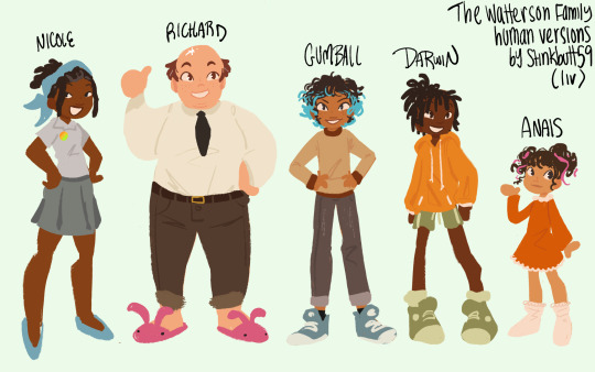
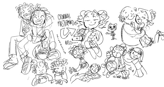
what!? liv made human designs for the watterson family again!? yes, she did, and here’s her train of thought for these under the cut:
so, these are actually for my fic that i’m writing on ao3 in which gumball finds himself transported to another universe in which everyone is a human after the events of the inquisition. this is why there’s very few animal traits on any of them, or magically colored anime hair. i wanted them to look like people who could exist and walk around.
in this, nicole is blasian and richard is a white latino (with frankie being white non-latino and jojo being latina). (also these headcanons were based on a lot of convos with some of my friends back in the day, i don’t remember anyone’s reasonings for these but they’ve been true for so long in my brain) gumball and anais are mixed, and i tried to nod to gumball taking more after nicole and anais taking more after richard without making them carbon copies. and then darwin of course is black thats just canon
as for their designs themselves, i’ll start with nicole. i tried to make her look decently muscular (although the simplistic style i used doesn’t exactly show it off). her blue bandana and shoes are obviously a nod to her canon design, so she doesn’t look like an entirely different character. as for her hairstyle i looked into relatively low-maintenance styles, since she’s a busy woman! and her hair is starting to gray from all that STRESS!
richard’s design is the most straightforward, yet it took me the longest because i was never satisfied with how it was turning out. i’m still not sure if i’m crazy about it. all i know is that i was dead set on making him bald, since there’s literally a whole episode about that. I didn’t commit all the way because the design without any hair was making me lose my mind. i gave him some freckles as a nod to his whiskers because they’re a lot more prominent than nicole’s (which is why she doesn’t have any). this also translated to gumball’s design. also, how could i ignore the obvious choice and not give him pink bunny slippers!? it fits him so well!
gumball was fairly easy for me, because i kinda always have human designs for him in mind. i always give him those blue sneakers because duh, and i always give him dyed-blue hair that he visibly doesn’t maintain. i always had this human-version-only headcanon that gumball BEGGED to dye his hair for the longest time, and nicole finally allowed it on the condition that he’d keep up with it on his own. he didn’t. classic gumball
darwin’s design is also usually an easy one for me. big orange hoodie, green shorts and sneakers. this time i also made the decision to have his hair tied up to resemble his little fin. it’s not really visible with their clothes and stuff blocking the original sketch, but i also tried to make his legs a little bit lankier than gumball’s, just to make them appear longer like they are in the show.
as for anais, i always have trouble nailing the design without it looking like a completely different character. i cant dye her hair pink, because she’s supposed to be four, but i also can’t give her pink shoes, because she’s of course the only one who actually has shoes! then i remembered ribbons and my day was saved. still not sure if i’m completely sold on her design yet, though. i think she looks a little older than four.
anyways, i’m planning on doing other designs like these with other characters! let me know if you’re interested. as for that fic, here’s the link:
#tawog#gumball watterson#darwin watterson#anais watterson#richard watterson#nicole watterson#human au#The Ending#gijinka#humanization#the amazing world of gumball#cartoon network#liv art#liv fic
446 notes
·
View notes
Text
ok wait yeah i need to talk about the short. let me compile all my thoughts and theories hold on
-the candy club is absolutely a lure for kids. cult needs kids, kids like candy. theres a few things in the town that lure kids in. vans and stores that give out candy, clowns, etc. based on the fact that the candy dealer is associated with the cartel (who trade actual sugar i guess) kevin was probably just hired to be an easy pawn and a scapegoat. thats what pelo meant when he drew kevin being puppeteered by cd (gonna ignore the fact that cd has a poster that says his candy is better than the candy clubs. thats for later) but i dont think hed hire just Anyone since cd also works for the cult, and this leads to my next observation
-kevins mom is seen with a diamond on her shirt, and her hair sticking out to the sides in points just like skiddads hairstyle. kevin clearly doesnt know about any cult, at least not yet. do his parents know? are they forced into it? do they understand who theyre associated with? plus we all know a photo with a heart drawn under it is a bad sign for the fates of the people in the pic. coughs Hope and her mother coughs
-roy is doomed. he is dooooomed he is so fucking doomed. it hurts to say it but his friends have a right to give up on him and leave him. roy has been nonstop bullying and teasing skid and pump because of his own insecurities and theres been no change from him whatsoever. i sympathize with him, i know what its like to be too stubborn to change because its such a vulnerable, powerless feeling, but if my prediction is right, roys just gonna drive them away and become vulnerable to the tree entity instead. theyll all be. if hes lucky, he and his friends will live to meet again so he can make it up to them and skid & pump after a lot of self reflection and a good amount of humbling from the adults around him. or trees around him
-lila is So broken and i feel so bad for her. no nice clothes, unbrushed hair, worlds most miserable expression. you just know skid had to force her out of bed to make breakfast for them. i have a lot of thoughts about lilas grief, its really telling that years later shes struggling so hard to raise skid, whos Exactly like his father. skid himself probably struggled to cope, i think hes the one who scribbled out skiddads face in the photos. lila trims skids hair a lot, he knows she doesnt like any reminders of him but he believes the mask is enough and doesnt think of any reason why she trims it other than she just says its getting too long for the mask. also jaune is doing kind of a shit job caring for lila? dont take her out to drink wtf. i swear shes part of the cult
-skid and pumps hair is revealed which means i get to post this observation i made. notice how susie not only has the pointed sides, but her widows peak resembles the lower half of a diamond
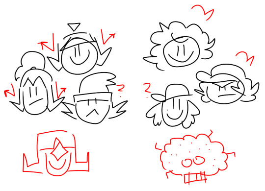
-skiddad is back ugh. also that last image with kevin is horrifying. it reminds me of this. i still wonder what the dots mean. maybe theyre locations? or people? theres 22 dots if that helps

-what does this mean. why is it right above pump. why does the skull have a diamond on it. whos that other guy
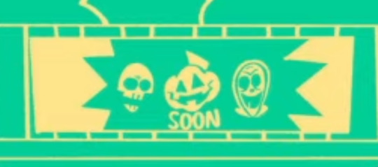
-only a bad bitch like carmen is able to make rick That visibly mad. making him carrying that heavy bag to the car. deserved

-his stupid ass

-here he is again actually paralleling gregor

speaking of gregor, the cult member that stabs kevin Has to be him. its gotta be. also if ignacio wasnt in one of the robes i will give this short a 0/10 <- lying
46 notes
·
View notes
Text
so im white, lets just get that out of the way, but i wanna talk about the orientalism in windblades design.
this doesnt feel like my place to talk about but if no one brings it up then no ones gonna learn about it or second guess it. im tired of other white people not noticing this problem or thinking its fine. if anyone asian (specifically japanese) has any thoughts or personal input it is SUPER fucking welcome! its hard to find people talking about this.
so transformers has a women problem in general. they set up women in the 80s in one episode and never elaborated on it in that show. they added arcee in the movie. they put a couple in the beast wars era, but outside of blackarachnia (becoming a literal succubus) we dont really get any of those characters adapted (besides arcee) over iterations. never any new ones really.
then the comics get windblade. i havent read the comics, this isnt about anything that happens in them. this is about her design how she comes off as as shes been adapted into cartoons. i wont comment on events from the comics outside of her origin, as i know fuck all about it.
so she was supposedly a fan-voted character, but her 'fan-voted' aspects have nothing to do with the problem (in fact the fan-vote was more of a suggestion because a few things dont end up being true) the voted aspects are as follows:
autobot. jet. fights with swords. red & black. named windblade. female. valiant. telepath. from Kaon.
so here's what that ends up looking like.

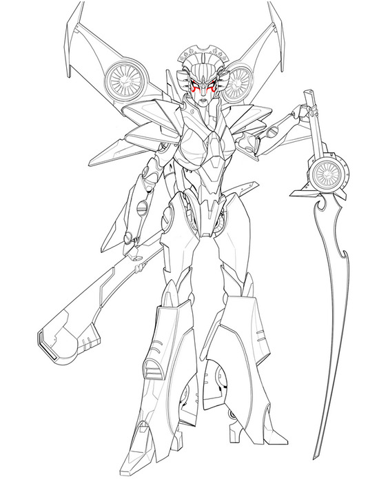
so they took some liberties. there was other concepts where she was a european knight etc, but this is where they landed. she has this extremely feminine figure, complete with makeup and sculpted hair. many people immediately mistake this look for a geisha (though supposedly being kabuki) she gets little pump heels, it makes her very human woman shaped. birthing hips and all. thats classic girl robot stuff. its the specifics of it that are an issue.
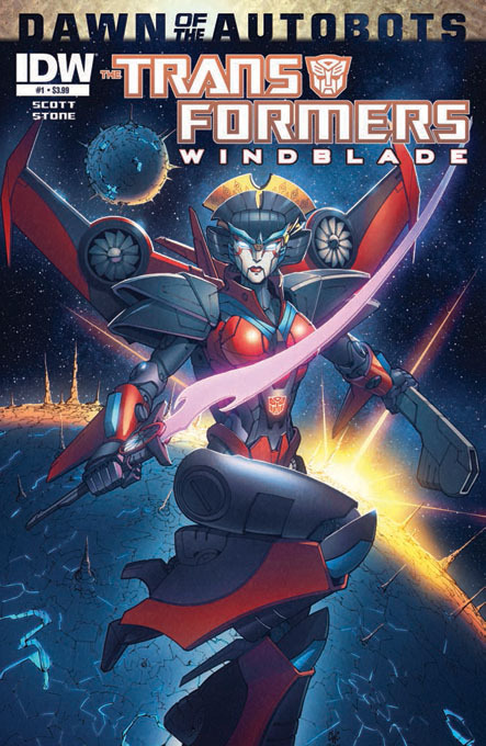
so thats kind of a lot of japanese motifs. the makeup, the swords, the hair... why does it look like human hair? thats a very specific hairstyle on a character who doesnt have hair...
on its own, having a japanese inspired aesthetic isnt the problem. i mean, coding characters to be from different places is fine. having characters coded as a specific race could be fine. jazz already exists, and despite being taken by racist creators sometimes (cough michael bay cough) its not inherently bad that he is black coded, specifically when in the hands of black creators/voices. thats key.
so having a transformer who landed in japan and took on some culture from there. you could see that happening. that could work if in the hands of people who were japanese.
but thats not even her backstory. shes not even from Kaon (as was voted), instead she's from another planet entirely, a more spiritual one, which narratively makes her alienated from cybertronians. this alienation adds to the problem. "shes not from here." "shes not like us."
you'll see many people look at this design and think "is that geisha transformer?" and as the character isnt from japan and knows nothing about the culture that inspired her, the media itself never corrects anyone. no one in the text goes "no shes not a geisha shes actually based on a kabuki performer", no one says any words about it, its just how she looks, its just aesthetics without explanation or cultural background. shes not literally japanese, she just looks it. its easy to mistake without cultural context from a western perspective, so calling her a geisha becomes a rampant problem. general audiences arent looking at forum posts form 2014 where someone correctly explains what the motifs are. shes made by white people, and white people are largely the ones consuming the media. its unfortunate, and could have been avoided if the culture shes inspired by was relevant to her character.
so she's clearly heavily inspired by japanese aesthetics, which codes her as being an asian woman in this media but written by non japanese people. and then she becomes so popular that she has to start making appearances in shows.
she shows up in robots in disguise first. lets compare her to strongarm (the only other girl in the show)
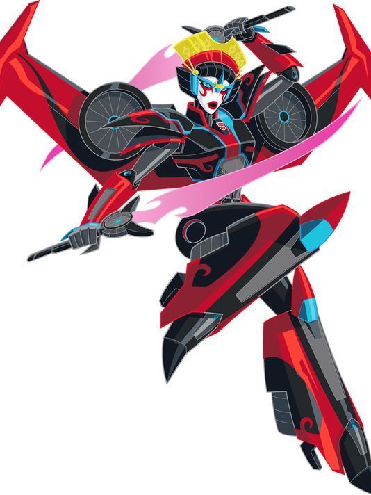
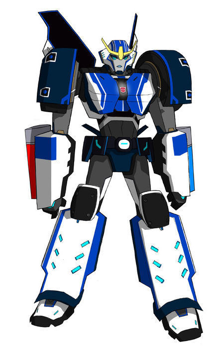
having this japanese woman be far more thin and feminized than the other girl characters is the problem. strongarm is literally the first non feminized main girl transformer (not counting strika) she is much more in line with the men around her, square and broadshouldered, shes the largest car of the bunch. that was an upgrade finally. and then we get windblade. she has ruby red lipstick, human hair, heels, jewellery. on its own? thats fine. but keep in mind, shes heavily japanese coded already. then shes immediately seen as a romantic conquest for sideswipe (though he never gets anywhere, he literally claims ownership) it leans into tropes of sexualizing asian women because she stands apart from strongarm. shes the flirt, shes the very feminine one. is this on purpose? its not their fault windblade looks like that in the comics and strongarm looks like this. but side by side what is it saying? did they intend to say this about their asian woman? no, probably not intentionally. its kind of unconscious bias that tends to happen when you dont have a diverse writers room. no one notices until it hits the audience.
but lets just jump in here with the other weird problem in RID, because shes not the only one who jumped from the comics.
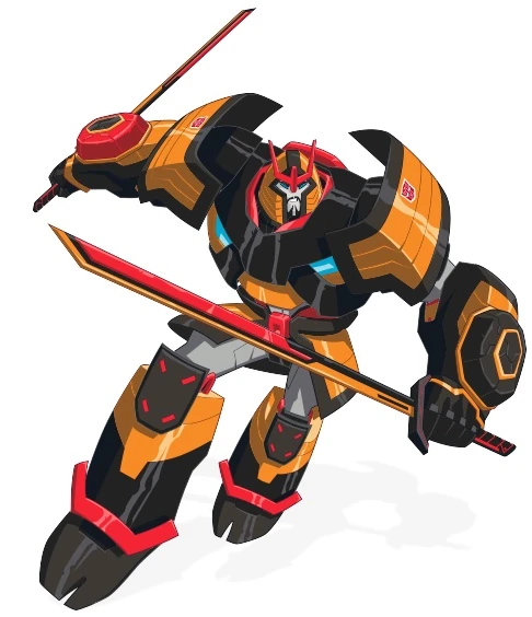
drift (who while being a samurai in the comics (literal?) doesnt.... LITERALLY wear a suit of samurai armour) shows up. with his two minicons who act as his children (who hes very strict with). theres a heavy overuse of the word honour. he owes a life debt, hes very humourless etc... they also never explain why he wears this armour. he came straight from space. he doesnt even turn into anything big that warrants it, hes just another sports car. bumblebee and sideswipe are sports cars too. but why is drift a sports car? tokyo drifting. drift. you get it.
so drift also is a comics original character. he, however, looks nothing like that
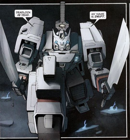
i will assume that drift looks different for one reason....
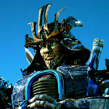
i mean. i shouldnt have to tell you why that was bad, right? you guys get why michael bay movies are bad? (if you genuinely dont please enjoy this series as a starter) ill just assume you do. knowing that that drift is bad, can we also say windblade is suffering from a similar problem?
this show brings in these FOUR new characters and heres how they look side by side.
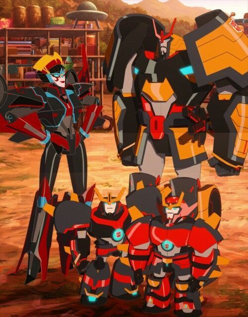
so. okay the minicons are raised by drift, they share his aesthetic, okay. we dont know where he got that aesthetic but yeah they share it. windblade.... its unclear in this show if she shares the being from another planet like idw part. shes on a mission from god to be here and thats all we know. but the point is they have no similar origin. yet they all look like they could be from the same place. that they shares a (japanese inspired/coded/stereotyped take your pick) culture. meanwhile our from ep1 mains look like this:
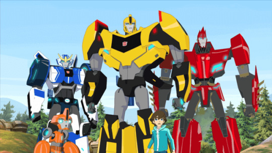
so that feels. specific.
its not inherently bad to code robots as japanese, however its a problem when it seems to be for aesthetics alone. its stereotyping. they look nothing like the rest of the cast, everything like each other, and are from completely different backgrounds. they literally have the same colour palette? theyre not even like that in the comics.
sidenote, if you add sideswipe (who's alt mode has kanji on it and an asian voice actor so we can assume some coding there too) they look like this. yes they all have swords.... no one else does!
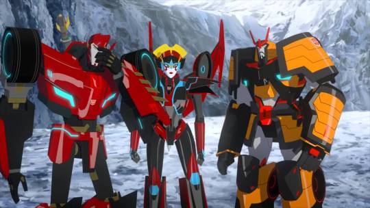
yes, windblade is the only character with a white face. makeup. yes sideswipe claims ownership over her to fight off one of the minicons. its not wrong to show windblade being harassed by a man, but it is wrong that no one ever says "leave her alone" you know? like thats just whats to be expected of her. it sucks. but at least her voice actress was asian! that wont happen again.
so. moving on to cyberverse, she becomes a central character. character wise? shes great. she gets to do a lot, no one sexually harasses her here, we're free of that era.

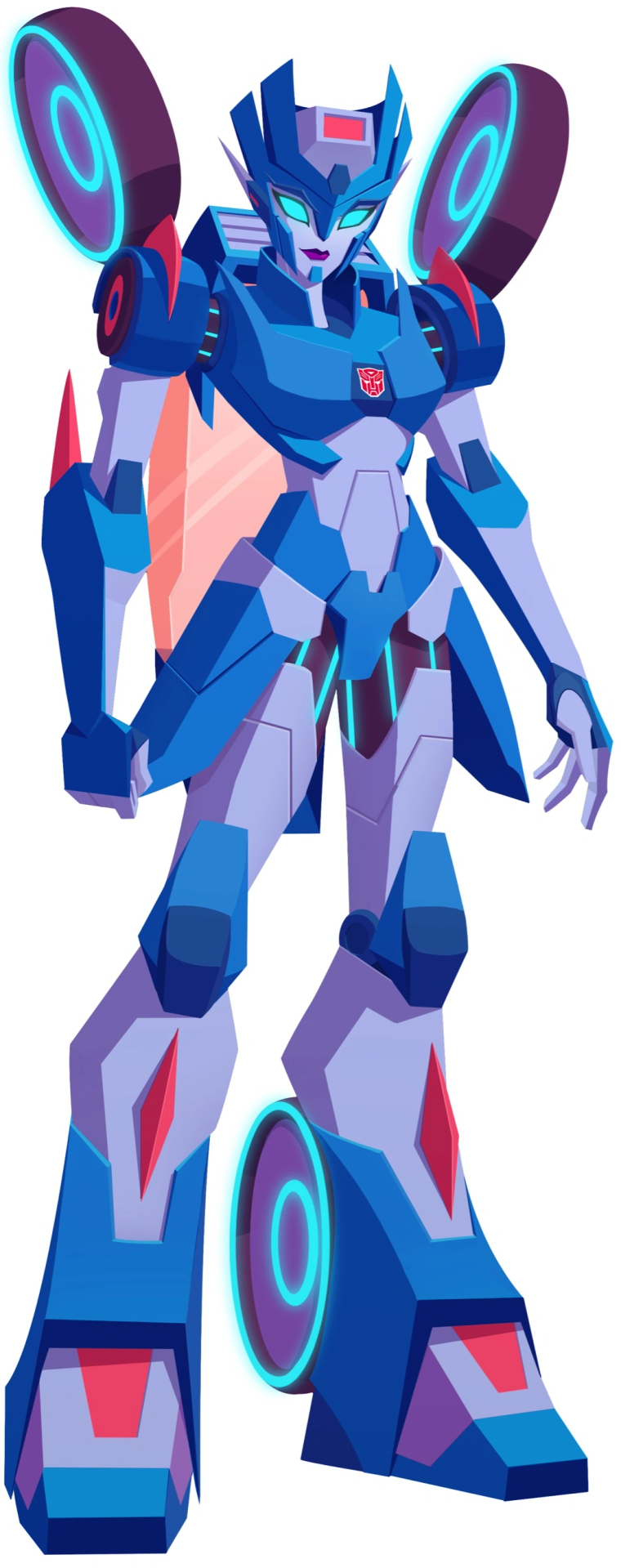
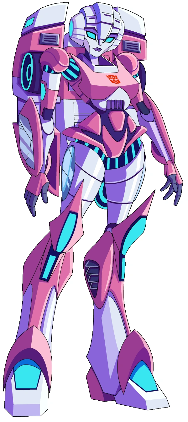
comparing her to the other autobot women, shes more in line now. if thats a good or bad thing overall is less the point (ie theres no autobots built like strongarm was, they are all just as thin and curvy as windblade is) but to me its still very apparent that shes still implying human hair. even with how simplified all these designs are.
like you can see how these red lines around her eyes get lost at a distance, same with the clips in her 'hair'. its clearly just trying to adapt her original design and im not saying thats a wrong choice they made, but i am saying its really busy in comparison
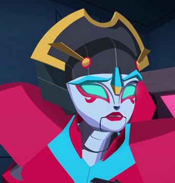
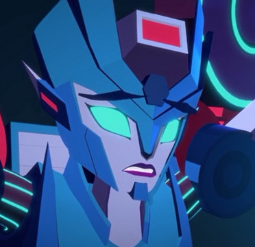
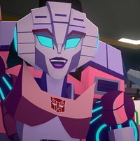
maybe thats a nitpick. but here it seems much more pronounced just how specific her head piece is because we can compare her to chromia, who is from the same place. do these two characters look like they have the same culture? not really. chromia and arcee look more alike. maybe thats just because they were designed later, but its unfortunate none the less.
even comparing her head to the seekers, what she is kind of supposed to be, they get the same old starscream mold. maybe she'd look better if they just did that? or something similar? like, give her a helmet. no one has hair. please stop implying hair. we all know what youre doing.

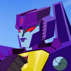
none of this is me saying i find these shows bad or that i hate windblade, i genuinely love her! and i love both these shows! it just feels hard to love her because of how she was designed. its not a problem with having a japanese coded character, its how stereotyped the look is. how othered it is. it leans into racist tropes. its orientalism, using japanese aesthetics to make her look interesting and different. you can tell she was made by white people.
how is it that despite being around for 10 years now, no ones tried to redesign her?
also look at the toys! look at the god damn toys!


she can take that head piece out to have a FAN. why does she need a fan?? shes got fucking WIND JETS ON HER BACK! its very obvious why they did this. shes a japanese woman, she can fight with a fan to complete the aesthetic! despite her character never having even been there! and no other transformer using a fan weapon! shes so COOL AND DIFFERENT like that isnt she?? holy fucking shit
to go back to those original voted concepts for a second? if we went back to the drawing board?
a telepathic valiant female autobot who can fly, has a red/blue/black colour combo (with yellow accents) uses swords, and maybe even with canonical asian heritage....
could they even do that? is it possible?
...
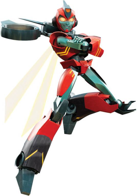
OH! wait it SUPER IS! who'd have thought!?
im NOT saying "we dont need windblade! we have a better girl with the same concept!" cuz thats stupid. do not misunderstand, theres room for WAYYYY MORE TF GIRLS! the literal 1:13 ratio is FUCKED! i know windblade had to fight to exist too and that sucks!
i just think it's CLEARLY possible to do this better, and it SHOULD be entirely possible to have windblade (who was LITERALLY holding court as the MAIN girl transformer for years) to be, i dont know, not so racistly designed? i think its entirely possible to fix, i just wish they would have tried already.
and this is just what my white ass has thought about since meeting her and not seeing anyone else bring it up. like going hunting for a real take about it just meets you with the rampant misogyny problem in fan spaces. its hard to find people talking about it in a normal way, but if they have before id love to know.
i just wanted to put my thoughts about it down, maybe get people to think about it more or talk about it more. cuz jeez, i would really like them to fix the problem. like they fixed the arcee problem in idw, right? can they fix windblade next?
83 notes
·
View notes
Text

The. Cursed. Critters. Part. 5.

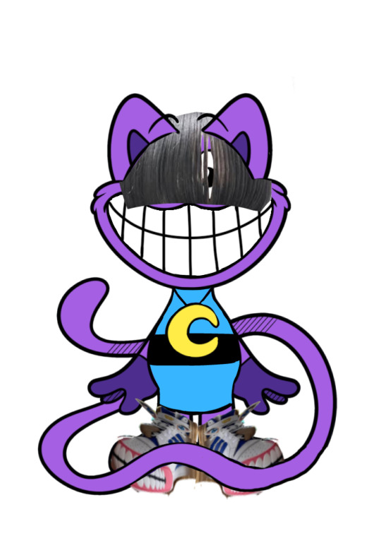
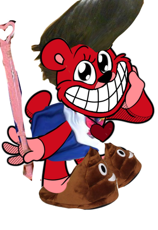
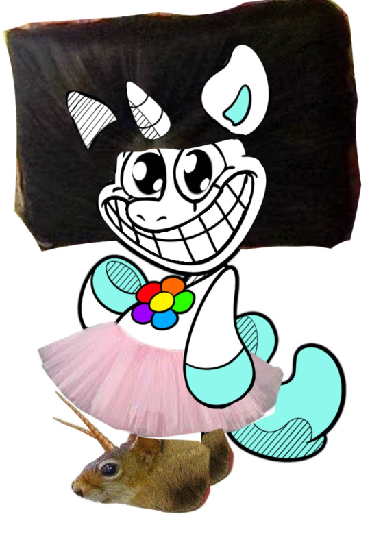

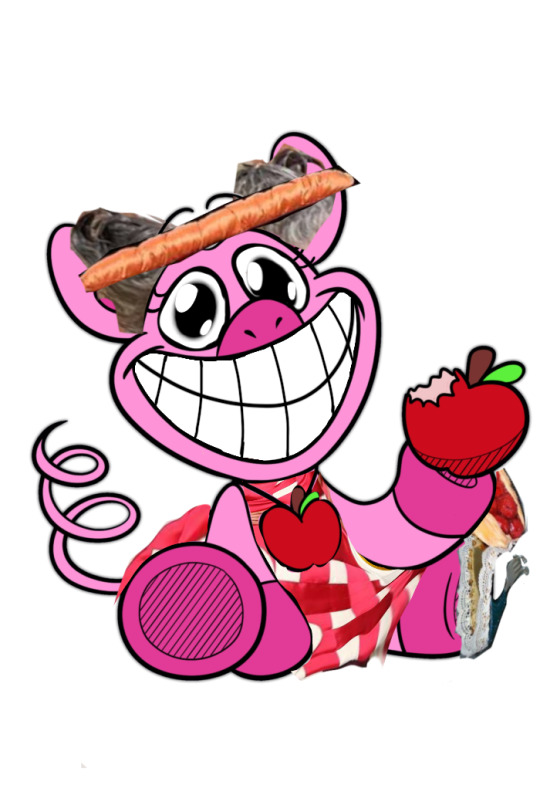
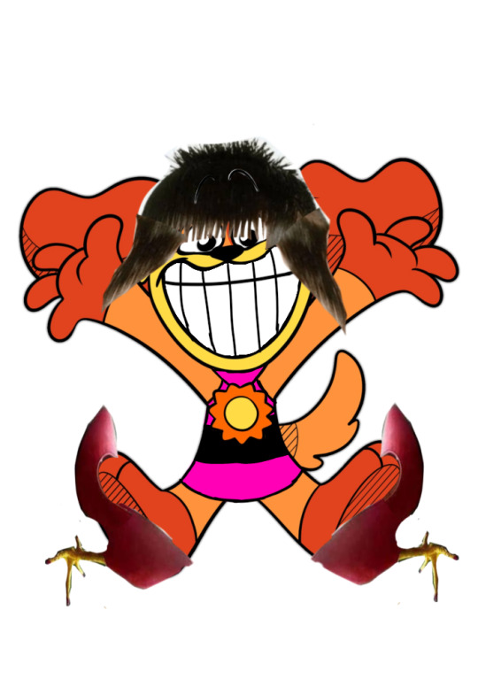
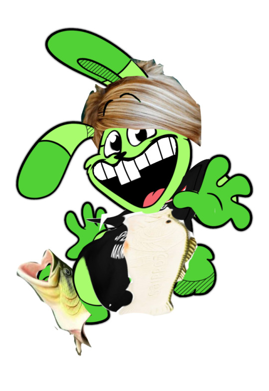
Thats it. Im absolutely done at this point. PERIODT.
____________________________________________
*Reporter voice*
"i am glad to have met you all." Was her last message to all of the fishies (fans) she has. Unfortunately, Siren has died. Cause of death? The cursed critters. These little creatures with cursed hairstyles, faces and clothes. Those horrible little shoes were out of style. And the mermaid didnt manage to survive the attack. My sincere condolence to her husband. This has left me in shock since no one has ever--errm what?
*inaudible noises*
Uhm, breaking news, the critters are now on the loose and are-Uh Phil(cameraman) Are you o--OH NO! The cursed critters a--
Hoppy: WHERE'S THE MANAGER?! I demand to speak to him right now!
Picky: Where's my other shoe?*sobs*
Hoppy: My carrot is rotting here and i need to know why! I need t--
*your pov: you were sitting on the couch, watching the chaos in the news tv when suddenly the screen glitched to a live news in the city*
Bubba: Uh is this thing working? *Adjusts the camera* uh yeah, now its working! E-hem! Balitang balita sa radyong sira! Isang baliw- *looks at his script* ay putangina english pala dapat- take two!
TL: on the news live, a crazy- *looks at his script* oh shit it should be in english- take two!
Bubba: A crazy bear is wrecking havoc in the city and we will all die!!! *runs from the camera frantically*
Bobby: *appears on screen* DONT YOU ALL LOVE ME?!!! AHAHAHAHA!!
Dogday: Do not worry as we-
Kickin: -the powergruff guys-
Catnap: -are here to save the day!!
*you spat your coffee ad the tv glitches again*
Crafty: Welcome to the Craftyrina show! Today we will learn about the basic steps of a ballerina!
You: oh fcking hell whats happening
Siren(me): i dont know either bud
You: wha-! Where did you come from??! Arent you dead?
Siren(me): ( ͡° ͜ʖ ͡°) *disappears*
____________________________________________
I didnt actually make a lore of the cursed critters, right? RIGHT????
#poppy playtime#poppy playtime chapter 3#smiling critters#catnap#dogday#kickinchicken#craftycorn#bubba bubbaphant#pickypiggy#bobby bearhug#hoppy hopscotch#cursed💀#this will be the final...i swear it this time!!#THIS “LORE” WAS ACCIDENTAL I MADE THIS UP JUST NOW
44 notes
·
View notes
Text
Okay but
Thinking about paralel canon and Agent 4 yesterday, i came with possibly the answer to whats Paralel Canon exactly and, more importantly, why it ISNT Agent 4 in a certain way
Rant and spoilers under the cut lol
So, for this we have to take a look on Marinas dev diary and Smollusk notes:
At the diary, Marina said that she was going to request "the person Cuttlefish introduced to her" for being part of the security system on the memverse... Basically Four. BUT, when SO plot happens, we dont actually don't know if 4 was already on the security system or still planned to.
Moving on, we have Smollusk notes after completing 4s pallette, where Smollusk slanders 4 for being chaotic and, the interesting part, that a Squad of Order its cooler than a Squidbeak Splatoon.
With these two things in mind, we can jump quickly to the conclusion that, the Boss which has ur splat2 hairstyle and its an Inkling its Agent 4... Well, i think no.
I think more than themselves completly... Theyre basically a grayscaled copy made off by Order. The interpretation i had in mind its: Agent 4 was registrered to be on the Memverse, but didnt went like Eight or Acht or OTH did, only part of their soul. A part of it was made into the pallette, and the other part was made for being the leader of the Paralel Canon or, more like, Order squad. Buuuuuut it was 4s soul, theyre a chaotic at heart, so the first time actually setting it came out wrong and the 4 copy rebelled against Order, so Order came up with the Paralel mask to retain the copy that it made.
Sooooo for shortening things out: 4s (more or less) alright at the real world. Paralel Canon its a copy of them made by Order and their impulses of breaking off are retained by that mask.
Okay thats it gn
25 notes
·
View notes
Text
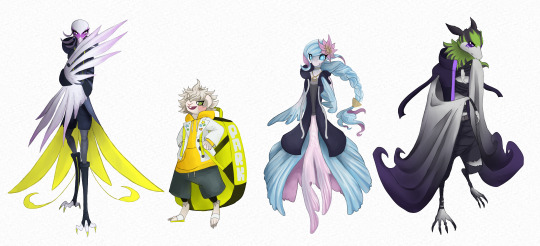
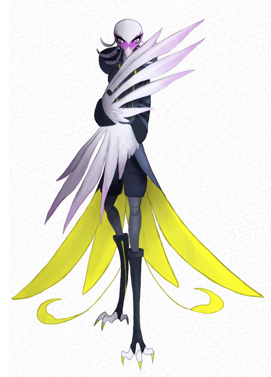
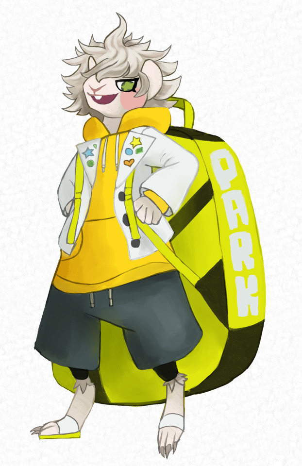
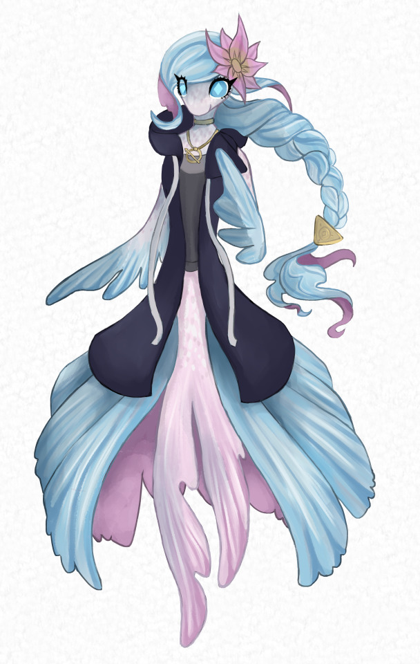
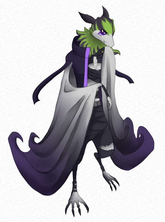
Others have already been furrying the Raincode characters and doing a phenomenal job, but when I would peruse Danganrompa fanart I really liked seeing different and wildly varying interpretations for the characters' animal choices and now it is my turn, my GOD GIVEN DUTY TO PROVIDE IN THE GENISIS OF THE RAINCODE FANDOM, FOR THE HONOR OF THOSE WHO HAVE COME BEFORE ME.
For all of them I used their pose from the artbook renders. I'll say it's to keep them recognizable but that is actually a lie I'm just lazy.
Secretary Bird Halara:
Halara I did first and they were the one I was most jazzed to do because I love them dearly. I made them a secretary bird and I think it's a PERFECT fit. Ahem allow me to rattle off. Secretary birds are birds, so doomed by the narrative to have to stay away from cats, they are predatory birds and of course Halara would be at the top of the food chain. Speaking of predetory birds, secretary birds are known for their ability TO KICK VENOUMOUS SNAKES TO DEATH, AND THATS JUST TOO GOOD A FIT. They also have plumage that I could easily shape into Halara's kinda smooth swoopy hairstyle, and face markings that could be sort of representative of their glasses! I think the drawing for them is probably the weakest out of the group just because as I went along I improved and started to translate the human designs in less one to one ways, plus the pose Halara has in the artbook doesn't fit perfectly to the really big wing hand things. I still enjoyed making it because H A L A R A N I G H T M A R E but I'm honestly kinda sad at how lackluster it is compared to Fubuki and Viva who got the most interesting details and texture work. NEVER DO YOUR FAVORITE FIRST IT'S A TRAP.
Guinea Pig Desuhiko:
With Desuhiko I was going back and fourth between a few rodents, I just think he kinda looks like one and already had those pikachu cheeks. My first scetch made him a hamster, and while it DID look like him, it felt a little too... Indistinct. Desuhiko's probably my favorite design in the cast just because he looks so distinctive and has a short stocky bodytype I really really love and makes my character designer brain happy, so I swapped hamster for guinea pig. While the guinea pig face doesn't look like him quite as much as the hamster, they are very interesting and distinctive looking which I loved a lot more even with a bit of accuracy sacrificed if that makes sense. Also there are Guinea pigs with spikey wild fur that make it so I could just kinda give him his actual hair and still have it make sense. Guinea pigs are also the perfect size and shape to be thrown like a large softball and out of all the Master Detectives Desuhiko looks like he'd be the most sadisfying to chuck across a room.
Fish Fubuki:
Fubuki was really hard just because it's difficult to anthropomorphize a fish in the same way as a mammal or a avian cause of their structure. She might look a biitttt more like a fantasy creature inspired by a fish than just a fish but she's charming enough I don't completely mind. I got some SOLID advice and looked at some Splatoon NPCs characteristics to try and make her more appealing. So why fish? I got it as a suggestion that I ended up really liking because fish are notorious for their bad memory, live in tanks their whole lives(Fubuki is the definition of sheltered), and they have fins to mimic the shape of Fubukis cloak and hair. I used beta fish for reference, they don't really fit her but just being a fish was good enough for me and at that point I was prioritizing looks. She doesn't even really look like any specific species like the other three to be honest. She's defiantly the outlier of the group but that's fine, she can be special in her own unique way like always. Got a little lazy with making the hair look all that fin-like, but it's kinda the main event of her human design so I wanted to keep it as true to that as possible but looking at it now I think its tooooo copy and paste looking. Her furry design IS my brothers favorite out of the batch so that's gotta count for something!
Flying Fox Bat Vivia:
The vampire looking man was always gonna be a bat, I am but a slave to the whims of fate. I made him specifically a flying fox because they're the largest bat species and therefore can loom ominously. Vampire bat would have been fun too, but they have more of a squished bastard energy that doesn't really fit Vivia. Bats also are known for their weird sleeping habits, ala upside. Viva isn't sleeping upside down or anything like that but he DOES snooze in some weird places so I think comparing him to a bat in multiple aspects is very apt! His drawing and animal design is probably my favorite, I really like the wings, and the bat feet are super weird I loved doing those. I did have trouble incorperating his hair, flying foxes have pretty smooth heads, but they do have sort of a mane thing going on so I tried to put some of his hair texture and shape there instead. Sorry I did not give him is edgy edgy hair cut, I too love it very much but it was simply not to be. I did try to mimic it's vibe with the patterning on his head though, an illusion of his bangs.
I'm very happy with this lineup overall, they're some neat little designs if I do say so myself! I might do more but I have the chronic problem of not being able to sit still for a long time to do a BUNTCH of guys again(though for the record I would make Seth the most delightfully storm drain gutter looking creature). I also kinda wanna do Makoto and Yuma cause someone suggested a REALLY good idea for them, but the concept for Makoto with this idea would be more of an involved design that I wouldn't be able to use all of his normal outfit for so it'd probably take longer than average.
TLDR: Furries amiright?
65 notes
·
View notes
Note
Okay, this may sound controversial and I may be delusional but... Doesnt it seem like all Salem's "black-coded" ocs cater to white people and actually have like, zero to none representation and he himself actually doesnt explore this at all? All of them are: - very light-skinned (or i guess light-furred) except for one of the Wolfjager bros and that Dominican(?) bear OC, whom I've seen like, one time lol; - have mostly 1-2 styles of mega puffy natural hair or mega thick dreads, literally with no other exploration of black hairstyles. on some occasion there are locks, but they also are drawn mega thick. where's that representation if you literally scared to go out of your comfort zone?? - all of the supposed "black and proud!!" ocs that he does not project to (like Hitch and Salem) literally show as rare as snow in the summer. how many times have you seen that demon goat twink or that cerberus girl versus some other explicitly black OCs?? the one exception is Tammy but she's took several years to actually have natural hair and "be openly POC" so I dont count her. - those who DO appear have the same/kinda same style or no black clothing style at all. Hitch was kinda distinct and had a pretty nice design, untill he literally recently started to morph into "BIKINY BOOBA SHORTS ASS" fit that Salem has. and the only one that got to have a black fashion style.... is Salem. and only the one that explicitly drew attention to his ass. - all the other "mega cool and super kinky" OCs that he has are either mega white or shown explicitly to be very white-passing. how many time have you seen that lopunny guy sex worker? versus, once again, that goat prince twink or other Very WhiteTM characters like Maul and that church nun wolf in kink gear? its all "Black Pride!" untill you actually have to draw other characters thats not you-looking/you-relating. So in conclusion.. Salem doesn't draw characters that should be liberating for black folks. He draws only to be liberated himself. I don't judge him for wanting to do that but then at least don't lie and pretend that you're doing that for others... Cause you're not.
that is because, despite all his talk. salem, was raised in a primarily "white" way. it is why, he expressed much discomfort around using the n word, or even expressing himself as black. which, i think he should be able, to re connect to. but pretending as if you are the beacon of representation, for something you yourself do not understand. is wrong.
for example. referring, to "black coded clothing," as being skimpy, and hyper sexualized, to me is an issue. black people, do not dress in bikinis and short shorts, on the street. please salem. look up street fashion. or maybe. try going outside. and seeing what other black people actually wear.
3 notes
·
View notes
Text
EEnE characters ranked (MY OPINION)
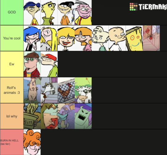
Let’s cut right to the chase, because I really wanna put this out there.
Lee Kanker is in last place. She gets lower than F tier. Where Marie and May had moments where they seemed to genuinely care about each other, Lee just sits there, manipulates, and spreads cruelty. And as for the times where Marie and May were fighting/being mean etc? Well, I have a theory. Remember in Big Picture Show where we see that Lee has a third eye? You know who else has a third eye for no good reason…?
DEMONS. LEE IS AN ACTUAL DEMONIC MENACE WHO BRAINWASHES HER SISTERS JUST TO MAKE OTHERS FEEL MISERABLE. AND EVEN THEN SHE MISTREATS HER “MINIONS” TOO.
And remember when Nazz kissed Double D and Eddy on the cheek? Compare that to how they react to the Kanker’s kisses. How big those lips are… that specific shade of red… the way the Ed boys become horrified every single time…
THE LIP STICK IS CREATED BY LEE AND HAS DARK MAGIC INSIDE OF IT. THATS MY THEORY. IM STICKING TO IT. SCREW YOU LEE.
(that was a joke lolol)
Everybody in the “lol why” tier it’s just an object that isn’t Plank or I haven’t seen those episodes yet. So I can’t really give my thoughts yet.
Rolf’s animals get their own tier. They have an amazing caretaker :3
HAHAHAHAHAHAHAH DORK DORK DORK DORK ITS KEVIN DJDJUDUFHDBRJRIRID.
He’s just a jerk lol.
Eddy’s brother (whose name is apparently Tarry??) is also a jerk. But he makes a pretty cool antagonist. And he just makes me like Eddy even more.
also i feel like he would be a tumblr sexy man
Mildred blinks at you :D
Plank is an immortal God who will one day rule the world. This is my canon.
I REALLY wish we could have seen more of what happened to Jonny post Big Picture Show. Him being “The Gourd” and having a villain arc just sounds super fun. Other than that he’s just a weird kid. I like him.
Don’t let Jimmy fool y’all. He’s a lil maniac. He probably gets it from Sarah. And it’s always a shocker to me given how much he acts so innocent and harmless. He’s a pretty neat anti hero.
I KNOW I SHOULD HATE SARAH. But I feel like there’s more to her than meets the eye. I honestly think her parents taught her the hate her big brother. If they weren’t around, she probably wouldn’t been to mean to him. Making me feel extremely sympathetic for both of them. And at least she looks after Jimmy, giving her redeeming qualities.
To be honest this show needs a character like Nazz. Everything has to be balanced out with someone who isn’t constantly out to get something, being mean, or acting like a weirdo. But yes, she does have her moments, which are rightfully deserved. Plus, I just really like her chill and hippie way of going about.
Marie Kanker and May Kanker are being ranked together. The potential they have to be redeemed is through the roof. They deserve so much better. If Lee wasn’t around to mess with their heads, I think they would be truly happy. Marie could spend her days jamming out and living on the edge, while May is cute and ditzy and a voice of reason at times. Plus both of their hairstyles are really eye candy for me.
The Ed boys are also being ranked together. What else can I say that hasn’t been said already? The way these three bounce off of each other is extremely enjoyable and definitely gets good laughs out of me. I know they have their moments where they aren’t so friendly, but you don’t always have to get along with someone for you to still love them. And when the gentle giant goof, the soft hearted nerd, and the selfish man with a heart of gold do get along, it’s sweeter than jawbreakers :)
AND NOW WE HAVE ARRIVED AT THE TRUE GOD. THE LIGHT IN DARK TIMES. THE DIAMOND WITHIN THE DIRT. THE ONLY BOY ON THE SHOW WITH A GOOD HAIRCUT.
ROLF. THE SON OF A SHEPHERD.
Rolf is hands down one of if not the best side character in animation history. He’s a goober for one thing. But a goober that’s gets us to take him seriously. You do not mess with this man. His pride is enough to break you leg. And yet, he still manages to be one of the nicest characters in the show. He’s so friendly and upbeat! And when he isn’t… his dark side is also a fun time.
And another thing, he’s a fish out of water. Which also allows the viewer to feel sympathetic for him. Like in Wish You Were Ed. Seeing Rolf cry is something you’d never think you’d see, but when you do, it makes you feel a somber emotion you had no idea existed. It’s amazing.
yeah, Rolf is amazing.
Also I asked my sister if she wanted to dance to That’s My Horse at her wedding and she said no. What a loser right?
So uh, that’s my list. Hope you enjoyed.
Go hug a chicken.
#ed edd n eddy#eene#eene rolf#the kanker sisters#marie kanker#may kanker#cartoon network#tier list#ranking#iNmYoWnPeRsOnAlHeAdCaNoN#my thoughts 💭#my opinion#I hate you lee
14 notes
·
View notes
Note
The other day i was watching how people made fun of the Hazbin trailer and someone uploaded a clip from "Inside Every demon is a Rainbow" to say it was a downgrade and my jaw dropped when i saw that it was true, i always thoght that the "new" H.H had something that made it look worse than the pilot but i couldn't put my finger on it, and now i think i understand the reson.
So, these are the reasons why the new clip looks like a downgrade (in my opinion):
1)The Song.
No matter your opinion on Hazbin, we all agree that "Inside of every demon is a rainbow" is an iconic song. Its not a masterpiece, but it works really great to introduce the show. Maybe its nostalgia talking, but i love this song, i really like how it start slow but then goes into a fast catchy tune as Charlie is talking with enthusiasm about her proyect. The voice actress also is doing an amazing song because she sounds SO energetic and genuine, wich is clearly a sign of how much she loved that job. Its a cringe song, but in a "charming" and pure way, that is very unique and enjoyable when you turn off your brain a little.
Meanwhile, the new one sounds like a generic, forgetable, lifeless Disney song, the only difference is that it has curses and shit. Its like its trying to replicate the other one without understanding what made it so loved.
2) The damn camera movements
The pilot was fast moving, energetic and sometimes there were parts where you couldnt tell what was happening until you paused, but even so, it was easier to digest because the camera was still most of the time, it didnt need crazy movements. There was a million things happening on screen, but at leats the camera had slight movements so your eyes could at least know where your focus should be in (check out the "so all you cartoon porn addictions" part to see what im talking about).
The new one? It shakes and zooms like crazy every time a character takes a step and it makes it hard to the eyes to understand where the fuck they should be looking. Its not even funny, someone WILL get motion sickness.
3) The character designs
Im one of those people who didnt like most of the redesigns, now i understand why: because they dont fix ANY of the problems the original ones had: no less use of red, they still have a shit ton of unecesary details, they still have copypasted body types...
I would say some are WORSE.
Take Charlie, for example; she used to wear a light red shirt with black pants, she would blend a little bit in the background when interacting with it. Now she wears a bright red suit in bright red background and she gets lost EVEN MORE. The only thing they improved was her hairstyle.
4) The animation
Some people say that the animation is good and its just the editing that makes it look bad, but i disagree. Just take a look at the pilot and then the new clip, you will see a clear downgrade.
The old animation was so smooth and expressive, new one is choppy and is afraid of smearframes. Making characters with cartoony propotions look so stiff.
Its like those Sonic games when they used motion capture to animate Sonic and his friends. So they would be literal cartoons animals moving like realistic humans and it sucked.
4) The pilot was visually easier to "diggest" in general
I gotta say, while re-watching the clip of Inside of every demon, the only parts where it was hard to follow were when Charlie interacted with characters with exagerated designs and when she is rapping and there are a lot of fast scenes that ends before you have time to understand what you saw. The rest was just ok.
But in the new clip, it was 90% Charlie jumping around different backgrounds with a drunk camera man and in some part i paused to look at the wall cuz i felt like my eyes were gonna burn if i keep looking.
So thats it, there are some other reasons but these are the most important ones.
Sorry for writting too much, its such that im mad for what they did to a proyect i used to be obssesed with.
Anyway, hope Hazbin gets cancelled in the mid of the first season and the rest became lost media, have a good day 🩷
These are some great thoughts, Anon, thank you. New Hazbin doesn't have much appeal to outsiders, but it looks even worse when held up to the pilot.
"Inside Every Demon is a Rainbow" isn't the best song in the pilot, but it was an excellent song to introduce us to Charlie. It's not an easy one to sing either, but Charlie's singing VA nailed it.
38 notes
·
View notes
Note
False Terapagos is a GENIUS IDEA! Kinda reminds me Faker.EXE a lot. Also, I like how Carmine has similar hairstyle to Indigo Disk Kieran (that's what you get Briar), Also, imagine Dokutaro's main goal is corrupt Terapagod? And started with Terapagos. That would be a terrifying and cool thought
HOW DID YOU READ MY MIND THATS WHAT I WAS THINKING HELP
Carmine's new hairdo isn't meant to be bad or edgy, she's just gonna work on being a better person (and also her bangs were getting too long)
False Terapagos is based on how Briar sees Terapagos (because she's a villain in my AU I decided). Since Briar sees Terapagos as only a tool that she can use and study, False Terapagos takes that kind of form.
Also I googled Faker.exe and did some research (and by research I mean the first result of google) and yeah I can see why the two are similar, although False Terapagos wants to have his own identity outside of being an alternate Terapagos, kinda like a Mewtwo situation (I think? It's been a while since I watched the movies he was in)
And YES, Dokutaro's main goal is to corrupt Terapagod! I was inspired by TOH with Belos corrupting the Titan. Terapagos is a good start with controlling a being with that much power, but if Dokutaro controls Terapagod, he essentially controls all of Paldea. And who's to say he won't spread his control to other regions?
#ask and ye shall receive#pokemon#pecharunt#pokemon dokutaro#dokutaro#pokemon pecharunt#false terapagos#terapagos pokemon#toxic consequences au#terapagod#carmine#the new pokespe futures#briar pokemon
12 notes
·
View notes
Note
SasuSakus are comparing JinXiao (Jin x Xiaoyu) and some are even saying that Jin copied Sasuke's hairstyle when it wasn't even close. Sure, there were similarities but Jin debuted in 1997 during Tekken 3's release while Sasuke in 1999 when the Naruto manga debuted in WSJ. If anything, Sasuke "copied" Jin's hair style. Jin's look is an amalgamation of Kazuya's hair with Jun's bangs. In series description says that Jin got Jun's face more than Kazuya's, which is similar to how Naruto is often said to have inherited Kushina's face.
SasuSakus are delusional to compare JinXiao with them since Jin left Xiaoyu much like Sasuke left Konoha and Sakura. However, it is not even close as Jin was gunned down in Tekken 3 but came back to life and fled the scene. He went into hiding and discarded everything about the Mishimas. However, unlike Sasuke, Jin really cared for Xiaoyu so much that he sent her an anonymous e-mail warning her about the Mishimas plus he didn't even lay a hand on her, unlike what Sasuke did with Sakura. If anything, when they reunited in Tekken 8, Jin wasn't annoyed at her. He was comfortable with her, much like how Naruto and Ichigo are comfortable with their ladies. Jin just wanted her to be safe as she, along with his mother Jun, are the most important people in his life. Also, a huge factor of Jin's decision to push Xiaoyu away is due to the Devil Gene, as it can be uncontrollable and can be passed on to the next generation.
Man, I kinda hate SasuSakus and some Naruto fans who think that Naruto became the basis of many franchises when in reality, it wasn't the case. Much like many franchises, it also got inspiration from others. SasuSaku is like a toxic version of VegeBulma, where they also share the character dynamics with. Many SasuSaku deny it.
Sorry for the long rant but I can't help but be annoyed at them for making a fuzz on other franchises.
I don’t play video games but yeah this ain’t the first time SS has tried to latch onto other series/franchises ships.
Remember when they tried to make Gray from Fairy Tail like Sasuke just because both Juvia and Sakura were obsessed with them but like……when did Sasuke EVER show care to Sakura even when they knew each other for YEARS????
Gray saved Juvia the first time they met and THATS why Juvia loves Gray. Sakura only liked Sasuke as a CHILD because of his LOOKS not because he ever saved her. Hell even then, if Sakura were actually like Juvia she’d love INO for saving her not Sasuke who did nothing for her.
Sasuke blatantly didn’t give a shit about Sakura after they spent school together! Gray just met Juvia (and knew she was the ENEMY) and saved her life.
This just shows that SS can never stand on their own. They’re like leeches attaching themselves to NH, GJ, and the ship you talked about to show how “healthy” and “normal” their ship is.
#naruhina#anti sasusaku#gruvia#juvia lockser#gray x juvia#gray fullbuster#fairy tail#lunaneko14#jinxiao
14 notes
·
View notes
Text
Oc-tober (late) Week 1!!
-> This is my first time posting these fellers online & I learned about the event a bit late so! Posting some recently done art of them! I’ll draw og art for the rest of the event though :)!


Disclaimer: These drawings were actually studies from images I found! So they’re p heavily referenced so I’m gonna make this post non-rebloggable due to the heavy reference & that I can’t find the og images at the current moment! So if you recognize these poses! Thats why!
Day 1. - Favorite oc(s)
THIS IS A VERY HARD CHOICE! This trio above comes to mind everytime this question is posed so all three of them get some spotlight! From L->R they’re Benjamin Bayheart, Dee Oshop, and Cory Reid! At the current moment I’ve been developing Cory a lot more than the other two, but they switch positions of Fav ever-so-often
Day 4. - Under-Appreciated oc(s)
Funnily enough, I couldn’t choose a single oc for this slot either. I categorize many of my ocs in groups in my mind to keep track of them, so I often think of them in their group first instead of as an individual, resulting in these group pieces as my first days </3!! BUT under-appreciated is definitely the three featured in that second drawing! From L->R they’re Cory Reid (dudes my current fav I cant find a piece of the others without him in it </3), Oliver Bayheart (Benny’s twin, thats why they look the same lmao), Faith Reid, and Wade Bayheart! Ollie, Faith, and Wade ended up getting pushed to the side in the narrative a lot (their brothers Benny & Cory taking the spotlight..) so they’re not appreciated as much as they should be.. this was actually my first time drawing them </3
Some thoughts for the other days under the cut ! I really love these oc’s and look for any excuse to yap about them!!
Day 2. - New oc
Tommy! A new member of the Spades I’ve begun to develop! He’s not majorly plot relevant but I needed to flesh out the Spades as a group better so Tommy’s been created to kinda help build the ranks a bit. At the current moment hes an old Highschool friend of Cory’s who Benny found after he had been tossed aside by Morris (the “Big Bad” of this story) & offered to join the Spades

Day 3. - Old oc
Despite being under-appreciated, Ollie (Oliver) is actually the oldest of this bunch! He used to be a very different character, but he started all of this ! He used to be a FNAF oc .. oh how far hes come . I made him in like. 2nd grade ? I’m in collage now lmao

Day 5. - Re-designed oc
Coincidentally I just went through some old sketchbooks that have my first oc drawings of this bunch in them!!! I found some ancient Dee art & I can now explain my process behind her redesign !!

The main reason she got such a different redesign is that I actually kinda forgot her first design </3 ! She was a humanized version of a dragon oc that had piebalism, so I redesigned her to have vitiligo after I made Mae & forgot about Mae’s design lmao BUT ! Now Dee is completely separate from her og dragon design & has gotten a design properly refined to be who she is now!! Still somehow ended up with the same height & hairstyle though
#beweirdOCtober#YAAAY FIRST POST!!!!!!! the next ones will actually be on the given dates#most of these (aside from the doodles) are pre-made pieces so no worries I wasnt speedrunnig to catch up for the entire week lmao#unfortunately only have these studies but ! yippee finally participating this year !#the spades#myart
5 notes
·
View notes